Humanitarian Analysis
Program (HAP)

Power BI
Training Guide
←
→
Page content transcription
If your browser does not render page correctly, please read the page content below
Humanitarian Analysis Program (HAP) Power BI Training Guide
ACAPS HAP Power BI Training Guide

Table of Contents

Introduction .................................................................................................................... 3
Scenario .......................................................................................................................... 3
Data ................................................................................................................................. 3
Power BI installation ....................................................................................................... 4
Exercise instructions ....................................................................................................... 5
Additional exercises ...................................................................................................... 18
Further training resources ............................................................................................ 18
Appendix 1 – Data review............................................................................................. 19

                                                                                                                                      2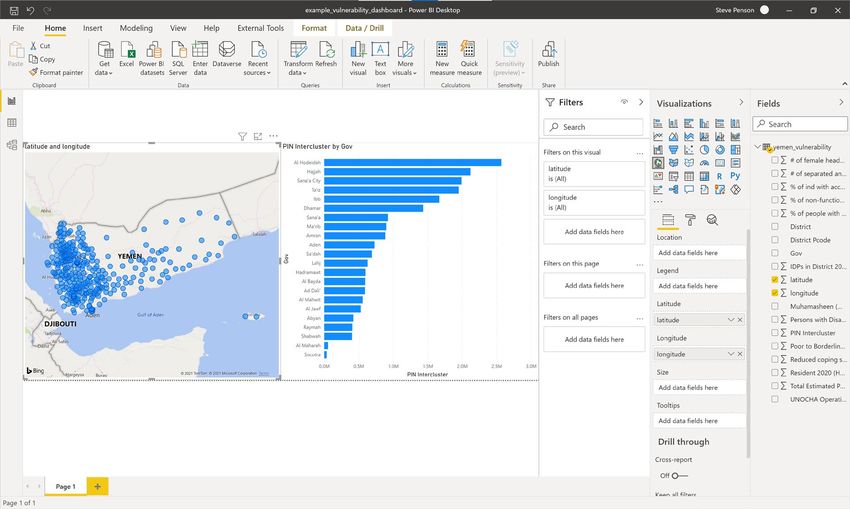
ACAPS HAP Power BI Training Guide

Introduction
This training will guide you through the development of an operational humanitarian
vulnerability dashboard using the desktop tool Microsoft Power BI.

Scenario
The protection cluster is focussing on identifying the most vulnerable districts within Yemen.
Such analysis will support operational teams in planning their humanitarian programming. To
give an overview of the most vulnerable areas, the protection cluster have asked you to
develop a dashboard highlighting the districts with the most people in need.

Data
The protection cluster have supplied you with a dataset:

   •    yemen_vulnerability.xlsx – an Excel file containing key metrics of vulnerability.

The dataset is separated by District with each row representing a District. Different geographic
levels are represented in the dataset:

   •    District – admin level 2 – lowest geographic level of data in this dataset.
   •    Gov – Governorate admin level 1. Each Governorate contains multiple districts.
   •    UNOCHA Operational Hub – UNOCHA geographic areas used to support operational
        planning.
   •    PCODE – unique geographic code for district. PCODES ensure a consistency in
        locating geographic areas. This is particularly useful when a geographic area can have
        multiple spellings.

The dataset contains key vulnerability indicators:

 Indicator
 IDPs in District 2020 (HNO)
 Resident 2020 (HNO)
 Total Estimated Population 2020 (HNO)
 Persons with Disabilities (Physical and Mental 15%)
 # of separated and unaccompanied children
 # of female headed households
 Muhamasheen (Minority Group Presence)
 % of non-functional schools
 % of people with access to a regular income
 Reduced coping strategies index
 Poor to Borderline food consumptions scores (Jan 2019)
 % of ind with access to markets
 PIN Intercluster

                                                                                              3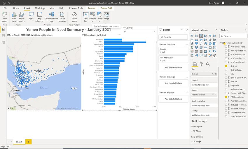
ACAPS HAP Power BI Training Guide

Notice that the data structure is consistent and clean. This flat data structure ensures data
quality is high and supports the use of tools such as Tableau or Power BI.

   •   Row 1 contains the name of each indicator.
   •   Every other row represents a district. There are no duplicate districts.
   •   If a indicator contains numerical data, the data does not contains text values.
   •   The data only contains one table and no graphs are present as these will be created in
       Power BI.

Ensuring data follows a consistent structure supports interoperability between different
datasets and allows complex analysis to be developed in a timely, consistent and accurate
manner. Similarly, the use of PCODES supports accurate geographic mapping of the data.

For this training you will only be using a few vulnerability metrics. Further details of the data
can be found in Appendix 1.

Power BI installation
To install Power BI Desktop, go to https://powerbi.microsoft.com/en-us/downloads/ and
download Microsoft Power BI Desktop.

Download is free. If you have an Office 365 License you will be able to publish dashboard
online.

                                                                                                    4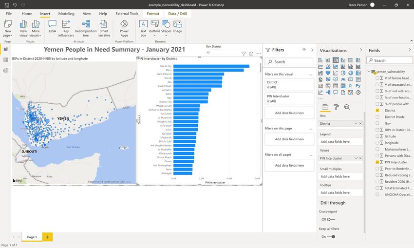
ACAPS HAP Power BI Training Guide

Exercise instructions
  1. Open Power BI desktop.

  2. Click Get data -> Excel -> Connect.

                                                                5
ACAPS HAP Power BI Training Guide

3. Locate the yemen_vulnerability.xlsx file and click Open.

4. Once opened, the Navigator will show the tabs available in the Excel spreadsheet.
   Select yemen_vulnerability and click Load.

                                                                                       6
ACAPS HAP Power BI Training Guide

5. The data will then take a few seconds to load.

6. Once loaded, the Excel spreadsheet data will be available in the Fields panel on the
   right hand side. This contains available column names we can use for analysis.

                                                                                          7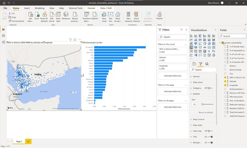
ACAPS HAP Power BI Training Guide

7. In the Fields panel click ‘Gov’. A new table will be created in the dashboard window.

8. In the Fields panel click ‘PIN Intercluster’. The number of PIN per governorate will be
   added to the table.

                                                                                             8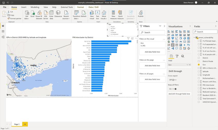
ACAPS HAP Power BI Training Guide

9. Click on the table and drag down to show the whole table.

10. Once the table is selected, under the Visualisation panel click on the Clustered Bar

   chart icon      .

                                                                                           9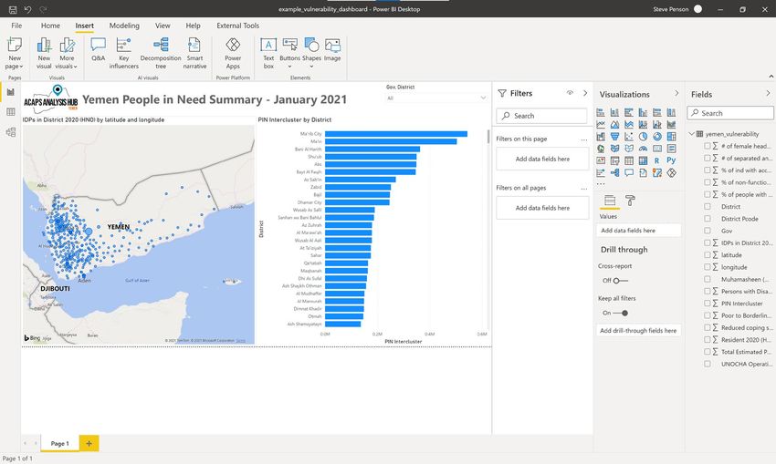
ACAPS HAP Power BI Training Guide
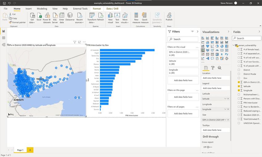
11. On the Visualisations panel select the Map icon . A new empty panel will be
created in the dashboard.
12. From the Fields panel, drag and drop the ‘latitude’ field to Latitude and the ‘longitude’
field to Longitude. Points representing each district should now be visible on the map.
10ACAPS HAP Power BI Training Guide
13. From the Fields panel, drag and drop the ‘PIN Intercluster’ field to Size. The district
points will now be sized based on the number of people in need within the district.
14. With the map selected, click the Format icon . Under the bubbles option, it is
possible to readjust the size of the bubbles to make the map clearer.
11ACAPS HAP Power BI Training Guide
15. To adjust the bar graph from Governorate to District, click on the graph and drag and
drop the District field into Axis section of the Visualisations panel. The graph will now
show PIN per district rather than by governorate.
16. To be able to filter the data by governorate and district, click on the dashboard window
away from the graph and map and select the Slicer icon . A blank slicer panel will
appear on the dashboard window.
12ACAPS HAP Power BI Training Guide
17. With the Slicer panel selected, from the Fields panel click Gov.
18. Click District. Both governorate and district will now be available in the slicer, giving the
user to ‘drill-down’ the select the geography.
13ACAPS HAP Power BI Training Guide
19. To the top right of the Slicer box, click the dropdown and select Dropdown option –
this will change the Slicer from a filter list to a dropdown filter.
20. To add a title to your dashboard, under the Insert menu click Text box. Draw a text box
within the dashboard window.
14ACAPS HAP Power BI Training Guide
21. Into the text box type a title such as ‘Yemen People in Need Summary – January
2021’.
22. To add an logo to your dashboard, under the Insert menu click Image. Draw a Image
box within the dashboard window.
15ACAPS HAP Power BI Training Guide
23. Locate the image location and click Open
24. Rearrange the dashboard objects as required.
16ACAPS HAP Power BI Training Guide
25. You can use the slicer, points on the map or graph to filter the dashboard.
26. The dashboard is now complete. It is now possible to analyse and filter PIN numbers
by district using both the map and the graph.
27. To save your dashboard, click File -> Save As and save in a suitable location.
Power BI files are saved as .pbix files.
17ACAPS HAP Power BI Training Guide
Additional exercises
Now you have completed your first operational dashboard, attempt to answer the following
questions by adding additional functionality and analysis to your dashboard:
1. Using fields ‘IDPs in District 2020 (HNO)’ and ‘Total Estimated Population 2020 (HNO)’,
identify which district has the highest number of IDPs as a percentage of population?
Note: Total Estimated Population = IDPs in District + Resident. Any Districts where this
does not add up suggests incorrect data and should be flagged or removed from the
analysis
2. Using fields ‘% of people with access to a regular income’ and ‘Total Estimated
Population 2020 (HNO)’, calculate the 5 top districts which have the highest estimated
population without access to a regular income. What might be the limitations with this
methodology?
3. Using the ‘Muhamasheen (Minority Group Presence)’ field, create a table, map and
filter visualising which districts have Muhamasheen present and which districts do
not.
Further training resources
Further training resources can be found at https://powerbi.microsoft.com/en-us/learning/.
This work is licensed under a Creative Commons Attribution-NonCommercial 4.0 International License.
18ACAPS HAP Power BI Training Guide
Appendix 1 – Data review
Field Description
PCODES are unique admin area codes use to define a geographical area such as an
governorate or district boundary.
District Pcode Using PCODES helps to ensure consistency between datasets as using a unique code mitigates
against issues of different place names spellings and ensures datasets can be joined easily.
PCODES are assigned by UNOCHA and are part of the Common Operational Datasets.
UNOCHA Operational Hub Name of the UNOCHA Operational Hub used to plan OCHA humanitarian programmes.
Gov Governorate name.
District District name.
Number of internally displaced people (IDPs) within district as taken from the 2020
IDPs in District 2020 (HNO)
Humanitarian Needs Overview.
Number of non-IDP residents within district as taken from the 2020 Humanitarian Needs
Resident 2020 (HNO)
Overview.
Total number of IDPs and residents within district as taken from the 2020 Humanitarian Needs
Total Estimated Population 2020 (HNO)
Overview.
Persons with Disabilities (Physical and Mental 15%) Approimation of the number of persons with disabilities by district.
# of separated and unaccompanied children Number of separated and unaccompanied children by district.
# of female headed households Number of female headed households by district.
Muhamasheen (Minority Group Presence) Whether the district contains vulnerable Muhamasheen communities.
% of non-functional schools Percentage of non-functional schools within the district.
% of people with access to a regular income Percentage of people with access to a regular income.
The Reduced Coping Strategies Index (RCSI) is a proxy indicator of household food insecurity.
Reduced coping strategies index The higher the rCSI score, the worse the food insecurity as people are deemed to be using more
negative coping strategies.
Number of people deemed to be have poor or borderline food consumption as of January 2019
Poor to Borderline food consumptions scores (Jan 2019)
by district.
% of ind with access to markets Percentage of individuals with access to market by district.
PIN Intercluster Number of intercluster people in need by district.
longitude Geographical longitude of the centre point of the district.
latitude Geographical latitude of the centre point of the district.
19You can also read