IS LARGE-SCALE RAPID COV-2 TESTING A SUBSTITUTE FOR LOCKDOWNS? THE CASE OF T UBINGEN - JOHANNES GUTENBERG-UNIVERSITÄT MAINZ
←
→
Page content transcription
If your browser does not render page correctly, please read the page content below
Is large-scale rapid CoV-2 testing a substitute for lockdowns?
                                     The case of Tübingen
           Marc Diederichs1 , Peter G. Kremsner2 , Timo Mitze3 , Gernot J. Müller2,5,6
                      Dominik Papies2 , Felix Schulz1 , Klaus Wälde1,5,7,∗
               (1)
                  Johannes Gutenberg University Mainz, (2) University of Tübingen
                 (3)
                     University of Southern Denmark, (5) CESifo, (6) CEPR, (7) IZA

                                             April 20, 2021

                                                Abstract
           Various forms of contact restriction have been adopted in response to the Covid-19
       pandemic. Only recently, rapid testing appeared as a new policy instrument. If sufficiently
       effective, it may serve as a substitute for contact restrictions. Against this background
       we evaluate the effects of a unique policy experiment: on March 16, the city of Tübingen
       set up a rapid testing scheme while relaxing lockdown measures—in sharp contrast to
       its German peers. Comparing case rates in Tübingen county to an appropriately defined
       control unit over a four-week period, we find an increase in the reported case rate, robustly
       across alternative specifications. However, the increase is temporary and about one half
       of it reflects cases that would have gone undetected in the absence of extra testing.

    Can large-scale CoV-2 testing strategies substitute for restrictive public health measures
(aka lockdowns)? In theory, the idea is straightforward. If, first, every socially active person is
subjected to a rapid CoV-2 test on a regular basis and, second, quarantined if tested positive,
there is zero infection risk arising from social interactions. In this way, one would achieve the
same outcome as a perfectly effective lockdown—but at much lower costs as, in contrast to a
lockdown, it would be possible to maintain social interactions. Against this background, there
have been calls for comprehensive and large-scale testing schemes early in the pandemic (1 ).
    In practice, however, there are several possible complications. Perhaps most importantly,
even an ideal testing procedure would generate false negatives, that is, some infections will
necessarily go undetected (2 ). Moreover, its timing is critical for the testing strategy to work:
if testing takes place too early, infected persons go undetected, if it takes place too late, the
transmission of the disease may have already taken place. In fact, some observers suggest that
for these reasons rapid tests do more harm than good (3 ). Lastly, testing and quarantining
may be not sufficiently comprehensive, for instance, because of lack of compliance.
    Lockdowns on the other hand are unlikely to prevent new infections altogether. First and
foremost, they cannot be complete because some social interactions are essential. Second, their
effectiveness also suffers from lack of compliance (4 , 5 ).
    So, eventually, the question of whether large-scale CoV-2 testing strategies can substitute—
fully or partially—for lockdown measures calls for an empirical assessment. A number of
countries have opted for large-scale testing in response to the pandemic. For instance, by early
   ∗
     Contact details of authors: Marc Diederichs, Johannes Gutenberg University Mainz, Gutenberg School
of Management and Economics, Jakob-Welder-Weg 4, 55131 Mainz, Germany; Peter G. Kremsner, Institute
of Tropical Medicine, University of Tübingen, Tübingen, Germany, Centre de Recherches Médicales de Lam-
baréné, Lambaréné, Gabon; Timo Mitze, University of Southern Denmark, Faculty of Business and Social
Sciences, Department for Border Region Studies Alsion 2, 6400 Sønderborg/Denmark; Gernot Müller, Uni-
versität Tübingen, Nauklerstr. 50, 72074 Tübingen, Germany; Felix Schulz, Johannes Gutenberg University
Mainz, Gutenberg School of Management and Economics, Jakob-Welder-Weg 4, 55131 Mainz, Germany; Klaus
Wälde (corresponding author), Johannes Gutenberg University Mainz, Gutenberg School of Management and
Economics, Jakob-Welder-Weg 4, 55131 Mainz, Germany, fax + 49.6131.39-23827, phone + 49.6131.39-20143,
e-mail waelde@uni-mainz.de.

                                                    1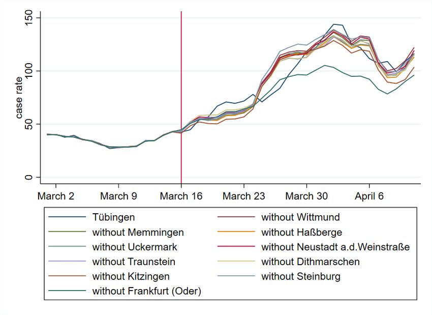
April 2021, Denmark and Slovakia, both had cumulatively performed more than 3500 tests
per 1000 people and thus about 6 times more than Germany. However, in these instances
testing was not systematically introduced as a substitute for lockdown measures, but often as
a complement. Second, we lack an appropriate control group against which we can benchmark
infection dynamics in these countries.
    This is why we turn to a uniquely suited policy experiment set up in the German town of
Tübingen in mid-March 2021. It introduced a large-scale rapid testing scheme while simulta-
neously relaxing lockdown measures. Each person that tested negative was permitted to shop
as well as to join other people in restaurants (although outdoors only). In order to set up
this experiment, Tübingen got a special permit from the state government. And while several
towns tried to obtain similar permits elsewhere in Germany, the case of Tübingen is unique in
that it switched from lockdown to testing while other German municipalities were still in the
lockdown mode.
    We rely on these municipalities as a reference point to assess infections dynamics in Tübin-
gen. This is essential for our evaluation of the experiment because infection dynamics gained
considerable momentum all over Germany in March 2021. In order to perform a systematic
comparison, we apply the synthetic control method (SCM) which allows us to construct a syn-
thetic control unit against which we can benchmark the developments in Tübingen. SCM allows
us to mimic an experimental setup and to study social phenomena in context where controlled
experiments are not feasible (6 ). Moreover, SCM is used in the context of the Covid-19 pan-
demic to study the effect of making face masks mandatory or to quantify the effect of lockdown
measures (7 , 8 ). But it is also used in other context, for instance, to quantify the impact of
the Brexit referendum on economic performance in the UK (9 ).

1    The experiment
In order to appreciate the experiment under study, we briefly consider the developments in
Germany prior to the experiment under study. In Germany the policy measures in response to
the Corona pandemic are set at the state level and while policies differed somewhat across the 16
states, all states agreed to a range of measures in response to the second wave in December 2020.
In particular, non-essential shops, restaurants, and schools were closed. These measures were
partly reversed in early March against the backdrop of rising infections numbers, presumably
because the second wave of infections had died off by late February. Tübingen is located in the
state of Baden-Württemberg (BW, for short). Here non-essential shops were opened on March
8 provided that the case rate in the county was below 50. Otherwise, a ‘click & meet’ scheme
was put in place. Teaching at primary schools resumed on March 15. These measures were
announced on March 5 by the state government and hence implemented on short notice.
    On March 15 the state government also announced that starting the next day (March 16),
the town of Tübingen would embark on a special experiment, centered around a large-scale
rapid testing scheme, officially labeled ‘Opening under Safety’ (‘Öffnen mit Sicherheit’), or
‘OuS’ for short. The town set up 9 testing posts where everybody would queue for about 5-30
minutes to be subjected to a rapid antigen test free of charge. After another 15 minutes the
result of a test would be released and in the case it was negative, the subject was provided with
a ‘day ticket’ entitling the holder to shop in non-essential stores, attend bars and restaurants
(outdoors), cinemas and theaters (the OuS activities). In case the test was positive, people
were asked to take a PCR test which is supervised by the public health office (Gesundheitsamt).
These tests form the basis for the official statistics on which our analysis is based. The capacity
for daily testing was 9000 and there were more than 30K tests per week (10 ).
    At the regional level, Germany is organized in 16 states, which are subdivided in a total
of 401 counties (“Landkreise” and “kreisfreie Städte”). Tübingen city (pop: 91K) is part of

                                                2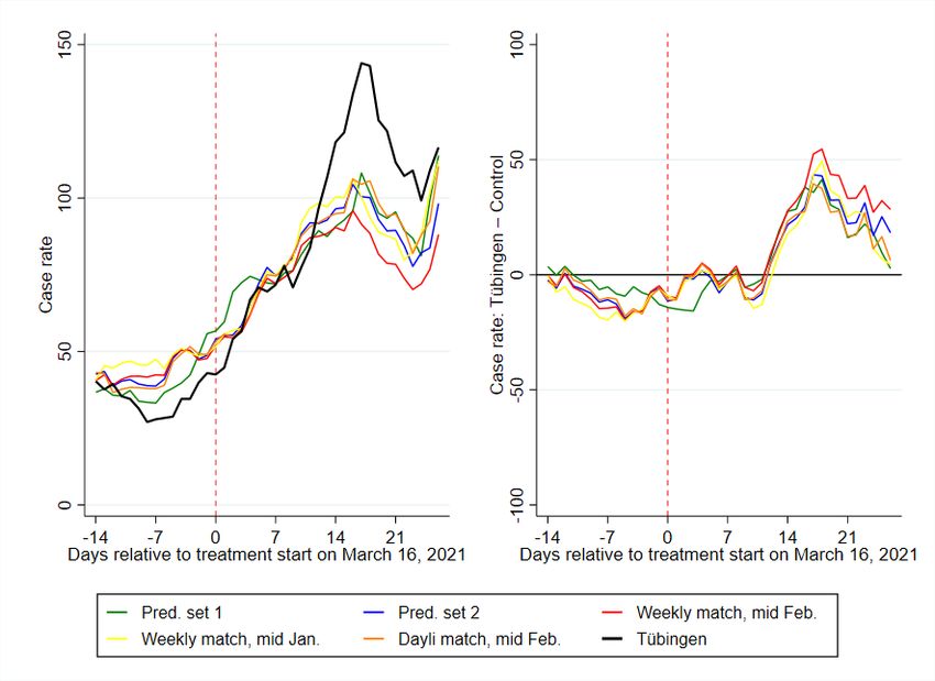
Tübingen county (pop: 229K). In total, there are 44 counties in BW. The experiment under
study took place in Tübingen city only. Still, everyone living in Tübingen county was allowed
to participate. Hence, spillovers from the city to the countryside may have potentially been
significant. Also, detailed data is available only at the county level. In what follows, we
therefore compare data for Tübingen county to those in other counties. In our baseline, we
focus on the seven-day CoV-2 case notification rate per 100,000 (“case rate”, for short), that
is, the number of new CoV-2 cases per 100K people in the past 7 days.
To measure the causal impact of OuS, it is important to note that Tübingen is not ex-
ceptional in terms of fundamentals. However, it performed relatively well compared to its
BW peers regarding CoV-2 case numbers (see appendix A.5.5 for more background). At some
point, Tübingen county was indeed enjoying the lowest case rate in all of BW. Still, there have
been many counties which did similarly well during the period. The experiment taking place
in Tübingen rather than elsewhere is most likely a result of local idiosyncrasies and politics
that are orthogonal to infection dynamics. The experiment, while approved by the state gov-
ernment, was devised jointly by the town’s major and his Corona-commissioner. Both have
gained prominence in national media as a result of vocal and eloquent interventions regarding
the handling of the pandemic and, more importantly, because of their personalities. It seems
that these personalities, rather than any special developments in Tübingen, have been causal
for setting up the Tübingen experiment. It thus comes close to a randomized control trial.
2 Findings
What is the effect of opening under safety (OuS) on infection dynamics in Tübingen?
2.1 Seven-day case rate
We start our analysis by describing the pandemic state by the most popular measure: the
seven-day case rate. As the solid black curve in the left panel of figure 1 shows, the case rate
in Tübingen was below 50 before the start of the project and increased to almost 150 at the
beginning of April during the Easter weekend. This increase was associated with OuS and led
to wide public claims that “Tübingen failed”.
It is clear that one cannot judge the success or failure of a project by comparing some
measure (the case rate in our case) before and after the start of the project. Other factors
than OuS might have affected pandemic dynamics in Tübingen over this period. We therefore
need to compare the pandemic in Tübingen to other counties sharing various characteristics.
This selection of counties should display comparable pandemic dynamics before the start of
OuS in Tübingen, should share certain fundamental characteristics (like population density,
age structure or medical services) and should be subject to very similar if not identical public
health measures.
We identify such a set of control counties using our statistical method (for details, see the
method section below) and by restricting the set of control counties from which to choose to
counties in BW, excluding direct neighbors of Tübingen (listed in appendix A.5.4) given a
high likelihood of spillovers. The restriction to the state of BW makes sure that all counties
are subject to the same public health measures before OuS. The resulting counties and their
weights constituting our synthetic control county are presented in table 1.
As the table shows, the synthetic control county consists of two cities, Heidelberg and
Freiburg, and two counties, Enzkreis and Heilbronn (which, however, is almost negligible with a
weight of around 1%). Similar to Tübingen, Heidelberg and Freiburg are major university towns
that have similar population levels of between 160-230K and comparable socio-demographic
structures (average age, share of highly educated inhabitants and similar job in-commuting
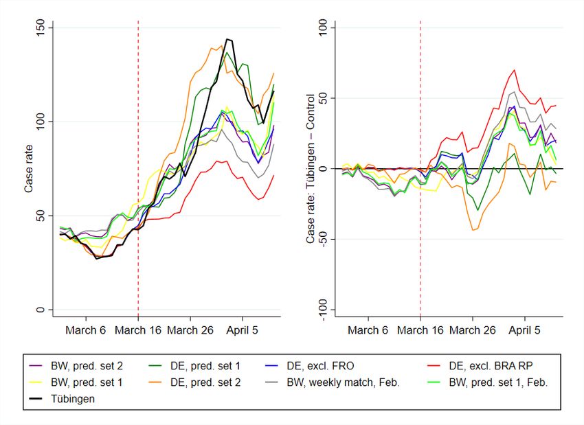
3Figure 1: Seven-day case rates for donor pool Baden-Württemberg
Notes: The left panel shows the seven-day case rate, the right panel shows the seven-day case rates between Tübingen and the
synthetic control county. Control counties were chosen by SCM where the donor pool was restricted to counties from BW only,
excluding neighboring counties of Tübingen.
Table 1: Control counties and their weights for figure 1
Name Weight
SK Heidelberg 0.431
SK Freiburg i.Breisgau 0.300
LK Enzkreis 0.254
LK Heilbronn 0.0160
structures). Local health care system (number of registered doctors and hospital beds) are also
similar. The Enzkreis has a lower population density and thus complements the smaller and
less agglomerated communities belonging to Tübingen county.
Given this background, we can now again turn to figure 1. We observe a good fit in the
pandemic history since February 2021. Table 4 shows that the fit with respect to other criteria
is also convincing.
If we want to enter into a detailed interpretation of day-to-day differences between Tübingen
and its control county, we need to remind ourselves that the effects of any policy measure are
visible in the data only with a certain delay. This is the result of incubation and a reporting
delay. If 100 new infections arose on day 1, 50 of them (median) would be visible in the data
between day 1 and around day 9, the rest later (see appendix A.3.2). Hence, given a ‘real-
world’ treatment date of March 16, we need to study whether effects in the data are visible as
of around March 24.
The best way to see the difference between Tübingen and its control is to consider the right
panel of figure 2. We indeed find a strong increase in the difference as of March 24. This looks
like a clear treatment effect for Tübingen due to OuS. The difference peaks three weeks after
the start, that is, around April 1, just before the Easter weekend. The right panel also shows
that this difference, while clearly visible, is hardly statistically different from zero at the 10%
level. Nevertheless, a treatment effect is visible, OuS seems to increase the case rate – at least
temporarily. Towards the end of our observation period, Tübingen and its synthetic control
4county hardly show any difference. Case rates are back to the synthetic control county’s level.
OuS seems to raise case rates only temporarily.
We note that Tübingen restricted the participation in OuS activities to inhabitants of Tübin-
gen county as of April 1st. At the same time, outdoor areas by restaurants were closed and
only pick-up was allowed. Given the previously discussed delay, this can not possibly be the
reason behind the drop as of April 1st. It should have contributed, generally speaking, to the
decline in case rates in Tübingen one to two weeks later.
2.2 Case rates and testing
There is one issue related to OuS which is relevant for all projects of this type. This issue
is also of a much larger concern and has been discussed for a long time: does the number of
reported infections increase when there is more testing?
One can argue that the answer is ‘no’ when a test is undertaken when a patient with
Covid-19 symptoms visits a doctor. If the test follows from the examination of the patient by
the doctor, the number of tests depends on the number of patients with Covid-19 symptoms.
The number of reported infections therefore increases only when there are more patients with
symptoms. Tests increase as a function of the state of the pandemic.
The argument is different when testing is the outcome of projects as, for example, the one
of Tübingen. In this case, the number of tests does not depend on the state of the pandemic
but on the number of participants and, on the national scale, on the number and scale of
OuS projects. Similar arguments can be made with respect to testing travellers, testing sport
professionals or all other preventive testing (see appendix A.3.3 for more background). In this
case, more infected individuals are found when there is more testing.
To understand the effect of more testing during the project period, we start from the number
of positive rapid tests. They amount to 45 (15 to 21 March), 39 (22 to 28 March), 29 (29 March
to 4 April) and 30 (5 to 11 April) per week (10 , 11 ). While clinical studies are being undertaken,
a good estimate about the share of positive rapid tests that is confirmed by a positive PCR
tests is lacking. A reasonable range seems to lie between 50% and 80%.
When we translate these weekly numbers of positive cases due to rapid testing into weekly
rates (see section A.4.2 for details), we can compute the seven-day case rate that would have
been observed in Tübingen in the case of OuS but in the absence of the positive cases which
occur only because of rapid testing.
Table 2: The increase in the case rate in Tübingen due to OuS and the effects of rapid testing
March 21 March 28 April 4 April 11
Difference 2.75 8.93 45.54 28.19
low predictive value (50%) -11.75 -3.57 36.04 18.69
high predictive value (80%) -20.45 -11.07 30.34 12.99
Notes: The first row (’difference’) shows the increase in the seven-day case rates in Tübingen due to OuS as plotted in the right
panel of figure 1. Case rates are based on reports of positive PCR tests. Assuming that 50% of the number of positive rapid tests
are PCR confirmed, the second row shows the corrected effect of OuS. A negative sign indicates that OuS reduces the case rate.
The third row shows the case where 80% of positive rapid tests are PCR confirmed.
Table 2 shows the differences in case rates for those four days for which we have weekly
positive test counts. It subtracts the case-rate counterpart of positive test counts according to
equation (A.7) for the case of a low and for a high predictive value. The case of a low predictive
value of rapid tests assumes that only 50% of all positive rapid tests are confirmed by a positive
5PCR test. Under the assumption of a high predictive value, there are only few false positive
cases, i.e. 80% of positive rapid tests are confirmed to be PCR positive.
These corrected case rates suggest a conclusion that OuS could actually reduce the case
rate. Yet, overall, table 2 does show that OuS in Tübingen on average increased case rates.
This is true especially around Easter (April 4), but case rates returned almost to the level of
its control county afterwards.
We emphasize that this issue is of importance beyond OuS projects: Correcting reported
cases by the number of positive tests from rapid testing should become routine when regulations
and potentially even laws are based on case rates. Otherwise each region following a testing
strategy to identify asymptomatic cases punishes itself by higher reported cases.
2.3 Understanding our findings
Our main message is that OuS in Tübingen did not lead to a substantial increase in case rates.
On the contrary, OuS even provides built-in mechanisms that possibly reduce the number of
cases. How can this be understood? Understanding means that we need some theory. Numbers
are numbers and a comparison of numbers does not explain differences. What is the effect of
OuS from a conceptual perspective?
First, OuS implies, by definition, more testing. Second, participants in the OuS activities
have contacts in the activities constituting the project and beyond (see appendix A.3.3 for
more details). More testing allows the identification of asymptomatic cases. This clearly has
a positive effect on the pandemic: Imagine a group of, say, five visitors. Imagine further that
one of these five visitors is infectious. If these five visitors meet in private, it is likely that some
non-infected of this group gets infected during this meeting. If these five visitors participate in
some OuS activities, the infectious individual is sorted out and would not infect the others.
The downside of OuS is the potential increase in risky contacts. Testing does not identify
exposed individuals (they are infected but not yet infectious) and there are false negative test
results. Hence, some infection risk is always left. More contacts should therefore lead to more
infections. (As a side remark, if contacts in the context of OuS substitute for otherwise private
contacts, the number of contacts due to OuS might actually not be higher than without OuS.)
A priori, it is therefore unclear whether OuS leads to more or less reported infections. These
simple theoretical considerations also show, however, that one can easily imagine a scenario in
which OuS possibly even reduces the number of infections.
3 Method
To estimate the causal effect of OuS (the ‘treatment’), on infection dynamics in Tübingen (the
‘treated unit’), we require a control unit that is comparable to Tübingen in terms of relevant
socioeconnomic factors as well as in terms of pre-treatment trends. To this end, we rely on the
synthetic control method (SCM), proposed for the causal assessment of policy interventions on
the basis of aggregate outcome measures (12 ).
At the heart of this method lies an estimator which identifies, in our application, counties in
Germany to which Tübingen county can be compared. This comparison is based on information
observable prior to treatment and summarized by a set of predictor variables. In our case, this
set includes several observations for the infection rate in the weeks prior to treatment and
other relevant characteristics such as, for instance, the old-age dependency ratio. Table 4 in
the appendix reports the full list of predictors for our preferred specification.
The control unit is constructed by minimizing the ‘Root Mean Square Percentage Error
Loss’ (RMSPE) which quantifies the distance of the (weighted sum of) comparison counties to
Tübingen prior to treatment. SCM requires an a-priori list of counties from which to construct
6the control unit (the ‘donor pool’). In our preferred specification, the donor pool consists of
all counties of BW, except for Tübingen county and its direct neighbors. In robustness checks
(see appendix A.5), we extend the donor pool to include all counties in Germany. In terms of
outcome variable, we focus on the 7-day case rate and provide robustness checks for alternatives
in appendix A.6. We provide more details on the method in appendix A.4.1.
4 Discussion
As we emphasise in the method section above, results of a comparison of a county without
synthetic county depend on (a) the measure used (outcome variable), (b) the criteria employed
to find comparable counties (predictor variables) and (c) the donor pool, i.e. the group of
counties from which to choose comparable counties. This section therefore discusses the impact
of variations in our choices. A short preview would reveal that changes in outcome variables and
predictor variables have no major effect on our overall evaluation. Changes in the donor pool
do however influence results significantly. For this reason, we want to start off our discussion
with the latter.
4.1 The role of the donor pool
• No optimistic story
We could have told a very optimistic story about Tübingen. It is the outcome of a SCM analysis
that allows all counties in Germany to be part of the donor pool and puts a strong emphasis on
short-run dynamics in the predictor set (our ’predictor set 1’ is shown in table 10). The larger
the donor pool, the larger the choice among counties, the larger the ”chance” that a county
similar to Tübingen is found and the better the outcome of the minimisation problem of the
SCM (see appendix A.4.1). The evolution of the case rate for the resulting synthetic control
region is displayed as the green line (’DE, pred. set 1’) in figure 2. It basically tracks Tübingen.
OuS would have no effect.
The downside of this approach consists in the risk that some counties chosen by SCM for the
synthetic control county might have experienced opening measures similar to OuS in Tübingen.
In fact, the control county for this specification contains Frankfurt/Oder, a region that also
allowed shops to open in mid March (see (13 ) or (14 )). We therefore exclude Frankfurt/Oder
from the donor pool. The strong effect of Frankfurt/Oder is confirmed by a leave-one-out and
leave-all-out analysis in section A.5.2. Given this, we do not consider this optimistic story to
be statistically convincing.
When we put more emphasis on longer-term predictors (our predictor set 2) we achieve a
similarly good fit and a zero-effect of OuS in Tübingen. This is the yellow-ochre (’DE, pred. set
2’) curve in figure 2. Even though the synthetic control county does not include Frankfurt/Oder,
a leave-all-out analysis (see appendix A.5.3) also shows that this specification is not robust.
Hence, both findings that OuS does not lead to additional cases turned out to be non-robust.
We therefore conclude that OuS does lead to some increase in cases, at least temporarily.
• Conservative Germany-wide approaches
Given the experience with Frankfurt/Oder as another treated region in Germany, we let
SCM choose control counties from restricted donor pools. The first restricted donor pool we
propose includes all 401 German counties without Tübingen and Frankfurt/Oder. We then
excluded all of Brandenburg (where Frankfurt/Oder is situated) plus Rhineland-Palatinate, as
the latter also, at least temporarily, allowed restaurants to serve outdoors. Both specifications
7Figure 2: Seven-day case rates for all specifications
Notes: Case rates and their difference between Tübingen and the respective synthetic control counties are shown for all relevant
SCM specifications. Apart from two perfect but not highly robust fits (’DE, pred. set 1’ and ’DE, pred. set 2’), all other
specifications confirm the baseline specification in figure 1
lead to developments of case-rates (see ’DE, excl. FRO’ in blue and ’DE, excl. BRA RP’ in
red in figure 2) that are similar to the evolution in our baseline specification. The specification
excluding Brandenburg and Rhineland-Palatinate is the one according to which OuS would
have the worst effects.
• The robustness of our baseline specification
We also investigate the stability of our baseline specification for BW in figure 1. We change
the predictor set to predictor set 2 (see table 12), putting more emphasis on long-run stable
predictors. We also vary the pre-treatment period employed to construct Tübingen’s synthetic
control county. As figure 18 shows in detail and figure 2 joint with our other robustness checks,
none of these variations led to a substantial change in our prediction.
4.2 The role of the pandemic measure
The seven-day case rate as employed in figure 1 is the measure of the pandemic state that
receives most of the attention around the world. It is not clear, however, whether this is the
best measure for a pandemic. It is also not clear, whether this is the best measure to compare
the evolution of the pandemic across regions. A moving average over a period of seven days
8is much more short-run in nature than for example the simple sum of all new infections since
some starting point.
We therefore investigate the total number of reported infections since January 2021 per
100,000 inhabitants as dependent variable. While the details are in appendix A.6.1, we find
that using this definition, the synthetic twin of Tübingen consists of different counties than
our benchmark analysis above. The fit was however much better compared to the specification
above, as cumulative infections over a longer period than only 7 days are less volatile. Finding
similar counties is therefore easier. What is most important, however, is the evaluation of OuS:
We confirm the findings from above. There is a small but not prohibitive difference between
Tübingen and comparison counties. OuS appears to be working.
By contrast, we find significantly different results whenever we do not normalize the infec-
tions numbers. If not caculated per capita, Tübingen fares worse than its synthetic twin. This
is true for when we observe the total number of reported infections since January 2021 (not
per 100,000 inhabitants) in appendix B.2 or the total number of reported infections over the
previous 7 days (hence the non-normalized counterpart of the standard seven-day case rate) in
appendix A.6.2.
We do not believe, however, that these findings contradict our previous results, nor that
they provide any understanding of the pandemic in general and the effects of OuS in detail. In
almost any SIR-type model, infection risk depends on both (i) the number of contacts and (ii)
the probability that the contact takes place with an infectious person. (See (15 ) for a detailed
discussion of the specification of an infection rate in SIR models.) The probability of meeting
an infectious person in a certain region does therefore plausibly not depend on the absolute
number of infectious individuals in the region alone. It is rather a function of the share of
infectious individuals in this region.
There is a second reason why non-normalized cases do not seem plausible: All public health
discussions center around normalized cases. Many regulations are based on case rates, i.e.
normalized cases. Hence, cases in a region must plausibly be normalized by population size
also for a statistical analysis. We therefore do not attach too much importance to findings
based on non-normalized cases.
4.3 The role of predictors
It is clear that the choice of predictors, i.e. the variables by which we compare counties deter-
mines what regions end up being part of our synthetic and untreated Tübingen. Depending
on what counties are chosen by SCM, we achieve different differences between Tübingen and
the synthetic county. We therefore begin with an explanation of the predictors for our baseline
specification and then report the effects of varying the predictor set.
Table 4 in the appendix shows our predictors. They consist of two subsets. First, lagged
outcome variables and, second, fundamental regional characteristics (like for example popu-
lation density, age structure or medical services). The choice of predictor variables is driven
(partly by their availability and) mainly by the desire to identify comparable counties based on
fundamental determinants driving the outcome variable. In an ideal world, one would include
those measures as predictors which determine the evolution of the pandemic in a county. As
these ideal predictors are not available, regional characteristics and lagged outcome variables
serve as proxies for the latent true variables.
As most SCM applications we are aware of work with low-frequency (like annual or quar-
terly) data, we experiment here with adding more high-frequency predictors. Appendix 4.3
shows that including high-frequency predictors improves the fit between Tübingen and its
twin. At the same time, it detaches Tübingen from its twins with respect to the more stable
long-term characteristics.
9Concerning our robustness concerns, we were relieved to see in figure 17 that Tübingen fares
just as well as its synthetic county as in our baseline specification. Varying predictors therefore
does not change our basic conclusion.
4.4 The future of Opening under Safety
What do our findings mean from a more general perspective? If we should draw lessons for
future OuS projects, the following would be our top priorities: Replicating the experiment in
Tübingen elsewhere should be done with care. Tübingen had an excellent starting point with a
very low initial case rate compared to its peers (see figures 5 and 9). Running OuS-projects in
high incidence regions both poses the risk of a fast increase of cases and the chance of finding
more asymptomatic cases. If such a project was monitored on a daily basis (which would be
very simple if existing case data at the community level were made available publicly), it would
be worth a try.
The effect of rapid testing on reported cases needs to be taken into account. Test centres
should be strongly encouraged to publish data on positive cases by postcode. This would
allow to draw a distinction between cases resulting from the dynamics of the pandemic and
cases resulting from rapid testing. The latter could be achieved if health authorities recorded
and reported the reason for a test (symptoms, contact person, on the job, rapid test etc). If
additional cases discovered through (PCR confirmed) rapid testing of asymptomatic individuals
are not subtracted from overall cases, regions undertaking rapid testing would punish themselves
by higher cases.
Can OuS experiments be justified in times of high and increasing case rates? Various
studies based on SIR models (inter alia (16 ), (17 ), (18 )) estimate the effects of public health
regulations. Some conclude from these studies that lifting contact restrictions must worsen the
pandemic state. As these findings were obtained at a time when rapid testing was not available,
these conclusions appear premature.
Whether OuS experiments should be undertaken in times of increasing case rates also de-
pends on one’s view where infections take place. If infections mostly occur because of private
contacts, additional regulation of public contacts is of little use. The issue of health policy is
then an issue of compliance and enforcement. If enforcement of rules for private contacts is
not possible, individuals need incentives to cooperate. If rapid testing is more acceptable with
a reward (like visiting a restaurant), many people will accept rapid testing. If vaccination is
more acceptable with a reward, more people would get a vaccination. OuS might be a way to
increase fast testing rates and thereby help identify asymptomatic cases. If the latter accept
quarantine (given the issue of enforcement and compliance), case numbers will fall through
OuS.
Data on repeated testing would be very informative. What is known about individuals that
take part in OuS events? Is the share of infected individuals higher after the event compared
to individuals who did not take part? Test outcomes of one and the same person should be
merged by testing centers. If data protection prevents this, data protection helps the pandemic
to continue.
Acknowledgments
We would like to thank Peter Martus for guidance to testing data and Viola Priesemann for
discussions and comments. Authors are funded by their universities, contributed equally and
declare no competing interests. All data and code is available in the manuscript or the supple-
mentary appendix.
10References
1. P. Romer, “Roadmap to responsibly reopen America”, tech. rep., (https://roadmap.
paulromer.net/paulromer-roadmap-report.pdf).
2. J. Dinnes et al., en, Cochrane Database of Systematic Reviews, Publisher: John Wiley &
Sons, Ltd, issn: 1465-1858, (2021; https://www.cochranelibrary.com/cdsr/doi/10.
1002/14651858.CD013705.pub2/full) (2021).
3. G. Guglielmi, “Rapid coronavirus tests: a guide for the perplexed”, Nature, news feature.
4. G. Graffigna et al., PLoS ONE 15(9): e0238613. (2020).
5. N. B. Masters et al., PLoS ONE 15(9): e0239025, https://doi.org/10.1371/journal.pone.0239025
(2020).
6. A. Abadie, A. Diamond, J. Hainmueller, American Journal of Political Science 59, 495–
510 (Apr. 2015).
7. T. Mitze, R. Kosfeld, J. Rode, K. Wälde, Proceedings of the National Academy of Sciences
117, 32293–32301, issn: 0027-8424, (https://www.pnas.org/content/117/51/32293)
(2020).
8. B. Born, A. M. Dietrich, G. J. Müller, PLOS ONE 16, 1–13, (https://doi.org/10.
1371/journal.pone.0249732) (Apr. 2021).
9. B. Born, G. Müller, M. Schularick, P. Sedláček, The Economic Journal 129, 2722–2744,
(https://doi.org/10.1093/ej/uez020) (May 2019).
10. B. Palmer, L. Federle, Stadt Tübingen: Der Oberbürgermeister, (www . tuebingen . de /
Dateien/modellprojekt_zweiter_zwischenbericht_land.pdf) (2021).
11. Gesundheitsamt Tübingen, Landkreis Tübingen, (https://www.kreis-tuebingen.de/
Abteilung+33+_+Gesundheit.html) (2021).
12. A. Abadie, A. Diamond, J. Hainmueller, SYNTH: Stata module to implement Synthetic
Control Methods for Comparative Case Studies, Statistical Software Components, Boston
College Department of Economics, Oct. 2011, (https : / / ideas . repec . org / c / boc /
bocode/s457334.html).
13. Allgemeinverfügung der Stadt Frankfurt (Oder) Nr. 08/2021 - erweiterte Schutzmaßnah-
men Inzidenz über 100, (https : / / www . frankfurt - oder . de / PDF / Allgemeinverf %
C3 % BCgung _ der _ Stadt _ Frankfurt _ Oder _ Nr _ 08 _ 2021 _ erweiterte _ Schutzma % C3 %
9Fnahmen_Inzidenz_%C3%BCber_100.PDF?ObjSvrID=2616&ObjID=9503&ObjLa=1&Ext=
PDF&WTR=1&_ts=1617345595).
14. Brandenburg zwingt Frankfurt (Oder) zur Notbremse, (2021; https://www.rbb24.de/
studiofrankfurt/panorama/coronavirus/beitraege_neu/2021/03/brandenburg-
frankfurt-eindaemmungsverodnung-kassiert.html).
15. J. R. Donsimoni, R. Glawion, B. Plachter, K. Wälde, German Economic Review 21, 181–
216 (2020).
16. J. Dehning et al., Science 369 (2020).
17. R. Kosfeld, T. Mitze, J. Rode, K. Wälde, Journal of Regional Science forthcoming,
eprint: https://onlinelibrary.wiley.com/doi/pdf/10.1111/jors.12536, (https:
//onlinelibrary.wiley.com/doi/abs/10.1111/jors.12536).
18. S. Hsiang et al., Nature 584, 262–267 (2020).
11A Supplementary appendix
A.1 Data
A.1.1 General information
Data on reported SARS-CoV-2 infections are taken from the Robert Koch Institute (1 ). In-
fections are identified by PCR tests. For our empirical analysis we use aggregate case numbers
for each county and day based on the reporting date by local health authorities. Time-varying
predictors are the average daily temperature and daily mobility changes for each county during
the pre-treatment period until March 16, 2020. Mobility changes (in percent) based on indi-
vidual mobile phone data are computed as difference in mobility patterns between a specific
date and the average value for the corresponding weekday from the same month in 2019 (pre-
COVID benchmark period). To give a specific example: The mobility change for Wednesday,
March 10, 2021 is calculated as difference in the number of regional trips for this date and the
average number of trips on Wednesdays in March 2019. We use data on daily temperatures
from Deutscher Wetterdienst (2 ) and updated data on mobility changes per county and day
are obtained from (3 ).
We further include time-constant cross-sectional predictors characterizing regional demo-
graphic structures and the regional health care system as in (4 ) based on data from the INKAR
online database of the Federal Institute for Research on Building, Urban Affairs and Spatial
Development (5 ). We use the latest year available in the database, which is 2017, and rely
on the following cross-sectional predictor variables: population density (Population/km2), the
share of female in population (in %), the average age of female and male population (in years),
old- and young-age dependency ratios (in %), the number of medical doctors per 10,000 of pop-
ulation and pharmacies per 100,000 of population, the regional settlement structure (categorical
dummy), and the share of highly educated population (in %).
A.1.2 Descriptive statistics
Table 3 shows descriptive statistics for all variables used in our analyses. The variables are
measured on the district level and the underlying population is Germany without direct neigh-
boring counties of Tübingen, listed in appendix A.5.4. The latter are excluded from all analyses.
Panel A contains all variables related to measuring the development of the pandemic. Panel B
displays information on the time varying predictors mobility and average air temperature and
panel C shows all predictors related to the districts demographic structure and their health
care coverage.
12Table 3: Descriptive statistics
Mean S.D. Min. Max.
A: Data on reported CoV-2 cases
Seven-day CoV-2 case notification rate per 100,000 106.85 68.91 3.74 66.77
Cumulative infections per 100,000 inhabitants since January 1st 5895.28 8317.93 343 151095
Cumulative cases over previous 7 days 211.50 286.32 2 7338
B: Time-varying predictors
Mobility -.11 .14 -.74 .73
Average temperature 3.02 4.88 -17.50 19
C: Regional demographic structure and local health care system
Population density (inhabitants/km2 ) 535.44 705.34 36.13 4686.17
Share of females in population (in %) 50.60 .64 48.39 52.74
Average age of female population (in years) 45.88 2.12 40.70 52.12
Average age of male population (in years) 43.18 1.84 38.80 48.20
Old-age dependency ratio (persons aged 65 years
34.39 5.49 22.40 53.98
and above per 100 of population aged 15-64 years)
Young-age dependency ratio (persons aged 14 years
20.53 1.44 15.08 24.68
and under per 100 of population aged 15-64 years)
Medical doctors per 10,000 of population 14.62 4.42 7.33 30.48
Pharmacies per 100,000 population 27.04 4.91 18.15 51.68
Categorical variable$ for population density of NUTS3 region 2.60 1.05 1 4
Share of highly educated* persons in regional population (in %) 13.05 6.21 5.59 42.93
Notes: * = International Standard Classification of Education (ISCED) Level 6 and above; $ = included categories are 1) larger
cities (kreisfreie Großstädte), 2) urban districts (städtische Kreise), 3) rural districts (ländliche Kreise mit Verdichtungsansätzen),
4) sparsely populated rural districts (dünn besiedelte ländliche Kreise).
A.2 Literature
In theory, it is clear that testing and quarantining can dramatically reduce the costs of an
epidemic (6 ). A systematic empirical assessment, however, of the benefits of widespread rapid
testing based on antigen tests is still missing (7 ). In the present paper, we seek to contribute to
such an assessment by studying a unique policy experiment, in which widespread rapid antigen
tests were coupled with opening of non-essential infrastructure. We estimate the causal effect
of this intervention using the synthetic control method (8 –10 ). This method, SCM, for short,
is the vehicle for our empirical identification strategy.
SCM has been frequently used in the social sciences to study the effect of policy interven-
tions, broadly defined, on political, social, and economic outcomes (10 ). In these contexts,
SCM has been shown to be a flexible and robust estimation tool. In addition, it has also
been applied to COVID-related research, for instance, to study the effectiveness of lockdown
measures by means of a counterfactual analysis for Sweden (11 , 12 ) and to study the effect of
shelter-in-place policies in California (13 ). In addition, (4 ) use SCM to study the effect of face
masks on SAR-CoV-2 cases in Germany. The SCM approach has also been used in the interim
evaluation of the Liverpool mass-scale testing project (14 ). While similar to the Tübingen
experiment, this pilot was centered around repeated testing of asymptomatic individuals, those
with a negative result were not allowed to participate in otherwise restricted activities. Com-
pared to the synthetic control region, they find that large scale testing does not significantly
decrease case numbers and hospitalization.
Under the SCM, identification is based on a counterfactual that mimics a situation in which
the treatment in treated regions (here: a re-opening of public life and the local economy in
conjunction with a large-scale rapid testing scheme) would not have taken place. In Section
13A.4.1, we explain in detail how we implement SCM in the context of the present study.
A.3 Findings
A.3.1 Our baseline result
The synthetic twin county employed in figure 1 consists of 4 counties who are listed, jointly
with their weights, in the main text in table 1. Their fit with respect to predictors and the
RMSPE is in table 4.
Table 4: Pre-treatment predictor balance and RMSPE for Figure 1
e(X balance)
Treated Synthetic
cum cases7(68) 63 78.117
cum cases14(74) 158 163.439
i7 rate(32) 44.29581 49.93466
i7 rate(39) 31.45002 42.83748
i7 rate(46) 31.89298 30.47054
i7 rate(53) 40.30919 35.23315
i7 rate(60) 39.86623 41.55996
i7 rate(67) 27.02044 41.37256
i7 rate(74) 42.96693 47.02528
mobility(68(1)74) .0011557 -.1706146
average temperature(68(1)74) 4.214286 7.101671
Population density 434.8634 1171.571
Share of females in population 51.25601 51.5463
Average age of female population 41.67062 41.9366
Average age of male population 40.03484 39.91151
Old-age dependency ratio 24.57881 25.2647
Young-age dependency ratio 20.20369 18.35703
Medical doctors per population 15.63642 22.25934
Pharmacies per population 23.47678 29.47752
Categorial variable for population density of NUTS3 region 2 1.273
Share of highly educated persons in regional population 26.46966 32.70743
RMSPE (pre-treatment) 8.75
Table 4 displays the criteria (predictors) which we selected for SCM to choose control regions
based on predictor values in the pre-treatment period before March 16, 2021. Predictors can
be split into groups: lagged pandemic measures (the outcome variable) and structural regional
characteristics, which are expected to influence the local infection dynamics over time. As
the table shows, we place a strong emphasize on lagged values of the seven-day case rate as
predictor in order to ensure that Tübingen and the selected control regions follow a common
pre-trend in the last two weeks before the OuS experiment stated in Tübingen. We also include
an average measure for the cumulative number of SARS-CoV-2 cases in the two weeks before
treatment start.
With regard to structural regional characteristics, we use both time-varying and time-
constant predictors. As such, we use average levels for daily temperature and intra-regional
mobility changes in the week prior to the treatment. The link between seasonality and infec-
tion dynamics has recently been studied (15 ). Including mobility effectively controls for social
14interaction as a driver of local infection dynamics and also as a measure how closely people
follow prevailing (lockdown) policy rules (16 ).
Additionally, we control for the share of females in population, average age of female popu-
lation, average age of male population, old-age dependency ratio, young-age dependency ratio,
medical doctors per population, pharmacies per population, categorial variable for population
density of NUTS3 region and share of highly educated persons in regional population as sug-
gested in (4 ). The rationale behind the inclusion of these predictors is to match Tübingen as
closely as possible to its synthetic control group in terms of socio-demographic factors and fac-
tors related to the local health care system. Previous research has shown that these factors are
significantly related to differences in COVID-19 incidence and death rates at the sub-national
level (17 ).
The overall inspection of the pre-treatment prediction error (RMSPE) for the SCM specifi-
cation shown in Table 4 underlines the good fit between the seven-day case rate development
in Tübingen and its syntethic control group as already visualized in figure 16.
A.3.2 The reporting delay
Imagine a public health measure is implemented on a certain day and that it is effective. When
should we see the effects in the data? This delay between measure and statistical visibility
depends on the usual incubation period and on the reporting delay. The incubation period is
well-studied and has a median of 5.2 days and 95% of all delays lie in the range of around 2 to
12 days. They seem to be approximately log-normally distributed (1, 2). The reporting delay
was studied in general and applied to Germany in (18 ). It consists of a delay due to diagnosis,
testing and reporting of the test. We update the findings on (18 ) for our purposes here.
Again, let DI denote a random variable that describes the incubation period. Let DR denote
a second random variable that describes the delay between perceptible symptoms and reporting
to authorities of a positive SARS-CoV2 test. We are interested in the distributional properties
of the overall delay defined as D = DI + DR . We will take the median of D as our measure for
how long it takes before effects of public health measures are visible in the data. Information
on the date of reporting and on the day of first symptoms is provided in (3). The difference
between these two dates gives a vector of realizations of the random variable DR .
Findings for incubation. (19 ) and (20 ) describe the delay between infection and symptoms,
i.e. the incubation period, by a lognormal distribution. To be precise about parameters in what
follows, a lognormal distribution f (x) of a random variable X is characterized by a dispersion
parameter σ and scale parameter µ. (20 ) report m = 5.1 and that 95% of all cases lie between
R 11.5
2.2 and 11.5 days. The latter reads, more formally 2.2 f (x)dx = 0.95. This implies σ = 0.4149.
The scale parameter is given by µ = ln5.1 = 1.63.
Table 5: Descriptive statistics for the reporting delay DR
Sample Period Mean Median Variance Standard Deviation
A Jan 7 to May 6, 2020 6.80 6 30.92 5.56
B May 7, 2020 to March 16, 2021 5.38 4 80.21 8.96
Note: The RKI data set downloaded on June 7, 2020 (April 8, 2021) contains 119,917 (851,576) observations with in-
formation on day of infection until re-porting day May 6, 2020 (March 16, 2021). We focus on 118,618 (831,328) with
DR ≥ 0.
Findings for reporting. The mean, median (50% percentile), variance and standard devia-
tion of DR in (18 ) are in the first row of table 5. The second row displays the same summary
15statistics from May 7, 2020 to March 16, 2021.
Merging the two. When we merge incubation and reporting, we consider the sum of two
random variables, D = DI + DR . The mean is ED = EDI + EDR and the variance reads
V arD = V arDI + V arDR assuming independence between the two random variables. More
distributional in-formation can be obtained from a convolution analysis (18 ). We obtain the
following percentiles.
Table 6: Percentiles of total delay D
Sample 1 2.5 5 10 25 50 75 80 90 95 97.5 99
A 3.42 4.09 4.78 5.70 7.65 10.52 14.30 15.41 18.74 22.22 26.29 34.23
B 3.21 3.8 4.38 5.16 6.76 9.07 12.08 12.96 15.69 18.54 21.86 28.51
A.3.3 Opening under Safety in a SIR framework
• Sketch of a model
To understand the effects of opening under safety (OuS), we start from a fairly standard
description of a pandemic illustrated in figure 3. Each circle represents the (expected) number
of individuals of a certain region in the respective state. When individuals are infected, they
are in state E like exposed. When infectious, they are either symptomatic or asymptomatic.
Thereafter, they can recover, enter hospital or even die. Models of this type have been employed
e.g. by (21 ), (18 ) or (22 ). We assume for illustration purposes that tests are undertaken only
if individuals visit a doctor and display symptoms related to Covid-19. All reported infections
are therefore symptomatic infections (Covid-19 cases). Tests employed in this case are PCR
tests.
Figure 3: An extended SIR model
What is the effect of rapid testing (which are not PCR tests) in such a framework? We
assume that symptomatic individuals, individuals in hospital (and deceased individuals) do
not show up for rapid testing. Hence, tests are applied to susceptible, exposed, asymptomatic
infectious and recovered. Identified infectious individuals do not receive a day pass such that
visitors with a day pass are under much lower infection risk. What is more, the rest of the
population is also subject to lower infection risk due to the discovery of asymptomatic cases
(assuming they enter quarantine).
Due to false negative tests and as exposed cannot be detected, individuals holding a day
pass include susceptible, exposed, asymptomatic infectious (at a much lower share than before
testing) and recovered individuals. The dynamics of the pandemic of a negatively tested group
16therefore follows an adjusted SIR model as illustrated in figure 3. Exposed individuals can turn
infectious with or without symptoms, susceptible individuals can turn exposed and infectious
individuals can recover.
Figure 4: A SIR model for an OuS project
• The effects on the number of reported infections
What happens to the number of reported infections in an OuS region? (See (23 ) for a
more general analysis of the testing bias in reported infections.) Following our model sketch,
rapid testing identifies asymptomatic infectious individuals. A certain share of them will be
confirmed to be positive by a subsequent PCR test. The number of reported infections therefore
no longer just includes symptomatic but also asymptomatic infectious individuals. The number
of reported infections therefore rises by the number of discovered asymptomatic cases. If no
OuS had taken place, the number of reported infections would still consist only of the number
of symptomatic infectious individuals.
From a theoretical perspective, we should therefore expect that OuS leads to more reported
infections (due to discovered asymptomatic cases). At the same time, it implies a drop in
(symptomatic and asymptomatic) infections as discovered asymptomatic cases enter quarantine
and the infection rate falls.
If we want to correct the artificially increased number of reported infections in an OuS region
caused by the additionally identified asymptomatic cases, one should subtract the number of
asymptomatic cases from the reported number of infections. This adjusted measure counts
the number of symptomatic infectious individuals after OuS. This adjusted measure should be
compared with the reported number of infections in the OuS region before OuS and in control
regions where no testing takes place. As Tübingen was the first county in Germany to start
with OuS, we assume (doing some robustness checks) that it is appropriate to subtract (PCR
confirmed) asymptomatic cases from reported number of infections.
A.4 Methods
A.4.1 The Synthetic control method
The synthetic control method (SCM) is by now a well established strategy to measure the
treatment effect of specific policy measures (see Section A.2 for references). Here we provide
the details regarding SCM that are relevant for our analysis. First, we set up the donor pool : it
includes 400 Germany counties (“Landkreise” und “kreisfreie Städte”). 34 of these are located
in BW and hence in the same state as Tübingen county. We consider alternative donor pools
in order to robustify our results.
Second, we construct a synthetic control unit as a weighted average across the counties in
the donor pool. Note that the number of counties with non-negligible weight is not restricted
by our procedure and may vary across specifications. The weights are selected on the basis of
a minimum distance approach. Specifically, we target a set of predictor variables for Tübingen
17county in the pre-treatment period (that is, before March 16) in order to determine county
weights. The predictor set includes observations for the outcome variable (infection rate). We
choose the weights on the counties in the donor pool such that the control unit resembles
Tübingen in terms of these variables as closely as possible. In this way, we ensure that pre-
treatment differences in trends of the outcome variable are equalized. Table 4 lists all predictor
variables. They include all socio-economic characteristics that are a) available at the county
level and b) may matter for infection dynamics. In addition, we include weekly averages for
infection rates in the six weeks prior to treatment.
Formally, let x1 denote the (k × 1) vector of predictor varibles in Tübingen and let X0
denote a (k × n) matrix with observations in the counties included in the donor pool consisting
of n counties. Let w denote a (n × 1) vector of country weights wj , j = 1, . . . , n. Then, the
control unit is defined by a w∗ which minimizes the mean squared error
(x1 − X0 w)0 V(x1 − X0 w) , (A.1)
subject to wj >= 0 for j = 1, . . . , n and nj=1 wj = 1. In this expression, V is a (k × k)
P
symmetric and positive semidefinite matrix. Here, V is a weighting matrix assigning different
relevance to the characteristics in x1 and X0 . Although the matching approach is valid for any
choice of V, it affects the weighted mean squared error of the estimator (24 ). We choose a
diagonal V matrix such that the mean squared prediction error of the outcome variable (and
the covariates) is minimized for the pre-treatment period (24 , 25 ).
We conduct all SCM estimations in STATA using the SYNTH (26 ) and SYNTH RUNNER
(27 ) packages. Our implementation follows largely (4 ).
Confidence intervals (CIs) are calculated from one-sided pseudo p-values obtained on the
basis of comprehensive placebo-in-space tests. The latter tests calculate pseudo-treatment
effects for all counties in the donor pool assuming that they, rather than Tübingen would
have been treated with OuS on March 16, 2021. We calculate one-sided pseudo p-values as
the share of placebo-treatment effects that are larger than the observed treatment effects for
treated counties and thus indicate the probability that the increase in the outcome variable was
observed by chance given the distribution of pseudo-treatment effects in the donor pool.
To account for differences in pre-treatment match quality of the pseudo-treatment effects,
only donors with a good fit in the pre-treatment period are considered for inference. Specifically,
we do not include placebo effects in the pool for inference if the match quality of the control
region, measured in terms of the pre-treatment root mean squared prediction error (RMSPE),
is greater than 10 times the match quality of the treated unit (28 ). Based on the obtained
pseudo p-values we calculate confidence intervals as described in (29 ).
A.4.2 Case rates, comparisons and growth rates
Some or our arguments require a little bit of algebra. Especially the comparison between the
number of weakly positive rapid tests and the seven-day case rate in section 2.2 becomes clearer
when the idea behind the difference shown in table 2 is clearly shown.
• The basics
We start by defining cit as the number of new cases on day t in region i. Let Ni denote the
population size of region i. This allows us to compute the sum of cases over the last seven days
as c7it ≡ Σt−1
t=t−7 cit and the seven-day CoV-2 case notification rate per 100,000 (the case rate) as
c7r 7
it ≡ cit /Ni ∗ 100, 000. (A.2)
This expression is shown everywhere in this paper whenever we display ’case rate’ on the axes
of the figures or write about seven-day case rates.
18You can also read