IT PAYS TO STAY INVESTED 2020 - Banking With Purpose
←
→
Page content transcription
If your browser does not render page correctly, please read the page content below
IT PAYS TO STAY INVESTED 2020
Stock markets rise and stock markets fall. Thankfully, history shows that
over the long term, they go up more than they go down. That’s why when you
invest appropriately, you’re able to grow your money for the future.
Even though market declines are a natural part of investing, they can still be scary, and they can hurt your portfolio if you
make a poor decision at the wrong time. How do you reduce anxiety when markets fall? And how do you give yourself the
best chance to meet your goals?

The answer is simple: stay invested.

Once you’ve built a well-diversified portfolio suited to your goals, time horizon, and tolerance for risk, staying invested
through all market conditions is a time-tested strategy for achieving investment success.

Is it possible to make more money buying and selling investments throughout the year to capture gains and avoid losses?
Yes. But it’s unlikely. In fact, we’ll share data showing the average investor earns a return significantly below that of the
overall market. Part of the reason is that investors buy and sell at the wrong time, “locking in” losses that would eventually
have been erased – if they had only stayed the course.

Review these charts with your advisor. You’ll come away with a clear understanding of how markets have behaved
historically in good times and bad, and why simply doing nothing can often be the best plan of action.

                                                                                                              GET STARTED »

                                                                                                              IT PAYS TO STAY INVESTED 2020 2 «
THE STRUGGLE TO KEEP UP
ANNUALIZED RETURNS %
January 1990 to December 2019

                10.4

                                                       7.7
                                                                             7.2                            7.0

                                                                                                                                           4.1

           U.S. stocks                        Canadian stocks            Global stocks                Canadian bonds            Average U.S. mutual fund
                                                                                                                                 stock investor (in US$)

What this chart shows                                                              The bottom line
Different types of investments produce different levels of return. For             Despite best intentions, the average investor is unable to match the
example, over the past 30 years, U.S. stocks have outperformed their               returns of the market, let alone beat them.
Canadian and global peers. The worst performer of all is investors
themselves.

For more about the charts in this book, see page 16.                                                                            IT PAYS TO STAY INVESTED 2020 3 «
BAD BEHAVIOUR – IT’S ONLY NATURAL
Dalbar is a U.S. research firm known for its studies of investor behaviour. Researchers there have identified nine
behaviours that can lead to weak investment performance. Of the nine, three stand out as the most detrimental:
LOSS AVERSION
Our natural fear of losing money can lead to withdrawal of capital at the wrong time – when markets are
already falling.
ANCHORING
The tendency to falsely believe that events and conditions from the recent past are more important and are
worth greater consideration than older events.
HERDING
Doing what everyone else is doing, just because everyone else is doing it. “If other people are selling their
investments, maybe I should too…”
IT PAYS TO STAY INVESTED 2020 4 «SUCCESS MEASURED IN DAYS
GROWTH OF $10,000
U.S. stocks from January 1990 to December 2019
$193,404 What this chart shows
All it takes is a few days to make a big difference in your portfolio. The bar
on the left shows how much an investment of $10,000 would have grown
if you’d owned U.S. stocks for the last 30 years. But what happened if you
missed just the top 10 days during that period? You would have given up
more than $96,000 - roughly half your money.
It’s true that missing the 10 worst days is a powerful way to achieve the
opposite: large gains. The problem is, whether best or worst, it’s
impossible to know when they’re coming.
$97,096
The bottom line
To ensure your portfolio will always benefit from big positive days in the
market, no matter when they happen, you must be willing to accept the
bad days too. Stay invested, it pays off in the end.
$37,781
Start with $12,714
$10,000
Invested Missing Missing Missing
all days 10 best days 30 best days 60 best days
For more about the charts in this book, see page 16. IT PAYS TO STAY INVESTED 2020 5 «THE GOOD OUTWEIGHS THE BAD
RANGE OF ANNUAL RETURNS
Canadian stocks from 1960 to 2019
17 43 18
What this chart shows
years years Not only have there been many more positive years than negative ones
negative positive for Canadian stocks over the past 60 years, the most positive outcome was
also the most frequent. The Canadian stock market delivered an annual
return of more than 20% nine times more often than it delivered a decline
14 of that amount.
11 11 The bottom line
Historically, a positive annual return from the stock market has occurred
much more often than a negative one. What’s more, a large positive return
has occurred most frequently of all.
4
2
20%
-10% 0% 10% 20%
Range of annual returns
For more about the charts in this book, see page 16. IT PAYS TO STAY INVESTED 2020 6 «THE BIG PICTURE IS POSITIVE
BULL AND BEAR MARKETS
U.S. stocks from January 1960 to December 2019
10.1%
700% Annualized return over the
Bull markets entire period, including dividends
Median duration = 61 months
500% Median cumulative return = 101.50%
Bear markets 130 months
Median duration = 17 months
300% Median cumulative return = -30.31%
100%
-100% Jan 1960 1987 2000 2008 Dec 2019
What this chart shows The bottom line
Looking at stock market returns for the past 60 years, evidence clearly When comparing periods of rising and falling markets, rising
favours the bulls. Periods of rising stock prices, or “bull” markets, have markets have historically:
typically lasted roughly three times longer than periods of falling prices,
or “bear” markets. And, at just over 100%, the median gain from a bull 9 Lasted longer
market has been more than enough to compensate for the median loss 9 Been more frequent
of 30% during a bear.
9 Produced gains that are more than enough to offset losses
For more about the charts in this book, see page 16. IT PAYS TO STAY INVESTED 2020 7 «THE STEEPER THE LOSS, THE HARDER THE RECOVERY
PERCENTAGE GAIN REQUIRED TO COMPENSATE FOR PERCENTAGE LOSS
233.3%
What this chart shows
If you lose 10% of your money in the stock market, you need to earn 10%
to get back to even, right? Not exactly. As you can see by the way the lines
in this chart diverge, the relationship is asymmetrical. If your initial loss is
150.0% small, as shown at the left, the gain required to break even is only slightly
higher. But what happens it you lose 30%, as many did during the 2008/09
financial crisis? It would take a gain of almost 43% to get back to even.
100.0%
The bottom line
66.7%
Many investors are under the impression that it’s only the gains that drive
42.9% long-term returns. In truth, it’s every bit as important to limit your losses.
25.0% You can do that by using effective risk management strategies, such as
11.1% diversification.
5.3%
-5.0% -10.0%
-20.0%
-30.0%
-40.0%
-50.0%
-60.0%
70.0%
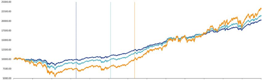
For more about the charts in this book, see page 16. IT PAYS TO STAY INVESTED 2020 8 «GET BACK ON TRACK FASTER WITH BONDS
40/60 Portfolio 60/40 Portfolio Global stocks
April 12, 2010 Feb 3, 2012 May 8, 2013
$25,000
$22,500 Vertical lines show when
each portfolio recovered its
$20,000 losses from the financial
crisis, returning to the initial
Investment amount
$17,500 $10,000 investment amount.
$15,000
$12,500
$10,000
$7,500
$5,000
2007 2008 2009 2010 2011 2012 2013 2014 2015 2016 2017 2018 2019
What this chart shows The bottom line
Global stocks fell further during the financial crisis than a diversified If you’re concerned about how long it might take to recover from severe
portfolio made up of both stocks and bonds. And even though stocks stock market losses, balance your portfolio with bonds. You may not earn
eventually caught up to the balanced portfolios, and have surpassed as high of a return at the end of the day, but the journey there is likely to
them in recent years, they took significantly longer to recover from their be more comfortable.
decline. See how the portfolio with a 60% allocation to bonds (dark blue
line) recovered its losses roughly two years earlier than the one with a
40% allocation to bonds (light blue line)? That’s how powerful bonds can
be in offsetting the volatility of stocks.
For more about the charts in this book, see page 16. IT PAYS TO STAY INVESTED 2020 9 «LONGER INVESTMENT PERIODS MEAN SMOOTHER RETURNS
ROLLING RETURNS FROM JANUARY 2000 TO DECEMBER 2019
Global stocks 60/40 Portfolio Global bonds
35
20
17
12 12
9 9 7
7 6 6 6
% return 3 4 3 4
1 -1 0 2
-3
-6
-14
-26
1 yr 5-yr rolling 10-yr rolling 15-yr rolling
What this chart shows The bottom line
The top value in each bar is the highest rolling return over the 20-year The longer the investment time horizon, the more likely you are to
period, the bottom value in each bar is the lowest. Notice how as you move experience positive returns, not just through the best of times, but
across the chart to the right, the highs get lower and the lows get higher, through the worst of times as well.
which makes for a more consistent, and overall more positive, return
profile. In fact, for the 15-year rolling periods from 2000 to the end of 2019,
there wasn’t a single negative period for any of the three portfolios.
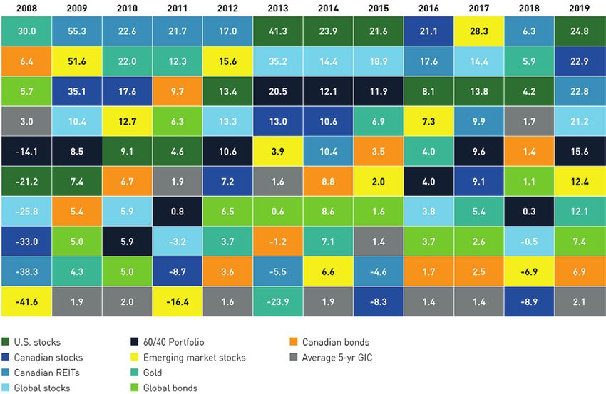
For more about the charts in this book, see page 16. IT PAYS TO STAY INVESTED 2020 10 «A DIVERSIFIED PORTFOLIO TO MANAGE RISK: THE CHART
2008 2009 2010 2011 2012 2013 2014 2015 2016 2017 2018 2019
BEST
30.0 55.3 22.6 21.7 17.0 41.3 23.9 21.6 21.1 28.3 6.3 24.8
6.4 51.6 22.0 12.3 15.6 35.2 14.4 18.9 17.6 14.4 5.9 22.9
5.7 35.1 17.6 9.7 13.4 20.5 12.1 11.9 8.1 13.8 4.2 22.8
3.0 10.4 12.7 6.3 13.3 13.0 10.6 6.9 7.3 9.9 1.7 21.2
-14.1 8.5 9.1 4.6 10.6 3.9 10.4 3.5 4.0 9.6 1.4 15.6
-21.2 7.4 6.7 1.9 7.2 1.6 8.8 2.0 4.0 9.1 1.1 12.4
-25.8 5.4 5.9 0.8 6.5 0.6 8.6 1.6 3.8 5.4 0.3 12.1
-33.0 5.0 5.9 -3.2 3.7 -1.2 7.1 1.4 3.7 2.6 -0.5 7.4
-38.3 4.3 5.0 -8.7 3.6 -5.5 6.6 -4.6 1.7 2.5 -6.9 6.9
-41.6 1.9 2.0 -16.4 1.6 -23.9 1.9 -8.3 1.4 1.4 -8.9 2.1
WORST
U.S. stocks 60/40 Portfolio Canadian bonds
Canadian stocks Emerging market stocks Average 5-yr GIC
Canadian REITs Gold
Global stocks Global bonds
For more about the charts in this book, see page 16. IT PAYS TO STAY INVESTED 2020 11 «A DIVERSIFIED PORTFOLIO TO MANAGE RISK: HOW IT WORKS
What this chart shows
If you invest in a single asset class, such as Canadian stocks or emerging
market stocks, the variation in returns can be extreme. For example, in
2008, at the depths of the financial crisis, emerging market stocks (yellow
box) plunged 42% (in Canadian dollars). The next year, when markets
rebounded, emerging market stocks soared 52%. That’s an exceptional
case, but as you can see in this chart, it’s not uncommon for asset classes
to zig-zag from top to bottom and back again.
Now observe the diversified portfolio (black box), which holds 60% global
stocks and 40% global bonds. Watch how the portfolio threads its way
through the chart, never at the top and never at the bottom. That
consistency relative to the individual components is the power of
diversification.
The bottom line
While a diversified portfolio is unlikely to give you the highest return, it
won’t give you the lowest return either. The purpose is to provide a
smoother investment journey, so you can achieve your goals with as little
anxiety as possible.
For more about the charts in this book, see page 16. IT PAYS TO STAY INVESTED 2020 12 «THE COST OF CAPITAL PROTECTION
7.0 Average 1-yr Canadian GIC
6.0 Before inflation After inflation
5.0
4.0
3.0
% return
2.0
1.0
0.0
-1.0
-2.0
-3.0
1995 1996 1997 1998 1999 2000 2001 2002 2003 2004 2005 2006 2007 2008 2009 2010 2011 2012 2013 2014 2015 2016 2017 2018 2019
What this chart shows The bottom line
You may be tempted to eliminate market risk altogether and invest your Investing in the stock market carries the risk of losing money. But not
money in guaranteed investment certificates. At least you’ll earn a small investing in the stock market carries its own risk – the risk of failing to
amount of interest, and you won’t lose money, right? There’s another meet your goals because your returns were too low.
factor to consider: inflation. After subtracting inflation, which reduces the
purchasing power of your money, the average “real” return on a 1-year
GIC was negative for 15 of the last 25 years. That was due to exceptionally
low interest rates following the 2008/09 financial crisis, a condition that
persists to this day. If you factor in taxes, this picture becomes even
more discouraging.
For more about the charts in this book, see page 16. IT PAYS TO STAY INVESTED 2020 13 «POINTS TO REMEMBER
» History shows that markets go up more than they go down, and there are many more
positive periods than negative ones
» Your portfolio can suffer heavily if you miss even a few of the best days in the market –
and you never know when they’re coming
» Limiting losses is crucial to generating the long-term returns you need to meet your goals
» Diversification is a time-tested strategy for helping limit losses, and for smoothing out
your investment experience
» The longer your time horizon, the smoother your investment journey and the more likely
you are to generate a healthy return
I’M ALWAYS FULLY INVESTED. IT’S A GREAT FEELING
TO BE CAUGHT WITH YOUR PANTS UP.”
Famed investor Peter Lynch
as quoted on investinganswers.com
IT PAYS TO STAY INVESTED 2020 14 «STRATEGIES TO CONSIDER
STICK TO THE PLAN ALL-IN-ONE PORTFOLIO SOLUTION
Perhaps the most significant step you can take toward achieving your Instead of building a portfolio from various individual funds, consider
long-term goals is to set them in the first place. Work with your advisor investing in a ready-made balanced fund, where you can get a fully
to paint a picture of your future, and then establish a simple, easy-to- diversified solution with just one decision. And, you never need to worry
follow plan for making it a reality. It’s not difficult, but it does take about rebalancing. The investment manager takes care of it for you
discipline. Monitoring your progress over time is a great way to stay through the daily operations of the fund.
focused on what matters.
WORK WITH AN ADVISOR
PUT FINANCIAL “NOISE” IN PERSPECTIVE
Households that worked with an advisor for at least 15 years accumulated
You may hear suggestions to “ignore” or “tune out” anxiety-inducing almost four times more financial assets than non-advised households,
market headlines. As humans with natural biases, this is all but impossible. according to a 2016 study. Perhaps even more eye-opening, the study
It’s not about ignoring short-term noise. It’s about recognizing it for what shows investors who left their advisors between 2010 and 2014 lost 34.2%
it is, and seeing that the long-term picture is more positive. of their asset values. Investors who kept their advisors saw asset values
grow 26.0%.
REGULAR REBALANCING The Gamma Factor and the Value of Financial Advice, Centre interuniversitaire de recherche
en analyse des organisations (CIRANO), 2016
At least once a year, connect with your advisor to rebalance your portfolio.
That means selling some of the “winners” and buying more of the “losers.”
This practice serves two functions:
• Your portfolio maintains the original asset allocation you established
at the beginning
• You force yourself to sell investments that made money (selling high)
and buy investments that lost money (buying low)
IT PAYS TO STAY INVESTED 2020 15 «ABOUT THESE CHARTS
Use this information to understand more about the charts in this book, including the index names, data sources, and other important facts. Index returns do
not include fees; you cannot invest in an index.
For all charts, unless otherwise indicated: Page 9: “Get back on track faster with bonds”
• Data are as of December 31, 2019 Global stocks: MSCI World Index; 40/60 Portfolio: 40% global stocks (MSCI World Index),
• Index returns and dollar values are in C$ 60% global bonds (Bloomberg Barclays Global Aggregate Bond Index, C$ hedged); 60/40
• Index returns include dividends Portfolio: 60% global stocks (MSCI World Index), 40% global bonds (Bloomberg Barclays
• Index and GIC data are sourced from Morningstar Global Aggregate Bond Index, C$ hedged).
Page 3: “The struggle to keep up” Page 10: “Longer investment periods mean smoother returns”
U.S. stocks: S&P 500; Canadian stocks: S&P/TSX Composite Index; Global stocks: MSCI Global stocks: MSCI World Index; Global bonds: Bloomberg Barclays Global Aggregate
World Index; Canadian bonds: FTSE TMX Canada Universe Bond Index. Index data are Bond Index, C$ hedged; 60/40 Portfolio: 60% global stocks (MSCI World Index), 40%
for the 30-year period ending December 31, 2019. The average investor return data is global bonds (Bloomberg Barclays Global Aggregate Bond Index, C$ hedged). 5- , 10- ,
sourced from Dalbar, for the 30-year period ending December 31, 2018, the latest and 15-year rolling returns are calculated on an annual basis from January 1, 2000 to
available at time of publication. The average investor return includes the impact of fees, December 31, 2019.
whereas the index returns do not.
Page 11 & 12: “A diversified portfolio to manage risk”
Page 5: “Success measured in days” U.S. stocks: S&P 500; Canadian stocks: S&P/TSX Composite Index; Canadian REITs
U.S. stocks: S&P 500. “Best days” are defined as individual days over the period with the (real estate investment trusts): S&P/TSX Capped REIT Index; Global stocks: MSCI World
highest per cent return on that day. Index; Emerging market stocks: MSCI Emerging Markets Index; Gold: S&P GSCI Gold
Index; Canadian bonds: FTSE TMX Canada Universe Bond Index; Global bonds:
Page 6: “The good outweighs the bad” Bloomberg Barclays Global Aggregate Bond Index, C$ hedged; 60/40 Portfolio: 60%
global stocks (MSCI World Index), 40% global bonds (Bloomberg Barclays Global
Canadian stocks: S&P/TSX Composite Index.
Aggregate Bond Index, C$ hedged). The 60/40 Portfolio was rebalanced quarterly.
Page 7: “The big picture is positive”
Page 13: “The cost of capital protection”
U.S. stocks: S&P 500. Bull and bear market return data are in US$ and do not
Inflation data sourced from Stats Can. Unlike mutual funds, the return and principal of
include dividends. A “bull market” is defined as a gain of 20% or more from the prior
a guaranteed investment certificate (GIC) is guaranteed.
low. A “bear market” is defined as a decline of 20% or more from the prior peak.
Page 8: “The steeper the loss, the harder the recovery”
Source: NEI Investments.
IT PAYS TO STAY INVESTED 2020 16 «» DEMAND MORE. WE DO. neiinvestments.com Commissions, trailing commissions, management fees and expenses all may be associated with mutual fund investments. Please read the prospectus before investing. Mutual funds are not guaranteed, their values change frequently, and past performance may not be repeated. This material is for informational and educational purposes and it is not intended to provide specific advice including, without limitation, investment, financial, tax or similar matters. Please consult with your own professional advisor on your particular circumstances. NEI Investments endeavors to ensure that the contents have been compiled or derived from sources that we believe are reliable and contain information that is accurate and complete. However, NEI Investments makes no representation or warranty, express or implied, in respect thereof, takes no responsibility for any errors and omissions contained herein. NEI Investments is a registered trademark of Northwest & Ethical Investments L.P. Northwest & Ethical Investments Inc. is a wholly-owned subsidiary of Aviso Wealth Inc. (“Aviso”). Aviso is a wholly-owned subsidiary of Aviso Wealth Limited Partnership (“Aviso Wealth LP”), which in turn is owned 50% by Desjardins Financial Holdings Inc. (“Desjardins”) and 50% by a limited partnership owned by the five Provincial Credit Union Centrals (the “Centrals”) and the CUMIS Group Limited. NEI0121E 03/20
You can also read