New York - 2020 County Health Rankings Report
←
→
Page content transcription
If your browser does not render page correctly, please read the page content below

New York

2020 County Health Rankings Report
County Health Rankings 2020

 2020 County Health Rankings for the 62 Ranked Counties in New York

   County                      County                           County                           County
     Albany     25   10         Franklin   28   57               Oneida     55   40                 Seneca   48   45
    Allegany    47   52           Fulton   46   58             Onondaga     43   21           St. Lawrence   44   56
       Bronx    62   62         Genesee    45   22               Ontario    13    8              Steuben     37   36
     Broome     52   37          Greene    51   42               Orange     11   26                Suffolk   14    6
 Cattaraugus    57   59        Hamilton    12   14               Orleans    54   50               Sullivan   60   51
      Cayuga    20   35        Herkimer    42   48               Oswego     49   60                 Tioga    16   27
 Chautauqua     61   54        Jefferson   31   49                Otsego    19   17             Tompkins     10    5
   Chemung      53   47            Kings   15   53               Putnam      4    2                 Ulster   30   29
   Chenango     50   39            Lewis   36   44               Queens      7   20               Warren     26    9
     Clinton    29   34       Livingston   23   23             Rensselaer   32   16           Washington     41   38
   Columbia     24   15         Madison     8   18              Richmond    21   19               Wayne      40   33
    Cortland    39   30         Monroe     35   25               Rockland    3    7           Westchester     5    3
   Delaware     33   41     Montgomery     59   61               Saratoga    2    4             Wyoming      18   28
   Dutchess     17   12          Nassau     1    1           Schenectady    38   24                 Yates    27   32
         Erie   56   43       New York      6   11              Schoharie   22   31
       Essex     9   13          Niagara   58   55               Schuyler   34   46

For more information on how these ranks are calculated, view the tables at the end of this report and visit
                                   www.countyhealthrankings.org

                                                                                      Stay Up-To-Date with County
                                                                                      Health Rankings & Roadmaps
                                                                                      For the latest updates on Rankings,
                                                                                      What Works for Health, community
                                                                                      support, RWJF Culture of Health
                                                                                      Prize communities, Action Learning
                                                                                      Guides, and more visit
                                                                                      www.countyhealthrankings.org. You
                                                                                      can see what we’re featuring on our
                                                                                      webinar series, what communities
                                                                                      are doing to improve health, and
                                                                                      how you can get involved!

                                       Page 2 | www.countyhealthrankings.org
County Health Rankings 2020

The County Health Rankings & Roadmaps (CHR&R) lifts up actionable data, evidence, guidance, and stories for communities to make
it easier for people to be healthy in their neighborhoods, schools, and workplaces. Ranking the health of nearly every county in the
nation (based on the model below), CHR&R illustrates what we currently know when it comes to what is keeping people
healthy or making them sick and shows what we can do to create healthier places to live, learn, work, and play.

What are the County Health Rankings?                                    Moving with Data to Action
Published online at www.countyhealthrankings.org, the                   The Take Action to Improve Health section of our website
Rankings help us understand what influences our health                  helps communities join together to look at the many
and how long and well we live. The Rankings are unique in               factors influencing health, select strategies that work, and
their ability to provide measures of the current overall                make changes that can have a lasting impact. Take Action
health of each county in all 50 states. They also look at a             to Improve Health is a hub for information to help any
variety of measures that affect the future health of                    community member or leader who wants to improve
communities, such as high school graduation rates, access               their community’s health and foster health equity. You
to healthy foods, rates of smoking, children in poverty,                will find:
and teen births.
                                                                          •    What Works for Health, a searchable menu of
For the past 10 years, communities have used the                               evidence-informed strategies that can make a
Rankings to garner support for local health improvement                        difference locally;
initiatives by engaging government agencies, health care                  •    The Action Center, your home for step-by-step
providers, community organizations, business leaders,                          guidance and tools to help you move with data to
policymakers, and the public.                                                  action;
                                                                          •    Action Learning Guides, self-directed learning
                                                                               modules combining guidance, tools, and hands-on
                                                                               practice and reflection activities on specific topics;
                                                                          •    The Partner Center, information to help you
                                                                               identify the right partners and explore tips to
                                                                               engage them.

                                                                        Ensuring Healthy Places for All
                                                                        Communities thrive when all people can be healthy in
                                                                        their neighborhoods, schools, and workplaces. CHR&R
                                                                        brings actionable data and strategies to communities
                                                                        working to ensure that healthy places are available to all.
                                                                        Pages 4 and 5 of this report highlights how health
                                                                        outcomes and health factors differ by place within your
                                                                        state. On pages 6 and 7, we illustrate how health differs
                                                                        among racial/ethnic groups within places.

The Robert Wood Johnson Foundation (RWJF) collaborates with the University of Wisconsin Population Health Institute (UWPHI) to
bring this program to cities, counties, and states across the nation.

                                                 Page 3 | www.countyhealthrankings.org
County Health Rankings 2020

What are Health Outcomes?
Everyone wants to experience long and healthy lives, yet places have different resources and opportunities. To understand
the health outcomes in a community, we measure both length and quality of life by county within New York.

                            Length of Life                                                Quality of Life

                              Premature death                                          Self-reported health status
                         (years of potential life lost
                               before age 75)                                  Percent of low birthweight newborns

How Do Counties Rank for Health Outcomes?                                  What Do Differences Between Ranks Mean?
The green map shows the distribution of New York’s health                  Counties are ordered by the health outcome rank, with a
outcome ranks across counties. The map is divided into                     top-ranked county (rank = 1) having the best health
four quartiles with less color intensity indicating better                 outcome score. Ranks are easy to communicate, but they
health outcomes in the respective summary rankings.                        mask differences in health within counties and from one
Specific county ranks can be found in the table on page 2.                 ranked county to the next. The chart next to the map
                                                                           shows the spread of health outcome scores (ranks) for
Detailed information on the measures and their associated
                                                                           each county (green circles) in New York. This graphic
weights is available on page 9. You can also learn about
                                                                           shows the size of the gap between ranked counties. The
how we calculate health outcome ranks at
                                                                           different background colors correspond to the four
www.countyhealthrankings.org.
                                                                           quartiles used in the map.

      Figure 1. Health outcome ranks displayed using quartiles (map) and underlying health outcome scores (chart)

                                                  Page 4 | www.countyhealthrankings.org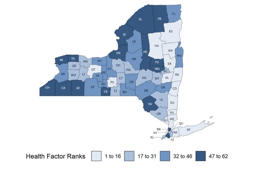
County Health Rankings 2020

What are Health Factors?
Many factors shape our opportunities to be healthy and influence how well and how long we live. Health factors represent
the things we can change to improve health for all, like opportunities for quality education, good paying jobs, access to
quality clinical care, healthy foods, green spaces, and secure and affordable housing. We measure four health factor areas.

                                                                       Social and Economic
     Health Behaviors                   Clinical Care                                                 Physical Environment
                                                                              Factors
         Tobacco use                                                           Education
                                        Access to care                                                    Air & water quality
       Diet & exercise                                                  Employment & income
      Alcohol & drug use                                                Family & social support
                                        Quality of care                                                    Housing & transit
        Sexual activity                                                   Community safety

How Do Counties Rank for Health Factors?                               What Do Differences Between Ranks Mean?
The blue map shows the distribution of New York’s health               Counties are ordered by the health factor rank, with a
factor ranks across counties. The map is divided into four             top-ranked county (rank = 1) having the best health factor
quartiles with less color intensity indicating better health           score. As previously noted, ranks mask differences in the
factors in the respective summary rankings. Specific                   opportunity for health within counties and from one
county ranks can be found in the table on page 2.                      county to the next. The chart next to the map shows the
                                                                       spread of health factor scores (ranks) for each ranked
Detailed information on the measures and their
                                                                       county (blue circles) in New York. This graphic shows the
associated weights is available on page 9. You can also
                                                                       size of the gap between ranked counties. The different
learn about how we calculate health factor ranks, at
                                                                       background colors correspond to the four quartiles used
www.countyhealthrankings.org.
                                                                       in the map.

          Figure 2. Health factor ranks displayed using quartiles (map) and underlying health factor scores (chart)

                                                Page 5 | www.countyhealthrankings.org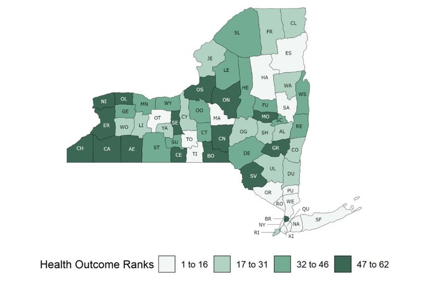
County Health Rankings 2020

Growing Healthy Places Means Ensuring Opportunities for All
Health is influenced by every aspect of how and
where we live. Access to secure and affordable
housing, safe neighborhoods, good paying jobs
and quality early childhood education are
examples of important factors that can put people
on a path to a healthier life. But access to these
opportunities often looks different based on
where you live, the color of your skin, or the
circumstances you were born into. Data show a
persistent pattern in barriers to opportunity for
people with lower incomes and for communities of
color across the United States. Patterned
differences in a range of health factors emerge
from unfair policies and practices at many levels
and over many decades.                             Copyright 2019 Brian Adams. Photo courtesy of the Robert Wood Johnson Foundation.

                                                                Using Data for Action
                                                                Achieving health equity means reducing and ultimately
                                                                eliminating unjust and avoidable differences in opportunity
                                                                and health. Our progress toward health equity will be
                                                                measured by how health disparities change over time. Visit
                                                                www.countyhealthrankings.org to learn more about:
                                                                1. Health outcome and factor measures for your state and
                                                                    county;
                                                                2. Measures that have data available for racial and ethnic
                                                                    groups to illuminate differences in opportunities for
                                                                    health in your state and county;
                                                                3. Additional data resources for New York that provide
                                                                    information about health and opportunity among other
                                                                    subgroups, such as gender, age, or zip code.

                                                                What Has Been Done Can Be Undone
                                                                Many communities are mobilizing state and local efforts to
                                                                harness the collective power of community members,
                                                                partners, and policymakers – working together to dismantle
                                                                unfair patterns and ensure the growth of healthy places for
                                                                all. To learn from others who are igniting possibilities and
                                                                inspiring action, visit our Learn from Others page at
                                                                www.countyhealthrankings.org.

                                                 Page 6 | www.countyhealthrankings.org
County Health Rankings 2020
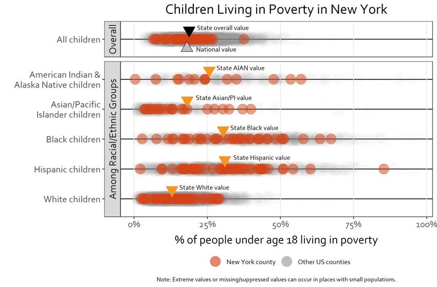
Opportunities for Health Within New York Counties
A healthy beginning is essential to a healthy future for our children and our communities. Children in poverty is a
measure of both current and future opportunities for the health of the community. Patterns of unfair and avoidable
differences at the local, state, and national level exist among racial and ethnic groups for children living in poverty.
The graphic below shows the patterns of children living in poverty for individual counties in New York and among racial
and ethnic groups within counties of New York. It also shows the data for all counties across the nation in the gray circles
beneath the New York data.
Key Takeaways for Children Living in Poverty in New York
•19% of New York children are living in poverty, higher than the national average of 18%.
Overall •Rates for children living in poverty range from 7% to 38% across New York counties.
•Rates for children living in poverty differ among racial and ethnic groups in New York and
Among the nation.
Racial & •In New York, state values (orange triangles) range from 13% for White children to 31% for
Ethnic Hispanic children.
Groups •Within New York counties (orange circles) and US counties (gray circles), rates of children
living in poverty also vary among racial and ethnic groups.
Want to learn more? Visit our State Reports page at www.countyhealthrankings.org to interact with the
data and explore patterns in other measures by place and among racial and ethnic groups.
Page 7 | www.countyhealthrankings.org
County Health Rankings 2020

2020 County Health Rankings for New York: Measures and National/State Results
                                                                                                                                      NY     NY
Measure                     Description                                                                             US      NY     Minimum Maximum
HEALTH OUTCOMES
Premature death*            Years of potential life lost before age 75 per 100,000 population (age-adjusted).      6,900   5,500    3,900    8,200
Poor or fair health         Percentage of adults reporting fair or poor health (age-adjusted).                      17%     17%      11%      27%
Poor physical health days   Average number of physically unhealthy days reported in past 30 days (age-              3.8     3.5      2.9      4.7
                              adjusted).
Poor mental health days     Average number of mentally unhealthy days reported in past 30 days (age-adjusted).      4.0     3.9      3.5       4.6
Low birthweight*            Percentage of live births with low birthweight (< 2,500 grams).                         8%      8%       5%        9%
HEALTH FACTORS
HEALTH BEHAVIORS
Adult smoking               Percentage of adults who are current smokers.                                          17%     14%      11%       19%
Adult obesity               Percentage of the adult population (age 20 and older) that reports a body mass         29%     26%      15%       39%
                              index (BMI) greater than or equal to 30 kg/m2.
Food environment index      Index of factors that contribute to a healthy food environment, from 0 (worst) to 10    7.6     9.1      7.5       9.7
                              (best).
Physical inactivity         Percentage of adults age 20 and over reporting no leisure-time physical activity.      23%     25%      16%      33%
Access to exercise          Percentage of population with adequate access to locations for physical activity.      84%     93%      49%      100%
  opportunities
Excessive drinking          Percentage of adults reporting binge or heavy drinking.                                19%     19%      16%       25%
Alcohol-impaired driving    Percentage of driving deaths with alcohol involvement.                                 28%     21%       0%       44%
  deaths
Sexually transmitted        Number of newly diagnosed chlamydia cases per 100,000 population.                      524.6   588.5    111.5    1,203.9
  infections
Teen births*                Number of births per 1,000 female population ages 15-19.                                23      15       3         36
CLINICAL CARE
Uninsured                    Percentage of population under age 65 without health insurance.                        10%      7%       4%      10%
Primary care physicians      Ratio of population to primary care physicians.                                      1,330:1 1,220:1 13,660:1   720:1
Dentists                     Ratio of population to dentists.                                                     1,450:1 1,220:1 5,400:1    560:1
Mental health providers      Ratio of population to mental health providers.                                       400:1 350:1     2,060:1   120:1
Preventable hospital         Rate of hospital stays for ambulatory-care sensitive conditions per 100,000 Medicare 4,535 4,203       2,669    6,304
  stays*                       enrollees.
Mammography                  Percentage of female Medicare enrollees ages 65-74 that received an annual             42%     42%      33%      55%
  screening*                   mammography screening.
Flu vaccinations*            Percentage of fee-for-service (FFS) Medicare enrollees that had an annual flu          46%     48%      36%      55%
                               vaccination.
 SOCIAL & ECONOMIC FACTORS
 High school graduation      Percentage of ninth-grade cohort that graduates in four years.                         85%     82%      68%      96%
 Some college                Percentage of adults ages 25-44 with some post-secondary education.                    66%     68%      50%      84%
 Unemployment                Percentage of population ages 16 and older unemployed but seeking work.               3.9%    4.1%     3.3%      6.8%
 Children in poverty*        Percentage of people under age 18 in poverty.                                          18%     19%       7%      38%
 Income inequality           Ratio of household income at the 80th percentile to income at the 20th percentile.     4.9     5.7      3.8       9.2
 Children in single-parent Percentage of children that live in a household headed by single parent.                 33%     34%      16%      60%
   households
 Social associations         Number of membership associations per 10,000 population.                               9.3     8.0      2.6      20.1
 Violent crime               Number of reported violent crime offenses per 100,000 population.                      386     379       48      598
 Injury deaths*              Number of deaths due to injury per 100,000 population.                                  70      49       33       82
 PHYSICAL ENVIRONMENT
 Air pollution - particulate Average daily density of fine particulate matter in micrograms per cubic meter         8.6     8.5      6.6      11.0
   matter                      (PM2.5).
 Drinking water violations Indicator of the presence of health-related drinking water violations. 'Yes' indicates   N/A     N/A       No      Yes
                               the presence of a violation, 'No' indicates no violation.
 Severe housing problems Percentage of households with at least 1 of 4 housing problems: overcrowding, high         18%     24%       9%      39%
                               housing costs, lack of kitchen facilities, or lack of plumbing facilities.
 Driving alone to work*      Percentage of the workforce that drives alone to work.                                 76%     53%       6%      87%
 Long commute - driving      Among workers who commute in their car alone, the percentage that commute              36%     38%      15%      67%
   alone                       more than 30 minutes.
* Indicates subgroup data by race and ethnicity is available

                                                         Page 8 | www.countyhealthrankings.org
County Health Rankings 2020
2020 County Health Rankings: Ranked Measure Sources and Years of Data
Measure Weight Source Years of Data
HEALTH OUTCOMES
Length of Life Premature death* 50% National Center for Health Statistics - Mortality Files 2016-2018
Quality of Life Poor or fair health 10% Behavioral Risk Factor Surveillance System 2017
Poor physical health days 10% Behavioral Risk Factor Surveillance System 2017
Poor mental health days 10% Behavioral Risk Factor Surveillance System 2017
Low birthweight* 20% National Center for Health Statistics - Natality files 2012-2018
HEALTH FACTORS
HEALTH BEHAVIORS
Tobacco Use Adult smoking 10% Behavioral Risk Factor Surveillance System 2017
Diet and Exercise Adult obesity 5% United States Diabetes Surveillance System 2016
Food environment index 2% USDA Food Environment Atlas, Map the Meal Gap from 2015 & 2017
Feeding America
Physical inactivity 2% United States Diabetes Surveillance System 2016
Access to exercise opportunities 1% Business Analyst, Delorme map data, ESRI, & US Census 2010 & 2019
Tigerline Files
Alcohol and Drug Use Excessive drinking 2.5% Behavioral Risk Factor Surveillance System 2017
Alcohol-impaired driving deaths 2.5% Fatality Analysis Reporting System 2014-2018
Sexual Activity Sexually transmitted infections 2.5% National Center for HIV/AIDS, Viral Hepatitis, STD, and TB 2017
Prevention
Teen births* 2.5% National Center for Health Statistics - Natality files 2012-2018
CLINICAL CARE
Access to Care Uninsured 5% Small Area Health Insurance Estimates 2017
Primary care physicians 3% Area Health Resource File/American Medical Association 2017
Dentists 1% Area Health Resource File/National Provider Identification 2018
file
Mental health providers 1% CMS, National Provider Identification 2019
Quality of Care Preventable hospital stays* 5% Mapping Medicare Disparities Tool 2017
Mammography screening* 2.5% Mapping Medicare Disparities Tool 2017
Flu vaccinations* 2.5% Mapping Medicare Disparities Tool 2017
SOCIAL & ECONOMIC FACTORS
Education High school graduation 5% New York State Education Department 2016-2017
Some college 5% American Community Survey, 5-year estimates 2014-2018
Employment Unemployment 10% Bureau of Labor Statistics 2018
Income Children in poverty* 7.5% Small Area Income and Poverty Estimates 2018
Income inequality 2.5% American Community Survey, 5-year estimates 2014-2018
Family and Social Children in single-parent 2.5% American Community Survey, 5-year estimates 2014-2018
Support households
Social associations 2.5% County Business Patterns 2017
Community Safety Violent crime 2.5% Uniform Crime Reporting - FBI 2014&2016
Injury deaths* 2.5% National Center for Health Statistics - Mortality Files 2014-2018
PHYSICAL ENVIRONMENT
Air and Water Quality Air pollution - particulate 2.5% Environmental Public Health Tracking Network 2014
matter+
Drinking water violations 2.5% Safe Drinking Water Information System 2018
Housing and Transit Severe housing problems 2% Comprehensive Housing Affordability Strategy (CHAS) data 2012-2016
Driving alone to work* 2% American Community Survey, 5-year estimates 2014-2018
Long commute - driving alone 1% American Community Survey, 5-year estimates 2014-2018
* Indicates subgroup data by race and ethnicity is available
+ Not available for AK and HI
Page 9 | www.countyhealthrankings.orgCounty Health Rankings 2020
2020 County Health Rankings: Additional Measure Sources and Years of Data
Measure Source Years of Data
HEALTH OUTCOMES
Length of Life Life expectancy* National Center for Health Statistics - Mortality Files 2016-2018
Premature age-adjusted mortality* National Center for Health Statistics - Mortality Files 2016-2018
Child mortality* National Center for Health Statistics - Mortality Files 2015-2018
Infant mortality* National Center for Health Statistics - Mortality Files 2012-2018
Quality of Life Frequent physical distress Behavioral Risk Factor Surveillance System 2017
Frequent mental distress Behavioral Risk Factor Surveillance System 2017
Diabetes prevalence United States Diabetes Surveillance System 2016
HIV prevalence National Center for HIV/AIDS, Viral Hepatitis, STD, and TB 2016
Prevention
HEALTH FACTORS
HEALTH BEHAVIORS
Diet and Exercise Food insecurity Map the Meal Gap 2017
Limited access to healthy foods USDA Food Environment Atlas 2015
Alcohol and Drug Use Drug overdose deaths* National Center for Health Statistics - Mortality Files 2016-2018
Motor vehicle crash deaths* National Center for Health Statistics - Mortality Files 2012-2018
Other Health Behaviors Insufficient sleep Behavioral Risk Factor Surveillance System 2016
CLINICAL CARE
Access to Care Uninsured adults Small Area Health Insurance Estimates 2017
Uninsured children Small Area Health Insurance Estimates 2017
Other primary care providers CMS, National Provider Identification 2019
SOCIAL & ECONOMIC FACTORS
Education Disconnected youth American Community Survey, 5-year estimates 2014-2018
Reading scores*+ Stanford Education Data Archive 2016
Math scores*+ Stanford Education Data Archive 2016
Income Median household income* Small Area Income and Poverty Estimates 2018
Children eligible for free or reduced price National Center for Education Statistics 2017-2018
lunch
Family and Social Residential segregation - Black/White American Community Survey, 5-year estimates 2014-2018
Support
Residential segregation - non-White/White American Community Survey, 5-year estimates 2014-2018
Community Safety Homicides* National Center for Health Statistics - Mortality Files 2012-2018
Suicides* National Center for Health Statistics - Mortality Files 2014-2018
Firearm fatalities* National Center for Health Statistics - Mortality Files 2014-2018
Juvenile arrests+ Easy Access to State and County Juvenile Court Case 2017
Counts
PHYSICAL ENVIRONMENT
Housing and Transit Traffic volume EJSCREEN: Environmental Justice Screening and Mapping 2018
Tool
Homeownership American Community Survey, 5-year estimates 2014-2018
Severe housing cost burden American Community Survey, 5-year estimates 2014-2018
*Indicates subgroup data by race and ethnicity is available.
+ Not available in all states
See additional contextual demographic information and measures online at www.countyhealthrankings.org
Page 10 | www.countyhealthrankings.orgCounty Health Rankings 2020
Technical Notes and Glossary of Terms
What is health equity? What are health disparities? And how do they relate?
Health equity means that everyone has a fair and just opportunity to be as healthy as possible. This requires removing
obstacles to health such as poverty and discrimination, and their consequences, including powerlessness and lack of access to
good jobs with fair pay, quality education and housing, safe environments, and health care.
Health disparities are differences in health or in the key determinants of health such as education, safe housing, and
discrimination, which adversely affect marginalized or excluded groups.
Health equity and health disparities are closely related to each other. Health equity is the ethical and human rights principle or
value that motivates us to eliminate health disparities. Reducing and ultimately eliminating disparities in health and its
determinants of health is how we measure progress toward health equity.
Braveman P, Arkin E, Orleans T, Proctor D, and Plough A. What is Health Equity? And What
Difference Does a Definition Make? Robert Wood Johnson Foundation. May 2017
How do we define racial and ethnic groups?
In our analyses by race and ethnicity we define each category as follows:
• Hispanic includes those who identify themselves as Mexican, Puerto Rican, Cuban, Central or South American, other
Hispanic, or Hispanic of unknown origin and can be of any racial background.
• American Indian & Alaska Native (AIAN) includes people who identify themselves as American Indian or Alaska
Native.
• Asian/Pacific Islander (Asian/PI) includes people who identify themselves as Asian or Pacific Islander.
• Black includes people who identify themselves as Black or African American.
• White includes people who identify themselves as White and do not identify as Hispanic.
Our analyses do not include people reporting more than one race, as this category was not measured uniformly across the
data sources used in the County Health Rankings. These racial and ethnic categories can mask variation within groups and can
hide historical context that underlies health differences.
We recognize that “race” is a social category, meaning the way society may identify individuals based on their cultural
ancestry, not a way of characterizing individuals based on biology or genetics. A strong and growing body of empirical
research provides support for the fact that genetic factors are not responsible for racial differences in health factors and very
rarely for health outcomes.
How do we rank counties?
To calculate the ranks, we first standardize each of the measures using z-scores. Z-scores allow us to combine multiple
measures because the measures are now on the same scale. The ranks are then calculated based on weighted sums of the
measure z-scores within each state to create an aggregate z-score. The county with the best aggregate z-score (healthiest)
gets a rank of #1 for that state. The aggregate z-scores are graphed next to the maps for health outcomes and health factors
on pages 4 and 5 to show the distribution of the values that contribute to the rank. To see more detailed information on rank
calculation please visit our methods in Explore Health Rankings on our website: www.countyhealthrankings.org.
Technical Notes:
• In this report, we use the terms disparities, differences, and gaps interchangeably.
• We follow basic design principles for cartography in displaying color spectrums with less intensity for lower values
and increasing color intensity for higher values. We do not intend to elicit implicit biases that “darker is bad”.
• Overall county level values of children in poverty are obtained from one-year modeled estimates from the Small Area
Income and Poverty Estimates (SAIPE) Program. Because SAIPE does not provide estimates by racial and ethnic
groups, data from the 5-year American Community Survey (ACS) was used to quantify children living in poverty by
racial and ethnic groups.
• County-level data for children in poverty among racial and ethnic groups are not shown if the estimate was
considered to be unreliable (confidence interval width was greater than 40% or value was 0% or 100%). Unreliable
estimates are often due to a very small sample size.
• Given the suppression of data for small sample sizes particularly for county data by race, there may be a gap between
the state value and the data for the county data that are available.
• In many of the images using one circle to depict a county the values are very close causing overlapping circles. In
these cases, greater color intensity indicates overlapping of multiple counties.
Page 11 | www.countyhealthrankings.orgCounty Health Rankings 2020
Report Authors
Courtney Blomme, MS, RD
Anne Roubal, PhD, MS
Marjory Givens, PhD, MSPH
Sheri Johnson, PhD
Lawrence Brown, PhD
Suggested citation: University of Wisconsin Population Health Institute. County Health Rankings State Report 2020.
Research Assistance:
Molly Burdine Joe Hinton, MA Elizabeth Pollock, PhD
Amanda Gatewood, PhD Hannah Olson-Williams Jennifer Robinson
Keith Gennuso, PhD Eunice Park, MIS Matthew Rodock, MPH
With contributions from our CHR&R team including:
What Works for Health
Community Transformation
Operations
RWJF Culture of Health Prize
This work could not be done without our partnerships with:
The Centers for Disease Control and Prevention for providing us with key health indicators
Burness for supporting our communication efforts
Forum One for website design and support
This work is possible thanks to a collaboration between the Robert Wood Johnson Foundation and the University of
Wisconsin Population Health Institute.
University of Wisconsin Population Health Institute
610 Walnut St, #524, Madison, WI 53726 | (608) 265-8240 | info@countyhealthrankings.org
Page 12 | www.countyhealthrankings.orgYou can also read