Open Research Online - Open ...
←
→
Page content transcription
If your browser does not render page correctly, please read the page content below
Open Research Online
The Open University’s repository of research publications
and other research outputs

Mapping networks of influence: tracking Twitter
conversations through time and space
Journal Item
 How to cite:
 Willis, Alistair; Fisher, Ali and Lvov, Ilia (2015). Mapping networks of influence: tracking Twitter conversations
 through time and space. Participations: Journal of Audience & Reception Studies, 12(1) pp. 494–530.

For guidance on citations see FAQs.

c 2015 The Authors

Version: Version of Record

Link(s) to article on publisher’s website:
http://www.participations.org/Volume%2012/Issue%201/30.pdf

Copyright and Moral Rights for the articles on this site are retained by the individual authors and/or other copyright
owners. For more information on Open Research Online’s data policy on reuse of materials please consult the policies
page.

                                      oro.open.ac.uk
.
                                                                          Volume 12, Issue 1
                                                                                  May 2015

Mapping networks of influence: Tracking
Twitter conversations through time and
space

Alistair Willis,
Open University, UK

Ali Fisher,
Independent Researcher

Ilia Lvov,
University of St. Andrews, Scotland

Abstract:
The increasing use of social media around global news events, such as the London Olympics
in 2012, raises questions for international broadcasters about how to engage with users via
social media in order to best achieve their individual missions. Twitter is a highly diverse
social network whose conversations are multi-directional involving individual users, political
and cultural actors, athletes and a range of media professionals. In so doing, users form
networks of influence via their interactions affecting the ways that information is shared
about specific global events.
        This article attempts to understand how networks of influence are formed among
Twitter users, and the relative influence of global news media organisations and information
providers in the Twittersphere during such global news events. We build an analysis around
a set of tweets collected during the 2012 London Olympics. To understand how different
users influence the conversations across Twitter, we compare three types of accounts:
those belonging to a number of well-known athletes, those belonging to some well-known
commentators employed by the BBC, and a number of corporate accounts belonging to the
BBC World Service and the official London Twitter account. We look at the data from two
perspectives. First, to understand the structure of the social groupings formed among
Twitter users, we use a network analysis to model social groupings in the Twittersphere
across time and space. Second, to assess the influence of individual tweets, we investigate

                                          Page 494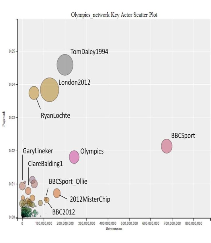
Volume 12, Issue 1
                                                                               May 2015

the ageing factor of tweets, which measures how long users continue to interact with a
particular tweet after it is originally posted.
        We consider what the profile of particular tweets from corporate and athletes’
accounts can tell us about how networks of influence are forged and maintained. We use
these analyses to answer the questions: How do different types of accounts help shape the
social networks? and, What determines the level and type of influence of a particular
account?

Keywords: Network analysis, Key Actor Analysis, Ageing Factor

Introduction
We live in a world of networks shaped by diverse social groups, relationships and
interactions including kinship, friendship, neighbourhood, work, online and social media
networks. As Steve Borgatti has argued, ‘one of the most potent ideas in the social sciences
is the notion that individuals are embedded in thick webs of social relations and
interactions’ (Borgatti et al. 2009).
        The internet and social networks have allowed the consumption of information to
move from a primarily broadcast model, in which information was provided by a small
number of providers, to a more conversational model, consisting of traditional providers,
commentators through blogs and real-time discussions through social media such as Twitter
and Facebook. The traditional broadcast media are engaging with this changing landscape
by maintaining their own bloggers and social media accounts.
        The natural occurrence of data on these social interactions via social media allows
research to benefit from the advantages of the unobtrusive research methods identified in
classical sociology (Webb et al. 1966) and interpreted for the online environment by
Janetzko (2008). Understanding the nature of the networks within which major
organisations and information services operate provides important insights into the ways
information flows through these networks, how influence and engagement can be mapped
and measured, and the cultural power and value which results from these communication
and information networks.

Context
The 2012 London Olympic and Paralympic Games were anticipated ‘to be a “once in a
generation” opportunity for the UK to attract the attention and interest of the entire global
community’.1 To that end, the UK Government stated the intention, as host nation, to
‘exploit the public diplomacy and “soft power” potential of the Games’.2 To exploit this
opportunity, the organisation of London 2012 involved a wider set of actors within and
outside the government than had sometimes been the approach of previous hosts. It was

                                          Page 495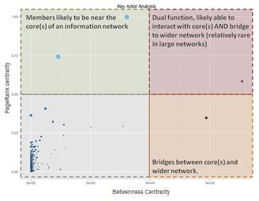
Volume 12, Issue 1
                                                                               May 2015

hoped that this would extend the reach of the games beyond traditional elites’ interests (Li
2013).
        In addition to the efforts of UK government departments, the FCO Minister with
responsibility for public diplomacy would henceforth ‘focus on providing specific ministerial
supervision of the relationship between the FCO and its directly funded partners’, primarily
the British Council and British Broadcasting Corporation World Service (BBCWS). 3
      As Nick Cull argued in his written evidence to the Written Evidence to the House of
Commons Foreign Affairs Committee,

     Media consumption is a behaviour strongly influenced by habit, and Olympic
     coverage provides an opportunity to inspire new habits in the global audience,
     or rekindle old habits such as attention to the broadcasts and web sites of the
     BBC World Service. (p. EV37)4

The increased penetration of internet access and adoption of social media provided a way in
which the British Broadcasting Corporation (BBC) and the BBC World Service could engage
with communities interested in the Olympic Games and use new platforms to kindle (or
rekindle) the habit of interacting with content produced by the broadcaster.
        As the BBC World Service was part of the strategy to exploit the public diplomacy
and ‘soft power’ potential of the Games, our paper looks at the social media interaction
with BBC and BBC World Service accounts on Twitter. In traditional broadcasting the BBC
has maintained a division between domestic and overseas services, with the exception of
some countries such as the Netherlands. However, social media platforms permit users to
ignore institutional boundaries between ‘domestic’ and ‘foreign’ focused services. As a
result, analysis included both BBC and BBC World Service accounts.
        In this essay we investigate how user interactions with Twitter reflect the ways in
which different actors in the Twittersphere have varying roles and influences. The different
ways in which broadcasters engage with social media users affects how their audiences
interact with them. As an example of a major international broadcaster, we take a particular
focus on the BBC World Service, and use user interactions with a number of the BBC’s
Twitter accounts to investigate the effects of the different ways in which users engage with
the BBC World Service’s presence on Twitter.
        To this end, we present a novel method for identifying key actors in a network based
on the habits of users who engage with, and respond to, the BBC via Twitter. This approach
looks beyond media consumption patterns of traditional audience research and emphasises
the way users respond to broadcasters and share content via social media. Over the last
twenty years, some researchers have increasingly argued that ‘there isn’t really such a thing
as the “audience” out there’. Instead, as Grossberg argued, ‘media audiences are shifting
constellations, located within varying multiple discourses which are never entirely outside of
the media discourse themselves’ (Grossberg 1988:386).

                                          Page 496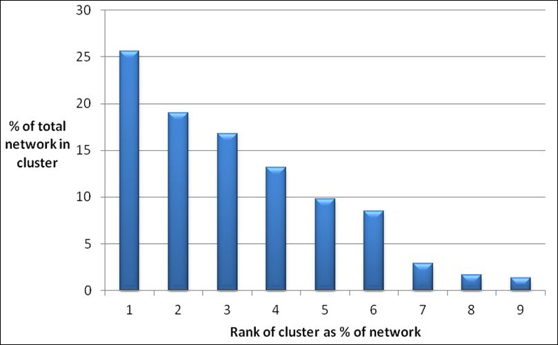
Volume 12, Issue 1
                                                                                 May 2015

        By analysing the habits and shifting constellations of users sharing content via social
media, we argue that individual citizens, members of organisations like the BBCWS, and
sports celebrities are influential in different ways. Our approach to key actor analysis
identifies the different roles individuals play in a group or network. We then analyse the
speed with which users respond to content produced by key actors and describe a method
of measuring the public engagement with individual tweets. The combination of the two
methods allows us to consider the different models of engagement used by the BBC.

Mapping Influence through social media network analysis
An area of increasing interest for social science and audience research is the impact of
social media on the production and dissemination of news. This includes the influence the
‘social’ aspect of social media has on the flow of information amongst publics at home and
abroad (Boyd and Ellison 2007; Newman et al. 2012; Xu and Sang 2014). To mention but a
few studies, research has examined the role of social media in political change (Shirky
2011), in sharing information about elections (Mäkinen and Kuira 2008; Metzgar and
Maruggi 2009), and even attempts to forecast large-scale human behaviour (Leetaru 2011).
These studies follow on from one of the classic questions in social science, ‘How does the
news get around?’ posed by Larsen and Hill (1954:426). This question has been asked in
forms, such as how people locate job opportunities (Granovetter 1973) or seek trusted
information (Levin and Cross 2004), and how small communities connect to form large
social structures which allow two individuals who have never met to send and receive
information through long chains of acquaintances (Milgram 1967).
         Studies analysing how news and information flow through a community often
return to the questions posed by Larsen and Hill: ‘Who learned the news, when and by
what means, and how much did such knowledge affect subsequent communications
behaviour?’ (Larsen and Hill 1954:426). While these questions have been addressed from
many angles over the years, including polling in the aftermath of specific events such as the
September 11th terrorist attacks (Rogers 2003), the increasing ability to access news via
social media provides greater opportunities to understand diffusion of information
between the users of these platforms. This has led an evolution of research from looking at
the ‘audience’ as a consumer to analysing the constellations of interconnected individuals
creating, sharing and consuming information. This in turn has increasingly emphasised
within audience research the different ways individuals or organisations can be influential
in the transmission and interpretation of news.
         The increased popularity of social media has led some researchers to suggest that
aggregating Twitter content could produce results ‘analogous to a distributed news wire
service’ (Sankaranarayanan et al. 2009). One important aspect of social media, and digital
media more generally, is the relative ease with which the data on the communication
between individuals can be gathered, allowing large-scale network graphs to be
constructed which represent the communication between individuals contained in a

                                           Page 497
Volume 12, Issue 1
May 2015
specific dataset. This has led to increased use of social network analysis in the investigation
of the diffusion of information on social platforms.
Social network analysis is a distinctive research approach within the social and
behavioural sciences. The analysis of networks has ranged from the transmission of disease
and the diffusion of innovation, to the dissemination of ideas and information (Christakis
and Fowler 2007; Erikson 2013; Gainforth 2014). Relationships have been shown to
influence the ways in which an individual accesses social support and social capital
(Wellman and Haase 2001; Luke and Harris 2007). Across the range of disciplines in which
social network analysis has been used, from studying family ties in Renaissance Florence
(Padgett 1994) to connections in covert terrorist networks (Krebs 2002), and calls between
mobile phone users in Côte d’Ivoire, (Blondel et al. 2012) the academic investigation
focuses on the importance of the relationships between interacting actors or units of
analysis (Wasserman and Faust 1994). It investigates the societal structures and social
context through which information travels. This rich history of studies provides the depth
of conceptual approaches that can be applied to research into social and digital media as
online platforms and the ‘internet of things’ as they become increasingly important aspects
of daily life, specifically in the consumption of news media.
To investigate how corporate and individual accounts fulfil different roles within a
socially mediated news environment such as Twitter, we use key actor analysis. This analysis
identifies those users that are important to the core of the network and those that are in
influential positions to share content with a wide community of Twitter users interested in
the London Olympics. This is a potentially different method from that which a mainstream
broadcaster might adopt, as it focuses on defining the account by its role within the wider
system of information sharing rather than on benchmarking levels of interaction against
competitors.
Data collection
The starting point for the network analysis is an appropriate data collection. The results in
this paper are based on the data collections from the Twitter Streaming API (see ‘Tweeting
The Olympics: the Methodological Framework’ article in this section). The collection used a
prototype for the data collection tool now available as part of the COSMOS Desktop social
media analysis workbench.5
The English language subsection of the corpus contains 3,906,569 English tweets,
collected over the London 2012 Olympic and Paralympic Games, running from the 26 th of
July to the 14th of August 2012. These tweets were obtained by following a list of accounts,
developed in collaboration with the BBC World Service research team. The collection criteria
contained a total of just over one thousand accounts to follow, containing lists of BBC
corporate accounts, accounts of BBC pundits (ie. named individuals representing the BBC)
and the accounts of several participating athletes. As a comparison to the BBC corporate
accounts, the official LOCOG (London Organising Committee of the Olympic and Paralympic
Games) twitter account, @london2012,6 was also followed.
Page 498Volume 12, Issue 1
May 2015
In particular, the collection includes all tweets that were posted by those accounts
during the Olympics, all of the retweets of those tweets, and all tweets which were sent in
reply to those tweets. As no further filtering by keyword or hashtag took place, the
collection contains the tweets sent by the accounts followed as well as any retweets of and
replies to these tweets.
Figure 1 (below) shows the number of English tweets collected each day during the
Olympics. It can be seen that there are large spikes in the numbers of tweets collected on
27th July (the opening ceremony), and 12 August (the closing ceremony), where in both
cases, the following day also shows the continuing activity from those two ceremonies. The
data does show that more tweets were collected during the closing ceremony than the
opening ceremony, possibly reflecting increased public interest in the Olympics over the two
weeks of the event.
Figure 1: Number of English tweets collected each day
Constructing a Network Graph
The starting point for network analysis is a representation of the relationships between the
members of a specific network in what is known as a network graph. In each case, the
relationship is represented by a line, known as an edge or arc, which connects the two
interacting units, which are known as nodes in a network graph. As data is added, the
network grows from one connection between two points (known as a dyad) into a large-
scale network representation. These can range from small networks to the 69 billion
friendship links between 721 million Facebook users (Backstrom et al. 2012) or the 61.6
million vertices and 1.47 billion edges from a study of Twitter (Ediger et al. 2010).
In order to create a representation of the information-sharing network on Twitter,
an edge is created for each user who retweeted or mentioned another user. Using this
Page 499Volume 12, Issue 1
May 2015
technique, previous research found that there was a ‘pattern in social media toward
clustering into insular like-minded communities’ and concluded that these clusters were
‘unmistakable’ (Lynch et al. 2014). This clustering behaviour has profound implications for
researching the dissemination, interpretation and influence of news on Twitter, and for
assumptions about the potential of social media for opening participation in a global public
sphere.
Constructing a network graph enables us to see who is interacting with whom, the
habits which individuals adopt, whether these habits form clusters within the network,
what the nature of those clusters is, and what this network mapping reveals about how, for
example, users interact with the BBC World Service. As noted earlier, network analysis
emphasises the importance of the relationships between interacting actors or units of
analysis (Wasserman and Faust 1994) and identifies users who are influential within the
network.
In the social network graphs built for this study, the interacting units, in the terms of
Wasserman and Faust, are Twitter users. These interacting units are known as nodes on the
social network graph. The process of constructing the network graph from the 3,906,569
tweets in the English language corpus found that there were 960,499 individual Twitter
accounts within the data set that were either the author of a tweet or mentioned in a tweet
at least once.
A relationship between the ‘interacting units’ is created each time a Twitter user
tweets to other users. This might involve interactions among individual Twitter users or
between Twitter users and the BBC or BBC World Service in response to corporate outputs,
accounts and/or communications.
Each interaction is represented on the resulting graph as a line between the node
which represents the user that created the original tweet, and the node representing the
user that re-tweeted that content. Each node represents one Twitter account (or Twitter
user). Each edge (→) represents a tweet that goes from one user to another. We say ‘A’s
tweet goes to B’ or ‘A tweeted to B’ (A → B) if one of the three cases occurred:
● User A replied to a post of user B (using Twitter ‘Reply’ functionality);
● User A retweeted a post of user B (i.e. user A posted a copy of user B’s post
which indicated that B was the original author);
● User A mentioned user B in their post using Twitter’s conventional symbol
‘@’.
The number of individual interactions identified from the 3,906,569 tweets in the English
language corpus was 2,215,379 replies, retweets or mentions. As some users retweeted or
mentioned the same user more than once during the period of data collection, the actual
number of relationships identified between the 960,499 nodes in the network was
1,367,321.7 Closer examination of the network data found that only 325,771 of the 960,499
users appear in the data more than once. This means that for the majority of users (66%),
Page 500Volume 12, Issue 1
May 2015
interaction with the content produced by the approximately 1,000 accounts on the original
list was a single, perhaps even ephemeral, activity.
To build the network representation, an edge list was created of all the edges
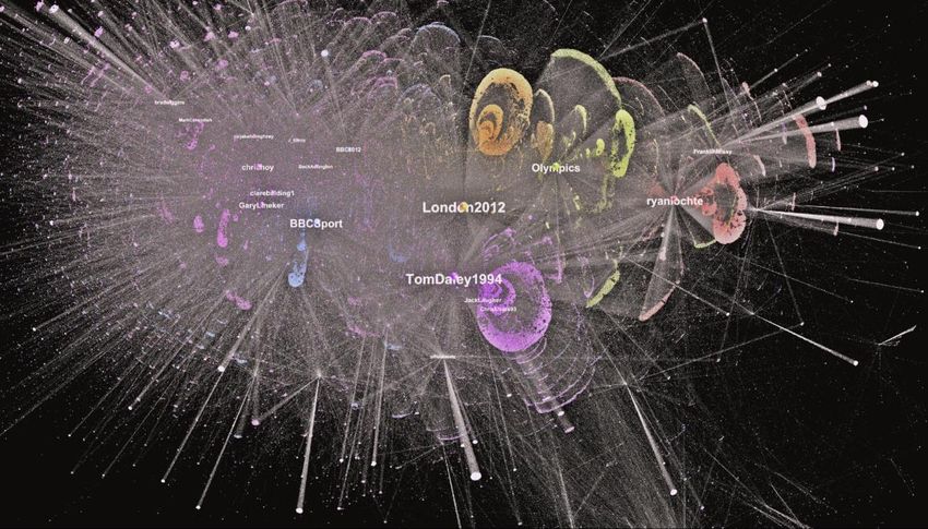
identified in the data. A visual representation of the network is shown in Figure 2. In Figure
2, users with similar combinations of connections are arranged together, with colours used
to highlight the statistically different clusters (discussed in the modularity section below).
Note that the network contains clusters centred around information sources (eg.
@london2012 and @BBCSport) and clusters centred around key athletes (eg. Tom Daley
and Ryan Lochte, whose accounts are @TomDaley1994 and @ryanlochte respectively).
In the visualisation in Figure 2, the thickness of the edge from A to B indicates the
number of times that A tweeted to B (most of the edges are thin and represent only one
tweet).8
Figure 12: Representation of a network graph
Network Metrics
Modularity:
Once the network graph has been drawn, it is possible to analyse whether the data contains
a single large network where all nodes interact equally with others, or whether the network
is in fact a collection of smaller sub-communities or clusters which engage in dense
interactions within that sub-community. This is one of the keys to identifying whether the
Olympics data represents a single global conversation or many distinct smaller
conversations.
One of the techniques for identifying sub-communities within the network is known
as modularity, and is used to identify interconnected clusters within the network.
Modularity is a form of statistical analysis of the network graph which measures how well a
Page 501Volume 12, Issue 1
May 2015
network can be decomposed into smaller sub-networks or modular communities (Blondel et
al. 2008). This measure identifies the range of smaller communities that are more closely
interconnected as compared with the rest of the network.
The modularity calculation on the network graph resulted in the identification of
forty distinct modular communities.9 However, of these forty communities only nine
modular communities individually contained more than one percent of the users in the
entire network. The largest community comprised a quarter of all the nodes in the network,
whereas the smallest 31 communities collectively account for only 1.31% of the entire
network (Figure 3).
Figure 23: The top nine modular communities ranked by size as a
percentage of the entire network. (Only communities greater than 1% are
shown.)
Our use of this technique was quite revealing. It showed that the World Service’s ambitions
to generate a ‘global conversation’ (conversations shared by a global network of
contributors and participants) were undercut by the presence of myriad small clusters of
tweeters having distinctive conversations. This indicated a much more fragmented picture
than the one imagined by the BBC’s notions of the global conversation.
Centrality:
Within network analysis, one set of metrics is a measure of centrality. Each centrality
measure provides a different perspective on how influential or important (central) a node
or actor is within a specific network. There are a wide range of options for calculating
centrality (Valente et al. 2008) but our study used the following three: (i) Degree, (ii)
Betweenness and (iii) PageRank to analyse the networks. This allowed us to assess the
influence of specific accounts within a wider social network.
Page 502Volume 12, Issue 1
May 2015
Degree:
Degree centrality is the number of relationships that connect to a specific node. For
example, if I had five friends and drew a network graph that represented these friendships,
the node representing me would have a degree centrality of 5. For the BBC World Service,
the figure will of course be much higher. The degree of a node is the number of lines that
coincide with it (Wasserman and Faust 1994).
Betweenness:
Betweenness centrality refers to how often a node lies on the shortest path between any
two nodes in the network. Actors who rank highly on betweenness centrality have the
potential to influence others near them in a network (Friedkin 1991). This may occur
through direct and indirect pathways. A node with high betweenness centrality has greater
potential influence over the spread of information through the network either by
facilitating, hindering, or even transforming the form and content of communication
between others (Freeman 1978; Newman 2003). This is important for understanding how
influence flows through networks.
In our example, to rank highly on betweenness centrality a user must fulfil two criteria:
1. They must be mentioning or retweeting other Twitter accounts
2. They must be mentioned or retweeted by other Twitter users
High betweenness often indicates a unique or almost unique position bridging between one
group of users and the rest of the network as all the shortest paths have to pass through
that single user. This helps us understand ‘Bridge Figures’ in networks – actors who are
influential in bridging and shaping flows of communication and information.
PageRank:
PageRank measures revolutionised the process of delivering web search results for Google
and others (Brin and Page 1998). PageRank refers to the probability distribution for nodes in
a network. In other words, it is a measure of how likely a user is to reach a specific node
from other nodes in a network. As such it is also a marker of influence. A shorthand way of
thinking about PageRank is that the PageRank of a specific node A is influenced by the
degree centrality of node A in conjunction with the degree centrality of the nodes which
connect to node A.
The reason PageRank takes both these elements into account is that it uses the idea
of random surfers finding their way across the internet by clicking a link on a web page,
landing on the next web page and clicking a link, which takes them to a third page and so
on. Brin and Page (the ‘Page’ in PageRank) applied the concept of the random surfer to
measure the intuitive justification that web pages ‘that are well cited from many places
Page 503Volume 12, Issue 1
May 2015
around the Web are worth looking at. Also, pages that have perhaps only one citation from
something like the Yahoo! homepage are also generally worth looking at’ (Brin and Page
1998:110).
In our case, this logic could be restated as follows: people who are frequently
retweeted are worth looking at, as are people who are not retweeted frequently – but when
they are, they are retweeted by well-known accounts – perhaps a major news provider, or
an influential individual such as @BarakObama. We applied this measure to see which
accounts in the collection were being frequently retweeted during the London Olympics,
and to gain further insights into flows of information and patterns of influence in the
Twittersphere.
Calculating PageRank requires the researcher to define the damping factor to ensure
that all areas of the graph have an equal opportunity to be ranked highly. While users
interface with Twitter in a slightly different way to classic websites, it is still important for the
analysis to ensure the entire graph has an equal chance of being ranked highly, a function
the damping factor fulfils. For our use of PageRank, the damping factor was set at (0.85 /
15%). This damping factor was selected as it was the level suggested by Brin and Page. It was
also highlighted by Becchetti and Castillo (2006) who, in their analysis of PageRank, observed
that the ‘typical damping factor used in practice is between 0.85 and 0.90’. This allows one
to set parameters of probability in likely behaviour and to measure actual behaviour against
these norms – enabling a more accurate picture to emerge.
Olympics data
The first centrality metric from the network data on the London Olympics was weighted in-
degree, equivalent to the number of times a user was retweeted or mentioned. It should be
noted that the method of data collection means the most mentioned accounts are likely to
appear in the list of over 1,000 accounts that were being followed as part of the study.
However, given that mentions of those 1,000 accounts on the list have an equal likelihood
of being recorded, the data represents how the different accounts being monitored fared in
comparison to other accounts on the list. The following findings should therefore be
considered in relation to the accounts being monitored and not their position within the
tweets about the London Olympics in their entirety.
From accounts monitored for the study, those that were mentioned or retweeted
most frequently spanned a range of types of account, including those of athletes such as
Chris Hoy (@ChrisHoy), Ryan Lochte and Tom Daley, BBC corporate accounts such as
@BBCSport, commentators who appeared on the BBC such as Gary Lineker (@GaryLineker)
and Clare Balding (@ClareBalding1) and the official LOCOG account, @london2012 (Figure
4).
Page 504Volume 12, Issue 1
May 2015
Figure 34: Most retweeted or mentioned accounts
The top ranked accounts by PageRank contain several of these accounts (Figure 5). Their
high PageRank, in comparison to other accounts that were monitored for the study, reflects
the likelihood that those accounts would have access to privileged information about
specific events or athletes, or alternatively were recognised as an integral part of the
Olympic Games. It therefore makes sense that athletes and commentators would appear
Figure 45: Top accounts by PageRank
Page 505Volume 12, Issue 1
May 2015
highly ranked. In addition, the Olympic mascot (Wenlock) and Erika Wright, who manages
some of the Olympic Athletes, also appear more highly ranked here than in total volume of
interactions. This reflects that other highly ranked users are likely to be mentioning or
retweeting them.
From the perspective of betweenness, @BBCSport ranks far higher than other
accounts, reflecting that this account had the ability to reach users that others did not
(Figure 6). This may be because @BBCSport provided news on a range of Olympic events
and athletes. In contrast, many of the other accounts focused on specific athletes, team or
events.
Figure 56: Top accounts ranked by betweenness
These three metrics individually provide specific perspectives on who was important in the
network of Twitter users sharing information about the London Olympics. While these
individual perspectives provide valuable insights into particular elements of a network, in
real life, Twitter users are simultaneously fulfilling a range of roles to varying extents in the
network. To show the extent that users fulfil different roles in the network, we use Key
Actor Analysis.
Key Actor Analysis
Identifying influential members in a network has been a key focus of network analysis. Many
different approaches have been suggested (Wilson and Banzhaf 2009; Tayebi et al. 2011;
Hsu et al. 2009). In this study we present a novel method for identifying key actors in a
network. Just as individuals are influential in different ways, this approach to key actor
analysis identifies the different roles individuals play in a group or network.
Page 506Volume 12, Issue 1
May 2015
This approach builds on a method suggested by Conway (2009) which, in turn, draws
on work examining correlations between different network metrics by Valente et al. (2008).
However, where Conway initially suggested using eigenvector centrality as a measure, we
have chosen to use PageRank (Newman 2003:210) instead. The PageRank algorithm
combines the eigenvector calculation with a ‘damping factor’ that ensures the algorithm
runs the calculation on disconnected elements of the network.
Method
To identify key actors we used a process of plotting two network metrics – Betweenness
and PageRank – against each other. Betweenness represents how important a user is in
facilitating the flow of information to specific parts of the network. Individuals fulfilling this
role are often known as bridges or gatekeepers and are valuable as they select and tailor
information to users in a specific part of the network.
Those with a high PageRank score are key members of the network because other
important network members interact with them. These users are heavily invested in the
activity of that network, and are usually recognised as important actors by other members.
The following figure illustrates how Key Actor Analysis diagrams are structured on an
example dataset. This is a scatterplot diagram. Each circle on the diagram represents one
Twitter account in the London Olympics dataset. The circles are positioned in alignment
with two axes. The horizontal axis represents their Betweenness centrality (i.e. ability to
bridge communities of the network). The vertical axis represents their PageRank centrality
(i.e. their relative importance in the network). The diagram is loosely partitioned into four
quadrants which represent three types of key actors (in top-left, bottom-right and top-right)
and a quadrant of non-key actors (bottom left).)
● Users in the bottom left quadrant tend to have no particular role and can be
thought of as (the majority of) general users.
● Users in the top left with high PageRank but low betweenness tend to be in
the core (or one of the cores) of the network. This indicates they are often
those most involved and are likely to exert influence by providing access to
privileged information. They are likely to be driving discussion and therefore
can be valued as authorities: trusted sources of information that others will go
on to share.
● Users in the bottom right quadrant, with high betweenness but low PageRank,
fulfil the role of bridging between the core content producers and a specific
community (or ‘audience’). The value of this role often comes from tailoring
information and, as such, these users are most valuable to a specific group,
but less important to everyone else. They also often share content from other
sources in addition to their own content.
● Users in the top right, scoring highly on both metrics, are rare. They have a
dual function, in that they have the same trusted status as those in the top
Page 507Volume 12, Issue 1
May 2015
left quadrant, yet also fulfill the same ‘bridge’ role as users in the bottom right
quadrant, reaching areas of the network which others do not.
Figure 7 illustrates how a scatterplot of key network actors can be used to identify nodes
that fulfil different roles in the network:
Figure 67: Key Actor Analysis example diagram
Using the data from the London Olympics, Figure 8 shows the relative positions of Twitter
accounts plotted against PageRank and Betweenness. The size of the circle represents the
third metric, in-degree, representing the number of times an account was retweeted or
mentioned.
In the top left of the graph, @TomDaley1994, @London2012, and @RyanLochte are
core sources of information. The athletes Tom Daley and Ryan Lochte were natural sources
of information on their own progress, while as the official Olympics channel, @London2012
provided up to date information on a range of relevant information.
In addition, journalists and commentators such as @ClareBalding1 and
@GaryLineker also appear to be primarily a source of information – most likely due to their
role presenting BBC coverage of the London Olympics.
Importantly, by combining the three metrics we see that although @BBCSport was
mentioned less frequently than @TomDaley1994 or @London2012, the @BBCSport account
was an important bridge to a community of users that other accounts did not reach.
The work on network metrics allows us to understand whether different types of accounts
fulfil different roles within the network. In the following sections, we look at what responses
to the tweets themselves might tell us about different roles in the network.
Page 508Volume 12, Issue 1
May 2015
Figure 78: Olympics network Key Actor Analysis scatter plot
Influence of accounts through Ageing Factors
While a network analysis can yield insights into the influence of different accounts by
examining the connections between those accounts and their tweets, it may also be
possible to gain insights by profiling how an account’s individual tweets behave following
their original posting. Cha et al. (2010) argue for the benefit of the counts of retweets over
the connectedness of a user’s account, as ‘retweets represent influence of a user beyond
one’s one-to-one interaction domain’.
The amount of influence of an individual tweet might reasonably be estimated in
terms of how long that tweet remains relevant to the group of users who engage with it.
One way of estimating whether the tweet is still relevant to those users is whether they are
still retweeting that tweet. A user is likely to retweet a tweet that strikes a chord with them,
and so we might realistically suppose that a widely retweeted tweet has had a wider
influence than a tweet that has been retweeted relatively little. As well as the total number
of retweets, an important question will also be for how long a tweet remains relevant. If a
tweet is retweeted several hours after the original post was made (a significant time-period
in Twitter-time), then we might similarly consider that tweet to be more influential. Tweets
which are still considered worth retweeting after several hours might be considered more
influential than those which are no longer retweeted after an hour or two. As the rate of
Page 509Volume 12, Issue 1
May 2015
retweeting drops off quite rapidly after the tweet is originally posted, then a measure of the
decay of the retweeting rate is often proposed as an appropriate measure for estimating the
time for which a tweet remains active (Bhattacharya and Ram 2012; Eysenbach 2011).
By investigating how users engage with different types of known public accounts,
such as the BBC’s corporate accounts and those of named individuals associated with the
BBC, it may be possible to determine how different forms of information dissemination are
appropriate for different kinds of engagement. When dealing with traditional corporate
information providers, how do users of Twitter engage with the corporate accounts,
compared with those associated with a named individual?
To attempt to answer this question, in this section, we consider the ageing factor of
a tweet (Uren and Dadzie 2012) as a measure of the influence that an individual tweet might
have. The ageing factor is an estimate of how long a tweet is considered to remain current,
by considering for how long the tweet continues to be retweeted.
This work builds on Brookes’ work in information science, which attempted to
formalise the understanding of information communication by modelling citation rates in
bibliometrics. Brookes’ (1970) work on annual ageing factor of a publication, and its
associated rate of obsolescence has been a highly influential mechanism for understanding
the use of literature among a particular group of users (Bawden 2008). In the same way, we
suggest that by applying Brookes’ models to the obsolescence and spread of tweets, we will
obtain similar insights into how tweets are used by the Twitter community.
Ageing Factor
The extremely rapid fall-off in the rate of retweeting suggests that in practice, the decay
happens over a few hours; the ageing factor of a tweet (Uren and Dadzie 2012) has been
proposed as a suitable mechanism for measuring the longevity of a tweet. The ageing factor
of a tweet after time t is a normalised measure of the number of times a tweet has been
retweeted at time t as a fraction of all the retweets of that tweet, and for a given tweet, the
ageing factor measure is given as:
The factor is chosen as an appropriate time unit for the document under consideration. In
Brookes’ work on citation of scientific publication, the time was measured in units of a year.
Uren and Dadzie’s analysis finds that in Twitter, an appropriate time unit is an hour.
The ageing factor tends towards 1 more slowly for tweets that are still being tweeted
a long time after originally being posted. For example, the following tweet sent by the
British diver Tom Daley in advance of the closing ceremony:
Closing ceremony tonight!!!!!
Page 510Volume 12, Issue 1
May 2015
was retweeted a total of 13,668 times. The number of times that this tweet was retweeted
in the hours following the initial post is shown in Figure 9. After an initial flurry of
retweeting in the first hour, the rate of retweeting then dropped off very rapidly, so that
about 70% of the total retweets occurred within the first hour of the original post.
Figure 89: Number of retweets by time
As a point of comparison, consider another of Tom Daley’s tweets, which this time contains
a URL:
Love this photo! http://t.co/eC9sCIgi
This tweet was retweeted 11,299 times, so around the same number as the previous tweet.
However, the pattern of retweeting is markedly different from that of the original tweet, as
shown in Figure 10.
Figure 910: Number of retweets by time
Page 511Volume 12, Issue 1
May 2015
In this case, the rate of retweeting falls off much less steeply; only about 40% of the total
retweets took place in the first hour, with several hundred retweets happening 7 hours or
more after the original post. In fact, plotting the two histograms on the same chart shows
that the second tweet has a higher absolute number of tweets after about two hours than
the first tweet (Figure 11).
Figure 1011: Comparison of total number of retweets
Plots of the ageing factor of the two tweets against time for the two tweets (Figure 12)
shows that the plot of ageing factors of the first tweet, shown in blue, is initially steeper and
tends towards a final ageing factor of 1.0 more rapidly than the second tweet (shown in
green).
Figure 1112: Comparison of ageing factors
Page 512Volume 12, Issue 1
May 2015
These values of ageing factor can be closely fitted to an exponential decay, according to the
formula:
where t is time in hours following the original tweet. A value of k can then be found whose
magnitude gives an indication of the rate of decay. We will call this rate of exponential
decay, the rate of obsolescence of a particular tweet.
As an indicative guide, if k=1, then after 1 hour, around 64% of the retweets have
taken place, after 2 hours, around 75%, after 3 hours, around 86% and so on. Curve fitting
was carried out with the python scipy curve fitting library.10
For the two graphs above, the first tweet is well modelled by a graph with a rate of
obsolescence of k=1.17 (Figure 13).
Figure 1213: High rate of obsolescence
In comparison, the second tweet, which aged more slowly, has a value of k=0.56 (Figure 14
below).
We propose that the rate of obsolescence of a tweet (ie. the value k) is indicative of
the level of engagement of the public with that tweet. In the above examples, we assume
that the first tweet, which has a higher rate of obsolescence (k=1.17), is less influential than
the second. The lower rate of obsolescence of the second tweet (k=0.56) suggests that users
consider the content of that tweet to still be relevant longer. That the tweet is being
retweeted for a longer time indicates that users believe the tweet still has something
original or valuable to say for a longer period after the original post.
Of course, for any given tweet, there are any number of factors which will influence
the pattern of retweeting. In these cases, the content of the original tweet:
Page 513Volume 12, Issue 1
May 2015
Figure 1314: Low rate of obsolescence
Closing ceremony tonight!!!!!
is quite generic, and so may have a short lifespan. On the other hand, the second tweet:
Love this photo! http://t.co/eC9sCIgi
is linked to a photograph of Tom Daley celebrating his medal win (Figure 15):
Figure 1415: Tom Daley's tweeted photograph
The longer lifespan of this tweet could possibly be attributed to the very personal nature of
the content.
Page 514Volume 12, Issue 1
May 2015
Alternatively, the second tweet’s lifespan could be attributable to it being less time
specific: a comment about the forthcoming closing ceremony is clearly only relevant in the
run-up to that event, while the time at which a post-medal celebration becomes less
relevant is much less clearly defined.
So in general there are many factors which contribute to the number of times that a
tweet might be retweeted. However, looking at the overall profile of a particular user’s
account might give us some insight into the broader influence of that user. In the remaining
discussion, we look at the retweeting profiles from different account types, rather than the
profiles of individual tweets.
Influence of different account types
Although the ageing factor applies to an individual tweet, a greater insight can be obtained
by considering the ageing factors of a collection of tweets. In this section, we will consider
the behaviour of a collection of tweets to attempt to understand the relative influence of
different accounts.
As an illustration, consider again the tweets sent by Tom Daley. To attempt to
visualise the overall behaviour of tweets from his account, Figure 16 shows a boxplot of the
ageing factors of the 100 most retweeted tweets from Tom Daley’s account. As usual with a
boxplot, each box contains the second and third quartiles of the values at that value, and
the central line in red represents the points’ median value. So for the set of tweets under
consideration, the median ageing factor after 1 hour is approximately 0.5, the median
ageing factor after 2 hours is approximately 0.8 and so on.
Figure 1516: Ageing factors boxplot for @tomdaley1994
In this case, an ageing factor curve has been fitted to the median value of the ageing factor
for each hour up to 15 hours after the original post. This gives a median rate of
obsolescence of k=0.71 for Tom Daley’s tweets.
Page 515Volume 12, Issue 1
May 2015
To compare with a similar athlete, Figure 17 shows a similar plot for the most
retweeted tweets of the American swimmer Missy Franklin,11 from the account
@franklinmissy.
Figure 1617: Ageing factors boxplot for @franklinmissy
Both athletes’ accounts show similar median ageing factors. To compare the general pattern
of the tweets from Tom Daley and Missy Franklin with those of two corporate Twitter
accounts, Figure 18 shows the boxplots for the combined ageing factors from the set of four
corporate BBC accounts: @bbcsport, @bbc2012, @bbcnews and @bbcworld. It is clear from
the plot that the tweets from these accounts have a far higher ageing factor than the tweets
from the two athletes’ accounts; the median ageing factor of the main corporate accounts is
k=2.37, significantly higher than the two athletes’ accounts.
Figure 1718: Ageing factors boxplot for BBC corporate accounts
Page 516Volume 12, Issue 1
May 2015
The official Olympics channel, @london2012 shows a similar pattern, with the rate of
obsolescence being k=1.83, again much higher than that of the athletes (Figure 19).
Figure 1819: Ageing factors boxplot for @london2012
So can this discrepancy be put down to a greater interest in the tweets of known people,
rather than the output from a corporation? As well as its official accounts, the BBC also uses
famous personalities (that is, who are famous as BBC employees, and who hosted the BBC
Olympics coverage). To compare against the corporate BBC accounts, Figure 20 and Figure
21 show the patterns of ageing factors for the BBC pundits Gary Lineker and Claire Balding.
Figure 1920: Ageing factors boxplot for @garylineker
Page 517Volume 12, Issue 1
May 2015
Figure 2021: Ageing factors boxplot for @clarebalding1
In both these cases, the patterns appear to be much closer to the corporate accounts (with
a rate of obsolescence of around k=2) than they do to the athletes. If the rate of
obsolescence is treated as a reasonable proxy for the degree of influence of a tweet, then in
these cases, it doesn’t seem to make much difference whether the tweet comes from a
corporate account, or a better-known public face.
A comparison of replying and retweeting behaviour
Another possibility for investigating the degree of engagement that people make with
Twitter accounts might be to look at how often people reply to a tweet, compared to
retweeting it. We can describe a reply to a tweet, or a retweet of that tweet as a response,
so that a response can be either a reply or a retweet. Replying to a tweet requires the user
to invest the additional effort in composing an original response, whereas retweeting
requires relatively little effort. We propose as a measure of engagement, therefore, that
comparing the rate of replies and the rate of retweets may give an indication of the level of
engagement of users with that tweet. That is, a tweet that has a high rate of replying to
responding might be considered more influential than one which elicits retweets alone.
Figure 22 shows the total number of responses to Tom Daley’s 30 most responded-
to tweets,12 divided into retweets and replies. Comparing the number of replies (shown in
green) against the number of retweets (in blue), the number of replies is often quite
substantial relative to the number of retweets. In many cases, the number of replies is
around 20% of the total number of responses, although sometimes the proportion is much
smaller (such as the tweets labelled 4, 8, 9 and so on in the figure), and sometimes quite a
bit larger (such as the tweets labelled 5, 6, 12 and so on).
Page 518Volume 12, Issue 1
May 2015
Figure 2122: Responses to @tomdaley1994
In comparison, how do the official BBC channels measure up to the same analysis? Figure 23
and Figure 24 show the equivalent figures for the @BBC2012 and @london2012 accounts
respectively. The figures suggest that the ratio of replies to retweets from these corporate
accounts is much lower than for Tom Daley: in very few cases is the number of replies even
as high as 2% of the total number of responses.
Figure 2223: Responses to @BBC2012
Page 519Volume 12, Issue 1
May 2015
Figure 2324: Responses to @london2012
As before, we can now compare the pattern of responses to the corporate accounts to the
patterns for the pundits’ accounts. Figure 25 shows the number of responses for the
account @GaryLineker, and how they split between retweet and response. The graph
indicates that there are several posts that have a relatively high number of replies. Indeed,
for the tweets labelled 7, 10, 18 and 28 in the plot, the number of replies to the tweet
constitute at least 80% of the total number of responses.
Figure 2425: Responses to @garylineker
Page 520Volume 12, Issue 1
May 2015
It is not always obvious what the content was of those posts that elicited a high proportion
of replies (although a more extensive analysis might provide some directions in these cases).
The two posts with the highest number of replies as a ratio of responses are:
Thank you so much for all the really kind tweets about our coverage. This time
next week I’ll be getting hammered over MOTD running order.
and:
Decision has been made to put me inside the Olympic stadium to present
tomorrow night. 100metre final. Could not be more excited #lovemyjob
However, looking at responses to the corporate account @BBCSport, it is clear that it is
possible to engage users by asking specific questions. Although the average rate of replies is
low for the @BBCSport account (at around 4%), where replies are specifically elicited, that
rate can be much higher for individual tweets. Two examples are:
OK guys and gals, who would like to see light the Olympic cauldron? #bbc2012
for which 97% of the responses were a reply, and:
What was your favorite moment of London 2012 and what do we need to do
to ensure the Games’ legacy. Get involved with #bbcsportsday
for which 87% of the responses were a reply. These suggest that although users’ primary
mode of engagement with the corporate accounts is to retweet rather than reply, users will
engage with the accounts in a conversational manner if invited to do so.
As another point of comparison, the ratio of replies to retweets can be compared for
a larger collection of accounts. Figure 26 shows the fraction of responses that are replies
(rather than retweets) for six accounts: two corporate accounts (@bbc2012 and
@london2012), two pundit accounts (@clarebalding1 and @garylineker) and two athletes’
accounts (@ryanlochte and @tomdaley1994). In these cases, it appears that the pattern of
responses to the pundits’ accounts is much more similar to the athletes’ accounts than it is
to the corporate accounts. In the case of the pundits and athletes, the median fraction of
responses that are replies is between 20% and 30% in each case, while the median fraction
of responses to the corporate accounts comes to less than 10% in each case.
Page 521Volume 12, Issue 1
May 2015
Figure 2526: Fraction of responses that are replies (1)
Finally, we might want to draw a comparison with corporate accounts that are specifically
designed to cause engagement. Radio 5 live is a good example, as that is the BBC’s main
national station specialising in interactive radio programmes such as phone-ins. For
comparison, a plot is shown in Figure 27. In this case, the @bbc5live account appears to
straddle the values for the pundits and the corporate accounts; even though the tweets
come from an account which is specifically intended to draw comment from its audience,
the number of replies to its tweets is still lower than those to official pundits.
Figure 2627: Fraction of responses that are replies (2)
Page 522Volume 12, Issue 1
May 2015
Broadly, the lessons found from comparing the retweet to reply ratio appear to be that:
● Tweets posted by BBC corporate accounts had a very small number of
replies. This suggests that it is unlikely that users view tweets from a
corporate account as part of the Twitter conversation. Rather, it may be
that users treat corporate accounts as mere information providers (similar
to the traditional broadcast model).
● Tweets posted by BBC pundits/commentators had a much higher number
of replies (but still smaller than the number of retweets). This suggests that
users are more likely to reply to a tweet from a BBC
pundit/commentator—in other words, pundits and commentators may be
more likely to encourage active participation than corporate accounts.
● The pattern of replying vs. retweeting is comparable for pundits and
athletes.
Findings
We have looked at two ways of measuring the level of engagement that users may have
with tweets, and what those measures might tell us about how users engage with different
types of Twitter accounts. The ageing factor measure indicates how long after an initial post
users still consider a tweet to be relevant.
Account name Account Number of Average Median Median
type followers/ response rate k reply
100013 (responses/ rate14/%
thousand
followers
london2012 Corporate 1380 0.35 1.83 2.00
BBC2012 Corporate 78.8 0.70 2.37 4.53
BBCSport Corporate 437 0.11 2.38 4.65
ClareBalding1 Pundit 214 0.41 2.01 30.6
GaryLineker Pundit 938 0.22 1.98 23.7
franklinmissy Athlete 269 0.85 0.75 27.7
RyanLochte Athlete 774 0.68 0.87 26.6
TomDaley1994 Athlete 1120 0.60 0.71 21.0
Table 1: Rates of obsolescence and rate of replies for Twitter accounts
The overall figures for the different types of accounts are shown in Table 1. The third
column shows the number of followers of each account (in thousands), and the fourth
column gives an indication of the rate of responses to each of the accounts’ tweets. The rate
Page 523Volume 12, Issue 1
May 2015
of response shown is the average number of responses per tweet, per thousand followers.
So for example, the tweets from the account @GaryLineker elicited an average of 0.22
responses on average for every thousand users following that account (or one response for
every 455 followers). In fact, the rate of response is surprisingly consistent across all the
accounts, being in the order of one response per ten thousand followers.
The fifth column, median k, shows the median rate of obsolescence for the tweets
posted by that account. A lower value in this column corresponds to a lower rate of
obsolescence (that is, the tweet continues to be tweeted for longer). Comparing the rate of
obsolescence from the athletes’ accounts against those of the corporate and pundit
accounts suggests that the athletes’ tweets seem to remain relevant longer than those of
the pundits and the corporate accounts. In fact, there appears to be little difference
between the retweeting patterns of the BBC corporate accounts and those of the pundits.
The official @london2012 account has a slightly lower rate of obsolescence than those of
the BBC accounts, but is still very much higher than the accounts of the athletes.
In contrast, the tweets of the pundits seem to attract more replies than those of the
corporate accounts, and by that measure, the degree of engagement with the pundits is
more comparable to the athletes’ accounts than it is to the corporate accounts, even when
those corporate accounts are designed to stimulate discussion and engagement. Again, the
interaction with the @london2012 is much closer to that of the BBC corporate accounts
than the athletes’ accounts; users appeared to be much less likely to have replied to the
official LOCOG twitter account than to those accounts associated with a particular
individual.
A particular point of interest is the comparison between the retweeting rates for the
@BBCSport account and the LOCOG @london2012 account, and their respective locations in
the Key Actor Analysis plot in Figure 5. The retweeting rates suggest that the manner of user
engagement with these two accounts is very similar, but the scatter plot indicates that the
two accounts play very different roles within the network. The location of the @BBCSport
account in the Key Actor Analysis plot suggests that the @BBCSport account has relatively
high betweenness centrality, and as such is an information provider to a specific community,
more so than the @london2012 account. Comparing these two accounts then, suggests that
there are accounts which are primarily about providing information, and whose users
engage with those accounts in the same way. However, for some cases (such as the
@BBCSport account), the betweenness centrality of the account within the network
suggests that that account is more likely to cater to a specific audience or demographic
within the whole of the social network.
This demonstrates that the influence of an account is a product both of the content
of that account (which determines whether its content is retweeted and/or replied to), as
well as its position in the network, which determines how users’ responses to that account
shape the network as a whole.
Page 524You can also read