Deliverable 5.1 REPORT ON THE DEVELOPED INDICATORS FOR NOWCASTING MIGRATION STOCKS BY TWITTER
←
→
Page content transcription
If your browser does not render page correctly, please read the page content below
This project has received
 funding from the
 European Union’s Horizon
 2020 Research and
 Innovation Programme
 under grant agreement
 No 870661

 Deliverable 5.1
REPORT ON THE DEVELOPED INDICATORS FOR
NOWCASTING MIGRATION STOCKS BY TWITTER

 Alina Sirbu, Laura Pollacci, Jisu Kim & Giulio Rossetti

 July 2021

 http://www.hummingbird-H2020.eu
Abstract
 Given the gaps and limitations of traditional data for migration research, social big data have been
 proposed to complement existing analyses. Amongst various types of social media data, user-generated
 content from Twitter is considered a valuable resource in migration studies. As recent works have shown,
 Twitter can indeed be used to study various migration-related problems such as estimating migration flows
 or studying language mobility. However, it is still unclear up to which extent these data can be useful.
 Here we investigate three different approaches to understand migrant stocks based on Twitter. We show
 that, although data can be reduced, some information can be extracted, and further analyses beyond
 stocks can be performed. At the same time, we show that in some situations Twitter data is limited and
 cannot bring a lot of information. In this case complementary data is required.

This report constitutes Deliverable 5.1, for Work Package 5 of the HumMingBird project.

July 2021

© 2021 – HumMingBird, Enhanced migration measures from a multidimensional perspective, – project
number 870661.

General contact: HumMingBird@kuleuven.be
p.a. HumMingBird
 HIVA - Research Institute for Work and Society
 Parkstraat 47 box 5300, 3000 LEUVEN, Belgium

For more information sandra.volders@kuleuven.be

Please refer to this publication as follows:
Sirbu, A., Pollacci, L., Kim J., & Rossetti, G. (2021). Report on the developed indicators for nowcasting stock
migration by Twitter data (Deliverable 5.1). Leuven: HumMingBird project 870661 – H2020.

Information may be quoted provided the source is stated accurately and clearly.
This publication is also available via http://www.hummingbird-H2020.eu
This publication is part of the HumMingBird project, this project has received funding from the European
Union’s Horizon 2020 research and innovation programme under Grant Agreement No 870661.

Copyright © HumMingBird Consortium, 2019
All rights reserved. No part of the report may be reproduced, stored in a retrieval system, or transmitted in
any form or by any means, electronic, mechanical, photocopying, recording, and may not be quoted or
cited, without prior permission in writing from the project coordinator.
The views expressed during the execution of the HumMingBird project, in whatever form and or by
whatever medium, are the sole responsibility of the authors. The European Union is not liable for any use
that may be made of the information contained therein.
VERSION CONTROL SHEET

 Deliverable number + title D5.1 Report on the developed indicators for nowcasting stock migration by
 Twitter data
 Prepared by Alina Sirbu & Laura Pollacci
 12 – UNIPI
 alina.sirbu@unipi.it
 Work package number 5
 Work package leader 12 - UNIPI
 Dissemination level (PU, CO) PU
 Delivery date 29/07/2021
 Submission date to EC 30/07/2021
 Main authors Alina Sirbu, Laura Pollacci, Jisu Kim, Giulio Rossetti
 Reviewers Carlos Arcila Calderon, Haodong Qi

REVISION HISTORY

 Version Date Summary of changes Initials Changes marked
 1 23/06/2021 Top-down nowcasting of stocks LP
 2 25/07/2021 Bottom-up nowcasting, Border Rush analysis, AS
 Introduction, Discussion and Conclusions, Abstract
 3 29/07/2021 Implemented suggestions from reviewers AS
Contents

1. Introduction 5

2. Top-down approach: Nowcasting using language and sentiment on Twitter
content 6
2.1 Data 6
2.2 Superdiversity Index 6
2.3 Nowcasting immigration rates 9

3. Bottom-up approach: from Twitter users to the study of migration 13
3.1 Data 13
3.2 Labelling strategy 13
 3.2.1 Assigning residence 13
 3.2.2 Assigning nationality 14
3.3 Migrant integration 16
 3.3.1 Overall distribution of DA and HA values 17
 3.3.2 Language as a key factor for integration 19
 3.3.3 Country specific results 19
3.4 Analysis of migrant and native communities 21
 3.4.1 Language and country location of Tweets 21
 3.4.2 Homophily of social links 23

4. Case study: border rush at the Turkish border 25
4.1 Data 25
4.2 Analysis 26

5. Discussion and conclusion 28

References 31

 4
1. Introduction

Measuring migration stocks and flows over time in various countries is crucial but challenging.
Migration-related information has important implications for effective policy design and for under-
standing broader population trends. Researchers and policymakers mostly rely on official statistics
and administrative data. However, these data typically show numerous drawbacks, e.g., low time and
space resolution (i.e. the measurements are not frequent in time and are usually aggregated at high
level geographical regions), inconsistency between different countries (different reporting standards,
different definitions, varying data quality and collection methods) and delays. This explains why the
current availability of data from social media, like Twitter, has offered new opportunities to attempt
to obtain more updated information and estimates and to improve and integrate traditional data
sources (Sirbu et al., 2020). Social media datasets contain several types of user information, cover large
population groups, even across multiple nations, and are often available cheaply and on time. Both
traditional and novel data are currently employed to study different aspects of migration, such as the
economic and cultural effects connected with migrants, monitoring flows, and estimating stocks.
 Among the various types of social big data, user-generated content from Twitter can be a valuable
resource in migration studies. This has been proven by recent works using Twitter data to study
various migration-related problems (Zagheni et al., 2014; Mazzoli et al., 2020; Lenormand et al., 2015;
Moise et al., 2016; Valle et al., 2017). However, data collection, pre-processing and analysis is far from
straightforward and can result in biased data that might influence the final results. Bias comes from
various sources. One is related to sampling bias introduced by the way individuals use Twitter: there
is a selection bias in the general Twitter population, but also when restricting the analysis to certain
subsets of data, such as geolocalised Tweets. Moreover, data, being user generated content, may be
very noisy, impeding their use in certain areas of research, or resulting in limited knowledge after
cleaning. It may also contain misleading or fake information (e.g. users using a nickname, or declaring
the wrong profile location). Furthermore, ethical and privacy issues need to be considered carefully,
as biased results and publication of sensitive information might harm migrants.
 One research question of interest is whether Twitter data can be useful to understand migrant
stocks. The hypothesis is that this type of data can provide better time and space resolution, and
provide more timely information compared to official statistics. Here we investigate these aspects,
through various types of analyses. A first analysis, that we define as top-down, employs features
extracted from the text of tweets generated by a community to estimate migration stocks, using
machine learning techniques. The second approach, bottom up, labels individual users with a nation-
ality and residence, using a data driven model, and estimates stocks from resulting labels. The two
approaches are complementary and will be discussed in detail in the following sections. A different
type of analysis based on Twitter is the study of a restricted period of time and geographical area, to
analyse a specific event. We will show preliminary results for the analysis of border rush at the Turkish
border in March 2021. Here we employ language as the main feature that determines nationality of
users.
 The report will end with a discussion of challenges, limitations and advantages that arose during
our analyses, and what we believe are the benefits of employing this type of data for migration studies.

 5
2. Top-down approach: Nowcasting using
 language and sentiment on Twitter content

In this section we aim to introduce a nowcasting model for immigration rates. Our method is based
on applying machine learning to features extracted from Twitter data at different geographical reso-
lutions. The main feature that we employ is our recent index that measures cultural diversity, i.e. the
Superdiversity Index - SI (Pollacci, 2019). In the following we describe the data employed in the
analysis, we define and validate the SI, and we present the nowcasting method and results. The analy-
sis concentrates on seven European countries: France, Germany, Ireland, Italy, Spain, United King-
dom, The Netherlands.

2.1 Data
To perform our work, we leverage two different kinds of resources, i.e., a geolocalised Twitter dataset
and the Data Challenge on Integration of Migrants in Cities (D4I) dataset.
 The Twitter dataset is a subset of Coletto et al. (2017) composed of more than 73,175,500 geolo-
calised tweets gathered for 3 months, from 1 August to 31 October 2015. From these, we select only
tweets originating in our target countries by leveraging the metadata field ‘coordinates’. Thus, we
extract only tweets containing geographical coordinates, excluding those containing only the field
‘place’, since this has no reliable information on the origin of a tweet. For each target country, we
select only tweets in the National Language, e.g., French for France. Afterwards, we assign tweets to
a city. This is required to match the D4I data to our results. For each tweet we identify the origin
place by using its coordinates and the Geopy Python library. If the origin city is attested in D4I we
assign the related NUTS codes to the tweet (we look at NUTS1, NUTS2 and NUTS3 levels). Other-
wise, we perform a dedicated rule-based pipeline described in Pollacci (2019). This step is often
required since in D4I locations are at the city level, while several tweet origins are at the district or
town level. Finally, tweets are processed following both a rule-based and a general-purpose Natural
Language Processing (NLP) pipeline (Pollacci, 2019). To obtain only significant words from the sen-
timent and meaning point of view, we use part-of-speech tagging and select nouns, adjectives, and
verbs. Following this procedure, we obtain a clean geolocated dataset made up of 4,295,287 tweets
from the 7 countries.
 The D4I dataset 1 contains the concentration of migrants in regions of most leading European
countries, i.e., Italy, Portugal Germany, Spain, France, the Netherlands, and Ireland, plus the United
Kingdom. Migrants are counted based on three different levels of aggregation: by country, continent
and EU versus non-EU. Since all migrant types cause diversity, we select both EU, and non-EU
immigrant counts to obtain total immigration levels.

2.2 Superdiversity Index
To measure the cultural diversity of a certain community we have recently introduced the Super-
diversity Index (Pollacci, 2019). This is based on sentiment of words, and measures the distance
between the sentiment valences of a set of words used by a community and the standard sentiment

1 https://knowledge4policy.ec.europa.eu/migration-demography/data-integration-d4i_en.

 6
valences. The SI is based on the hypothesis that groups of people with different cultural backgrounds
associate emotional values to words differently. Therefore, a multi-cultural community will display a
use of the local language that is different in its emotional content compared to a standard expected
use.
 We use the algorithm of Pollacci et al. (2017) to calculate emotional valences for words used in
tweets in the national language version grouped by countries at different spatial resolutions (from
NUTS1 to NUTS3). We calculate the SI using the average Pearson correlation coefficient (r) over
ten runs between the emotional valences from a standard tagged lexicon, i.e., ANEW (Bradley &
Lang, 1999), and the calculated valences. We correlate the distance between the SI with immigration
rate at different spatial resolutions.
 Figure 1 shows the scatter plots of SI and immigration rates for all the selected European countries.
Ireland has very few NUTs regions, hence the number of points in the plot is reduced. Nevertheless,
we show the results, mentioning however that the statistical measure computed on it do not have a
large enough sample size. All plots show how at all NUTS levels (triangles, squares, and circles,
respectively), the SI tends to allineate with the first diagonal, despite the presence of sparse points.
Tables in the next section also include Pearson correlation values for SI versus Immigration rates,
showing that in general correlation are very good. This indicates that the higher the immigration rates,
the higher our SI values. Also, we observe that correlations are in general larger than for other pos-
sible indices of cultural diversity extracted from the same data.

 7
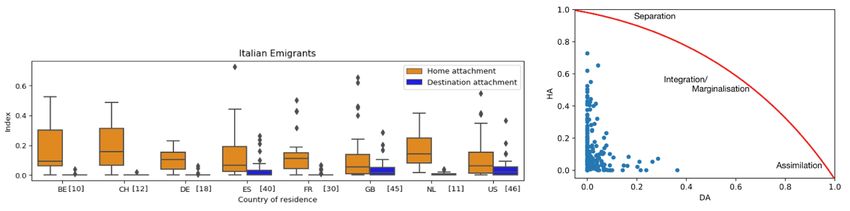
Figure 1. Scatter plot of SI and immigration by country*

 * The SI was generated using data from 2015 (August-October). The immigration rates come from the D4I
 dataset, based on the 2011 census.

 8
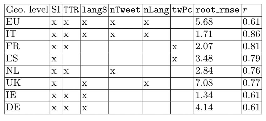
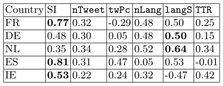
2.3 Nowcasting immigration rates
The results above indicate that there is a direct relation between the SI and immigration rates in
European countries and regions. Therefore we hypothesised that the SI could form a good basis for
a predictive model for immigration rates. For a better prediction performance, we extracted from the
same Twitter data a set of five other indices of diversity: the total number of tweets in the region
(nTweet), the number of tweets per capita (twPc), the number of distinct languages in the dataset
(nLang), the entropy of the use of languages (langS, measuring how flat is the distribution of the
number of tweets in the different languages: a low entropy means most Tweets are in one language
only, a large entropy means there are many languages and Tweets are equally distributed across the
various languages), and the Type/Token Ratio (TTR, Templin et al., 1957), which is a measure of
language richness. Tables 1 (UK) and 2 (Italy) show the correlation between immigration rates and
all six indices (including SI), at different space resolutions. The tables also show results for the null
model for SI, achieved by reshuffling tweets across geographical regions, maintaining fixed the
number of tweets in each region. At the county level (NUTS3) we selected the top 40/20 regions
based on the number of tweets available in the dataset.
 The two tables show that the SI provides the most correlation with immigration rates in Italy and
the UK, however other indices also provide some information. The Null model SI does not correlate
to immigration rates, validating thus the SI.

Table 1. Correlation between different measures of diversity extracted from Twitter and the
 immigration rates, at various geographical levels in the UK, excluding London and
 Northeast England (which were considered outliers)

 Source Pollacci (2019)

Table 2. Correlation between different measures of diversity extracted from Twitter and the
 immigration rates, at various geographical levels in Italy

On this basis, we extend our approach also to other European countries, i.e., Germany, Spain, France,
the Netherlands, Ireland. Table 3 shows the correlations between SI, different measures of diversity,

 9
and the immigration rates by country, over all NUTS levels together. Again, the Superdiversity Index
tends to reach the highest correlations, although in some cases, i.e., Germany and the Netherlands,
other indices may also correlate with immigration rates.

Table 3. Correlations between different measures of diversity and the immigration rates by
 country

Our results suggest that the combined use of various measures of diversity, including the Superdiver-
sity Index, could be a potential predictor for immigration stocks.
 Thus, the SI and other measures are fed into a machine learning pipeline to model the immigration
rates. To obtain the best predictions, we test various regression algorithms, i.e., Linear Regression,
Lasso, Ridge, Decision Tree Regression, Gaussian Support Vector Regression (SVR), and polynomial
SVR. Moreover, to maximise the prediction we study features' impact and finally optimise the
parameters through Grid Search. We apply regression algorithms by country and at the European-
level, i.e., grouping all the tweets posted by all countries in the dataset at all NUTS levels.
 Each regression model uses the six measures of diversity as features, both in the original range and
normalised in the range [0,1]. The regression evaluation is carried out through Leave One Out Cross
Validation (LOOCV), and by considering the Pearson Correlation Coefficient r between actual and
predicted immigration rates and root-mean-square error (root_mse).
 We observe that different algorithms achieve different results with respect to different countries,
as well as normalisation of features. We finally select the Polynomial SVR on normalised features as
the nowcasting model, since it produces the best results.
 Since our goal consists of an European model and an optimised model for individual countries, we
further analyse how features could differently affect the performances of algorithms. We train models
that only employ subsets of features, exploring all possible subsets that include the SI.

Table 1. Feature selection for individual countries and Europe

 10
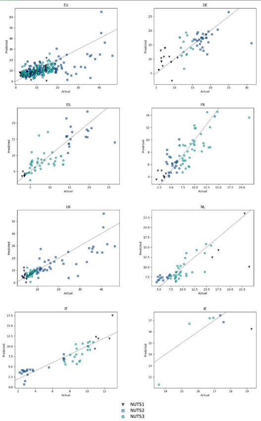
As summarised in Table 4 results seem to confirm our hypothesis on the different impact of features
across countries. For Europe and Italy, the model benefits from the combination of almost all indices.
Conversely, all the other countries achieve the best performance with different combinations of three
indices, except Spain, which has only two features (Superdiversity Index and the number of tweets
per capita). It is important to mention that the impact here is only based on the accuracy of the model
on test data, i.e. based on an empirical analysis typical to the machine learning domain. We select the
feature combination that gives the best prediction. However this approach does not evaluate the
strength of the effect, and the correlations among the features themselves.
 After the feature selection phase, we perform the optimisation of parameters using Grid Search on
the regularisation parameter (C), epsilon ( ), and degree. The optimisation, performed using feature
selection and grid search, allows us to obtain slight improvements to performances, which are
summarised in Table 5.

Table 2. Result obtained after the optimisation phase for individual countries and Europe

The European model, using all data available, obtains an r=0.66 and RMSE=5.52. National models
achieve better performance, with r-values between 0.70 and 0.89 and RMSE between 1.47 and 6.28
depending on the country. Figure 2 shows predicted versus real immigration rates for Europe and
European countries (triangles correspond to NUTS1 regions, squares to NUTS2, and circles to
NUTS3).
 Despite some sparse points, predicted immigration rates tend to be coherent with actual ones for
both Europe and individual countries. For countries, we note that predictions are more accurate
when immigration is under 10-15%, while for the European model the threshold is 20%.
 All in all, we can conclude that the SI and other features do provide a good estimate of the immi-
gration rate. With respect to traditional data, this approach could be useful to capture migration in a
more timely manner, could include undocumented migration, and could be applied at various spatial
resolutions, as we have shown above. In terms of limitations, the model does not distinguish stocks
by nationality, it only attempts to estimate overall migration. Additionally, the estimates could be
biased, due to the Twitter user selection bias, which does not cover the different demographic groups
uniformly. In future work we will investigate means to estimate stocks by nationality, employing
additional features extracted from the data.

 11
Figure 2. Scatter plot of actual and predicted immigration rates for Europe and selected Euro-
 pean countries*

 * The SI was generated using data from 2015 (August-October). The Immigration rates come from the D4I
 dataset, based on the 2011 census.

 12
3. Bottom-up approach: from Twitter users to the
 study of migration

The bottom-up approach is based on labelling Twitter users with a nationality and residence, and
then studying the stocks for specific countries. This approach also allows to analyse further aspects
of migration, such as migrant integration, and also compare the social network activity of migrants
with that of natives.

3.1 Data
The starting point of our data collection strategy is a Twitter dataset collected by the SoBigData.eu
Laboratory (Coletto et al. 2017). We extracted from this dataset all the geo-located tweets posted from
Italy from August to October 2015. This allowed us to obtain a set of 34,160 individual users that
were in Italy in that period, which we call the first layer users. For these users, we downloaded the
friends, resulting in 258,455 users that we denominate as second layer users. For all of these users,
we have also gathered their 200 most recent tweets. We further extended the dataset to obtain a larger
number of migrants by extracting also the friends of the second layer users (i.e. the third layer), and
their 200 most recent Tweets. After this process, the total number of users grew to 59,476,205. Our
dataset, therefore, consists of three layers: the core first layer users, their friends (second layer users)
and the friends of the friends (third layer users). Our analysis concentrates on a subset of these users
for which we have information about their friends, resulting in a total of 200,354 users. These are
users from the first and second layers (some overlap was present among the two layers).

3.2 Labelling strategy
A migrant is a person that has the residence different from the nationality. We thus consider our core
200,354 Twitter users and assign a residence and nationality based on the information included in
our dataset. The difference between the two labels will allow us to detect individuals who have
migrated and are currently living in a place different from their home country. The methodology we
propose is based on a series of hypotheses: a person that has moved away from their home country
stays in contact with their friends back in the home country and may keep using their mother tongue.

3.2.1 Assigning residence
In order for a place to be called residence, a person has to spend a considerable amount of time at
the location. Our definition of residence is based on the amount of time in which a Twitter user is
observed in a country for a given solar year. More precisely, a residence for each user is the country
with the longest length of stay which is calculated by taking into account both the number of days in
which a user tweets from a country but also the period between consecutive tweets in the same
country. In this work we compute residences based on 2018 data.
 To compute the residence, we first compute the number of days in which we see tweets for each
country for each user. If the top location is not ‘undefined’, then that is the location chosen as resi-
dence. Otherwise, we check whether any tweet sent from ‘undefined’ country was sent on a same day

 13
as tweets sent from the second top country. In case at least one date matched between the two loca-
tions, we substitute second country as the user's place of residence. On average, 5 dates matched.
This is done under the assumption that a user cannot tweet from two different countries in a day.
Although this is not always the case if a user travels or uses a VPN that generates the location, in
most of the days of the year this should be true.
 In case the top country remains ‘undefined’, we computed the length of stay in days by adding
together the duration between consecutive tweets in the same country. We selected the country with
the largest length of stay. In case the top country was `undefined’, we checked whether `undefined’
locations were in between segments of the second top country, in which case the second country was
chosen.

3.2.2 Assigning nationality
In order to estimate nationalities for Twitter users, we took into account two types of information
included in our Twitter data. The first type relates to the users themselves and includes the countries
from which tweets are sent and the languages in which users tweet. For each user u we define two
dictionaries locu and langu where we include, for each country and language the proportion of user
tweets in that country/language.
 The second type of information used is related to the user's friends. Again, we look at the languages
spoken by friends, and locations from which friends tweet. Specifically, starting from the loc and lang
dictionaries of all friends of a user, we define two further dictionaries floc and flang. The first stores all
countries from where friends tweet, together with the average fraction of tweets in that country,
computed over all friends:

Similarly, the flang dictionary stores all languages spoken by friends, with the average fraction of tweets
in each language l:

The four dictionaries defined above are then used to assign a nationality score to each country C for
each user u:

where languages(C) are the set of languages spoken in country C, while wloc, wlang , wfloc, wflang , are para-
meters of our model which need to be estimated from the data (one global value estimated for all
users). Each of the w value gives a weight to the corresponding user attribute in the calculation of the
nationality. To select the nationality for each user we simply select the country C with maximum NC.

 14
In our experiments, maximum accuracy was obtained with the language weights set to null, meaning
that language was not considered relevant. This was based on an internal validation dataset that con-
siders the profile language to be an indication of nationality. More details can be found in Kim et al.
(2020).
 With the approach described above, out of the total 200,354 users, we were able to identify nation-
alities of 197,464 users. As for the residence, we were able to identify residences of 57,299 users. In
total, we have identified both the residences and nationalities for 51,888 users. The rest of the users
were ignored, as not enough geotagged data was available to compute a residence or nationality.
Among 51,888 users, the total number of individual users that we have identified as migrants are
4,940 users. In Figure 3 we display the main migration links in our dataset: the number of migrants
for countries that have at least 10 migrants, showing a total of 21 countries. However, overall, we
have 128 countries of nationality and 163 countries of residence. From the plot, we see that in terms
of nationality, the most present countries are the United States of America, Italy, Great Britain and
Spain. This is due to the fact that our first level users were selected among those geo-localised in Italy.
In terms of migration patterns, we note that Italy has mostly out-going links whereas countries like
the USA and GB has a significant amount of both in and out-going links. France and Germany, on
the other hand, have mostly in-coming links.

Figure 3. Twitter migrant stocks after the identification procedure

We chose to employ this methodology because it adopts a definition of a migrant that is close to the
official definition: the Recommendations on Statistics of International Migration, Revision 1(p. 113).
United Nations, 1998, defines a migrant as ‘a person who moves to a country other than that of his
or her usual residence for a period of at least a year’. It also allows us to identify both immigrants and
emigrants simply by comparing the nationality and residence labels. It is important to mention that
the migration patterns we see here are specific to our dataset, and are not meant to represent a global

 15
view of the world's migration. However, we do observe some correlation to official data when looking
at individual countries. In Figure 4, we show Spearman correlation coefficients between our predicted
data and ground truth data for Italian emigrants from AIRE (Anagrafe degli italiani residenti all'estero, the
Italian register data) and Eurostat. We employ the Spearman coefficient because we want to under-
stand whether the ranking of the countries with the most Italian immigrants corresponds between
the various data sources. For European countries, the correlation with the AIRE data is 0.831 and
0.762 with the Eurostat data. For non-European countries, the correlation stays at 0.56. We note that
for Germany and Switzerland the prediction seems to underestimate the migrant stocks, while for
other EU countries the prediction overestimates migrants. As for non-EU countries, Brazil, Argen-
tina, Venezuela (countries with large Italian expat communities) are underestimated.

Figure 4. Percentage of Italian emigrants in various destination countries based on AIRE and
 Eurostat: predicted versus ground truth data*

 * The first two figures show the results for EU countries and the last figure shows the result for non-EU coun-
 tries. Predictions and official datasets correspond to the data for 2018.

3.3 Migrant integration
The migrant dataset obtained through our labelling strategy can be employed to study several aspects
of migration. One interesting question is how useful these data can be to study cultural integration.
By integration, we mean an umbrella term for the process that migrants go through when moving to
a different country.
 Cultural integration has been long studied by various research communities. These include interna-
tional economic organisations, which have built indicators for integration at different levels, consid-
ering socio-economic features such as labour market participation, living conditions, civic engage-
ment and social integration (Eurostat, 2011; OECD, 2018; Huddleston et al., 2013). On the other
hand, studies of integration have been mainly done by sociologists, by employing survey data such as
World Values Survey, Eurobarometer, and European Social Survey. The main elements used in the
studies are often inter-marriage, religion and language (Esser, 2006; Lochmann et al., 2019; Sirbu et
al., 2020; Vigdor 2008). However, studying integration is very complex, as one is ‘not only attracted
to the culture of host society but is also held back from his culture of origin’ (Park, 1928; Safi, 2008).
The four-fold model reflects this complexity by dividing acculturation into four different classes:
assimilation, integration, marginalisation and separation (Berry, 1997; Constant & Zimmermann,
2008; Penninx, 2003). Integration takes place when a migrant's and receiving society's characteristics
mutually accommodate. Assimilation on the other hand takes place when a migrant perfectly absorbs

 16
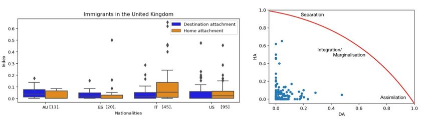
the characteristics of the receiving society, losing the connection to the home country. Marginalisation
refers to a situation where migrants remain distinguishable from both the receiving and home society,
whereas separation refers to complete rejection of host's culture. These theories typically consider
two dimensions: preservation of links to the home country and cultural traits, which we call here home
attachment, (HA), and formation of new links and adopting cultural traits from the country of migra-
tion, that we define as destination attachment (DA). Based on these two concepts, we can summarise the
four integration patterns from the literature, as displayed in Table 6.

Table 3. Theories of integration and their relation to HA and DA

 Low HA High HA
 Low DA Marginalisation Separation
 High DA Assimilation Integration

Through our work we provided a novel method to compute HA and DA from Twitter data, to
answer the following questions: How much do migrants absorb the culture of their destination society? Do they
lose connection with their home country? This is based on the topics that migrants and natives discuss on
Twitter, through the analysis of hashtags. The HA index is defined as the fraction of tweets of a
migrant that discuss topics related to their home country. Similarly, DA is the fraction of tweets
discussing topics related to the destination country. We determine country-specific topics by assign-
ing nationalities to hashtags. These definitions are based on the idea that the topics discussed provide
indications on various aspects of attachment: the amount of information that a person holds about a
specific country, the social links to people living in a certain country, the interest in political and
public issues of a country, adoption of customs and ideas, all related to integration as a wider concept.
 In the rest of this section, we analyse the relationship between the two indices and compare them
to a null model obtained by shuffling the hashtags in our dataset. Second, we study different country-
specific cases, i.e., immigrants in the United States and the United Kingdom, and emigrants from
Italy. More details can be found in our submitted article (Kim et al., 2021, a).

3.3.1 Overall distribution of DA and HA values
The distributions of the home and destination attachment indices are shown in Figure 5. The HA
index is 0.051 on average and the DA index is 0.034 on average for all the migrants we have in our
dataset regardless of the nationality or the place of residence. We observe that some users have rela-
tively high values for the two indices, however the majority are under 0.2 in both cases.
 In the same figure, we compare these values with a null model analysis where the hashtags of indi-
vidual users were randomly re-distributed five times. The null model tells us what the DA and HA
values would be if users chose their topics of discussion randomly, i.e. there was no influence from
the country of residence or nationality. We observe that in general the null model DA0 and HA0 are
smaller than the actual index values, with lower means for the null model distributions.
 To statistically validate the difference between the null model, and DA and HA, we also computed
two non-parametric tests: Wilcoxon and Kolmogorov-Smirnov (KS) tests. The results for the
Wilcoxon test show that for both the DA and HA, their distributions are significantly different from
the distribution of the DA0 and HA0 with p-values of 5.16e-07 and 0.014, respectively. We obtained
similar results from the KS tests, with p-values of 1.18e-51 for DA and 2.98e-56 for HA. Although
not reported here, the results for KS-tests for sub-populations split by country of residence and
country of origin equally show that the null model and the actual index values have different distri-
butions.

 17
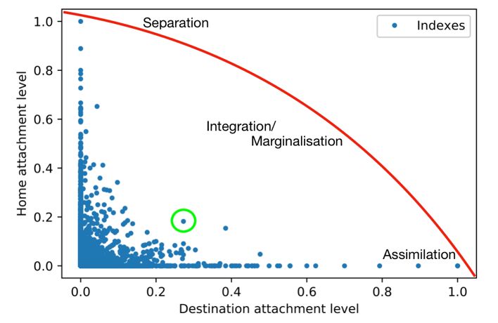
Figure 5. Distribution of HA and DA values, and comparison to null model DA0 and HA0

To understand the relationship between the DA and HA, we computed the Pearson correlation
among them. Figure 6 displays the HA versus DA values for all users. A weak negative relation is
found with r=-0.13, and p-value=6.937e-14, indicating that in general the more a migrant is attached
to his country of origin, the less the migrant is attached to the host country and vice versa. However,
we can observe various different patterns for individual users, leading to different acculturation types
as mentioned in Table 6. In the same figure, the red curve provides an approximate indication of
users' acculturation type. We underline the fact that we do not aim to provide a specific categorisation
of acculturation types in this paper. Instead, we aim to provide a broad picture where the angle of
each individual from the x/y-axis gives us an indication of the acculturation type. Thus, a migrant
close to the x-axis is most probably going through an assimilation process, a migrant close to the y-
axis is undergoing separation, while those in between are undergoing integration or marginalisation.
The distinction between integration and marginalisation depends on the length of the distance of data
point from the origin. In other words, marginalisation is when the data point is close to 0 and inte-
gration is when the data point is point further away from 0. The data point circled in green would be
a good example of an integrated migrant, who keeps good links with both home and destination
country.

Figure 6. HA versus DA for migrant Twitter users

 18
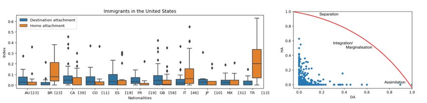
3.3.2 Language as a key factor for integration
One possible candidate factor to explain the DA and HA values observed is language. As previously
studied, language is considered to be a key factor in integration and our indexes reflect this importance
as well.
 In Figure 7 we display the distribution of the DA and HA for two user groups: a group that speaks
the language of the host country (i.e. over 90% of their tweets are in that language) and a group that
very rarely speaks the language of the host country (under 10% of their tweets are in that language).
Here, we are looking at all the migrants we have in the dataset regardless of the country of origin or
the country of residence. We observe that the group that speaks the language of the destination
country shows in general higher DA compared to the non-speaking group, confirming the signifi-
cance of the language for integration in the host country. In addition, we observe that users who do
not speak the language of the destination country tend to be more attached to their home country
compared to those speaking the destination language. Hence, interestingly, destination language pro-
ficiency seems to correlate with both destination and home attachment levels. When comparing DA
and HA within groups, the groups that speak the destination language have the two indices compa-
rable, while for those who do not speak it, HA is much larger than DA, indicating a pattern of sepa-
ration. However, we do not mean to generalise, what we observe are population level patterns. When
looking at individual level, we do observe all four acculturation types discussed in Table 6.

Figure 7. Box plots showing the HA and DA distributions for a group of migrants who speak the
 language of the host country on the left and a group of migrants who do not speak
 the language of the host country on the right*

 * The plot includes only the migrants identified through our method.
 Source

3.3.3 Country specific results
In this section, we provide country-specific results. One of the advantage of using our methodology
is that we can look at different countries simply by changing the labels. Hence, here we look at dif-
ferent country cases to understand how immigrants in a specific country behave and to know how
emigrants from a certain country of origin behave in different countries. We selected three study

 19
cases which had the largest number of users in our data: immigrants in the US and UK, and emigrants
from Italy. Here we consider only the migrant groups with at least 10 users. The square brackets in
the figures below show the number of users we have for each country of origin.

3.3.3.1 Immigrants in the US
In Figure 8 on the left, we observe different destination and home attachment indices of 17 groups
of immigrants from different countries of origin. Overall, we observe that for many groups of immi-
grants in the United States DA is larger than HA. Immigrants from Canada have the highest DA
followed by Colombian and English immigrants. On the other hand, immigrants from Turkey have
the highest HA followed by Brazilian and Italian immigrants. In the right figure, we observe data
points individually on a scatter plot of HA vs. DA. It tells us that immigrants in the US are integrated
and assimilated in general.

Figure 8. Left: box plots for the DA and HA index of immigrants in the United States. Right:
 scatter plot of HA vs. DA indicating approximate integration types for immigrants in
 the US

3.3.3.2 Immigrants in the UK
Figure 9 shows the indices for the immigrants residing in the United Kingdom. Only four groups are
shown, corresponding to those that have at least 10 migrants. Overall, UK immigrants in our data
are more attached to home than to the destination country. On average, the DA is 0.04 and the HA
is 0.063. From the figure on the left, it is clear that immigrants from Italy have the highest HA index.
On the other hand, we observe that immigrants from Australia that share long historical ties with the
UK have the highest DA index. Looking at the figure on the right, we can observe that immigrants
are mostly in the area of marginalisation/integration.

Figure 9. Left: Box plots for the DA and HA index of immigrants in the United Kingdom. Right:
 Scatter plot of HA vs. DA indicating approximate integration types for immigrants in
 the UK

 20
3.3.3.3 Emigrants from Italy
Figure 10 displays the DA and HA indices for Italian emigrants across different countries of resi-
dence. In general, we observe that Italians are more attached to their home country than to their
destination country. Switzerland, Belgium and Netherlands are the three countries where Italian
emigrants are most attached to home. On the other hand, Italians tend to show higher DA levels in
English speaking countries: the US and in the UK. Among the higher DA levels we also observe
Spain, probably due to the language similarity. In the figure on the right, we also observe that Italian
emigrants have higher HA level compared to DA level. This data points indicate that they are in
general close to the separation type of cultural integration.

Figure 10. Left: Box plots for the DA and HA index of emigrants from Italy. Right: Scatter plot of
 HA vs. DA indicating approximate integration types for emigrants from Italy

3.4 Analysis of migrant and native communities
A different type of analysis that our data allows is to study various characteristics of the migrant and
native communities. In the following we compare the travelling and language usage patterns as
extracted from social media, and the level of homophily of social links for each community. Other
more detailed results can be found in our submitted article Kim et al. (2021,b).

3.4.1 Language and country location of Tweets
Tweets provide useful information about user behaviour. We are interested in the locations (country
level) and languages a user employs on Twitter. Hence, we look at the number of languages and
locations that appear in the users’ 200 most recent tweets and computed also the KS statistics to
compare the differences between the distributions of migrants and natives. As shown in Figure 11,
we note that migrants tweet in a wider variety of languages and locations. The two distributions for
migrants and natives are different from each other as the KS tests show low p-values; 2.36e-194 for
location and 1.412e-38 for language.

 21
Figure 11. Distribution of tweet locations and languages

Since we possess network information, we also studied the tweet language and location information
for a user's friends. In Figure 12, the two distributions show smaller differences among natives and
migrants, compared to Figure 11. However, the p-value of the KS test tells us that the distributions
are indeed different from one another, where the p-value for location and language distribution for
migrants and natives are 3.246e-05 and 0.005 respectively. Although the differences are small, we
observe that the friends of migrants tweet in more numerous locations than those of natives, with
average of 29.6 for migrants and 27.4 for natives. However, although the two distributions are
different from each other from the KS p-value, the actual difference between average values is very
small in the case of the number of languages of friends.

Figure 12. Distribution of tweet locations and languages of friends

 22
These numbers indicate that the migrants have travelled in more various places and hence write in
diverse languages than the natives. The friends of migrants tend to have travelled more also. How-
ever, no large differences were observed for the number of languages that friends can write in for
both migrants and natives.

3.4.2 Homophily of social links
We measure homophily of social links by computing the assortativity of nodes by different attributes
of individuals, i.e., migrants or natives, country of residence and country of nationality. We study the
networks of 51,888 users, out of which 4,940 are migrants. Assortativity tells us whether the network
connections correlate in any way with the given node attributes (Newman, 2002). In other words, it
tells us whether the nodes in the network tend to connect with other similar nodes (e.g. migrants with
other migrants, natives with other natives). It typically ranges between -1 and 1. A value of 1 means
nodes always connect with nodes with the same attributes, i.e. full homophily, while -1 means nodes
tend to connect with nodes with different attributes. In our case this analysis allows us to infer
whether and in what measure the network topology follows the nationality or residence of the users,
or whether the migrant/native status is relevant when building online social links.
 We begin with global assortativity measures, which give one assortativity score for the entire net-
work. When looking at the coefficient by the country of residence, the score of 0.54 shows a very
good homophily level. The score improves slightly when we examine the behaviour through the
attributes of country of nationality (0.6). These values tell us that nodes tend to follow other nodes
that share same country of residence and country of nationality, with a stronger effect for the latter.
However, when looking at the coefficient by the migrant/native label, we observe no particular cor-
relation (0.033).

Figure 13. Node level conformity values for natives and migrants. The histograms are stacked

 23
The global assortativity scores are susceptible to be influenced by the size of the data and the imbal-
ance in labels, which is our case especially for the migrant/native labels. Therefore we continue to
examine the assortativity at local level, allowing us to overcome the possible issues at global level. We
thus compute the scores based on an extension of Newman's assortativity introduced by Rossetti et
al. (2021) called conformity. In Figure 13 we show the distribution of node-level conformity of migrants
and natives, for the three attributes (nationality, residence and migrant/native label). We observe
different behaviour patterns for migrants and natives. Specifically, we see that migrants tend to dis-
play lower homophily compared to natives, when looking at the conformity of nodes by country of
residence. This tells us that migrant users tend to consider less the country of residence when follow-
ing other users. Instead, most natives tend to connect with users residing in the same country. When
looking at nationality, this effect is less pronounced. While natives continue to display generally high
homophily, with a small proportion of users with low values, migrants show a flatter distribution
compared to the nationality. Again, a large part of migrants show low homophily, however a con-
sistent fraction of migrant users show higher nationality homophily, as opposed to what we saw for
the residence. This confirms what we observed at global level: there is a stronger tendency to follow
nationality labels when creating social links.
 As for the conformity of nodes by migrant/native labels, we observe that migrants and natives
clearly have distinctive behaviours. While natives tend to form connections with other natives,
migrants tend to connect with natives as well, resulting in negative conformity values for migrant
users. The observed values could also be due to the fact that migrants are only about 10% of our
users so naturally many friends will be natives (from either residence, nationality or other country).
This result is different from what we observed at global level and confirms that the global assortativity
score was influenced by the size of the data and the imbalance in labels.

 24
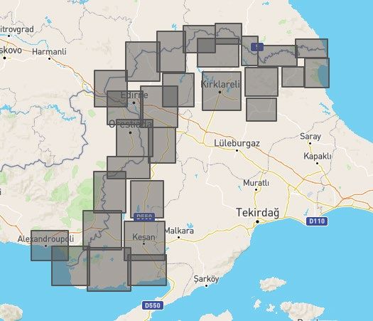
4. Case study: border rush at the Turkish border

On the 27 February 2020, after the death of 33 Turkish troops in airstrikes in Northern Syria, a
Turkish government representative gave a briefing and stated that the refugees will no longer be
stopped at the Turkish borders to Europe, and the doors are opened. 2 This was immediately followed
by movements of thousands of people towards the regional hub of Edirne in northeast Turkey from
where both the Bulgarian and Greek border crossings are easily accessible. In the following days
several declarations have been made by political leaders and media stating that over 100,000 refugees
left the border town Edirne. Despite these and other official declarations, 3 there is no clear picture
of the movement patterns across borders in that period. In this section, we investigate the use of
Twitter to gain knowledge on which migrant groups attempted to cross the border and where they
went. This analysis was not initially planned in the project, but was undertaken as additional research
due to the events in Turkey. The analysis will be integrated with mobile phone data for a joint publi-
cation of work packages 5 and 6 of the project.

4.1 Data
We have collected Twitter data from 25 February to 25 March 2020, using the Academic Track
Twitter API. Specifically, we searched for geolocated tweets at the European Turkish border, using
a set of bounding boxes shown in Figure 14. This resulted in a total of 11,187 tweets, posted by
1,375 users. For these users, we went on to download all their 2020 tweets, resulting in an additional
350,969 tweets.

Figure 14. Area of collection of tweets in the period 25 February-25 March 2020

2 https://www.bloomberg.com/news/articles/2020-02-27/erdogan-chairs-emergency-security-meeting-amid-syria-clashe.
3 https://www.theguardian.com/world/2020/feb/29/erdogan-says-border-will-stay-open-as-greece-tries-to-repel-influx.

 25
4.2 Analysis
We first study the language of the Tweets published in the area of interest in the period 25 February-
25 March 2020. We see a total of 35 languages, demonstrating the cultural richness of the region.
Figure 15 shows the number of Tweets in languages that have more than 10 tweets. We observe that
Turkish, English and Greek are the most common, followed by Indonesian, Arabic and Tagalog
(Philippines). The number of tweets in these 3 last languages are however rather reduced (under 100).

Figure 15. Number of tweets in languages that are most present at the Turkish border

Figure 16. Number of users tweeting in each language present at the border*

 * Only languages with at least 10 users are shown.

Secondly, we look at the number of users for each language, in Figure 16. We observe that the ranking
remains almost unchanged, except for the Arabic language which have less than 10 users present.
This indicates that, even if a large amount of migrants that speak Arabic are present in Turkey, and
were mentioned also by media, their presence is not visible on Twitter. This shows that, for this
particular case study, Twitter may not be representative enough for a thorough analysis. We do, how-
ever, manage to see these migrant groups at the border by using CDR data, which in this case is
richer.

 26
Another question of interest is the destination of the persons observed at the border. In principle,
Twitter could allow for a fine-grained analysis of movements of different groups. However, for pri-
vacy concerns, and given the small number of users present in our data, we simply look at the location
of all users and only at a very coarse-grained spatial resolution. We thus consider all the users seen
on the Turkish side of the border in the initial period (25/02/2020-25/03/2020), resulting in
1,314 users. We then compute the set of users who were seen in Turkey between May and December
2020. The intersection of the two sets counts 972 users, telling us that the majority of users remained
in Turkey. The remaining 342 users were either seen at different locations (34 users in 31 different
countries) or are not present in the data after May. Again, the analysis indicates that the data are not
sufficient for this type of analysis. The number of users present is too small to observe general pat-
terns, and privacy concerns reduce the resolution at which we can study the data.
 All in all, we conclude the Twitter data, for this case, did not provide significant information. The
number of users is very reduced, and the migrant groups that were mentioned by official statements
are weakly represented in the data. Here, CDR data provides an advantage, since some specific
nationalities are better represented, as will be described in deliverables pertaining to WP6.

 27
5. Discussion and conclusion

We have presented two different approaches and one case study to estimate migration stocks through
Twitter data. The first is a top-down approach, where overall immigration levels are estimated
through machine learning applied to features extracted from the entire set of Tweets of a community.
The second is a bottom-up approach that identifies migrant users and then studies the distribution
of migrants of different nationalities in different countries. This type of analysis allows for further
investigation on the communities of migrants and natives, such as integration or social network usage.
The case study is an attempt to investigate border rush in Turkey using Twitter. The analysis uncov-
ered one important challenge of these type of data: lack of representativity for some migrant groups,
due probably to selection bias. In fact, our data includes very limited information on refugee groups
present in Turkey.
 The approaches presented here complement the ones in the literature. In general, exiting works
have looked at national and international flows, studying either residence of users (approximated
through the geolocation similarly to our approach, Zagheni et al. 2014), or language used (Moise et
al., 2016). Our top-down approach is the first, to our knowledge, that attempts to use machine learn-
ing for nowcasting, employing various features extracted from the data. The bottom-up approach,
on the other hand, is the only one that looks at residence and nationality at the same time. This allows
to differentiate stocks by nationality, and therefore perform analyses on the different migrant groups.
It is important to note that what we call nationality may be a concept also related to country of birth,
or even country where a person belongs most to. What our data measures is the social connection to
a specific location, therefore a foreign national fully integrated in a certain country would be indistin-
guishable from a native by our method. Furthermore, the method will not identify those people with
foreign nationality who lived all their lives in a different country (e.g. individuals born in the US,
hence having US nationality, but having lived all their lives in a different country). However, our
intention, is not to identify these cases, since they are already integrated, but migrants who actually
spent a significant part of their life in a country and then moved to another one. For this, we expect
that our method will identify most of the time the correct origin and destination country.
 The work we performed underlined a few challenges regarding these types of novel data sources.
First of all, it became clear to us that the data collection step is not straightforward. While using the
streaming API to download Tweets is simpler, we had to make large efforts to download the network
of users, at a large scale. The difficulties came from the large amounts of requests to be done to the
API, and large amounts of data to be stored. Therefore we found that the data collection step (in the
sense of downloading the Twitter data for further analysis), and the initial pre-processing still requires
specific computer science expertise, and a long time to complete.
 A different challenge that we came across, in the context of studying migration stocks, or migrant
behaviour, is that even if we are in the field of big data, the relevant data resulting after the pre-
processing step could still be reduced, due to filtering out of irrelevant or incomplete data in consecu-
tive processing stages. For instance, the fact that we only work with geolocalised tweets, reduced the
data a lot. The proportion of geo-tagged tweets typically range from 3.17% from the Streaming API
and 1.45% from Firehose (Morstatter & Liu, 2017). This is due to the fact that not all users enable
geolocation. In our case, this was visible in the bottom-up approach, where, even if we started with
over 200,000 users in our core network, we were able to assign residence and nationality only to
approximately 50,000 users, which is a quarter of the data.

 28
One of the most notable challenges for Twitter is that the user population does not represent the
offline population (Zagheni & Weber, 2015), i.e. there is a so called ‘selection bias’. This is partly due
to different Internet and Twitter penetration and regulations in different countries. Also, according
to a survey conducted by Pew research, Twitter population has characteristics that are different from
other social media platforms (Wojcik & Hughes, 2019). In the United States, Twitter users tend to
have more education and higher income than the general public. As for the genders, they are equally
represented on Twitter. When it comes to ethnicity, white ethnicity is prominently present on Twitter.
Although there are studies on demographics of general Twitter users using Twitter data (Mislove et
al., 2011; Longley et al., 2015), studies that focus on migrants are missing in the literature. Therefore,
it is difficult to understand socio-economic and demographic composition of migrants. We can how-
ever understand from these works that young population, age 15 and above, and white ethnicity are
over-represented on Twitter in the United States and in London. Furthermore, it is not clear how the
demographics of those who use geolocation are different from the rest of the Twitter and offline
population. We are therefore facing at least a double selection bias: one into using Twitter, and the
second into enabling geolocation. In our second study, among 50,000 total users, only about 4,900
were labelled as migrants, which is, in the end a rather small sample. We might be undercounting
some migrants groups and overcounting some others. An even larger effect was seen in the Turkish
border analysis. Here, the main migrant and refugee groups were not visible at all, indicating that
those groups do not use Twitter. In those cases, other data types such as CDR, may provide more
information.
 The top-down approach is somewhat less affected by these issues: all tweets of a community are
included, including migrants and natives, and that increases a lot the amount of data that we can base
our analyses on. We expect that to be true also for other types of top-down studies, e.g. evaluation
of sentiment towards migrants, where what we are most interested in the sentiment of natives. Even
so, the native population under analysis still suffers from selection bias.
 A different aspect where there are a lot of open issues is that of privacy and ethics. The terms and
conditions of the public APIs can be at times vague, and may not cover all ethics issues involved.
There have been some attempts to produce ethics and privacy guidelines for using social media data
in research (Townsend & Wallace, 2016; Williams et al., 2017), however they are general and do not
consider the special case of migration research. In this field we are facing a very difficult problem.
On one hand, sensitive personal information such as geolocation and demographics are key to
developing suitable analyses and advancing the state of the art. On the other hand, we are studying
possibly very sensitive groups, hence these pieces of personal information should be protected, both
for the sake of the individual and group privacy. In these conditions, special guidelines are necessary,
including issues on privacy, ethics and legality.
 Currently, most migration research using Twitter data do not publish the data they are based on,
impeding thus replicability, which is one of the pillars of good quality research. We are also unable to
publish our raw data, and we are considering new research directions to investigate anonymisation
and privacy preserving methods for Twitter. Some works exist describing de-anonymising and
reidentification for social graphs (Narayanan & Shmatikov, 2009), social network content
(Henriksen-Bulmer & Jeary, 2016) and geolocations (Yoshiura, 2019; Monreale et al., 2010; Cecaj et
al. 2016). However, a set of widely accepted guidelines and solutions to publishing such data do not
exist. Privacy risk assessment is an ongoing topic (Pellungrini et al., 2017), and further results, espe-
cially related to migration, are needed.
 Overall, the gaps and biases that exist in Twitter data make it difficult for researchers to generalise
their findings to the general population. This also applies to the case of the bottom-up approach.
However, we believe that our methodology could still be useful when limiting the scope to a certain
type of migrants. It enables a rich analysis of the characteristics of the migrant population on Twitter,
as we have exemplified with the home and destination attachment study. This due to the richness of
Twitter data, which includes topics of interest, language and location information, etc. We have

 29
You can also read