Situated data analysis: a new method for analysing encoded power relationships in social media platforms and apps - Nature
←
→
Page content transcription
If your browser does not render page correctly, please read the page content below
ARTICLE
                  https://doi.org/10.1057/s41599-020-0495-3                    OPEN

                  Situated data analysis: a new method for analysing
                  encoded power relationships in social media
                  platforms and apps
                  Jill Walker Rettberg              1✉
1234567890():,;

                  This paper proposes situated data analysis as a new method for analysing social media
                  platforms and digital apps. An analysis of the fitness tracking app Strava is used as a case
                  study to develop and illustrate the method. Building upon Haraway’s concept of situated
                  knowledge and recent research on algorithmic bias, situated data analysis allows researchers
                  to analyse how data is constructed, framed and processed for different audiences and pur-
                  poses. Situated data analysis recognises that data is always partial and situated, and it gives
                  scholars tools to analyse how it is situated, and what effects this may have. Situated data
                  analysis examines representations of data, like data visualisations, which are meant for
                  humans, and operations with data, which occur when personal or aggregate data is processed
                  algorithmically by machines, for instance to predict behaviour patterns, adjust services or
                  recommend content. The continuum between representational and operational uses of data
                  is connected to different power relationships between platforms, users and society, ranging
                  from normative disciplinary power and technologies of the self to environmental power, a
                  concept that has begun to be developed in analyses of digital media as a power that is
                  embedded in the environment, making certain actions easier or more difficult, and thus
                  remaining external to the subject, in contrast to disciplinary power which is internalised.
                  Situated data analysis can be applied to the aggregation, representation and oper-
                  ationalization of personal data in social media platforms like Facebook or YouTube, or by
                  companies like Google or Amazon, and gives researchers more nuanced tools for analysing
                  power relationships between companies, platforms and users.

                  1 University   of Bergen, Bergen, Norway. ✉email: jill.walker.rettberg@uib.no

                  HUMANITIES AND SOCIAL SCIENCES COMMUNICATIONS | (2020)7:5 | https://doi.org/10.1057/s41599-020-0495-3   1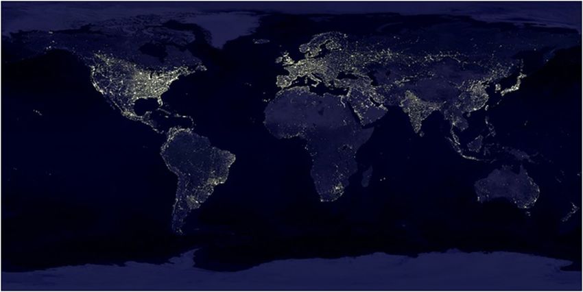
ARTICLE                                  HUMANITIES AND SOCIAL SCIENCES COMMUNICATIONS | https://doi.org/10.1057/s41599-020-0495-3

W
Introduction
             e are all data subjects, constantly sharing data. If you      showing where people run, cycle and swim as well as publishing
             are reading this journal article on the web, the website      annual reports with various graphs and charts showing how
             is likely sending your data to third parties that will use    people in different cities tend to exercise at different times and so
it to tailor advertisements for you. Your phone sends your loca-           on. These data visualisations are intended for human audiences
tion to your service provider, which may anonymize it and sell it1.        and are representations of the data that can be analysed using
Social media platforms analyse your likes and habits to try to             visual methods such as social semiotics (Aiello, 2020), but
make you view more ads or to manipulate you in other ways.                 humans are not the only audience of the aggregated data (see Fig.
Shoshana Zuboff calls this incessant collection and use of per-            1). Publicly released, aggregated Strava data is processed
sonal data “surveillance capitalism”, which she describes as the           algorithmically, by machines, for purposes such as city planning,
“new global architecture of behavioural modification” (2019,                public health research, data-based activism and developing
p. 2). Situated data analysis is a new method for analysing these          navigation systems for automated vehicles and human cyclists
architectures that emphasises how data is always situated, both in         or pedestrians. In these cases, the data is no longer primarily
how it is constructed and how it is presented in different contexts.       representational: it is operational. Operationality is a concept I
I analyse the manipulation and behavioural modification of                  will return to later, but in brief it means that the data does
platforms dealing with personal data as environmentality, a                something through computation rather than showing something
concept recently emerging as descriptive of digital media and              to humans as in a visual representation (Hoel, 2018). Because
developed by Jennifer Gabrys (2014), Erich Hörl (2018) and Mark            Strava situates the same data in different ways, it allows us to
Andrejevic (2019). Environmentality was originally suggested by            analyse the different kinds of power relationships that are made
Michel Foucault in a brief passage at the end of a lecture in 1979         possible by these different situations. When the data is
(Foucault, 2008, pp. 259–260). Environmental power is encoded              operational rather than primarily representational, it shapes
in our surroundings and the infrastructures and technologies we            new environmental forms of power, and actually contributes to
use. While disciplinary power relies on each individual inter-             altering our physical and digital environment.
nalising norms, environmental power alters the environment so
as to promote certain behaviours and make undesired behaviours
difficult or impossible.                                                    Situated data. Many data visualisations are presented as though
                                                                           they are neutral renditions of fact, with a “view from nowhere”.
                                                                           This is what Donna Haraway called “the God trick” in “Situated
Strava. The fitness tracking app Strava provides us with an                 Knowledges” (1988, p. 581). Examining different representations
interesting case because its users want it to record their data, and       or framings of data from a single app highlights the situatedness
because this data is situated, analysed and displayed in a range of        of the “knowledges” and corresponding power relationships that
different ways. Strava is a fitness tracking app that uses location         are presented through situated data and data visualisations.
data from users’ phones to track outdoor exercise such as running             I am introducing the term situated data as a tool to analyse
or cycling. Users allow the app to track their location during a           how the same data can be situated in different ways and how this
run, and afterwards, Strava displays a summary of how fast and             situation is integral to power relationships between users,
how far the user ran, with a map showing the distance run, and             platforms, and ideologies. A fundamental tenet of situated data
statistics comparing performance to the user’s own previous                analysis is the acknowledgement that data is always situated. It is
performance and to that of other runners or cyclists who have              not a given and is not objective, not even when we are dealing
run the same route. Strava produces personal data that aligns with
the individual’s internalised norms, as well as aggregate data that
is used to embed environmental power structures in cities and
infrastructures, for instance by allowing city planners to position
bike paths according to traffic measured by Strava. By analysing
Strava, I develop a situated model of power at different levels of
data collection and use that can also be applied to other platforms
where the data is experienced very differently by the individual
user to the way it is used at an aggregate level by companies and
advertisers.
   As several scholars of self-tracking have shown, users of self-
tracking apps like Strava use them as what Foucault calls
“technologies of the self”: as means for self-improvement
(Foucault, 1988; Sanders, 2017; Depper and Howe, 2017;
Kristensen and Ruckenstein, 2018). In the case of fitness apps
like Strava, this self-improvement is desired and cultivated by the
individual, and aligns with public health goals and societal ideals
of fitness and beauty. In her analysis of the biopolitics of the
quantified self movement, Btihaj Ajana notes that “biopower and
biopolitics are not so much about explicit coercive discipline, but
follow the neoliberal modality of free choice and the promise of
reward” (Ajana, 2017, p. 6). Strava’s multiple levels of data, from
the individual via the nearby to the global, thus become interfaces
between individual self-discipline and normative societal                  Fig. 1 Data situated for different audiences. Data from individual users of
pressures.                                                                 Strava is aggregated and processed for human audiences through data
   Each user’s data is also aggregated. This is made evident to            visualisations that are representational, but machine audiences do not need
users as Strava uses visualisations of the aggregate data in its           visual representations of the data. Diagram designed for this publication by
marketing. Strava maintains a website with a Global Heatmap                Maren L. Knutsen at Overhaus.

2                           HUMANITIES AND SOCIAL SCIENCES COMMUNICATIONS | (2020)7:5 | https://doi.org/10.1057/s41599-020-0495-3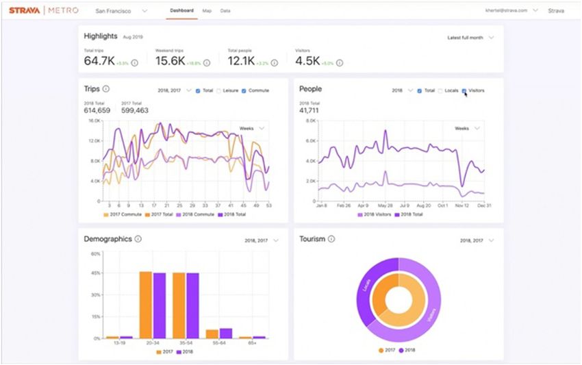
HUMANITIES AND SOCIAL SCIENCES COMMUNICATIONS | https://doi.org/10.1057/s41599-020-0495-3                                       ARTICLE

with immense quantities of data. Data does not provide us with              knowledge generators “have a dynamic, open-ended relation to
an all-knowing, all-seeing, God’s eye view of data. The digital             what they can provoke” (p. 65). Representational visualisations
humanities have shown this again and again, from Lisa                       often leave out information and present statistics as abstracted
Gitelman’s anthology Raw Data is an Oxymoron (2013) to the                  “from circumstance” to avoid “troubling detail” (2014, p. 92). Of
extensive work in feminist, Black, intersectional and postcolonial          course, the troubling detail may often be important factors in the
digital humanities (see for instance Brown et al., 2016; Losh and           actual lives of the people whose data is the basis of the visuali-
Wernimont, 2018; Risam, 2019a). Research on algorithmic bias                sation. Knowledge generators may likewise abstract the “troubling
shows that racial and gender biases are encoded into the datasets           detail” (in fact, this is perhaps the very foundation of any
used for algorithmic prediction (Bolukbasi et al., 2016; Buolam-            visualisation) but for Drucker they are also combinatory, “taking
wini and Gebru, 2018; Eubanks, 2018; O’Neil, 2017), and artists             a fixed set of values and allowing them to be recombined for
and scholars have demonstrated how datasets used in machine                 different uses and purposes” (2014, p. 105).
learning are flawed, misleading and biased (Crawford and Paglen,                Drucker’s distinction has a lot in common with the distinction
2019; Kronman, 2020). Situated data analysis recognises that data           proposed by filmmaker Harun Farocki and developed by artist
is always partial and situated, and it gives scholars tools to analyse      Trevor Paglen between operational images and representational
how it is situated, and what effects this may have.                         images. In “Operational Images,” Paglen explains that “Instead of
   In the following I analyse four levels of situated data in Strava.       simply representing things in the world, the machines and their
The boundaries between levels can be fluid, and other divisions              images were starting to “do” things in the world” (Paglen, 2014).
could have been made. In my analysis I emphasise the source of              This distinction between the procedural or computational or
the data (individual user or aggregrate users) and its intended             operational level of digital media and the representational level
audience (an individual user, humans in general, or machines).              that is seen by humans has been noted before, as Aud Sissel Hoel
The four levels I identify are (1) personal data visualised for the         points out (2018), but Paglen and Farocki’s work demonstrates
individual user and as shared with friends and nearby users, (2)            that even images and artifacts we have not previously thought of
aggregate data visualised for humans, and (3) aggregate data as an          as specifically digital are becoming operational. Hoel calls for a
operational dataset, intended either for human users manipulat-             theory of “operative media” that goes beyond images (2018, p.
ing data through a dashboard showing data visualisations, or (4)            27), and in his book Automated Media (2019), Mark Andrejevic
for machines that process the data to generate new information.             goes some distance in developing such a theory, by combining
Before discussing each of these layers, I will explain the concepts         Foucault’s idea of environmentality with the idea of operation-
of operation and representation and of disciplinary and                     ality. While Andrejevic argues that the operationalism of auto-
environmental power, which are important to the analysis. These             mated media sets them in absolute opposition to representation, I
are not two sets of binary opposites but represent a spectrum.              would argue that the reality is more nuanced than this3. His
After the analysis of Strava, the paper concludes with recom-               connection of operationality with environmentality is very fruit-
mendations for how to perform a situated data analysis of other             ful, though, and I build upon it in this paper.
platforms.                                                                     An app like Strava will always have operational aspects,
                                                                            because the data is obviously computationally processed, but it is
                                                                            fair to say that the primary purpose of the data visualisations as
Operation and representation                                                they are shown to the individual user is representational. The user
Strava uses data visualisations to communicate its data to human            wants to see a representation of their run or bike ride. This is a
viewers, whether individual users looking at statistics and visua-          form of numerical or data-visualised self-representation, a way of
lisations of their latest run, or city planners looking at aggregate        seeing ourselves through technology (Rettberg, 2014). The
data showing how cyclists move through the city. Data visuali-              emphasis shifts from representation to operation when the data
sations are a genre of visual communication that has always been            are aggregated and used for other purposes, such as city planning
closely tied to quantification. The connection between nation                or generating automated route suggestions.
states’ collection of statistical, demographic data and the “golden
age of data visualisation” in the 19th century is well-established
(Friendly, 2008), and data visualisations have often revealed sig-          Discipline and environmentality
nificant patterns that were not evident before visualisation. In his         As Deborah Lupton puts it, “the boundaries between small and
massively influential book Envisioning Information, Edward Tufte             big data are porous” (Lupton, 2016, p. 63). Individuals may not
formulates the fundamental challenge for pre-digital data visua-            really experience their data as being part of a global set. They see
lisations thus: “The world is complex, dynamic, multi-                      their personal data compared to the data of their friends on the
dimensional; the paper is static, flat. How are we to represent the          app, and to the fastest cyclists or runners in their area. But the
rich visual world of experience and measurement on mere flat-                truly big data is global and gives the companies that own the data
land?” (Tufte, 1990). Today’s visualisations of big data present            a great deal of potential knowledge and potential profit. This
different challenges. The abstraction that Tufte describes as               tension between the intimacy of personal data, and the sometimes
occurring between the “complex, dynamic, multidimensional”                  surprising uses that emerge when millions of individuals’ personal
world and a data visualisation today happens at the point where             data is aggregated is at the root of much contemporary anxiety
data is captured. Of course, this was also the case in the “golden          about big data. Clearly, big companies make a lot of money from
age” of statistics, but in contrast to then, many if not most data          aggregating personal data. Detailed information about our per-
visualisations today are automatically generated2. Each individual          sonal preferences and habits is not only used by the apps and
user of Strava sees their own data represented in standardised,             platforms we intentionally use; it is also shared with and sold to
computationally generated visualisations.                                   adtech companies and data brokers. In early 2020 the Norwegian
   Johanna Drucker writes that data visualisations can either be            Consumer Council reported finding that ten apps they tested
representations or knowledge generators: “A basic distinction can           transmitted user data to “at least 135 different third parties
be made between visualisations that are representations of infor-           involved in advertising and/or behavioural profiling” (2020, p. 5).
mation already known, and those that are knowledge generators               Data shared ranged from location, age and gender to highly
capable of creating new information through their use” (Drucker,            sensitive information about sexuality, religion and drug use,
2014, p. 65). Drucker describes representations as static, while            despite such sharing clearly being illegal under the General Data

HUMANITIES AND SOCIAL SCIENCES COMMUNICATIONS | (2020)7:5 | https://doi.org/10.1057/s41599-020-0495-3                                         3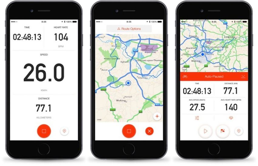
ARTICLE                                    HUMANITIES AND SOCIAL SCIENCES COMMUNICATIONS | https://doi.org/10.1057/s41599-020-0495-3

Fig. 2 Real-time data visualisations. Visualisations of an individual user’s cycling data as shown to the user in the app Strava.

Protection Act (p. 6). The people who use these apps are usually
neither aware of who their data is being shared with or what it is
being used for.
   The concepts of environmentality and environmental power
can be productive lenses for understanding how aggregated per-
sonal data can involve a different kind of power in addition to the
biopolitical and neoliberal control of bodies and population
                                                                              Fig. 3 Personal statistics. A section of a Strava user’s dashboard, showing
through numbers. Environmentality is a concept mentioned but
                                                                              an overview of the frequency and length of their runs in the last 4 weeks.
barely developed by Foucault. At the end of a lecture he gave in
                                                                              Reproduced with permission from Strava.
1979 he described environmentality as a new kind of power that
“appears on the horizon (..) in which action is brought to bear on
the rules of the game rather than on the players, and finally in               black numbers on a white background, with a red button that
which there is an environmental type of intervention instead of               starts or stops the tracking. You can swipe to see a map of where
the internal subjugation of individuals” (Foucault, 2008, p. 260).            you have run or pause to see more detail. As you amass data after
While disciplinary societies use visible surveillance and other               running regularly, you can view visualisations of your running
mechanisms to give their citizens a deep sense of internal dis-               habits on the Strava website, seeing your habits stack up neatly as
cipline that keeps them in line, environmentality doesn’t require             in Fig. 3, or perhaps being disappointed at a more haphazard
individuals to have any normative sense of right and wrong.                   pattern. While you run, Strava uses minimal visualisation, pre-
Instead, the environment is designed in a way that makes certain              senting you with numbers and facts instead: You have run for so
behaviours easy and others difficult. Foucault promises to return              many minutes, your speed is this. Afterwards, you see visualisa-
to this in his next lecture, but does not, however the idea has been          tions comparing your effort both to your own previous efforts, as
taken up recently by several scholars. Jennifer Gabrys argues that            in Fig. 3, and to results from your friends on the app and other
“environmental technologies” in smart cities “mobilise urban                  local Strava users. For instance, when I log a run around the lake
citizens as operatives within the processing of urban environ-                near our house, I pass through two “segments” that have been
mental data” (Gabrys, 2014). So rather than the individual being              defined by other users, and Strava automatically compares my
governed, the individual becomes an “operative” in a larger sys-              performance on these segments to my earlier runs. Last time I
tem. Erich Hörl connects Foucault’s environmentality to Skinner’s             ran, Strava put a little bronze medal icon next to the map of my
behavioural engineering and Gibson’s affordances, both lines of               run to indicate that I had achieved my third fastest time on the
research that emphasise how the psychological or physical                     300 m stretch on one side of the lake. Clicking on this, I could see
environment can be adapted to nudge people towards certain                    my personal record for this stretch, when I achieved it, and how
behaviours. This “radically relational and procedural conception              many “efforts” I had made. A link to the Leaderboards encour-
of environment” (Hörl, 2018, p. 160) is also well-aligned with new            aged me to compare myself to other Strava users who have run
materialist and posthumanist understandings of matter as                      the same stretch. I could view the fastest women, the fastest men,
“vibrant” (Bennett, 2010), technology as having the potential for             the fastest users this year or today, and if I paid for a premium
non-conscious cognition (Hayles, 2017) and the need to under-                 subscription, I could compare myself to even more specific
stand how humans, things and technologies function together as                groups, for instance to other users of my age or weight. By using
assemblages.                                                                  the map of the run as a central visual and conceptual interface to
                                                                              my own and other users’ data, Strava creates a sense of sociality
Level 1: Personal data visualised for humans                                  that is local. The scope of my data sharing feels limited. I can only
Like many self-tracking apps, Strava is designed as an intimate               see data from my friends and from people who live or at least run
companion that the user can confide in, presenting itself as a                 and cycle near me.
trusted diary-like tool (Rettberg, 2018a). The data you see in the               At this level, Strava functions as a technology of the self. The
app when you run is personal (Fig. 2). As you run, you see clean              user chooses to use it, chooses to log their data, and primarily sees

4                             HUMANITIES AND SOCIAL SCIENCES COMMUNICATIONS | (2020)7:5 | https://doi.org/10.1057/s41599-020-0495-3
HUMANITIES AND SOCIAL SCIENCES COMMUNICATIONS | https://doi.org/10.1057/s41599-020-0495-3                                         ARTICLE

their own data. There is no emphasis on the fact that the indi-             collected. Strava sometimes gets the GPS tracking wrong, and it
vidual user’s data is also being shared widely and aggregated,              does not track everything, not even things that it could track and
although the comparisons with friends and with named users in               that could impact a cyclists’ performance, such as the air tem-
the same geographic area establish a sense of immediate local               perature or how well the cyclist slept the night before (Lupton
community, both in terms of geography and personal relation-                et al., 2018, p. 654).
ships. The graphs, comparisons and badges help motivate users,                 Strava sets up very clear goals for its users: go faster to beat
as one of the Strava users in a study by Lupton et al. (2018)               your own records; compete with others to get on the leaderboard
reported: “Then you start to rush because you want to beat your             for a particular segment. Lupton et.al.’s informants described
time. There’s a little graph that they draw [on the Garmin web-             altering their cycling plans in order to do well at these tasks: “Like
site] and you never want to go slow” (p. 659). Visualisations like          on the weekend, on Saturday, there was a bit of an easterly
that shown in Fig. 3 give a sense of aesthetic satisfaction when            coming up in the afternoon when I headed out for a ride… and I
users use Strava regularly, and provide disharmonious patterns              structured my ride around being able to take advantage of that,
for more irregular usage, reinforcing the discipline that the users         and went after a few Strava segments that I hadn’t done so well on
are trying to develop. This of course connects to societial norms           in the past” (p. 656).
encouraging fitness and health, but also the societal norm that                 In summary, the data visualisations Strava users see of their
self-discipline and regular, healthy habits are good in themselves.         own data and their friends’ data support their use of Strava as a
   The Strava app does not invite users to think about their data           “technology of the self”. The social aspects of Strava in particular
as part of a global data-gathering infrastructure, indeed, it could         support a biopolitical form of discipline rather than environ-
be argued that it obfuscates this (Sareen et al., 2020). Rather than        mental control.
the grand scale of global or city-wide visualisations, individual              It is in the comparison of different contexts and situations that
cyclists deal with their own data, seen in the context of their             situated data analysis has its greatest effect, although it is quite
connections on Strava and of the leader boards and the infor-               possible that the method can be applied to just one level with
mation about the fastest cyclists in their area. This mundane data          productive results. The methods used for analysing each level of
(Pink et al., 2017) is presented to the individual user as their own.       situated data will be different, both based on the approach chosen
However, many Strava users are very aware of what data they                 by the researcher and what kinds of access to data are possible on
share with friends and other users and use selective sharing to             different platforms and at different levels. My analysis of the first
negotiate the relationship between themselves and other indivi-             level of situated data in Strava used semiotic analysis of the visual
duals, similarly to users of other social platforms (Kant, 2015). In        interfaces and data visualisations and drew upon published eth-
a study of Strava users’ communicative practices, Smith and                 nographic work on Strava by other scholars. Interviewing users
Treem report an informant telling them about withholding spe-               directly or using other ethnographic methods, such as observa-
cific kinds of data:                                                         tions or diaries would be an obvious alternative, or one could use
                                                                            the walkthrough method to analyse usage of an app with a par-
   “A lot of guys don’t share their heart rate and wattage,                 ticular focus on how data is gathered and situated for an indi-
   because of that, they’ll just share, hey this was my segment             vidual user (Light et al., 2016). Another strategy might be to
   time and this is what my elevation, just the really basic data           analyse how the platform situates data for an imagined or ideal
   to share, but the pros rarely post their heart rate and                  user, and to push against that. Safiya Noble does this when dis-
   wattage” (male, mountain biker, 31) (Smith and Treem,                    cussing Google search results for “black girls”, writing of the pain
   2017, p. 143).                                                           of seeing young black girls confronted with racist and sexist
   The cyclists Smith and Treem interviewed spoke of using their            search results clearly not intended for them (Noble, 2018).
own data as self-validation, but also imagining others looking at           Scholars in Black digital humanities do this when considering the
the data. As one informant told them, “There’s an element of                effects of the digitisation of records of enslaved people (Johnson,
vanity to it, look at me, look at how fit I am.” This rider went on          2018), and critical race scholars do it when analysing encoded
to summarise, “[T]here’s this subconscious thing in the back of             racial stereotypes (Benjamin, 2019) or the ways DNA analyses
your mind where you think someone is looking at your Strava                 reinscribe racial categories (M’charek et al., 2020). None of these
profile” (p. 144). It is easy to make the connection from this to            methods of analysis will tell us everything, but as Haraway
Foucault’s analysis of disciplinary power and the idea of the               reminds us, acknowledging that our knowledge is partial and
panopticon, where citizens behave because they know they might              situated is the closest we will get to objectivity.
be being watched at any moment. This is an example of dis-
ciplinary power rather than environmental power.
   There is also a sense of pleasure in viewing one’s own data. Like        Level 2: Aggregate data visualised for humans
taking a selfie, using a self-tracking app allows individuals to             Strava presents an example of data willingly gathered by indivi-
reflect upon themselves, and to create a self-representation they            duals for their own benefit, but where that data is also used at an
can admire. In a study focusing on how cyclists sense their data,           aggregate level that the individuals have less control over. This
Lupton et.al. found their informants spoke of their enjoyment of            entails particular ethical issues. Roopika Risam recently showed
seeing the numbers:                                                         that when data visualisations showing the flow of migrants into
                                                                            Europe are created from datasets that lack participant involve-
   Tony observed that he enjoyed reviewing the details that                 ment, they tend to dehumanise migrants, framing them as a
   Strava gives him about his rides, including gradient graphs,             problem. Notably, the “othering” of the migrants increased when
   speed graphs, heart rate fluctuation graphs, and “power                   visualisations used existing data, but in cases where the data
   zones,” which provide a calculation based on combined                    visualisers collaborated with migrants about the data and its
   data on heart rate, gradient, and speed. He also enjoyed                 visual representation, the visualisations were less dehumanising
   looking at the dashboard on his Garmin bike computer                     and expressed more empathy with the migrants (Risam, 2019b).
   during his trips so that he could monitor his data in real               Strava users are hardly full collaborators in the way their data is
   time (Lupton et al., 2018, p. 654).                                      collected, aggregated and visualised, but they do have choices in
   This pure pleasure in having data is fascinating. Users were             terms of what data they choose to record and what data they
also aware of the inaccuracies and lacunas in the data they                 choose to mark as private. Strava’s data visualisations of global

HUMANITIES AND SOCIAL SCIENCES COMMUNICATIONS | (2020)7:5 | https://doi.org/10.1057/s41599-020-0495-3                                           5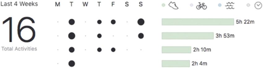
ARTICLE HUMANITIES AND SOCIAL SCIENCES COMMUNICATIONS | https://doi.org/10.1057/s41599-020-0495-3
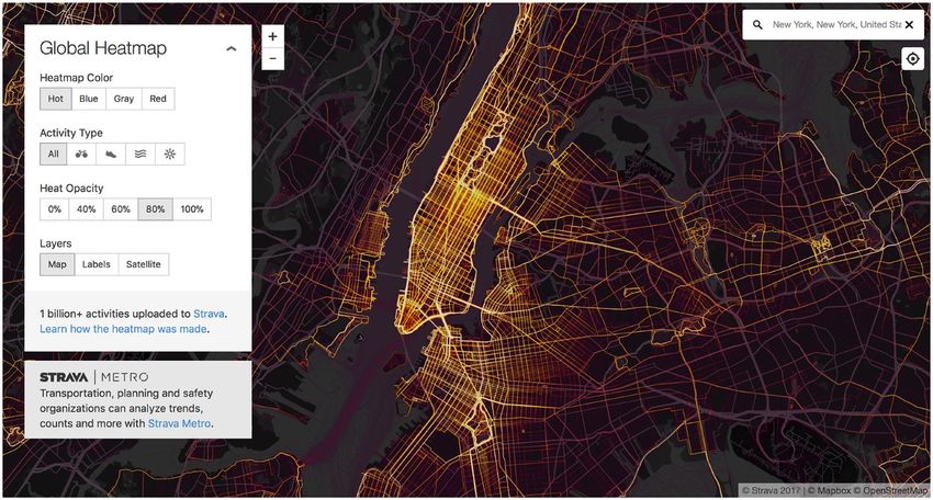
Fig. 4 Strava Global Heatmap. The view of Manhattan visualises the paths taken by cyclists and runners as golden lines on a map of the city.
data have the app users as a main intended audience, providing a about, that we assume directly corresponds to the thing that we
sense of community, much as a range of other personal data are trying to analyse or represent. Proxies do not always tell the
tracking services provide in their annual visualisations of user full story. For instance, when Sendhil Mullainathan and Zaid
activity (Rettberg, 2009). Obermeyer used machine learning to analyse the health records
The data visualisation of aggregate data that Strava promotes of patients who had had a stroke, the system found that based on
the most is the Global Heatmap4, a publicly available website with the data available, having had prior accidental injuries or acute
a world map showing the paths of runners and cyclists as glowing sinusitis or having been screened for colon cancer were among
yellow lines on a dark background. Brighter lines mean that more the statistically valid predictors for later having a stroke
Strava users have used those routes. Part of the Global Heatmap’s (Mullainathan and Obermeyer, 2017). As it turns out, having a
appeal is the thrill of recognition combined with a slight newness. bad cold with acute sinusitis does not actually cause you to have a
We recognise the map of Manhattan shown in Fig. 4, but at the stroke later on. Strokes are not always diagnosed, and many
same time it is different from the maps we are used to seeing, with people who experience a minor stroke do not go to hospital and
its strong emphasis on the central parts of the city, and the strong may never realise that they had a stroke, so, “whether a person
visibility of the irregular shapes of paths in Central Park. The decides to seek care can be as pivotal as actual stroke in
relative darkness of Harlem, just North of Central Park, may be determining whether they are diagnosed with stroke” (p. 477).
due to demographic imbalance in who uses Strava and thus The problem is that health records are incomplete, because
whose movements are visualised rather than actual running and patients do not always go to the doctor, and even if they do, not
cycling activity. As Alex Taylor writes of a similar map of jour- every aspect of their health will be diagnosed. Health records are
neys made on London’s bikesharing network, when we visualise interpretations of reality, rather than pure reflections of it, or, in
“the most common cycle journeys or where the flows are most Mullainathan and Obermeyer’s more medical terminology,
dense” we generate “visualisations that seem to conveniently “Many decisions and judgments intervene in the assignment of
remind us where the wealth flows in London” (Taylor, 2016, a diagnosis code—or indeed, any piece of medical data, including
p. 201). obtaining and interpreting test results, admission and re-
I will analyse the data at this level in two ways: looking at the admission of a patient to the hospital, etc.” (Mullainathan and
data visualisations as representations and looking at how the Obermeyer, 2017). In this case, the existence of data about an
individual user is situated as an anonymous member of a com- injury predicts the existence of data about a stroke, because “both
munity but can also be resituated and deanonymized from are proxies for heavy utilisation patients” (p. 478). Johanna
the data. Drucker suggests that perhaps we should use the term capta
instead of data, to emphasise that data is captured from reality
and is not equivalent to reality (2011). There is no such thing as
Aggregate data as representations. Data visualisations are raw data, as Lisa Gitelman points out (2013).
representations of data, but data is itself a representation, a What are the data and the proxies that are being visualised in
measurement, a proxy for that which the visualisation purports to Strava’s Global Heatmap? Strava’s Global Heatmap visualises data
represent. Representations always situate that which they repre- generated by its users as they track their runs, bike rides and other
sent in a particular way. They are constructions (Hall, 1997, p. 25) activities. The most obvious limitation is that it does not include
that situate reality or fiction in a particular way. Figuring out what data about runners and cyclists who are not using Strava’s
the data actually represents and what is left out is an important software. It also does not include data about Strava users who
step in situated data analysis. have marked their data as private, or about Strava users’
One of the ways data is constructed is by using proxies. We movements inside of areas that they have marked as private.
cannot measure everything, so datasets often consist of proxies. A Sometimes the GPS measurements are off, resulting in faulty
proxy is something that we can measure, or that we have data paths. Sometimes a Strava user forgets to wear their tracker and
6 HUMANITIES AND SOCIAL SCIENCES COMMUNICATIONS | (2020)7:5 | https://doi.org/10.1057/s41599-020-0495-3HUMANITIES AND SOCIAL SCIENCES COMMUNICATIONS | https://doi.org/10.1057/s41599-020-0495-3 ARTICLE Fig. 5 Night Lights 2012 Map. Strava’s Global Heatmap reminds us of images of the Earth as seen from space. Even this “God’s eye view” of Earth, from NASA’s Earth at Night collection, is an example of situated data: it is a visualisation of filtered data gathered over a six month period. goes for a bike ride that is not tracked. Other times, perhaps a situated data visualisation that carefully shows certain kinds of tracker is forgotten on a bus and movements are tracked that data, in this case city lights, as a proxy for dense and were not cycled or run. Other limitations are noted by technologically supported human habitation. The image excludes geographers who want to use aggregated data from the package other data, such as natural lights or information about any Strava calls Strava Metro, which is discussed below, in Level 3. human habitation with fewer electrical lights, as you might see in The geographers cannot analyse individual riders’ habits or a refugee camp or poorer community. Refugee camps might show trajectories, do not have access to the age, gender or socio- up on a night-time image taken from space, but at a far lesser rate economic status of riders, which would be useful for designing than more affluent communities do. Based on studying nighttime better cycling infrastructure, and GPS accuracy is not perfect images from space over time, a group from Refugees Deeply (Romanillos et al., 2016). The demographic imbalance is also estimated that “a 10 percent increase in the refugee population is noted as a problem, as Strava users are predominantly male and associated with a 3.6 percent increase in the nighttime lights affluent (Griffin and Jiao, 2015). Strava’s data is a particular, index within 10 km (6.2 mi) of the camp” (Alix-Garcia et al., situated representation of reality, with clear limitations and 2017). We could say that NASA’s image of Earth is a errors. representation of an operational process of visualisation. The visual rhetoric of a data visualisation also makes certain Strava’s Global Heatmap clearly references the many composite claims about truth. The most obvious design choice in the Strava images we have seen of the Earth at night. It also, perhaps Global Heatmap is to make the exercise paths show up as lights inadvertently, reproduces colonial, Eurocentric maps of the world on a black map of the Earth. Maps that show various features of where Africa was shown as a “dark continent”. Indeed, so do technological adaptation are frequently shown in this style, with NASA’s visualisations, although since NASA is explicitly individual users showing up as lights on a dark globe. The image emphasising city lights as seen in the dark night, their choice of also reminds us of photos of Earth as seen at night from space, colour scheme is at least based on the actual colours of the data with cities visible by their lights (Fig. 5). they are visualising. It is important to remember that even an apparently As Martin Engebretsen notes, the viewers of a visualisation will photographic image, such as that of the Earth shown in Fig. 5 tend to assume that all the visual elements, including colour is actually a data visualisation, and not something that could be choices, mean something (Engebretsen, 2017). The Global seen by a human, even if a human were positioned in space. First Heatmap replicates the aesthetic of heatmaps, coming from of all, it is a composite image assembled from images taken by an infrared vision, perhaps suggesting the Strava app as equivalent to unmanned satellite 6 months apart. Second, the image is not a a God’s eye view from space that can see more than any human simple representation of light that is visible to the human eye. eye. This matches their emphasis of the sheer size of their dataset NASA’s description explains that this series of images used the in press releases (Rettberg, 2018b), and fantasies about big data’s visible infrared imaging radiometer suite (VIIRS), which “detects framelessness (Andrejevic, 2019, p. 113) and lack of a point of light in a range of wavelengths from green to near-infrared.” They view (Feldman, 2019). Situated data analysis instead emphasises also used “filtering techniques to observe dim signals such as city the situatedness of data even when it is presented as immense, all- lights, gas flares, auroras, wildfires, and reflected moonlight,” and encompassing and objective. We can see this situatedness in the because the image is a composite, Australian wildfires that Global Heatmap’s perhaps inadvertent but telling reproduction of happened at different times are all visible simultaneously (NASA, colonial maps, visualising Strava use as light against a background 2012). In other words, the image of the Earth in Fig. 5 is already a of darkness. HUMANITIES AND SOCIAL SCIENCES COMMUNICATIONS | (2020)7:5 | https://doi.org/10.1057/s41599-020-0495-3 7
ARTICLE                                 HUMANITIES AND SOCIAL SCIENCES COMMUNICATIONS | https://doi.org/10.1057/s41599-020-0495-3

Re-individualising aggregate data. The Global Heatmap situates            kind of reverse engineering could be used as a method in itself,
the aggregrate data from all its users as communal. The data is           although one should consider potential ethical and legal issues if
not situated as belonging to an individual user, but as coming            attempting it. In the following we will see how the same data can
from a global community of users who merge together, almost               be used in a more operational mode, and how that leads to more
forming a superorganism of runners and cyclists lighting up the           environmental modes of power.
globe. We imagine a shared humanity collectively creating
glowing lines of light throught the world. Moving through the
map visualisations is a very sensuous experience, and the visua-          Level 3: Aggregate data as an operational dataset
lisations are beautiful, perhaps even sublime (Rettberg, 2018b).          Less visible to ordinary users is “Strava Metro”, a programme
   Big data that comes from people may be anonymised with the             where Strava sells aggregate user data to cities with the slogan
intent to only reveal global patterns, but often the identity of          “Better data, better cities.”5 Although little if any information is
individuals can still be reconstructed. The case of the reidentifica-      provided to users about this programme, the website presents it as
tion of individuals from AOL’s massive data dump of                       a community effort that users are willing participants in: “Our
anonymized searches in 2006 is a frequently cited example of              community actively contributes because they know logging their
this (Barbaro and Zeller, 2006), and Strava’s global data has also        commutes is a vote for safer infrastructure.” Customers can
been traced back to individuals. A couple of months after Strava          purchase access to the data with a web dashboard (shown in
released its 2017 Global Heatmap, Nathan Ruser, a 20-year-old             Fig. 6) allowing them to quickly see where and when Strava users
Australian student of international security and Middle Eastern           are cycling and running in a specific city.
studies, posted a series of tweets showing how the Heatmap                   Here user data is completely anonymized, and individual users
precisely revealed the locations of US army bases in the Middle           can no longer see themselves in the data as they can in the app.
East by showing the exercise paths of Strava users (Ruser, 2018).         The dashboard still provides representations of the data, but the
Looking at the global map you can easily see that most Strava             representations are not the end goal as in the earlier examples.
users come from specific cultures. Europe and North America are            This is operational more than representational. This data is no
densely criss-crossed with tracks, while the Middle East and              longer functioning as a technology of the self. It is still involved in
Africa are mostly black on the map. But if you zoom-in on the             biopolitics and population management, but no longer in a way
Middle East, you’ll see a few lit-up dots. The Norwegian                  that is directly experienced by the individual cyclists and runners.
broadcasting company NRK used Ruser’s idea to identify the                Instead, this data supports an environmental power, as city
individual profiles of European soldiers whose running routes              planners use data from Strava users to redesign the city to
were shown on Strava’s heatmap, although they had to use third            encourage or alter the usage patterns they observe.
party software and feed Strava false GPS coordinates to access the           Uses of Strava’s datasets do not always consider the difference
information (Lied and Svendsen, 2018). Responding to Ruser’s              between Strava’s data and actual cycling, as in an analysis of
tweet about the army bases, twitter user Brian Haugli also noted          cycling in Johannesburg that found only 20% of rides were
that the global map allows you to see the actual homes of                 commutes, but that neglected to consider that Strava users were
individual Strava users, by zooming in to see individual houses           not a representative sample of actual cyclists in Johannesburg
and looking for houses that have short lines connecting them to           (Selala and Musakwa, 2016). This paper cites, without acknowl-
the thicker running paths (Haugli, 2018). By default, Strava users        edgement, on p. 588, a statement that I assume, based on how
automatically share all their location data, but it is possible to        often it is cited elsewhere online, must at one time have been
set all data to private, or to set a “Privacy Zone”, so that no data      published on Strava’s own website, “Strava Metro is a data service
from immediately around your home is shared. Obviously, many              providing “ground truth” on where people ride and run.” But of
soldiers and individuals have not done this, and are probably             course, this “ground truth” is not the whole truth. Ground truth is
unaware that their private data is showing up in global                   an important term in machine learning, but while other fields,
visualisations like this. This is an example of how the way that          such as meterology, can compare their models to the “ground
data sharing is situated to the individual user or data subject at        truth” of weather measurements made on site, the ground truth
one level (e.g. in the app) can be at odds with the way the data is       in machine learning is usually at least one step removed from the
displayed at a different level (e.g. on the Global Heatmap).              “real world”. The ground truth for a machine-learning algorithm
   In summary, we see that Strava’s Global Heatmap is primarily           is the training data set with its labelled data (or in this case data
representational: it is a data visualisation of aggregate data meant      from Strava users), which is itself often biased and non-
for a human audience. The data visualisation is a visual                  representative6. Most cyclists probably do not use Strava, and
representation of the data, and the data itself is a constructed          the cyclists who do use Strava are more likely to be affluent and
and thus situated representation of the reality of users’ actual          male than those who do not use the app. Especially in a city like
exercise patterns. The Heatmap is a rhetorical statement with             Johannesburg, this biased data set can lead to very inequitable
inherent biases, such as the emphasis of areas frequented by              analyses.
wealthy, Western users. In this way the Heatmap enacts power                 Other studies do recognise that Strava data is demographically
much as other forms of representation do: by showing the world            biased. For instance, a robust study on Victoria in Canada that
from a particular point of view it makes implicit claims about            used Strava data alongside geological survey data on slopes,
what is important. It also inadvertently puts individuals at risk by      population data, city data on pavement width, parked cars, and
disclosing their data in ways that are not made clear at other            bicycle lanes, and more, found that there was a linear relationship
levels. Although the Heatmap is presented as a representation of          between crowdsourced data from Strava and manual counts of
immensely rich data, it is situated and limited as all other data.        cyclists in the same locations and at the same times: for each
   Methods that can be used for analysing how data is situated at         Strava user logged, there were 51 actual cyclists on the street
a level where aggregate data is represented to humans can include         (Jestico et al., 2016). This was despite the data showing that 77%
semiotic, visual and rhetorical analysis, explorations of the data’s      of Strava users were men, so not a representative sample of the
provenance and omissions, and could also include ethnographic             population. Similar findings were made in Glasgow, where a
observations or audience studies. I also used media reports and           volunteer pro-cycling advocacy group called GoBike! compared
social media discussions where people have tried to deanonymize           Strava data from Glasgow to roadside surveys of cyclists con-
Strava users based on the publicly available aggregate data. This         ducted by the city, and found that despite 82% of users in

8                          HUMANITIES AND SOCIAL SCIENCES COMMUNICATIONS | (2020)7:5 | https://doi.org/10.1057/s41599-020-0495-3
HUMANITIES AND SOCIAL SCIENCES COMMUNICATIONS | https://doi.org/10.1057/s41599-020-0495-3                                         ARTICLE

Fig. 6 A screenshot of the Strava Metro dashboard for San Francisco, as shown in a demo video for the product (Strava, 2019).

Glasgow being male, Strava data closely matched the manual                     In an overview of trajectory data mining, Yu Zheng describes
count in the roadside surveys (Downie, 2015).                               three common ways of visualising numerical data about the tra-
   To analyse the situatedness of data at a mostly operational level        jectories of people or vehicles through space. First, trajectories can
like this can be more difficult than analysing the representational          be projected onto an existing map, treating the map as a network
level, which is directly accessible to us. My approach here was to          graph in itself, where intersections are nodes and roads are edges
look at published studies by people who have used the data, and             (in a network graph, an edge is the line between two nodes). Then
to view the promotional material made public about the system. If           the data about actual movements on the roads is used to weight
it is possible to gain direct access to the system, another method          the existing edges, so for instance, the thickness or colour of the
might be to test it out, perhaps applying the walkthrough method            roads would be altered according to the speed or volume of traffic
(Light et al., 2016) or using critical code studies (Marino, 2020) or       on them. Second, the trajectories could also be visualised in a
other experimental methods to analyse how the system works. In              landmark graph, where the emphasis is on the trajectories
the case of Strava, researchers might be able to purchase access to         themselves rather than on the conventional map. Here, paths that
Strava Metro data and compare it to data presentation in other              are frequently taken become landmarks and the trajectories
levels of the analysis. A third approach might be to interview              themselves are seen as the network that generate a visual mapping
people who use or develop the system, or the people and insti-              of the area. Third, the map could be divided into regions, and
tutions who purchase the data to understand how they use it.                arrows could show how traffic moves between different regions.
                                                                               Zheng is not very interested in what the network graphs look
Level 4: Aggregate data for a machine audience                              like. His goal is not visualisation, but computation. Transforming
At level 3, Strava Metro data is presented as operational data that         trajectories “into other data structures (..) enriches the meth-
is processed by humans working with machines. Level 4 of my                 odologies that can be used to discover knowledge from trajec-
analysis examines how Strava data is algorithmically processed by           tories,” Zheng explains (2015, p. 24). He does include images of
machines with little human involvement. At this level there is no           two of these kinds of network graph, just as he includes mathe-
need for human-readable representations such as data visualisa-             matical formulas to describe the trajectories in their non-graph
tions and the data leans heavily to the operational end of the              format. For Zheng, as for the computers that process this data, it
spectrum. The example I will focus on is the processing of “tra-            is a pure coincidence that the network graphs are also visually
jectory data”, that is, data about how people or vehicles move              interesting. These almost coincidental visualisations are “images
through space. Trajectory data from apps like Strava can be used            made by machines for other machines”, as Paglen described
as data sets for systems that can calculate the best route for a self-      operational images (Paglen, 2014).
driving car to take from point A to B, given changing traffic                   At this level, the data is primarily operational, and it is not
patterns at different times of the day, or an algorithm could               directly experienced by human users. Instead, the data is used to
predict future traffic and use that to recommend altered traffic              change the environment, for instance by resulting in analyses that
light signalling, different routes for public transport, or the             lead to the physical environment being changed or changing
improvement of bicycle lanes along certain roads.                           municipal allocations to various kinds of infrastructure, or by

HUMANITIES AND SOCIAL SCIENCES COMMUNICATIONS | (2020)7:5 | https://doi.org/10.1057/s41599-020-0495-3                                           9
ARTICLE HUMANITIES AND SOCIAL SCIENCES COMMUNICATIONS | https://doi.org/10.1057/s41599-020-0495-3
impacting the route guidance individual humans may receive Strava’s levels of situated data are more openly accessible than
when planning a route across the city. Perhaps a driver would be many other systems, but it is reasonable to assume that we can see
routed away from roads that were heavily used by cyclists, or a similar patterns elsewhere as well. At the individual level, You-
runner would be given route suggestions that slightly increased Tubers or users of TikTok or Instagram or Twitter learn how to
the distance run in order to encourage greater health benefits. self-brand and create content that is liked and watched by others,
This kind of power is environmental, not disciplinary, and can thus internalising a particular set of norms, though less as a
change behaviour although it may not even be noticed by the deliberate choice than for cyclists tracking their rides on Strava7.
people affected by it. It is also a power not directly wielded by Data about each user’s performance on social media platforms is
Strava, but one that might better be understood as enacted visualised to them through hearts showing likes, or follower
through an assemblage, following Jane Bennett (2010) and other counts and comments, which also make the gaze of others visible
feminist new materialists and posthumanist scholars, which to them. At the aggregate level data about users’ behaviour is used
consists of individual Strava users, the data collected by them, the to promote and recommend certain videos above others, and on
algorithms that aggregate the data, the APIs that make it reusable, many platforms, data is sold to third parties. Like with Strava, this
the algorithms that are used to process it, the apps that provide an aggregate data becomes operational, and is used to extend an
interface for new users (for instance navigational apps) and the environmental power, to “change the rules of the game” and thus
cities or other parties that use it. alter the behaviour of the people whose data was collected.
The increased operationality of the data at this level naturally Situated data analysis requires thinking about how data gath-
makes it less visible to humans, as it is meant for machines to ered by a platform or app is situated in different ways. It can be
read, not for us. That means its effects can be harder to spot using used when analysing a single aspect of a platform, or for a
traditional social science and humanities methods. My solution comparative analysis of the different levels, as in this paper. If
has been to read technical papers to understand how the data can focusing on a single level, a situated data analysis should consider
be used. This allows me to speculate about the environmental how the same data might be situated differently, even if the
effects such uses of data might have, for instance on urban design analysis does not examine each level in depth.
and on the technical infrastructures we use. Other approaches To apply a situated data model to other platforms than Strava,
might be to look for patents filed by the company, as these often a scholar would first identify the different levels of situated data in
include descriptions of how data can be used (see Andrejevic, the platform, based on the source of the data (individual user or
2019, pp. 117–118 for an example), or interviewing stakeholders aggregrate users) and its intended audience (an individual user,
such as developers, urban designers, public health officials, humans in general, or machines). At each level, an analysis
cyclists, professional drivers or residents or homeless people should ask whether the data is presented as data visualisations or
affected by changes in physical and digital infrastructures. other forms of representation for a human audience, or whether
Obviously, no single analysis could do all these things, but an they are instead operational and processed by machines. To
awareness of other possible ways of studying situated data is understand power relationships, a situated data analysis should
central to situated data analysis, because this is a way of consider what power relationships each level emphasises or
acknowledging and reflecting upon how the analysis itself is also makes possible: disciplinary, environmental, or perhaps other
necessarily situated. power constellations. Figuring out what the data actually repre-
sents and what is left out is also an important step in situated data
analysis. Depending on the focus of the analysis, other questions
Conclusion might include what kinds of knowledge are made visible, how the
I have analysed four levels of situated data in Strava: (1) personal data subjects (the Strava users in my example) are presented or
data visualised for the individual user and shared with friends and framed, and who is given access to the data. Is the data presented
nearby users, (2) aggregate data visualised for humans, and (3) as neutral, objective, partial, comprehensive, flawed? Approaching
aggregate data as an operational dataset, intended either for these questions through the lens of situated data analysis allows
human users manipulating data through a dashboard showing for a more nuanced understanding of how massive platforms use
data visualisations, or (4) for machines that process the data to data in different ways in different contexts.
generate new information. All these levels combine the repre- Situated data analysis is explicitly indebted to Donna Har-
sentational with the operational, with operationality becoming away’s insistence that knowledge is always situated, and that an
increasingly important the further the data is removed from the omniscient “view from nowhere” is impossible. The main point of
individual user. Representation is present not only in the visua- a situated data analysis is thus to examine how the data is situated
lisation of the data for human users, but also in the construction and what that means. Situatedness has been used in other scho-
of the data itself. lars’ approaches to digital media, but not in the Harawayian
As the data is situated in a more operational context, the power sense. For instance, Carolin Gerlitz, Anne Helmond, David B.
relations also move towards the environmental. This relates to the Nieborg, and Fernando N. van der Vlist discuss the infra-
visuality of technologies of the self, and to a society where self- structural situatedness of apps, which “involves attending to apps’
discipline is normalised partly through a knowledge that others relations to one another and to other things, practices, systems,
may be watching us at any time. We use data visualisations of our and structures”. They continue by noting that “not only are apps
personal data, like those we see in the Strava app, as self- situated in a technical or material sense, but also they are situated
reflections that allow us to improve ourselves. We are aware of in an economic and institutional sense and can be related to other
what aspects of our personal data we share with others, and we objects, devices, systems, infrastructures, clouds, and environ-
compare our own metrics with those of others that are made ments, both by humans and nonhuman actors” (Gerlitz et al.,
visible to us. Strava Metro, on the other hand, is de-individualised 2019). This is clearly relevant to a situated data analysis, but the
and more operational than representational. Here the users are object of analysis in a situated data analysis is the data rather than
not situated as subjects seeing themselves and each other but as the app. Even more importantly, while Harawayian situatedness
sensors feeding data into a larger system. In such an operational can encompass relationality, as in Gerlitz et al.’s approach, it also
setting, power becomes environmental. Analysing the data allows contains a strong argument against the idea of “disembodied
cities to change the environment, and thus change the behaviour scientific objectivity” (Haraway, 1988, p. 576), which has been
of residents. echoed in José van Dijck’s critique of dataism, which van Dijck
10 HUMANITIES AND SOCIAL SCIENCES COMMUNICATIONS | (2020)7:5 | https://doi.org/10.1057/s41599-020-0495-3You can also read