Style Guide - Valid until August 1, 2020 - UAB

Page created by Max Salinas
 
CONTINUE READING
Style Guide - Valid until August 1, 2020 - UAB
Style Guide - Valid until August 1, 2020
Style Guide - Valid until August 1, 2020 - UAB
table of contents
                       Our Guidelines            4

                                    Logos        6

                                     Color 16

                            Typography 20

                All logos and artwork shown in this manual are the property
              of the University of Alabama at Birmingham, and artwork may
                                not be used without prior written permission.

2                                                                               3
Style Guide - Valid until August 1, 2020 - UAB
Logos, colors, fonts and photos are important signals.

    guidelines   They tell both prospective and current students,

                 faculty and staff that every school and unit on campus

                 is part of a larger mission: One university inspiring

                 and empowering the creation of knowledge

                 that changes the world.

4                                                                         5
Style Guide - Valid until August 1, 2020 - UAB
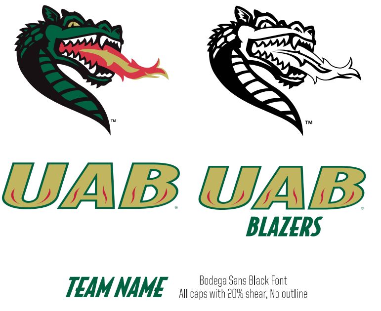
logos   This section covers the usage of the master logo, its construction and the

            variety of layouts available to you. If you need something further defined

            please reach out to University Relations.

                                       MONOGRAM & LOGO

                                       C L E A R S PA C E

                                       MINIMUM SIZING

                                       L I M I TAT I O N S

                                       OTHER MARKS

                                       AT H L E T I C S M A R K S

6                                                                                        7
Monogram

                                                                                                       Monogram                      Wordmark

                                                                                                                                                                                                     Wordmark

    the monogram                                                                                                  anatomy of the mark
    The UAB monogram alone has a very visible presence and on occasion may be used alone for special              This preferred logo incorporates two graphic elements: the UAB monogram and
    applications when space is limited, such as signage or small promotional items.                               “The University of Alabama at Birmingham” as the wordmark.

    All UAB logos are registered trademarks and should be used with trademark registration, with the                  • The wordmark should always appear as Avenir LT Standard 85 Heavy ALL CAPS.
    exception of digital spaces, letterhead/business cards and signage.
                                                                                                                      • It is preferred that the logo appear as two-color: the monogram is Pantone 3425 and the
                                                                                                                        wordmark in black. Other color variations include one color black or white.

                                                                                                                      • SCHOOL LOGOS: We would prefer the use of the entire logo with the wordmark to help establish
                                                                                                                        our brand nationally, but recognize that in some instances, schools within UAB will want to
                                                                                                                        promote themselves. In this case, we are offering school logos with a wordmark lockup so the
                                                                                                                        entire university name is always present.

    “DESIGN I S S O S I M PL E , T H AT ’ S WH Y I T I S S O COMP L ICATE D.”

                                                                                     — PAU L RA N D
                                                                                                                                                                            The University of Alabama at Birmingham

8                                                                                                                                                                                                                      9
spacing

          A.

                                                                                                                              120px                                    16px

     B.
                         spacing
                                   logo white space                                                                minimum size
                                   The importance of clear space around brand elements and throughout              For readability, scale needs close attention.
                                   all layouts cannot be overstated. It adds confidence and clarity to the
                                   visual messaging. The more space, the better. These visuals are used to         A. MASTER LOGO
                                   define minimums.
                                                                                                                   The logo should never be reduced below 90 pixels wide.
                                   A . S PA C I N G F O R L O G O
                                   The logo should be surrounded on all sides by clear space, no less than         B. MONOGRAM
                                   one-half the height of the UAB monogram. Do not print graphics, rules,          The mark can be reduced down to favicon size (16px by 16px).
                                   typography or other elements in this area.                                      In print and other use cases it’s recommended that the size not to be
                                                                                                                   reduced below 1/2-inch.
                                   B . S PA C I N G F O R M O N O G R A M
                                   For the mark, the minimum clear space allowance should be equal to half
                                   of the mark itself. Repeat the scale of the mark around it, regardless of the
                                   scale per circumstance.

10                                                                                                                                                                                         11
inappropriate usage

         A . C H A N G E T H E O R I E N TAT I O N        D. CHANGE THE COLOR
         OF THE MARK                                              OF THE MARK

         B. STRETCH                                        E . P U T “ F U N ” L AY E R
         F O R M S T O F I L L S PA C E                EFFECTS ON ANY VISUAL
                                                              B R A N D M AT E R I A L S

         C . R O TAT E T H E M A R K                 F. O U T L I N E T H E LO G OT Y P E

12                                                                                          13
university seal and secondary logos                                                                   athletic marks
                                                    The logo incorporates two graphic elements: the UAB monogram and               The UAB primary athletic logos are the preferred marks to represent UAB
                       ALABAMA
                    OF         A                    “The University of Alabama at Birmingham” wordmark.                            athletics. The two primary logos can be used interchangeably, and they
               TY
                                      T                                                                                            should be used in strict adherence to the identity guidelines in this manual.
               SI

                                      BIR
         UNIVER

                                         MINGHAM                                                                                   It is greatly preferred that the full- or two-color primary logos be used
                                                    THE UNIVERSITY SEAL                                                            whenever possible.
                                                    The university seal is a registered trademark reserved for official and
     THE

                                                    ceremonial uses only, as determined by the Office of University Relations.
                                                                                                                                   A. BLAZE HEAD
                                                    Examples include diplomas, legal documents, commencement programs,
                         19 6 9                                                                                                    The Blaze head logo is not allowed to be facing left. This mark must face
                                                    policy manuals, formal invitations, certificates and awards.
                                                                                                                                   right at all times.

                        AM
                             | TH
                    H             E
                                                    T H E U N I V E R S I T Y W AT E R M A R K                                     B . AT H L E T I C S W O R D M A R K
         G

                                      U
      N

                                          NI

                                                    The university watermark is a registered trademark and can be used when it     The vertical version allows for easy use in applications that limit available
     BIRMI

                                          VERSITY

                                                    isn’t appropriate to use the university seal.                                  width for display of the logo.
      AT

               A                      O
                                  F
                    ALABAM
                                                    UAB MEDICINE
                                                    UAB Medicine is the name and primary brand for the clinical facilities and
                                                    services provided (hospital, clinics, patient care) by UAB. UAB Medicine has
                                                    its own brand, similar to but separate from the rest of UAB.

14                                                                                                                                                                                                                 15
This section covers the usage of our color system,

             the print and web specifications, and some simple visual guides.

     color

16                                                                              17
color palettes
AaBbCcDdEeFfGgHhIiJjKkLlMmNnOoPpQqRrSsTtUuVvWwXxYyZz
AaBbCcDdEeFfGgHhIiJjKkLlMmNnOoPpQqRrSsTtUuVvWwXxYyZz   This section covers the usage of our typography system.
AaBbCcDdEeFfGgHhIiJjKkLlMmNnOoPpQqRrSsTtUuVvWwXxYyZz   Because of the simplicity in our brand, type plays an important

AaBbCcDdEeFfGgHhIiJjKkLlMmNnOoPpQqRrSsTtUuVvWwXxYyZz   part. If you need something further defined please reach out to

                       typography
AaBbCcDdEeFfGgHhIiJjKkLlMmNnOoPpQqRrSsTtUuVvWwXxYyZz   University Relations or your school’s Communications Director.

AaBbCcDdEeFfGgHhIiJjKkLlMmNnOoPpQqRrSsTtUuVvWwXxYyZz          P R OX I M A N OVA

AaBbCcDdEeFfGgHhIiJjKkLlMmNnOoPpQqRrSsTtUuVvWwXxYyZz          K U LT U R I S TA

AaBbCcDdEeFfGgHhIiJjKkLlMmNnOoPpQqRrSsTtUuVvWwXxYyZz
0123456789!@#$%^&*0123456789!@#$%^&*01234567890
 20                                                                                                                      21
proxima nova
                                                                     Aa
                                                                     AaBbCcDdEeFfGgHhIiJjKk   kulturista
                                                                                                                                                             Aa
                                                                                                                                                             AaBbCcDdEeFfGgHhIiJjKk
     Mark Simonson designed Proxima Nova in 2005, a
     face combining modern even-width proportions with a
                                                                     AaBbCcDdEeFfGgHhIiJjKk   Kulturista is a distinct linear typeface with sturdy serifs.
                                                                                              Created by Tomáš Brousil in 2009, the lopsided serifs of
                                                                                                                                                             AaBbCcDdEeFfGgHhIiJjKk
     somewhat geometric appearance. Initially created as
     Proxima Sans in 1994, it was re-released with many more         AaBbCcDdEeFfGgHhIiJjKk   round strokes prevent serifs on a single line of text from
                                                                                              interfering with each other and they become a significant      AaBbCcDdEeFfGgHhIiJjKk
     weight and style variations after Simonson saw a growing
                                                                     AaBbCcDdEeFfGgHhIiJjKk
                                                                                              feature of the alphabet. The font is a display typeface
     opportunity for geometric fonts. Released on Adobe
     Typekit, the font is affordable and easily accessible for any
                                                                                              well suited for use in editorial design or as a basis of a
                                                                                              corporate style.*
                                                                                                                                                             AaBbCcDdEeFfGgHhIiJjKk
     designer with Adobe Creative Cloud.*
                                                                     AaBbCcDdEeFfGgHhIiJjKk   WEIGHTS                                                        AaBbCcDdEeFfGgHhIiJjKk
     WEIGHTS

     The full set contains 16 weights.
                                                                     AaBbCcDdEeFfGgHhIiJjKk   The full set contains 10 weights.
                                                                                                                                                             0123456789!@#%^&*
                                                                     AaBbCcDdEeFfGgHhIiJjKk   *SOURCE: SUITCASE TYPE FOUNDRY

                                                                     AaBbCcDdEeFfGgHhIiJjKk
     *SOURCE: MIC PRODUCT BLOG

                                                                                                                           TYPEFACES DO MOR E TH AN SPELL WOR DS. USED CONSI STENTLY, TH EY
                                                                     0123456789!@#%^&*                BE COME IMAGES OR SYMB OLS FOR OUR B R AND AND DEMONSTR ATE I TS ESSENCE.

22                                                                                                                                                                                            23
University Relations
     205.934.9430 | creative@uab.edu

24
You can also read