The essential science of climate change - Matthew Pye - Cut 11 Percent
←
→
Page content transcription
If your browser does not render page correctly, please read the page content below
Matthew Pye

  The
essential
 science
of climate
 change.
    No Common Sense
-3-
Colophon

‘Plato tackles climate change.’
Author: Matthew Pye
Guest Authors: Carolina Teixeira & Jules Pye
(from the ‘Climate Academy’)

ISBN/EAN: 978-9-08-310150-7
Published by Matthew Pye
Copyright ©2020 Matthew Pye
First edition, September 2020.

Facts & Science: Homo Sapiens Foundation
Birgit van Munster and Michael Wadleigh
(ourfutureuncompromised.org)

Cover Design: Stijn van der Pol (w7b14.com)
Proofreading: Sean O’Dubhghaill, Anthony Swallow and Moira Cronin
Design: thisissaf~ (thisissaf.com)
Cartoons: Carl Jonsson (carl-brink.com)
Photography: Katriina Surquin (katriinasurquin.com)

All rights reserved. No part of this publication may be reproduced or transmitted by any means, electronic,
mechanical, photocopying or otherwise, without prior permission of the publisher. Graphs & Photography:
All image sources and credits are listed in the image index at the end of the book, unless the original source
could not be tracked. In case you find a copyrighted image, please let us know.

Chapters Eight & Nine from

  Plato
courage
tackles
climate
change.
       Matthew Pye

            -1-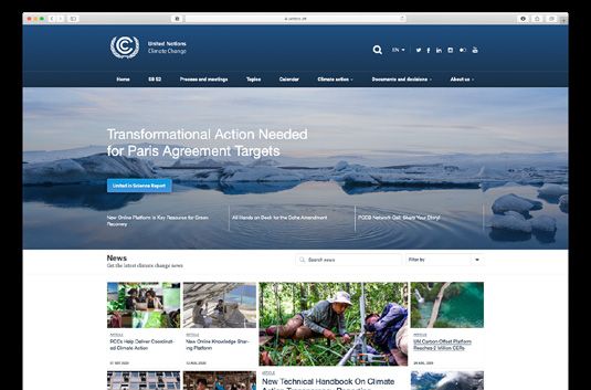
science
Chapter Eight

                  The Science of
                  Climate Change

                             Introduction

There is little point mobilising different philosophers to examine climate
change if the basic scientific facts are not right. Getting the evidence
straight is critical, any book on climate change must be written on a firm
scientific base.

Due diligence with the empirical data and the latest conclusions of
mainstream science avoids two dangers: It prevents us from being too
casual about the severity of the crisis we are in, and it prevents us from
undue alarmism.

This chapter summarises the key points of climate science in a step by step
way. All the analysis is rooted in the latest research and data, and without
compromising that, it hopefully breaks everything down into language
and metaphors that can be readily understood.

This is how our boom can go bust, according to climate science.

                                    -3-
The size of this bust is important.
What is at stake in our climate crisis is monumentally big. It is neither the
kind of bust that might happen in an economic cycle, or even during a
global recession, nor is this a bust equivalent to the Bronze Age Collapse
or the Fall of the Roman Empire. The type of collapse that could happen
will dwarf such events. This is because we have a global population
that now stands at over 7.8 billion, and it is because our societies are so
interconnected at every level. Moreover, it is not just human societies that
may collapse, but entire ecosystems; it will not only affect humans, but all
other species too and it is irreversible on human timescales.

It is a bust of massive proportions.

The strength of the science is important.
For anyone who has not yet had the key scientific conclusions explained
to them in a clear way, all of this strong language will seem somewhat
overcooked. Foreseeing the possible collapse of human civilisation as we
know it would normally commit a book to the science-fiction section of
bookstores and libraries. Yet, regrettably, we are currently on a pathway
towards around 4°C by the end of the century and the conclusions of
mainstream science are emphatic. We are moving deeper into a minefield
of formidably dangerous trigger points, and the range of disruption and
suffering that this will cause to human beings will be unacceptable.

However, it is still possible to avoid this crash, there remains a narrow
pathway out of the crisis. Moreover, if we could use our common sense
to make the right choices, right now, then we would not only dodge the
wrecking ball, but we would also surely gain a much richer life. The status
quo is reducing the biosphere’s astonishing, diverse beauty down to a world
of cattle and cats, cornflakes and coke. It will be hard to save our social body
from muscle atrophy as our senses feed off the vividness of a digital screen.
Yet, there is so much to win by resetting our priorities and recovering our
common sense.

                                       -4-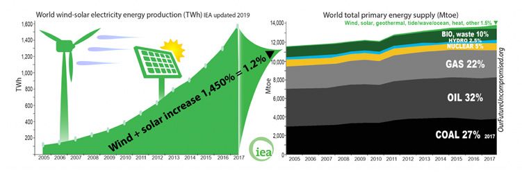
We need to understand the science to do this; literally, we need to under-
stand. We need the humility to accept that there are laws of physics and
chemistry that govern us. This humility will serve us well in how we go
about the imperative changes to our systems and lifestyles. If we manage
to dramatically reduce our emissions, then it could also mean that we will
be living in a healthier, more just society too.

This chapter is about understanding the key aspects of that science.

                        The Absolute Basics

Global Heating
A rise of 2°C average global temperature might not sound like a big deal,
but anyone who has had a fever for a few days at 39°C will know how
lethargic and grumpy it can make human beings feel. Moreover, doctors
inform us that if an elevated temperature is not treated for several weeks,
then vital organs can start to break down. A 4°C rise for humans is a
medical emergency; vital organ damage occurs and death will follow if
the temperature is not lowered. It is called hyperpyrexia.

All life has similar difficulties with movements in temperature outside
of their tolerance zone. The parallel between ecological systems and the
human body is only a metaphor, given that different organisms experience
heat stress differently. However, it gives a good approximation of the
deadly consequences that await human civilisation that we are on track to
lock-in by the end of this century.

                                    -5-
It is crucial to not underestimate the dangers of escalating levels of
greenhouse gases in the atmosphere. In 2019, global average temperature
was 1.1°C higher than the pre-industrial level; this is consistent with a
warming trend of 0.2 °C per decade. Since 1980, each decade has been
warmer than any preceding one since 1850.1 The six warmest years on
record have all been in the past six years. It is possible that 2020 has set
a new record with 54.4°C (!) being recorded in the USA.2 Indeed, rising
temperature is one marker of climate change, there are many others:
rising sea-levels, melting ice, extreme weather events (heat waves, floods,
droughts, storms) and wildfires. These markers lead to decreased food
security and water availability, increased migration, dramatic changes
in ecosystem, decreased biodiversity, health hazards and reductions of
economic growth (especially in low developed countries).3
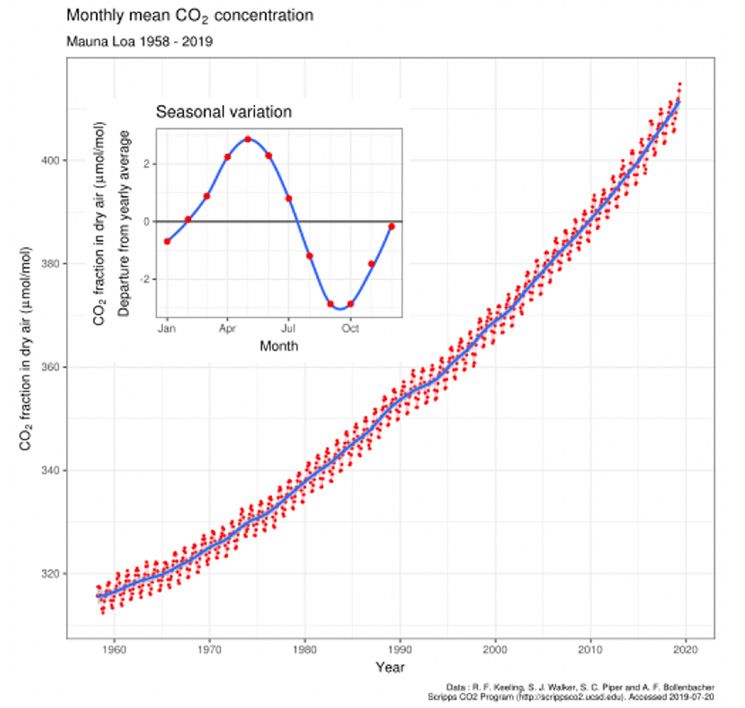
Greenhouse Gases
Science has known of the greenhouse gas effect since 1824, through the
work of French physicist Joseph Fourier. In 1856, Eunice Foote provided
the first key chemical details of this effect when she established that H2O
and CO2 trap heat.4
Modern science can measure, in a remarkably precise manner, which
particles make up the atmosphere above our heads. Since 1958, the Mauna
Loa Observatory in Hawaii has been measuring the concentration of
atmospheric molecules, expressed as parts per million (ppm) or billion
(ppb)5 (the number of molecules of a gas per million/billion molecules of
dry air).
1 World Meteorological Organization: Statement on the state of the global climate in 2019.
2 National Ocean and Atmospheric Administration: State of the Climate (August 2020)).
3 World Meteorological Organization: Statement on the state of the global climate in 2019.
4 Foote E., “Circumstances affecting the Heat of the Sun’s Rays”. Read before the American Association,
August 23d, 1856. It is common to credit John Tyndall for this discovery, but his lecture to the Royal
Society lecture was delivered 3 years later on June 10th, 1859.
5 The number of molecules of a gas per million/billion molecules of dry air.
-6-This data has been plotted onto a graph known as ‘The Keeling Curve’,
so named after the scientist Charles David Keeling, who set it up. The
Mauna Loa reading at the time of writing signalled that there were 414
particles of CO2 in every million (414ppm).6 Nitrogen (N) makes up over
three-quarters of the rest with 780,900ppm, alongside Oxygen (O) that
occupies 209,500 ppm.
6 Monthly average July 2020, 1.5 ppm higher than July 2019.
Source: https://www.esrl.noaa.gov/gmd/ccgg/trends/monthly.html
-7-Although 414 parts per million7 does not sound like a lot, a carbon reading
of 414 ppm informs us that we have bumped up the level of CO2 by 46%
since the start of the Industrial age.8
This is a concentration of CO2 that is unprecedented in around 4 million
years and when geologists look back in time to previous epochs that had
the same levels of CO2 they do not see a world which is compatible with
human civilisation as it is now: “Current levels of CO2 correspond to an
equilibrium climate last observed 3-5 million years ago, a climate that was
2-3°C warmer than today, and sea levels that were 10-20 m higher than
those today.”9
It will take us into an utterly alien world for our species. This is a kind of
situation that is very hard for us homo sapiens to wrap our heads around.
NDAA Climate.gov Data: NCEI
7 To be exact, the global average for 2019 was 410ppm. The 414ppm that
was measured in Mauna Loa is a reading taken at a particular moment in
the annual zig-zag of concentrations caused by the four seasons.
8 These figures do not include the other greenhouse gases like
methane (CH4), nitrous oxide (N20) and halogens.
9 World Meteorological Organization Greenhouse Gas bulletin 2017.
-8-The climate has been so temperate and accommodating in the past. It
is hard to imagine that it could switch so dramatically to become such
a dangerous enemy. Indeed, human beings have just experienced an
unusually balanced climatic period known as the ‘Holocene’ that lasted
from 11,700 BCE until the modern day. This calm interglacial pocket of
time provided the favourable conditions that helped Neolithic homo-
sapiens to grow up, and it served as the background for our more
immediate ancestors’ development in the Bronze and Iron Ages.
Looking over the shoulder of the people in the Holocene, and observing
the climate for those hominoids who lived in the last 800,000 years of
the Palaeolithic Age, we can see that things appear to be more turbulent.
With this wider zoom we can see the effects of planet Earth’s slowly
drifting patterns of orbits, spins and wobbles (more eloquently known as
the Milankovitch cycles). Yet, even when these huge rhythmic pulses are
examined throughout this age, the level of CO2 was entrenched in a stable
range of between ~180ppm and ~280ppm10. Therefore, a reading of over
410ppm is not a historic level; it is a profoundly prehistoric level.
Throwing our whole ecological system out of its long-entrenched
equilibrium is unimaginably foolish. The entire biosphere that we are
part of has evolved over millions of years into forms of life that are
perfectly adapted to this current environment. Anthropogenic climate
change is happening at breath-taking speed, 0.2°C per decade, and it is
accelerating.11 This is about 20 times faster than the average rate of ice-age
recovery warming.12 Many species’ ability to adapt will be vastly outpaced
by climate change.
10 World Meteorological Organization Greenhouse Gas bulletin 2017.
11 Intergovernmental Panel on Climate Change, Global Warming of 1.5°C (2018) Executive Summary
12 Nasa Earth Observatory: “As the Earth moved out of ice ages over the past million years, the global
temperature rose a total of 4 to 7 degrees Celsius over about 5,000 years.” That is about 0.008 to
0.014°C per decade; in other words, current climate change is 14 to 25 (average 20) times faster than
the average rate of ice-recovery warming.
-9-The graphs are vertiginous. It is like suddenly doubling the voltage on
the power supply to your laptop on which you have all your work, family
photos, bank account details and personal files stored. Why would you
wilfully do that, especially when there is no back up?
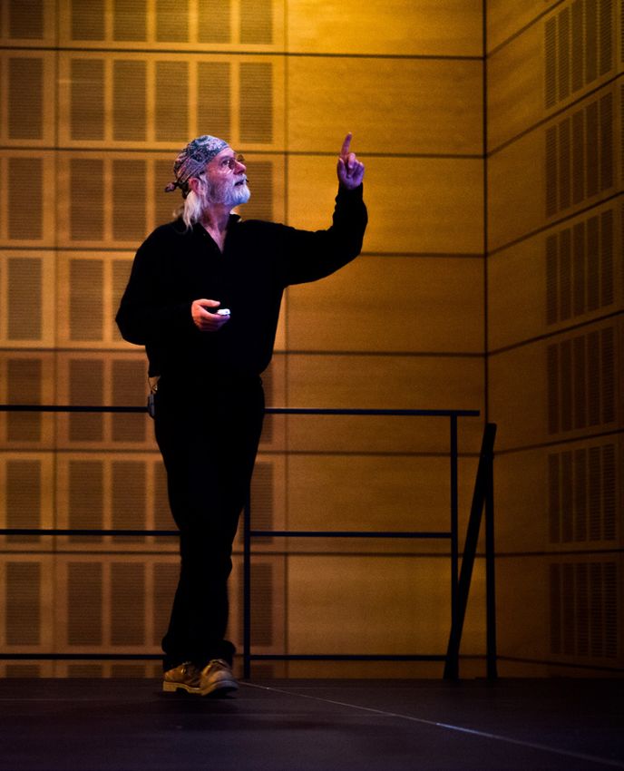
Image 1. - Michael Wadleigh speaking at the European School Brussels II
- 10 -No Common Sense
Why is such a fundamentally important reality so far from our common
sense?
Millions of people have an awareness of climate change, but far fewer are
aware of how radically dangerous it is at a systemic level. This lack of
understanding makes it possible for people to think and act as if more
recycling, eating less meat, reduced flying and a reduction of single use
plastics are anywhere close to the level of change that is required.
1. Christmas Turkey Syndrome
Spare a thought for the Christmas turkey.
He has been fed so regularly and diligently all year by the farmer; he
cannot imagine when he hears the shake of the grain bucket on December
24th that things are going to turn out so badly after breakfast.
Likewise, it is truly difficult for us humans to imagine a different set of
coastal maps from the ones that we have all grown up with. It is hard to
imagine a whole city going under water because it all seems so concrete.
Surely geologists deserve more screen time; it used to be cool to be a
geologist in the 19th century, now we tend to think of them in the same
kind of category as the fossils that they study and collect. Geologists
should garner the respect and the attention that they deserve to make it
clear to us that planet Earth can look radically different from what it looks
like today.
It was only ‘yesterday’, in geological terms (c16,000BC), that Doggerland
was the one of the busiest hunting grounds in Europe, with grazing
mammoth, herds of deer and the odd prowling lion. Today, it is under
about 30 meters of water, and it is only really of interest to fishermen who
- 11 -tune into BBC Radio 4 for the Shipping Forecast. Geologists can describe
landscapes and climates that are unimaginably alien to us if we really spin
the dial of time back on the globe.
We have been pumping these greenhouse gases into the atmosphere for
over 200 years and the effects of doing so seem to have only invaded our
awareness with intermittent extreme weather events. It would be easy to
think, especially in the technologically advanced Western world, that the
problem was not so serious. Rather like the COVID-19 virus, the problems
of climate change will express themselves with the most damage rather
later than the moment at which the problem was established.
To casually imagine that nature will remain essentially favourable to human
life is deeply negligent, both of the geological past and of those who have an
interest in its future.
2. The difference between a tree and a forest
Climate change is a truth that is essentially non-sensory. The climate can
only be seen in scientific graphs. By contrast, we sense the weather because
it blows in our face, chills or warms our bodies and gets our clothes wet.
The weather happens to us. The distinction between the weather and the
climate is very important. It can be made clear by simply thinking about
the difference between a tree and a forest.
When you are in the middle of a forest you can only see the trees around
you; each tree is like a weather event. By contrast, the whole forest remains
out of sight. Not only can you not see the trees hundreds of miles away, but
the forest has been around for hundreds, thousands or perhaps millions
of years. The forest, in this fullest aspect, is like the climate. One dead tree
does not signify anything about the forest, you need to be able to look at
the bigger picture. One flood or storm, one cold or warm winter, does not
signify anything about the climate. You need to have much deeper and
wider data to be able speak scientifically.
- 12 -Fudging the difference between the climate and the weather is a common
tactic used by sceptics to undermine the climate science. It is also true that
whilst extreme weather events are typical of what climate change looks
like, those who are committed to stopping climate change can make an
error by asserting a certain link between a weather event and a climate
trend without qualification.
In this rather abstract way, climate change is mostly beyond our common
sense.
3. Motion Blindness
By extension, another challenge to our common sense about climate
change stems from our inability to experience change. For obvious
reasons, the human mind is set up to see the world in the present tense; we
just get to see our lives moment by moment, and so observing long term
change13 is generally elusive to us. We are shocked to see an old passport
image of ourselves from a decade ago and we are shocked to see relatives
after a long break. The imperceptible change, cell by cell, of our faces is
not something that we can see in the conventional sense of the verb.
The late Physics Professor Al Bartlett famously gave a lecture about the
human inability to grasp change. Starting in 1969, for 36 years he gave his
(unchanged) talk about change a total of 1,742 times.14 He always opened
with the same arresting claim: “The greatest shortcoming of the human
race is our inability to understand the exponential function.” By just
playing around with simple arithmetic, he demonstrates the real-world
consequences of steady growth rates.
13 The word “change” is used modestly here, out of respect to the deep thoughts of Zeno. This is be-
cause as soon as an object changes, it is no longer the same object. So, in the very moment of change
the notion of change simultaneously becomes irrelevant, because change implies continuity and as
soon as change happens there are two different and clearly distinct objects that have only a tenuous
link to each other, arguably they have no link at all.
14 This is an average of 1 lecture every 7.5 days.
- 13 -For example, he calculated that if the 1999’s population growth of 1.3%
per year continued, it would lead to a population density of 1 person per
square meter on the dry land surface of the earth in 790 years. That is not
enough room for anyone to swing a kitten in.
Yet we would have to farm this square meter for all our food, park our car
in it, whilst also squeezing our share of all the houses, hospitals, schools,
factories and shops into it too.
Similarly, the headlines for climate change sound diminutive; our
Greenhouse Gas (GHG) emissions grew on average 1.6% per year since the
1970s. However, what that actually means is that they doubled by 201315 -
and at this rate they will triple by 2040 and quadruple by 2060.
Thinking about environmental issues in percentages and rates is clearly
a necessity for some types of analysis, but it does not always help us to
get a common sense of what is actually going on. There would be intense
media attention and debate about population growth if it were to become
an annual event. Having 81 million16 extra people disembarking off a
giant spaceship every New Year’s Day would cause the current residents
of Earth to ask some critical questions about how they might be fed and
located. Given the current stress marks that can already be seen on the
planet’s resources, the fact that we are adding the equivalent of the entire
population of a country like Germany to a closed mass system every year
is one of the most remarkable silences in our current political thinking.
This political silence about population growth is equally bewildering when
the negative implications for climate change of having to factor an extra
81 million people every year into the carbon emissions calculations are
considered.
15 Emissions Database for Global Atmospheric Research (EDGAR),
EDGAR 5.0 FT2018 (EC-JRC/PBL, 2019)
16 We are currently adding about 81 million people a year (a growth rate of 1.1%). United Nations
World Population Prospects, the 2019 revision, medium estimate.
- 14 -Bartlett’s point is not that we would ever reach a point of one person per
square meter in 790 years, because the stress would snap civilisation and
the planet much earlier. His point is that humans have to concentrate to be
able to see the real action that is actually occurring inside a steady, long-
term trend. This lack of awareness makes humans very prone to making
disastrously passive responses to critical issues.
In Munich, a 43-year-old female patient was admitted to hospital
in October 1978. Suffering from a lesion in section V5 of her brain;
patient ‘LM’ complained of extreme headaches and vertigo, but more
puzzlingly, she could now only see the world in snapshot images. Her
disorder is known to medical history now as Gross Akinetopsia.17 It is
more commonly known as ‘Motion Blindness’. Patients suffering from
Akinetopsia, with their strobe-like vision, find it very challenging to pour
a glass of water and cross a road. They have also reported difficulties in
following a conversation as the fluent soundtrack does not match the
stuttering images of the lips that they see. LM is the only extensively
documented case of severe Motion Blindness.
Yet, perhaps we are all suffering from that condition in a sense. We can
see the evidence for climate change, but we really struggle to perceive
the massive wrecking ball that is coming our way for various cognitive
reasons.
17 Zihl J; von Cramon N Mai (1983). “Selective disturbance of movement vision after bilateral brain
damage”. Brain. 106: 313–340. doi:10.1093/brain/106.2.313.
- 15 -The Essential Science in 6 Graphs
Science can freeze frame reality. It can pull the past, present and future
together into one place, so that we can get a good look at it. The following
6 graphs illustrate the most fundamental facts about climate change. They
are made from the baseline data that human civilisation is dependent upon.
Graph One – The cause of Climate Change
These are the long-lived greenhouse gases in the atmosphere. They
are the cause of climate change. The graph shows that greenhouse gas
concentrations have been increasing and are continuing to rise relentlessly.
Stating the obvious, we are not controlling our emissions. The line on the
graph is going up, and new records are being set every year.18,19 In the last
30 years, radiative forcing (the technical label for the ‘warming effect’) has
risen 49%. The overall average increase was 0.03 w/m2 per year, but the last
5-year average was 0.04 w/m2 per year.20 These blunt facts mean that we
are not decreasing greenhouse gases in the atmosphere. Conversely, we are
accelerating their increase.
A rise from 2.1 to 3.1 W/m2 radiative forcing might not sound like a lot, but
when the 1 Watt per square meter increase is cashed out into a different set
of units, the reality of it all is rather amazing. A 1W per m2 increase across
the entire earth’s surface amounts to a 510 trillion-Watt force.
18 UNEP The Emissions Gap Report 2019, United Nations Environment Programme (2019).
19 PBL Tabellen mondiale CO2 en broeikasgasemissions 1990-2018, PBL Netherlands
Environmental Assessment Agency (2019).
20 National Oceanic and Atmospheric Administration Earth System Research Laboratory,
The NOAA Annual Greenhouse Gas Index (1979-2018).
- 16 -Cause of Climate Change
Long-lived greenhouse gases > >>
3.0 E>
in the atmosphere
A PS
WMO Greenhouse Gas Bulletin LL
2018 including projection CO
2.5
Radiative forcing (warming effect) – Watts per square meter (W/m2)
2.0
1.5
CO2
1.0
CH4
0.5
N2O
CFC-12
CFC-11
15 minor
0.0
1969 1979 1989 1999 2009 2019
Graph 1: Courtesy of Homo Sapiens Foundation, Our Future
Uncompromised, adapted from World Meteorological Organisation
Greenhouse Gas Bulletin Figure 1 (2019).
- 17 -This upturn is the equivalent of 600,000 Hiroshima nuclear bomb
explosions per day.21
When geologists create images of the planet for how it must have looked
in the deep past, as a snowball earth or a greenhouse earth, it is hard to
imagine the forces that must have been at work over millions of years to
make such transformations possible. When we look at our earth from
satellite imagery today and see a giant disco ball, we might simply be
reminded of the streetlights at home.
Yet these lights represent another awesome power. They are just a fragment
of the energy that human beings are affecting the planet with, on every
spin. Seen as a disco ball, those glitzy lights offer a startling reminder of our
invasive colonisation of the planet.
Such is our impact on the planet, geologists have proposed that a new
section of geological history can be asserted: the Anthropocene (after the
Greek for human, ἄνθρωπος, ‘anthropos’).
A ‘Disco Ball Earth’ could be a very apt symbol for the Anthropocene.
Image 2. - Disco Ball Earth
21 Increase of 1 W = 1 J / s, earth surface 510.1 trillion m2, thus increase 1 W/m2 equals 510 TJ / s for
total earth surface. Energy content of Hiroshima bomb ‘Little Boy’ is estimated to be equivalent to
63 TJ. Increase of 1 W/m2 is the equivalent of 510 / 63 = 7.6 ‘little boys’ per second or about 600,000
Hiroshima nuclear bombs per day for earth.
- 18 -Graph 2 – Energy Sources
Our emissions are increasing due to the fact that we are still meeting the
large majority of our energy demands with fossil fuels. The chart on the
right shows that 81% of all our energy is produced by either coal, oil or gas.
These statistics are taken from the latest data of the International Energy
Agency. It shows that wind and solar power has dramatically increased
from around 110 Twh to over 1,580 Twh since 2005, a whopping 1,450%
increase.
Graph 2: Courtesy of Homo Sapiens Foundation, OurFutureUncompromised.org
However, increasing the size of an apple pip by 1,450% does not change
much if it is in competition with slowly inflating Beach Ball or Hopper
Ball that had a sizeable head start. In fact, although the use of fossil fuels
increased by a much smaller percentage, it outstripped green energy
growth by 11 times in absolute terms.
In COP21 in Paris, President Obama proudly underlined the “ambitious
investments” [sic] that the USA had made in tackling climate change by
talking about the size of his ‘apple pip’: “Over the last seven years, we’ve
made ambitious investments in clean energy, and ambitious reductions in
our carbon emissions. We’ve multiplied wind power threefold, and solar
power more than twentyfold.”
- 19 -Globally, wind, solar, hydro and all other renewable non-emittive energy
sources still only account for 4% of humanity’s energy supply. Nuclear
Power, for all of its other complications, is at least carbon friendly, so we
get to 9% with this included. Biomass (which is emittive and has great
unsustainability issues) is about 10%.
The impression that we might have, from casually observing solar panels
on people’s roofs or wind turbines in the open fields by motorways, is
that green energies are significantly replacing fossil fuels. Politicians may
frequently cite their commitments to huge-percentage increases in green
energy supplies.
However, the data that matters shows very clearly that we are not making
any inroads into curtailing our reliance on fossil fuel. The word “transition”
for the energy sector is a real misnomer: It has never happened. The whole
industry is stuck in stasis.22,23
In fact, all of the recent policy commitments to new investments in green
energy are not even sufficient to deal with the increased demand for energy
that will come in the years ahead from factors such as consumption and
population growth. Therefore, fossil fuel use and emissions will continue
to increase until 2030 and beyond.24,25,26
22 T.C.J.Dangerman & A. Grossler, “No way out? - Analysing policy options to alleviate or derail Success-
to-the-Successful in the energy system”. (2013) https://hdl.handle.net/2066/91359
23 Wainstein, M; Dangerman, J; Dangerman, S, Energy business transformation & Earth system resil-
ience: A metabolic approach, Journal of Cleaner Production, 2019, 215 pp. 854 - 869
24 United Nations Framework Convention on Climate Change (UNFCCC) Updated synthesis report on
the aggregate effect of the Intended Nationally Determined Contributions (INDCs) May 2016.
25 PBL Netherlands Environmental Assessment Agency, Climate Pledge NDC Tool, Global emissions,
http://themasites.pbl.nl/climate-ndc-policies-tool.
26 United Nations Emissions Gap Report, 2019, figure ES4.
- 20 -Graph 3 – Rising Emissions
On 4th June 1992, the United Nations Framework Convention on Climate
Change (UNFCCC) opened its doors for the Earth Summit in Rio. By
1994, the UNFCCC entered into force with near universal membership
(196 parties).27 It had become very clear that humanity was stepping
into very dangerous territory with global warming. The UN understood
that the politicians needed regular updates on the science and regular
reviews of the progress made in achieving the Convention’s objective.
The convention’s ultimate decision-making body is the Conference of the
Parties (COP) and, as part of their plan, they established annual COP
meetings in which these reviews would take place. The first COP meeting
took place in Berlin on March 28th, 1995.
The UNFCCC has a singular objective: “To stabilise greenhouse gas
concentrations in the atmosphere at a level which would prevent
dangerous anthropogenic interference with the climate system”.
There have been a long list of negotiated outcomes that often carry the
name of the location in which they were agreed upon, and state various
purposeful slogans. However, despite all of the signatures, the troubling
fact is that not a single COP meeting has made progress in achieving
its declared objective. The reason for gathering hundreds of politicians,
diplomats and scientists together every year is to achieve the goal that the
UNFCCC was set up for, which is “to stabilise emissions”.
A list of the meetings is presented on the next page.
27 United Nations Framework Convention on Climate Change timeline.
- 21 -Emission Emission Emission
Outcome Outcome Outcome
CO2 parts Gigatonnes Limit for
UNFCCC per of CO2 per 1.50C Gt
Conference Year Location Negotiated Outcome million28 year29 of CO230
COP 1 1995 Berlin Berlin Mandate 360.0 27.8 1,091
COP 2 1996 Geneva Geneva Ministerial Declaration Noted 361.8 28.3 1,063
COP 3 1997 Kyoto Kyoto Protocol 362.9 30.4 1,033
COP 4 1998 Buenos Aires Buenos Aires Plan of Action 365.5 28.4 1,004
COP 5 1999 Bonn Bonn Agreement 367.6 28.3 976
COP 6 2000 The Hague Bonn Agreement Consensus 368.8 29.3 947
COP 7 2001 Marrakesh Marrakesh Ministerial Declaration Adopted es 370.4 29.4 917
COP 8 2002 Delhi G
Declaration on Climate Change & Sust. Development
as
372.4 30.4 887
COP 9 2003 Milan u Fund
Climate Change Fund & Least Dev. Countries
se 375.0 32.0 855
h o
COP 10 2004 Buenos Aires Complete Marrakesh Accords en 376.8 33.1 822
COP 11 2005 Montreal g re
Global Environmental Facility Guidelines 378.8 33.8 788
d-
COP 12 2006 Nairobi ive
Nairobi Framework Welcome 381.0 35.0 753
g-l
on
COP 13 2007 Bali Bali Roadmap 382.7 35.0 718
COP 14 2008 Poznan Adaptation Fund L 384.8 36.2 682
COP 15 2009 Copenhagen Copenhagen Accord 386.3 37.4 644
COP 16 2010 Cancun Cancun Agreements 388.6 38.5 606
COP 17 2011 Durban Durban Platform for Enhanced Action 390.5 39.6 566
COP 18 2012 Doha Doha Amendments to the Kyoto Protocol 392.5 40.5 526
COP 19 2013 Warsaw Warsaw outcomes 395.2 40.9 485
COP 20 2014 Lima Lima Call for Climate Action 397.1 41.1 444
COP 21 2015 Paris Paris Agreement 399.4 41.6 402
COP 22 2016 Marrakech Marrakech Action Proclamation 402.9 40.8 361
COP 23 2017 Bonn Fiji Momentum for Implementation 405.0 41.2 320
COP 24 2018 Katowice Paris Rulebook not finalised 407.4 42.1 278
COP 25 2019 Chile Madrid Paris Rulebook not finalised 409.9 43.1 235
COP 26 2020 Postponed
Graph 3 Courtesy Homo Sapiens Foundation – Our Future Uncompromised, adapted
28 Ed Dlugokencky and Pieter Tans, NOAA/GML (www.esrl.noaa.gov/gmd/ccgg/trends.
29 Friedlingstein P. et al, Global Carbon Budget 2019, Global Budget v1.0.
30 Cumulative CO2 emissions until 2100, < 1.5°C, > 67% probability, IPCC (2018) Global Warming of
1.5°C, table 2.2. Limit by the end of the mentioned year.
- 22 -The red line, which cuts across the years and the places is going up.31 We
have gone from 360ppm of CO2 to 410ppm, because we have continued
to add excessive amounts of CO2 into the atmosphere. In 1995, the year
of the first COP meeting, we added an extra 27.8 gigatonnes of CO2. This
number continued to climb through the nineties and we now emit over
40 extra gigatons of carbon in a year. This is a very basic observation, but
it has to be stated repeatedly.
The UNFCCC has many sub-groups, from Climate Finance to Climate
Technology, from Deforestation to Gender, but it has one singular
overriding objective. It has to keep anthropogenic interference in the
atmosphere to a safe level. All of the other targets and outcomes only have
any value in how they relate to this central aim.
The UNFCCC is not doing its job.
In Paris at COP21, Obama announced positive news about the bike that
we are all travelling on at an impossibly fast speed: “… the good news is this
is not an American trend alone. Last year, the global economy grew while
global carbon emissions from burning fossil
fuels stayed flat. And what this means can’t
be overstated.” When the scientific reality is
put squarely against his use of the word “s
tabilisation”, Obama’s statement does
actually sound like a major overstatement.
In the graph above, it can be seen that there
have been some years during which the
rate of increase started to flatten out, but
this is hardly a comforting fact. If you were
to be a child as a passenger on your dad’s
31 This much hyped ‘lull’ in energy related CO2 emissions in 2015-2016 was short-lived. Energy CO2
emissions grew at 1.5% in 2017, 1.8% in 2018, and so on. The 2020 decrease in emissions because of
the global economic slow-down as a result of the COVID measures, is expected to be short-lived. Of
course, to stop climate change emissions have to be zero.
- 23 -bike, and because of his enthusiasm and energy the bike had accelerated at
an exponential rate, it would be little comfort if he shouted the message:
“There is no need to worry” through the wind-noise.
Slowing down the rate of increase is not enough. Even if your bike stopped
increasing in speed and stabilised at 100kmh, it is still going way too fast.
Moreover, this is not a flat track, and there are major obstacles and bumps
ahead.
What is urgently needed is a firm and sensible application of the brakes
to actually slow down the bike to a speed that is compatible with your
survival32.
UNFCCC – A School Report
In the European School system, where my students study, the pass mark is
5 out of 10. A failure to meet this average mark means that they must repeat
a year of schooling.33 Throughout the year, the students are presented with
their grades in tests and homework across all of their subjects with marks
out of 10. Their continual assessment is provided so that they can know
if they are on target, and it helps students, teachers and parents make the
right interventions in adequate time. A student with homework scores of
3/10 in Maths and French, a 7/10 in Art, but with 4/10 in all the other
subjects will clearly be in danger of having to repeat the year.
It is a clear method of assessment.
32 In fact, to achieve 1.5°C or lower we need to go in reverse,
but first we have to slow right down and eventually stop.
33 There are some qualifications to this rule.
- 24 -Going back to Obama’s speech at
COP21 Paris, this level of clarity is
absent: “For our part, America is on
track to reach the emissions targets
that I set six years ago in Copenhagen.
We will reduce our carbon emissions
in the range of 17 percent below 2005
levels by 2020. And that’s why last
year I set a new target: America will
reduce our emissions 26 to 28 percent below 2005 levels within 10 years
from now.” No, there is not a problem with the microphone, there was no
problem with the autocue. That is how Obama presented his emission
goals.
What is the concrete reality behind these confusing numbers? Do these
commitments bring us closer to the UNFCCC’s objective or not? If they
do, how much closer? Why do the media and the public tolerate being
given their information in such a jumbled way, especially for something
so fundamentally important to every society?
The USA was not alone in making things cloudy in Paris. Obama was
simply following what has become the standard way in which the vital
statistics for climate emissions data are released and published. Climate
targets continue to be framed like this. For example, in 2020, the EU
established the European Green Deal that affirmed its intention to reduce
emissions by at least 50% (and towards 55%) by 2030 based on the level
of 1990.34 Japan is committed to reducing its emissions by 26% by 2030
based on the level of 2013, and so on.
By contrast, Economics would not tolerate such numerical ambiguity.
34 Proposal for a Regulation of the European parliament and the Council establishing
the framework for achieving climate neutrality and amending regulation,
European Climate Law (2020/0036 (COD)).
- 25 -It is informative to make a comparison with another institution. For example,
The Bank of England has a clear mandate, much like the UNFCCC. It must
keep the UK’s inflation (CPI) “as close as possible to 2%”. The Bank must
write an open letter of explanation to the Chancellor of the Exchequer if
the CPI index roams more than one percentage point away from this target
in either direction. In the letter, it has to explain how long it expects the
inflation rate to remain off target, and the bank must also explain the policy
actions it is taking to rectify the problem.
On the homepage of the Bank of England’s website, the target inflation rate
(2%), the current inflation rate (0.6%, as of July 2020) and two other key
statistics (the lending rate and QE) are clearly shown. This is just common
sense. In a democratic society, government institutions are accountable to
the public and whether they succeed or fail in their goals, everyone has the
right to know what is happening. This is especially true with something as
fundamentally important to the economy as interest rates and inflation.
Image 3. - Bank of England Homepage
clear
objective
- 26 -A visit to the UNFCCC website is very different. Anyone (whose interests
include treasure hunts and wasting valuable time) could spend several
days clicking around the website looking for the key information. There
are interesting articles about beating plastic pollution, how people in the
Sahel are developing solar energy and so much more. It is a busy webpage
with many layers and hundreds of articles that are related to climate
change. All of which creates the impression that something is being done.
However, the fundamental question about climate change remains
unstated and unanswered.
The essential target for humans is buried far away from the home page,
and the essential data that demonstrates our progress towards that target
is missing. It is a systemic problem that extends from the webpage to the
podium. It is a systemic problem that is also mirrored in the way the media
reports on the UNFCCC. For the media, a motivation to get to the roots
of a story has been undermined by the commercial imperative to appear
interesting and attract clicks.
? Image 4. - UNFCCC Homepage
objective
not stated
- 27 -Back to School
There are two school-related issues here.
Firstly, returning to the problem of reporting emissions targets as
percentages: imagine that as a parent you receive a report for your child
which reads like this: “In History, we expect Madeline to achieve a 26-
28% improvement in her grade by 2025 based on the results she attained
in 2005” and “In Geography, we expect Madeline to increase her mark by
40% by 2040 based on the level of 1990”. Given such a foggy and muddled
format, you would rightly insist that the school provide another document.
It would be reasonable to ask for the overview to be given in grades like
7/10 and 8/10. It is a notation system that is transparent, and it enables the
reader to draw the main conclusions easily. They show where improvements
have been made, and where more effort or interventions are needed.
Every child in a class has the right to know how well they are performing,
for better or worse. Every citizen has the right to clear information about
the atmosphere.
Secondly, many students who fail an exam or an assessment do so because
they do not answer the question. When appropriate, my Philosophy
students’ essays are assessed on a ‘shit’ scale. At the bottom of this scale
is horseshit. These responses are characterised by various features: they
cover a large area, they have little shape but a large volume, they don’t really
smell of anything because their content is rather bland, and they are not
very memorable. Although it is a very unpleasant thought, at the top of
the scale is dogshit. These are outstanding essays, characterised by a very
meaty content, a compact size and a strong impression that is difficult to
forget. Most importantly, dogshit essays point somewhere.
If I invited my students to assess any of the speeches made in all of the COP
meetings, or indeed any political comments about climate change, they
would be graded as horseshit. They simply do not answer the question that
they have set out to answer. Although teachers can monotonously repeat
the same message about focus, and although many students struggle to see
- 28 -why this is so fundamentally important in an assessment, the dull fact is
that not answering the question posed makes all of the knowledge and
understanding they might have used irrelevant.
Dog shit
Horse shit
Whilst it might seem tedious, the press must continually hold their
politicians accountable to their own mission of “stabilising greenhouse
gas concentrations in the atmosphere at a level which would prevent
dangerous anthropogenic interference with the climate system”.
In order to keep this properly in focus, there are two very simple questions
that must be posed: “How many more gigatonnes of carbon can be
released before we commit ourselves to a 2°C rise, or 1.5°C?” and “When
are we currently projected to exceed that carbon limit?”
The truth is, these are not actually boring questions. In an odd way, they are
the most striking questions, because nobody is asking them. It is weirdly
mesmerising that every year thousands of delegates, with thousands of
scientists, accompanied by thousands of staff, tracked by thousands of
reporters, all assemble in one town for 2 weeks – and the main reason for
them all being there is not directly addressed or openly discussed.
- 29 -Graph 4 – The Gigaclock
Here is the answer to the first of those questions:
“How many more gigatonnes of carbon can be emitted before we commit
ourselves to a 1.5°C or 2°C rise?”35
Researchers are constantly refining their modelling of how the biosphere
would respond to heightened CO2 levels. They have to consider so many
variables when making these calculations. These limits come from the 2018
IPCC Report Global Warming of 1.5°C.
The simple point of this graph is to show that there is a limit to what can be
put up into the atmosphere. It also shows the accelerating speed with which
we go through the budget by the rapidly increasing sizes of subsequent 20-
year slices. At 2019 emissions, we are due to spend the 1.5°C budget by
2025, the 2.0°C budget by 2043.
It is a number that should be clearly displayed on the UNFCCC website,
as it rolls down to 0.
If we take the Paris Agreement at face value, and assume that all of the
nations of the world actually want to limit climate change to well below
2°C, then this carbon budget would be the starting point and the end point
of the commitments and the negotiations that follow. The fact that this
simple budget does not define either the political or public debate about
tackling climate change indicates that we are not yet really serious about
the crisis.
We remain lost in a fog of meaningless targets that have been fixed without
any reference to this budget.
35 There are some important qualifications to this graph. Firstly, these are for a 67% probability to
limit warming to 1.5°C or 2°C since pre-industrial average. It relies on a rapid reduction of other
greenhouse gas emissions and accounts for earth feedback systems. It does not include any negative
emissions or temperature overshoot (then cooling).
- 30 -Remaining limit for 1.5°C Remaining limit for 2°C
5 years of 2019 emissions 23 years of 2019 emissions
2g3iga5-
es
tonn
5
98
nn -
es
to giga
Temperature increase Limit Emitted by Remaining by
since 1850-1900 1840-2100 31 Dec. 2019 1 Jan. 2020
~1.5°C 2,635 2,400 235
~2°C 3,385 2,400 985
Graph 4: Courtesy of Homo Sapiens Foundation, OurFutureUncompromised.org
- 31 -Graph 5 – the state we are in
Where are we now?
The safest interference with the atmosphere would be as close to a 0°C rise
as possible. However, the World Meteorological Organization confirmed
in 2019 that we have already achieved a 1.1°C increase.36 Having already
overstepped a 1°C rise, human society has passed a threshold that scientists
warned us that we should not cross decades ago.
Given that anything over this line carries significant risk, the boundary for
a global warming rise was set at COP21 in Paris in 2015. According to the
Paris agreement, nearly every nation of the world committed “…to limit
global warming to well below 2°C, preferably 1.5°C”.
However, here is a strange fact. The level of CO2 that is in the atmosphere
now basically guarantees that a rise to 1.5°C will happen in the near future.37
This is because of what scientists call ‘lock in’ – certain CO2 levels ‘lock in’
temperature rises, even if it takes years to materialise. There is a time-lag
between the CO2 going up into the air and the thermal effects taking place.
It is like setting an oven to a certain temperature; we know that it does not
get to that temperature immediately, it takes some time.
To avoid a 1.5°C rise, truly gigantic amounts of CO2 will have to be
removed from the atmosphere - something we do not know how to do.
There are many other aspects to this issue, that would take too long to open
up here, but underneath all of the debates about what is ‘plausible’ and
how they should pin the parameters of stating an ‘average’ temperature, the
bald truth is that unless something close to miraculous happens, 1.5°C is
effectively going to happen.
36 https://public.wmo.int/en/media/press-release
/2019-concludes-decade-of-exceptional-global-heat-and-high-impact-weather.
37 Rogelj, J. et al. Energy system transformations for limiting end of century warming
to below 1.5 °C. Nat. Clim. Change 5, 519–527 (2015).
- 32 -This mechanical detail about the climate system is well understood by
science, but this has not been evident at COP meetings. Neither the
highest-ranking politicians, nor the media seemed to be aware of the
implausibility of even negotiating anything relating to a 1.5°C rise. It was
almost surreal to follow the coverage of the COP21 (Paris) back in 2015,
given that this most basic fact about the situation was simply not on the
table. For example, the BBC’s Science Correspondent, Matt McGrath,
published an article just before the conference in which he reported
that 15 leading Buddhists, including the Dalai Lama, called for the
Paris Agreement to limit warming to 1.5°C. However, no comment was
made about this ambition being a very improbable goal.38 A BBC Sport
correspondent would not ask a football manager what result he might be
hoping for in a match in a post-match interview. He should have watched
the game and questioned the manager about the performance and the
result.
With 1°C already here, and with 1.5°C coming, the scientists have insisted
that the temperature rise caused by current and projected emissions
will invite an unmanageable amount of damage and risk for human
civilisation. In fewer than 20 years, with Paris fully implemented, GHG
in the atmosphere will likely cause dangerous 2°C, the upper limit of the
COP21 agreement. Despite this, many major industrialised nations are
not even on track to fulfil their Paris commitments.
What are we heading into?
There is a great deal of difference between where we are now, and the
policies and action that are required to get “well below 2°C”. This gap
is known as ‘The Emissions Gap’.39 All nations of the world agreed to
put forward their Nationally Determined Contribution (NDC) towards
stabilising GHG in the atmosphere. 190 nations made an intended
38 https://www.bbc.com/news/science-environment-34658207.
39 UNEP (2019) The Emissions Gap Report 2019, United Nations Environment Programme (UNEP)
Nairobi, figure 3.1.
- 33 -commitment and 173 proceeded to submit their national commitments.
Interestingly, Nicaragua neither offered an NDC, nor did it sign the Paris
Agreement. This was not because of some delusional leader, but, rather
nobly, it was because they simply wanted to point out the size of the
emissions gap and they wanted to protest about the lack of serious action.
Indeed, even when all of the NDCs are added up, and assuming that
every nation will follow through on its commitments (and most major
industrialised nations are failing to meet their pledges40), humanity is still
heading for a climate that is projected to be an intolerable 3-4°C warmer.
This is shown by the two blue sections on the graph; the upper dark blue
Graph 5: Courtesy of Climate Action Tracker
2100 Warming Projections
Emissions and expected warming based on pledges and current policies
200
Global greenhouse gas emissions
Warming
projected
150 by 2100
Baseline
GtCO2e / year
4.1 - 4.8°C
100 Current policies
3.1 - 3.5°C
Optimistic policies
3.0°C
50
Pledges & Targets
2.7 - 3.0°C
2°C consistent
0 1.6 - 1.7°C
1.5°C consistent
1.3°C
-50
1990 2000 2010 2020 2030 2040 2050 2060 2070 2080 2090 2100
area represents the current policy commitments, and the lower lighter blue
represents the pathway if current targets are met. It might be the case that
nations enter into a positive feedback loop with policy making once public
opinion swings firmly behind climate action, but it is also true that nations
can emphatically swing the opposite direction, such as with the USA and
Brazil recently.
40 Victor, D.J. et al. Prove Paris was more than paper promises. Nature 548, 25–27 (2017)
- 34 -That is bad news.
However, this graph is highly misleading.
There is worse news...
Negative Emissions
The climate scenarios that the media use rarely
disclose that calculations include ‘negative
emissions’. Working out negative emissions
involves counting the total greenhouse
gases that are drawn out of the atmosphere.
Trees and plants do this all the time, and so
rewilding our landscapes would help boost
our negative emissions. However, what the
graphs and calculations in the public domain
do not admit to is the sheer scale of how much
negative emissions capacity is assumed in the
numbers – it far exceeds what is currently available. They imagine that we
are able to suck CO2 out of the atmosphere on a truly massive industrial
level with technology that does yet exist.41
It seems to be neither correct, nor transparent, to have such reductions in
greenhouse gases included in the graphs, yet they almost always are. The
2100 Warming Projections graph (previous page) from Climate Action
Tracker is no different42. It is, therefore, very misleading.
There are two important statements to be made then in conclusion for
Graph 5.
41 Even if it were to exist, such projects would suffer from the usual objections of NIMBY.
42 The UN also produced a similar graph, with a little more detail, in their “Emissions Gap Report
2019”. They also include unproven and misleading levels of negative emissions in their calculations.
- 35 -Firstly, we are essentially committed to overstepping a 1.5°C rise.43 This
is because without dabbling in the scientifically and ethically dubious
potentials of geoengineering, and with carbon capture still a far distant
reality for the scale required44, there is simply no path from the present that
can pull us to that safety point from here once the negative emissions have
been properly accounted for.
Secondly, if the media reporting was more transparent about the current
path that we are on, then the projections would show that we are actually
heading for a rise of around 4°C by 2100.
Another way of stating the facts is to acknowledge that the current NDCs
only add up to a commitment that is one sixth of what is required.45,46
Graph 6 – Who is responsible?
Most media coverage of climate change points to China as the world’s worst
emitter of CO2. The figures require some adjustment to get an exact picture
of who is causing the emissions. Given that the atmosphere is shared by
every human being, the statistics should show the figures divided on a
per capita basis. Everyone has an equal right to the earth’s resources and,
therefore, to an equal share of the atmosphere.
For example, China has 1.42 billion people, 18.5 % of the world’s population,
and accounts for 28 % of global CO2 emissions. In comparison, the USA
has only 0.3 billion people (4.2 % of the world’s population) and accounts
for 15% of emissions. In other words, Americans’ emissions are 17 tons of
43 Rogelj J., et al. Paris Agreement climate proposals need a boost
to keep warming well below 2 °C. Nature 534, 631-639 (2016)
44 Anderson, K. & Peters, G., “The trouble with negative emissions.”
Science. 354, 3609, p. 182-183 2 p (2016)
45 United Nations Environment programme, Emission Gap Report 2018
46 These figures were all correct at the time of going to press. As different editions of the book are
published, these figures will be updated. For updates, see OurFutureUncompromised.org.
- 36 -CO2 per person, and Chinese are 7 ton/person per year.47 This is true for
‘territorial’ emissions. This calculation of emissions measures the volume
of CO2 that are emitted from within each national boundary of the globe.
Indeed, that seems like the common sense way of counting emissions.
Portugal and Peru, Bulgaria and Brunei should all be held accountable for
what they produce within their territory.
However, the map of emissions looks quite different if the emissions are
calculated as ‘consumption emissions’. This means that if a European
buys a product that was made in China, then the emissions that occur
because of their consumption are counted as European, not Chinese. This
way of calculating emissions accounts for the major industrial powers
‘outsourcing’ of the external costs of their lifestyle and is, therefore, fair
and representative.
If emissions are only calculated ‘territorially’, then China has 30% of the
volume of CO2 emissions and Europe has 10%. If emissions are calculated
based on consumption, then China only bears 24% responsibility for the
CO2, and the EU (28) bears 12% of the responsibility.By lining up the data
in this more realistic way, Luxembourg comes out as the worst country
with 41 tons CO2/capita and Rwanda as the least culpable with 0.1 ton
CO2/capita per year.48
Once all of this has been taken into account, a clearer map emerges of
the distribution of CO2 emissions. Therefore, throughout this book the
emissions will be counted both as ‘consumptive’ and ‘per capita’.
47 Friedlingstein P. et al, Global Carbon Budget 2019, National Emissions v1. Population data: United
Nations World Population Prospects 2019 revision. Per capita data, Homo Sapiens Foundation.
48 Ibid.
- 37 -Responsibility for objective failure
UN human
development Low Medium High Very High
Graph 6: Courtesy of Homo Sapiens Foundation, OurFutureUncompromised.org adapted.
Overall, the nations which the United Nations classifies as “Very High
Developed” (USA, EU) cause 33 times more emissions per capita than those
nations classified as “Low” (Nigeria and other African nations), 8 times
more than “Medium” (India), and twice the amount of those classified as
“High” (China)49.
Apart from the basic inequity of these proportions, it is also instructive to
remember that those countries that contribute the least to the problem also
have the fewest resources to stop it from happening.
The final consideration that is required to get the most accurate image of
climate change responsibility is ‘historical emissions’. Most of the countries
classified as “Very High Developed” have a strong economic position
because they were the first nations to industrialise their economies.
This historical fact means that they had a large head start in filling the
atmosphere with CO2.
49 Calculations OurFutureUncompromised, data United Nations World Population Prospects 2017
Revision (medium estimate) (2017), United Nations Development Programme Human Development
Index (2018), Le Quéré C et al. Global Carbon Project, Carbon Budget and Trends (2018).
- 38 -You can also read