The Global Alliance for Improved Nutrition (GAIN) - BRAND GUIDELINES
←
→
Page content transcription
If your browser does not render page correctly, please read the page content below
The Global Alliance
for Improved
Nutrition (GAIN)
BRAND GUIDELINES
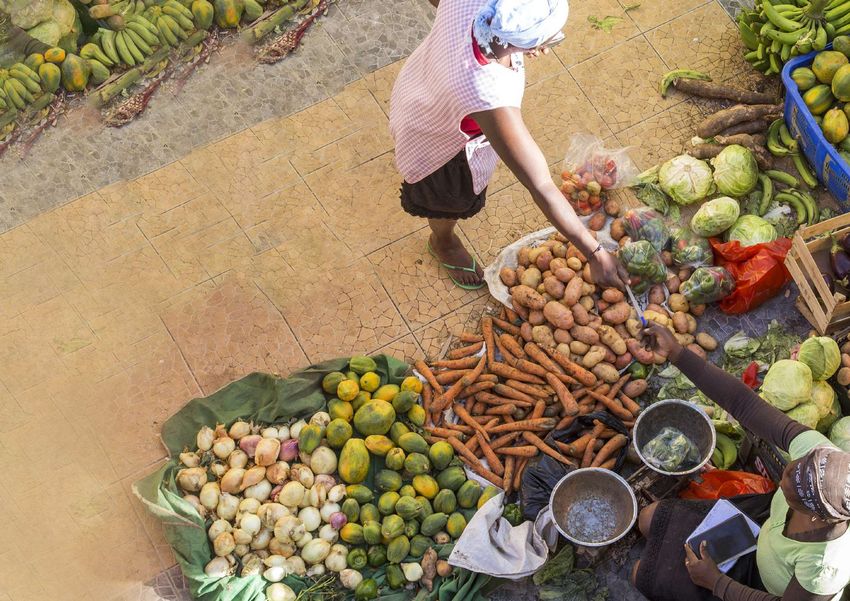
TABLE OF CONTENTS

FOREWORD                        4. LANGUAGE AND STYLE
                                   English style           30
1. INTRODUCTION                    Titles                  30
   Definition of “brand”   6       Jargon                  31
   Why branding ?          6       Messages                31
   Our brand strategy      7
                                5. LOOK AND FEEL
2. BRAND IDENTITY                  Problem statement       33
   Vision and mission       9      The GAIN promise        34
   Who we are              10      Tagline                 39
   Core values             11
                                6. APPLICATION
3. VISUAL IDENTITY                 Tagline                 41
   GAIN name and logo      13      GAIN’s brochures        42
   Colour palette          19      Co-branding brochures   43
   Co-branding colours     20      Posters                 44
   Typography              21      Roll-ups                47
   Photography             24      Instagram               48
                                   Map                     49
                                   Stationery              50

                                7. TEMPLATES               54

                                                                2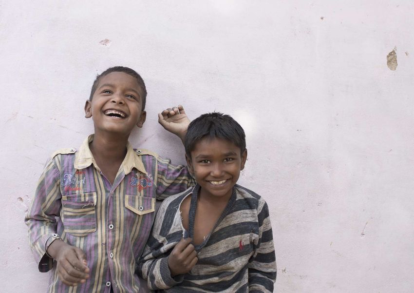
FOREWORD

           Dear colleagues,

           When communicating the important work that GAIN does to improve consumption of nutritious and
           safe food for all and reduce malnutrition worldwide, it is important to have a common approach and
           convey consistent messages to our various stakeholders.

           These brand guidelines will make an important contribution to doing that in a clear, effective and
           professional manner. It will help make sure that our ideas and messages have the best possible chance
           of being heard, understood and acted upon by everyone, including people outside the nutrition or
           development sectors.

           A clear GAIN brand can help us achieve our goal to end malnutrition. If we all understand and
           communicate the GAIN brand consistently, our combined efforts as ambassadors of GAIN will result in
           strong and growing support for the work we do.

           These guidelines are relevant to all of us: some apply to everyday tasks, some will be relevant and
           helpful to the professionals and consultants in our different countries and programmes who write and
           design materials for us.

           I would like to thank the Communications and Legal Teams for their work in producing these guidelines,
           and all of you who participated in the work to develop the new GAIN tagline.

           I look forward to seeing the results as we apply these guidelines to all our new materials and work.

           Kind regards,

           Lawrence Haddad
           Executive Director

                                                                                                                  3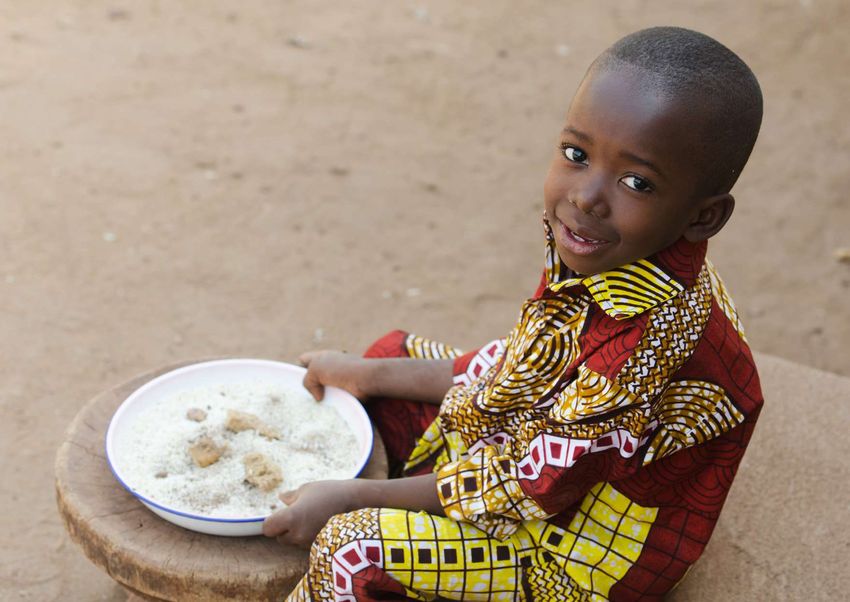
Dear colleagues and partners,

We are pleased to share with you these new GAIN Brand Guidelines, which were developed
in consultation with various colleagues across the organisation, and approved at the Annual Programme
Review Meeting held in Geneva in October 2018. This document is intended to help
and guide you when communicating “who we are” and “what we do” to our external audiences.

Our brand strategy builds on simple messages that explain the complex problems of malnutrition.
It suggests possible ways forward, as well as GAIN’s solutions to these global challenges. The people
we seek to serve are at the centre of our communications : all of our programmes aim to bring about
change in the food system that benefits them and their families, so that they can have access to better
food and enjoy healthier lives.

The different elements contained in these Brand Guidelines have been developed thinking about a
variety of audiences and contexts around the world. Therefore, it should be easy to adapt messages and
design elements to your specific country context or programme. To support the implementation of our
brand strategy, we have designed simple templates that you can use when communicating our work to
our external audiences.

Going forward, we should all follow these guidelines and use the available templates, whether
at the headquarters, in the representative offices or in country offices. By doing this, we will ensure
to communicate globally with one voice, one that reflects our strategy and our collective effort to
end malnutrition worldwide.

If you have questions related to any element included in these guidelines, please do not hesitate
to contact the Communications Department in Geneva at communications@gainhealth.org
or +41 22 749 18 50.

Best regards,

Nathalie Perroud
Head of Communications

                                                                                                          4
01
INTRODUCTION

           5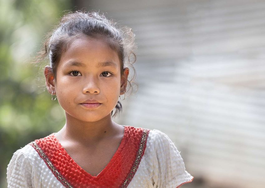
DEFINITION OF “BRAND”
“Brand” is our story, our core purpose, and our promise to the external world. It is our reputation, what lives
in the mind of our stakeholders.

Brand strategy builds on a vision, is aligned with business strategy, emerges from a company/organisation’s
values and culture, and reflects an in-depth understanding of the customer/stakeholder needs and
perceptions. Brand strategy defines positioning, differentiation, the “competitive advantage”, and a unique
value proposition.

WHY BRANDING ?
GAIN has a powerful story to tell and a mission to accomplish. Branding can help us tell our story better and
have a better impact on our audiences.

A clear, consistent, and strong brand will help us grow and prosper.

                                                                                                                  6
OUR BRAND STRATEGY
To have an impact on a wide audience, it is important that we communicate not only the problems we are
trying to solve, but also the solutions we propose. This means that our messages need to include a problem
statement related to malnutrition and an explanation of what we are doing to solve that specific problem.

The photos we use should portray the people we seek to serve through our programmes, as well as the
complexity of the food system we are trying to change, and what we consider as “nutritious food” – foods
that contribute to a healthy diet.

Positive messages showing how people can improve their diets and how the food system needs to change
to deliver more nutritious food to all people are encouraged.

We believe that this brand strategy will help GAIN to make a difference and bring about change for
communities, consumers, governments and businesses.

                                                                                                             7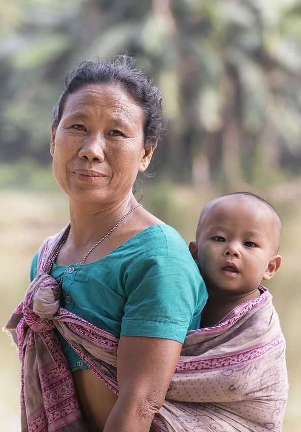
02
BRAND
IDENTITY

           8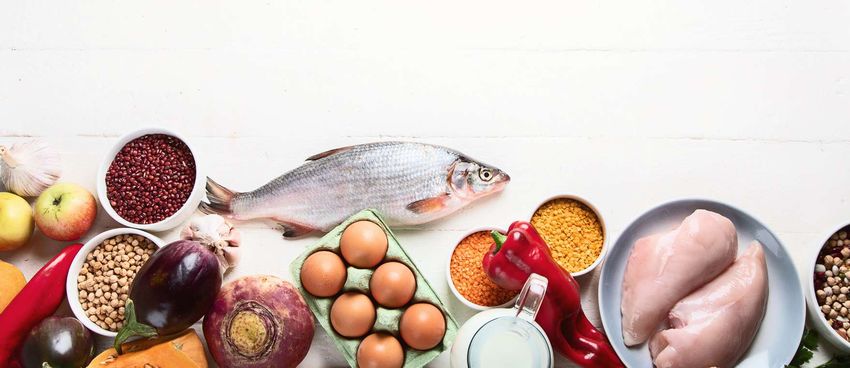
VISION AND MISSION
GAIN is driven by a vision of a world without malnutrition,
in which all people have access to and consume nutritious and
safe food.

GAIN’s mission is to advance nutrition outcomes by improving
the consumption of nutritious and safe food for all people,
especially the most vulnerable to malnutrition.

   Content : when communicating with external audiences, our powerful vision and mission can help in explaining the exact problem
   we are trying to solve. Please refer to these whenever needed.
                                                                                                                                    9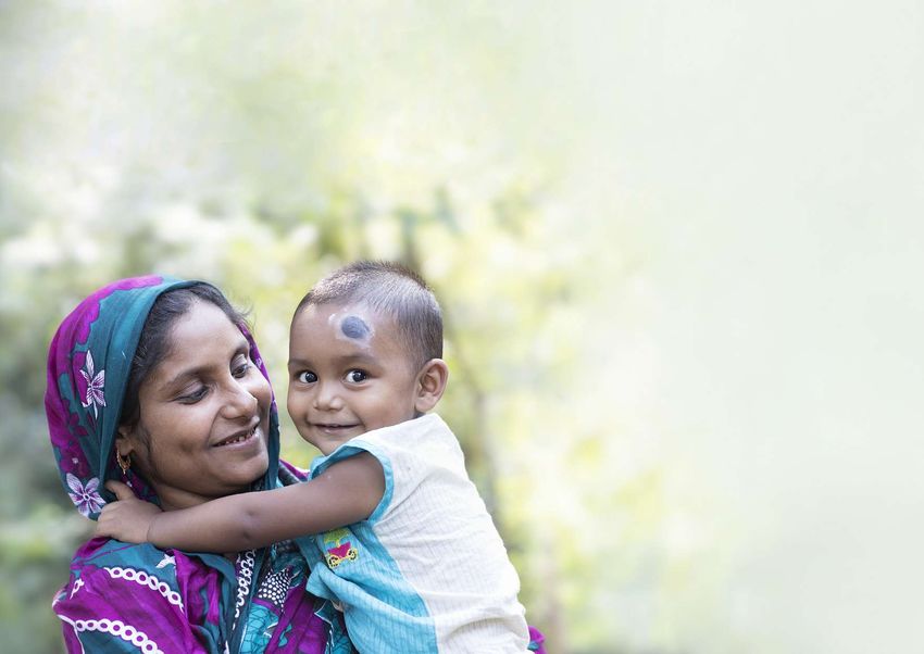
WHO WE ARE
The Global Alliance for Improved Nutrition (GAIN)
is a Swiss-based foundation launched at the UN
in 2002 to tackle the human suffering caused by
malnutrition.

Working with both governments and businesses, we
aim to transform food systems so that they deliver
more nutritious food for all people, especially the
most vulnerable.

   Content : the text above is a short and concise description of
   who we are and what we do. For consistency, please use this
   description in your communications.

                                                                    10
CORE VALUES
TEAMWORK INNOVATION PASSION EXCELLENCE
We work as a team, as “ONE We strive to constantly innovate, We want to make a difference We aim for excellence and
GAIN”, we support each other, develop new approaches and and have an impact to reduce constantly challenge ourselves
are respectful, open and inclusive. bring new creative ideas forward. malnutrition worldwide. to deliver the best results.
Content : our core values are represented with icons, Icons available on :
keywords and very simple descriptions. For consistency,
please use these wordings when referencing these items. • Flaticon : www.flaticon.com. All icons can be downloaded
for free from this website. Contact the Communications Team
Graphics : for the icons, you can choose any secondary to get the login details.
colour from the colour palette (see page 19). Please use
the same colour for all icons on the same page. • The Noun Project : www.thenounproject.com. All icons are
available for free in black and white only. To download icons in
Typography : keywords should be in red bordeaux. colours, you have to subscribe to a paid plan or purchase the icons.
1103
VISUAL
IDENTITY
12GAIN NAME AND LOGO
The objective of the following guidelines is to :
• Set out a policy on the conditions of the use of the GAIN name and logo that allows the GAIN name and
logo to be used widely enough to ensure visibility for GAIN and its work.
• Minimise the risk that the GAIN name and logo appear on documents and products that do not reflect
the GAIN policy or in a way that is inconsistent with the correct logo design and presentation.
OLD LOGO NEW LOGO
One grain is in a different colour. In the new logo, all grains are of the same colour.
13GAIN NAME
We are officially registered as “The Global Alliance for Improved Nutrition”, abbreviated as GAIN.
The “GAIN” acronym should always be written with capital letters.
The working language at GAIN is English.
The GAIN name should not be translated into other languages.
Examples of unacceptable use of the GAIN name :
• the global alliance for improved nutrition → lowercase is not acceptable.
• GAIN health → our official name is GAIN – The Global Alliance for Improved Nutrition,
not “GAIN health”.
• Alliance globale pour une meilleure nutrition → the GAIN name should not be translated
into other languages.
14GAIN LOGO
The GAIN logo consists of three elements :
• The bowl of grain.
• The acronym “GAIN”.
• The words “Global Alliance for Improved Nutrition”.
In general, all three elements should be presented as a unit. The GAIN logo should always be displayed in
such a way as to ensure that the words “Global Alliance for Improved Nutrition” are legible. In exceptional
circumstances - where space is restricted, for example on the spine of a book - the bowl of grain and the
acronym “GAIN” can be used without fully spelling out the name of the Foundation.
15COLOURS
Wherever possible, the GAIN logo should be presented in colour on a white background. It is acceptable for
the logo to be reversed out on a coloured background and for the logo to appear in white. The GAIN logo
can appear in black only on a black and white document. No other colour should be used for the GAIN logo.
The GAIN logo is available in English only. It should not be translated into other languages.
Standard version : the GAIN logo in colour should Negative version : the white logo can be used on a Black and white version : the black logo can be
be used on a white background whenever possible. bordeaux background. used on black and white documents only.
PRINT COLOURS WEB COLOURS
Four-colour process : Two-colour process : Screen : Hex code :
C : 0 BORDEAUX R : 178 # b20933
M : 100 PANTONE 201 G: 9
Y : 63 B : 51
K : 29
16Never change proportions, colours, typefaces or language of the logotype. Examples of
unacceptable use of GAIN logo :
Do not use black on a coloured Do not use weak contrast. Do not change proportions. Do not change colours.
background.
gain Alliance globale pour
une meilleure nutrition
Do not change typeface. Do not translate The bowl should not be separated Do not use a blurred,
“Global Alliance for Improved Nutrition”. from the rest of the logo, especially low resolution logo.
on official documents.
17PERMISSION TO USE THE GAIN NAME AND LOGO
The GAIN name and logo are part of the Foundation’s intellectual property and are a registered trademark. This
means that they may not be used without the express permission of the GAIN Communications Department or
Strategic Management Team. In addition, the Foundation can stop its unauthorised or illegal use.
The use of the GAIN logo is encouraged in the context of GAIN-funded projects and partnerships, and where
GAIN is contributing financially or technically to a meeting, event or publication. Requests for the use of the
GAIN name and logo should be sent to the GAIN Communications Team at communications@gainhealth.org.
Written permission will be required for any use of the GAIN name and logo. Requests for permission will
need to be accompanied by a prototype showing the proposed usage and permission will be given for that
specific usage only.
All use of the GAIN name and logo is strictly subject to GAIN’s Standard Terms and Conditions of use as
outlined in GAIN’s grant agreements or licenses of use.
The GAIN name and logo are not authorised on any packaging of fortified food products, supplements or
therapeutic foods distributed in countries. GAIN supports sustainable solutions that aim to go beyond the
period of GAIN’s funding, hence the use of the GAIN logo on packaging is not appropriate, is unlikely to be
helpful for consumers, and may be confusing. It is also recommended to avoid displaying the GAIN name and
logo on machinery that is funded or donated by GAIN.
USE OF THE GAIN LOGO NEXT TO OTHER LOGOS
Where the GAIN logo is used alongside other logos, it should be presented with sufficient prominence to
reflect the contribution that GAIN has made, either financial or technical, to the product in question, or the
project being reported. This means that the logos are of comparable size and placed in a similar position.
18COLOUR PALETTE
PRIMARY COLOURS
Bordeaux and white are our primary colours. The white became a primary colour within our palette in order
to have more white spaces on backgrounds and reduce “noise”.
BORDEAUX PANTONE 201 WHITE
CMYK : 0 - 100 - 63 - 29 CMYK : 0 - 0 - 0 - 0
RGB : 178 - 9 - 51 RGB : 255 - 255 - 255
HEX : #b20933 HEX : #ffffff
SECONDARY COLOURS
These should be used as additional colours for text boxes, infographics, charts, maps, icons, etc. Secondary
colours can also be used as backgrounds.
PANTONE 7501C PANTONE 4665C PANTONE 7C PANTONE 427C
CMYK : 13 - 16 - 30 - 0 CMYK : 27 - 38 - 54 - 0 CMYK : 0 - 0 - 0 - 37 CMYK : 18 - 13 - 15 - 0
RGB : 228 - 212 - 186 RGB : 197 - 161 - 124 RGB : 183 - 184 - 184 RGB : 216 - 216 - 214
HEX : #d9c89e HEX : #c6a27d HEX : #b9b8b8 HEX : #d9d8d7
19CO-BRANDING COLOURS
For all communication materials produced in collaboration with our partners, such as reports and
publications, we have developed a set of colours that you can choose from. You can propose the colour of
your choice to your partner. Please use only one colour in the same publication.
If the selected colour does not fit well with the main GAIN logo (red bordeaux), please use the white version
of the logo.
PANTONE 7489 PANTONE P 83-7 PANTONE 144 PANTONE 2123
CMYK : 59 - 28 - 65 - 0 CMYK : 42 - 100 - 0 - 10 CMYK : 0 - 50 - 100 - 0 CMYK : 70 - 50 - 0 - 0
RGB : 122 - 154 - 111 RGB : 151 - 21 - 119 RGB : 243 - 146 - 0 RGB : 92 - 121 - 187
HEX : #7c9a6f HEX : #971577 HEX : #f39200 HEX : #5c79bb
For your publication, you can choose one of these
colours and associate it with black and white.
In general, the background should be white and the
BLACK PANTONE 6C WHITE
CMYK : 50 -4 0 -4 0 -10 0 CMYK : 0 - 0 - 0 - 0 text should be black, except for keywords and titles,
RGB : 0 - 0 - 0 RGB : 255 - 255 - 255 which should be in the selected colour.
HEX : #1d1d1b HEX : #ffffff
20TYPOGRAPHY
KEY MESSAGES – Book Antiqua (Bold)
Improving people’s diets
to reduce malnutrition.
Abcdefghijklmnopqrstuvwxyz
0123456789@&?!*
TEXT KEYWORDS BACKGROUND
Black Bordeaux White
Book Antiqua should be used for key messages only and always in Bold. You can highlight keywords in bordeaux for greater
impact. This font is available on all Microsoft programmes (Word, Excel, PowerPoint, etc).
21TITLES – Avenir Black (or Arial Bold) SUBTITLES – Avenir Black (or Arial Bold)
Uppercase : Uppercase :
THE MARKETPLACE RWANDA THE MARKETPLACE RWANDA
Lowercase : Lowercase:
The Marketplace Rwanda : The Marketplace Rwanda : improving
environments for availability of poultry
improving environments for products to low-income consumers
availability of poultry products
to low-income consumers
TEXT – Avenir Book (or Arial)
Lorem ipsum dolor sit amet, ad his vidit facilisis, veri
probatus petentium vim at. Alii dolorem singulis at
mei. Interesset interpretaris ut mei, pro vidit harum
maluisset te.
Titles and subtitles : use uppercase for short titles (less than 50 characters including spaces). If more than 50 characters,
use lowercase.
Colours: the text should generally be black on a white background. The red bordeaux is used to highlight keywords in key
messages and titles only.
Fonts: for titles and subtitles we use Avenir Black and for normal text we use Avenir Book. Both fonts can be downloaded from the
web on PCs. If you can’t download these fonts, please use Arial Bold for titles and subtitles, and regular Arial for normal text.
Style: please do not “justify” text. All texts should be aligned to the left.
22TYPOGRAPHY SUMMARY
TITLES SUBTITLES TEXT
Preferred font Avenir Black Avenir Black Avenir Book
Alternative font Arial Bold Arial Bold Arial Regular
Uppercase vs. Sentence case UPPERCASE : Short titles UPPERCASE : Short subtitles UPPERCASE : Never
(less than 50 characters) (less than 50 characters)
Sentence case : Long titles Sentence case : Long subtitles Sentence case : Always
(more than 50 characters) (more than 50 characters) (only capitalise the first letter of a sentence)
Colours Black or red bordeaux Black or red bordeaux Black only
Size ratio suggestions 14 10 10
17 12 12
21 15 15
31 22 22
40 28 28
23PHOTOGRAPHY
Photography is a critical part of GAIN’s visual
identity. Images are a powerful tool to tell our story
and to convey key messages about our work.
Photos must always be respectful of the people we
seek to serve and portray them with dignity. Images
should portray the reality of the person being
photographed.
Before taking photos of the people we serve
through our programmes and projects, it is
important to always ask for their consent, unless
it is a large group of people in the distance. It is
also necessary to ask for written consent. We have
prepared a “Consent form”, which is available on
the GAIN Intranet (my.gainhealth.org). This form
requires that each person being photographed
gives consent for a specific material to be used in
GAIN’s communications. If a person does not feel
comfortable in front of a camera, ask the person
the permission to take a photo where s/he can’t
be identified. If someone explicitly expresses his/
her unwillingness to be photographed, avoid taking
photos of that person.
24COVER
Photos used on the main cover of a
publication should be high-quality
images portraying the people we
seek to serve, the food we consider as
“nutritious” or different aspects of the
food system we are trying to change.
EDITORIAL
Editorial photos are used to accompany
news or tell individual stories. The photo
should enhance the story being told.
Human interest stories should relate
to the people we serve through our
programmes and projects.
25PORTRAITS
Portraits are a great option for cover photos. These
images should convey a positive message. Use
photos of happy people, if possible eating nutritious
food, so that the link to our mission is clear.
Photo subjects should be either on the left or on the
right of the frame, to respect the “rule of thirds”.
This rule is a basic principle in photography by
which important parts of an image are placed at the
intersection of four different lines.
The theory is that if you place points of interest in the
intersections or along the lines your photo becomes
more balanced and will enable a viewer of the image
to interact with it more naturally.
If we respect this rule, there is also enough
space to add titles on a cover page or - in other
communication materials - short and compelling
messages. There should be a good contrast between
people’s faces in the foreground and the background,
which should generally be plain or blurred. Avoid
distracting elements and, if possible, use light colours
in the background.
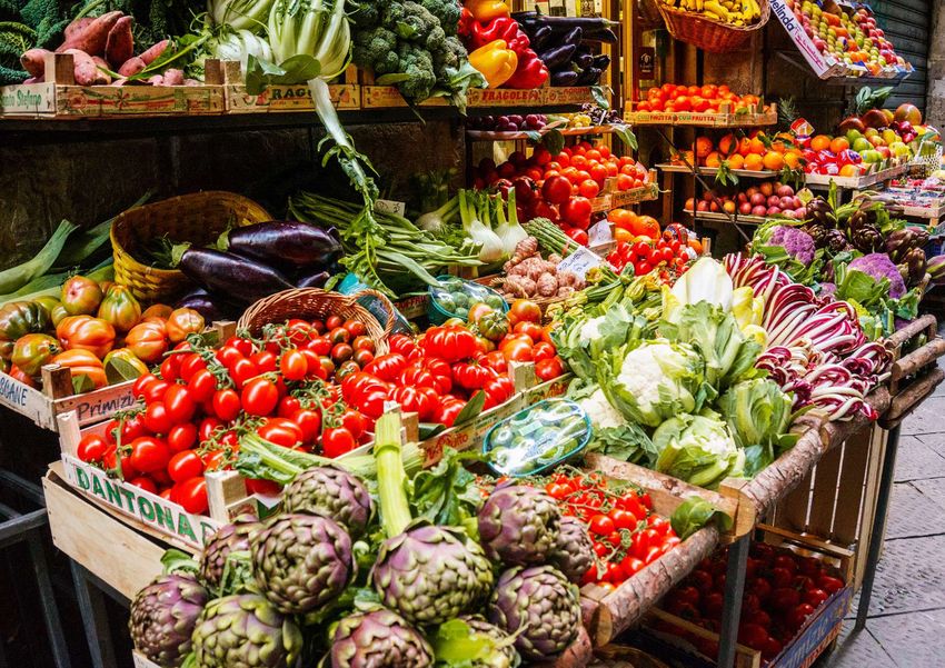
26FOOD
Since the GAIN strategy focuses on making nutritious
food more desirable, available and affordable, the use
of images displaying nutritious food are encouraged.
Food can be adapted to a country-specific context.
For example, if you are producing a publication about
India, images of dhal or okra will be preferred, while
if you are publishing a report about biofortification in
Mozambique, beans would be a better option. Use a
white background whenever possible to avoid “noise”
and make the nutritious food stand out.
27CREDITS
Photos, both in print and online formats, should be
credited as follows:
[Copyright symbol] GAIN/[name and surname of the
photographer]
Example :
© GAIN/Greg Garrett
2804
LANGUAGE
AND STYLE
29ENGLISH STYLE
In all our communication materials - such as reports, brochures and other publications, as well as on websites
and social media – we use British English.
If you need to write a proposal or report for a US donor, or if you are producing a publication in collaboration
with another organisation which uses a different style, you can use American English, provided that you use it
consistently within the same document.
TITLES
For titles, please use “Sentence case” instead of “Title Case”. Sentence case is when you only capitalise the
first letter of the first word in a heading. Proper nouns are in capital letters.
Example :
• Preferred : “New partnership between the Global Alliance for Improved Nutrition (GAIN) and
HarvestPlus seeks to expand access to biofortified crops to one billion people.”
• To be avoided : “New Partnership Between the Global Alliance for Improved Nutrition (GAIN) and
HarvestPlus Seeks to Expand Access to Biofortified Crops to One Billion People.”
If you are writing for an external journal whose editorial style requires Title Case, you can use it, provided
that you use it consistently within the same document.
30JARGON
In order to reach a wide range of stakeholders, messages need to be simple, memorable, and accessible.
We should be careful in using technical terms or terms that are very specific to our sector when targeting
a wide audience : not everyone is a nutrition/development/health expert. We want our messages to be
understood by everyone.
Example of a sentence which is fine when used internally, but can be challenging for external audiences :
“Strengthen the enabling environment for designing, implementing, and scaling up effective
programmes.”
MESSAGES
Our key messages need to be :
• Clear : it should be easy to understand the
messages we want to convey.
• Consistent : we should communicate with the same
messages across different parts of the organisation.
• Credible : we must “walk the talk”. What we say is
accurate, and we can prove it with facts.
• Concise : a sentence should contain no unnecessary
words.
3105
LOOK
AND FEEL
32PROBLEM STATEMENT
1 in 3 people
worldwide are
malnourished.
Content : the critical problem of malnutrition is explained here with simple words and in a very concise manner. This problem
statement can be replaced by other statements that illustrate the complex problem of malnutrition or related issues.
Statements must be short, snappy, and easy to understand. Avoid jargon as much as possible.
Graphics : it is important that the icons complement and enhance the problem statement.
Typography : for these key messages, please use Book Antiqua Bold. Use the red bordeaux to highlight keywords.
33THE GAIN PROMISE
We aim to make healthier food choices more
desirable, more available, and more affordable.
Content : with clear, concise and compelling words, explain what GAIN is doing to solve the problem statement.
Graphics : the photo used should reinforce the message we want to convey. White backgrounds contribute to making important
elements stand out.
Typography : use Book Antiqua Bold for key messages. The red bordeaux should be used to highlight keywords.
34Increase consumer
demand for nutritious
and safe food.
DESIRABILITY
Content : short and snappy sentences should be used to describe what GAIN does.
Graphics : use close-up images of happy people to enhance the positive message. Photo subjects should be either on the left or
on the right, to allow text on the opposite side.
Style : use one of the secondary colours in the colour palette as backgrounds of text boxes.
35Increase availability
of nutritious and
safe food.
AVAILABILITY
36Fresh fruits and
vegetables are
unaffordable for
large parts of the
world.
AFFORDABILITY
37TAGLINE
The tagline is a short and snappy phrase that captures the essence, personality, positioning of the organisation,
and distinguishes it from other organisations/companies.
The best taglines are “deceptively simple, meaningful and memorable, and have a long life”.
The GAIN tagline is “Better nutrition. For all.” and can be used as follows :
Communities in general Better nutrition. For all. #BetterNutrition4All
Better Diets for Children Better nutrition. For children. #ChildrenNutrition
Babies Better nutrition. For babies. #BabyNutrition
Breastfeeding mothers Better nutrition. For breastfeeding mothers. #MaternalNutrition
Adolescent Nutrition Better nutrition. For adolescents. #AdolescentNutrition
Workforce Nutrition Better nutrition. For workers and farmers. #WorkforceNutrition
Urban Governance for Nutrition Better nutrition. For cities. #UrbanNutrition
Making Markets Work Better nutrition. Through markets. #MakingMarketsWork
Reducing Post-harvest Loss Better nutrition. For all. #NoFoodLoss
Food Fortification Better nutrition. For all. #FutureFortified
Nutritious Foods Financing Better nutrition. For all. #InvestInNutrition
Marketplace for Nutritious Food Better nutrition. For all. #Marketplace4Nutrition
Mozambique Better nutrition. For Mozambique. #BetterNutrition4Moz
India Better nutrition. For India. #BetterNutrition4India
Other variations of the tagline or new hashtags should be approved by the Communications Department
before they can be used, unless it is another GAIN country.
38Better nutrition.
For all.
3906
APPLICATION
40TAGLINE
The font of the tagline changes according to its use. Please follow these guidelines :
Font 1st Part Font 2nd Part Application
(Better nutrition.) (For all.)
Tagline by itself Book Antiqua Bold, black. Book Antiqua Bold : Better nutrition.
”For” in black and ”all” in red
bordeaux. For all.
Tagline related to programmes Book Antiqua Bold, black. Avenir Black, uppercase and red
Better nutrition.
bordeaux. The size is smaller than
FOR CHILDREN.
the first part.
Tagline in stationery Avenir Black, all uppercase and Avenir Black, all uppercase and
BETTER NUTRITION. FOR ALL.
red bordeaux. red bordeaux.
41GAIN’S BROCHURES 2. 1.
4.
6.
3. 5.
1. Titles in Avenir Black (or Arial Bold).
2. Subtitles in Avenir Black (or Arial Bold).
3. Regular text is in Avenir Book (or Arial Regular).
4. Short and compelling messages are in Book Antiqua Bold, sentence case. Keywords are in bordeaux.
5. The hashtag should be in Avenir Black.
6. Use high-quality images that portray the people we seek to serve. Images should fill the page.
42CO-BRANDING BROCHURES 1. 2.
4.
3. 6 5.
1. Titles in Avenir Black (or Arial Bold).
2. Subtitles in Avenir Black (or Arial Bold), in the selected co-branding colour.
3. Regular text is in Avenir Book (or Arial Regular).
4. Short and compelling messages are in Book Antiqua Bold, sentence case. Keywords are in red bordeaux.
5. Partner logos should be at bottom of the publication in similar sizes. Please double check with partners the
order of appearance of the logos.
6. Use high-quality images that portray the people we seek to serve. Images should fill the page.
43POSTERS
5. 6.
1.
2.
3.
4.
7.
1. Use Book Antiqua Bold in the first part of the tagline.
2. Adapt the second part of the tagline to the target group of the programme/country. Use Avenir Black, red bordeaux,
and capital letters.
3. Describe the problem statement with concise words. Highlight keywords in red bordeaux.
4. Image that represents either the problem or a possible solution. Use pictures of food on a white background.
5. High-quality image of the communities we serve at country level or through programmes.
6. Message explaining what GAIN is doing to tackle the problem mentioned in the first poster. Keywords in red bordeaux.
7. The hashtag and the GAIN logo are either at the bottom or top of the posters.
44POSTERS
45POSTERS
46ROLL-UPS
1. 1. 4. 5.
2. 2. 3.
3. 3. 1.
2.
4. 5.
4. 5.
1. First part of the tagline in Book Antiqua Bold, lowercase.
2. Second part of the tagline adapted to the target group of the programme/country. Use Avenir Black in red bordeaux, uppercase.
3. Image of nutritious foods or of the people we serve through our programmes.
4. Hashtag of the programme/country at the top or bottom left of the roll-up.
5. Logo at the top or bottom right of the roll-up.
47INSTAGRAM
Company 22:47 Company 22:47 Company 22:47
gain.health gain.health gain.health
Malnutrition is
truly everyone's
business and
everyone's
responsibility.
IMPROVING CHILDREN’S DIET
Company 22:47 Company 22:47 Company 22:47
322 Likes
gain.health 322 Likes
gain.health 322 Likes
gain.health
gain.health Better Nutrition. For All. #investinnutrition gain.health Better Nutrition. For All. #InvestInNutrition gain.health Improving Children’s Diets #InvestInNutrition
6 MINUTES AGO 6 MINUTES AGO 6 MINUTES AGO
1 1 1
Good nutrition
in the first 1000
days reduces the
risk of malnutrition
and chronic
non-communicable
diseases.
- 1000 DAYS
#ChildrenNutrition
322 Likes 322 Likes 322 Likes
gain.health Better Diets for Children gain.health Better Diets for Children gain.health Better Diets for Children
#ChildrenNutrition #ChildrenNutrition #ChildrenNutrition
6 MINUTES AGO 71 6 MINUTES AGO 68 6 MINUTES AGO 91
On our Instagram account, we will use three main elements :
• Close-up pictures of the people/communities we serve.
• Images of nutritious food on a white background.
• Compelling messages on a white background.
48MAP
KAZAKHSTAN
AFGHANISTAN TAJIKISTAN
DENMARK
UNITED KINGDOM
UNITED STATES THE NETHERLANDS
SWITZERLAND
MALI KENYA
HAITI SENEGAL ETHIOPIA
RWANDA
Colour legend : BURKINA FASO NIGERIA PAKISTAN INDIA
Headquarters in Geneva
INDONESIA
Representative offices BANGLADESH
Country offices
TANZANIA
Projects
MOZAMBIQUE
Where we work
Headquartered in Geneva, Switzerland, GAIN has representative offices in Denmark, The Netherlands, the
United Kingdom, and the United States. In addition, we have country offices in Bangladesh, Ethiopia, India,
Indonesia, Kenya, Mozambique, Nigeria, Pakistan, and Tanzania. Programmes and projects are carried out in
a variety of other countries, particularly in Africa and Asia.
49STATIONERY Letterheads
Mrs Smith
123 Main Street Unit 21
New York City, NY 10001
United States of America
Business cards
Dear Mrs Smith,
Apername des in nihicil luptam sitatquos non comnissi aliquas inci quam suntis nus
sequi si corem se nis debit licte labori voloris nosse volores nis doluptia con repre
ressendi dolum dus voluptam quae omnis sitasi dolupist offictotam, quia aut aut acca-
temquiam qui ut quisciendam exerem faccum cus modiciatur?
NATHALIE PERROUD Mi, nonsernat lic te corem qui unt quibusdam qui recta voluptae volo ea di beruntibus
Head of Communications dolorem everum fugit, utatem nihitae ped quati que magnam et ommolup taturia
dendunt iorrori berum rendaniet plabo. Nam destibusto omnimus ea dest eligenis sit
et et pe sa dolupta sitatis evelique maio. Udit id ut alitaqui omni repro beatiis atem que
neturer iberspedi ne lacesed minusani quatus doluptat aspeles edigenisin proriaeptur
Rue de Varembé 7 Email : nperroud@gainhealth.org
as volenimporem utem aut enecte et voles et quodi ommodis ipsa vendita tianto corpos
1202 Geneva LinkedIn : www.linkedin.com/in/nperroud
eum imi, nobisqui quatius sitat alia debis disit esequidelit, utem rectincto beatisciis
Switzerland Phone : +41 22 749 18 45
experunt arit, sent ex erum es.
www.gainhealth.org Mobile : +41 79 886 90 37
Leces mint maximol uptatibus, none voles pelluptaquae venit, qui a sam, is eum eos
sequi velignis del maionse dipienem ipient excesse caboriamus, nihil invendam, que
doluptati ad magni sam labor re num rernatemquas magniam faceaquid qui ipsunt, a
dolorrum re repudis nobit lacearcim facepel esequis mos estiat quiaepe lendis vitionse-
que comnihi ciducitatiur simus molupitisque aliscillabo. Ficieni volest lam andeles
non consequi ipiendis si que dolorem quam nectota eptatur alitiantis dolor a sed quia
comnimpor mollecta si omnis di cum, soluptat.
ARIJIT CHAKRABARTY Sincerely,
Senior Project Manager
Better Diets for Children
Lawrence Haddad
D-2, Commercial Tower, The Edenpark Hotel Email : achakrabarty@gainhealth.org
(Qutab Hotel), Qutab Institutional Area Skype : arijit chakrabarty
Shaheed Jeet Singh Marg Phone : +91 11 431 475 750
New Delhi – 110016, India BETTER NUTRITION. FOR ALL.
www.gainhealth.org GAIN, Rue Varembé 7, PO Box 55, CH-1211 Geneva 20, Switzerland, T. +41 22 749 18 50, www.gainhealth.org
50Envelopes
John Doe
123 Main Street Unit 21
New York City, NY 10001
United States of America
51Notebooks
Compliment slips
BETTER NUTRITION. FOR ALL.
BETTER NUTRITION. FOR ALL.
GAIN, Rue Varembé 7, PO Box 55, CH-1211 Geneva 20, Switzerland, T. +41 22 749 18 50, www.gainhealth.org
52Folders
BETTER NUTRITION. FOR ALL. www.gainhealth.org
5307
TEMPLATES
54The following templates are available in print and digital formats :
PRINT DIGITAL
Letterheads Business card
Envelopes Generic word template
Folders PowerPoint presentation
Compliment slips Request for proposals
Notebooks Consent form
All templates are available on the GAIN Intranet my.gainhealth.org
in the “Communications” section.
For additional information, please contact the GAIN Communications
Department in Geneva at communications@gainhealth.org.
55Photo credits Yousuf Tushar, Bangladesh: pages 1, 8, 24, 25, 26 (bottom). Sharbendu De, India : 54. Brigitte Besson, Switzerland : pages 3, 4. Greg Garrett, Switzerland : page 28, 46. Shutterstock : pages 5, 6, 9, 10, 12, 27, 29, 32, 34- 37, 39, 40, 47, 48. Getty images : page 7, 26 (top). The photos on pages 5, 37, and 48 (first Instagram post) are for editorial use only. The image used on page 31 is not free of rights. Design Inox Communication, Switzerland, www.inox.com The Global Alliance for Improved Nutrition Bangladesh | Denmark | Ethiopia | India | Indonesia | Kenya | Mozambique | Nigeria | Rue de Varembé 7 Netherlands | Pakistan | Switzerland | Tanzania | United Kingdom | United States of America CH-1202 Geneva, Switzerland Phone : +41 22 749 18 50 © 2019 The Global Alliance for Improved Nutrition Email : communications@gainhealth.org Website : www.gainhealth.org
You can also read