THE GREAT BALANCING ACT - The COVID-19 Pandemic Navigator May 2020 - Oliver Wyman
←
→
Page content transcription
If your browser does not render page correctly, please read the page content below
THE GREAT
BALANCING
ACT
The COVID-19 Pandemic Navigator
May 2020
The great balancing act

            PREFACE
            In the first installment of our Insight Series, we introduced the Oliver Wyman
            COVID-19 Pandemic Navigator, the most comprehensive toolkit in existence for
            connecting sophisticated epidemiological modelling with detailed impact on the
            earnings and capital of businesses. This toolkit is being used by governments,
            healthcare organizations, businesses, and financial services firms across the
            world to help make decisions and plan around the coronavirus crisis.

            In this, the second installment, we discuss the application of our toolkit in the
            sphere of the policymakers, who will have to quickly articulate and manage a
            national risk appetite in terms of health, economy, privacy, and lifestyle.

© Oliver Wyman                                                                                  2
The great balancing act
A BRIEF RECAP ON WHERE WE ARE
As can be seen in the US example in Exhibit 1, the decisive actions taken by policymakers in
recent months, combined with changes in citizens’ behavior, have had the desired effect of
suppressing the transmission rate. As a result, the case curves have been flattened and a major
health crisis in the short term has been averted.
But on the other side of the societal scales, the damage inflicted on the economy by containment
measures has been severe:
• Revenue loss for more than 50 percent of business sectors has ranged from 25 percent to
50 percent, and 30 percent of businesses are even more severely impacted.
• For more than 50 percent of businesses, the likelihood of defaulting on their debt has
increased threefold.
• In some large jurisdictions, in more than half of business sectors, government stimulus
and support have mitigated less than 30 percent of the income loss.
But the infection rate and number of active cases will still need to be controlled to ensure the
total caseload is kept under hospital capacity levels. So the key question facing policymakers
can now be expressed as follows: What is the revised set of policy measures that can keep the
growth in COVID-19 cases under control while inflicting as little further damage as possible on
the economy and broader society?
The remainder of this article attempts to lay the foundations for answering this question.
Exhibit 1. Impact on COVID-19 transmission rate of containment actions over time
Comparison of Oliver Wyman COVID-19 transmission rate with changes in mobility (US)
Oliver Wyman COVID-19 transmission rate Mobility index
0.8 10
0.7
0
0.6
0.5 -10
0.4
0.3 -30
0.2
-40
0.1
0 -50
February 16 March 1 March 15 March 29 April 12 April 26 May 10
2020
Oliver Wyman COVID-19 Workplace (Google) Transit stations (Google)
transmission rate
Source: Oliver Wyman, Oliver Wyman Pandemic Navigator
© Oliver Wyman 3The great balancing act
Exhibit 2. Impact on the economy of containment actions
Revenue decrease in full lockdown (sorted by sectors from lowest to highest revenue decrease)
Revenue
Impact change Sector
Positive shock Up to +10% • Retail food items
• Postal and courier activities
Modest Up to -20% • Wholesale food items; manufacture of food products
negative shock • Manufacture of pharma products
• Information service activities
• Telecommunications
• Agriculture, forestry and fishing
• Education
• Human health and social work activities
• Manufacture of beverages
Moderate Up to -50% • Electricity, gas, steam and air conditioning supply
negative shock • Water supply; sewerage, waste management and remediation activities
• Computer programming, consultancy and related activities
• Scientific research and development
• Public administration and defense; compulsory social security
• Office administrative, office support and other business support
• Manufacture of computer products and electronic equipment
• Retail non food items
• Extraction of natural gas
• Wholesale non food items
• Publishing activities; real estate activities; legal and accounting activities
• Activities of head offices; management consultancy activities
• Veterinary activities
• Warehousing and support activities for transportation
• Manufacturing of plastic and metallic products
• Water transport
• Construction
High Up to -75% • Manufacture of coke, refined petroleum products and chemicals
negative shock • Manufacture of machinery and equipment
• Wholesale and retail trade and repair of motor vehicles
• Manufacture of ships and boats
• Manufacturing (tobacco, textiles and wearing apparel, furniture etc.)
• Manufacture of air and spacecraft and related machinery
• Programming and broadcasting activities
• Employment activities
• Extraction of crude petroleum
• Manufacture of motor vehicles, trailers and semi-trailers
Severe Up to -100% • Air transport
negative shock • Motion picture, video and television program production
• Travel agency, tour operator, reservation service and relate
• Arts, entertainment and recreation
• Other service activities
• Accommodation activities
• Food service activities
Source: Oliver Wyman, Oliver Wyman Pandemic Navigator
© Oliver Wyman 4The great balancing act
FOUR CRUCIAL FACTORS
Our Pandemic Navigator models allow us to drill deeper into four factors that will have a major
bearing on the dynamics of COVID-19 in the coming months: testing and tracing capacity,
immunity levels, seasonality effects, and partitioning strategies.
As of May 10, 69 percent of COVID-19 deaths globally have been concentrated in just five
countries: the United States, United Kingdom, Italy, Spain, and France (based on official records).
Below is a high-level assessment of these factors in these regions in early March, when the crisis
took hold, compared with what the prevailing situation might be in July.
Exhibit 3. Infection rate drivers (US, UK, Italy, Spain, France)
Driver March 2020 July 2020?
Testing and Largely limited to testing of symptomatic Increased testing capacity and potential
tracing capacity patients in hospitals for a much more sophisticated regime
that captures the majority of infections
through contact tracing
Immunity levels Approximately 0% in the beginning, since Some estimates claim that the infected or
almost no patients had yet been infected recovered rate could be as high as 20-30%
or recovered in some of the worst-affected cities like
London, New York, and Madrid
However, we don’t yet know whether
being infected actually confers immunity
and for how long
Seasonality effects Some evidence that March temperatures Hope that seasonality could contribute
in these regions (0 to 15 Celsius) to a drop in R in the summer months in
gave ideal conditions for COVID these 5 regions
spreading rapidly
Partitioning One-size-fits-all approaches, Differentiated approaches by sub-region
strategies with “shielding” policies for the and age-group
most vulnerable
Source: Oliver Wyman, Oliver Wyman Pandemic Navigator
Our models can take these different factors into account to estimate the change in the effective
reproductive number, R, one of the key metrics being monitored by policymakers when
determining their response.
Our models estimate that R was somewhere between 3.5 and 4.0 in these five regions in early
March, before the lockdown measures were put in place. This reflected a situation of limited
understanding of the transmission and protective measures by the public, limited availability of
testing, no immunity in the system and potentially a negative period in terms of seasonality. In
response, policymakers were forced to introduce a stringent set of lockdown measures (social
distancing, travel restrictions, stay at home, and so on) that brought R down to just below 1.0.
With serious concerns in the health arena, containment and suppression were needed and had
to be rushed. As such, the tools used were blunt instruments and inevitably suboptimal in terms
of economic and social costs.
© Oliver Wyman 5The great balancing act
In Exhibit 4 we look at how differently things might look in July in a large city such as London. If
the build-up of immunity in a badly affected city like London were as high as 25 percent, this alone
would knock 25 percent off the effective R number.1 An instantaneous testing and tracing regime
that captured 50 percent of infected patients and forced them into quarantine or self-isolation
would similarly subtract a further 1.06 from the value of R. And let’s assume for a moment that
seasonality behaves in the same direction as influenza and reduces R in summer months: The
cumulative effects of these developments would see R reduced to 1.1.
The implications of such a set of developments would be significant. If we assume that the
United Kingdom aims to maintain a target level for R of, say, 0.7, then we might need a much
less stringent package of containment measures to close the gap to the target R in London in
July than we did in March. Crucially this reduced package of measures could be made up of
approaches such as mask-wearing, hygiene and plastic screens which are useful at controlling
the virus but which place a lower burden on the economy compared with full lockdowns and
stay at home orders. Social and physical distancing in the workplace and the prevention of large
public gatherings should likely be maintained during the early stages of exit until more data has
been gathered.
Exhibit 4. Potential improvement in R in London (without lockdown measures)
Effective Reproductive Number, R
Effective Reproductive Number, R
3,5
A stringent
Seasonality benefits
3,0 lockdown
required
2,5 25% Immunity benefits
2,0
R A less Testing and tracing benefits
1,5
stringent
lockdown
required
1,0 R=1
R Target R = 0.7
0,5
0
March 2020 July 2020
Source: Oliver Wyman, Oliver Wyman Pandemic Navigator
1 R = R0 * (1–immunity %) so the effective R drops as immunity levels rise with R, eventually dropping below 1 when we hit the
herd immunity threshold. As shown in Exhibit 4, immunity is not the only factor that affects R.
© Oliver Wyman 6The great balancing act
This is just one possible scenario for where we might be in July in London, with a lot of
assumptions made, and this is not intended to be a prediction. The aim is to highlight for
policymakers that many other factors will impact R beyond the containment measures used to
date; that none of these factors will be enough to eradicate the disease on their own, but their
combination can make a meaningful difference to the rate of transmission; and that it is vital that
policymakers are informed what the value of these parameters might be, both today and in the
future when setting out plans.
The remainder of this article looks at these key drivers in turn and shows that it is already
possible to start making estimates or to put bounds on the assumptions in different regions. This
will help policymakers not only to observe what was happening to R but also to understand why
it is happening and which factors are contributing to any changes, allowing plans to be set out
with more confidence.
TESTING AND CONTACT TRACING
The reliability and availability of testing when the virus first spread was limited, with many
countries initially testing only people with severe symptoms in hospitals. This left a great number
of cases undetected, with the potential to contract and pass on the virus to many others without
knowledge of it.
The blunt-instrument lockdown response slowed down COVID-19 transmission in both the
detected and undetected populations — but came at a high economic cost. A smarter approach
to achieve a similar level of reduction in R is to increase testing and contact tracing and to coerce
this group into self-isolation or quarantine.
Our models confirm that an increase in the percentage of infections that are detected through
increased testing can have a major effect on reducing R. The charts below show how testing
reduces the pressure on the economy.
Exhibit 5. Testing capture rate with instantaneous and delayed contact tracing
Instantaneous contact tracing and testing
Increased testing capacity Containment without testing R0=3.0
and tracing has a devastating
No testing effect on the economy
and tracing
A timely testing
and tracing
“Outbreak zone” regime has the
potential to fully
relieve pressure
R=1 on the economy
Maximum
testing “Containment zone”
and tracing
Maximum containment Zero containment
Increasing economic and social costs
© Oliver Wyman 7The great balancing act
Delayed contact tracing and testing (with 6-day latency)
R0=3.0
Increased testing capacity
No testing
and tracing
“Outbreak zone” If there are delays
in the testing and
tracing regime then
R=1 it won’t be enough
on its own
Maximum Partial
testing “Containment zone” lockdown required
and tracing
Maximum containment Zero containment
Increasing economic and social costs
Source: Oliver Wyman, Oliver Wyman Pandemic Navigator
As the second chart shows, however, increasing the number of tests is not enough. Testing needs
to be accompanied by an instantaneous contact-tracing regime. And the timelines of the test
results and the speed with which contacts are informed is vital. Otherwise, the spread of the
virus will continue to outpace the speed with which information is being delivered, and the virus
will maintain the upper hand.
Most developed countries are already piloting a blend of manual contact tracing schemes and
mobile app-based schemes. The manual schemes are likely to have a high level of latency similar
to the second chart. The challenges with app-based schemes relate to adoption, compliance, and
privacy issues. Countries that already have well-established digital ID schemes with a high level
of adoption are going to be better placed to quickly implement something. Countries starting
with a blank page are having to set aside large budgets for developing the technology and
for promoting the apps to ensure adoption and compliance. But the cost of developing such a
program is likely immaterial compared with the potential benefits to the economy.
IMMUNITY LEVELS
It is well understood that the cases disclosed in the widely used Johns Hopkins University
dataset represent only the detected COVID-19 cases, and that many cases remain undetected
in the system. Getting a handle on this undetected universe is crucial in understanding the
dynamics of an outbreak, assuming immunity exists, we extended the traditional susceptible,
infected, removed (SIR) model to include two more states: infected (undetected) and
removed (undetected).
In our white paper, available at our website, we show the results of our analysis and the
academic research on the undetected universe. A summary of the results for a selection of
regions is shown below.
© Oliver Wyman 8The great balancing act
Exhibit 6. Ratio of undetected to detected cases by country.
Comparison of Wuhan and Italy study on undetected cases
Number of undetected cases to detected cases, as of May 4th, 2020
0 20 40 60 80 100 120 140
Wuhan study
Australia
Italy study
Austria
Belgium
Brazil
Canada
Chile
China
Czechia
Denmark
Ecuador
Finland
France
Germany
Indonesia
Iran
Ireland
Israel
Italy
Korea, South
Luxembourg
Malaysia
Mexico
Netherlands
Norway
Pakistan
Poland
Portugal
Romania
Russia
Spain
Sweden
Switzerland
Thailand
Turkey
UK
Source: Oliver Wyman,
US Oliver Wyman
Pandemic Navigator
© Oliver Wyman 9The great balancing act
As testing capacity and sophistication have improved in the various regions, the ratio of
undetected to detected cases has fallen but remains high in many regions. For example, while
the United Kingdom currently reports roughly 227,000 detected cases as of May 12, our upper
estimate for total infections is 6.7 million, or approximately 10 percent of the population.
The chart below shows that for most regions we are a long way away from the herd immunity
threshold, on average. Even before we reach this threshold, however, growing levels of immunity
in the population will help to gradually reduce the effective R over time, and so can still make
some contribution to slowing the transmission rate.
Exhibit 7. Estimated infected or recovered proportion of population
Infected proportion of US population (%), by state
90
80
70 Proportion required for herd immunity
60
50
40
30
20
10
0
New York California Illinois Michigan
High undetected Best estimated Confirmed
Source: Oliver Wyman, Oliver Wyman Pandemic Navigator
© Oliver Wyman 10The great balancing act
SEASONALITY EFFECTS
We already have some data to help understand the seasonality of COVID-19. The chart below
shows the calculation of the average value of R during March for 142 countries against the
average temperature during the same period in those countries.
Exhibit 8. Country infection rates and average March temperature
March reproductive number, Rt R2 = 0.3005
6 Transmission sweet spot
5
4
3
2
1
0
-10 10 20 30
o
Average March temperature, C
Source: John Hopkins COVID case data, Oliver Wyman Analysis
A pattern exists showing R at lower levels in warm-weather nations during March. We are aware,
however, that there are many alternative explanations for this pattern — for instance, that GDP
per capita also falls on average for warm-weather regions, which could signal a decrease in
testing capacity. Nonetheless, the data does offer some hope that there might be a sweet spot
for an outbreak in the -5 to +15 degrees Celsius range and that the summer weather in the
Northern hemisphere might lead to slowing growth. What is clear is that seasonality will not
be enough on its own to kill the virus, and in our scenarios we treat seasonality as one of the
unknown factors that can be switched on and off.
The big Northern hemisphere cities covered in our analysis (such as New York, London, Paris,
and Berlin) would clearly stand to gain in the coming months if the assumption of COVID-19
seasonality turns out to be correct.
© Oliver Wyman 11The great balancing act
Exhibit 9. Average monthly temperature for a sample of large cities
City Jan Feb Mar Apr May Jun Jul Aug Sep Oct Nov Dec
New York City 0.6 2.1 6.1 11.9 17.1 22.1 24.9 24.3 20.2 14.1 8.9 3.3
London 4.3 4.5 6.9 8.7 14.1 17.3 21.2 19.3 14.3 10.9 7.2 4.7
Milan 2.5 4.7 9.0 12.2 17.0 20.8 23.6 23.0 19.2 13.4 7.2 3.3
Madrid 6.3 7.9 11.2 12.9 16.7 22.2 25.6 25.1 20.9 15.1 9.9 6.9
Los Angeles 14.4 14.9 15.9 17.3 18.9 20.7 22.9 23.5 22.8 20.3 16.9 14.2
Cape Town 20.4 20.4 19.2 16.9 14.4 12.5 11.9 12.4 13.7 15.6 17.9 19.5
Sydney 22.3 22.3 21.2 18.5 15.5 13.1 12.2 13.4 15.5 17.8 19.6 21.3
Singapore 27.0 27.0 28.0 28.0 28.0 28.0 28.0 28.0 27.0 27.0 27.0 26.0
Hong Kong 16.3 16.8 19.1 25.9 27.9 27.9 28.8 28.6 27.7 25.5 21.8 17.9
Oliver Wyman COVID-19 transmission rate: High Medium Low
Source: List of Cities by Average Temperature, Oliver Wyman analysis
PARTITIONING STRATEGIES
Our models show that there could be major benefits in applying partitioned approaches for
different demographics or for sub-regions, but that a great deal of care needs to be taken to
understand the potential impact of the drivers we have discussed and to study the data at the
highest level of granularity possible to avoid generalizations.
Partitions by region
The latest estimates of R from Cambridge University for the sub-regions of England indicate that
London has a substantially lower R level. This has opened up a debate as to whether a different
exit strategy or timing might be appropriate. Our model of the same sub-regions also shows
London exhibiting the lowest R level, but the difference is less pronounced. Exhibit 10 shows,
however, that R for London has been below 1 for longer than the other regions, with London
having hit peak infections a week or more before most others.
It also becomes clear when looking at the timeline that it is dangerous to take a single snapshot
of R and to define a strategy based on that. Moreover, London is itself a big region with many of
its boroughs having had a different experience of the crisis. Large segments of the commuter
population and overseas workers have not been in the capital during the lockdown and could
change the dynamic when they return. In short, we are dealing with a complex and dynamic
problem that needs to be examined from a number of different angles before settling on a
course of action.
© Oliver Wyman 12The great balancing act
Exhibit 10. Infection rate by sub-region in England
R, English regions
England 0.75
0.80
0.76
0.71 0.73 0.71
0.68
0.40
East London Midlands North East North South South
and Yorkshire West East West
Source: Cambridge University MRC Biostatistics/Public Health England
R, English regions (5-day moving average)
3.0
2.5
2.0
1.5
1.0
0.5
UK lockdown
0 (March 23rd)
March 14 March 21 March 28 April 4 April 11 April 18 April 25 May 2 May 9
2020
London North east and Yorkshire North west South west
South east Midlands East R=1
Source: Oliver Wyman Pandemic Navigator/Public Health England
Partitions by demographic
It was established early in the crisis that hospitalization and fatality rates vary significantly
between age groups and that the elderly and those with prior conditions are most vulnerable.
One of the earliest applications of partitioning has been the attempt to shield the vulnerable
from the non-vulnerable, with the latter demographic being given more freedom to keep the
economy moving. To date these shielding strategies have not been fully successful, with many
well-documented cases of large outbreaks in care homes.
© Oliver Wyman 13The great balancing act
Exhibit 11. Infection fatality ratio by age group (United States)
% of population Cumulative infection fatality rate/% hospitalized
20 6.0
5.0
16
14
13 13 13 13 4.0
12 12
11
3.0
8
7
2.0
4 4
1.0
0 0
0-9 10-19 20-29 30-39 40-49 50-59 60-69 70-79 80+
Population (LHS) Hospitalized (RHS) Deaths (RHS)
65% of the US population is below age 50. Assuming 100% of that group was infected by the virus,
1.1% of the population would have been hospitalized and 0.04% would have died – (120,000 deaths)
Source: US Census Bureau, Current Population Survey, Annual Social and Economic Supplement, 2018; Verity et al, Estimates of
the severity of coronavirus disease 2019: a model-based analysis, Lancet Infect Dis 2020
Nonetheless, in the scenarios we studied, we have observed meaningful differences in
performance between uniform strategies and more stratified approaches mainly driven by
the variation in hospitalization ratio and fatality ratio by age groups. We have also found that
applying population-wide parameters for immunity levels leads to an over-estimation of the herd
immunity threshold, since in reality the number of those susceptible is depleted faster in some
sub-populations, slowing growth.
A move toward an instantaneous testing-and-tracing regime that captures the necessary data on
demographic groups will also be crucial to allow these partitioned strategies to become a more
effective policy tool. For example, it is inevitable that the vulnerable population at some point will
come into contact with the non-vulnerable population (for example, the workers in care homes)
and we need to have a much higher level of confidence these interactions are not putting the
vulnerable at risk.
Partitioning goes hand in hand with the population taking steps to protect themselves and
vulnerable groups, through the use of masks, social distancing, screens, better hygiene,
temperature checks and other protective measures. The elderly must necessarily have contact
with younger age groups, for instance in caregiving, but with these measures and adequate PPE,
vulnerable groups can be protected.
© Oliver Wyman 14The great balancing act
BACK TO THE BALANCING ACT
The purpose of this article was not to lay out a single scenario for COVID-19 or to make the case
that the situation will definitely improve in the summer in the Northern hemisphere. There are
still too many unknowns to place too much weight on single scenarios.
However, for policymakers, we believe there is now enough data supporting the testing of more
sophisticated containment strategies, in which we increasingly understand the implications on R
and case levels and can simultaneously assess economic costs.
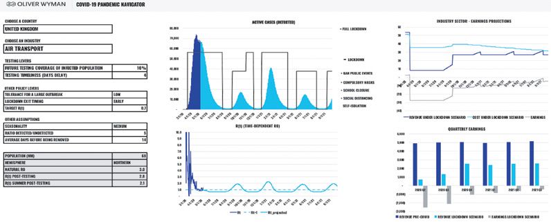
Exhibit 12 is an example of the dashboard we have been using with clients to a create a more
comprehensive and coherent model of the crisis. A joined-up modelling framework such as this
one offers policymakers the chance to define and communicate an overarching risk appetite for
health and the economy, which can be extended to include privacy and lifestyle metrics.
Exhibit 12. Pandemic Navigator industry-level dashboard (cashflow forecast)
5 6
1
2
3
4 7
1. Calibrated by region 5. Lockdown patterns of varying intensity
2. Earnings impact for 40 different sectors 6. Impact on the economy/earnings/cashflows
3. Includes testing levers 7. Transparent metrics such as the evolution of R
4. Adjusts for undetected cases and accounts
for potential seasonality affects
Source: Oliver Wyman Analysis, Oliver Wyman Pandemic Navigator
While policymakers will set the direction for health policy and economic activity, we are
expecting differentiated approaches by companies, communities, and demographics in the
future, essentially reflecting their own risk appetite. Any lack of a robust framework, clarity, and
transparency at the national level will lead to ambiguity and a more punitive and conservative
approach eventually being needed.
© Oliver Wyman 15The great balancing act
CONCLUDING REMARKS
When the COVID-19 virus started to spread globally, it initially gained the upper hand, but
was met with the full force of a hammer-like policy response. This hammer had an equally
devastating effect in suppressing the economy, however. We hope the next phase of this story
will be characterized by human ingenuity, with data, technology, and medical research playing a
much more prominent role in our collective response. While the creation of this new apparatus
will take a massive coordinated effort and investment, our modelling shows it will pay rapid
dividends in the near to medium term. And this invaluable apparatus will remain in place for
when future and potentially deadlier viruses threaten humankind.
© Oliver Wyman 16Oliver Wyman is a global leader in management consulting that combines deep industry knowledge with specialized
expertise in strategy, operations, risk management, and organization transformation.
Americas EMEA Asia Pacific
+1 212 541 8100 +44 20 7333 8333 +65 6510 9700
If you are interested in discussing our Pandemic Navigator, please contact:
NORTH AMERICA EUROPE
Ugur Koyluoglu Barrie Wilkinson
PhD, Partner and Vice Chairman, Partner and Co-Lead of Digital Transformation EMEA,
Financial Services Americas Digital
ugur.koyluoglu@oliverwyman.com barrie.wilkinson@oliverwyman.com
Helen Leis
Partner,
Health and Life Science ASIA
helen.leis@oliverwyman.com Tim Coyler
Partner,
Michael Moloney
Head of Indonesia
Partner,
tim.coyler@oliverwyman.com
Financial Services and Co-Head of Global Insurance
michael.moloney@oliverwyman.com
Copyright © 2020 Oliver Wyman
All rights reserved. This report may not be reproduced or redistributed, in whole or in part, without the written permission of Oliver Wyman
and Oliver Wyman accepts no liability whatsoever for the actions of third parties in this respect.
The information and opinions in this report were prepared by Oliver Wyman. This report is not investment advice and should not be relied on
for such advice or as a substitute for consultation with professional accountants, tax, legal or financial advisors. Oliver Wyman has made every
effort to use reliable, up-to-date and comprehensive information and analysis, but all information is provided without warranty of any kind,
express or implied. Oliver Wyman disclaims any responsibility to update the information or conclusions in this report. Oliver Wyman accepts no
liability for any loss arising from any action taken or refrained from as a result of information contained in this report or any reports or sources
of information referred to herein, or for any consequential, special or similar damages even if advised of the possibility of such damages. The
report is not an offer to buy or sell securities or a solicitation of an offer to buy or sell securities. This report may not be sold without the written
consent of Oliver Wyman.
Oliver Wyman – A Marsh & McLennan Company www.oliverwyman.comYou can also read