The state we are in: inequality in Ireland 2022 - Robert Sweeney and Donald Storrie - TASC
←
→
Page content transcription
If your browser does not render page correctly, please read the page content below

The state we are in:
inequality in Ireland 2022

             Robert Sweeney and Donald Storrie
                                    May 2022
The state we are in: inequality in Ireland 2022

      Published by:

      TASC
      28 Merrion Square North
      Dublin 2
      Ireland
      Tel: +353 1 616 9050
      E-mail: contact@tasc.ie
      Website: www.tasc.ie
      Twitter: @TASCblog

      © TASC 2022

      The present report does not represent the collective views of TASC, but only of the respective
      authors. The responsibility of TASC is limited to approving its publication as worthy of
      consideration.

      978-1-7397462-2-3
2
Contents

Table of Contents
1 Introduction							                                         5

2 Global trends in inequality                                 9

3 Inequality in Ireland                                      13

4 Income inequality and the pandemic				                    19

5 Inequality and the cost of living				                     27

6 Structural drivers of cost of living 						               33

7 Short-term social protection measures implemented		       37

8 Discussion and policy recommendations		                   41

Bibliography						                                          47

                                                                   3
The state we are in: inequality in Ireland 2022

4
1 Introduction

                 5
The state we are in: inequality in Ireland 2022

    1 Introduction
    •    Income inequality has fallen over 25 years
    •    Welfare state has been key over the long term
    •    Inequality fell during the pandemic, though market inequality remains high
    •    Pandemic supports key to cushioning income losses
    •    Cost of living has hit the poorest hardest, as they consume a large share of their budget on energy
    •    Long-term policy failures have also contributed, such as energy inefficient buildings and poor land
         use planning
    •    Market inequality could be reduced through social investment and collective bargaining
    •    Ireland should consider temporary energy price regulation or an energy company windfall tax
    •    Moderate wage increases and targeted expansion of welfare payments are appropriate
    •    Investment in public transport and greater progressivity in retrofit programme needed to offset fossil
         fuel subsidies

    The last two years have been turbulent times for Irish society. The onset of Covid-19 constituted a shock
    to the economy and society that has been unprecedented. It affected the whole of Irish society, but
    as is often the case with economic downturns, it affected those with the fewest means the most. The
    lockdown devastated the service sector, where so many low-income workers earn a living. With Covid
    now behind us, there is potential to rebuild society, or at least remold it. This is happening in the sphere of
    work, with workers increasingly demanding that working from home should be here to stay.

    But just as society has emerged from Covid, so it has happened that another shock has beset Ireland.
    This time, it has been more economic in nature as opposed to a health crisis. Inflation has re-emerged
    as a global phenomenon. Prices are increasing at a rate not seen in over 50 years. As with Covid and the
    lockdown, it affects all in society, though not all equally. Moreover, it is ongoing and may be here to stay
    for some time.

    It is therefore important to take stock and look at how these events have affected the distribution of
    resources in the economy. A recurrent theme in Irish political, social and economic debate has been
    the nature of our state. It is recognised that the state does much to redistribute income – a success
    story in that respect. It is also recognised that our welfare state has deficiencies, especially regarding the
    provision of public services. It is also believed that there are deficiencies in not just the level but in the
    delivery of those services. These issues emerge in this report.

    This report looks at inequality since Covid, and the distributional aspects of the cost of living crisis. It finds
    that inequality has fallen since Covid. The state has done much to buffer the fall in income during the
    pandemic. The fall in income inequality is part of a broader trend of declining inequality in Ireland. Over
    the long-term, it has been the welfare state that has been central to narrowing the distribution of market
    income in Ireland, which remains very high. Going forward, it would be best to tackle high market income
    inequality through social investment and a fairer distribution of wage and labour income.

    As to the cost of living crisis, lower-incomeome households have been affected more because they spend
    more of their income on energy. The recent measures introduced to alleviate the cost of living crisis have
    moderated the impact, but they should be better targeted at those in need. Aside from this immediate
    impact, longer-term problems have aggravated the cost of living. This includes import dependency on
    energy, very energy inefficient housing historically, and poor land use planning. These factors elevate the
    need to use energy, and also the cost of doing so.
6
1 Introduction

This report is divided into two parts. The first part deals with trends in income inequality and the effect of
the pandemic. Section 2 looks at global trends in inequality. Section 3 looks at Irish trends, documenting
the fall in inequality. Section 4 looks at inequality and the Irish pandemic, demonstrating that the Covid
measures introduced by the government did much to buffer the loss in income during this period.

The second part of the report looks at the cost of living crisis and its distributional implications. Section
5 looks at inequality and the cost of living crisis, examining distributional aspects of recent inflation and
energy poverty. Section 6 explores some long-term components of Ireland’s cost of living, implicating
building energy inefficiency, and land use planning, among other factors. Section 7, the penultimate
section, reviews some recent measures to address the cost of living crisis. The final section, Section 8,
offers some discussion and policy recommendations.

                                                                                                                  7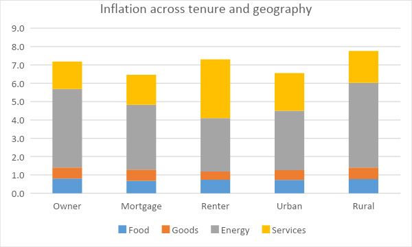
The state we are in: inequality in Ireland 2022

8
2 Global trends
   in inequality

                   9
The state we are in: inequality in Ireland 2022
2 Global trends in inequality
Trends in global inequality have succinctly framed the major socio-economic issues of their times. Though
economic inequality has long been the subject of considerable academic discussion, it is only recently
that discussion has found its way into broad public and political debate. Rising inequality has been an
uneven process, accelerating in some periods and regions while slow or even reversing in others. In
aggregate, though, it has been on the rise.
Figure 1 breaks down one measure of global income inequality (the ratio of the top 10% of earners
compared to the bottom 50%) into differences between all the countries of the world and the distribution
within all these countries.
Figure 1: Developments in global income inequality.
Source: World Wealth and Income Database.
From the early 1800s industrialisation led to increasing inequality between the West, their colonies, and
other less developed countries up to 1980. Within-country inequalities, largely driven by developments in
the West, also increased and so overall global inequality increased significantly. As democracy developed
towards universal suffrage and the labour movement grew stronger, the within-country inequalities began
to decline after 1900, Picketty (2022). With the rapid growth of the welfare state immediately after the
Second World War, the fall in within-country inequality became more pronounced up to the beginning of
the 1960s, reaching an all-time low in 1980.
After 1980 as other nations caught up with the West, mainly in Asia, the between-country inequality has
declined year by year up to the present. This was in stark contrast to within-country inequality which
increased, especially in the period between 1980 and 2000. These strongly divergent recent trends of
within- and between-county inequality resulted in the striking fact that, according to the World Inequality
Report 2022, whether an individual belongs to the bottom 50%, top 1%, etc. in their own country now
matters more than their nationality (where they live) in the determination of global inequality levels
(Chancel at al., 2022).
102 Global trends in inequality
Covid-19 appears to have reversed, at least temporarily, the trend decrease in between country
inequality. World Bank (2022) estimates that the pandemic is estimated to have raised between-country
income inequality due to a slow recovery in less developed countries and so reducing between-country
inequality to the levels of the early 2010s.
The reversal of the post-second world war trend towards more within-country inequality was a highly
significant development but it did not occur uniformly in all countries. Nolan et al. (2021) provide an
account of inequality developments in the richer nations of the world since 1980. Among the English-
speaking countries, there were pronounced increases in the USA and the UK. There were also significant
increases in Australia and New Zealand, less so in Canada and, since 1987 at least, not at all in Ireland.
Among the Nordics inequality rose sharply in Finland and especially Sweden, less so in Norway while in
Denmark little changed. There was some increase in Belgium, Luxembourg, Germany, Italy, Spain and
the Netherlands, no change in Austria and in France inequality actually decreased. In both Portugal and
Greece the data does not stretch back to 1980 but the more recent trends there show a decrease. There
are historical data availability problems for the low inequality formerly state socialist countries, but some
did grow much more unequal. Nolan et al. conclude that ‘these figures show that about two-thirds of
the countries having a significant increase in inequality from around 1980 up to just before the economic
crisis’. (Nolan et al., 2021).
It is of course highly unlikely that such a broad range of national experiences and contexts can provide a
single clear answer to the question of why inequality increased after 1980. Most explanations, however,
do centre around the interactions of increased globalisation and the introduction of digitally-based
technologies, together with different and changing institutional contexts and policies. As regards the more
general drivers of inequality it would appear that there is an emerging consensus around the importance
of globalisation for income distribution in Western Europe and the United States (Dabla-Norris, 2015).
Indeed it is very striking in Figure 1 that just as within-country inequality began to increase in 1980, the
tide also turned to a decline in between-country inequality.
Of course, institutions and policies mattered too. The Irish context, described in the next section,
demonstrates how effectively taxes and transfers can mitigate much of the inequality generated in the
market. However, the role of political choices for income distribution is best exemplified by the very rapid
increase in inequality in the early 1980s in the UK, which can be quite clearly related to the policies
of the Thatcher era. Subsequently, there was little change in inequality up until the recession of 2008.
The political context of the early 1980s in the then influential USA and UK led to a more private market
orientation of economic policies not only in the West but also globally in what came to be known as the
Washington Consensus. The privatisation or marketisation of public services, the deregulation of labour
and financial markets, and challenges to the influence of trade unions have had a regressive impact on
the distribution of income and wealth in those countries that chose to adopt such policies.
11The state we are in: inequality in Ireland 2022 12
3 Inequality in
       Ireland

                  13
The state we are in: inequality in Ireland 2022
3 Inequality in Ireland
This section looks at distributional trends in Ireland. It shows the widely-acknowledged fall in income
inequality and that this long-term fall is attributable to the work done by Ireland’s welfare state. It also
shows that inequality has fallen since the pandemic, which is discussed in the following section.
Trends
Since 2003 the measurement of inequality in Ireland is based on the EU-regulated SILC dataset and
collected by the CSO. Previous measurement used surveys compiled by the ESRI, first in a one-off survey
in 1987 and then in the Living in Ireland survey between 1994 and 1999. These various sources have been,
at least partially, harmonised in ESRI (2021) up to 2019.1 While in principle little harmonisation is required
to ensure consistent measurement of inequality between 2003 and 2019, there is a significant break in
the most recently available SILC data from 2020. This is due to changes in the reference period (of most
importance), the definition of the household, a new sampling methodology and the termination of face-
to-face interviews while the fieldwork was being conducted due to Covid-19. CSO (2021) provides details
of the changes but has yet to provide an assessment of the impact on comparability to previous years.2
Given these uncertainties, and the fact that Covid left both a prominent and unusual footprint on income
distribution since 2020, these developments will be taken up in the next section.
Figure 2 plots three partial measures of income inequality in disposable income showing developments
for higher earners compared to low earners (90-10 ratio), high compared to middle earners (90-50 ratio),
and middle compared to low (50-10 ratio). This refers to income after-tax but includes benefits with
account taken to the size and composition of the household. This is called equivalised disposable income.
Figure 2: Income inequality trends in Ireland.
Sources: EU-SILC (2003-2019), Living in Ireland (1994-1999), Survey of Income Distribution, Poverty and Usage
of State Services (1987), as adjusted in ESRI (2021).
1 There may be some remaining comparability issue with the SILC data related to sample attrition in the 1994 to 1999
Living in Ireland Survey and differences in the survey mode between the two pre 2003 surveys and the more recent SILC.
2 A CSO press release from 21 December 2021 states that ‘the CSO would also like to highlight a break in the official
SILC time series. This means that 2020 SILC results cannot be compared with results from previous rounds of the SILC.’
Conversations with CSO staff revealed that there is no way of assessing whether the revised methodology would tend to
14 increase of decrease inequality.3 Inequality in Ireland
In 1987, those near the top of the income distribution earned four times more than those at the bottom.
The middle group earned just under twice that of the lower earners and the well paid just over double
those at the middle. The pattern of variation over the whole period is best viewed in the top curve (the
90-10 ratio). With the economic development and accompanying employment growth of the Celtic tiger
inequality fell up to the recession of 2008 and then then increased up to 2012. While there is fluctuation
of all three measures over the whole period, the overall trend is towards less inequality. This was most
pronounced between 2017 and 2019 with the 2019 number being the lowest for the entire period.
The tendency towards greater disposable income equality is mirrored in the Irish trends relative to the EU
average. Up until the recession of 2008 the Gini coefficient in Ireland (the most commonly used overall
measure, with 0 corresponding to everybody having the same income and 1 to one person having all the
income) was around or just above the EU average. Since then Ireland’s inequality has fallen and, as shown
in Table 1, income inequality is currently well below the European average in 2020. Note that despite the
level of inequality being below the EU average, Ireland is ranked around the middle, as average values
are pulled up by highly unequal countries such as Bulgaria.
Table 1: Inequality ranking of EU member states from most equal to most unequal, Gini coefficients
for equivalised disposable income, 2020.
rank country Gini rank country Gini
1 Slovakia 0.21 15 Cyprus 0.29
2 Slovenia 0.24 16 Malta 0.30
3 Czechia 0.24 17 Estonia 0.31
4 Belgium 0.25 EU average 0.31
5 Finland 0.27 18 Luxembourg 0.31
6 Sweden 0.27 19 Portugal 0.31
7 Austria 0.27 20 Greece 0.31
8 Poland 0.27 21 Spain 0.32
9 Denmark 0.27 22 Italy 0.33
10 Hungary 0.28 23 Romania 0.34
11 Netherlands 0.28 24 Germany 0.34
12 Croatia 0.28 25 Latvia 0.35
13 Ireland 0.29 26 Lithuania 0.35
14 France 0.29 27 Bulgaria 0.40
Source: Eurostat, EU-SILC.
While the recent improvement in Ireland’s distributional performance is likely a result of its employment
performance, the Irish welfare state has done much to redistribute income. Trends in inequality, in both
market (before taxes and transfers) and disposable (after taxes and transfers) income between 1987 and
2021 are plotted in Figure 3 using the Gini coefficient. Trends in the Gini mirror that of the three partial
measures of disposable income inequality from Figure 2 (SILC 2019:28.3, 2020:28.7). Market income
inequality is appreciably higher and rose dramatically in the early years of the Great Recession. Despite
the recent decline, indicating employment expansion as the economy recovered, there is no discernible
downward trend in market income inequality over the whole period as there was for disposable income.
The 2019 market income Gini coefficient is the same as in 1987, indicating that over the long term
employment expansion has not been the driver of Ireland’s improved distributional performance. Market
inequality in Ireland is the most unequal (together with Romania and Bulgaria) of all European countries
in the OECD and higher even than in the United States (OECD, 2022).
15The state we are in: inequality in Ireland 2022
While data on market inequality are not available for 2020 and 2021, they are available for disposable
income. As discussed, the most recent release of SILC, the survey used to measure income and its
distribution, has a methodological change, so is shown in grey. It shows that inequality has continued
to fall, so that income inequality is at its lowest ever recorded point. Inequality and the pandemic is
discussed more fully in the next section.
Figure 3: Market and disposable income inequality (Gini coefficient), in Ireland 1987 to 2019.
Sources: EU-SILC (2003-2019), Living in Ireland (1994-1999), Survey of Income Distribution, Poverty and Usage
of State Services (1987), as adjusted in ESRI (2021).
The welfare state has and continues to play an unusually large role in redistributing income in Ireland.
This is demonstrated by the very large gap between market inequality and disposable income inequality,
which shows the effects of taxes and transfers. Indeed, in the OECD area on average taxes and transfers
led to a 25% reduction in income inequality (from market to disposable income) as measured by the
Gini coefficient (OECD, 2018). In Ireland, the reduction was 40% - the highest in the OECD area. Thus the
current below average level of disposable income inequality in Ireland relies heavily upon the strong re-
distributional impact of taxes and benefits.
Moreover, the redistributive nature of Ireland’s welfare state has grown over time. While in 1987 taxes
and transfers reduced the Gini, from market to disposable income by 36%, in 2019 the corresponding
reduction was 46%. The reduction of inequality is not due to a more equal labour market but to taxes and
benefits. Of the two Savage et al. (2015) estimated that roughly three quarters of the total reduction in
inequality was due to transfers, and one-quarter from direct taxation.
Though redistribution is straightforward to understand, no single factor has been settled as the main
cause of Ireland’s high market inequality. Part of the explanation is due to the high rate of people living in
households in Ireland without any market income at all. Nolan and Maître (2021) identify the contribution
of jobless households to market inequality compared to other countries and find that it does explain
some of the gap (see also Roantree, 2021). However, it does not eliminate it and there is still a very high
dispersion of labour income in both one and two-earner households that has yet to be accounted for.
Aside from jobless households, Ireland has many so-called low work intensity households. These are
households in which working age members work less than a fifth of their paid working time. Though
163 Inequality in Ireland
difficult to quantify the impact, that Ireland has one of the highest rates of low work intensity households
in the EU is another contributory factor to Ireland’s high level of market inequality (Nugent, 2021).
Less explored in an Irish context is the impact on market inequality of individual wage inequality, which
is high in Ireland. Part of the reason stems from the fact that low paid workers are generally not located
in low-income households (Collins, 2016). Some policies that mitigate wage inequality, such as minimum
wage increases, will therefore be of limited impact in reducing market inequality, at least when measured
at the household level as it typically is. However, Ireland also has high rates of high pay, where people earn
more than one and a half times the gross median earnings of full-time workers. As highly paid individuals
are located in high-income households, efforts to tackle wage inequality at the high end would reduce
Ireland’s high market inequality (Sweeney, 2021).
17The state we are in: inequality in Ireland 2022 18
4 Income inequality
 and the pandemic

                      19
The state we are in: inequality in Ireland 2022
4 Income inequality and the pandemic
The previous section established that not only has income inequality fallen, but that over the long term,
the welfare state has been the key actor in reducing inequality. Inequality also fell during the pandemic,
but it is as yet unclear why. This section shows that welfare supports during Covid have played an
important role in mitigating inequality.
Factors influencing the distributional outcome of the pandemic
The first main factor that has driven income distribution in the pandemic was the reduction in market
income caused by the job loss (or reduction of hours worked) attributable to either the pandemic itself
or the lockdown restrictions. These were largely in sectors where the business is conducted by face-to-
face interactions such as hospitality, entertainment and recreation activities. These sectors are amongst
the lowest paid of all sectors. In this respect, the pandemic-induced recession was different to other
recessions where typically the better-paid manufacturing and construction are hardest hit.
The other main factor is how social insurance systems, both those in place before the pandemic (for
example the job seekers assistance, JSA) and those introduced specifically to combat the extraordinarily
severe labour market consequences caused by the pandemic. In practically all EU countries, these were
primarily various forms of job retention and unemployment benefit schemes (Eurofound, 2022).
In Ireland the Pandemic Unemployment Payment (PUP) was introduced in March 2020. Payment levels
varied over time but were never lower than €203 a week, i.e. the same rate as the JSA. In most respects
the PUP was more progressive than the JSA as, in addition to the level of compensation, it did not require
proof of employment experience and was not means tested. It was however less generous than JSA in
terms of payments to other dependent adults in the household.
The Temporary Wage Subsidy scheme (TWSS) was also introduced in March 2020. It subsidised wages
(paid to the employer) for employees who could be deemed to otherwise have been made redundant to
up to €410 per week for eligible employees that were kept on the payroll. In September it was replaced
by the Employment Wage Subsidy scheme (EWSS), which provided a similar subsidy in firms with at least
a 30 per cent loss in turnover.
It is difficult to gauge the extent of support in Ireland compared to other European countries in terms of
either the costs or the coverage. This includes both the measures already in place before the pandemic
(automatic stabilisers) and the measures specifically introduced to address the pandemic (discretionary
measures). However, it does appear that the coverage of the Irish job retention scheme (percentage of
employed receiving the subsidy) was rather high and above all prolonged (OECD 2022b) and the relative
fiscal cost (as a percentage of national income) of all measures in Ireland was above the European average
(Conefrey et al. 2021).
Previous studies estimating the distributional outcome of the pandemic
There are still rather few studies that can utilise actual individual income data to trace the impact of
the pandemic on income inequality not only in Ireland but also elsewhere. Various studies use so-
called nowcasting techniques. These take pre-pandemic household data and update such data using
known changes in the labour market (employment, unemployment and market income) together with
simulations of the impact of the prevailing tax and transfer systems.
204 Income inequality and the pandemic
For Ireland O’Donoghue et al. (2021) estimate that the net result of the initial negative income effects due
to the job loss together with the compensatory automatic stabilisers and discretionary measures actually
led to a decline in income inequality as measured by the Gini coefficient. Also, Doorley et al. (2020) find
that the policy measures ‘completely stabilised disposable income inequality’. Both studies focused on
the early periods of the pandemic. Similar results are found in the UK. Corlett and Try (2022) estimate
‘that the significant pandemic-related package of benefit support in 2020-21 contributed to welcome
reductions in income inequality, relative poverty and absolute poverty.’
There are very few studies in Europe to date that use actual income data and do not have to rely on
simulations. Clark et al 2021 (based on a survey conducted during the pandemic between January 2020
to January 2021) in France, Spain, Germany and Italy find that income inequality decreased. Grabka (2021)
using the well-established German Socio-Economic panel also finds a small decrease in inequality, due
to the losses incurred by some high earning self-employed and the targeting of support measures to
lower earners. Sweden appears to be the only exception to the finding of a net progressive effect of the
pandemic. The authors, Angelov and Waldenström (2021), suggest that this may be due to the relatively
modest level of targeted Covid support measures there.
The distributional outcome of the pandemic in Ireland 2020
None of the Irish research cited above has been based on household data collected since the onset
of the pandemic. While it does appear likely that the studies based on nowcasting methodologies are
at least roughly right in terms of the overall distributional message, evidence based on data actually
collected post pandemic that is directly comparable to pre pandemic data is obviously to be preferred
both in terms of reliability and being able to more precisely identify the distributional outcome.
In early 2022 the CSO published a Frontier Series Dataset that by using administrative data sources is able
to provide income data that allow for comparisons between 2019 and 2020. According to this data median
equivalised disposable income for calendar year 2020 was €24,674 which increased from €23,675 in
2019.
Figure 4 groups net equivalised disposable income into deciles (each comprised of 10% of the population)
broken down by the source of income in 2020. Decile 1 corresponds to the lowest earners and Decile 10
is the highest. It highlights the crucial importance of the non-pandemic related social transfers for the
lower income groups, not least for the lowest decile where it accounted for all of 72% of net equivalized
disposable income. Moving up to the 9th decile an ever larger share of income comes from employment,
peaking at 80%, only to fall by the 10th decile where other sources contributed to 17% of income.
The PUP had a progressive impact on income distribution as it accounted for a much smaller share of
income for Deciles 7 to 10 than for the others, especially Decile 1, 4 and 5. The wage subsidy schemes
were a relatively more important source of income for the middle deciles in particular deciles 4 to 7.
Overall Covid-19 income supports accounted for between 8% and 13% of income up to the 7th decile. For
the other upper deciles this percentage declines and accounts for only 2% in the 10th decile.
21The state we are in: inequality in Ireland 2022
Figure 4: Net equivalised disposable income by source of income in 2020.
Source CSO (2021b).
Figure 5 shows that most of the total Covid expenditure (PUP and WSS) went to the middle income
deciles, but with somewhat more weight towards the top of the distribution. The 5th decile had the
highest average Covid-19 support payment (€3,024), followed by the 6th (€2,853) and 4th (€2,738). The
lowest average Covid social transfer payment was to the lowest income decile (€963), where WWS was
particularly low. The top three receivers of WWS were in Deciles 7, 8 and 6 and for PUP 5, 6 and 4.
Figure 5: Covid supports by decile.
Source CSO (2021b).
To examine the changes between 2019 and 2020, the deciles were defined in 2019 and incomes were
compared to the same individuals in 2020. In other words, the income distribution as of 2019 is taken, and
the distributional impact of Covid supports estimated to predict changes in income for different groups
224 Income inequality and the pandemic
in 2020. In Figure 6 the blue line shows income change that would have happened without Covid-19
income supports and the red line includes the Covid supports. The grey line shows the net impact of the
measures.
Figure 6. Percentage change in income due to Covid supports 2020.
Source CSO (2021b).
Had there been no Covid supports only the lowest income decile would have had an increase in income
(2%). This is shown by the blue line which is positive for decile 1 only. All other deciles would have lost
income in 2020 compared to 2019 with the biggest losers in the 5th and 10th decile. The Covid supports
raised income for all deciles resulting in a positive increase in income for all deciles except the top one.
The grey line is the difference between the two others and so represents the added re-distributional
impact of the Covid measures. The biggest effect is in the first decile, mainly attributable to the PUP, and
the 5th which received the most of both supports combined. The decline in the extra Covid effect after
the 5th decile highlights that the Covid measures were progressive and led to lower levels of inequality
in Ireland.
Note that this is not inconsistent with Figure 5 which shows where Covid supports were directed in euro
terms. Though lower income groups received less in euro terms than middle income groups, they have
less income to begin with. They therefore have experienced a comparable percentage increase in their
incomes.
The distributional outcome of the pandemic in Ireland 2021
The pandemic and lockdown continued into 2021, although not at quite the same level seen in 2020. As
a result, 2021 saw an extension of the Covid supports, especially as the virus began to grow again toward
the latter part of the year after the summer opening. The state, then, has continued to play an important
role in supplementing incomes.
Figure 7 below shows the composition of household disposable income for 2021. This is based on SILC
2021, which relates only to the first part of the year. The pattern seen is largely the same as that shown
23The state we are in: inequality in Ireland 2022
in Figure 4. Lower income deciles are heavily dependent on transfers, as would be expected. Both PUP
and EWSS remain important sources of income, albeit somewhat less important than in 2022. The sixth
decile received the most from PUP in euro terms the 8th decile received the most from EWSS. As a share
of income both PUP and EWSS have been most important for Decile 6.
Figure 7: Composition of household disposable income 2021.
Source: CSO (2022b).
In terms of redistribution, Figure 8 below reproduces Figure 6 but using data for 2021. It looks at how
Covid measures introduced in 2021 affected different deciles of the income distribution, measured by
equivalised household disposable income. The blue represents the percentage change in income
excluding Covid-related supports, whereas the red line represents the change in household income that
occurred with Covid supports. The grey line isolates the effect of the Covid supports. This assumes that
absent Covid supports conventional welfare payments would not have been expanded.
The pattern is largely the same as in 2020. As per the blue line, only Decile 1 would not have suffered a
loss in income due to Covid. This is likely a result of lowest income households being detached from the
labour market to begin with so that Covid had a comparatively modest impact on income. Deciles 3 and
4 suffer the largest income losses, no doubt a result of employment losses in the less well-paid service
sector.
244 Income inequality and the pandemic
Figure 8. Percentage change in income due to Covid supports 2021.
Source: CSO (2022b).
In terms of (predicted) outcomes, the red line shows that lower-income groups gained the most. The line
is almost monotonically or smoothly decreasing, where each decile gains less as we move from poor to
rich. The grey line shows that Deciles 3 and 4 gained the most from Covid supports. The measures were
therefore very well targeted as it was these groups who experienced the largest income losses from the
pandemic.
The effect on inequality of Covid supports on income inequality in terms of Gini coefficient and income
shares is not available. However, the CSO does produce a series showing the change in the at-risk of
poverty rates. One is at risk of poverty if their (equivalised) household income per person is less than 60%
the median. While different from the Gini coefficient or ratio of the income of the top and bottom decile,
at risk of poverty generally moves in tandem with conventional inequality metrics.
As shown in Table 2, without social transfers or Covid-related supports, 41.3% of the population would fall
below the at-risk of poverty threshold. Social transfers do much to alleviate poverty as only a fifth of the
population are at risk when non-Covid transfers are added. Finally, Covid-related transfers do much to
reduce inequality as poverty risk falls by a further 8.3%.
Impact of measures 2021 At-risk of poverty rate (%)
All measures included 11.6
Without Covid supports 19.9
Without general or Covid supports 41.3
Table 2: Impact on measures on at-risk of poverty 2021.
Source: CSO SIA113.
It would be tempting to attribute the fall in inequality (and poverty) to the exceptional welfare supports
introduced during Covid such that absent such supports, inequality would not have changed. It is difficult
to quantify definitively but had there been no Covid supports, poverty risk would certainly be lower than
19.9%. This is because were workers made unemployed instead of being EWSS, they would be in receipt
25The state we are in: inequality in Ireland 2022
of other welfare payments. This is also the case with PUP, the claimants of which have now moved to
jobseekers payments. The above table disaggregates the effects of the various payments given poverty
has fallen, and is not a counterfactual claim that says without a given pandemic payment poverty would
not have fallen by a given amount.
In sum, the Irish welfare state has done much to reduce Ireland’s high level of market inequality over the
long-term. The fall in inequality means that Ireland currently ranks in the middle among EU countries. The
latest fall in inequality may improve that position further. The supports introduced during Covid did much
to cushion the losses in labour market income during the pandemic. They were very well-targeted as
they were directed at those who suffered the largest losses. To the extent that it is the extraordinary and
transitory measures introduced during Covid that are responsible for the latest fall in inequality is unclear.
Conventional welfare payments would have expanded in their absence, albeit to an unknown extent. We
next turn to how the cost of living has impacted inequality.
265 Inequality and
the cost of living
27The state we are in: inequality in Ireland 2022
5 Inequality and the cost of living
Having established that income inequality has fallen over the last number of years, the remainder of this
report turns to how the rising cost of living has impacted distributional outcomes.
Distributional aspects of inflation
The opening up of economies after Covid was predicted to put upward pressure on prices as supply
struggled to meet pent-up demand. Its asymmetric nature, with high-income, highly-vaccinated Western
economies now largely open for business, and the persistence of Covid in much of the developing world
where goods are produced, has, however, aggravated general prices pressures. The Russian invasion
of Ukraine has done much to add to this, especially with regard to the price of energy. Nevertheless,
the extent to which global inflation has reemerged has taken most commentators by surprise. As well
as eroding living standards, high inflation makes it difficult for households and businesses to plan, and
can lead to a slowdown in investment. It therefore has had and is having major social, distributional and
economic implications.
Inflation is calculated based on economy-wide consumption patterns of households. The Consumer Price
Index, the main inflation indicator in Ireland, reveals the average price change of goods and services. This
is important as changes in wages, social welfare payments, pensions and so on can be benchmarked to
see if, or to what extent they are keeping up general changes in the cost of living.
However, different groups in society have different consumption patterns so that the average change
in the price level will not necessarily be the same as the average change in the price of an individual’s
or a group’s typical consumption basket. Lower-income households consume fewer luxury goods and
services so that essentials are likely to comprise a larger share of their household budget. Similarly, the
consumption patterns of urban and rural households are likely to differ, as it is the consumption of the
old and the young. Indeed the most recent bout of inflation has affected groups in societies differently,
although it has been found that over the long-term inflation affects all similarly (Lydon, 2022a).
The figure below looks at the breakdown of inflation by income group, and among four general
consumption groups. An important caveat is that these calculations are based on the previous Household
Budget Survey, which relates to 2015. The figure assumes that consumption patterns are the same today
as they were six years ago and similarly that households have not shifted consumption behaviour in the
face of recent inflation. The figure is up to March 2022, so that it measures the year-on-year increase in
prices between March 2021 and March 2022. As can be seen, inflation is running at an aggregate level of
almost 7%, which is significantly higher than what has been seen in recent years.
285 Inequality and the cost of living
Figure 9: Inflation across the income distribution.
Source: Lydon (2022b).
Importantly in the context of this report is that the bottom 20% of income recipients, Quintile 1, have
experienced the largest increases in prices. The inflation rate for this group has been just under 8% for
this group, while for Quintile 2, it is closer to the average at just over 7%. Inflation rates continue to fall as
one moves up the income distribution – the top 20% has faced an inflation rate of a little over 6% over the
last year. In other words, the erosion of living standards has been greatest for those with least income.
The major contributor to inflation has obviously been energy, which has increased by 43.8% over the last
year. As energy is a necessity, all households consume it so that it comprises a larger share of low-income
households’ budgets, given their lower incomes. Being a necessity means that energy consumption is
less subject to change in the face of rising prices. Another factor that elevates lower-income households’
energy use is their comparatively poor standard of accommodation, which tends to be less well-insulated
than high-income housing. Combined, these factors explain why the poor have suffered most under rising
cost of living pressures.
While income is the most obvious way to analyse cost of living in an inequality context, it is clearly not
the only one. Pre-covid most discussion of Ireland’s high cost of living had centered on the rising cost of
accommodation. Urban renters, in particular, had experienced very high increases in the cost of a most
basic necessity, shelter. Geography has much to say about the economic lives that people live.
Figure 10 below breaks down inflation by tenure type and according to rural and urban residence.
Variations in inflation by tenure type are not as pronounced as variations according to income. Renters
and owners have experienced largely the same level of inflation, which is only somewhat above mortgage
holders. Renters spend less on energy, which is likely a result of living in smaller units, but spend more on
services, perhaps due to their younger age. Rural dwellers may have larger houses and so spend more
heating their home, but also spend more on energy-based products due to a greater reliance on private
transport.
29The state we are in: inequality in Ireland 2022
Figure 10: Inflation across tenure and geography.
Source: Lydon (2022b).
The four consumption categories in these figures have been chosen on the basis of data available for
disaggregation by income and other categories. There is obviously much going on within the four groups
of food, goods, energy, and services. For instance, transport has also experienced major price increases
as annual inflation to March 2022 stands at 18.7% (CSO, 2022a). This has been driven by fuels for personal
transport and transport services. Petrol and diesel have increased by 35.2% and 46%, while transport
services have increased by 25.6%, mostly a result of higher aviation costs. Public transport prices have
fallen, as the government has effectively subsidised public transport users (ibid.). It is therefore likely that
the large increases in transport prices have affected low-income households less, in significant part due
to government policy.
Fuel and energy poverty
Poverty and deprivation are defined with reference to one’s income and one’s ability to afford the necessities
of life. Energy is obviously a necessity and poverty and energy poverty overlap, but not completely.
Generally speaking, a household is energy poor if it is unable to provide itself with a comfortable standard
of heat. Energy poverty can adversely impact one’s physical and mental health. Colder accommodation is
unpleasant to reside in and can impede one from carrying out functions important for daily life.
There are a number of ways to measure energy poverty (see Lawlor and Visser, 2022). One measures
energy poverty as the share of households that spend more than 10% of their income on energy. Using
this metric, the rate of energy poverty in Ireland was found to be 17.5% in 2020. Severe and extreme
energy poverty, the share of households spending more than 20% and 30% respectively, was found to be
5.6% and 3.0% (O’Malley et al., 2020). The weakness of energy spending shares is that they may capture
some high-income households who choose to have high energy spending – such as those with large
homes or swimming pools. On a more subjective level, the share of people reporting difficulty heating
their homes was 4.9% in 2019, down from 9% in 2015 (Lawlor and Visser, 2022). It is very likely that energy
poverty has increased considerably in 2022. The year-on-year inflation rate for energy products is 43.6%
as of March 2022.
Energy poverty is caused by a variety of factors. Aside from a lack of income, substandard housing and
305 Inequality and the cost of living
general price inflation elevate the risk of being energy poor. The latter may arise when households
economise on energy consumption in the face of rising prices for other goods and services. In an
Irish context, being a lone parent, having low education, single glazing windows, and dampness in
one’s residence are among the factors that lead to energy poverty (Tovar-Reanos, 2021). However, the
relationship between quality of accommodation and energy poverty has declined over time, and energy
poverty in Ireland is now more directly related to income (Farrell, 2021). This may be due to higher building
standards.
Overall the cost of living crisis has impacted lower-income households the most, as is recognised. This
has been driven by higher energy use, which has seen the largest increase in prices. Pre-cost of living
inflation, energy poverty had been in decline, though this has surely reversed now. The following section
seeks to understand structural or longer-term drivers of the cost of living crisis in Ireland, focusing on
energy use.
31The state we are in: inequality in Ireland 2022 32
6 Structural drivers
    of cost of living

                        33
The state we are in: inequality in Ireland 2022
6 Structural drivers of cost of living
Energy use
Access to reliable sources of energy is an integral part of modern living. It enables one to live comfortably
at home, to work comfortably in the workplace, and to travel to and from work and social life. Energy
also facilitates modern commerce, and will continue to do so in the digital age. As well as having general
access, access must be reliable as disruptions can have severe economic consequences. This point is
underscored by the recent geopolitical events.
Table 3 below breaks down final energy use in Ireland by the three main modes: electricity, transport,
and heat. When heat or transport is sourced from electricity, such as electric cars, this is counted as
electricity not transport. We use the year 2019 as though data for 2020 are available, the large change in
consumption patterns was exceptional due to the lockdown and is unlikely to hold from 2022 onwards.
Share Growth in ktoe ‘05-’19 (%)
Electricity 19.7 16.7
Transport 42.7 2.8
Heat 38.3 -12.6
Table 3: Energy use by mode.
Source: SEAI (2020).
Notes: ktoe stands for kilotonne of oil equivalent.
We can see that transport accounts for the greatest share of final energy use in Ireland, after which comes
heat. Transport use declined sharply in the previous financial crash but since the recovery has surpassed
heating as the major form of energy consumption. Heating comes a close second. Then comes electricity,
which is used for lighting and other appliances.
Breaking down energy use by sector as opposed to mode of energy produces similar results (SEAI, 2020).
The transport sector remains the major consumer, with an almost identical share of energy consumption
at 42.1%. Next comes the residential sector which, at 23.2%, comprises just under a quarter of final energy
use. Industry and services make up most of the remainder as together they use a third of final energy.
As well as general energy use by industry, data centres constitute a significant component of energy -
currently around 11% of electricity but due to rise. The government has stated that this does not raise
prices for consumers, though it will make it more difficult to meet emissions targets and has implications
for security of supply (Oireachtas, 2021). Clearly, most but not all of the total energy consumed in heating
and electricity goes toward heating and supplying homes (ibid.).
Transportation is a major channel through which global energy prices translate into price inflation at home.
Private cars consume 37.2% of the energy use of the transport sector, by far the major consumer. Around a
fifth comes from aviation and another fifth comes from goods vehicles. Public passengers comprise less
than 3%. Fossil fuels, particularly diesel, are the most important fuel type (ibid.).
In terms of international comparisons, energy prices are higher in Ireland compared to other countries
(Denny, 2021). Residential electricity prices are the third most expensive out of 14 EU countries and the
UK, residential gas prices around the middle, and diesel prices the joint fourth most expensive (ibid.).
346 Structural drivers of cost of living
A variety of factors affect the energy and electricity prices including fuel generating mix, taxation, general
labour and non-labour costs, and more. Energy tax rates are generally lower in Ireland than the EU, though
labour costs in the electricity sector are above average, as would be predicted for a high-income country
(ibid., Eurostat, 2022). Denny attributes Ireland’s high electricity prices to first and foremost Ireland’s high
import dependency for energy, and secondly poor land use planning. The importance attributed to import
dependency may be surprising given that energy markets are typically global markets, with a single,
global price. That being the case, whether energy is sourced domestically or whether it is imported from
abroad should matter little in terms of costs. While this is the case for oil, it has historically been less the
case for gas (Fitzgerald, 2011: 13). As to the importance of planning, electric cables have to run a lot farther
here given Ireland’s history of sprawl and one-off rural housing (Denny, 2021).
Regarding households and particularly low-income households, there is no harmonised EU-wide series on
the energy efficiency of homes. Eurostat collects information on home energy use, which naturally varies
depending on how hot or cold the climate is. Irish homes are, however, significantly less energy efficient
than homes in the UK, which has largely the same climate (ibid.: 324). A study by home heating company
Tado (2020) examined how much temperature homes lose after 5 hours with an inside temperature of
20c, and an outside temperatures of 0c. The study therefore provides a measurement of home energy
efficiency that is unaffected by a country’s climate. The study does not present data on Ireland but it finds
that UK homes are the least energy efficient out of 11 Western European countries. Available evidence
therefore suggests that Irish homes are among the least energy efficient in Western Europe, and may be
the least efficient. As discussed, it is likely that lower-income housing is among the least energy efficient
though it is important to note that this relates to existing stock and regulations have been passed in
recent years to improve energy efficiency of new homes.
Transport use
As the transport sector is a major user of energy, patterns of transport use have important implications for
understanding the cost of living crisis. Moreover, as many of the cost of living measures have subsidised
fossil fuels, it is essential that concurrent policies are pursued to mitigate their environmental impact.
Transport policy is relatively understudied topic with policy to date oriented more towards building roads
than incentivising public use (Rau and Hynes, 2016). Transport policy will have to undergo a major shift in
the coming years.
The table below shows how transport costs in Ireland compare to other EU countries. Both overall
transport costs and a subgroup, transport services, are included, along with public spending on transport
as a percentage of national income. Transport services includes public transport and also aviation and
sea transport. As 2021 data are not yet available, we use 2019 data to avoid distortions caused by the
lockdown. The figures are presented in purchasing power parity as an index, with Ireland as a base.
Purchasing power parity is a conversion that shows the relative price of the same good or service in
different countries. Or, equivalently, it shows how much needs to be spent in one country to purchase
the same volume of goods or services in another country. As Ireland is the base country, the values in
the table indicate how much needs to be spent to receive the same amount of transport that 100 units
of spending provides in Ireland. To take the example of Ireland and Greece, Greece’s value is 83.3 and, as
Ireland is the base country, its value is 100. This means that to consume the same amount of transport
that €100 provides in Ireland, one needs to spend €83 in Greece, for instance.
35The state we are in: inequality in Ireland 2022
Transport Transport services Public spending
Greece 83.3 67.7 1.9
Luxembourg 86.5 66.7 3.2
Spain 86.5 72.0 1.5
Portugal 89.3 79.5 1.8
Italy 92.8 72.1 1.8
Belgium 97.3 95.9 2.8
UK 99.3 115.5 -
Ireland 100.0 100.0 1.8
Germany 100.5 116.1 1.6
France 100.6 94.7 2.0
Austria 101.0 99.2 2.8
Finland 105.5 104.2 2.2
Sweden 105.8 90.1 2.8
Netherlands 112.1 125.8 2.1
Denmark 120.2 117.7 1.7
Table 4: Cost of and public spending on transport.
Source: Eurostat, PPP, price level indices and COFOG. CSO N2024.
Note: Public spending expressed as a percentage of GDP, except for Ireland where it is expressed as a
percentage of GNI*. GNI* removes the distortions to GDP caused by multinationals’ tax planning and avoidance.
We see that in Ireland aggregate transport costs are in the middle in Ireland. As many countries have
higher transport costs than Ireland as they do lower costs. When it comes to transport services, which is
more relevant to public transport, Ireland is the sixth most expensive country. Despite the fact that lower-
income households have been relatively insulated from rising transport costs, such households seem to
face a high cost of transport to begin with. Interestingly, many of the countries where transport services
are more expensive such as Belgium, France, Austria, and Sweden have higher standards of living than
Ireland (Honohan, 2021). Higher public transport costs are not merely a result of being a high-income
country then.
When it comes to public spending, Ireland is again around middle, along with a number of other
countries. This is consistent with the fact that public transport comprises an above-average share of
passenger kilometers in Ireland compared to other EU countries (Eurostat, 2022).3 Aside from Ireland,
which is a median spender on public transport but has an above average costs of transport services, the
relationship between public spending and the cost of transport services is negative – more spending
generally lowers costs. In Ireland, public spending may not have translated into low costs because of
other factors that drive up the cost of public provision. This includes Ireland’s high level of sprawl and high
transport fuel prices. As we discuss later Dublin appears to be a highly congested city.
High dependence on energy imports and poor land use planning have exacerbated the cost of living crisis
in Ireland. These are structural issues that are not easily remedied. Before looking at policy implications,
we first review some of the cost of living measures implemented so far.
3 These data exclude cycling which may be more important in many European countries than in Ireland.
367 Short-term
social protection
measures
implemented
37The state we are in: inequality in Ireland 2022
7 Short-term social protection
measures implemented
The government has introduced a series of measures aimed at alleviating the cost of living pressures.
The first suite, announced in February, included increases in fuel allowance, energy credits, and more.
The second package, announced over the subsequent two months, included reductions in VAT, further
changes to fuel allowance, and cuts to excise duty. Questions arise as to how well-targeted these
measures are.
Fuel allowance is a social welfare payment available to certain social welfare recipients. It is designed to
assist people to meet the costs of heating their homes. To qualify, a means test must be passed whereby
being in receipt of non-contributory welfare payments will generally be sufficient to pass, though is not
necessary to do so. Non-contributory payments are those payments in which recipients do not have
sufficient PRSI contributions to automatically qualify and so must pass a means test. It includes the non-
contributory state pension, the disability allowance, and many more. The standard rate of payment for
fuel allowance is €33 per week and is available for 28 weeks of the year. In February of this year, an
additional €125 lump sum was announced and paid to recipients in mid-March.
In addition to increasing fuel allowance, the government also provided an energy credit of €200 euro
for every home in the country. The rebate was paid directly to households’ energy supplier, costing the
exchequer some €378 million. As the credit is effectively a flat payment to all households, unlike the
increase in the fuel allowance it is non-means tested and not targeted. It is therefore less progressive. The
government also introduced a 20% reduction in the cost of public transport beginning in April until the
end of the year. Other measures included an increase in subsidies for school transport and an increase in
the Working Family Payment.
The resurgence of Covid in China and other parts of the world has led to another series of lockdowns
in many of the major manufacturing countries. Global inflation has therefore persisted longer than what
most commentators believed. The Russian invasion of Ukraine in late February and the reaction of global
oil and other commodity markets have greatly magnified already existing price pressures. In March and
April further measures were announced.
In March the government announced a reduction of excise duty of 20c per litre on petrol (to 46c) and an
excise reduction of 15c per litre on diesel (to 40c) (see Revenue, 2022). These measures aimed to reduce
the cost of personal transport and are expected to save the typical motorist €9-12 when filling their tank.
There has also been reduction on excise duty on green diesel. The measures are due to last until Budget
Day in October and will cost the exchequer €80 million (GoI, 2022).
Doorley et al. (2022) examine the distributional impact of the measures up to March. They estimate the
contributions of earnings growth, excise cuts, cost of living measures, and Budget 2022 to the income
growth of each decile in the income distribution. In terms of all policy measures (i.e. all income changes
excluding earnings growth), the bottom 10% in the income distribution has benefitted most. Deciles 6-8
also benefitted significantly, with the top two deciles along with 3 and 4 benefitting less. The bottom 10%
has also benefitted the most from the cost of living measures, no doubt due to the highly targeted nature
of the fuel allowance and reforms to Working Family Payment. Policy measures, though shielding the
poorest have been uneven.
38You can also read