The Gini Index: A Lens for Analyzing Inequality in an Interdisciplinary College Classroom - USF Scholar Commons
←
→
Page content transcription
If your browser does not render page correctly, please read the page content below
Numeracy
                                                                      Advancing Education in Quantitative Literacy

Volume 12 | Issue 1                                                                                                           Article 5

2019

The Gini Index: A Lens for Analyzing Inequality in
an Interdisciplinary College Classroom
Jared Warner
Guttman Community College, jaredwarner4@gmail.com
Vivian Lim
Guttman Community College, vivian.liu@guttman.cuny.edu

Follow this and additional works at: https://scholarcommons.usf.edu/numeracy
     Part of the Science and Mathematics Education Commons

Recommended Citation
Warner, Jared, and Vivian Lim. "The Gini Index: A Lens for Analyzing Inequality in an Interdisciplinary College Classroom." Numeracy
12, Iss. 1 (2019): Article 5. DOI: https://doi.org/10.5038/1936-4660.12.1.5

Authors retain copyright of their material under a Creative Commons Non-Commercial Attribution 4.0 License.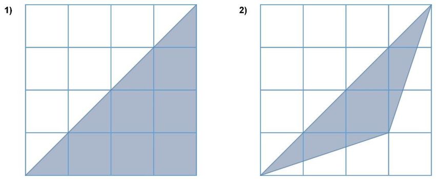
The Gini Index: A Lens for Analyzing Inequality in an Interdisciplinary
College Classroom
Abstract
The Gini index is one of the most commonly used indicators of income inequality, and its computation and
interpretation require a thorough understanding of various quantitative literacy concepts. In this article, we
describe a unit for an interdisciplinary quantitative literacy course at a community college that treats concepts
of ratio and proportion, percentages, and mathematical modeling through an exploration of income inequality
and the Gini index. The broader theme of the interdisciplinary course is immigration, so the unit also invites
students to explore connections between the Gini index and immigration. Employing in-class simulations,
interactive online applets, and real-world data sets, the unit offers a variety of ways for students to encounter
the quantitative literacy material through the lens of income inequality and immigration. Using both student
and instructor reflections, we analyze the strengths and challenges of the unit through the lens of the culturally
relevant mathematics pedagogy (CureMap) framework as developed by Rubel and Chu (2012).

Keywords
quantitative literacy, mathematics for social justice, Gini index, income inequality

Creative Commons License

This work is licensed under a Creative Commons Attribution-Noncommercial 4.0 License

Cover Page Footnote
Jared Warner and Vivian Lim are Assistant Professors of Mathematics at Guttman Community College. Jared
enjoys the challenge of bringing mathematics to life for his students, and the creativity this challenge draws
out of him. Vivian’s background and research interest is in teaching mathematics for social justice; her goal is
to challenge her students to view mathematics differently and to empower them to use mathematics to tackle
the world’s problems.

           This theme collection: social justice is available in Numeracy: https://scholarcommons.usf.edu/numeracy/vol12/iss1/art5
Warner and Lim: The Gini Index: A Lens for Analyzing Inequality
Introduction
The Gini index is a mathematical tool that quantifies inequality in the distribution
of a particular resource (income, wealth, energy, etc.) within a population (Gini
1912). Its direct function in measuring inequality presents a unique opportunity to
teach mathematics for social justice. Teaching mathematics for social justice is an
educational framework that aims to empower students to learn and use mathematics
to uncover and address injustice in their lives, communities, and society (Gutstein
2006). The grounding of this approach can engage students who find abstract
mathematics uninspiring but care deeply about issues of justice.
In a previous issue of Numeracy, Catalano et al. (2009) presented an example
of how the Gini index can be used in a calculus class with the goal of incorporating
social justice into the curriculum. In their work, they argue that teaching about the
Gini index for social justice also presents rich opportunities to build students’
quantitative literacy. The Gini index is a measure that relies on a model of income
distribution, which opens up opportunities for students to engage in reasoning as
they build and evaluate the mathematical model. Moreover, because the Gini index
is a tool to evaluate inequality in real-world resource distributions, it is inherently
embedded in a purposeful context and demands to be interpreted. Building and
analyzing models of income distribution and interpreting the resulting Gini indices
require reasoning about how the mathematics relates to the real world–what it
means, what it represents, and what its implications are.
Although a study of the Gini index can employ calculus to measure inequality
in resource distribution models, in this article we show how a simplified study of
the Gini index centered on the concept of ratios can be used in the context of a
quantitative literacy course. Our goals for this paper are threefold. First, we aim to
share our curricular unit, framing it in relation to our objectives based on the course
and institutional contexts and our own goals to promote social justice. Second, we
provide our pedagogical rationale behind the unit’s design, drawing on a framework
for culturally relevant mathematics pedagogy (Rubel and Chu, 2012). Finally, we
provide our reflections, questions, and insights about challenges and opportunities
we encountered in the design and implementation of the unit.
Institutional and Course Contexts
The Gini index curricular unit we present in this paper was taught at Guttman
Community College to three sections of an interdisciplinary, multi-component
course called City Seminar. In this section, we provide a brief description of
Guttman and City Seminar in order that our readers may fully understand how the
unit is situated within our context.
Published by Scholar Commons, 2019 1Numeracy, Vol. 12 [2019], Iss. 1, Art. 5
Guttman is a new community college located in Midtown Manhattan with a
unique educational model. One of the cornerstones of our model is our First-Year
Experience, in which students take most of their classes in a learning community
with up to 30 of their peers. With the aim of increasing retention and improving
graduation rates, each learning community progresses through a common set of
core classes focused on the same themes. As of 2017, our student body was
composed of mostly traditional students (98% under 22 years old) and mostly
minority students (92% non-white), with a majority qualifying to receive need-
based financial aid (71%).1
At the heart of the curriculum in our First-Year Experience is an
interdisciplinary, multi-component course called City Seminar. Each City Seminar
course is taught by multiple faculty members who collectively choose a theme with
which to study New York City. While New York City remains the central object of
study in all City Seminar courses, the theme of the course may change depending
on the expertise and preference of the faculty members. One constant, though, is
that the theme is related to some salient issue of justice in New York City (e.g.,
gentrification).
One of the three components of the course, called Critical Issue, is where the
main socio-political topics surrounding the theme are addressed. The other two
components are Reading & Writing and Quantitative Reasoning, which serve as
Guttman’s mechanism for providing our first-year students with culturally relevant
and embedded remediation. Quantitative Reasoning covers many skills typically
found in a quantitative literacy course (ratio and proportion, percentages,
mathematical modeling), but these skills are embedded in the study of the
aforementioned City Seminar theme and bolstered by the interdisciplinary nature
of the course.
The Gini index unit we describe in this paper was implemented in three
different Quantitative Reasoning sections of a City Seminar course with the theme
of immigration. All three sections were taught by Vivian Lim, one of the authors
of this paper.
Curriculum Description
Learning Objectives
We designed the unit with two main learning objectives in mind, which bring
together the goals of the Quantitative Reasoning course as well as our personal
1
https://guttman.cuny.edu/about/fast-facts (Accessed June 28, 2018)
https://scholarcommons.usf.edu/numeracy/vol12/iss1/art5 2
DOI: https://doi.org/10.5038/1936-4660.12.1.5Warner and Lim: The Gini Index: A Lens for Analyzing Inequality
goals to promote social justice. Upon completion of the unit, we wanted students to
be able to apply a quantitative lens to:
1. describe and analyze inequality, and
2. evaluate effects of policies designed to address inequality.
In our context, the unit, as described below, addresses the learning objectives
in very pointed ways. Specifically, the concepts of ratio and percent strongly shape
the quantitative lens we invite students to consider throughout the unit because
Guttman’s Quantitative Reasoning courses emphasize these concepts. Furthermore,
our unit invites students to describe and analyze income inequality (as measured by
the Gini index) and to evaluate the fiscal policies of progressive taxation, universal
basic income, and guaranteed minimum income.
The Lorenz Curve and Gini Index
Before proceeding with a description of the Gini index unit, we provide in this
section a brief introduction to the Gini index as a measure of inequality. We also
share some justification for our decision to build the unit around the Gini index
given our institutional and course context and our learning objectives.
The Gini index was first introduced by Italian statistician Corrado Gini (Gini
1912) and is now used by the World Bank, the Central Intelligence Agency, and
the United States Census Bureau to measure the inequality of a distribution of
resources within populations as small as census tracts and as large as nations.
Although the resource in question can be any quantifiable good (energy, food,
health care, education), the Gini index is most commonly applied as a metric for
income and wealth inequality. Here, we describe its derivation as applied to income
distributions.
The Gini index is a number derived from the geometry of the Lorenz curve, y
= L(x), where L(x) is the percent of income earned by the lowest earning x percent
of the population. For example, if the lowest earning 20% of the population
cumulatively make 5% of the income for a particular income distribution, then
L(20) = 5 (here and in what follows we use percentages instead of decimals). If
income is distributed equally within a population, then for all 0 ≤ x ≤ 100, x percent
of the population would make x percent of the income (e.g., 50% of the population
would together make 50% of the total income). As a mathematical function, this
would be represented by L(x) = x, so we refer to the line y = x as the “line of
equality.” For all other income distributions, we have that L(x) < x for all 0 < x <
100 so that the Lorenz curve lies below the line of equality. Notice then that the
area of the region between the line of equality and the Lorenz curve is a measure of
how far the income distribution strays from equality. The Gini index can be defined
as the proportion of the area below the line of equality that lies above the Lorenz
curve, which we will refer to here as the region of inequality (Fig. 1). There are
Published by Scholar Commons, 2019 3Numeracy, Vol. 12 [2019], Iss. 1, Art. 5
many equivalent definitions of the Gini index, but we chose this definition for our
students as it is consistent with our emphasis on ratio and percent. With this
definition, the Gini index is always between zero and one, with values closer to one
representing more unequal income distributions.
Figure 1. Lorenz curve and Gini index
To construct the exact Lorenz curve, one would need to know the income of
each individual within a population. Since this information is rarely attainable for
large populations, in practice the Lorenz curve can be approximated using
information about the estimated income earned within particular brackets of
society. For a very crude approximation, one can construct a piecewise-linear
Lorenz curve using information about the mean household incomes within
quintiles, and then compute the Gini index in the way described above from the
approximated Lorenz curve (Fig. 2). It is this approach to approximating the Gini
index that we invite students to use throughout the unit.
To our readers who are more familiar with the Gini index, we readily admit
that such an approximation can significantly underestimate income inequality
because, in effect, we are assuming that all households within a quintile have the
same income. (Heuristically, this approximation fails to account for the inequality
within quintiles). Farris (2010) provides a thorough analysis of the error associated
with approximating the Gini index with a piecewise-linear Lorenz curve. He also
provides two probabilistic (and illuminating) interpretations of the Gini index by
viewing the derivative of the Lorenz curve as a probability density function. Jantzen
https://scholarcommons.usf.edu/numeracy/vol12/iss1/art5 4
DOI: https://doi.org/10.5038/1936-4660.12.1.5Warner and Lim: The Gini Index: A Lens for Analyzing Inequality
and Volpert (2012) suggest a more sophisticated approach to approximating the
Lorenz curve (and thus the Gini index) given quintile data. They exploit the self-
similarity of the Lorenz curve to suggest a smooth form with only two parameters
that yields a better approximation of the Gini index than even interpolation with a
fifth degree polynomial (let alone a piecewise linear function!). The interested
reader will find that both of these articles illustrate the complexity of the Gini index
far more than we have attempted here. However, given our students, our course
context, and our learning objectives, any in-depth discussion of error analysis or
probability is beyond the scope of this paper.
Figure 2. A Lorenz curve approximated by quintiles
We chose to feature the Gini index in our unit on income inequality for a
variety of reasons. Most central to our motivation was our desire to forefront the
concepts of ratio and percent. Constructing a Lorenz curve given an income
distribution requires students to consider percentages within population and income
as well as the interaction between the two. Specifically, given an income
distribution, students must consider two separate part-to-whole ratios to construct
and interpret phrases like “the poorest 20% of the population makes 5% of the
income.” Even our definition of the Gini index as a ratio of areas emphasizes the
idea that relative size is often a more meaningful quantity than absolute size. We
also chose to study the Gini index because it is one of the most common metrics of
inequality, so data was readily available and easy to find (both for us as instructors
and for our students).
Published by Scholar Commons, 2019 5Numeracy, Vol. 12 [2019], Iss. 1, Art. 5
Finally, we were excited to introduce an idea as sophisticated and abstract as
the Gini index in a course with developmental goals. In the fall 2015 semester, 74%
of freshmen in associate degree programs in the City University of New York
(CUNY) system were placed into remedial mathematics (CUNY Task Force on
Developmental Education 2016). Teaching mathematics for social justice has been
shown to provide “a more compelling alternative to traditional remediation” by
engaging students in work that is interesting and sophisticated while still providing
students with exposure to basic mathematical concepts such as ratio (Rubel, Hall-
Wieckert, and Lim 2016, 567), or to push students to grapple with more advanced
mathematical topics (Lim et al. 2015, Rubel et al. 2016). We viewed the Gini index
as providing an opportunity to present students with advanced, college-level
content in an accessible way.
Lessons
In this section, we describe our design of the Gini index unit. We implemented the
unit in four thematic sessions each designed for a 90-minute class period. We start
with a unit overview, which provides a bird’s-eye view of the unit and shows how
it addresses our two learning objectives. We then describe each lesson in detail, as
well as the unit’s culminating project, to both better illustrate how we addressed the
objectives and provide readers with a clearer idea of how they could adapt the unit
in their own classrooms. We note that the design of the unit is heavily
contextualized to New York City, and we recommend that the necessary
components of the unit be amended for use in institutions within a different context.
(For some suggested amendments, please see “Suggestions and Resources for
Instructors” below.) We also acknowledge that the following description is our
intended implementation of the unit, but our actual implementation at Guttman
deviated slightly at certain points due to natural classroom dynamics.
Unit Overview. The first three sessions provide students with an in-depth
exploration of the Gini index and how it can be used to understand inequality. In
the first session, students consider the concept of income inequality in a quintile
distribution and are introduced to the Lorenz curve as a way to model income
distributions through a physical simulation and an applet. The main outcomes of
this session are that students construct a Lorenz curve given an income distribution
and that students interpret what certain properties of the Lorenz curve say about the
income distribution within a society.
To begin to concretize the abstract concept of the Lorenz curve, the second
session introduces the Gini index associated with a Lorenz curve and invites
students to explore income distributions and income inequality in New York City
neighborhoods using census data. By the end of the second session, students should
know how the Gini index is calculated given a Lorenz curve and they should be
https://scholarcommons.usf.edu/numeracy/vol12/iss1/art5 6
DOI: https://doi.org/10.5038/1936-4660.12.1.5Warner and Lim: The Gini Index: A Lens for Analyzing Inequality
able to roughly discern the level of income inequality (as measured by the Gini
index) within a population given the mean household incomes within quintiles.
The third session of the unit is the first to incorporate the City Seminar theme
of immigration. Through a comparison of Guyana and the United States, students
consider what it means for two countries with very different income distributions
to have the same Gini index and what this reveals about the limitations of the Gini
index as an indicator of the economic health of a country. Students then use the
gross domestic product per capita based on purchasing power parity (PPP GDP) to
construct possible mean household incomes within quintiles for the United States
and Guyana.
The fourth session of the unit addresses our second learning objective by
inviting students to explore the effects of three different fiscal policies on income
inequality in the United States. After learning about progressive taxation, universal
basic income, and guaranteed minimum income, students determine the effect of
each policy on the income distribution and Gini index of the United States. By the
end of this session, students should be able to decide which of the three policies
best helps alleviate income inequality given the income distribution of any country.
The unit project brings together both of the learning objectives by drawing
directly on the skills students have acquired throughout the unit. Students construct
and interpret a possible income distribution for a country of their choosing given
the PPP GDP and the Gini index. They then consider the effects of progressive
taxation, universal basic income, and guaranteed minimum income on income
inequality in the country to formulate their own perspectives about these policies.
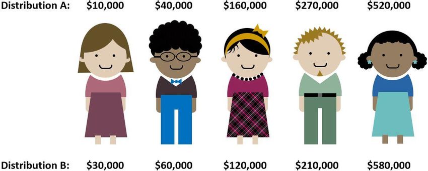
Session 1: An Introduction to the Lorenz Curve. To introduce the topic of
income inequality, the first session begins by presenting two distributions of
$1,000,000 dollars to five people (Fig. 3). Students are asked to identify which
distribution they consider to be more equal and to try to quantify inequality within
the distributions.
After fielding student responses to these prompts, the instructor moves toward
introducing the term “quintile” and quantitative statements such as: “In Distribution
A, the bottom 40% (or two quintiles) of the population receives 5% of the money.”
Reviewing various statements with this form prepares students for the Lorenz curve
class simulation that follows.
The simulation begins with the teacher passing out index cards to students with
different incomes. (Being a New York City-centric institution, we modeled the
income distribution after Manhattan’s). Students are instructed to group themselves
into five quintiles based on their income, compute their quintile’s mean income,
and, once all mean incomes within quintiles are known, compute the percentage of
the total class’s income earned by their quintile. Students represent their quintile’s
share of the total income by cutting a paper meter strip to the corresponding length
Published by Scholar Commons, 2019 7Numeracy, Vol. 12 [2019], Iss. 1, Art. 5
(e.g., 12% would be 12 cm). Using these strips, the instructor guides the class
through the construction of a Lorenz curve that models the class’s income
distribution.
Figure 3. Two ways of distributing $1,000,000 among five people
Referring back to the introductory discussion, the instructor makes clear that
the points on the Lorenz curve reflect quantitative statements such as “The lowest
earning 60% of the population make 21% of the income.”
The final activity of this session asks students to use a GeoGebra applet2 we
designed for the unit to come up with an income distribution with a particular level
of inequality and construct a Lorenz curve for this distribution. The applet allows
the user to set the mean incomes of quintiles for a population and then animates the
construction of the associated Lorenz curve following the method used in class.
Each of the five groups of students is assigned a different qualitative level of
inequality – completely equal, close to equal, kind of equal, really unequal, or
completely unequal – but students are encouraged to create their own distributions
individually. Each student then draws their Lorenz curve and tapes it up on the class
board, which is divided up into sections labeled with the levels of inequality.
The first session concludes with a class discussion comparing the students’
Lorenz curves. Mathematically, this comparison should reveal the concept of the
“line of equality” (from the completely equal group), and the qualitative idea that a
more concave Lorenz curve reflects a more unequal income distribution. The class
discussion can also include a discussion about the concept of income inequality,
eliciting students’ initial ideas about the relationship between income equality and
fairness. The discussion should open up conversation to diverse perspectives about
whether fairness necessarily means that everyone should have the same income and
elicit ideas about factors that one might consider in evaluating fairness (e.g.,
education level and the nature of one’s work).
2
https://www.geogebra.org/m/sa7v2jg3. All GeoGebra applets are available for free use.
https://scholarcommons.usf.edu/numeracy/vol12/iss1/art5 8
DOI: https://doi.org/10.5038/1936-4660.12.1.5Warner and Lim: The Gini Index: A Lens for Analyzing Inequality
Session 2: The Gini Index in New York City. Session two begins with students
finding the area of two shaded regions on a grid (Fig. 4). At the end of the
discussion, the teacher asks students to compare the areas of the two shaded regions
in terms of ratios. More specifically, if the first shaded region is considered the
“whole,” students are asked to determine the percent of the whole that the second
shaded region represents. This exercise provides students with a warm-up geometry
problem with multiple points of entry while building a scaffold to introduce the
formula for calculating the Gini index.
The class then reviews the key points from the concluding discussion from the
previous day’s activity–what a Lorenz curve looks like when there is complete
income equality as well as complete income inequality and how greater concavity
of the curve reflects greater income inequality. This review builds to the idea that
the greater the area of the region between the line of equality and the Lorenz curve,
the greater the inequality. In addition, the idea of maximum, or total, inequality is
introduced, where the entire triangular region under the line of equality is
encompassed between the line of equality and the Lorenz curve. Tying in the
introductory activity of finding the ratio of areas, the teacher introduces the Gini
index as a measure that quantifies inequality by taking the ratio of the area of the
region between the line of inequality and the Lorenz curve to the area of the region
at the maximum state of inequality.
Figure 4. Shaded regions for area exercise
Having been introduced to the Gini index, the students are then instructed to
tape up the Lorenz curves they drew in the previous session again but this time line
them up in order from least to greatest amount of inequality. The students are then
asked to find the Gini index of their distributions using a different GeoGebra
applet,3 which has the additional function of providing the Gini index calculation
3
https://www.geogebra.org/m/amzkxkqp
Published by Scholar Commons, 2019 9Numeracy, Vol. 12 [2019], Iss. 1, Art. 5
for a distribution. The class concludes the activity by evaluating whether their
Lorenz curves were in the correct order.
Session two ends with an “NYC inequality hunt” in which students look for
inequality in income data from New York City neighborhoods. To preface the hunt,
students are prompted to think about income inequality in the five boroughs of New
York City - Bronx, Brooklyn, Manhattan, Queens, and Staten Island - and to use
their prior knowledge about their city to predict which borough has the greatest and
the least income inequality. Students are then given the mean household incomes
within quintiles for each borough and are asked to refine their predictions based on
the data (without explicitly calculating the Gini index). Finally, students use a Gini
index calculator4 to test their predictions. This activity incites fruitful discussion
about what characteristics of an income distribution translate to high or low Gini
indices.
Having practiced how to spot income inequality (or equality) from an income
distribution, students are given census data reporting the mean household incomes
within quintiles for each New York City neighborhood and asked to use the Gini
index calculator to find the neighborhoods with the greatest and least income
inequality. In our implementation of the unit, we used Public Use Microdata Areas
(PUMAs) as the geographical unit defining a New York City neighborhood, and
we obtained the data using Social Explorer,5 a demographic data visualization and
research tool. With over 50 PUMAs in New York City and only 10 minutes to
complete their inequality hunt, groups did not have time to use a brute-force
approach by computing Gini indices for each neighborhood. Instead, successful
groups used both their knowledge of New York City neighborhoods and their sense
of how an income distribution translates into a Gini index to choose candidate
neighborhoods for which to compute the Gini index using the calculator. By sharing
findings at the end of the session, students vocalize the strategies they used for
choosing candidate neighborhoods.
Session 3: The Gini Index in the World. Session three begins by challenging
students to consider what the Gini index of a country cannot tell us about the income
distribution in that country. This challenge is guided by presenting students with
the fact that both Guyana and the United States had a Gini index of 0.45 in 2007.6
This comparison should lead to the crucial observation that the Gini index does not
measure income, but income inequality. To emphasize this point further, the metric
of gross domestic product per capita based on purchasing power parity7 is very
4
https://www.geogebra.org/m/nscenwwr
5
https://www.socialexplorer.com
6
https://www.cia.gov/library/publications/the-world-factbook/rankorder/2172rank.html
7
PPP GDP per capita is a commonly used metric to gauge standard of living within a country.
Though not a measure of personal income, the PPP GDP per capita is a helpful approximation to
https://scholarcommons.usf.edu/numeracy/vol12/iss1/art5 10
DOI: https://doi.org/10.5038/1936-4660.12.1.5Warner and Lim: The Gini Index: A Lens for Analyzing Inequality
briefly described and then suggested as a substitute for income per person within a
country. Then, being presented with Guyana’s 2007 PPP GDP of $5,000 and the
United States’ of $48,000, students can hopefully see the limitations of relying
solely on the Gini index to reveal the economic health of a country.
Students are then asked to reverse engineer possible income distributions of
the United States and Guyana given the PPP GDP and Gini index of each county.
To achieve this, students make a sequence of guesses for the mean household
incomes within quintiles, adjusting each guess to achieve the desired mean income
and Gini index. For example, a student might initially guess that the mean
household incomes within quintiles for the United States are $10,000, $20,000,
$40,000, $70,000, and $100,000. This would give a mean income of $48,000 as
desired, but the Gini index for this distribution is 0.38. To increase the Gini index,
the student’s second guess might concentrate more income in the higher quintiles
at the expense of the lower quintiles. A table such as the one in Figure 5 can be
used to help students organize their guesses (trials).
Figure 5. Table used to help students reverse engineer an income distribution
Once enough students reverse engineer income distributions for the United
States and Guyana, the instructor can demonstrate that different income
distributions can have the same Gini index to continue to illustrate the limitations
of the Gini index. Students will also notice that the highest quintile in Guyana will
have roughly the same income as the lowest quintile in the United States. This
observation, among many others from comparing the income distributions, could
lead to a discussion about “push-pull factors” for Guyanese immigrants to the
United States.
personal income as it takes into consideration the national wealth of a country along with cost of
living.
Published by Scholar Commons, 2019 11Numeracy, Vol. 12 [2019], Iss. 1, Art. 5
Session 4: The Effects of Policy on the Gini Index and Wrap-Up. The first three
sessions of the unit help students grow familiar with the tools of the Lorenz curve
and the Gini index as measures of income inequality within a country. The fourth
session invites students to put on a policymaker’s hat by exploring the effects of
different government policies on income inequality.
The fourth session begins by asking students to analyze the political cartoon
“Let Them Eat Crumbs” (Darkow 2007).8 The cartoon depicts a large man eating
half of a pie and leaving the other half for a crowd of people, to whom he exclaims,
“Well I left you half! What are you, greedy?” Students consider what statement the
cartoon is making, what mathematical ideas are behind this statement, and whether
or not they agree with the statement.
To support the statement of the cartoon, the instructor then shares data with the
class that reveal the various forms of fiscal inequality in the United States. This
data should at least include the mean household incomes within quintiles, but can
also include data on wealth inequality (as opposed to income inequality) and data
comparing US CEO salaries to employee salaries. The point of sharing this data is
to set up the big question of the day: “What are some policies that the United States
could use to try to tackle income inequality head on?”
To answer this question, the instructor introduces policies of progressive
taxation, universal basic income, and guaranteed minimum income. As a brief
review of these policies for the unfamiliar reader, a progressive tax system taxes
higher-earning individuals at a higher rate, universal basic income is a policy
whereby all citizens annually receive a certain amount of money from the
government, and guaranteed minimum income is a policy whereby all citizens
earning below a certain threshold are annually given an amount of money to meet
that threshold. The progressive tax system is introduced as a policy already in place
in the United States, while the universal basic income policy is introduced to
students through relevant news articles about recent events related to it. Having
sufficiently established the foundations of the three policies, the instructor sets
reasonable parameters for the three policies (i.e., the tax rates for each income
quintile and the amounts of universal basic income and guaranteed minimum
income) and asks students to explore each policy’s effect on the Gini index in the
United States. The table in Figure 6 can be used to help students organize their
analysis of the three policies.
8
https://caglecartoons.com/viewimage.asp?ID=%7BA6545529-A612-419D-B009-
47449C49A6EB%7D
https://scholarcommons.usf.edu/numeracy/vol12/iss1/art5 12
DOI: https://doi.org/10.5038/1936-4660.12.1.5Warner and Lim: The Gini Index: A Lens for Analyzing Inequality
Figure 6. Table used to help students analyze policy effects on the Gini index
Unit project description. The unit culminates with a final project that asks students
to apply their understanding of the unit to study income inequality within a
particular country. The first of two parts of the project requires students to choose
a country (not the United States) and research that country’s Gini index and PPP
GDP. Using this data, students construct a possible income distribution and draw a
Lorenz curve for this distribution. Students then use these metrics to compare their
chosen country to the United States and describe what an immigrant from their
country to the United States might experience in light of the comparison. All of
these findings and reflections are summarized in a few paragraphs of writing that
include a table of the quintile incomes and a figure of the Lorenz curve.
Part two of the project mirrors session four in that students use their income
distributions from part one to analyze the effects of progressive taxes, universal
basic income, and guaranteed minimum income on income inequality. Because
each student will have different distributions, the parameters for the three policies
need to be defined more generally than they were in session four. For example, we
set the threshold for the guaranteed minimum income to be 50% of the country’s
PPP GDP and the universal basic income to be 25% of the country’s PPP GDP. For
the progressive tax policy, we set the tax rates within the quintiles to be 3%, 8%,
13%, 17%, and 22%. Having analyzed the effects of the three policies on their
income distributions, students are asked to write a paragraph explaining which
policy reduced income inequality the most, which reduced income inequality the
least, and why they think some policies were more effective than other policies.
Students finish the second part of the project by writing about other factors to
consider (besides just the Gini index) when evaluating the three policies and
describing, with justification, what policy they would choose to implement in their
country.
Published by Scholar Commons, 2019 13Numeracy, Vol. 12 [2019], Iss. 1, Art. 5
Pedagogical Rationale
Pedagogical Framework: Culturally Relevant Mathematics
Pedagogy
Our pedagogical rationale in designing the unit was influenced by both our goals
as educators in general and our goals for this unit in particular. At the heart of our
approach is an effort to uphold culturally relevant pedagogy as it applies to
mathematics education. Culturally relevant pedagogy is a framework centered on
three goals for students: academic success, cultural competence, and critical
consciousness (Ladson-Billings 1995a, 1995b). Ladson-Billings defines academic
success as “the intellectual growth that students experience as a result of classroom
instruction and learning experiences” (Ladson-Billings 2014, 75). This growth is
not limited to acquiring skills as outlined by standardized testing or other external
standards; instead, it encompasses the development of students’ “literacy,
numeracy, technological, social, and political skills in order to be active participants
in a democracy” (Ladson-Billings 1995a, 160). Cultural competence is having the
opportunity to draw on and connect to one’s culture and experiences as a legitimate,
valid source of knowledge to support learning. Ladson-Billings (2014) states that
attaining cultural competence results in students being able to “celebrate their
cultures of origin while gaining knowledge of and fluency in at least one other
culture”–namely, the dominant culture (75). Finally, critical, or sociopolitical,
consciousness is “the ability to take learning beyond the confines of the classroom
using school knowledge and skills to identify, analyze, and solve real-world
problems” (Ladson-Billings 2014, 75). More specifically, Ladson-Billings
describes the need to prepare students for “active citizenship” by empowering them
with the knowledge and skills “to critique the cultural norms, values, mores, and
institutions that produce and maintain social inequities” (Ladson-Billings 1995a,
162). Applied to mathematics education, culturally relevant pedagogy seeks to
center students’ learning of mathematics on their lived experiences, including the
conditions of inequity and oppression they might face, to prepare them for
democratic citizenship (Tate 1994).
Rubel and Chu (2012) offer an explicit framework for culturally relevant
mathematics pedagogy specifically, or CureMap. The framework consists of three
dimensions that further expound on each of the goals of culturally relevant
pedagogy to research-based ideas in mathematics education. The first dimension is
teaching mathematics for understanding. Rubel and Chu draw on the work of
Hiebert and Carpenter (1992) to suggest a view of academic success in mathematics
as going beyond attaining procedural knowledge of mathematics towards
understanding concepts (Hiebert and Grouws 2007) and sense-making (Wenger
1998). The second dimension is centering instruction on students’ experiences.
https://scholarcommons.usf.edu/numeracy/vol12/iss1/art5 14
DOI: https://doi.org/10.5038/1936-4660.12.1.5Warner and Lim: The Gini Index: A Lens for Analyzing Inequality
Rubel and Chu (2012) draw on the work of Moll et al. (1992) to argue for the
importance of drawing on students’ “funds of knowledge” (133). In other words,
cultural competence in terms of mathematics education means valuing students’
knowledge and experiences as members of communities and cultures outside of the
classroom as connected and central to the learning that takes place in the classroom.
Furthermore, Rubel and Chu (2012) include students’ experiences as learners in the
classroom in the definition of students’ experiences. According to their framework,
in addition to connecting to students’ identities outside of the classroom, culturally
relevant mathematics pedagogy means that students must be “central participants
in the building of mathematical understanding” (Rubel and Chu 2012, 41).
Finally, the third dimension of CureMap is developing students’ critical
consciousness with and about mathematics. For this dimension, Rubel and Chu
(2012) refer to the literature on teaching mathematics for social justice. Founded
on Paulo Freire’s critical pedagogy ([1968] 2007), teaching mathematics for social
justice is fundamentally about what Gutstein (2006) calls “reading the world with
mathematics” (24), or using mathematics to critique the status quo; and “writing
the world with mathematics” (26), which refers to using mathematics to change it.
Developing students’ critical consciousness with mathematics means empowering
them with the ability to wield their mathematical knowledge and skills as a tool, or
a “weapon,” to critique and challenge hegemonic practices and conditions in
society (Gutstein 2012). Second, Rubel and Chu also include the importance of
developing students’ critical consciousness about mathematics, which requires that
students turn their critical skills back on mathematics itself to understand it as a
human tool that has also played a role in creating or maintaining hegemonic
conditions.
The learning objectives described above are tied to our pedagogical
framework. Our goals for students to be able to use a quantitative lens to describe
and analyze inequality as well as to evaluate policies stem from our overall goals
for students to achieve a conceptual understanding of mathematics, to make
connections to and draw on their lives and their world, and to be empowered to read
and write the world with mathematics. In what follows, we elaborate on how the
lessons more specifically address these three goals.
Teaching Mathematics for Understanding
Because the Gini index is based on ratios, the unit provides multiple opportunities
for students to engage in developing a conceptual understanding of ratio. The Gini
index unit also consists of activities that engage students in sense-making that are
not specifically tied to pre-determined mathematical content.
Developing Conceptual Understanding of Ratio and Other Topics. There are
two ways that ratio and proportion come into play in the calculation of the Gini
Published by Scholar Commons, 2019 15Numeracy, Vol. 12 [2019], Iss. 1, Art. 5
index. First, the Lorenz curve is a model of income distribution based on
proportions–the percentage of income that is made by a cumulative percentage of
the population. Second, the calculation of the Gini index is itself a ratio: the area of
the space between the line of equality and the Lorenz curve and the area
representing absolute inequality, which is what yields an index value between 0 and
1. These two ideas present multiple opportunities for students to engage with the
concepts of ratio and proportion, as they have to consider how different levels of
incomes could yield similar Gini indices and to understand what a Gini index
represents.
The idea that the ratio of the income values rather than their absolute values
determines the value of the Gini index is reinforced at multiple points in the unit.
In the first session, when students participate in building a Lorenz curve using an
income distribution simulation with their classmates, the activity requires students
to convert their income values to percentages. The final product of the simulation
is a graph whose axes both represent ratios in terms of percentages: the percent of
the population (x-axis) and the percent of society’s income (y-axis). This idea is
physically experienced by students representing their quintile group’s income using
a part of a meter strip, which represents 100% of society’s income. Thus, even
before being introduced to the Gini index itself, students are exposed to the idea of
the model of income distribution being entirely based on proportions.
In the final activity of the first session, students create their own income
distributions and Lorenz curves based on an assigned level of inequality. Having
students work individually yields multiple Lorenz curves with similar levels of
inequality in each group even though the absolute amount of the incomes may be
entirely different. The most obvious example of this is in the case of completely
equal distribution, in which case every quintile would have the same mean income;
regardless of how high or low the chosen income, it would qualify as a completely
equal distribution and result in a Lorenz curve that coincided with the line of
equality. The second session reinforces the proportional nature of the Lorenz curve
and the Gini index, as students calculate Gini indices using the applet and find that
distributions with varying levels of income yield similar indices. The third session
then directly asks students to consider how two countries with very different
economic situations–the United States and Guyana–can have the same Gini index,
thus further reinforcing the idea that the Gini index is based on relative quantities
as opposed to absolute ones.
The idea of the Gini index representing a ratio of two areas is addressed in the
second session. As an abstract geometric quantity, the area between the line of
equality and the Lorenz curve is a rather meaningless number without some
touchstone values with which to compare. For example, it is difficult to interpret an
area between curves of 0.2 as “big” or “small” without reference to the largest
possible value this area can be. Thus, considering the ratio of the area between
https://scholarcommons.usf.edu/numeracy/vol12/iss1/art5 16
DOI: https://doi.org/10.5038/1936-4660.12.1.5Warner and Lim: The Gini Index: A Lens for Analyzing Inequality
curves to the area under the line of inequality reinforces proportional reasoning by
considering the question “compared to what?” The reader will observe that the area
under the line of equality is always equal to 0.5 and is independent of the Lorenz
curve, so that effectively the Gini index is simply twice the area between curves. A
classroom discussion of this fact would not be without value, especially if initiated
by students’ observations, but we chose not to define the Gini index as twice the
area between curves because this definition could seem rather arbitrary without
justification. (E.g., one might wonder why the Gini index is not defined as three
times the area between curves).
Engaging in Sense-Making Practices. The Gini index unit also provides students
with opportunities for engaging in sense-making practices. Although sense-making
is embedded throughout most of the activities of the unit, there are two activities
where it is central, as students do not need to rely on specific mathematical concepts
or approaches to be successful. One of these activities is the NYC inequality
scavenger hunt. There are no rules or instructions for how students should go about
determining which neighborhoods’ quintile distributions represent high or low
levels of inequality. Instead, the activity invites students to come up with strategies
that are reasonable given their understanding of how the Gini index is measured
and calculated. Another activity relying on student sense-making is performing
trials to come up with a distribution that matches a country’s given Gini index.
There are no instructions to students for how they should adjust their distributions
in subsequent trials; here, too, students have to come up with their own strategies
for making adjustments that would help them achieve their goal and avoid a
completely randomized process. These two activities rely on students applying their
understanding of how the Gini index works and its relationship to inequality in a
distribution to make reasonable decisions.
Centering Instruction on Students’ Experiences
There are three main ways that instruction is centered on students’ experiences.
First, the Gini index is a social tool that is inherently tied to the real world. In this
unit, it is used to provide a lens for understanding immigration as well as evaluating
real world policies about income inequality. For students for whom immigration,
income inequality, and injustice is important, the Gini index unit has the potential
to hold personal significance. Second, throughout the unit, instruction is designed
to draw on students’ “funds of knowledge” (Moll et al. 1992) to make meaning in
their process of learning. Finally, in conjunction with drawing on students’ funds
of knowledge, the unit positions students as producers of knowledge in their
experiences in the classroom.
Published by Scholar Commons, 2019 17Numeracy, Vol. 12 [2019], Iss. 1, Art. 5
Relevance of the Gini Index Unit. Unlike more general mathematical concepts
such as ratio or percent, the Gini index as a measure of inequality is inherently a
socially relevant tool, given more legitimacy by its use by the World Bank and other
organizations. The social significance of the broader topic of income inequality is
further contextualized by its ties to the topic of immigration and fiscal policies.
Immigration is a topic that has the potential to be relevant for many students,
particularly in New York City, where the foreign-born population is nearly 37%
(United States Census Bureau 2016). The unit project opens up opportunities for
students to make personal connections to their learning, as they are asked to choose
the countries they want to study.
The policy considerations are also grounded in reality rather than presented as
abstract ideas. The progressive tax rates that students are instructed to use in their
assignment are modeled after the United States federal income tax rates.
Guaranteed minimum income and universal basic income are introduced to students
through relevant news articles (Weissman 2013; Dillow and Rainwater 2017).
Universal basic income was particularly topical at the time of the unit’s
implementation, as nations such as Finland had been experimenting with some form
of it (Goodman 2016), and leaders in technology within the United States had also
expressed their support and launched pilot programs (Dillow and Rainwater 2017).
Based on these current events, we set the guaranteed minimum and universal basic
income rates similar to ones being used in the world. Thus, the unit presents an
opportunity for students to evaluate the effectiveness of real world policies and add
their voice to relevant and current conversations.
Drawing on Student Funds of Knowledge. Even if students do not view the Gini
index and the context in which it is presented as personally relevant, there are still
opportunities for students to draw on their own lives and experiences in class
activities and assignments. For two of the main activities in the unit, students’
experiences as New Yorkers play a key role. As described earlier, the income
inequality scavenger hunt in New York City neighborhoods relies on students’
sense of how the Gini index measures inequality but could also be supported by
students’ sense about where they see inequality in their city (e.g., neighborhoods
where housing projects are down the street from luxury condominiums). Students’
experiences in New York City are also key in comparing the United States and
Guyana to discuss implications related to immigration. Although the Guyanese
foreign-born population only constitutes about 4.5% of all foreign-born people in
New York City, it is a significant population; in 2016, the Guyanese foreign-born
(immigrant) population in New York City was 140,341, nearly half of the 271,544
Guyanese immigrants in the entire United States (United States Census Bureau
2016). The activity draws on the unique role of the Guyanese immigrant population
https://scholarcommons.usf.edu/numeracy/vol12/iss1/art5 18
DOI: https://doi.org/10.5038/1936-4660.12.1.5Warner and Lim: The Gini Index: A Lens for Analyzing Inequality
in New York City and invites students to draw on their potential and particular
experiences as New Yorkers.
The unit also draws on students’ prior understanding and sense about
inequality and injustice. Prior to any instruction about the Gini index, the unit starts
with asking students to articulate their own ideas for comparing the levels of
inequality in two income distributions. The activity provides students with the
opportunity to apply any mathematical skills and approaches that are already in
their arsenal, such as analyzing the differences between incomes in the
distributions, the differences in the incomes between the two distributions, or the
ranges of the distributions, with their own perspectives and prior understandings
about what constitutes inequality influencing their choice of approach. Students’
knowledge and perspectives about inequality are also incorporated into their unit
projects. The Gini index provides a value but is not accompanied by any guide for
deciding what level of inequality is acceptable. Students have to apply their own
judgments, based on their opinions and experiences, to ultimately make
interpretations and form conclusions about whether they feel a certain level of
inequality is reasonable or unjust.
Students’ knowledge and perspectives about the real world are also included
in the policy considerations. Although the resulting Gini index from the three policy
applications are meant to inform students’ final policy recommendations, students
are also asked to consider factors beyond the index that they believe to be important.
The Gini index is presented as one tool that can help analyze policy, but it is stressed
that it is the students’ use, interpretation, and considerations of this tool in context
that should ultimately drive conclusions about their analyses.
Positioning Students as Central in Building Mathematical Understanding. The
lessons also center instruction on students’ experiences by positioning students as
active participants in constructing mathematical ideas. In the first session, the
students physically create a Lorenz curve using a distribution in the class as their
first introduction before seeing a digital simulation and model. At the end of that
first session, when students are assigned a level of inequality for creating a
distribution, the students create and evaluate their own distributions rather than
being shown examples of distributions with different levels of inequality.
Similarly, both in the third session and in their Gini index unit projects, the
students are asked to come up with distributions given a set of parameters. There is
no prescribed answer for what the final outcome should be aside from meeting the
parameters. As explained previously in the section about teaching mathematics for
understanding through sense-making, the students generate strategies and ideas for
raising or lowering the Gini index in their distributions. In all of these cases, the
students are positioned as being able to contribute and produce knowledge that aids
in their own and their classmates’ learning and understanding of the Gini index,
Published by Scholar Commons, 2019 19Numeracy, Vol. 12 [2019], Iss. 1, Art. 5
income inequality, and the mathematical or quantitative ideas on which they are
based.
Developing Critical Consciousness about and with
Mathematics
Developing Critical Consciousness with Mathematics. The Gini index unit
challenges students to measure and critically analyze income inequality in society.
Throughout the unit, students have opportunities to consider the levels of income
inequality in their own city and nation. In these lessons, students consider not just
the mean incomes of the quintiles but the percentages and cumulative percentages
of the incomes attributed to the lower quintiles in comparison to the upper quintiles.
Intuitive concepts of justice and fairness are not explicitly taught, and the
determination of what constitutes a reasonable disparity compared to an unjust
disparity is left to the students to determine. However, seeing that the first quintile
in Manhattan earns just 1.4% of the total income while the fifth quintile earns 62%
has the potential to illustrate the magnitude of the inequality. It is in the fourth
session, when the political cartoon is introduced along with data about the various
forms of fiscal inequality in the United States, when students are asked to consider
fairness. For some of these data (e.g., ratios comparing employee salaries vs. CEO
salaries), the data for the United States is presented alongside data for other
countries. Making comparisons highlights how great the disparities are in the
United States while simultaneously showing the possibility for incomes to be
distributed more evenly, pushing students to consider whether the United States has
a just system. Evaluating policies can also have this effect. Using the Gini index to
measure the potential for different policies to reduce income inequality brings out
the idea that social conditions can be changed.
The Gini index unit also presents opportunities for students to consider ideas
about justice and inequality on a theoretical level. In the first and second sessions,
the income distributions that students create for the various levels of inequality
serve as concrete examples for students to reflect on as they form their own
conceptions about the relationship between income inequality and unfairness. In
particular, reflecting on distributions that show absolute equality (everyone has the
same income) and maximum inequality (one person has all the income) can push
students to think critically about what income inequality might mean at these
extreme levels. For example, students might consider whether it is fair for everyone
to have the same income or if there are factors that justify that some receive more
income than others. These considerations can therefore inform more nuanced
critical judgments that do not automatically equate fairness with total equality
without deeper consideration. Thus, while the evidence highlighting the magnitude
of income inequality in Manhattan and in the United States provides a motivation
to question the fairness of the social conditions in these places, students must utilize
https://scholarcommons.usf.edu/numeracy/vol12/iss1/art5 20
DOI: https://doi.org/10.5038/1936-4660.12.1.5You can also read