TRANSFORM AWARDS EUROPE 2020 - Transform magazine
←
→
Page content transcription
If your browser does not render page correctly, please read the page content below
TRANSFORM
AWARDS
EUROPE 2020   1
2
Welcome
                                          At the Transform Awards, shortlisted companies represent every sector and size of
                                          organisation, presenting a true benchmark for excellence in strategic brand work.
                                          Every company deserves congratulations for delivering excellent, creative brand work.
                                          At this year’s awards, packaging stole the hearts of judges, as they lauded Urban Cordial,
                                          Carlsberg and Kellogg’s for their data-fuelled strategies. They were awed as well by
                                          corporate brands like Hollis and Baker Tilly, which filled the corridors of their businesses
                                          with life and light. Aktuel impressed creatively as it transformed its visual identity
                                          into proof positive of its products’ very success. The unique, bespoke typography is
                                          inextricably linked to the brand and delivers an ownable asset that communicates the
                                          company’s point of differentiation. Scala Radio turned heads, too, for its ability to build
                                          a successful new brand within a corporate brand portfolio that addressed a need in the
                                          marketplace with creative content, campaign material and communications.
Brittany Golob                            This year has been full of excellent rebranding and brand development work.
Editor in chief, Transform magazine       Well done to all of the winners at the 2020 Transform Awards!

 4   Judges                                                                SECTOR
 8   Winners
                                                                     43    Best visual identity by a charity,
     CONTENT                                                               NGO or not-for-profit
                                                                     46    Best visual identity from the education sector
12   Best use of a visual property                                   47    Best visual identity from the energy
13   Best brand architecture solution                                      and utilities sector
16   Best use of copy style or tone of voice                         48    Best visual identity from the engineering
17   Best brand experience                                                 and manufacturing sector
18   Best use of packaging                                           49    Best visual identity from the financial
                                                                           services sector
19   Best wayfinding or signage
                                                                     50    Best visual identity from the FMCG sector
20   Best use of audio brand
                                                                     51    Best visual identity from the food
21   Best use of typography                                                and beverage sector
24   Best place or nation brand                                      54    Best visual identity from the healthcare
                                                                           and pharmaceuticals sector
     PROCESS
                                                                     55    Best visual identity from the industrial and
26   Best external stakeholder relations                                   basic materials sector
     during a brand development project                              58    Best visual identity from the lifestyle and
27   Best internal communication during                                    wellbeing sector
     a brand development project                                     59    Best visual identity from the professional
28   Best implementation of a brand                                        services sector
     development project                                             60    Best visual identity from the property,
29   Best implementation of a brand development                            construction and facilities management sector
     project across multiple markets                                 61    Best visual identity from the public sector
                                                                     62    Best visual identity from the retail sector
     STRATEGY                                                        63    Best visual identity from the technology,
                                                                           media and telecommunications sector
30   Best creative strategy
                                                                     64    Best visual identity from the transport
31   Best brand evolution                                                  and logistics sector
32   Best strategic or creative development                          65    Best visual identity from the travel,
     of a new brand                                                        leisure and tourism sector
33   Best development of a new brand
     within an existing brand portfolio
                                                                     69    Best overall visual identity
36   Best naming strategy
                                                                     70    Grand prix
     TYPE

39   Best corporate rebrand following
     a merger or acquisition
40   Best brand development project to reflect
     a changed mission, values or positioning
41   Best brand consolidation
42   Best rebrand of a digital property

                                                                                                                                         3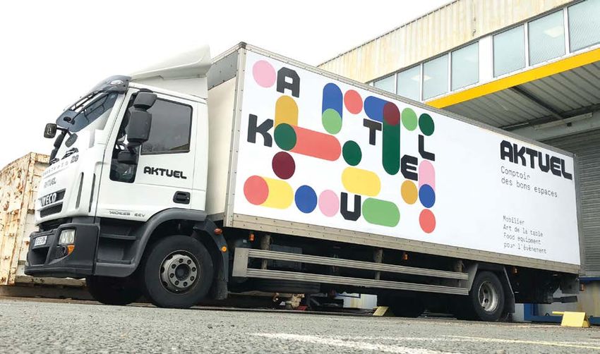
THE JUDGES

    Helen Geny                                 Grace Ashton                               Christine Ayre
    Senior marketing manager                   Brand marketing consultant                 Head of brand design
    Penfida Limited                            One Faced                                  King’s College London

    Helen is a marketing and                   Grace is a brand marketing consultant      Christine is head of brand design at
    communications specialist who              with over 10 years of experience           King’s College London. She leads the
    helps brands connect with customers        working in-house and agency-side           interpretation, evolution and execution
    through compelling storytelling and        for global brands across the FMCG,         of the King’s brand, directs and
    a clear sense of purpose. Helen has        fashion, telecoms, health and wellness     supports the creative agency roster
    particular expertise in the financial      sectors. She has worked across the         as a collaborating team and has run
    and professional services sectors          entire brand marketing mix including       in-house design for five years. Seizing
    and in enabling brands to leverage the     brand and product launches, advertising,   every possible opportunity to make
    benefits of digital transformation. She    digital, content, social and influencer    great brand experiences, she blends
    is currently with Penfida, a corporate     marketing, design, and photography         logical, flexible brand discipline with
    finance adviser to pensions schemes        and video production. She is passionate    inspirational creativity including the
    and trustees.                              about the value that a strong brand        famous alumni display on the Strand
                                               brings to a business in building genuine   and the transformation of Bush House.
                                               connections with audiences.

    Lisa Cheung                                Fleur Clarke                               Babak Daemi
    Director of marketing and brand strategy   Head of brand marketing                    Former marketing director
    Foundry                                    HarperCollins Publishers                   Future PropTech

    Lisa leads marketing strategy, brand       At HarperCollins, Fleur leads brand        Babak delivers marketing
    and creative content at Foundry, the       strategy for some of the world’s most      process, strategy and brand value
    developer of creative software for         successful and beloved authors,            proposition for startups at the
    the media, entertainment and digital       including Agatha Christie, JRR Tolkien     scaling stage of their business.
    design industries. Lisa has 16 years       and George RR Martin. In her six years     The bulk of his experience is in the
    of experience in communications and        in publishing, she has created award-      tech and events sectors. Babak’s
    media strategy for companies such          winning campaigns for established          current project is working with an
    as L’Oreal, McDonalds and Peugeot,         authors such as Stephen King and           events company focused on the
    from agencies within WPP and               Jodi Picoult, and launched exciting        financial risk and control functions
    Omnicom. She has worked in-                new voices into the market. She            of financial institutions.
    house at various technology sectors        is passionate about insight-driven
    including telecoms, digital media and      creative and campaigns that cut
    entertainment, and fintech.                through the noise.

4
THE JUDGES

Lorna Blackmore                             Federica Carlotto
Director of communications                  Course leader
and integration                             Sotheby’s Institute of Art
Flagship Group
                                            Federica is a cultural strategist for
A fellow of the Chartered Institute         luxury and a course leader of the ‘art
of Marketing, Lorna has over 18             of luxury’ programme at Sotheby’s
years of experience in marketing            Institute of Art. Her research, training
and communication. In her current           and consultancy activity focus on
role Lorna is responsible for leading,      the analysis of the meanings and
developing and executing the brand          practices underpinning the production,
and communication strategy for the          branding and consumption of luxury
group. She also leads the integration       and fashion.
process through the pre- and post-
merger lifecycle; optimising brand
architecture to clearly communicate
the company and its portfolio of
offerings for an evolving business.

Rupert Daniels                              Greg Dawson
Global marketing director                   Senior corporate
Cambridge University Press                  communications manager
                                            Nestle
Rupert is the global marketing director
for the Cambridge University Press          Greg is currently working on
where he leads the development of           establishing a strong purpose and
Cambridge’s global marketing strategy       vision within Nestle’s UK&I marketing.
and shapes the transformation               Prior to this, he worked in the global
of the world’s oldest publisher             communications team at Diageo and
into a 21st century digital content         has also held a number of leadership
brand. Rupert has over 20 years of          positions within communications at
interdisciplinary global experience in      Direct Line Group. Over his career in the
general management, sales, media            UK and Canada he has worked across
rights, digital, production, branding and   multiple sectors with some iconic and
marketing. Prior to joining Cambridge,      diverse brands – from Churchill the Dog
he held senior positions at Arsenal         and Guinness to nations like Oman, Sri
Football Club, Fifa and 1Goal.              Lanka and Grenada.

                                                                                                     5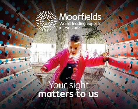
THE JUDGES

    Gregg Finlay                                Alex Glancy                                Sarah Hedges
    Creative director and associate partner     Creative director,                         Equity partner and new business
    Prophet                                     Stereo                                     director
                                                                                           Hoxby
    Gregg is creative director and associate    Alex Glancy is the creative director at
    partner at Prophet London, co-leading       Stereo, a full-service creative agency     Sarah is partner and new business
    the design and experience practice for      whose clients include Nike, BBC, H&M,      director at Hoxby, an award-winning
    Europe. Prophet has won Transform           Worldpay and Virgin Atlantic. Prior to     agency of over 1,000 freelancers
    Awards for work with Formula E, Addiko,     this, Alex was the head of creative at     collaborating through cloud technology
    Fora and Hikma in recent years. Gregg       Virgin Holidays for 5 years, where he      across 30 different countries. For the
    has over 18 years of experience leading     was responsible for design, branding       past year, she has been working with
    interdisciplinary teams to rethink some     and creative. Since joining Virgin         the game tech marketing team at
    of the worlds’ biggest (and smallest)       Holidays in 2015, he’s led a complete      Amazon Web Services and developing
    brands. With expertise in financial         overhaul of its brand, values and visual   a marketing automation solution.
    services to home appliances and from        identity, and worked on the launch of      Prior to Hoxby, Sarah worked for the
    telco to tech, Gregg is passionate about    its new platform, ‘Seize the Holiday.’     Football Association as Wembley’s
    design as a transformative force to         Before Virgin Holidays, Alex worked at     marketing manager.
    power business growth.                      Barclaycard, NetJets and Cobra Beer.

    Matt Roberts                                Helen Steadman                             Martin Steinecker
    Digital designer                            Head of brand                              Executive creative director
    Sightsavers                                 Aldermore                                  Superunion

    Matt is a digital designer at               Helen is head of brand at Aldermore        Martin has over 20 years of experience
    Sightsavers, an NGO that works              where she is responsible for the           in brand management, design
    in developing countries to treat            strategic evolution of the bank’s          and marketing. After working as a
    and prevent avoidable blindness             brand positioning, expression and          photographer and completing his
    and promote equality for people             execution across all touchpoints.          design studies, Martin worked at
    with disabilities. His experience           Before this, Helen was head of brand       Pixelpark, frogdesign, McCannErickson,
    spans from branding, UI/UX design,          and content at Euler Hermes, part of       MetaDesign and HenkelHiedl in leading
    illustration, animation to art direction.   Allianz, where she developed a global      positions as creative director and
    He now focuses on accessible and            brand strategy, content strategy and       CEO. His current clients at Superunion
    inclusive design, for which he is a         brand expression. Helen has over 20        include Axel Springer, Deutsche Bank,
    keen advocate. He has written for           years of experience in the financial       fritz-kola, Jägermeister and Oman
    Creative Review about being a colour-       services industry and has designed         Aviation Group.
    blind designer, and he spearheaded          award-winning brand programmes for
    Sightsavers’ ‘Perspectives’ exhibition      Legal & General and Aviva.
    at the D&AD festival in 2018.

6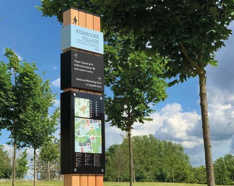
THE JUDGES

Naomi Jones                                Matthew Leopold
Communications and marketing director      Head of brand, PR and content marketing
Suez                                       LexisNexis

For the last 10 years, Naomi has been      Matthew is a branding specialist with
the communications and marketing           a background in PR and sponsorship.
director for the UK and Sweden for         He has extensive experience creating
Suez, a water utility, waste management    go-to-market brands for large and small
and recycling company. She started         businesses. He has led brand, CSR, PR
her career in agencies, specialising in    and sponsorship teams for a number of
public affairs and crisis management.      blue chip companies, including British
She became the Suez group’s youngest-      Gas, Centrica and Lexis Nexis. He
ever department head and board             has also led global brand for US tech
member at 28 years-old. In 2015, she       giant, RingCentral Inc. Matthew is a
project managed the Suez rebrand and       non-executive director of the European
repositioning in the UK and Scandinavia.   Sponsorship Association, furthering the
                                           role of sponsorship across Europe.

Alex Vasili                                Gregor Young
Head of brand                              Head of digital marketing and brand
MVF Global                                 BT Group

Alex leads the creative vision for         Gregor has 10 years of experience
MVF’s brands. He pioneers an award-        helping established brands deliver
winning account-based marketing            customer-first digital excellence. As
strategy for MVF and is passionate         head of digital brand at BT Group,
about driving brand-led campaigns          Gregor has led on many aspects of BT’s
that connect with audiences in new         digital transformation revolutionising
and engaging ways. A regular speaker       digital design and web architecture,
on branding and creative strategy,         establishing social media and content
Alex is a mentor for hustlecrew.co;        marketing strategy, and introducing
mentoring and running workshops            new group-wide enterprise software
for people from diverse backgrounds        and partnerships. Gregor is a strategic
looking to get into tech.                  thinker with an uncompromising drive
                                           for digital excellence and brilliant
                                           customer experience.

                                                                                                  7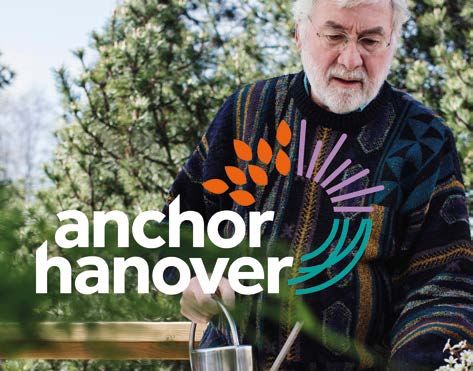
THE WINNERS

    CONTENT                                                    Best place or nation brand
                                                               Gold – Vauxhall One and Anatomy
    Best use of a visual property                              Silver – Brent Cross South and SomeOne
    Gold – Urban Cordial and Jackdaw Design
    Silver – ESL and Superunion                                PROCESS
    Silver – Hollis and Frank, Bright & Abel
    Bronze – Hirsh London and Williams Murray Hamm             Best external stakeholder relations during a brand
    Bronze – Real Handful and Midday                           development project
    Highly commended – Bristows and Frank, Bright & Abel       Gold – Coutts and FutureBrand
                                                               Silver – A1 Hrvatska
    Best brand architecture solution
    Gold – BMI Group and McCann Enterprise                     Best internal communication during a brand
    Silver – Lenzing Group and Siegel+Gale                     development project
    Bronze – Baker Tilly and Brandpie                          Gold – Mercury Processing Services International
    Bronze – Grupa MTP and Dragon Rouge Warsaw                 and Start Design
    Highly commended – Nephila and Coley Porter Bell           Silver – Baker Tilly and Brandpie
    Highly commended – NSS and Studio North                    Bronze – A1 Hrvatska

    Best use of copy style or tone of voice                    Best implementation of a brand development project
    Gold – Tesco and 1HQ Brand Agency                          Gold – Platfform and Clout
    Silver – Andjoy and JoosNabhan                             Gold – Scala Radio and Thinkfarm
    Silver – Hollis and Frank, Bright & Abel                   Silver – Hollis and Frank, Bright and Abel
    Bronze – Pingit and Start Design                           Bronze – Nephila and Coley Porter Bell
    Bronze – Tikkurila and Grow                                Highly commended – Prime plc and UnitedUs
    Highly commended – Action For Children and ASHA
                                                               Best implementation of a brand development project
    Best brand experience                                      across multiple markets
    Gold – Bang & Olufsen and Publicis Sapient                 Gold – Carlsberg Group and Elmwood Leeds
    Gold – Country Road and HMKM
    Silver – Lush and Hyphen                                   STRATEGY
    Bronze – Lamb Weston and Williams Murray Hamm
    Highly commended – Battersea Power Station                 Best creative strategy
    and Greenspace                                             Gold – Frontline AIDS and Brandpie
    Highly commended – Tikkurila and Grow                      Silver – DigiPlex
                                                               Silver – National Children’s Bureau and Lantern
    Best use of packaging                                      Bronze – Rubix and Prophet
    Gold – The Coca-Cola Company and Dragon Rouge              Highly commended – Spinnup and Dragon Rouge
    Silver – Kellogg’s and Landor
    Bronze – PZ Cussons and PB Creative                        Best brand evolution
    Highly commended – Challs International and Bulletproof    Gold – Grosvenor Group and Dragon Rouge
    Highly commended – Dalston’s Soda Co. and B&B Studio       Silver – Bristol Sport and Mr B & Friends
                                                               Silver – O2
    Best wayfinding or signage                                 Bronze – DigiPlex
    Gold – Berkeley Group and Air Design                       Highly commended – An Post and Image Now Consultants
    Silver – Multi Corporation and Air Design                  Highly commended – ARU and Rufus Leonard
                                                               Highly commended – Samaritans and Spencer du Bois
    Best use of audio brand
    Gold – Axel Springer and Superunion + why do birds         Best strategic or creative development of a new brand
    Bronze – Gallerian/AMF Fastigheter and Lexter Ljuddesign   Gold – Geldmaat and VBAT
    Highly commended – Wards and Finally                       Silver – Scala Radio and Thinkfarm
                                                               Bronze – Accsys and GW+Co
    Best use of typography                                     Bronze – Just Drive and Finally
    Gold – The British Academy and Only                        Highly commended – Flawsome! and Coley Porter Bell
    Silver – Action For Children and ASHA                      Highly commended – Wunderman Thompson and Landor
    Silver – Transmission Roundhouse and Only
    Bronze – Boots and Coley Porter Bell
    Highly commended – BCO and Luminous
    Highly commended – The English Provender Company
    and 1HQ Brand

8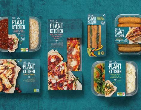
THE WINNERS

Best development of a new brand within an existing         Best visual identity from the energy and utilities sector
brand portfolio                                            Gold – Petredec and Luminous
Gold – Plant Kitchen and Coley Porter Bell
Silver – Chelsea Football Club and LoveGunn
Bronze – English Cities Fund/Muse Developments             Best visual identity from the engineering and
and Cuckoo                                                 manufacturing sector
                                                           Gold – Lenzing Group and Siegel+Gale
Best naming strategy                                       Silver – The Institution of Engineering and Technology
Gold – Flawsome! and Coley Porter Bell                     and Frank, Bright & Abel
Gold – Scala Radio and Thinkfarm
Silver – Lord’s Taverners and Thinking loud & clear
Bronze – Barnsley Premier Leisure and WPA Pinfold          Best visual identity from the financial services sector
Bronze – Eggcetera and Beniamin Pop Studio                 Gold – Coutts and FutureBrand
Highly commended – Andjoy and JoosNabhan                   Gold – Pingit and Start Design
                                                           Silver – Saltus and Baxter & Bailey
TYPE                                                       Bronze – Candid and Mytton Williams
                                                           Highly commended – BBVA and Landor
Best corporate rebrand following a merger or acquisition   Highly commended – Xe and SomeOne
Gold – Anchor Hanover and Spencer du Bois
Silver – Rubix and Prophet                                 Best visual identity from the FMCG sector
Silver – Saltus and Baxter & Bailey                        Gold – Kellogg’s and Landor
Bronze – Informa and Luminous                              Silver – Tikkurila and Grow
Bronze – NSS and Studio North
Highly commended – Cloudreach and Siegel+Gale              Best visual identity from the food and beverage sector
Highly commended – Lumyna Investments                      Gold – Urban Cordial and Jackdaw Design
and Dragon Rouge                                           Silver – Plant Kitchen and Coley Porter Bell
                                                           Bronze – Carlsberg Group and Elmwood Leeds
Best brand development project to reflect changed          Bronze – Dalston’s Soda Co. and B&B Studio
mission, values or positioning                             Highly commended – BEARFACE and Pearlfisher
Gold – Platfform and Clout
Silver – 21Construction and UnitedUs                       Best visual identity from the healthcare and
Bronze – IFS and Olix Consulting                           pharmaceuticals sector
Highly commended – Concern Worldwide and Red Dog           Gold – Moorfields and Spencer du Bois
                                                           Silver – Informed Sport and We Launch
Best brand consolidation                                   Bronze – Lumity and SomeOne
Gold – Vianeo and BrandSilver                              Highly commended – Blueleaf and Redhouse
                                                           Highly commended – Midsona 1HQ Brand Agency
Best rebrand of a digital property
Gold – The Collective and Matter Of Form                   Best visual identity from the industrial and basic
Silver – Reed Words and Baxter & Bailey                    materials sector
Bronze – London Business School and Rufus Leonard          Gold – Air Liquide and Gather
Highly commended – IFS                                     Silver – Rubix and Prophet

SECTOR                                                     Best visual identity from the lifestyle and wellbeing sector
                                                           Gold – Barnsley Premier Leisure and WPA Pinfold
Best visual identity by a charity, NGO or not-for-profit   Silver – La Montgolfière and Brand Brothers
Gold – Barnsley Premier Leisure and WPA Pinfold            Bronze – Nuffield Health and SomeOne
Silver – Frontline AIDS and Brandpie
Bronze – Lord’s Taverners and Thinking loud & clear        Best visual identity from the professional services sector
Bronze – Send a Cow and Spencer du Bois                    Gold – Simmons & Simmons and SomeOne
Highly commended – Robbie’s Rehab and Designhouse          Silver – Ayming and Kimpton Creative
                                                           Silver – Baker Tilly and Brandpie
Best visual identity from the education sector             Bronze – Bristows and Frank, Bright & Abel
Gold – QA and Missouri Creative                            Highly commended – Preu Bohlig and INTO Branding
Silver – ARU and Rufus Leonard
Bronze – Durham University and Lloyd Northover
Highly commended – London Business School
and Rufus Leonard

                                                                                                                          9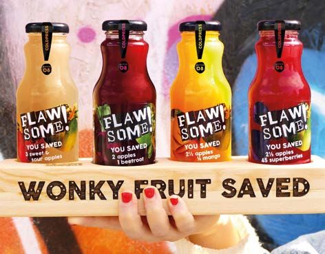
THE WINNERS

     Best visual identity from the property, construction
     and facilities management sector
     Gold – Hollis and Frank, Bright & Abel
     Gold – The Argyll Club and SomeOne
     Silver – Amsteldok, WPP Campus Amsterdam and VBAT
     Bronze – NSS and Studio North
     Highly commended – Battersea Power Station and Greenspace
     Highly commended – Scotscape Group and Designhouse

     Best visual identity from the public sector
     Gold – Government Office for Science and Redhouse
     Silver – Homes England and Lloyd Northover

     Best visual identity from the retail sector
     Gold – Hirsh London and Williams Murray Hamm
     Silver – Boots and Coley Porter Bell
     Bronze – Paul Beuscher and Brand Brothers

     Best visual identity from the technology, media
     and telecommunications sector
     Gold – Channel 4 and DixonBaxi
     Gold – ESL and Superunion
     Silver – MyCujoo and We Launch
     Bronze – Scala Radio and Thinkfarm
     Highly commen ded – O2

     Best visual identity from the transport and logistics sector
     Gold – Aktuel and Brand Brothers
     Silver – Chair Airlines AG and Branders Group
     Highly commended – GasLog Ltd. and Frank, Bright & Abel

     Best visual identity from the travel, leisure and tourism sector
     Gold – Eight and Mytton Williams
     Silver – ACCOR and Brandimage SGK
     Silver – Chair Airlines AG and Branders Group
     Bronze – Rich Mix and Cog Design
     Highly commended – Avani Hotels & Resorts and Slider Creative

     Best overall visual identity
     Winner – Aktuel and Brand Brothers

     Grand prix
     Winner – Scala Radio and Thinkfarm

10
11
CONTENT

     Best use of a visual property
     Gold – Urban Cordial and Jackdaw Design
     Urban Cordial began as a hobby, when Natasha Steele used
     foraged fruits from her London allotment to make the cordial
     and sell it at farmers’ markets. It soon became a full-time job
     and she established Urban Cordial in 2015. Every bottle is
     made from locally sourced, lumpy and bumpy seasonal British
     fruit – surplus produce otherwise bound for landfill. However,
     it’s not easy to break into the crowded UK soft drinks market,
     and after three years, Urban Cordial’s bottling production was
     still done by hand, and growth had plateaued.
     Steele commissioned Jackdaw Design to transform the
     brand. What followed was a new identity and packaging
     design, focusing on people and flavour. After eight months,
     Urban Cordial returned to growth, enabling it to outsource
     production, resulting in up to 35% cost savings per unit. One
     judge said, “The products look fantastic on the shelf and really
     push home their difference in the sector.”

     Silver – ESL and Superunion
     ESports giant ESL needed a new identity to stand out among
     dozens of lookalike brands and match its status as a leader in
     its field. Superunion worked with ESL to create an identity that
     would work with any type of game. The new brand is based
     on subverted camouflage. Judges said ESL understood its
     audience’s love of secrets, codes and hidden messages, using
     a flexible brand that has been implemented beautifully.

     Silver – Hollis and Frank, Bright & Abel
     Independent real estate consultancy Hollis has expanded its
     skillset and footprint since its last rebrand 12 years ago. It
     enlisted Frank, Bright & Abel to overhaul the brand and find a
     distinctive way to deliver the intangible aspects of the offer.
     It used bright colours, illustrative type, illustrations and small
     photographic figures to bring the brand to life. One judge said:
     “Bold and brilliantly unexpected… human, light and full of energy”.

     Bronze – Hirsh London and Williams Murray Hamm
     Family-run jeweller Hirsh London is surrounded by established
     global jewellery brands. Although well-known and respected,
     Hirsh wanted to increase its brand presence. Williams Murray
     Hamm set out to capture Hirsh’s point of difference as an
     expert in the niche market of coloured gemstones. It used
     imagery that highlighted the beauty and craftsmanship of the
     jewellery, with a playful, colourful approach.

     Bronze – Real Handful and Midday
     After 18 months on the market, Real Handful’s flavoured
     trail mixes and protein bars had picked up listings, but its
     growth was being limited by its branding. It enlisted Midday
     to reposition the brand and inject it with personality. Midday
     used quirky and characterful illustrations, giving it a buzz and
     renewed sense of vigour. As a result, Real Handful has grown
     by 120% in the first year after the rebrand.

     Highly commended – Bristows and Frank, Bright & Abel

12
CONTENT
Best brand architecture solution
Gold – BMI Group and McCann Enterprise
International roofing specialist BMI Group was formed
from the merger of Braas Monier and Icopal, aimed at
bringing together a portfolio of different specialist roofing
technologies and solutions. However, the merger created
more than 50 brands with thousands of products, bringing
with it product overlap and customer confusion. BMI brought
in McCann Enterprise to rationalise and connect its brand
portfolio, clarifying each brand’s role and that of BMI itself.
BMI became the relationship brand, and the legacy brands
became the technology brands. Visual identity guidelines have
been applied across all sub-brands, incorporating BMI in the
format, so that they are referred to as BMI Braas, BMI Icopal
or the like. The brand architecture solution was implemented
through events, digital and social channels and a new global
website which consolidated 257 sites, generating an annual
savings of £57m. Judges praised the elegant solution to a
complex challenge.
Silver – Lenzing Group and Siegel+Gale
Austrian fibre manufacturer Lenzing produces sustainable
materials used by apparel producers and brands worldwide.
However, a complex structure of corporate and product
brands diluted its sustainability message and muddied
understanding of where value lay in the business. Siegel+Gale
streamlined the positioning, architecture and identity of the
brands, highlighting its flagship brand, Tencel.
Bronze – Baker Tilly and Brandpie
Baker Tilly comprises 126 independently owned member
firms operating as a network. However, as it evolved, its
appearance became fragmented. Brandpie was appointed to
unify the network as a global brand and created an identity
system and simplified structure, making it easier to navigate.
One judge said, “Member networks are always a huge
challenge. Great job establishing a master brand strategy.”
Bronze – Grupa MTP and Dragon Rouge Warsaw
Polish exhibition specialist Grupa MTP had been a leader in
the industry for almost 100 years but as the sector diversified
and evolved, it needed to transform significantly. With the
help of Dragon Rouge, it extended its reach with the creation
of new brands within the organisation, covering areas such
as outdoor advertising campaigns new types of events and
geographies, and refreshed its design assets in the process.
Highly commended – Nephila and Coley Porter Bell
Highly commended – NSS and Studio North
13What do you stand for,
where should you be
heading, why should
anybody care?
We pull things apart to get to grips with the challenge.
We bring things together to make the most of the future.
Let’s meet:
+44 (0)7736 945 298 @anatomybrands
hugh@anatomylondon.com anatomylondon.com
Anatomy ad
Positioning | Identity | Roll out
14Place, identity and positioning:
using the past to frame the future
‘Where do you live?’ Almost certainly one of the most different but also be honest. It’s easy to overlook the life
common questions we ask when meeting new people. and communities that make Vauxhall interesting. Climbing,
Place is a way to find common ground. Or highlight cross-fit, craft beer, 24-hour clubbing, drag, cabaret, fringe
differences. Place and our identities are not just tightly theatre, cute vegan cafés and an art gallery cluster are just
woven, they are inextricably linked. Our past and where we some of the things that make up its unusual offer.
are from don’t just define who we are now, they frame our
future, they influence our ambitions and who we want to But the journey to regeneration will be longer than its
be, or who we don’t want to be. neighbours. Aside from major developments, all with
different completion dates, the remodelling of the
It’s the same with place. Start talking about an area’s history dominating, inhuman gyratory and the public realm
and you get someone’s attention. It immediately provides masterplan are big messy projects. As the cranes
the human perspective we need to connect because we increase, so will its sense of being inhospitable. But the
naturally look for links and points of comparison when we’re end result will be infinitely better for everyone. And place
trying to understand something. That’s how positioning branding is, if nothing else, the promise of a better future.
works. And it’s all about positioning.
The seminal history of the Vauxhall Pleasure Gardens,
An area’s past helps us to frame the present and define the what they stood for and the impact they had, provided a
ambition for the future. What’s there that is still relevant way to connect with the past in a meaningful way. With
and might inspire pride? Which reputational challenges a knowing smile, the Vauxhall London identity celebrates
do we need to overcome? What can we leverage to create variety, difference and the unusual. It is inclusive; inspired
interest from the outside and encourage investment? by today’s lively, offbeat mix of people, cultures and things
to do as much as it draws on a bizarre and eclectic past.
It’s not just about mining the past for the sake of it. If we
don’t tie it to what’s happening in the present, if it doesn’t Digging around for a story to connect to sounds easy for
resonate with communities and stakeholders today, it’s a central London location, a second city or a cute market
just telling a nice story for the sake of it. It’s not branding. town perhaps. But things that might feel mundane if
you know an area are often real assets. Sporting heroes,
Working in the Vauxhall Nine Elms Battersea Opportunity artists, musicians, agriculture and industry all provide
area it was obvious that each of the three locations within opportunity. There’s always something there. Scratch the
it already had distinct personalities, and that the most surface and you’ll find what a place means to people. And
effective strategy for a Vauxhall place brand was to further why it’s important.
distinguish it from its neighbours.
Any brand process needed to acknowledge the area’s
challenges whilst playing to its strengths; it needed to feel Hugh Stevenson is the managing partner of Anatomy
15CONTENT
Best use of copy style or tone of voice
Gold – Tesco and 1HQ Brand Agency
Tesco wanted to overhaul its baby offering, Tesco Loves
Baby, and enlisted 1HQ to create a new brand, establishing
a story that would speak with a more personal voice to both
carers and children through the use of storytelling. Tesco
wanted to talk to the whole family unit about the adventure
of growing up, without creating a glossy, unrealistic view of
life with little ones.
Consumer research demonstrated that Tesco’s target
audience wanted to enjoy parenthood without the pressure
to be perfect. The new Fred & Flo baby range uses straight
talking and a light collaborative approach to inform the tone
of voice. It deploys genuine and supportive language to paint
a realistic picture of family life, while highlighting the product
benefits. Since launch, Tesco Loves Baby has grown its
consumer base by 2.5%. Judges said it was succinct and a
clear success in terms of sales, with nice brand storytelling.
Silver – Andjoy and JoosNabhan
Sports, wellness and entertainment brand Andjoy is a
platform that provides access to 35,000 activities in 10
countries. In a category that focuses largely on sports and
performance, Anjoy highlights wellness, with an emphasis
on freedom and quality of life. JoosNabhan created a tone of
voice to express this, concentrating on people, their desires
and preferences, with the promise ‘Free to be well my way.’
Silver – Hollis and Frank, Bright & Abel
International real estate consultancy Hollis has a strong
sense of self and wanted to deliver its personality as part
of a rebrand. Frank, Bright & Abel crafted a balanced tone of
voice, highlighting Hollis’ professionalism but with strong,
punchy copy and a quirky touch and the ‘All together different’
brand positioning. Judges praised the positioning, the bold
statements and the clear, consistent messaging throughout.
Bronze – Pingit and Start Design
Pingit, formerly Barclays Pingit, is a pionering mobile
payment app. However, the market became crowded quickly,
and there was user confusion about who it was intended
for. Start Design was enlisted to refresh the brand. Pingit’s
tone of voice changed, bringing coherence in messaging,
language and tone across different channels and comms,
and a style that was youthful and colloquial.
Bronze – Tikkurila and Grow
150 year-old Finnish paint specialist Tikkurila had a strong
position across Scandinavia, eastern Europe, Russia and
China. However, due to increasing commoditisation and
competition, it needed to reinforce its position. It enlisted
Grow to help it tap into a more emotional territory and create
its own voice to capture the audience. By defining the tone
of voice as part of the brand platform, it managed to provide
clear direction and a springboard for creative expression.
Highly commended – Action For Children and ASHA
16CONTENT
Best brand experience
Gold – Bang & Olufsen and Publicis Sapient
Bang & Olufsen has an iconic place in product design and
innovation. However, it was lacking digital direction and
was struggling to stand out in a competitive marketplace. It
appointed Publicis Sapient to unlock its brand value across
the entire customer experience, which involved ‘undesigning’
everything to relaunch the website.
Publicis Sapient distilled Bang & Olufsen’s knowledge and
thinking into an iconic, minimalist graphic design language,
cutting the clutter and honing small details to create a sense
of luxurious simplicity. Because sales were more likely
the longer visitors stayed on the site, it shared interactive,
engaging narratives with direct paths to purchase through
lifestyle-led shoppable stories. One week after the launch,
customer conversion rates were up 23% and average order
value increased 27%. One judge said, “It really makes you feel
like you are getting closer to performance sound.”
Gold – Country Road and HMKM
In 2018, Australian clothing and homeware brand Country
Road was struggling in tough trading conditions with physical
retail challenged by online sales and ever more demanding
customers. It appointed HMKM to focus on what the brand
stands for and to reaffirm its place as a true Australian
lifestyle brand for everyone. Country Road’s Melbourne
flagship store was chosen as the launch venue for its new
positioning, and it aimed to become the first Green Star-rated
fashion retailer in Australia.
It brought down the ‘walls’ that were segregating each
product category and in doing so opened up the store
meaning customers can see the breadth of the collections.
The new store landscape focused on core principles of
form, detail and sustainability, which defined the new retail
language for the brand and enhance customer experience at
every touchpoint. Judges praised the experience’s authenticity
and storytelling.
Silver – Lush and Hyphen
In 2019, cosmetics brand Lush opened Lush Liverpool, its
biggest store and spa, alongside architecture firm Hyphen.
Lush and Hyphen restored the building to its 1920s-era glory.
Since opening the new store, sales are up 150% year-on-year
and footfall is up by 191%. One judge said, “This is truly fitting
with the audience. It is a smart use of space and also people,
which is a significant part of this brand.”
Bronze – Lamb Weston and Williams Murray Hamm
Lamb Weston produces high quality potato products for the
food service trade. In 2017, it became a public company and
upgraded its Idaho headquarters, alongside Williams Murray
Hamm (WMH). The aim was to inspire employees and ensure
they were recognised and valued. Treating the building as an
exhibition space, textures and bold graphics create fun and
playful spaces while communicating brand messages.
Highly commended – Battersea Power Station
and Greenspace
Highly commended – Tikkurila and Grow
17CONTENT
Best use of packaging
Gold – The Coca-Cola Company and Dragon Rouge
Coca-Cola wanted to capitalise on the growing popularity of
dark spirits and bring mixology closer to consumers through
its already well-established brand. It appointed Dragon
Rouge to create a brand and identity for four new Coca-
Cola Signature Mixers, designed to be paired with premium
dark spirits. The range of mixers is based around the need
to ‘unlock creative experimentation’ and strike a balance
between the familiarity of Coca-Cola with new flavour profiles.
Taking inspiration from the brand’s founder and inventor, Dr
Pemberton, Dragon Rouge repurposed one of the first glass
bottle designs, dating back to 1899, creating a visual identity
that reflects the craft of contemporary mixologists and gives
a nod to the brand’s heritage. One judge said, “I saw this in a
pub recently and it immediately made me go over and check
it out. I like the simplicity and vintage branding. I enjoy this
project, personally.”
Silver – Kellogg’s and Landor
Kellogg’s needed to reassert its position as a category leader
in an increasingly crowded market, where it found it was
lacking relevance. It enlisted Landor to redesign its portfolio
and packaging. By focusing on Kellogg’s origins as the
provider of natural grain goodness it clarified the message,
and with a revamped colour scheme and renewed focus on
mascots, it emphasised the brand’s personality and heritage.
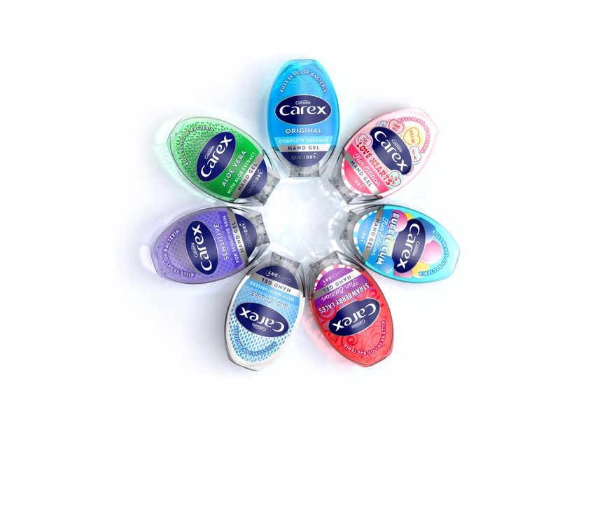
Bronze – PZ Cussons and PB Creative
Since Carex pioneered everyday antibacterial hand gel more
than 20 years ago, the sector has experienced huge growth,
with a proliferation of brands. Carex needed to differentiate its
product and tasked PB Creative with redesigning its brand. It
produced a contemporary pebble-shaped pack that embodies
the contours of the brand mark. Judges said the redesigned
packaging is much more fun, with a more transportable feel.
Highly commended – Challs International and Bulletproof
Highly commended – Dalston’s Soda Co. and B&B Studio
18CONTENT
Best wayfinding or signage
Gold – Berkeley Group and Air Design
Kidbrooke Village is a mixed-use development from property
developer Berkeley Group, situated in London’s Royal
Borough of Greenwich. The aim was to create a harmonious
environment where both humans and wildlife can thrive, and
so as part of a rebrand, Berkeley tasked placemaking and
wayfinding specialist Air Design with redesigning the public
signage to complement the natural and built environment.
Air Design used modern yet natural materials such as cedar
for the signage, with the overall brief to improve the user
experience site-wide for residents, visitors and staff. The
wayfinding system had to be updatable, and so Air Design
created a modular system with signs composed of trays on
which the information can be easily removed and/or replaced
as required. The design captures the character of Kidbrooke
Village and sits comfortably within the scheme’s natural and
built environments.
Silver – Multi Corporation and Air Design
Forum Gdańsk in Poland is a mixed-use scheme by Multi
Corporation that combines buildings, streets, squares,
greenery and canals along with 200 shops and eateries,
plus entertainment and office spaces. Air Design created a
wayfinding scheme that worked with the development’s brand,
using its geometric shapes and patterns, and architecture
while fitting in with the historic Gdańsk.
19CONTENT
Best use of audio brand
Gold – Axel Springer and Superunion + why do birds
Axel Springer has a diverse media brand portfolio that
includes Bild, Welt, Business Insider and Politico Europe. It
employs over 16,000 people and is active in more than 40
countries. As the emphasis has moved away from traditional
print media towards digital publishing, it had to push further
into new territories, with the aim of becoming a technological
and digital flag-bearer for the industry.
With the help of Superunion and why do birds, it set about
creating a simple, flexible audio concept that would reinforce
the visual rebranding. The team used the sound of founder
Axel Springer’s voice as a starting point for an innovative
sound language, taking excerpts from his voice and
translating them into a percussive dialogue. Consonants and
vowels were given different rhythmic elements with drums
mimicking the phonetic sounds of his words. Judges praised
the unification of brand positioning and audio brand strategy.
Bronze – Gallerian/AMF Fastigheter and Lexter Ljuddesign
Gallerian is Stockholm’s largest shopping mall, based in
the city centre. Following an extensive refurbishment and
expansion, it enlisted Lexter Ljuddesign to develop an audio
concept. The result was sound that is custom produced
and adjusted to different locations, acoustic conditions and
customer flow. Judges said it was an ambitious project
featuring a strong idea that could make a real impact.
Highly commended – Wards and Finally
20CONTENT
Best use of typography
Gold – The British Academy and Only
The British Academy’s summer showcase is an annual
celebration of pioneering research, where 15 interactive
exhibits are hosted alongside pop-up talks, workshops and
performances, bringing it to life. The academy enlisted Only
to create an exhibition brand to support its vision of a world in
which everyone is inspired to think more deeply about what it
means to be human.
Only set out to create a sense of intrigue and discovery across
applications and throughout the exhibition, as the identity
needed to engage quickly and be distinctive enough to be
remembered. All of the dynamic type sits on a central axis
and simply scales up and down to create unique layouts. This
simple dynamic approach provides the necessary constraints
to unify applications, while allowing for creative expression.
One judge said, “The signage is gorgeous! And the identity is
instantly recognisable across all the outputs.”
Silver – Action For Children and ASHA
Action for Children needed to clarify its message. It appointed
ASHA to create a rebrand, based around the concept ‘We
Are Family,’ which encompassed a warm tone of voice and
friendly, handwritten-style visuals to reflect the pragmatic,
approachable and informal way that the charity works.
Judges said the visuals create a warm atmosphere and are
appropriate and unifying.
Silver – Transmission Roundhouse and Only
Transmission Roundhouse is an online station for young
people, with the emphasis on the next generation of creatives
and culture makers. It enlisted Only to create a brand identity
that would capture the full spectrum of underserved youth
cultures it represents. The new Transmission Roundhouse
logo is bold, simple and direct, and inspired by the movement
of dynamic equaliser bars.
Bronze – Boots and Coley Porter Bell
Boots had an instantly recognisable, dated logo. Coley
Porter Bell delivered typography that could flex from calm
and reassuring in the Boots pharmacy to contemporary
and fashionable in Boots beauty. The new brand now works
powerfully across all platforms. Judges said this was a
delicate challenge, and the creative has worked well to
modernise the brand in a subtle way.
Highly commended – BCO and Luminous
Highly commended – The English Provender Company
and 1HQ Brand
2122
Alienate to accelerate

Through our lives we are all conditioned to fit in. At school,    firm apart from picking up bits of local work? What it has
we have to wear a uniform, abide by the rules, be quiet and       successfully done is alienate the majority of its wider
follow a curriculum. When you grow up, not a lot changes.         market.
You are conditioned to get a serious job, climb the ladder,
dress a certain way and, if you don’t get drunk on a night        First, it says no to women. Second, it says no to men that
out, you are viewed with suspicion that increases with            are happily married. But who it definitely says yes to are
every round of drinks.                                            men going through divorce. The message is: ‘Family law
                                                                  solicitors dedicated to helping men through divorce.’
The same goes for business, it is a scary thing standing
out when the safer thing to do is fit in. One of the most         There are approximately 90,000 opposite-sex divorces
difficult challenges is defining your precise target market       each year, so out of the 68 million people in the UK, the
and why your business exists.                                     firm’s target market is only 45,000 people. But if you are
                                                                  one of the 45,000 men going through a divorce, which
The perceived danger is that if you narrow your audience,         solicitor firm are you going to choose? You choose the
you run the risk of reducing your ability to grow and             one that understands and has the most experience of
get business fomo. The reality is, however, for many              your situation. Cordell & Cordell has grown faster because
businesses the opposite is true, because if you try and           it has a clear proposition targeting a defined market. Its
appeal to everyone, you will in fact appeal to no one.            marketing mix and message is made so much easier
                                                                  because of this clarity.
Sometimes the quickest way to grow is to seriously shrink
the size of your audience. If you can really drill down and       And the whole point of positioning is to make it really easy
drill down again into the company purpose and the target          for someone to choose you.
market, it will enable you to create a watertight marketing
plan. You will know where you need to be seen, what               If you are a small business looking to grow fast, you need
content to write, what your message needs to be and all           to work exceptionally hard to understand what you are
of this will appeal to your exact audience. In effect, you        truly great at, and who your audience is. Then, you can hit
alienate the majority of your wider market and hone in on         them with crystal clear messaging and relevant content
something specific.                                               that backs up your story.

Cordell & Cordell is, in essence, a solicitor firm. Okay great,
but how on earth do you get new business as a solicitor           Steve Howard is the co-founder of Finally.

                                                                                                                                 23
CONTENT
Best place or nation brand
Gold – Vauxhall One and Anatomy
Vauxhall One Business Improvement District (BID) is a
large area that includes landmarks such as MI6, the Oval
and Lambeth Palace. It turned to Anatomy to define its
positioning, brand identity, website, marketing and events
strategy. As 25.4m people used Vauxhall station in 2018,
Vauxhall’s challenge is not footfall, but dwell time and
perception. The large area sees different communities and
cultures happily co-exist, without being owned or managed
by one landowner.
Anatomy positioned the brand as ‘the Destination for
Different.’ This celebrates variety, difference, the area’s history
and the unusual, with the aim of being inclusive. The visual
identity embodies Vauxhall’s spirit, linking past and present in
a humorous way, with historic drawings juxtaposed with bold
colour blocks and an almost punk-like typographic style. The
logo is off-kilter to reflect Vauxhall’s non-conformist nature.
Silver – Brent Cross South and SomeOne
Brent Cross South is one of London’s largest redevelopments,
providing a mix of residential, office and retail space, including
a new high street, improved transport and community
facilities. SomeOne was tasked with creating a place brand.
It developed a striking series of assets designed to make a
positive impact. The bright colour system and bold graphic
patterns newly invigorate Brent Cross South.
2425
PROCESS
     Best external stakeholder relations
     during a brand development project
     Gold – Coutts and FutureBrand
     With more than 325 years of heritage, Coutts is an iconic
     name in private banking. But, the brand had become tired and
     needed an overhaul. Coutts wanted to broaden its banking
     relationships to encompass investments, driving perceptions
     of investment expertise and value for money and appointed
     FutureBrand to refresh its brand. External stakeholder
     research found that one of the most prized aspects of the
     bank is its family feel and unparalleled service.
     FutureBrand’s branding uses imagery of real client families,
     with a bright colour palette and a digitised logo. The updated
     brand strategy expresses this as ‘the Indispensable Coutts
     Advantage’ putting the client benefits front and centre. The
     refreshed visual identity is shifting perceptions, with external
     stakeholder research finding that client associations with
     ‘innovative’, ‘modern’ and ‘caring’ increased substantially after
     exposure to the refreshed identity.

     Silver – A1 Hrvatska
     When A1 Telekom Austria Group rebranded its Croatian
     subsidiary, Vipnet, as A1 Hrvatska, it carried out numerous
     PR and marketing activities to inform its external audiences.
     It aimed to show customers how to use as many benefits of
     technology, using a microsite to better communicate with its
     audience. Following its positioning campaign, acquisition of
     fixed users rose by 150% and mobile users by 33%.

26
PROCESS
Best internal communication during
a brand development project
Gold – Mercury Processing Services International and
Start Design
When Croatian payments processing specialist Mercury
was acquired by Nets Group it was essential to engage its
employees at a time of transition. It enlisted Start Design to
develop a creative concept for its 10th anniversary. It had to
do so in a way that would bring to life the spirit and energy
of the people at the heart of the business at a sensitive but
positive time of change.
Start created the concept ‘#tothepowerof10’ to emphasise
how everyone can exceed their potential when empowered
in the right way. Through internal engagement, it unearthed
many genuine and passionate stories from individuals, which
were brought to life across digital and screen installations
and a dedicated microsite. Some 253 employees took part,
yielding a 72% participation rate. An internal satisfaction
survey after the event saw 100% of participants rate it 4 or 5
on a scale of 1-5, with 80% giving it full marks.
Silver – Baker Tilly and Brandpie
Baker Tilly is comprised of 126 member companies. However,
it needed a unifying idea and consistent brand identity, for
which it enlisted Brandpie. One-on-one interviews with key
stakeholders followed, as well as online sessions to gather
insights from employees across the membership. One judge
said, “It’s a real achievement to get this level of adoption and
rollout across such a complex portfolio of companies.”
Bronze – A1 Hrvatska
A1 Telekom Austria Group decided to rebrand its Croatian
subsidiary, Vipnet, to A1 Hrvatska. To make the integration
of the new brand as easy as possible, numerous digital and
offline activities for the employees were carried out, bringing
the values of the new brand closer to them. The activities saw
increased employee engagement and communication, with
the development of strong bonds to the new brand.
27PROCESS
Best implementation of a brand development project
Gold – Platfform and Clout
Platfform is the mental health and social change charity
for Wales. Previously known as ‘Gofal,’ a name it operated
under for 30 years, the charity needed to reposition itself
to reflect its changing role as a compelling force for social
change. A name change would remove the barrier to
understanding for non-Welsh speakers. It tasked Clout with
developing a new brand, and so Platfform was created – a
name that works in both Welsh and English.
Clout’s branding aligned Platfform’s values with its visual
identity. The new brand has instilled a greater sense
of pride and a renewed purpose for employees and
stakeholders, and has differentiated Platfform from other
mental health charities, enabling it to work beyond its
charity remit by connecting people and organisations to a
wider social agenda. Judges said it was a great execution
of the core idea indicating positive change.
Gold – Scala Radio and Thinkfarm
Bauer launched Scala Radio after identifying a gap in the
commercial radio market, showing that a growing number
of classical music fans were not served by a radio station
that really engaged them. It enlisted Thinkfarm to create a
brand strategy and positioning that would pinpoint the
Scala Radio difference.
Bauer and Thinkfarm profiled audiences who listen to all
sorts of music, classical among them. The result was the
positioning, ‘Classical music for modern life.’ The branding
was brought to life through an out-of-home campaign that
brought classical music to life across urban landscapes,
digital touchpoints and cultural spaces. Judges praised the
implementation of this new brand as a bold addition to the
category and lauded the inventive colour palette, exciting
graphics and punchy approach to what has previously been
a staid category.
Silver – Hollis and Frank, Bright and Abel
Hollis has expanded its skillset and footprint and enlisted
Frank, Bright and Abel for a rebrand. The implementation
delivered powerful messaging based around the positioning
of ‘All together different,’ bringing the brand to life with a rich
visual style, informative and warm tone of voice and a varied
graphic world. One judge said, “Implementation in the real
world looked warm, soft and unexpected.”
Bronze – Nephila and Coley Porter Bell
Nephila deals in catastrophe reinsurance and weather risk.
However, it had evolved significantly and needed a rebrand
to pinpoint its personality and more accurately reflect the
depth and breadth of its services. Coley Porter Bell created
a new brand strategy including a website that uses dynamic
gliding pages to project changing perspectives, plus short
films based on visualisations of some of the crises Nephila’s
clients face.
Highly commended – Prime plc and UnitedUs
28PROCESS
Best implementation of a brand development
project across multiple markets
Gold – Carlsberg Group and Elmwood Leeds
Somersby cider, owned by Carlsberg, is sold in multiple
markets around the world. It is also merchandised differently
across markets. Carlsberg wanted to elevate the Somersby
brand and simplify its multi-tier brand architecture, as well as
flexibly meet the needs of different market environments.
It appointed Elmwood Leeds to establish a new brand that
would enhance Somersby’s distinctiveness in each of the key
markets, as well as provide assets that each market could
tailor to its own needs, while remaining ownable, recognisable
and, even iconic, on a global basis. Every nuance of the
brand was reconsidered to represent a sense of optimism,
including the tree trunk, with branches that open out to be
more welcoming and supportive. The ‘living tree’ image was
designed to become a flexible brand asset that unifies the
product portfolio, while communicating key fruit flavour
tasting notes in a more premium way.
29You can also read