WAKE COUNTY LOGO STANDARDS - Prepared by Wake County General Services Administration
←
→
Page content transcription
If your browser does not render page correctly, please read the page content below
WAKE COUNTY
   LOGO STANDARDS

              Prepared by
Wake County General Services Administration
                   and
           Public Affairs Office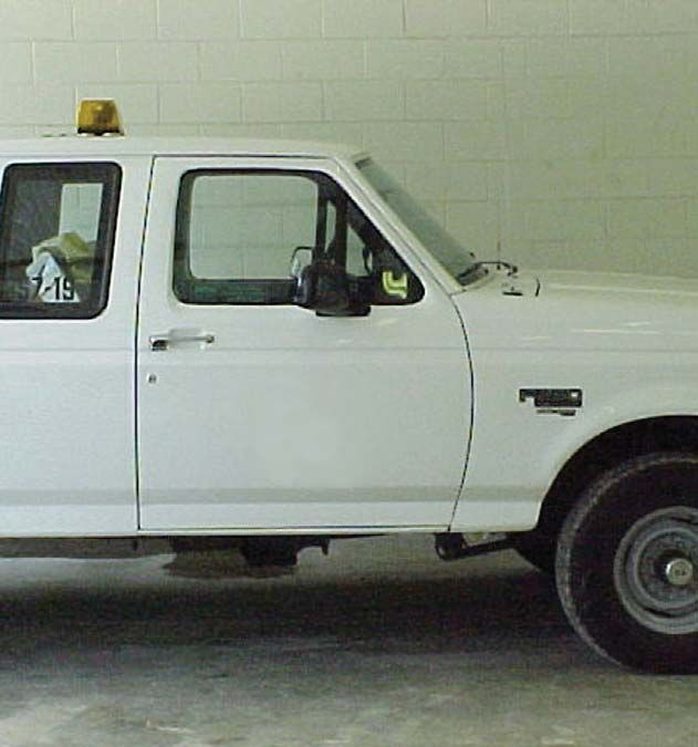
Wake County adopted this logo on July 1, 2000, to provide a
corporate identity for the County and to replace the numerous
existing logos in the various departments. The logo uses the
colors of cobalt and copper to signify sky and land, and its design
is intended to bring to mind the many paths of service the County
delivers: paths for parks and greenways, paths of learning through
our libraries, the healing paths of human services programs and
paths toward a progressive and well-planned future. The design
also conveys the idea of a flag, to signify government, with a star
representing Wake County’s standards of excellence, as well as its
status as the state’s capital county.

                                   David Cooke, County Manager

                            44.145–6/6/12

                                                                      i
COMMITTEE CONTACT INFORMATION:

If you have questions concerning printed material you may call
Dave Ceneskie, Support Services Supervisor (GSA), at 856-5445.

If you have questions concerning signs or sign graphics you may call
Ken Rambeaut, Sign Graphics Supervisor (GSA), at 870-4029.

If you have questions concerning the general usage of the logo,
you may call Sarah Williamson-Baker, Public Affairs Office, 919-856-7532.

If you have questions concerning the electronic or video usage of
the logo, you may call Chris Smith (Web Administrator) at 856-7331.

                                                                            ii
TABLE OF CONTENTS
Introduction from the County Manager _______________ i
Committee contact information _____________________ii
What is a logo? ___________________________________ 1
Highlights of logo usage instructions ________________ 2
Logo usage in documents _________________________ 2
Logo position and spacing ________________________3-4
Logo unity _______________________________________ 5
Logo orientation/distortion ________________________ 5
Minimum size ____________________________________ 5
Typefaces ________________________________________ 6
Department name placement ______________________ 6
Stationery
Letterheads _______________________________7-8
Envelopes _________________________________ 9
Business Cards ____________________________ 10
Color usage _____________________________________ 11
One color offset printing _________________________ 12
Special effects ___________________________________ 12
Electronic/video usage ___________________________ 12
Vehicles ________________________________________ 13
Promotional items _______________________________ 13
Clothing/uniforms ____________________________ 14-15
Signage ________________________________________ 16
Entrance Plaques ________________________________ 16
Main Facility Signage ____________________________ 17
Special material _________________________________ 18
County logo usage with other logos _______________ 19
Special event graphics ___________________________ 19
Exclusion of logo usage __________________________ 19
iiiWHAT IS A LOGO?
The Wake County logo is more than just an illustration. The consistent
application of graphic elements and standards will reinforce Wake
County’s image as a strong, unified and progressive County. This
logo replaces all former logos and these guidelines will introduce you
to the County’s corporate identity and help you communicate your
message in a clear and consistent manner. Your cooperation is
essential to the County’s success. These guidelines must be followed
uniformly and applied consistently through every aspect of our
communications. (Any department or agency that reports to the County
Manager must abide by the standards; those rest who do not are
welcome to use the logo, and also must adhere to the standards.)
If business reasons necessitate a change to the
corporate identity standards on your materials
or if your application is not addressed in the
manual, please contact General Services
Administration, Support Services Supervisor, for
assistance. See page i.
official logo
departmental/
divisional logo
Central
Services
1HIGHLIGHTS OF LOGO USAGE INSTRUCTIONS
Below is a summary of the guidelines in this manual. These do not
represent all restrictions that apply.
• If the logo prints in two colors, it must be printed in
PMS 5255 cobalt and PMS 876 copper inks. (Pantone Match-
ing System)
• If the logo prints in a single color it should be PMS 5255 or
black.
• If the logo is resized, the height to width ratio must be main-
tained.
• A minimum size of 3 picas by 4 picas (1/2” x 5/8”) must be
maintained.
• A minimum white space must be maintained around the logo
that is equal to or greater than the height of the word “Wake”
in the logo.
• The logo should not be surrounded on all sides by graphics
or text.
• See the section on page 12 concerning the use of the logo in
electronic form, such as on web pages.
These images are available in the P:\LOGO directory in EPS format:
• Color logo without border (for use as stand-alone image)
• Black and white logo without border (for use as stand-alone
image)
• Color logo with border (for use with department name)
• Black and white logo with border (for use with department
name)
You can copy the standards manual (“Logo Standards.PDF” file) from
the P: drive\LOGO directory to your hard drive, then open it with
Acrobat Reader. (Acrobat Reader is a free download from ADOBE.
COM.) Please be sure you COPY the file and not MOVE the file.
LOGO USAGE IN DOCUMENTS
Forms, newsletters, brochures, fliers, etc.
Externally used documents:
The logo should appear on any document that will be viewed by
anyone other than Wake County staff.
Internally used documents:
Existing documents used internally only may omit the logo if space
limitations prohibit adding it to the document.
All new documents, internal and external, should be designed with
the logo included. (Standards continued
on page 3.)
2POSITION AND SPACING STANDARDS
• The logo should be placed so that it is never surrounded
on all sides by text or other graphics.
a: inappropriate
Logo should not
be surrounded with
text on all sides.
b: APPROPRIATE
Negative space to edge
and around logo
LOGO USAGE ON FORMS
The logo should never be used
smaller than the minimum size of
3 picas wide by 4 picas tall (1/2 x
5/8 in.). On forms, it should be in
one of the corners when possible.
On internal forms, if space is lim-
ited, the logo can be used as space
allows or not at all (see diagram).
(Standards continued
on page 4.) 3POSITION AND SPACING STANDARDS cont.
• A minimum negative space (white border) of 1/2” or the height
of the word “Wake,” whichever is greater, must be maintained
around the logo.
• When the logo is placed over a solid color background, white
space may be reduced to a white border equal to the height
of the “N” in “North Carolina.”
3p (1/2”)
a: appropriate
minimum space
Space of 1/2” or
Height of “Wake”
b: appropriate
Logo is focal point
a: appropriate b: appropriate
negative space negative space
for text for solid color
background
Text negative
space
Solid back-
ground
negative
space 4LOGO UNITY
Logo should always appear in its entirety and never be broken into
separate elements. No graphics should appear as extensions of the
logo.
LOGO ORIENTATION/DISTORTION
Logo should never appear horizontally. When resizing, the height
to width ratio must be maintained. No graphic distortion will be
accepted.
a: APPROPRIATE c: inappropriate
b: inappropriate d: inappropriate
MINIMUM SIZE
For readability, the logo should never be reduced smaller than 3 picas
wide by 4 picas high (1/2 inch by 5/8 inch). Some exceptions in size
may be made for promotional items. You may contact GSA regarding
this (see page i).
3p (1/2 in.)
4p (5/8 in.)
5TYPEFACES
The words “Wake County” and “North Carolina” should always be
in Trajan Bold. However, because these words have been specially
kerned, the logo art should always be used for the logo itself. The
departmental/divisional type such as “Central Services” should always
be in Avenir Heavy and should be placed in size and relation to the
logo as seen in the diagram below.
official logo
trajan bold
departmental/
divisional logo
Central Avenir Heavy
Services
DEPARTMENT NAME PLACEMENT
The cap height of the department name should always equal the height
of and line up with the word “Wake.” The baseline of the second line
in the department name should always line up with the baseline of
“North Carolina.” The negative space (n) border rule listed on pages
three and four still applies.
n
General Services
Administration
On envelopes only, there is the option of using the department name
on the first line and a program name on the second line. The guides
for the department name size and negative space still apply.
n
Human Services
Child Support Enforcement 6STATIONERY: LETTERHEADS
All departments will use one of the letterhead styles shown below.
The exception will be for elected officials and at-will employees.
PAPER SIZE – 8.5 x 11 inches LOGO – 3/4 x 1 inch (4p5 x 6p)
TYPESETTING
Set all departmental letterhead type uppercase and lowercase, flush right,
ragged left, normal letter spacing, 7.5 pt. Avenir Medium (department name
is 7.5 pt. Avenir Black) with 9.5 pt. leading. The department/division name
to the right of the logo should be set flush left at 16.5 pt. Avenir Heavy with
17.5 pt. leading. See page 8 for margins. The bottom line of the generic
letterhead is 8 pt. Avenir Medium (centered).
COLOR
Logo: Pantone 876, Pantone 5255 Text: Pantone 5255
PAPER STOCK – Standard: Georgia Pacific, Valorem Opaque, White Smooth
60# Text
Option: Certificate Bond 24# Rag content
PRINTING – Offset lithography, flat
style a
By division TEL 919 856 5746
FAX 919 856 6478
Central A Division of General Services Administration
Services P.O. Box 550 s Raleigh, NC 27602
style b
By department TEL
FAX
919 856 5746
919 856 6478
General Services Central Services
Administration P.O. Box 550 s Raleigh, NC 27602
style c
Generic
letterhead
(letterheads
reduced to 50%)
7STATIONERY: LETTERHEADS cont.
6p (1 in.) 45p (7 1/2 in.)
4p5 (3/4 in.)
TEL 919 856 5746
FAX 919 856 6478
10p5 (1 3/4 in.) Central A Division of General Services Administration
Services P.O. Box 550 s Raleigh, NC 27602
Logo centered on the page
3p (1/2 in.)
9p6 (1 5/8 in.)
letterhead
reduced to 55%
3p (1/2 in.)
Text centered on the page
8STATIONERY: ENVELOPES
SIZE – no. 10 (9.25 x 4.125 inches)
LOGO – 9/16 x 3/4 inch (3p4.5 x 4p5)
TYPESETTING
Set Wake County return address uppercase and lowercase, normal letter spac-
ing, and 7.5 pt. Avenir Medium. When a department and a division name
must be used for mailing purposes, the cap height of the department
name should line up with the height of “Wake.” The division or program
name baseline should line up with the baseline of “North Carolina.” The
department should be in 12.5 pt. Avenir Heavy, with a leading of 13 pt. The
division should be in 9 pt. Avenir Heavy, and the leading should be 13 pt.
COLOR – Logo: Pantone 876, Pantone 5255 Text: Pantone 5255
PAPER STOCK – Fox River, Starwhite Vicksburg, Tiara (white), Smooth 24#,
#10 Commercial Flap
PRINTING – Offset lithography, flat
Helvetica 12 pt.
2p7.5 (7/16 in.) 24p (4 5/8 in.)
1p6 (1/4 in.)
General Services
7p (1 3/16 in.) Administration
P.O. Box 550 s Raleigh, NC 27602-0550
12p (2 in.)
NAME OF ADDRESSEE
TITLE (OPTIONAL)
NAME OF COMPANY
STREET ADDRESS
CITY STATE (2 letter abbrev.) ZIP CODE
option a
department name only 7p6 (1 1/4 in.)
(envelopes
reduced to 53%)
2p
223344 (3/8 in.)
option b
department and
division/program name
The index code may be printed on the right side (as shown above) for billing postage and
should be set in 6 pt. Helvetica type. Postal regulations suggest the mailing address should
be set in Helvetica 12 pt. type.
9STATIONERY: BUSINESS CARDS
All departments will use one of the business card styles shown below.
The exception will be for elected officials and at-will employees.
SIZE – 2 x 3.5 inches
LOGO – 1/2 x 3/4 inch (3p x 4p5)
TYPESETTING
Set all type uppercase and lowercase, normal letter spacing,
and 9.5 point leading. Set name in 10 pt. Avenir Heavy, title
in 7 pt. Avenir Light Oblique, phone numbers in 7 pt. Avenir
Medium, “tel” and “fax” in 6 pt. Avenir Medium, small caps,
e-mail in 7 pt. Avenir Book, division in 6 pt. Avenir Heavy, and
address in 6 pt. Avenir Medium.
COLOR
Logo: Pantone 876, Pantone 5255
Text: Pantone 5255
PAPER STOCK – Wausau, Southern Hi-Bulk, Bright White 80# Cover
PRINTING – Thermograved/raised
1p6 (1/4 in.) 19p6 (3 1/4 in.)
2p (5/16 in.)
3p5 (9/16 in.) } 2 or 3 lines
8p (1 3/8 in.) } 3 or 4 lines
10p3 (1 11/16 in.)
} 2 lines
style a
style b
10COLOR USAGE
The two PMS inks are PMS 5255 (cobalt) and PMS 876 (copper).
Whenever possible the logo should appear in these two inks or the
following equivalent.
• CMYK for printed materials: cobalt = C=83, M=87,
Y=0,
K=46; copper = C=38, M=59, Y=73, K=7
• RGB for screen/video: cobalt = R=29, G=13, B=73;
copper = R=146, G=82, B=49
• For color output to laser printers, etc., match colors to
the two PMS colors as closely as possible.
PMS 5255 PMS 5255
PMS 876 PMS 876
COLOR USAGE OTHER THAN THOSE SPECIFIED ABOVE
When the logo is to be printed in two colors, it must always be in PMS
876 (copper) and PMS 5255 (cobalt); no other color combinations are
to be used.
When a piece is not printed in PMS 5255 and 876 or the 4-color
process equivalent, the logo should either reverse out to white (or
the color of the paper) from the darkest color used OR print in all
black or all cobalt. Logo should never appear in one color trapped
in another color.
a, b: APPROPRIATE
c: inappropriate
a b c
Ex: The piece is printing in green and cobalt; the logo should
appear reversed out to white from the green ink (a) or the logo should
print in all cobalt ink (b). The logo should never print in one color
trapped by the other (c). (When the two specified PMS inks cannot
be used, the logo should print in only one color; never a combination
of two other colors.)
11ONE COLOR OFFSET PRINTING
When the logo is to be printed in just one color, on official correspon-
dence where only one ink color is to be used, it should print in either
all black or all cobalt.
SPECIAL EFFECTS
Watermark
The logo may be used as a watermark in a sheet of paper.
Background Screen
When screened, the logo will be printed in black or 5255
cobalt blue. The logo will be screened to 5% if overprinted,
or at least 50% if standing alone.
Foil Stamped
The logo may be foil stamped, one color, in gold, silver, white,
black, copper, or dark blue. The foil may be either gloss or
matte finish.
Blind Embossed
The logo may be blind embossed in paper or foil.
ELECTRONIC/VIDEO USAGE
The logo should always appear in a prominent position on every web
page in its web safe colors or RGB screen equivalents to the PMS inks.
The web safe colors for the logo are:
Cobalt: #1D0C4A
Copper: #945231
On pages that have a dark or black background, the logo can be
reversed out to all white or provide a white border equal to 10 pixels
of white space or more.
Always maintain the minimum buffer area around all sides of the logo
equal to 30 pixels or more of negative white space.
The minimum size of the logo in an electronic document should not
be smaller than 65 X 80 pixels.
The white space of the logo should never be transparent and have
any background images passing through it.
The logo should never have any electronic special effects applied such
as shadows, animation, or be distorted in any way. (See page 5.)
12VEHICLES
On all vehicles, the logo should be centered top to bottom and left
to right over each front door panel. It should always be produced in
the 2 logo colors PMS 5255 and PMS 876 on white background.
PROMOTIONAL ITEMS
All county identified items, including mugs, hats, t-shirts, other cloth-
ing, paper-weights, plaques, pens, pencils, napkins, awards, etc.
should bear the Wake County logo. If space is limited, the logo can be
used as space allows (trying to maintain as much integrity as possible)
or not at all. Specialty items should follow the corporate standards
including typeface usage, logo placement, colors (except where
engraved), etc.
13CLOTHING/UNIFORMS
The logo can appear by itself, or with either of the text elements, or
with both text elements. Department names and division/program
names can be interchanged between the top text and the bottom
text. Diagrams A–D
A. B.
t ral Servic
en e
C
s
General Services General Services
Administration Administration
C. D.
F ie ld Ser
A/ vic
GS
es
14CLOTHING/UNIFORMS cont.
Any of the layouts (A–D on page 14) can be used for both screen
printing and embroidery. However, when embroidering, the words
“North Carolina” in the logo will be replaced by a solid copper bar.
When screen printing, the “North Carolina” may be a solid copper
bar if the material being printed creates a quality problem.
The logo measures 1 5/8” high by 1 1/4” wide. The text for the top
element is Avenir Heavy, 24 pt. set on a 1 1/2” radius arc. The text
for the bottom element is Avenir Heavy, 24 pt. centered below the
logo.
The logo should be placed over the left breast or on the sleeve of
the garment.
• For screen-printed apparel, the logo prints in PMS 5255 (cobalt)
and PMS 876 (copper), or all cobalt, or black, or reversed to white
or cream. White or cream will be used for darker color shirts such
as maroon or black. Photos A and B
• For embroidered apparel, the thread colors should match the PMS colors
as closely as possible. All other standards stated above also apply.
Photo A
Photo B
15SIGNAGE
When the logo is used on signage, first determine the final size the
logo will be on the sign. Once the final size has been determined, the
minimum border of negative space around the logo should always be
the height of the “N” in “North Carolina” (see diagram).
a: appropriate
negative space
for signage
negative space
For permanent signs, the logo should always be produced in the
cobalt and copper (Premium Spar-cal #1508 copper metallic and 3M
Custom Match PMS 5255 in vinyl signs, PMS 5255 and PMS 876 for
screenprinting) on a white background.
For temporary banners, signs, etc. the logo should print in either the
two specified PMS inks, or when other colors are used, the logo should
print in just one color – blue or black, or reverse out to white (from
the darkest color used). See section on one color usage.
ENTRANCE PLAQUES
Information about entrance plaques to come
16SIGNAGE cont.
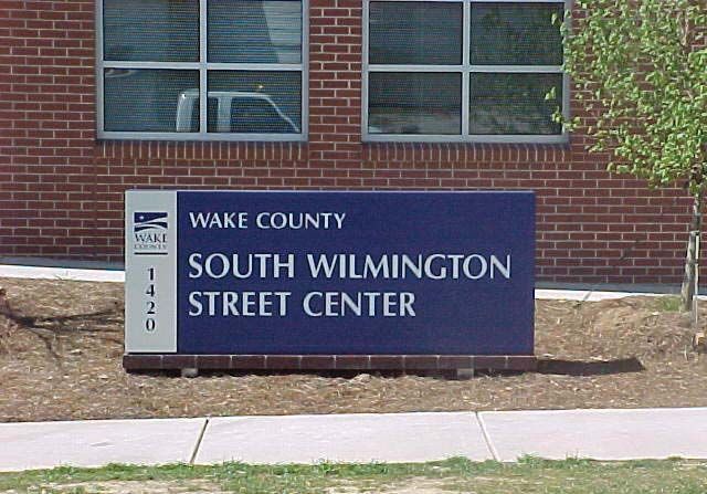
MAIN FACILITY SIGNAGE
For permanent signs, the logo should always be produced in the
cobalt and copper (Premium Spar-cal #1508 copper metallic and 3M
Custom Match PMS 5255 in vinyl signs, PMS 5255 and PMS 876 for
screenprinting) on a white background.
For temporary banners, signs, etc. the logo should print in either the
two specified PMS inks, or when other colors are used, the logo should
print in just one color – blue or black, or reverse out to white (from
the darkest color used). See section on one color usage.
Standard
Internally
Illuminated
Facility Sign
38” high X
96” long
17SPECIAL MATERIAL
Use of special materials to create the Logo are reviewed on a case-
by-case basis by GSA. (see page i) Examples include paint, carpet,
vinyl and thread (other than uniforms). As a rule, any material that
cannot be matched to the PMS inks should be reviewed by the logo
committee.
18COUNTY LOGO USAGE WITH OTHER LOGOS
General Services Administration needs the following information sub-
mitted in written form before approval is to be given to use an official
statewide or federal program logo on a County document:
1. If your department is required to use another logo in order to obtain
funding from an organization, you must submit a copy of the legal
contract or supporting document where this clause is mandated.
Once approval has been obtained to use this secondary logo in
conjunction with the County logo, then the following restrictions
apply:
a) The County logo should always be equal to or larger than
the secondary logo.
b) Secondary logos or funding information may appear at the
bottom of the letterhead. Envelopes will carry the Wake
County logo only.
c) The same color usage and logo placement standards apply
from pages 7 through 11 when printing the County logo.
2. If your department (program) is in a partnership with an outside
organization that wants logo representation, you must submit docu-
mentation of the organization’s funding or in-kind contributions
and/or services provided that benefit Wake County. Once approval
has been obtained to use a secondary logo with the County logo,
the same restrictions apply from 1a through 1c above.
EVENT GRAPHICS
For events that occur only one time each year, it is permissible
to establish a graphic to promote that event. If Wake County is the
primary contributor to the event, either in funds or time, or the sole
contributor, the Wake County logo will be used in conjunction with
the event graphic.
EXCLUSIONS OF LOGO USAGE
WITH NON-COUNTY LEASING GROUPS
If an outside agency (i.e. United Arts) leases space from Wake County,
then it will be allowed to use its corporate identity or logo at the
storefront of the leased space only (i.e. on door or window). No
other usage will be allowed within the facility. Pre-approval must be
obtained, and leasing group must coordinate signage placement
with GSA.
19You can also read