ATMOSPHERIC POLLUTANTS IN AND AROUND MANCHESTER, UNITED KINGDOM
←
→
Page content transcription
If your browser does not render page correctly, please read the page content below
ATMOSPHERIC POLLUTANTS IN
    AND AROUND MANCHESTER,
         UNITED KINGDOM

 Physics with Meteorology Senior Honours Project
          September – December 2006

                CHRISTINA ROBERTSON
                                 0343207

                                  Abstract

Concentrations of nitrogen oxides (NOx) and tropospheric ozone (O3) at six
locations in the Greater Manchester area were analysed over an eight year
period. The various daily, weekly and seasonal trends were evaluated for
each location. A correlation between NOx and ozone concentrations was
established - an increase in NO concentrations was found to cause a
decrease in ozone concentrations. A period of extreme exceedance in NOx
was then identified, where hourly measurements of NOx concentrations at
Bury reach in excess of 2000µg/m3. Its causes were investigated by
examining the environmental conditions at the time, and comparing these to
the conditions on the days with low NOx concentration levels. It was revealed
that extreme exceedance events occur for the most part in winter, when there
is high pressure, little wind and a shallow and stable boundary layer. Periods
of low NOx concentrations are favoured by warm, windy conditions, with a
deep and well-mixed boundary layer.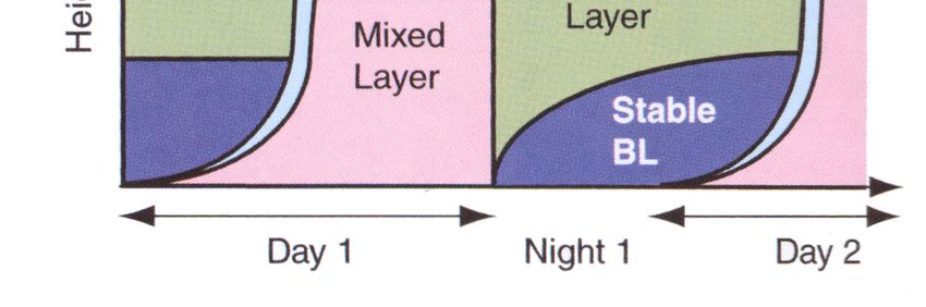
1. Introduction

One of the biggest environmental problems the human race has to face is that
of air pollution. There is hardly a city in the world that is not affected and
statistics show that in the developed world, air pollution causes more deaths
than any other meteorological hazard. There is also a large economic impact,
not only a result of reduced crop yields and building damage (with costs
running into billions of pounds a year), but also from increased health care
costs and lost work productivity due to the health problems air pollution can
cause. It is estimated that in the United States of America alone these health
problems create a bill that runs in billions of dollars per year [1].

Legislation aimed at reducing pollution levels in our atmosphere has become
common in the last 50 years. Pollution is not, however, a new problem.
Smoke from burning coal and wood was a huge problem in Medieval England,
so much so that King Edward I brought in the first recorded law aimed at
reducing air pollution. It did not do much to alleviate the problem, however,
and with the onset of the Industrial Revolution several centuries later, the
quality of the air was inevitably going to get worse.

One of the main components of the smoke emitted was sulphur – which in
large quantities can cause severe respiratory problems in humans. By the
mid-nineteenth century dangerous and often fatal ‘smoky fogs’ were
commonplace in Britain’s industrial cities, particularly London. The word
‘smog’ was first used in the early twentieth century to describe this mixture of
smoke and foggy air. It was difficult to bring in effective regulations because
the owners of the factories held so much influence over governmental
policies, and to reduce emissions would surely have a huge impact on their
profits. It wasn’t until 1952 that an event forced the UK parliament to make
dramatic change in policy. Weather conditions in London created thick smog
that lasted for no less than five straight days. Visibility in the city reduced to
zero and almost 4000 people died as a direct result of breathing in the
noxious fumes. The Clean Air Act was passed in 1956 making London and
other industrial cities much cleaner with respect to this type of pollution.

Tackling air pollution remains a difficult task today. Whilst the so-called
London-type smog may be a thing of the past in cities in developed nations,
the increased use of private cars has created a whole new type of smog. This
was first identified in Los Angeles in the 1950s and is thus often referred to as
Los Angeles-type smog. This type of smog occurs when there are high levels
of tropospheric ozone. Although it is vital for our well-being to have sufficient
levels of ozone in the stratosphere to protect us from harmful UV-rays from
the sun, ozone in the troposphere acts as a pollutant with significant negative
health effects.

Two other pollutants which are still a huge problem in today’s cities are
nitrogen (nitric) oxide (NO) and nitrogen dioxide (NO2), collectively known as
nitrogen oxides (NOx).

                                                                                 2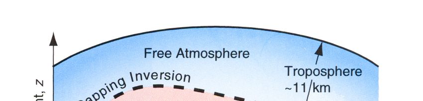
1.1 - Types of air pollutants

Air pollutants are defined as airborne substances that exist in the atmosphere
in concentrations that are damaging to our health and to vegetation and
buildings. They can come from natural sources such as volcanic eruptions or
anthropogenic sources.

They can be separated into two main groups: primary air pollutants that are
released into the atmosphere from a direct source such as a chimney or a car
exhaust and secondary air pollutants which are created through chemical
reactions in the atmosphere.

Nitrogen oxides are primary pollutants, the main anthropogenic sources being
the burning of oil and coal in power plants and vehicles.
Inhaling high concentrations of NOx is said to cause various heart and lung
problems, along with increasing the chance of respiratory infection due to
lowering resistance. There is also the possibility nitrogen oxides can assist the
spread of cancer, but this theory is largely untested on humans.

Tropospheric ozone is a secondary pollutant. It can either be formed as part
of the nitrogen cycle in the troposphere itself, or be transported down from the
stratosphere. As the chemical reactions take place in the presence of sunlight,
the Los Angeles-type smog is also known as photochemical smog.

Ozone can cause many health problems, ranging from the relatively minor
such as eye irritations, to the more severe. Chronic illnesses such as asthma
and bronchitis can be greatly aggravated by exposure to ozone. Even healthy
people can be subject to problems such as reduced lung capacity when
exposed to ozone for a period of a few hours.

It is this tropospheric ozone, and in particular its chemical precursor, nitrogen
oxides, that will be studied in detail in this report. Daily, weekly and seasonal
variations will be considered before looking at exceedance events in nitrogen
oxides, and investigating any relationships which may exist between extreme
exceedance events and the local atmospheric situation.

                                                                                3
2. Background Information and Theory
Before examining the various trends of the concentration data, it is important
to have an understanding of some of the processes involved in determining
the formation and destruction of these particular air pollutants.
2.1 - Sources of Nitrogen Oxides
It has already been stated that nitrogen oxides are primary pollutants, the
main sources being car exhaust fumes and power plant emissions. It is
seemingly obvious to say that the concentration levels of NOx will be directly
linked to the levels of emissions. While this is undoubtedly true, there are
several other factors. Firstly, the lifetime of nitrogen oxides vary depending on
the conditions in the atmosphere; colder and wetter conditions lead to longer
lifetimes. The second, and perhaps more important, factor relates to the
atmospheric boundary layer and an understanding of this boundary layer, its
properties and variations, is needed.
2.2 - Boundary Layer Physics
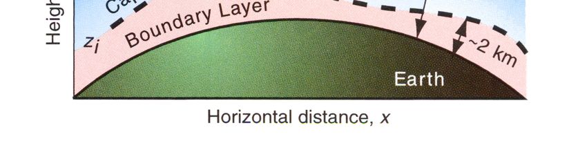
The Boundary Layer (also called the Atmospheric Boundary Layer, or the
ABL) is the layer of atmosphere next to the surface of the earth, as shown in
Figure 1. The air is very well mixed within this layer due to the amount of
turbulence that exists. At the top of the boundary layer, however, there exists
an inversion (i.e. a very stable layer) which effectively creates a barrier. There
is very little mixing between the air in the boundary layer and the air in the free
atmosphere above this stable layer, so air pollution that exists in the boundary
layer is therefore trapped there.
Figure 1 - A cross section of the troposphere showing the nature of the boundary layer. Ref:[2], p.376
The depth of the boundary layer is usually between 1 and 2 kilometres. It can
vary considerably over even quite a short period of time. Clearly, the deeper
the boundary layer, the more space the pollutants have to ‘mix’ in, therefore
meaning lower pollution levels at ground. Exceedingly high concentrations are
4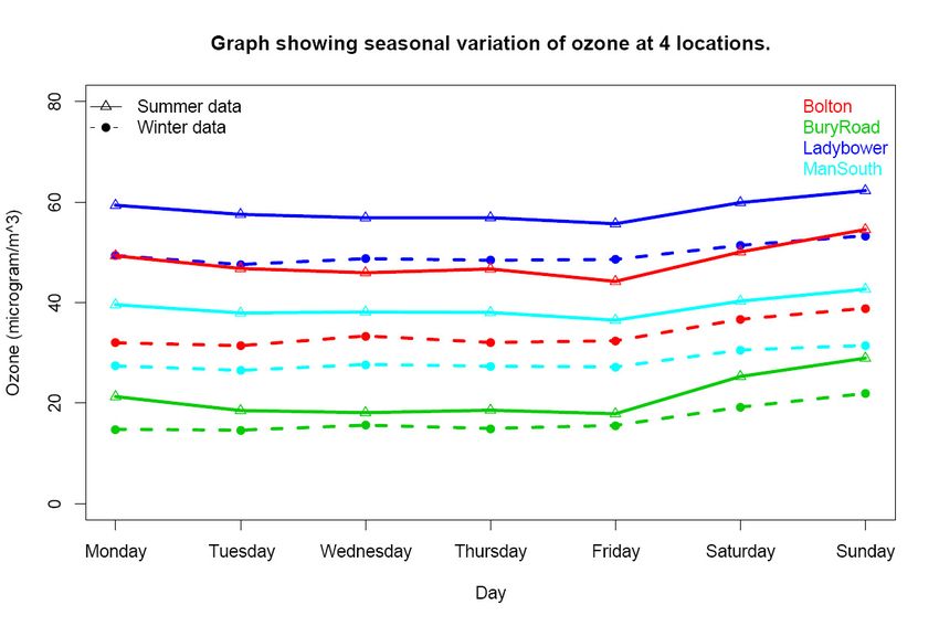
most probably caused by an extremely shallow boundary layer, causing all the
pollutants to be trapped closer to the ground. It is this concept that will be
explored in Section 5 of this report – Exceedance Events in NOx.

Figure 2 – A graph showing diurnal variation in the boundary layer. Ref:[2], p. 398

There is also quite a distinctive diurnal variation in the depth and properties of
the boundary layer, as shown in Figure 2. Turbulence is mostly caused by
surface heating by energy coming from the sun. Thus when this energy is
‘turned off’ at night time; this source of turbulence is taken away, and the
boundary layer becomes very stable. Mixing of the atmosphere only really
takes place very close to the surface during the night. After sunrise, the
surface slowly heats up again, creating more and more turbulence. The mixed
boundary layer grows in size, until the whole of the boundary layer consists of
this mixed air at some point around midday.
In theory, this diurnal variation in the boundary layer should have an effect on
the daily cycle of NOx concentrations. This idea will be explored in Section 4 of
this report – Variations and Trends in NOx and Ozone Data.

2.3 - The Nitrogen Cycle

Ozone is formed in the troposphere as part of the nitrogen cycle, which
functions as follow:

     1. The photolysis of nitrogen dioxide by ultraviolet radiation creates
        nitrogen oxide and a single oxygen atom.

                                   NO2 + hf                NO + O

           where hf indicates the energy from ultraviolet radiation from the sun.

                                                                                      5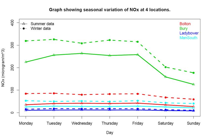
2. This single oxygen atom combines with an oxygen molecule to form
      ozone. This reaction must take place in the presence of a third
      molecule, M, which serves to absorb energy from the reaction as heat.

                    O2 + O + M     O3 + M

   3. The ozone then reacts with nitric oxide to form oxygen and nitrogen
      dioxide, thus completing the nitrogen cycle.

                    O3 + NO      NO2 + O2

The above cycle generally takes around three minutes to complete. The
photolysis reaction in part 1 of the cycle is relatively slow when compared to
reactions 2 and 3. It is clear, however, that in this cycle, all ozone that is
created is also destroyed. Thus, a build up of ozone can only exist if the ratio
of NO2 to NO is sufficiently large enough. For this to happen, processes are
required to convert NO to NO2 without destroying any ozone.

2.4 - The VOC Oxidation Cycle

This chemical process is the main way the ratio of NO2 to NO can reach the
required levels for ozone build up.
Volatile organic compounds are another primary pollutant. They are primarily
hydrocarbons, and the main anthropogenic source is once again the exhaust
fumes of vehicles. These compounds are oxidised in the atmosphere by a
series of reactions, from which carbon monoxide, carbon dioxide and water
are produced. The processes are detailed below, where RH represents any
hydrocarbon and R is the organic fragment of this hydrocarbon.

   1. The extremely reactive hydroxyl radical (OH) attacks the hydrocarbon
      to form water and R:

                    RH + OH      H2O + R

   2. R then reacts with an oxygen molecule in the presence of a third mass,
      M:
                   R + O2 + M    RO2 + M

   3. RO2 then reacts with nitrogen oxide in the following manner:

                    RO2 + NO      NO2 + RO

This third process is the key to allowing ozone build-up as it converts nitrogen
oxide to nitrogen dioxide without causing the destruction of ozone.

                                                                               6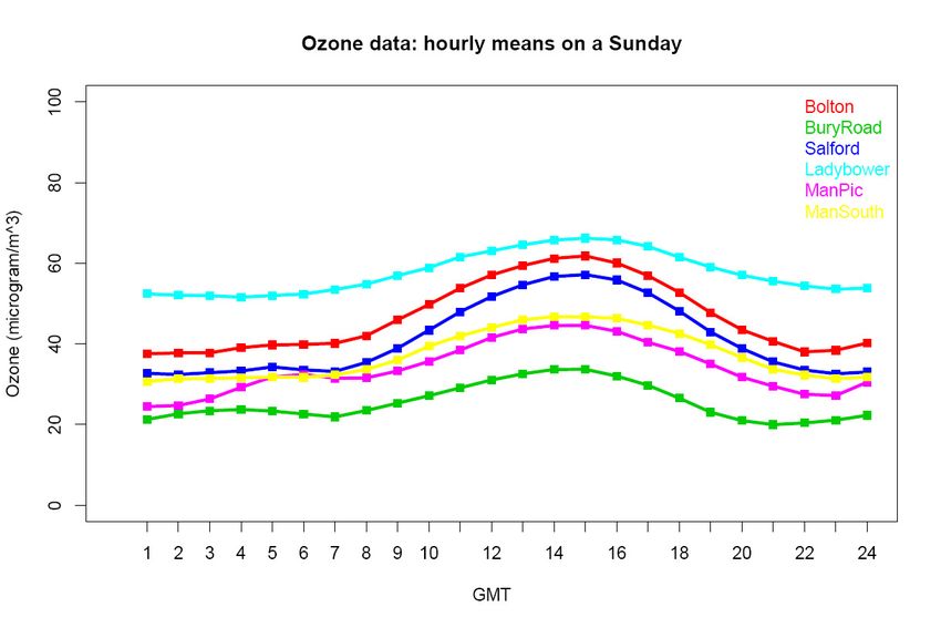
2.5 - Build-up of ozone concentrations

The build up of ozone formation in the troposphere relies mostly on the
presence of two sets of compounds: nitrogen oxides and VOCs. However, as
nitrogen oxides are involved in both the formation and destruction of ozone,
its involvement is slightly more complicated. Of course, if there were no
nitrogen oxides whatsoever the ozone could not be created, and in some
cases a reduction in NOx emissions can help lead to a reduction in ozone
concentration levels. In areas where there is a huge abundance of NOx, the
time scales of all the reactions involved mean that the high NO concentrations
destroy ozone faster than NO2 can create it.

These features mean that, in areas of high NOx concentrations, a decrease in
NOx emissions can actually lead to an increase in ozone concentrations due
to the reduction in ozone destroying NO. In these situations, a reduction in the
amount of ozone in the atmosphere is more greatly achieved through the
reduction of VOC emissions.

Local areas have been characterised as being either NOx-limited, where a
reduction in ozone levels is more likely through a decrease in nitrogen oxides,
or VOC-limited, where the reduction of volatile organic compounds is more
likely to decrease ozone concentrations. In general, rural areas are NOx-
limited, while urban areas tend to be VOC-limited.

2.6 - Sinks of Nitrogen Oxides

Nitrogen oxides can also be destroyed through reactions with other
substances. The main example of this is the hydroxyl free radical molecule
(OH). This is highly reactive and will react with almost any thing. It is generally
formed through the following processes:
    a) An ozone molecule is broken into a single oxygen atom and an oxygen
       molecule through photolysis by ultra-violet radiation.
    b) The single oxygen atom formed can then react with water to form two
       hydroxyl radical molecules.

                     O + H2O      OH + OH

Concentrations of OH are likely to be highest at midday, and on a seasonal
basis, in the summer, when there is more uv-radiation to photolyse ozone
molecules and more ozone molecules to begin with.
OH will react with nitrogen dioxide in the presence of a third body, M to form
nitric acid (NO2 + OH + M       HNO3 + M) and in this way acts as a sink for
NOx.
As the hydroxyl level is also a main component of the VOC Oxidation Cycle,
its presence also encourages the conversion of NO to NO2 and thus
encourages the build up of ozone.

                                                                                  7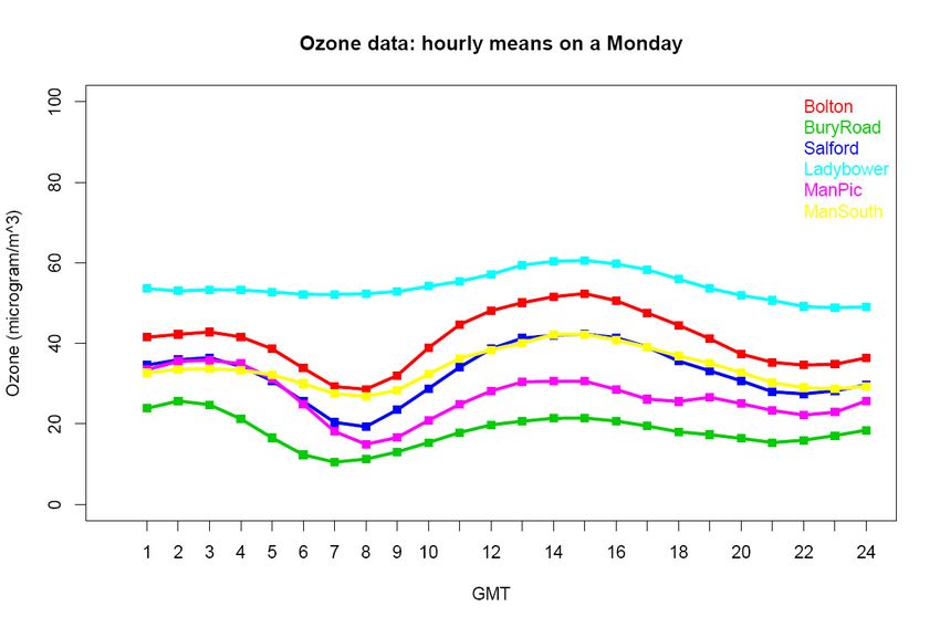
3. Experimental/Method

This project did not involve the collection of any new raw data but instead
made use of the UK National Air Quality Database [4]. This online database
stores large quantities of high quality air pollutant concentration data from
monitoring stations around the country.

There are over 1500 different sites across the United Kingdom that monitor air
quality, mostly on an hourly basis. It was decided to focus on one particular
region to analyse variations and search for a weekend effect. Different
stations monitor different air pollutants, however, and so it was important to
choose an area which has a sufficient number of stations that provide hourly
readings in both nitrogen oxides and ozone.
Six locations around the Greater Manchester area were chosen as they
represent several different types of backgrounds within a reasonably small
area. Thus, we can make the tentative assumption that any local
meteorological conditions will have the same effect on all the locations.

3.1 - Descriptions of monitoring station locations [4]

The sites chosen range from city centre to a completely rural setting. They are
Bolton, Bury, Salford Eccles, Manchester Piccadilly, Manchester South (all in
Greater Manchester) and Ladybower in the Peak District, approximately 25
miles east of Manchester.

Bolton – this monitoring station is in an urban location that is quite built up.
There are three busy roads in the vicinity, with a combined traffic flow of
18,000-23,000 vehicles per day. The manifold inlet is approximately 9 metres
above ground level.

Bury – this is a roadside location, 16 metres away from the very busy M62.
This motorway has an annual average weekday flow of 169,000 vehicles.
Also in the area (21 metres away) is a prominent roundabout with an average
weekday flow of around 40,000 vehicles. Both the motorway and the
roundabout are subject to congestion, especially during rush hour times. The
monitoring station itself is in quite an open area, without any tall building
obstructing its surroundings. One would expect the daily cycle and weekend
effect to be very noticeable here.

Salford Eccles – this location is described as ‘urban industrial’. Again, it is
reasonably near (250m) to a busy road – the M602 which sees approximately
70,000 vehicles per day. It is also only 100m from Eccles town centre. The
area is generally open but there are many suburban properties.

Manchester Piccadilly – this station is located in the corner of Piccadilly
Gardens in the city centre. It exists in a pedestrianised zone surrounded by
many several storey buildings.

                                                                               8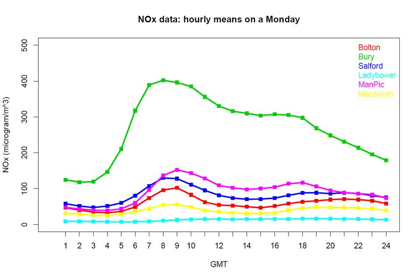
Manchester South – this location is listed as ‘suburban’. The general area is
quite built up with suburban properties but the monitoring station itself is
situated on the edge of a sports field. Thus the surrounding area is very open.
The closest road is 85 metres away, and the closest motorway is 2 miles
away.

Ladybower – this location is completely rural, the monitoring station being
approximately 0.5 miles from Ladybower reservoir. There is a road nearby but
it use is limited to access to the adjacent farm only. The surrounding area is
mostly open moorland, with the closest trees being several hundred metres
away.

3.2 – A Brief Description of data handling and the statistics package

Data was retrieved for an eight year period running from 1998-2005. The data
was obtained in csv format which could then be read in by the statistical
programming language, R. This is an open-source programming package
which is based on S-plus and has many of the same characteristics. It is used
widely within the field of environmental science and its main function in this
project is to produce several time-series plots. It is possible to plot the mean
of a particular hour for a given day. For example, it can calculate the mean of
all the data that exists for a Monday at 9am throughout the time period.
It is also possible to sort the data for each location into descending order, and
pick out the highest concentrations and when they occurred. This function
was essential for identifying any extreme exceedance events. Examples of
the main scripts used can be found in Appendix A.

                                                                                9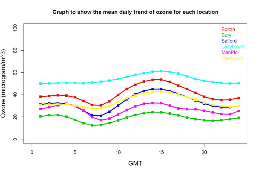
4. Variations and Trends in NOx and Ozone Data

Results

The first thing R was used for was to obtain mean values of NOx and ozone
concentrations in each location. These provide a general idea of what kind of
values to expect for each location, and can be found in the table below.

Location                                           Mean of NOx (µg/m3)                                 Mean of Ozone (µg/m3)
Bolton                                             57.4                                                41.0
Bury                                               250.1                                               19.0
Salford                                            76.8                                                33.2
Ladybower                                          12.9                                                53.9
Manchester Piccadilly                              86.3                                                26.5
Manchester South                                   37.2                                                33.9
Table 1 - a table showing the mean hourly concentrations of nitrogen oxides and ozone at each location. All values are given to 1 decimal place.

Scripts were then written to plot several graphs to show a range of different
trends and variations. Each script was written to plot NOx data, and then
altered slightly to create the same plots for ozone data.

NOx Plots

The first plots produced show how the means of the hourly data varies a) due
to the day of the week (see Graphs 1) and b) due to the hour of the day (see
Graph 2). The values shown relate to the mean of the relevant data
throughout the 8 year period the datasets cover.

Graph 1 – a graph to illustrate how hourly measurements of nitrogen oxides vary with the day of the week at each location

                                                                                                                                                   10
Graph 2 – a graph to illustrate how hourly measurements of nitrogen oxides vary with the time of day at each location
Graphs 1 and 2, together with the data given in Table 1, give important basic
information about NOx concentrations with respect to location, weekly trends
and daily cycles.
Firstly, the highest concentrations occur at the roadside location of Bury.
Concentrations then decrease continually as the locations range from
Manchester Piccadilly (city centre), Salford and Bolton (both urban locations),
Manchester South (situated in suburbia). Finally, the lowest concentrations
exist at Ladybower in a rural environment.
Secondly, the mean of hourly data remains fairly constant throughout the
working week. At the monitoring stations in the roadside, urban and suburban
locations, however, the mean drops at the weekend. This change is most
substantial at Bury roadside, but still exists quite clearly in the other Greater
Manchester locations. At Ladybower, however, there does not seem to be any
variation at all throughout the week.
Thirdly, Graph 2 provides some information about the daily cycle of NOx
concentrations. At Bury, the mean of hourly measurements varies quite
considerably throughout the day. The highest concentrations occur in the
morning, between 7 and 10am. The lowest concentrations are found at night
time, particularly in the early hours of the morning. The daily cycles at the
urban/suburban locations match that of Bury, although the gradients and
peaks aren’t as extreme. Again, the data from Ladybower shows little, if any,
variation, throughout the day.
11A script was then written to separate the daily cycle of hourly means into the
seven days of the week. Graph 3 shows the daily cycle of a typical working
day (Monday), whereas the daily cycle at the weekend is represented in
Graph 4, where the hourly means on a Sunday are plotted. The plots for the
remaining days of the week can be found in Appendix B.
Graph 3 - a graph to show the daily cycle of nitrogen oxides at each location on a Monday
Graph 4 - a graph to show the daily cycle of nitrogen oxides at each location on a Sunday
12These plots not only reiterate the results shown in the previous plots, but also
reveal a difference in the daily trend on a working day and the daily trend at
the weekend. Consider first the plot of Monday’s data (Graph 3). The
magnitudes of the concentrations are understandably smaller in the graph
showing the average daily trend due to the concentrations being lower at the
weekend than in the week (an effect seen most obviously at Bury, where the
dip at the weekend is most substantial). Other than that, Monday’s plots take
roughly the same form as those in Graph 2.
On the other hand, the plot showing Sunday’s data (Graph 4) takes on a
completely different form. This time, the data does not vary nearly as much
throughout the day. There is no peak in concentrations occurring between 7
and 10 am and in fact, the highest concentrations take place in the evening.
The results at Ladybower remain the same, with little variation seen.
The plot created by the final script written for showing variations in NOx data
is shown in Graph 5. This graph shows the seasonal variation of the daily
means of hourly data throughout the week at 4 of the 6 locations. The dashed
lines with circular points show data from the winter months, whilst data from
the summer months is represented by solid lines with triangular points.
Graph 5 – a graph showing the seasonal variation of nitrogen oxides at four of the six locations
Two main points can be deduced from this graph:
a) Concentrations of nitrogen oxides are higher in the winter months.
This is true even at Ladybower.
b) The gradients of the lines connecting Friday and Saturday’s points
look to be unchanged between the summer and winter data. Thus,
there is no obvious effect of seasonal variation on the weekend
effect.
13Ozone Plots
The plots created by the scripts adapted to show ozone data results can be
seen in Graphs 6-10.
As with the NOx plots, the first two graphs (Graphs 6 and 7), together with
Table 1, give the basic information about the variations in ozone due to
location, weekly trends and daily cycles.
1) Conversely to NOx, the highest ozone concentrations occur at
Ladybower, with the lowest concentrations at Bury Roadside. Whilst
NOx concentrations at Ladybower show no variation in the daily or
weekly cycle, this is not true for ozone concentrations.
2) Concentrations of ozone are generally higher at the weekend than
during the week. This variation is most dramatic at Bury, but applies
to all locations.
3) There is a variation in hourly readings throughout the day at all
locations. The form of this daily cycle, however, differs at
Ladybower to the other locations. The hourly values at Ladybower
are all fairly constant, apart from an increase in magnitude during
the afternoon. The daily cycles at the other locations have this peak
in the afternoon, but a dip in concentrations is also evident at
around 8/9am. This dip coincides with the peak of NOx
concentrations occurring each workday morning at the roadside,
urban and suburban locations.
Graph 6 – a graph to illustrate how hourly measurements of ozone vary with the day of the week at each location
14Graph 7 – a graph to illustrate how hourly measurements of ozone vary with the time of day at each location
The data was again separated into daily averages, and an average daily cycle
at leach location for each day was plotted. Graphs 7 and 8 show the average
daily cycles of ozone concentrations on a Monday and a Sunday respectively.
The plots showing the daily cycles of ozone on the remaining days can be
found in Appendix C.
Graph 8 - a graph to show the daily cycle of ozone at each location on a Monday
15Graph 9 - a graph to show the daily cycle of ozone at each location on a Sunday
Once again, the example of a daily cycle on a working day (in this case, on an
average Monday) differs greatly from the daily cycle at the weekend. The
cycles at Ladybower remain unchanged, but this cannot be said for the other
locations. The graph showing Monday’s daily cycle is practically identical to
the graph showing the average of all day in the week. The dip in
concentrations occurring in the morning on Monday’s plot, however, does not
exist on the Sunday. On this day, the daily cycles at all locations match that of
Ladybower, with concentrations increasing throughout the day, reaching a
peak in the late afternoon, before declining again at night time.
16Graph 10 is the final ozone variation plot and shows the seasonal variation of
ozone concentrations at the same 4 locations as were chosen to show
seasonal variations in NOx concentrations.
Graph 10 – a graph showing the seasonal variation of ozone at four of the six locations
This graph clearly shows that ozone levels are higher in the summer months.
There is also a difference in the importance of the weekend effect - the
gradients of the lines connecting Friday and Saturday’s points look to be
steeper in the summer than in the winter. Thus, with respect to ozone,
seasonal variation affects not only the levels of concentrations, but also the
extent to which the weekend effect is important.
17Direct Comparison Plots
A script was written to create plots showing how concentrations of ozone
compare to concentrations of NOx. As the daily and weekly variations of
concentrations were most evident at Bury and Manchester Piccadilly, these
two locations were chosen to show this direct comparison. The comparison of
hourly means on a Monday can be found in Graph 11. The plots showing
comparisons on the remaining days of the week are in Appendix D.
Graph 11 – a graph showing a direct comparison of ozone and NOx measurements on a Monday and Bury and Manchester Piccadilly
Graph 11 shows that as NOx concentrations rise, ozone levels fall. The rate of
change of concentrations is a lot higher in NOx, however. That is, a large
increase in NOx levels corresponds to a very small decrease in ozone levels.
18Discussion
4.1 – Variation of NOx concentrations due to location
Location clearly has a big impact on NOx concentrations. By far the highest
concentrations exist by the roadside at Bury, with the lowest coming from the
rural location of Ladybower, as can be seen in Graph 1. This is hardly
surprising given that one of the main sources of nitrogen oxides is from car
exhausts.
As expected, as the location environment changes from city centre to
suburban to rural NOx concentrations decrease. The location does not only
have an impact on the general magnitude of NOx concentrations, but also on
the daily trend of the data. The hourly readings vary a huge amount by the
roadside, and there is also a significant variation at the other urban and
suburban locations. This daily cycle looks to be non-existent at Ladybower.
4.2 – Daily trend of NOx concentration data
As mentioned earlier, the daily variation in hourly data is most greatly
pronounced at Bury. If further proof was needed that vehicles were to blame
for a large proportion of NOx emissions here it is – the daily cycle matches
almost perfectly the common usage of the car.
Consider the daily cycle of a typical work day, for example a Monday (as
shown in Graph 3). Despite the fact that one of the main chemical reactions
causing the destruction of nitrogen oxides is favoured during daylight hours
(when there is more OH due to photolysis), NOx concentrations are highest
during the working day when vehicles are most in use. There is a large surge
in concentrations at around 8am, during the peak of the morning rush hour.
After this peak, NOx levels start to decrease steadily, with another increase in
concentrations at around the time of the afternoon rush hour. This increase is
a lot more subtle and is spread out over a longer period of time. There are a
few reasons why this peak is a lot less dramatic that of the morning rush hour,
where at Bury concentration levels rise by almost four times.
The biggest factor is probably the nature of the boundary layer, and how its
depth varies throughout the day. During the morning rush hour, the depth of
the mixed layer still pretty small, meaning that pollutants being emitted into
the atmosphere will be trapped at a lower level. By mid-afternoon, the mixed
layer will have reached the full height of the boundary layer. Therefore,
assuming that the boundary layer itself is not too shallow, the pollutants will
have more room to dissipate into, and so concentrations will be lower.
It is also worth noting that in the afternoon the rush hour itself is spread out
over a longer period of time. For instance, whilst both workers and school
children tend to have to reach their respective destinations for 9am, schools
tend to finish considerably earlier than most jobs. Thus, the school run will
occur earlier in the late afternoon whilst the evening commute for the workers
takes place in the early evening.
19Another possible factor relates again to the chemical reactions involving OH.
As stated earlier, this is one of the main sinks of nitrogen oxides. As OH is
formed through photolysis, and so its build up is directly related to the amount
of sunlight present. Therefore, the highest concentrations of OH in the
atmosphere are likely to be highest in the afternoon, thus causing the levels of
NOx to be considerably lower than they otherwise would be. This is likely to be
more of a factor on a seasonal rather than a daily scale.
At Ladybower the daily variation of NOx concentrations looks practically non-
existent. There is the possibility that this is due to the scale of the y-axis on
the plot. As the concentrations at Ladybower are so small anyway, any
variation may well not show up. A graph showing solely Ladybower data will
determine whether or not this is the case.
Graph 12 – a graph presenting the daily cycle of nitrogen oxides at Ladybower on a more suitable scale
Graph 12 does indeed show that the lack of a daily cycle was due to the scale
of the graph. The scale on this graph is so small, however, and difference
between the highest and lowest concentrations is so little, that it is difficult to
say whether this variation is trivial or not. Of course, the diurnal variation of
the depth of the boundary layer is expected to have an effect on the daily
variation of pollutant concentration levels. The daily cycle at Ladybower does
not seem to match this diurnal variation, however. We would expect the
highest concentrations to exist at night time, when the boundary layer has the
least mixing. The dataset used shows the exact opposite, with the highest
levels occurring in the daytime.
It can be deduced from this that, although the variation in the boundary layer
depth is indeed a factor, when there are a lot fewer sources of NOx in the area
20anyway, the diurnal variation of the ABL does not have a direct effect on
concentration levels.
In conclusion, with respect to the daily cycle of NOx concentrations, the
diurnal variation of the ABL and the rate of emissions are of equal importance.
4.3 – Variation of NOx concentration data through the week
Throughout the working week, the average hourly readings and daily trends
remain fairly constant. When examining the data from the weekend, however,
we can see substantial differences. From Graph 2 we can see that the
average magnitude drops sharply on the Saturday and is lower still on the
Sunday. Likewise, from the individual daily graphs for the weekend data,
shown in Graphs 3 and 4, it is clear that the daily cycle so prominent during
the working week is completely different on the Sunday.
Once again, the differences between a working day and the weekend can be
explained by the pattern of vehicle usage. At the location which is barely
affected by emissions from exhausts (Ladybower) there is no real variation in
hourly readings to speak of, either a variation throughout the day or
throughout the week.
4.4 – Variations in ozone data and correlation between NOx and ozone
concentrations
Ozone concentrations also vary with location, with the lowest concentrations
occurring at the places with the highest NOx concentrations and vice versa.
There is a daily variation in ozone levels at all locations, although its form
differs depending on location and the day of the week. The highest
concentrations of ozone in all cases occur in the late afternoon.
There are two reasons for this. Firstly, reaction 1 of the Nitrogen Cycle is
much more likely to take place in the afternoon and at midday, when the uv-
rays from the sun are at their strongest.
The second factor stems from the NO2 to NO ratio. As mentioned earlier, this
ratio needs to be relatively high (approximately 10:1) if there is to be a
noticeable increase in ozone levels. At night time, the main component of NOx
is NO, and so ozone levels remain low. At sunrise, however, the free radicals
needed to convert this NO to NO2 through the VOC-cycle are formed through
photolysis of various VOC compounds. Over a few hours of this cycle taking
place, NO2 gradually becomes the main component of NOx, thus allowing
ozone build up to take place. Eventually, NO2 levels decrease, partly through
the sink reaction involving OH, and partly through dilution due to the boundary
layer expanding. As night time draws near, uv-radiation also decreases and
reaction 1 of the Nitrogen Cycle takes place a lot less frequently. Ozone can
no longer be formed, and much of the existing ozone is destroyed in reactions
with NO. Thus, ozone levels diminish in the evening, leading into the night.
The above reasons explain the daily cycles at Ladybower, as well as all the
other locations at the weekend. During the working week, however, the daily
cycle of ozone concentration levels at the urban/suburban/roadside locations
21has an added feature – a dip in concentration levels in the morning. This
dramatic decrease in concentrations coincides with the peak of NOx
concentrations occurring during the morning rush hour. The time scales of all
the reactions involved provide a reason for this. The sudden increase in car
exhaust fumes creates a huge surge in NO, NO2 and VOC concentrations.
The reaction with NO that destroys ozone is quite fast, whereas the reactions
which create the single oxygen atom and increase the NO2 to NO ratio are
comparatively slow. The sudden increase in NO in particular means that
ozone is destroyed a lot faster than it can be created, meaning that
concentrations are even lower at this time of day than during the night when
no ozone can be created due to the lack of uv-radiation. Once this peak in
NOx concentrations subsides, ozone formation resumes as normal.
The lack of a morning peak in NOx concentrations at the weekend due to the
reduced use of cars means that this dip in ozone concentrations does not
occur at the weekend. Thus, ozone concentration levels are generally higher
at the weekend than during the working week.
Ozone concentration levels do indeed appear to be very dependent on NOx
concentration levels. This is further emphasised in Graph 11, where the
concentrations of both pollutants are plotted on the same axis. From this we
can conclude that the area is VOC-limited, that is a reduction in ozone levels
is much more likely through the reduction of VOC emissions as opposed to
NOx emissions.
4.5 – Variation throughout the seasons
NOx concentrations are highest in the winter months. This could be related to
the fact that emissions will be so much higher in the colder, winter months -
people are more likely to use their cars than to walk, and power stations will
be required to create more electricity to cope with the extra demand due to
people using their heaters more.
The main reason, however, is probably due to the fact that the lifetime of NOx
is longer in the winter, when the presence of its main sink, OH is severely
diminished.
Ozone concentrations are understandably higher during the summer months,
when uv-rays coming from the sun are at their most abundant and the
strongest. The fact that NOx concentrations are lower in the summer months
will also cause a rise in ozone concentration levels.
The weekend effect in ozone is also stronger in the summer, when the
increase in ozone concentrations at the weekend is bigger. As the lifetime of
NOx is shorter in the summer, this means that nitrogen oxides emitted on the
Friday are less likely to survive into the weekend, which explains this further
increase in ozone build-up.
225. Exceedance events in NOx
Results
For the first part of this section of the project, scripts were written to create
plots to show:
a) the annual mean of NOx concentrations for each location for the 8
year period the dataset covers, and how this compares to the EU
guidelines for NO2 (Graph13).
b) the number of times the hourly measurement exceeds 200µg/m3 in
a calendar year, and, again, how this compares to the EU guideline
that concentrations of NO2 should not exceed this hourly
measurement more than 18 times in a calendar year. (Graph 14).
It should be clarified at this point that the EU guidelines refer solely to nitrogen
dioxide concentrations, whilst the data sourced from the UK National Air
Quality Archive consists of both nitrogen oxide and nitrogen dioxide, i.e. NOx.
The lifetime of NO, however, is quite short (about 10 minutes), and so it can
be assumed that the majority of the NOx is in fact nitrogen dioxide. For the
purpose of this experiment, therefore, NO2 and NOx will be considered to take
the same value.
Graph 13 – a graph showing the nitrogen oxides annual means at each location
EU guidelines have set a target that annual means of NO2 should not exceed
40µg/m3 in any given location. The overall trend observed in Graph 13 shows
that EU guidelines are being grossly violated. All the locations studied in
Greater Manchester have failed to meet the EU target in the last 8 years, and
only the suburban location of Manchester South has managed to meet the
target at all in this period. The monitoring stations in Manchester Piccadilly
and Salford regularly hit annual means of about double that of the EU
23guidelines, whilst the worst offender, Bury, has annual means of between 4 to
6 times that of the EU guidelines.
On a more positive note, annual means have been generally decreasing over
the 8 year period. The graph shows that, in Bury, the annual mean of NOx
concentration has decreased by over 100µg/m3 between 1998 and 2005.
There is no problem at Ladybower, where the annual means are consistently
below the target level.
The second EU guideline relates to the number of times the hourly
measurements of NO2 concentrations exceed 200µg/m3 in a calendar year.
There was initially some confusion whether this meant the total number of
hours which exceeded this amount in a year, or whether it referred to
‘exceedance episodes’, for example the number of days in a year which had
hourly measurements that exceeded the given limit. A report on Nitrogen
Dioxide in the UK found on the DEFRA website by the Air Quality Expert
Group [3], helped to clarify this issue: a list in the appendix of this article
states an example of a site exceeding this limit more than 800 times in a year.
Therefore, the guideline was taken to refer to the total number of hours in a
year where the hourly limit of 200µg/m3 was surpassed.
Graph 14 – a graph illustrating the number of times at each location the EU recommendation for how often an hourly limit should be surpassed
Graph 14 shows the number of hours in a calendar year in which the
recommended limit was exceeded. Once again, with the exception of
Ladybower, this guideline is repeatedly broken. Bury is once more the worst
offender, with almost 5000 hours in 1998 exceeding the hourly limit. This
graph is consistent with Graph 13, and shows the situation as improving in
recent years.
24A short script was then written that picked out the top 50 values of NOx
concentrations for each location. These were examined, and it was noted that
dates which came up time and time again were those of the 11th and 12th of
December 2001. It was therefore decided to examine the data from this month
and then investigate the meteorological environment of the time.
A script was written to plot several graphs showing how NOx concentrations
varied throughout December 2001 at Bury, Bolton, Manchester South and
Ladybower. These four locations were so chosen because they represent four
different types of environments – roadside, urban, suburban and rural. They
are also the best sites to choose with respect to where the monitoring stations
are themselves situated – these four sites are least affected by tall buildings
and vegetation. The quality of data should thus be superior here.
For each of the four locations two histograms were initially plotted: the first
shows the mean value of hourly measurements for each day and the second
shows the maximum hourly measurement on each day. The plots generated
for Bury can be found in Graphs 15-16, Bolton’s graphs are shown in Graphs
18-19, whilst the monthly trends at Manchester South and Ladybower can be
found in Graphs 21-22 and 24-25 respectively.
The plots show a surge in concentration levels at all locations on the 11th
December 2001, with the exceptions of Ladybower and Manchester South. In
the case of Ladybower, the values before the 11th of the month are missing,
and so the high values on that day cannot strictly speaking be referred to as a
surge. The values on the 11th are around six times those during the rest of the
month, as well as the maximum value being over 25 times greater than the
mean value of NOx concentrations at Ladybower. It can therefore be assumed
that the extreme exceedance event occurring at the other stations is also
taking place at Ladybower. As this location is rural with practically no vehicle
use in the near vicinity, it can also be deduced that the factors that are
causing this sudden increase in concentration levels are most likely to be
environmental as opposed to a practical factor such as a sudden massive
increase in vehicles in the area.
At Manchester South, the highest concentrations occur on the 12th of the
month as opposed to the 11th. It is possible that this extreme event is taking
place over the night between the 11th and the 12th, thus creating this anomaly.
To investigate this notion, further graphs were plotted showing the individual
hourly values for the days surrounding these two dates. These plots can be
found in Graphs 17, 20, 23 and 26.
25Graph 15
Graph 16
Graph 17
26Graph 18
Graph 19
Graph 20
27Graph 21
Graph 22
Graph 23
28Graph 24
Graph 25
Graph 26
29Discussion
5.1 – EU guidelines and how well they are adhered to
The only location where NOx concentrations are consistently below the
recommended EU limits is at Ladybower. Given the rural setting of this site,
this is hardly surprising.
The location with the worst record is Bury, although graphs 13 and 14 show
that conditions at Bury are improving.
Graph 27
Graph 27 shows the hourly measurements of NOx at Bury that exceed
1000µg/m3. It is clear that even these extremely high concentrations occur on
a regular basis. The improvement in conditions is apparent in this plot, as the
extreme events in the latter years are not only smaller in magnitude, but also
more spaced out. This would imply that the extreme events are becoming less
frequent over time.
The seasonal variation in NOx is also quite evident here, as these extreme
events only occur during the winter.
Thus we can conclude that conditions at Bury are improving but are still far
from being acceptable, with around 3000 hourly exceedance events in 2005.
It is debatable whether one can really expect any better at a roadside location
by such a busy motorway.
305.2 – An extreme exceedance event that occurred in December 2001
The graphs plotted of NOx concentrations during the month of December
2001 show that there is indeed an extreme exceedance event that occurs
mostly on the 11th December, although some of its effects are also seen on
the 12th.
Of course, an increase in pollution levels can be due to an increase in
emissions. However, an increase of this kind and magnitude is much more
likely to be caused by environmental and meteorological factors, such as the
depth of the boundary layer.
In order to confirm this, the atmospheric conditions of the period were
investigated. Vertical profiles of the local area were looked at, as well as
pressure charts of the United Kingdom.
Using the month of December 2001 to investigate the links between pollutant
concentration levels and the concurrent nature of the boundary layer has the
added bonus that the month consists of days with particularly low levels of
pollution as well as the extreme event. These low events occur around the
24th and 25th of the month. However, the 25th of December is obviously
Christmas Day, thus being a public holiday and so emissions of nitrogen
oxides are likely to be reduced in the first place, due to fewer vehicles on the
roads. The analysis of this low event will therefore concentrate solely on
December 24th.
The depth of the boundary layer was determined using Skew-T profiles,
retrieved from an archive on the University of Wyoming’s website [6]. The
nearest place for which these profiles are measured is at Nottingham,
approximately sixty miles south-east of Manchester. When considering this on
a large scale, however, this distance is negligible, and there is not expected to
be much difference between the features of the boundary layer at the two
places. Skew-T profiles are created four times a day in 6-hour intervals: at
00Z, 06Z, 12Z and 18Z.
Figure 3 shows a profile representing 18Z on December 11th 2001. The line
on the left represents the dew point sounding and the line on the right is the
temperature sounding. This analysis will focus mostly on the temperature
sounding. When the temperature increases with height, this indicates a very
stable layer.
As the profile in Figure 3 shows, the air temperature close to the surface does
indeed increase with height and therefore there is very little mixing in the
atmosphere at this level. Further Skew-T profiles taken from this day, as well
as the 12th, can be found in Appendix E. The temperature soundings from this
period show that the boundary layer is generally very stable and compressed,
thus not allowing the air pollutants emitted or formed close to the surface to
‘escape’ to higher in the atmosphere. This is one of the causes of the
especially high concentrations of nitrogen oxides over this period.
31Figure 3 – a skew-T vertical profile at 18 Z on 11 Dec 2001, Nottingham. Ref:[6]
Figure 4 is a pressure map of the North-Eastern Atlantic and Western Europe
for December 11th 2001, taken from a paper archive [5]. This pressure map
clearly shows that on the day of the extreme exceedance in NOx event, there
was a large area of high pressure sitting over the United Kingdom. The area
of Greater Manchester sits towards the centre of this high, some way from the
closest isobar.
Figure 4 – A Pressure chart covering the UK on 11/12/2001. Ref:[5]
32These features have two consequences. First of all, the high pressure sitting
over the area will actually serve to ‘squash’ the boundary layer down by
limiting the amount of upwelling in the air. Secondly, the lack of isobars close
to the area means that the pressure gradient is very small, meaning that there
will be little wind. Undoubtedly, this will also encourage high concentrations of
NOx to accumulate as there is little wind to disperse the pollutants.
From this pressure map, high concentrations would be expected throughout
the north and midland areas of England, as well as much of Scotland. An
isobar crosses the south of England, however, so it is very possible that
enough winds were generated to disperse much of the pollutants.
Further data was retrieved from the UK Air Quality Database that gave NOx
concentrations for a range of locations in Scotland and London in December
2001. Graphs 28 and 29 show one example from Scotland and one example
from the London area. Other plots created for these locations can be found in
Appendices F and G. Each value on the plots represents the mean of all the
hourly measurements on that particular day.
Graph 28
The example plot from Scotland, Graph 28, shows the monthly trend at
Glasgow City Chambers. As expected, there is a great surge in concentration
levels around the 11th and 12th of the month, which then recedes again in the
following days. All the plots created using data from locations in Scotland
show the same kind of trend, as can be seen in Appendix F.
33Graph 29
Graph 29, showing the monthly trend at North Kensington in London, is
reasonably indicative of all the plots created using data from the London area
(see Appendix G). There is no surge in concentrations around the 11th, in fact
the values on and around this date are not even the maximum values over the
month. A vertical profile for Herstmonceux, East Sussex (Figure 5) shows that
the atmosphere at the surface here is not as stable as it is further north and
the first capping inversion layer, although still quite low, implies a much
deeper boundary layer than at Nottingham. The lack of high concentrations of
NOx in London is therefore due to an increased depth and instability to the
boundary layer and light winds in the London area dispersing the pollutants,
as indicated on the pressure chart.
Figure 5 - a skew-T vertical profile at 12 Z on 11 Dec 2001, Herstmonceux, Sussex. Ref:[6]
34This can all be compared to a day where the concentrations of NOx are
especially low. Figure 6 shows the Skew-T profile of Nottingham on the 24th
December 2001, whilst Figure 7 shows the pressure chart of the same date.
Figure 6 - a skew-T vertical profile at 18 Z on 24 Dec 2001, Nottingham. Ref:[6]
Figure 7– A Pressure chart covering the UK on 24/12/2001. Ref:[5]
35The atmospheric conditions on this day were very different to the conditions
on the 11th December. Figure 7 shows many isobars covering the United
Kingdom, therefore this particular day will have been accompanied by high
winds. These high winds would do a lot to disperse any pollutants in the
atmosphere, thus producing low concentration levels at monitoring stations.
This is corroborated by the fact that concentration levels are low at all the
locations examined, including those in Scotland and London.
Figure 6 also shows ideal conditions for a low pollution day. The first inversion
in temperature does not occur until well over 1 kilometre high, and the
atmosphere below this level looks to be very unstable and thus well mixed.
Therefore, it can be assumed that areas of high pressure and a stable
boundary layer will lead to high pollution concentration levels, whereas high
winds and a deep, well mixed boundary layer leads to low concentrations of
pollutants.
366. Errors and Uncertainties
Due to the nature of this project, and the fact that no raw data has been
collected, it is not possible to perform quantitative data analysis itself. This
section will instead discuss some of the possible sources of uncertainty.
A main source of uncertainty is the equipment used to collect the data. All
scientific measurements include an error of some variety and this is no
exception. The measurements are collected automatically many times in a
day. As there is no one there in person to monitor the collection, there are
plenty of chances for errors to go unnoticed.
The biggest uncertainty is that due to location. Take for example, the case of
Manchester Piccadilly. The monitoring station is located in the centre of a city
centre square, surrounded by reasonably tall buildings. These buildings can
cause the wind around the monitoring station to channel, severely tampering
with the quality of the data collected.
Ideally, the monitoring stations should sit in open spaces with no obvious
immediate obstructions. The best example of this is at Manchester South.
It should also be noted that in the data there are a lot of missing values, which
could also affect the quality of the results, especially those where averages
are taken. There is also the fact that the data spans over 8 years. In terms of
technology, this is a very long time and the equipment used to measure
concentrations towards the end of the period may be much more
sophisticated and accurate than earlier equipment. This could cause problems
when looking at how the trends varying over the years. The same point
applies to looking how trends vary due to location – the type and quality of
equipment may differ from place to place.
Last but not least, the very nature of the way concentrations of nitrogen
oxides are measured creates a level of uncertainty when discussing
exceedance events in NO2. As it is difficult to distinguish between nitrogen
oxide and nitrogen dioxide at detection, the concentrations measured are
combined NOx, and thus comparisons between the concentrations measured
and EU guidelines can draw problems. It is still possible to compare the to
due to the short life time of NO, but this is a source of uncertainty
nonetheless.
377. Conclusions
Analysis of the data presents various daily, weekly and seasonal trends of
NOx and ozone concentrations which vary with the location and setting of the
monitoring stations. Clearly, a strong relationship exists between high NOx
concentrations and increased emissions from vehicles, as well as a
correlation between NOx and ozone concentrations.
In the area investigated, a reduction in NOx concentrations generally leads to
an increase in ozone concentrations, resulting in the so-called ‘Weekend
Effect’, that is when ozone levels at the weekend are higher than during the
working week. The Greater Manchester area and its surroundings can
therefore be said to be VOC-limited.
Furthermore, a study of periods of both high and low concentrations in NOx
reveals a link between concentration levels and the behaviour of the
atmospheric boundary layer. High concentration levels are encouraged by a
shallow, stable boundary layer and high pressure, and days with low
concentration levels are likely to be accompanied by winds and a deep
boundary layer.
38References
Books
[1] Ahrens, C. D.: 2003, Meteorology Today: An Introduction to Weather and
Climate, Thomson Learning
[2] Wallace, J. M. and Hobbs, P.V.: 2006, Atmospheric Science: An Introductory
Survey, Academic Press
Articles and Reports
[3] Air Quality Expert Group (2003): Report on Nitrogen Dioxide in the United
Kingdom, http://www.defra.gov.uk/corporate/consult/aqeg-no2/
Paper and Internet Archives
[4] The UK National Air Quality Database
http://www.airquality.co.uk/archive/autoinfo.php
[5] Weather Journal: December 2001, Weather Log
[6] The University of Wyoming, Department of Atmospheric Science: Internet
Archive of Weather Soundings, http://weather.uwyo.edu/upperair/sounding.html
39You can also read