Beck's representation of London's Underground system: map or diagram?
←
→
Page content transcription
If your browser does not render page correctly, please read the page content below
GSR_2
                                            RMIT University, Melbourne
                                                 December, 2012

  Beck's representation of London's Underground system: map or diagram?

                                            William Cartwright
               School of Mathematical and Geospatial Sciences, RMIT University, Australia
                                Email: william.cartwright@rmit.edu.au

Abstract
Prior to 1932, maps provided by London Transport clung closely to the geography above ground,
irrespective of the fact that the system being represented was a different geography altogether. In 1931,
Electrical Draughtsman, Harry Beck designed a completely new representation of the Underground, which
ignored the geography aboveground and concentrated on ‘mapping’ the lines, stations and interchanges. His
design was tested by London Transport in 1932, with a trial print run. It was an immediate success! By
distorting geography Beck made the product more usable and an effective communicator about how to move
about (under) London.
Quite recently, many from the design community have questioned whether Beck’s representation of
London’s underground rail system is a map or a diagram. The majority of articles on this topic come from
the design community, and they generally support the view that Beck’s product is a diagram, rather than a
map. Very little comment on this debate comes from the cartographic community.
This paper considers, from a cartographic perspective, whether Beck’s representation of the London
Underground is in fact a map. It provides the results of a survey, which canvassed the international
cartography and design community about whether Beck's representation is a ‘map’ or a 'diagram'. The
contribution is unashamedly made from the viewpoint of a cartographer. However, the analysis has been
made in a rigorous and unbiased manner. It is hoped that this contribution provides one cartographic view
of the debate.
Introduction
Travellers on urban underground transportation systems zip beneath the earth, contained in aluminium tubes
powered by electric motors. They disappear from sight into the underground and emerge at various nodes
on the system – the underground stations. They use the system to enable them connect efficiently between
different places in a city and travel to places near and far. To understand how the system works, to plan
which line to take, where to connect and where to alight these travellers use representations of the system.
The representations are used and exploited to ensure that journeys are undertaken in the most efficient
manner and in a way that is attuned to one’s particular method of travel.
These tools to understand and navigate the underground system have are provided as paper artefacts, posters
on the walls of station concourses, on train carriage walls and as foldouts, smart phone applications and Web
page planning applications.
Generally, these artefacts have the look-and-feel that is attributed to the design of one particular
representation – that of the London Underground rail system, designed by Harry Beck in 1931 (Figure 1),
and first published by The London Passenger Transport Board (now Transport for London (TFL)) in 1933.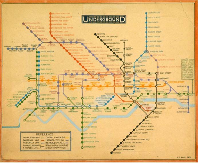
Figure 1. Beck’s map – first edition, 1933. Source:http://www.ltmuseum.co.uk/omnibus/pg/1919b.htm#

Beck’s representation of the London Underground has been used as the model for developing many other
representations of urban transportation systems worldwide. These representations ‘work’ in their various
forms. They support gaining an understanding of the complexities of a system, aid travel planning and act
as a navigation tool to assist in working one’s way through the underground maze of lines and stations and
as a reference once a journey is underway.
It could be assumed that cartographers claim it as a map. It looks like a map and has the various attributes
that make a map – a map. And, do designers consider this to be a diagram?
This paper reports on a piece of preliminary research that was undertaken to ascertain, from canvassing the
international cartography and design communities about how members of these communities view Beck’s
design (and, by inference, other metromap designs that have been produced in the genre of Beck’s
representation of the London Underground) – map or diagram.
Note: to ensure that no bias is shown regarding Beck’s representation of the London Underground, the term
‘artefact’ will be used throughout this paper.
The paper begins by outlining Beck’s artefact and some of the elements that made it successful. Then it
reflects on some of the maps and diagrams that were used by London Transport pre-Beck. A brief treatise on
what constitutes both a map and a diagram respectively follows this. Then whether Beck’s artefact is a map
or a diagram is addressed, considering the responses elicited from the international cartography and design
communities. Finally, comments are provided about why it is useful to consider this question.
Beck’s representation
In the early 1930s London was considering the future of its mode of transportation for the future. In 1931
inner London’s population was already a hefty 4,397,003 people and Greater London had a population of
8,110 358 (Exploring 20th Century London, nd). The London Passenger Transport Board pioneered public
transport campaign for coherence and efficiency. Part of this move to efficiency was the development of a
modern integrated public transport system.
An efficient public transportation system was not guaranteed, with the popularity of the motor car, and the
concepts of changing the city to suit motor transport that was changing the face of cities across the Atlantic.
In 1937 the Bressey Report (Bressy, 1938) was released, which looked at how London’s transportation
system might be changed to implement changes needed if motorized transport was to dominate the city.
Concepts about how London would work were richly illustrated in newspapers of the time (Figure 2).

                      Figure 2. Bressey Report, 1937. The Illustrated London News (28 May 1938)
                       http://longstreet.typepad.com/.a/6a00d83542d51e69e20120a8120f1f970b-pi

However, the London Passenger Transport
Board’s electrified underground won the day and
a modern system continued to be developed. As
well as developing this modern system, the
London Passenger Transport Board championed
the concept of selling the system to the public as a
modern system. This was reflected in the design
of the London Underground stations, the rolling
stock and the graphics that promoted the
transportation system’s position in contemporary
London, a London powered by electricity. One of
London Transport’s posters published in 1930
illustrates the contemporary nature of the design
artifacts (Figure 3).

This type of publicity campaign reflected the
modern consciousness of the time. It showed the
outward trappings that re-configured the spirit of
place, of London, around the emerging concept of
the information economy (Elsaessen, 2000). This
concept of “the city as a machine” and the                     Figure 3. London Transport poster. E. McKnight Kauffer,
‘machine aesthetic’ was already established in the                                        1930
formal languages of the avant-garde (Elsaessen,                 Underground Gallery: London Transport Posters 1920s–
                                                                                 1940s (MoMA exhibit)
2000). Beck’s representation of the Underground               http://intermediatewithgen.blogspot.com/2010/11/undergrou
fitted this concept to a tee.                                               nd-gallery-london-transport.html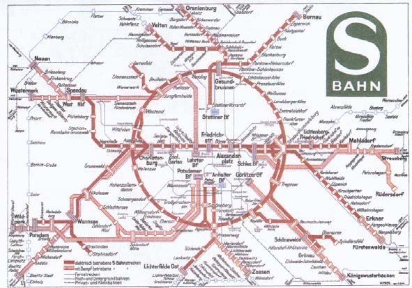
When the first printed version of Beck’s artefact was introduced by The London Passenger Transport Board
in 1933 it was an outstanding success, with 850,000 copies of the map in circulation within two months after
its introduction (Garland, 1994). This success is seen by Eliman (2006, p. 172) to be due to the fact that:
“Beck’s London Underground map offered an image of organisational clarity, brilliantly presenting the
increasingly chaotic city as an object of coherence”. Beck’s map sat immediately within the artefacts of the
machine aesthetic. Beck's London Underground artefact changed forever how representations of urban
underground railway systems were presented. Beck’s training as an electrical draughtsman is obvious when
one looks at his conceptual drawing for the map (Figure 4), which was then transformed into his final design
for the artefact (Figure 5).

   Figure 4. Sketch for London Underground map Henry C. (Harry) Beck (1903-74), 1931. Pencil and coloured ink. Science
                                                  Museum, London.

       Figure 5. Sketch for London Underground map. Henry C. (Harry) Beck (1903-74), 1931. Pencil & coloured ink.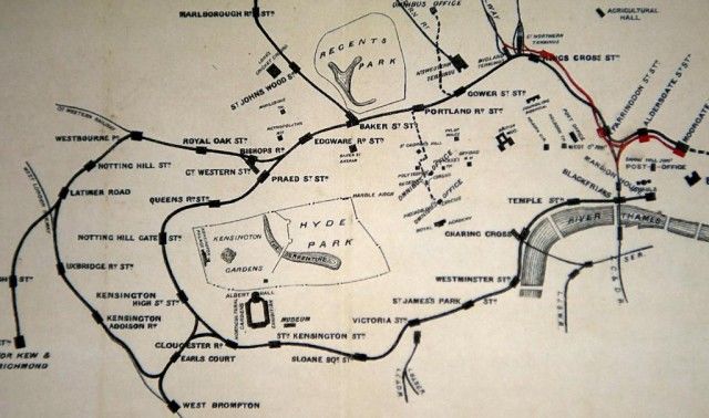
It was all about lines and connections. And, it was these connections and the simple information graphics
that made the artefact 'work', irrespective of whether the user is a seasoned London commuter or a tourist
arriving at the Capital for the first time.

Beck’s representation ‘painted’ a fictional geography by moving away from the concept that transportation
maps had to position the underground geography directly to the aboveground geography. His design moved
away from the concept that the representation had to follow the actual geographical route of the lines. By
replacing the strict geographically imposed rules, that required that representations be placed exactly where
they were located, with a regular pattern of generally horizontal, vertical or diagonal lines his new artefact
depicted more clearly the relative locations of the different lines and the sequence of stations. Beck’s
fictional underground geography did bear a close resemblance to the real geography aboveground, but Beck
sought freedom from the strict geographically imposed demands that required that elements depicted on a
transportation map be placed in their exact spatial positions. Again, Beck focussed on the lines, stations and
interchanges, rather than precise geographical locations.
His design had certain rules imposed:
   •   Only horizontal, vertical or 45o lines
   •   Centre of map enlarged - at expense of suburbs
   •   Distinctive interchange symbol
   •   Stations denoted by ‘tickmarks’
   •   Distinctive colours for lines
   •   Street detail not shown (Roberts, 2005)
This was done to overcome several difficulties, viz:
   •   Dense stations in central areas
   •   Circle line (not circular)
   •   The need for diagonals
   •   No clear interchange convention
   •   The need to incorporate additional lines (Roberts, 2005)
By distorting geography Beck, made the artefact more usable and an effective communicator about how to
move about London. His original design moved away from the concept that the artefact had to follow the
actual geographical route of the lines. According to Hadlaw (2003), what Beck did was to set aside
geographic space in favour of graphic space. (See Jenny, 2006 and Jenny and Hurni, 2011 for an
investigation of the actual distortions.)
In March 2006, viewers of BBC2's The Culture Show and visitors to London's Design Museum voted Harry
Beck's Tube map as their second-favourite British design of the 20th century in the Great British Design
Quest. The winner was the Concorde aircraft.
(Wikipedia http://en.wikipedia.org/wiki/Harry_Beck)

Why does it work?
Hadlaw (2003) says that the actual success of the map lies in the fact that both the map and the underground
users shared the same sensibility, and it was comprehensive because of the logic that underpinned the
design, which was “coherent with their experience, as modern individuals, of a historically particular time
and space (Hadlaw, 2003, p. 26). Here, neither good map design nor an intimate knowledge of the ‘place’ of
the underground was responsible for better understanding of how the map ‘worked’, but an ‘agreement’
about the underpinning logic.
Tufte (2002) noted: “The Underground Map … perfectly attuned to their particular data, so focused on their
data sets. They do not serve, then, as good practical generic architectures for design; indeed, revisions and
knock-offs have usually been corruptions or parodies of the originals.”
What were critical to Beck's design were connections: the interchanges between the various lines. His
concept was to ignore what was above ground (it didn’t matter when you were in the ‘Tube’ and travelling
from, say, Piccadilly to Cockfosters on the Piccadilly line) – it was the connections that mattered (Ken
Garland, interview, BBC Design Classics, 1985).
And, any other representation of London can look, well, just wrong. As Board (Barber and Board, 1993, p.
151) notes: “Indeed it has virtually replaced the true-to-scale maps, which can be found in most
Underground stations, as the correct map because the latter look unfamiliar and therefore suspect, even
wrong.”
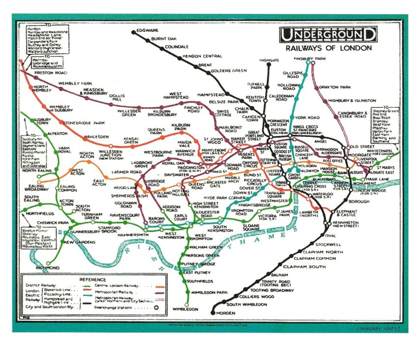
Depicting London’s Underground pre-Beck
Several diagrams of the system were used, especially inside carriages. They generally showed one
particular line, rather than the whole system. Figure 6 illustrates one of the diagrams employed.
Figure 6. District Railway Route Diagram (1920s). Source: London Transport Museum collection,
http://www.ltmcollection.org/images/best/eu/i00008eu.jpg
Previous maps of the Underground were tied to the geography of London above ground. Previous designs,
discussed later in this paper, slavishly sought to ensure that everything was ‘geographically correct’. This
impacted on the final product.
The depiction of the central London elements of the Underground resulted in extremely crowded graphics,
whereas the lines at the outer extents of the Underground system appeared as sparse, relatively empty
spaces. These maps acknowledged the geographical reality above ground, but, in so doing, compromised
the graphic effectiveness of the representation as a usable tool for planning and navigation. This can be seen
in an early map of the system from 1874 (Figure 7), and the 1927 London Underground Map by F.H.
Stingemore (Figure 8), which Beck’s artefact replaced.
Finally, it must be noted that, according to Ovenden (2005), Beck was not the first to draw this kind of
display. The first was the Berlin S Bahn representation of 1931 (shown in Figure 9). However, Beck’s
sketch design was also produced in the same year. And, with international travel being quite rare in this
period for someone like Beck, one could assume that Beck had never seen this representation.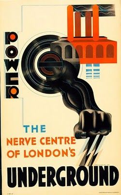
Figure 7. London Transport 1874
                      http://blog.visualmotive.com/2009/automatic-generation-of-transit-maps/

Figure 7. 1927 London Underground Map by F.H. Stingemore. Used prior to Beck's representation. London Transport Museum.
      Source: http://alistairwelch.files.wordpress.com/2012/07/1984-51-208-pocket-central-london-railway-map-1907.jpg

                                   Figure 10. The Berlin S Bahn representation, 1931.
                            Source: http://www.schmalspurbahn.de/netze/Netz_1931_klein.gif
Information graphics, maps and diagrams
Information graphics are found in the latter part of the 19th Century. Closely linked to the Industrial
Revolution, they were used to illustrate the intricacies of machines, processes and procedures. As
transportation became mechanised there became an increased need for map-making, sign-posting and
timetables. Maps were also used for illustration of statistics and trade information. Later the ‘diagram’
broke free from maps (Wildbur, 1989).
The International Cartographic Association (2003) has approached the definition of a ‘map’:
“a map is a symbolised image of geographical reality, representing selected features or characteristics,
resulting from the creative effort of its author¹s execution of choices, and is designed for use when spatial
relationships are of primary relevance”.
Woodward and Lewis (1998) define maps as:
“graphic representations that facilitate a spatial understanding of things, concepts, conditions, processes,
or events in the human world”.
(For an extensive approach to definitions of the word 'map', 1649-1996, see Andrews (1998)).
Maps can be seen as ‘windows’ for viewing the world. They are generally seen as precise scientific
documents that have provided the resources and, later, a record of exploration and discovery, accurate tools
of warfare, records of new lands and settlements, depictions of communications and national development
and artefacts for tourists and conveyances for armchair travellers. They are useful, accurate and powerful
information provision tools. We can read the map, explore each street and lane and gain an understanding of
this place.
The Oxford dictionary defines ‘Diagram’ as: a simplified drawing showing the appearance, structure, or
workings of something; a schematic representation” (Oxford Dictionary online, 2012.
http://oxforddictionaries.com/definition/english/diagram).
Meyer (1997, p. 231) said that:
“Glances organize. Charts convey information symbolically. Maps depict-large-scale reality on
comprehensively smaller scales. Illustrations render the abstract imaginable. … Diagrams, a hybrid
of all four, employ elements of each. Whether symbolic or realistic, they depict reality in organised
ways on manageable scales that seek to make complicated spatial or systematic concepts as
understandable as possible.”
Beck’s representation: map of diagram
Aficionados of crosswords use a thesaurus when looking for words that can be substituted for the clue –
across or down. Looking at the map / diagram relationship, Websters New World Crossword Puzzle
Dictionary (2ndedition, 1997) provided these synonyms:
Map: plat (4) Diagram: draw, icon, plan,
chart, image, (6) plot, tree (4)
charte, design, isobar, sketch, chart, epure, gamut
survey (7) graph (5)
diagram, epitome, explore, picture design (6)
(8) drawing (7)
delineate (9) blueprint (8)
embodiment, representation (10)It must be noted that, according to this crossword tool, a diagram can be a map, but a diagram cannot be a
map.
Looking at the design world, Tufte (2002) calls Beck’s representation “The Underground Map. Meggs and
Purvis (2006) do not call it a map, but a diagram. They said that Beck’s design proposal “replaced
geographic fidelity with a diagrammatic interpretation” (p. 327). Garland (1994), entitled his book on the
subject as: Mr Beck’s Underground Map. And, Dobbin (2012, p. 68), in her excellent book London
Underground Maps: Art, Design and Cartography, only refers to it as a ‘map’.
Comments were elicited from the cartographic community. From Fraser Taylor (2012): It is a diagram, as it
bears no real relationship to either location or direction other than in a most general sense nor does it have
a meaningful scale. Kraak (2012): “It is a map, a schematic map to be precise. It is a map since it has
geography in it even though not to scale and distorted. And, Kenneth Field (2012): “I view it clearly as a
map because it represents some characteristic of space using a system of encoded marks. It underpins one
of the very basic functions of a map (to locate yourself and to journey plan/navigate) so it not only has the
structure of a map, it fulfills the purpose of a map. …”
So … how to determine what works best for Beck’s representation.
Determining views on Beck’s representation from the international cartography and design
communities
In order to determine how Beck’s representation is viewed – map or diagram – a review was conducted with
members of the international cartographic and design communities. A total of 83 individuals who are
prominent in their fields were canvassed. Countries and requests numbers are provided in Table 1 (below).
GBR NL CAN AUT BRA USA RSA FR AUS NZ HU CH SWE DE ESP RU BEL HR CHN
12 5 3 9 1 11 3 2 15 1 3 5 1 5 1 2 2 1 1
Table 1. Countries and requests.
They were asked to answer two questions:
“Is Beck’s representation of the London Underground rail system a MAP or Diagram?”
and Why? (in just one sentence).
66 responses were received.
Of these responses to the first question the perception of what Beck’s artefact was differed. The
interpretations saw the artefact as MAP, DIAGRAM, MAP and DIAGRAM, CARTOGRAM, DRAWING,
SCHEMA, SCHEMATIC MAP, SCHEMATIC DIAGRAM, NETWORK MAP, MAP (TOPOLOGICAL),
DIAGRAMMATIC MAP.
A breakdown of the ‘popularity’ of the polling is provided in Table 2.
MAP 37 SCHEMATIC MAP 1
DIAGRAM 6 SCHEMATIC DIAGRAM 1
MAP and DIAGRAM 5 NETWORK MAP 1
CARTOGRAM 1 MAP (TOPOLOGICAL) 1
DRAWING 1 DIAGRAMMATIC MAP 1
SCHEMA 1
Table 2. ‘Popularity poll’.It should be noted that the design community, whilst small in the number of responses received, did not see
Beck’s artefact just as a drawing. The majority saw it as a map (4 of 7), then map and drawing (2 of 7) and
then drawing (1 of 7).
The ‘map’ received the greatest number of ‘votes’. However, the reason why it is considered to be a map
varies. Therefore, it is important to include a summary of the answer received here. (The table below is an
abridged version, showing a selection of the comments received. Also, whilst just one sentence justifying
the answer to the first question was requested, many respondents wrote much more than this. However, only
their first sentence is included here, for space disallows including all of the complete responses. Also, it
includes comments from respondents who saw Beck’s artefact as some type of map).
Respondent Position (country) Comment
1 Professor (NL) It is a map , because the stations or underground network nodes depicted are
represented in a spatial framework.
2 Professor (NL) It is a map since it has geography in it even though not to scale and distorted
3 Prof (AUT) In my understanding maps are systems to structure and order information by their
spatial component, which is true in this case as well.
4 Ass Prof (AUT) ... because this representation (map) depicts spatial information that supports
knowledge retrieval for gaining insight that can trigger directed action.
5 Prof (RSA) Beck's Underground map is a topological map and not a diagram as it allows for
the visualization of space, something a diagram does not necessarily do.
6 Developer (USA) I view it clearly as a map because it represents some characteristic of space using
a system of encoded marks.
7 Assoc Prof (AUS) I would class it as a map, as its purpose is to communicate connectivity and aid in
navigation.
8 Prof (CH) I prefer the term "Schematic Maps", since two main requirements of a map are
fulfilled: Topology and Spatial relation.
9 Cartographer (GBR) Although topologically distorted it locates stations via their (relative) geospatial data,
and for many people is the first/only map that they need for London.
10 Assoc Prof (NL) Because in my opinion any diagram depicting spatial information is a map.
11 Assoc Prof (NL) It contains (geo)spatial info, and although distorted, it can be used to determine
(for example) lines/station North and South of the river Thames
12 Prof (SWE) I have always called it to be a map. It is easy to read and gives a quick answer to
where you are and where to go.
13 Prof (DE) In German we have this nice term "kartenverwandte" or "kartenähnliche
Darstellung" (map-related" or "map-like cartographic (re)presentation" ... In this sense I
tell my students, that such a "Topogramm" (only topoligy, nor topography) counts as a
"kartenähnliche Darstellung".
14 Prof (CDN) Beck's London Underground is a map. It distorts, but so as to make an
understandable space. Spatial relations make it a map.
15 Prof (USA) Maps are a type of diagram, with diagrams subsuming the maps category.
16 Assoc Prof (NL) This is because it perfectly fits under the common definition of a map (display):
Beck's map is a reduced and simplified representation and abstraction of
geographic reality, projected onto a plane (display screen or paper).
17 Prof (USA) In my opinion, it is a map because it depicts relationships among locations at
geographical scale.
18 Assoc Prof (ESP) If I was to take one option I should think about it as a map, not a diagram. I see
three reasons for that. First, it represents a spatial distribution. Second, it is linked
to real geographical space by means of the underground stops, since their relative
positions are maintained. And finally, abstraction and simplification are inherent
concepts to any map. In this case, the representation of the lines (highly
abstracted and simplified, far removed from the real routes) may be the main
reason for considering it as a diagram, not a map.
19 Prof (AUT) Yes, Beck’s London Underground map is a map, since it refers to two dimensions
of geographical space, if only in a rather schematic way.
20 Cartographer / Because it contains geographic information like base map elements (river),
researcher (CH) changing points, and line orientation according to cardinal directions.
21 Snr lecturer (GBR) It is a map, for the same reason the Peutinger is map, in that it is designed to
allow people to get from one known point to another known point using routes that
are topologically correct.
22 Researcher (RSA) I have always considered Beck's London Underground map and similar maps to
be topological maps, rather than diagrams. A topological map allows one to
emphasize the structure of data rather than the exact locations, and over the
years the shape or structure of the London Underground map has changed for
reasons of cartographic licence or to accommodate the addition and removal of
lines and stations, but it is still anchored to the underlying geography, particularlyin the representation of the Thames.
23 Industry (DE) It is a map in the type of (electricity) diagram; and this representation of reality
therefore needed to compromise a lot in terms of metrics.
24 Prof (USA) Beck's representation is a map because it functions as such.
25 Lecturer (GBR) I would regard it as a MAP because while its representation is highly generalised
and its symbology very abstract - characteristics akin to many diagrams - its
primary function is nevertheless associated with personal navigation through a
spatially complex system lying beyond our immediate comprehension.
26 Researcher (DE) At first I tended to say Beck's representation of the London underground rails
system is both a map and a diagram based on the respective definitions.
But finally I think Beck's representation of the London underground rails system is
a MAP.
27 Researcher (USA) Because it portrays the geographic reality of the connections of the London
underground transit system.
28 PhD student (CH) DIAGRAMMATIC MAP
I used to learn – and I still like this term – that those kind of network-plans are
“Topogramms” (composed from the words TOPOlogie and 11iagram).
29 Snr lecturer (GBR) I'll go for a performative definition It's a map if its used as one.
The deployment of the image is what matters, as a relational and spatial tool, not
any necessary representational qualities
30` Professor (USA) The only thing different about the map you mention is that it has an extreme
amount of generalization. But, it still serves a spatial function so it's still a map.
We go down the wrong road when we try classify maps based on how they look
rather than what purpose they serve.
31 Researcher/developer My answer would be map (as a specific form of a diagram). If a diagram helps
(AUT) understanding spatial distribution by providing topologically correct information, I
would call it a map.
32 Lecturer (AUS) Although it is not a traditional map, in that it doesn't show correct scale or
geography, it clearly encompasses the key elements of a successful map. It uses
clear symbology and text to show linkages (topology), exchanges and differences
between lines, enabling users to navigate very effectively through the system.
33 Lecturer (HU) Since we call it "metro-map", it must be a map. It may be a diagram by definition,
but is used as a map, so it is a map.
34 Prof (CN) My answer is that it is a MAP because it is about the distribution of
geographic network and its relative geographic correctness.
35 Snr Lecturer (UK) While John Keates would have said it is not a map, these days I would say it is in
the group of objects we generally accept as being maps.
If we accept the ICA definition of a map, then it conforms with the idea that it is
graphic representation where spatial relationship are being represented.
36 Researcher/developer It is a map because it is a (although geographically distorted) topologically correct
(AUT) representation of space
37 Snr lecturer Beck's iconic underground map is a particular kind of map for two reasons: firstly,
(Commns) (AUS) because that's how people refer to it when they use it, and secondly, that's what
people use it for: to orient themselves in this mapping between two largely
exclusive spatial experiences: the street and the tube.
38 Snr lecturer Beck's representation of the London Underground rail system is a map because it
(Commns) (AUS) has some quality of reliable correlation with real space and geography.
39 Snr lecturer I think of Beck's London Underground map as a 'map' rather than a 'diagram'
(Commns) (AUS) because of its emphasis on communicating spatial relationships between different
parts of a bigger system, whereas diagrams aren't always so specifically
concerned with space.
40 Artist (AUS) Concurrent with assisting in physically finding ones way around London, Beck
inadvertently also maps urban consciousness, in that it
metaphorically preferences movement and connection points reflecting urban
mind spaces that began to emerge with trains, planes and now
technology.
Table 3. Popularity poll - MAP.
Comments from respondents who saw it as a diagram are provided in Table 4.
Respondent Position (country) Comment
1 Professor (CAN) It bears no real relationship to either location or direction other than in a most
general sense nor does it have a meaningful scale.
2 Cartographer (GBR) Becks tube map was thus called to preserve the historic use of 'map' in the title as
in earlier editions by other authors who most usually also included geographical
features, which Becks did not, with the exception of a stylized River Thames.
3 Assoc Prof (HU) The aim of his work was a clear and stylized representation of the London
Underground network, and he used a map as starting point for this "stylization", to
keep a spatially correct (but not cartographically exact) location of the stops withinthe city.
4 Researcher (DE) I think, it is a diagram because it does not show geography (except a
very generalized outline of the river)
5 Professor (HR) For me, the Beck's representation of the London Underground rail system is a
diagram because it is a two-dimensional geometric symbolic visual representation
of information
6 PhD student I would argue it is more diagram than map because the actual geography is not
(Cartography) (AUT) important.
7 Prof (Drawing) (GBR) Drawing. Because Beck’s representation of the London Underground rail
system explains the relationship between the parts of the whole without reference to
accurate measurement it is a diagrammatic not cartographic drawing.
Table 4. Popularity poll – DIAGRAM/DRAWING.
And, for diagram and map :
Respondent Position (country) Comment
1 Assoc Prof (CAN) The differentiation about geography and geometry (map and diagram) that I like is
the one by Franco Moretti (who actually borrowed it from another Italian
academic): the map is about the geographic location while the diagram is about
the connection between entities. … if I had to place Beck's map on a continuum
Map/diagram, it would probably be somewhere in the center, but closer to the
diagram, since we travel often through more than two stations, we consider most
of the stations as being part of a diagram instead of being part of a map.
2 PhD student It is both, because a map is a special kind of a diagram.
(Cartography) (AUT)
3 Researcher/developer It's both a map and a diagram. any diagram that shows topology can be called a map.
(AUT) (so every map is a diagram, but not every diagram is a map)
4 Prof (Architecture) Beck's London Underground map is both a map and a diagram; a map
(AUS) because it represents the spatial relationship between places and a
diagram because it does so in following linear, abstract conventions
of explanation.
5 Asoc Prof (Commns) I am compelled to say that it is both, depending on the intention of the reading or
(AUS) use. It is a diagram of a network system - a railway - and articulates the paths of
the various lines within the network. It is a 'loose' map of places for although not
geographically correct, it situates different places in relation to each other via the
life line of London - the tube.
Table 5. Popularity poll – DIAGRAM and MAP.
Discussion
Maxwell Roberts wrote that: “Henry Beck’s iconic map (or diagram) of 1933 tamed the London
Underground by showing chaotic meandering routes as straight lines” (Eye Magazine, 2010). He continues
to say: “No graphic designer would work in this rigid rule driven way with type, so why the bias for maps?
How can designers who automatically reach for tradition know whether they really have shown a network in
the best possible way?” (op cit.).
Looking at the comments supporting the views about Beck’s representation, the reasons for this are provided
below.
To summarise the comments of the ‘MAP’ respondents, it is seen as a MAP, as:
• Spatial relations make it a map;
• It has geography;
• The system is represented in a spatial framework;
• It structures and orders information by their spatial component;
• It shows a topologically correct representation of space;
• It locates stations via their (relative) geospatial data;
and, two powerful statements, in the opinion of this author,• It is a map because it functions as such; and
• It's a map if it is used as one.
The ‘DIAGRAM’ supporters criticized the simple, stylized ‘map’ elements in Beck’s representations.
However, the supporters of the MAP saw that, even though simplified and distorted, it is the very map-
elements that make it a map and make it work as a navigation and spatial planning tool.
Maps provide a ‘balanced’ and multi-faceted view of geography. If we look at the ‘language’ of Beck’s
map , we can see that it does:
• Shape the mental image of the city (Board, quoted previously in this paper said that other maps of
the London Underground “look unfamiliar and therefore suspect, even wrong.” (See Vertesi (2008)
for a report on users representations of urban space using Beck’s artefact) )
• Give prominence to lines and connections
• Focus information depicted on the geography below ground
• Provide the tool to ‘see’ a route, stations and interchanges
Maps ‘work’ as an art form, as a technological outcome and as a communicatible artefact. What we judge a
map to be depends upon our viewpoint, but also what we use the artefact for. As one of the respondents
offered : “I'll go for a performative definition It's a map if its used as one” (Perkins, 2012).
Conclusion
Humans develop mental maps of environments, real or imaginary. The map provides a graphic description
of a selection of reality that shows a selection (usually made by the cartographer) from reality has been
classified, generalised and scaled to show the relative positions of objects to one-another. The question is
therefore: do the ‘elements’ of a map need to be placed according to absolute geographical positions, one
that is defined by latitudes and longitudes, grid squares, street directory pages, etc. ‘above ground?
Therefore, how best do we determine what is in fact a map? What MacEachren says is that:
“... but, as you will know from How Maps Work (McEachren, 2005), my view is that maps are a
radial category with no firm boundaries and that I don't think that it is up to cartographers to set
any bounds -- maps are what people believe them to be“ (MacEachren, 2012) .
What was seen from the various outlooks on Beck’s representation of the London Underground was that
there was really no exact answer, even amongst cartographers canvassed. Both the cartographic and
arts/graphics community views it as a different type of artefact. The MAP was the most common answer,
but not ‘the’ answer. Each individual had their own interpretation of what the artefact is, and they were able
to justify their view. Beck’s artefact is a most useful tool to plan and navigate through the London
Underground (Thaler and Sunstein, 2011). The academic and research communities differ about what they
see it as – map, diagram, … But all saw it as an effective communication tool, which is a tribute to the
Beck’s design – effected in 1931, published for the first time in 1933 and still the model for an effective,
useful and usable graphic product.
Finally, reflecting on a statement from Maxwell Roberts: “When mapping a network, we must be careful not
to fall into the cul-de-sac that Henry Beck worship leads us down. […] Interestingly, our studies show that
subjective preferences are not linked to planning performance. Map engagement and map usability are
completely separate factors” (Eye Magazine, 2010). Beck’s representation engages the user due to it’s
overall design aesthetics. Just as when the map was first released, and it was accepted due to the fact that it
conveyed information about the London Underground system effectively and it had the look-and-feel of ‘thenew’, the avant-garde and it reflected modernism. It is perhaps this acceptance of and engagement with Beck’s design that made it work. References Andrews, J. H., 1998, Definitions of the word 'map', 1649-1996. http://www.usm.maine.edu/~maps/essays/andrews.htm Barber, P. and Board, C.,1993, Tales from the Map Room, London: BBC Books. BBC, 1985, Design Classics – The London Underground Map. Bressey, C., 1938, “The Bressey Report: A Thirty-year Scheme”, The Times, London. Dobbin, C., 2012, London Underground Maps: Art, Design and Cartography, Farnham, Surrey: Lund Humphries. Elliman, P., 2006, “Signal Failure”, in Else/Where Mapping, J. Abrams and P. Hall (eds.), Minneapolis: University of Minnesota Design Institute. Elsaessen, T., 2000, Metropolis, London:BFI. Exploring 20th Century London, nd, http://www.20thcenturylondon.org.uk/server.php?show=nav.41 Field, K., 2012, personal correspondence. Garland, K., 1994, Mr. Beck’s Underground Map: A History, Harrow Weald, Middlesex: Capital Transport Publishing. Hadlaw, J., 2003, “The London Underground Map: Imagining Modern Time and Space”, Design Issues, vol. 19, No. 1, Winter 2003, pp. 25 – 35. International Cartographic Association (ICA), 2003, A Strategic Plan of the International Cartographic Association, 2003 - 2011 - Revised Version", 16 pp. Jenny, B., 2006, “MapAnalyst - A digital tool for the analysis of the planimetric accuracy of historical maps”. e- Perimetron, 1- 3, p.p 239–245. Jenny, B. and Hurni, L., 2011, “Studying cartographic heritage: Analysis and visualization of geometric distortions”, Computers & Graphics, 35-2, pp. 402–411. Kraak, M-J., 2012, personal correspondence. MacEachren, A.M., 2012, personal correspondence. MacEachren, A.M., 2005, How Maps Work: Representation, Visualization, and Design, New York: Guildford Press. Meggs, P.B. and Purvis, A. W, 2006, Megg’s History of Graphic Design, Hoboken, New Jersey: John Wiley and Sons, Inc. Meyer, E. K.,1997, Designing Infographics, Indianapolis, Indiana: Hayden Books. Ovenden, M, 2005, Metro maps of the world, Harrow Weald, Middlesex: Capital Transport Publishing. Oxford Dictionary online, 2012. http://oxforddictionaries.com/ Perkins, C., 2012, personal correspondence. Roberts, M., 2010, “Knots and geography”, Eye Magazine, 17 February 2010 http://www.eyemagazine.com/blog/post/knots-and-geography. Web page accessed 27 November 2012. Roberts, M., 2005, Underground Maps After Beck, Harrow: Capital Transport Publishing Rose, D., 2012, Henry Beck Invented What?. Web page accessed November 23, 2012. http://www.dougrose.co.uk/index_henry_beck.htm Taylor, F., 2012, personal correspondence. Thaler, R. H. and Sunstein, C. R., 2011, “Mind the Map” – How the map of the London Underground affects decision making”, June 5, 2011, Nudge blog. http://nudges.org/2011/06/05/mind-the-map-how-the-map-of-the-london- underground-affects-decision-making/. Web page accessed 11 October 2011. The Evening Standard, 2012, “Christie's Posters With a Purpose: The London Transport Museum sale”, 22 October 2012. http://www.standard.co.uk/news/london/christies-posters-with-a-purpose-the-london-transport-museum-sale- 8196196.html?action=gallery&ino=1 Tufte, E., 2002, London Underground maps (+ worldwide subway maps) Blog http://www.edwardtufte.com/bboard/q-and-a-fetch-msg?msg_id=00005W. January 11, 2002, Vertesi, J., 2008, “Mind the gap: The London underground map and users' representations of urban space”, Social Studies of Science, Vol. 38, Issue1, pp. 7-33. Websters New World Crossword Puzzle Dictionary (2ndedition), 1997, Cleveland, Ohio: Wiley Publishing. Wildbur, P., 1989, Information Graphics, New York: van Nostrand Reinhold Company. Woodward and Lewis, 1998, The History of Cartography Vol 2 Book 3, Chicago: The University of Chicago Press.
You can also read