Cartography with ArcGIS Pro - S4 Summer 2021 GIS Institute
←
→
Page content transcription
If your browser does not render page correctly, please read the page content below
Cartography with ArcGIS Pro
                           S4 Summer 2021 GIS Institute

                          Frank Donnelly, GIS & Data Librarian

Introduction
This tutorial introduces basic elements of cartography with ArcGIS Pro: spatial reference sys-
tems (SRS) and map projections, symbolization, labeling, data classification, and map layout. We
will continue where we left off with our first tutorial, Introduction to ArcGIS I, and will use our
gis_introduction project and the Rhode Island tutorial data that we downloaded from the Canvas
GIS Institute page.

    Conventions used in this tutorial:
    • Summaries of steps appear in bold face.
    • Names of windows, tabs, and tools appear in italic face.
    • Names of files, features, and fields appear as typewriter face.

1     Map Projections
This section will illustrate spatial reference system (SRS) handling in ArcGIS Pro. These systems
are the foundation for what makes GIS software work, as they are standards that allow data layers
to be overlaid and treated as geographic data.
    1. Launch the software: Open the Start Menu in Windows, select the ArcGIS folder, and select
       ArcGIS Pro to open the software.
    2. Open a project and add a new map: On the ArcGIS Pro Start Page, click on the
       gis_introduction project on the left to open our previous project. ArcGIS Pro will
       launch. On the Insert tab on the ribbon click the New Map button. This adds a second map
       to our view. In the Contents pane, double click on Map 1 and rename it USA. Click OK.
    3. Add shapefile to map: There is a shapefile of counties stored in our gisintro_sampledata
       - shapefiles folder. Hit the Add Data button on the Map ribbon, drill down into the
       folders and select the cb_2019_us_county_500k.shp file and hit OK to add it to the map.
    4. View counties files: Explore the shapefile in the USA map view. Select this layer in the
       Contents panel, right click, and choose Properties. Click on the Source option, scroll down
       and open the Spatial Reference section. You will see this layer is in NAD 1983, which is a
       basic longitude / latitude geographic coordinate system whose unique WKID code is 4269.
       Close the window.

                                                1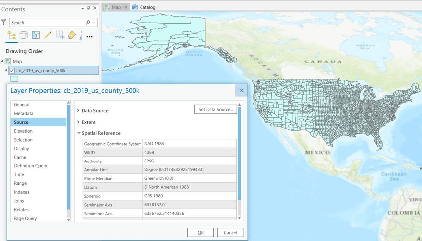
5. Reproject layer: Go to the Analysis tab on the ribbon and open the Tools. In the Geo-
     processing window, select the Toolboxes option. Drill down through these toolboxes: Data
     Management Tools - Projections and Transformations and choose the Project tool. In the
     Project window, choose cb_2019_us_county_500k.shp as input. Beside the output, hit the
     folder icon, navigate into the gisintro_sampledata - shapefiles folder and in Name
     enter counties_nalcc.shp and hit Save (we don’t want to put this file into our our RI geo-
     database). Back on the Project window, for the output coordinate system hit the small globe
     button to open the Coordinate System window. Drill down through: Projected Coordinate
     Systems - North America and choose North America Lambert Conformal Conic and click
     OK. Back in the Project window, click Run.

  6. Reset the map view: It looks like nothing has happened, because ArcGIS has reprojected
     the new layer on the fly to match the SRS of the window, which was set to the SRS of the
     first layer we added. In the Contents pane, double click on USA map view. In the Properties
     menu select Coordinate Systems. In the layers list select North America Lambert Conformal
     Conic and click OK. Note the dramatic change in the view window. Zoom into the United
     States and explore the layer, and open its properties menu to view the SRS definition.

Brown University                              2                                   Summer 2021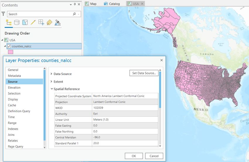
7. Reproject layer again: Uncheck the cb_2019_us_county_500k layer. Return to the Tool-
     box on the Analysis tab. Do a quick search for the Project tool. Choose counties_nalcc
     as the input layer. Name the new layer counties_risp and *save it in the same folder as
     before, as a shapefile*. For the output coordinate system browse through: Projected Coor-
     dinate Systems - State Plane - NAD 1983 (US Feet) - NAD 1983 StatePlane Rhode Island.
     Click OK then Run. When finished, repeat the previous step to reset the map view to match
     the new system for this file, then explore the map. This SRS is centered on Rhode Island.

  8. Export counties for RI: Uncheck the counties_nalcc layer. Zoom into the map to
     see Rhode Island. Click the Map tab on the ribbon and hit the Select features button.
     While holding down the Shift key, click each of the five counties of Rhode Island in the
     counties_risp layer. In the Contents pane, select counties_risp, right click, and choose
     Data - Export Features. Choose counties_risp as the input, and for the Output Location
     *store the layer in the rhode_island_tutorial database*. Name the new feature class
     counties. Click OK.

Brown University                             3                                  Summer 2021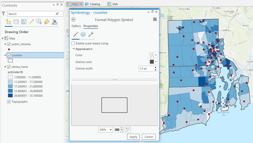
9. Add counties to original map: Flip back to your original map in Map view that contains
       the layers for libraries and census tracts. Use the Add Data button on the Insert tab to add
       this new layer of Rhode Island counties to this map. Save your project.

2     Symbolization and Labeling
This section we demonstrates how to overlay and symbolize multiple polygon layers, and how to
turn on feature labels.
    1. Change the fill for counties: In your original Map view drag the counties layer in the
       Contents pane so that it sits below the public libraries but above the census tracts.
       Right click on the counties and choose Symbology. Under the Primary Symbology window
       click on the rectangle for the symbol. In the Format Polygon Symbol menu switch from the
       Gallery to the Properties. Drag the window open a little to expand it. Change the dropdown
       for color to No Color.Change the outline to a darker grey and increase the thickness to 1.5pt.
       Click Apply. Close the Symbology window.

Brown University                                  4                                   Summer 2021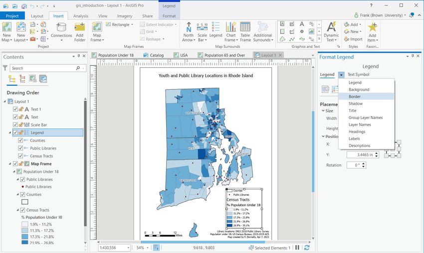
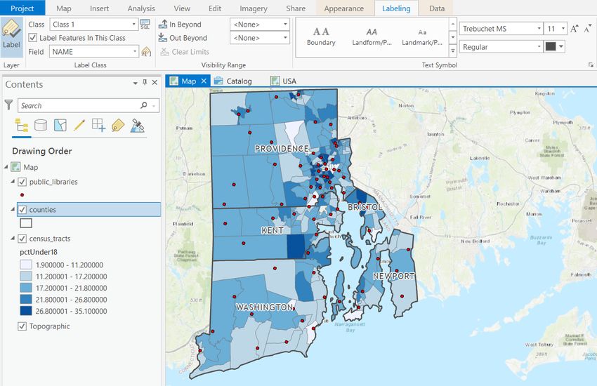
2. Label counties: With the counties layer selected in the Contents pane, click on the Labeling
       tab on the ribbon. On the far left side of the ribbon click the large Label button, and make
       sure Field dropdown is set to NAME, which is the attribute column that holds the county name.
       In the center of the ribbon experiment with the different label options by selecting different
       ones in turn. Note that when you select a label you can alter the font type, face, capitalization,
       and size on the right. For example: select the Populated Place (Capital) scheme, change the
       font type to Trebuchet MS, the font size to 11 and the font face to regular. Also note if you
       hit the call out box arrow you can access a full range of label options. Save your project

    3. Reset library symbols: *If* you tried the experiments at the end of the previous tutorial,
       change the symbolization of the public_libraries layer back to being displayed as basic
       single symbols.

3     Data Classification and Multiple Maps
In this section you will experiment with different quantitative data classification methods, and will
learn how to duplicate existing maps to create multiple series in the same project.

    1. Experiment with data classification: Select the census_tracts layer, right click, and
       choose Symbology. Make sure the dropdown is set to Graduated Colors, the field is set to
       pctUnder18, you have 5 classes, and the color scheme is set to display different tones of the
       same color from light to dark. Begin with Natural Breaks (Jenks) as the method, and observe
       the map and the scheme displayed in the Contents pane. Cycle through the quantile, equal

Brown University                                    5                                    Summer 2021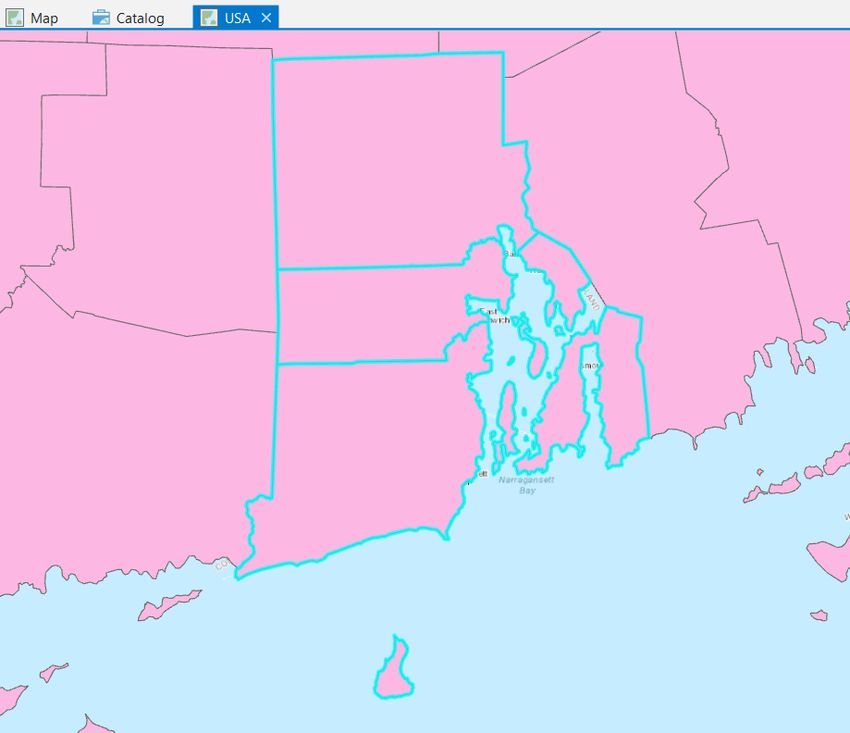
interval, defined interval, and manual methods; note the descriptions of each and notice how
       the map changes with each method.

    2. Set to natural breaks: When you are finished experimenting, set the method to Natural
       Breaks and close the symbology window.

    3. Make a copy of this map: In the Contents pane, double click on your Map. In the Properties
       menu change the name from Map to Population Under 18, and click OK. Next, open the
       Catalog view (if you don’t have one open, go to View - Catalog View). In the Contents
       on the left, open the Maps, select the Population Under 18 map, right click and choose
       Copy.Then click on the Maps folder, right click and choose Paste. A copy called Population
       Over 181 is created. Select it, right click, and choose Rename. Name it Population 65
       and Over. Last, with this map selected and the Catalog tab selected in the ribbon, hit the
       Open button. This opens this newly copied map in the view window of your project.

    4. Alter the second map: In the Population 65 and Over map, go into the Symbology and
       change the field being mapped to pctOver65. Save your project.

4     Map Layout
This section briefly demonstrates map layout capabilities, and the preliminary steps you need to
take to insure that the labels of your layers and field are appropriate for making finished maps.

    1. Prepare to map: In both sets of Rhode Island maps, make sure the Topographic layer is
       turned off. On each map, zoom in and pan so that Rhode Island is perfectly centered in your
       map view.

Brown University                                 6                                  Summer 2021
2. Format layer titles: We need to modify the names and descriptions of our layers in the map
view so they will appear correctly in our legend. There are a couple ways to achieve this. First,
we can double click on a layer, open its Properties menu, and change the name in the General
tab. Do this for the counties to capitalize it to Counties. Alternatively, you can keep the
file name in the source and give it a legend label. Right click on the public_libraries and
open the Symbology window. Under the Primary Symbology in the Labels box enter Public
Libraries. For the census_tracts, use the first method to change the name to Census
Tracts. Then open the Symbology for the tracts, and click on the last Advanced Symbology
Options button at the top of the window. Under Category change the option from numeric to
percentage, then under Format Labels and Rounding change the decimal places from 6 to 1.
Close the window.
3. Modify field or column names: Last, we need to modify some of our attribute information
to clearly illustrate the tract data we are mapping. Right click the Census Tracts, choose
Design - Fields. This opens a new tab in the view pane. Next to each field name is an
alias, which is currently identical to the field name. In the alias beside the pctUnder18 field,
type in: % Population Under 18. Close the fields tab and save the changes. Go into the
symbology and reclassify the data so the change is reflected in the Contents pane.
4. Add a layout: Select the Population Under 18 map so that it is your active map view. On the
Insert tab on the ribbon, click the New Layout button on the far left. Choose ANSI Portrait
letter paper for the page size. A new layout tab will appear in your view window.
5. Add a map: On the Insert tab on the ribbon click the Map Frame button. Choose the
Population Under 18 1:620,000 scale option (not the Default option). Then click in
the upper left hand corner of the page, leaving a little space for a margin, drag a box that
covers the page (leaving a little space for a margin) and release. This adds the map to the
page. You can resize the box by clicking the corners and moving it around.
6. Change zoom on map: To modify the extent and zoom of the actual map (as opposed to
just zooming in and out of the page layout), select the Map Frame in the Contents pane. In
the Layout tab on the ribbon, click the Activate button towards the right of the ribbon. Now,
Brown University 7 Summer 2021on the Map tab on the ribbon, you should be able to pan and zoom to get Rhode Island more
centered in your layout view. Make sure to leave some space in the layout for a title and
legend. When finished, click the Layout: Map Frame link that appears next to a backward
arrow in the upper left-hand corner of the view to return to the layout mode.
7. Add legend: With the Map Frame selected in the Contents pane, on the Insert tab on the
ribbon click the Legend button, and draw a box to insert a legend on your map. Click on
the legend, and a Format Legend pane opens on the right that allows you to customize every
conceivable option about the legend. For example, hit the dropdown arrow beside the Legend
heading and choose Border. Turn the border from no fill to a dark grey line and hit Apply.
Then hit the middle Layers button on this window and add a text offset of 4 or 5 points and
hit Apply. On the right in the Contents pane you will see each item that is active in the legend.
You can check or uncheck layers to remove them from the legend (they stay on the map)
or drag to change the drawing order. For example, drag the Public Libraries layer so it
appears below the County layer.
8. Add scalebar: On the Insert tab on the ribbon click the dropdown arrow beside the Scale Bar
button, and choose a scalebar. Then click on the map to add a scalebar. With the bar selected,
you can modify its properties in the Format Scale Bar pane on the right. On the Properties
in the Fitting Strategy dropdown, choose the option to Adjust divisions and values, and then
drag the edge of the scalebar with the mouse to create one of suitable size that doesn’t contain
tick marks with long decimal numbers like 3.175.
9. Add a title and text: On the Graphics and Text section on the Insert tab of the ribbon, click
on the small, plain letter "A" to add Straight Text, and then click near the top of the map to
add text. With the text selected, in the Format Text pane on the right change the value from
Brown University 8 Summer 2021Text to Youth and Public Library Locations in Rhode Island. Then click on the
Text Symbol option, and increase the font size to 18. You can also change the font face if you
wish. When you’re finished, repeat this step and add text in a smaller font size towards the
bottom of the map to provide source information like:
Library locations: IMLS 2018 Public Library Survey
Population under 18: US Census Bureau, 2015-2019 ACS
Map created by F. Donnelly, Apr 2021
You can modify how text is aligned in a box (left, center, right) under Text Symbol - Position.
10. Align elements and export. Now that you have all the elements in place, experiment with
aligning them on the page to achieve some balance. When you are satisfied, select the layout
in the Contents pane, and on the Share tab on the ribbon hit the Layout Export button. In
the Export properties menu, you could change the file type (default is PDF, can also choose
image types like PNG and TIF), the destination and file name, and can modify other elements.
Keep the defaults and under Name scroll to the end of the path and change the file name to
ri_libraries_under18. Hit the Export button at the bottom. When the export is finished,
click on the View Exported File link at the bottom of the menu. Congrats on creating your
first map! Save your project.
5 Experiment on Your Own
1. Repeat the map layout steps, and create a stand-alone map for the population 65 and over
relative to public library locations, entitled "Seniors and Public Library Locations in Rhode
Island".
2. Create a third layout where you add two maps - the under 18 and 65 and over pop - to the
same layout side by side. In doing this, you will also want to adjust the classification schemes
of each map so that they match. Experiment with different possibilities for doing this.
3. Experiment some more with different layout options and modifying the properties of legends
and scalebars. You can also add a north arrow to your maps, as well as dynamic text which
is drawn from underlying data in your project.
4. In the USA map view, experiment with additional map projections such as North America
Albers Equal Area for all the counties in the US and NAD 83 UTM Zone 19N for the Rhode
Island counties.
Brown University 9 Summer 2021You can also read