Color Your World - With SAS - LexJansen
←
→
Page content transcription
If your browser does not render page correctly, please read the page content below
NESUG 2007                                                                                                                            Posters

                                         Color Your World – With SAS®
                              Louise S. Hadden, Abt Associates Inc., Cambridge, MA
                                Lauren Olsho, Abt Associates Inc., Cambridge, MA
                              Andrew Johnson, Abt Associates Inc., Cambridge, MA

        ABSTRACT
        SAS® provides programmers with many options to use color to enhance SAS® output. In addition, there are other
        valuable resources to aid color choices and specifications while using SAS® procedures. Resources both inside
        and outside of SAS® will be explored and results presented in living color. Examples will include maps produced
        using SAS/GRAPH and macros that demonstrate data-driven shading of geographic areas as well as the use of
        color in tabular output for both print and web applications. These techniques will be demonstrated using SAS 9.1.3
        for Windows; however, they are also applicable to earlier versions of SAS on different platforms unless specifically
        noted otherwise.

        INTRODUCTION
        The State of South Dakota contracted with Abt Associates Inc. to conduct a comprehensive evaluation of the State’s
        long-term care system. South Dakota as a whole faces the dual challenges of a rapidly-growing elderly population
        and a shortage of frontline healthcare workers. However, there exists wide regional variation in the adequacy and
        quality of long-term care services across the State. South Dakota policymakers are therefore particularly interested
        in detailed geographic analyses of population demographics, healthcare workforce, and long-term care capacity at
        the county level. These regional analyses will serve to identify priority long-term care policy concerns both locally
        and statewide, and to inform future directions for policy.

        During the initial phases of the evaluation, Abt Associates Inc. investigators gathered extensive county-level data in
        order to 1) perform descriptive analyses of the State’s current long-term care system, and 2) predict future trends in
        capacity of and demand for long-term care services across the State. Qualitative and quantitative data were
        collected from a variety of national and regional sources. County-level population data by age and sex were obtained
        from the year 2000 Decennial US Census and the US Census Intercensal estimates for 2001-2005. Projected future
        population data for the years 2010 to 2025 came from the South Dakota State Data Center. Finally, information on
        existing long-term care capacity was compiled based on annual Medical Facilities Reports produced by the South
        Dakota Department of Health, supplemented with additional non-public data provided directly by the State. These
        data included the number, size, age, location, and other characteristics of nursing facilities, assisted living facilities,
        and home health organizations for 2003-2005.

        Once collected, data from these various sources were compiled into a single composite database with information
        on each of South Dakota’s sixty-six counties. This database was then used to perform extensive county-level
        analyses, ranging from projected demographic trends in aging and disability to calculations of current and future
        projected facility long-term care capacity. Supply trends were overlaid with projected trends in future demand to
        identify gaps and problem areas in the expected distribution of services. Results were aggregated and tabulated by
        region and by county characteristics in order to provide a broad overview. However, because the State was
        particularly interested in a county-by-county breakdown, we decided that colored county maps constituted the
        cleanest and most accessible means of presenting findings.

        Since colors were to be used to identify trends, a color
        gradient scheme with low values represented by paler
        shades of a specified color and high values
        represented by progressively darker shades of the
        same color was determined to be the best choice.
        The default color list provided by SAS or simple user-
        determined color lists (such as the one shown in the
        graphic to the right) was not appropriate for the
        graphic representation of trends.

                                                                    1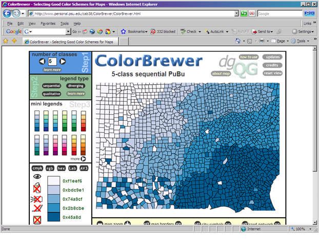
NESUG 2007 Posters
In order to create color gradient maps, Abt
compiled a database with variables of interest by county (identified by FIPS code)
developed consistent classification schemes for data elements
calculated means, medians, and identified state- and national-level points of comparison in order to
appropriately categorize county-level data
used a specified gradient color scheme to represent data points (classified above) graphically in maps
DATA PREPARATION
Data preparation is an important but relatively straightforward operation. As described above, counties were
selected as the geographic unit of analysis. Because our analysis included a plethora of variables, we prepared an
Excel spreadsheet to incorporate all variables of interest to simplify the data input. The spreadsheet necessarily
contained columns for the Federal Information Processing Standards (FIPS) State Code for South Dakota (46), FIPS
County Codes, and the pre-determined levels for each variable used to separate the counties into different
categories. For our convenience, the spreadsheet also contained county names, variables that were frequently used
in the denominator of a calculated variable, and the raw data for each of the variables of interest in case we needed
to re-specify the levels of a variable. Listed below is a sample of the data elements that were mapped.
Data Element Year(s) # of Levels Level Names
County Type 2007 3 Urban, Rural, Frontier
State Region 2007 5 West, Central, Northeast, Southeast,
American Indian
Percent Change in Elderly Population 2005 5 -3 to 4, 5 to 10, 11 to 14, 15 to 24, 25 to
40 Percent
# Licensed Nursing Home Beds 2005 5 No Nursing Homes, 1 to 99, 100 to 199,
200 to 399, 400+ Beds
Nursing Home Occupancy Rate (%) 2005 6 30 to 59, 60 to 69, 70 to 79, 80 to 89, 90
to 100 Percent
Percent Change in Nursing Home Occupancy 2003 – 6 No Nursing Homes, -20 to -10, -9 to -5, -4
Rate (%) 2005 to 4, 5 to 9, 10 to 20 Percent
Percent of Elderly Residents Living in a 2005 6 No Nursing Homes, 0 to 4, 5 to 9, 10 to
Nursing Home 14, 15 to 19, 20+ Percent
Percent of Elderly Residents Leaving Home 2005 6 No Nursing Homes, 0 to 9, 10 to 19, 20 to
County for Nursing Home Services 39, 40 to 59, 60+ Percent
Average Age of Nursing Homes in a County 2005 6 No Nursing Homes, 0 to 19, 20 to 29, 30
to 39, 40 to 49, 50+ Years
The specification of levels depends on the data element and the statement the map is supposed to make. For many
data elements, the data revealed natural breakpoints for levels and the map depicted the geographic location of
variation in the data element. For other data elements, we used pre-established benchmarks to specify levels so the
map compared individual counties to those benchmarks. For example, the data element ‘Percent Change in Elderly
Population 2000 – 2005’ used the national average of 4.87 for one level specification, and the South Dakota average
of 10.34 for another level specification.
Our county maps, which are simple chloropleth maps, show a limited number of “patterns” or colors. A legend with
more ranges takes up a disproportionate amount of the map print area, and the presence of many different patterns
within the map area is both distracting and decreases the ability to discern any trends. We elected to show between
3 and 6 levels in each map. Identical numbers of groups (as well as an identical color gradient scheme) were used
to map similar data points for different years.
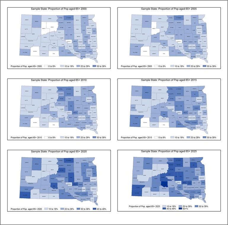
For example, we projected the proportion of residents in a county that are 65 years of age or older for the years 2000
(actual data), 2005 (actual data), 2010, 2015, 2020, and 2025 using a gradient in which darker colors indicate a
larger proportion. When viewing these maps in succession, an overall darkening of color for a county indicated
growth in the proportion of county residents aged 65 years or more.
2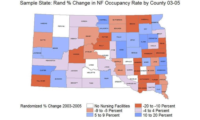
NESUG 2007 Posters
For data elements with a structure similar to
‘Percent Change in Nursing Home Occupancy
Rate (%)’, we used the color scheme: white (No
Nursing Homes), dark red (-20 to -10 percent), light
red (-9 to -5 percent), light purple (-4 to 4 percent),
light blue (5 to 9 percent), and dark blue (10 to 20
percent). As the data for the chart to the right was
supplied by the State of South Dakota, data points
presented have been randomized and do not
represent true and accurate statistics. This chart is
presented only for the purpose of showing the color
scheme used.
3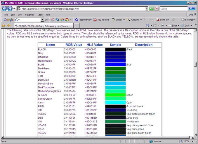
NESUG 2007                                                                                                                       Posters

        WHERE TO GO?

        Maps were output to JPEG files using the HTML destination for this particular contract but could easily have been
        directed to Active-X or Java destinations. Note that the different destinations have different “look and feel” running
        the same code. Maps output to different destinations also have different functionalities. Maps to be used in printed
        reports may be output to one destination while maps destined to be shown on a website might be output to another.
        The destination being used will also influence your choice of colors (and, how those colors appear!) It is best to
        experiment to find the best match for your needs.

        Three representations of the same map are shown below, using three different “image” devices. The code to create
        the maps is exactly the same with the exception of the devices.

        goptions xpixels=600 ypixels=400 device=DEVICE ftext="Arial/bo" cback=white border;
        ods listing close;
        ods html path=odsout body=graphicx.htm';
            /* define patterns */
         pattern1 value=msolid color=vpag;
         pattern2 value=msolid color=vpab;
         pattern3 value=msolid color=pink;
         pattern4 value=msolid color=yellow;
        title "County Map of South Dakota - Median Income Quartiles";

        proc gmap data=dd.sdctyinf map=sd;
          id state county;
          choro inccat / discrete anno=anno coutline=grey name="iname";
          format inccat incfmt.;
        run;
        quit;

        ods html close;
        ods listing;

        Two additional representations of the same map are shown below, using the JAVA and ACTIVEX destinations. The
        code to create the maps is exactly the same as for the previous three maps with the exception of the destination.
        These maps have additional interactive capacities when right and left-clicking, and must be viewed with a browser on
        a system with special JAVA and ACTIVE-X add-ins that are part of a SAS® installation.

                                                                  4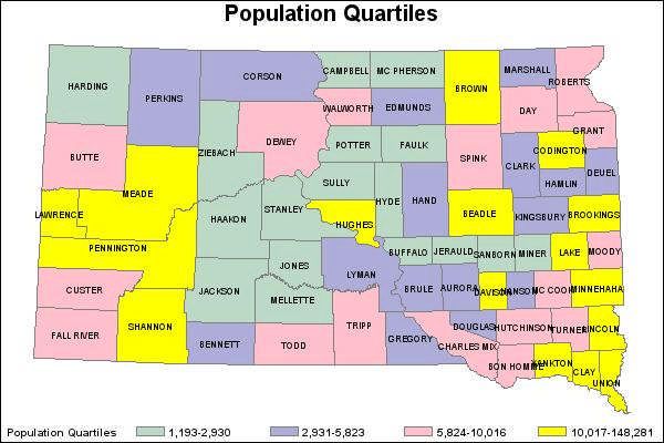
NESUG 2007                                                                                                                              Posters

        THE CRAYOLA® MOMENT
        Ordinarily, maps (and graphs) produced by SAS/GRAPH utilize colors and patterns in default lists unless specifically
        directed otherwise. SAS® programmers can specify their own color list, and/or specify a list of patterns. Colors can
        be expressed in a number of different ways, including color name, RGB value, HLS Value and Hex Value.

        To match a response variable (the data item you want to map) to a specific color or pattern, a value format and
        pattern statements should be used, and the number of patterns specified should match the number of levels in the
        response variable. The discrete option should be used in generating the map or graphic for a leveled response
        variable. (You can choose to have SAS® pick the breaks by specifying the number of levels in a continuous
        response variable.)

        One of the difficulties with this process is getting the “right” colors. Different color specifications work well (or not) in
        different environments. For example, if a graphic is displayed on a monitor or printed in 16 colors, a program using a
        256-color classification scheme will not necessarily appear as expected. Colors expressed in words may not give a
        fine enough distinction within a single color, such as blue, for some purposes. The choice of colors can become a
        fairly labor intensive task. Luckily, there are a number of tools and techniques to aid the SAS® programmer.

        Specifying colors by hand:

        First, it is useful to have a color chart such as the one shown below for reference (from SAS® TS-688). Colors can
        be chosen for each level of the response variable to be mapped, and specified. Note the value for each pattern
        specified in the code snippet below is MSOLID – this provides a solid color for the map area as opposed to diagonal
        lines, crosshatches and the like. Other options can be chosen if desired. The response variable to be mapped has
        four levels, so four pattern statements are supplied. Colors in this case are specified using names and abbreviations
        for names, but could have been specified using RGB values, HLS values and Hex values.

            /* define patterns           */
         pattern1 value=msolid           color=vpag; /* abbreviation for very pale green */
         pattern2 value=msolid           color=vpab; /* abbreviation for very pale blue */
         pattern3 value=msolid           color=pink;
         pattern4 value=msolid           color=yellow;

                                                                     5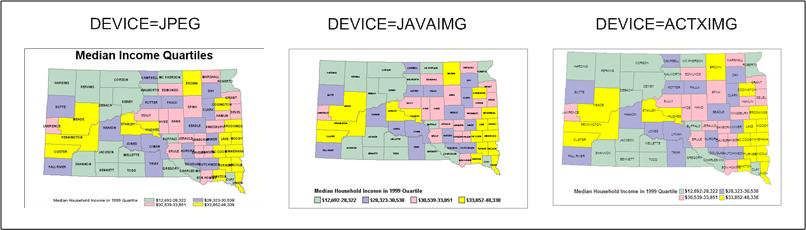
NESUG 2007                                                                                                                   Posters

        %colorscale:

        Using the chart shown above (or a similar chart) to choose beginning, end, and intermediate (optional) colors, use
        the SAS® provided macro %colorscale. The description below is from the SAS-supplied %colorscale macro page.

        /*********************************************************************/
        /*      The COLORSCALE macro can be used to determine a list of      */
        /*      colors in a gradient. The TOP and BOTTOM colors are          */
        /*      required; a middle color is optional. The value N sets the */
        /*      desired number of intermediate colors. For example, if N     */
        /*      is 10 and no middle color is specified, 12 colors are shown */
        /*      in the output. If a middle color is specified, 13 colors     */
        /*      would be shown in the output.                                */
        /*                                                                   */
        /*      The macro takes the following parameters:                    */
        /*                                                               */
        /*     TOP: color displayed on top of the output                 */
        /* MIDDLE: optional middle color; the gradient is                */
        /*          forced through this color                            */
        /* BOTTOM: color displayed on the bottom of the output           */
        /*       N: the number if intermediate colors                    */
        /*     DSN: name of the dataset that stores the colors.          */
        /*          The variable RGB contains the color values,          */
        /*          the variable NUMCOL contains the number              */
        /*          of colors.                                           */
        /* SWATCH: if "Y", display a sample of the colors.               */
        /*                                                               */
        /* Colors should be represented as RGB hex values, such as       */
        /* FFFFFF for white or 000000 for black. See Technical           */

                                                                6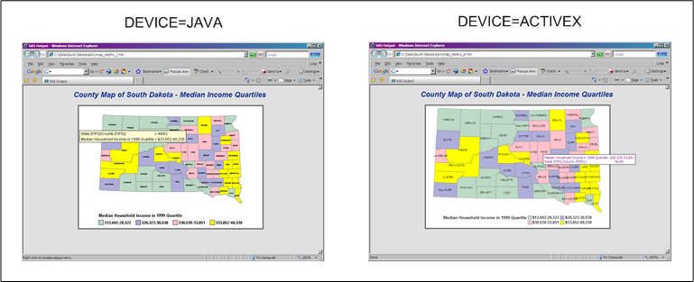
NESUG 2007                                                                                                                      Posters

        /*      Support document TS-688 for more information.                */
        /*                                                               */
        /*      This macro uses the INCR macro, below, to calculate the      */
        /*      intermediate color values.                                   */
        /*                                                               */
        /*      Because values must be rounded, slightly different results   */
        /*      may occur if the values for the top and bottom colors are    */
        /*      reversed. If the last intermediate color seems to 'jump'     */
        /*      from the top or bottom color, try reversing the values for   */
        /*      the top and bottom colors.                                   */
        /*                                                                   */
        /*      When invoking the macro, remember that the parameters are    */
        /*      positional. If no middle color is specified, the comma       */
        /*      should remain: %colorscale(000000,,FFFFFF,3,anno);           */
        /*                                                                   */
        /*                                              Revised 20SEP02      */
        /*********************************************************************/

        For our project, we used the %colorscale macro to determine our color scheme for maps, and nested the macros
        inside a macro to populate patterns and then to generate maps for different response variables. All that needed to
        be done was to choose the beginning color (in this case white) and ending color (in this case dark blue) from a chart
        such as the one shown above. The color values needed for this macro are the last 6 digits of the RGB values. The
        %colorscale macro needs to be available (either by previous invocation in your SAS® program or in a macro library.)

        goptions reset=all cback=white;
        /*****************************************************************/
        /* SAMPLE COLOR SCALE WITH NO MIDDLE COLOR.                      */
        /* This example produces 8 shades of blue, ranging from a        */
        /* medium blue to pure white. A color swatch is requested, and   */
        /* the list of colors is output to a dataset named LIST.         */
        /*****************************************************************/

        %colorscale(ffffff,,3399ff,6,list,no);
        /* Use the gradient to define colors in a map */
        /* Define PATTERN statements using the
           output dataset LIST. */
        %macro patt;
        data _null_;
        set list;
        call symput('color'||left(put(_n_,3.)),'cx'||rgb);
        call symput('total',left(put(numcol,3.)));
        run;
        %do i=1 %to &total;
        pattern&i v=s c=&&color&i;
        %end;
        %mend;

        %patt;

        %macro mapit(fname,tit,varnm,levs,fmt2use);

        goptions xpixels=600 ypixels=400 device=jpeg ftext="Arial/bo" cback=white border;
        ods listing close;
        ods html path=odsout body="&fname..htm";
            /* define patterns */
        %patt;

        title "South Dakota - &tit";

        proc gmap data=dd.disabled2 map=sd;
          id state county;
          format &varnm. &fmt2use..;

                                                                 7
NESUG 2007 Posters
choro &varnm. / levels=&levs discrete anno=anno coutline=grey name="&fname.";
run;
quit;
ods html close;
ods listing;
%mend;
%mapit(ltc2005d,LTC beds per 1000 disabled elderly 2005,
ltcbeds_de_2005_cat,6,beddisf);
Colorbrewer:
Colorbrewer is a wonderful (free) website that allows you to choose color schemes “online.” For maps such as the
ones created for this project, one can choose the number of levels (in the screenshot shown below, 5.) Then
choose legend type (in this case, sequential.) The “step 3” box then offers a number of options for color schemes
(we chose a particularly attractive blue gradient scheme.) Directly below one can click on any number of color
representation codes (in this case, HEX is shown.) These codes can then be used in pattern statements as shown
above. Colorbrewer is particularly handy if you will be presenting maps online as you can see how the colors will
look viewed online. There are many more features to Colorbrewer than can be described here: a visit to the website
is well worth the time (the URL is provided at the end of the paper.)
8NESUG 2007 Posters
Coming attractions: In SAS® 9.2
Using a color chart such as the one partially shown above, Colorbrewer, or simple color names, choose a beginning
and end color.
%let color1=cornsilk;
%let color2=lib; /* abbreviation for light blue */
proc template;
define style styles.grad1;
parent=styles.listing;
style twocolorramp / startcolor=&color1 endcolor=&color2;
end;
run;
goptions cback=white gunit=pct htitle=6 htext=4 ftitle="arial/bo" ftext="arial";
GOPTIONS xpixels=800 ypixels=600 DEVICE=png;
ODS LISTING CLOSE;
ODS HTML path=odsout body="&name..htm" style=grad1;
legend1 label=none shape=bar(3,3) position=(left middle) across=1;
title1 "V9.2 Gradient Shading";
footnote "startcolor=&color1 endcolor=&color2";
proc gmap data=maps.us map=maps.us;
id state;
choro state / levels=5 coutline=black legend=legend1 des="" name="&name";
run;
quit;
ODS HTML CLOSE;
ODS LISTING;
Result:
9NESUG 2007 Posters
CONCLUSION
SAS® provides us with many tools to customize ODS output. The combination of SAS® analytics and SAS®
mapping provide our clients with attractive, informative graphics to inform future policy decisions.
The ability to choose colors to graphically display data elements is an extremely valuable presentation tool. The
possibilities offered by both SAS® provided tools and Colorbrewer to choose colors, in addition to the capability
SAS® offers in terms of analyzing and graphically displaying data, allow SAS® programmers to “color the world.”
REFERENCES & RECOMMENDED READING
SAS® Online Documentation PC SAS V9.1
http://support.sas.com
http://support.sas.com/techsup/technote/ts688/ts688.html “TS-688 – Defining Colors Using Hex Values”
http://www.personal.psu.edu/cab38/ColorBrewer/ColorBrewer.html Colorbrewer Online Tool
Watts, Perry. “Using ODS and the Macro Facility to Construct Color Charts and Scales for SAS® Software
Applications.” Proceedings of the Twenty-Seventh Annual SAS Users Group Conference, April 2002.
Watts, Perry. “Working with RGB and HLS Color Coding Systems in SAS® Software.” Proceedings of the Twenty-
Eighth Annual SAS Users Group Conference, April 2003.
Watts, Perry. “Advanced Programming Techniques for Working with Color in SAS® Software.” Proceedings of the
Twenty-Ninth Annual SAS Users Group Conference, May 2004.
Zdeb, Mike and Allison, Robert. “Stretching the Bounds of SAS/GRAPH® Software.” Proceedings of the Thirtieth
Annual SAS Users Group International Conference. April 2005.
Zdeb, Mike and Hadden, Louise. “Zip Code 411: A Well Kept SAS® Secret.” Proceedings of the Thirty-First Annual
SAS Users Group International Conference. March 2006.
Zdeb, Mike. 2002. Maps Made Easy Using SAS®. Cary, NC: SAS Institute Inc.
ACKNOWLEDGMENTS
State of South Dakota, Department of Social Services, Division of Adult Services and Aging
Our colleagues, Carol Simon, Project Director, and Victoria Shier.
Robert Allison, Darrell Massengill and Liz Simon of SAS® who work tirelessly to improve and
facilitate the use of SAS/GRAPH® and mapping with SAS.
Mike Zdeb, the SAS/GRAPH® Mapping Guru
SUPPORT.SAS.COM – the samples, FAQs and human beings behind the scene are the
greatest!
SAS and all other SAS Institute Inc. product or service names are registered trademarks or
trademarks of SAS Institute Inc. in the USA and other countries. ® indicates USA registration.
Other brand and product names are trademarks of their respective companies.
No crayons were harmed in the creation of this paper.
10NESUG 2007 Posters
CONTACT INFORMATION
Your comments and questions are valued and encouraged. Contact the authors at:
Louise Hadden Lauren Olsho Andrew Johnson
Abt Associates Inc. Abt Associates Inc. Abt Associates Inc.
55 Wheeler St. 55 Wheeler St. 55 Wheeler St.
Cambridge, MA 02138 Cambridge, MA 02138 Cambridge, MA 02138
(617) 349-2385 (work) (617) 349-xxxx (work) (617) 349-xxxx (work)
louise_hadden@abtassoc.com Lauren_olsho@abtassoc.com Andrew_johnson@abtassoc.com
Sample code is available from the authors upon request. Please contact Louise Hadden for programs.
KEYWORDS
SAS®; SAS/GRAPH®; PROC GMAP; COLOR; PATTERN; COLORBREWER;
%COLORGRADE; ODS; JPEG; JAVA; ACTIVE-X
11You can also read


