Colour Planner - pantoneview - AUTUMN | WINTER 2017-18 - aatcc
←
→
Page content transcription
If your browser does not render page correctly, please read the page content below
pantone view        ®

                 Colour Planner
                  AUTUMN | WINTER 2017-18

womenswear menswear activewear cosmetics interiors industry graphics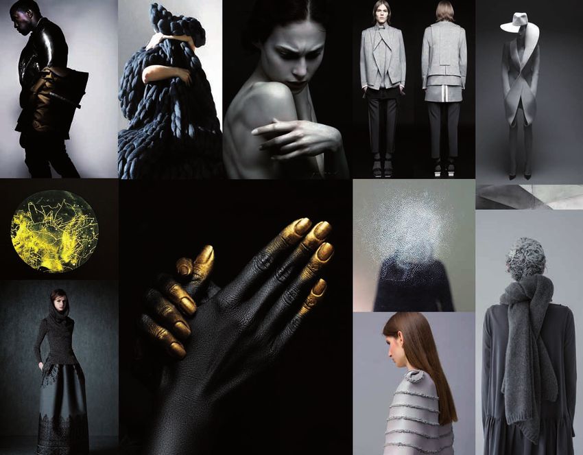
A U T U M N | W I N T E R 2 0 17-18   pantone view | Colour Planner
                                                ®
general introduction how to use
COLOUR PLANNER AUTUMN | WINTER 2017-18 Winter neutrals key colours 9 COLOUR PLANNER AUTUMN | WINTER 2017-18 Winter neutrals key & supplementary colours | Absence | inspiration 1 11
11-1001 tcx
The key colours we introduce each palette with four key
winter winter
white alyssum
pantone®
11-1001 TCX
pantone®
12-0304 TCX
pantone®
14-4107 TCX
pantone®
18-5102 TCX
neutrals colours. These colours form your merchandising base, which
neutrals
12-0304 tcx
whitecap gray
White alyssum Whitecap gray Quiet gray Brushed Nickel
should be a constant for the season. In combination with the
The New Colour Planner
Absence 14-4107 tcx
quiet gray
Our four key colours White is defined by the colours that surround
tread very lightly. it, and gives anonymity to objects when used
alone or in low contrast, shaded executions. We
18-5102 tcx
brushed nickel
supplementary colours found on subsequent pages, the key
We begin with three begin with a simplified palette, our four key
colours supplemented with small areas of
lofty neutrals anchored
by a warm grey. Their
delicate apricot, redolent of soft flesh and
slightly cosmetic in character. A milky
elderberry, also delicate and bruised in 14-1217 tcx
amberlight
colours can be worked into various exciting stories.
appearance gives our four neutrals a touch of
neutrality is the key to colour, only to be used sparingly. A hint of
brown, so dark as to be almost black, serves as
their flexibility – they punctuation and focus to a fairly ethereal and
Key + supplementary colours
layered palette. The idea is to provide
are designed to mix
easily with each other
cocooning, enveloping colour, using soft touch
fabrics as thick insulation, a buffer against the
outside world. It’s a very internal dialogue,
this is where we add
and also with more both contemplative and moody and this is 17-1605 tcx
two to four supplementary colours to the key colours shown at the
Welcome to our new version of the PANTONEVIEW Colour Planner.
elderberry
emphasised by using creamy textures and
saturated colour. softened constructions. Oversized silhouettes
that softly gather round the body sit alongside
quite structured product that has been softened
by a curved line or spongy textures. This
palette is inherently linked with material, where beginning of the chapter. These supplementary colours will allow
With colour becoming more lifestyle in nature, we wanted to make it easier
we discover a broad mix of surface textures
from fluffy to smooth, transparent and elastic.
They all have one thing in common, a soft
hand feel and delicious tactility.
19-1103 tcx
espresso
you to develop, transform and individualise the core. We show
these supplementary colours as major additives to the colour bar
for you to use our colour trend stories across multiple product categories 9-22 Winter neutrals.indd 1
THE KEY COLOURS
08-12-15 13:23 9-22 Winter neutrals.indd 3
KEY + SUPPLEMENTARY
06-12-15 20:05
in thought provoking inspiration pages. Sometimes, different
and merchandising programmes. 12 Winter neutrals | Absence | harmonies 1 COLOUR PLANNER AUTUMN | WINTER 2017-18
COLOURS supplementary colours can take us in completely different inspira-
tional directions. However, we never use more than four supple-
As you will see, each colour palette is launched with the four key colours we
14 Winter neutrals | Absence | products 1 COLOUR PLANNER AUTUMN | WINTER 2017-18
white alyssum
mentary colours per palette.
believe are fundamental to your season’s planning. Following on from that, whitecap gray
we propose four supplementary hues, which should be used to develop, covered shapes marbled technology
Harmony pages we enhance our palette with harmony
hexagonal texture
quiet gray
pages, where the key colours are presented in different combinati-
transform and personalise those core colours. Soft
Geometry ons, transformed by not only by those supplementary hues but by
We enhance that message with harmony pages, where the key colours are
brushed nickel
flecked yarns boiled wool
occasional colours chosen from other parts of the general colour
flat planes
name of colour
card. Creating colour mixes and harmonies is one of the great
presented in different combinations, transformed by not only by those amberlight
Quiet product with soft edges. Brushed surfaces.
Smooth ceramics. Diffused colour, layered and
Warm infusion
infused. Relaxed forms that maintain formality.
Overblown silhouettes and shapes. Limited and strengths of the PantoneView Colour Planner.
narrow colour palettes that cast shadows and
supplementary hues but by occasional colours chosen from other parts of
Our four neutrals are infused with warm tones
of apricot and elderberry, creating snug layers of bounce light. Natural stone and leather has a
elderberry colour. Highlights can appear as transparent layers. technical finish. Layers show different surfaces
in the same or similar colour.
loose silhouettes oversized accessories soft cubes
Product pages this is where we show you how product
the general colour card . With the continuity of the four key colours in HAMONY PAGES PRODUCT PAGES
9-22 Winter neutrals.indd 6 08-12-15 13:25
ranges can now be coloured up using the various palettes to have
each new palette ensuring a unity that is crucial to your colour merchandi- COLOUR PLANNER AUTUMN | WINTER 2017-18 Transitional celadons & supplementary colours | Slide and blur | inspiration 1 91
a point of difference, but still work within a cohesive whole.
sing, product ranges can now be coloured up using the various palettes to
12-5204 tcx
transitional
morning mist
celadons 15-4715 tcx
aqua sea
Transitional colours here, we talk about colours that
have a point of difference, but still work within a cohesive whole. Slide and blur
A cool slide of coloured celadon grey and
turquoise tones evoke a sense of materials in
18-5620 tcx
ivy
19-5230 tcx
can cross from season to season, location to location, gender to
gender. This colour card, Disguise, is built with Autumn/Winter
forest biome
We also introduce coverage dedicated to ‘transitional’ colours. Climate
flux and movement. These four key transitional
tones, which we can read as one, are, here,
effortlessly altered and re-presented with four
new tints that completes our cameo. All
together, they change the mood and rhythm
with a light tilleul, a tobacco, and two soft
12-0418 tcx
hay
pantone view ®
2017-18 in mind but the colours shown on these pages also have
change and a trans-continental market place means that we need more
greens. The atmosphere now slips easily from
warm to cool, and from dark to light. Inspired
Colour Planner
by the feeling of colours that easily move from
fluid to solid, we can enjoy the blur of
projected speed and chromatically adjusted 18-1312 tcx
their roots in Summer 2017 and will evolve into Summer 2018.
images. Glass like materials are stacked and deep taupe
colour stories that work across summer and winter and appeal to all consu-
carved, filtered and shadowed, reflected,
absorbed and mirrored back. They are created
by hand and craft or by computer and digital
cadmium yellow
diffused orchid
winsome orchid
provincial blue
gossamer green
brushed nickel
apricot nectar
Poster and DVD
white alyssum
whitecap gray
meadow mauve
roasted pecan
vibrant green
maritime blue
atlantic deep
windsor wine
morning mist
wood thrush
black beauty
poison green
jalapeño red
forest biome
scarlet sage
living coral
baleine blue
maple sugar
coral blush
agave green
dragon fire
love potion
quiet green
mauve morn
rooibos tea
amberlight
design. The result is often the same. Rough
elderberry
aurora red
amberglow
black plum
navy peony
lemon zest
stormy sea
quiet gray
sea turtle
deep taupe
sunflower
margarita
lilac gray
goji berry
rain drum
lapis blue
excalibur
ibiza blue
pale gold
elmwood
to complete the product we offer a DVD
chili oil
blue fog
aqua sea
espresso
dubarry
spli pea
falcon
viola
tofu
hay
mineral textures freeze and liquefy and fine
ivy
11-1oo1 tcx
12-0304 tcx
14-4107 tcx
18-5102 tcx
14-1217 tcx
17-1605 tcx
15-0927 tcx
19-1103 tcx
12-2102 tcx
15-1316 tcx
14-3206 tcx
17-3520 tcx
14-1133 tcx
18-1706 tcx
13-5907 tcx
16-1546 tcx
17-1019 tcx
17-1129 tcx
19-0916 tcx
16-1350 tcx
16-6339 tcx
15-1054 tcx
19-4048 tcx
18-1550 tcx
19-3831 tcx
19-4726 tcx
18-5806 tcx
18-1304 tcx
15-4008 tcx
19-1528 tcx
19-4045 tcx
18-1355 tcx
16-6444 tcx
18-4220 tcx
18-1659 tcx
19-4029 tcx
14-1909 tcx
14-0116 tcx
16-3815 tcx
16-1054 tcx
16-0545 tcx
16-3905 tcx
18-3905 tcx
18-1440 tcx
17-4245 tcx
13-0756 tcx
16-1460 tcx
18-1951 tcx
18-1759 tcx
18-3230 tcx
19-1559 tcx
17-1647 tcx
11-4801 tcx
17-1052 tcx
19-0403 tcx
19-3911 tcx
12-5204 tcx
15-4715 tcx
18-5620 tcx
19-5230 tcx
12-0418 tcx
18-1312 tcx
15-6317 tcx
18-4711 tcx
porcelain organics contrast with crystalline 15-6317 tcx
mers irrespective of location, gender or lifestyle preferences.
translucency. Emotionally, these colours convey quiet green
their power in waves of slipping and blurring
tones, tints, washes and lines that make us
engage and enjoy this new colour landscape.
Poster CP 37.indd 2
A U T U M N | W I N T E R 2 0 17-18 pantone view| WINTER
AUTUMN | Colour Planner
2017-18
®
06-12-15 20:09
and poster. The DVD contains two files – the first with static
18-4711 tcx
stormy sea
the images contained on this dvd are for personal
and private use. unauthorised copying, lending,
hiring, public performance is
strictly prohibited.
images of the photos used to illustrate our colour themes, the
89-94 Transitional celadon.indd 3 08-12-15 13:26
second featuring a movie version of the season with colours and
Please see the facing page for a full guide on how to use our latest issue. TRANSITIONAL COLOURS POSTER AND DVD music to inspire.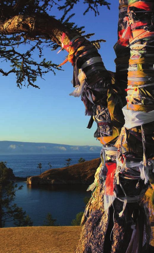
key colour statements

Whites        we feel that white is a    Natural hues          recently, indus-    Pinks      we have said it many          Pastels      we fundamentally believe      Celadons        new winter lagoon       Mauves        mauve is a colour that     Mid-tones          mid-tones become      Greens      this season we see green
counter-reaction to the overuse of       try has been showing a passion for        times: pink is more than a fashion       that pastels are entrenching themsel-      greens are another transitional group   gathers in strength and co-exists with   less dusky and powdery and reveal        used both as a bright and as a
colour, it cleans and simplifies. This   hair and natural animal hues. This        colour! It is gender-neutral, a colour   ves as a serious part of the palette and   of colours that we are proposing for    and within many other groups. For        cleaner, more modern hues. They          blending colour. When used with
season, we are interested in natural     continues into A/W 17-18 with             of protest, it transcends age and has    are being used in more multifarious        A/W17-18. Turquoise-based, these        example it appears in mid-tones,         are therefore more suitable for a        olives and khaki hues it gives a
white hues – albino white, Australian    classic camel, vicuna and llama tones     multiple uses. Just as pink has          ways. This season, pastels act as          celadons take on a metallic sheen or    pastels and pink when using lighter      wider range of materials ranging         camouflage appearance, bit it can
wool white, alongside optical whites.    still very popular; however, we are       crossed gender, it now crosses           neutrals to make more bizarre              icy and greyish overtones. They also    hues and red and blue when se-           from textures to clean, polished         also be used in other combinations,
Because of its relationship to white     also seeing a movement away from          materials. No longer associated with     harmonies. They are used to enliven        darken into shadowy and muted           lecting stronger, more purple tones.     surfaces. They also act as an anchor     with rich blues and browns, or in
wool fibres, it is seen as a serious     deeper hues to lighter, albino variati-   fluffy and soft finishes, it is now      the brighter colours and give the          winter dusks.                                                                    for brighter, faster colours revolving   complimentary combinations with
winter colour, particularly when         ons. Note that these natural shades       being linked to firmer, more dermic      palette a more fractured look. They                                                                                         around them.                             saturated brights. Green also works
applied to insulating product.           also work well with pastels.              and plasticised chemical finishes. It    are diversifiers, giving colour groups                                                                                                                               well with metallized finishes and, of
Remember, white is also a great                                                    is both sensual and chaste, human        non-uniformity. They inject surprise,                                                                                                                                course, in more rustic traditional
transeasonal colour, it is neutral and                                             and android. New developments in         a sugar shock to other palettes. They                                                                                                                                textures such as leather and suede.
combines well with other colours.                                                  robotics are being executed with a       can always be used on their own, but
                                                                                   human aesthetic, so new shades of        this season their newness comes from
                                                                                   dermic pink are becoming even            this sugar injection amongst good
                                                                                   more important.                          quality base colours.
contents

                                                                                                                                                                                   1. introduction                                             9. winter neutrals                                                23. dermic pinks
                                                                                                                                                                       We welcome you to our new version of the Colour            We begin with three lofty neutrals anchored by a warm             Next season, pink evolves into a series of paler, more
                                                                                                                                                                     Planner. With colour becoming more lifestyle in nature,      grey. Their neutrality is the key to their flexibility – they   fragile shades to express a transparent nudity. Beiges, off
                                                                                                                                                                      we outline how we are making it easier for you to use       are designed to mix easily with each other and also with         white and blues are all subtly influenced by pink, while
                                                                                                                                                                    our colour trend stories across multiple product categories                    more saturated colour.                                    pink mauves are the new baby pink.
                                                                                                                                                                                 and merchandising programmes.

                                                                                                                                                                                   41. winter roots                                              53. winter darks                                              65. new traditions
                                                                                                                                                                    We reflect our concern with the health of planet earth in      Compelling and essential winter hues, these deep and           This is a palette of iconographic colours, flags to remind
                                                                                                                                                                    a key palette based on nature such as brown, ochre, and         rich colours are all about texture and surface. It’s a            us where we are from and where we are going. But
                                                                                                                                                                    grey mud, together with the colours of its vegetable root      group that works well together or, as each colour has           aristocratic and classic though they are, they can still be
Reds      reds are another of our        Blues       blue doesn’t have a        Brights       first, we had brights for   Greys and black             still very                 products such as carrot orange.                     such a strong identity, thrives as single statements.        radicalised by new harmonies to represent and celebrate
transitional choices. This season,       singular presence this season, but     brights sake; then we had brights in      important, greys are not veiled and                                                                                                                                                       diversity in all its forms!
reds have moved more to the coral        still plays a pivotol role when used   texture; now brights have evolved         misted any more. Instead, they
side, adding a summery feel to           in coordination with other colours.    into high-energy transmitters,            appear bolder and like many of the
winter and therefore contrasting         Yet again, it appears in multi hued    utilising reflection and other surface    other colours shown on the palette
with traditional scarlet. Red should     varieties, starting with a new         finishes, as we look this season at the   work both on clearer, cleaner bases
not just be seen as a solid; it can be   blue-black tone, moving through        impact of light and light effects on      as well as textured surfaces. Black is
mixed in a degradé manner with its       accepted indigo to brighter royal      these hues. For A/W 17-18, brights        back as a fixture colour in the
orange and brown cousins; and it         and cobalt shades.                     move from being blatant fluo shades       palette. It moves into the realm of
can be offset in clean contrasts with                                           to high-speed colours and symbols         being a classic winter colour once
                                                                                                                                                                           77. modulating mid-tones                                         83. transitional reds                                       89. transitional celadons
black, grey and white. Finally, it                                              of power.                                 again, in some ways replacing the
                                                                                                                                                                    A group of modulating mid-tones that form an unexpec-          A story of iconic reds that vibrate from a hot scarlet,           This is new cool, iconic greyed but strong turquoise
lends itself well to new metallic                                                                                         omnipresence of blue that we have
                                                                                                                                                                     ted union: they create a modern ambiance and act as           through pink, to a deep lacquer red and a soft coral           camaïeux story. It amplifies a layered, altered look from
treatments, where red seen in a                                                                                           witnessed in the past two years. It
                                                                                                                                                                      unusual winter anchors in a wide range of materials.         creating a forceful, confident energy. It’s a range of         a cold pale mist to a deep resinous green. It is an impor-
metallic finish working with copper                                                                                       feels cooler as it absorbs colder tones
                                                                                                                                                                             Wilder, brighter, high-energy colours                colours that transitions between grandiose display and           tant monochrome to nuance or animate the season in
is particularly new.                                                                                                      and it allows materials to speak out
                                                                                                                                                                                       should with them.                                          concealed masquerade.                                                 equal measure.
                                                                                                                          in ways other colours do not.
COLOUR PLANNER AUTUMN | WINTER 2017-18                                                Winter neutrals key colours 9

Disguise
                                                                                  pantone®
                                                                                  11-1001 TCX
                                                                                                           pantone®
                                                                                                           12-0304 TCX
                                                                                                                           pantone®
                                                                                                                           14-4107 TCX
                                                                                                                                         pantone®
                                                                                                                                         18-5102 TCX
                                                                                                                                                          winter
                                                                                   White alyssum           Whitecap gray   Quiet gray    Brushed Nickel
                                                                                                                                                          neutrals
                                                                                                                                                          Our four key colours
                                                                                                                                                          tread very lightly.
   We have grouped our major colour messages for A/W 17-18 under a
   common title, Disguise, which we feel suits the current lifestyle zeitgeist                                                                            We begin with three
                            in the marketplace.
                                                                                                                                                          lofty neutrals anchored
    The process of colouring fulfils our fundamental desire for change. We
     apply colour to our walls, the floors we walk on, the face we see in the
                                                                                                                                                          by a warm grey. Their
   mirror each day, the car we drive. We clothe ourselves in different colours
  for different occasions. Colour is at the heart of what we do, and our need
                                                                                                                                                          neutrality is the key to
                     to disguise and transform appearance.
    We have said before that colour goes hand in hand with texture, and the
                                                                                                                                                          their flexibility – they
   focus this season on materiality remains unbroken. This season, however,
    we are also interested in materials that emit and reflect light; we explore
                                                                                                                                                          are designed to mix
     embellished finishes and perfect smooth, shining surfaces. We see how                                                                                easily with each other
  transparency reveals and alters colour, and how thick cocooning materials
                      muffle shape and change its meaning.                                                                                                and also with more
  The presence of light – and the lack of it – also plays an important role in
  how colour is altered and disguised. For example, we research anonymous                                                                                 saturated colour.
  colour and colour that appears absent. When is a colour there and when is
 it not? How does colour simultaneously cover and reveal? How do products
   change when they are coloured and when they are not? You will find the
                 answers within our brand new colour planner.
                              We hope you enjoy it!
10 Winter neutrals key & supplementary colours | Absence | inspiration 1 COLOUR PLANNER AUTUMN | WINTER 2017-18 COLOUR PLANNER AUTUMN | WINTER 2017-18 Winter neutrals key & supplementary colours | Absence | inspiration 1 11
11-1001 tcx
winter
white alyssum
neutrals 12-0304 tcx
whitecap gray
Absence 14-4107 tcx
quiet gray
White is defined by the colours that surround
18-5102 tcx
it, and gives anonymity to objects when used brushed nickel
alone or in low contrast, shaded executions.
We begin with a simplified palette, our four
key colours supplemented with small areas
of delicate apricot, redolent of soft flesh and
slightly cosmetic in character. A milky
elderberry, also delicate and bruised in 14-1217 tcx
amberlight
appearance gives our four neutrals a touch of
colour, only to be used sparingly. A hint of
brown, so dark as to be almost black, serves as
punctuation and focus to a fairly ethereal and
layered palette. The idea is to provide
cocooning, enveloping colour, using soft touch
fabrics as thick insulation, a buffer against the
outside world. It’s a very internal dialogue,
both contemplative and moody and this is 17-1605 tcx
elderberry
emphasised by using creamy textures and
softened constructions. Oversized silhouettes
that softly gather round the body sit alongside
quite structured product that has been softened
by a curved line or spongy textures. This
palette is inherently linked with material, where
we discover a broad mix of surface textures
from fluffy to smooth, transparent and elastic.
They all have one thing in common, a soft 19-1103 tcx
espresso
hand feel and delicious tactility.
12 Winter neutrals | Absence | harmonies 1                                      COLOUR PLANNER AUTUMN | WINTER 2017-18   COLOUR PLANNER AUTUMN | WINTER 2017-18                               Winter neutrals | Absence | harmonies 1 13

                                             white alyssum
                                                                                                                                                                             white alyssum

                                             whitecap gray

                                                                                                                                                                             whitecap gray

                                               quiet gray

                                                                                                                                                                               quiet gray

                                             brushed nickel

                                                                                                                                                                             brushed nickel

                                              amberlight

                                                              Warm infusion                                              Cool layers
                                                              Our four neutrals are infused with warm tones              An almost-black is brought into the mix to add
                                                              of apricot and elderberry, creating snug layers of         gravitas and solidity to ethereal layers of white      espresso
                                              elderberry      colour. Highlights can appear as transparent layers.       and grey.
14 Winter neutrals | Absence | products 1                                                   COLOUR PLANNER AUTUMN | WINTER 2017-18     COLOUR PLANNER AUTUMN | WINTER 2017-18                                                         Winter neutrals | Absence | products 1 15

                                                                                                                                                                                                          Curved but also
                                                                                                                                                                                                           straight lined
                                                                                                                                                                                                          Porcelain beauty
                                                                                                                                                                                                          Foggy colour
                                                                                                                                                                                                          Relaxed precision
                                                                                                                                                                                                          Cocooning
                                                                                                                                                                                                          Indistinct edges
                          covered shapes                                              marbled technology                             hexagonal texture                          structured floppy knits                                                     layered whites

                                                                 Soft
                                                               Geometry
                                            flecked yarns                                                         boiled wool           flat planes                                bonded materials          synthetic with natural                          curvilinear

                                                                     name of colour

                                    Quiet product with soft edges. Brushed surfaces.
                                    Smooth ceramics. Diffused colour, layered and
                                    infused. Relaxed forms that maintain formality.
                                    Overblown silhouettes and shapes. Limited and
                                    narrow colour palettes that cast shadows and
                                    bounce light. Natural stone and leather has a
                                    technical finish. Layers show different surfaces
                                    in the same or similar colour.
   loose silhouettes                                                                                         oversized accessories      soft cubes                               moulded geometrics                            singular colour statements
16 Winter neutrals key & supplementary colours | The grey zone | inspiration 2 COLOUR PLANNER AUTUMN | WINTER 2017-18 COLOUR PLANNER AUTUMN | WINTER 2017-18 Winter neutrals key & supplementary colours | The grey zone | inspiration 2 17
11-1001 tcx
winter
white alyssum
neutrals 12-0304 tcx
whitecap gray
The grey zone 14-4107 tcx
quiet gray
Our ghostly neutrals are now supplemented
18-5102 tcx
with a heavier influence of black and metallic. brushed nickel
Off-black plays a dominant role, acting as a
canvas against which the paler shades are
brought forwards. It is also used in the same
capacity as white was in “Absence”, as a
covering colour, giving product anonymity and
a sense of mystery. The presence of a metallic 17-1605 tcx
elderberry
gold adds rich contrast and here we explore
how objects can be elevated and transformed
by touches of gold and the textural contrast
that metallics bring to 3D product. As a follow
on from the “Absence” theme, there is still a
very textural focus here, but instead of softer
hand feels, we turn to a mix between soft and
hard. Large scale knits and boiled wools are
contrasted with metallic hardware, for 15-0927 tcx
pale gold
example. There is also a heavier influence of
natural materials. We see tweeds, leather and
natural wood mixed with more synthetic or
modern influences. In the closing product page
where the focus is on metallic influences, the
impression is more animalistic, curious and
enticingly enigmatic.
19-1103 tcx
espresso18 Winter neutrals | The grey zone | harmonies 2 COLOUR PLANNER AUTUMN | WINTER 2017-18 COLOUR PLANNER AUTUMN | WINTER 2017-18 Winter neutrals | The grey zone | harmonies 2 19
white alyssum white alyssum
whitecap gray whitecap gray
quiet gray quiet gray
brushed nickel brushed nickel
espresso pale gold
Mysterious mauve Glittering gold
Amongst the heavier layers of grey, a mysterious Metallic gold provides a dramatic contrast to dark
mauve peeps through, adding a sense of mystery to greys and nearly black. White in contrast, has a
elderberry our four neutrals small part to play as a tiny highlight. espresso20 Winter neutrals | The grey zone | products 2 COLOUR PLANNER AUTUMN | WINTER 2017-18 COLOUR PLANNER AUTUMN | WINTER 2017-18 Winter neutrals | The grey zone | products 2 21
broguing metallic concrete carpet textures neat edges tailored asymmetry
Soft/hard
Natural/artificial
Hand made
Machine made
Melange
Posh artisan
Historical
heritage styles modern tailoring new and old sharp and soft nostalgic silhouettes pleated textile and leather
Rough textured wool contrasts with hard surfaces
such as leather, wood and ceramic. Pleated and
embossed geometric pattern is softened on pliable
surfaces. Unfinished edges of felted wool cut
super straight. Large open textures woven and
knitted in geometric patterns. Formal classic
silhouettes with touches of asymmetry. Classic
shapes with rounded corners.
large scale knit modern retro structured informality embossed melange organic and manmade22 Winter neutrals | The grey zone | products 2 COLOUR PLANNER AUTUMN | WINTER 2017-18 Winter neutrals | KEY COLOURS SUPPLEMENTARY COLOURS | Winter neutrals
cracked carapaces layered darks black snakeskin gold inside
Dark and intense.
COLOUR PLANNER AUTUMN | WINTER 2017-18
Animal, vegetable and mineral hybrids.
Texture is key.
Granular and cracked.
Jointed and scaled. Segmented shine.
Rough matte areas.
Mysterious silhouettes.
all over metallic metal edging
brushed nickel
whitecap gray
white alyssum
amberlight
elderberry
quiet gray
pale gold
espresso
11-1001 tcx
12-0304 tcx
14-4107 tcx
18-5102 tcx
14-1217 tcx
17-1605 tcx
15-0927 tcx
19-1103 tcx
slashed leather burnished animal metallic high quality hardwareCOLOUR PLANNER AUTUMN | WINTER 2017-18 Dermic pinks key colours 23
pantone®
12-2102 TCX
pantone®
15-1316 TCX
pantone®
14-3206 TCX
pantone®
17-3520 TCX
dermic pinks
Mauve morn Maple sugar Winsome orchid Diffused orchid
Next season, pink evolves
into a series of paler, more
fragile shades to express a
transparent nudity. Beiges,
off white and blues are
all subtly influenced by
pink, while pink mauves
are the new baby pink. We
are looking at a story that
is many things – sensual
and sensitive, human or
artificial, provocative or
gently therapeutic.24 Dermic pinks key & supplementary colours | Ex-machina | inspiration 1 COLOUR PLANNER AUTUMN | WINTER 2017-18 COLOUR PLANNER AUTUMN | WINTER 2017-18 Dermic pinks key & supplementary colours | Ex-machina | inspiration 1 25
dermic pinks
Ex-machina
12-2102 tcx
mauve morn
Our first story is based solely on the key
colours, where nude pinks work as a backdrop
to be combined with pinkish beiges, mauve and
bluish pinks. Our body is something we
disguise, protect and hide; that’s why showing
(too much) skin can be provocative and
liberating act. Meanwhile, artificial intelligence 15-1316 tcx
tries to disguise technology by portraying it as maple sugar
human. In fact, humanism is the very thing
technology wants to emulate, as it pursues its
goal to be closer, more familiar and beneficial
to mankind. Ex-machina is a range that shows
devotion and gives value to the superficial, the
tactile and the simple beauty of the seemingly
fragile but kind and gracious. Disguise the
synthetic with human skin!
14-3206 tcx
winsome orchid
17-3520 tcx
diffused orchid26 Dermic pinks | Ex-machina | harmonies 1 COLOUR PLANNER AUTUMN | WINTER 2017-18 COLOUR PLANNER AUTUMN | WINTER 2017-18 Dermic pinks | Ex-machina | harmonies 1 27
mauve morn
mauve morn
coral blush
whitecap gray
winsome orchid
quiet gray
amberlight
coral blush
maple sugar
diffused orchid
agave green
Humanoid Neo flesh
Paleness and sensuality join tanned tones and light, Nude tones converse with clay and botanical
soft metallic hues. greens to form a symbiosis between the human,
maple sugar the vegetal and the mineral.
black plum28 Dermic pinks | Ex-machina | products 1 COLOUR PLANNER AUTUMN | WINTER 2017-18 COLOUR PLANNER AUTUMN | WINTER 2017-18 Dermic pinks | Ex-machina | products 1 29
Breathable
Touchable
Sensitive
Cosmetic
Carnal and sensual
Tanned and pale
Skin textured
fleshy marble stretch leather dermic aesthetic translucent membrane overlay new skins
Textures emulate wrinkles,
pores, soft hairiness. Hues
are ephemeral and powdery
like blushers. Materials
breath, swell and granulate.
Marbles look like refined
flesh. Transparency
emulates elastic membranes;
relief work models itself on
veins; and designs are
inspired by tattoo work.
strategic techno folders breathable plastic surfaces hairy alpaca softness coloured translucent accessories spray dyes natural leather shades
dermal patch moisture touch soft functionality human shapes artificial skin precious craft rugous and tactile surfaces30 Dermic pinks key & supplementary colours | Trans-inspiration | inspiration 2 COLOUR PLANNER AUTUMN | WINTER 2017-18 COLOUR PLANNER AUTUMN | WINTER 2017-18 Dermic pinks key & supplementary colours | Trans-inspiration | inspiration 2 31
12-2102 tcx
dermic pinks
mauve morn
Trans-inspiration
15-1316 tcx
maple sugar
14-3206 tcx
A new culture is emerging, one that trades the winsome orchid
symbols, identities and concepts tied to specific
genders for the other side and another source
of aesthetic enrichment. Gender identity has 17-3520 tcx
diffused orchid
also been segregated through colour, used to
create barriers between the amazing possibilities
offered by dualistic sexual identity. Pink, for
example, with its messages of femininity and
sensitivity, has never been seen as a ‘man’s
colour’: blue vice versa! But all that’s changing,
as we see the arrival of a new, post-austerity
sensitive male, matched by an increasingly 14-1133 tcx
emancipated woman in a new, liberating apricot nectar
interaction between the sexes. All this is
reflected in the intermarriage of ‘female’ pinks
and ‘male’ blues, where they are dyed together
to produce a range of mauve and violet grey
tones to reflect our new ‘hem’ society. It’s
Disguise through exchanging gender elements!
18-1706 tcx
black plum32 Dermic pinks | Trans-inspiration | harmonies 2 COLOUR PLANNER AUTUMN | WINTER 2017-18 COLOUR PLANNER AUTUMN | WINTER 2017-18 Dermic pinks | Trans-inspiration | harmonies 2 33
mauve morn
mauve morn
winsome orchid
amberlight
maple sugar
coral blush
apricot nectar
winsome orchid
diffused orchid
apricot nectar
agave green
black plum
lilac gray
lilac gray
excalibur
Androgyne Flowery powder mask
Even though the blue and grey hues are used in a Grey gets tinged and coloured by mauve. Clay
ground breaking way, the nude and innocent pinks and orchid pink whisper poems to the green.
ensure a sense of caressing sensitivity.
maritime blue black plum34 Dermic pinks | Trans-inspiration | products 2 COLOUR PLANNER AUTUMN | WINTER 2017-18 COLOUR PLANNER AUTUMN | WINTER 2017-18 Dermic pinks | Trans-inspiration | products 2 35
Sensitive, sensual
embroideries
Hairy softness
Vaporous
Scientific
performance
Healthy tenderness
petal touch futuristic cocoon fifties groove satin roundness sensual glass mauve lightning
Feminine and light
fabrics for all uses.
Glossy, silky and
sensitive materials.
Metallic blushers.
Sensitive strokes.
Sensual glass.
Organic shapes.
emotional design blushed metal organic 3d shapes compact woollen
figurative embroidery over frilled to hide and to show fluidity pink wood new scandinavian spirit sensible masculinity36 Dermic pinks key & supplementary colours | Cosmeceutical | inspiration 3 COLOUR PLANNER AUTUMN | WINTER 2017-18 COLOUR PLANNER AUTUMN | WINTER 2017-18 Dermic pinks key & supplementary colours | Cosmeceutical | inspiration 3 37
12-2102 tcx
dermic pinks
mauve morn
Cosmeceutical
15-1316 tcx
maple sugar
14-3206 tcx
A new mask blending the cosmetic with the winsome orchid
pharmaceutical. Foil pink, green hued
metallics, foamy mauves, slick yellow touches,
a dusting of lavender or blush frostings, 17-3520 tcx
diffused orchid
celadon gels, buttercreams and technical
surfaces. These all come together to make a
palette that is silently obscured from view,
blanketed, quietly veiled, bubbled and air filled.
It’s Disguise through light.
13-5907 tcx
gossamer green
16-1546 tcx
living coral38 Dermic pinks | Cosmeceutical | harmonies 3 COLOUR PLANNER AUTUMN | WINTER 2017-18 COLOUR PLANNER AUTUMN | WINTER 2017-18 Dermic pinks | Cosmeceutical | harmonies 3 39
mauve morn mauve morn
living coral apricot nectar
maple sugar gossamer green
winsome orchid winsome orchid
diffused orchid quiet gray
roasted pecan maple sugar
black plum pale gold
Intensifying the beauty Bio-active
Naked fragility is shrouded and wrapped in intense Medical and healthy colour harmonies inspired
flowery tones. The geranium plays with the violets to by beauty creams and relaxing gels to bring a
bring high, but sensitive impact to the skin colours. therapeutic feeling to daily, urban life.
lilac gray roasted pecan40 Dermic pinks | Cosmeceutical | products 3 COLOUR PLANNER AUTUMN | WINTER 2017-18 Dermic pinks | KEY COLOURS SUPPLEMENTARY COLOURS | Dermic pinks
Pigments become transient
dropping away to nothing.
Light bleaches.
Brand new technical
alliances.
Medical and drug-like
benefits.
Organic and inorganic.
Overloaded and showy.
coloured glass overloaded and showy new bold geometry
COLOUR PLANNER AUTUMN | WINTER 2017-18
nacreous humorous graphics
diffused orchid
Reflecting
winsome orchid
gossamer green
apricot nectar
living coral
maple sugar
mauve morn
black plum
Mirroring
Interfering
12-2102 tcx
15-1316 tcx
14-3206 tcx
17-3520 tcx
14-1133 tcx
18-1706 tcx
13-5907 tcx
16-1546 tcx
Filtering
Dichroic prism
Nacreous
irregular multicolour dyes felted hairiness spontaneityCOLOUR PLANNER AUTUMN | WINTER 2017-18 Winter roots key colours 41
pantone®
17-1019 TCX
pantone®
17-1129 TCX
pantone®
19-0916 TCX
pantone®
16-1350 TCX
winter roots
Elmwood Wood thrush Rain drum Amberglow
We reflect our concern
with the health of planet
earth in a key palette
based on nature, such as
brown, ochre, and grey
mud, together with the
colours of its vegetable
root products such as
carrot orange. What is
new is not so much the
colours themselves, but
the prominence we give
to them in this new win-
ter rustic palette.42 Winter roots key & supplementary colours | Deception | inspiration 1 COLOUR PLANNER AUTUMN | WINTER 2017-18 COLOUR PLANNER AUTUMN | WINTER 2017-18 Winter roots key & supplementary colours | Deception | inspiration 1 43
17-1019 tcx
winter roots
elmwood
Deception
17-1129 tcx
wood thrush
19-0916 tcx
Our supplementary colours, green and rain drum
terracotta, not only enrich this palette, but add
harmony and a modern touch to these ancient
hues. Contrary to what one might think, 16-1350 tcx
amberglow
simulation isn’t confined to nature: our society
is unambiguously a world of things that appear
to be other things or, in some cases, of things
that appear to be nothing at all. Primitive man
masked objects in an impromptu aesthetic
mixing mineral greys, earth and leafy
terracottas and berry reds and oranges. Today,
we use technology to create representations 16-6339 tcx
that are hard to distinguish from physical and vibrant green
sensory objects. Camouflage has lost its military
identity and has changed in appearance and
coloration. It has become a form of
ostentation, an extroverted style that even
influences iconic objects of luxury, exerting
a powerful signal of eclecticism.
15-1054 tcx
cadmium yellow44 Winter roots | Deception | harmonies 1 COLOUR PLANNER AUTUMN | WINTER 2017-18 COLOUR PLANNER AUTUMN | WINTER 2017-18 Winter roots | Deception | harmonies 1 45
elmwood elmwood
wood thrush wood thrush
rain drum rain drum
amberglow amberglow
chili oil chili oil
split pea vibrant green
Tradition Entropy
Brown, turmeric yellow, orange, mud, green: colours, Forgotten and forsaken artefacts are corroded
fabrics and matching accessories with impeccable by enzymes and acidity to acquire new and
style to disguise old and new alike. The legacy of a unexpected hues. The greens, oranges, and ochres
new world of decoration where nature and nature- create a random and suggestive aesthetic: they are
cadmium yellow inspired colours and textures become a statement. the colours of a new industrial archaeology. split pea46 Winter roots | Deception | products 1 COLOUR PLANNER AUTUMN | WINTER 2017-18 COLOUR PLANNER AUTUMN | WINTER 2017-18 Winter roots | Deception | products 1 47
Wood and steel
Tone-on-tone
Liquid surfaces
Monochromatic
Carapace shine
Rounded plissé
Harris tweed
synthetic beauty archeo camp
Felted cotton leather effects traditional orange
Rusty shades
Juxtapose tradition and modernity. Camo prints
Use neutrals as a fulcrum for other colour groups. Worsted yarns
Vegetal weaving using tone-on-tone.
Memories of the past in new shapes and materials. Pigment coated
A worn out approach to new shapes and textures. Delavé
Fertile and rich. Aged leather
Earth hues lightened by tanned tones.
Go to the core of the material. Burnt effects
Soft and hairy surfaces for wools and tweeds. Pied-de-poule
mixed materials pigmented canvas vegetal weaving under the glass felted plissé
rustic burnt and washed classic and casual contaminated luxury herringbones hard and soft winter cotton48 Winter roots key & supplementary colours | Body language | inspiration 2 COLOUR PLANNER AUTUMN | WINTER 2017-18 COLOUR PLANNER AUTUMN | WINTER 2017-18 Winter roots key & supplementary colours | Body language | inspiration 2 49
17-1019 tcx
winter roots
elmwood
Body language
17-1129 tcx
wood thrush
19-0916 tcx
The first three key colours of this palette are rain drum
modern earth tones, simulating feelings for
something natural in our urban environment.
With the addition of supplementary blue and 16-1350 tcx
amberglow
red tones, we transform that perception into
something, much more “out of the box”.
As stated, we are moving away from traditional
concepts of camouflage. One of the many new
approaches is to use our very bodies to screen
reality and broadcast our views through 15-1054 tcx
tattooing, an ancient body language that cadmium yellow
belongs to all cultures. Meanwhile, modern
urban dwellers conceal themselves behind the
trappings and colours commonly associated
with shamanic peoples and ethnic tribes
We feel a need to be closer to our skin, a desire
now being expressed in many form of design.
For example, we combine colour with new
membrane and printing technologies to 19-4048 tcx
emulate human skin in architecture and even baleine blue
cars. It’s Disguise in our own skins.
18-1550 tcx
aurora red50 Winter roots | Body language | harmonies 2 COLOUR PLANNER AUTUMN | WINTER 2017-18 COLOUR PLANNER AUTUMN | WINTER 2017-18 Winter roots | Body language | harmonies 2 51
cadmium yellow rain drum
rain drum chili oil
amberglow brushed nickel
elmwood atlantic deep
atlantic deep elmwood
brushed nickel baleine blue
Bandage Shamans
Bandages are strips of material for healing The colours of the earth, the blue of the sky, the
wounds, but coloured in red and orange they orange of clay, the grey-green of mud. Modern
become symbols, signs of a presence or directions shamans are amongst us, using colours to create
to be followed. They become signal colours that symbolic objects.
aurora red transform everyday objects into unique pieces. cadmium yellow52 Winter roots | Body language | products 2 COLOUR PLANNER AUTUMN | WINTER 2017-18 Winter roots | KEY COLOURS SUPPLEMENTARY COLOURS | Winter roots
bi-coloured curved attitude modern by tradition geometric pattern
COLOUR PLANNER AUTUMN | WINTER 2017-18
Polychrome. Contrasting coloured canvases. Giving
colours a sense of volume. Shaping by colour, laser
cutting and hand stitching. Embroidery with ribbons.
Elasticated, thin fabrics like a second skin. Coloured
transparency. Mixing the traditional and modern in
pattern and structure. Corporeal, generous and
capricious. Inside the roots, outside the body.
Coloured plastic. Signal colours and symbolic edges.
Multi-coloured dyed yarns.
customised multi-coloured
cadmium yellow
vibrant green
wood thrush
baleine blue
aurora red
amberglow
rain drum
elmwood
17-1019 tcx
17-1129 tcx
19-0916 tcx
16-1350 tcx
16-6339 tcx
15-1054 tcx
19-4048 tcx
18-1550 tcx
plexi stripes natural dyes coloured matrix beauty insideCOLOUR PLANNER AUTUMN | WINTER 2017-18 Winter darks key colours 53
pantone®
19-3831 TCX
pantone®
19-4726 TCX
pantone®
18-5806 TCX
pantone®
18-1304 TCX
winter darks
Maritime blue Atlantic deep Agave green Falcon
Compelling and essential
winter hues, these deep
and rich colours are
all about texture and
surface. It’s a group that
works well together or,
as each colour has such
a strong identity, thrives
as single statements.
They are crucial,
seasonal building blocks!54 Winter darks key & supplementary colours | Anonymous | inspiration 1 COLOUR PLANNER AUTUMN | WINTER 2017-18 COLOUR PLANNER AUTUMN | WINTER 2017-18 Winter darks key & supplementary colours | Anonymous | inspiration 1 55
winter darks
Anonymous
19-3831 tcx
maritime blue
These key colours sway between the two
monumental darks: deepest blue black with a
slight red tinge and an impenetrable industrial
turquoise. Alongside these colours lie two vital
neutrals, together they create critical
cornerstones for this winter season.
The palette derives directly from the materials, 19-4726 tcx
from which the colours are born. They are atlantic deep
unadulterated, and unapologetic: a deep dark
steely navy, an arcane turquoise, a green tinged
neutral and a soft woody brown. Materiality
not the colour is what matters; it’s all about
surface and texture - well-worn and ’unclean’
metals, beautifully aged woods that are marked
and stained with maturing, and stones that
wear the sullying of time. This story has a
natural and quiet ambience: subtle but potent. 18-5806 tcx
The act of using familiar objects but using agave green
them in a different guise brings about a new
reaction; it harks back to the industrial age or
pre-industrial age, but the reconfiguring brings
about a contemporary ambience.
18-1304 tcx
falcon56 Winter darks | Anonymous | harmonies 1 COLOUR PLANNER AUTUMN | WINTER 2017-18 COLOUR PLANNER AUTUMN | WINTER 2017-18 Winter darks | Anonymous | harmonies 1 57
maritime blue
maritime blue
atlantic deep
atlantic deep
agave green
falcon
agave green
blue fog
windsor wine
falcon
Unidentified Secreted excalibur
Quiet and hidden from view, these dark tones From the deepest darks slightly more colourful hues
blend, merge and disguise, while the navy and deep emerge: a foggy pale blue and a heavy wine colour.
turquoise are gently lifted out from the neutral The green tinged blues form the background base
excalibur base. These foundation colours can be used alone, notes, while black adds a defining stroke to the
black beauty
or as bases from which other colours shine out. final picture.58 Winter darks | Anonymous | products 1 COLOUR PLANNER AUTUMN | WINTER 2017-18 COLOUR PLANNER AUTUMN | WINTER 2017-18 Winter darks | Anonymous | products 1 59
Reclaimed
Mismatched
Humble yet strong
Humanism
Poignant
Challenging
Recontextualised
coarse handweaves laser-cut cardboard natural and organic honest materials Rustic forms
Powerful & natural interiors hard and soft
handsome
A new visual and tactile landscape: sensing the
Timeworn surfaces
human in the design. Substances have an uneven Craftsmanship
sturdiness: wood, ‘hard’ wools, robust leathers, Powerful alliances
‘unclean’, raw metals, coarse hand-weaves, felted, Grainy textures
papery, stout cardboards. They are handcrafted, Reconfigured
machine-made or digitally enhanced new Familiar
amalgams. Each piece achieves an effortless tone, Different guises
but all the while demanding a fresh response. Robust
new affiliations traditional classics bold and powerful reformed & reclaimed repurposed
wood clad urban ambiance offbeat and quirky fibrous and hairy strong leathers roughly stitched dry touch craft plus industrial60 Winter darks key & supplementary colours | Chronobiology | inspiration 2 COLOUR PLANNER AUTUMN | WINTER 2017-18 COLOUR PLANNER AUTUMN | WINTER 2017-18 Winter darks key & supplementary colours | Chronobiology | inspiration 2 61
19-3831 tcx
winter darks
maritime blue
Chronobiology
19-4726 tcx
atlantic deep
18-5806 tcx
Our four key colours are joined to four agave green
supplementary, more colorful hues - a foggy
grey-blue, wine, a true-blue and terracotta
orange. This group explores the colours when 18-1304 tcx
falcon
they are in the light and then follows them as
they are dimmed or blackened. Light and
darkness have shaped human history from the
beginning of mankind. Genetically manifested
timers that reside deep within our bodies 18-1355 tcx
control this fundamental rhythm. We respond rooibos tea
quite differently as the colour picture changes:
augmented or reducing as small patches of
heightened colours become more saturated and
vivid when the light changes. When the light is
fuller and brighter so the colours modify and,
as darkness shrouds the picture, any light that 19-4050 tcx
lapis blue
then appears, intensifies the colour.
The act of obscuring with translucent filters
intrigues us as the hues weaken or strengthen.
Let’s celebrate the light but also the darkness!
15-4008 tcx
blue fog
19-3911 tcx
black beauty62 Winter darks | Chronobiology | harmonies 2 COLOUR PLANNER AUTUMN | WINTER 2017-18 COLOUR PLANNER AUTUMN | WINTER 2017-18 Winter darks | Chronobiology | harmonies 2 63
maritime blue maritime blue
atlantic deep agave green
agave green blue fog
falcon lapis blue
blue fog windsor wine
lapis blue rooibos tea
Tempestuous Divulged
Dark and brooding, ranging from the darkest and Colours ebb and flow out of the black shadows. The
deepest tones to paler greyblues. Born from our rich terracotta and vibrant blue react differently to
natural world, these dramatic scenarios create their backgrounds, escalating and declining. These
black beauty magnetic responses as colours rise and fall in intensity. more vibrant colours are key accents this winter. black beauty64 Winter darks | Chronobiology | products 2 COLOUR PLANNER AUTUMN | WINTER 2017-18 Winter darks | KEY COLOURS SUPPLEMENTARY COLOURS | Winter darks
reflective overlaid ephemeral reactive lighting
Dimmed
COLOUR PLANNER AUTUMN | WINTER 2017-18
Dark filters subdue and
Exaggerated alter in increments. Mirror
and screens mystify and
Changing intrigue. Layering and light
Illusory play becomes critical in
Intriguing creating products with
Light rhythms curiosity and surprise.
Filtered & altered Veiled and semi obscured.
dark filters devoré
maritime blue
atlantic deep
windsor wine
agave green
rooibos tea
lapis blue
blue fog
falcon
19-3831 tcx
19-4726 tcx
18-5806 tcx
18-1304 tcx
15-4008 tcx
19-1528 tcx
19-4045 tcx
18-1355 tcx
blackened strung monumental forms veiled spacesCOLOUR PLANNER AUTUMN | WINTER 2017-18 New traditions 65
pantone®
16-6444 TCX
pantone®
18-4220 TCX
pantone®
18-1659 TCX
pantone®
19-4029 TCX
new
Poison green Provincial blue Goji berry Navy Peony
traditions
The red, bright green, light
indigo and navy are icono-
graphic colours, flags to re-
mind us where we are from
and where we are going.
But aristocratic and classic
though they are, they can
still be radicalised by new
harmonies to represent and
celebrate diversity in all its
forms!66 New traditions key & supplementary colours | Mimetic | inspiration 1 COLOUR PLANNER AUTUMN | WINTER 2017-18 COLOUR PLANNER AUTUMN | WINTER 2017-18 New traditions key & supplementary colours | Mimetic | inspiration 1 67
16-6444 tcx
new
poison green
traditions 18-4220 tcx
provincial blue
Mimetic 18-1659 tcx
goji berry
This is a new approach to camouflage where,
19-4029 tcx
instead of patching vegetal hides and grasses, navy peony
we hide behind cultural, anthropological and
historical conglomerations. A channel-
hopping aesthetic that jumbles different eras,
places, and aesthetics: a fearless chromatic
proposal that dares to create dialogue
between the accepted and the odd, provoking
spectacular visual effects, somehow integrated
and hidden in our everyday surroundings. 14-1909 tcx
A melting of periods, cultures, ethnic groups coral blush
and ways to understand the world, from
shamanism through to today’s pop culture
and big data. Dress up through camouflage!
14-0116 tcx
margarita68 New traditions | Mimetic | harmonies 1 COLOUR PLANNER AUTUMN | WINTER 2017-18 COLOUR PLANNER AUTUMN | WINTER 2017-18 New traditions | Mimetic | harmonies 1 69
coral blush coral blush
maple sugar
margarita
sunflower
sunflower
rooibos tea
pale gold
goji berry
living coral
ibiza blue
goji berry
poison green
roasted pecan
forest biome
poison green
agave green
Tradition up-ended Jubilant union provincial blue
provincial blue
Turning tradition upside down. A joyous game of Colours come together in an expressive and
regimental and decorative colours that create a abundant mixture of vibrant, artificial and natural
courageous modernity with a bright lights feel. tones and hues.
navy peony navy peony70 New traditions | Mimetic | products 1 COLOUR PLANNER AUTUMN | WINTER 2017-18 COLOUR PLANNER AUTUMN | WINTER 2017-18 New traditions | Mimetic | products 1 71
Multi-colour
Brindled and dappled
Overdecorated
Mixtures of techniques
Luxurious handicraft
Rudimentary-tech
Extraordinary cultural
vitality
contrasted and dense ambiance monochrome jacquards holographic effects new klimt Accumulation-layering 3d stripes
Always textural
Hyper-decorated and Brushed, embroidery
ornamental. Colour plays Multi-pattern
with light. Coloured Smeared, mottled,
metallics. Scratched with stippled, marbled,
inlaid work or decoration. variegated
Patterned. One-colour Overdyed
jacquards. Iridescent metals. Stratified
Rainbow colouring. Hyper-
coloured tweeds. Diverse, High contrast in both
unusual patches. material and colour
sporty baroque colourful brass cross-stitch marble fancy stripes
rainbow dyes bold stripes multi-pattern flamboyant tweeds styles and epochs coexist iridescent synthetic organza inlay materials and colours72 New traditions key & supplementary colours | Bizarre | inspiration 2 COLOUR PLANNER AUTUMN | WINTER 2017-18 COLOUR PLANNER AUTUMN | WINTER 2017-18 New traditions key & supplementary colours | Bizarre | inspiration 2 73
16-6444 tcx
new
poison green
traditions 18-4220 tcx
provincial blue
Bizarre 18-1659 tcx
goji berry
We add pastels and tender hues to our
19-4029 tcx
aristocratic key colours to create an eclectic, navy peony
thought provoking and disturbing palette.
It’s all about using a taste for the excessive
and hyper-exaggerated to catch attention.
These classical tones suddenly start swinging
when played with bright sunflower and viola
mauve. It’s Disguise through overload!
16-3815 tcx
viola
16-1054 tcx
sunflower74 New traditions | Bizarre | harmonies 2 COLOUR PLANNER AUTUMN | WINTER 2017-18 COLOUR PLANNER AUTUMN | WINTER 2017-18 New traditions | Mimetic | harmonies 2 75
amberlight
gossamer green
margarita
living coral
viola
viola
poison green
goji berry
goji berry
sunflower
sunflower
split pea
pale gold
stormy sea
provincial blue
Altered nature Illusory reality navy peony
The ochres are shocked and astonished by the Colours are rearranged in an eccentric approach
presence of tender pastels to create a new and where pink and almond green add a disturbing,
exceptional crafted look. rather than usually tender touch.
elderberry
lilac gray76 New traditions | Bizarre | products 2 COLOUR PLANNER AUTUMN | WINTER 2017-18 New traditions | KEY COLOURS SUPPLEMENTARY COLOURS | New traditions
metallic dairy pointillist tweeds greenish metals
Stippled, variegated
COLOUR PLANNER AUTUMN | WINTER 2017-18
Unusual assemblies
New cut-outs
Special embellishment
Rudimentary tech
Wrapped & knitted folders
Accumulated
Renaissance flowers
Bold details
Sparkling, hefty shapes
renaissance flowers rudimentary tech
provincial blue
poison green
coral blush
navy peony
sunflower
margarita
goji berry
viola
16-6444 tcx
18-4220 tcx
18-1659 tcx
19-4029 tcx
14-1909 tcx
14-0116 tcx
16-3815 tcx
16-1054 tcx
bold graphic placing emphasize the perimeter to sheathe with knits over decorated with different techniquesCOLOUR PLANNER AUTUMN | WINTER 2017-18 Modulating mid-tones 77
pantone®
16-0545 TCX
pantone®
16-3905 TCX
pantone®
18-3905 TCX
pantone®
18-1440 TCX
modulating
Split pea Lilac gray Excalibur Chili oil
mid-tones
This group of modulating,
mid-tone colours make an
appealing new palette for
winter. The key colours of
olive green, pale lavender,
dusky grey and deep earthy
red, emanate from a primitive
place and spring from a
wide range of base materials
that influences the nature
of the colour cast: clay,
stone, patinated bronzes and
coppers, leathers, burnished
woods and paint decorated
surfaces. They reference
the ancient and the super
modern creating a base for
new and unusual coalitions.78 Modulating mid-tones | Mask | inspiration 1 COLOUR PLANNER AUTUMN | WINTER 2017-18 COLOUR PLANNER AUTUMN | WINTER 2017-18 Modulating mid-tones & supplementary colours | Mask | inspiration 1 79
16-0545 tcx
modulating
split pea
mid-tones 16-3905 tcx
lilac gray
Mask 18-3905 tcx
excalibur
Our mid-tone, key colours not only act as
18-1440 tcx
winter anchors for a wide range of materials chili oil
but also work as catalysts in creating very
unusual and modern vibes when mixed with
our wilder, brighter supplementary tones.
These high voltage hues of cyan, yellow, fiery
orange and hot pink are built on new digital 17-4245 tcx
ibiza blue
representations that transform the palette with
injections of light. They transmit energy and
power, so use them sparingly for maximum
impact! African traditions of mask making are
a tool for enabling transformation to take
place: to reach a mythical place and to 13-0756 tcx
commune with the spirit world. The lemon zest
conversion into a digital depiction radically
transmutes the resultant picture and a whole
new set of questions arises about heritage, the
complexity of our increasingly digitized world
and our globalized lives. A punchy group of
colours that is full of action and vitality! 16-1460 tcx
dragon fire
18-1951 tcx
love potion80 Modulating mid-tones | Mask | harmonies 1 COLOUR PLANNER AUTUMN | WINTER 2017-18 COLOUR PLANNER AUTUMN | WINTER 2017-18 Modulating mid-tones | Mask | harmonies 1 81
split pea
split pea
lilac gray
lilac gray
excalibur
excalibur
chili oil
lemon zest
dragon fire
ibiza blue
love potion
Disturb Reinforced
A slightly unsettling mix of solid heavy hues: Base notes of primal greens, slightly yellowing, are
lavender cast greys and metallic greens with injected with sharp shocks of cyan. Greys, both red
shocking jolts of fiery orange and hottest pink. and green tinged become the foundation. agave green
black beauty Touches of black add to the tension.
Masks designed & created by Brian Cargile of TwoHornsUnited Creations. http://twohornsunited.deviantart.com82 Modulating mid-tones | Mask | products 1 COLOUR PLANNER AUTUMN | WINTER 2017-18 Modulating mid-tones | KEY COLOURS SUPPLEMENTARY COLOURS | Modulating mid-tones
highly polished streamlined with light translucency fluctuating colour
Modern materials and Technical alliances
COLOUR PLANNER AUTUMN | WINTER 2017-18
surfaces transpose co- Polished & smooth
lours, splitting and re-
flecting. Light further Super-modern
transmutes, producing Transmitted
glowing and enthralling Light radiating
effects that seem science
built and highly pro- Airy structures
cessed. Transient effects
light emitting roseate floreale designed in the lab
dragon fire
love potion
lemon zest
lilac gray
ibiza blue
excalibur
split pea
chili oil
16-0545 tcx
16-3905 tcx
18-3905 tcx
18-1440 tcx
17-4245 tcx
13-0756 tcx
16-1460 tcx
18-1951 tcx
glowing inflated chromatics ignitedYou can also read