Communication Guidelines - American Express Bahrain
←
→
Page content transcription
If your browser does not render page correctly, please read the page content below
Communication Guidelines

                    June 2018
How we LOOK – Essential visual identity elements

                                                                                                                     Aa
                                                                                                                     Guardian

                                                                                                                     Aa
Blue Box logo

                                                   logotypes

alternate logo
                                                                                                                     Benton Sans
Small space digital only

LOGOS OR LOGOTYPE                                              BRAND COLOR                                    BRAND TYPOGRAPHY                           TAGLINE

The Blue Box logo should appear prominently on all             If the communications piece includes           If the communications piece includes       On promotional, offering, and advertising
American Express communications. The Alternate logo,           color, use only the brand color. The brand     copy, use only the brand typography.       pieces the Tagline is a mandatory element.
(cropped to AM EX) is reserved for small scale digital use.    color palette is comprised of a bright blue,   The brand typography is comprised of
                                                                                                                                                         In transactional or informational pieces
One of the two Logotypes may be used in place of the           deep blue, and a neutrals palette.             the san serif font “Benton Sans” and the
                                                                                                                                                         where the tagline is too promotional or
logo, however the logo can still be used smaller, to                                                          serif font “Guardian”. These two fonts
                                                                                                                                                         unnecessary, or in situations with space
complement the logotype.                                                                                      may be used in four combinations.
                                                                                                                                                         limitations, the tagline can be eliminated.

(Centurion Line, Standard Blue Box Line and Cobrand            (Centurion Line and American Express           (Centurion Line and American Express
                                                                                                                                                         (Centurion Line and American Express
communications can use these)                                  Cobrand-led communications only)               Cobrand-led communications only)
                                                                                                                                                         Cobrand-led communications only)

                                                                                          ‹   Contents ›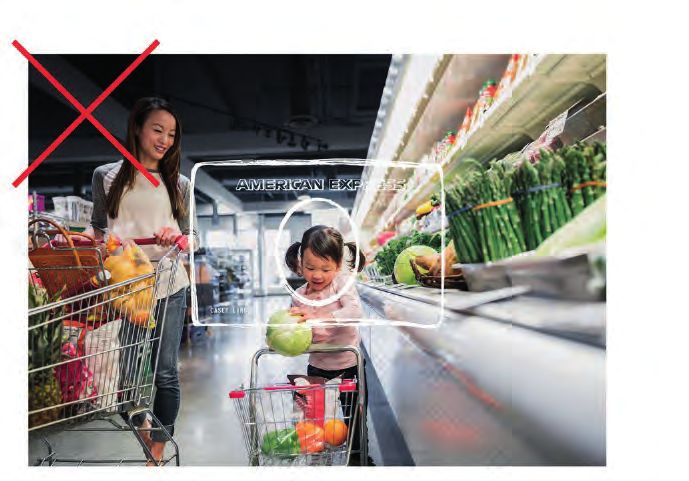
Blue Box logo
                                     The Blue Box logo is the core visual expression of American Express. The logotype may be used in place of the Blue Box logo, where applicable.

                                     The Logo has been drawn to maintain legibility/continuity throughout the visual identity (from small to environmental scales).
                                     Four scale versions have been provided (see below). The logo should not be scaled below the minimum sizes (per scale) found on this page.

                                     The Blue Box Logo can be placed on imagery as long as it maintains maximum legibility.

SCALE SYSTEM                                                                 MINIMUM SIZES                                                             FILE TYPES

The Blue Box logo files have been provided at four scales:                   To ensure proper legibility, the Blue Box logo files should not be        The Blue Box logo assets are available in these file-types:
Small, Regular, Large, and Extra Large (environmental).                      used in sizes smaller than those listed above, right (per scale).

The height of the Blue Box logo determines the scale version                 For small scale applications the “small” logo should never be             print (eps files)
(at right) that should be used.                                              used smaller than a height of .325" or 40 pixels.                         pms coated
                                                                                                                                                       pms uncoated
                                                                                          Minimum height of SMALL scale logo:                          and cmyk (4-color)
               Blue Box logo, Height
                                                                                          .325" or 40 pixels
                                                                                                                                                       Note: B/W files are supplied as well. The B/W files should
                                                                                                                                                       ONLY be used on 1-color, black-only, print applications
In an application, when the Blue Box height is:                                                                                                        (like a black-and-white newspaper ad).
                                                                             Exception: If a Blue Box logo is needed at a height below the
.325 to .45" or 40 to 50 pixels use the small scale
                                                                             minimum above, the Alternate logo may be substituted: from 175”
.45 to 1" or 50 to 110 pixels use the regular scale                                                                                                   digital (svg, png, jpg)
                                                                             or 22 pixels, up to .325” or 40 pixels (minimum above).
                                                                                                                                                      rgb
1 to 4.25" or 110 to 410 pixels use the large scale
4.25" and above or 410 pixels and above use the extra large scale                                                                                     Note: EPS (and InDesign) “Digital Master Files” have been
                                                                                                                                                      provided. These can be used, as needed, to generate any
Note: If the logo’s height is a shared, meeting number                                                                                                alternate SVG, PNG and JPG files.
(e.g. .45", or 1"), please use the larger scale.

Note
The Blue Box logo files, custom drawn (individually for print and then digital) to work at different scales, should never be recreated or modified. To maintain consistency, legibility, and brand integrity,
please use only the files supplied, in their correct type (print versus digital) at their correct scales.
Use only the colors, as specified.
Use of the registration mark is not required on the logo other than:
China: on the bottom right
Cuba, Chile, Costa Rica, El Salvador, Guatemala, Haiti, Honduras, Mexico, Nicaragua, Peru, Zaire: on the bottom left

                                                                                                     ‹    Contents ›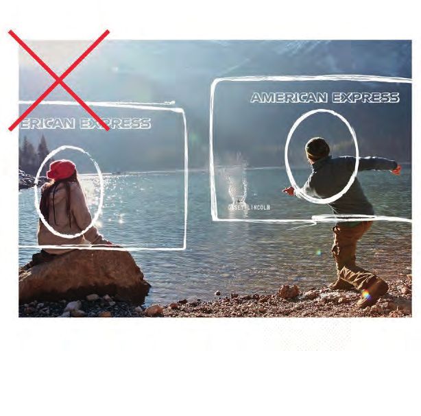
Blue Box logo, Alternate
                                  The Blue Box logo, Alternate was created to make a powerful impression in a small space world. This logo should be reserved for
                                  American Express social media, app use, and mobile contexts where scale is restricted (e.g. mobile banners). It can also be used as an
                                  acceptance mark in small or hard to read spaces.

                                  The Blue Box logo, Alternate is a supporting logo only; research indicates that our audience prefers the “American Express” logo remain
                                  foremost. The Alternate logo should only replace the core Blue Box logo in the small scale, digital environments (noted above) where its
                                  clarity and boldness excels.

                                  The logo has been drawn to maintain legibility/continuity throughout the visual identity (from extra small to regular scales). Three scale versions
                                  have been provided (see right). The logo should not be scaled below the minimum sizes (per scale) found on this page.

SCALE SYSTEM                                                              MINIMUM SIZES                                                        FILE TYPES

The Blue Box logo, Alternate files have been provided at three            To ensure proper legibility, the Blue Box logo files should not be   The Blue Box logo, Alternate assets are available in these file-types:
scales: Extra Small, Small, and Regular.                                  used in sizes smaller than those listed above, right (per scale).

The height of the Blue Box logo determines the scale version              For small scale applications the “extra small” logo should never     digital (svg, png, jpg)
(at right) that should be used.                                           be used smaller than a height of .175” or 22 pixels.                 rgb

                                                                                                                                               Note: EPS (and InDesign) “Digital Master Files” have been provided.
                                                                                    Minimum height of EXTRA SMALL scale logo:                  These can be used, as needed, to generate any alternate SVG, PNG
              Blue Box logo, Alternate,
                                                                                    .175" or 22 pixels                                         and JPG files.
              Height

                                                                          Exception: If a Blue Box logo is needed at a height below the
In an application, when the Blue Box (Alternate) height is:
                                                                          minimum above, the Alternate logo may be substituted:
.175 to .225” or 22 to 32 pixels use the extra small scale                from 175” or 22 pixels, up to .325” or 40 pixels (minimum above).

.225 to .45” or 32 to 50 pixels use the small scale

.45” and above or 50 pixels and above use the regular scale

Note: If the logo’s height is a shared, meeting number
(e.g. .225”, or .45”), please use the larger scale.

Note
The Blue Box logo Alternate files, custom drawn to work at different scales, should never be recreated or modified.
To maintain consistency, legibility, and brand integrity, please use only the files supplied at their correct scales.

                                                                                                  ‹   Contents ›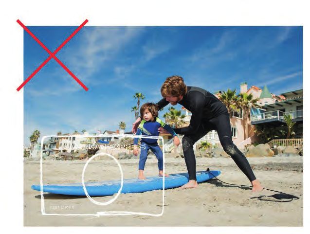
Clearspace
Clearspace around an identity asset is critical in order to separate the asset from other communication elements and ensure clarity and prominence.
The diagrams below show the minimum amount of clearspace space required.

BLUE BOX CLEARSPACE                                                          LOGOTYPE CLEARSPACE                                              CLEARSPACE EXCEPTIONS

Maintain at least 1/3 “X” (where X = height of the Blue Box logo)            Maintain at least 3 “X” (where X = Cap-height of the logotype)   These four exceptions are not bound to the above clearspace rules.
between the logo and any accompanying element.                               between the logotype and any accompanying element.
                                                                                                                                              1. Bleeding the Blue Box off one or more edges.
                                                                                                                                                (Before producing please consult your vendor for advise.)
Clearspace is 1/3 X (X = height of Blue Box)                                 Clearspace is 3X (X = Cap-height of logotype)
                                                                                                                                              2. Digital apps and avatars, etc. where cropping is mandatory.
 1/3   X                              1/3   X
                                                                              3X                                                              3. Emphatic use of the either the logo or logotype
                                                                                                                     X                          (bleeds or tight to edges).

                                                                                                                                              4. “Pattern” logotype cropping (such as on folders or totes, etc.).
                          X                                    X

                                                                              3X

                                                                                                       X

If your Bank logo is appearing next to the blue box, blank space
needs to be equal to 1.5x the size of the Blue Box

                                                         x

                                                                                                                                                                                   App and avatar crops

                                                                                                                                              Blue Box Bleeds
Partner Logo                                             x

 Horizontally centre the Partner logo                    x
 with the American Express Blue Box

                   1.5x           x             x

                                                x equals the height of the
                                                                                                                                              Emphatic Logo or logotype            cropped Logotype
                                                American Express Blue Box

                                                                                                   ‹    Contents ›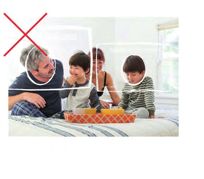
Blue Box do’s and don’ts
Blue Box do’s
                                                                                                                           PARTNER
                                                                                                                             ABC

✓   USE the approved                 ✓   USE contrasting background           ✓      USE the logo over an image        ✓     MAINTAIN the proper clear
    logo artwork                         colors to enhance the contrast              with contrasting background             space around the logo
                                         of the logo

Blue Box don’ts

                                                                              Use your                Card today             PARTNER
                                                                                                                               ABC

✗   DO NOT place the logo on flat    ✗   DO NOT place the logo on             ✗      DO NOT use the Blue Box as        ✗   DO NOT violate the clear space
    blue backgrounds that are too        imagery that compete                        text, for example, as part of a
    close in color to the Blue Box                                                   sentence instead of the words
                                                                                     “American Express”

                                                                    ‹   Contents ›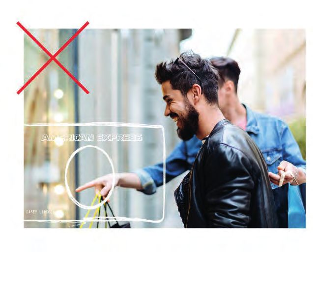
Blue Box lock up with other logos
•   No new logo treatments or lock ups including the Blue Box may be created for any product or service

•   New logos may only be created by American Express

                                                     PARTNER                                                                            PARTNER
                                                       ABC                                                                                ABC

✓     DO Locking up logos with a line in between is acceptable                               ✓      DO Locking up logos without a line in between is also acceptable

                                                     ISSUER LOGO

                                                                            7997

                                           3759 876543 21001
                                        Valid Thru

                                        00/00
                                                             Member since

                                                                    95
                                                                                                                        PARTNER ABC
                                        CARDMEMBER NAME

                                                                                                                      Rewards Program

✗     DO NOT lock up the logo with other logos, with text or with Card art                   ✗      Logos should never be vertically stacked

                                                                                   ‹   Contents ›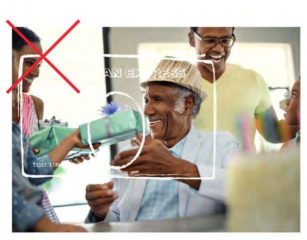
Taglines – Centurion Line & American Express Cobrand-led only

The taglines convey critical brand messaging and should be used whenever possible: promotional, offerings, services, advertising pieces, etc. It need not be a part of
informational and transactional pieces in which the tagline would feel out of place, or overly promotional.
The taglines should not be scaled below the minimum size found on this page. The primary tagline files are horizontal. However, an alternate stacked version can be
used in limited-space applications. The taglines can be placed on imagery as long as they maintain maximum legibility.

SCALE SYSTEM AND MINIMUM SIZES                            ALTERNATE CONFIGURATION                              FILE TYPES                                              LOCK-UPS

The taglines use a single scale version.                  When horizontal space is limited an alternate        The tagline assets are available in these file-types:   When a lock-up (Blue Box and tagline in close
                                                          three-line vertical configuration may be used.                                                               proximity) is preferred, please use the relationships
To ensure proper legibility, the tagline files should
                                                          The single-line configuration is always preferred,   print (eps files)                                       designated here:
not be used in sizes smaller than a .05” or 7 pixels
                                                          when possible.                                       pms coated
Cap-height.
                                                                                                               pms uncoated                                            X                                          1
                                                                                                                                                                                                                      /6 X
(The Cap-height is determined by the height of a                                                               cmyk (4-color)
single line of capital letters.)                                                                               and reverse_white                                                 1
                                                                                                                                                                                     /3 X
The Taglines have no maximum scale limit.
                                                                                                               Note: B/W files are supplied as well.
                                                                                                               The B/W files should ONLY be used on                    X
                                   Cap-height                                                                  1-color, black-only, print applications
                                                                                                                                                                                                       1
                                                                                                                                                                                                           /9 X

                                                                                                               (like a black-and-white newspaper ad).
                                                                                                                                                                                            1
                                                                                                                                                                                                /5 X

                                                                                                               digital (svg, png, jpg)                                 horizontal lock-up
                                       Minimum Size
                                                                                                               rgb
                                       of Taglines:                                                                                                                    Where X = the height of the Blue Box: 1/3 “X”
                                       .05” or 7 pixels                                                        Note: EPS “Digital Master Files” have been              space between “don’t” and the Blue Box; 1/6 “X”
                                       Cap-height                                                              provided. These can be used, as needed,                 cap-height; “don’t” centered to Blue Box.
                                                                                                               to generate any alternate SVG, PNG and
                                                                                                                                                                       alternate lock-up
                                                                                                               JPG files.
                                                                                                                                                                       Where X = the height of the Blue Box: 1/5 “X” space
                                                                                                                                                                       between “Don’t” and the Blue Box; 1/9 “X” Cap-
Note: The tagline files should never be recreated or modified. To maintain consistency and brand integrity, please use only the files supplied.                        height; tagline configuration centered to Blue Box.
Use only the sizes and colors, as specified.

                                                                                                     ‹   Contents ›
Taglines: Don’ts

                                                                            DON’T LIVE LIFE WITHOUT IT
   Don’t – Use a color not from the final core colors                       Don’t – Use a different font

                                                                                            Live Life
   Don’t – Use over an image with a busy background                         Don’t – Use a different font for ‘live life’

                                                                             PARTNER
                          PARTNER                                              ABC
                            ABC

   Don’t – Lock up Issuer logo with tagline horizontally                    Don’t – Lock up Issuer logo with tagline. Maintain clear space
                                                                            around the tagline

                                                           ‹   Contents ›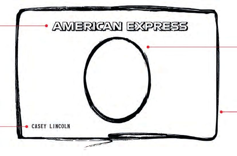
How we LOOK
How we LOOK: dos and don’ts
DO                                                                                                DON’T

✓		 Use the essential elements in all communications.                                             ✗		 Use colors other than the approved brand colors, except in
                                                                                                      photography or illustration. Not applicable for Blue Box Line.
✓		 Be creative with the flexible elements.
                                                                                                  ✗		 Use the tagline in communications that are not promotional.
✓		 Use Card art to enhance Card-specific marketing.
                                                                                                  ✗		 Use script except in the tagline.
✓		 Refer to the Visual Identity Guidelines for details and specifications.
                                                                                                  ✗		 Alter the elements in any way.
✓		 Use only Benton Sans or Guardian fonts for Centurion Line or
     Cobranded American Express-led communications.

For specific rules on how to use these elements, please see Visual Identity Guidelines.

                                                                                          ‹   Contents ›
Photography – for Centurion Line & Cobrand American Express-led
only
Strategic point of view Composition
All content should have a character who is the hero/American Express Photography composition is extremely important in conveying the
Cardmember, surrounded by the Relationship Device. American Express brand messages. Please follow the rules below:
Subject matter subject matter should feel authentic, real, and captured 1. Images should be uncluttered to maximize legibility of advertising
in the middle of a moment. Not overly staged. elements. Consider how the Relationship Device, headline + body copy,
logo lockup will appear.
Scenarios should feel aspirational but attainable.
2. Images should be rich in color. Avoid muted or black and white photography.
Scenarios should feature shared experiences and social moments,
not people alone.* 3. Avoid extreme close-ups which do not have clearspace for the
Relationship Device.
People should represent modern Cardmembers:
• Represent diversity in gender, ethnicity and age
• Avoid stereotypes in age and gender roles
(i.e., women shopping, men in suits, etc)
• Should feature real people of all shapes and sizes.
Note: Vista and locations images are sometimes needed to inspire travel but not typically used by themselves.
*
‹ Contents ›Photography: Do’s
Do – use images with aspirational but Do – use shots with at least two people Do – use images that represent the Do – use shots with subject matter that
attainable subject matter interacting and sharing experiences modern Cardmember (diversity in is authentic, real, and less stereotypical
gender, ethnicity, age, shapes and sizes)
Do – use images that are Do – use images that have a clear Do – use images that are rich in color Do – make the moment the focal point
uncluttered to maximize legibility role for American Express (the (people enjoying a concert rather than
of advertising elements Cardmember is the hero and the the concert itself; people having an
Card/service is the enabler) adventure, rather than a scenic shot of
a city or landscape)
Note: Global photo library is available to access imagery, please ask your American Express representative for details.
‹ Contents ›Photography: Don’ts
Don’t – Use images with a busy background Don’t – Use stereotypical images Don’t – Use images that have artificial filters
Don’t – Show ostentatious subject matter Don’t – Have images with people posing
such as silver service dining and butlers for the camera
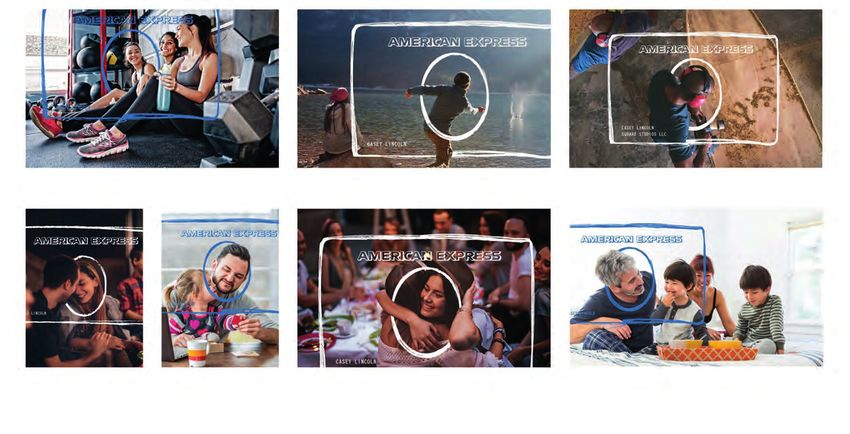
‹ Contents ›Relationship Device – Centurion Line and American Express-led
Cobrands
The Relationship Device (or RD) is a graphic element that is used repeatedly across American Express platform communications. It can only be used once in any
communication. This asset symbolizses the relationship between American Express and Cardmembers, merchants, and business owners.
AMERICAN EXPRESS LOGOTYPE CENTER OVAL
A hand-drawn asset that matches the The customer replaces the Centurion and
expressiveness of the Relationship Device. becomes the hero of the communication.
It should always be fully visible and This strengthens the concept of relationships
never cropped. and American Express putting its customers
first. Oval should be organically integrated
with photo, not stamped on top.
CUSTOMER NAME
OUTER FRAME
Customer and business names are used
to reinforce the individuality of the design. A hand-drawn asset which can be scaled to frame
Names should be customized per execution hero of communication. Brush strokes cannot be
to match the gender and diversity of the altered but multiple expressions are available.
MEAGHAN ELLIS
featured person. Countries to insert regionally Only two sides may be cropped off of a picture.
nuanced customer and/or business names.
BUSINESS NAME MEMBER SINCE
MEAGHAN ELLIS
Business names should be included in SILVERBIRD STORAGE Can be used in Cardmember communications
applicable executions. These should also to reinforce the value of loyalty.
be customized per execution to match
the represented business type. Countries
to insert regionally nuanced customer
and/or business name within the device.
‹ Contents ›Relationship Device: cropping and placement
The Relationship Device is a flexible asset that can be used on a variety of images. It can be placed off-center and cropped as long as the American Express logotype, the
customer name, the oval, and at least two sides remain visible.
CROP RULES
The American Express logotype,
the customer name, the oval, and at
least two sides must remain visible.
INTEGRATING THE RD
The RD should be integrated into
the photographic scene, going over/ Top edge Right edge Centred
around parts of the featured person.
LOGOTYPE RULES
The American Express logotype may
never be cropped; use alternate RD.
Edges Bottom edge Left edge
‹ Contents ›Relationship Device: Don’ts
Don’t – use RDs around someone’s hand or Don’t – use more than one RD in a single Don’t – use RDs around more than one
other body parts; RDs go around people’s piece of creative person’s head in one photo
heads only
Don’t – use RDs around non-human objects Don’t – use RDs around non-human objects Don’t – use RDs around a child
‹ Contents ›7. Card art in marketing
THE CARD IN MARKETING. Card plastic is the most visible touch point of the American Express brand. More than any other form of marketing and communications,
the Card physically connects you to Cardmembers and is a very important expression of both of our brands.
Follow these guidelines when using Card art:
Mock cards
•
Aim to show the full Card. If necessary, show Cards stacked or in partial view Mock cards, also known as faux cards, are either paper or plastic cards that are
– as long as the Blue Box or Centurion on the front is fully visible. typically adhered inside an acquisition direct mail package. To ensure that mock
cards are not mistaken for real Cards, these guidelines must be followed:
• Make sure the words “American Express” within the Blue Box logo are legible
when the Card is reproduced. • Issuer clarity should be maintained on the card front as required in the Card
Design Guidelines (applicable per contractual agreement with partner).
• The Card artwork should not be reduced by more than 50%.
• Either on the face (bottom or side) or on the card back, include “SAMPLE”,
• Position Card artwork in a prominent place in printed materials.
“VOID”, “This is not an actual charge/credit card” or “This is not a valid
•
Use a non-valid account number for security and fraud prevention. charge/credit card”.
• If a name is used on the Card front, make sure you have permission • Do not include a 4 digit CID number, an Expiration Date, a Valid through date
and a release. or a magnetic stripe.
•
Always depict Cards accurately. • A marketing message may be added but only on the back of the card.
Make sure the words “American Express” within the Blue Box logo are
• Avoid making the Card part of another object. legible when the card is reproduced – card artwork should not be reduced
by more than 50%.
• No marketing text or other imagery should be added to Card art.
• Print – or for plastic, can be embossed – “Your Name Here” or “Cardmember
• Do not rotate the Card sideways or display it upside down. Name” in the name field.
• Do not use mirror imaging of the Card in communications. Please note that mock cards should never be used in Centurion or Platinum Card
marketing.
‹ Contents ›Card art: Multiple Centurion Line Cards
When including multiple Centurion Line Card products in communications, order Cards from left to right or top to bottom, ranked by tier.
If Cards are overlapped (which is not preferred), ensure that the Centurion head is visible.
The Gold Charge Card
The Gold Charge Card
✓ If Cards are shown stacked or in partial view keep as much ✓ Rank Cards by tier
of the Card in view. (Centurion head must be visible)
‹ Contents ›Card art: Communications with other brands
Positioning with other portfolio products
To be consistent with our brand positioning, American Express-branded Card products should be marketed as targeted, high value offerings. Wherever possible, they
should stand alone in communications. At a minimum, if American Express products are shown with your card products issued on other networks, American Express
products must be placed so that our premium positioning is highlighted with the differentiated product benefits made prominent.
When Cards are overlapping
✓ Show the full Card on top ISSUER LOGO
7997
3759 876543 21001
Valid Thru Member since
00/00 95
CARDMEMBER NAME
When Cards or logos are in full view
✓ When Cards or Blue Box logos are shown besides competitor products or logos, place American Express logo in a preferred or equal position.
Either to the far left: Either to the far left:
Network logo Network logo
Or to the far right: Or to the far right:
ISSUER LOGO
7997
Network logo Network logo
3759 876543 21001
Valid Thru Member since
00/00 95
CARDMEMBER NAME
Additional rules may apply to specific types of product offerings and may differ by country and by contractual agreement. For additional guidance on dual Cards,
please consult your American Express representative.
‹ Contents ›Card art: Don’ts
✗ DO NOT alter or distort its image in any way ✗ DO NOT add marketing text or imagery to the Card art
ISSUER LOGO ISSUER LOGO
7997 7997
3759 876543 21001 3759 876543 21001
Valid Thru Member since Valid Thru Member since
00/00 95 00/00 95
CARDMEMBER NAME CARDMEMBER NAME
ISSUER LOGO ISSUER LOGO
7997 7997
3759 876543 21001 3759 876543 21001
Valid Thru Member since Valid Thru Member since
00/00 95 00/00 95
CARDMEMBER NAME CARDMEMBER NAME
✗ DO NOT make the Card part of another object/build an object ✗ DO NOT rotate the Card sideways or displaying it upside down
‹ Contents ›How is ATL defined?
Above the Line is classified as all mass media advertising where American Express is visible in the public eye.
These can include but not restricted to:
• TV Commercials
• Videos
• Digital Videos
• Print (in branch, magazines, newspapers, etc)
• Out of Home
• Web banners
• Digital banners
• New AXP Homepages
• New Microsites, New Platform sites, New mobile app, Facebook page launch.
‹ Contents ›At what touchpoints do our marketing materials require review?
All marketing materials must be submitted to your American Express representative for review and approval
per the BOP policy.
Brand Approval is required at the following touchpoints prior to the next stage of creative development:
ATL New Product Launch or N2N* BTL Card Design Exceptions
All ATL besides TVC/Videos 1. Product positioning New plastic (via email) Case by case management based on
1. Campaign communications brief 2. Campaign communications brief 1. Initial design/concept enterprise and Issuer specific policies
2. Concept/creative proposals 3. Initial creative concept 2. Revised Card design
3. Final execution 4. Creative amends 3. Final design approval
5. Final executions
TVC/Videos: Reprints (via email)
1. Communications brief 1. Only if changes or updates
2. Storyboard to existing designs
3. Rough cut
4. Final execution
*N2N (New to Network) is defined as: Account Cards, Dual
‹ Contents ›Reviews
When to submit for review
NEW MATERIALS
You are required to submit materials in their final layout form prior to production. For television commercials or video, please submit the agency’s creative brief for
approval, followed by concepts in storyboard format. Then resubmit rough-cut film format for approval before proceeding to final production.
EXISTING MATERIALS
You are required to resubmit all communications that have been in the marketplace for more than one year for review and approval.
THE PROCESS
Once we receive your materials, we will evaluate them based on brand standards, marketing policies and contractual requirements, Make sure to build extra time
into your schedule to accommodate this review process and potential revisions. Our Service Level Agreement with you for review is 3-5 business days.
We will respond in one of four ways:
STATUS THIS MEANS
Approved as is No changes are required and you may proceed with production.
Approved with comments These comments will be recommendations, not mandatory.
Approved with changes You must make the required changes before proceeding with production and materials need to be re-submitted for review.
Not approved/resubmission You need to address all mandatory comments and resubmit the piece with revisions for an additional review and required
approval before proceeding with production. We will review resubmissions within the contractually agreed-upon review period
(generally 3 business days).
Note: It is not possible to create guidelines for every situation that may occur in marketing communications. For this reason, if a submission runs the risk of doing damage to the brand but does not explicitly violate
a guideline, we may flag the piece for revision.
‹ Contents ›You can also read