Developing a leisure brand that's fit for market - Design ...
←
→
Page content transcription
If your browser does not render page correctly, please read the page content below
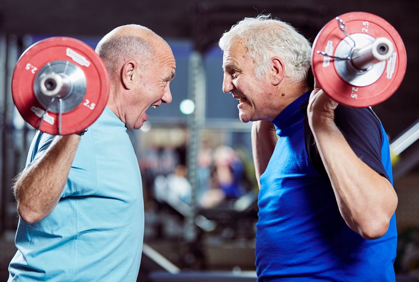
Design Effectiveness Awards
2020 Submission

Design consultancy:
WPA Pinfold

Client company:
Barnsley Premier Leisure

Project:
Developing a leisure brand
that’s fit for market

                                       Developing a
For publication

                                       leisure brand
                                       that’s fit
                                       for market.

                             Before:                   After:

©WPA Pinfold 2020                               wpa-pinfold.co.uk   Page 01 of 12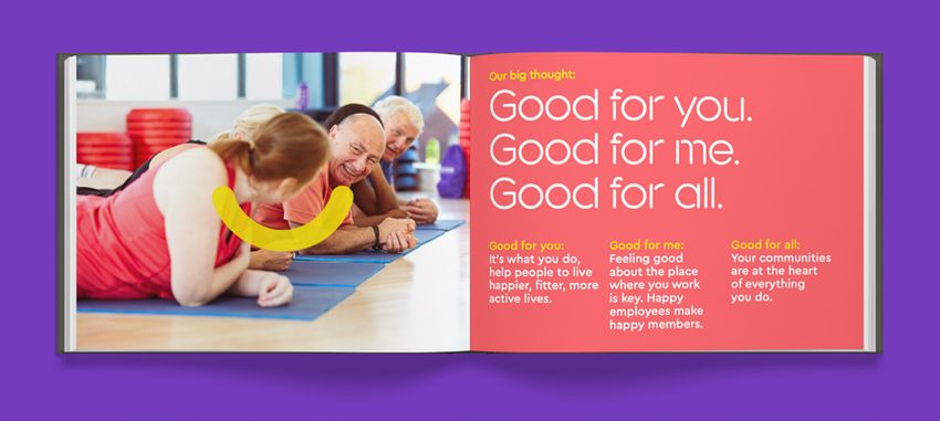
Design Effectiveness Awards
2020 Submission

Design consultancy:
WPA Pinfold

Client company:
Barnsley Premier Leisure

Project:
Developing a leisure brand
that’s fit for market

For publication

Executive summary                                        In addition to this, as out-of-gym fitness equipment
Barnsley Premier Leisure (BPL) are a not-for-profit      improves drastically, and technology continues
social enterprise that provides affordable, value        to evolve, more people are choosing to get fit at
for money health, sport and leisure facilities           home. This provides a true alternative to gym
and activities in South Yorkshire and North              memberships, resulting in the need for a brand
Nottinghamshire; and we were approached by them          which provides a compelling offer to attract,
to rebrand their fitness proposition.                    retain and grow membership.

Their existing fitness offering brand, ‘Fitness Flex’,   We defined the key target audience and developed
was no longer fit for purpose; it did not position       a new brand proposition and positioning,
them uniquely in the market and did not portray the      emphasising the focus on the brands’ local
company core values that they pride themselves           communities, their members and personal fitness
on. The brand image was generic, and the brand           goals, and the not-for-profit nature of the operations.
name gave the wrong connotations of a body
building gym. The brand required revitalisation and      From this positioning we created a connective
repositioning, moving away from the value gym            ‘big thought’ at the centre of the brand, to guide
marketplace and focusing firmly on their purpose,        the creative thinking and give a reason to believe in
to help enrich people’s lives within their community,    the brand’s message – we expressed this externally
through fitness.                                         for customers with a strapline and internally for
                                                         employees with a rally call.
The pressure on BPL’s Fitness Flex brand was
increasing from all angles: Budget gyms have eroded      This thinking communicated the good that the
the price of memberships down to a commodity,            not-for-profit operation did for the community,
competing solely on price. Mid-market gyms are           the good that it did for its employees and
defining their audiences with younger targeted           ultimately the good that exercise and fitness
brands such as JD Gyms entering the market; and          does for your body and mind.
boutique gyms are focusing on enhanced service
levels and customer experience, premiumising the
market for specialist offers.

©WPA Pinfold 2020                                                           wpa-pinfold.co.uk         Page 02 of 12
Design Effectiveness Awards
2020 Submission

Design consultancy:
WPA Pinfold

Client company:
Barnsley Premier Leisure

Project:
Developing a leisure brand
that’s fit for market

For publication

Executive summary                                        – Increased satisfaction and recommendations -
We renamed the gym chain to ‘Your Space’, placing           Increased Net Promoter Score since rebrand
the members at the heart of the brand, making it            from 58%–82%, where BPL had hoped for 69%
your space to do what you want, and your space           – Increased membership - 100% increase on
to feel good. We created a vibrant brand identity,          membership sales based on previous year,
a friendly tone-of-voice and new imagery featuring          Annual sales target reached in first 3 months
real people, rather than models, enjoying getting           (a net gain of 500 members for the first site)
fitter and healthier. The brand identity was supported
                                                         – Increased employee engagement and
by experiential applications, both externally and
                                                            understanding of core values – Staff sickness has
internally.
                                                            decreased from 3.8% to 1.6% and staff retention
                                                            has increased from 65% to 100%.
The result was a totally reinvigorated offering:
                                                         – Brand roll-out – The brand is being rolled out across
– Enriching more people lives - Member usage
                                                            all 10 venues with a total of 4 sites complete to date.
   up by 85%, where target was 50%
                                                            The brand is now planned to embrace aquatics,
– Retaining membership against increased                   bowling and golf.
   competition - Attrition rates at 3.2% (the industry
   standard is 5.5%)

9.7m                          1 in 7                     Retention                          ...clubs need
                                                                                            a sense of
Over 9.7 million fitness
club members in the UK
                              people in the UK
                              are members of a gym
                                                         Clubs lose around 50% of
                                                         their members each year
                                                                                            community and
                                                                                            belonging...
                                                                                            Mintel UK Health and Fitness
                                                                                            Club report

+500                          40%                        Staff                              ...a friendly
                                                                                            environment is
Over 500 low cost
clubs in the UK
                              less likely to leave       Half of UK
                                                         gym members
                                                                                            important for
                              if they have made
                              a friend at the gym        experience staff that              member retention.
                                                         don’t speak to them                Mintel UK Health and Fitness
                                                                                            Club report

©WPA Pinfold 2020                                                                wpa-pinfold.co.uk            Page 03 of 12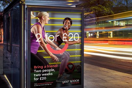
Design Effectiveness Awards
2020 Submission

Design consultancy:
WPA Pinfold

Client company:
Barnsley Premier Leisure

Project:
Developing a leisure brand
that’s fit for market

For publication

Context and overview                                                                                                                                   local communities, meaning the brand needed to
Barnsley Premier Leisure (BPL) are a not-for-profit                                                                                                    reinforce these relationships.
social enterprise that provides affordable, value
                                                                                                                                                       BPL are investing in the refurbishment of their fitness
for money health, sport and leisure facilities
                                                                                                                                                       facilities, ensuring that each gym offers the most
and activities in South Yorkshire and North
                                                                                                                                                       innovative and up-to-date fitness products and
Nottinghamshire. They operate a fitness provision
                                                                                                                                                       services on the market. From unique equipment and
within a diverse portfolio of sports and leisure
                                                                                                                                                       tailored fitness opportunities, BPL wanted their brand
facilities, including multi-use leisure centres and
                                                                                                                                                       to support this investment.
stand-alone health and fitness facilities.
                                                           The key business objectives were:
It was important for BPL that their fitness provision
                                                           – To rename, rebrand and reposition the fitness
was proud of its locality, as their venues at the heart
                                                              provision brand, ‘Fitness Flex’, to a defined
of their communities. Not only for fitness, but also
                                                              audience, reflecting the unique nature of the
swimming, children’s parties, local events, weddings,
                                                              social enterprise aspect of the operation.
functions, and other entertainment, enabling
members of the community to develop strong                 – To increase membership, attendance and to create
relationships with their local leisure venue.                 healthier lives whilst reducing attrition, in order to
                                                              build a sustainable model for the reinvestment of
As a charitable trust, all of their profits are reinvested    profits into new equipment and facilities.
back into their venues and the greater good of the

     Environment
     Environment
  Feel good

                                                                                                                                           Feel good

                                              Feel good factor:                                Feel good factor:
                                             We are a local gym,                            Your goals are our goals.
                                              for local people.
                                                                                                We want to help
                                            There’s always a warm                          you achieve realistic targets
                                           welcome and a real social                        and we’re there with you
                                             atmosphere in which                             every step of the way!
                                             to make new friends.

                                                                                               Feel good factor:
                                               Feel good factor:                             We offer a price for life.
                                                  We are a not
                                              for profit company.                        The price you pay when you join
                                                                                         is the price you pay throughout
                                        We reinvest the money we make                            your membership.
                                            back into our facilities.                              It pays to stay!

                                                                                                  Operated by
                       Price for life

                                                                        Price for life

                                                                                                                          Price for life

                                                                                                a charitable trust

©WPA Pinfold 2020                                                                                                                                                        wpa-pinfold.co.uk         Page 04 of 12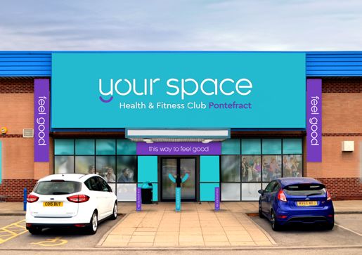
Design Effectiveness Awards
2020 Submission

Design consultancy:
WPA Pinfold

Client company:
Barnsley Premier Leisure

Project:
Developing a leisure brand
that’s fit for market

For publication

The key business objectives continued:                                                  Fitness Flex was positioned in the value-for-money,
–	To create a unique positioning in the market to                                      low to middle market, where competition was
   allow the brand to stand out in a crowded middle                                     increasing. At the low-price end, budget gyms had
   market that is under pressure from both budget                                       made gym memberships a commodity competing on
   gyms and premium boutiques.                                                          price, whilst boutique fitness brands at the premium
– 	To build a brand that both communities and                                          end were picking off the more affluent market
   employees are proud of – which clearly reflects                                      with specific high-end offers. The middle market
   their core values in order for external and internal                                 is dominated by big names such as Virgin, Nuffield
   buy-in and for both to understand the purpose                                        Health and Bannatynes, all with large marketing
   of the brand.                                                                        budgets, whilst new entrants such as JD Gyms
                                                                                        were appealing to a younger demographic.
The Fitness Flex brand was not delivering a unique
positioning in the market, the fitness provision had                                    Another threat was the increased use of technology
some strong USP’s that were not being communicated:                                     such as Fitbits and smart watches, giving consumers
– Not-for-profit                                                                        access to activity data, enhancing the out of gym
                                                                                        exercise experience, with products such as Peloton
– Price for life
                                                                                        allowing exercise at home to become more communal.
– Local community involvement                                                           All of which reduces the need for gym membership.
– Everyone’s welcome

   Marketing communications

                                                                                                                                                                                                                                search your space

                                                                                                                 to feel good    Find your space       Discover your space    Join your space   What’s on in your space     Login to your space

                                                                                                                                                                                                – Timetables
                                                                                                                                                                                                – Classes
                                                                                                                                                                                                – Book a class
                    Your Space                           Your Space                                                                                                                             – Local events
                    @yourspace                           @yourspace
                                                                                                                                                                                                – Fundraising
              Tell us what you do in Your Space?   Tell us what you do in Your Space?                                                                                                           – News
                                  Lorem ipsum
                                  Lorem
              #whatdoyoudoinyourspace   ipsum      #whatdoyoudoinyourspace

                                                                                                   I have a giggle, while I wiggle
                        What do
                       you do in
                                                          Make
                      Your Space?                        friends

                                                                                                    Find your space              Feel good factors                      Price for life!                     What’s on in
                                                                                                    by location                  reasons to join...                     Join now and pay                    your space...
                                                                                                                                 Discover why you                       the same price for                  Fitness class and
                                                                                                                                 should join and how                    the life of your                    pool timetables,
                                                                                                    type in your postcode        it’s your space                        membership!                         fundraising,
                    Your Space                           Your Space                                                              to feel good                           It pays to stay!                    local events
                    @yourspace                           @yourspace                                                                                                                                         and more

              Tell us what you do in Your Space?   Tell us what you do in Your Space?
              #whatdoyoudoinyourspace              #whatdoyoudoinyourspace

©WPA Pinfold 2020                                                                                                               wpa-pinfold.co.uk                                                                                                   Page 05 of 12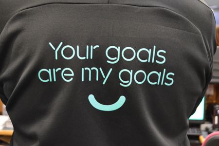
Design Effectiveness Awards
2020 Submission

Design consultancy:
WPA Pinfold

Client company:
Barnsley Premier Leisure

Project:
Developing a leisure brand
that’s fit for market

For publication

The scope of work included:                               created an authentic brand positioning which
–	Planning and strategy – including a brand audit,       differentiated itself from the rest of the market
   market review and insights, consumer analysis (by      place. It was at this stage that we drilled down
   category), competition analysis and benchmarking,      into the purposeful nature of the operation – the
   brand architecture and hierarchy, SWOT analysis,       core values being to enrich peoples’ lives through
   value proposition and positioning, brand mapping,      fitness and health, and the fact that this is an
   new brand thought and new brand proposition.           inclusive environment where everyone is made to
– 	Brand articulation – name generation, brand visual    feel welcome, whilst the profits are reinvested into
   identity, tone of voice, brand world, brand film.      the facilities and the local community. This resulted
                                                          in the strategic idea that the brand would create
– 	Brand activation – brand management guidelines,
                                                          good and be good for its members’ health and the
   brand assets and imagery.
                                                          communities that it operates within.
– 	Brand application – application to external signage
   scheme, interior scheme, uniforms, merchandise,        We identified the core target audiences:
   digital marketing, social media, website, printed      – Aspiring homemakers – Younger families
   marketing and membership cards.                           aged 26–35, income £40k–49k
                                                          – Suburban stability – Mature suburban owners
During the planning and strategic phases, it was             living in mid-range housing, aged 56–65,
critical for us to build a new brand platform that          income £40k–49k

   Brand
   The   icon brand icon
       ‘smile’

©WPA Pinfold 2020                                                            wpa-pinfold.co.uk         Page 06 of 12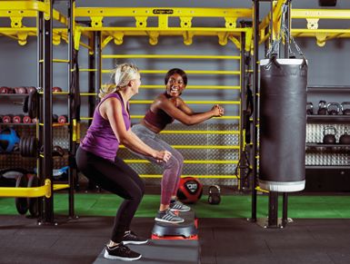
Design Effectiveness Awards
2020 Submission

Design consultancy:
WPA Pinfold

Client company:
Barnsley Premier Leisure

Project:
Developing a leisure brand                                        Target exceeded
that’s fit for market
                                                                  Annual sales target reached
For publication                                                   in first three months.

We developed the brand values:                          The scope included:
Local...                                                The new brand and brand world was
A sense of belonging, membership that means you         completely rebuilt:
are a member in the true sense of the word; that it     – New name
is your fitness facility and run for the benefit of the – Brand identity
whole community.
                                                        – Brand language and tone of voice
Innovative...                                           – Brand iconography
The facilities have the latest equipment, great classes – Signage scheme
and knowledgeable trainers – delivering the best        – Interior scheme including digital signage
service to its members.                                 – Communications
Fun and friendly...                                     – Digital marketing and social media
It is open to all, it is not intimidating, but a place  – Uniforms
to have fun, learn new skills and reach your fitness    – Key visual assets
goals, whatever they may be. Where every member – Motion graphics/brand film.
counts and is a person not a number.

   Tone of voice

                                                                           I have a giggle
                                                                             while I wiggle

       Stress? Let it
      wash over you

     Swimming is a great way to
     reduce stress and unwind.                   Now that’s
                                              something to feel
     If you enjoy swimming, why not             good about
     become a member and reduce
     the cost of your swim sessions.
     Join at: yourspacetofeelgood.com

     Visit yourspacetofeelgood.com for more
     information or chat to us at the gym

©WPA Pinfold 2020                                                                     wpa-pinfold.co.uk   Page 07 of 12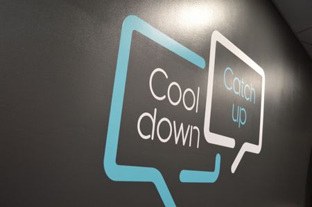
Design Effectiveness Awards
2020 Submission

Design consultancy:
WPA Pinfold

Client company:
Barnsley Premier Leisure

Project:
Developing a leisure brand
that’s fit for market

For publication

To help focus the brand, we developed a
‘big thought’ and an internal ‘rally call’:
–B ig thought:
  Good for you, good for me, good for all

                                                                     560
– Internal rally call:
  Make someone feel good today

The articulation of the brand continued this thinking;               new members
the name suggested the inclusive nature of the
brand, and the visual articulation positioned the new      Improved footfall/
brand as friendly, warm and contemporary.                  attendance

We renamed the gym chain ‘your space’, based on
the fact it should be the members’ space – your

                                                                    90%
space to join in with a class, your space to reach your
goals and your space to relax. We then combined
the name with a tagline ‘to feel good’, resulting in
the communication of the core brand message, your
space to feel good.
                                                           Improvements in
The brand logo was created out of a contemporary           customer experience
friendly lower-case stencil font, with the bottom of
the descending ‘y’ creating a smile. The smile is an
iconic device we then used in the visual language of
the brand, communicating friendliness, enjoyment
and the feel-good factor of fitness. As the brand
was going to be applied across a diverse portfolio
of facilities from standalone gyms, leisure centres,
health clubs and large destination leisure venues, we
adopted a core palette of colours that would give us
flexibility in application.

We also did not want to lose the local aspect of
the venues, so for signage application, we integrated
the place name into the description (e.g. Hoyland          Efficiency/cost benefits
Leisure Centre).

The language of the brand was also a key aspect
in delivering the personality and the idea of
inclusiveness, creating a space where you can be
yourself and not worry about being judged by
others. The clubs are very social with warm and
friendly staff – so we wanted to make sure that the        Rollout of design solution;
way the brand communicates reflected this. Every           uptake of model by other
visitor is different, they all have their own individual   departments
reasons for joining and all have different levels of
fitness ability, so we wanted to communicate in an
inclusive way, that is appropriate to all customers.

©WPA Pinfold 2020                                               wpa-pinfold.co.uk        Page 08 of 12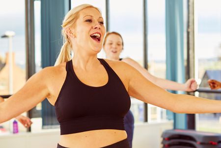
Design Effectiveness Awards
2020 Submission

Design consultancy:
WPA Pinfold

Client company:
Barnsley Premier Leisure

Project:
Developing a leisure brand
that’s fit for market

For publication

We wanted to be positive and passionate; sound
knowledgeable without appearing bossy; sound
fun and friendly, without being silly or over            Tone of voice examples:
familiar; and honest without being blunt. We also
wanted to come across as encouraging without             Zumba class –              Swimming classes –
sounding patronising or fake. Within this tone of        Let’s dance off the 9 to 5 Different strokes for
                                                                                    different folks
voice, we created core brand messages that were          Body combat class –
used in marketing materials, with loud and proud         I have a giggle            Boxing class –
messaging within venues, consisting of super             while I wiggle             I make friends (and then
graphics on the walls of the gym.                                                   punch them!)
                                                         Lane swimming –
                                                         Life in the fast lane (or  Spin class –
The images we used for the brand say as much             just a leisurely swim)     Spin to win
about the brand as the tone of voice does. We
produced a series of images and video clips that
were bright, optimistic, energetic and real. We
wanted to capture the heart of Your Space, sweaty
t-shirts and all. The images show people from all
walks of life, all ages and ethnicities, all abilities
and all levels of fitness. They were shot on location
with bright and natural lighting, using models
selected to reflect real people. All scenarios and
expressions were natural, and not overly posed.
They all have a sense of vitality and life – whether
they’re exercising, chatting or having a cup of
coffee. Your Space is full of life and activity, so we          Increased engagement
wanted to make sure we captured this.                           with internal audiences

The fitness industry landscape
–O  ver 9.7 million fitness members in the UK with a
   market value of £4.9bn, with 1 in 7 people in the

                                                                           +
                                                                               2,560
   UK members of a gym (State of the UK fitness
   industry report 2018)
–O  ver 500 low cost clubs in the UK this is the
   budget end where Fitness Flex was positioned
   (State of the UK fitness industry report 2018)
                                                                Increased patronage
–C  lubs lose around 50% of their members each
   year so it is a viscous circle of recruiting new
   members each year. Members are 40% less likely
   to leave if they have made a friend at the gym.
–H  alf of UK gym members experience staff that
   don’t speak to them
–8  4% of the total UK population live within 2 miles
   of a public gym (State of the UK fitness industry
   report 2018)
– To help clubs retain members an industry report              A sense of pride
   says “clubs need a sense of community and
   belonging that keeps people hooked...”, “a friendly
   environment is important for member retention...”
   (Mintel UK Health and Fitness Club report).

©WPA Pinfold 2020                                                        wpa-pinfold.co.uk          Page 09 of 12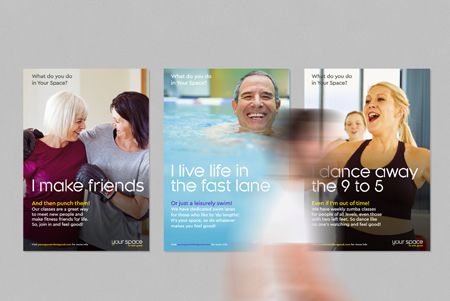
Design Effectiveness Awards
2020 Submission

Design consultancy:
WPA Pinfold

Client company:
Barnsley Premier Leisure

Project:
Developing a leisure brand
that’s fit for market

For publication

                                            “Working with WPA Pinfold was an
                                              extremely enjoyable experience –
                                              they have the ability to understand
Increased awareness/                          your needs by creating a strong
profile, positive shift in                    visual concept. Their professionalism
perception                                    and support throughout the process
                                              was amazing and I would strongly

       200%
                                              recommend them to all businesses.”
                                              Barnsley Premier Leisure

An increase in digital
growth/engagement

Results:                                                  –	The Brand guidelines have helped reduce design
Increase membership and retention - Commercial               time for their internal studio as they have clear
–	Increased retention - Attrition rates at 3.2%,            templates and guidance. The guidelines have also
   previously 4.5% (industry standard 5.5%).                 delivered a clear scheme specification for future
                                                             venue fit outs allowing BPL to procure and tender
–	Increased membership - Annual sales target
                                                             signage contracts, uniform and merchandise
   reached in first three months (net gain 500
                                                             requirements, which allowed then to get best
   members for first site).
                                                             value on agreed specifications, quantities, and
– Secondary spend has seen a 55% increase in sales.          warranty.
–	Increased investment - Following the rebrand,
   with increased confidence in the brand through
                                                          Positioning in the market - Marketing
   member numbers and retention, the profits
   have been reinvested into the facilities with new      –	Price positioning retained against increased price
   equipment, leases on facilities extended, additional      competition from budget sector.
   sites sought with further expansion planned.           –	Change in demographics attracting new members
   Continued roll out of the rebrand from the initial 4      from private hotel gyms for example.
   sites across 10 venues and the stretch of the brand    –	Proof of customer devotion – Member usage up
   to take in aquatics, bowling, golf and retail sales.      by 85% where target was 50%, an increased Net
–	Efficiency savings - with the implementation              Promoter Score since rebrand from 58%–82%.
   of digital screens within the clubs we have            –	Customer satisfaction shown through surveys
   reduced print costs and increased engagement              before and after the rebrand, which shows
   with interactive timetables and personal trainer          great improvement and feedback, including online
   information, marketing resource can now                   reviews of the venues – pre brand this was 79%
   remote access the screens to update real time             and now customer satisfaction is at 95%.
   marketing offers.
                                                          –	Unique website views have seen a 260% increase
                                                             for the same period last year, bounce rates
                                                             have decreased by 15% and online joining sales
                                                             through direct click-throughs on the website have
                                                             increased by 120%.

©WPA Pinfold 2020                                                           wpa-pinfold.co.uk         Page 10 of 12
Design Effectiveness Awards
2020 Submission
Design consultancy:
WPA Pinfold
Client company:
Barnsley Premier Leisure
Project:
Developing a leisure brand
that’s fit for market
For publication
Building a brand to be proud of - Employees
– The employees were taken along the rebrand journey and have a
clear understanding of the core values. They also understand the
importance of their attitude and behaviour in order to communicate
these values to the customer. Employees have a much clearer
definition of their role is within the bigger picture and are now
measured on “how many people they make feel good” which is the
brand’s rally call, as opposed to how many sales they generate
– Working practices, KPI frameworks and internal reward/recognition
schemes have all been brought in line with the new brand values.
– Highest average length of stay as of Sep 2019 was 17 months, as
opposed to Dec 2018 being 10 months.
– Increased volume of job applicants since the rebrand – within 2
weeks of opening they attracted 2 new personal trainers.
Brand guidelines
05
Home
Brand strategy
Our big thought:
Good for you.
Our big thought
Our brand positioning
Our feel good factors
Brand toolkit
Brand voice
Good for me.
Brand showcase
Further info
Good for all.
Brand guidelines
Version 1 – November 2018
10 Logo and usage > Primary logos – colour variations
20 Colour palette > Primary palette
29 Iconography > Our icon style
Home Home Our brand is bright, bold and Home Our icon style takes inspiration
optimistic and we want it to feel from our logo and is sympathetic
Brand strategy Brand strategy inclusive, positive and energetic. Brand strategy to our stencil headline font,
Brand toolkit Brand toolkit So we’ve chosen a colour palette Feel good Feel good Feel good Brand toolkit Kroppen. Icons are created using
that reflects this – colours that a single stroke where possible,
Logo and usage Logo and usage have that feel good factor.
purple coral aqua Logo and usage or a series of single strokes. They
Colour palette Colour palette Colour palette should always be used white and
Fonts Fonts CMYK: Pantone: 266 Pantone: 178 Pantone: 319 Fonts yellow on a dark grey background.
‘Your Spaces’ ‘Your Spaces’ CMYK values should be used in CMYK: 55.70.0.0 CMYK: 0.75.55.0 CMYK: 65.0.20.0 ‘Your Spaces’
printed materials where the four Our icons are practical tools
Iconography Iconography
colour process is used, in either RGB: 117.59.189 RGB: 255.88.93 RGB: 37.201.208 Iconography
that help the customer to quickly
Photography Photography digital or litho print. Hex: 753bbd Hex: ff585d Hex: 25c9d0 Photography identify facilities available and
Templates Templates Templates where things are. They should only
1. White and yellow logo on coral background 2. White and aqua logo on purple background RGB/Hex codes: RAL: 310 40 40 RAL: 030 60 50 RAL: 210 70 35 ever be used in this functional way
Brand voice Brand voice RGB and Hex code values are for Brand voice and never as purely decorational
Brand showcase Brand showcase on-screen use only (e.g. websites, Brand showcase assets.
email templates and PowerPoint
Further info 3. White and purple logo on aqua background 4. Dark grey and coral logo on yellow background Further info Further info
presentations). Over time, additional icons may
need creating – any additional
PANTONE: icons should follow the same
Spot colours should be used when graphic style, stroke weight and
a Pantone match is required. This Feel good Feel good Feel good colours as our existing icons.
could be for litho print or silkscreen Please contact brand support with
print applications such as corporate
yellow light grey dark grey any icon requests.
stationery and merchandise.
Pantone: 108 Pantone: 2332 Pantone: 2336 The following pages show our
Our preference is to use Pantone CMYK: 0.5.100.0 CMYK: 20.20.20.40 CMYK: 60.50.50.40 current range of facility and
spot colour reproduction for large- wayfinding icons.
format print items such as pull-up RGB: 254.219.0 RGB: 140.137.133 RGB: 78.75.72
banners, presentation boards etc. Hex: fedb00 Hex: 8c8985 Hex: 4e4b48
Where this is not possible, specify
CMYK values. RAL: 085 80 80 RAL: 100 50 00 RAL: 100 25 00
RAL:
RAL codes are for paint
applications. *These colours are shown in CMYK
24 Fonts > Headline font
35 Photography > Our style 41 Templates > Statutory notices
Home Our headline font is Kroppen Round. Kroppen Round Regular specimen Home Home There are a number of statutory
It is a stencil font to reflect the Your notices that are required to
Brand strategy Space identity. Brand strategy Brand strategy communicate day-to-day
I have a giggle Out of
Brand toolkit Brand toolkit Brand toolkit information to members e.g. when
It has a lot of character and feels fun a piece of equipment is out of
Logo and usage and friendly in appearance. Instantly Logo and usage Logo and usage order or a class has flashing
Colour palette recognisable and memorable. Colour palette Colour palette lights, etc. Headline set in
Kroppen
Fonts Fonts Fonts
‘Your Spaces’ Because it has such personality, ‘Your Spaces’ ‘Your Spaces’ Tone of voice is vital here.
while I wiggle action
it should be used sparingly in Although a notice is a functional
Iconography Iconography Iconography
headlines, titles and primary piece of information, it needs
Photography applications like signage and Photography Photography to be engaging and take on
Templates wayfinding. Templates Templates our brand voice. See page 41
for details.
Brand voice Attention to detail is critical with any Brand voice Brand voice
Brand showcase typography. These are some general Brand showcase Brand showcase We have a number of templates
guidelines. available for use. However, if a
Further info
Character spacing
Further info Further info new sign is needed, consult with
the marketing team and follow
Sub header in Cera (but we’re on it...)
Toilets. Exit. Cycle.
Kroppen should be set using optical these guidelines when producing
character spacing of 0. your notice.
Leading Smile device
Members. Studio.
We prefer the leading to be 10% set at 1/3rd of
greater than the size of the lettering, the page width
ie 50pt/55pt leading, 70pt/77pt
leading.
Arrangement
Typography should always appear in
ragged type. The alignment can be
flush-left, or centered on occasion.
Never use justified text.
abcdefghijklmnopqrstuvwxyz
White space
Give the text and images room to
1234567890±!@£$%^&*()_+,./`~ 1 2 3 4
breathe. Use white space to make Logo should sit
the layout relaxed, informal and bottom right
inviting to read.
©WPA Pinfold 2020 wpa-pinfold.co.uk Page 11 of 12Design Effectiveness Awards
2020 Submission
Design consultancy:
WPA Pinfold
Client company:
Barnsley Premier Leisure
Project: Social media
Developing a leisure brand Posts in support of the new brand rollout and focused around
that’s fit for market core brand values and behaviours.
For publication
“It’s an amazing gym with
amazing staff. You can train
in a friendly atmosphere with
Launch date: First
high tech equipment without
venue rebranded breaking the bank. It’s my
January 2019 favourite place to visit!”
#nowthatssomethingtofeelgoodabout
@yourspacegyms
38% Increase of likes
on social media
“Friendliest gym I’ve ever
joined – made some lifelong
friends here thanks to the
social side and friendly
atmosphere”
6.9% Increase in
daily engagement
#nowthatssomethingtofeelgoodabout
@yourspacegyms
26.1% Increase in social Your Space Pontefract: Your Space Pontefract:
media reach Members give their feedback Feeling good about being finalists
on the new brand at the UK Active Awards
©WPA Pinfold 2020 wpa-pinfold.co.uk Page 12 of 12You can also read


