Einführung zu Twitter Bootstrap - Nutzung in Contao 3.1 Eine Präsentation von Johannes Pichler (webpixels) Klaus Gansberger (webplus) - Die ...
←
→
Page content transcription
If your browser does not render page correctly, please read the page content below

Einführung zu
Twitter Bootstrap
    & Nutzung in Contao 3.1

        Eine Präsentation von
     Johannes Pichler (webpixels)
                  &
     Klaus Gansberger (webplus)
Agenda
•   Was ist Twitter Bootstrap

•   Was kann Twitter Bootstrap

•   Wie nutze ich es in Contao

•   one more thing...
Was ist Twitter Bootstrap ?
Was ist Twitter Bootstrap ?

• CSS   Framework
• Erstellt   und gestaltet von Twitter
• Zusammenspiel        von CSS, HTML, JAVASCRIPT für:
 Typographie, Forms, Buttons, Tables, Grid, Navigation und vieles mehr...
Was kann es ?
Video: http://youtu.be/S1xvdtKlRKg
Warum Twitter Bootstrap ?
Warum Twitter Bootstrap ?

•   Einfach in der Nutzung          •   Beinhaltet RD (responsive design)

•   Schnelle Webentwicklung         •   Gutes Zusammenspiel mit anderen
                                        Bibliotheken (jQuery, LESS, ...)
•   Viele, viele Seiten nutzen es
                                    •   Es ist GRATIS (Apache 2.0 Lizenz)
•   Konsistenz mit den gängigen
    Browsern
Stärken von Twitter Bootstrap
Javascript
Komponenten Plugins
Dazu später mehr...Browser-Unterstützung
Browser-Unterstützung
                           Firefox
Apple Safari                                    Opera

                                     Internet
                                     Explorer
           Google Chrome
                                                  ....
Browser-Unterstützung OS Browser Version Unterstützt Apple OS X Firefox ab v. 5 ja Apple OS X Google Chrome ab v. 14 ja Apple OS X Safari ab v. 5 ja Apple OS X Opera ab v. 11 ja Windows Internet Explorer ab v. 7 ja Windows Google Chrome ab v. 14 ja Windows Firefox ab v. 5 ja Windows Opera ab v. 11 ja
Was beinhaltet es
Was beinhaltet es
 Scaffolding              Base CSS
                 •Styles für typische Elemente
 •Reset CSS
                    •Tabellen
 •Grid
                    •Formularfelder
 •Layout
                    •Schaltflächen ...

Komponenten        Javascript Plugins

  •Navbar               •Tooltips
  •Alerts               •Popovers
  •Tabs                 •Modals
  •Buttons ...
HTML CSS JAVASCRIPT
Scaffolding
„Bootstrap is built on responsive 12-column grids, layouts, and components“RESET Typography and links Bootstrap sets basic global display, typography, and link styles. Specifically, we: • Remove margin on the body • Set background-color: white; on the body • Use the @baseFontFamily, @baseFontSize, and @baseLineHeight attributes as our typographic base • Set the global link color via @linkColor and apply link underlines only on :hover These styles can be found within scaffolding.less. Reset via Normalize With Bootstrap 2, the old reset block has been dropped in favor of Normalize.css, a project by Nicolas Gallagher and Jonathan Neal that also powers the HTML5 Boilerplate. While we use much of Normalize within our reset.less, we have removed some elements specifically for Bootstrap.
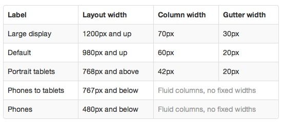
GRID
            12 Spalten für 940px

                 Std. ohne RD

                      Mit RD
                  (zusätzl. Stylesheet)

         With the responsive CSS file added, the
       grid adapts to be 724px and 1170px wide
       depending on your viewport. Below 767px
        viewports, the columns become fluid and
                     stack vertically
GRID - offset
Move columns to the right
offset using .offset* classes.
offset offset Each class increases the left
margin of a column by a
offset
whole column.
For example, .offset2
moves .span3 over two
columns.GRID - nested columns
To nest your content with
the default grid, add a
new .row and set of .span*
columns within an
existing .span* column.
Nested rows should include
a set of columns that add
up to the number of
columns of its parent.GRID - fluid
Make any row "fluid" by
changing .row to .row-fluid.
The column classes stay the
exact same, making it easy
to flip between fixed and
fluid grids.
Offsetting is the same as
with non-fluid gridRD - responsive design
About responsive Bootstrap
Supported devices
Media queries allow for custom CSS based on a Bootstrap supports a handful of media queries in
number of conditions—ratios, widths, display a single file to help make your projects more
type, etc—but usually focuses around min- appropriate on different devices and screen
width and max-width. resolutions. Here's what's included:
• Modify the width of column in our grid
• Stack elements instead of float wherever
necessary
• Resize headings and text to be more
appropriate for devices
Use media queries responsibly and only as a start
to your mobile audiences. For larger projects, do
consider dedicated code bases and not layers of
media queries.RD - responsive design Responsive utility classes For faster mobile-friendly development, use these utility classes for showing and hiding content by device. Below is a table of the available classes and their effect on a given media query layout (labeled by device).
CSS
Base CSS
„Fundamental HTML elements styled and enhanced with extensible classes“Base CSS betrifft • Typographie • Buttons • Code • Images • Forms • Icons
Typographie
Typographie
Headings                  Lead body copy

                         Alignment classes
Typographie Emphasis classes Addresses
Tabellen
Tabellen
Tabellen
Tabellen
Schaltflächen
Schaltflächen

         button

          button

         button
Schaltflächen
Schaltflächen
Bilder
Bilder
Icons
Icons
Icons

So einfach geht‘s...
Icons - Anwendungsfall
HTML CSS JAVASCRIPT
Komponenten
„Dozens of reusable components built to provide navigation, alerts, popovers, and more“Komponenten beinhaltet • Dropdowns • Pagination • Breadcrumbs • Button groups • Labels & badges • Progress bar • Button dowpdowns • Typography • Media Objects • Navs • Thumbnails • Navbars • Alerts
Ausgewählte Komponenten
     kurz vorgestellt
Dropdowns
Button groups
Button dropdowns -1
Button dropdowns -11
Navbar - BASIC
Navbar - FIXED TOP

    bleibt beim Scrollen
Navbar - STATIC TOP verschwindet beim Scrollen
Navbar - FIXED BOTTOM

      bleibt beim Scrollen
Navbar - RESPONSIVE
Navbar - RESPONSIVE
Lables & Badges

Labels           Badges
Progress bars
JAVASCRIPT

                     Javascript Plugins
„Bring Bootstrap's components to life - now with 13 custom jQuery plugins“
Bootstrap setzt auf jQuery
nicht mootools :-)Verfügbare JS Plugins • Transitions bootstrap-transition.js • Tooltips bootstrap-tooltip.js • Modals bootstrap-modal.js • Popovers bootstrap-popover.js • Dropdowns bootstrap-dropdown.js • Alert messages bootstrap-alert.js • ScrollSpy bootstrap-scrollspy.js • Buttons bootstrap-button.js • Togglable tabs bootstrap-tab.js • Collapse bootstrap-collapse.js • Carousel bootstrap-carousel.js • Typeahead bootstrap-typeahead.js • Affix bootstrap-affix.js
All in one

    bootstrap.js
           bzw.

 bootstrap.min.js

individuell anpassbar
      (kommt später....)
Keine JS Programmierkenntnisse erforderlich
JS Plugins werden via data-Attribute gesteuert
Popover on topBeispiel: popover TOP
Interaktion auch via jQuery möglich

               z.B. popover:

   $('#element').popover('hide')
   $('#element').popover('toggle')
   $('#element').popover('destroy')
Wo bekomme ich es
http://twitter.github.io/bootstrap/
2 Möglichkeiten

1. Direkt herungerladen
2. Angepasste Version erstellen (BESSER)
Seiten-Layout
ENDE ... oder ?
one more thing...
einfaches gridden...
Wir haben für euch eine kleines Modul gemacht

      Artikel GRID
Artikel GRID
Im Artikel:

• Spalten zuweisen
• Offsets zuweisen
• Umbruch definieren
Im Modul Artikel:

• Visuelles Feedback in Artikelliste
• Farbliche Zuordnung zu
  Layoutbereichen
Im Frontend-Modul Wahlweise:

• Contao core Grid
• Twitter Bootstrap grid FIXED
• Twitter Bootstrap grid FLUID
Ab heute zum Download bereit auf www.contao-austria.at

             Ihr könnt es testen und ein Feedback geben...
Viel Vergnügen und DANKE für die Aufmerksamkeit
one very last thing...
Heute Vormittag Rückmeldung bekommen, RS will ein Contao Modul
Modul für Contao

•   Exklusives Demo für Contao

•   Kein Demo-Antrag erforderlich

•   Keine Domainbeschränkung

•   Preroll + Zeichenbeschränkung (Demo)

•   37 Sprachen (Demo weniger)
Jetzt wirklich: ENDE
Präsentation kann auf www.contao-austria.at heruntergeladen werden

             Video unter http://youtu.be/S1xvdtKlRKg
You can also read


