Exploring the Role of Complexity, Content and Individual Differences in Aesthetic Reactions to Semi-Abstract Art Photographs
←
→
Page content transcription
If your browser does not render page correctly, please read the page content below
Art & Perception 8 (2020) 89–119

         Exploring the Role of Complexity, Content and
      Individual Differences in Aesthetic Reactions to Semi-
                    Abstract Art Photographs

  Nathalie Vissers1,*, Pieter Moors1, Dominique Genin2 and Johan Wagemans1
  1
   Laboratory of Experimental Psychology, Department of Brain and Cognition, KU Leuven
                              (University of Leuven), Belgium
                    2
                      SLAC, Academy for Visual Arts, Leuven, Belgium
                       Received 20 July 2019; accepted 7 January 2020

Abstract
Artistic photography is an interesting, but often overlooked, medium within the field of empirical
aesthetics. Grounded in an art–science collaboration with art photographer Dominique Genin, this
project focused on the relationship between the complexity of a photograph and its aesthetic appeal
(beauty, pleasantness, interest). An artistic series of 24 semi-abstract photographs that play with
multiple layers, recognisability vs unrecognizability and complexity was specifically created and se-
lected for the project. A large-scale online study with a broad range of individuals (n = 453, varying
in age, gender and art expertise) was set up. Exploratory data-driven analyses revealed two clusters
of individuals, who responded differently to the photographs. Despite the semi-abstract nature of the
photographs, differences seemed to be driven more consistently by the ‘content’ of the photograph
than by its complexity levels. No consistent differences were found between clusters in age, gender
or art expertise. Together, these results highlight the importance of exploratory, data-driven work
in empirical aesthetics to complement and nuance findings from hypotheses-driven studies, as they
allow to go further than a priori assumptions, to explore underlying clusters of participants with dif-
ferent response patterns, and to point towards new venues for future research. Data and code for the
analyses reported in this article can be found at https://osf.io/2fws6/.

Keywords
Art photography, empirical aesthetics, semi-abstract, complexity, individual differences, content,
beauty, interest, pleasure

 *To whom correspondence should be addressed. E-mail:nathalie.vissers@kuleuven.be

© Koninklijke Brill NV, Leiden, 2020                                      DOI: 10.1163/22134913-20191139

                                           Downloaded from Brill.com03/17/2020 03:17:46PM by johan.wagemans@psy.kuleuven.be
                                                                                                           via Dr Wagemans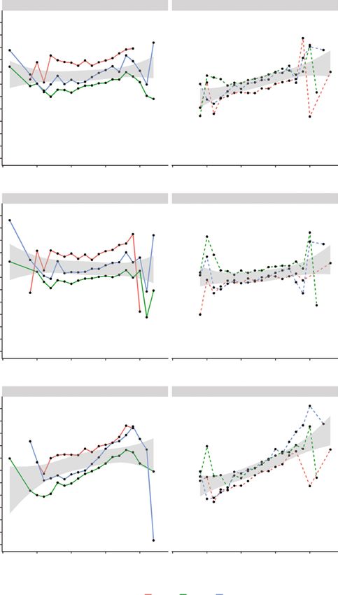
90 N. Vissers et al. / Art & Perception 8 (2020) 89–119
1. Introduction
Photography is the easiest thing in the world if one is willing to accept pictures
that are flaccid, limp, bland, banal, indiscriminately informative, and pointless.
But if one insists in a photograph that is both complex and vigorous it is almost
impossible. – John Szarkowski, former director of photography New York’s
Museum of Modern Art (n.d.)
[…]and what we’re all trying to do is to create a layered, deep, complex, com-
plicated photograph that doesn’t look complex or complicated[…] – Sam Abell,
photographer at National Geographic (Braun, 2008)
Two ideas stand out from the introductory quotes above: First, it is not always
easy to make a captivating photograph. Second, the complexity of a photo-
graph seems to play an important role in its aesthetic appeal. What is not clear,
however, is the exact nature of this relationship. Where can we find the edge
where vigorousness and complexity co-exist, where a layered and complex
photograph does not look (too) complex?
This is a relevant question to anyone making photographs, but also to re-
searchers in empirical aesthetics — longing to understand what determines
our aesthetic reactions to visual stimuli. A collaboration between a photogra-
pher and researcher could therefore be an ideal playground for these questions
about complexity, photography and aesthetics. What you are reading is the
result of exactly such an artist–scientist collaboration. Concretely, we studied
the nature between complexity (see Note 1) and aesthetic appeal in a set of
art photographs with the following aims: (1) to shed new light on our aes-
thetic reactions to art photographs, (2) to focus on the role of complexity in
the p hotographs — a feature often linked to aesthetics, and (3) to engage in a
science–art collaboration that is meaningful for both artist and scientist. Be-
low, we shortly introduce these three aspects, after which we will outline the
approach for our current study.
1.1. Aesthetic Reactions to Photography
At this point, there is limited psychological knowledge on our aesthetic re-
actions to (artistic) photography (Jacobsen and Beudt, 2017; McManus and
Stöver, 2014). Within the domain of empirical aesthetics, the only review spe-
cifically focusing on photography and aesthetics (as far as we know) concludes
with the statement: “Surprisingly little effort has been put into a scientific
understanding of photographs and photography, be those effects perceptual or
aesthetic” (McManus and Stöver, 2014, p. 271). Still, we are currently living
in a world where we encounter a flood of photographs with aesthetic inten-
tion on a daily basis, where the debate on photography as a valid form of art
Downloaded from Brill.com03/17/2020 03:17:46PM by johan.wagemans@psy.kuleuven.be
via Dr Wagemans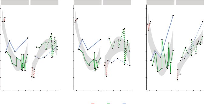
N. Vissers et al. / Art & Perception 8 (2020) 89–119 91
is well behind us, and where we are experiencing a rise of art photography
works b eing sold for exuberant prices (e.g., Andreas Gursky’s ‘Rhein II’ was
purchased for 4.3 million dollars during an auction at Christie’s New York
in 2011). It is therefore high time to introduce art photography into the field
of empirical aesthetics, and empirical aesthetics into the field of art photog-
raphy to get more insight into what determines our aesthetic impressions of
photographs.
Overall, the field is only beginning to emerge (see McManus and Stöver,
2014 for an overview), but some studies have tried to find underlying dimen-
sions of — and individual differences in — people’s judgements of photographs
(Axelsson, 2007a, b), focused on the role of image quality c haracteristics such
as sharpness or contrast (Tinio et al., 2011), the centre of mass of a photograph
(McManus et al., 2011) or automatic vs controlled processing of art photo-
graphs (Foytik et al., 2013).
Some of these studies hint towards an important role of (perceived) stim-
ulus complexity in people’s preferences for (artistic) photographs. For ex-
ample, Axelsson (2007a) was inspired by a framework of Eckblad (1981) on
mental representations — or schemes — and how assimilation resistance (the
resistance of new input into existing schemes) is associated with certain emo-
tions. In particular, a combination of stimulus complexity and the person’s
information processing abilities will result in a certain type of emotional re-
sponse. For example, as schemes are developed and a certain type of input
(e.g., photographs) is mastered, predictive schemes are formed and previously
encountered photographs become familiar. As this happens, people will start
to appreciate a higher level of assimilation resistance. Moderate resistance, in
this framework, would lead to pleasantness, too high assimilation resistance to
unpleasantness, and interest would be somewhere in between (above moderate
degree of resistance). Building on this framework to study individual differenc-
es in preferences to photographs, Axelsson (2007a) hypothesizes that experts
in photography — who should have a superior ability to process photographic
information, thanks to better developed predictive schemes for photographs —
should prefer relatively more uncertain (e.g., complex, ambiguous, full of
contradictions) and unfamiliar photographs than novices. In line with this,
Axelsson (2007a) found that experts preferred photographs that were more un-
certain, dynamic, unfamiliar and expressive, whereas novices preferred more
familiar, certain, possibly static, and hedonic or pleasant photographs. Simi-
larly, Foytik and colleagues (2013) found that their participants (undergraduate
students and mainly photography novices) gave higher preference ratings to
photographs that were perceived to be more familiar and easy to process.
These studies provide some first ideas regarding the relationship between
complexity and aesthetic preferences for artistic photographs, and possible
individual differences in the relationship. However, they rely on relatively few
Downloaded from Brill.com03/17/2020 03:17:46PM by johan.wagemans@psy.kuleuven.be
via Dr Wagemans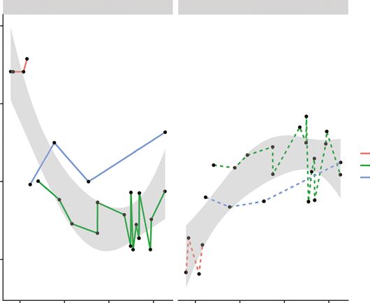
92 N. Vissers et al. / Art & Perception 8 (2020) 89–119
participants (45 undergraduates in Foytik et al., 2013 and 10 novices and 5
professionals in Axelsson, 2007a), who had to fill out many ratings for each
photograph (27 semantic differentials), and results are obtained from sum-
marising over these ratings based on principal components analyses, as well
as summarizing over a wide range of photography types (e.g., from cat pho-
tographs or Stockholm cityscapes to iconic art photographs). Moreover, the
studies above focus mainly on linear relationships, whereas the relationship
between complexity and aesthetic preference might be better explained by a
curvilinear pattern (as outlined in the next paragraph).
Overall, we can conclude that there are some first ideas regarding the
role of complexity and aesthetic appreciation of photographs, but research
on this specific, possibly non-linear relationship with a larger and more di-
verse group of participants has been lacking. This might be surprising, given
that complexity is a central concept within the larger field of empirical aes-
thetics (overview in the next paragraph) and — as the introductory quotes
illustrate — is also an ecologically valid feature within the photography world
itself. Moreover, the field of machine learning — inspired by the concept of
complexity within empirical aesthetics — has already successfully introduced
complexity features in their algorithms to predict human aesthetic preferences
of large user-based photography databases (Romero et al., 2012; Sun et al.,
2015). However, these algorithms were built for possible future applications,
such as browsers that take into account aesthetic preferences, and are not
primarily out of interest in the nature of this relationship or in demonstrating
“the existence of universal aesthetic principles or rules” (Romero et al., 2012,
p. 126).
Therefore, specifically focusing on the relationship between complexity
and aesthetics in artistic photographs could be an important step to bridge the
gap between the fields of artistic photography and empirical aesthetics.
1.2. Complexity and Empirical Aesthetics
Trying to grasp concepts like beauty and our aesthetic reactions to art is not
a new trend, but has existed already since philosophers in ancient Greece.
With Fechner’s ‘Vorschule der Aesthetik’ (Fechner, 1876), a field of empiri-
cal aesthetics was born, where researchers were trying to understand these
philosophical principles in a controlled and empirical fashion. Complexity has
popped up as a possible predictor of aesthetic experience already early on in
this field. Both Birkhoff (1932) and Eysenck (1941) tried to formulate the role
of complexity and order on people’s aesthetic evaluations, but it was not until
Berlyne (1971) introduced his psychobiological framework that “the study of
complexity’s influence on the appreciation of beauty was based on firm psy-
chological and neurological grounds” (Nadal et al., 2010, p. 174).
Downloaded from Brill.com03/17/2020 03:17:46PM by johan.wagemans@psy.kuleuven.be
via Dr WagemansN. Vissers et al. / Art & Perception 8 (2020) 89–119 93
Berlyne’s psychobiological framework relates arousal to hedonic value,
postulating that an intermediate level of arousal will result in the highest he-
donic value. As a result, our aesthetic appreciation of a work of art will also
be highest if it induces an intermediate level of arousal in the viewer. Several
collative properties of an artwork can induce arousal (e.g., novelty, complex-
ity, uncertainty, conflict) of which complexity is an important one. Following
from these ideas, Berlyne’s theory suggests that the relationship between com-
plexity and hedonic value will describe an inverted U-curve, where interme-
diate levels of complexity will be liked best; too little is boring, too much is
overwhelming. Many researchers have since followed in Berlyne’s footsteps,
trying to predict people’s aesthetic reactions from the complexity levels of
many different stimuli, ranging from computer-generated patterns (Güçlütürk
et al., 2016), to snowflakes (Adkins and Norman, 2016), music (Gordon and
Gridley, 2013), architecture (Imamoglu, 2000), and abstract paintings (Kru-
pinski and Locher, 1988). However, the results of these studies have diverged:
whereas some successfully reproduced the hypothesized inverted U-curve,
others have also found positive and negative linear relationships or even U-
curve relationships (see Nadal et al., 2010 for an empirical study trying to
understand these divergences and Van Geert and Wagemans, in press a, for a
recent review of the literature on order, complexity and aesthetic preference).
Thus, the relationship between complexity and aesthetics seems to be com-
plex itself. Some have put forward the differences in type of stimuli and opera-
tionalization of the involved factors (stimuli and complexity concept — Nadal
et al., 2010; conceptualization of liking — Marin et al., 2016), whereas others
have focused on the data analytical strategies as possible causes of the diver-
gence (e.g., Güçlütürk et al., 2016).
1.2.1. Conceptualization of Aesthetic Response: Beauty, Pleasure and
Interest
Depending on the type of aesthetic response, different relationships between
complexity and aesthetics could be found. When comparing underlying di-
mensions of complexity, interest and pleasingness ratings, Berlyne and his
colleagues found that both complexity and interest have two underlying di-
mensions, and both interest dimensions correlated highly to the complexity
dimensions (labelled ‘information content’ and ‘unitariness vs. articulation
into easily recognisable parts’). Pleasingness, however, had three underlying
dimensions, of which only one dimension correlated highly to a complexity
dimension (to the ‘information content’ component), the second did relate to
the second interest component, and the third component was more difficult to
interpret (but was labelled ‘meaningfulness’ or ‘associative value’, for it seems
to separate more familiar and less familiar objects) (Berlyne et al., 1968). Oth-
ers have also found an intricate relationship between complexity and interest.
Downloaded from Brill.com03/17/2020 03:17:46PM by johan.wagemans@psy.kuleuven.be
via Dr Wagemans94 N. Vissers et al. / Art & Perception 8 (2020) 89–119
Silvia (2005) showed that interest can be predicted by the appraisals of com-
plexity and ability to understand the image. Muth et al. (2015) found that the
perceived degree of ambiguity related positively to different aesthetic respons-
es (liking, interest, and strength of affect), but the largest effect was found for
interest.
Studies and theories focusing on the importance of complexity and ambigu-
ity in predicting aesthetic response have been contrasted to theories that focus
on processing fluency as an overarching predictor (comprising aspects such
as good Gestalt, symmetry, etc.) for aesthetic pleasure (Reber et al., 2004).
To account for these contrasts in predicting aesthetic outcome (complex
images vs. fluent images predicting aesthetics), Graf and Landwehr (2015,
2017) proposed a dual-process perspective on fluency-based aesthetics. They
hypothesized that processing fluency and processing style (automatic and de-
liberate) interact to determine different aesthetic responses. Automatically
processed images that are processed fluently would result in aesthetic plea-
sure, whereas images that are less fluently processed would — through delib-
erate processing, and reducing the disfluency — result in interest responses.
Others have put forward similar ideas, but focusing on the distinction between
beauty and pleasure, emphasizing that processing fluency could lead to mild
aesthetic pleasure (‘pretty’), but it cannot explain more intense aesthetic feel-
ings related to novel stimuli (‘beauty’). They relate this to prevention goals
and promotion goals, respectively (Armstrong and Detweiler-Bedell, 2008).
Finally, an empirical study focusing on the relationship between complexity
and different types of aesthetic response (Marin et al., 2016) also found dif-
ferences in the relationships. For example, in a set of paintings, they found
that — after controlling for familiarity — the relationship between complexity
and beauty was significantly positive, whereas for pleasantness it was weakly
negative, and it was not present for liking (Marin et al., 2016). In sum, these
results highlight the importance of approaching aesthetic response as a multi-
dimensional concept, taking into account that complexity might have different
relationships with different aesthetic dimensions.
1.2.2. Data Analytic Strategy: Averaging and Individual Differences
Beside this conceptual factor, there is also a data-analytical factor that might
explain the inconsistent findings, namely the aggregation of individual data
that exhibits qualitatively different patterns. Specifically, the average relation-
ship between complexity and preference does not necessarily accurately re-
flect the relationship for all individuals (Estes, 1956). Comparing participants’
individual judgments of novel graphic patterns, Jacobsen and Höfel (2002)
found large individual differences. Different participants considered different
sometimes even opposing – elements to contribute to beauty. As a result, when
they compared group and individual models, the group model that averaged
Downloaded from Brill.com03/17/2020 03:17:46PM by johan.wagemans@psy.kuleuven.be
via Dr WagemansN. Vissers et al. / Art & Perception 8 (2020) 89–119 95
over participants’ beauty ratings could not accurately describe their data. In
fact, it could only account for around half of their participants.
Similarly, Güçlütürk and colleagues (2016) warn against the use of across-
participant analyses in psycho-aesthetics. Choosing Berlyne’s inverted
U-curve between complexity and liking as an example — and making use of
computer-generated geometrical patterns — they put forward cluster analyses
as an alternative way to explore the patterns in the data. Using the traditional
across-participant analyses, Berlyne’s proposed inverted U-curve was found.
However, a data-driven cluster approach of participants’ ratings showed that
this inverted U-curve could be decomposed into two groups of participants
that showed opposite patterns. The largest cluster (20 out of 30 participants)
showed a linear decrease in beauty for increasing complexity, whereas the rest
of the participants showed a linear increase, effectively demonstrating that the
inverted U-curve might lead to erroneous conclusions. They proposed cluster
analyses as a good alternative to the commonly used analyses, because the
data-driven approach, followed by further investigation of the differences be-
tween participant clusters, could lead to new insights into the mechanisms that
underlie aesthetic preferences (Güçlütürk et al., 2016).
Indeed, using this kind of cluster approach could lead to interesting new
results on aesthetic preferences. Studying people’s preferences for different
fractal-like stimuli, Spehar and colleagues (Spehar et al., 2016) also found
that their group-level inverted U-curve was made up of — no less than four —
distinct clusters of participants. While half followed the inverted U-curve pat-
tern, others showed a linear increase, decrease or no significant preference.
Interestingly, by presenting different image types to the same participants, it
turned out that these different patterns were stable individual differences.
In sum, whereas many would agree that complexity plays an important role
in predicting people’s aesthetic reactions to different types of artistic and non-
artistic visual stimuli, the exact nature of this relationship seems to depend on
the conceptualization of the involved factors as well as the analysis techniques
researchers have used. Despite its incongruent results, however, Berlyne’s psy-
chobiological model can still be used as an interesting ‘scientific playground’
(Marin et al., 2016, p. 4) to study aesthetic experience. In this case, we aim to
make use of this playground to further our scientific understanding of the aes-
thetic appeal of art photographs, while engaging in a meaningful science–art
collaboration.
1.3. Art–Science Collaboration
One of the main challenges in psycho-aesthetics is the trade-off between ex-
perimental control and ecological validity (Makin, 2017; Wagemans, 2011).
Measuring participants’ aesthetic preferences to simple, controlled stimuli,
Downloaded from Brill.com03/17/2020 03:17:46PM by johan.wagemans@psy.kuleuven.be
via Dr Wagemans96 N. Vissers et al. / Art & Perception 8 (2020) 89–119
carefully manipulated to vary on a certain dimension will give experimen-
tal control, but cannot always inform us about ‘real’ aesthetic experiences to
works of art. On the other hand, opting for ‘real’ artistic stimuli within their
natural context takes away a certain level of control. Of course, there are more
than just these two options within empirical aesthetics; there are a myriad of
possibilities between these extremes, such as doing an ecologically oriented
study within a more controlled context (Carbon, 2019).
Here, we opt for the latter, using original artistic photographs within an on-
line computer-based task. This gives us the control to randomize the order and
choose the presentation format, while also making use of ecologically valid
artistic photographs. Using these artistic photographs is not only of interest to
us, as scientist, but results in valuable insights for the artist too. The project
was part of a larger science–art collaboration (PiLoT1, 2016–2017, https://
pilotleuven.wordpress.com/), where scientists of the University of Leuven
teamed up with artists of the Leuven art academy (SLAC Leuven) to work on
the broad theme of ‘chaos’. The present article is the result of a collaboration
with art photographer Dominique Genin (https://www.dominiquegenin.com/).
The results of another collaboration within our research group — with painter
Lou Bielen (http://www.loubielen.be/) — will appear in a future article.
At the moment the study was set up (2016–2017), Dominique Genin (1956,
Belgium) had just successfully graduated from a five-year part-time art pho-
tography education at the Leuven art academy (SLAC), and was following a
multi-disciplinary specialization course, in which the option for the science–
art collaboration was introduced. His photographic style includes playing with
abstraction and the border between recognizable/unrecognizable, where he
aims to let the viewer take an active role in discovering the work or, as he
explains it on his website: “My pictures tend to be at the boundary between
abstraction and reality, where the viewer can create his own reality, when he
is not just looking but seeing…” (Genin, 2019).
In line with this photographic style, the idea of ‘chaos’ led Dominique
Genin to a photography series with semi-abstract photographs that were made
up of different layers (through multiple exposures), in which he played with
levels of recognisability, coincidence and complexity. The resulting series of
photographs proved to be an excellent starting point to examine the relation-
ship between complexity and aesthetics. The photographs form a homogenous
series, but are still varied in their levels of complexity, layers and recognisa-
bility. Together with the artist, 24 photographs were selected that showed an
interesting variety in complexity and recognisability for the current research
purposes, as well as staying true to the essence of the artistic project. All se-
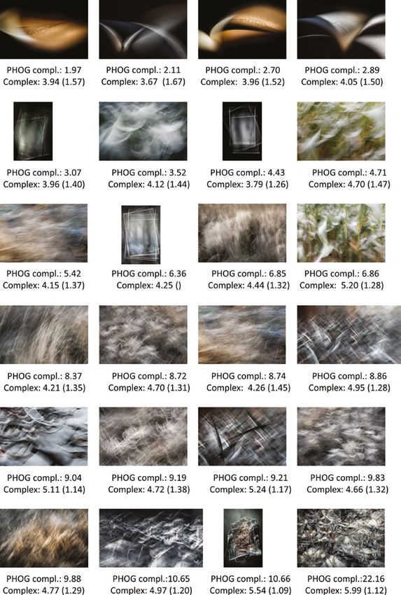
lected photographs can be found in Fig. 1.
The photographer took part in the different phases of the research (from
brainstorm to selecting stimuli and recruiting participants, to discussing
Downloaded from Brill.com03/17/2020 03:17:46PM by johan.wagemans@psy.kuleuven.be
via Dr WagemansN. Vissers et al. / Art & Perception 8 (2020) 89–119 97
Figure 1. Artistic photographs by photographer Dominique Genin that were used in the
study. Photographs are ordered by PHOG complexity values. PHOG complexity and perceived
complexity scores (average and standard deviation) can be found below each photograph.
Downloaded from Brill.com03/17/2020 03:17:46PM by johan.wagemans@psy.kuleuven.be
via Dr Wagemans98 N. Vissers et al. / Art & Perception 8 (2020) 89–119
r esults). These types of close scientist–artist collaborations therefore result in
valuable insights for scientist and artist (see Wagemans, 2011 for an elabora-
tion on this new kind of experimental psycho-aesthetics).
1.4. The Present Study
Grounded in a science–art collaboration, the present study focuses on the re-
lationship between complexity and aesthetic ratings in a series of original ar-
tistic photographs.
Specifically, the following research questions were explored:
(1) Does the relationship between complexity of the artistic photographs and
beauty ratings follow Berlyne’s inverted U-curve pattern?
(2) Are there individual differences underlying this across-participant pattern?
(3) Can individual differences be explained by participant or photograph
characteristics?
(4) Does the pattern differ depending on aesthetic response (beauty, pleasure,
interest) or the measure of complexity (objective vs. perceived)?
Given the few available resources on aesthetic reactions to art photographs
and the incongruent results of previous studies on complexity and aesthet-
ics, the study took a largely exploratory and data-driven approach, while
being informed by previous findings from the empirical aesthetics literature.
We took into account considerations put forward by previous researchers on
the multifaceted nature of complexity (Nadal et al., 2010) and aesthetic re-
sponse (Marin et al., 2016) by using multiple measures for both, as well as
the warnings against across-participant analyses by following a data-driven
cluster approach, followed by an exploration of the clusters (Güçlütürk
et al., 2016). Moreover, we tried to step away from a reductionist approach
to empirical aesthetics by focusing on real artistic photographs that resulted
from a collaboration with both artistic and scientific intent. In doing this,
we hope to move towards the new kind of experimental psycho-aesthetics
that produces valuable insights for both artist and scientist (Wagemans,
2011).
2. Method
2.1. Participants
To reach a broad audience, the study was set up as an online experiment.
Participants were contacted through the networks of the senior author, the
artist and the art–science PiLoT1 organization, followed by a snowball effect.
A total of 461 participants completed the experiment, of which eight partici-
pants completed the experiment more than once and were therefore excluded.
Downloaded from Brill.com03/17/2020 03:17:46PM by johan.wagemans@psy.kuleuven.be
via Dr WagemansN. Vissers et al. / Art & Perception 8 (2020) 89–119 99
The final set of 453 participants represent a broad audience varying in gender
(63% female), age (ranging from 18 to 85, M = 41.15, SD = 16.73) and artistic
expertise (37% followed an art education; 21% reported an active art practice).
On average, participants seemed to be rather interested in art (M = 5.16; SD =
1.40), and the most often selected answers for art gallery visits and art books
were 2–3 times a year (39% of participants) and a lot, more than 10 (33% of
participants), respectively.
2.2. Stimuli
Stimuli were 24 photographs by art photographer Dominique Genin, specif-
ically created and selected for the purposes of the current art–science col-
laboration. Figure 1 shows all photographs. Together, they form a series of
semi-abstract photographs that vary in complexity and recognisability, which
is ideal for the purposes of our study. Compare, for example, the photograph
on the top left showing a relatively simple pattern, in which a viewer might
recognize the folded leaves of a book, with the photograph on the bottom right
showing a more complex, layered photograph where the photographed content
is almost impossible to recognize.
Note that, even though the photographs form one coherent stylistic series,
the artist’s way of working (i.e., adding layers, abstracting photographs through
certain manipulations, etc.) resulted in a few subgroups of photographs that
were inspired by the same type of content (e.g., the top row of photographs
all relate to the abovementioned folded book leaves). We will also explore the
role of content in our analyses.
2.3. Measures
2.3.1. Art Expertise
A self-developed scale was used to measure participants’ art expertise. Similar
items have been used in previous studies from our research lab (e.g., Augustin,
2012; Chamberlain et al., 2017) and the items are similar to self-developed
scales by other researchers (e.g., the art experience questionnaire in Chatter-
jee et al., 2010). Specifically, the following six items were used to tap into
participants’ art education, art practice and interest in art. All items were con-
sidered separately in this article, as there is no clear-cut way to turn these into
a summary scale, without making subjective decisions on how these different
aspects should be counted and weighed into what makes an ‘art expert’.
Art education (one item) was measured by asking participants whether they
received an art and design education. They could indicate whether they stud-
ied art school, art history and/or a course that uses applied art, design, visual
thinking or drawing, as well as specify the number of years they studied this.
Participants were allowed to indicate multiple options.
Downloaded from Brill.com03/17/2020 03:17:46PM by johan.wagemans@psy.kuleuven.be
via Dr Wagemans100 N. Vissers et al. / Art & Perception 8 (2020) 89–119
Art practice (two items) was measured by asking participants whether they
considered themselves to be a practicing artist or designer. If so, participants
were asked to specify the number of years of their practice and to indicate the
specific field of art or design on a multiple-choice list [including drawing/
illustration, fine art (e.g., painting, sculpture), conceptual art, graffiti, photog-
raphy, film/animation, fashion/textile design, product design, graphic design,
typography, architecture]. Participants were allowed to choose multiple items
and/or specify another field that was not part of the list.
Art interest (three items) was measured by Likert-scales where people
could indicate their interest in art (seven-point Likert scale ranging from 1 =
not at all to 7 = yes, very strongly), the number of times they visited an art
gallery (four-point scale with options: never; once; 2–3 times a year; often)
and the number of art or design books they owned (four-point scale with op-
tions: none; at least 1 but less than 5; at least 5 but less than 10; a lot, more
than 10).
2.3.2. Complexity Measures
PHOG complexity. For each photograph, a complexity measure was calculated
based on the Pyramid of Histograms of Orientation Gradients (PHOG) meth-
od. The measure is based on a shape descriptor originally developed for object
recognition and categorization (Bosch et al., 2007; Dalal and Triggs, 2005),
but can also be used to derive several image properties that have been studied
for their role in aesthetic appreciation, such as visual complexity. Specifically,
Christoph Redies and his colleagues (Braun et al., 2013; Redies et al., 2012)
have previously used this method of calculating image properties for different
types of visual stimuli and the relation to aesthetic appreciation. In this article,
we only focus on the measure of PHOG complexity.
To calculate the PHOG of an image, the image is first divided into three
images representing the different channels: luminance, red–green and blue–
yellow channels, after which a gradient image is calculated for each of these
images. A summary of these three gradient images is made by taking the high-
est value of the three channels for each pixel. From this gradient image, PHOG
features can be derived by dividing the orientations of the gradients in dif-
ferent bins and calculating the strength of the gradient per bin, after which
the histogram values are normalized. Using this information, complexity is
measured as the average of all gradient strengths in an image (see Braun et al.,
2013; Redies et al., 2012 for mathematical details). In other words, this means
that images that show small changes between pixel values (in luminance or
colour channels) will result in a low complexity score, while large changes
result in higher complexity scores. Figure 1 shows the photographs organized
according to their PHOG complexity scores — and includes the PHOG num-
ber below each photograph.
Downloaded from Brill.com03/17/2020 03:17:46PM by johan.wagemans@psy.kuleuven.be
via Dr WagemansN. Vissers et al. / Art & Perception 8 (2020) 89–119 101
Perceived complexity. To complement the calculated image property of
(PHOG) complexity, participants were also asked to rate each photographs’
complexity on a seven-point Likert scale that ranged between 1 (very simple),
over 4 (neutral) to 7 (very complex). Throughout the article, we will refer to
this measure as ‘perceived complexity’.
2.3.3. Aesthetic Responses
Three aesthetic responses were measured for each photograph, each of them
rated on a seven-point Likert scale:
Interest was measured on a scale ranging from 1 (very boring) over 4 (neutral)
to 7 (very interesting).
Beauty was measured on a scale ranging from 1 (very ugly), over 4 (neutral), to
7 (very beautiful).
Pleasantness was measured on a scale ranging from 1 (very unpleasant), over 4
(neutral), to 7 (very pleasant).
At the end of the experiment, participants were also asked about their general
opinion of the photographs created by Dominique Genin by clicking one or
more adjectives out of the following list: attractive, abstract, chaotic, complex,
busy, ambiguous, monotonous, emotional, expressive, impressive, compli-
cated, interesting, meaningless, incomprehensible, touching, overwhelming,
strange, restful, special and confusing.
2.4. Procedure
Ethical approval was obtained from the Social and Societal Ethical Committee
of the KU Leuven. Participants received an invitation to participate through
e-mail. After clicking the link, they could choose their language (Dutch, French,
English, Italian) and then received a short introduction about the tasks and the
project, indicating that the study was part of the larger artist–scientist collabo-
ration PiLoT1, that it was about the perception and appreciation of images by
a photographer, Dominique Genin, and that it would take around 15 minutes.
After giving their consent, participants provided their e-mail address to
unlock the experiment (or continue their ongoing participation, if they had
chosen to do only part of the experiment before) and first answered the short
demographic questions (age, gender, mother tongue) and art expertise items.
Then, they saw four example photographs by Dominique Genin. These photo-
graphs were not part of the selected 24 photographs and did not have to be rat-
ed, but rather served as a reference for participants, so that they could anchor
their ratings based on the context of this type of photographs. An accompany-
ing statement said that these are not the kind of photographs that most people
Downloaded from Brill.com03/17/2020 03:17:46PM by johan.wagemans@psy.kuleuven.be
via Dr Wagemans102 N. Vissers et al. / Art & Perception 8 (2020) 89–119
take (e.g., birthdays, groups of people, holidays), but more abstract images
and that they would be introduced to 24 of these images that they would have
to rate on four scales.
Following this, participants were introduced to each of the 24 photographs
separately (in a randomized order), accompanied by all four rating scales,
presented simultaneously below the photograph. The rating scales were dis-
played in the following order (from top to bottom): complexity, interest, beau-
ty, pleasantness. Finally, at the end of the experiment, participants were also
asked about their general impression of the photographs, by selecting one or
more adjectives out of a list (see Sect. 2.3.3.)
3. Results
3.1. Data-Analysis Approach
Although guided by our research questions, our analyses were mainly done in
an exploratory and data-driven manner, taking into account some of the find-
ings previously outlined within the psycho-aesthetics literature. Data and code
for the analyses reported in this article can be found at https://osf.io/2fws6/.
First, we calculated general descriptive statistics for each photograph, as
well as the correlations among complexity measures (PHOG and perceived
complexity) and aesthetic responses (beauty, pleasantness, interest). Then, we
explored our four research questions using the following steps:
(1) Visually explore whether the across-participant relationship between
PHOG complexity and beauty follows an inverted U-curve pattern.
(2) Perform a data-driven cluster approach to examine whether the aggregate
pattern is the result of underlying individual differences (participant clus-
ters) and statistically compare which model (overall model vs participant
clusters) fits the data best.
(3) Explore whether the differences in the relationship between PHOG
complexity and beauty can be explained by participant or photograph
characteristics.
(4) Explore whether a different measure of complexity (PHOG vs perceived
complexity) or aesthetic response (beauty, pleasure, interest) yields quali-
tatively similar or different findings.
3.2. Data Preparation and Descriptive Statistics
3.2.1. Outliers
One photograph deviated strongly from the others on its PHOG complexity
score. This photograph (bottom right in Fig. 1, score of 22.16) scored almost
double on the complexity measure compared to the second most complex
Downloaded from Brill.com03/17/2020 03:17:46PM by johan.wagemans@psy.kuleuven.be
via Dr WagemansN. Vissers et al. / Art & Perception 8 (2020) 89–119 103
p hotograph (score of 10.66) (Note 2). We therefore dropped it from further
analyses, so we would have a continuous range of complexity scores with
enough data points to draw reliable conclusions about the relationships of in-
terest. The final dataset therefore included 23 photographs, 453 participants
and 10,419 observations (453 participants who each rated 23 photographs).
All the following analyses, results and conclusions are based on this dataset.
3.2.2. Missing Data Values
There were a few missing values for ratings of perceived complexity (n = 13;
0.12% of all complexity ratings); interestingness (n = 28; 0.27% of all inter-
estingness ratings) and beauty (n = 15; 0.14% of all beauty ratings), because
the online set-up did not prevent participants (accidentally) skipping items. To
exploit the maximum amount of available data, cases were only dropped when
they had missing values on the variables of interest specific for each respective
analysis.
3.2.3. Average Ratings per Photograph
Figure 1 shows the average scores on the two complexity measures (PHOG
and perceived complexity) for each photograph. The photographs are ordered
based on their PHOG value. In our final dataset (excluding the outlier photo-
graph), photographs had an average value of 6.70 (SD = 2.96) on the PHOG
complexity measure. Generally, aesthetic reactions to the photographs seem to
be positive, with average ratings per photograph tending towards the beauti-
ful (M = 4.57; SD = 0.22), pleasant (M = 4.54, SD = 0.27), interesting (M =
4.56, SD = 0.30) and complex (M = 4.49, SD = 0.52) side of the scales. The
median was always 5 on a scale from 1 (very ugly, unpleasant, boring and
simple, resp.) through 4 (neutral) to 7 (very beautiful, pleasant, interesting
and complex, resp.).
Considering their general impression of the photographs, the top three ad-
jectives that were selected by most people from the list (see Sect. 2.3.3. for the
full list) were abstract (69.32%), interesting (49.45%) and expressive (36.20%).
3.3. Correlations among Scales
Figure 2 shows the correlations among the variables of interest. Pearson cor-
relations are calculated using the 23 final selected photographs (removing the
outlier photograph for complexity). We first standardized all response ratings
within each participant (i.e., calculated z-scores per scale per participant) to
prevent that differences in scale use would confound the results. All correla-
tions were significant (p < 0.001), except for the correlation between inter-
est and PHOG complexity (r = 0.01, p = 0.22). Results show that the three
aesthetic responses are all positively correlated, with beauty and pleasantness
Downloaded from Brill.com03/17/2020 03:17:46PM by johan.wagemans@psy.kuleuven.be
via Dr Wagemans104 N. Vissers et al. / Art & Perception 8 (2020) 89–119
ity
ex
pl
m
s
co
es
tn
ed
st
an
eiv
ty
re
s
au
rc
ea
te
Be
Pe
In
Pl
phog complexity 0.33 –0.11 –0.15 0.01
Perceived complexity 0.15 0.08 0.38
Beauty 0.76 0.64
Pleasentness 0.56
–1 –0.8 –0.6 –0.4 –0.2 0 0.2 0.4 0.6 0.8 1
Figure 2. Correlation matrix with variables of interest. Correlations are calculated on
standardized ratings (standardized within participants) for the final 23 photographs (outlier
photograph is removed).
showing the highest correlation. The two complexity measures (PHOG com-
plexity vs perceived complexity) show a moderate positive correlation and
perceived complexity is also moderately correlated to interestingness ratings.
The other relations between complexity measures and aesthetic responses
show smaller correlations, sometimes positive, sometimes negative. This does
not mean that both concepts are not related, however. As correlations only
capture linear relations between variables, we would not be able to detect the
expected curvilinear pattern (such as Berlyne’s inverted U-curve). Moreover,
individual differences in how complexity and aesthetics relate could obscure
a clear average pattern. In the next sections, we explore whether a curvilinear
pattern might be a better fit, followed by a cluster analyses to explore possible
individual differences.
3.4. Across-Participant Relationship between PHOG Complexity and Beauty
We visually examined whether a curvilinear pattern would fit the relationship
between PHOG complexity and beauty across all participants. Again, beauty
ratings were standardized within each participant to prevent that differences
in scale use would confound the results. Figure 3A shows the relationship
between these average (normalized) beauty ratings and PHOG complexity.
A quadratic function fit was added to the data to examine whether the pattern
follows Berlyne’s inverted U-curve. Visual inspection reveals that this is not
the case; instead the relationship seems to resemble almost the opposite — a
U-curve pattern — where the most simple and the most complex photographs
receive higher beauty ratings than those in the middle of the set.
Downloaded from Brill.com03/17/2020 03:17:46PM by johan.wagemans@psy.kuleuven.be
via Dr WagemansN. Vissers et al. / Art & Perception 8 (2020) 89–119 105
A B C
1.0 1.0 1.0
0.8 0.8 0.8
0.6 0.6 0.6
Average beauty rating (normalized)
0.4 0.4 0.4
0.2 0.2 0.2
0.0 0.0 0.0
–0.2 –0.2 –0.2
–0.4 –0.4 –0.4
–0.6 –0.6 –0.6
–0.8 –0.8 –0.8
2.5 5.0 7.5 10.0 2.5 5.0 7.5 10.0 2.5 5.0 7.5 10.0
PHOG complexity PHOG complexity PHOG complexity
Cluster Cluster 1 (n = 295) Cluster 2 (n = 158)
Figure 3. The relationship between PHOG complexity and average beauty rating (normalized).
(A) The across-participant pattern (with an added quadratic function fit). (B, C) Results of the
cluster analyses, showing two participant clusters with different relationships between PHOG
complexity and beauty ratings (with added linear or quadratic function fits, respectively).
3.5. Data-Driven Cluster Approach to Discover Underlying Individual
Differences
Following the recommendation by Güçlütürk and colleagues (2016), we used
a cluster approach to explore possible individual differences that might un-
derly the general pattern.
The cluster method is a data-driven approach which clusters participants
based on their rating patterns over the different PHOG complexity levels. Spe-
cifically, we started from a matrix where participants are represented as rows,
photographs as columns (organized from low to high PHOG complexity) and
standardized beauty ratings (standardized within individuals) as cells. Thus,
the cluster analyses start from the full dataset for one aesthetic response (in
this case beauty), without having to average over photographs or individuals.
On this matrix, cluster analyses are performed to examine whether the patterns
of individuals’ beauty ratings over the range of the PHOG complexity ratings
can be organized into clusters of individuals with similar patterns (and thus
show a similar relationship between PHOG complexity and beauty).
Cluster analyses were implemented in R 3.6.1 (R Core Team, 2019), with
the pamk (Partitioning Around Medoids With Estimation Of Number Of Clus-
ters) function from the package fpc (v2.2-3; Hennig, 2019). Specifically, this
package uses the partitioning around medoids (pam) approach (see Chapter 2
of Kaufman and Rousseeuw, 1990 for an introduction to this approach), a
more robust version of K-means clustering, and the algorithm itself deter-
mines the optimal number of clusters. The algorithm first looks for a good set
Downloaded from Brill.com03/17/2020 03:17:46PM by johan.wagemans@psy.kuleuven.be
via Dr Wagemans106 N. Vissers et al. / Art & Perception 8 (2020) 89–119
of representative objects within the observations — called medoids. Follow-
ing this, each observation is assigned to the nearest medoid. Thus, the pack-
age optimizes both the number of clusters and the specific medoids, based on
the patterns of the data. For our analyses, we used the default method of the
‘pamk’ function, which examines solutions for two to 10 clusters, and decides
on the optimal number of clusters based on the optimal average silhouette
width. The silhouette width is a measure of the quality of clustering (by com-
paring the dissimilarity of an item to the rest of its cluster, and comparing this
to the dissimilarity to the closest neighbouring cluster). It indicates whether
an observation is well-clustered (silhouette width approaching 1), in between
clusters (around 0) or misclassified (negative numbers). When comparing the
average silhouette width of all observations over different numbers of clusters
tested, the optimal number of clusters can be determined (the largest overall
average silhouette width) (Rousseeuw, 1987).
The cluster approach yielded two clusters of participants. We first examined
whether our original across-participant U-shaped pattern could be explained
by two different relationships for these clusters. Figure 3B plots the results of
the two clusters together with a linear fit to their data (following the approach
by Güçlütürk et al., 2016), while Fig. 3C shows the same information but with
an added quadratic fit. In both cases, it is clear that the average pattern does not
fit all participants. In fact, one cluster (n = 295, 65.12%) does seem to follow
a similar U-curve pattern to the general pattern we found above — or a nega-
tive relationship when using a linear fit. However, another cluster (n = 158,
34.88%) seems to follow rather the opposite pattern that lies closer to Ber-
lyne’s inverted U-curve — or a positive relationship when using a linear fit. It
is clear that depending on the specific fit we add to our data, our interpretations
of these relationship will be different. Therefore, in the next section we com-
pare the different models statistically to explore which model fits our data best.
3.5.1. Statistical Comparisons of Different Models
The following linear mixed effects models were compared, using the ‘lmer’
function of the lme4 package in R (Bates et al., 2014). Each model corre-
sponds to one of the visualizations in Fig. 3 (the letters below correspond to
the respective panels).
(A) Beauty = β0 + β1 PHOG complexity + β2 PHOG complexity2 + b0
Participant + ε
(B) Beauty = β0 + β1 PHOG complexity + β2Cluster + β3 PHOG complex-
ity × Cluster + b0Participant + ε
(C) Beauty = β0 + β1 PHOG complexity + β2 PHOG complexity2 + β3
Cluster + β4 PHOG complexity × Cluster + β4 PHOG complexity2 ×
Cluster + b0Participant + ε
Downloaded from Brill.com03/17/2020 03:17:46PM by johan.wagemans@psy.kuleuven.be
via Dr WagemansN. Vissers et al. / Art & Perception 8 (2020) 89–119 107
Table 1.
AIC and BIC criteria for the three linear mixed effect models.
Model DF AIC BIC
Model A 5 33689 33726
Model B 6 33307 33350
Model C 8 32988 33046
Table 1 shows the AIC and BIC criteria for the comparison of the three mod-
els. Both converge towards Model C as the best fit for our data (lowest AIC
and BIC criteria), indicating that our data are best explained by two different
curvilinear relationships between PHOG complexity and beauty, one for each
cluster — with the largest cluster (Cluster 1) showing a U-curve pattern, and
the other cluster (Cluster 2) showing a trend towards an opposite U-curve
pattern.
3.6. Can Individual Differences be Explained by Participant or
Photograph Characteristics?
As the cluster approach is a hypothesis-free approach that just examines the
patterns that show up in the data, we aimed to find out whether we could
explain some of these differences through the other available information,
namely participant characteristics or photograph characteristics.
3.6.1. Participant Characteristics
Our participant group consisted of a broad audience that varied in age, gender
and art background. Here, we explore whether the two clusters of participants
show differences on these characteristics. Only one significant difference was
found, that is the second cluster had a higher average for the ‘art books’ scale
(M = 2.84, vs M = 2.50 in cluster 1; Welch t-test: t (331.85) = −3.01, p <
0.01), indicating that participants in the second cluster were closer to answer
option 3 (at least 5, but less than 10 books), than to option 2 (at least 1, but
less than 5 books), whereas the average for the first cluster was in the middle
of these two options. Since the other artist-related questions did not show any
significant differences, it is difficult to interpret this specific difference for the
number of art books.
3.6.2. Photograph Characteristics
We were interested to see whether the specific content of the photograph could
play a role in the differences between participant clusters. When examining
the full set of photographs, some subgroups can be identified. For instance,
Downloaded from Brill.com03/17/2020 03:17:46PM by johan.wagemans@psy.kuleuven.be
via Dr Wagemans108 N. Vissers et al. / Art & Perception 8 (2020) 89–119
we find four photographs that show an abstraction of book pages (top row in
Fig. 1), four photographs that show variations of a certain rectangular theme
(the four photographs with portrait orientation in Fig. 1) and the remaining
photographs that are inspired more by natural scenes (varied with layers, add-
ed manipulations, etc.). The photographer himself refers to these three sub-
groups within his larger ‘On the Edge of Chaos’ project as ‘object’, ‘still-life’
and ‘nature’ respectively on his website (Genin, 2019).
It turns out that these specific photograph subgroups are somewhat con-
founded with the calculated PHOG complexity levels. That is, the four simplest
photographs in our subset are the four ‘object’ photographs of book p ages (top
row in Fig. 1). Luckily the nature and still-life categories were more spread out
over the range of PHOG complexity values, both ranging from around 3–4 to
around 10–11 in PHOG values (see Fig. 1).
To understand the role these subgroups of photographs play in determin-
ing participants’ ratings, we explored visually (Fig. 4) and statistically how
participant cluster and photograph subgroup (and their interaction) related to
the average beauty ratings through a mixed ANOVA, taking into account that
participants gave multiple ratings per subgroup of photographs. Significant
Cluster 1 (n = 295) Cluster 2 (n = 158)
1.0
Average beauty rating (normalized)
0.5
Photograph subgroup
object
nature
0.0 still-life
–0.5
2.5 5.0 7.5 10.0 2.5 5.0 7.5 10.0
PHOG complexity
Figure 4. Average beauty ratings (normalized) per PHOG complexity value for three subgroups
of photographs in the two participant clusters, with an added quadratic function fit per cluster
(as in Fig. 1).
Downloaded from Brill.com03/17/2020 03:17:46PM by johan.wagemans@psy.kuleuven.be
via Dr WagemansN. Vissers et al. / Art & Perception 8 (2020) 89–119 109
main effects were found for both cluster (F1,438 = 11.89, p < 0.001, η2G =
0.02) and photograph subgroup (F1.69,740.64 = 8.99, p < 0.001, η2G = 0.007),
along with a significant interaction between the two (F1.69,740.64 = 184.37, p <
0.001, η2G = 0.12). Therefore, it is clear that participants in the two clusters
responded differently to the different subgroups of photographs. Follow-up
pairwise contrasts of the effects between clusters for each photograph sub-
group revealed that participants in cluster 1 showed a higher preference for
the ‘object’ subgroup [t(869) = 13.11, p < 0.0001], a lower preference for the
‘nature’ subgroup [t(869) = −5.75, p < 0.0001], but no significant difference
for the ‘still-life’ subgroup [t(869) = 1.11, p = 0.27] compared to participants
in cluster 2.
In fact, when visually inspecting Fig. 4, it becomes clear that the different
subgroups (as well as individual variances for specific photographs) seem to
drive the different patterns, and beauty ratings between clusters can be more
consistently interpreted based on different responses to photograph subgroups
than to the variance in PHOG complexity. This is noticeable when examining
how beauty ratings vary according to the PHOG complexity levels within one
subgroup. For example, when exploring the ‘nature’ photographs, the largest
subgroup of photographs, it is difficult to see a consistent relationship between
PHOG complexity and beauty ratings.
3.7. Extension to Other Aesthetic Responses (Pleasantness, Interest) and
Predictor (Perceived Complexity)
In this section, we explore how different aesthetic responses and/or a different
predictor (perceived complexity) might change our results.
3.7.1. Other Aesthetic Responses (Pleasantness, Interest)
In Fig. 5, we repeat the same type of visualisations and cluster analyses as
before — but now also for the responses of pleasantness and interest. Note
that, for pleasantness and interest, there are some participants for which we
could not do the calculations, either because of missing values in their rat-
ings or because they gave all photographs the same score on pleasantness or
interest. When exploring the resulting clusters of individuals and the visual-
ization of the relationship between PHOG complexity and aesthetic response,
pleasantness (Fig. 5B) shows a very similar pattern as the beauty results we
described before (Fig. 5A), with two different curvilinear patterns (Cluster 1:
n = 295; Cluster 2: n = 157; missing: n = 1). This is not surprising, given that
beauty and pleasantness were correlated highly (see Fig. 2). For interest also
(Fig. 5C), we again found two clusters of participants, where one cluster fol-
lows the U-curve pattern (Cluster 1: n = 274), but the second cluster follows a
linearly increasing pattern (as opposed to a somewhat more inverted U-curve
pattern) (Cluster 2: n = 154; missing: n = 25).
Downloaded from Brill.com03/17/2020 03:17:46PM by johan.wagemans@psy.kuleuven.be
via Dr WagemansYou can also read