Facilitating Machine Learning Model Comparison and Explanation Through A Radial Visualisation
←
→
Page content transcription
If your browser does not render page correctly, please read the page content below
Noname manuscript No.
                                          (will be inserted by the editor)

                                         Facilitating Machine Learning Model Comparison and
                                         Explanation Through A Radial Visualisation

                                         Jianlong Zhou · Weidong Huang · Fang Chen

                                         the date of receipt and acceptance should be inserted later
arXiv:2104.07377v1 [cs.LG] 15 Apr 2021

                                         Abstract Building an effective Machine Learning (ML) model for a data set is a dif-
                                         ficult task involving various steps. One of the most important steps is to compare gen-
                                         erated substantial amounts of ML models to find the optimal one for the deployment.
                                         It is challenging to compare such models with dynamic number of features. Compar-
                                         ison is more than just finding differences of ML model performance, users are also
                                         interested in the relations between features and model performance such as feature
                                         importance for ML explanations. This paper proposes RadialNet Chart, a novel visu-
                                         alisation approach to compare ML models trained with a different number of features
                                         of a given data set while revealing implicit dependent relations. In RadialNet Chart,
                                         ML models and features are represented by lines and arcs respectively. These lines
                                         are generated effectively using a recursive function. The dependence of ML models
                                         with dynamic number of features is encoded into the structure of visualisation, where
                                         ML models and their dependent features are directly revealed from related line con-
                                         nections. ML model performance information is encoded with colour and line width
                                         in RadialNet Chart. Together with the structure of visualisation, feature importance
                                         can be directly discerned in RadialNet Chart for ML explanations.
                                         Keywords Machine learning · performance · chart · RadialNet chart · visualisation

                                         1 Introduction

                                         We have witnessed a rapid boom of data in recent years from various fields such as
                                         infrastructure, transport, energy, health, education, telecommunications, and finance.
                                         J. Zhou and F. Chen
                                         Data Science Institute
                                         University of Technology Sydney, Australia
                                         E-mail: {jianlong.zhou, fang.chen}@uts.edu.au
                                         W. Huang
                                         Faculty of Transdisciplinary Innovation
                                         University of Technology Sydney, Australia
                                         E-mail: weidong.huang@uts.edu.au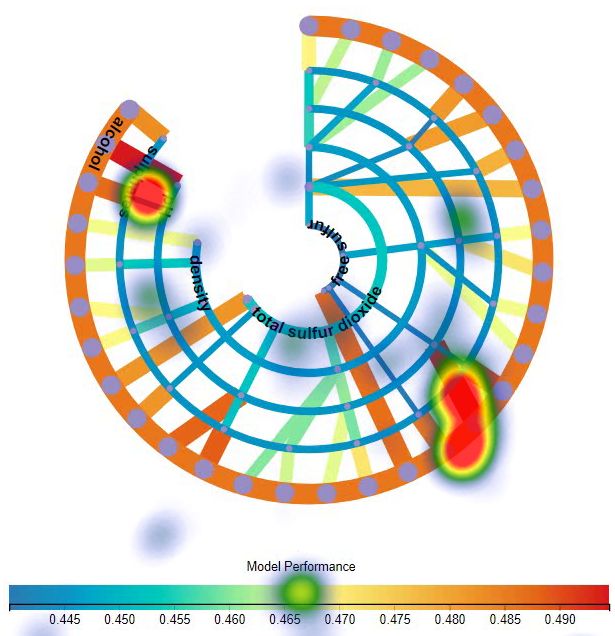
2                                                                     Jianlong Zhou et al.

Together with the dramatic advances in Machine Learning (ML), getting insights
from these “Big Data” and data analytics-driven solutions are increasingly in de-
mand for different purposes. While these “Big Data” are used by sophisticated ML
algorithms to train ML models which are then evaluated by various metrics such as
accuracy, the generated substantial amounts of ML models must be compared by the
engineering designers and analysts to find the optimal one for the deployment [33].
Fig. 1 shows a typical pipeline that processes data to find an optimal ML model. Tak-
ing a data set with multiple features for ML training as an example, multiple features
can be grouped differently as the input for an ML algorithm to train different ML
models. For example, if a data set has three features of F1, F2, and F3, these features
may have seven different groups: [F1], [F2], [F3], [F1, F2], [F1, F3], [F2, F3], and
[F1, F2, F3]. Each feature group can be used as the input for an ML algorithm to train
an ML model, thereby obtaining seven different ML models. It is a common thread
to find the best/worst model by comparing such models, however it is often challeng-
ing when having a large number of features. Furthermore, comparison is more than
just finding differences of ML model performance, users are also interested in the
relations between features and model performance from comparison to get explana-
tion of models, for example, to find which features result in high performance of ML
models, and those features are referred as high important features, or vice versa. This
is because the identification of the most or least important features are the key steps
for feature engineering in effective and explainable machine learning [33, 30].

Fig. 1: The pipeline of getting an optimal ML model for a data set with multiple
features.

     On the other hand, it is widely recognised that visualisations amplify human’s
cognition during data analysis [9] and proper visualisation of ML outcomes is essen-
tial for a human analyst to be able to interpret them [4, 27]. Viegas and Wattenberg
[28] claimed that “data visualisation of the performance of algorithms for the pur-
pose of identifying anomalies and generating trust is going to be the major growth
area in data visualisation in the coming years”. More importantly, comparison with
visualisation is imperative to identify the optimal model from substantial amounts
of ML models. Bar chart, radar chart, line chart as well as others [1] are commonly
used visualisation methods in machine learning to compare different variables. How-
ever, comparison of ML models with a large number of features is still considered
challenging with the aid of these commonly used visualisations: the items for com-
parison and the relationships between them can be highly complicated. While these
commonly used visualisation approaches not only cause information clutters for large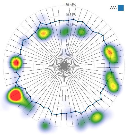
Facilitating Machine Learning Model Comparison                                        3

number of visual elements (e.g. bars, dots, lines) but also miss relation information
between features and models, which are significant in ML explanations. It is also
very difficult for users to differentiate differences of various model performances
with these commonly used visualisation approaches. Despite the specific focus on
visualising comparison in recent studies [14, 19, 21], little work has been done on the
visual comparison of ML models while identifying relations between features and
ML models (e.g. the most and least important features).
    We explore an approach based on the structure of visualisation in addressing chal-
lenges of comparison ML models with dynamic number of features: while height in-
formation of bars and lines in commonly used visualisation approaches only encode
one-dimensional information in a 2-dimensional (2D) space, it is possible to encode
ML model information in other dimensions of the space. If both visual elements and
structure of visualisation can be used to encode information of ML models, insights
about ML models could be automatically generated, users would not have to inspect
every model to find optimal one or conduct complex calculations [30] to estimate
feature importance.
    In this paper, we propose RadialNet Chart (also referred to RadialNet in this pa-
per), a novel visualisation approach to compare ML models with different number
of features while revealing implicit dependent relations. In RadialNet, ML models
and features are represented by lines and arcs respectively (an arc also represents the
model based on the single feature of arc). The challenge of revealing dependence of
ML models with dynamic number of features is addressed by encoding such informa-
tion into the structure of visualisation, where ML models and their dependent features
are directly revealed from related line connections. These lines are defined using a re-
cursive function to generate them effectively. ML model performance information is
encoded with colour and line width in RadialNet. It simplifies the comparison of
different ML models based on these visual encoding. Moreover, together with the
structure of visualisation, feature importance can be directly discerned in RadialNet
for ML explanation. RadialNet uses a concept of feature path for ML model lines to
avoid a large number of line entangles. And when visual elements for ML models
are crowded, RadialNet allows to interactively change spanning space that Radial-
Net covers to dynamically control the visual complexities. To understand the effec-
tiveness of RadialNet, we conducted a comparison experiment with three commonly
used visualisation approaches of line chart, bar chart, and radar chart. The compar-
ison experiment was evaluated with eleven researchers and developers experienced
in machine learning related areas. The findings show that RadialNet has advantages
in identifying features related to specific models as well as directly revealing impor-
tance of features (for ML explanations). Furthermore, RadialNet is more efficient to
help users focus their attention to find visual elements of interest. It is more compact
to show more information in a limited space compared with other visualisation types.

2 Background and Related Work

In machine learning, given a fixed number of features, it is possible to use different
features and their groups to train machine learning algorithms resulting in various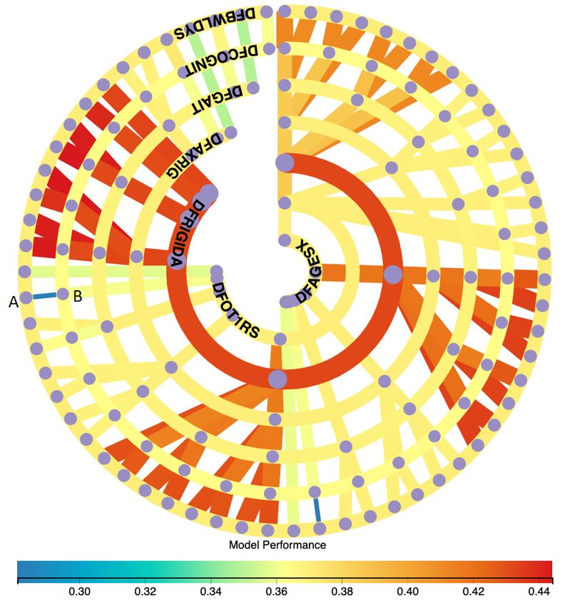
4                                                                      Jianlong Zhou et al.

machine learning models. Users need to compare these models to find the optimal one
for their tasks. Getting the optimal results out of machine learning models requires
a truly understanding of all models. However, each data set with a large number
of features can have hundreds or even thousands of ML models, making it nearly
impossible to understand all models based on different feature groups in an intuitive
fashion. Visualisation can be used to help unlock nuances and insights in ML models.
     This section investigates various visualisations from the perspectives of multi-
attribute data visualisation, visualisation in explanation of machine learning, and
comparison visualisation in order to demonstrate the state-of-art approaches and chal-
lenges for comparison of machine learning models with visualisation.

2.1 Visualisation of Multi-Attribute Data

The comparison visualisation of machine learning models is related to multi-attribute
(or multiple features) data visualisation. The visualisation of multi-attribute data has
been frequently investigated for years. One of classical approaches to visualise multi-
attribute data points is parallel coordinates [34]. The advantage of this technique is
that it can provide an overview of data trend. One of obvious disadvantages of parallel
coordinates is that it lacks a tabular view for presenting value details of each coordi-
nates. SimulSort [16] organizes different attributes of data in a tabular and sorts all
of the attribute columns simultaneously. However, users still need laborious interac-
tions in SimulSort in order to highlight different points for comparison. Zhou et al.
[32] proposed a visualisation approach for presenting multi-attribute data by combin-
ing advantages of both parallel coordinates and SimulSort, which organizes various
attributes in a tabular-like form implicitly. Colours are used to encode data belong-
ing to different groups, instead of highlighting attributes of one point at a time as in
SimulSort. Such colour encoding approach provides an overview of points and their
associated attribute details to improve the information browsing efficiency. Motivated
by such colour encoding, this paper uses colours to encode ML model performance
to provide an overview of performance for comparison. However, such visualisation
cannot reveal complex relations between machine learning models and their depen-
dent features with dynamic numbers.
     Moreover, the contradiction between the limited space and the large amount of
information to be presented is another challenge for multi-attribute data visualisa-
tion. Coordinated & multiple views (CMV) [24] is widely used to extend the limited
space of a single view for large data set visualisation. Langner et al. [18] presented a
framework that uses a set of mobile devices to distribute and coordinate multiple vi-
sualisation views for the exploration of multivariate data. Koytek et al. [17] proposed
MyBrush for extending brushing and linking technique by incorporating personal
agency in the interactive exploration of data relations in CMV. Sarikaya et al. [26] in-
troduced a framework to help determine the design appropriateness of scatterplot for
task support to modify/expand the traditional scatterplots to scale as the complexity
and amount of data increases. Most of these investigations focus on the extension of
spaces for the complex information presentation, however ignore making full use of a
given limited space. Our approach in this paper aims to encode complex information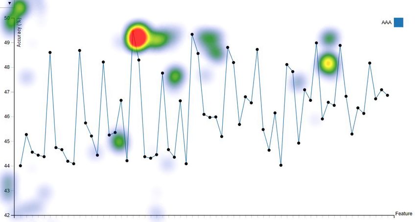
Facilitating Machine Learning Model Comparison                                          5

with less visual elements (e.g. model lines) to avoid entangled visual elements in the
limited space to improve the information presentation efficiency.

2.2 Visualisation in Explanation of Machine Learning

In the early years, visualisation is primarily used to explain the ML process of sim-
ple ML algorithms in order to understand the ML process. For example, different
visualisation methods are used to examine specific values and show probabilities of
picked objects visually for Naı̈ve-Bayes [4], decision trees [3], Support Vector Ma-
chines (SVMs) [8]. Advanced visualisation techniques are then proposed to present
more complex ML processes. Erra et al. [13] introduced a visual clustering which
utilises a collective behavioral model, where visualisation helps users to understand
and guide the clustering process. Paiva et al. [22] presented an approach that employs
the similarity tree visualisation to distinguish groups of interest within the data set.
Visualisation is also used as an interaction interface for users in machine learning.
For example, Guo et al. [15] introduced a visual interface named Nugget Browser
allowing users to interactively submit subgroup mining queries for discovering in-
teresting patterns dynamically. EnsembleMatrix allows users to visually ensemble
multiple classifiers together and provides a summary visualisation of results of these
multiple classifiers [27]. Zhou et al. [31] revealed states of key internal variables of
ML models with interactive visualisation to let users perceive what is going on inside
a model.
     More recent work tries to use visualisation as an interactive tool to facilitate ML
diagnosis. ModelTracker [2] provides an intuitive visualisation interface for ML per-
formance analysis and debugging. Chen et al. [11] proposed an interactive visualisa-
tion tool by combining ten state-of-the-art visualisation methods in ML (shaded con-
fusion matrix, ManiMatrix, learning curve, learning curve of multiple models, Mc-
Nemar Test matrix, EnsembleMatrix, Customized SmartStripes, Customized Mod-
elTracker, confusion matrix with sub-categories, force-directed graph) to help users
interactively carry out a multi-step diagnosis for ML models. Wongsuphasawat et al.
[29] presented the TensorFlow Graph Visualizer to visualise data flow graphs of deep
learning models in TensorFlow to help users understand, debug, and share the struc-
ture of their deep learning models. Neto and Paulovich [20] presented a matrix-like
visual metaphor to explain rule-based Random Forest models, where logic rules are
rows, features are columns, and rules predicates are cells. The visual explanation al-
lows users to effectively obtain overviews of models (global explanations) and audit
classification results (local explanations). Chan et al. [10] presented an interactive vi-
sual analytics system to construct an optimal global overview of the model and data
behaviour by summarising the local explanations using information theory. The ex-
planation summary groups similar features and instances from local explanations and
is presented with visualisations.
     Visualisations comprise the major body of ML process explanations. However,
these approaches cannot be directly used for the comparison of machine learning
models trained with a different number of features, and facilitate the revealing of
feature importance directly from visualisations of models for ML explanations.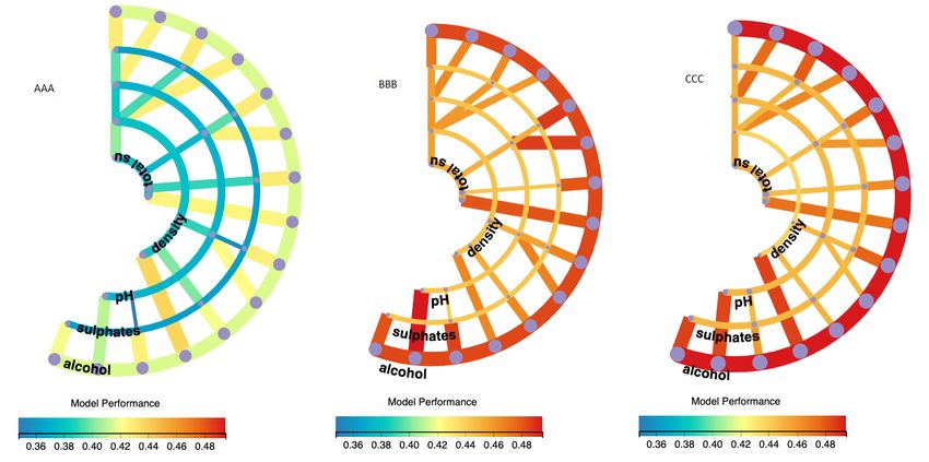
6                                                                        Jianlong Zhou et al.

2.3 Comparison Visualisation

Supporting comparison is a common challenge in visualisation. Gleicher [14] cate-
gorized four considerations that abstract comparison when using visualisation. These
four considerations include to identify: the comparative elements, the comparative
challenges, a comparative strategy, and a comparative design, which provide a guide-
line for developing comparison solutions in visualisation. Law et al. [19] presented
Duet, a visual analysis system to conduct pairwise comparisons. Duet employs min-
imal specification in comparison by only recommending similar and different at-
tributes between them when one object group to be compared is specified.
     Bar chart is one of commonly used visualisation methods for comparison in ma-
chine learning [1]. It works with two variables – one is the length of the bar on
one axis and the second is the position of this bar on another axis. The variable is
compared by denoting it with the length of the bars when various bars are plotted
together. Radar Chart is another commonly used approach to compare multiple quan-
titative variables. It is useful for seeing which variables have similar values or if there
are any outliers amongst the values of each variable. It can also help to find which
variables are high or low. Besides, other methods such as line chart and ring chart
are also used in comparison. Ondov et al. [21] made evaluations of comparison vi-
sualizations of 5 layouts: stacked small multiples, adjacent small multiples, overlaid
charts, adjacent small multiples that are mirror symmetric and animated transitions.
The data to be compared are encoded with the length of bars in bar charts, slop of
lines in line charts, and angle of arcs in donut charts.
     These previous works provide significant guidelines and advances in comparison
visualisation. This paper proposes a new visualisation method for machine learning
model comparison with a full consideration of four aspects as categorized in [14]. The
new visualisation approach is evaluated by comparing it with other three commonly
used visualisation methods (bar chart, line chart, and radar chart) in machine learning
model comparisons.

3 RadialNet Chart

This section presents a novel visualisation approach called RadialNet Chart to com-
pare machine learning models trained with different feature groups of a data set.

3.1 Design Goals

After having a thorough survey with experienced researchers and developers in ma-
chine learning on their problems meeting in comparing machine learning models, we
phrase following design goals for the RadialNet:
    – Comparison: To maximise differences among visual elements of models to help
      users find the optimal target easily. The comparison is the core objective in the
      ML model visualisation. This is a challenge when substantial amounts of ML
      models must be compared.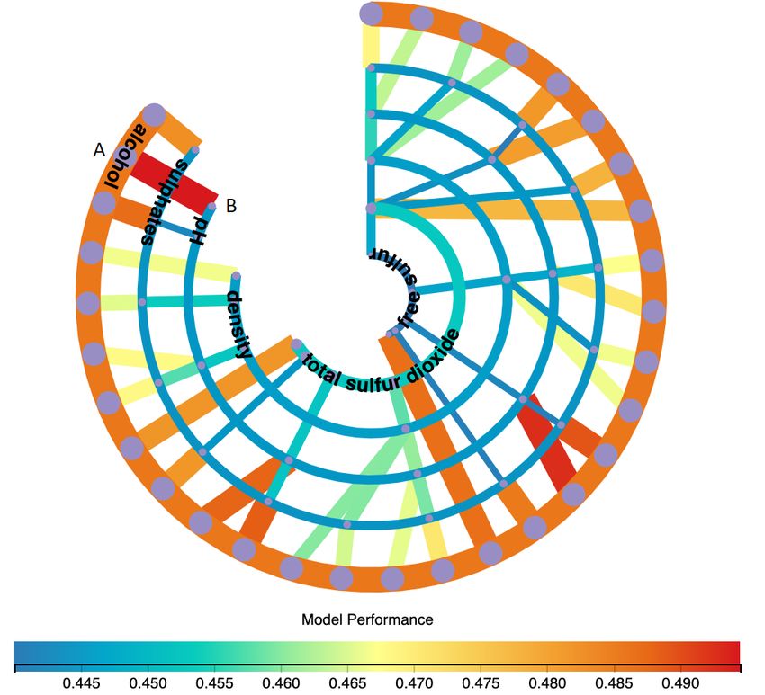
Facilitating Machine Learning Model Comparison                                        7

                         Fig. 2: An example of RadialNet chart.

 – Importance: To easily identify importance of features directly from visualisa-
   tion. The importance of features plays significant roles in the feature selection
   in the ML pipeline and ML explanations [5]. It is a challenge to identify impor-
   tance of features directly from visualisation without complex feature importance
   calculations.
 – Feature identification: To easily identify relationships between models (and model
   performance) and their dependent features. This helps users easily link ML mod-
   els and their dependent features for understanding both features and models,
   which is usually challenging with commonly used visualisation approaches.
 – Compactness: To represent complex visualisation in a compact form and reduce
   the visual clutters because of substantial amounts of information in a limited
   space.

3.2 Definition of RadialNet Chart

This subsection defines the RadialNet. Fig. 2 shows an example of RadialNet. Based
on this example, we firstly give following definitions that are used to set up a Radial-
Net:

Feature arc Each feature is represented by a concentric arc in RadialNet. The arc is
   also called feature arc. The name of each feature is displayed at one end of the arc
   as shown in Fig. 2 (e.g. F1, F2, F3, F4). Each arc also represents the ML model
   based on that single feature.
Model line RadialNet uses a line segment to represent an ML model based on mul-
   tiple features. The line is also called model line. For example, in Fig. 2, the line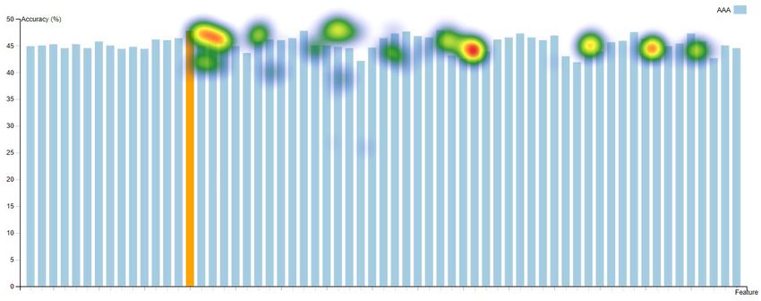
8                                                                        Jianlong Zhou et al.

   AB, BC, and CD represent different ML models respectively. The features used
   for the model are defined based on the feature path of the line (see the definition
   of feature path below).
Feature point A feature point refers to an intersection point of a model line with an
   arc. It is represented by a dot point on a feature arc as shown in Fig. 2 (e.g. feature
   points A, B, C).
Feature path A feature path defines features used for a model line. A feature path
   starts from the feature point of a model line on its outermost arc and ends at the
   feature point on the innermost arc it can reach through the connected feature point
   in the RadialNet. For example, in Fig. 2, for the model line AB, its feature path
   starts from the feature point A on the arc F4, passes through B and C, and ends
   at D on the innermost arc F1. This path can be represented by a list of features
   corresponding to arcs of each feature point, i.e. the feature path of AB is [F4, F3,
   F2, F1]. Similarly, the feature path of BC is [F3, F2, F1], the feature path of CD
   is [F2, F1], the feature path of EC is [F4, F2, F1], the feature path of MP is [F4,
   F3, F2], and the feature path of PQ is [F3, F2].

    Furthermore, the model performance is encoded using two methods: the width
of the line/arc and the colour of the line/arc. The wider the line/arc is, the higher
the model performance. A colour scale is accompanied with the RadialNet to encode
model performance and let users easily perceive the difference of performance of
different models as shown in Fig. 2.

    Based on these definitions, the visualisation of lines and arcs are spiraling from
the centre to outside and therefore it is called RadialNet Chart. The RadialNet has
different advantages. For example, given a data set in machine learning, if most of ML
models related to one specific feature show high model performance, that feature can
be considered as a high important feature, and vice versa if most of ML models related
to one specific feature show low model performance, that feature can be considered
as a less important feature. The RadialNet can depict importance of features directly
through visualisation: if an arc and its connected lines are mostly wider than others
and have colours representing high performance values in the colour scale, the feature
represented by the arc is an important feature, and vice versa it can also depict less
important features. For example, in Fig. 2, the feature F1 is an important feature
because the width and colour of the arc as well as its connected lines are mostly
wider and red, while the feature F4 is an less important feature. The RadialNet also
helps users directly identify features used for a specific model because of the feature
path mechanism in RadialNet.

    Fig. 3 shows the steps used to draw a RadialNet. The definition of different pa-
rameters is the key during RadialNet drawing. Firstly, key parameters are defined
with user interactions or predefined approaches. Arc parameters and line parameters
are then generated based on key parameters. The RadialNet is drawn finally based on
generated parameters.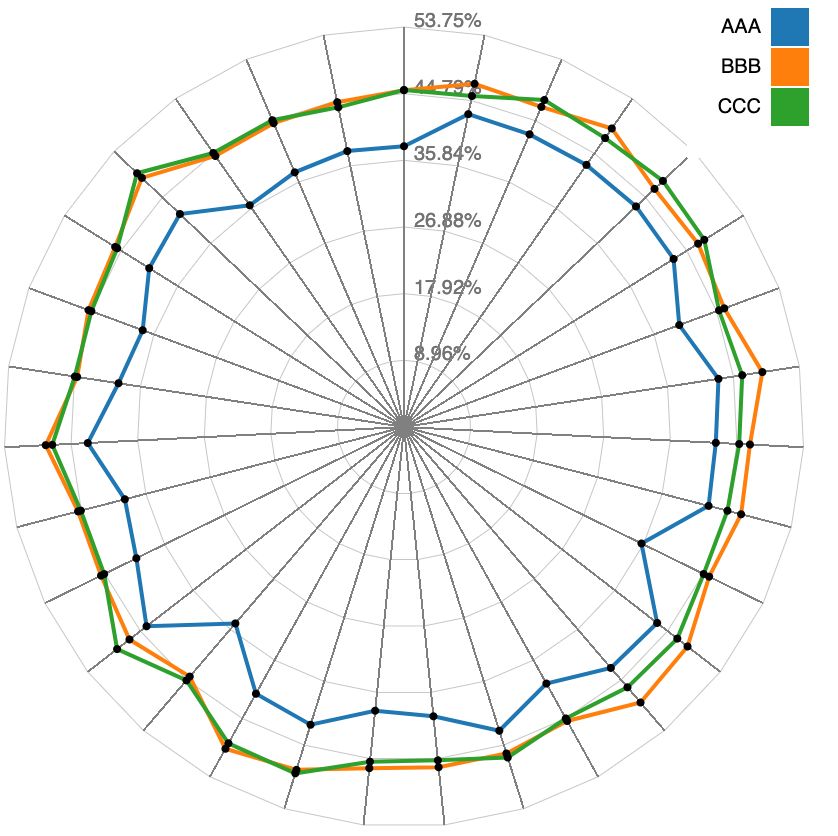
Facilitating Machine Learning Model Comparison                                         9

                         Fig. 3: The steps for drawing RadialNet.

3.3 Key Parameter Initialization

The key parameters include the overall spanning angle of RadialNet, the overall num-
ber of models given the number of features, the size of the drawing canvas, as well
as others. The overall spanning angle defines the space that the RadialNet covers in
degrees. It can be interactively modulated by users to control the compactness of the
visualisation in a limited space. If the number of ML models to be visualized is low,
a small value can be defined for the spanning angle, and vice versa a large value can
be defined for the spanning angle in order to help users easily control and compare
ML models in a limited space.
    Given N features of a data set, F1, F2, ..., FN, a machine learning algorithm uses
these features to set up ML models. The ML models can be set up based on one or
multiple features of the data set. Typically, the number of models based on various
groups of N features can be got from Equ. 1:

                      CN = CN1 +CN2 + ... +CNi + ... +CNN = 2N − 1                   (1)
where CN is the number of models based on groups of N features,         CNi
                                                                         is the group
number of selecting i features from N features. It shows that the number of ML mod-
els is increased exponentially with the increase of number of features.
     Furthermore, because of the circular characteristics of RadialNet, polar coordi-
nates are used to represent arcs and lines in RadialNet.

3.4 Arc Parameter Generations

Algorithm 1 shows the process for generating arc parameters. The arc is denoted by
its start point and end point in polar coordinates. In this algorithm, arcSpanning
defines the largest angle that arcs cover in the space and can be interactively changed
by a sliding bar in the user interface. N is the number of features. canvasWidth
is the width of the drawing canvas. allFeatures is a list of all studied features
which are sorted in the decreased order based on model performance of individual
features. Each arc represents the model performance based on an individual feature
from allFeatures list. The algorithm generates arc parameters aiming to make N
arcs evenly distributed in the drawing canvas space. This algorithm initialises the
spanning angle of each arc with the arcSpanning value, and the spanning of each
arc (arcAngle) is dynamically updated in the drawing algorithm (see Algorithm 3)
to allow arcs in a spiral format. arcParasDict is a dictionary storing parameters of
arcs and the key of the dictionary is the individual features for the arc. The parameters
include arc’s radius, spanning angle and arc width. Data is read from a JSON file and
stores different feature groups and their model performance values.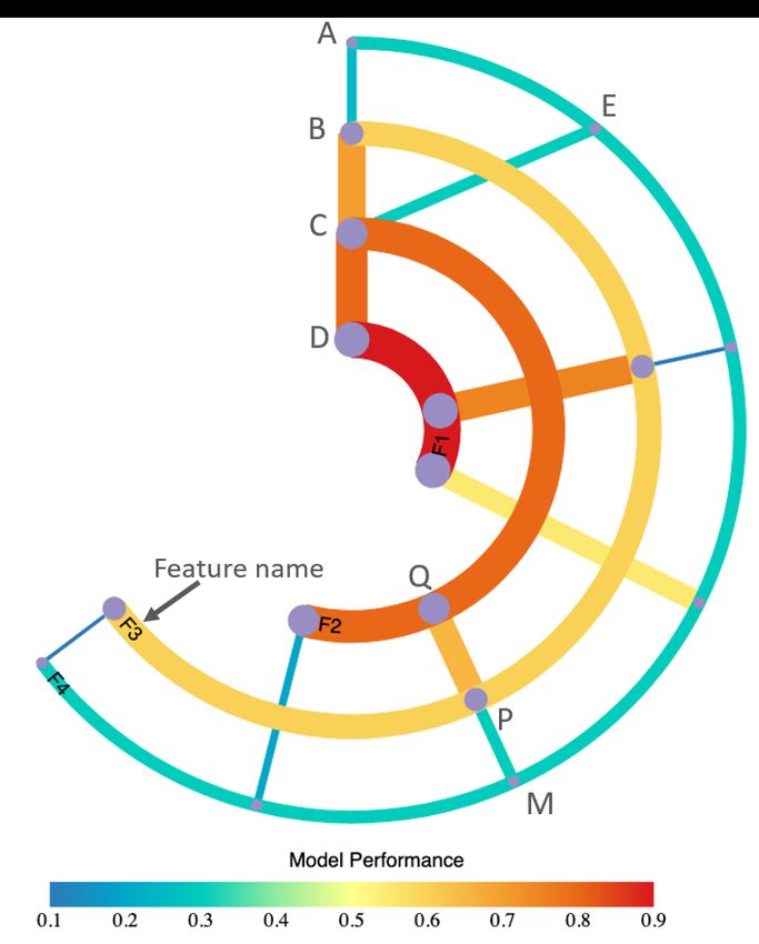
10                                                                      Jianlong Zhou et al.

 Algorithm 1: Algorithm for arc parameter generations
         Function ArcParasGen( arcSpanning, N, canvasWidth, allFeatures, Data):
            // Distance between two arcs
  1         arcSpacing ← canvasWidth /(2*N);
  2         prev radius ← 0.0;
  3         arcParasDict ← { };
  4         for f in allFeatures do
     5            arcRadius ← prev radius + arcSpacing;
     6            prev radius ← arcRadius;
                  // Encode performance of the model based on f as the arc width
     7            arcWidth ← Data[ f ].performance;
     8            arcAngle ← arcSpanning;
     9            arcParasDict[ f ] ← [arcRadius, arcAngle, arcWidth];
 10         return arcParasDict

3.5 Line Parameter Generations

Algorithm 2 shows a recursive function used for generating model line parameters.
The line is denoted by its start point and end point in polar coordinates. In this algo-
rithm, lineParasDict is a dictionary and stores parameters of lines, and the key of
the dictionary is the feature list (feature path) used for the line. The line parameters
stored in the dictionary include the start and end points of the line in polar coordi-
nates as well as line width of the line. lineFeatures is the feature list for the current
line and is sorted in the decreased order based on model performance of individual
features. startAngle is the angle of polar coordinates of the start point of the line.
angleStep is the step size that angle increases each time.
    In this algorithm, if the key with the current lineFeatures does not exist in
lineParasDict, a sub-key with the feature list by removing the last feature in
lineFeatures is created. If this sub-key still does not exit in lineParasDict and
the number of features in this sub-key is more than 2, the algorithm recursively call
this function with the current sub-key features. Otherwise, the algorithm defines the
start point and end point of the line and pushes them into lineParasDict.
    The line width is encoded with the model performance based on lineFeatures.
The colour of the line is also encoded with the model performance using a colour
scale.

3.6 RadialNet Chart Drawing

Algorithm 3 shows the process of drawing a RadialNet. In Algorithm 3, after getting
key parameters such as number of points on the outermost arc and arc spanning angle,
Algorithm 1 is firstly called to generate arc parameters. Then Algorithm 2 is called for
each feature to generate line parameters related to that feature. These parameters are
then used to draw arcs and lines by calling functions of DrawArcs() and DrawLines()
respectively. DrawArcs() and DrawLines() calls Javascript functions to draw arcs and
lines.
Facilitating Machine Learning Model Comparison 11
Algorithm 2: Algorithm for line parameter generations
Function LineParasGen(allFeatures, lineParasDict, arcParasDict,
lineFeatures, startAngle, angleStep, Data):
// Use lineFeatures as key of lineParasDict
1 ikey ← lineFeatures;
2 len lineFeatures ← lineFeatures.length;
3 if ikey is not in lineParasDict then
// Sub-features without the last feature
4 isubkey ← ikey[:len lineFeatures-1];
5 len isubkey ← isubkey.length;
6 if isubkey is not in lineParasDict and len isubkey> 2 then
// Recursively call the function
7 LineParasGen(allFeatures, lineParasDict, arcParasDict, isubkey,
startAngle, angleStep, Data);
8 else
// Define start and end points
9 if isubkey is in lineParasDict then
// Polar coordinates of start point
10 startAngle←lineParasDict[isubkey].endAngle;
11 startRadius←lineParasDict[isubkey].endRadius;
12 endSubF ← isubkey.endFeature;
13 endF ← ikey.endFeature;
14 if not neighbour(endSubF, endF) in allFeatures then
15 dist ← distance(endF, endSubF) in allFeatures;
16 startAngle←startAngle+angleStep*dist;
17 else
18 if lineFeatures.length == 2 then
19 startAngle←startAngle+angleStep;
20 iFeature ← lineFeatures[len lineFeatures-1];
21 startRadius ← arcParasDict[iFeature].radius;
// Polar coordinates of end point
22 lastFeature ← lineFeatures[len lineFeatures];
23 endAngle ← startAngle;
24 endRadius ← arcParasDict[lastFeature];
// Encode model performance as the line width
25 lineWidth ← Data[lineFeatures].performance;
// Push line parameters into dict
26 lineParasDict[ikey] ← [startAngle, startRadius, endAngle, endRadius,
lineWidth];
27 return lineParasDict, startAngle
4 Implementation
The proposed approach is implemented in Javascript based on the D3.js library [6].
The data input to RadialNet are saved in a JSON file. The RadialNet is also imple-
mented as a Javascript library and it is easily to be reused in different visualisation
applications. This library will be released as an open-source library.12 Jianlong Zhou et al.
Algorithm 3: Algorithm for drawing RadialNet
Input: allFeatures, arcSpanning, N, canvasWidth, Data
Output: SpiralChart
// Number of points on the outmost arc
1 num points ← CN−1 ; // see Equ. 1;
// Define step size of angles
2 angleStep ← 2*arcSpanning / (num points - 1);
// Initialize parameters
3 startAngle ← 0;
4 lineParasDict ← { };
// Generate arc parameters
5 arcParasDict ← A RC PARAS G EN(arcSpanning, N, canvasWidth );
// Generate line parameters
6 for f in allFeatures do
// Number of lines based on feature f
7 num lines ← Data[ f ].length;
8 for j ← 1 to num lines do
// Feature list used for the current line
9 lineFeatures ← Data[ f ][ j];
// Number of features for the current line
10 num features ← lineFeatures.length;
11 if num features != 1 then
// Generate line parameters
12 lineParasDict, startAngle ← L INE PARAS G EN (allFeatures,
lineParasDict, arcParasDict, lineFeatures, startAngle,
angleStep);
// Update arcAngle
13 if j == num lines then
14 arcParasDict[ f ].arcAngle ← startAngle/2;
// DrawLines and DrawArcs call Javascript functions to draw lines and arcs
of RadialNet Chart
15 DrawArcs (arcParasDict);
16 DrawLines (lineParasDict);
5 Case Studies
In this section, RadialNet is used to visualise machine learning models based on dif-
ferent data sets and ML algorithms. Two data sets from UCI machine learning data
repository [12] and PPMI [23] respectively were analyzed, and three machine learn-
ing algorithms of K-Nearest Neighbours (KNN), Naı̈ve Bayes (NB) and Random
Forest (RF) were deployed in the experiment. Fig. 4 shows the visualisation of differ-
ent ML models for a data set with 6 features. From this visualisation, we can easily
locate the model with the highest performance (the widest red line AB as shown in
Fig. 4) as well as features (two features of “alcohol” and “pH” on the feature path of
the line) used for the model training. It also helps users easily identify the importance
of features, the most important feature “alcohol” is represented by the outermost arc
(the arc and its connected lines are mostly redder and wider than others) and the lest
important feature “free suffur” is represented by the innermost arc (the arc and itsFacilitating Machine Learning Model Comparison 13
connected lines are mostly bluer and narrower than others). Fig. 5 shows the visual-
isation of different ML models for a data set with 7 features. Compared with Fig. 4,
the model number is increased dramatically when the feature number is increased just
one. This visualisation also helps users easily locate the model with the lowest per-
formance (the narrowest blue line AB as shown in Fig. 5). We can also easily directly
identify the most important feature (the third inner arc represented by the widest red
arc) and the least important feature (the innermost narrowest yellow arc) as shown in
Fig. 5.
Fig. 4: RadialNet of ML models based on a data set with 6 features.
Fig. 5: RadialNet of ML models based on a data set with 7 features.14 Jianlong Zhou et al.
Besides comparison of feature importance of a data in RadialNet, it can also be
used to compare performance of different ML algorithms for a given data set. Fig. 6
shows the comparison of three ML algorithms for the same data set with RadialNet
visualisation. From this figure, we can easily get that the ML algorithm represented
by the left diagram shows the worst performance, compared to algorithms represented
by the other two diagrams, because its colour is bluer which is located on the left side
of the colour scale. While the algorithm represented by the middle diagram shows
the best performance because its colour is redder which is located on the right side of
the colour scale. Furthermore, the visualisation shows that the feature represented by
the outermost arc (i.e. the feature of “alcohol”) is the most important feature because
this arc is the widest and its colour is located on the right side of the colour scale in
all three visualizations.
Fig. 6: Comparison of three ML algorithms for the same data set with RadialNet.
6 Evaluation
To understand the effectiveness of RadialNet in the ML model comparison, we com-
pare it with three commonly used visualisation approaches of bar chart, line chart and
radar chart. 11 participants were recruited (9 males and 2 females, ages from 20s-40s)
to conduct a comparison user study. All participants are researchers and developers
experienced in machine learning related areas.
The following metrics are proposed to evaluate different visualisations:
– Comparison: How easily that the visualisation helps users to compare perfor-
mance of different models;
– Feature importance: How easily that the visualisation helps users to identify
importance of features;
– Feature identification: How easily that the visualisation helps users to link each
model and its dependent features;
– Complexity: How complex the visualisation is to present data.Facilitating Machine Learning Model Comparison 15
(a) Bar chart (b) Line chart (c) Radar chart
Fig. 7: ML models based on the data set of 6 features are visualized using bar chart,
line chart and radar chart respectively.
Besides, user cognitive responses to visualisation such as mental effort as well
as time spent on the selection task are also evaluated to compare effectiveness of
visualizations:
– Mental effort: How much mental effort users used for tasks with the visualisa-
tion;
– Time spent: How much time users spent in task decisions with the visualisation.
To understand the usability of the RadialNet Chart, we also administrate a ques-
tionnaire that asks participants questions about their experience and feedback in using
the charts. Further, eye tracking study is conducted with a separate participant to un-
derstand participant’s eye movement behaviours with different visualisations.
6.1 Data and Visualisation
Two data sets from UCI machine learning data repository [12] and PPMI [23] re-
spectively were analysed in this study. Two data sets have 6 features and 7 features
respectively, which generate 63 ML models and 127 ML models respectively to com-
pare. ML models are visualised using bar chart, line chart, radar chart, and RadialNet
respectively as shown in Fig. 7 and Fig. 4 (the data set with 6 features visualised
in Fig. 7 and Fig. 4). In bar chart, line chart, radar chart and RadialNet, the related
features for a model and its performance are popped up when the mouse is moved
over the relevant visual elements (e.g. bars, dots, lines, or arcs), which allows users
to inspect more details of each model.
Besides, for a given data set, three ML algorithms were used generating various
ML models respectively. The ML models by these three ML algorithms were visu-
alised together in a single bar chart, line chart, and radar chart respectively as shown
in Fig. 8, which were also visualised using RadialNet as shown in Fig. 6. These visu-
alisations were used to compare the effectiveness of different ML algorithms. AAA,
BBB, and CCC in visualisations (e.g. Fig. 7, Fig. 8) represent three ML algorithms
used to compare: KNN, NB, and RF. The exact ML algorithms used for ML models
were not shown to participants during the study to avoid any bias.16 Jianlong Zhou et al.
(a) Bar chart (b) Line chart (c) Radar chart
Fig. 8: Comparison of three ML algorithms for the same data set with three visuali-
sation approaches.
6.2 Procedure and Data Collection
The study was conducted in a lab environment using a Macbook Pro with 13-inch dis-
play of resolution 2560 × 1600. The procedure of the study is described as follows:
Tutorial slides on the study were firstly presented to participants to let them under-
stand concepts and operations during the study. A training task was then conducted
to practice interactions. After that, the formal tasks were conducted with different
visualisations. During the study, different visualisations as described in the previous
section were displayed to participants one-by-one in random order. For each visual-
isation, participants were firstly required to find which ML model gives the best or
worst performance by selecting the visual elements in the visualisation (we call it as
the selection task). This is more akin to what analysts do with real data sets. After
the selection task, participants were asked to answer different questions as described
below on the task and visualisation. At the end of the study, participants were asked
to give their feedback in using the charts and some personal details such as gender,
age, working topics.
After the selection task of each visualisation, the participants were asked to an-
swer questions related to comparison, feature importance, feature identification, vi-
sual complexity, and mental effort on the visualisation using 9-point Likert scales
(comparison, feature importance, feature identification: 1=least easiness, 9=most eas-
iness; visual complexity: 1=least complex, 9=most complex; mental effort: 1=least
effort, 9=most effort). At the end of all visualisation tasks, the participants were also
asked to answer in a questionnaire which visualisation helps users more easily com-
pare ML performance of different features, and which visualisation helps users more
easily compare ML performance of different ML algorithms respectively.
6.3 Results
In this section, for the evaluation of each metrics, we firstly performed one-way
ANOVA test and then followed it up with post-hoc analysis using t-tests (with a
Bonferroni correction under a significance level set at p < .054 = .013, based on the
fact that we had four visualisation types to test) to analyze differences in participantFacilitating Machine Learning Model Comparison 17
(a) Comparison easiness (b) Feature identification (c) Feature importance
(d) Visual complexity (e) Mental effort (f) Time spent
Fig. 9: Comparison of mean normalized metrics for different visualisation types.
responses of each metrics. Each metric values were normalised with respect to each
subject to minimise individual differences in rating behavior (see Equ. 2):
Ti − Timin
TiN = (2)
Timax − Timin
where Ti and TiN are the original metric rating and the normalised metric rating re-
spectively from the participant i, Timin and Timax are the minimum and maximum of
metric ratings respectively from the participant i in all of his/her tasks. The time spent
in the selection tasks is also normalised in a similar way as other five metrics.
Fig. 9 shows mean normalised metric values for different visualisation types.
Comparison easiness One-way ANOVA test gave significant differences in compar-
ison easiness among four visualisation types (F (3, 84) = 3.067, p < .03) (see
Fig. 9a). However, the post-hoc t-tests only found that line chart was signifi-
cantly easier to compare performance of different ML models than radar chart
(t = 2.813, p < .007). The result shows that RadialNet did not help users increase
the easiness in comparing performance of different ML models, which is not as
we expected, but a trend shows the higher ratings in comparison easiness for Ra-
dialNet than bar chart and radar chart (see Fig. 9a). This is maybe because of the
relatively small number of participants used for the study.
Feature identification One-way ANOVA test found significant differences in easiness
of feature identification among four visualisation types (F (3, 84) = 6.108, p <
.001) (see Fig. 9b). The post-hoc t-tests found that RadialNet was significantly
easier to identify features related to models than all of other three visualisation
types (line chart: t = 3.296, p < .002; bar chart: t = 3.393, p < .002; radar chart:
t = 4.089, p = .000). This is because that users can get features and performance18 Jianlong Zhou et al.
(a) Bar chart (b) Line chart (c) Radar chart
Fig. 10: Heat maps of bar chart, line chart, and radar chart.
related to an ML model directly from connected visual elements in RadialNet,
while users need to move mouses to visual elements of each model to inspect
related features and performance in other three visualisations.
Feature importance There were significant differences found in easiness of identify-
ing feature importance among four visualisation types by one-way ANOVA test
(F (3, 84) = 14.481, p = .000) (see Fig. 9c). The post-hoc t-tests found that Radi-
alNet was significantly easier to identify feature importance than all of other three
visualisation types (line chart: t = 4.878, p = .000; bar chart: t = 5.320, p = .000;
radar chart: t = 7.678, p = .000). The results suggest the obvious advantage of
RadialNet over other three visualisation types for feature importance identifica-
tions.
Visual complexity One-way ANOVA test found significant differences in visual com-
plexity among four visualisation types (F (3, 84) = 20.254, p = .000) (see Fig. 9d).
The post-hoc t-tests found that RadialNet was significantly more complex than
all of other three visualisation types (line chart: t = 7.032, p = .000; bar chart:
t = 6.001, p = .000; radar chart: t = 3.710, p < .001). It was also found that radar
chart was significantly more complex than line chart (t = 3.383, p < .002).
Mental effort There were significant differences found in mental effort among four
visualisation types by one-way ANOVA test (F (3, 84) = 8.757, p = .000) (see
Fig. 9e). The post-hoc tests found that line chart took significantly less effort
than other three visualisation types (bar chart: t = 3.722, p < .001; radar chart:
t = 4.981, p = .000; RadialNet: t = 5.562, p = .000). RadialNet did not show
significant differences in mental effort with radar chart and bar chart.
Time spent One-way ANOVA test found significant differences in time spent in the
selection of the best/worst model task among four visualisation types (F (3, 84) =
5.301, p < .002) (see Fig. 9f). The post-hoc tests found that users spent signifi-
cantly more time in RadialNet than in both line chart (t = 3.286, p < .002) and
bar chart (t = 3.111, p < .003) respectively.
When four types of visualisation were used to compare performance of different
ML algorithms for a given data set, it was found that line chart was easier to compare
performance of different ML algorithms followed by RadialNet despite no signifi-
cant differences found in the easiness. This could be because of the relatively small
number of participants in this study. However, RadialNet can reveal importance of
features while others not when comparing performance of different ML algorithms.Facilitating Machine Learning Model Comparison 19
Fig. 11: Heat map of RadialNet.
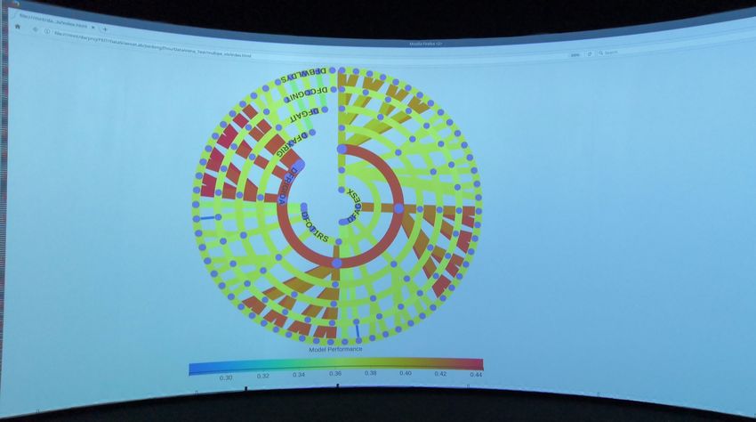
Fig. 12: RadialNet displayed in our large scale visualisation facility.
We also collected participants’ feedback after completing all tasks by each partic-
ipant. Overall, all participants believed that “RadialNet is the most effective visualisa-
tion in identifying feature importance compared with other three approaches”. Some
participants suggested to “enlarge the size of RadialNet with the increase of number
of features”. Participants agreed that “RadialNet is more efficient to help users focus
their attention to find visual elements of interest”. Fig. 10 and Fig. 11 show heat maps
on four visualisations recorded by an SMI eye-tracker from a participant during the
selection task period respectively. Heat maps reveal the focus of attention by colours
indicating the amount of time eyes stay focused on a particular area in the visuali-
sation, the redder, the more time eyes focused. Fig. 10 and Fig. 11 suggest that the
user’s attention in RadialNet was more focused on two model lines with high perfor-20 Jianlong Zhou et al.
mance (wide red lines), while it was much scattered among different points in other
three visualisations.
Overall, we can say that RadialNet shows significant advantages in identifying
features and performance related to specific models as well as easily revealing im-
portance of features compared with other three visualisation types. Despite these ad-
vantages, the mental effort and time spent in RadialNet did not show much differences
from others such as radar chart.
7 Discussion
This study proposed a novel visualisation approach to compare variables with dif-
ferent number of dependents. Data information is encoded with colour, line width,
as well as structure of visualisation to reveal insights from data. The experimental
results showed that RadialNet has advantages in identifying features related to spe-
cific models as well as directly revealing importance of features for ML explanations.
Different from conventional feature importance evaluations based on complex com-
puting algorithms [30] (such as by simulating lack of knowledge about the values
of the feature(s) [25], or by mean decrease impurity, which is defined as the total de-
crease in node impurity averaged over all trees of the ensemble in Random Forest[7]),
RadialNet allows users to estimate feature importance directly from visualisation by
checking lines connected to the feature arc. The consistent large line width of these
lines with colours on the right-hand side of the colour scale indicate the high impor-
tance of the feature to the modelling.
RadialNet is more compact to show more information in a limited space com-
pared with other three visualisation types. And the compactness of RadialNet can
also be controlled by changing its spanning angle dynamically (see the attached video
with this paper). However, RadialNet will be much complex when the number of fea-
tures is high. This could be compensated with large scale visualisation facilities. For
example, we have a 360-degree interactive data visualisation facility set to change
the way we view and interact with data. Viewers stand in the middle of a large cylin-
drical screen, four metres high and ten metres in diameter. A high performance com-
puter graphics system drives six 3D-stereo video projectors, edge-blended to create a
seamless three-dimensional panorama. Picture clarity is made possible from an im-
age that’s 20, 000 × 1200 pixels. This facility can be used to present RadialNet with
large number of ML models for effective interactions. Fig. 12 shows an example of
RadialNet displayed with around 60-degree field of view in the facility.
This paper used the exploration of performance of ML models based on different
feature groups from a given data set as a case study to demonstrate the powerfulness
of RadialNet in visualising data with complex relations. The RadialNet can also be
generalised to other applications where similar relations need to be explored.
8 Conclusion and Future Work
This paper presented RadialNet Chart, a novel visualisation approach to compare
ML models with different number of features while revealing implicit dependent re-Facilitating Machine Learning Model Comparison 21
lations. The RadialNet is developed to address the challenges faced in comparing a
large amount of ML models with each dependent on a dynamic number of features.
It is implemented by representing ML models and features with lines and arcs re-
spectively, which in turn are generated by a recursive function and a feature path
concept. We presented our design criteria and described the algorithms for gener-
ating the chart. Two case studies were also presented with representative data sets
and an experiment was conducted evaluating the effectiveness of the RadialNet. Our
case studies showed that the proposed visualisation can help users easily locate target
models and important features. Furthermore, the user study revealed that in compari-
son with other commonly used visualisation approaches, RadialNet is more efficient
to help users focus their attention to find visual elements of interest. It is also more
compact to show more information in a limited space. Our research provides an effec-
tive visualisation approach to represent data with complex relations. It is specifically
helpful for users to find optimal machine learning model and discern feature impor-
tance visually and directly, but not through complex algorithmic calculations for ML
explanations.
For future work, we plan to conduct a more comprehensive eye tracking study,
focusing on the analysis of eye activities during the task time to learn eye move-
ment patterns in viewing RadialNet. Such study will help to improve the design of
RadialNet for more efficient information browsing. We also hope that the use of Ra-
dialNet in ML model comparison presented here can serve as both a template and a
motivation for other data and applications. RadialNet Chart will be available as an
open-source library.
References
1. Aigner, W., Miksch, S., Schumann, H., Tominski, C.: Visualization of Time-Oriented Data. Human-
Computer Interaction Series. Springer (2011)
2. Amershi, S., Chickering, M., Drucker, S.M., Lee, B., Simard, P., Suh, J.: ModelTracker: Redesign-
ing Performance Analysis Tools for Machine Learning. In: Proceedings of the 33rd Annual ACM
Conference on Human Factors in Computing Systems, pp. 337–346 (2015)
3. Ankerst, M., Elsen, C., Ester, M., Kriegel, H.P.: Visual classification: an interactive approach to deci-
sion tree construction. In: Proceedings of KDD ’99, pp. 392–396 (1999)
4. Becker, B., Kohavi, R., Sommerfield, D.: Visualizing the Simple Bayesian Classifier. In: U. Fayyad,
G.G. Grinstein, A. Wierse (eds.) Information visualization in data mining and knowledge discovery,
pp. 237–249. Morgan Kaufmann (2001)
5. Biran, O., Cotton, C.: Explanation and justification in machine learning: A survey. In: Proceedings of
the 2017 IJCAI Explainable AI Workshop, pp. 8–13 (2017)
6. Bostock, M., Ogievetsky, V., Heer, J.: D3 data-driven documents. IEEE Transactions on Visualization
and Computer Graphics 17(12), 2301–2309 (2011)
7. Breiman, L., Friedman, J., Olshen, R., Stone, C.: Classification and Regression Trees. Wadsworth and
Brooks, Monterey, CA (1984)
8. Caragea, D., Cook, D., Honavar, V.G.: Gaining insights into support vector machine pattern classifiers
using projection-based tour methods. In: Proceedings of KDD ’01, pp. 251–256 (2001)
9. Card, S.K., Mackinlay, J.D., Shneiderman, B.: Readings in Information Visualization: Using Vision
to Think. Morgan Kaufmann (1999)
10. Chan, G.Y.Y., Bertini, E., Nonato, L.G., Barr, B., Silva, C.T.: Melody: Generating and visualizing
machine learning model summary to understand data and classifiers together. arXiv:2007.10614 [cs]
(2020). URL http://arxiv.org/abs/2007.1061422 Jianlong Zhou et al.
11. Chen, D., Bellamy, R.K.E., Malkin, P.K., Erickson, T.: Diagnostic visualization for non-expert ma-
chine learning practitioners: A design study. In: 2016 IEEE Symposium on Visual Languages and
Human-Centric Computing (VL/HCC), pp. 87–95 (2016)
12. Dua, D., Karra Taniskidou, E.: UCI machine learning repository (2017). URL http://archive.
ics.uci.edu/ml
13. Erra, U., Frola, B., Scarano, V.: An Interactive Bio-inspired Approach to Clustering and Visualizing
Datasets. In: Proceedings of the 15th International Conference on Information Visualisation 2011, pp.
440–447 (2011)
14. Gleicher, M.: Considerations for visualizing comparison. IEEE Transactions on Visualization and
Computer Graphics 24(1), 413–423 (2018)
15. Guo, Z., Ward, M.O., Rundensteiner, E.A.: Nugget Browser: Visual Subgroup Mining and Statistical
Significance Discovery in Multivariate Datasets. In: Proceedings of the 15th International Conference
on Information Visualisation, pp. 267–275 (2011)
16. Kim, S., Dong, Z., Xian, H., Upatising, B., Yi, J.S.: Does an eye tracker tell the truth about visual-
izations?: Findings while investigating visualizations for decision making. IEEE Trans. Vis. Comput.
Graph. 18(12), 2421–2430 (2012)
17. Koytek, P., Perin, C., Vermeulen, J., André, E., Carpendale, S.: Mybrush: Brushing and linking with
personal agency. IEEE Transactions on Visualization and Computer Graphics 24(1), 605–615 (2018)
18. Langner, R., Horak, T., Dachselt, R.: Vistiles: Coordinating and combining co-located mobile devices
for visual data exploration. IEEE Transactions on Visualization and Computer Graphics 24, 626–636
(2018)
19. Law, P., Basole, R.C., Wu, Y.: Duet: Helping data analysis novices conduct pairwise comparisons by
minimal specification. IEEE Transactions on Visualization and Computer Graphics 25(1), 427–437
(2019)
20. Neto, M.P., Paulovich, F.V.: Explainable matrix – visualization for global and local interpretability of
random forest classification ensembles. IEEE Transactions on Visualization and Computer Graphics
(2020)
21. Ondov, B.D., Jardine, N., Elmqvist, N., Franconeri, S.: Face to face: Evaluating visual comparison.
IEEE Transactions on Visualization and Computer Graphics 25(1), 861–871 (2019)
22. Paiva, J.G., Florian, L., Pedrini, H., Telles, G., Minghim, R.: Improved Similarity Trees and their
Application to Visual Data Classification. IEEE Transactions on Visualization and Computer Graphics
17(12), 2459–2468 (2011)
23. Prakash, N., Caspell-Garcia, C., Coffey, C., et al.: Feasibility and safety of lumbar puncture in the
parkinson’s disease research participants: Parkinson’s progression marker initiative (PPMI). Parkin-
sonism & Related Disorders (2019)
24. Roberts, J.C.: State of the art: Coordinated & multiple views in exploratory visualization. In: Fifth
International Conference on Coordinated and Multiple Views in Exploratory Visualization (CMV
’07), pp. 61–71 (2007)
25. Robnik-Sikonja, M., Kononenko, I., Strumbelj, E.: Quality of Classification Explanations with PRBF.
Neurocomput. 96, 37–46 (2012)
26. Sarikaya, A., Gleicher, M.: Scatterplots: Tasks, data, and designs. IEEE Transactions on Visualization
and Computer Graphics 24(1), 402–412 (2018)
27. Talbot, J., Lee, B., Kapoor, A., Tan, D.S.: EnsembleMatrix: interactive visualization to support ma-
chine learning with multiple classifiers. In: Proceedings of the SIGCHI Conference on Human Factors
in Computing Systems, pp. 1283–1292 (2009)
28. Viegas, F., Wattenberg, M.: Visualization: The secret weapon for machine learning. Keynote in Euro-
Vis 2017 (2017)
29. Wongsuphasawat, K., Smilkov, D., Wexler, J., Wilson, J., Mané, D., Fritz, D., Krishnan, D., Viégas,
F.B., Wattenberg, M.: Visualizing dataflow graphs of deep learning models in tensorflow. IEEE Trans-
actions on Visualization and Computer Graphics 24(1), 1–12 (2018)
30. Zhou, J., Chen, F. (eds.): Human and Machine Learning: Visible, Explainable, Trustworthy and Trans-
parent. Springer, Cham (2018)
31. Zhou, J., Khawaja, M.A., Li, Z., Sun, J., Wang, Y., Chen, F.: Making Machine Learning Useable by
Revealing Internal States Update – A Transparent Approach. International Journal of Computational
Science and Engineering 13(4), 378–389 (2016)
32. Zhou, J., Sun, J., Chen, F., Wang, Y., Taib, R., Khawaji, A., Li, Z.: Measurable Decision Making with
GSR and Pupillary Analysis for Intelligent User Interface. ACM Transactions on Computer-Human
Interaction 21(6), 33 (2015)You can also read