New Zealand Progress in the net zero transition - OECD
←
→
Page content transcription
If your browser does not render page correctly, please read the page content below
Regional Outlook 2021 - Country notes

                                           New Zealand

                            Progress in the net zero transition

PUBE

Disclaimer (for the referring document)
This document, as well as any data and map included herein, are without prejudice to the status of or sovereignty
over any territory, to the delimitation of international frontiers and boundaries and to the name of any territory, city
or area. Extracts from publications may be subject to additional disclaimers, which are set out in the complete
version of the publication, available at the link provided.
2|
                                                  EMISSIONS

       2018 OECD average:                 2018 New Zealand average:             New Zealand emissions target:
         11.5 tCO2e/capita                      16.6 tCO2e/capita                     Net zero carbon by 2050

Large regions (TL2)

Figure 1. Estimated regional greenhouse gas emissions per capita              Greenhouse gas (GHG) emissions
Tons CO2 equivalent (tCO2e), large regions (TL2), 2018                        per capita generated in most of New
                                                                              Zealand’s large regions are above 10
                                                                              tCO2e per capita. Only Auckland,
                                                                              Wellington Region and Bay of Plenty
                                                                              Region have lower emissions per
                                                                              capita than the OECD average of
                                                                              11.5.

                                                                              Estimated emissions per capita in
                                                                              Southland Region are more than ten
                                                                              times higher than in Auckland.

Figure 2. Estimated GHG emissions per capita
Tons CO2 equivalent, large regions (TL2), 2010 & 2018

Agricultural emissions are usually the largest contributors, especially to those regions with the highest estimated
emissions per capita. Emissions per capita has changed little in most regions between 2010 and 2018.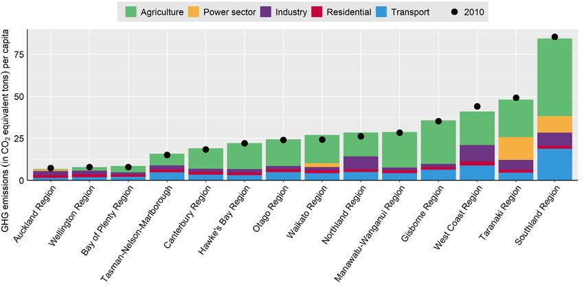
|3
Figure 3. Estimated GHG emissions
Million tons CO2 equivalent, large regions (TL2), 2018

Estimated absolute emissions are highest in Waikato Region, mostly driven by agriculture.

Target notes: Emissions targets included in the Net Zero Tracker database from ECIU before January 25, 2021 are considered.
Figure notes: Figures 1, 2, 3 and the OECD average show OECD calculations based on estimated greenhouse gas emissions data from the European Commission’s Joint
Research Centre (ECJRC). The Emissions Database for Global Atmospheric Research of the ECJRC allocates national greenhouse gas emissions to locations according to
about 300 proxies. . See Box 3.7 in the 2021 OECD Regional Outlook for more details.

                                                                         ENERGY

New Zealand electricity mix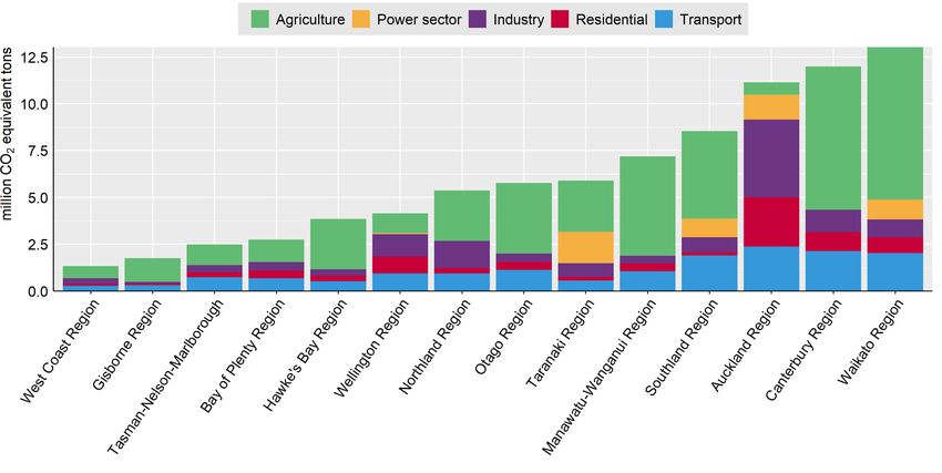
4|
Figure 4. National electricity generation by energy source in 2019

Share of coal-fired electricity generation

                                                                      2030 well below 2°C benchmark for Asia Pacific:
                                 2019 New Zealand average: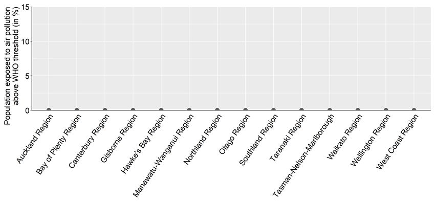
|5
2019 New Zealand average: 2030 well below 2°C benchmark for Asia
2019 OECD average: 8%
5% Pacific: >13%
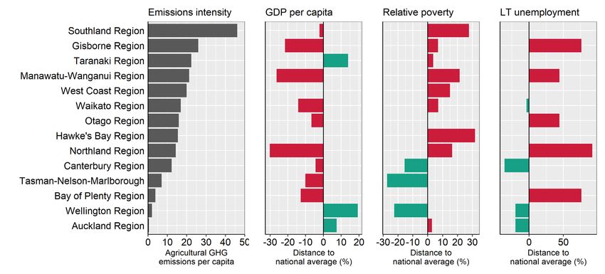
Figure 6. Regional wind power generation estimates Figure 7. Wind power potential
Per cent of total electricity generation, large regions (TL2), 2017 Mean wind power density (W/m2)
Regional wind electricity generation is estimated using facility level data for 67% Source: Map produced by The Global Wind Atlas
of New Zealand’s wind capacity.
Solar power
2019 New Zealand average: 2030 well below 2°C benchmark for Asia
2019 OECD average: 3%
0.3% Pacific: >15%
Figure 8. Solar power potential
Global horizontal irradiation (kWh/m2)
Source: Map produced by The Global Solar Atlas
While New Zealand has a lot of zero-emission electricity generation from hydropower the national wind and solar
shares are low, although wind power densities are unusually strong in many locations onshore and offshore. Most
regions do not currently have any solar and wind power, including in regions with strong potentials. On the other hand,
Wellington Region and Manawatu-Wanganui Region exclusively use wind power.
Benchmark notes: The well-below 2 degrees benchmarks show IEA Sustainable Development Scenario (SDS) numbers. The SDS models how the global energy system can
evolve in alignment with the Paris Agreement’s objective to keep the global average temperature increase well below 2°C above pre-industrial levels. According to the Powering
Past Coal Alliance (PPCA), a phase-out of unabated coal by 2030 for OECD countries is cost-effective to limit global warming to 1.5°C.
Figure notes: Figure 4 shows data from the IEA (2020). Figures 5 and 6 show OECD calculations based on the Power Plants Database from the WRI. The database captures
electricity generation from the power plants connected to the national power grid. As a result, small electricity generation facilities disconnected from the national power grid might
not be captured. See here for more details. Figures 7 and 8 show the power potential of solar and wind. Mean wind power density (WPD) is a measure of wind power available,
expressed in Watt per square meter (W/m²). Global horizontal irradiation (GHI) is the sum of direct and diffuse irradiation received by a horizontal surface, measured in kilowatt
hours per square metre (kWh/m2).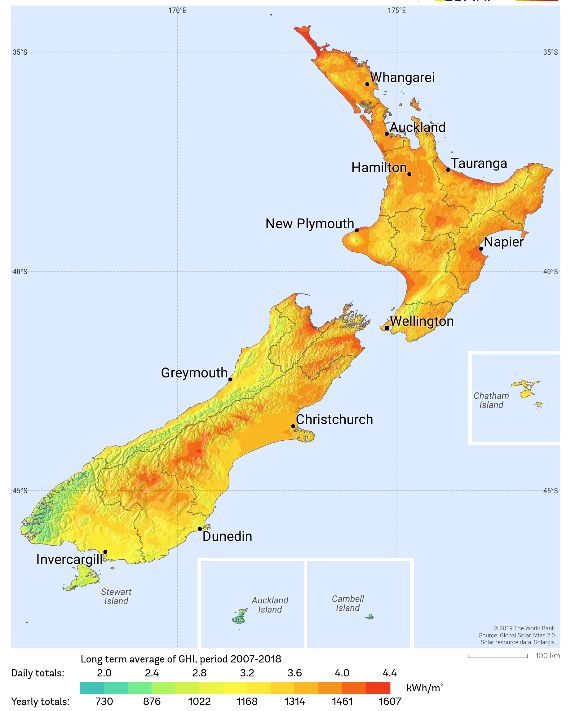
6|
                                                                          AGRICULTURE

Figure 9. Estimated GHG emissions from agriculture per capita and relative difference to country means for
GDP per capita, relative poverty and long-term unemployment
Large regions (TL2), 2018

While agriculture is not a sector that was broadly identified as being subject to employment risks based on employment
effects simulated across OECD countries (See Box 3.9 of the 2021 OECD Regional Outlook), it will be subject to
important transformations, for example with respect to animal farming, fertiliser use and carbon sequestration.

Regions with higher emissions per capita in agriculture may have a higher transition risk from rising carbon prices. In
New Zealand, estimated agricultural emissions per capita are highest in the Southland Region. The transition to net-
zero greenhouse gas emissions needs to be just, avoiding social hardship. Regions with higher agricultural emissions
per capita tend to have lower GDP per capita and higher poverty risk than the national average.

 Figure notes: Figure 9 is based on data from OECD Statistics and ECJRC. Poverty risk is assessed from individuals’ survey respondents indicating there have been times in the
 past 12 months when they did not have enough money to buy food that they or their family needed. Long-term unemployment is defined as unemployed for 12 months or more.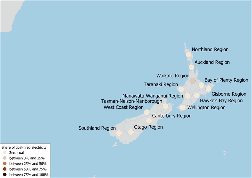
|7
                                                                         TRANSPORT

Modal shift

Auckland has a relatively poor public transport                       Figure 10. Public transport performance in 2018
performance. For comparison, London (UK)
has among the highest public transport
performance          scores.        Inhabitants         of    the
metropolitan area of London can on average
reach 95% of the population living within 8 km
in 30 minutes by public transport.

Benchmark notes: In the IEA’s Sustainable Development Scenario, OECD countries (such as the European Union, Japan and the United States) as well as China fully phase
out conventional car sales by 2040. This scenario is aligned with the Paris Agreement’s objective to keep the global average temperature increase well below 2°C above pre-
industrial levels. The UK Committee on Climate Change finds that all new cars and vans should be electric (or use a low carbon alternative such as hydrogen) by 2035 at the
latest to reach net zero GHG emission targets by 2050. A more cost-effective date from the point of view of users is 2030.
Figure notes: Figure 10 is based on data from ITF and OECD Statistics. See Box 3.10 in the 2021 OECD Regional Outlook for more details. GDP per capita is expressed in USD
per head, PPP, constant prices from 2015.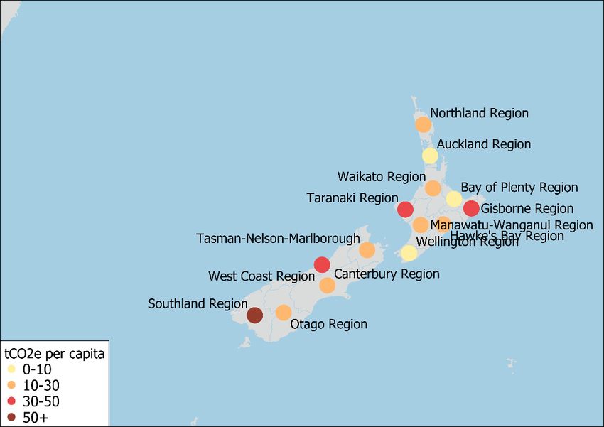
8|
                                                                  AIR POLLUTION

Large regions (TL2)

                                                              2019 New Zealand share of
     2019 OECD share of population                                                          WHO-recommended air quality
                                                             population exposed above the
        exposed above the WHO-                                                              threshold: PM2.5 annual mean
                                                             WHO-recommended threshold:
      recommended threshold: 62%                                                               concentration < 10 µg/m3
                                                                          0%

Figure 11. Share of population exposed to levels of air pollution above the WHO-recommended threshold
Percentage of population exposed to above 10 µg/m3 PM2.5, large regions (TL2), 2019

Policies towards net-zero greenhouse gas emissions can bring many benefits beyond halting climate change. They
include reduced air and noise pollution, reduced traffic congestion, healthier diets, enhanced health due to increased
active mobility, health benefits through thermal insulation, and improved water, soil and biodiversity protection. Some
are hard to quantify.
Small particulate matter (PM2.5) is the biggest cause of human mortality induced by air pollution. Major disease
effects include stroke, cardiovascular and respiratory disease. Air pollution amplifies respiratory infectious disease
such as Covid-19. It affects children the most. It reduces their educational outcomes as well as worker productivity.

 Figure notes: Figure 11 is based on data from OECD Statistics.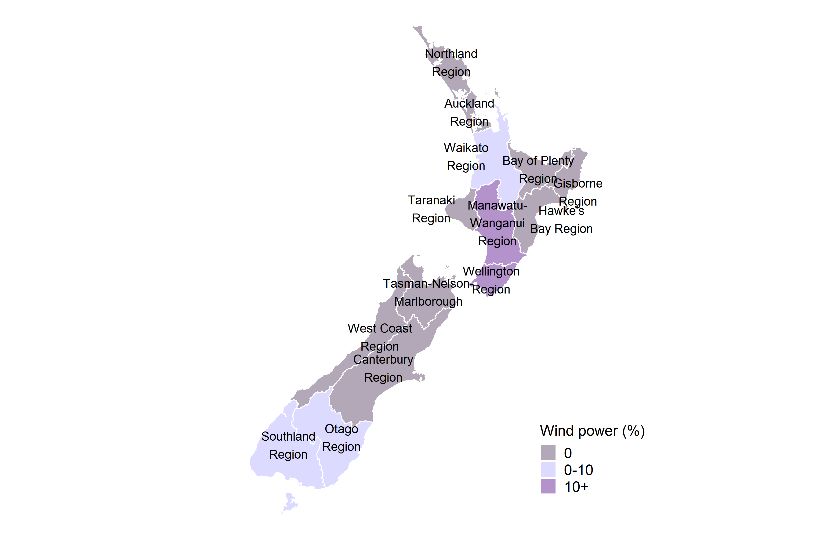
You can also read