BASIC ELEMENTS JULY 2013 - travelofferz

Page created by Wendy Shaw
 
CONTINUE READING
BASIC ELEMENTS JULY 2013 - travelofferz
COMMERCIAL
BASIC ELEMENTS   EXTERNAL SIGNAGE   PRE-SIGNAGE   INTERNAL SIGNAGE   STATIONERY       LOBBY   ROOM   CO-MEETING   FIT & SPA LOUNGE   RESORTS                    FOOD & BEVERAGE
                                                                                                                                               DOCUMENTS

                                                   BASIC ELEMENTS
                                                                                  JULY 2013

                                                                                                                                                            >
                                                                                                                                                                  JULY 2013
BASIC ELEMENTS JULY 2013 - travelofferz
COMMERCIAL
    BASIC ELEMENTS   EXTERNAL SIGNAGE   PRE-SIGNAGE   INTERNAL SIGNAGE   STATIONERY      LOBBY    ROOM   CO-MEETING   FIT & SPA LOUNGE   RESORTS                    FOOD & BEVERAGE
                                                                                                                                                   DOCUMENTS

                                                                                      Important

                                            SOME PRINCIPLES AND RULES DEFINED IN THIS CHAPTER
                                             MAY EVOLVE AND BE UPDATED BY SEPTEMBER 2013.

<                                                                                                                                                               >
                                                                                                                                                                      JULY 2013
BASIC ELEMENTS JULY 2013 - travelofferz
COMMERCIAL
      BASIC ELEMENTS   EXTERNAL SIGNAGE   PRE-SIGNAGE   INTERNAL SIGNAGE   STATIONERY   LOBBY         ROOM      CO-MEETING   FIT & SPA LOUNGE   RESORTS                    FOOD & BEVERAGE
                                                                                                                                                          DOCUMENTS

    BASIC ELEMENTS
    BRAND BLOCK . GENERAL PRESENTATION . SYMBOL RATIONALE .                                     SECONDARY COLOURS . PRESENTATION . SHADINGS . AGAINST
    COLOURS . POSITION OF LOGO . SECURITY ZONE AND MINIMUM                                      BACKGROUNDS
    SIZE . USE ON WHITE OR CHARCOAL GREY BACKGROUNDS .                                          TYPEFACES . FUTURA . BODONI . COMPUTER USES
    USE ON VISUAL BACKGROUNDS . PROHIBITED USES .
    COMBINED WITH HOTEL NAME                                                                    HOTEL NAMES

    BRAND BLOCK SPECIAL CASES . WITHOUT SYMBOL .                                                BILINGUAL DOCUMENTS TRANSLATION . PRESENTATION .
    UNACCOMPANIED PULLMAN . THE MULTI-BRAND FRIEZE                                              SPECIAL CASES

    SYMBOL . COLOURS AND MINIMUM SIZE . USE . DERIVED                                           WRITTEN STYLE
    PRODUCTS . SPECIAL CASE: FAVICON                                                            ILLUSTRATIONS . SHOOT INTENTIONS . USE OF VISUALS .
    SUMMARY OF MINIMUM DIMENSIONS FOR USE                                                       PICTOGRAMS
    CORPORATE COLOURS . PRESENTATION . SHADING . USE OF                                         PRINT PRODUCTION . PAPER RECOMMENDATIONS . PREMIUM
    SHADING . USE OF CHARCOAL GREY AND WHITE . USE OF CHARCOAL                                  TREATMENT
    GREY: SPECIAL CASE . USE OF WHITE: SPECIAL CASE . USE OF SAND
    COLOUR . USE OF SAND COLOUR: SPECIAL CASE . USE OF MAUVE .

<                                                                                                                                                                      >
                                                                                                                                                                             JULY 2013
BASIC ELEMENTS JULY 2013 - travelofferz
COMMERCIAL
   BASIC ELEMENTS      EXTERNAL SIGNAGE        PRE-SIGNAGE   INTERNAL SIGNAGE   STATIONERY   LOBBY   ROOM   CO-MEETING   FIT & SPA LOUNGE   RESORTS                FOOD & BEVERAGE
                                                                                                                                                      DOCUMENTS

BRAND BLOCK
GENERAL PRESENTATION
The brand block consists of the symbol,
the name Pullman and the identifier
Hotels and Resorts.

Each part of the block fits into
a precise scale of proportions.
These must always be respected.
____

IMPORTANT:
The shape of the brand block must not be changed,
it must not be truncated or shortened, and it must be
used in its entirety

 > Download this document

                                                                                                                                                                     JULY 2013
BASIC ELEMENTS JULY 2013 - travelofferz
COMMERCIAL
   BASIC ELEMENTS     EXTERNAL SIGNAGE       PRE-SIGNAGE   INTERNAL SIGNAGE   STATIONERY        LOBBY         ROOM     CO-MEETING     FIT & SPA LOUNGE    RESORTS                FOOD & BEVERAGE
                                                                                                                                                                    DOCUMENTS

BRAND BLOCK
SYMBOL RATIONALE
The symbol is one of the major
components of the brand block. In

                                                                                                                           D

                                                                                                                                        Y
                                                                                                                       EN

                                                                                                                                      LIT
particular, its design transmits the

                                                                                                                                                    ITY
                                                                                                                      H-

                                                                                                                                    NA
fundamental values of the brand:

                                                                                                                     HIG

                                                                                                                                                 AR
                                                                                                                                  O
cosmopolitan, stylish, vibrant.

                                                                                                                               RS

                                                                                                                                                T
                                                                                                                                             EN
                                                                                                                             PE

                                                                                                                                         LIM
It expresses the positive duality of

                                                                                                                                      MP
the business/leisure concept. This paradox

                                                                                                                                    CO
is experienced as a perfect balance,

                                                                                                                                                   Y
                                                                                                                                               ON
as with the concept of yin and yang.

                                                                                                                                            RM
                                                                                                                                         HA
The symbol is in itself the symbol of
the Pullman identity. It enriches the way
it is perceived, gives it added meaning
and becomes a vital element of brand

                                                                                            N
recognition.

                                                                                         SIG
____

IMPORTANT:                                                                             DE
The shape of the symbol must not be changed, and it must

                                                                                                 ITY
not be inclined at a different angle
                                                                                               RN
                                                                                             DE

                                                                                                                CE
                                                                                           MO

                                                                                                              EN
                                                                                                         FER
                                                                                                        DIF

                                                                                                                                                                                   JULY 2013
COMMERCIAL
   BASIC ELEMENTS      EXTERNAL SIGNAGE        PRE-SIGNAGE   INTERNAL SIGNAGE       STATIONERY     LOBBY   ROOM   CO-MEETING   FIT & SPA LOUNGE   RESORTS                FOOD & BEVERAGE
                                                                                                                                                            DOCUMENTS

BRAND BLOCK
COLOURS
The brand block exists in two versions:
in charcoal grey, or in reverse printed in
white.

It must under no circumstances be used
in another colour.
____

TECHNICAL SPECIFICATIONS:
- The user may choose between the CMYK and Pantone
colour models for all print purposes, and may also use
the RGB or hexadecimal models for web/digital uses
- Vector format

                                                                            CHARCOAL GREY
                                                                            CMYK: black 90%
                                                                            PANTONE: black U 90%
                                                                            RGB: 61/60/60
                                                                            #: 3d3c3c

                                                                            WHITE

                                                                                                                                                                           JULY 2013
COMMERCIAL
   BASIC ELEMENTS     EXTERNAL SIGNAGE          PRE-SIGNAGE   INTERNAL SIGNAGE   STATIONERY        LOBBY   ROOM   CO-MEETING   FIT & SPA LOUNGE   RESORTS                FOOD & BEVERAGE
                                                                                                                                                            DOCUMENTS

BRAND BLOCK
POSITION OF SYMBOL
The symbol takes up the total height of
the brand block. The distance separating
the symbol from the word Pullman is
equivalent to half the width of the symbol
(i.e. its radius).
____

IMPORTANT:
The shape of the symbol must not be changed, and it must
not be inclined at a different angle

SEE ALSO:
> Brand block: security zone and minimum size

                                                                                              RADIUS
                                                                                              OF LOGO

                                                                                                                                                                           JULY 2013
COMMERCIAL
   BASIC ELEMENTS     EXTERNAL SIGNAGE          PRE-SIGNAGE   INTERNAL SIGNAGE   STATIONERY   LOBBY   ROOM           CO-MEETING   FIT & SPA LOUNGE   RESORTS                FOOD & BEVERAGE
                                                                                                                                                               DOCUMENTS

BRAND BLOCK
SECURITY ZONE
AND MINIMUM SIZE
Each part of the block fits into a precise
scale of proportions.
These must always be respected.

The security zone around the brand block
with the symbol corresponds to the width
of the symbol (i.e. its diameter).

To ensure that it is legible, the brand
block must not be used with a width
of less than 40 mm. Very specific
exceptional cases may however be
accepted. Please refer to the pages
Brand Block: Special Cases.
____

IMPORTANT:
No element must appear in this zone so as to preserve
the integrity and visibility of the brand block

SEE ALSO:
> Brand block: security zone and minimum size

                                                                                                             40 MM MINIMUM

                                                                                                                                                                              JULY 2013
COMMERCIAL
   BASIC ELEMENTS      EXTERNAL SIGNAGE        PRE-SIGNAGE   INTERNAL SIGNAGE   STATIONERY   LOBBY   ROOM   CO-MEETING   FIT & SPA LOUNGE   RESORTS                FOOD & BEVERAGE
                                                                                                                                                      DOCUMENTS

BRAND BLOCK
USE ON WHITE OR CHARCOAL
GREY BACKGROUND
On a white background, the brand block
is used in charcoal grey.

On a charcoal grey background, it is
used in reverse printed in white version.

In the event of a particularly high-end
use, the brand block may also be treated
on a tone-by-tone basis in gloss spot
varnish (e.g., gloss spot varnish on matt
paper printed in charcoal grey flat tint).

____

IMPORTANT :
Flat tint backgrounds other than white or charcoal grey
are prohibited in the brand block

SEE ALSO:
> Brand block: use on a visual background
> Print production: premium treatment

                                                                                                                                                                     JULY 2013
COMMERCIAL
   BASIC ELEMENTS      EXTERNAL SIGNAGE        PRE-SIGNAGE   INTERNAL SIGNAGE   STATIONERY   LOBBY   ROOM   CO-MEETING   FIT & SPA LOUNGE   RESORTS                FOOD & BEVERAGE
                                                                                                                                                      DOCUMENTS

BRAND BLOCK
USE ON VISUAL
BACKGROUNDS
The brand block can also be used
against a background of visuals.
The composition of these visuals must be
clearly presented and must allow for
good legibility of the brand block.

On a light visual background, the brand
block is used in charcoal grey.

On a dark visual background, it is used
in reverse printed in white.
____

IMPORTANT:
Always ensure that the brand block has good legibility

SEE ALSO:
> Brand block: use on white or charcoal grey backgrounds

                                                                                                                                                                     JULY 2013
COMMERCIAL
  BASIC ELEMENTS   EXTERNAL SIGNAGE   PRE-SIGNAGE   INTERNAL SIGNAGE       STATIONERY   LOBBY   ROOM   CO-MEETING   FIT & SPA LOUNGE      RESORTS                         FOOD & BEVERAGE
                                                                                                                                                         DOCUMENTS

BRAND BLOCK
PROHIBITED USES
It is essential that the brand block should
not be modified in any way.
It forms an untouchable whole.
                                                                       1                                                                                              2
1. Do not use the brand block against a
background that affects its legibility.

2. Do not transform its colour.

3. Do not move any part of the brand
block and do not allow any rotation of
the symbol.
                                                                       3                                                                                              4
4. Do not change the shape of the brand
block.

5. Do not change the angles of the brand
block.

6. Do not apply filters to the brand block
or make it more opaque.
                                                                       5                                                                                              6
7. Do not use a surrounding border of
any colour or any shape whatsoever.

8. Do not eliminate or replace Hotels and
Resorts, or change its typeface.

                                                                                                                                   Hôtels  et  Resorts

                                                                       7                                                                                              8

                                                                                                                                                                            JULY 2013
COMMERCIAL
   BASIC ELEMENTS       EXTERNAL SIGNAGE       PRE-SIGNAGE      INTERNAL SIGNAGE   STATIONERY   LOBBY   ROOM           CO-MEETING     FIT & SPA LOUNGE   RESORTS                      FOOD & BEVERAGE
                                                                                                                                                                         DOCUMENTS

BRAND BLOCK
COMBINED WITH
HOTEL NAME
The hotel name can be combined with the                                                                        PARIS LA DÉFENSE
brand block. This combination always follows
the same rules, whatever medium is being used.

The name is always presented in capitals and
centred on the width of the word "Pullman".

In the case of a name that is particularly long,
this is distributed over 2 lines. The 1st line is
always longer than the 2nd.

The security zone all around the brand block
combined with the hotel name is equivalent
to the width (diameter) of the symbol.                                                                                                                             height = 2 N
____                                                                                                                                                               height = 2 N
                                                                                                                PARIS LA DÉFENSE
IMPORTANT:
- Ensure the name never surpasses the width of the word "Pullman"
- Do not change the typeface and/or the thickness of the line.
- The brand blocks have already been created for the entire network.
They may be downloaded via the link at the bottom of the page. Only
hotels with correct names were created

TECHNICAL SPECIFICATIONS:
- Vector format except for the hotel name, which can be
customised (Futura Condensed)

SEE ALSO:
> Typefaces: Futura .                                                                                              PARIS LA DÉFENSE
> Names of hotels

  > Download the brand block for your hotel                                                                    40 MM MINIMUM

                                                                                                                                                                                        JULY 2013
COMMERCIAL
  BASIC ELEMENTS     EXTERNAL SIGNAGE       PRE-SIGNAGE   INTERNAL SIGNAGE   STATIONERY   LOBBY   ROOM            CO-MEETING   FIT & SPA LOUNGE   RESORTS                FOOD & BEVERAGE
                                                                                                                                                            DOCUMENTS

BRAND BLOCK
SPECIAL CASES
WITHOUT SYMBOL
Below 40 mm wide and up to 30 mm
the brand block may be used without the
symbol, in charcoal grey or in reverse
printed in white.

The security zone around the brand
block without the symbol corresponds to
the height of the "l" in "Pullman".
____

TECHNICAL SPECIFICATIONS:
- The user has the choice between the CMYK and Pantone
colour models for all print uses, and also the RGB or
hexadecimal models for web/digital uses
- Vector format

SEE ALSO:
> Brand block: security zone and minimum size
> Brand block special cases: unaccompanied Pullman

 > Download this document                                                                         30 MM MINIMUM

                                                                                                                                                                           JULY 2013
COMMERCIAL
   BASIC ELEMENTS       EXTERNAL SIGNAGE          PRE-SIGNAGE   INTERNAL SIGNAGE   STATIONERY   LOBBY   ROOM            CO-MEETING   FIT & SPA LOUNGE   RESORTS                FOOD & BEVERAGE
                                                                                                                                                                  DOCUMENTS

BRAND BLOCK
SPECIAL CASES
UNACCOMPANIED PULLMAN
Below 30 mm wide and up to 15 mm
the brand block may be used with
unaccompanied Pullman, in charcoal
grey or in reverse printed in white.

The security zone around the brand
block with unaccompanied Pullman
corresponds to the height of the "l" in
"Pullman".
____

IMPORTANT :
As part of a print operation and given its small size, it is
recommended to use this brand block in charcoal grey on
white background

TECHNICAL SPECIFICATIONS:
- The user has the choice between the CMYK and Pantone
colour models for all print uses, and also the RGB or
hexadecimal models for web/digital uses
- Vector format

SEE ALSO:
> Brand block: security zone and minimum size
> Brand block special cases: without symbol

                                                                                                        15 MM MINIMUM

 > Download this document

                                                                                                                                                                                 JULY 2013
COMMERCIAL
   BASIC ELEMENTS      EXTERNAL SIGNAGE        PRE-SIGNAGE    INTERNAL SIGNAGE    STATIONERY       LOBBY   ROOM   CO-MEETING   FIT & SPA LOUNGE   RESORTS                FOOD & BEVERAGE
                                                                                                                                                            DOCUMENTS

BRAND BLOCK
SPECIAL CASES
THE MULTI-BRAND FRIEZE
Within the multi-brand frieze that presents
Accor and recalls that Pullman forms part
of the Group, and in view of the fact that
it is used in an extremely small version,
the brand block is simplified as much as
possible and only keeps the word
Pullman.

Exceptionally, it is used in Accor's
greige colour.
____

IMPORTANT:
- This minimalist version is used only for this purpose
and is always combined with the multi-brand frieze
- The shape of the frieze must not be changed
- The Accor greige colour must be used at 100% of its value

TECHNICAL SPECIFICATIONS:
Vector format
                                                                             ACCOR GREIGE
SEE ALSO:                                                                    CMYK: 10/25/25/40
> Brand block special cases: without symbol                                  PANTONE: 408 U or C
                                                                             RGB: 153/139/132
                                                                             #: 998B84

 > Download this document

                                                                                                                                                                           JULY 2013
COMMERCIAL
   BASIC ELEMENTS      EXTERNAL SIGNAGE         PRE-SIGNAGE   INTERNAL SIGNAGE   STATIONERY   LOBBY   ROOM   CO-MEETING   FIT & SPA LOUNGE    RESORTS                FOOD & BEVERAGE
                                                                                                                                                        DOCUMENTS

SYMBOL
COLOURS AND MINIMUM SIZE
The symbol can also be used unaccompanied and
with contrasting bands in charcoal grey, in white or
in sand colour.

In addition, it can be presented in a more subtle
way on a background of the same colour.
- gloss spot varnish symbol on a matt white
background,
- dark charcoal grey symbol on charcoal grey                                                                                         6 MM MINIMUM
background,
- dark sand symbol on sand background.

The symbol must not be used
with
____ less than 6 mm in diameter.

IMPORTANT:
- The symbol must never be used in other colours
- Within the brand block, the symbol may be white or
charcoal grey, but never sand-coloured
- The shape of the logo is non-modifiable, it must never
be altered

TECHNICAL SPECIFICATIONS:
Vector format

SEE ALSO:
> Brand block: colours
> Corporate colours: presentation

 > Download this document

                                                                                                                                                                       JULY 2013
COMMERCIAL
   BASIC ELEMENTS      EXTERNAL SIGNAGE         PRE-SIGNAGE   INTERNAL SIGNAGE      STATIONERY              LOBBY   ROOM   CO-MEETING   FIT & SPA LOUNGE      RESORTS                            FOOD & BEVERAGE
                                                                                                                                                                                DOCUMENTS

SYMBOL
USE
When printed on brochure covers, or
                                                                                                                                                               Marking coat-hangers
used in pre-signage or on objects or
furniture inside the hotel, it allows for
subtle marking out of the brand's home
territory.
____
                                                                             Cover for room-card
IMPORTANT:
The symbol is used to underscore discreetly the brand's
ownership and must therefore be used sparingly

SEE ALSO:
> Brand block: security zone and minimum size

                                                                             Cufflinks and furniture markings                                              Marking on Moleskine type notebook

                                                                                                                                                                                                   JULY 2013
COMMERCIAL
   BASIC ELEMENTS     EXTERNAL SIGNAGE        PRE-SIGNAGE   INTERNAL SIGNAGE   STATIONERY           LOBBY                ROOM        CO-MEETING   FIT & SPA LOUNGE   RESORTS                FOOD & BEVERAGE
                                                                                                                                                                               DOCUMENTS

SYMBOL
DERIVED PRODUCTS
The symbol can be used to give a touch
of variety to product coverings, for
example by reproducing its image all
over a particular surface (e.g., gift
packaging).

The symbol may also exceptionally be
used to form a pattern, by using only the
actual internal design of the symbol itself
                                                                                        Cover for magnetic card
and prolonging this to the edges of the
surface concerned.
____

IMPORTANT:
- Ensure that the high-end appearance and the elegance
of the finishing is preserved
- Tone-by-tone finishes will be preferred to excessive
contrasts

                                                                                        Gift packaging design (from our boutiques)

                                                                                                                                                                                              JULY 2013
COMMERCIAL
   BASIC ELEMENTS       EXTERNAL SIGNAGE       PRE-SIGNAGE   INTERNAL SIGNAGE   STATIONERY           LOBBY                 ROOM               CO-MEETING   FIT & SPA LOUNGE   RESORTS                FOOD & BEVERAGE
                                                                                                                                                                                        DOCUMENTS

SYMBOL
SPECIAL CASE: FAVICON
A favicon is a computer icon that
symbolises a website. Favicons are used
by web browsers to access the address
bar, title bar, favourites, tabs and other
Internet short cuts.

For the purposes of this icon of extremely
small dimensions, a simplified sign has
been specially conceived.                                                                                                         16 pixels

It is used exclusively at a size of 16 pixels
(equivalent to the diameter of the logo).
____

IMPORTANT:
- This symbol is used for no other purpose
- This symbol must only be used in one size (16px)

TECHNICAL SPECIFICATIONS:
Format .ico

SEE ALSO:
> Internet guidelines

                                                                                             Extract of navigation bar with tab

 > Download this document

                                                                                                                                                                                                       JULY 2013
COMMERCIAL
   BASIC ELEMENTS     EXTERNAL SIGNAGE       PRE-SIGNAGE   INTERNAL SIGNAGE   STATIONERY            LOBBY       ROOM   CO-MEETING   FIT & SPA LOUNGE   RESORTS                FOOD & BEVERAGE
                                                                                                                                                                 DOCUMENTS

SUMMARY OF MINIMUM
DIMENSIONS FOR USE
                                                                                   For use higher or equal to
Compliance with these minimum sizes                                                40 mm wide:
ensures the readability of brand block or
symbol when it is used alone.
____

VOIR AUSSI :
> Brand block: security zone and minimum size
> Brand block special cases: without symbol
> Brand block special cases: unaccompanied Pullman
> Symbol: coulours and minimum size
                                                                                   For use included
                                                                                   between 39 and 30 mm wide:

                                                                                   For use included
                                                                                   between 29 and 15 mm wide:

                                                                                   For use included
                                                                                   between 14 and 6 mm wide:

                                                                                                                                                                                JULY 2013
COMMERCIAL
   BASIC ELEMENTS      EXTERNAL SIGNAGE        PRE-SIGNAGE   INTERNAL SIGNAGE      STATIONERY          LOBBY   ROOM   CO-MEETING   FIT & SPA LOUNGE   RESORTS                FOOD & BEVERAGE
                                                                                                                                                                DOCUMENTS

CORPORATE COLOURS
PRESENTATION                                                                    SAND
                                                                                CMYK: 8/25/55/8
Corporate colours embody the brand's
                                                                                PANTONE: 467 U
values and are used across the board
                                                                                RGB: 212/184/126
in all means of communication.
                                                                                #: d4b87e
These colours may under no
circumstances be changed and must be
used at 100% of their value.
____

TECHNICAL SPECIFICATIONS:                                                       MAUVE
The user may choose between the CMYK and Pantone                                CMYK: 55/85/30/5
colour models for all print purposes, and may also use                          PANTONE: 260 U
the RGB or hexadecimal models for web/digital uses                              RGB: 119/64/111
                                                                                #: 77406f
SEE ALSO:
> Corporate colours: use of sand colour
> Corporate colours: use of mauve
> Corporate colours: use of charcoal grey

                                                                                CHARCOAL GREY
                                                                                CMYK: black 90%
                                                                                PANTONE: black U 90%
                                                                                RGB: 61/60/60
                                                                                #: 3d3c3c

                                                                                WHITE

                                                                                                                                                                               JULY 2013
COMMERCIAL
   BASIC ELEMENTS      EXTERNAL SIGNAGE        PRE-SIGNAGE   INTERNAL SIGNAGE    STATIONERY   LOBBY   ROOM            CO-MEETING        FIT & SPA LOUNGE   RESORTS                 FOOD & BEVERAGE
                                                                                                                                                                      DOCUMENTS

CORPORATE COLOURS
SHADING
Expressing the concept of Business/
Leisure, mauve and sand colour are
combined with the shaded band.

This colour shading follows an order that
it is vital to comply with: mauve (on the
left) passing to sand colour (on the right).

The point of balance between the 2
colours is reached in the centre of the
format in which the shading is illustrated.
Neither of the 2 colours must occupy
more space than the other.
____

TECHNICAL SPECIFICATIONS:
The user may choose between the CMYK and Pantone                                MAUVE 100%             Point of balance between the 2 colours                        SAND 100%
colour models for all print purposes, and may also use
the RGB or hexadecimal models for web/digital uses

SEE ALSO:
> Corporate colours: presentation
> Use of shading

                                                                                                                                                                                     JULY 2013
COMMERCIAL
   BASIC ELEMENTS     EXTERNAL SIGNAGE       PRE-SIGNAGE   INTERNAL SIGNAGE   STATIONERY            LOBBY               ROOM           CO-MEETING   FIT & SPA LOUNGE        RESORTS                            FOOD & BEVERAGE
                                                                                                                                                                                                  DOCUMENTS

CORPORATE COLOURS
USE OF SHADING
The colour shading model, ranging from
mauve to sand, co-exists with all the                                                  Use in a typeface
colours in the guidelines.

It is used in vertical or horizontal
banners, or in the various typefaces.
____
                                                                                      Use in a banner
IMPORTANT:
- The shading is always used in its entirety so as to
represent mauve and sand at each end at 100% of their
respective values. It must not be cut short
- The shading is never used over large surfaces or
in the symbol

SEE ALSO:
> Corporate colours: shading

                                                                                               Use of shaded typeface in an envelope                  Use of a shaded banner in a hotel invoice

                                                                                                                                                                                                                 JULY 2013
COMMERCIAL
   BASIC ELEMENTS      EXTERNAL SIGNAGE         PRE-SIGNAGE     INTERNAL SIGNAGE   STATIONERY            LOBBY           ROOM   CO-MEETING      FIT & SPA LOUNGE          RESORTS                  FOOD & BEVERAGE
                                                                                                                                                                                      DOCUMENTS

CORPORATE COLOURS
USE OF CHARCOAL GREY
AND OF WHITE
Charcoal grey and white co-exist with
all the other colours in the guidelines.

They may be used on both large
and small surfaces, in the symbol or
in typefaces.
____

IMPORTANT:
Charcoal grey must not be used with a "diluted" value.
Whether it is used in CMYK or in Pantone, its value is always
90% (apart from one exceptional case - see link below)

SEE ALSO:

                                                                                                                                             Lorem ipsum
> Corporate colours: presentation
> Corporate colours: use of charcoal grey - special case                                        LOREM IPSUM
> Corporate colours: use of white - special case

                                                                                      Use in the logo and in typefaces                 Use as a background, even for large surfaces

                                                                                      Use in small surfaces

                                                                                                                                                                                                     JULY 2013
COMMERCIAL
   BASIC ELEMENTS        EXTERNAL SIGNAGE          PRE-SIGNAGE    INTERNAL SIGNAGE   STATIONERY   LOBBY   ROOM   CO-MEETING   FIT & SPA LOUNGE      RESORTS                       FOOD & BEVERAGE
                                                                                                                                                                     DOCUMENTS

CORPORATE COLOURS
USE OF CHARCOAL GREY:
SPECIAL CASE
When the symbol is used on a charcoal
grey background and the graphic
designer requires a tone-by-tone finish,
the value of the charcoal grey within
the symbol may, exceptionally, vary.                                                                                                CHARCOAL GREY
                                                                                                                                    CMYK: black 90%
This subtle contrast can also be obtained                                                                                           PANTONE: black U 90%
through a gloss spot varnish.                                                                                                       RGB: 61/60/60
                                                                                                                                    #: 3d3c3c
____

IMPORTANT:
- This 2nd value of charcoal grey is exceptionally used only
for this purpose. In all other cases, it is the corporate value                                                                     CHARCOAL GREY 2 - SPECIAL CASE
of charcoal grey that must be used                                                                                                  CMYK: black 100%
- This 2nd value is only used at 100% of its value                                                                                  PANTONE: black U 100%
                                                                                                                                    RGB: 26/23/27
SEE ALSO:                                                                                                                           #: 000000
> Corporate colours: presentation
> Corporate colours: use of charcoal grey and of white
> Print production: premium treatment

                                                                                                                                                                                    JULY 2013
COMMERCIAL
   BASIC ELEMENTS       EXTERNAL SIGNAGE         PRE-SIGNAGE      INTERNAL SIGNAGE   STATIONERY   LOBBY   ROOM   CO-MEETING   FIT & SPA LOUNGE       RESORTS                FOOD & BEVERAGE
                                                                                                                                                               DOCUMENTS

CORPORATE COLOURS
USE OF WHITE: SPECIAL CASE
When the symbol is used on a white
background and the graphic designer requires
a tone-by-tone finish, the value of the white
within the symbol may, exceptionally, vary.

This subtle contrast can also be obtained                                                                                           WHITE
through a gloss spot varnish.
____

IMPORTANT:
- This 2nd value of white is exceptionally used only for this
purpose. In all other cases, it is pure white that must be used

SEE ALSO:                                                                                                                           WHITE 2 - SPECIAL CASE
> Corporate colours: presentation                                                                                                   CMYK: black 5%
> Corporate colours: use of charcoal grey and of white                                                                              PANTONE: black U 5%
> Print production: premium treatment                                                                                               RGB: X
                                                                                                                                    #: X

                                                                                                                                                                              JULY 2013
COMMERCIAL
   BASIC ELEMENTS      EXTERNAL SIGNAGE           PRE-SIGNAGE   INTERNAL SIGNAGE   STATIONERY             LOBBY            ROOM   CO-MEETING      FIT & SPA LOUNGE         RESORTS                FOOD & BEVERAGE
                                                                                                                                                                                     DOCUMENTS

CORPORATE COLOURS
USE OF SAND COLOUR
Sand colour co-exists with all the other
colours in the guidelines.

It may be used on both large and small
surfaces, in the symbol or in typefaces.

It is also one of the essential components
of corporate colour shading.
____

IMPORTANT:
Sand colour is always used at 100% of its value

SEE ALSO:
> Corporate colours: presentation
> Use of shading
> Corporate colours: use of sand colour - special case
                                                                                                LOREM IPSUM                                    Lorem ipsum

                                                                                      Use in the symbol and in typefaces                 Background use, even on large surfaces

                                                                                      Use in small surfaces

                                                                                      Use in colour shading

                                                                                                                                                                                                    JULY 2013
COMMERCIAL
   BASIC ELEMENTS       EXTERNAL SIGNAGE        PRE-SIGNAGE      INTERNAL SIGNAGE   STATIONERY   LOBBY   ROOM   CO-MEETING   FIT & SPA LOUNGE       RESORTS                FOOD & BEVERAGE
                                                                                                                                                              DOCUMENTS

CORPORATE COLOURS
USE OF SAND COLOUR:
SPECIAL CASE
When the symbol is used on a sand-
colour background and the graphic
designer requires a tone-by-tone finish,
the value of the sand colour may,
exceptionally,
____           vary.                                                                                                               SAND
                                                                                                                                   CMYK: 8/25/55/8
IMPORTANT:                                                                                                                         PANTONE: 467 U
- This 2nd value of sand colour is exceptionally used only for                                                                     RGB: 212/184/126
this purpose. In all other cases, it is the corporate value of                                                                     #: d4b87e
sand colour that must be used
- This 2nd value is only used at 100% of its value

SEE ALSO:                                                                                                                          SAND 2 - SPECIAL CASE
> Corporate colours: presentation                                                                                                  CMYK: 8/25/55/15
> Corporate colours: use of sand colour                                                                                            PANTONE: 7509
                                                                                                                                   RGB: 200/174/119
                                                                                                                                   #: lc8ae77

                                                                                                                                                                             JULY 2013
COMMERCIAL
   BASIC ELEMENTS      EXTERNAL SIGNAGE         PRE-SIGNAGE   INTERNAL SIGNAGE   STATIONERY            LOBBY      ROOM   CO-MEETING   FIT & SPA LOUNGE   RESORTS                FOOD & BEVERAGE
                                                                                                                                                                   DOCUMENTS

CORPORATE COLOURS
USE OF MAUVE
Mauve co-exists with all the other colours
in the guidelines.

It is used exclusively in small surfaces or
in typefaces.                                                                             LOREM IPSUM
It is also one of the essential components
of corporate colour shading.
                                                                                          Lorem ipsum
____                                                                                      Use in typefaces

IMPORTANT:
- Mauve is always used at 100% of its value
- The shading is never used over large surfaces or in the
symbol
                                                                                          Use in small surfaces
SEE ALSO:
> Corporate colours: presentation
> Corporate colours: shading

                                                                                         Use in colour shading

                                                                                                                                                                                  JULY 2013
COMMERCIAL
   BASIC ELEMENTS      EXTERNAL SIGNAGE        PRE-SIGNAGE   INTERNAL SIGNAGE      STATIONERY        LOBBY              ROOM      CO-MEETING      FIT & SPA LOUNGE    RESORTS                     FOOD & BEVERAGE
                                                                                                                                                                                     DOCUMENTS

SECONDARY COLOURS                                                               SPAS                                                    CO-MEETING

PRESENTATION
Secondary colours complete                                                      CMJN : 70/0/20/0             CMJN : 70/0/30/30          CMJN : 80/15/20/10           CMJN : 96/30/10/40
the corporate colours.                                                          PANTONE : 631                PANTONE : 5483             PANTONE : 7459               PANTONE : 7469
                                                                                RVB : 107/183/203            RVB : 85/141/145           RVB : 74/146/175             RVB : 0/92/130
They each relate to one aspect of                                               # : 6bb7cb                   # : 558d91                 # : 4a92af                   # : 005c82
the Pullman offer.

They operate in pairs: a light colour value
+ a dark colour value.
                                                                                CONNECTIVITY                                             RESORT
They are used on small surfaces or
in typefaces, but not in the symbol or as
a full-page flat tint.
____                                                                            CMJN : 30/0/80/0             CMJN : 30/0/80/40           CMJN : 0/20/90/0            CMJN : 0/30/100/35
                                                                                PANTONE : 365                PANTONE : 378               PANTONE : 128               PANTONE : 146
IMPORTANT:                                                                      RVB : 201/213/90             RVB : 139/148/65            RVB : 241/204/54            RVB : 169/136/6
- Secondary colours are always used at 100% of their                            # : c9d55a                   # : 8b9441                  # : flcc36                  # : a98806
respective values
- The user may choose between the CMYK and Pantone
colour models for all print purposes, and may also use
the RGB or hexadecimal models for web/digital uses
                                                                                FOOD & BEVERAGE
SEE ALSO:
> Corporate colours: presentation
> Use of shading
> Secondary colours: use against backgrounds                                    CMJN : 0/100/40/20           CMJN : 0/100/40/50
                                                                                PANTONE : 215                PANTONE : 208
                                                                                RVB : 165/0/75               RVB : 119/0/53
                                                                                # : a5004b                   # : 770035

                                                                                                                                                                                                    JULY 2013
COMMERCIAL
   BASIC ELEMENTS       EXTERNAL SIGNAGE         PRE-SIGNAGE      INTERNAL SIGNAGE      STATIONERY       LOBBY   ROOM             CO-MEETING           FIT & SPA LOUNGE   RESORTS                FOOD & BEVERAGE
                                                                                                                                                                                    DOCUMENTS

SECONDARY COLOURS                                                                    SPAS

SHADINGS
Sand colour is the common denominator
for the secondary colours when they are
used in colour shadings.                                                             CO-MEETING

These shadings follow an order that it
is vital to comply with: secondary colours
(on the left) passing to sand colour
(on the right).

The point of balance between the                                                     CONNECTIVITY
2 colours is reached in the centre of
the format in which the shading is
illustrated. Neither of the 2 colours must
occupy more space than the other.

The shading is used in vertical or                                                   RESORT
horizontal banners.
____

IMPORTANT:
- The shading is always used in its entirety so as to represent
the colours at each end at 100% of their respective values.
It must not be cut short                                                             FOOD & BEVERAGE
- The shading is never used over large surfaces or in the
symbol

SEE ALSO:
> Corporate colours: presentation
> Secondary colours: use against backgrounds
                                                                                     SECONDARY COLOURS                   Point of balance between                                       SAND
                                                                                     at 100%                            the 2 colours in the shading                                 at 100%

                                                                                                                                                                                                   JULY 2013
COMMERCIAL
   BASIC ELEMENTS      EXTERNAL SIGNAGE   PRE-SIGNAGE   INTERNAL SIGNAGE   STATIONERY    LOBBY   ROOM   CO-MEETING   FIT & SPA LOUNGE   RESORTS                FOOD & BEVERAGE
                                                                                                                                                  DOCUMENTS

SECONDARY COLOURS
USE AGAINST BACKGROUNDS
Secondary colours operate in pairs: a
light colour value + a dark colour value.

Use the light colour against a charcoal
grey background, and the dark colour
against a white background.
____                                                                                    LOREM                        LOREM
SEE ALSO:
> Corporate colours: presentation                                                       IPSUM                        IPSUM

                                                                                        LOREM                        LOREM
                                                                                        IPSUM                        IPSUM

                                                                                                                                                                 JULY 2013
COMMERCIAL
   BASIC ELEMENTS     EXTERNAL SIGNAGE       PRE-SIGNAGE   INTERNAL SIGNAGE     STATIONERY       LOBBY          ROOM         CO-MEETING   FIT & SPA LOUNGE   RESORTS                FOOD & BEVERAGE
                                                                                                                                                                       DOCUMENTS

TYPEFACES
FUTURA                                                                        FUTURA STD
Futura Std Condensed was chosen for
its legibility, its impact, its simplicity,
its dynamism and its modernity.
                                                                              BOLD CONDENSED
Futura is used in bold, light, regular
and oblique. Capital letters are preferred
for most types of text apart from
                                                                              OBLIQUE
running texts.
____                                                                          abcdefghijklmnopqrdtuvwxyz
TECHNICAL SPECIFICATIONS:
- The character fonts used are not downloadable.
Users are invited to purchase them
                                                                              ABCDEFGHIJKLMNOPQRDTUVWXYZ
- Use Open Type typefaces (compatible with Mac/PC)
                                                                              0123456789 ,;:!?»”
SEE ALSO:
> Typefaces: Bodoni
> fontshop.com

                                                                              PAUL RENNER
                                                                              Futura is a geometrical linear typeface designed by Paul Renner
                                                                              between 1924 and 1927 for the Bauer Type Foundry.

                                                                                                                                                                                      JULY 2013
COMMERCIAL
  BASIC ELEMENTS      EXTERNAL SIGNAGE      PRE-SIGNAGE   INTERNAL SIGNAGE      STATIONERY       LOBBY          ROOM          CO-MEETING   FIT & SPA LOUNGE   RESORTS                     FOOD & BEVERAGE
                                                                                                                                                                             DOCUMENTS

TYPEFACES
BODONI                                                                       Bodoni Std Bold
Bodoni Standard was chosen for
its roundness, its elegance, its character                                   abcdefghijklmnopqrdtuvwxyz
and its timelessness.

Bodoni is always used in bold (never                                         ABCDEFGHIJKLMNOPQRDTUVWXYZ
light type, and never in italics)
for sub-titles, introductions, leads or
boxed texts. Lower-case letters are                                          0123456789 ,;:!?»”
preferred (except of course for capital
letters at the beginnings of sentences
or proper names).

____

IMPORTANT:                                                                   GIAMBATTISTA BODONI
The Bodoni should be used sparingly and always                               A native of Parma in Italy, he was nicknamed "the king of printers and the printer of kings".
accompanied by Futura                                                        He designed and engraved his typeface characters at the end of the 19th century.
                                                                             Bodoni is recognisable by the great contrast between its downstrokes and its upstrokes,
TECHNICAL SPECIFICATIONS:                                                    its perfectly vertical stems and its slender serifs.
- The character fonts used are not downloadable.
Users are invited to purchase them
- Use Open Type typefaces (compatible with Mac/PC)

SEE ALSO:
> Typefaces: Futura
> fontshop.com

                                                                                                                                                                                            JULY 2013
COMMERCIAL
   BASIC ELEMENTS     EXTERNAL SIGNAGE          PRE-SIGNAGE   INTERNAL SIGNAGE   STATIONERY   LOBBY   ROOM   CO-MEETING   FIT & SPA LOUNGE   RESORTS                FOOD & BEVERAGE
                                                                                                                                                       DOCUMENTS

TYPEFACES
FOR COMPUTER USE                                                                 $5,$/%2/',7$/,&
For computer use (Word, Excel,
PowerPoint, etc.), when the Futura
                                                                                 DEFGHIJKLMNOPQRSTUGWXYZ[\]
and Bodoni typefaces are not available
or installed on the computer software,                                           $%&'()*+,-./012345'789:;
COMMERCIAL
   BASIC ELEMENTS     EXTERNAL SIGNAGE        PRE-SIGNAGE    INTERNAL SIGNAGE   STATIONERY           LOBBY              ROOM             CO-MEETING      FIT & SPA LOUNGE   RESORTS                FOOD & BEVERAGE
                                                                                                                                                                                      DOCUMENTS

HOTEL NAMES
Each hotel has its own name, which is
a part of its identity and shows not only
that it forms part of the brand but also
its specific location. It is an important
driver of visibility and publicity.

The name of a hotel is always presented
as follows: "Pullman" + Name of city
                                                                                PP UULLL LM
                                                                                          PMUALNALP M
                                                                                                    UP LALP
                                                                                                    N     R
                                                                                                          NMIASPARANBIRESPIRSACBRBYEIESR
                                                                                                                                       R BCC Y
                                                                                                                                             EYR C Y
+ Suffix.
                                                                                P U L L M PA UN L V
                                                                                                  LMPI LUALLNEL M
                                                                                                                SC UIATFNYF IVSXIUEL FL FE I XS EU F F I X E
The suffix usually corresponds to the                                            PP UU LL LL MMA   AN  N PV AI LRLIES SL UA F FD IÉXF EE N S E
district in which the hotel is located,

                                                                                PPP UU
                                                                                     ULLLL LLM
                                                                                             PMUALNA   N
                                                                                                       UP LALLPNMO
                                                                                                                 IASPAN
                                                                                                                      RANLID
                                                                                                                           RASPIOSADNLRÉLAIFASES NDDTL SÉAÉEFPFEDAENÉN
                                                                                                                                                                     NSF ESCNERS AE S
but may also refer to a historical event,
to a distinctive local point of interest, etc.                                                M    ALP M
                                                                                                       N       R
                                                                                PPP UU
                                                                                     ULLLL LLM
                                                                                             PM
                                                                                              MUALNA   N
                                                                                                   ALP M  LALD
                                                                                                       UL O
                                                                                                       N         DALAON
                                                                                                              LNMO     KONND
                                                                                                                           ALDSO
                                                                                                                           N    ROOTNNNTPDEASOSRNTTNCAPRSPNAATANGSPNCAARCNARCSAR AS S
____
                                                                                PP UULLL LM  PMUALNALP M
                                                                                                       UD LALM
                                                                                                       N       KMAO
                                                                                                               N    DARANN TKTDEAPRAREAK TNAELR
                                                                                                                                           L   GRIAATE ENRRGAAANNG TA I G O N E
IMPORTANT:                                                                        PULLMAN DAKAR TERANGA
- Accents must be placed on the relevant letters wherever                       PULLM
                                                                                    P UALNLP M
                                                                                             UMLAOLNN
                                                                                                    MTM
                                                                                                      APNOE N
                                                                                                            LMLTIOPENERLT LPAIENELRTLIIG
                                                                                                                                       AE O
                                                                                                                                          NR N
                                                                                                                                             T AIEGN OT INGE O N E
appropriate
- Each hotel name is subject to contractual conditions and                      PULLMAN MONTPELLIER ANTIGONE
must be validated by the Pullman Marketing Department. It
must be used consistently in all means of communication,
including telephone details

SEE ALSO:
> Brand block combined with hotel name

                                                                                                                                                                                                     JULY 2013
COMMERCIAL
   BASIC ELEMENTS       EXTERNAL SIGNAGE        PRE-SIGNAGE     INTERNAL SIGNAGE   STATIONERY             LOBBY   ROOM         CO-MEETING         FIT & SPA LOUNGE   RESORTS                FOOD & BEVERAGE
                                                                                                                                                                               DOCUMENTS

TRANSLATIONS OF
BILINGUAL DOCUMENTS
PRESENTATION
In bilingual documents, English must be
the first language read. The local language
then follows.

For document titles and headings,
the two languages are separated by a “/”.
The local language is printed in italics
to distinguish it from the English.
                                                                                                                         Quick departure form, both sides
For everyday texts, the two languages
are either separated by a “/” or printed as
                                                                                   Laundry form
two clearly separate paragraphs.
The local language is printed in light
type and in italics to distinguish it from
the English.

For slogans, taglines, straplines and teaser
texts, the local language is placed
underneath the English. It is printed in italics
and in a 50% smaller body (in so far as it
remains legible - minimum 6/7 body).
____

IMPORTANT:
- In the case of titles, if the two languages are printed
on two different lines, do not use the “/” at the end
of the first line                                                                                                        “Plant for the planet” label, both sides
- The Connectivity by Pullman card is in progress. The visual
shows only graphic line treatment of typography. The
sentences are not final

                                                                                   Connectivity by Pullman card

                                                                                                                                                                                              JULY 2013
COMMERCIAL
   BASIC ELEMENTS      EXTERNAL SIGNAGE        PRE-SIGNAGE   INTERNAL SIGNAGE   STATIONERY        LOBBY                 ROOM              CO-MEETING   FIT & SPA LOUNGE   RESORTS                FOOD & BEVERAGE
                                                                                                                                                                                    DOCUMENTS

TRANSLATIONS OF
BILINGUAL DOCUMENTS
SPECIAL CASE
When the translation is not presented
on the same page or the same panel,
the typographic treatment of the translation
is applied differently.

The standard text in the local language
(example: breakfast order leaflet) is no
longer set apart from the English by being
printed in italics. Both languages are
treated in the same way.

Only headings (example: room service
leaflet) and taglines keep their distinction                                                 Four-page breakfast order leaflet (pages 1, 2 and 3)
preserving italics on local language.
____

SEE ALSO:
> Translations of bilingual documents: presentation

                                                                                             Three-panel room service leaflet (inside pages)

                                                                                                                                                                                                   JULY 2013
COMMERCIAL
   BASIC ELEMENTS         EXTERNAL SIGNAGE      PRE-SIGNAGE   INTERNAL SIGNAGE   STATIONERY              LOBBY                ROOM              CO-MEETING        FIT & SPA LOUNGE          RESORTS                      FOOD & BEVERAGE
                                                                                                                                                                                                            DOCUMENTS

EDITORIAL TONE                                                                                PULLMAN

All texts must be written in an upmarket                                                      FRANGIPANI FLOWERS INSPIRE THE DESIGN
yet not ostentatious tone.                                                                    OF THE PULLMAN BALI LEGIAN NIRWANA
A “Less is more” style: restraint in the                                                      HOTEL. SHOPS, SPA, POOL WITH OCEAN VIEW
service of efficiency.
                                                                                              — PULLMAN PROVIDES A MODERN
Speak candidly: a natural and simple
delivery, direct and unhindered,
                                                                                              INTERPRETATION OF TRADITIONAL BALINESE
immediately understandable.                                                                   HOSPITALITY.
A creative style: we create a unique                                                          NOT PULLMAN
language for Pullman.
                                                                                              A relaxing moment in the spa, a sublime experience in the swimming pool with an ocean view, and a break for
A “lively” tone: positive, energetic,                                                         shopping. Inspired by the shape of Frangipani petals, the Pullman Bali Legian Nirwana hotel invites you to
persuasive.                                                                                   discover Balinese hospitality.
____

IMPORTANT:
The editorial style guide presents the right style and
editorial tone to be adopted, and gives vivid and relevant
practical examples. It is advised to refer to this guide                                      PULLMAN

SEE ALSO:                                                                                     LE PULLMAN AACHEN QUELLENHOF IS IN THE
> Editorial style guide
                                                                                              CENTRE OF TOWN. EQUALLY CONVENIENT FOR
                                                                                              BUSINESS AND PLEASURE.
                                                                                              NOT PULLMAN

                                                                                              The Pullman Aachen Quellenhof, which is situated in a central neighbourhood, attracts businessmen
                                                                                              and it also attracts tourists.

                                                                                                                                                                                                                           JULY 2013
COMMERCIAL
   BASIC ELEMENTS      EXTERNAL SIGNAGE   PRE-SIGNAGE   INTERNAL SIGNAGE   STATIONERY   LOBBY   ROOM   CO-MEETING   FIT & SPA LOUNGE   RESORTS                FOOD & BEVERAGE
                                                                                                                                                 DOCUMENTS

ICONOGRAPHY
PHOTO SHOOT GUIDELINES
The purpose of these guidelines is to guide
the photographer. The quality of the result
achieved will enhance the value of the brand
name and make it stand out from the
competition.

LIGHT: use natural daylight whenever
possible; focus on playing with light and
shadows to create vibration. Shades and
tones are warm and welcoming.

PEOPLE: casting (customer/staff) is
cosmopolitan. Attitudes and poses are
natural and elegant, and put across a feeling
of serenity and well-being. The subject is
immersed in his or her world and forgets that
the photographer is there.

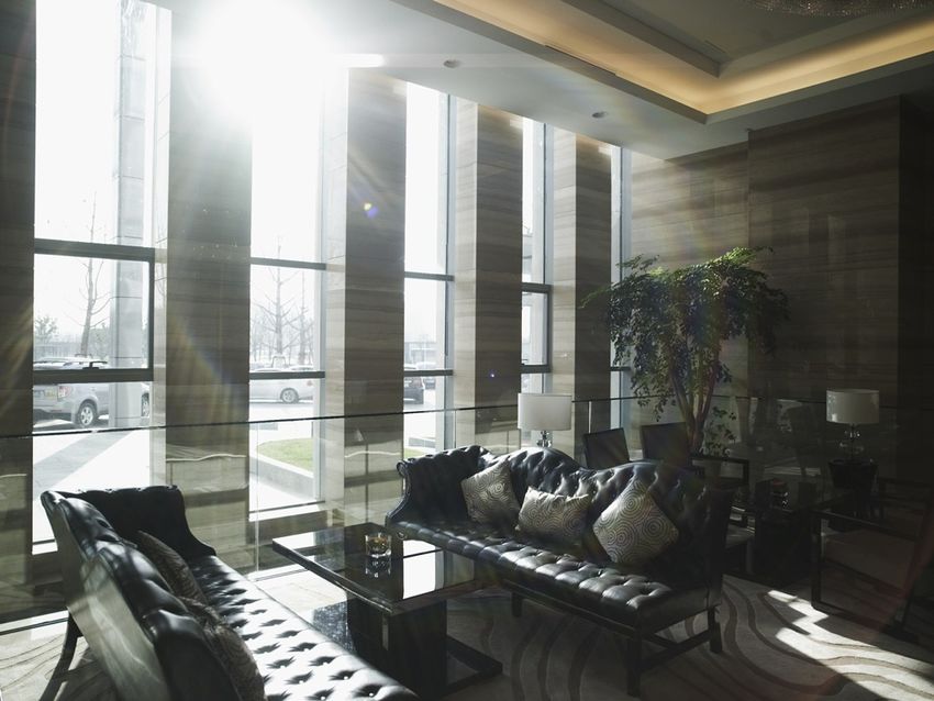
SHOT FRAMING: preferably horizontal, with
wide, medium or close-up shots, working to
show volumes, design, materials, atmosphere
and the scene to their full advantage. Do not
overload compositions with too many objects
or with complex objects.

DESIGN: focus on colourful and elegantly-
shaped objects/furniture in a contemporary
design but without being ostentatious.
Through them, the mood and spirit of the
brand will also be expressed.
____

SEE ALSO:
> Iconography: use of images
> Photographic brief for hotel reports

                                                                                                                                                                JULY 2013
COMMERCIAL
   BASIC ELEMENTS     EXTERNAL SIGNAGE   PRE-SIGNAGE   INTERNAL SIGNAGE   STATIONERY     LOBBY          ROOM   CO-MEETING   FIT & SPA LOUNGE   RESORTS                FOOD & BEVERAGE
                                                                                                                                                         DOCUMENTS

ICONOGRAPHY
USE OF IMAGES
Images are mainly used in sales
and marketing documents such as hotel
brochures and leaflets.

Images are used without artifice or
graphic effects, either full page or in
a less imposing size, but never as
thumbnail versions.
____

SEE ALSO:
> Iconography: photo shoot guidelines

                                                                                       Hotel brochure

                                                                                                                                                                        JULY 2013
COMMERCIAL
   BASIC ELEMENTS     EXTERNAL SIGNAGE       PRE-SIGNAGE   INTERNAL SIGNAGE        STATIONERY             LOBBY       ROOM      CO-MEETING       FIT & SPA LOUNGE      RESORTS                  FOOD & BEVERAGE
                                                                                                                                                                                   DOCUMENTS

ICONOGRAPHY
PICTOGRAMS
                                                                                INTERNET                THEME-BASED     PETS          CHILDREN’S               LIGHT MEAL        CHILDREN’S
A set of pictograms has been designed to                                                                 ACTIVITIES   WELCOME           SERVICE                                    MENU
meet the needs of signage, guidance and
information materials in and around the
hotel, and for use in sales and marketing
documents (web and print) developed by
the brand or by hotels.

The design of these pictograms is plain
and simple, and neutral enough to satisfy                                 SWIMMING POOL                    ROOM         BUS            AIRPORT               UNDERGROUND          FERRIES
the requirement for integration across the                                                                SERVICE                      SHUTTLE
territory covered by the brand.
____

IMPORTANT:
- The pictograms are used in charcoal grey on a light
background or in solid white on a dark background. Make
sure they are legible
- The minimum size to be used is 5 mm wide                                    AT LEAST 5 MM
- The list of pictograms shown here is not exhaustive

TECHNICAL SPECIFICATIONS:
Vector format

                                                                              CHARCOAL GREY
                                                                              CMYK: black at 90%
                                                                              PANTONE: black U at 90%
                                                                              RGB: 61/60/60
                                                                              #: 3d3c3c

                                                                              WHITE

                                                                                                                                                                                                  JULY 2013
COMMERCIAL
   BASIC ELEMENTS      EXTERNAL SIGNAGE         PRE-SIGNAGE    INTERNAL SIGNAGE   STATIONERY   LOBBY          ROOM         CO-MEETING   FIT & SPA LOUNGE   RESORTS                FOOD & BEVERAGE
                                                                                                                                                                     DOCUMENTS

PRINT PRODUCTION
PAPER RECOMMENDATIONS
The paper used across all brand
communication materials is Balance Pure.

It has been selected for its natural, matt,
upmarket and highly contemporary look.

Recommended paper grammages vary
between 120 gsm and 300 gsm.
____

IMPORTANT:
- As this is an offset paper, it is recommended that 2 days’
drying time be allowed after printing to prevent smudges
and finger marks
- Full colour (four-colour process) images must be prepared
and under colour removal carried out to prevent poor
rendering
- In countries where Balance Pure is not marketed, its
generic definition must be used as a basis when searching
for the nearest equivalent: offset paper, 100% recycled
virgin fibre, chlorine-free, FSC                                                                                           
                                                                                                  BALANCE PURE
                                                                                                  Balance Pure is a chlorine-free,
                                                                                                  100% recycled virgin fibre offset paper.

                                                                                                                                                                                    JULY 2013
COMMERCIAL
   BASIC ELEMENTS        EXTERNAL SIGNAGE          PRE-SIGNAGE     INTERNAL SIGNAGE        STATIONERY              LOBBY                    ROOM   CO-MEETING   FIT & SPA LOUNGE   RESORTS                FOOD & BEVERAGE
                                                                                                                                                                                             DOCUMENTS

PRINT PRODUCTION
PREMIUM TREATMENT
To give an even more luxurious finish,
the brand block or the symbol alone can
be printed using high quality processes.

Gloss spot varnish is printed using a silk
screen process, in two layers, with UV
drying.

Glossy charcoal grey ink relief is printed
using a silk screen process and in
particular may be used to highlight the
brand block on business cards
____
                                                                                      Gloss spot selective varnish finish on Balance Pure
IMPORTANT:
- It is crucial that two layers of gloss spot varnish be applied
to deliver the proper thickness and quality finish
- These treatments require special skills and expertise.
Choose the service provider carefully and make sure the
appropriate techniques are fully mastered.

                                                                                      Ink relief finish on Balance Pure

    > Download these files

                                                                                                                                                                                                            JULY 2013
COMMERCIAL
  BASIC ELEMENTS   EXTERNAL SIGNAGE   PRE-SIGNAGE   INTERNAL SIGNAGE   STATIONERY   LOBBY   ROOM   CO-MEETING   FIT & SPA LOUNGE   RESORTS                FOOD & BEVERAGE
                                                                                                                                             DOCUMENTS

CONFIDENTIALITY NOTICE
This Pulllman document content is
confidential and shall not be disclosed as
such to any person or entity other than:

1. To employees or authorized
subcontractors who need to know the
content of this Pullman documentation for
the purposes of implementing or evaluating
the Pullman Brand standards (collectively,
“Representatives”); provided that such
Representatives have been informed of the
confidential nature of this Pullman
documentation and instructed to hold such
information in confidence,

2. As required by any supervisory authority
provided, however, that if disclosure is
required, written notice of such required
disclosure shall be given to the Pullman
Headquarters team.
In receiving this document, you
acknowledge to hold such information in
confidence and to strictly follow the rules
described above.
Copying in any way whatsoever or in any
form whatsoever, either partially or fully,
documentary material (including
photographs and text) included in this
Pullman document is strictly prohibited.

                                                                                                                                                            JULY 2013
You can also read