SILVERLIGHT SPELLCHECKER - COMPONENTONE
←
→
Page content transcription
If your browser does not render page correctly, please read the page content below
ComponentOne

Silverlight SpellChecker
Copyright 2011 ComponentOne LLC. All rights reserved. Corporate Headquarters ComponentOne LLC 201 South Highland Avenue 3rd Floor Pittsburgh, PA 15206 ∙ USA Internet: info@ComponentOne.com Web site: http://www.componentone.com Sales E-mail: sales@componentone.com Telephone: 1.800.858.2739 or 1.412.681.4343 (Pittsburgh, PA USA Office) Trademarks The ComponentOne product name is a trademark and ComponentOne is a registered trademark of ComponentOne LLC. All other trademarks used herein are the properties of their respective owners. Warranty ComponentOne warrants that the original CD (or diskettes) are free from defects in material and workmanship, assuming normal use, for a period of 90 days from the date of purchase. If a defect occurs during this time, you may return the defectiv e CD (or disk) to ComponentOne, along with a dated proof of purchase, and ComponentOne will replace it at no charge. After 90 days, you can obtain a replacement for a defective CD (or disk) by sending it and a check for $25 (to cover postage and handling) to ComponentOne. Except for the express warranty of the original CD (or disks) set forth here, ComponentOne makes no other warranties, express or implied. Every attempt has been made to ensure that the information contained in this manual is correct as of the time it was written. We are not responsible for any errors or omissions. ComponentOne’s liability is limited to the amount you paid for the product. ComponentOne is not liable for any special, consequential, or other damages for any reason. Copying and Distribution While you are welcome to make backup copies of the software for your own use and protection, you are not permitted t o make copies for the use of anyone else. We put a lot of time and effort into creating this product, and we appreciate your support in seeing that it is used by licensed users only. This manual was produced using ComponentOne Doc-To-Help™.
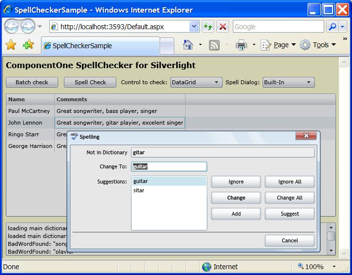
Table of Contents
ComponentOne SpellChecker for Silverlight Overview ...................................................................................1
        Installing SpellChecker for Silverlight ................................................................................................................. 1
                     SpellChecker for Silverlight Setup Files ................................................................................................ 1
                     System Requirements ............................................................................................................................. 2
                     Installing Demonstration Versions........................................................................................................ 2
                     Uninstalling SpellChecker for Silverlight.............................................................................................. 2
        End-User License Agreement .............................................................................................................................. 2
        Licensing FAQs .................................................................................................................................................... 2
                     What is Licensing? ................................................................................................................................. 2
                     Studio for Silverlight Licensing ............................................................................................................. 3
        Technical Support ................................................................................................................................................. 4
        Redistributable Files ............................................................................................................................................. 4
        About This Documentation ................................................................................................................................. 5
        Silverlight Resources............................................................................................................................................. 5
        Creating a Silverlight Project in Visual Studio ................................................................................................... 6
        Creating a Silverlight Project in Expression Blend............................................................................................. 7
        Adding the SpellChecker for Silverlight Components to a Blend Project ........................................................ 8
        Adding the SpellChecker for Silverlight Components to a Visual Studio Project............................................ 9
        Using Templates ................................................................................................................................................. 10
                     Data Templates..................................................................................................................................... 10
                     Control Templates ................................................................................................................................ 15
        Preparing Your Enterprise Environment .......................................................................................................... 18

Key Features .............................................................................................................................................. 18

Working with SpellChecker for Silverlight .................................................................................................... 19
        Introduction to C1.Silverlight.SpellChecker ..................................................................................................... 19
        Concepts and Main Properties........................................................................................................................... 19
                     Spell Dictionaries.................................................................................................................................. 19
                     Spell-Checking Modes.......................................................................................................................... 21
                     As-you-type Spell-Checking................................................................................................................. 22
                     Spell-Checking Options........................................................................................................................ 22

                                                                                                                                                                          iii
Spell-Checking Dialog Boxes............................................................................................................................. 22
                         Using the Built-in Spell Dialog Box .................................................................................................... 23
                         Customizing the Built-in Spell Dialog Box......................................................................................... 23
                         Using Custom Spell Dialog Boxes ...................................................................................................... 24
             Spell-Checking Different Types of Controls ..................................................................................................... 24
             Spell Dictionary Format ..................................................................................................................................... 25

     SpellChecker for Silverlight Samples ............................................................................................................ 26

iv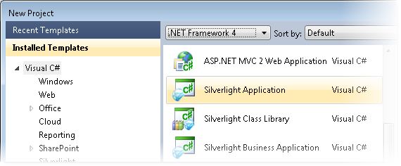
ComponentOne SpellChecker for
Silverlight Overview
ComponentOne SpellChecker™ for Silverlight is a is a Silverlight                   Getting Started
version of ComponentOne SpellChecker for WinForms™, a mature
component that provides the fastest, easiest to use, and most flexible         Get started with the
spell-checking solution available on the market. This is the same engine       following topics:
that drives ComponentOne IntelliSpell™, our add-in for Visual Studio           - Key Features (page 18)
that allows you to spell-check your applications for spelling mistakes in
forms, web pages, and comments used to generate XML                            - Spell-Checking Dialog
documentation.                                                                 Boxes (page 22)

The main features in SpellChecker for Silverlight are:                         - SpellChecker for
                                                                               Silverlight Samples (page
    Efficiency: On typical systems, SpellChecker for Silverlight is            26)
        capable of spell-checking about 400,000 words per second. The
        spelling dictionaries are compressed and easy to maintain.
    Ease of use: All it takes to spell check a control is one call to the
       CheckControl method.
    Flexibility: SpellChecker for Silverlight provides several spell-
        checking services: you can spell-check strings and controls, and
        get suggestions for misspelled words. The interface-based
        architecture allows you to spell-check any controls that contain
        text, to implement custom spell dialog boxes, dictionaries, and text
        parsers. Finally, SpellChecker for Silverlight has a SpellOptions
        property that allows you to fine tune the spell-checking options.
    Multi-language support: SpellChecker for Silverlight ships with
       over 20 international spell dictionaries, including English,
       Spanish, French, Italian, German, Portuguese, Dutch, Russian,
       Danish, Swedish and Greek.
       You can download spell dictionaries for specific languages from
       this page:
       http://www.componentone.com/SuperProducts/SpellCheckerSilve
       rlight/Dictionaries/

Installing SpellChecker for Silverlight
The following sections provide helpful information on installing ComponentOne SpellChecker for Silverlight.

SpellChecker for Silverlight Setup Files
The ComponentOne Studio for Silverlight installation program will create the following directory: C:\Program
Files\ComponentOne\Studio for Silverlight 4.0. This directory contains the following subdirectories:

 Bin          Contains copies of ComponentOne binaries (DLLs, EXEs, design-time assemblies).
 Help         Contains documentation for all Studio components and other useful resources including

                                                                                                               1
XAML files.
Samples
Samples for the product are installed in the ComponentOne Samples folder by default. The path of the ComponentOne
Samples directory is slightly different on Windows XP and Windows Vista/Windows 7 machines:
Windows XP path: C:\Documents and Settings\\My Documents\ComponentOne Samples\Studio for
Silverlight 4.0
Windows Vista and Windows 7 path: C:\Users\\Documents\ComponentOne Samples\Studio for
Silverlight 4.0
See the SpellChecker for Silverlight Samples (page 26) topic for more information about each sample.
System Requirements
System requirements for ComponentOne SpellChecker for Silverlight include the following:
1. Microsoft Silverlight 4.0 or later
2. Microsoft Visual Studio 2008 or later
Installing Demonstration Versions
If you wish to try ComponentOne SpellChecker for Silverlight and do not have a serial number, follow the steps
through the installation wizard and use the default serial number.
The only difference between unregistered (demonstration) and registered (purchased) versions of our products is that the
registered version will stamp every application you compile so a ComponentOne banner will not appear when your users
run the applications.
Uninstalling SpellChecker for Silverlight
To uninstall ComponentOne SpellChecker for Silverlight:
1. Open the Control Panel and select Add or Remove Programs (XP) or Programs and Features (Windows
7/Vista).
2. Select ComponentOne Studio for Silverlight 4.0 and click the Remove button.
3. Click Yes to remove the program.
End-User License Agreement
All of the ComponentOne licensing information, including the ComponentOne end-user license agreements,
frequently asked licensing questions, and the ComponentOne licensing model, is available online at
http://www.componentone.com/SuperPages/Licensing/.
Licensing FAQs
The ComponentOne Studio for Silverlight product is a commercial product. It is not shareware, freeware, or open
source. If you use it in production applications, please purchase a copy from our Web site or from the software reseller of
your choice.
This section describes the main technical aspects of licensing. It may help the user to understand and resolve licensing
problems he may experience when using ComponentOne products.
What is Licensing?
Licensing is a mechanism used to protect intellectual property by ensuring that users are authorized to use software
products.
2Licensing is not only used to prevent illegal distribution of software products. Many software vendors, including
ComponentOne, use licensing to allow potential users to test products before they decide to purchase them.
Without licensing, this type of distribution would not be practical for the vendor or convenient for the user. Vendors
would either have to distribute evaluation software with limited functionality, or shift the burden of managing software
licenses to customers, who could easily forget that the software being used is an evaluation version and has not been
purchased.
Studio for Silverlight Licensing
Licensing for ComponentOne Studio for Silverlight is similar to licensing in other ComponentOne products but there
are a few differences to note.
Initially licensing in handled similarly to other ComponentOne products. When a user decides to purchase a product, he
receives an installation program and a Serial Number. During the installation process, the user is prompted for the serial
number that is saved on the system.
In ComponentOne Studio for Silverlight, when a control is dropped on a form, a license nag dialog box appears
one time.
The About dialog box displays version information, online resources, and (if the control is unlicensed) buttons to
purchase, activate, and register the product.
All ComponentOne products are designed to display licensing information at run time if the product is not licensed.
None will throw licensing exceptions and prevent applications from running. Each time an unlicensed Silverlight
application is run; end-users will see the following pop-up dialog box:
To stop this message from appearing, enter the product's serial number by clicking the Activate button on the About
dialog box of any ComponentOne product, if available, or by rerunning the installation and entering the serial number in
the licensing dialog box. To open the About dialog box, right-click the control and select the About option:
Note that when the user modifies any property of a ComponentOne Silverlight control in Visual Studio or Blend, the
product will check if a valid license is present. If the product is not currently licensed, an attached property will be added
to the control (the C1NagScreen.Nag property). Then, when the application executed, the product will check if that
property is set, and show a nag screen if the C1NagScreen.Nag property is set to True. If the user has a valid license the
property is not added or is just removed.
One important aspect of this of this process is that the user should manually remove all instances of
c1:C1NagScreen.Nag="true" in the XAML markup in all files after registering the license (or re-open all the files that
3include ComponentOne controls in any of the editors). This will ensure that the nag screen does not appear when the
application is run.
Technical Support
ComponentOne offers various support options. For a complete list and a description of each, visit the ComponentOne
Web site at http://www.componentone.com/SuperProducts/SupportServices/.
Some methods for obtaining technical support include:
Online Resources
ComponentOne provides customers with a comprehensive set of technical resources in the form of FAQs,
samples and videos, Version Release History, searchable Knowledge base, searchable Online Help and more.
We recommend this as the first place to look for answers to your technical questions.
Online Support via our Incident Submission Form
This online support service provides you with direct access to our Technical Support staff via an online incident
submission form. When you submit an incident, you'll immediately receive a response via e-mail confirming
that you've successfully created an incident. This e-mail will provide you with an Issue Reference ID and will
provide you with a set of possible answers to your question from our Knowledgebase. You will receive a
response from one of the ComponentOne staff members via e-mail in 2 business days or less.
Peer-to-Peer Product Forums
ComponentOne peer-to-peer product forums are available to exchange information, tips, and techniques
regarding ComponentOne products. ComponentOne sponsors these areas as a forum for users to share
information. While ComponentOne does not provide direct support in the forums, we periodically monitor them
to ensure accuracy of information and provide comments when appropriate. Please note that a ComponentOne
User Account is required to participate in the ComponentOne Product Forums.
Installation Issues
Registered users can obtain help with problems installing ComponentOne products. Contact technical support
by using the online incident submission form or by phone (412.681.4738). Please note that this does not include
issues related to distributing a product to end-users in an application.
Documentation
Microsoft integrated ComponentOne documentation can be installed with each of our products, and
documentation is also available online. If you have suggestions on how we can improve our documentation,
please email the Documentation team. Please note that e-mail sent to the Documentation team is for
documentation feedback only. Technical Support and Sales issues should be sent directly to their respective
departments.
Note: You must create a ComponentOne Account and register your product with a valid serial number to obtain
support using some of the above methods.
Redistributable Files
ComponentOne SpellChecker for Silverlight is developed and published by ComponentOne LLC. You may use it to
develop applications in conjunction with Microsoft Visual Studio or any other programming environment that enables
the user to use and integrate the control(s). You may also distribute, free of royalties, the following Redistributable Files
with any such application you develop to the extent that they are used separately on a single CPU on the
client/workstation side of the network:
C1.Silverlight.SpellChecker
Site licenses are available for groups of multiple developers. Please contact Sales@ComponentOne.com for details.
4About This Documentation
You can create your applications using Microsoft Expression Blend or Visual Studio, but Blend is currently the
only design-time environment that allows users to design XAML documents visually. In this documentation, we
will use the Design workspace of Blend for most examples.
Acknowledgements
Microsoft, Windows, Windows Vista, Visual Studio, and Microsoft Expression are either registered trademarks or trademarks of
Microsoft Corporation in the United States and/or other countries.
ComponentOne
If you have any suggestions or ideas for new features or controls, please call us or write:
Corporate Headquarters
ComponentOne LLC
201 South Highland Avenue
3rd Floor
Pittsburgh, PA 15206 • USA
412.681.4343
412.681.4384 (Fax)
http://www.componentone.com/
ComponentOne Doc-To-Help
This documentation was produced using ComponentOne Doc-To-Help® Enterprise.
Silverlight Resources
This help file focuses on ComponentOne Studio for Silverlight. For general help on getting started with
Silverlight, we recommend the following resources:
http://www.silverlight.net
The official Silverlight site, with many links to downloads, samples, tutorials, and more.
http://silverlight.net/learn/tutorials.aspx
Silverlight tutorials by Jesse Liberty. Topics covered include:
Tutorial 1: Silverlight User Interface Controls
Tutorial 2: Data Binding
Tutorial 3: Displaying SQL Database Data in a DataGrid using LINQ and WCF
Tutorial 4: User Controls
Tutorial 5: Styles, Templates and Visual State Manager
Tutorial 6: Expression Blend for Developers
Tutorial 7: DataBinding & DataTemplates Using Expression Blend
Tutorial 8: Multi-page Applications
Tutorial 9: ADO.NET DataEntities and WCF Feeding a Silverlight DataGrid
Tutorial 10: Hyper-Video
http://timheuer.com/blog/articles/getting-started-with-silverlight-development.aspx
5Silverlight tutorials by Tim Heuer. Topics covered include:
Part 1: Really getting started – the tools you need and getting your first Hello World
Part 2: Defining UI Layout – understanding layout and using Blend to help
Part 3: Accessing data – how to get data from where
Part 4: Binding the data – once you get the data, how can you use it?
Part 5: Integrating additional controls – using controls that aren’t a part of the core
Part 6: Polishing the UI with styles and templates
Part 7: Taking the application out-of-browser
http://weblogs.asp.net/scottgu/pages/silverlight-posts.aspx
Scott Guthrie's Silverlight Tips, Tricks, Tutorials and Links Page. A useful resource, this page links to
several tutorials and samples.
http://weblogs.asp.net/scottgu/archive/2008/02/22/first-look-at-silverlight-2.aspx
An excellent eight-part tutorial by Scott Guthrie, covering the following topics:
Part 1: Creating "Hello World" with Silverlight 2 and VS 2008
Part 2: Using Layout Management
Part 3: Using Networking to Retrieve Data and Populate a DataGrid
Part 4: Using Style Elements to Better Encapsulate Look and Feel
Part 5: Using the ListBox and DataBinding to Display List Data
Part 6: Using User Controls to Implement Master/Details Scenarios
Part 7: Using Templates to Customize Control Look and Feel
Part 8: Creating a Digg Desktop Version of our Application using WPF
http://blogs.msdn.com/corrinab/archive/2008/03/11/silverlight-2-control-skins.aspx
A practical discussion of skinning Silverlight controls and applications by Corrina Barber.
Creating a Silverlight Project in Visual Studio
Complete the following steps to create a new Silverlight project in Microsoft Visual Studio 2010:
1. Select File | New | Project to open the New Project dialog box in Visual Studio 2010.
2. In the Project types pane, expand either the Visual Basic or Visual C# node and select Silverlight.
3. Choose Silverlight Application in the Templates pane.
64. Name the project, specify a location for the project, and click OK.
Next, Visual Studio will prompt you for the type of hosting you want to use for the new project.
5. In the NewSilverlight Application dialog box, select OK to accept the default name and options and to
create the project.
Creating a Silverlight Project in Expression Blend
Complete the following steps to create a new Silverlight project in Microsoft Expression Blend 4:
71. Select File | New Project to open the New Project dialog box in Blend 4.
2. In the Project types pane, click the Silverlight node.
3. In the right pane, choose Silverlight Application + Website in the Templates pane to create a project
with an associated Web site.
4. Name the project, specify a location for the project, choose a language (Visual C# or Visual Basic), and
click OK.
Your new project will be created.
The Project
The solution you just created will contain two projects, YourProject and YourProject.Web:
YourProject: This is the Silverlight application proper. It will produce a XAP file that gets downloaded to
the client and runs inside the Silverlight plug-in.
YourProject.Web: This is the host application. It runs on the server and provides support for the
Silverlight application.
Adding the SpellChecker for Silverlight Components to a Blend Project
To add a reference to the assembly:
1. Select Project | Add Reference.
1. Browse to find the C1.Silverlight.Chart.dll assembly installed with Chart for Silverlight.
Note: The C1.Silverlight.SpellChecker.dll file is installed to C:\Program
Files\ComponentOne\Studio for Silverlight\bin by default.
2. Select C1.Sivlerlight.SpellChecker.dll and click Open. A reference is added to your project.
8To add a component from the Asset Library:
1. Once you have added a reference to the C1.Silverlight.SpellChecker.dll, click the Asset Library button
in the Blend Toolbox. The Asset Library appears.
2. Click the Controls drop-down arrow and select All.
3. Select C1SpellChecker. The component will appear in the Toolbox below the Asset Library button.
4. Double-click the C1SpellChecker component in the Toolbox to add it to Window1.xaml.
Adding the SpellChecker for Silverlight Components to a Visual Studio
Project
When you install ComponentOne SpellChecker for Silverlight the C1SpellChecker control should be added to
your Visual Studio Toolbox. You can also manually add ComponentOne controls to the Toolbox.
ComponentOne SpellChecker for Silverlight provides the following control:
C1SpellChecker
To use a SpellChecker for Silverlight control, add it to the window or add a reference to the
C1.Silverlight.SpellChecker assembly to your project.
Manually Adding SpellChecker for Silverlight to the Toolbox
When you install SpellChecker for Silverlight, the following SpellChecker for Silverlight control will appear in
the Visual Studio Toolbox customization dialog box:
C1SpellChecker
To manually add the C1SpellChecker control to the Visual Studio Toolbox, complete the following steps:
1. Open the Visual Studio IDE (Microsoft Development Environment). Make sure the Toolbox is visible
(select Toolbox in the View menu, if necessary) and right-click the Toolbox to open its context menu.
2. To make SpellChecker for Silverlight components appear on its own tab in the Toolbox, select Add Tab
from the context menu and type in the tab name, C1SpellChecker, for example.
3. Right-click the tab where the component is to appear and select Choose Items from the context menu.
The Choose Toolbox Items dialog box opens.
4. In the dialog box, select the Silverlight Components tab.
5. Sort the list by Namespace (click the Namespace column header) and select the check boxes for components
belonging to the C1.Silverlight namespace. Note that there may be more than one component for each
namespace.
Adding SpellChecker to the Window
To add ComponentOne SpellChecker for Silverlight to a window or page, complete the following steps:
1. Add the C1SpellChecker control to the Visual Studio Toolbox.
2. Double-click C1SpellChecker or drag the control onto the window.
Adding a Reference to the Assembly
To add a reference to the SpellChecker for Silverlight assembly, complete the following steps:
1. Select the Add Reference option from the Project menu of your project.
2. Select the ComponentOne SpellChecker for Silverlight assembly from the list on the .NET tab or on the
Browse tab, browse to find the C1.Silverlight.SpellChecker.dll assembly and click OK.
93. Double-click the window caption area to open the code window. At the top of the file, add the following
Imports statements (using in C#):
Imports C1.Silverlight.SpellChecker
This makes the objects defined in the SpellChecker for Silverlight assembly visible to the project.
Using Templates
The previous sections focused on the ComponentOne Studio for Silverlight controls. The following topics focus
on Data and Control Templates, and how they are applied to Silverlight controls in general (including controls
provided by Microsoft). If you are an experienced Silverlight developer, this information may be of no interest to
you.
Data Templates
DataTemplates are a powerful feature in Silverlight. They are virtually identical to the DataTemplates in WPF, so
if you know WPF there's nothing really new about them.
On the other hand, if you have never used WPF and have seen pieces of XAML that contain styles and templates,
you may be confused by the concepts and notation. The good news is DataTemplates are very powerful and are
not overly complicated. Once you start using them, the concept will make sense in a couple of minutes and you
will be on your way. Remember, just reading the tutorial probably won't be enough to fully grasp the concept.
After reading, you should play with the projects.
Create the "Templates" Solution
To illustrate the power of DataTemplates, let's create a new Silverlight solution. Call it "Templates". Complete the
following steps:
1. Select File | New | Project to open the New Project dialog box in Visual Studio 2008.
2. In the Project types pane, expand either the Visual Basic or Visual C# node and select Silverlight.
3. Choose Silverlight Application in the Templates pane.
4. Name the project "Templates", specify a location for the project, and click OK.
Next, Visual Studio will prompt you for the type of hosting you want to use for the new project.
5. In the New Silverlight Application dialog box, select OK to accept the default name ("Templates.Web")
and settings and create the project.
6. Right-click the Templates project in the Solution Explorer and select Add Reference.
7. In the Add Reference dialog box locate and select the C1.Silverlight.dll assembly and click OK to add a
reference to your project.
This is required since we will be adding C1.Silverlight controls to the page.
8. Now, open the MainPage.xaml file in the Templates project and paste in the XAML below:
10This creates a page with two columns. The left column has a standard ListBox control and the right has
two C1ComboBoxes. These are the controls we will populate and style in the following steps.
Populate the Controls
Before we start using templates and styles, let us populate the controls first. To do that, complete the following:
1. Open the MainPage.xaml.cs file and paste the following code into the page constructor:
public Page()
{
InitializeComponent();
// Get list of items
IEnumerable list = GetItems();
// Add items to ListBox and in C1ComboBox
_listBox.ItemsSource = list;
_cmb1.ItemsSource = list;
// Show fonts in the other C1ComboBox
FontFamily[] ff = new FontFamily[]
{
new FontFamily("Default font"),
11new FontFamily("Arial"),
new FontFamily("Courier New"),
new FontFamily("Times New Roman"),
new FontFamily("Trebuchet MS"),
new FontFamily("Verdana")
};
_cmb2.ItemsSource = ff;
}
The code populates the ListBox and both C1ComboBoxes by setting their ItemsSource property.
ItemsSource is a standard property present in most controls that support lists of items (ListBox,
DataGrid, C1ComboBox, and so on).
2. Add the following code to implement the GetItems() method in the MainPage class:
List GetItems()
{
List members = new List();
foreach (MemberInfo mi in this.GetType().GetMembers())
{
members.Add(new DataItem(mi));
}
return members;
}
3. Add the definition of the DataItem class. to the MainPage.xaml.cs file, below the MainPage class
definition:
public class DataItem
{
public string ItemName { get; set; }
public MemberTypes ItemType { get; set; }
public DataItem(MemberInfo mi)
{
ItemName = mi.Name;
ItemType = mi.MemberType;
}
}
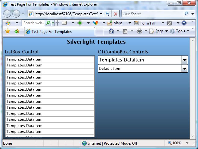
If you run the project now, you will see that the controls are being populated. However, they don't do a very good
job of showing the items:
12The controls simply convert the DataItem objects into strings using their ToString() method, which we didn't
override and by default returns a string representation of the object type ("Templates.DataItem").
The bottom C1ComboBox displays the font family names correctly. That's because the FontFamily class
implements the ToString() method and returns the font family name.
It is easy to provide a ToString() implementation that would return a more useful string, containing one or more
properties. For example:
public override string ToString()
{
return string.Format("{0} {1}", ItemType, ItemName);
}
If you add this method to the DataItem class and run the project again, you will see a slightly more satisfying
result. But there's only so much you can do with plain strings. To represent complex objects effectively, we need
something more. Enter Data Templates!
Defining and Using Data Templates
Data Templates are objects that map regular .NET objects into UIElement objects. They are used by controls that
contain lists of regular .NET objects to convert these objects into UIElement objects that can be displayed to the
user.
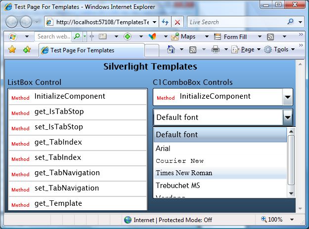
For example, the Data Template below can be used to map our DataItem objects into a StackPanel with two
TextBlock elements that display the ItemName and ItemType properties of the DataItem. This is what the
template definition looks like in XAML markup:
13This template tells Silverlight (or WPF) that in order to represent a source data object, it should do this:
1. Create a StackPanel with two TextBlocks in it,
2. Bind the Text property of the first TextBlock to the ItemType property of the source data object, and
3. Bind the Text property of the second TextBlock object to the ItemName property of the source object.
That's it. The template does not specify what type of control can use it (any control can, we will use it with the
ListBox and also with the C1ComboBox), and it does not specify the type of object it should expect (any object
will do, as long as it has public properties named ItemType and ItemName).
To use the template, add an ItemTemplate attribute to the controls where you want the template to be applied. In
our example, we will apply it to the ListBox declaration in the MainPage.xaml file:
And also to the top C1ComboBox:
Note that we can now change the appearance of the DataItem objects by modifying the template in one place. Any
changes will automatically be applied to all objects that use that template, making application maintenance much
easier.
Before you run the application again, let's add a template to the second C1ComboBox as well. This control
contains a list of font families. We can use templates to display each item using the actual font they represent.
This time, we will not define the template as a resource. It will only be used in one place, so we can insert it inline,
as shown below:
14Don't let the XAML syntax confuse you. This specifies that in order to create items from data, the control should
use a DataTemplate that consists of a single TextBlock element. The TextBlock element should have two of its
properties (Text and FontFamily) bound to the data object itself (as opposed to properties of that object).
In this case, the data object is a FontFamily object. Because the template assigns this object to the Text property
and also to the FontFamily property, the TextBlock will display the font name and will use the actual font.
If you run the project now, you should see this result:
Note that if you assign a DataTemplate to the C1ComboBox, it will no longer be able to perform text-related tasks
such as auto-search and editing. If you want to re-enable those features, you should provide your own
ItemConverter that is a standard TypeConverter.
Styles and Templates are extremely powerful concepts. We encourage you to play and experiment with this
sample. Try modifying the templates to show the data in different ways. The more you experiment, the more
comfortable you will feel with these concepts and with the Silverlight/WPF application architecture.
Control Templates
Data Templates allow you to specify how to convert arbitrary data objects into UIElement objects that can be
displayed to the user. But that's not the only use of templates in Silverlight and WPF. You can also use templates
to modify the visual structure of existing UIElement objects such as controls.
Most controls have their visual appearance defined by a native XAML resource (typically contained within the
assembly that defines the control). This resource specifies a Style which assigns values to most of the control's
properties, including its Template property (which defines the control's internal "visual tree").
For example:
15This is a very simplified version of the XAML resource used to specify the HyperlinkButton control. It consists of
a Style that begins by setting the default value of several simple properties, and then assigns a value of type
ControlTemplate to the control's Template property.
The ControlTemplate in this case consists of a Grid (RootElement) that contains a Rectangle (FocusVisualElement)
used to indicate the focused state and a ContentPresenter (Normal) that represents the content portion of the
control (and itself contains another ContentTemplate property).
Note the TemplateBinding attributes in the XAML. These constructs are used to map properties exposed by the
control to properties of the template elements. For example, the Background property of the hyperlink control is
mapped to the Background property of the Normal element specified in the template.
Specifying controls this way has some advantages. The complete visual appearance is defined in XAML and can
be modified by a professional designer using Expression Blend, without touching the code behind it. In practice,
this is not as easy as it sounds, because there are logical relationships between the template and the control
implementation.
Recognizing this problem, Silverlight introduced a TemplatePart attribute that allows control classes to specify the
names and types it expects its templates to contain. In the future, this attribute will be added to WPF as well, and
used by designer applications such as Blend to validate templates and ensure they are valid for the target control.
For example, the Microsoft Button control contains the following TemplatePart attributes:
///
/// Represents a button control, which reacts to the Click event.
///
[TemplatePart(Name = Button.ElementRootName, Type =
typeof(FrameworkElement))]
[TemplatePart(Name = Button.ElementFocusVisualName, Type =
typeof(UIElement))]
[TemplatePart(Name = Button.StateNormalName, Type = typeof(Storyboard))]
[TemplatePart(Name = Button.StateMouseOverName, Type =
typeof(Storyboard))]
[TemplatePart(Name = Button.StatePressedName, Type = typeof(Storyboard))]
[TemplatePart(Name = Button.StateDisabledName, Type = typeof(Storyboard))]
public partial class Button : ButtonBase
These six template parts constitute a contract between the control implementation and the design specification.
They tell the designer that the control implementation expects to find certain elements in the template (defined by
their name and type).
Well-behaved controls should degrade gracefully, not crashing if some non-essential elements are missing from the
template. For example, if the control can't find a Storyboard named Button.StateMouseOverName in the template, it
should not do anything when the mouse hovers over it.
16Well-implemented templates should fulfill the contract and provide all the elements that the control logic supports.
Designer applications such as Blend can enforce the contract and warn designers if they try to apply invalid
templates to controls.
For the time being, the easiest way to create new templates for existing controls is to start with the original XAML
and customize it.
We will not show any actual examples of how to create and use custom control templates here. Instead, we suggest
you download the examples developed by Corrina Barber:
http://blogs.msdn.com/corrinab/archive/2008/03/11/silverlight-2-control-skins.aspx
The link contains previews and downloads for three 'skins' (bubbly, red, and flat). Each skin consists of a set of
Style specifications, similar to the one shown above, which are added to the application's global XAML file
(App.xaml). The format is similar to this:
Once these styles are defined in the App.xaml file, they can be assigned to any controls in the application:
If you are curious, this is what the Button control looks like after applying each of the skins defined in the
reference above:
Default Bubbly Red Flat
This mechanism is extremely powerful. You can change what the controls look like and even the parts used
internally to build them.
Unlike data templates, however, control templates are not simple to create and modify. Creating or changing a
control template requires not only design talent but also some understanding of how the control works.
It is also a labor-intensive proposition. In addition to their normal appearance, most controls have Storyboards
that are applied to change their appearance when the mouse hovers over them, when they gain focus, get pressed,
get disabled, and so on (see the C1ComboBox example above).
Furthermore, all controls in an application should appear consistent. You probably wouldn't want to mix bubbly
buttons with regular scrollbars on the same page for example. So each 'skin' will contain styles for many controls.
Some controls are designed with custom templates in mind. For example, the C1ComboBox has an ItemsPanel
property of type ItemsPanelTemplate. You can use this property to replace the default drop-down ListBox
element with any other UIElement you like.
For examples of using the ItemsPanel property, check the ControlExplorer sample installed by default with
ComponentOne Studio for Silverlight.
17Preparing Your Enterprise Environment
Several considerations are important to take into account when planning a corporate deployment of your
Silverlight applications in an enterprise environment. For information about these considerations and a description
of system requirements and deployment methods as well as the techniques to maintain and support Silverlight after
deployment, please see the Silverlight Enterprise Deployment Guide provided by the Microsoft Silverlight team.
The guide helps you to plan and carry out a corporate deployment of Silverlight, and covers:
Planning the deployment
Testing deployment strategy
Deploying Silverlight
Maintaining Silverlight in your environment
The Silverlight Enterprise Deployment Guide is available for download from the Silverlight whitepapers site:
http://silverlight.net/learn/whitepapers.aspx.
Key Features
ComponentOne SpellChecker for Sivlerlight allows you to create customized, rich applications. Make the most
of SpellChecker for Silverlight by taking advantage of the following key features:
Easy-to-use, Client-side SpellChecker
SpellChecker offers a client-side solution for implementing spell checking on Web pages. This enables you
to implement and deploy spell checking with minimal effort. All it takes to spell check a control is one call
to the CheckControl method..
Most Efficient SpellChecker
On typical systems, SpellChecker is capable of spell-checking about 400,000 words per second. The
spelling dictionaries are compressed and easy to maintain.
Flexible Spell-checking
SpellChecker provides several spell-checking services:
You can spell-check strings and controls, and get suggestions for misspelled words.
The interface-based architecture allows you to spell-check any controls that contain text, to implement
custom spell dialogs, dictionaries, and text parsers.
SpellChecker has a SpellOptions property that allows you to fine tune the spell-checking options.
Multi-language Support
SpellChecker ships with 20+ international spell dictionaries, including English, Spanish, French, Italian,
German, Portuguese, Dutch, Russian, Danish, Swedish, and Greek.
18Working with SpellChecker for
Silverlight
ComponentOne SpellChecker™ for Silverlight is a spell-checking engine that you can use to spell-check plain
text or controls.
Introduction to C1.Silverlight.SpellChecker
ComponentOne SpellChecker™ for Silverlight is a is a Silverlight version of ComponentOne SpellChecker for
WinForms™, a mature component that provides the fastest, easiest to use, and most flexible spell-checking
solution available on the market. This is the same engine that drives ComponentOne IntelliSpell™, our add-in for
Visual Studio that allows you to spell-check your applications for spelling mistakes in forms, web pages, and
comments used to generate XML documentation.
The main features in SpellChecker for Silverlight are:
Efficiency: On typical systems, SpellChecker for Silverlight is capable of spell-checking about 400,000
words per second. The spelling dictionaries are compressed and easy to maintain.
Ease of use: All it takes to spell check a control is one call to the CheckControl method.
Flexibility: SpellChecker for Silverlight provides several spell-checking services: you can spell-check
strings and controls, and get suggestions for misspelled words. The interface-based architecture allows you
to spell-check any controls that contain text, to implement custom spell dialog boxes, dictionaries, and text
parsers. Finally, SpellChecker for Silverlight has a SpellOptions property that allows you to fine tune the
spell-checking options.
Multi-language support: SpellChecker for Silverlight ships with over 20 international spell dictionaries,
including English, Spanish, French, Italian, German, Portuguese, Dutch, Russian, Danish, Swedish and
Greek.
You can download spell dictionaries for specific languages from this page:
http://www.componentone.com/SuperProducts/SpellCheckerSilverlight/Dictionaries/
Concepts and Main Properties
The following topics outline Spellchecker for Silverlight's concepts and primary properties.
Spell Dictionaries
SpellChecker for Silverlight uses three types of dictionary to check text. Each dictionary is exposed as one of the
three following properties: MainDictionary, UserDictionary, or CustomDictionary. The following topics detail
each of these three properties.
MainDictionary
The main dictionary is a read-only, compressed word list that typically contains a few hundred thousand words.
The main dictionary is typically loaded when the application starts, using the LoadAsync method as illustrated
below:
public Page()
{
InitializeComponent();
// Other initialization...
19// Load main dictionary
SpellDictionary md = c1SpellChecker1.MainDictionary;
md.LoadCompleted += md_LoadCompleted;
md.LoadProgressChanged += md_LoadProgressChanged;
md.LoadAsync("C1Spell_en-US.dct");
}
The LoadAsync method takes as a single parameter the URL of the spell dictionary, which is typically deployed as
part of the application. The example above loads the C1Spell_en-US.dct which is the US English spell dictionary
that ships with SpellChecker for Silverlight. This dictionary contains about 120,000 words and is about 250k bytes
in size.
The LoadAsync method loads the main dictionary asynchronously, so your application can start while the
dictionary is downloaded from the server. When the download is complete, the C1SpellChecker component fires
the LoadCompleted method which you can use to determine that the C1SpellChecker component is ready for
work.
You can use the MainDictionary.State property to check at any time whether the main dictionary has been
successfully loaded.
You can also load the main dictionary from a Stream object, so you can customize the loading process if you
want.
UserDictionary
The user dictionary is a read-write word list that contains terms defined by users, such as names and technical
jargon (for example "ComponentOne", "Silverlight", and so on). Users can add words to the custom dictionary
while spell-checking by clicking the "Add" button in the spell dialog box. You can also add and remove words
using code.
The user dictionary is typically stored in the applications isolated storage, rather than on the server. You can load
and save the custom dictionary using the LoadFromIsolatedStorage and SaveToIsolatedStorage methods as shown
below:
public Page()
{
InitializeComponent();
// Other initialization...
// Load main dictionary
SpellDictionary md = c1SpellChecker1.MainDictionary;
md.LoadCompleted += md_LoadCompleted;
md.LoadProgressChanged += md_LoadProgressChanged;
md.LoadAsync("C1Spell_en-US.dct");
// Load user dictionary
UserDictionary ud = c1SpellChecker1.UserDictionary;
ud.LoadFromIsolatedStorage("Custom.dct");
// Save user dictionary when app exits
App.Current.Exit += App_Exit;
}
void App_Exit(object sender, EventArgs e)
{
// Save modified user dictionary into compressed isolated storage
UserDictionary ud = c1SpellChecker1.UserDictionary;
ud.SaveToIsolatedStorage("Custom.dct");
}
20The code loads the user dictionary from isolated storage, and attaches an event handler to save any changes when
the application exits. The user dictionary is typically small, and it is saved in compressed format, so it does not take
up much storage space.
You can also load and save user dictionaries to Stream objects, so you can customize the persistence mechanism
for the user dictionary if you want.
CustomDictionary
Custom dictionaries are classes that derive from C1Window and implement the ISpellDictionary interface. This
allows you to create dictionaries based on any custom logic that makes sense to your application. For example,
you could create a dictionary that looks up words on the web and stores them in a cache, or that looks words up in
a proprietary database.
Custom dictionaries are optional.
Spell-Checking Modes
SpellChecker for Silverlight supports three modes of spell-checking: Batch Mode, Modal Spell-Checking, and As-
You-Type Spell-Checking. The sections below provide information about each mode of spell-checking
Batch Mode
The CheckText, CheckWord, and GetSuggestions methods check strings and get lists of errors and provide spelling
suggestions. You can use these methods to spell check text that is not in a control. For example, you could spell-
check text that is stored in a database.
The code below illustrates this mode:
// Check some text
var someText = "this text comtains two errrors.";
var errors = c1SpellChecker1.CheckText(someText);
Debug.WriteLine("CheckText(\"{0}\") =", someText);
foreach (var error in errors)
{
Debug.WriteLine("\t{0}, {1}-{2}",
error.Text, error.Start, error.Length);
foreach (string suggestion in
c1SpellChecker1.GetSuggestions(error.Text, 1000))
{
Debug.WriteLine("\t\t{0}?", suggestion);
}
}
Modal Spell-Checking
The CheckControlAsync method will spell check controls that implement the ISpellCheckableEditor interface. The
Microsoft TextBox control and the C1RichTextBox controls implement this interface out of the box. You can
create your own classes to provide spell-checkable wrappers for other controls.
The code below illustrates this mode:
// Show modal spell-checking
private void Button2_Click(object sender, RoutedEventArgs e)
{
// Hook up event hander
c1SpellChecker1.CheckControlCompleted +=
c1SpellChecker1_CheckControlCompleted;
// Spell-check a textbox
c1SpellChecker1.CheckControlAsync(textBox1);
21// Unhook the event hander
c1SpellChecker1.CheckControlCompleted +=
c1SpellChecker1_CheckControlCompleted;
}
void c1SpellChecker1_CheckControlCompleted(object sender,
CheckControlCompletedEventArgs e)
{
Debug.WriteLine("CheckControlCompleted: {0} errors found",
e.ErrorCount);
if (e.Cancelled)
WriteLine("\t(cancelled...)");
}
This code shows a spell checking dialog box and highlights each spelling error, providing suggestions and allowing
the user to fix or ignore each error. When the process is completed, the CheckControlCompleted event fires and
provides feedback to the user.
As-you-type Spell-Checking
This mode monitors a control while the user types, underlining errors with a red wavy line as in the Microsoft
Word spell-checker. Right-clicking a misspelled word presents the user with a context menu containing
suggestions.
This mode is not yet implemented in SpellChecker for Silverlight.
Spell-Checking Options
The Options property allows you to fine-tune the spell checking process. It returns a SpellOptions object that
contains the following properties:
DialogLanguage: Customizes the language used in the built-in spell dialog box.
Ignore: Specifies whether to ignore words in upper-case, mixed-case, words that contain numbers, html
tags, urls, etc.
ActiveSpellingEnabled: Gets or sets whether as-you-type spell-checking is enabled. This property isn't
currently supported in SpellChecker for Silverlight.
ShowSuggestionsInContextMenu: Gets or sets whether the C1SpellChecker component should provide a
context menu for misspelled words when as-you-type spell checking is enabled. This property isn't
currently supported in SpellChecker for Silverlight..
MaxSuggestionsInContextMenu: Gets or sets the maximum number of suggestions to be shown in the
context menu associated with misspelled words. This property isn't currently supported in SpellChecker
for Silverlight.
UnderlineColor: Gets or sets the color used to underline misspelled words in as-you-type mode. This
property isn't currently supported in the in SpellChecker for Silverlight.
Spell-Checking Dialog Boxes
When you call the CheckControlAsync method, SpellChecker for Silverlight displays a dialog box that highlights
each of the errors found in the control and allows the user to correct or ignore each error.
SpellChecker for Silverlight contains a built-in spell dialog box that is used by default. You can use the built-in
dialog box as-is, customize it, or replace it with your own custom version.
22Using the Built-in Spell Dialog Box
Using the built-in spell dialog box is easy. You don’t have to do anything other than call the CheckControlAsync
method.
The built-in dialog box has built-in localization with support for seven languages. The localization is controlled by
the SpellOptions.DialogLanguage property. The default setting, Automatic, causes the dialog box to be displayed
in the language that corresponds to the CultureInfo.CurrentCulture property. You can override that as shown
below:
SpellOptions options = c1SpellChecker1.Options;
options.DialogLanguage = DialogLanguage.German;
Here is the German version of the built-in spell dialog box:
Note that the dialog box language matches the application language and is independent of the current dictionary
language. You could write an English application and use it to check German text for example.
Customizing the Built-in Spell Dialog Box
The built-in dialog box derives from C1Window. You can easily perform minor customizations to the dialog box
by instantiating it, modifying its properties, and then passing the customized dialog box to the CheckControlAsync
method.
For example, the code below modifies the caption of the built-in dialog box:
var dlg = new C1SpellDialog();
dlg.Header = "Customized Caption!";
c1SpellChecker1.CheckControlAsync(textBox1, false, dlg);
Here is the customized version of the built-in dialog box:
23Using Custom Spell Dialog Boxes
To use custom spell dialog boxes, you have to perform two tasks:
1. Create a class that derives from C1Window and implements the ISpellDialog interface.
2. Use the overloaded version of the CheckControlAsync method that takes the ISpellDialog parameter.
To make the first task easier, we provide two dialog boxes that you can use as a starting point when creating your
own dialog boxes. One of them is identical to the built-in dialog box, whereas the other is similar to the spell dialog
box in Microsoft Word. You can find the source code in the "SpellCheckerSample" application that is installed in
the "Samples" folder along with the product.
This is what the second custom dialog box looks like:
Spell-Checking Different Types of Controls
SpellChecker for Silverlight can be used to spell check any control that contains text. This support is built-in for
the C1RichTextBox and Microsoft TextBox controls. To spell-check other controls, you need to provide a
wrapper class that implements the ISpellCheckableEditor interface.
For example, the "SpellCheckerSample" shows how you can spell-check a DataGrid control. It does this by
creating a class called DataGridSpellWrapper that implements the ISpellCheckableEditor interface on behalf of
the grid. The wrapper class enumerates the grid cells and exposes the text in each cell to the C1SpellChecker
component. When an error is found, the cell is selected and the spell dialog box shows the error and suggestions as
usual. The image below illustrates what the SpellCheckerSample sample looks like while spell-checking a
DataGrid:
24You can also read


