SPSS: Displaying Data - For Windows - SSRIC
←
→
Page content transcription
If your browser does not render page correctly, please read the page content below
SPSS: Displaying Data
     For Windows

       August 2012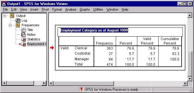
SPSS: Displaying Data

                                                    Table of Contents
Section 1: Introduction ................................................................................................................3

Section 2: Tables .........................................................................................................................3

Section 3: Exporting Tables in SPSS ...........................................................................................6

Section 4: Bar Graphs .................................................................................................................7

Section 5: Scatterplots ............................................................................................................... 10

Section 6: Modifying and Exporting Graphs .............................................................................. 18

Section 7: Interactive Charts...................................................................................................... 22

                                                                                                                                          2

The Division of Statistics + Scientific Computation, The University of Texas at Austin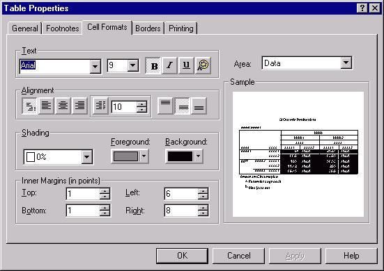
SPSS: Displaying Data
Section 1: Introduction
This document is the third module of a four module tutorial series. This document describes the
use of SPSS to create and modify tables which can be exported to other applications. Graphical
displays of data are also discussed, including bar graphs and scatterplots as well as a discussions
on how to modify graphs using the SPSS Chart Editor and Interactive Graphs. If you are not
familiar with SPSS or need more information about how to get SPSS to read your data, consult
the first module, SPSS for Windows: Getting Started, of this four part tutorial.
This set of documents uses a sample dataset, Employee data.sav, that SPSS provides. It can be
found in the root SPSS directory. If you installed SPSS in the default location, then this file will
be located in the following location: C:\Program Files\SPSS\Employee Data.sav.
Section 2: Tables
Much of the output in SPSS is displayed in a pivot table format. While these pivot tables are
professional quality in their appearance, you may wish to alter their appearance or export them to
another application. There are several ways in which you can modify tables. In this section, we
will discuss how you can alter text, modify a table's appearance, and export information in tables
to other applications.
To edit the text in any SPSS output table, you should first double-click that table. This will
outline dashed lines, as shown in the figure below, indicating that it is ready to be edited. Some
of the most commonly used editing techniques are changing the width of rows and columns,
altering text, and moving text. Each of these topics are discussed below:
Changing column width and altering text. To change column widths, move the mouse
arrow above the lines defining the columns until the arrow changes to a double-headed
arrow faceing left and right. When you see this new arrow, press down on your left
mouse button, then drag the line until the column is the width you want, then release your
mouse button.
Editing text. First double-click on the cell you wish to edit, then place your cursor on
that cell and modify or replace the existing text. For example, in the frequency table
shown below, the table was double-clicked to activate it, then the pivot table's title was
double-clicked to activate the title. The original title, "Employment Category," was
modified by adding the additional text, "as of August 1999."
Using basic editing commands, such as cut, copy, delete, and paste. When you cut and
copy rows, columns, or a combination of rows and columns by using the Edit menu's
options, the cell structure is preserved and these values can easily be pasted into a
spreadsheet or table in another application.
3
The Division of Statistics + Scientific Computation, The University of Texas at Austin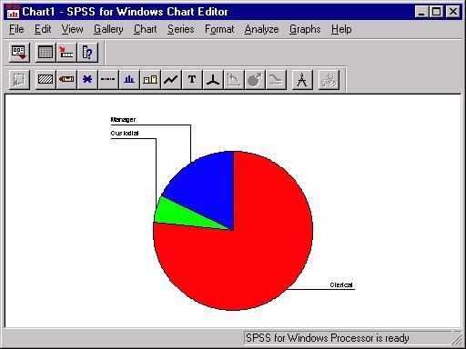
SPSS: Displaying Data

Aside from changing the text in a table, you may also wish to change the appearance of the table
itself. But first, it is best to have an understanding of the SPSS TableLook concept. A TableLook
is a file that contains all of the information about the formatting and appearance of a table,
including fonts, the width and height of rows and columns, coloring, etc. There are several
predefined TableLooks that can be viewed by first right-clicking on an active table, then
selecting the TableLooks menu item. Doing so will produce the following dialog box:

                                                                                                     4

The Division of Statistics + Scientific Computation, The University of Texas at Austin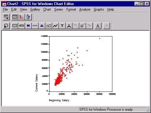
SPSS: Displaying Data

This dialog box will allow you to modify the appearance of your table. Use the tab and cursor
keys to navigate the different table look options. When you have selected the table look you
want, type the Tab key until "Ok" is selected, then type Enter.

You can browse the available TableLooks by clicking on the file names in the TableLook Files
box, as shown above. This will show you a preview of the TableLook in the Sample box.

While the TableLooks dialog box provides an easy way to change the look of your table, you
may wish to have more control of the look or create your own TableLook. To modify an existing
table, right-click on an active pivot table, then select the Table Properties menu item. This will
produce the following dialog box:

The above figure shows the Table Properties dialog box with the Cell Formats tab selected.
You can alternate between tabs (e.g., General, Footnotes, etc.) by clicking on the tab at the upper
left of the dialog box. While a complete description of the options available in the Table
Properties dialog box is beyond the scope of this document, there are a few key concepts that are
worth mentioning. Note the Area box at the upper right of the dialog box. This refers to the
portion of the box that is being modified by the options on the left side of the box. For example,
the color in the Background of the Data portion of the table was changed to black and the color
of the text was changed to white by first choosing Data from the Area box, then selecting black
from the Background drop-down menu and selecting white for the text by clicking on the color
palette icon in the Text area on the left side of the dialog box.

                                                                                                     5

The Division of Statistics + Scientific Computation, The University of Texas at Austin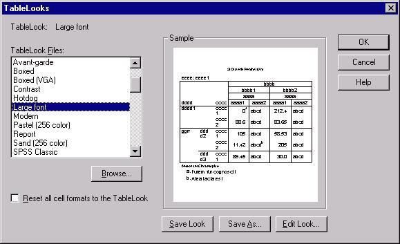
SPSS: Displaying Data

This dialog box will also allow you to modify the appearance of your table. Use the mouse to
navigate and select the options you want.

The Printing tab also has some useful options. For example, the default option for three-
dimensional tables containing several layers is that only the visible layer will be printed. One of
the options under the Printing tab allows you to request that all layers be printed as individual
tables. Another useful Printing option is the Rescale wide/long tables to fit page, which will
shrink a table that is larger than a page so that it will fit on a single page.

Any modifications to a specific table can be saved as a TableLook. By saving a TableLook, you
will be saving all of the layout properties of that table and can thus apply that look to other tables
in the future. To save a TableLook, click on the General tab in the Table Properties dialog box.
There are three buttons on the bottom right of this box. Use the Save Look button to save a
TableLook. That button will produce a standard Save As dialog box with which you can save the
TableLook you created.

                          Section 3: Exporting Tables in SPSS
In addition to modifying a table's appearance, you may also wish to export that table. There are
three primary ways to export tables in SPSS. To get a menu that contains the available options
for exporting tables, right-click on the table you wish to export. The three options for exporting
tables are: Copy, Copy object, and Export.

The Copy option copies the text and preserves the rows and columns of your table but does not
copy formatting, such as colors and borders. This is a good option if you want to modify the
table in another application. When you select this option, the table will be copied into your
system clipboard. Then, to paste the table, select the Paste command from the Edit menu in the
application to which you are importing the table. The Copy option is useful if you plan to format
your table in the new application; the disadvantage of this method is that only the text and table
formatting remains and you will therefore lose much of the formatting that you observe in the
Output Viewer.

The Copy object method will copy the table exactly as it appears in the SPSS Output Viewer.
When you select this option, the table will be copied into your clipboard and can be imported
into another application by selecting the Paste option from the Edit menu of that application.
When you paste the table using this option, it will appear exactly as it is in the Output Viewer.
The disadvantage of this method is that it can be more difficult to change the appearance of the
table once it has been imported.

The third method, Export, allows you to save the table as an HTML or an ASCII file. The result
is similar to the the Copy command: you will have a table that retains the text and cell layout of
the table you exported, but it will retain little formatting. This method for exporting tables to
other applications is different from the above two methods in that it creates a file containing the
table rather than placing a copy in the system clipboard. When you select this method, you will
immediately be presented with a dialog box allowing you to choose the format of the file you are
                                                                                                      6

The Division of Statistics + Scientific Computation, The University of Texas at Austin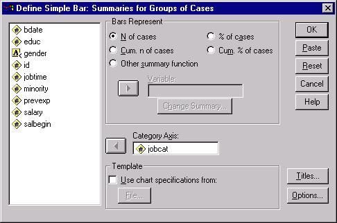
SPSS: Displaying Data

saving and its location on disk. The primary advantage of this method is that you can
immediately create an HTML file that can be viewed in a Web browser.

                                    Section 4: Bar Graphs
Bar graphs are a common way to graphically display the data that represent the frequency of
each level of a variable. They can be used to illustrate the relative frequency of levels of a
variable by graphically displaying the number of cases at each level of the variable. For example,
you could compare the distribution of employees among employment categories by plotting the
frequency of each job category next to the other job categories. If you want to develop a similar
display for a continuous variable, examine the Histogram option on the Graphs menu. To access
the SPSS facilities for visually displaying data, including the bar graph procedure, select the Bar
option from the Graphs menu:

  Graphs
   Bar...

This will produce the following dialog box:

In this dialog box, you must choose between the three types of bar graphs offered by SPSS. The
Simple bar graph is the most common one and is used to graph frequencies of levels within a
variable. In the Simple bar graph, the category axis is the variable and each bar represents a level
of the variable.

The Bar Charts dialog box allows you to choose what type of chart you would like. To open the
Bar Charts dialog box, while in the data editor type Alt+G and B. Use the Tab and cursor keys
to select the Bar Chart that you want. When you have made your selection, type Tab until the
"Define" button is selected, then type Enter.

                                                                                                     7

The Division of Statistics + Scientific Computation, The University of Texas at Austin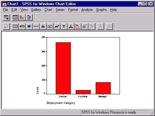
SPSS: Displaying Data

The other two types of bar graphs are used in situations where you want to graph frequencies for
more than one variable. For example, if you want to graph job category by gender of employee,
then you would choose either the Clustered or Stacked options in the above dialog box. The
Clustered option groups together bars representing levels of a category. For example, in graphing
gender by job category, you could produce a bar graph in which male and female, the levels of
the gender variable, are grouped next to each other for each of the three levels of the job-
category variable:

The other bar graph option for two variables is the Stacked option, which will have a bar for each
level of one of the variables, while the levels of the other variable are placed on top of each other
within each bar. The frequency of each level within a variable in a stacked bar graph is
represented by a different color. For example, you could create a graph in which there was a bar
for the levels of gender, male and female, and the numbers of males in females within each
employment category are represented by a different color within a bar:

                                                                                                     8

The Division of Statistics + Scientific Computation, The University of Texas at Austin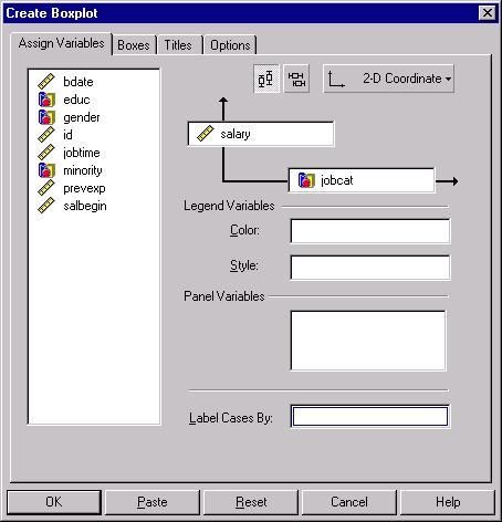
SPSS: Displaying Data

This discussion will focus on the the Simple graph. The options for all three are similar, so an
understanding of the Simple option will suffice for either the Clustered or Stacked options. To
get started with the bar graph, click on the icon representing the type of graph that you want, then
click on the Define button to produce the following dialog box:

The Define Bar Chart dialog box allows you to choose the variables represented in your simple
chart. Within this dialog box, use the Tab and cursor keys to navigate. When you have selected
the options you want, type Tab until the "Ok" button is selected, then type Enter.

                                                                                                     9

The Division of Statistics + Scientific Computation, The University of Texas at Austin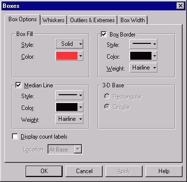
SPSS: Displaying Data

You may create the same Bar chart in SPSS by using the following syntax:

GRAPH

 /BAR(SIMPLE)=COUNT BY jobcat

 /MISSING=REPORT.

To open a syntax window to use the above syntax, type Alt+F, N, and S.In this dialog box, the
Category Axis is the only box that you must fill in. Click on a variable name in the list of
variables at left and move it to the Category Axis box by clicking on the arrow next to that box.
You should also select the summary information that you want in the Bars Represent section of
the box. The N of cases option is the default and is the most common way of summarizing data
in a bar graph. There is little difference between using the N of cases and the % of cases options,
other than the unit of measurement in the vertical axis. Using either the Cum. n of cases or the
Cum. % of cases options will produce a cumulative graph in which the first bar represents the
level of a variable with the fewest number of cases, then then next bar represents the level with
the second fewest number of cases in addition to the level that has previously been graphed, and
so on.

In addition to these four options, you can also use the Other summary function option to specify
another summary statistic, such as a variable's mean, sum, or variance. As in the above example,
begin by selecting a Category Axis variable. Next, select the Other summary function, then place
another variable in the box labels Variable. For example, you could select the variable salary to
obtain the mean salary for each level of the variable jobcat. Doing so would produce the
following table:

                                    Section 5: Scatterplots
                                                                                                    10

The Division of Statistics + Scientific Computation, The University of Texas at Austin
SPSS: Displaying Data
Scatterplots give you a tool for visualizing the relationship between two or more variables.
Scatterplots are especially useful when you are examining the relationship between continuous
varaibles using statistical techniques such as correlation or regression. Scatterplots are also often
used to evaluate the bivariate relationships in regression analyses. To obtain a scatterplot in
SPSS, go to the Graphs menu and select Scatter:
Graphs
Scatter...
This will produce the following dialog box:
Note that there are four scatterplot options. The Simple option graphs the relationship between
two variables. The Matrix option is for two or more variables that you want graphed in every
combination: variable is plotted with every other variable. Every combination is plotted twice so
that each variable appears on both the X and Y axis. For example, if you specified a Matrix
scatterplot with three variables, salary, salbegin, and jobtime, you would receive the following
scatterplot matrix:
11
The Division of Statistics + Scientific Computation, The University of Texas at AustinSPSS: Displaying Data
The third scatterplot option is the Overlay option. It allows you to plot two scatterplots on top of
each other. The plots are distinguished by color on the overlaid plot. For example, you could plot
education by beginning and current salaries by pairing the variables educ with salbegin and educ
with salary using our example dataset. Doing so would produce the graph shown below. In that
graph, the green points represent the educ x salbegin plot whereas the red points represent the
educ x salary plot.
The fourth option for scatterplots is the 3-D scatterplot. This is used to plot three variables in
three dimensional space. Here is an example of the 3-D option, containing the variables, educ,
salary, and salbegin:
12
The Division of Statistics + Scientific Computation, The University of Texas at AustinSPSS: Displaying Data
Returning to the Simple scatterplot option, you can examine some of the options that are
commonly used with a basic scatterplot by plotting the values of two variables. When you select
the Simple option from the initial dialog box, you will get the following dialog box:
Select the two variables that you want to plot from the list on the left, placing one in the Y axis
box and the other in the X axis box. If you have multiple groups (e.g., males and females) in your
dataset, you can have SPSS draw different colored markers for each group by entering a group
variable in the Set Markers by box.
13
The Division of Statistics + Scientific Computation, The University of Texas at AustinSPSS: Displaying Data
You may create the same scatterplot in SPSS by using the following syntax:
GRAPH
/SCATTERPLOT(BIVAR)=salbegin WITH salary
/MISSING=LISTWISE .You can add titles to your chart by clicking on the Titles button.
Clicking OK in the dialog box will produce the following scatterplot:
Some of the most useful options for modifying your scatterplot are only available after you have
the initial scatterplot created. To use these options, double-click on the chart. This will open the
chart in a new window, as shown below:
14
The Division of Statistics + Scientific Computation, The University of Texas at AustinSPSS: Displaying Data
To navigate back and forth between the main dataset window and output windows, you can use
the Window navigation keystrokes:
Go to first working window (usually the data editor) = Alt + W and 1
Go to second working window = Alt + W and 2
Go to third working window = Alt + W and 3
etc. (the windows will be assigned numbers in the order in which they were opened or created in
this session. Thus, if you open the data editor, then produce output, and then open a chart
window, your windows will be assigned as follows: 1=Data Editor; 2=Output; 3=Chart. If you
have multiple chart or output windows, they will each be assigned their own number in the order
in which they were opened or created).
From the chart window, you have several options for modifying your chart. We will only deal
with scatterplot-specific options here, as many of the general options will be covered in the next
section. To get the scatterplot options, select Options from the Chart menu:
Chart
Options...
To get the following dialog box:
15
The Division of Statistics + Scientific Computation, The University of Texas at AustinSPSS: Displaying Data
Some of the most useful options that will add information to your scatterplot are the Sunflowers
and the Fit Line options. The Show sunflowers option draws spikes that resemble petals for each
case where there are overlapping cases in the scatterplot. Clicking on the Sunflower Options
button will then give you several options for defining how fine or coarse you want the spikes to
appear and how many cases are represented by each spike in your scatterplot. See the chart at the
end of this section for an example of sunflowers on a scatterplot. The Fit Line option will allow
you to plot a regression line over your scatter plot. Click on the Fit Options button to get this
dialog box:
Next, click on the type of regression line you want in the Fit Method box. The Linear regression
line is the most commonly plotted regression line, and it represents the linear increase in the Y
variable as a function of increases in the X variable. The graph below illustrates a linear
regression line plotted on a sunflower scatterplot. If you have a quadratic or cubic term in your
model, you will likely be interested in plotting one of those fit lines.
16
The Division of Statistics + Scientific Computation, The University of Texas at AustinSPSS: Displaying Data
One common extension of the above example is to plot separate regression lines for subgroups.
For example, you could plot separate regression lines for men and women in the above example
to visually examine whether the relationship between beginning salaries and current salaries is
the same for both men and women. To do this, you will first need to select a categorical variable
in the main scatterplot dialog box (this is the dialog box that is labeled Simple Scatterplot). Place
a categorical variable in the box labeled Set Markers by. After doing that, follow the rest of the
above steps until you reach the dialog box labeled Scatterplot Options. There, you can define
separate regression lines for your groups by selecting the Subgroups option in the Fit Line
section of the Scatterplots dialog box. Doing so produces the graph shown below:
17
The Division of Statistics + Scientific Computation, The University of Texas at AustinSPSS: Displaying Data
Section 6: Modifying and Exporting Graphs
The primary tool for modifying charts in SPSS is the Chart Editor. The Chart Editor will open in
a new window, displaying a chart from your Output Viewer. The Chart Editor has several tools
for changing the appearance of your charts or even the type of chart that you are using. To open
the Chart Editor, double-click on an existing chart and the Chart Editor window will open
automatically. The Chart Editor shown below contains a bar graph of employment categories:
18
The Division of Statistics + Scientific Computation, The University of Texas at AustinSPSS: Displaying Data
You may create the same Bar chart in SPSS by using the following syntax:
GRAPH
/BAR(SIMPLE)=COUNT BY jobcat
/MISSING=REPORT.
While there are many useful features in the Chart Editor, we will concentrate on the three of
them: changing the type of chart, modifying text in the chart, and modifying the graphs.
You can change the type of chart that you are using to display your data using the Chart Editor.
For example, if you want to compare how your data would look when displayed as a bar graph
and as a pie chart, you can do this from the Gallery menu:
Gallery
Pie...
Selecting this option will change the above bar graph into the following pie chart:
19
The Division of Statistics + Scientific Computation, The University of Texas at AustinSPSS: Displaying Data
Once you have selected your graphical look, you can start modifying the appearance of your
graph. One aspect of the chart that you may want to alter is the text, including the titles,
footnotes, and value labels. Many of these options are available from the Chart menu. For
example, the Title option could be selected from the Chart menu to alter the charts title:
Chart
Title...
Selecting this menu item will produce the following dialog box:
The title "Employment Categories" was entered in the box above and the default justification
was changed from left to center in the Title Justification box. Clicking OK here would cause this
title to appear at the top center of the above pie chart. Other text in the chart, such as footnotes,
legends, and annotations, can be altered similarly. The labels for the individual slices of the pies
20
The Division of Statistics + Scientific Computation, The University of Texas at AustinSPSS: Displaying Data
can also be modified, although it may not be obvious from the menu items. To alter the labels for
areas of the pie, choose the Options item from the Chart menu.
Chart
Options...
This will produce the following dialog box:
In addition to providing some general options for displaying the slices, the Labels section
enables you to alter the text labeling slices of the pie chart as well as format that text. You can
click the Edit Text button to change the text for the labels. Doing so will produce the following
dialog box:
To edit individual labels, first click on the current label, which will be displayed below the Label
box, then alter the text in the Label box. When you finish, click the Continue button to return to
the Pie Options dialog box. You can make changes to the format of your labels by clicking the
Format button here. If you do not want to to change formatting, click on OK to return to the
Chart Editor.
In addition to altering the text in your chart, you may also want to change the appearance of the
graph with which you are working. Options for changing the appearance of graphs can be
accessed from the Format menu. Many options available from this menu are specific to a
particular type of graph. There are some general options that are worth discussing here. One such
is Fill Pattern option, which changes the pattern of the graph. It can be obtained by selecting the
Fill Pattern option from the Format menu:
21
The Division of Statistics + Scientific Computation, The University of Texas at AustinSPSS: Displaying Data
Format
Fill Pattern...
This will produce the following dialog box:
First, click on the portion of the graph where you want to change the pattern, then select the
pattern you want by clicking on the pattern sample on the left side of the dialog box. Then, click
the Apply button to change the appearance of your graph.
One other formatting option that is generally useful is the the ability to change the colors of your
graphs. To do that, select the Color option from the Format menu:
Format
Color...
To produce the following dialog box:
This will allow you to change the color of a portion of a graph and its border. First, select the
portion of the graph for which you would like to change its color, then select the Fill option if
you want to change the color of a portion of the graph and select the Border option if you want to
change the color of the border for a portion of the graph. Next, click on the color that you want
and click Apply. Repeat this process for each area or border in the graph that you want to
change.
Section 7: Interactive Charts
22
The Division of Statistics + Scientific Computation, The University of Texas at AustinSPSS: Displaying Data
Many of the standard graphs available through SPSS are also available as interactive charts.
Interactive charts offer more flexibility than standard SPSS graphics: you can add variables to an
existing chart, add features to the charts, and change the summary statistics used in the chart. To
obtain a list of the available interactive charts, select the Interactive option from the Graphs
menu:
Graphs
Interactive
Selecting one of the available options will produce a dialog for designing an interactive graph.
For example, if you selected the Boxplot option from the menu, you would get this dialog box:
Dialog boxes for interactive charts have many of the same features as other SPSS dialog boxes.
For example, in the above dialog box, the variable type is represented by icons: scale variables,
such as the variable bdate, are represented by the icon that resembles a ruler, while categorical
variables, such as the variable educ, are represented by the icon that resembles a set of blocks.
Variables in the variable list on the left of the dialog box can be moved into the boxes on the
right side of the screen by dragging them with your mouse, in contrast to using the arrow button
23
The Division of Statistics + Scientific Computation, The University of Texas at AustinSPSS: Displaying Data
used in other SPSS dialog boxes. Options in interactive graphs can be accessed by clicking on
the tabs. For example, clicking on the Boxes tab produces the following dialog box:
Here, you have several choices about the look of your boxplot. The choice to display the median
line is selected here, but the options to indicate outliers and extremes are not selected. The Titles
and Options tabs offer several other choices for altering the look of your table as well, although a
thorough discussion of these is beyond the scope of this document. When you have finished the
specifications for a graph, click the OK button to produce the graph you have specified in the
Output Viewer.
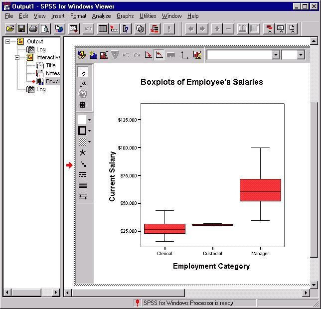
Interactive graphs offer several choices for altering the look of the chart after you have a draft in
the Output Viewer. To get the menus for doing that, double-click on the interactive graph that
you want to alter. For example, double-clicking on the boxplot obtained through the above dialog
box will produce the following menus:
24
The Division of Statistics + Scientific Computation, The University of Texas at AustinSPSS: Displaying Data
The icons immediately surrounding the graph provide you with several possibilities for altering
the look of your graph. The three leftmost items in the horizontal menu are worthy of mention.
The leftmost icon produces a dialog box that resembles the original Interactive Graphs dialog
box and contains many of the same options. For example, you could change the variables that
you are graphing using this dialog box. The next icon, the small bar graph, lets you add
additional graphical information. For example. you could overlay a line that graphed the means
of the three groups in the above graph by choosing the Dot-Line option from the menu, or you
could add circles representing individuals salaries within each group by choosing the Cloud
option. The third icon provides several options for changing the look of your chart. Selecting that
icon will produce the following dialog box:
25
The Division of Statistics + Scientific Computation, The University of Texas at AustinSPSS: Displaying Data
Each icon in this dialog box can be double-clicked to produce a dialog box that contains the
properties of the component of the chart represented by that icon. For example, you could obtain
the properties of the boxes in the interactive graph above by double-clicking on the icon labeled
Box. Doing so would produce this dialog box:
26
The Division of Statistics + Scientific Computation, The University of Texas at AustinSPSS: Displaying Data
Changing the properties in this or any other dialog box that controls the properties of any portion
of the chart will change the look of the graph in the Output Viewer. For example, you could
change the colors of the boxes and their outlines by selecting a different color from the above
drop-down menus.
27
The Division of Statistics + Scientific Computation, The University of Texas at AustinYou can also read