The Effects of Smart Home Interface Touch Button Design Features on Performance among Young and Senior Users
←
→
Page content transcription
If your browser does not render page correctly, please read the page content below

Article

The Effects of Smart Home Interface Touch Button Design
Features on Performance among Young and Senior Users
Na Yu 1,2,*, Ziwei Ouyang 3, Hehe Wang 1, Da Tao 4 and Liang Jing 5

                                          1 College of Furnishings and Industrial Design, Nanjing Forestry University, Nanjing 210037, China;
                                            chris7251@163.com
                                          2 Co-Innovation Center of Efficient Processing and Utilization of Forest Resources, Nanjing Forestry

                                            University, Nanjing 210037, China
                                          3 College of Art and Design, Nanjing Forestry University, Nanjing 210037, China; ouyzw0418@163.com

                                          4 Institute of Human Factors and Ergonomics, College of Mechatronics and Control Engineering,

                                            Shenzhen University, Shenzhen 518060, China; taoda@szu.edu.cn
                                          5 User Experience Testing Center, China Household Electric Appliance Research Institute,

                                            Beijing 100053, China; liangj@cheari.com
                                          * Correspondence: yuna@njfu.edu.cn

                                          Abstract: Touch technology-based smart homes have become increasingly prevalent, as they can
                                          help people with independent daily life, especially for the elderly. The aim of this study was to
                                          investigate the effects of button features (i.e., button size, graphics/text ratio, and icon style) in smart
                                          home interfaces on user performance across two age groups. Participants in the young group (n =
                                          15) and senior group (n = 15) completed a clicking task. Button size ranged from 10 mm to 25 mm
                                          with 5 mm increments. The three levels of graphics/text ratio were 3:1, 1:1, and 1:3, while icon style
Citation: Yu, N.; Ouyang, Z.;
                                          was either flat or skeuomorphic. Results showed that button size and graphics/text ratio had signif-
Wang, H.; Tao, D.; Jing, L. The
                                          icant effects on user performance in both groups, whereas icon style only had an effect in the senior
Effects of Smart Home Interface
                                          group. It was observed that the elderly were fond of buttons with a larger size of 20 mm with larger
Touch Button Design Features on
                                          texts and skeuomorphic icons, whereas the young preferred a button size of 15 mm with equal-
Performance among Young and
Senior Users. Int. J. Environ. Res.
                                          sized graphics and text. These results may help to improve the accessibility and usability of smart
Public Health 2022, 19, 2391.             home interface design.
https://doi.org/10.3390/
ijerph19042391                            Keywords: smart home; interface design; touch button; user performance

Academic Editor: Paul B.
Tchounwou

Received: 20 December 2021                1. Introduction
Accepted: 16 February 2022
                                                Aging has become an important public concern and received increasing attention
Published: 18 February 2022
                                          around the world. It is estimated that the proportion of the elderly aged 65 years and more
Publisher’s Note: MDPI stays neu-         will reach 16% of the world population by 2050 [1]. Previous studies have found that,
tral with regard to jurisdictional        among people aged 65 years and more, more than half have vision problems, one-third
claims in published maps and institu-     have hearing problems, and nearly two-fifths have movement problems [2]. With the ag-
tional affiliations.
                                          ing process, the elderly usually experience a gradual decline in health, thus needing as-
                                          sistive devices or caregivers to help with their daily lives. With the rapid development of
                                          technologies in recent years, the application of 5G technology, artificial intelligence (AI),
                                          and the Internet of things (IOT) has endowed traditional home furnishing and equipment
Copyright: © 2022 by the authors. Li-
                                          with intelligent characteristics, leading to the concept of a smart home [3]. For most of the
censee MDPI, Basel, Switzerland.
                                          elderly, long-term home care appears inevitable, yet unaffordable for them. The emer-
This article is an open access article
distributed under the terms and con-
                                          gence of smart homes can be a good solution to this problem. Smart homes not only enable
ditions of the Creative Commons At-
                                          the elderly to live a convenient and safe life, but they can also be an affordable and sus-
tribution (CC BY) license (https://cre-   tainable solution for long-term home care [4].
ativecommons.org/licenses/by/4.0/).             Smart homes can assist the elderly with their independent daily life. They can be
                                          especially beneficial for individuals with motor control disabilities. Previous research has
                                          shown that the elderly are willing to accept life changes and advantages such as

Int. J. Environ. Res. Public Health 2022, 19, 2391. https://doi.org/10.3390/ijerph19042391                              www.mdpi.com/journal/ijerph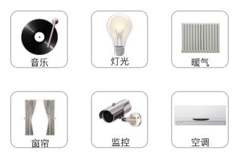
Int. J. Environ. Res. Public Health 2022, 19, 2391                                                                            2 of 15

                                        emergency assistance, fall prevention and detection, and medicine reminders from smart
                                        home devices [5–7]. However, there is still a long way to go for the commercialization and
                                        use of smart homes. In many studies, although the word “elderly” was used in the abstract
                                        and the title of the paper, the actual experiment was carried out on young people, whereas
                                        research on middle-aged and elderly people is relatively scarce [8]. Consequently, it is
                                        necessary to carry out research for different ages and truly include the elderly population.
                                        The development of this kind of research can provide a reference for smart home design
                                        based on the performance of different age groups.
                                             A touchscreen interface is the most direct and common way of interacting with smart
                                        home devices, which entails the need for universal design. The main reason for the success
                                        of touchscreen interfaces is that they allow direct input and are a more intuitive and ac-
                                        cessible way to support human–computer interaction [9]. However, users still encounter
                                        many problems when using touchscreens, such as finger occlusion and individual varia-
                                        tion [10–12], and the design characteristics of the interface affect user performance [13–
                                        16]. To solve these limitations, the interface design of smart home control should fully
                                        consider factors that may affect the use of the devices. Moreover, efforts should be made
                                        to develop intuitive visual user interfaces for consumers, and these user interfaces should
                                        be evaluated frequently using quality of Experience (QoE) metrics [17]. The correspond-
                                        ing solutions to the usability problems of touchscreen interface design were summarized
                                        in the early stage, and it was found that the solutions mostly involve the reasonable design
                                        of icons, text, interface layout, information display, text prompt, size, and location.
                                             The purpose of this study was, therefore, to investigate the effects of touch button
                                        design features of smart home interfaces on user performance and perceptions by indi-
                                        viduals of different ages, by taking button size, graphic/text ratio, and icon style as exam-
                                        ples. While the majority of previous studies focused on small touchscreen devices, this
                                        study simulated a smart home terminal interface with a large touchscreen device. Results
                                        from this study could help improve the usability of smart home interfaces and guide de-
                                        sign for users of different ages.

                                        2. Related Work
                                        2.1. Button Size
                                              Earlier studies believed that a larger button size led to better performance [18,19],
                                        especially for freehand interaction [20]. However, button sizes should be kept optimal
                                        minimal because of the limited screen space in many cases. Several international stand-
                                        ards have been developed to indicate button size recommendations. ANSI/HFES 100-2007
                                        recommends a minimum button size of 9.5 mm, with no modifications larger than 22 mm
                                        [21]. ISO 9241-9 [22] recommends a button size of 22–23 mm (the breadth of the distal
                                        finger joint of a 95th percentile male). Other researchers believed that a button with a size
                                        of 19.05 mm and a gap of 6 mm is best [23]. Moreover, researchers found that, when the
                                        button size was 17.5 mm and larger (e.g., 19.05 mm and 20 mm), better user performance
                                        could be generated under different levels of button spacing [24–26]. Thus, there is no con-
                                        sensus on button size among these standards and previous studies. In addition, previous
                                        studies have suggested that button design should be evaluated with various user groups
                                        and situations. Chen [27] reported that user performance was better at a button size of 20
                                        mm for the healthy group, while the disabled group had a continuously improved user
                                        performance as button size increased. Yueh [28] found that, compared with young people,
                                        the elderly preferred larger buttons with a side length of 20 mm when using touchscreens.
                                        Jin [25] found that, for the elderly with normal finger movement, a button size of 16.51
                                        mm was best, whereas, for the elderly with low finger flexibility, a button size of at least
                                        19.05 mm was required. Other studies considered posture. When the button size was less
                                        than 20 mm, the user performance in a standing posture was worse than that when sitting,
                                        while there was no significant difference in user performance when the button size was
                                        larger [13]. Despite more and more research being published on touchscreen use
Int. J. Environ. Res. Public Health 2022, 19, 2391 3 of 15
performance and related standards, studies on touchscreen use in smart home terminal
interfaces are still lacking.
2.2. Graphic/Text Ratio
Previous studies indicated that graphic symbols can reduce the complexity of inter-
face and improve the efficiency of information transmission. Compared with text mes-
sages, participants can more quickly and more accurately identify graphic information
[29–31]. Meanwhile, other researchers held the view that screen interfaces with “graphics
+ text” have better user performance than those with “text” or “graphics” only in terms of
task completion time and accuracy rate [32]. A few studies examined graphics/text ratio
in web design. Lin et al. [33] found that a web page with a graphics/text ratio between 3:1
and 1:1 would be clear and easy to use, a ratio of 1:1 seemed to have the most realistic
look, and a ratio of over 3:1 looked too fancy. Although previous research has suggested
that the combination of graphics and text in the button should be more universal to im-
prove legibility of the interface, few studies have examined how various ratios of graphics
to text affect user performance in smart home terminal interfaces.
2.3. Icon Style
Icons are important graphical elements with the potential to communicate, directly
affecting the quality of the interaction and the user experience [34]. Icon style is also an
important button design factor that contributes to users’ feelings. It was found that par-
ticipants performed better when clicking buttons with flat icons than those with skeu-
omorphic icons [35]. However, others reported that a search in flat text mode and a search
for flat icons were associated with higher cognitive load, while the search time of flat icons
was almost twice as long as that of skeuomorphic icons [36]. The main criticism was that
a flat design ignores the three-dimensional nature of human brain, which is extremely
sensitive to visual cues linking interfaces to the real world. Backhaus and others con-
ducted a study with younger and elderly participants by creating two interface versions
of a smart phone operating system (flat and skeuomorph). The results indicated that the
elderly showed a preference for skeuomorphic design due to its understandability,
whereas younger people preferred a flat design [37]. Similarly, Cho and Blaynee [11,12]
also found that the elderly preferred a skeuomorphic design, exhibiting higher satisfac-
tion, while young people favored a flat design. These findings indicate that individuals of
various ages perform differently with different icon styles.
3. Methods
3.1. Experimental Design
The experiment implemented a three-factor (4 × 3 × 2) within-subject design, includ-
ing button size (i.e., 10 mm,15 mm, 20 mm, and 25 mm), graphics/text ratio (i.e., 3:1, 1:1,
and 1:3), and icon style (i.e., flat and skeuomorphic) as independent variables. Button
shape was unified as a fillet square, and button sizes referred to the side length of square
buttons. Graphics/text ratios referred to the proportion of the graphics and text in each
button, and the total area was constant. Flat icons were made up of black lines, while
skeuomorphic icons were colorful solid figures.
User performance was measured using objective evaluation indices (i.e., task com-
pletion time, accuracy rate, and eye movement data including saccade times and mean
fixation time) and a subjective evaluation index (i.e., user preference questionnaire). Task
completion time referred to the total time spent by a participant to complete a task. Accu-
racy rate was calculated as the percentage of times that a participant performed correctly
in a task. Eye movements were sampled using an eye tracker. Saccade times and mean
fixation times were used to measure the searching efficiency and cognitive load of the
participants during the tasks. User preference was assessed through a paper questionnaire
which was used to investigate their most preferred button design. In the questionnaire,Int. J. Environ. Res. Public Health 2022, 19, 2391 4 of 15
schematics and descriptions of the three factors at all levels with equal proportion were
listed (See Appendix A), from which the participants were required to select their favorite
button design for the terminal interface of a smart home.
3.2. Participants
This experiment recruited 34 Chinese people, with 16 in the young group and 18 in
the senior group. All participants had normal or corrected-to-normal vision, and those
who needed vision correction were asked to wear glasses during the experiment; none of
them suffered color-blindness. They had no physical or mental impairments and were all
right-handed. The participants in the young group were undergraduate students, while
those in the senior group were active or retired staff from the university. The eye move-
ment data of four participants were invalid, one from the young group and three from the
senior group. Their eyelids were swollen or pulled down due to cell aging, leading to a
low sampling rate.
Finally, 15 participants in the young group (seven males and eight females, mean age
= 24.2 years (SD = 1.8 years)) and 15 participants in the senior group (eight males and
seven females, mean age = 63.0 years (SD = 6.1 years)) were included for data analysis. The
average length and width of their index fingers were 72.4 mm (SD = 6.2 mm) and 14.2 mm
(SD = 1.8 mm), respectively, and their average arm length was 61.8 cm (SD = 3.5 cm). All
participants had experience using smart touch screen devices. In the young group, 12 sub-
jects had experience using smart home devices, while three subjects did not. Only one
subject in the senior group had experience using smart home devices, while the other 14
subjects did not. The experiment obtained the consent of all participants.
3.3. Materials and Tasks
A smart home terminal interface prototype was developed with Axure (Axure Soft-
ware Solution, San Diego, California, United States) and MockingBot (Beijing Modaokeshi
Technology Co., Ltd., Beijing, China). The prototype was presented on a Huawei tablet
PC with an EMUI 9.1 operating system (8.4 inch screen with a resolution of 2560 × 1600
pixels). Referring to a previous study [13,27], the display screen was at a 70° angle to the
desk surface. Eye movements were sampled using an eye tracker (Tobii Pro Nano, Tobii
Tech., Stockholm, The Kingdom of Sweden), with a sampling rate of 60 Hz and a spatial
accuracy of 0.3° or higher. The human–machine environment test cloud platform (Ergo-
LAB, Kingfar International Inc., Beijing, China) was also used to measure the behavior
data and eye-movement data. Miller [38] found that the capacity of visual short-term
memory is 7 ± 2 bits. Considering the capacity and design aesthetics, the experimental
interface contained six buttons with six commonly used functions (i.e., light, curtain, air
conditioner, heating, monitor, and music) in smart homes. The selection was based on a
market survey and user questionnaires; icons normalized by GB/T 35417-2017 [39] were
excluded in the experiment (see Figure 1 for an example). There were 24 pages in the pro-
totype. The interface background was white, and all text was black. Texts prompting a
click were shown at the top of each page, and six buttons with constant spacing of 6 mm
were set below the texts. In the task, participants were required to click the six buttons in
order according to the text prompt. The order of the text prompt and buttons was random.
The button color was changed to yellow within 0.1 s as visual feedback after each button
was pressed by the participant, before immediately returning to its original color. Data on
user performance (i.e., task completion time and accuracy rate) and eye movement were
recorded.Int. J. Environ. Res. Public Health 2022, 19, 2391 5 of 15
Figure 1. Examples of screenshot for clicking tasks of smart home touchscreen interfaces (A, a full
page of experimental interface showing buttons with 10 mm size, graphics/text ratio of 3:1, and flat
icons. B, part of page showing buttons with 15 mm size, graphics/text ratio of 1:1, and skeuomorphic
icons. C, part of page showing buttons with 25 mm size, graphics/text ratio of 1:3, and flat icons.
English words in parentheses were not shown during the experiments).
3.4. Procedures
This experiment was conducted in the Ergonomic Laboratory of Nanjing Forestry
University. Before the experiment, participants were informed the procedure, and they
could stop at any time. After providing informed consent, participants were asked to fill
out a personal information questionnaire including their demographic information and
physical condition. A research assistant measured the length and width of the right index
finger and the length of their right arm. Then, participants were tested for their cognitive
ability using the Flanker task. After adjusting the seat to the appropriate angle and height
and being informed about the operation procedure, participants were asked to complete
the pretests, and then the formal experiment began after the practice. The whole experi-
ment was divided into three parts. Participants took a 3 min break after the completion of
each part (eight pages and six click tasks on each page), before continuing with another
part. The order of the buttons and text prompts on each page was random. Participants
were required to click the buttons according to the text prompt as quickly and accurately
as they could. Upon the completion of all parts, they were asked to fill out the user pref-
erence questionnaire about their button design preference. The whole experiment lasted
about 20 min.
3.5. Data Analysis
First, to examine whether objective evaluation variables were normally distributed,
the Shapiro–Wilk test was applied, while three-way repeated-measures analyses of vari-
ance (ANOVAs) were used to analyze the effects of button size, graphics/text ratio, andInt. J. Environ. Res. Public Health 2022, 19, 2391 6 of 15
icon style. Post hoc tests were performed using the Bonferroni correction for multiple
comparisons. Sensitivity analyses were used to adjust the analyses for gender, the length
and width of the index finger, and the arm length in both groups, but no significant effect
was observed. A chi-square test was performed to examine the differences in user prefer-
ence between the two groups. The significance level was set at p < 0.05 for all statistical
tests. Statistical analyses were performed using SPSS Version 22 (IBM, Armonk, New
York, United States).
4. Results
4.1. Cognitive Ability
The Flanker task was used to measure the cognitive ability of all participants. The
variation coefficients of reaction time and accuracy rate of each participant were calcu-
lated, all of which were less than 0.15 (Table 1). It has been suggested that a coefficient of
variation greater than 0.3 indicates that the data are faulty or that the experimental varia-
bles are uncontrollable [40]. The results indicated that the dispersion of data was small,
and the decision-making ability and response ability of all participants were in a normal
and equal range.
Table 1. Results of reaction time and accuracy rate on flanker tasks for all participants.
Young Group Senior Group
Coefficient of Coefficient of
Mean SD Mean SD
Variation Variation
Reaction time (ms) 498.263 56.406 0.113 672.274 94.043 0.140
Accuracy rate (%) 98.5 1.5 0.016 98.4 1.5 0.015
4.2. Task Accuracy Rate
Table 2 shows the ANOVA analysis results for accuracy rate. Button size was found
to have a significant effect on accuracy rate in both groups, revealing the lowest accuracy
rate for a size of 10 mm, while there was no significant effect for the larger three sizes. Icon
style had a significant effect in the senior group, whereby they achieved a higher accuracy
rate for the skeuomorphic icons. No other significant effect was observed.
Table 2. Main effects of button size, graphics/text ratio, and icon style on task accuracy rate (%).
Young Group Senior Group
Descriptive Descriptive
ANOVA ANOVA
Analysis Analysis
Mean SD F-Values p-Values Mean SD F-Values p-Values
10 mm 96.111 9.026 92.963 11.443
Button 15 mm 98.518 5.385 96.111 8.673
3.541 0.015 4.784 0.003
Size 20 mm 98.704 5.138 96.481 8.094
25 mm 98.703 4.490 97.777 5.698
Graphics 3:1 98.055 6.181 95.139 9.516
/Text 1:1 97.917 7.022 0.019 0.981 95.555 9.598 1.150 0.318
Ratio 1:3 98.055 5.792 96.805 7.263
Flat 98.333 5.599 94.907 9.665
Icon
Skeuo 0.924 0.337 3.933 0.048
Style 97.685 6.995 96.759 7.898
morphInt. J. Environ. Res. Public Health 2022, 19, 2391 7 of 15
4.3. Task Completion Time
Table 3 shows the ANOVA results for task completion time. In the young group,
graphics/text ratio was found to have a significant effect on task completion time, while
button size and icon style did not show any significant effect. As graphics/text ratio de-
creased (i.e., graphics area decreased and text area increased), the task completion time of
the young participants decreased. As for the senior group, all factors had significant ef-
fects on task completion time. Both groups had a shorter task completion time for 20 mm
button size, but the factor of button size in the young group had no significant effect. In
the senior group, the paired comparison showed that the task completion time for 10 mm
was significantly different to that for 20 mm and 25 mm. As for icon style, buttons with a
skeuomorphic icon resulted in significantly faster performance than buttons with a flat
icon for the senior group. For the young group, buttons with a flat icon were a little bit
faster, but there was no significant effect. In the senior group, the interaction between
button size and icon style was significant (F = 2.968, p < 0.05) (Figure 2).
Table 3. Main effects of button size, graphics/text ratio, and icon style on task completion time (s).
Young Group Senior Group
Descriptive Descriptive
ANOVA ANOVA
Analysis Analysis
Mean SD F-Values p-Values Mean SD F-Values p-Values
10 mm 10.251 1.769 17.688 5.285
Button 15 mm 9.864 1.874 16.159 4.229
2.260 0.081 8.784Int. J. Environ. Res. Public Health 2022, 19, 2391 8 of 15
4.4. Number of Saccades
Table 4 presents ANOVA results for number of saccades in eye movement data. But-
ton size was found to have a significant effect on number of saccades for the young group
but not for the senior group. The young group had the most saccades when the button
size was 10 mm, which was significantly different from the other three levels in the paired
comparison, while the paired comparison results of 15 mm, 20 mm, and 25 mm showed
no significant difference. Graphics/text ratio showed a significant effect on number of sac-
cades for both groups. The young participants had fewer saccades at the 1:1 graphics/text
ratio, while the senior participants had fewer saccades at the 1:3 graphics/text ratio. As for
icon style, no significant effect was observed. Graphics/text ratio presented a significant
interaction with button size (F = 4.365, p < 0.001) for the young group (Figure 3).
Table 4. Main effects of button size, graphics/text ratio, and icon style on number of saccades.
Young Group Senior Group
Descriptive Descriptive
ANOVA ANOVA
Analysis Analysis
Mean SD F-Values p-Values Mean SD F-Values p-Values
10 mm 41.400 12.135 60.478 32.622
Button 15 mm 37.744 14.752 59.622 30.945
4.151 0.007 0.613 0.607
Size 20 mm 36.511 13.273 57.800 28.884
25 mm 36.789 10.108 63.944 33.003
Graphi 3:1 46.900 13.828 67.108 36.022
cs/Text 1:1 32.758 8.792 64.032Int. J. Environ. Res. Public Health 2022, 19, 2391 9 of 15
4.5. Mean Fixation Time
Table 5 presents the results of ANOVA for mean fixation time in eye movement data.
For the young group, only button size was found to have a significant effect on mean
fixation time, while there was no significant effect of the other factors. Mean fixation time
plateaued at 10 mm button size in the young group, which was significantly different from
the other three sizes in the paired comparison. As for the senior group, all of the factors
were found to have a significant effect on mean fixation time. The mean fixation time of
the senior group for the 25 mm button size and a graphics/text ratio of 1:3. In terms of icon
style, the senior participants presented a significantly shorter mean fixation time for the
skeuomorphic icons. A significant interaction between button size and graphics/text ratio
(F = 2.738, p = 0.012) was observed in the senior group (Figure 4).
Table 5. Main effects of button size, graphics/text ratio, and icon style on mean fixation time (s).
Young Group Senior Group
Descriptive Descriptive
ANOVA ANOVA
Analysis Analysis
Mean SD F-Values p-Values Mean SD F-Values p-Values
10 mm 0.258 0.043 0.288 0.080
Button 15 mm 0.239 0.031 0.258 0.081
10.671Int. J. Environ. Res. Public Health 2022, 19, 2391 10 of 15
4.6. User Preference
Table 6 shows user preference in terms of button size, graphics/text ratio, and icon
style. More young people preferred the 15 mm button size (46.7%) and flat icons (60%),
but the difference was not significant. A majority of young participants preferred the
graphics/text ratio of 1:1 (60%; χ2 = 6.4, p < 0.05), which showed a significant difference.
For the senior group, more people preferred the 1:3 graphics/text ratio (53.3%), but the
difference was not significant. Most senior participants preferred the 20 mm button size
(80%; χ2 = 14.8, p = 0.001) and skeuomorphic icons (86.7%; χ2 = 8.067, p < 0.05), which
showed a significant difference.
Table 6. Distribution of user preference by button size, graphics/text ratio, and icon style.
Young Group Senior Group
Percentage χ2 p-Values Percentage χ2 p-Values
Button Size
10 mm 0 0
15 mm 46.7% 13.3%
2.800 0.351 14.800 0.001
20 mm 40.0% 80.0%
25 mm 13.3% 6.7%
Graphics/Text
Ratio
3:1 33.3% 26.7%
1:1 60.0% 6.400 0.043 20.0% 2.800 0.351
1:3 6.7% 53.3%
Icon Style
Flat 60.0% 13.3%
0.600 0.607 8.067 0.007
Skeuomorph 40.0% 86.7%
5. Discussion
The popularization of smart homes has led to an increasing number of consumers
using smart home systems. To get more people to accept smart homes, especially the el-
derly, it is necessary to make the interface of smart homes easy to use. This research fo-
cused on the performance of users of different ages, which can effectively help designers
select the design features of smart home interface buttons, so as to better improve usability
and achieve a better user experience. By simulating the terminal interface of smart home
and clicking tasks, the present study was conducted to examine the effects of three design
characteristics (i.e., button size, graphics/text ratio, and icon style) on user performance
and perceptions in two age groups. Due to aging, the user performance of senior partici-
pants was worse than that of young participants in all factors. Icon style had no significant
effect on young participants, while other factors had significant effects. Graphics/text ratio
had a significant interaction with button size and icon style in the young group. Young
participants preferred a graphics/text ratio of 1:1 and a 15 mm button size. All factors had
significant effects on the senior participants, where button size was found to interact with
graphics/text ratio and icon style. They preferred a 20 mm button size, a graphics/text ratio
of 1:3 (i.e., smaller graphics area and larger text area), and skeuomorphic icons.
5.1. Effects of Button Size
The experimental results indicate that the young group had better user performance
with button sizes of 15 mm and above, while the senior group had better performance
with button sizes of 20 mm and above. All participants had difficulty in recognizing the
smaller 10 mm button size. This was consistent with previous studies [23–25,27,28]. ThereInt. J. Environ. Res. Public Health 2022, 19, 2391 11 of 15
was almost no difference in accuracy when using 15 mm, 20 mm, and 25 mm buttons
among users, especially among young people. However, according to other indicators, a
20 mm button was more suitable and more popular among users. Moreover, in the termi-
nal interface design of a smart home, the button size cannot be increased infinitely for
better usability because of the limitation of screen size. In order to maximize user perfor-
mance in a limited screen, designers and engineers need to think carefully how to balance
the two factors and meet more performance requirements.
5.2. Effects of Graphics/Text Ratio
Previous studies reported that a ratio of graphics to text between 3:1 to 1:1 would be
clearer and more usable in web page design [33]. However, the participants were young
people, whereas middle-aged and elderly people were not considered in the study. In this
study, the elderly were taken into consideration. The results indicate that user perfor-
mance of the participants in young group improved for a ratio of graphics to text of 1:1
and 1:3, while the senior participants had better user performance for a 1:3 ratio, which is
inconsistent with a previous study in web design [33]. This difference was caused by the
experimental materials used. Lin’s study was based on web pages and discussed the over-
all graphic ratio of web pages, while this study was based on a touchscreen and discussed
the ratio of icons and texts in one button. In different situations, an individual’s preference
will vary. The interaction between button size and graphics/text ratio showed that elderly
user performance improved as button size increased up to 15 mm with a ratio of graphics
to text of 1:3; alternatively, a button size of 25 mm and a graphics/text ratio of 1:1 also
yielded good performance. With larger button sizes and smaller graphics/text ratios, it is
obvious that texts on the button become larger and clearer so that participants can rapidly
identify the button on the basis of the text. A larger text leads to better guidance, probably
because, although graphics can represent things more vividly, texts can be understood
intuitively. Another explanation may be that users’ fingers covered the graphics or texts
on buttons of a smaller size, which made clicking tasks complicated. Consequently, but-
tons with larger texts may have poor appearance despite excellent user performance and
high recognition efficiency.
5.3. Effects of Icon Style
Another important contribution of the present work to the literature is that this study
provides evidence on the effects of icon style in two age groups. Significant effects of icon
style on user performance were not found in the young group, indicating that young peo-
ple might focus on the texts more frequently or that the effectiveness of flat design and
skeuomorphic design were equal. However, the senior participants showed significant
differences with respect to icon style. The skeuomorphic icons improved user perfor-
mance of the elderly, indicating that icon style played an important role in the process of
elderly recognition. It is also important to note that a significant interaction effect between
button size and icon style was observed in the senior group. Buttons with a skeuomorphic
icon resulted in a faster reaction, even for a button size of 10 mm. This suggests that icon
style affects the recognition efficiency of old people, and that skeuomorphic icons facili-
tates understanding of the information conveyed by the button. While flat design is a style
derived from minimalism, users from an older generation are not familiar with it. When
users control smart home devices with operating errors, there are potential safety risks.
Collectively, designers should explicitly take the familiarity and habits of older genera-
tions into account during design. Skeuomorphic icons may be more readily understanda-
ble and acceptable by the majority of individuals.
5.4. User Preference
Subjective preference of users is increasingly recognized in interface design [41,42],
but this is largely ignored in smart interface design guidelines. User choice of products isInt. J. Environ. Res. Public Health 2022, 19, 2391 12 of 15
largely based on subjective preferences; hence, it is necessary to pay attention to user per-
ceptions and preference. In this study, participants in different age groups had different
preferences for the interface design of a smart home. Young people held the view that
button size did not need to be too big, with 15 mm identified as an appropriate size. They
considered 10 mm buttons a bit small for a large touch screen, while some considered 20
mm to 25 mm buttons also acceptable. More than half of the young people chose a 1:1
graphics/text ratio. In addition, 60% of them preferred buttons with flat icons, but no sig-
nificant difference was observed. They felt that flat icons looked simple and comfortable,
as they are frequently used in many operating systems such as Windows and Mac OS. In
contrast, a majority of the senior participants favored the 20 mm button size, a
graphics/text ratio of 1:3, and skeuomorphic icons. These results are consistent with the
objective evaluation of the experiment. For the elderly generations, large texts are very
efficient for searching and controlling, especially when they encounter icons that they are
not familiar with. However, skeuomorphic icons will also alleviate this issue.
5.5. Limitations
Only two healthy age groups were selected to participate in this study, and they were
asked to complete the tasks in a seated posture. It is unknown whether user performance
would be affected by people of different regions, races, and abilities, as well as by different
postures and context of use. Users do not have to be sitting when controlling smart home
devices; they are likely to be in standing, lying, or even walking postures. It remains to be
further investigated whether these elements affect the results of this study. Second, the
presence of text on the button may have affected the experimental results, especially when
the effect of icon style was investigated. For participants who are used to reading text
only, the text may attract their attention, whereby the icon is probably ignored. Future
studies could exclude factors which may affect the experimental results and confirm their
effectiveness. Third, because of the low complexity of tasks in the experiment, participants
could easily complete them with high satisfaction. In practice, however, users are ex-
pected to carry out a series of searching and clicking steps if they want to perform a certain
function when controlling smart home devices. This difference may have affected the re-
sults of this study. Lastly, although an operation timeout in smart home devices poses
some safety concerns, the wrong operation is more dangerous for vulnerable groups. For
such studies, the degrees of safety, easiness, and satisfaction, combined with a subjective
evaluation, can be applied to verify user performance. Older people may have a long re-
action time; hence, the validity of the task completion time index requires further study.
Future work could focus on a usability evaluation of smart home terminal interfaces and
establish a multi-assessment system. In addition, the touchscreen is a complex technology,
whereby screen resolution, pixel size and spacing, color restoration and contrast, and
other factors can also affect the user’s interactive performance [43]. Although these ele-
ments were consistent in this work, these influencing factors are also worthy of investiga-
tion, and subsequent studies can focus on these aspects.
6. Conclusions
This study investigated the effect of button size, graphics/text ratio, and icon style on
user performance in young and senior groups. While performing clicking tasks on a sim-
ulated smart home system, the search performance and eye movement were measured.
The user preference could be verified by questionnaire and interview. There was a signif-
icant difference between the two age groups. The user performance of the senior group
plateaued for a larger button size of 20 mm with larger texts and skeuomorphic icons,
while the young group preferred intermediate options. Understanding how people in dif-
ferent ages and abilities interact with smart home interfaces can allow designers and en-
gineers to improve usability. Furthermore, vulnerable groups should be given priority in
product design and development, so that they can live an independent and comfortable
life. In light of the results of this study, a rounded square button with a side length of 20Int. J. Environ. Res. Public Health 2022, 19, 2391 13 of 15
mm, a graphic and text ratio of 1:3, and skeuomorphic icons should be used in the design
of functional buttons to appeal to a broader range of users. It is also worth mentioning
that, although this study was conducted from the perspective of a smart home, the re-
search results with regard to touchscreen buttons in terms of size, graphic/text ratio, and
icon style can have certain reference value for other designs. In particular, with regard to
the ratio of icon to text in a button, the results show that allocating more space to text on
buttons can achieve better user performance.
Author Contributions: Conceptualization, N.Y. and H.W.; methodology, H.W. and D.T.; software,
H.W. and Z.O.; validation, H.W. and D.T.; formal analysis, H.W. and Z.O.; investigation, H.W.; re-
sources, N.Y. and L.J.; data curation, H.W.; writing—original draft preparation, H.W. and Z.O.;
writing—review and editing, D.T. and Z.O.; visualization, H.W.; supervision, N.Y.; project admin-
istration, N.Y.; funding acquisition, N.Y. All authors read and agreed to the published version of
the manuscript.
Funding: This study was supported by the Humanities and Social Science Foundation of Ministry of
Education of China (grant number 17YJCZH231), and the New Engineering Construction Project of “Er-
gonomics in Health and Smart Home” provided by the Cooperative Education Program of Ministry of
Education of China (grant number 201901024002) and NATIONAL STANDARD “General technical re-
quirements for household appliances for the elderly” (project number 20183097-T-607).
Institutional Review Board Statement: The studies involving human participants were reviewed
and approved by the Ergonomics Lab.
Informed Consent Statement: Informed consent was obtained from all subjects involved in the study.
Data Availability Statement: The data presented in this study are available on request from the
corresponding author. The data are not publicly available due to them being used as a reference for
further experiments.
Acknowledgments: The authors are grateful for the support of the “Scientific Research Support”
project for providing scientific research equipment by Kingfar International Inc. The authors would
also like to thank Eric Wang for his tender guidance.
Conflicts of Interest: The authors declare no conflicts of interest.
Appendix A
Preference questionnaire
Subject No.________
Please choose an option that best describes your answer for each question.
1. Which button size do you prefer most?
10 mm 15 mm 20 mm 25 mm
2. Which ratio of graphics to text (“light”) do you prefer most?
3:1 1:1 1:3
3. Which icon style do you prefer?Int. J. Environ. Res. Public Health 2022, 19, 2391 14 of 15
Flat Skeuomorph
References
1. United Nations, Department of Economic and Social Affairs (UN DESA). Population Division. World Population Prospects 2019
(ST/ESA/SER.A/408). 2019. Available online: https://population.un.org/wpp/Publications/ (accessed on 19 December 2021).
2. Tanjani, P.T.; Motlagh, M.E.; Moradinazar, M.; Najafi, F. The health status of the elderly population of Iran in 2012. Arch. Gerontol.
Geriatr. 2015, 60, 281–287. https://doi.org/10.1016/j.archger.2015.01.004.
3. Harper, R. Inside the Smart Home; Springer; London, UK, 2006. https://doi.org/10.1007/b97527.
4. Sharma, S.; Wong, J. Three-button gateway smart home interface (TrueSmartface) for elderly: Design, development and deploy-
ment. Measurement 2020, 149, 106923. https://doi.org/10.1016/j.measurement.2019.106923.
5. Courtney, K.L.; Demiris, G.; Rantz, M.; Skubic, M. Needing smart home technologies: The perspectives of older adults in con-
tinuing care retirement communities. Inform. Prim. Care 2008, 16, 195–201. https://doi.org/10.14236/jhi.v16i3.694.
6. Rashidi, P.; Mihailidis, A. A Survey on Ambient-Assisted Living Tools for Older Adults. IEEE J. Biomed. Health Inform. 2013, 17,
579–590. https://doi.org/10.1109/jbhi.2012.2234129.
7. Portet, F.; Vacher, M.; Golanski, C.; Roux, C.; Meillon, B. Design and evaluation of a smart home voice interface for the elderly:
Acceptability and objection aspects. Pers. Ubiquitous Comput. 2011, 17, 127–144. https://doi.org/10.1007/s00779-011-0470-5.
8. Pal, D.; Triyason, T.; Funikul, S. Smart Homes and Quality of Life for the Elderly: A Systematic Review. In Proceedings of the
2017 IEEE International Symposium on Multimedia (ISM), Taichung, Taiwan, 11–13 December 2017; pp. 413–419.
https://doi.org/10.1109/ism.2017.83.
9. Menghi, R.; Ceccacci, S.; Gullà, F.; Cavalieri, L.; Germani, M.; Bevilacqua, R. How Older People Who Have Never Used Touchscreen
Technology Interact with a Tablet; Lecture Notes in Computer Science; 2017; pp. 117–131.
10. Benko, H.; Wigdor, D. Imprecision, Inaccuracy, and Frustration: The Tale of Touch Input. In Tabletops—Horizontal Interactive
Displays; Müller-Tomfelde, C., Ed.; Springer: London, UK, 2010; pp. 249–275.
11. Cho, M.; Kwon, S.; Na, N.; Suk, H.-J.; Lee, K. The Elders Preference for Skeuomorphism as App Icon Style. In Proceedings of
the Proceedings of the 33rd Annual ACM Conference Extended Abstracts on Human Factors in Computing Systems, New York,
NY, USA, 18–23 April 2015.
12. Blaynee, J.; Kreps, D.M.; Kutar, M.; Griffiths, M. Collaborative HCI and UX: Longitudinal Diary Studies as a means of Uncov-
ering Barriers to Digital Adoption. In Proceedings of the British HCI 2016 Conference Fusion, Bournemouth, UK, 11–15 July
2016.
13. Chourasia, A.O.; Wiegmann, D.A.; Chen, K.B.; Irwin, C.B.; Sesto, M.E. Effect of sitting or standing on touch screen performance
and touch characteristics. Hum. Factors: J. Hum. Factors Ergon. Soc. 2013, 55, 789–802. https://doi.org/10.1177/0018720812470843.
14. Hu, B.; Ning, X. Cervical spine biomechanics and task performance during touchscreen computer operations. Int. J. Ind. Ergon.
2016, 56, 41–50. https://doi.org/10.1016/j.ergon.2016.09.007.
15. Sesto, M.E.; Irwin, C.B.; Chen, K.B.; Chourasia, A.O.; Wiegmann, D.A. Effect of Touch Screen Button Size and Spacing on Touch
Characteristics of Users With and Without Disabilities. Hum. Factors J. Hum. Factors Ergon. Soc. 2012, 54, 425–436.
https://doi.org/10.1177/0018720811433831.
16. Pizzagalli, S.; Spoladore, D.; Arlati, S.; Sacco, M.; Greci, L. HIC: An interactive and ubiquitous home controller system for the
smart home. In Proceedings of the 2018 IEEE 6th International Conference on Serious Games and Applications for Health
(SeGAH); Institute of Electrical and Electronics Engineers (IEEE), Vienna, Austria, 16–18 May 2018; pp. 1–6.
17. Stojkoska, B.R.; Trivodaliev, K.V. A review of Internet of Things for smart home: Challenges and solutions. J. Clean. Prod. 2017,
140, 1454–1464. https://doi.org/10.1016/j.jclepro.2016.10.006.
18. Beaton, R.J.; Welman, N.; Schlam, E. Effects Of Touch Key Size And Separation On Menu-Selection Accuracy. In Proceedings of
the 1985 Los Angeles Technical Symposium, SPIE, Los Angeles, CA, USA, 21 January 1985; Volume 526, p. 8.
19. Beringer, D.B. Target Size, Location, Sampling Point and Instructional Set: More Effects on Touch Panel Operation. In Proceed-
ings of the Human Factors Society Annual Meeting, Orlando, FL, USA, 8–12 October 1990; Volume 34, pp. 375–379.
20. Tao, D.; Diao, X.; Wang, T.; Guo, J.; Qu, X. Freehand interaction with large displays: Effects of body posture, interaction distance
and target size on task performance, perceived usability and workload. Appl. Ergon. 2021, 93, 103370.
https://doi.org/10.1016/j.apergo.2021.103370.Int. J. Environ. Res. Public Health 2022, 19, 2391 15 of 15
21. Human Factors and Ergonomics Society. American National Standard for Human Factors Engineering of Computer Workstations
(ANSI/HFES Standard No. 100-2007); Human Factors & Ergonomics Society: Santa Monica, CA, USA, 2007.
22. International Organization for Standardization. ISO 9241-9: Ergonomic Requirements for Office Work with Visual Display Terminals
(VDTs)—Part 9: Requirements for Non-keyboard Input Devices (FDIS-Final Draft International Standard); International Organization
for Standardization: Geneva, Switzerland, 2000.
23. Monterey Technologies. Resource Guide for Accessibility: Design of Consumer Electronics; Draft Submitted to: EIA-EIF Committee
on Product Accessibility, a Joint Venture of the Electronic Industries Association and the Electronic Industries Foundation;
Monterey Technologies: Washington, DC, USA, 1996.
24. Colle, A.H.; Hiszem, K.J. Standing at a kiosk: Effects of key size and spacing on touch screen numeric keypad performance and
user preference. Ergonomics 2004, 47, 1406–1423. https://doi.org/10.1080/00140130410001724228.
25. Jin, Z.X.; Plocher, T.; Kiff, L. Touch Screen User Interfaces for Older Adults: Button Size and Spacing. In Proceedings of the
International Conference on Universal Access in Human-computer Interaction, Beijing, China, 22–27 July 2007; pp. 933–941.
26. Tao, D.; Yuan, J.; Liu, S.; Qu, X. Effects of button design characteristics on performance and perceptions of touchscreen use. Int.
J. Ind. Ergon. 2018, 64, 59–68. https://doi.org/10.1016/j.ergon.2017.12.001.
27. Chen, K.B.; Savage, A.B.; Chourasia, A.O.; Wiegmann, D.A.; Sesto, M.E. Touch screen performance by individuals with and
without motor control disabilities. Appl. Ergon. 2013, 44, 297–302. https://doi.org/10.1016/j.apergo.2012.08.004.
28. Yueh, H.-P.; Lin, W.; Lu, T.-Y.; Chou, Y.-L. Examining older users’ performance on and preference for menu designs of digital
photo frames. Theor. Issues Ergon. Sci. 2013, 14, 273–289. https://doi.org/10.1080/1463922x.2011.617113.
29. Hemenway, K. Psychological issues in the use of icons in command menus. In Proceedings of the 1982 Conference Human
Factors in Computing Systems, New York, NY, USA, 15–17 March 1982; pp. 20–23.
30. Muter, P.; Mayson, C. The role of graphics in item selection from menus. Behav. Inf. Technol. 1986, 5, 89–95.
https://doi.org/10.1080/01449298608914502.
31. Shneiderman, B.; Plaisant, C.; Maxine S. Cohen; Steven M. Jacobs. Designing the User Interface. (2009). Traffic & Transport,
17(2), 157–158. https://doi.org/10.1075/idj.17.2.14mar
32. Wiedenbeck, S. The use of icons and labels in an end user application program: An empirical study of learning and retention.
Behav. Inf. Technol. 1999, 18, 68–82. https://doi.org/10.1080/014492999119129.
33. Lin, Y.-C.; Yeh, C.-H.; Wei, C.-C. How will the use of graphics affect visual aesthetics? A user-centered approach for web page
design. Int. J. Hum.-Comput. Stud. 2013, 71, 217–227. https://doi.org/10.1016/j.ijhcs.2012.10.013.
34. Silva, T.; Caravau, H.; Reis, L.; Almeida, P. Iconography’s development for a seniors’ iTV informative platform. Procedia Comput.
Sci. 2017, 121, 576–583. https://doi.org/10.1016/j.procs.2017.11.076.
35. Xi, T.; Wu, X. The Influence of Different Style of Icons on Users’ Visual Search in Touch Screen Interface. Adv. Ergon. Des. 2017,
588, 222–232. https://doi.org/10.1007/978-3-319-60582-1_22.
36. Burmistrov, I.; Zlokazova, T.; Izmalkova, A.; Leonova, A. Flat Design vs Traditional Design: Comparative Experimental Study.
In Proceedings of the 15th IFIP TC 13 Conference on Human-Computer Interaction, Bamberg, Germany, 14–18 September 2015;
Volume 2, pp. 106–114.
37. Backhaus, N.; Trapp, A.K.; Thüring, M. Skeuomorph Versus Flat Design: User Experience and Age-Related Preferences. In De-
sign, User Experience, and Usability: Designing Interactions; Marcus, A., Wang, W., Eds.; Springer: Cham, Switzerland, 2018; pp.
527–542.
38. Miller, G.A. The magical number seven, plus or minus two: Some limits on our capacity for processing information. Psychol.
Rev. 1956, 63, 81–97. https://doi.org/10.1037/h0043158.
39. Standardization Administration of the People’s Republic of China (SAC). GB/T 35417-2017, Graphical Symbols for Use on Equip-
ment-Icon Symbols for Computer; Standards Press of China: Beijing, China, 2017. Available online: http://open-
std.samr.gov.cn/bzgk/gb/newGbInfo?hcno=E422BB970494080FCAA1BF609380D904 (accessed on 19 December 2021).
40. Brown, C.E. Coefficient of Variation. In Applied Multivariate Statistics in Geohydrology and Related Sciences; Springer: Berlin/Hei-
delberg, Germany, 1998; pp. 155–157; https://doi.org/10.1007/978-3-642-80328-4_13.
41. Law, E.L.-C.; van Schaik, P.; Roto, V. Attitudes towards user experience (UX) measurement. Int. J. Hum.-Comput. Stud. 2014, 72,
526–541. https://doi.org/10.1016/j.ijhcs.2013.09.006.
42. Lallemand, C.; Gronier, G.; Koenig, V. User experience: A concept without consensus? Exploring practitioners’ perspectives
through an international survey. Comput. Hum. Behav. 2015, 43, 35–48. https://doi.org/10.1016/j.chb.2014.10.048.
43. Hancock, P.; Sawyer, B.; Stafford, S. The effects of display size on performance. Ergonomics 2014, 58, 337–354.
https://doi.org/10.1080/00140139.2014.973914.You can also read


