Visual Rhetorical Analysis of the BBC News Page
←
→
Page content transcription
If your browser does not render page correctly, please read the page content below
1

                                                                                      Philip Stubbs
                  Visual Rhetorical Analysis of the BBC News Page

URL of web page: http://www.bbc.com/news/
The web page that I chose to analyze for this assignment is the home page of the BBC news site
(located at the URL link above). BBC (British Broadcasting Corporation) is a public service
broadcaster headquartered in London, England. This broadcasting corporation not only serves
the United Kingdom through television, radio, and the web, but it is a worldwide service
translated into 27 languages for news and entertainment. The corporation was founded in 1927,
and today, it is the largest news broadcaster in the world in terms of number of viewers and staff.
For this assignment, my focus will be on the main news page of the BBC site.

Rhetorical Situation
Audience:
The audience for the BBC news home page is pretty diverse. A lot of BBC’s readers come from
different cultures. Even though BBC can be translated into 27 different languages, the page that I
am analyzing is primarily for an audience that can read and speak English. The majority of
people who come to this page are people who want a professional, unbiased news site. They are
generally interested in international and world news as well as news specific to their countries
and regions. The readers of this site are of all ages, young and old, because there are many news
topics and sections that attract people from different generations that include science and
technology, sports, entertainment, and video. Being a more professional news page and also
having more serious, sophisticated content, it would be fair to say that the majority of the readers
are college educated (or at least high school educated). A lot of the readers who come to this site
are probably going to come from either the middle or upper class, especially because of the more
sophisticated content and because the content is delivered through technologies like the web and
cellular phones. So, the audience members are also digitally literate (able to understand and find
information via digital technologies). In addition, I can assume that most of the readers are
regular, loyal visitors to the site, so they expect the news page to be designed and laid out
similarly to print newspapers and other online news pages. In other words, readers expect the
design of the web page to have a main header at the top of the page, a main feature story with a
large image, subordinate news stories and videos below the main headlines, and the text should
be arranged into columns. I also will assume that the readers of this site are people who like to
keep up with what is happening in the world, and they use outlets like BBC to keep up-to-date
with the most pertinent news information.

Purpose:
The purpose of the BBC news page is to inform, to entertain, and as well as to educate readers of
all ages because it is a broadcasting corporation, but more important, it is a public service
corporation. Thus, BBC tries to satisfy the readers’ interests by providing worldly content that is
professional, sophisticated, and that is meant for people to learn about the world around them
through text, video, images, etc. This purpose of informing people about professional content
matches BBC’s reputation as a trusted, unbiased news source. Thus, the purpose of this page is a
part of the corporation’s ethos to present information in a clear and objective manner (or as much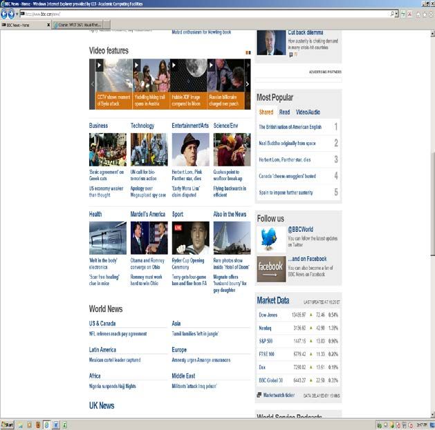
2

as possible). Although the site’s main purpose is to inform and to educate, BBC also tries to
entertain its readers through detailed, rarely-seen images, interesting videos, and interactive
blogs and comment features to actually engage the readers in what they read.

Context:
There are a variety of contexts in which people use BBC. Readers of the BBC news page are
either going to be using the information via the Internet at home, on the go with cellular phones,
or by some type of screen device. Some readers might be fans of BBC News on Facebook,
follow the latest updates on Twitter, or use some other social media outlet to keep in touch with
the site. Thus, users may come across this site while they are logged into social media sites as
well. Some people will search for articles when they are actually at the site, or other people will
only read the articles from BBC that pop up on their news feeds in Twitter or show up in their
emails. Some readers will print out the articles they like, but most readers will keep the
information they read online and share the most interesting stories with friends and family via
social media and email. Finally, most people will not read the page from top to bottom. They will
tend to skip around to different chunks, topics, and links that they find most interesting and
relevant to read because most people probably only have enough time to skim and scan the most
significant content. Finally, it is significant to point out that there is a cross-cultural context to
keep in mind, but this context will not be a major focus of my analysis.

Elements of the Visual Language (Intra, Inter, and Supra)
**Typefaces, fonts, and line weights are estimates.

                          Textual                      Spatial                             Graphic

                  Type style is estimated to   There is normal spacing          Punctuation marks include
                  be Calibri or some related   between all of the text          periods, commas, single and
                  sans-serif typeface like     characters and units.            double quotation marks, and
                  Gill Sans regular for body                                    apostrophes.
                  text.                        There is single spacing
                                               between the lines of text.       Commonly used symbols used
                  Type size is estimated to                                     throughout on this page include
                  be about 11pt.               There is an extra vertical       %, $, and comment/dialogue
  Intra-level                                  space between the blue-          boxes.
                  The text is lower case.      colored links/headlines in the
                  Not much boldfacing or       body of the text.                Links inside the body of the text
                  italics on this page. The                                     are highlighted blue like normal
                  body text is very simple                                      convention.
                  and consistent across the
                  page.                                                         The color of the body text is
                                                                                strictly gray except the text that
                                                                                accompanies the video section is
                                                                                white.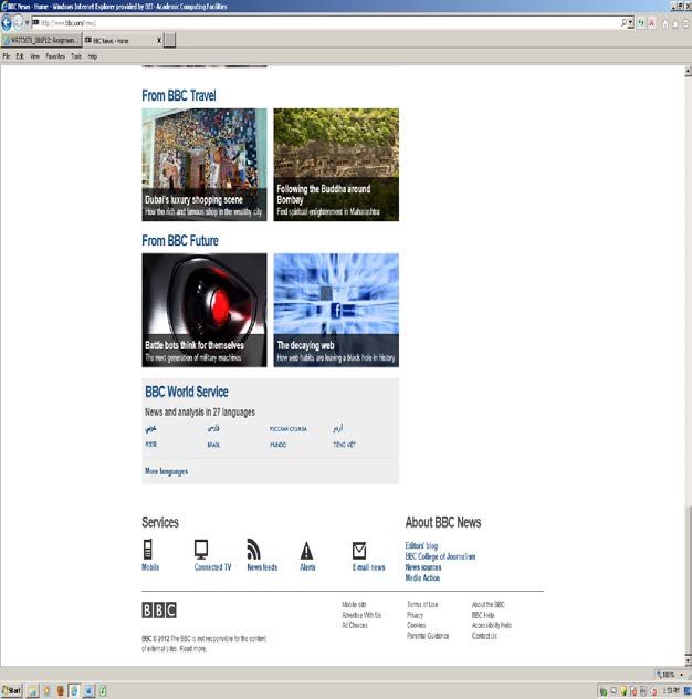
3

              There are four levels of       All text on web page is left    There are light gray boxes
              headings on this web           justified.                      highlighting and bordering the
              page:                                                          text in the side column of the
                                             Headings are left justified     web page for emphasis and
              H1 heading (the main           and align with the images       figure-ground contrast.
              headline for the top           they correspond to.
              feature story): Boldface,                                      There are light gray lines that
              36 pt. Calibri/sans-serif.     There is an extra space         divide the different sections and
              Also, this heading is          between headings and text.      headings from each other for
              linked to a news story on                                      clarity and arrangement
              a different page.              There are approximately 2.5-    purposes. The line weight is
                                             3 inches of white space in      estimated to be 1 pt.
              H2 headings                    the margins on the left and
              (“Magazine,” “Features,”       the right sides of the text.    Towards the bottom of the web
              “Comment & Analysis,”                                          page, there are orange and black
              etc.): 24 pt., Calibri/sans-   Text is arranged into           boxes highlighting and bordering
              serif, Boldface.               different sized boxes and       the text, images, and headings for
                                             rectangles (this is a typical   emphasis and figure-ground
              H3 headings (“Business,”       layout for a web page).         contrast.
Inter-level   “Technology,” “Sport,”
              “Health,” etc.): 16 pt.,       The main text is divided into   The “most popular” section of
              Calibri/sans-serif, bold,      small paragraph chunks, and     the web page uses the numbers 1-
              linked.                        these small paragraphs have     10 to order what is most read and
                                             no indentation.                 shared.
              H4 headings (the story
              headlines below the H3         Text is divided into two
              headings that are linked       columns. The left (main
              to different screens): 12-     centered) column is wider
              pt., Calibri/sans-serif,       than the side (right) column.
              hyperlinked.
                                             Towards the middle of the
              The “Most Shared”              page as you scroll down, the
              section of the web page in     H3 headings are grouped and
              the side column on the         arranged together in the
              right has numbered,            shape of a rectangular box.
              ordered lists for articles
              that are most shared, most
              read, and most watched.
4
There is a solid red page All images are placed to the The color of the overall page has
header with the word left or above the text they a white background and a red
“NEWS” (all upper case, correspond to. header.
approximately 40-pt., and
Calibri/sans-serif The single data display There are framing lines at the top
typeface) on the left side entitled “Market Data” is and bottom of the page.
of the header. Also, the along the right-hand side of
date is displayed inside the page. The dimensions of The BBC icon/logo is placed in
the header to the right of the display are about 4 the footer and in the header on
the word, “NEWS,” with inches tall by 3 inches wide. the left-hand side. The color of
12-pt font and the icon in the header is red and
Calibri/sans-serif The scrollable length of the white. The color of the icon in
typeface. This is a screen is about 4 scroll bars the footer is white and gray for
typical-looking, from the top to the bottom of contrast and emphasis purposes.
conventional page header. the page.
A picture of a red globe is spread
There are navigational The size of the BBC over the right-hand side of the
bars located above and logo/icon in the header and header for emphasis and
below the header that footer is approximately ½ identification reasoning.
include the BBC icon. inch tall by 1.5 inches wide.
Supra-level
The tab labels within the
navigational bars are
internal and external
links, so the web site is
easily searchable and
information can be found
quickly.
There is text (copyright
information, contact
information, accessibility
information, etc.) in the
footer.5
Rhetorical Impact of the Visual Language
Arrangement:
Just like the design conventions of other traditional, professional news pages, BBC’s news page
is arranged in a strict hierarchical structure. In other words, the more prominent, relevant, and
more newsworthy stories are towards the top of the page, and the less significant linked articles
or headlines are towards the bottom of the page because readers have to scroll down four scroll
bar lengths just to arrive at this subordinate information. Behind the overall, hierarchical
structure of the web page (supra-level, spatial mode), the page includes 1 pt. (approximately)
gray lines that divide the information into even more sections than the super structure of the page
does (inter-level, graphic mode). This strategy makes sense because, based on the rhetorical
situation, BBC knows that its readers probably do not have much time to sit down and read the
information. So, the web page is arranged so that its readers can find the most important and
relevant information more quickly on the web and on their phones.
Within this hierarchical structure, the web page also utilizes an important grouping
strategy to divide and separate the different types of content. The designers at BBC grouped and
positioned related items in the same box or in the general proximity of each other. For example,
all of the “Feature” headlines are grouped in the same box at the top of the screen in the right
side column. There is even a visible gray box surrounding the “Feature” group to emphasize that
these articles are related because they are all features for that day. Also, all of the video content
is positioned near each other (side-by-side) towards the middle of the screen if the reader scrolls
down a bit. The most effective grouping strategy is actually towards the bottom of the page after
the reader scrolls down past the video section. Underneath the group of feature videos, BBC has
arranged all of the major topics of stories and news together in a rectangular box. Topics like
“Business,” “Sport,” and “Health” are all linked to different content and represent different
subjects. However, they are all grouped and positioned in close proximity to each other because
they all represent H3 level headings (a grouping strategy at the inter-level, textual and spatial
modes of design). Finally, also at the inter-level, spatial mode, the web page is arranged into a
two-column format that satisfies the readers’ expectations as to what is considered a print or
online news source.
Emphasis:
One visual cognate that this web page effectively implements is emphasis. This strategy can be
seen both at the inter-level and the supra-level of design. First of all, the emphasis strategy is
portrayed in the header of the web page (supra-level). The red background for the header (the
figure) illustrates a strong figure-ground contrast with the white background of the entire web
page. The red header stands out from the rest of the page when the readers come to this site. This
strategy makes sense because the audience expects there to be a noticeable, contrasting header
for a traditional news source like BBC. Thus, BBC follows the visual convention of designing a
header for a web site. Also, inside of the header itself, there are elements that stand out and
provide “pop” to the reader’s eye. On the left-hand side of the header, the word “NEWS” is the
perfect example of the supra-level design for both the textual and graphic modes that illustrates
emphasis. The color of the letters of the word, “NEWS,” is white, which is in stark contrast with
the red background that shows another instance of figure-ground contrast. Also, the
capitalization of this word is significant for BBC to emphasize because it alerts the readers that6
this page is indeed a news source and not a weather, travel, or blog site (even though BBC
provides links to these separate pages).
Emphasis can also be seen at the inter-level of design with the headings. For example, the
main news story/heading of the day is right below the header (inter-level, spatial mode). The
major headline for this story is always boldface, linked, and more important, the type size (inter-
level, textual mode) is much larger (approximately 36 pt.) to emphasize to the readers that this
story is very important, relevant information. This emphasis signals to the readers that it is a
must read article. As readers scroll down the page, the type size of the headings becomes smaller
and smaller. This emphasis strategy shows the readers that the more prominent and more
important elements of the page are towards the top of the page (where readers do not have to
scroll down). Thus, the emphasis strategy reinforces the hierarchical arrangement strategy
mentioned above.
Clarity:
One strategy that BBC implements into its news page very well is clarity. The page invites
readability to its site because there is a lot of white space in the background that keeps the
foreground and the main content uncluttered and easy to read. There is not only a lot of white
space in the margins (about 2.5-3 inches on either side), but there is also extra white space
between the divisional lines and the different groups of information. The white space (supra-
level, graphic mode) and the divisional lines between the text (inter-level, spatial and graphic
modes) add clarity to the page because they invite the readers’ eyes to scan content quickly to
find what they are looking for in a timely manner. This clear visibility and quick scanning of text
is also attributed to the left justified alignment (inter-level, spatial mode) of headings and body
text that better organizes the textual elements for clarity. In addition, it allows the readers to
continuously flow through the information from top to bottom or scan without much difficulty or
confusion. This clarity strategy is especially helpful for BBC’s cross-cultural context because the
page is translated into 27 different languages and is used in many cultures around the world.
Designing the page with a lot of blank space, visual room to navigate, and with visual
consistency across the page will not turn off a diverse group of readers.
By keeping the typeface, the font size, and the font style consistent at the inter-level and
at the intra-level textual mode, the reader can scan across the lines of text and headings with
ease. At most, the web page does not seem to use more than two (maybe three) different fonts
and typefaces for text and headings. This consistency is important because it makes it clearer and
easier for the readers to pick up certain information and skim headlines on the page. Also, BBC
utilizes a sans-serif typeface for the text and headlines (inter- and intra-level, textual mode). This
choice in typeface contributes to the clarity and visibility of the document. Because there are no
serifs and because there is empty room (lots of white space), the page is easier to read, there is
less clutter to make the page more legible, and there is less visual noise as compared to the serif
font that has tails on the tips of the letters.
Ethos and Tone:
The ethos and tone strategies for this web page are interrelated, and they are strongly portrayed
in the supra-level of design in the textual, spatial, and graphic modes. For example, the BBC
icon/logo in the top left corner of the header and the footer shows ethos. When people come to
this page, the first thing they will see is the BBC icon, which establishes credibility and trust in
the website because most people who come to the BBC news page are already regular readers of7
the site (based on my audience assumptions in the rhetorical situation). By seeing a globally
recognized icon, the regular visitors of the website (and even new visitors to the site) will
automatically identify BBC as a professional, unbiased, and worthy news source. These
attributes are reflected in the inter-level textual content as well, but they are mainly portrayed in
the formal, professional visual design of the page. In addition, the globe image in the background
of the header (supra-level, graphic mode) establishes the ethos of the corporation because the
image relates to the fact that BBC is a credible, worldly news page that has a sophisticated voice
that lacks bias or distortion. In other words, the image of the globe identifies BBC as a worldly
news source that shares information objectively and accurately. Thus, it sets the ethos as well as
the tone of the page. In conclusion, the header, the BBC icon, the globe image, and even the
framing lines at the top and bottom of the page all suggest to the reader the level of formality and
professionalism in which this corporation conducts itself on a daily basis.
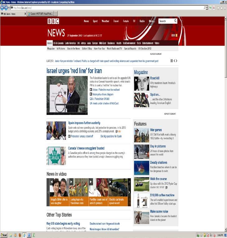
Screen Shot of the Top of the Web Page: Figure-ground contrast: red header
with white background. It shows
Supra-level, spatial emphasis and identification.
mode: the size of the Supra-level, graphic
BBC icon in the header is mode: the red globe
approximately ½ inch tall in the header is
by 1.5 inches wide. placed for emphasis
and identification
reasoning. It also
establishes ethos.
Supra-level, textual
mode: “NEWS” is Inter-level, textual
40 pt., sans-serif, mode: H2 headings
and all caps. It also (“Magazine,”
shows emphasis. “Features,”
“Comment &
Analysis,” etc.) are
Inter-level, textual 24 pt., sans-serif,
mode: H1 Heading is boldfaced.
36 pt., sans-serif,
boldfaced, and Inter-level, graphic
mode: There are
hyperlinked.
light gray shaded
boxes highlighting
the content in the
side column for
emphasis and
figure-ground
contrast to show
the more
prominent
information.8
Screen Shot of the Middle of the web page (scrolled down to middle):
Arrangement/grouping
strategy: grouping all H3
Arrangement: text is
headings together in divided into two
close proximity to form a columns like a
rectangular box. traditional news
source.
Inter-level, textual mode:
H3 headings are 16 pt.,
sans-serif, boldfaced, and
hyperlinked.
Inter-level, textual mode:
H4 headings are 12 pt.,
sans-serif, and
hyperlinked underneath
H3 headings. Supra-level, spatial
mode: The dimensions of
the “Market Data” data
display are about 4
inches tall by 3 inches
wide.
Screen Shot of the Bottom of the web page:
Grouping/arrangement
Inter-level, spatial mode:
strategy: arranging similar
2.5 to 3 inches of white
content in close proximity
space in the margins on
to each other.
either side of the text and
images. White space adds
clarity and conciseness.
BBC logo/icon
establishes the tone
and the ethos of the
page. There is also
figure-ground contrast
between the gray
background of the icon
and the white Left-justified alignment
background of the of text, headings, and
page. images add to the
clarity of the page.You can also read