Visualizing An Inconvenient Truth - Jim Sweitzer
←
→
Page content transcription
If your browser does not render page correctly, please read the page content below
Visualizing An Inconvenient Truth

Jim Sweitzer

Since its release in 2006, the award winning documentary film An Inconvenient Truth (AIT)
has created a sea change in public awareness of the threat posed by global warming. It is
based upon a slide show that former Vice President Al Gore had shown nearly a thousand
times. After the film opened, increasing demand for live presentations of the slide show
inspired him to found The Climate Project in 2007. I was privileged to become an early
member of The Climate Project (www.theclimateproject.org).
Because my planetarium consulting and production work often involve the use of scientific
visualization, I thought it would be worth posing the questions: “What types of visualizations
might one want to accompany An Inconvenient Truth? And, in particular, what might we
learn that would help in the creation of full-dome digital theater visualizations?” This short
paper is a thought experiment that begins to address these questions based upon my
experience presenting Al Gore’s slide show to the public. I don’t intend the exercise to simply
augment AIT: rather, I hope it will be useful for content producers and educators who wish to
visualize climate change topics for digital theaters.

Figure 1. The Science Visualization Experience.

Of course creating programs based upon science visualization involves numerous steps and is
a multi-faceted enterprise (see fig 1). This chart maps the extent of the task producers face
when developing effective science visualization experiences. The two areas most important
for answering my questions about visualizing AIT are located in the Interpreting and Science
Data branches of the diagram. If one selects meaningful science data, interprets it properly,
and makes it easy to access by display systems, then a knowledgeable presenter could amplify
the AIT slide show in unique ways. They might help the audience with a more immediate

State of Climate Visualization, CSPR-report 2009:4                                          75
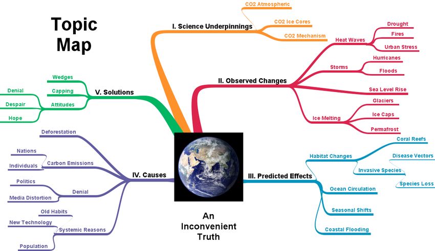
experience of global hot spots and local impacts. The presenter would also have engaging
visual tools to lead audience discussions about questions raised in the film.
Focusing on the questions audiences have posed about this film is the first step to
understanding how to engage people in future discussions. I decided to use my experience as
a member of The Climate Project as informal data to anticipate audience reactions to climate
change visualizations. Twenty thousand presentations have been given by 1,200 volunteers
like myself in the United States alone. This group effort has reached audiences of over 2
million in the past two years. Based upon my own AIT presentations as well as numerous
discussions with and presentations by my Climate Project peers, I have found that some parts
of the film’s content are much more likely to be addressed than others.

Figure 2. Topic Map of ‘An Inconvenient Truth’.

Figure 2 shows how An Inconvenient Truth is organized. It is a documentary film with a
large amount of information. Personally, I have been amazed that a film based upon a one-
hour lecture could be so popular. The film version is, however, actually the short version of
Gore’s presentation. The complete Keynote slide show package currently includes over 400
of Mr. Gore’s slides! Of course no audience could withstand such a long program, even
though I’ve seen Al Gore deliver a six-hour presentation of it with only a couple short breaks!
All presenters cull the base set of slides extensively.
If I wanted to use real-time science visualizations in a dome show immediately after the AIT
slide show, I would still want to shorten my typical slide talk. I would tend to focus the AIT
slides on Topic Map branches I and II. Topic areas II and III (Observed Changes and
Predicted Effects) might be the best areas to mine for additional visualizations. Before
suggesting an organization for these visuals, I first investigated what has actually been done
to add visualizations using Google Earth.
The Climate Project and Google funded student interns at the Pew Center for Climate Change
to develop visualizations for Google Earth. Google actively works with The Climate Project.
It sends representatives to our summits, and Al Gore serves as a senior advisor to Google. At:
sites.google.com/a/theclimateproject.org/google-earth-internship, one can find kml data for
these visualizations:

76                                                State of Climate Visualization, CSPR-report 2009:4
•   Global Air Surface Temperature A1B Scenario
    •   Global Carbon Emissions
    •   US Carbon Emissions
    •   Global Oil Consumption
    •   Global Solar Irradiation
    •   US Solar Irradiation
    •   US CO2 Emissions and Tree Populations

Google Outreach is encouraging projects like this and could be a source of grants:
http://earth.google.com/outreach. One of my hopes is that they make a plug-in that will allow
viewing of Google Earth in domed theaters.
Although these student kml efforts are useful and interesting, they might not be exactly the
visualizations that would be the most useful in a discussion after delivering the AIT slide
shows. In my opinion, some of them are also not as highly rendered or developed as one
would need for a high-resolution digital planetarium either.
Since visualizations are only the props to be used in a discussion, it is useful to learn what
Climate Project presenters have experienced during discussions. We know that audiences can
become quite animated. Most want a positive conversation that does not drift into either
pessimism or denial. An Inconvenient Truth paints the big picture challenge rather well, but
question and answer periods usually drift into conversations about local impacts. Specific
visualizations will require new and frequently updated visualizations.
Although local concerns are a focus, whenever I have shown people their cosmic
(astronomical) context, they say they feel motivated by understanding how they are part of the
larger story of planet earth. It’s natural for me as an astronomer to want to do this, but I’ve
honestly been surprised at how popular adding this level of meaning has been. I have used
Uniview to accomplish this perspective a couple of times. In my mind I have extended the
usual environmental dictum from “Think Globally, Act Locally” to “Think Globally, Act
Locally, Reflect Cosmically.”
More specific questions in these talks touch on topics like water resources and drought. I
know that many in my audiences are concerned for wildlife both in the oceans and on land.
So, it seems to me that data sets that show species and water resource information at local
levels would be interesting. For one talk, I incorporated some of California Academy of
Sciences data on the future habitat range of the Canadian Lynx under different carbon
emission scenarios. The Lynx requires snow because it prefers to hunt Snowshoe Hares. As a
result, changes in the yearly distribution of snow pack will have an impact on the Lynx.
Displayed in Google Earth, these data made the effects of climate change on this
extraordinary North American wild cat apparent.
Finally, in my AIT audience discussions, I’ve found that people enjoy being able to add their
own knowledge and opinions. They also have generally been interested in knowing what
specific actions they might take to lower their carbon footprints – down to what type of water
heater to buy!
Of course visualizing water heaters is not what I mean by visualizations that will serve AIT
discussions. I think, however, the following structure might could serve as a useful data tree
for visualizations:

State of Climate Visualization, CSPR-report 2009:4                                          77
• Current Data
o Global Data
Biosphere
Cryosphere
Hydrosphere
Atmosphere
Technosphere (the constructed world of humans)
o Local/Regional Data (A couple examples are listed here. These data should be
specific and meaningful for the region where the program is presented.)
Water resources
Species habitats
• Future Data: Climate Model Predictions
o Global Data
IPCC Emission Scenarios
o Local/Regional Data
“Migrating Climates” (www.ucsusa.org/greatlakes/glimpactmigrating.html)
Species habitat changes
Local sea level rise
Data visualized for the above scheme must be platform and application software independent
too. Kml format and wms servers would be one way to start. This will allow presenters to
include them in versions that can run on anything from a laptop up to large immersive theaters
and even pre-rendered production segments. Because theater time with audiences will be
limited, giving them the ability to explore more on their own later will be welcomed.
There is one more dimension to productions on this topic that I would like to discuss. Helping
audiences understand the topic of climate change is more than simply data and scientific
explanations. It is important to help the audience deal with their emotional reactions to the
threat. One always wants to move the audience beyond fear, denial, and angst towards
hopeful action. They need to feel that they can make a difference. Pollsters have learned in the
past two years that many more Americans accept the fact of global warming than they did a
couple years ago. The problem for American audiences, at least, is that they don’t feel it is an
urgent priority to address. (See: people-press.org/report/485/economy-top-policy-priority)
This is a major roadblock to solving this global challenge. Moving people to take action will
require producers to be mindful of the emotional “frames” that the public associates with
addressing the problem of climate change.
In recent years, the popular media have knowingly or unknowingly encouraged imposing
contextual “frames” around the discussion of global warming. These include associating it
with pollution, scientific uncertainty, and economic consequences. These are negative frames,
some of which have been constructed by groups or stakeholders who stand to suffer if
legislation were to be adopted that would seek to control the consumption of carbon-based
fuels. Once associations like these become widespread, it is hard for educators or other
communicators to prevent audiences from seeing the challenges only through one of these
filters. Educators who work with visualizing climate content will want to work to establish
more positive frames.
Examples of more promising frames have appeared lately through the Repower America
program. These might not work in other countries, but they have been tested and are worth
considering when establishing a context for dealing with climate change. These frames
78 State of Climate Visualization, CSPR-report 2009:4include positioning action on curbing green house gasses as fostering: innovation, prosperity,
health and stewardship.
Some of these positive frames might not work well or be appropriate in a full-dome digital
theater program. I have, however, had promising reactions to a positive frame similar to that
of stewardship. I would call it the cosmic context frame. I sometimes have a short section in
my talks, called The Cosmic Carbon Story, which traces the origin of carbon in long-dead
generations of stars to earth’s present atmosphere and its carbon-based life. The audience is
thereby made to feel part of this universally-scaled drama. It is easier for them to realize that
how the next act unfolds is at least in part up to them, or as the script of Yann Arthus-
Bertrand’s film Home ends: “It’s up to us to write what happens next – together.” This
approach helps them take action by making them feel part of something much bigger and
more meaningful than they might have previously believed.
This short paper is my way of exploring the question of how one might approach adding full-
dome visualizations for an audience discussion following the presentation of An
Inconvenient Truth. Although based upon experiences with that film’s slide show, the
thoughts presented here needn’t be confined to accompanying only AIT. Rather, the
experience of educating with that film should be regarded as data to help us know where to
begin our visualizations and productions.
We should keep in mind too that what we may well be aiming for is a program that goes
beyond simply presenting scientific truth. It is also not merely a story about how we know
what we know, either. Our climate programs deal with a moral question: Given what we now
know, how should we act? Presenting such programs offers us a new, important, and possibly
uncomfortable role as planetarians. We are no longer simply helping people understand our
planet among others as if humans were merely along for the ride. We now have the
knowledge that we are a force of nature and determining the fate of our planet. The stakes
have just been raised, but if any profession is equipped to ascend to that new level of
responsibility, I can’t think of a better one than our own that has always aimed for the stars.
Biography
James Sweitzer, Ph.D. is the owner of Science
Communications Consultants, a long-time plane-
tarian, a professor at Columbia College Chicago,
and a member of The Climate Project. He consults
on the development of digital planetariums and their
programming.
State of Climate Visualization, CSPR-report 2009:4 79You can also read