WORKING PAPERS SERIES - Paper 132 - Mar 08 Collaborative Mapping of London Using Google Maps: The LondonProfiler
←
→
Page content transcription
If your browser does not render page correctly, please read the page content below
UCL CENTRE FOR ADVANCED SPATIAL ANALYSIS

                                                                    WORKING
                                                                    PAPERS
                                                                    SERIES
                                                                    Paper 132 - Mar 08
                                                                    Collaborative Mapping of
                                                                    London Using Google Maps:
                                                                    The LondonProfiler

                                                                    ISSN 1467-1298

Centre for Advanced Spatial Analysis University College London 1 - 19 Torrington Place Gower St London WC1E 7HB
Tel: +44 (0)20 7679 1782 casa@ucl.ac.uk www.casa.ucl.ac.uk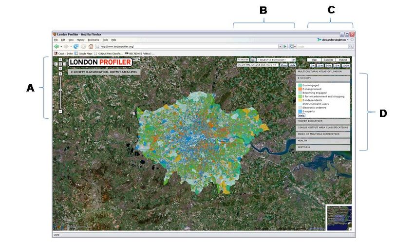
Collaborative Mapping of London Using Google Maps:
                    The LondonProfiler
    Maurizio Gibin, Alex Singleton, Richard Milton, Pablo Mateos, Paul Longley†

Abstract
This paper begins by reviewing the ways in which the innovation of Google Maps
has transformed our ability to reference and view geographically referenced data.
We describe the ways in which the GMap Creator tool developed under the ESRC
National Centre for E Social Science programme enables users to ‘mashup’ thematic
choropleth maps using the Google API. We illustrate the application of GMap
Creator using the example of www.londonprofiler.org, which makes it possible to
view a range of health, education and other socioeconomic datasets against a
backcloth of Google Maps data. Our conclusions address the ways in which Google
Map mashups developed using GMap Creator facilitate online exploratory
cartographic visualisation in a range of areas of policy concern.

Keywords: GIS, Google Maps, Visualisation, Cartography, Mashup, Web 2.0

        1. An evolving visual representation of spatial data

Cartography is defined as the art and science of making maps that historically have
been used to simplify and represent real world features (Monmonnier, 1996). With the
advent of Geographic Information Systems and Science (see Longley et al, 2005),
cartographers have acquired new tools and methods capable of enhancing static maps
and introducing multiple layering, interactivity and multimedia (Dransch, 2000). The
advent of computer-based visualisation of geospatial data has stretched traditional
cartographic domains of visual thinking and visual communication (DiBiase, 1990) to
drive the development of a new discipline that embeds these technologically driven
tools into a new but wider research agenda. This is the domain of geographic
visualisation or “Geovisualisation” (GVis) that “can be applied to all the stages of
problem-solving in geographical analysis, from development of initial hypotheses,
through knowledge discovery, analysis, presentation and evaluation” (Buckley et al.,
2000). GV is also embodies the visual elements of exploratory spatial data analysis
(ESDA) tools. Thus, for example, through brushing ESDA makes it possible
dynamically to link graphs, charts, tables and maps with a view to detecting patterns

†
  Tuesday, 18 March 2008. All authors are associated with the Centre for Advanced
Spatial Analysis (CASA) at UCL. Pablo Mateos and Paul Longley are also faculty
members in the Geography Department at UCL.
in data, formulating initial hypotheses and investigating aspects of model assessment
such as goodness-of -fit (Haining and Wise, 1997)

The innovation and astonishingly rapid diffusion of Google Maps and Google Earth
has fuelled new ways of deploying GI across computer platforms through a standard,
easy to navigate graphic user interface. Google Maps provides a geographically
enabled Web 2.0 service. Web 2.0 is a phrase coined by O'Reilly Media in 2004 to
summarise the rise of a series of web communities based on technologies of social
networking, social bookmarking, blogging, Wikis and much other open content using
RSS/XML feeds (Graham, 2007). The use and reintegration of these technologies
through open standards is the core organising framework of Web 2.0. In June 2005
Google officially released their Google Maps Application Programming Interface
(API), which enables users to mix Google streamed base data with other spatially
referenced material. These data can then be served as bespoke applications through
the Google map interface. A number of different terms have been used to describe
these applications, including “map mashups” (Purvis et al., 2006) and “map hacks”
(Erle et al, 2005). The mixing of various data sources through common and open
standards is central to Google Maps’ position within the concept of Web 2.0.

When using the Google Maps API, programmers can access different pre-built
functionalities or classes, and create their own applications by using classes to
perform operations using their external data. The Google Maps API is essentially a
collection of JavaScript classes that can be called from a web page in order to build
various elements of an interactive map. Other, more automated, ways exist for users
to create and share maps, such as Google My Maps, but the creation of mashups
require users to posses some knowledge of JavaScript, XML (Extensible Markup
Language), Ajax (Asynchronous JavaScript and XML), XHTML, CSS and VML. The
lattermost two of these create the web page layout for the map mashup application.

The Google Maps API should not be thought of as a complete ESDA tool because it
lacks the functionality of brushing, yet its wide and free availability has encouraged a
very considerable number of users with intermediate and advanced programming
knowledge to build their own applications, using Google Maps data as a visualisation
interface. There are numerous examples of Google Map mashups online, some of
which are detailed in Table 1.
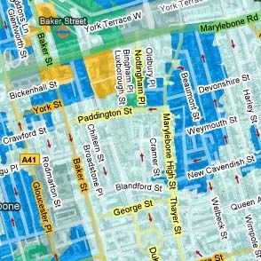
Table 1: Some Example Google Map Mashups (source: adapted from
                       googlemapsmania.blogspot.com)

Name                   Data                        URL
Chicago    Crime    –  Crime Incidents in          http://www.chicagocrime.org/map
Community Information  Chicago.
Housing     Maps    –  Craigslist    Housing       http://www.housingmaps.com/
Property Search        Data – For Sale &
                       Rentals.
Wikimapia – User User               generated      http://www.wikimapia.org/
descriptions of places semantic content about
                       places.

A commonality between these mashups is that they display spatial point data.
However, it is often the case that point objects are misleadingly used to summarise an
areal distribution, and as such is an instance of what Martin (2001) describes as
instances of spatial object transformations. Viewed from this perspective, the
production of many choropleth maps also entails spatial object transformations, since
spatially referenced data are aggregated into artificially bounded areas, such as
Census Output Areas, or administrative units created to protect data on individuals
from disclosure. The low prevalence of choropleth map mashups most likely arises
because the Google Maps API neither supplies nor supports tools to incorporate
areally aggregated data into Google map interface. In this context, we present here a
tool created by the UCL Centre for Advanced Spatial Analysis to enable the creation
of choropleth thematic layers which may be integrated into the Google Maps API.
Using areal coverages created using this tool, it is possible to build feature-rich
cartographic websites that may be readily used and interpreted by individuals who
have hitherto had only limited experience of spatial data handling. This paper
illustrates these ideas by presenting such an application for London
(http://www.londonprofiler.org).

        2. Building thematic data layers in Google Maps
External data displayed by Google Maps may originate from a variety of sources and
formats. Typically, these data refer to classic GIS data objects such as points,
polylines, polygon vectors and rasters. However, GIS files common across desktop
GIS software, such as ESRI (Redlands, CA) Shapefiles, may not directly be imported
into a Google Map mashup, and therefore require a degree of manipulation before
they can be displayed. Vector data can be drawn on top of a Google Map using the
Google Map API through conversion of points using the Google class GPoint;
polylines can be drawn using GPolyline; and polygons may be drawn using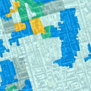
GPolygon. Each of these three classes needs arguments (points or arrays of points) in
order to visualise geographic features. In practice, as suggested above, most mashup
applications use point data alone because building complex polylines and polygons
requires specification of data arrays pertaining to vertices and coordinates in order to
facilitate display: this adds to the download size and slows down the application. For
this reason, Google Maps mashups showing polygon data thematised by a particular
attribute are uncommon.

In order to ameliorate this situation, and as part of an ESRC National Centre for E
Social Science initiative, we have developed a freeware application to simplify
thematic mapping in Google Maps. GMap Creator1 can read and then project
shapefiles onto a thematic map layer based on a field attribute from a table. Unlike the
standard API method of displaying points, lines and polygons, which requires arrays
of vertices and coordinates to be specified in the HTML, GMap Creator renders this
information as a series of raster image tiles (256x256 pixels) whose frequency depend
on the zoom level selected. The higher the zoom level, the greater the frequency of
tiles required to cover any given geographic area. These are represented using a
quadtree data structure wherein each region is sub divided into four quadrats that each
facilitate an increase in zoom level (see Figure 1).

 Figure 1: The frequency of thematic tiles created increases with each increased
                                level of zoom.

Using GMap Creator, it is possible to overlay pre-rendered thematic tiles on top of the
street and satellite views of Google Maps. This makes it possible to show complex
areal coverages, as the client’s browser has only to download and display the pre-
rendered tiles, rather than complex vector data consisting of multiple points, lines or
polygons. Use of this type of architecture has the added benefit of avoiding
infringement of many intellectual property rights, since it is not possible to recover
the original vector data from the image tiles. Indeed, even if an image processing
algorithm were used to extract the data from the images, the recovered data will only
be a scaled approximation of the original.

Use of pre-rendered data stored as images makes it possible to publish geographically
extensive data on the Web. However, the tile based architecture described above is
more suited to browsing, rather than interrogating, data. Unlike other Web based GIS
packages, enabling simple ESDA functions such as brushing a thematic region to
discover other associated data is problematic, if not impossible to implement.
Similarly, standard spatial analysis functions based on correlations and comparison
between different fields of data are not possible without access to the original data
stored on the server. However, there is potential for implementing sophisticated GIS
functions, in which the server storing the thematic tiles might be used dynamically to
create tiles based on user-specified criteria. However, these processes require CPU
time on the server, and this limits the number of requests that may be handled at any
single point in time. The objective of the GMap Creator software is to reduce the
thematic map layer to a set of files that may be stored on a web server, thus making it
possible for them to be served using simple file transfers. This is the simplest possible
solution and offers users who do not have access to a programmable server the facility
to display thematic maps; and this solution can also scale to handle very large
numbers of hits.

In addition to the creation of image tiles, the software also renders a basic webpage
that contains the Google mapping interface in a standard format and layout. The
examples presented in this paper were built using GMap Creator as the main engine to
create the tiles, although the style and design of the web pages was manipulated in
order to offer additional cartographic features such as the ordering of layers and the
ability to select different data.

                            3. Profiling of London

The purpose of the Londonprofiler website (www.londonprofiler.org) is to create a
resource on which multiple spatial data from a variety of public domain or public
sector sources may be displayed. The common interface is designed to allow different
stakeholders to make improved decisions using spatial and thematic search criteria.
The Londonprofiler application interface is designed to be as intuitive as possible. The
features of the interface are outlined in Figure 2.
Key: A – The standard Google pan and zoom controls. B – Select a London Borough, or search by unit
postcode: each enables external KML files to be loaded on top of the map. C – Standard “Map”,
“Satellite” and “Hybrid” map buttons and additional map transparency controls to allow fading of
thematic layer (0%, 25%, 50%, 75, 100%) over base map. D – Map attribute selection pallet.
Figure 2: The LondonProfiler Interface.
Figure 2 illustrates the similarity between the main map interface and the standard
Google Map website. Additional items have been added to this interface in order to
refine search capability (e.g. to select by borough or unit postcode) or add
interactivity. The function of the standard “hybrid” map button (Figure 2 – C) has
been altered to enable overlay of the road network data on both the thematic and
satellite data.
Map View Satellite View Hybrid View
Figure 3: The three different Google view options, using 50% opacity
A further feature added to the interface (Figure 2 – C) is the ability to change the
visibility of the thematic data from 0% (no background data visible) to 100%(background data only visible, as illustrated in Figure 4). The colour of the thematic
layer alters slightly as the transparency changes. Therefore, in order to aid visual
interpretation of the data by users, the map key (Figure 2 – D) changes the colours of
the labels to compensate for each change in transparency. The thematic layer can be
changed by clicking on the relevant tab (Figure 2 – D, here selecting a
geodemographic classification of use of information and communications
technologies).
0% Visible 25% Visible 50% Visible
75% Visible 100% Visible
Figure 4: The visual impact of the transparency filter
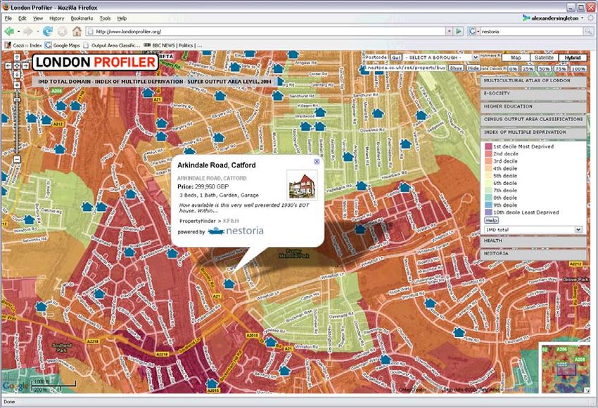
The Google Maps API 2 released in 2006 enabled KML files to be rendered on top of
the Google Maps background data. Thus, on the Londonprofiler site a publically
available third party URL can be entered into the display box (see Figure 2 – B) and
the third party KML file will be displayed on top of the thematic layer. KML data are
a type of XML which encapsulate a spatial location and a series of metadata. This
creates a range of possibilities for user interaction, such as displaying third party
boundaries and point data, or the integration of disparate data feeds. In order to
illustrate this functionality, one such link has been formalised as a tab (see Figure 2 –
D) to link the Nestoria website (http://www.nestoria.co.uk/), which is a UK property
aggregator. Nestoria allows a range of search criteria to be specified and returns a listof properties for sale within a selected search area. In addition to displaying these properties as a list on a basic webpage, the site also returns a series of data formats including RSS and KML. By copying the URL to the KML data stream from the Nestoria site into the KML display box on Londonprofiler, houses for sale can be displayed on top of the thematic data (see Figure 5). Figure 5: Nestoria generated KML for “SE6” in London displayed over the Summary 2004 Index of Multiple Deprivation Hybrid Map with 75% visibility. The Londonprofiler website is currently available as a beta test site, and it is expected that many more datasets will be added in the future. The datasets that are currently live include: • Multicultural Atlas of London (Mateos et al, 2007) • E-Society Classification (Longley et al, 2006) • HEFCE POLAR Classification and Associated HE data (Corver, 2005) • Hospital Episode Statistics (www.hesonline.nhs.uk) • Index Multiple Deprivation (DCLG, 2004) • National Statistics Output Area Classification (Vickers and Rees, 2007) A help section is provided for each dataset which provides details of how the source data were created with links to www.spatialanalysisonline.com, an independent source of geospatial reference material (also available as de Smith et al 2008).
The remaining part of this paper considers three applications in health, higher
education and ethnicity. For each domain, the data currently present on the site are
outlined and comment made on how these data could be used in problem solving
relevant to current public policy.

                 3.1 Profiling of London: Higher Education

A range of UK sources of Higher Education (HE) data are publicly available,
including those sourced from the Higher Education Statistics Agency (HESA) or the
Universities and Colleges Admissions Service (UCAS). The HE data currently
displayed in Londonprofiler are derived from data supplied by the Higher Education
Funding Council for England (HEFCE). HEFCE developed a classification of
Participation of Local Areas (POLAR: Corver, 2005) which divides wards into five
quintiles based on their ‘young’ (18-19 year old) participation rate. In June 2007
HEFCE supplemented these data by conducting a pilot exercise to assess the value to
its stakeholder groups of other local area statistics related to young participation rates.
Both the POLAR classification and these additional data were provided as Excel files,
detailing a range of variables for 1991 Wards.

These data provide a wealth of useful information for institutions and their provision
should be applauded. However, the value of this information is heavily circumscribed
by their interpretability. Cartographic representation of these data potentially offers a
much improved method for end users to visualise and interpret any inherent spatial
patterns. In a traditional GIS environment, each institution would have to: input the
POLAR data into a specialist software package such as ESRI’s ArcGIS; obtain
boundary data; join the files; and finally create an appropriate visualisation and colour
palette. Together with the GMap Creator, the Londonprofiler website allows anyone
creating data on HE an opportunity to centralise findings through a common visual
interface. The potential savings for such a centralised facility should not be
underestimated, not least because few institutions have in-house GIS trained analysts.
If every HE institution in the UK (of which there were 327 in 2006) desired to create a
set of maps for their local areas using the standard procedure of employing a GIS
consultant (typically two days labour @ £400/day) the cost to the HE sector as a
whole would be approximately £261,600. This very large amount of money could
easily be saved through the use of centralised mapping such as Londonprofiler.

The ward level HEFCE generated data included in the Higher Education tab are:

   •   The POLAR Classification (% of 18-19 year old age cohort that participate in
       HE)
• The percentage of participants whose parents come from NS-SEC
socioeconomic classes IIIM, IV and V
• The percentage of entrants who attended independent school
• The percentage of entrants that had deferred application from a previous year
• The percentage of entrants whose successful applications were made through
the UCAS clearing system
• The percentage of participants whose highest entry qualification was not at A-
level
• The percentage of entrants ordinarily resident with their parents
The spatial organisation of participation in HE is an important growth area of public
policy research, of acute concern because of the political imperatives of extending
participation to underrepresented groups in an era of increasing fees and increasing
socio-economic differentiation in prior attainment. In addition to these policy
concerns, institutions operate within an increasingly competitive environment,
wherein identification of the areas supplying the most suitable students could assist
both in leveraging market advantage and increasing the efficiency of the sector as a
whole. The HE data presented in the Londonprofiler application could easily be used
to explore the spatial arrangement of data relevant to these policy issues. An
admissions officer at a university in London, for example, might enter local applicant
postcodes into the postcode search facility in order to assess the level of deprivation
with the ward in which a series of applicants are domiciled. A further application
might entail widening participation officers using a supplementary KML file of
secondary schools to identify schools in wards of high recruitment priority, perhaps
defined by the lowest participation quintile in the POLAR classification.
3.2 Profiling of London: Health
The health tab of Londonprofiler accesses data from the Hospital Admissions for
Long-Term diseases (HALT) dataset at Lower Layer Super Output Area (LLSOA)
level. These data are derived from four years of individual level admissions to all
hospitals of London. For a selected number of conditions, hospital admission ratios
have been calculated as the observed number of admissions for an area divided by the
expected number that would prevail assuming that the age- and sex-specific rates
were the same as for the whole of London. An admission ratio of 100 is the London
average; 50 is half and 200 the double.
In addition to the London wide health data, additional data have been derived from
registered patients within the 48 General Practices located in the Southwark Primary
Care Trust area of responsibility. Data at individual level for Southwark have been
aggregated into unit postcodes and then imported into a GIS. Using this point dataset,
the density of registered patients per square kilometre was calculated using a kernel
density estimation algorithm (Silverman, 1986) with a bandwidth of 500m and a cellsize for the output raster of ten metres. The health tab of Londonprofiler can also
display the Percent Volume Contours2 (PVCs) of the densities of registered patients
for each general practice in Southwark Primary Care Trust. PVCs represent the
boundaries of a certain cumulative percentage in the density function. Thus, for each
practice, the PVCs show the areas within which approximately 50%, 75% and 95% of
the patients live whom are registered with a corresponding general practice.
A range of applications is possible by using PVCs to infer areas of primary
responsibility for each General Practice, and overlaying these on top of the thematic
layers of the Londonprofiler. Visualisation enables decision makers to assess different
GP practice areas in terms of their aggregate spatial characteristics across a range of
domains. For example, if a GP practice has a catchment in an area where there is a
high prevalence of hospital admissions related to heart attacks, the GP could supply
targeted information about healthy lifestyle choices and their likely effects in reducing
the probability of heart disease.
A further application concerns the E-society geodemographic classification (Longley
et al, 2006), which maps the level of household engagement with information and
communications technologies at the unit postcode level of analysis. This information
is very important when considering the use of new technologies in health care service
provision, such as targeting GP practices where Internet based booking systems for
appointments and repeated prescriptions may be successful.
3.4 Profiling of London: Ethnicity
The ethnicity tab of Londonprofiler consolidates the provisional findings of a new
methodology of classifying areas into groups based on the common cultural, ethnic
and linguistic origin of the resident surnames and forenames. By appending the
classification of names developed by Mateos et al., (2007) to the UK Electoral Roll, a
range comprising some 18 groups in London have been mapped at output area level,
specifically: Bangladeshi, Chinese, English, Greek, Indian, Irish, Italian, Jewish,
Nigerian and Ghanaian, Other Muslim, Pakistani, Polish, Portuguese, Russian, Sikh,
Sri Lankan, Turkish, and Vietnamese. The advantage of using names to classify
ethnicity rather than decennial census returns is that the data have finer granularity
both in terms of the groups they represent and the temporal interval for which they
may be updated.
The ethnicity data presented on Londonprofiler have a plethora of potential
applications that cannot be covered in the space available here. However, one core
application concerns the identification of areas where recent migrants to the UK may
have clustered, e.g. those related to recent EU expansion. In terms of public sector
service delivery, use of a current and disaggregate ethnicity classification provides atool that might enable targeting of supplementary information in minority languages
spoken by residents of an area, perhaps enabling better uptake or appropriate usage of
local facilities and services.
4. Discussion and Conclusions
Google Map mashups in their basic form are straightforward to implement and
currently remain a free solution for online exploratory cartographic visualisation. Use
of mashups as described in this paper provides a cheap and effective platform for
visual communication of health and education data to both internal and external users.
The interface is well designed and intuitive, and so needs only limited instruction on
usage and navigability, saving time on training in more complex GIS technologies.
The simple cartographic design of the Google Map base layers which are integrated
into all of the mashups makes ideal background for thematic overlays. In health,
education and public sector applications it is now possible for users to visualise
thematic layers made up from boundaries of unfamiliar size and location within the
context of local and scalable geographical features such as roads or gazetteer entries.
Visualising essential geographic information of the “where?” with the “what?” needs
careful design (Tufte, 1990). For example, the colour scheme choice for the thematic
overlay must avoid tones that can be confounded with the underlying Google Map. A
solution deployed in the examples reported here uses a combination of thematic
overlay transparency and the Google hybrid map layer. Setting a 100% transparency
for the thematic layer and putting the street layer on top allows essential geographic
information to be conveyed along with additional attribute data.
Because of the ways in which Internet and web browsers work in general, the Google
Maps API makes best use of the available technology for a data publishing solution.
The challenge is to leverage this towards solutions that allow publishing of
geographically extensive and interactive data. A ‘browse-tool’ for data is technically
possible using the vector data capabilities of the Google Maps API, but these
solutions are not scalable for large geographical coverages. Furthermore, this
architecture is slower than the pre-rendered approach that the GMap Creator takes. As
an example, data for the entire UK at lower output area level exceeds 380MB. With
just a handful of users accessing datasets of this size, the server would quickly run out
of memory and CPU cycles. Thus, the approach taken by Google Maps is to push all
of the computation over onto the browser, in order to produce a scalable solution.
Unless there are huge advances in computing, the browser will never be able to handle
large datasets through the Google Maps API. At present, it is possible to handle about100 data points or about 1000 points making up polylines or areas. Yet geographic
solutions at the scale of a large city involve areal data entailing millions of points that
therefore cannot be rendered on the fly. Resolution of this problem is therefore
unlikely to be achieved by transferring the original vector data to a client’s browser
prior to rendering. Furthermore, this also effectively gives the client access to the
server’s dataset, and this may have implications in terms of intellectual property rights
and disclosure control. Therefore, using the Google Maps technology, it is possible to
build systems for small numbers of users similar to traditional GIS where data can be
manipulated and displayed over the Google Maps street view or satellite images. With
an appropriately large server it would potentially be possible to handle any type of
geospatial analysis and manipulation that could be handled by a desktop GIS.
However the cost of these resources would be great and as such the current solution is
only able to support a small number of users at any one time. If the target audience of
a Google Maps based application is a large number of users, then pre-rendering of
data is the answer, but with its consequential implications for provision of data
storage facilities and also lack of manipulation options. We think, however, that there
also exists a class of system somewhere between these two. Using pre-rendered tiles,
it may be possible to overlay different thematic layers and make comparisons
manually based on the values contained within the raster data. Thresholding and
Boolean comparison of thematic regions from pre-rendered layers can be done as this
can be reduced to a pixel operation between map tiles from different sources on the
web server. For example, a system has been tested that renders a demographic
classification for areas where house prices are greater than a specified threshold. The
inputs to this system are two pre-rendered thematic maps built using the GMap
Creator with the output a hybrid overlay. This opens up some interesting possibilities
in which people can publish data that may be explored interactively by large numbers
of users.
References
Buckley, A.R., Gahegan, M., Clarke, K. (2004). Geographic Visualization. In, R. B.
Mcmaster and E. L. Usery. A Research Agenda For Geographic Information
Science. Boca Raton, Fl: Crc Press.
Corver, M. (2005). Young Participation in Higher Education. HEFCE 2005/03.
Bristol: HEFCE.
de Smith, M. J., Goodchild, F. M., Longley, P. A. (2008). Geospatial Analysis: a
Comprehensive Guide to Principles, Techniques and Software Tools (Second
Edition). Leicester: The Winchelsea Press/Troubador.DCLG (2004). Index of Multiple Deprivation (online). Available from:
http://www.communities.gov.uk/archived/general-
content/communities/indicesofdeprivation/216309/.Accessed 18th December
2007. London: Department of Communities and Local Government.
Dibiase, D. (1990). Visualization in the earth sciences. Bulletin of Earth and Mineral
Sciences, Pennsylvania State University 59(2), 13–18.
Dransch, D. (2000). The Use Of Different Media In Visualizing Spatial Data.
Computer & Geosciences 26(1), 5-9.
Erle, S., Gibson, R., Walsh, J. (2006). Mapping Hacks: Tips & Tools for Electronic
Cartography. Sebastopol, CA: O'Reilly Media, Inc.
Graham, P. (2007). Web 2.0 (Online). Available from:
http://www.paulgraham.com/web20.html.Accessed 24th April 2007.
Haining, R. and Wise, S. (1997). Exploratory Spatial Data Analysis, NCGIA Core
Curriculum in GIScience (online). Available from:
th
http://www.ncgia.ucsb.edu/giscc/units/u128/u128.html. Accessed 18 December
2007.
Longley, P.A., Goodchild M.F., Maguire D.J. and Rhind D.W. (2005). Geographic
Information Systems and Science. Chichester: John Wiley & Sons.
Longley,P.A., Ashby,D.I., Webber,R., Li,C. (2006). Geodemographic classifications,
the digital divide and understanding customer take-up of new technologies. BT
Technology Journal 24, 67-74.
Martin, D (2001). Geographic Information Systems: Socioeconomic Applications.
London, Routledge.
Mateos, P., Webber, R., Longley, P.A. (2007). The Cultural, Ethnic and Linguistic
Classification of Populations and Neighbourhoods using Personal Names. CASA
Working Paper 116. Available online from:
http://www.casa.ucl.ac.uk/working_papers/paper116.pdf
Monmonier, M. (1996). How to Lie With Maps. University of Chicago Press:
Chicago.
Purvis M., Sambells J., Turner C. (2006). Beginning Google Maps Applications with
PHP and Ajax. Berkeley: APress.
Silverman, B.W. (1986). Density Estimation. London: Chapman And Hall.
Tufte, E. (1990). Envisioning Information. Cheshire, CT: Graphic Press.
Vickers, D., Rees, P. (2007). Creating the National Statistics 2001 Output Area
Classification, Journal of the Royal Statistical Society, Series A 170(2).
1
GMap Creator is part of the GeoVUE Project at CASA, a project sponsored by the ESRC as a node in
the National Centre for e-Social Science. GMap Creator is developed at CASA by Richard Milton.
2
Percent volume contours were calculated with a free ArcGIS extension called Hawth’s Analysis Tools
developed by Hawthorne Beyer and downloadable from the website http://www.spatialecology.com.You can also read