AIRPORT MASTER PLAN CHAPTER 2 - FORECASTS - City of San Angelo
←
→
Page content transcription
If your browser does not render page correctly, please read the page content below
AIRPORT MASTER PLAN
                           CHAPTER 2 - FORECASTS

centurIon
 PLANNING AND DESIGN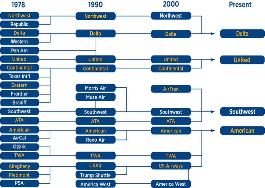
AIRPORT MASTER PLAN – CHAPTER TWO | FORECASTS

      INTRODUCTION
      The Aviation Forecasts chapter of this Airport Master Plan analyzes current and future airport activity
      at the San Angelo Regional Airport (SJT). Forecasting provides a general idea of the magnitude of
      growth, as well as fluctuations in activity anticipated over a 20-year forecast period. They assist the
      Airport in determining existing and planned future facility needs based on airport activity level
      estimates and projections. Forecasts attempt to develop a realistic estimate of future changes;
      however, when conditions dramatically change, forecasts should be reviewed and updated.
      Forecasts developed for an Airport Master Plan are important to adequately plan, size, and sequence
      development of future facilities to meet future projected growth. Development at airports, however, is
      demand-based from actual numbers rather than forecasts.

      To thoroughly analyze and develop a probable aviation forecast, a technical review has been
      completed using several methods to help quantify the potential aviation activity over the next 20
      years. The forecasts for this Airport Master Plan study were prepared by the project team members
      including Centurion Planning & Design, Landrum and Brown, and C & S Companies.

      FORECAST RATIONALE
      Forecasting the demand for airport services is a critical step in the development of an airport. It allows
      an airport to examine its ability to satisfy the needs of the aircraft and people it serves, and to
      determine the approximate timing of necessary improvements by projecting airport user activity
      levels.

      Forecasts developed for airport master plans and/or federal grants must be approved by the Federal
      Aviation Administration (FAA). The SJT Master Plan Aviation Activity Forecast was approved on May
      24, 2020. It is the FAA’s policy, listed in Advisory Circular 150/5070-6B, Airport Master Plans , that FAA
      approval of forecasts at non-hub airports with commercial service should be consistent with the
      Terminal Area Forecasts (TAF). Master plan forecasts for operations, based aircraft and enplanements
      are consistent with the TAF if they meet the following criteria:

          1. Forecasts differ from the TAF by less than 10% in the five-year forecast and by less than 15% in
             the 10-year period, or
          2. Forecasts do not affect the timing or scale of an airport project, or
          3. Forecasts do not affect the role of the airport as defined in the current version of FAA Order
             5090.3, Field Formulation of the National Plan of Integrated Airport Systems.

      The Airport Master Plan Advisory Circular also acknowledges that locally prepared forecast may
      contain a more detailed analysis of local economic conditions or development that is not considered
      when preparing the TAF. The TAF model used for this report is from the 2018 FAA TAF available in
      January 2018, also factored into this report is the Airports FAA Form 5010-1, Airport Master Record,

                                                          2-1
AIRPORT MASTER PLAN – CHAPTER TWO | FORECASTS
population and income data for the Metropolitan Statistical Area. This is the latest data available when
the forecasting effort began for this airport master plan.
Finally, FAA Order 5090.3C states forecasts should be:
1. Realistic
2. Based on the latest available data
3. Reflect the current conditions at the airport
4. Supported by information in the study
Provide an adequate justification for the airport planning and development
FORECAST EXECUTIVE SUMMARY
The following pages contain a great deal of analysis, information, and forecast methodology
descriptions. To ease review of the materials we have provided a brief executive summary below
Summary of Commercial Aviation Forecast Findings
Passenger enplanements at the San Angelo Regional Airport (SJT) are forecasted to grow at a
compounded annual growth rate (CAGR) of 1.2% over the coming 20 years
In line with forecasted economic & population growth
Resulting in 76,136 enplaned passengers by 2037
Within 4.3% of the TAF (within 2.1% of 10-year forecast and 1.1% of 5-year forecast)
Growth will be driven by larger aircraft as number of operations are not forecasted to change
significantly
As seat capacity will grow at a 1.2% CAGR through 2037 – indicating flat load factors
Current SJT 50-seat regional jet flying will evolve to all 76-seat jet flying by 2037
This is in line with expected industry trends
While not reflected in the forecast information above, it has been determined there is potential
for the reintroduction of a second airline at SJT
Current American Airlines results are persuasive - good profitability & high load factors
Demand exists, as 50% of traffic base “leaks” to other regional airports
Should a second airline be introduced, forecast modeling estimates enplaned passenger
volume could be as high as 101,192 by 2037
United (UA) service to Houston (IAH) is compelling as UA plans to grow capacity 6% per year
over the next 3 years, mostly with ERJ aircraft – this aircraft is a good fit for IAH-SJT service.
Currently Houston ranks as the number 6 market served for people flying out of San Angelo.
The drive distance from San Angelo to Houston further strengthens the case for new service
by UA.
2-2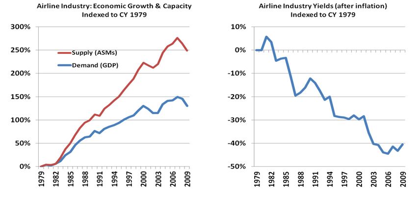
AIRPORT MASTER PLAN – CHAPTER TWO | FORECASTS
Summary of General Aviation Forecast Findings
General Aviation operations are expected to grow moderately over the next 20 years
Itinerant operations expected to grow at 0.7% CAGR over next 20 years from 22,199 to 25,522.
Local operations are forecasted to grow at a CAGR of 1.3% from 12,951 to 16,669.
These forecasts are in line with planned economic growth but vary from the general aviation
operations forecasted within the FAA TAF.
Combined with commercial operations, total SJT operations are expected to grow
0.8% CAGR by 2022, 0.6% by 2027 and 0.5% by 2037.
These forecasts are in line with planned economic growth but vary slightly from the FAA TAF.
SJT Based Aircraft are forecasted to grow at 0.7% CAGR over the next 20 years
0.7% CAGR over 5-year and 10-year periods.
Increasing from 176 based aircraft in 2017 to 202 by 2037.
Varies slightly from the projected based aircraft on the FAA TAF
While the preferred general aviation operations forecast varies from the TAF general aviation
operations forecasts, airports are often influenced by fluctuations in demographic and socioeconomic
factors within their surrounding communities. Although modest, increases in population for the San
Angelo MSA, combined with steady increases in employment and per capita income in the same MSA,
have the potential to increase the Airport’s general aviation activity.
For the purposes of this report, the data as reported on the current 5010 for the 12-month period
ending December 31, 2018, served as the baseline data. While TAF uses a forecasted data, the
information in the 5010 can be confirmed, and as described in detail later in the report, can account
for the slight variation between the recommended forecasts and the TAF forecasts.
ECONOMIC BASE FOR AIR TRAFFIC
Air travel demand is typically correlated with a region’s demographic and economic characteristics.
The economic strength of the Air Service Area has a major impact on the aviation activity at the
Airport. The next sections review current economic trends and conditions in the Airport’s Air Service
Area and present data indicative of the Air Service Area’s capability to generate growing demand for
air transportation throughout the forecast period.
Socio-Economic Trends
Data for population, income, and gross regional product for the Air Service Area are discussed below.
Parallel data for the United States and the State of Texas is shown to provide a basis of comparison to
trends in the Air Service Area. Where available, historical data will be presented for the 2007-2017
period, which is representative of a longer-term trend and the most recent 10 years of historical data
available. Where available, forecast data will be presented through 2037, so as to be consistent with air
traffic forecasts presented later in this chapter.
2-3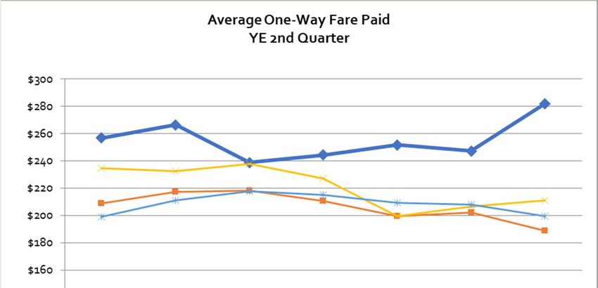
AIRPORT MASTER PLAN – CHAPTER TWO | FORECASTS

      Historical and Forecast Population
      Population is a significant source of demand for air travel. Table 2A includes 2007 and 2017
      population data and provides population trends in the Air Service Area, Texas and the U.S. during this
      period. Forecasts through 2037 are also included. Data in Table 2A below shows that between 2007
      and 2017, the population in the Air Service Area increased from 107,774 to 120,712, or 12.0% (1.1%
      CAGR). During the same period, U.S. population increased by 9.4% (0.9% CAGR), while Texas grew
      18.6% (1.7% CAGR).

       TABLE 2A
       Historical and Forecast Population (2007-2037)
                                                                      Forecast     Percent       CAGR1/
                                   Historical Population             Population    Change    2007-    2017-
       Area                     2007                2017               2037        2007-17    2017    2037
       Air Service Area        107,774             120,712            137,402       12.0%     1.1%    0.7%
       Texas                 23,831,000           28,274,000         38,102,000     18.6%     1.7%    1.5%
       United States         298,217,999         326,128,000         374,137,000    9.4%      0.9%    0.7%
      Note:
      1/ Compound annual growth rate.
      Source: Woods & Poole Economics, U.S. Census Bureau

      Population growth data are based on estimates of the Air Service Area’s birth rate, death rate, and net
      in-migration. The forecast population increase in the Air Service Area for the period 2017 to 2037
      reflects a CAGR of 0.7% and is comparable to the U.S. rate during the same period (0.7%), although less
      than ½ of Texas. The increase in new residents in the Air Service Area, approximates 1,000 between
      2017 and 2037, is expected to generate additional demand for air service.

      Household Income
      As described in Table 2B, the average household income for the air service area was $97,866 in 2017
      and is forecast to grow to $120,137 by 2037, or a 22.8% increase (1.03% CAGR). During this same time
      span, the U.S.’ average household income is forecasted to increase from $113,991 to $145,160, or
      27.3% (1.22% CAGR).

                                                               2-4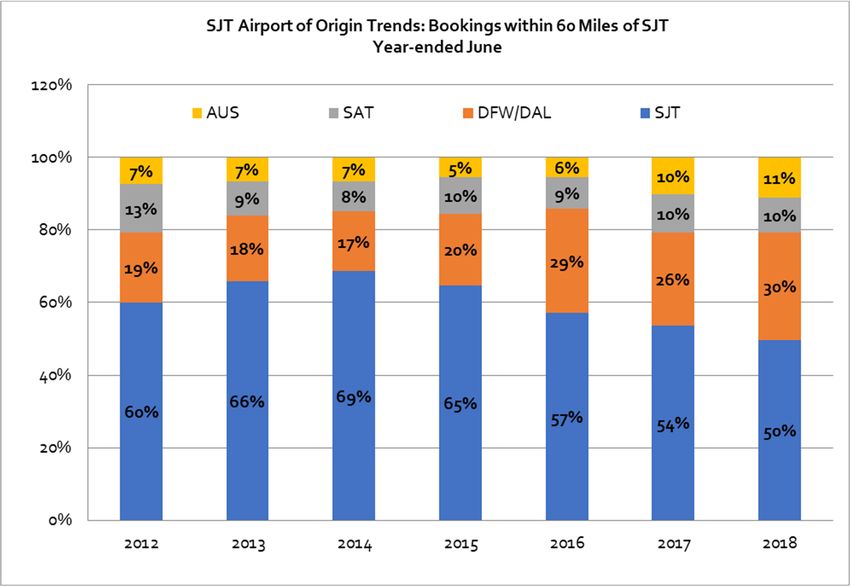
AIRPORT MASTER PLAN – CHAPTER TWO | FORECASTS

               TABLE 2B
               Median Household Income and Income Distribution (2017-2037)
                                                Air Service Area         Texas            United States
               2016 Median Household                $42,855             $57,051              $59,039
               I
               2017 Average Household               $97,866            $116,535             $113,991
               I2037 Average Household             $120,137           $150,935         $145,160
                I
                                                                      Household Income Distribution %
               2017 Household Income            Air Service Area        Texas             United States
               Less than $19,999                        23.0%           19.2%                 18.5%
               $20,000 to $44,999                       30.7%           26.2%                 24.9%
               $45,000 - $74,999                        22.8%           22.6%                 23.0%
               $75,000 - $99,999                        11.6%           12.0%                 12.6%
               $100,000 - $199,999                      11.8%           16.0%                 16.7%
               $200,000 or more                         2.0%             4.1%                 4.3%
               Total                                100.0%                                   100.0%

               2037 Household Income
               Less than $20,000                        17.0%           13.1%                 12.7%
               $20,000 to $45,000                       22.8%           18.3%                 17.6%
               $45,000 - $75,000                        27.9%           22.7%                 22.7%
               $75,000 - $99,999                        16.0%           16.6%                 17.3%
               $100,000 - $199,999                      16.4%           23.2%                 23.7%
               $200,000 or more                         2.8%             6.0%                 6.0%
               Total                                100.0%                                   100.0%
              1/ Amounts are shown in current dollars
              Source: Woods & Poole Economics

     The percentage of higher income households, defined as those earning $100,000 or more annually,
     within the Air Service Area is another key indicator of potential demand for air travel services. In 2017,
     approximately 6,300 Air Service Area households had an income of $100,000 or more. This is equal to
     approximately 13.8% of all Air Service Area households. According to Consumer Expenditure Survey
     data from the U.S. Bureau of Labor Statistics, 54% of airline fare expenditures are made by households
     with annual incomes of $100,000 or more. Data in Table 2C on the following page shows that
     between 2017 and 2037, the Air Service Area will gain an additional 3,572 households with annual
     income greater than $100,000.

                                                                2-5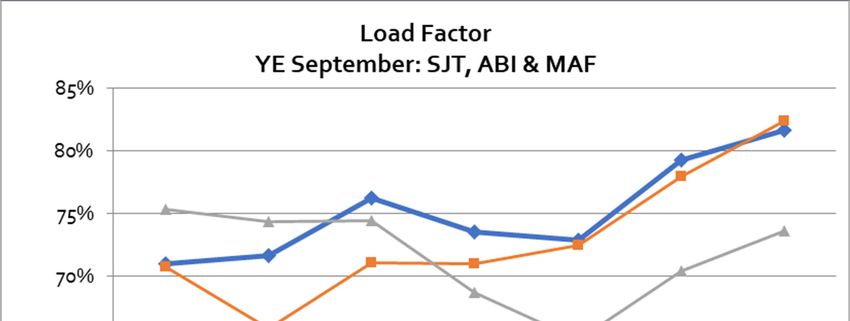
AIRPORT MASTER PLAN – CHAPTER TWO | FORECASTS

       TABLE 2C
       Households with Income of $100,000 and Above (2017-2037)

                                                                   Air Service Area    Texas       United States
       Total Households
       2017 estimate                                                    46,544        10,211,000     127,019,027
       2037 forecast                                                    51,417        13,244,000     146,739,258
       Increase in households                                           12.6%             29.7%           15.5%
                        1/
       CAGR 2017-2037                                                    0.5%              1.3%             0.7%

       Households with Income of $100,000 and Above2/
       2017 estimate                                                     6,300         1,842,000      26,673,996
       2037 forecast                                                     9,872         3,736,000      43,581,560
       Increase in households with income of $100,000 and               56.7%            102.8%           63.4%
        b
       CAGR  2017-2037                                                   2.3%              3.6%             2.5%

       % of Households with Income of $100,000 and Above2/
       2017 estimate                                                    13.8%             18.4%           21.0%
       2037 forecast                                                    19.2%             28.5%           29.7%
      Notes:
      1/ Compound annual growth rate.
      2/ In current dollars.
      Source: Woods & Poole Economics

      Gross Regional Product / Gross Domestic Product
      Gross domestic product (national level) and gross regional product (state- and county-level) are
      measures of the value of all final goods and services produced within a geographic area. These
      measures are general indicators of the economic health of a geographic area and, consequently, of
      the area’s potential demand for air transportation services. Table 2D shows the CAGR for the Air
      Service Area’s gross regional product and gross domestic product for the U.S. Table 2D indicates that
      gross regional product for the Air Service Area increased at a CAGR of 0.6% between 2007 and 2017,
      which was below the U.S. CAGR of 1.5%.

      Forecasts for 2037 in Table 2D show that gross regional product for the Air Service Area is forecast to
      increase at a CAGR of 1.4%, which is below the forecasted CAGR of the U.S. of 1.7% between 2017 and
      2037.

                                                             2-6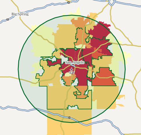
AIRPORT MASTER PLAN – CHAPTER TWO | FORECASTS

       TABLE 2D
       Historical and Forecast Per Capita Gross Regional and Gross Domestic Product (2017-2037)
                                          Gross Regional & Gross Domestic Product Growth
                    CAGR1/                      Air Service Area                     Texas                  U.S.
                   2007-2017                           0.6%                          2.1%                   1.5%
                   2017-2037                           1.4%                          2.3%                   1.7%
      Note:
      1/ Compound annual growth rate.
      Source: Woods & Poole Economics, Inc; in 2009 dollars

      Labor Market Trends
      Civilian labor force data, unemployment rates, and employment for the Air Service Area are discussed
      below and are presented in Table 2E. Parallel data for the U.S. is also shown to provide a basis of
      comparison for trends in the Air Service Area.

       TABLE 2E
       Historical and Forecast Non-Farm Payrolls and Unemployment Rate (2000-2017)
                                NON-FARM PAYROLLS                                      UNEMPLOYMENT RATE
           Year              Air Service Area           United States         Year       Air Service Area   United States
           2000                   44,900                  158,439             2000             3.9%             4.0%
           2001                  45,400                   158,510             2001            3.8%                 4.7%
           2002                  45,100                   156,779             2002            4.8%                 5.8%
           2003                  44,600                   156,413             2003            5.1%                 6.0%
           2004                  44,100                   158,124             2004            4.7%                 5.5%
           2005                  44,500                   160,850             2005            4.3%                 5.1%
           2006                  45,400                   163,748             2006            4.1%                 4.6%
           2007                  45,800                   165,596             2007            3.6%                 4.6%
           2008                  45,600                   164,688             2008            4.1%                 5.8%
           2009                  44,600                   157,560             2009            6.3%                 9.3%
           2010                  45,100                   156,423             2010            6.5%                 9.6%
           2011                  45,600                   158,329             2011            6.2%                 8.9%
           2012                  46,800                   161,004             2012            5.3%                 8.1%
           2013                  47,900                   163,655             2013            5.1%                 7.4%
           2014                  48,900                   166,724             2014            4.0%                 6.2%
           2015                  49,400                   170,175             2015            4.1%                 5.3%
           2016                  48,800                   173,166             2016            4.5%                 4.9%
           2017                  48,900                   175,949             2017            3.7%                 4.4%
              2/
       CAGR
          2000 – 2017          0.5%             0.6%
      Source: Bureau of Labor Statistics, U.S. Department of Labor; U.S. non-farm payrolls in 000s

                                                                        2-7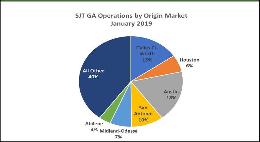
AIRPORT MASTER PLAN – CHAPTER TWO | FORECASTS

      2007 – 2017 Non-Farm Payrolls and Unemployment Rate
      Table 2E includes annual civilian labor force and unemployment data from 2000 through 2017 for the
      Air Service Area, and the U.S. Data in Table 2E show that between 2000 and 2017, the Air Service Area
      labor force grew about 8.9% or at a CAGR of 0.5%. At the same time, the U.S. increased from 158
      million to 176 million, or a CAGR of 0.6%.
      Regional Economic Overview
      San Angelo Regional Airport (SJT) is the primary commercial service airport serving the area of south-
      central Texas. It is in the Concho Valley, a region of central Texas. San Angelo is home to Angelo State
      University, historic landmark Fort Concho, and Goodfellow Air Force Base

      Economic development officials in the Air Service Area underscore the importance of the Airport’s
      links to destinations in the U.S. and around the world. Because access to domestic and international
      markets is a major factor in the site selection process, the Airport plays a significant role in attracting
      new businesses and the expansion of existing enterprises in the Air Service Area.

      As part of the economic discussion, it must be pointed out that San Angelo sits on the eastern edge of
      the Permian Basin, where the shale boom has elevated oil and gas production, or output in millions of
      barrels of oil and gas, to levels experienced in the middle east and other oil producing countries.
      Midland, Texas, located 112 miles to the west, is experiencing exponential growth as a result of this oil
      and gas exploration and development. San Angelo is experiencing spillover growth. Many companies
      in the city are servicing the shale oil boom west of here while enjoying what industry leaders say is
      enhanced quality of life. As commercial flights get full it is not uncommon to see people fly into San
      Angelo before heading further west.

      Major Employers
      Major employers in the Air Service Area for which employment data are available are shown in Table
      2F. These firms represent a variety of industries including: Defense (Goodfellow Air Force Base),
      government, education and healthcare.
       TABLE 2F
       Major Air Service Area Employers
       Company                                                                            Approximate Employees
       Goodfellow Air Force Base                                                                2,688
       Shannon Health System                                                                    2,467
       San Angelo ISD                                                                           2,069
       Angelo State University                                                                  1,455
       City of San Angelo                                                                        909
       San Angelo Community Medical Center                                                       865
       San Angelo State Supported Living Center                                                  861
       Tom Green County                                                                          764
       Verizon, Inc.                                                                             645
       Ethicon (Johnson & Johnson)                                                               618
      Source: https://livability.com/tx/san-angelo/business/san-angelo-tx-top-employers

                                                                 2-8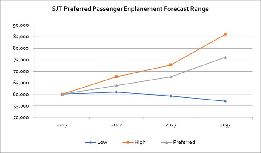
AIRPORT MASTER PLAN – CHAPTER TWO | FORECASTS

      Economic Outlook
      As has been illustrated earlier in this chapter, the San Angelo economy is typically slower growing as
      compared to U.S. averages. Population and economic forecasts for the Air Service Area are shown in
      Table 2G and are also compared to the U.S. As illustrated, the population, employment, total personal
      income, and total gross regional product are expected to have relatively lower growth rates in the Air
      Service Area as compared to the U.S. This continues trends that have been noted previously.

      This indicates that the ongoing capacity of the Air Service Area to continue to generate demand for air
      travel services during the forecast period will continue, albeit at slower rates of growth as compared to
      the U.S.
      TABLE 2G
      Passenger Demand Forecast Variables (2017-2037)
                                                                          2017           2037               CAGR
      Air Service Area Population                                         120,712        137,402             0.7%
      U.S. Population (000s)                                              298,217        326,128             0.7%

      Air Service Area Total Employment                                    74,325         90,245             1.0%
      U.S. Total Employment                                         184,227,000       210,105,000            1.5%

      Air Service Area Total Personal Income ($ billion)                      $4.7           $6.5            1.6%
      U.S. Total Personal Income ($ billion)                             $15,104.2      $18,982.7            2.6%

      Air Service Area Per Capita Personal Income                         $39,175        $46,978             0.9%
      U.S. Per Capita Personal Income                                     $46,974        $53,841             1.5%

      Air Service Area Gross Regional Product ($ billion)                     $4.3           $5.7            1.4%
      U.S. Gross Domestic Product ($ billion)                            $17,839.3      $22,003.7            2.1%
      Source: Woods & Poole Economics, Inc., Data Profiles for MSA, state, and U.S.

      COMMERCIAL PASSENGER INDUSTRY AVIATION TRENDS
      The trends presented in this section are intended to provide a framework for better understanding
      past and future trends at SJT. It will also establish a basis for estimating how aviation activity may be
      expected to grow and change in the future. This frame of reference is essential when identifying
      potential activity scenarios for the airport.

      Long-Term History (1978-2008)
      Since de-regulation in 1978, through 2008, the U.S. airline industry cumulatively lost approximately 40
      billion dollars. This was primarily a function of overcapacity in the industry, where the supply of seats
      was greater than demand. The result was that airlines had to price airline seats below cost. Exhibits 2A

                                                                   2-9
AIRPORT MASTER PLAN – CHAPTER TWO | FORECASTS
and 2B illustrate: 1) the widening gap between the supply of seats and demand that took place during
this time period, and 2) the resulting decline in airline price (yield).
After roughly thirty (30) years of overcapacity, the airline industry had amassed massive financial
losses, numerous airlines had gone out of business or merged, and airline balance sheets consisted of
heavy debt levels. These financial results had been generated despite the fact that one of the primary
cost inputs (oil prices) had been fairly tame during this time period, typically ranging from about $20-
$50 per barrel. There were two primary beneficiaries from the aforementioned excess capacity:
airports and the traveling public, who benefited from relatively low air fares. The effect was elevated,
but unsustainable passenger volumes.
During this time period, passenger volumes across the U.S. increased at a Compounded Annual
Growth Rate (CAGR) of 2.65% (2008 vs 1978, source: A4A).
EXHIBIT 2A EXHIBIT 2B
Beginning in 2007, oil prices spiked, eventually peaking at around $150/barrel and a subsequent,
severe economic recession. The airline industry’s very survival depended upon a significant
transformation. The key component would be to sharply reduce capacity, particularly with regard to
fuel inefficient aircraft fleets such as 50-seat regional jets. The airlines began to reduce seat capacity in
2008 as fuel prices spiked and the economic recession worsened.
Airline Industry Transformation (2009 – Today)
Exhibit 2C illustrates what has occurred since 2009: airlines cut flight capacity and revenues improved
sharply. Revenue increases were driven by higher yields (prices), marginally higher load factors and
ancillary fees. Airlines have also benefited from sharply lower oil prices. The result was that a habitually
unprofitable industry has become quite profitable, recording the most profitable years in industry
history over the past four years, with 2017 generating comparable results to recent history.
2-10AIRPORT MASTER PLAN – CHAPTER TWO | FORECASTS
EXHIBIT 2C
Industry Capacity and Key Revenue Metrics
Industry Capacity & Revenue Metrics
50%
ASMs Flights
40%
RASM Rev/Flight
30%
20%
10%
0%
‐10%
2009 2010 2011 2012 2013 2014 2015 2016
* Source: Air Transport Association (A4A)
The biggest changes came at the largest network airlines (Delta, United & American), where the
financial results had historically been the worst. These airlines drastically cut capacity, primarily in the
form of eliminating the most unprofitable fleet types, focusing upon improved profitability. At the
same time, Ultra Low Cost Commercial Carriers (ULCCs) such as Allegiant, who had been profitable
over time, continued to grow significantly while at the same time generating consistent profitability.
(Refer to Table 2H)
The effects of these changes and its effect upon smaller communities has been vast. Since the oil price
spike and subsequent U.S. recession in the late 2000s, the three major network airlines that serve
relatively smaller markets (Delta, United and American) have generally reduced seat capacity. Most of
the capacity growth across the U.S. has generally come from niche airlines who primarily serve certain
areas of the country (JetBlue, Alaska) or ULCCs who primarily cater to leisure travelers, flying to popular
vacation spots (Allegiant, Spirit, Frontier).
The one positive during this time period was that ULCC Allegiant was growing significantly into smaller
markets, backfilling for some of the lost service from network airlines. Still, the Allegiant Airlines service
was limited to vacation travelers, flying to popular vacation spots, where lost network airline service
would have allowed for travel to pretty much any market in the world.
2-11AIRPORT MASTER PLAN – CHAPTER TWO | FORECASTS
TABLE 2H
Industry Profitability for 9 Publicly Traded Airlines
Calendar Years 2014 - 2017
Pre-Tax: 2014 (millions) Pre-Tax: 2015 (millions) Pre-Tax: 2016 (millions) Pre-Tax: 2017 (millions)
Airline Rev P&L Margin Rev P&L Margin Rev P&L Margin Rev P&L Margin
Delta $40,362 $4,500 11.1% $40,704 $7,802 19.2% $39,639 $6,952 17.5% $41,244 $6,114 14.8%
Southwest $18,605 $1,816 9.8% $19,820 $4,116 20.8% $20,425 $3,760 18.4% $21,171 $3,515 16.6%
United $38,901 $2,373 6.1% $37,864 $5,166 13.6% $36,556 $4,338 11.9% $37,736 $3,498 9.3%
American $42,650 $4,249 10.0% $40,990 $6,204 15.1% $40,180 $5,284 13.2% $42,207 $4,058 9.6%
jetBlue $5,817 $515 8.9% $6,416 $1,216 19.0% $6,632 $1,312 19.8% $7,015 $1,000 14.3%
Alaska $5,368 $962 17.9% $5,598 $1,298 23.2% $5,931 $1,349 22.7% $7,933 $1,260 15.9%
Allegiant $1,137 $157 13.8% $1,262 $372 29.5% $1,363 $371 27.2% $1,504 $227 15.1%
Spirit $1,932 $355 18.4% $2,141 $509 23.8% $2,322 $444 19.1% $2,648 $389 14.7%
Total $154,772 $14,927 9.6% $154,795 $26,683 17.2% $153,048 $23,810 15.6% $161,458 $20,061 12.4%
Exhibit 2D illustrates just how disproportionate capacity changes have been by carrier type. It should
be noted that the four largest airlines in aggregate (Delta, United, American and Southwest) control
approximately 83% of industry seat capacity.
2-12AIRPORT MASTER PLAN – CHAPTER TWO | FORECASTS
EXHIBIT 2D
Departing Seat Capacity Change (% Change, 2017 vs 2005)
While major airlines have constrained capacity, the effect has been disproportionate across the U.S.
For example, Delta Air Lines, over the past twelve years, has reduced seat capacity approximately 12%
across their system. Still, Delta has increased seat capacity significantly on the U.S. West Coast, where
Delta’s Seattle seat capacity is up well over 100% and Los Angeles’ is up approximately 100%. In
general, airlines are putting capacity where economic growth is the most vibrant and this is on the U.S.
Coasts – particularly the West Coast. United, American and Southwest are also focusing the majority of
their capacity growth currently in this region of the U.S. – with an emphasis in California.
As the industry transformation has taken place, one of the major effects upon the industry is the
increased gauge (larger aircraft) and longer stage length (nonstop flight miles). Part of this effect is
occurring because of the sharp reduction in 50-seat regional jet flying that was noted earlier. This
flying is then, in many cases, being replaced with 76-seat regional jet aircraft, flying less frequency
than was flown with the 50-seat aircraft.
As an example, for many markets across the U.S. over the past few years it is not uncommon that
frequency has been reduced from 2 or 3 daily 50-seat regional jet departures, and replaced with 1-2
daily 76-seat jet departures, resulting in less frequency, more seats per departure and similar-to-less
overall seat capacity levels.
As depicted on Exhibits 2E and 2F, on flights of less than 600 miles, industry flights are down by 16.4%
since 2009, while flights in the 600 to 1,000 mile range are up 0.2% and for flights greater than 1,000
miles, flights actually increased 23.3%. Carriers are typically using larger aircraft to fly longer distances.
When specifically looking at 50-seat regional jet departures (CRJ & ERJ aircraft), scheduled flights have
declined 41% since 2009 and 53% since peaking in 2005.
2-13AIRPORT MASTER PLAN – CHAPTER TWO | FORECASTS
EXHIBIT 2E
Industry Capacity Trends by Flight Miles
% Change in Departures since 2009
By Flight Mileage
30%
25% 23.3%
20%
15%
10%
5% 0.2%
0%
‐5%
‐10%
‐15% ‐16.4%
‐20%
< 600 600‐1,000 > 1,000
Nonstop Flight Miles
EXHIBIT 2F
Industry Capacity Trends by Daily Departures
50 –Seat Regional Jet Daily Departures
4,500
4,000
3,500
3,000
2,500
2,000
1,500
1,000
500
2002
2004
2006
2009
2000
2001
2014
2003
2005
2007
2008
2010
2011
2013
2015
2017
2012
2016
2-14AIRPORT MASTER PLAN – CHAPTER TWO | FORECASTS
Tied in part to the analysis above, as the industry transformation has taken place, one of the major
effects upon the industry is the increased gauge (larger aircraft) and longer stage length (nonstop
flight miles). Part of this effect is occurring because of the sharp reduction in 50-seat regional jet flying
that was noted earlier, but also the trend of larger aircraft being flown by mainline carriers.
The chart to the right illustrates gauge declining during Seats per Departure
the surge in CRJ/ERJ flying from 2000-05, when seats per 130
depart declined from about 120 to less than 100. Since
then, seats per departure have increased back to 120 and 120
further growth appears likely.
110
Consolidation
100
The transformation of the U.S. airline industry had its
origins in 2007 with the spike in oil prices to $150/barrel
90
and the subsequent U.S. economic recession that began
2000
2001
2002
2003
2004
2005
2006
2007
2008
2009
2010
2011
2012
2013
2014
2015
2016
in 2008. For its very survival, major U.S. airlines had to
change quickly, and they did.
A major part of the industry’s transformation has been a continuing consolidation of the industry. The
evolution of the industry is shown below in Exhibit 2G. Today, the four largest airlines control 83% of
industry seats. This consolidation will in large part work to ensure that airline capacity discipline that
has been so prevalent over the past few years, will likely work in a similar fashion going forward.
A key consideration is that the airlines highlighted in yellow (Delta, United and American) are major
network airlines offering connecting service to large and smaller markets across the U.S., while
Southwest Airlines, highlighted in white, focuses upon carrying point-point traffic typically in the
largest markets in the U.S. Hence, consolidation has had a more adverse effect upon smaller
communities as opposed to larger markets, as noted earlier.
In summary, the U.S. airline industry lost approximately $40 billion during the approximate 30-year
period following de-regulation in 1978. These operating losses were largely driven by excess seat
capacity which resulted in pricing (yield) that was below airlines cost.
Since 2010, a transformation took place, when airlines drastically reduced seat capacity, mostly in the
form of reduced regional jet flying, to the point where prices (yields) increased to the level where
airlines were profitable. In addition, airlines were able to add ancillary fees that were another form of a
price increase. In addition, carrier Load Factors have also trended higher, from the mid-70% range (in
the 1990s) to roughly 85% today. The past three years have been the most profitable in industry
history, with industry operating margins averaging close to 15% on an annual basis.
2-15AIRPORT MASTER PLAN – CHAPTER TWO | FORECASTS
EXHIBIT 2G
Network Airlines from De-regulation through Today
The Future
Going forward, the future will likely look very much like the recent past. There are likely to be four
primary trends driving the U.S. airline industry air service trends:
1. Limited network airline capacity growth (American, Delta, United, Southwest). In addition,
where growth does occur, it will be focused in areas of faster economic growth (east/west
coast and international). In general, airlines target overall capacity growth closely to U.S. GDP
growth. Hence, system capacity growth is typically in the 2% range for large, network airlines.
2. Relatively faster growth by ULCCs (Allegiant, Spirit, Frontier). These airlines will continue
growing much faster, although likely a bit slower than recent 10%-20% annual growth rates. In
addition, while Allegiant has a large presence in smaller airports, going forward, Allegiant will
focus their growth in relatively larger markets, a trend that started in 2014. Finally, expect this
sector to start growing faster into international markets, particularly to the Caribbean and
Mexico.
3. Trend of larger aircraft. This trend has been firmly in place since the end of the recession and
will likely continue. While taking place across entire carrier fleets, smaller markets will
2-16AIRPORT MASTER PLAN – CHAPTER TWO | FORECASTS
experience this trend primarily in the form of less 50-seat regional jet flying and more 76-seat
jet flying. In addition, over time, more 100-115 seat aircraft flying could enter the mix (in the
form of Bombardier C-series and 717 aircraft). Bombardier, the largest manufacturer of
regional jets in the world, expects larger regional jet aircraft (64-90 seats) to more than double,
from 3,300 aircraft in 2016 to 6,950 by 2036. In addition, they expect aircraft in the 90-150 seat
range to grow from 3,600 aircraft in 2016 to 7,300 aircraft. In total, Bombardier forecasts that
aircraft in the 60-to 150-seat segment to double (worldwide) by 2036. Finally, Bombardier
expects the small regional jet segment (AIRPORT MASTER PLAN – CHAPTER TWO | FORECASTS
TABLE 2I
U.S. Historic and Forecasted Enplaned Passengers
Fiscal Year Enplaned Passengers Fiscal Year Enplaned Passengers
HISTORIC FORECAST2
2000 641,200 2017 742,000
2001 625,000 2018 762,000
2002 626,800 2019 783,000
2003 574,500 2020 794,000
2004 628,500 2021 805,000
2005 669,500 2022 815,000
2006 668,400 2023 826,000
2007 690,100 2024 838,000
2008 680,700 2025 851,000
2009 630,800 2026 863,000
2010 635,200 2027 877,000
2011 650,100 2028 892,000
2012 653,800 2029 907,000
2013 654,300 2030 921,000
2014 669,000 2031 937,000
2015 696,000 2032 953,000
2016 726,000 2033 968,000
1
CAGR 2000-2016 0.73% 2034 985,000
2035 1,002,000
1
CAGR = Compounded annual growth rate 2036 1,019,000
2
FAA Aerospace Forecast (2017‐2037) 2037 1,037,000
Passenger Figures are in 000s CAGR1 2017-2037 1.69%
1
CAGR 2000-2037 1.27%
AIR SERVICE AND TRAFFIC ANALYSIS
This section evaluates and describes the current state of air service at the Airport, analyzes historical
trends in air traffic, and identifies key factors that generally affect demand for air travel.
Regional Role and Catchment Area Analysis Overview
San Angelo Regional Airport (SJT) is the primary commercial service airport serving the area of south-
central Texas. This area is known as the Concho Valley and makes up the San Angelo Metropolitan
Statistical Area. The Airport is a point of air access for the region, including being a center for
healthcare, education and is home to a key military base.
2-18AIRPORT MASTER PLAN – CHAPTER TWO | FORECASTS
EXHIBIT 2H
Air Service Area
Source: Diio Mi, Catchment Mapper for SJT, 60 miles
There are approximately 137,013 people that reside within 60 miles of SJT (SJT Catchment Area
depicted on Exhibit 2H). While SJT is the closest commercial airport to this population base, there is
significant competition in the region. These airports offer significantly more nonstop air service, and
typically at much lower air fares. This includes a variety of low fare carrier service. Specifically, these
airports include Austin International Airport (AUS - 212-mile drive), San Antonio International Airport
(SAT – 212 mile drive) and Dallas-Fort Worth International/Dallas Love Field Airports (DFW – 261 mile
drive DAL – 282 mile drive).
Exhibit 2I illustrates where SJT’s origin traffic comes from. As can be seen, 80% of traffic comes from
San Angelo. The remaining 20% comes from communities in the region. In general, SJT can capture
2-19AIRPORT MASTER PLAN – CHAPTER TWO | FORECASTS
traffic from throughout the region, due to the combination of SJT’s marketing to this traffic base and
the convenience of SJT.
EXHIBIT 2l
U.S. Historic and Forecasted Emplaned Passengers
* Source: Agency Reporting Corporation (ARC). Year-ending June.
Exhibit 2J illustrates SJT “leakage” trends. This graph shows the airport of origin for bookings within
60 miles of SJT. From 2011 to 2014 (year-ending June), SJT’s retention of regional bookings was slowly
increasing, going from 60% in 2012 to a peak of 69% in 2014. During this time period, SJT enplaned
passengers and load factors were increasing sharply (the SJT load factor increased from 62% in 2011
to 76% in 2014). This was also during a time period that some of the larger regional airports
experienced moderate capacity growth.
2-20AIRPORT MASTER PLAN – CHAPTER TWO | FORECASTS
EXHIBIT 2J
Airport of Origin Trends: Passengers Booked from the SJT Catchment Area
* Source: Agency Reporting Corporation (ARC). Year-ending June.
Since 2014, SJT has experienced worsening “leakage”, reduced seat capacity and declining traffic. This
trend has been driven by three factors: 1) Expiration of the Wright Amendment in October 2014
resulted in significant capacity increases at Dallas Love Field (DAL). This in turn resulted in sharp fare
declines at DFW and DAL. 2) ULCCs have added service from DFW, SAT and AUS during this time. In
particular, Spirit and Frontier Airlines have added service, putting further downside pressure on fares.
3) SJT has experienced moderate air service declines over the past two years.
The key effect of the changes noted in the prior paragraph was the increasing disparity between SJT
and larger, regional airport’s air fares. As illustrated in Exhibit 2K paid air fares at aforementioned,
larger airports started to decline subsequent to 2015, while SJT air fares started to increase, with much
of SJT air fare increase taking place over the past 12 months.
2-21AIRPORT MASTER PLAN – CHAPTER TWO | FORECASTS
For year-end 2018, the average paid (net of taxes/fees) one-way fare at SJT was $280, while fares at
DFW, SAT and AUS ranged from $190-$210, equivalent to 25%+ differences. DAL fares were even
lower. These fare disparities explain much of recent SJT leakage trends.
EXHIBIT 2K
Average One-Way Fare Paid: SJT vs DAL, DFW, AUS and SAT
* Source: DOT Report DB1B (via Diio)
It should be noted that these fare differences are likely conservative. Published air fare differences are
typically much greater (relative to what is purchased), as consumers will not purchase air fares where
the disparities are the greatest and/or published SJT air fares are extremely high. When this occurs,
“spoilage” takes place, as consumers will not purchase these air fares.
Air Service at the Airport
The following sections will evaluate current air service capacity and operating performance for the
primary passenger airlines serving the Airport. Airline performance will be evaluated from an
economic perspective, or evaluating carrier revenue, yield and load factor results. The Airport’s overall
O&D market will also be assessed at the market level, comparing current performance with prior.
2-22AIRPORT MASTER PLAN – CHAPTER TWO | FORECASTS
Historically, SJT has had commercial air service to both Houston (IAH) on Continental Express and DFW
on American Eagle (and for a time on Delta Air Lines). The service to IAH operated from 2000 to 2009.
This service was operated with a variety of turboprop aircraft. Delta operated DFW service from 1993
to 1997. The American Eagle service to DFW has operated from 1993 to today.
Since 2012, American has exclusively offered jet service from SJT, primarily in form of ERJ 140/145 and
CRJ 200 aircraft, although during much of 2017 (May-December), American offered service on dual
cabin, 65-seat CRJ-700 aircraft. In fact, during the months of June 2017 through September, American
offered exclusive service on this aircraft type. During this time, American load factors on these larger
aircraft were good, typically operating in the 80% range.
Exhibit 2L illustrates SJT load factors by month during 2017 through July 2018. In general, AA has
generated strong loads from SJT during this time, including when the CRJ-700 aircraft was utilized. On
a relative basis, for all American flying at their DFW hub during the month of July 2018, SJT ranked #41
(of 153 markets with at least 1 daily round-trip departure), ranking in the top 1/3 of AA flying. Based
upon load factors, it would appear that SJT is in line for additional capacity from AA. But load factors
only tell half of the story.
In addition, Exhibit 2M illustrates annual load factor trends at SJT, in addition to Abilene (ABI) and
Midland-Odessa (MAF). As shown, load factors have improved sharply at SJT, going from
approximately 70% in 2012 to about 82% in 2018. ABI has improved even more, although load factors
have been similar over the past three years. MAF has experienced load factor deterioration over the
past few years, likely due to declining oil prices and its effect upon the oil industry.
EXHIBIT 2L
SJT Load Factor by Month 2017-2018 and Year (2012-2018)
SJT Load Factor
By Month: 2017‐2018
95%
89% 89%
90% 86%
88% 88%
86%
85% 85%
85% 80%
81%
82%
83%
80% 80% 80%
79%
80% 78% 78%
75%
70% 67%
65%
60%
55%
50%
Jan Feb Mar Apr May Jun Jul Aug Sep Oct Nov Dec
2017 2018
2-23AIRPORT MASTER PLAN – CHAPTER TWO | FORECASTS
EXHIBIT 2M
SJT Load Factor by Year (2018-2018) including ABI and MAF
Exhibit 2N illustrates all AA non-stop markets illustrated by gray dots (under 1,500 miles). It shows the
RASM and nonstop flight mileage per market. The downward sloping curve is representative of the
average mileage-adjusted RASM (proxy for average profitability). The curvature is also representative
of an airline’s cost curve. As illustrated, AA’s SJT service is generating a mileage-adjusted RASM above
system averages, indicative of average profitability. In other words, profitability is strong, as our
current load factors. This would seem to affirm that SJT is likely in line for capacity increases – either in
the form of additional gauge (most likely) or additional frequency.
In addition, AA results to other regional markets of Lubbock (LBB), Amarillo (AMA), ABI and MAF are
also illustrated. As shown, SJT-DFW RASMs are moderately higher than at these other regional airports.
The two strongest routes appear to be SJT-DFW and LBB-DFW, while MAF-DFW is comparable, and ABI
and AMA are right at (mileage-adjusted) system averages. All routes appear profitable for AA.
2-24AIRPORT MASTER PLAN – CHAPTER TWO | FORECASTS
EXHIBIT 2N
Mileage-Adjusted Revenue Per Available Seat Mile (RASM)
American RASM & Stagelength (YE 1Q18)
For markets < 1,500 miles
80
Revenue per Available Seat Mile (RASM)
70
60
50 ABI‐DFW
40 SJT‐DFW
30
MAF‐DFW
20 LBB‐
AMA‐DFW
DFW
10
0
0 200 400 600 800 1000 1200 1400
Stage length (Nonstop Flight Miles)
* Source: Diio (BTS Reports DB1A & T100); Less than 1,500 miles
In addition, by comparing carrier results at SJT for the most recently available period (YE 1Q18) versus
results earlier this decade (2012), it can be seen that American Airlines (AA) is generating much better
revenues than during this earlier time period. This can be seen in Table 2J below. Hence, SJT air
service exhibited the same tendencies as the rest of the U.S.: reduced capacity, higher revenue (via
improved load factors and yields) and subsequently much more profitable/stable air service.
TABLE 2J
Key AA Revenue Metrics at the Airport and Regional Airports (CY 2017 vs CY 2012)
RASM RASM Load Load Yield Yield
2017 2012 % Factor Factor Change 2017 2012 %
Airline (cents) (cents) Change 2017 2012 (pts.) (cents) (cents) Change
SJT - DFW 33.3 31.5 5.7% 80.3% 74.6% 5.7 41.4 42.3 (2.1%)
AMA – DFW 25.9 25.9 (0.2%) 72.1% 81.9% (9.8) 35.9 31.6 13.4%
ABI – DFW 36.4 34.1 6.5% 79.7% 68.8% 11.0 45.6 49.6 (8.1%)
LBB – DFW 30.7 29.5 4.0% 77.4% 85.8% (8.5) 39.7 34.4 15.4%
MAF - DFW 31.8 28.1 13.2% 76.3% 82.1% (5.7) 41.7 34.3 21.7%
Source: Diio, US DOT Reports DB1A and T100; note that results include merged airline results
2-25AIRPORT MASTER PLAN – CHAPTER TWO | FORECASTS
O&D Market
Table 2K below presents the Airport’s Top 25 Origination and Destination (O&D) markets, including
passenger activity and the average one-way fare paid (net of taxes/fees). The table also presents daily
departures and daily non-stop seats for each market. In addition, further below in Table 2L, %
changes in demand are shown in each of SJT’s top 25 O&D markets over the past 10 years.
TABLE 2K
Top 25 O&D Markets: Year-Ended 1st Quarter 2018
Rank Market Miles Avg. Daily O&D Pass. Avg. Fare
1 Dallas 228 13.3 179
2 LA Basin1 1,039 5.4 254
3 Las Vegas 904 4.8 243
4
4 Wash, D.C. 1,411 4.5 310
3
5 New York 1,613 4.4 275
6 Houston5 327 4.1 217
7 Denver 631 3.9 232
8 Atlanta 950 3.7 241
9 Orlando 1,166 3.5 259
10 Chicago 1,010 3.3 243
11 San Diego 983 3.0 242
12 Charlotte 1,161 2.9 264
13 SF Bay Area2 1,306 2.9 254
14 Baltimore 1,445 2.8 263
15 Seattle 1,600 2.4 272
16 Miami-FLL6 1,285 2.3 274
17 Phoenix 688 2.2 240
18 Nashville 859 2.0 246
19 Philadelphia 1,531 2.0 268
20 St. Louis 767 1.9 225
21 Madison 1,017 1.8 340
22 Minneapolis 1,013 1.8 241
23 Boston 1,789 1.8 274
24 Portland 1,540 1.7 312
25 Tampa 1,104 1.7 242
Total/Average for all Markets 1,525 151.1 280
1
Includes LAX, ONT, SNA, and BUR
2
Includes OAK, SFO, and SJC
3
Includes LGA, JFK, and EWR
4
Includes DCA and IAD
5
Includes IAH and HOU
6
Includes MIA and FLL
Source: Diio; US DOT Report DB1A
2-26AIRPORT MASTER PLAN – CHAPTER TWO | FORECASTS
TABLE 2L
Top 25 O&D Markets - Year Ended 1st Quarter 2018 vs Year Ended 1st Quarter 2008
Rank Market Daily O&D Pass. Change Avg. Fare Change Change in Revenue
1 Dallas (50%) 107% 5%
2 LA Basin1 (12%) 18% 4%
3 Las Vegas (23%) 38% 7%
4 Wash, D.C.4 1% 42% 44%
5 New York3 (30%) 33% (8%)
5
6 Houston (41%) 74% 3%
7 Denver (2%) 18% 15%
8 Atlanta 2% 26% 30%
9 Orlando (12%) 43% 27%
10 Chicago (10%) 40% 26%
11 San Diego 28% 32% 69%
12 Charlotte 190% 24% 259%
2
13 SF Bay Area (13%) 13% (1%)
14 Baltimore (28%) 24% (11%)
15 Seattle (21%) 24% (1%)
6
16 Miami-FLL 6% 63% 73%
17 Phoenix (12%) 18% 4%
18 Nashville (24%) 47% 12%
19 Philadelphia (25%) 45% 9%
20 St. Louis (26%) 41% 5%
21 Madison 758% 54% 1220%
22 Minneapolis (25%) 36% 2%
23 Boston 10% 9% 20%
24 Portland 22% 34% 63%
25 Tampa (39%) 30% (21%)
Total (14%) 40% 20%
1
Includes LAX, ONT, SNA, and BUR
2
Includes OAK, SFO, and SJC
3
Includes LGA, JFK, and EWR
4
Includes DCA and IAD
5
Include IAH and HOU
6
Includes MIA and FLL
Source: Diio; US DOT Report DB1A
Over the past 10 years, like most of the U.S. (particularly for smaller airports), SJT has experienced a
significant increase in air fares (40%), with a moderate decline in air traffic (-14%), resulting in sharp
revenue growth of 20%. In other words, a very positive trend for AA.
Overall, given the positive revenue/fare trends and relatively strong RASM in conjunction with high
load factors currently in place at SJT should result in positive seat capacity trends going forward.
2-27AIRPORT MASTER PLAN – CHAPTER TWO | FORECASTS
Air Traffic Activity Trends
This section will analyze historical trends in air traffic activity at the Airport. It will also discuss the
primary factors affecting these trends.
Enplaned Passengers
Table 2M presents historical enplaned passenger trends at the Airport between CY 2000 and CY 2016,
including an estimate of CY 2017. It also presents enplaned passenger activity for overall U.S. domestic
activity on a federal fiscal year basis (years ending September 30) for 2000 through 2016 and presents
the Airport’s share of overall U.S. activity.
Since 2000, SJT enplaned passengers grew at a CAGR of 1.7%, which was generally in line with
economic growth during this time-period. But this growth has been volatile. From 2000-02, traffic
declined by a CAGR of 4.7%. This was during the post-09/11 time-period, with the traffic decline driven
by Continental Express temporarily eliminating service to their IAH hub. During this same time period,
American Eagle kept service relatively consistent at 5-6 daily trips to their DFW hub on 34-seat SF3
aircraft. From 2002 until 2008, SJT experienced a strong CAGR of 8.7%. Most of this growth took place
in 2004, as Continental Express re-entered the SJT market. In addition, during this same time period,
American’s traffic increased almost 25%, increasing from approximately 36,500 enplaned passengers
in 2003 to over 54,000 in 2008. During this period, American’s load factor also increased from 56% to
almost 75%. From 2008-10, SJT enplaned passenger activity declined at a CAGR of 6.4%. This was
during a time of a significant U.S. economic recession, with the vast majority of U.S. airports
experiencing declining passenger volumes. Tied to this, Continental Express exited the market in
2009. During this same time period, American increased seat capacity in response to Continental
exiting the market, although traffic didn’t keep pace and load factors fell to 51% in 2010.
Since 2010, enplaned passenger activity has increased by almost 6.9% or at a 0.96% CAGR. During this
time, American steadily reduced seat capacity, or over 25% during the 7-year time-period. The result
was that American’s 2010 load factor of 51% has improved to 80% in 2017.
To summarize SJT’s current air service situation, SJT is currently positioned better for future air service
growth than likely anytime over the past 25+ years. This is due to: 1) Load factor increases from the
50s earlier this decade to the mid-80s currently. In other words, planes are full. Once load factors begin
ranging from 85%-90%, carriers look at adding more capacity; 2) Mileage-adjusted RASMs are well
above both system averages and other regional airports – indicative of relative profitability and 3)
Finally, there is more demand than is currently flying out of SJT, due to significant leakage to other
regional airports.
2-28AIRPORT MASTER PLAN – CHAPTER TWO | FORECASTS
TABLE 2M
Historical Enplaned Passenger Trends at the Airport and U.S.
U.S.
Domestic Airport
Federal Enplaned Share of
Fiscal Air Air Taxi & Enplaned % Fiscal Passengers % U.S.
Year Carrier Commuter Passengers Change Year (000s) Change Domestic
2000 262 44,067 44,329 - 2000 641,200 - 0.057%
2001 541 48,599 49,140 10.9% 2001 625,000 (2.5%) 0.053%
2002 627 37,745 38,372 (21.9%) 2002 626,800 0.3% 0.045%
2003 1,713 40,975 42,688 11.2% 2003 574,500 (8.3%) 0.050%
2004 1,216 59,010 60,226 41.1% 2004 628,500 9.1% 0.048%
2005 1,907 61,878 63,785 5.9% 2005 669,500 6.5% 0.047%
2006 1,688 66,518 68,206 6.9% 2006 668,400 (0.2%) 0.046%
2007 1,693 68,045 69,738 2.2% 2007 690,100 3.2% 0.044%
2008 2,070 66,560 68,630 (1.6%) 2008 680,700 (1.4%) 0.043%
2009 2,430 57,885 60,315 (12.1%) 2009 630,800 (7.3%) 0.040%
2010 2,451 53,774 56,225 (6.8%) 2010 635,200 0.7% 0.036%
2011 2,469 52,835 55,304 (1.6%) 2011 650,100 2.3% 0.040%
2012 2,403 54,247 56,650 2.4% 2012 653,800 0.6% 0.042%
2013 2,108 58,019 60,127 6.1% 2013 654,300 0.1% 0.042%
2014 1,296 64,018 65,314 8.6% 2014 669,000 2.2% 0.045%
2015 1,963 62,938 64,901 (0.6%) 2015 696,000 4.0% 0.044%
2016 1,787 58,229 60,016 (7.5%) 2016 726,000 4.3% 0.040%
2017E 1,368 58,727 60,095 0.1% 2017E 742,000 2.2% 0.033%
CAGR1 CAGR1
2000-17 1.7% 2000-17 0.8%
2000-02 (4.7%) 2000-02 (0.8%)
2002-08 8.7% 2002-08 1.2%
2008-10 (6.4%) 2008-10 (2.3%)
2010-15 2.4% 2010-15 1.5%
2015-17 (2.5%) 2015-17 2.2%
1
CAGR = Compounded annual growth rate; Source: FAA TAF
Source: FAA Aerospace Forecasts
Commercial Aircraft Operations
As illustrated in Table 2N, passenger aircraft operations at SJT have declined by approximately 36%
since 2000, as noted in Table 2BB. American exclusively flew 34-seat SF3 turboprop aircraft through
2002, then began to incorporate ERJ-135/140/145 regional jet aircraft beginning in 2003, steadily
increasing the usage of that aircraft until turboprops were completely phased out beginning in 2013.
As a part of this, from 2008 until 2012, American flew a heavier mix of 66-seat ATR turboprop aircraft.
2-29AIRPORT MASTER PLAN – CHAPTER TWO | FORECASTS
Finally, as noted earlier, American incorporated more CRJ-700 aircraft in 2017 (May-December),
although in 2018 they are again completely relying on ERJ-135/140/145 aircraft.
Continental Express operated 34-seat Embraer 120 turboprop aircraft at SJT from 2000-2002, until
they eliminated service at SJT in the post-9/11 environment. Subsequently, Continental re-entered the
SJT market in 2004, this time operating a mix of ERJ-135/145 regional jet aircraft, EMB-120 turboprop
and SF3 turboprop aircraft, until they exited the market at the depths of the U.S. recession in 2009.
TABLE 2N
Historical Commercial Aircraft Operations at the Airport
Air Taxi &
Fiscal Year Air Carrier Commuter Total % Change
2000 18 9236 9254 -
2001 16 9225 9241 (0.1%)
2002 20 6689 6709 (27.4%)
2003 78 6903 6981 4.1%
2004 198 7997 8195 17.4%
2005 1749 6027 7776 (5.1%)
2006 1332 6262 7594 (2.3%)
2007 396 7584 7980 5.1%
2008 1352 7890 9242 15.8%
2009 5596 5806 11402 23.4%
2010 6597 5571 12168 6.7%
2011 5052 5285 10337 (15.0%)
2012 4784 5923 10707 3.6%
2013 5390 6681 12071 12.7%
2014 5793 7161 12954 7.3%
2015 5787 5775 11562 (10.7%)
2016 3645 4306 7951 (31.2%)
2017E 2269 3676 5945 (25.2%)
* Source: June 2018 SJT Terminal Area Forecast (TAF). Air Carrier: 60 seats or greater, CommuterAIRPORT MASTER PLAN – CHAPTER TWO | FORECASTS
TABLE 2O
Historical Operation by Aircraft Type
Seating
Capacity 2012 2013 2014 2015 2016 2017
COMMUTER
< 40 Seats 0.6% 1.1% - - - -
40-60 Seats 89.0% 98.9% 100.0% 100.0% 100.0% 45.2%
AIR CARRIER
61-99 Seats 10.3% - - - - 54.8%
100-120 Seats - - - - - -
121-150 Seats - - - - - -
151+ Seats - - - - - -
Source: BTS Report T-100 for 2011-16; 2017 was based upon published airline schedules (source: Innovata)
PASSENGER AIR TRAFFIC ACTIVITY FORECASTS
Landrum and Brown has reviewed past activity and related forecasts for the San Angelo Regional
Airport (SJT). The upcoming section will forecast SJT enplaned passenger activity for the 5, 10 and 20-
year time periods. This is described in the sections below. Subsequent to this, a forecast pertaining to
Passenger Aircraft Operations, including by aircraft type will take place.
2018 Forecast Review
A short-term review and forecast was performed to assess the SJT forecast for Calendar Year 2018.
Through July 2018, enplaned passenger activity is down 6.1%, on a similar seat capacity decline. Based
upon published airline schedules, seat capacity for the full year is expected to decline about 8%. This is
due to downgraded aircraft from CRJ-700 to smaller ERJ regional jets. Due to this, we are estimating
2018 enplaned passengers of 55,450, or an 8% decline year over year.
Long-term Forecast Review
The long-term forecast at San Angelo will be done for 5, 10 and 20-year time periods, using 2017 as
the baseline. The enplaned passenger forecast below, will be done using a variety of forecast
methodologies: 1) Historical Trends, 2) FAA Forecasts, 3) SJT market shares of industry projections and
4) Regression analysis of the Air Service Area’s economic metrics.
2-31AIRPORT MASTER PLAN – CHAPTER TWO | FORECASTS
Historical Trend Analysis
Three historical trends have been considered for future projections:
1. Short-term trend: The first historical trend emulates the past five years (2012-2017) at SJT,
using 2017 enplaned passengers as the baseline. The past five years were a time-period when
the area saw moderate economic growth after the significant recession in the late 2000s. The
CAGR in enplaned passenger traffic during this five-year time period was 1.19%. This is
Scenario #1.
2. 10-Year Trend: The second trend uses data from the ten-year period of 2007-2017, reflecting a
CAGR of (-1.48%). This time period incorporated the significant recession and subsequent
economic climb back. This projection will serve as the basis for Historical Trend Scenario #2.
3. 20-year Trend: The third historical trend uses a 20-year period of historical data (1997-2017)
and reflects a CAGR of 1.8%. This projection will be the basis for Historical Trend Scenario #3.
Exhibit 2O illustrates the results of applying these trends to the baseline 2017 result of 60,095
passenger enplanements.
EXHIBIT 2O
SJT Enplanement Projections Based on Historical Trends
SJT Enplanement Projections
Based upon SJT Historical Trends
90,000
85,000
80,000
75,000
70,000
65,000
60,000
55,000
50,000
45,000
40,000
2017 2022 2027 2037
Historical Trend Scenario #1 Historical Trend Scenario #2
Historical Trend Scenario #3
Source: Landrum and Brown Analysis
2-32AIRPORT MASTER PLAN – CHAPTER TWO | FORECASTS
FAA Forecast Sources and Scenarios
The FAA presents aviation activity forecasts in several different sources, including the following two
sources to be utilized in this forecast analysis:
FAA Aerospace Forecasts
This document provides growth projections for the entire aviation industry in fiscal years, as described
earlier. In this document, the FAA predicts that annual total enplanements for U.S. domestic air carriers
will increase at a CAGR of approximately 1.69% annually between 2017 and 2037. This growth rate,
applied to CY 2017 baseline SJT enplanements, will serve as the basis for FAA Forecast Scenario #1.
2017 FAA Terminal Area Forecast (TAF)
The TAF utilizes national growth trends, coupled with historical local growth trends, to develop
airport-specific activity forecasts on a fiscal year basis (October-September). The most recent TAF
enplanement projections include a compound growth rate of approximately 0.98% annually for SJT
between 2017 and 2037. This will serve as the basis for Forecast Scenario #2.
Exhibit 2P illustrates the results of applying these scenarios based upon FAA Forecast documentation
to the 2017 level of 60,095 enplanements. The figure also depicts an enplanement level at 10% above
the TAF for the first five years of the forecast period, typically viewed by the FAA as the level of
variation from the TAF that is deemed acceptable before additional justification is required to support
higher forecasted activity levels.
EXHIBIT 2P
SJT Enplanement Projections Based on FAA Forecast Scenarios
SJT Enplanement Projections
Based upon FAA Forecast Scenarios
90,000
80,000
70,000
60,000
50,000
2017 2022 2027 2037
Scenario 1: Terminal Area Forecast (2017) Scenaro 2: FAA Forecast
Scenario 3: 10% Above 2017 TAF Forecast
Source: Landrum and Brown Analysis
2-33You can also read