Brand Guidelines - FEBRUARY 2020 - BC Hydro

Page created by Holly Cummings
 
CONTINUE READING
Brand Guidelines - FEBRUARY 2020 - BC Hydro
Brand
  Guidelines

    FEBRUARY 2020
Brand guidelines | 1. Brand overview   1
Brand Guidelines - FEBRUARY 2020 - BC Hydro
Welcome

These guidelines will help keep
our brand strong and consistent.
We draw inspiration from
our province, our employees
and, most importantly, our
customers. And at the very core
of our brand is our essence:
power smart.

Brand guidelines | 1. Brand overview   2
Brand Guidelines - FEBRUARY 2020 - BC Hydro
Brand guidelines

1. BRAND OVERVIEW                   5. OUR COLOURS                  7. ILLUSTRATION
Who we are                      6   Concept                    29   Overview                                47
Brand toolkit                   7   Our palette                30   Line illustration                       48
                                    Our safety colours         31   Full-colour vector illustrations        49
2. TONE OF VOICE
                                    Using our safety colours   32   Vector illustrations of people          50
Brand tone                      9
                                    Using tints                33   Safety vector illustrations of people   52
Tips to humanize our tone      10
                                    Using colours              34   Safety vector illustrations
3. OUR LOGO                                                         with backgrounds                        54
                                       Print                   34
BC Hydro logo                  12      Pairing                 37   8. PHOTOGRAPHY
Clear space and minimum size   13      Short text documents    38   Our universal photography style         56
Logo variations                14      Long text documents     39   Stock photography                       57
Symbol variations              15      Copy and photography    41   Product photography                     58
Logo misuse                    16
                                    6. DESIGN ELEMENTS              Photo misuse                            59
Logo lock-ups                  17
                                    Coloured bars              44   For more information                    60
4. TYPOGRAPHY                       Call-outs                  45
Primary typography             21
Alternative typography         23
Editorial details              24
Typesetting details            26

                                                                                                                 3
Brand Guidelines - FEBRUARY 2020 - BC Hydro
1. Brand overview

Brand guidelines | 1. Brand overview   4
Brand Guidelines - FEBRUARY 2020 - BC Hydro
Smart about power
                          in all that we do.

Brand guidelines | 1. Brand overview           5
Brand Guidelines - FEBRUARY 2020 - BC Hydro
Brand overview        Tone of voice    Our logo   Typography     Our colours    Design elements      Illustration   Photography

Who we are
Smart about power in all we do                                 Where is “power smart” from?                                   Brand purpose and conviction
As BC Hydro looks to the future, being smart about our         For 25 years, Power Smart was run as a conservation            We exist to power the lives of British Columbians.
power is more important than ever. This was one of the         program. It encouraged British Columbians to save              Through our brand tagline, we show that we are the
reasons why, in 2015, we made “power smart” our tagline.       power and money by reducing their power consumption.           trusted resource for energy in British Columbia.
                                                               During that time, there was a concerted effort to give the
Power Smart has been a popular program that focuses on                                                                        Though what we do is very rationale, why we do it is
                                                               Power Smart program its own identity and tone so that it
bringing energy-saving tips and rebates to customers, but                                                                     not. We bring life to B.C. and power moments and
                                                               could remain as friendly and approachable as possible—
we realized it could be—and should be—so much more.                                                                           memories. We maintain an emotional connection to our
                                                               and it was very successful. But there was one crucial
                                                                                                                              audience. We involve our customers in the BC Hydro
Our purpose at BC Hydro is to be power smart.                  problem: BC Hydro didn’t get the credit it deserved for
                                                                                                                              story. We exist to power their lives.
                                                               all the positive virtues and results of Power Smart. In
Power smart stands for being even smarter with how we
                                                               short, it created two brands under BC Hydro—and more
conserve our precious resource. It stands for delivering
                                                               than a few challenges.
smarter customer care and always being smart about
how we work. It stands for continuing to deliver some          In 2015, we decided there should only be one brand,
of the cleanest energy on the planet and building the          BC Hydro.
infrastructure we need to meet the increasing energy
                                                               There were two key points to this decision. One, keep
demands of B.C.
                                                               the incredibly successful brand tone of Power Smart,
Power is what we do; smart is how we do it.                    and two, expand the meaning of Power Smart beyond
                                                               conservation. Now, at BC Hydro, any good thought,
                                                               decision or action is power smart.

                                                               To reinforce this new purpose for BC Hydro, “power
                                                               smart” has also become the tagline for the entire
                                                               company. For employees, it reminds them how to work.
                                                               And for customers, it serves as a promise of good
                                                               service, inviting everyone to be power smart too.

Brand guidelines | 1. Brand overview                                                                                                                                                 6
Brand Guidelines - FEBRUARY 2020 - BC Hydro
Brand overview        Tone of voice    Our logo   Typography         Our colours   Design elements       Illustration   Photography

Brand toolkit
Here is a simple overview of all the elements that make
up our brand. Think of them as tools in your brand toolkit.

               Smart                                                                                                                  Brand Hub
              Authentic
                                                                                                                                      For templates and other useful
              Relatable                                                                                                               branding tools, please visit Brand
                                                                                                                                      Hub on the HydroWeb.

                 Brand tone                                   Logo                                     Colours

         ABCD
            1234
               Typography                             Photography                                    Illustration

Brand guidelines | 1. Brand overview                                                                                                                                       7
Brand Guidelines - FEBRUARY 2020 - BC Hydro
2. Tone of voice

Brand guidelines | 1. Brand overview   8
Brand Guidelines - FEBRUARY 2020 - BC Hydro
Brand overview         Tone of voice   Our logo    Typography     Our colours     Design elements      Illustration   Photography

Brand tone
Brands are often given human traits, such as tone of voice      Authentic
and character. And, like a person, our brand has some
depth to its character.
                                                                Authenticity is presenting how we really are. We don’t              Why does our tone of voice matter?
                                                                want to feel produced or phony: we want to show our
                                                                                                                                    O Humanizes the brand
As a reference, think about the emails you’ve written in the    customers our true brand, as it is. It means that we’re
last few days. One may have been to your nephew wishing         not perfect, nor the authority on everything. We make               O Fosters natural conversations
him a happy birthday. Another may have been to an old           mistakes. We are open. And we are as transparent as
                                                                                                                                    O Creates connections
classmate and another may have been to your boss. Each          possible. We are genuine, and our tone should always
message and recipient is very different, and yet, the person    come across as such.                                                O Builds trust
sending the emails remains the same.
                                                                Relatable                                                           O Maintains consistency
With that in mind, BC Hydro has a few tonal words to
                                                                By being Smart and Authentic, we open our brand to                  O Creates boundaries for how we communicate
describe our character: Smart, Authentic, Relatable.
                                                                being Relatable. Our subject matter should always skew                with stakeholders
Smart                                                           to our audience: the people of B.C. We should treat

The first tonal word is Smart. What we’re talking about         our audience as friends and neighbours, and not from a

here is being clever and insightful. It’s not about showing     stuffy corporation. We want to people to feel that they

off with overly technical terms and it’s certainly not about    “get us”. That they understand that we’re here to help

being patronizing.                                              them live their best lives. After all, we’re not just a huge
                                                                part of the province, we play a large role in their lives.
Think of the best public speakers at TED who need to

                                                                                                                                             Smart
be able to present complex ideas. Those speakers relate
to their audience on their terms through thoughtful
arguments and interesting metaphors. It’s about being
approachably smart and never boastful.
                                                                                                                                            Authentic
                                                                                                                                            Relatable

Brand guidelines | 2. Tone of voice                                                                                                                                               9
Brand Guidelines - FEBRUARY 2020 - BC Hydro
Brand overview         Tone of voice   Our logo   Typography    Our colours     Design elements     Illustration   Photography

Tips to humanize our tone
O Focus on the audience first—benefits,                        O Be direct and action-oriented with the reader—
  effects, risks.                                                “sign up here” vs. “to sign up, visit bchydro.com.”

O Use more of the first person—we, our.                        O Embrace contractions.

O Avoid internal language, acronyms and                        O Use titles sparingly and focus on descriptions—
  jargon.                                                        programs and job titles.

O Make it concise, scannable, helpful—save the details         O Ban the phrase “we are committed to”—show,
  for those who want them.                                       don’t tell.

O Be friendly and personable, not chatty—be                    O Ask customers & employees how they would like to
  the helpful not intrusive neighbour.                           be addressed. (by name and/or pronouns such as they,
                                                                 she, he)
O Use employees in photography and as spokespeople.

Brand guidelines | 2. Tone of voice                                                                                              10
3. Our logo

Brand guidelines | 1. Brand overview   11
Brand overview        Tone of voice   Our logo   Typography   Our colours   Design elements   Illustration   Photography

BC Hydro logo
The BC Hydro logo was designed in the 1960s and                                                                               Symbol
still embodies the visionary, enduring and responsible
spirit of the brand. This iconic symbol was an abstract
interpretation of electrical energy and Mother Nature                                                                         Wordmark
coming together in British Columbia.

In 2015, we updated the logo to be contemporary and
timeless. We chose a neutral, contemporary and legible                                                                        Tagline

typeface. We changed the symbol to a circle so it feels
more modern. We then moved the symbol to the left
side of the wordmark and adjusted the spacing. The
colours were also slightly adjusted to warmer tones.

                                                                                   Grass                           Sea     Granite

Brand guidelines | 3. Our logo                                                                                                           12
Brand overview        Tone of voice   Our logo      Typography     Our colours     Design elements      Illustration   Photography

Clear space and minimum size
Making sure our logo is legible and clear is very                Clear space                                                     Minimum size
important in keeping our brand consistent.
                                                                 For the BC Hydro logo, use the symbol as the clear              We always want our logo to be legible. Make sure you
                                                                 space guide. In order to keep the integrity of the logo,        follow the minimum size guidelines.
                                                                 it’s important that nothing is placed in this area.

                                                                                                                                                               1"

                                                                                                                                 Digital applications
                                                                                                                                 In digital applications, whenever possible, use our logo
                                                                                                                                 in a scalable vector graphics (SVG) format to maximize
                                                                                                                                 legibility and scalability. All the elements in our logo are
                                                                                                                                 clearly visible at 96 px in SVG format.

                                                                                                                                 In other formats, please adjust the logo according to the
                                                                                                                                 screen resolution (i.e., @2x for Retina Display and @3x
                                                                                                                                 for iPhone 6 Plus).

                                                                                                                                                             96 px

Brand guidelines | 3. Our logo                                                                                                                                                                  13
Brand overview        Tone of voice   Our logo       Typography     Our colours    Design elements      Illustration   Photography

Logo variations
There are three colour variations that will give you
plenty of flexibility to work with in just about every
application. Each of these variations is available in
both PMS and CMYK as AI (Illustrator) and EPS
vector files. The RGB version is also available as
JPG and PNG files. SVG is the preferred format for
digital applications.

Please note that the logo may also be used without                Colour                                                         Black
the power smart tagline in limited applications,                  For use against a white background in colour                   For use against a white background in
as shown on the bottom right.                                     applications (including four-colour process,                   limited-colour applications.
                                                                  spot colour and onscreen).

                                                                  Reverse                                                        Without tagline
                                                                  For use against colourful, dark or busy backgrounds            You may sometimes see the logo without the power
                                                                  in both full- and limited-colour applications.                 smart tagline. This is only for signage and permanent
                                                                                                                                 installations—never use it anywhere else.

Brand guidelines | 3. Our logo                                                                                                                                                           14
Brand overview        Tone of voice   Our logo       Typography     Our colours    Design elements      Illustration   Photography

Symbol variations
There are instances when space is limited or
legibility is a concern, but our brand needs to be
identified at a glance. In these cases, we can use the
symbol alone (for example, the signage on the top
of our building in Vancouver).

We have two versions of our symbol—one has a
white border and the other does not. Our preferred
option is to use the symbol on a white background.                Symbol                                                         Symbol with border
But if the symbol will be placed on a coloured or                 Where space is limited or legibility is a concern, and our     When the logo is placed on a coloured or patterned
busy background, use the version with the white                   brand needs to be identified at a glance, we can use the       background, use the symbol with white border so it is
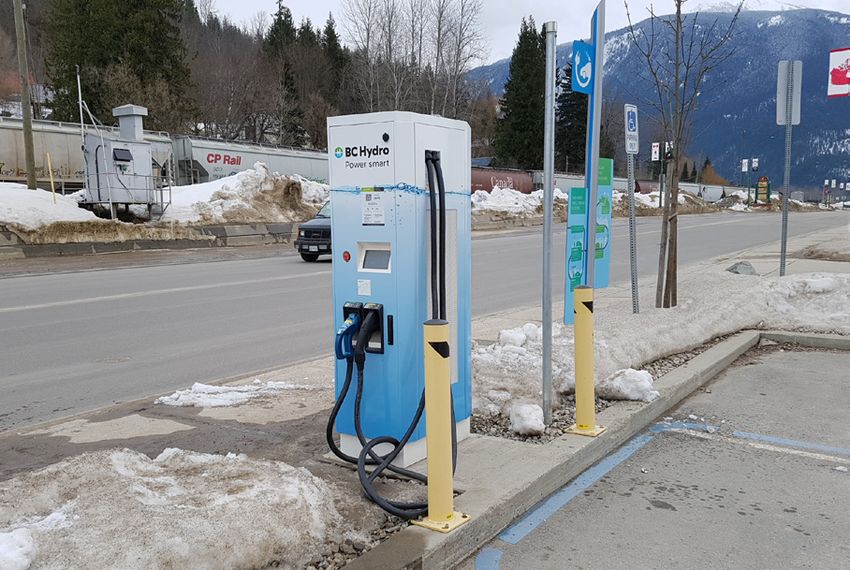
border so that the symbol is clear and visible.                   symbol alone. This is for permanent signage, power boxes       clear and visible.
                                                                  or uniforms.

     Using symbol-only variations

     The Grass and Sea colours are an integral part
     of our symbol and should always be presented
     when symbol-only logo variations are used.

Brand guidelines | 3. Our logo                                                                                                                                                           15
Brand overview        Tone of voice   Our logo        Typography   Our colours    Design elements    Illustration   Photography

Logo misuse
We want our logo to be consistent and legible
wherever it appears. On the right are a few
examples of what not to do.

When it comes to legibility, use your judgement.
One logo treatment might look great in print but not
                                                                    o not reconfigure the logo or use
                                                                   D                                          o not use colour variations
                                                                                                             D                                 o not add drop shadows,
                                                                                                                                              D
in a video. In such cases, look for a more suitable
                                                                   any of the elements from within           other than the three provided.   outlines or other effects.
logo variation rather than ignoring the guidelines.
                                                                   the logo on their own.

                                                                                                                    www.bchydro.com

                                                                    o not stretch or otherwise
                                                                   D                                          o not add anything within
                                                                                                             D                                 o not place the colour logo
                                                                                                                                              D
                                                                   distort the logo.                         the logo’s clear space.          on a busy background.

                                                                   Do not change the tagline.                 o not use an alternative
                                                                                                             D
                                                                                                             font and do not reconstruct
                                                                                                             the logo.

Brand guidelines | 3. Our logo                                                                                                                                                16
Brand overview        Tone of voice   Our logo         Typography   Our colours   Design elements    Illustration    Photography

Logo lock-ups
For partnerships                                                                                                           .35 pt in Granite

BC Hydro often works in cooperation with
government, media, retailers and other corporate
partners. Include partner logos in instances where
it is appropriate and in context. Here’s how to pair
partner logos with our logo.

Use a thin rule at .35 pt in Granite for full-colour
versions and in Ice in limited-colour applications
to separate our logo from our partner logos; then                                         Full-colour applications
place the lock-up on the bottom left. The space in
between the rule and logo is the same width as the
“o” in Hydro. Apply the same rule for clear space as
on the BC Hydro logo.                                                                                                        .35 pt in Ice

The proportions of the partner logo should be 65%
and the BC Hydro logo should be 100%.

Logo lock-ups should never be used on promotional
materials (e.g., T-shirts).

                                                                                          Reverse

Brand guidelines | 3. Our logo                                                                                                                 17
Brand overview        Tone of voice     Our logo   Typography     Our colours       Design elements       Illustration   Photography

Logo lock-ups
Placement                                                       Single partner                                                     Video and animation

The best logo placement depends on how many partners
and pages there are, and whether the partnership applies
to the whole communication or just a portion of the
content (for example, when we are featuring specific                                                                               First screen       First screen       Second screen
products for specific retailers, their logos should appear                                                                         (single partner)   (multiple partners)

alongside the relevant content).
                                                                Single           Multiple pages (print)
                                                                composition

                                                                Multiple partners                                                  Online applications (in footer)
              Our logo            Partner logo

                                                                Single           Multiple pages (print)                            Desktop                                   Mobile
                                                                composition

                                                                Content-specific partnership

                                                                Single           Multiple pages (print)
                                                                composition

Brand guidelines | 3. Our logo                                                                                                                                                           18
4. Typography

Brand guidelines | 1. Brand overview   19
Say hello to
   our font.
ABCDEFGHIJKLMN
OPQRSTUVWXYZ
  1234567890
Brand overview       Tone of voice    Our logo     Typography    Our colours     Design elements      Illustration   Photography

Primary typography                                              Headlines are GT Haptik Black.
                                                                Subheads can be set in Haptik Bold for less impact.
Our primary typeface is officially called GT-Haptik-
BC-Hydro, but we refer to it as GT Haptik.                      ALTE RNATIVE SU B HEADS ARE SET IN HAP TIK BOLD ALL C APS.

This type face is typically used by our external agencies       Body copy on white is Haptik Regular. It reads well and is very legible.
and our internal Creative Design Services team. It tends
                                                                Body copy on a colour is Haptik Medium. We don’t want it to disappear.
to be used for headlines, subheads and body copy for
both online and print executions. Body copy is usually
Granite but can be black when legibility is a an issue,
such as in newspapers. Headlines and body copy
                                                                   Headlines                                                  Body
should generally be left aligned but centring copy is
also an option.                                                    Case: Sentence case                                        Case: Sentence case
                                                                   Font size: As required                                     Font size: As required
If you are creating documents such as posters,
                                                                   Leading: 1.1 times the font size                           Leading: Multiply the font size by 1.5
newsletters, one pagers, updates, templates etc. on
                                                                   Letter-spacing: 15                                         Space after: Half of the leading
your own, please use our alternate font - Arial.
See page 23 for more information on when to use it.                Subheads                                                   For example: The font size is 9 pt, the leading is 13.5 pt
                                                                                                                              and the additional space after each paragraph is 6.75 pt.
                                                                   Case: Sentence case
                                                                   Font size: Smaller than headline                           Kerning & ligatures
                                                                   Leading: Equal to the font size
                                                                                                                              Kerning should be set to optical kerning, but be sure
                                                                   Letter-spacing: 15
                                                                                                                              to manually kern headlines and subheads if necessary.
                                                                   Alternative subheads                                       Ligatures should be turned off.

                                                                   Case: All caps                                             Minimum font size
                                                                   Font size: Same as body
                                                                                                                              Minimum font size for Medium, Bold and Black font
                                                                   Leading: Same as body
                                                                                                                              weights is 9 pt and should ideally be set in Granite or
                                                                   Letter-spacing: 75
                                                                                                                              Ice (when used on a coloured background). Minimum
                                                                   Heading and spacing                                        font size for regular weight is 6 pt and should be set in
                                                                                                                              Granite only.
                                                                   The space before a subheading should be twice
                                                                   the space of the leading.

                                                                   The space after the headings and subheadings
                                                                   should be equal to that of the leading.

Brand guidelines | 4. Typography                                                                                                                                                           21
Brand overview       Tone of voice   Our logo   Typography    Our colours   Design elements   Illustration   Photography

Primary typography
Weights                                                      Characters and glyphs

GT Haptik Regular                                            ABCDEFGHIJKLMNOPQRSTUVWXYZ
                                                             abcdefghijklmnopqrstuvwxyz
GT Haptik Medium
                                                             1234567890][(!@#$%&.,?;:”*-–—)
GT Haptik Bold
GT Haptik Black

Brand guidelines | 4. Typography                                                                                           22
Brand overview       Tone of voice     Our logo    Typography     Our colours     Design elements      Illustration   Photography

Alternative typography
For email templates, forms, Word documents and online,
use Arial Regular typeface.
                                                                Headlines are Arial Black.
Recommended sizes and case styles are the same as with          Subheads can be set in Arial Bold for less impact.
GT Haptik, with the same leading and paragraph spacing,
if possible.                                                    ALTERNATI VE SUBHE ADS ARE SET IN ARI AL BOLD ALL CAPS.

Headlines and body copy should generally be left aligned        Body copy on white is Arial Regular. It reads well and is very legible.
but centring copy is also an option.
                                                                Body copy on a colour is Arial Bold. We don’t want it to disappear.

     Primary vs. alternative typeface                               Headlines                                                  Body

     GT Haptik should be used by external agencies                  Case: Sentence case                                        Case: Sentence case
     and our Creative Design Service team.                          Font size: As required                                     Font size: As required
     When creating documents such as posters,                       Leading: 1.1 times the font size                           Leading: Multiply the font size by 1.5
     newsletters, one pagers, updates, templates etc.               Letter-spacing: 15                                         Space after: Half of the leading
     on your own, please use Arial.
                                                                    Subheads                                                   For example: The font size is 9 pt, the leading is 13.5 pt
                                                                                                                               and the additional space after each paragraph is 6.75 pt.
                                                                    Case: Sentence case
                                                                    Font size: Smaller than headline                           Kerning & ligatures
                                                                    Leading: Equal to the font size
                                                                                                                               Kerning should be set to optical kerning, but be sure
                                                                    Letter-spacing: 15
                                                                                                                               to manually kern headlines and subheads if necessary.
                                                                    Alternative subheads                                       Ligatures should be turned off.

                                                                    Case: All caps                                             Minimum font size
                                                                    Font size: Same as body
                                                                                                                               Minimum font size for Medium, Bold and Black font
                                                                    Leading: Same as body
                                                                                                                               weights is 9 pt and should ideally be set in Granite or Ice
                                                                    Letter-spacing: 75
                                                                                                                               when on a coloured background. Minimum font size for
                                                                                                                               Light and Regular weights is 6 pt and should be set in
                                                                                                                               Granite only.

Brand guidelines | 4. Typography                                                                                                                                                             23
Brand overview       Tone of voice   Our logo       Typography     Our colours     Design elements      Illustration   Photography

Editorial details
In general, we follow the The Canadian Press                     Our name                                                        Websites
Stylebook (CP) for writing and communications;
                                                                 “BC Hydro” is always two words in title case. It should         URLs should never include “www.” Include a period
however, there are a few other in-house standards
                                                                 never be split by a line break.                                 when the URL ends a sentence. Simply use bchydro.com
that should be used for extra polish and clarity.
                                                                                                                                 set in GT Haptik BC Hydro Bold. Like the telephone
                                                                                                                                 numbers, URLs should not be broken across two lines.
                                                                 Telephone numbers
Power smart                                                                                                                      When the URL is at the end of a sentence in body copy,
                                                                 Use spaces rather than dashes or periods, in phone
The words “power smart” are always lower case,                                                                                   the period following it should be in the same colour
                                                                 numbers, and never let the numbers break across lines.
unless they begin a sentence, in which case the “P”                                                                              and weight as the text preceding the URL, with the
                                                                 If the numbers are part of a call to action, they should
is capitalized. It is now a behaviour not a program,                                                                             exception of call-to-action communications where the
                                                                 be set in GT Haptik Medium, like this: 1 800 BC HYDRO
so treat it as other action words are treated.                                                                                   URL is on its own. When the URL is at the end of a
                                                                 or 604 224 9376.
                                                                                                                                 sentence in a headline, do not add a period or change
                                                                                                                                 the weight of the URL.

                                                                                                                                     URL within a sentence

                                                                                                                                     You can access bchydro.com on your mobile.

                                                                                                                                     URL at the end of a sentence

                                                                                                                                     Summer energy-saving tips can be found at
                                                                                                                                     bchydro.com.

                                                                                                                                     URL in copy CTA

                                                                                                                                     Learn more at bchydro.com

Brand guidelines | 4. Typography                                                                                                                                                          24
Brand overview       Tone of voice   Our logo      Typography     Our colours      Design elements    Illustration   Photography

Editorial details
When to use periods                                             Lists/bullets version 1                                        Lists/bullets version 3
Periods are required when headlines and subheads                When you’re listing multiple items in short statements         If your list includes complete and incomplete sentences,
are a complete sentence, for example:                           that aren’t complete sentences, you don’t need to              the majority rule applies to ensure consistency in the list.
                                                                use periods, for example:
Being smart with power is just good                                                                                            For example, in the instance below, the fourth bullet is a
business sense.                                                 Why does our tone of voice matter?                             complete sentence, but it has been worded to match the
                                                                                                                               style of the other bullets and the period has been removed
You can save energy and money with                              O Humanizes the brand
                                                                                                                               as the majority of bullets are incomplete sentences.
product incentives.
                                                                O Fosters natural conversations
                                                                                                                               Our videos cover various categories, including:
                                                                O Creates connections
Not sure if it’s a complete                                                                                                    O Education

sentence?                                                       O Builds trust
                                                                                                                               O How-to
                                                                O Keeps consistency
A complete sentence always expresses a complete                                                                                O Science & Technology
idea and makes sense standing alone. If further
                                                                                                                               O Campaign–these are most likely created and produced
information is needed to complete the idea, then                Lists/bullets version 2                                            by the advertising agency
it isn’t a complete sentence.
                                                                For lists consisting of complete sentences, use periods.
                                                                For example:
When not to use periods                                         Final checklist:
Don’t use periods for incomplete sentences
                                                                O Consistent and high-quality footage, audio, transitions,
or statements, for example:
                                                                  motion graphics and titles.
About our program
                                                                O On-brand use of all brand elements, including logos,
Ways to learn                                                     typography, colours, tone of voice, and photography
What to use and when                                              and illustration style.

                                                                O All footage, photos, music and other assets have
                                                                  appropriate rights for use in all potential channels.

                                                                O Everyone appearing in the video has signed
                                                                  an appropriate release or waiver for use in all
                                                                  potential channels.

Brand guidelines | 4. Typography                                                                                                                                                            25
Brand overview         Tone of voice       Our logo    Typography     Our colours     Design elements     Illustration   Photography

Typesetting details
Bullet points                                                       Percentages with numbers                                       Closed em dashes and hyphens
Our bullets are hollow circles, preferably set in a                 Always use the numeral and the % symbol, regardless of         When using dashes, use a closed em dash rather than
colour that matches the colour of the document                      size and whether it starts a sentence.                         an open en dash. Also, make sure it is a closed em dash,
heading or subheading.                                                                                                             that is, there are no spaces between the em dash and the
                                                                    Like this: You can save 10% on your energy bill.
                                                                                                                                   two words that it divides—just like that. For ranges of
                                                                    Not like this: You can save ten percent on your energy bill.
                                                                                                                                   any kind, use a closed en dash, like this: 41–53 and July–
                                                                    Like this: 20%                                                 August, for example. When writing copy that contains
    Checklist                                                       Not like this: 20 % or 20 percent                              hyphenated words, use the system hyphen, which is
                                                                                                                                   slightly shorter than the en dash.
    O Make sure bullets are the same size as body copy.
       They shouldn’t be larger than the cap height.
                                                                    Numbers unrelated to percentages                               - A hyphen is shorter than an en dash
    O The indent after the bullet should be .125 and
                                                                    Write out numbers one to nine if they are unrelated to         – An en dash is shorter than an em dash
       any following lines should align.
                                                                    percentages. Numbers 10 and above should use the digits,       — An em dash is longer than an en dash
    O The line space after each bullet point should be              regardless of whether it starts a sentence, but if possible,
       set to .0625.                                                rewrite the sentence so it doesn’t start with a number.

                                                                    Like this: We’ve hired six new energy advisors.
                                                                    Not like this: We’ve hired 6 new energy advisors.                  Any questions?

Fine print, footnotes and                                           Like this: You’ll find energy workshops at 15 locations 		         If you have any questions regarding the
                                                                                                                                       editorial details, please get in touch with
page numbers                                                        around B.C.
                                                                    Not like this: You’ll find energy workshops at fifteen 		          Creative Services, Brand Strategy.
Occasionally we’ll need to include fine print (legal copy)
                                                                    locations around B.C.
or footnotes to a piece. The type should be GT Haptik
Regular in Granite at 5.5 pt with 6.5 leading. Punctuation          Like this: We completed 12 energy audits.
(asterisks, numerals, quotation marks) should hang.                 Not like this: We completed twelve energy audits.
Shorter copy (one to three lines) can be set flush left,
but longer copy (over four lines) can be justified with
hyphenation off. If the fine print is on a solid or coloured
background, set it in GT Haptik Medium in Ice. Footnotes
should be flush left on the bottom of the page, and page
numbers should be flush right on the bottom of the page.

Brand guidelines | 4. Typography                                                                                                                                                             26
5. Our colours

Brand guidelines | 1. Brand overview   27
Paint with colours
                            from our province.

Brand guidelines | 1. Brand overview             28
Brand overview        Tone of voice   Our logo    Typography   Our colours   Design elements   Illustration   Photography

Concept
Our colours
We have a relatively wide range of colour to work with
to express our brand. Our colour palette is inspired by
our beautiful province and the landscape—mountains,
forests, earth and water­.

Brand guidelines | 5. Our colours                                                                                           29
Brand overview        Tone of voice    Our logo      Typography     Our colours    Design elements       Illustration   Photography

Our palette
We have two primary colours, seven accent                         Primary colours                Accent colours                                             Support colours
colours and four support colours in our colour
palette. These colours are to be used evenly
across programs. This means our brand will stay
fresh, and there will be no colour silos, that is,
no program will be associated with a particular
                                                                  Sea                           Spruce                  Stone             Grass             Sand             Tide
colour and no program will own a colour. To show                  COATED                        COATED                  COATED            COATED            COATED           COATED
                                                                  Pantone 638 C                 Pantone 3025C           Pantone 7530 C    Pantone 369 C     Pantone 7528 C   Pantone 290 C
our source of inspiration, we have given each                     C86 M0 Y9 K0                  C100 M27 Y10 K56        C10 M18 Y25 K32   C70 M0 Y100 K0    C5 M10 Y17 K16   C23 M0 Y1 K0
colour a name we can lovingly refer to.                           R16 G163 B200                 R0 G79 B108             R156 G148 B141    R80 G184 B72      R203 G196 B188   R154 G219 B232
                                                                  BinHex 10A3C8                 BinHex 004F6C           BinHex 9C948D     BinHex 50B848     BinHex CBC4BC    BinHex 9ADBE8
                                                                  UNCOATED                      UNCOATED                UNCOATED          UNCOATED          UNCOATED         UNCOATED
All BINHEX and RGB values are given based on                      Pantone 312 U                 Pantone 3025 U          Pantone 7530 U    Pantone 369 U     Pantone 7528 U   Pantone 290 U
BC Hydro’s digital accessibility standards.                       C80 M10 Y13 K0                C99 M14 Y12 K45         C9 M16 Y22 K26    C68 M18 Y100 K3   C3 M6 Y9 K10     C32 M1 Y2 K0

     Additional colour values

     For most printed applications, stock with a                  Ice                            Granite                Hemlock                             Quartz           Moss
                                                                                                 COATED                 COATED                              COATED           COATED
     smooth or satin finish should be used so that                C0 M0 Y0 K0                    Pantone 7 C            Pantone 356 C                       Pantone 7507 C   Pantone 578 C
                                                                  R255 G255 B255                 C0 M0 Y0 K90           C91 M4 Y100 K25                     C0 M13 Y35 K0    C27 M0 Y48 K0
     the paper acts as a coated stock. Coated
                                                                  BinHex FFFFFF                  R62 G57 B53            R4 G106 B56                         R252 G210 B153   R188 G209 B155
     colours should always be used. Even if you’re                                               BinHex 3E3935          BinHex 046A38                       BinHex FCD299    BinHex BCD19B
                                                                                                 UNCOATED               UNCOATED                            UNCOATED         UNCOATED
     printing at the office, coated colours are better                                           Pantone 419 U          Pantone 356 U                       Pantone 7507 U   Pantone 578 U
                                                                                                 C0 M0 Y0 K90           C80 M3 Y93 K17                      C0 M11 Y28 K0    C26 M2 Y45 K0
     as they’re more intense and vibrant. Uncoated
     colours are best used for applications like
     newsprint and low-quality papers. If you have
     any questions on when to use which colour
     breakdowns, please contact Creative Services,
     Brand Strategy.                                                                            Arbutus                 Sunset
                                                                                                COATED                  COATED
                                                                                                Pantone 1665 C          Pantone 486 C
                                                                                                C0 M79 Y100 K0          C0 M55 Y50 K0
                                                                                                R250 G70 B22            R232 G146 B124
                                                                                                BinHex FA4616           BinHex E8927C
                                                                                                UNCOATED                UNCOATED
                                                                                                Pantone 1665 U          Pantone 486 U
                                                                                                C0 M63 Y95 K0           C0 M51 Y46 K0

Brand guidelines | 5. Our colours                                                                                                                                                     30
Brand overview        Tone of voice   Our logo       Typography     Our colours    Design elements       Illustration   Photography

Our safety colours
Our safety colours                                                Primary colour                 Support colours
All safety related communications should use
Arbutus as the primary colour. Use it to highlight
the main headline or the safety component of
an illustration, and pair it with supporting
colours Granite and/or Ice for icons, body copy                   Arbutus
                                                                                                     Granite               Ice
                                                                  COATED
and background.                                                   Pantone 1665 C
                                                                                                     COATED
                                                                                                     Pantone 7 C           C0 M0 Y0 K0
                                                                  C0 M79 Y100 K0
                                                                                                     C0 M0 Y0 K90          R255 G255 B255
For all external Safety campaigns, follow the                     R250 G70 B22
                                                                                                     R62 G57 B53           BinHex FFFFFF
                                                                  BinHex FA4616
campaign guideline colour palette.                                                                   BinHex 3E3935
                                                                  UNCOATED
                                                                                                     UNCOATED
                                                                  Pantone 1665 U
                                                                                                     Pantone 419 U
                                                                  C0 M63 Y95 K0
                                                                                                     C0 M0 Y0 K90

Arbutus as a support colour
Safety is and always will be a big component of the
BC Hydro brand. Arbutus should mainly be used as
a safety colour but can also be used as a support
colour for illustrations.

See page 53 for safety communication examples.

Brand guidelines | 5. Our colours                                                                                                           31
Brand overview        Tone of voice   Our logo    Typography   Our colours   Design elements   Illustration   Photography

Using our safety colours
Safety-only messaging                                                                                                       Solid Arbutus header bar
                                                                                                                            In safety-only messaging, use
Internal safety headlines should always be written
                                                                                                                            a solid Arbutus header bar.
in Ice and an Arbutus header bar. If space doesn’t
allow for a header bar, set the headline in Arbutus
on an Ice background.                                                                                                       Headline
                                                                                                                            Set headline in Ice using
                                                                                                                            GT Haptik Black font.

                                                                                                                            Background
                                                                                                                            The background colour
                                                                                                                            should be in Ice.

                                                                                                                            Type
                                                                                                                            Set copy in Granite with
                                                                                                                            subheads in GT Haptik Bold
                                                                                                                            and body copy in GT Haptik
                                                                                                                            Regular.

                                                                                                                            Logo
                                                                                                                            Include the BC Hydro logo
                                                                                                                            on the bottom right corner.

Brand guidelines | 5. Our colours                                                                                                                           32
Brand overview        Tone of voice   Our logo      Typography   Our colours     Design elements   Illustration   Photography

Using tints
We use tints primarily for backgrounds and                                                                                  Examples of tints in use
occasionally for illustration. When using copy on                         100%           100%         100%
a coloured background, make sure there’s enough
contrast between the copy and the background.
Tints are shown at 20%, though some lighter
                                                                          100%           100%         100%
colours may be used at up to 40%. Please use
your discretion.

                                                                          100%           100%         100%

                                                                          100%           100%         100%

                                                                                                                                1,000,000 mph
                                                                                                                                service, online.
                                                                           20%            20%          20%

                                                                           20%            20%          20%

                                                                           20%            20%          20%

                                                                           20%            20%          20%

Brand guidelines | 5. Our colours                                                                                                                      33
Brand overview        Tone of voice     Our logo   Typography    Our colours     Design elements   Illustration   Photography

Using colours
Print                                                           Approved colour combinations for single-line headlines
When using a single line heading, using a single
colour will keep the message simple and focused.
Use approved colour combinations that will help
us stay on brand.
                                                                    Smart about power.                                              Smart about power.
                                                                Spruce on Sea                                                   Ice on Sea

     Checklist

     O Are you using approved colour combinations for               Smart about power.                                              Smart about power.
        shorter headlines (shown on the right)?

     O Is the headline only one line?                           Arbutus on Ice                                              Sunset on Ice

                                                                    Smart about power.                                              Smart about power.
                                                                Hemlock on Ice                                              Grass on Ice

                                                                    Smart about power.                                              Smart about power.
                                                                Spruce on Ice                                               Sea on Ice

                                                                    Smart about power.                                              Smart about power.
                                                                Granite on Ice                                              Stone on Ice
Brand guidelines | 5. Our colours                                                                                                                        34
Brand overview         Tone of voice    Our logo       Typography    Our colours    Design elements   Illustration   Photography

Using colours
Print                                                               Approved colour combinations for multi-line headlines
Our colours act as a visual cue that helps our customers
recognize BC Hydro in a crowd. When a large splash of
colour is needed to attract the eye, like on a report cover
                                                                        Smart about power                                          Smart thinking
or a sign, use Sea as a background.                                                                                                can happen
To keep our brand feeling clean and bright, accent
                                                                        in all we do.                                              between floors.
colours can be used for copy set on an Ice background.
                                                                    Ice and Spruce on Sea                                      Ice and Spruce on Sea
Remember that pairing colours that maximize
legibility and complement each other is key to creating
successful colour combinations.

                                                                        Smart about power                                          Smart about power
     Checklist
                                                                        in all we do.                                              in all we do.
     O Are you using approved colour combinations
                                                                    Arbutus and Sunset on Ice                                  Hemlock and Grass on Ice
        for longer headlines (shown on the right)?

     O Is the natural break in the sentence emphasized
        with a colour change?

     O When using the colours, only shift from one                      Smart about power                                          Smart about power
        colour to a second colour once in a sentence.
        For instance, do not use Spruce, then Sea,
                                                                        in all we do.                                              in all we do.
        then Spruce.
                                                                    Spruce and Sea on Ice                                      Granite and Stone on Ice
     O When using two colours on Ice, use the darker
        colour first, then use the lighter colour to achieve
        a gradient effect.

Brand guidelines | 5. Our colours                                                                                                                         35
Brand overview        Tone of voice     Our logo       Typography    Our colours    Design elements   Illustration   Photography

Using colours
Print                                                               Approved colour combinations for headlines with subheads
When we use a headline and a subhead, we want to
show a clear change from one to the other. Even if the
headline is a multi-line headline, we should keep it in                 Smart about power
one colour so it reads as one, so we see the subhead
as something separate.
                                                                        in all we do.
                                                                        We are forward thinking.

     Checklist                                                      Ice and Spruce on Sea

     O Are you using approved colour combinations
        for longer headlines with subheads (shown on
        the right)?                                                     Smart about power                                          Smart about power
     O When using the colours, only shift from one                      in all we do.                                              in all we do.
        colour to a second colour, even if the headings
        and subheadings are more than one line.                         We are forward thinking.                                   We are forward thinking.
     O When using two colours on Ice, use the darker
        colour first, then use the lighter colour to achieve        Arbutus and Sunset on Ice                                  Spruce and Sea on Ice
        a gradient effect.

                                                                        Smart about power                                          Smart about power
                                                                        in all we do.                                              in all we do.
                                                                        We are forward thinking.                                   We are forward thinking.

                                                                    Hemlock and Grass on Ice                                   Granite and Stone on Ice

Brand guidelines | 5. Our colours                                                                                                                             36
Brand overview        Tone of voice   Our logo       Typography   Our colours       Design elements          Illustration   Photography

Using colours
Pairing our colours
Our wide range of colours in our palette allows us
to keep our brand fresh and vibrant. To maintain                   Smart about power                                                        Smart about power
consistency, follow the guidelines for pairing colours.
                                                                   in all we do.                                                            in all we do.

                                                                  Do not mix two different colours on ice.                                Do not use unapproved colours on Sea.

                                                                   Smart about power                                                        Smart about power
                                                                   in all we do.                                                            in all we do.

                                                                  Do not start with the lighter colour.                                   Do not use support colours on Ice.

                                                                                                                                            Smart about power
                                                                   Smart about power.
                                                                                                                                            in all we do.

                                                                  Do not switch colours mid-line.                                         Do not use an accent colour as a background.

Brand guidelines | 5. Our colours                                                                                                                                                        37
Brand overview        Tone of voice   Our logo       Typography   Our colours   Design elements                         Illustration       Photography

Using colours
Short text documents
In short documents that contain a single message
(e.g., a project update that is a single page), we
                                                                                Interior to Lower Mainland
want to keep our colours bright and simple. Use                                 Transmission Project update                                                                            Heading
colour to draw attention to headings and subheads                               March 2011                                                                                             The heading should be set
                                                                                                                                                                                       in colour to bring vibrancy
and so the sections are clearly separated—using too                             Parum que core eum harunt lautet qui ulparcium vid evendamus, quam sequo
                                                                                dit vellatquo qui a consequ amuscim eos sum eum quiaerc hillabo reratur arum
                                                                                                                                                                                       to the document. Make sure
many colours gets confusing. With that in mind,                                 derum vel elibusa pitibus plabore iustrumquo ommolup taquis alibus non et, inullat                     you use the colour correctly.
                                                                                uressintius, cus eum expersped eicipsanim nimus, saperum nost, qui blaut quidelent
use two colours in the same family (for example,                                porrori beataqui bla con pelesti sant eumendent.

Hemlock and Grass or Spruce and Sea) plus Granite
                                                                                Ensuring clean and renewable energy.
to keep the document looking consistent and clear.                              Parum que core eum harunt lautet qui ulparcium vid evendamus, quam sequo
                                                                                dit vellatquo qui a consequ amuscim eos sum eum quiaerc hillabo reratur arum
                                                                                                                                                                                       Subheadings
                                                                                derum vel elibusa pitibus plabore iustrumquo ommolup taquis alibus non et, inullat
                                                                                uressintius, cus eum expersped eicipsanim nimus, saperum nost, qui blaut quidelent
                                                                                                                                                                                       The subheads help define the
                                                                                porrori beataqui bla con pelesti sant eumendent.
                                                                                                                                                                                       sections of the document.
                                                                                W H AT T H AT M E A N S F O R YO U.                                                                    Use a lighter version of the
                                                                                Parum que core eum harunt lautet qui ulparcium vid
     Checklist                                                                  evendamus, quam sequo dit vellatquo qui a consequ
                                                                                                                                                                                       heading colour to keep the
                                                                                amuscim eos sum eum quiaerc hillabo reratur nimus                                                      document looking consistent.
                                                                                arum derum vel elibusa pitibus plabore iustrumquo
     O Are you using the colours correctly in                                   ommolup taquis alibus non et inullat.

        the heading?
                                                                                W H AT T H AT M E A N S F O R C U S T O M E R S .
                                                                                Parum que core eum harunt lautet qui ulparcium vid
     O Are the subheads in the same colour family                               evendamus, quam sequo dit vellatquo qui a consequ
                                                                                amuscim et, inullat uressintius, cus eum expersped                                                     Alternative subheadings
        as the heading?                                                         eicipsanim nimus, saperum nost, qui blaut quidelent
                                                                                porrori beataqui bla con pelesti sant eumendent.                                                       Because alternative subheads
     O Are the alternative subheadings in Granite?                                                                                                                                     introduce tertiary information,
                                                                                O   Parum que core eum harunt lautet?
                                                                                                                                                                                       they should signal a change in the
                                                                                O   Parum que core eum harunt lautet?                            The ILM route passes through
                                                                                                                                                                                       content but shouldn’t compete
     O Do your bullet points match the colour of                                O   Parum que core eum harunt lautet?
                                                                                                                                                 some very rugged terrain.
                                                                                                                                                                                       with other subheads. Use Granite
        the headings?                                                                                                                                                                  to keep them neutral.

     O Are you using a maximum of three colours?

                                                                                       Bullet points                                                  Images
                                                                                       Bullet colours should match the                                Image captions should be on a
                                                                                       colour used in the headlines.                                  Sand background at a 20% tint.

Brand guidelines | 5. Our colours                                                                                                                                                                                           38
Brand overview        Tone of voice   Our logo       Typography   Our colours   Design elements                         Illustration         Photography

Using colours
Long text documents
In long documents that contain many messages
(chapters, sections or several ideas or concepts),                              Welcome to a smart future.
it’s better to keep the document somewhat neutral                               Things are changing at BC Hydro.                                                                              Heading
                                                                                Parum que core eum harunt lautet qui ulparcium vid evendamus,
and not oversaturated with colour. Use Granite for                              sequo dit qui a consequ amuscim sum eum quiaerc hillabo reratur                                               Set headings in Granite.
headings and colour(s) for subheads, illustrations                              arum vel elibusa pitibus plabore iustrumquo ommolup taquis alibus
                                                                                non, inullat uressintius, cus nimus, saperum nost, qui blaut quidelent

and diagrams. In documents with long sections,                                  porrori beataqui bla con pelesti sant eumendent.

choose a different colour per section for subheads.                             Ensuring clean and renewable energy.
                                                                                Parum que core eum harunt lautet qui ulparcium vid evendamus,
                                                                                quam sequo dit vellatquo qui a consequ amuscim eos sum eum
                                                                                                                                                                                              Subheadings
                                                                                quiaerc hillabo reratur aruusmmolup taquis alibus non et, inullat, cus
                                                                                eum expersped eicipsanim nimus, saperum nost, qui blaut quidelent
                                                                                                                                                                                              The subheads will bring
                                                                                porrori beataqui bla con pelesti sant eumendent.
                                                                                                                                                                                              colour to the document.
     Checklist

     O Are you using Granite in the headings?                                                                                                                                                 Illustration
                                                                                                                                                                                              Illustration can add character
     O Are the subheads in each section consistent
                                                                                                                                                                                              or support to a copy-heavy
        in colour?                                                                                                                                                                            document. Use a different
                                                                                                                                                                                              accent colour than your
     O Are the alternative subheadings Granite?                                                                                                                                               subheader to add variety.

                                                                                W H AT T H AT M E A N S F O R C U S T O M E R S .
     O Do your bullet points match the subheadings                              Parum que core eum harunt lautet qui ulparcium vid lorem
                                                                                evendamus, quam sequo dit vellatquo qui a consequ amuscim eos
        in colour?                                                              sum eum quiaerc hillabo reratur lorem ipsum finis.
                                                                                                                                                                                              Alternative subheadings

                                                                                O   Parum que core eum harunt lautet?
                                                                                                                                                                                              Use Granite to keep the
                                                                                                                                                                                              alternative subheadings neutral
                                                                                O   Parum que core eum harunt lautet?
                                                                                                                                                                                              and make sure they’re smaller in
                                                                                O   Parum que core eum harunt lautet?
                                                                                                                                                                                              type size than the subheadings.
                                                                                                                                                         Our corporate strategic plan |   5

                                                                                       Bullet points
                                                                                       Bullets should follow our bullet
                                                                                       guidelines and the colour should
                                                                                       match the colour used in the
                                                                                       subheadings.

Brand guidelines | 5. Our colours                                                                                                                                                                                                39
Brand overview        Tone of voice      Our logo        Typography   Our colours                                 Design elements                                                     Illustration                  Photography

Using colours
Long text documents
                                                                       Welcome to a smart future.                                                                                             Smart about power.                                                                                                                           Using your power smarts.
On the right is an example of how sections in a
                                                                        Things are changing at BC Hydro.                                                                                       Safety is key at work and home.                                                                                                             Some tips and tricks.

longer document can feel consistent but have their                      Parum que core eum harunt lautet qui ulparcium vid evendamus,
                                                                        sequo dit qui a consequ amuscim sum eum quiaerc hillabo reratur
                                                                                                                                                                                               Parum que core eum harunt lautet qui ulparcium vid evendamus,
                                                                                                                                                                                               sequo dit qui a consequ amuscim sum eum quiaerc hillabo reratur
                                                                                                                                                                                                                                                                                                                                           Parum que core eum harunt lautet qui ulparcium vid evendamus,
                                                                                                                                                                                                                                                                                                                                           sequo dit qui a consequ amuscim sum eum quiaerc hillabo reratur
                                                                        arum vel elibusa pitibus plabore iustrumquo ommolup taquis alibus                                                      arum vel elibusa pitibus plabore iustrumquo ommolup taquis alibus                                                                           arum vel elibusa pitibus plabore iustrumquo ommolup taquis alibus

own look by using accent colours as subheadings.                        non, inullat uressintius, cus nimus, saperum nost, qui blaut quidelent
                                                                        porrori beataqui bla con pelesti sant eumendent.
                                                                                                                                                                                               non, inullat uressintius, cus nimus, saperum nost, qui blaut quidelent
                                                                                                                                                                                               porrori beataqui bla con pelesti sant eumendent.
                                                                                                                                                                                                                                                                                                                                           non, inullat uressintius, cus nimus, saperum nost, qui blaut quidelent
                                                                                                                                                                                                                                                                                                                                           porrori beataqui bla con pelesti sant eumendent.

Start with the brightest colours (Sea, Grass, Arbutus)                  Ensuring clean and renewable energy.
                                                                        Parum que core eum harunt lautet qui ulparcium vid evendamus,
                                                                                                                                                                                               Being safe every day at work.
                                                                                                                                                                                               Parum que core eum harunt lautet qui ulparcium vid evendamus,
                                                                                                                                                                                                                                                                                                                                           Education is key.
                                                                                                                                                                                                                                                                                                                                           Parum que core eum harunt lautet qui ulparcium vid evendamus,
                                                                        quam sequo dit vellatquo qui a consequ amuscim eos sum eum                                                             quam sequo dit vellatquo qui a consequ amuscim eos sum eum                                                                                  quam sequo dit vellatquo qui a consequ amuscim eos sum eum

for the subhead and, if additional subheads are                         quiaerc hillabo reratur aruusmmolup taquis alibus non et, inullat, cus
                                                                        eum expersped eicipsanim nimus, saperum nost, qui blaut quidelent
                                                                                                                                                                                               quiaerc hillabo reratur aruusmmolup taquis alibus non et, inullat, cus
                                                                                                                                                                                               eum expersped eicipsanim nimus, saperum nost, qui blaut quidelent
                                                                                                                                                                                                                                                                                                                                           quiaerc hillabo reratur aruusmmolup taquis alibus non et, inullat, cus
                                                                                                                                                                                                                                                                                                                                           eum expersped eicipsanim nimus, saperum nost, qui blaut quidelent
                                                                        porrori beataqui bla con pelesti sant eumendent.                                                                       porrori beataqui bla con pelesti sant eumendent.                                                                                            porrori beataqui bla con pelesti sant eumendent.

required, use the darker colours (Spruce, Hemlock).                                                                                                                                                                                                                                                                                        W H AT T H AT M E A N S F O R C U S T O M E R S .
                                                                                                                                                                                                                                                                                                                                           Parum que core eum harunt lautet qui ulparcium vid lorem

Subheads should be the same colour within a                                                                                                                                                                                                                                                                                                evendamus, quam sequo dit vellatquo qui a consequ amuscim eos

section, but illustration and call-out boxes can vary.

                                                                                                                                                                                                                            Actions in progress                    Where do we go next?

                                                                                                                                                                                                                       Ovidelis et re, apeliatet doluptam        Intio ferruptas acesci estisciatur
                                                                        W H AT T H AT M E A N S F O R C U S T O M E R S .
                                                                                                                                                                                                      Row 1            endam am rem ero officil incim quia       exero maximi, consed quia suntis
                                                                        Parum que core eum harunt lautet qui ulparcium vid lorem                                                                                       suntis acesci estisciatur.                acesci qui ipid et repuditate.

                                                                        evendamus, quam sequo dit vellatquo qui a consequ amuscim eos
                                                                        sum eum quiaerc hillabo reratur lorem ipsum finis.                                                                                             Arioreh entempo rrovidesti volor aut      Genduntiissi quam inctem quia
                                                                                                                                                                                                      Row 2            es il il ea qui ratusaero quos sercient   suntis acesci non sequaero offictendi

     Checklist
                                                                                                                                                                                                                       acesci estisciatur quam inctem.           repercim faces de pa.
                                                                        O   Parum que core eum harunt lautet?

                                                                        O   Parum que core eum harunt lautet?                                                                                                                                                                                                                                This is a n ex a m ple of a lo n g ca pt i o n t hat ru n s a lo n g t he
                                                                                                                                                                                                                                                                                                                                             bo t to m of a pho to a n d lef t a li g n s w i t h t he he a dli n e.

                                                                        O   Parum que core eum harunt lautet?

     O Are you using Granite in the headings?                                                                                                    Our corporate strategic plan |   5                                                                                                                   Our corporate strategic plan |   5                                                                                            Our corporate strategic plan |   5

     O Are the subheads in each section consistent
        in colour?
                                                                        Introducing the new BC Hydro brand.                                                                                    Thinking differently about power.                                                                                                           Family first.
                                                                        Parum que core eum harunt lautet qui ulparcium vid evendamus,                                                          Parum que core eum harunt lautet qui ulparcium vid evendamus,                                                                               Parum que core eum harunt lautet qui ulparcium vid evendamus,
     O Are the alternative subheadings Granite?                         sequo dit qui a consequ amuscim sum eum quiaerc hillabo reratur
                                                                        arum vel elibusa pitibus plabore iustrumquo ommolup taquis alibus
                                                                                                                                                                                               sequo dit qui a consequ amuscim sum eum quiaerc hillabo reratur
                                                                                                                                                                                               arum vel elibusa pitibus plabore iustrumquo ommolup taquis alibus
                                                                                                                                                                                                                                                                                                                                           sequo dit qui a consequ amuscim sum eum quiaerc hillabo reratur
                                                                                                                                                                                                                                                                                                                                           arum vel elibusa pitibus plabore iustrumquo ommolup taquis alibus
                                                                        non, inullat uressintius, cus nimus, saperum nost, qui blaut quidelent                                                 non, inullat uressintius, cus nimus, saperum nost, qui blaut quidelent                                                                      non, inullat uressintius, cus nimus, saperum nost, qui blaut quidelent
                                                                        porrori beataqui bla con pelesti sant eumendent.                                                                       porrori beataqui bla con pelesti sant eumendent.                                                                                            porrori beataqui bla con pelesti sant eumendent.

     O Do your bullet points match the subheadings                      Change is good.                                                                                                        Bringing the smarts to school.                                                                                                              Smart also means turning off.
                                                                        Parum que core eum harunt lautet qui ulparcium vid evendamus,                                                          Parum que core eum harunt lautet qui ulparcium vid evendamus,                                                                               Parum que core eum harunt lautet qui ulparcium vid evendamus,
        in colour?                                                      quam sequo dit vellatquo qui a consequ amuscim eos sum eum
                                                                        quiaerc hillabo reratur aruusmmolup taquis alibus non et, inullat, cus
                                                                                                                                                                                               quam sequo dit vellatquo qui a consequ amuscim eos sum eum
                                                                                                                                                                                               quiaerc hillabo reratur aruusmmolup taquis alibus non et, inullat, cus
                                                                                                                                                                                                                                                                                                                                           quam sequo dit vellatquo qui a consequ amuscim eos sum eum
                                                                                                                                                                                                                                                                                                                                           quiaerc hillabo reratur aruusmmolup taquis alibus non et, inullat, cus
                                                                        eum expersped eicipsanim nimus, saperum nost, qui blaut quidelent                                                      eum expersped eicipsanim nimus, saperum nost, qui blaut quidelent                                                                           eum expersped eicipsanim nimus, saperum nost, qui blaut quidelent
                                                                        porrori beataqui bla con pelesti sant eumendent.                                                                       porrori beataqui bla con pelesti sant eumendent.                                                                                            porrori beataqui bla con pelesti sant eumendent.

     O Is the illustration or call-out box a different
        colour than the headings?                                                                                                                                                                                                                                                                                                              “We want everyone to help us find innovative ways
                                                                                                                                                                                                                                                                                                                                                to provide out customers with reliable, affordable,
                                                                                                                                                                                                                                                                                                                                                clean electricity, safely.”
                                                                                                                                                                                                                                                                                                                                                                                                                         Jane Doe

                                                                                                                                                                                               W H AT T H AT M E A N S F O R C U S T O M E R S .                                                                                           W H AT T H AT M E A N S F O R C U S T O M E R S .

                                                                                                                                                                                               Parum que core eum harunt lautet qui ulparcium vid lorem                                                                                    Parum que core eum harunt lautet qui ulparcium vid lorem
                                                                                                                                                                                               evendamus, quam sequo dit vellatquo qui a consequ amuscim eos                                                                               evendamus, quam sequo dit vellatquo qui a consequ amuscim eos
                                                                                                                                                                                               sum eum quiaerc hillabo reratur loremsum eum quiaerc hillabo                                                                                sum eum quiaerc hillabo reratur lorem isum eum quiaerc hillabo
                                                                        W H AT T H AT M E A N S F O R C U S T O M E R S .
                                                                                                                                                                                               reratur lorem ipsum finis.                                                                                                                  reratur lorem ipsum finis.
                                                                        Parum que core eum harunt lautet qui ulparcium vid lorem
                                                                        evendamus, quam sequo dit vellatquo qui a consequ amuscim eos
                                                                                                                                                                                               ○   Parum que core eum harunt lautet?                                                                                                       ○  Parum que core eum harunt lautet?
                                                                        sum eum quiaerc hillabo reratur lorem ipsum finis.

                                                                                                                                                                                               ○   Parum que core eum harunt lautet?                                                                                                       ○  Parum que core eum harunt lautet?
                                                                        O    Parum que core eum harunt lautet?

                                                                        O    Parum que core eum harunt lautet?

                                                                                                                                                 Our corporate strategic plan |   5                                                                                                                   Our corporate strategic plan |   5                                                                                            Our corporate strategic plan |   5

Brand guidelines | 5. Our colours                                                                                                                                                                                                                                                                                                                                                                                                                                        40
Brand overview        Tone of voice   Our logo       Typography   Our colours   Design elements   Illustration   Photography

Using colours
Copy and photography
When using copy on a photograph, be sure the copy
is completely legible. Choose images that don’t have
busy backgrounds or that have a clear space for the
                                                                   We look to our beautiful                                    Get cozy during
copy. If the background is light, use dark-coloured                province for inspiration.                                   the holiday season.
text, and if the background is dark, use Ice text.

Copy can be flush left or centred, as long as it’s
placed within a clear space on the photograph.
Keep large margins around the copy, so it’s not
too close to the edge of the photograph.

                                                                   We are here                                                 We always work as
                                                                   for our                                                     one team.
                                                                   customers.

Brand guidelines | 5. Our colours                                                                                                                    41
Brand overview        Tone of voice          Our logo           Typography   Our colours           Design elements                Illustration          Photography

Using colours
Photo captions
When adding captions to photographs, place them                                                                                                                                         Photo with a border.

in a solid bar below the photo with a background fill

                                                                                                                                                                 P h oto by Ja ne Doe
of Sand at a 20% tint to set them apart from other
copy. Captions must be smaller than any other copy                                We look to our beautiful                                                                              Credit is placed
                                                                                                                                                                                        vertically inside the

used on the photo. They should be set in a 70%                                    province for inspiration.                                                                             border on the top
                                                                                                                                                                                        right corner.
tint of Granite in GT Haptik Regular. When using
standard-sized printing paper, captions should be
no larger than 9 pt.

Photo credits                                                                     Th is is a sh or t p h oto ca p t i on.                                                               Caption is under the
When adding credits to a photo without a border,                                                                                                                                        photo and is left aligned
                                                                                                                                                                                        with the headline copy in
place them vertically on the top right corner of the                                                                                                                                    the image.
photograph. On photos with borders, place the
                                                                                                                                                                                        Photo without a border.

                                                                                                                                                               P hoto by Jane Do e
credit vertically inside the border on the top right
corner. Set credits in GT Haptik Regular. If the photo                        Get cozy during the
has a light background, set text in a 70% tint of                             holiday season.                                                                                           Credit is placed
Granite, and if the background is dark, set the text                                                                                                                                    vertically inside at
                                                                                                                                                                                        the top right corner
in Ice. When using standard-sized printing paper,                                                                                                                                       of the photo.
credits should be no larger than 7 pt.

                                    Captions should be
                                    contained in a solid bar                  T h is is a n ex a m p l e of a l on g ca p t i on t h at run s a l on g t h e
                                    with a background fill of                 b ot tom of a p h oto a n d l ef t a l i g n s wi t h t h e h ea d l i n e.
                                    Sand at a 20% tint.

Brand guidelines | 5. Our colours                                                                                                                                                                                   42
6. Design elements

Brand guidelines | 1. Brand overview   43
Brand overview         Tone of voice      Our logo   Typography    Our colours      Design elements              Illustration        Photography

Design elements
Coloured bar                                                      Charts
When creating a piece on Ice, such as posters,                                                                                                                                       Colour bar/titles
                                                                                                     Actions in progress                      Where do we go next?
documents or digital ads, we want to draw the eye to                                                                                                                                 Charts should begin with a
the top of the piece using a thin coloured bar. This will                                                                                                                            solid Sea or accent colour bar.
                                                                                                Ovidelis et re, apeliatet doluptam           Intio ferruptas acesci estisciatur      Column titles should be set in
also help define the piece so it stands out. The colour
                                                                                                endam am rem ero officil incim quia          exero maximi, consed quia suntis        GT Haptik Black and should be
                                                                        Row 1
of the bar should match the first line of the headline.                                         suntis acesci estisciatur.                   acesci qui ipid et repuditate.          Ice in colour. Spacing above
Only use the bar when printing professionally.                                                                                                                                       and below the title should be
                                                                                                                                                                                     equal to or larger than the
                                                                                                                                                                                     x-height of the type.
                                                                                                Arioreh entempo rrovidesti volor aut         Genduntiissi quam inctem quia
                                                                        Row 2                   es il il ea qui ratusaero quos sercient      suntis acesci non sequaero offictendi
                                                                                                acesci estisciatur quam inctem.              repercim faces de pa.
                                                                                                                                                                                     Chart lines

    Building                                                                                                                                                                         The stroke of chart lines
                                                                                                                                                                                     should be Ice and 1 pt

    bright ideas.
                                                                                                                                                                                     in weight.
                                                                       Row titles                            Background                                    Copy
                                                                       Set row titles using                  Set the background in                         Body copy should be
                                                                       GT Haptik Black in the                a 20% tint of Sand in                         in GT Haptik Regular
                                                                       same colour as the                    a box with sharp corners                      in Granite. It should
                                                                       colour bar.                           (not rounded).                                be smaller in size
                                                                                                                                                           than the chart titles.

 Colour bar                   Content
 Use this to grab             Set the beginning
 attention and add            of the headline in
 colour. The colour           the same colour as
 should be Sea or an          the bar. It should
 accent colour.               be typeset in
                              GT Haptik Black.

Brand guidelines | 6. Design Elements                                                                                                                                                                            44
Brand overview        Tone of voice      Our logo           Typography     Our colours       Design elements       Illustration    Photography

Design elements
Call-outs in circles                                                     Call-out boxes
When calling out information on a diagram or image, the                  To draw attention to information or separate information
call-out is best used as a circle. These should be perfect               from the rest of the copy on the page, use call-out
circles, and the background colour should be a 20%                       boxes. The call-out boxes should always be in a 20% tint
tint of a support colour—whatever works best with the                    of Sand. A primary or accent colour should be used for
image or diagram. The heading in the call-out should be                  the top bar and headline within the box.
treated as an alternate subhead and be set in the same
colour family as the call-out box. The body copy should
be set in Granite. If pointing to a diagram use a 1 pt line
with a solid circle end point.

                                                                              Checklist                                                            “We want everyone to help us find innovative
                                                                                                                                                   ways to provide out customers with reliable,
                                          YO U R                              O Is there enough contrast?
                                          HOME                                                                                                     affordable, clean electricity, safely.”
                                        Insulation in the                     O Is all text legible?
                                          roof will help                                                                                                                                 Jane Doe
                                        keep heat in and                      O Are you only using accent colours as an accent
                                            cold out.
                                                                                 to support primary colours?

                                                                         Colour bar               Content                  Background                                                    Author
                                                                         Use this to grab         The headline should      The background                                                The author of a
                                                                         attention and add        be the same colour       should be a flat                                              quote should be
                                                                         colour. The bar has a    as the colour bar        coloured box with                                             typeset in GT
                                                                         3 pt line weight. The    and be typeset in        sharp corners (not                                            Haptik Black and
                                                                         colour should be Sea     GT Haptik Black.         rounded). A 20%                                               be in the same
                                                                         or an accent colour.     Body copy should be      tint of Sand should                                           colour as the
                                                                                                  in GT Haptik Regular     be used as a fill                                             colour bar.
                                                                                                  in Granite.              colour, and there
                                                                                                                           should be no outline.

Brand guidelines | 6. Design Elements                                                                                                                                                                   45
Illustration

7. Illustration

Brand guidelines | 1. Brand overview                  46
Brand overview          Tone of voice   Our logo     Typography     Our colours    Design elements     Illustration   Photography

Illustration overview
Icons, infographics, and line and full-colour vector
                                                                  Line illustration                                             Full-colour vector illustration
illustrations are all categorized as illustration.
Illustration is a friendly and lighthearted way to                The line style is used for icons and images that need to      The full-colour vector style should only be used when
communicate with our customers and an effective                   convey simple ideas directly and quickly.                     more detail is necessary and the viewer is given time
tool to convey simple ideas in a flash.                                                                                         to absorb the information.

Brand guidelines | 7. Illustration                                                                                                                                                      47
Brand overview          Tone of voice   Our logo      Typography   Our colours     Design elements            Illustration        Photography

Line illustration
Modern and understated line illustrations are a
lighthearted way to convey our spirit to
our customers.

Line illustrations work well with content that needs
to be understood in a second. For example, consider
using line illustrations in spaces that are in motion,
such as our vans or on transit, when you have a limited
amount of time to get the message across effectively.
Line illustrations should never be combined with
photography or vector style illustrations.

Use our primary colours and accent colours for line
illustration. If needed, you can also add support
illustrations in Sand to add depth. Alternatively, single-
colour Ice illustrations on Sea are also an option.

This is our preferred style of illustration because                        On-brand                                    On-brand                                     On-brand
it keeps our messaging simple and direct.                                  Illustration is simple and uses             Line weights are equal.                      Our BC Hydro symbol must always be
                                                                           geometric and symmetrical lines.                                                         filled in or reversed out. It should never
If there is a need for more colour and detail, use the                                                                                                              be in the line style of illustration.

vector style illustrations instead. See page 61 for
more information.

     Line illustration specifications

     O Line weight is 1.5 pt for most executions.
         Large-scale executions are determined on
         a case-by-case basis.

     O Line weights should be equal.

     O Lines should be geometric.                                      Off-brand                                             Off-brand                              Off-brand
                                                                      Avoid drawing people as a                              Illustration is too complex and uses   Illustration is overly detailed and
                                                                      line drawing.                                          non-geometric lines.                   can’t be scaled in size.

Brand guidelines | 7. Illustration                                                                                                                                                                               48
Brand overview          Tone of voice   Our logo     Typography   Our colours       Design elements              Illustration   Photography

Full-colour vector illustrations
Full-colour vector illustrations are used to show content
that requires more complex details. For example,
diagrams and infographics have detailed information and
need to be engaging. Vector illustrations should never be
                                                                                                                                                           HIGH-PERFORMANCE
combined with photography or line illustrations.                                      INSULATION IN C EILINGS                                             ENERGY STAR DOUBLE-
                                                                                          AND WALLS IS                                                     AND TRIPLE-GLAZED
                                                                                     EFFECTIVE IN HELPING TO                                                   WINDOWS.
Create illustrations with our brand colours to maintain                                PREVENT HEAT LOSS.

consistency throughout our communications. In addition
to the brand colours, you can use tints of the brand
colours to illustrate simple shadows, if needed, but never
use gradients or drop shadows.                                                                                                                                  ENERGY STAR
                                                                                                                                                             APPLIANCES REDUCE
                                                                                                                                                            YOUR ELECTRICITY USE
Never use an illustration to show a specific product or                               EFFICIENT HEATING                                                     AND HELP YOU SAVE ON
                                                                                                                                                             YOUR UTILITY BILLS.
model, only a general type of product.                                               AND COOLING SYSTEMS
                                                                                       USE LESS ENERGY.

     Vector illustration checklist

     O Is the illustration attention-grabbing
         and engaging?

     O Does the illustration have geometric shapes
         and lines?

     O Are you using brand colours that are
         complementary to each other?

     O Is the subject matter accurately portrayed?

                                                                    Off-brand                                                   Off-brand                  Off-brand
                                                                    Avoid combining line and                                    Illustration looks dated   Illustration doesn’t feel modern
                                                                    vector drawings                                             and cartoonish.            or symmetrical.

Brand guidelines | 7. Illustration                                                                                                                                                            49
You can also read