COLOR & DESIGN ESSENTIALS - 2021 featured color palettes - Peirone Produce
←
→
Page content transcription
If your browser does not render page correctly, please read the page content below
COLOR & DESIGN ESSENTIALS
          2021
         featured color palettes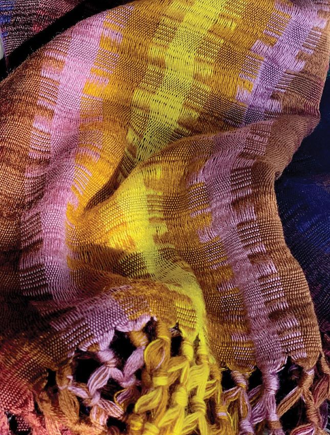
FOLKLORIC
  Folkloric implies the patterns, styles or
colors that are specific to a particular area
  or culture. As the poetry of pre-tech life
  gives energy to a fresh take on all-but-
 forgotten traditions, new forms of folk art
     are emerging, one that includes a
variety of designs and hues from differing
  backgrounds. Handmade, natural and
 genuine authenticity pays homage to old
    ways with a glint of humor and fun.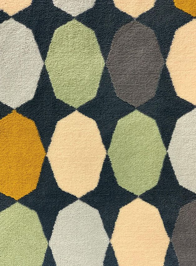
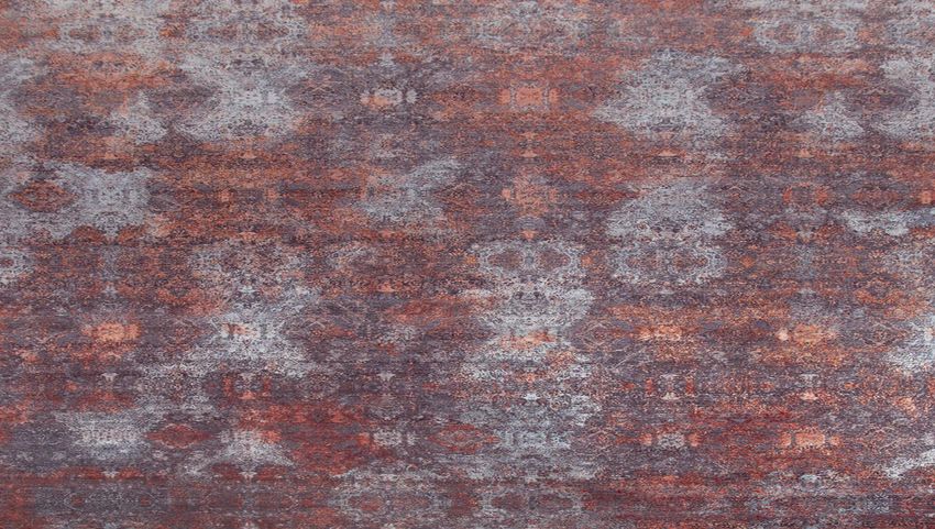
TERRACOTTA
     Comforting and reassuring, the
  inherent warmth of Terracotta hues
    have a broad appeal across may
 cultures, with its comforting presence
 reaching beyond bricks and ceramics
 to fabric, painted surfaces, and more.
The versality of this cordial shade and
surrounding earthy variations make it a
        perfect color companion.
COMPOSED
The Composed palette orchestrates a
  blended harmony of always-classic
   colors and neutrals. Creating soft
      harmonies that support both
   contemporary and casual styling,
  Composed captures the appeal of
    non-confrontational pastels and
    timeless neutrals whose subtle
   voices quietly soothe. These are
 colors that reach across generations
 and beyond trends with an enduring
               message.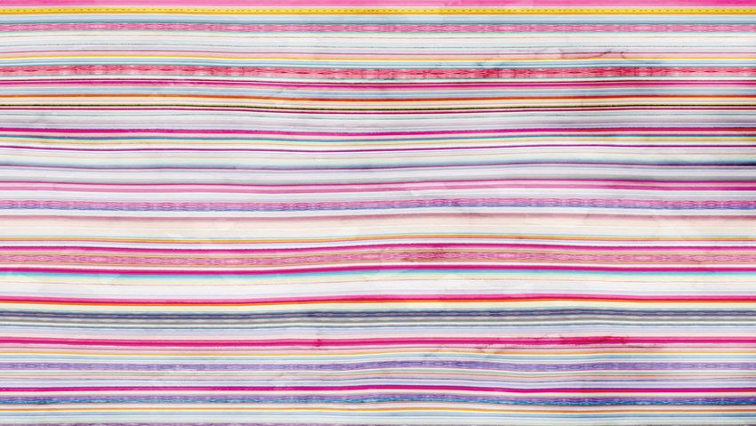
VIVIFY
Evocative of new modernity, Vivify’s
cheerful palette expresses a sense
 of playful freshness with delicious
 and whimsical hues meshing and
   mingling in an adventuresome
    exploration of newness and
               originality.
FLEUR
Flowers have long been nature’s most
    sublime color expression. Fleur
   celebrates the intrinsic romance
   found in lush, floral red tints and
       tones. The glamour and
luxuriousness of the floral references
 gives rise to a re-exploration of past
 luxuries which includes a shimmery
             gold metallic.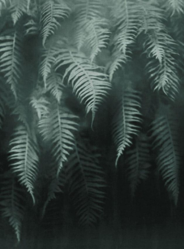
QUIXOTIC
 Taking a cue from the rich, graphic,
multicultural influences at play in the
  worlds of fashion and art, Quixotic
deploys both closely matched colors
   and complementary pairings in
  intriguing combinations. There is
   something a bit quirky, bold and
    adventurous about the entire
    grouping, yet there is still the
 opportunity to include some familiar
basic and ever-dependable favorites.
POLYCHROME
        Polychrome is a story
 of complexity in color. Although all
    the colors in the palette stand
 beautifully on their own and within
monochromatic groupings, the colors
additionally open the door to creative
  possibilities, lending themselves
especially well to color combinations
 of contrasting hues and tonalities.
SYNERGY
     Synergy speaks to the quiet
   connection and compatibility of
   hushed tones and understated
undertones. Calming and meditative,
 this peaceful and pleasing palette
expressive of color cooperation and
   collaboration is never jarring or
obtrusive, yet there is drama evident
    in contrasts of light and dark.
GALAXIES
The galaxies that lie beyond earth
have always been of enormous
Interest. Pushing technological
materials and finishes
ever-forward the metallic finish and
high sheen of the colors we see in
Galaxies glow with a new intensity.COLOR & DESIGN ESSENTIALS
2021
featured color palettesYou can also read