MODELLING AND SIMULATION - APPLICATIONS OF
←
→
Page content transcription
If your browser does not render page correctly, please read the page content below
APPLICATIONS OF
 MODELLING AND SIMULATION
 http://arqiipubl.com/ams eISSN 2600-8084 VOL 4, 2020, 31-39

 Exploring Colors Combinations Impact on the Vision
 Comfortable and 3D Model Lucidity
 Sarah Qahtan M. Salih1* and Abdul Sattar A. Khamas2
 1
 Computer Center, College of Health and Medical Technology, Middle Technical University, Baghdad, Iraq
 2
 Radiology Departments, College of Health and Medical Technology, Middle Technical University, Baghdad, Iraq
*
 Corresponding author: sarah.qahtan2014@gmail.com

Received 03 November 2019, Revised 04 December 2019, Accepted 05 December 2019.
Copyright © 2020 The Authors.

Abstract: The human vision and model clarity is predominantly affected by color and light. In order to verify whether there
is any impact of mingling colors on the vision comfortable and model lucidity, we conducted experiments based on color
temperature (warm and cool colors) and Munsell color system (hue, tone, tint, and shade). The experiments include nine groups
of colors combination, two chosen colors in each group. Moreover, a new illumination design is introduced to support our
proposed method. Since the study depends on human’s estimation, we survey to gauge the outcome. One-way ANOVA and
the Post-Hoc tests are used to analyze the data of vision comfortable. Mean and Standard Deviation tests are used to measure
the model lucidity improvements. Data from the experiments shows a significant difference by comparing mixed colors based
on their temperature. According to the respondents, cool tone & cool shade mixture gives the highest lucidness to the model.

Keywords: Color wheel; Cool color; Hue; Shade; Tint; Tone; Warm color.

1. INTRODUCTION
Colors play an important role in human decisions on what they like and what they are not. Many researchers studied the relation
between colors or color combinations and human emotions [1]. Moreover, the significance of color has been studied on
different sides; among them, its impact on visual perception, and the relationship between color and details understanding
(lucidity). The color perception considers the most powerful info channel among human senses in human visual experience
[2]. In the human visual system, the eye senses the illumination and sends signals through the optic nerve to the brain which
gives humans the ability to see. Ten million different colors and shades humans can distinguish with a 200-degree viewing
angle. The significant function of the rods is supplying black and white vision as such, it is essentially as faint illumination.
On the other hand, the cones are responsible for vision in broad daylight and senses color as well. The lens and cornea of the
eyes focus images on the retina by the eye optics [3,4].
 Colors change with illumination sources. Human’s comprehension of shape, orientation, and depth are depending on the
color as well as the illumination. The countless CPU hours of constructing the third dimension of structures can be saved by
lighting. It can pull the models of interest away from the background and other models in the scene. On the contrary, greatest
visualization efforts can be defeated by poor illuminations. For instance, unsuitable illumination can deceive humans by
thinking that a concave model is convex, or vice versa. Important details may be misunderstood or missed completely without
good illumination.
 Many researchers investigated the impact of colors on human emotions [1,5,6]. Suk and Irtel tried to find the relation
between colors and valence, arousal, and dominance. They selected 36 colors (hue and tone) based on the CIELAB LCh
system. CRT monitor and A5-size glossy paper were used to display the colors. They found the emotional responses to color
differ more intensely for tone than to hue. Also, their result presented there was an impact of media on the emotional responses
to colors [1]. In 2013, Kuhbandner and Pekrun studied the enhancements of memory based on the negative and positive
emotions to the color. They assumed that red is used as a warning signal (negative information) whereas green as a security
signal (positive information). They found that the memory of colored words was increased and enhanced the effect of emotion.
Besides, the manipulation of colors could have diverse functions in human memory [6]. Naz et al. explored the impact of light,
color, and texture on the emotional response in virtual reality (VR). They evaluated the emotional responses based on the pre-
designed questionnaire. The response to the virtual space was reliable with equivalent replies from real-world illumination and
color emotional perception [5].
 Another group of researchers studied the impact of colors in education and on the students [7-9]. Gaines and Curry
investigated the impression of colors on student behavior, attention, and achievement. Their results indicated that colors are
 This article is distributed under a Creative Commons Attribution 4.0 License CC BY that permits any use, reproduction and distribution of 31
 the work without further permission provided that the original work is properly cited.
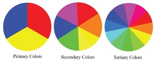
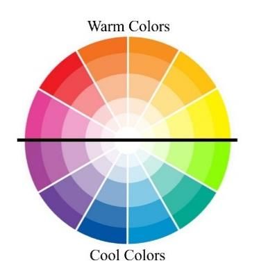
S. Q. M. SALIH AND A. S. A. KHAMAS, APPLICATIONS OF MODELLING AND SIMULATION, 4, 2020, 31-39

important for educators and parents in scheming functional learning spaces. Moreover, they found that even students with
disabilities were more sensitive to color in the classroom [7]. In 2014, Kurt and Osueke used surveys and questionnaires as a
research method to discover the psychological effects of colors on students. Their analysis specified that colors indeed
influence human feelings such as uninvited, relaxed, calm, warm, or cool [8]. In 2017, a group of researchers studied the
quality of textbooks in primary school based on color factor. They categorized colors to three classes which were primary,
secondary, and tertiary colors. Most students were interested in tertiary colors [9].
 Furthermore, many studies employed color in visualization to enhance the depth and shape of an object. Bailey et al.
explored the realistic impact of a colored object on the depth and the difference of shading and contours on objects. They
observed that there was an association between the color temperature and perceived depth. The warm colors tended to seem
closer than the cool colors [10]. Furthermore, the state of art presented by Silva et al. stated the importance of color in data
and information visualization. Also, they reviewed and explored color tools to help researchers and designers to create color
scales that are suitable for certain visualization or date [11].
 The aim of the present study was to examine color combination influences on vision comfortable and model lucidity. Most
of the previous studies explored the impact of color on human emotions, memory, depth improvements, and education. On the
other hand, the inspiration of the present study is the lack of exploring the impact of colors on visual comfort and the detail
clarity. The proposed method is divided into two phases. In the first phase, colors temperature based shading of model method
is developed as well as new illumination design. In the second phase, the vision comfortable of the color combination and
details understanding is determined through a survey.

2. BASIC CONTROL THEORY
Color theory has several principles and definitions, however, the most convenient and acceptable categories of color theory
are color-wheel, color-harmony, and color-context. In this paper, the focus is on color-wheel.

2.1 The Color-Wheel
In 1666, Sir Isaac Newton established a color-circle or color-wheel diagram for the first time. The traditional color wheel is
based on red, blue and yellow [12]. Later, Newton expressed the laws of mixing color, his law states that “if two color mixtures
yield the same sensation of hue, their mixture will also yield that sensation”. He also developed the color-wheel based on 7
colors (red, orange, yellow, green, blue, indigo, and violet) circled with white at the center [13].
 Over time, several variations have been designed based on Newton’s concept, but the wheel of twelve colors considered
the most common one. This color-wheel categorized to primary, secondary and tertiary colors as shown in Figure 1. The
primary colors consist of three colors yellow, red and blue. Secondary colors and tertiary colors are derived from these primary
colors. Secondary colors consist of primary colors and the other three colors which are green, orange and purple. The mixture
of yellow and red give green color, red and yellow give orange, and the mixture of blue and red give purple. Tertiary colors
consist of secondary colors and other six colors which are red-purple (magenta), red-orange (vermillion), blue-purple (violet),
blue-green (teal), yellow-orange (amber) and yellow-green (chartreuse) [9,14,15].

2.2 Warm and Cool Color
Colors are classified as warm-colors and cool-colors according to their location on the color wheel. In the 18th century at least,
the researchers realize the significance of the difference between warm and cool colors [16]. Splitting the color-wheel into 2
halves, warm and cool colors are parted as shown in Figure 2. Warm-colors consist of red, orange, yellow and their mixtures.
Cool-colors consist of blue, green, purple and their mixtures. The impact of colors on human physiology and behavior is
noticed by many artists, scientists, and designers [5]. In 2014, Alter wrote about the meaning of the color and their impact on
the human. For instance, red is a symbol of violence, romance, power, or anger, likewise, blue is the color of the sky that may
refer to soothe and peace. Experiments have showed that grading papers in red color could reduce the engagement of students
in the class [17].
 The perception of depth in humans is affected by color [18]. The viewer's perception stimulated by the warm-colors. On
the other hand, the impression of calm can be gotten from cool-color. Black, white, and gray are measured to be neutral colors
[19]. Warm-colors are advancing that look closer to the viewers. Cool-colors are receding that look farther away from the
viewers. This idea is based on the fact that the human’s eyes adjust while focusing on hues of diverse wavelengths. Blue light
waves have a shorter wavelength than red ones [10,20-22]. Gooch et al. used tone shading [23,24] to illuminate the surface of
the 3D model. They proposed a tone shading based illumination that allows the outlines and highlights to be earmarked.

 Figure 1. The three categories of color-wheel

 32
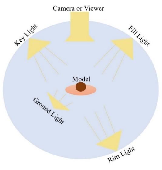
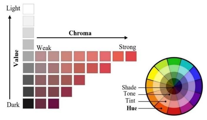
S. Q. M. SALIH AND A. S. A. KHAMAS, APPLICATIONS OF MODELLING AND SIMULATION, 4, 2020, 31-39

 Figure 2. Warm color and cool color on the wheel

2.3 Munsell Color System
At the beginning of the 20th century, Albert H. Munsell created the Munsell color system. The system is based on three
properties of color which are hue, value (lightness or darkness), and chroma (saturation). Hue is the other word of “color” and
it is described as the excellence of separating one color from another. Hue is more precisely termed by the dominant
wavelength. The degrees of light or dark of a color is known as a value, it depends on the light the hue imitates. High-value
color (tint) is a color variation combined with white light. On the contrary, Low-value color (shade) is a hue variation of a
color combined with black. Besides tint and shade, there is tone. A tone is a hue variation combined with gray, as shown in
Figure 3. Chroma is also known as saturation or strength of the hue. It is the degree of departure of color from the neutral color
of the same value. The low chroma of color is called “weak,” whereas the color of high chroma is called “vivid” or “strong”
[15,19,25].

2.4 Illumination
Illuminations design in photography, filmmaking illumination, and stage illumination have been considered crucial. In
computer graphics, illuminations design includes illumination direction, position, strength, and color. Many researchers and
designers developed diverse illumination systems. Light Collages system [26] introduced by Lee et al. The system designed
for effective visualization and is based on principles of human perception. They used multiple placement light sources with
inconsistent global illumination. Three-point lights system [27] presented by Birn which were key light, fill light and rim light.
The key light provides the dominant angle of the light and produces the main illumination of the model. The fill light makes
the model more visible by reducing the key light illumination. The rim light defines the edge of the model by separating the
model from the background. Halle and Meng proposed the LightKit system [28] that was based on the illumination system
presented by Birn [27]. They added head-light to the Birn’s lights to increase the contrast of the surfaces and beneath the
model.

3. METHODOLOGY
The method presented in this paper is based on mixing colors based on their temperatures and the Munsell color system is used
to explore the impact on the volume of the model. New illumination design is needed to accomplish the goal of this study
which is improving the lucidity of the model. In addition, providing vision a comfortable combination of color and light.

 Figure 3. The color system proposed by Albert H. Munsell

 33
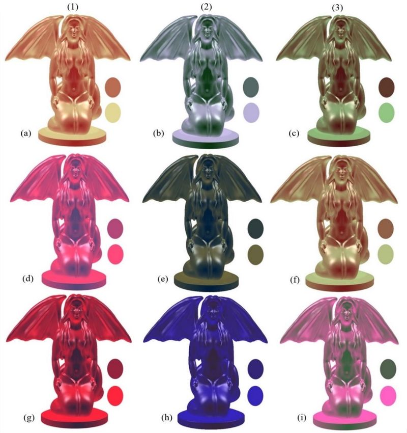
S. Q. M. SALIH AND A. S. A. KHAMAS, APPLICATIONS OF MODELLING AND SIMULATION, 4, 2020, 31-39 3.1 Colors Temperature Based Shading of 3D Model Manipulating color can improve the volume of the model based on distance. Painters used aerial perspective to convey the volume through the difference of hue and value based on volume. Normally cooler hues used in the background while warmer in the foreground [29]. In this paper, we are investigated the impact of combining two colors (warm and cool). In addition, hues, shades, tones and tints of different colors are used in our experiments. The color combination is used to measure vision comfortable. Moreover, the mixtures of color are used to measure the lucidity improvements. The tone-based shading method [23,24] has been adopted and developed for the proposed shading. The cosine of light (L) and normal (N) vectors has been used for the calculation of the colors temperature as: 1+ . 1 + . (1) = ( ) + (1 − ) 2 2 1+ . 1 + . (2) = ( ) + ( ) 2 2 1+ . 1 + . (3) = (1 − ) + (1 − ) 2 2 where = + ∗ and = + ∗ . The values of and determined the prominence of the model’s color and the strength of the luminance, and represents the RGB color reflectance. 3.2 Illumination Design Humans use curvature features to comprehend shapes and differentiate between models. The illumination gradient can affect the curvature and lucidity of the models. The light system proposed by Birn [21] is adopted and developed in this paper. Birn’s three-point lighting has been extended to four lights which are key, fill, and rim and ground lights as shown in Figure 4. The following subsections describes the roles of each light. 3.2.1 The Key Light The dominant light in the scene and model main illumination are created by the key light. This light defines the visible light and controls global shading. A spotlight employed to serve as the key light. The light is positioned in front of and above the model and a bit to the left. Normally, the brighter illumination in the design is covered by the key light. Besides, the darkest shadows are cast by the same light. 3.2.2 The Fill Light The illumination of the key light is extending by the fill light which adds soft illumination to the model. The fill light is set as opposed to the key light (in front of and above the model and a bit to the right). A spotlight employed to serve as the fill light as same as the key light. Birn’s design sets the intensity of the fill light to be half of the key light. Conversely, the intensity of the fill light in our design sets to be 1/8 of the key light. 3.2.3 The Rim Light The rim or backlight is used to separate the background from the foreground by creating a bright line around the silhouette of the model. The rim light is set above and behind the model, and a bit to the right. A point light engaged to serve as the rim light and the intensity of this light set to be half of the key light. 3.2.4 The Ground Light Ground light is to the Birn three-point light for our illumination design. This light is located beneath and a bit to the front of the model. In the ground light, the intensity is set as the fill light and the highlight (specular) parameter is omitted. 3.3 Questionnaire Setup The impact of mixing two colors based on temperature and Munsell color system was measured by using a questionnaire. The target participants were undergraduate and graduate students from different disciplines, besides lecturers and staff at Middle Technical University (MTU). The participants. The numbers of participants used by Veitch et al. [30], Naz et al. [5], Wirtitsch et al. [31], Ebert et al. [32], Deng et al. [33], Preim et al. [34] were 45, 32, 24, 48, 60,160 respectively. The sample size of this research was 84 that is near to the average sample size (61.5) of the six previous studies. A total of 84 participants were volunteered for the study. The participants were 30 male and 54 female, (86%) ranged in age from 22-24. Twelve participants (14%) ranged in age from 29-55. Participants were given a presentation in 20-30 minutes, to explain the meaning of the temperature color (warm and cool) and Munsell color system (hue, tone, tint, and shade). Then, the participants had to fill out a questionnaire, they filled the questionnaire based on the displayed images. The questionnaire was in the form of a three-point Likert scale [5,8] and it consisted of 2 parts. The first part consisted of 3 questions as listed below to measure the color vision comfortable: I feel comfortable when I look to the model in a warm color shown in column (1). I feel comfortable when I look to the model in a cool color shown in column (2). I feel comfortable when I look to the model in warm & cool colors shown in column (3). 34
S. Q. M. SALIH AND A. S. A. KHAMAS, APPLICATIONS OF MODELLING AND SIMULATION, 4, 2020, 31-39 Figure 4. Top view of the proposed illumination design The respondents rate each question from 1 to 3 (three-point Likert scale), where 1 represents agree and 3 represents disagree. The second part consisted of 9 questions to measure the lucidity improvements based on color, the following example of the questions: The color mixtures in (a) make the model very clear and improve the shape details. 3.4 Data Analysis The quantitative data analysis was measured by using IBM SPSS 24. The data were analyzed following the methods used by Newman and Lee [35], Naz et al. [5], and Mangkuto et al. [36]. The overall mean values of the questionnaire were used to compare the combinations of different colors on the comfort of the respondent’s eye. Also, examining the impact of each combination on the lucidity improvements. The comparisons used to determine if there was a statistically significant difference. The analysis of variance (ANOVA) test was used for data processing and analysis for this purpose. Data are reported as statistically significant (there is a significant difference between compared groups) at (P
S. Q. M. SALIH AND A. S. A. KHAMAS, APPLICATIONS OF MODELLING AND SIMULATION, 4, 2020, 31-39

Figure 5. Samples of the results where column 1: mixed of two warm colors, column 2: mixed of two cool colors and column
 3: mixed cool and warm colors

 Table 1. The lucidity improvements comparison between all the color mixture groups

 Mixtures Group Mean ± Standard Deviation
 warm tone & warm tint 2.51 ± 0.784
 cool tone & cool tint 2.70 ± 0.617
 cool tint & warm shade 2.64 ± 0.687
 warm shade & warm tone 2.15 ± 0.951
 cool shade & cool tone 1.98 ± 0.905
 warm hue & warm hue 1.56 ± 0.734
 cool hue & cool hue 1.36 ± 0.652
 warm tint & cool tone 2.56 ± 0.750
 cool tint & warm tone 2.50 ± 0.799

 36
S. Q. M. SALIH AND A. S. A. KHAMAS, APPLICATIONS OF MODELLING AND SIMULATION, 4, 2020, 31-39

 Table 2. The results of the pairwise comparison (Tukey)

 Colors mixture Mean difference P-value
 cool
 0.020 0.967
 vs
 warm & cool 0.381* 0.001
 warm
 0.020 0.967
 vs
 warm & cool 0.361* 0.001
 warm
 0.381* 0.001
 vs
 cool 0.361* 0.001

5. DISCUSSION
The impact of color on human emotions has been conducted in many previous studies [1,5,6,17]. Some researchers [21,22,28]
have investigated the impact of warm and cool color on the 3D data. Conversely, this research investigated warm and cool
colors based on (hue, tone, tint, and shade) and measure the respondent’s comfort with mixed colors. In addition, the lucidity
improvements measured based on the respondent’s opinion.
 When the ANOVA test was carried out, our result revealed that differences between each lighting group was highly
significant difference (P < 0.001). A P-value less and equal to 0.05 indicates the significant differences, while P-value greater
than 0.05 indicates statistically insignificant differences [38]. Consequently, the ANOVA values acquired specify that the
results obtained were reliable [38]. The reliable data obtained P-value less and equal to .05 is consistent with results from
previous studies [5,6,9]. In the respondent’s vision comfortable, the significant differences (P < 0.001) were obtained by
mixing warm & cool compared warm mixture and cool mixture. Furthermore, the warm mixture and cool mixture showed
significant differences as well. Additional comparison of percentages values for the three mixture groups is shown in Figure
6 in which warm and cool mixed colors have the most acceptance rate (62%), however, warm mixed colors have the lowest
acceptance rate (40%). The mean and standard deviation are used to measure the improvements difference between nine mixed
groups. Additionally, when we compared warm tone & warm tint to cool tone & cool tint, where the respondents gave the
highest score to cool tone & cool tint (79%) and the lowest to warm tone & warm tint (69%). The respondents gave scores to
another two pairs of mixtures which were warm shade & warm tone and cool shade & cool tone. Cool shade & cool tone had
a lower score (39%) compared to warm shade & warm tone (54%).

 RESPONDENT’S VISION COMFORTABLE RATE

 disagree Neutral agree

 WARM&COOL MIXTURE 25% 13% 62%
 COOL MIXTURE 45% 9% 46%
 WARM MIXTURE 41% 18% 40%

 Figure 6. Respondent’s vision comfortable rate

 THE LUCIDITY IMPROVEMENTS RATE
 disagree Neutral agree

 COOL TINT & WARM TONE 15% 13% 71%
 WARM TINT & COOL TONE 19% 12% 69%
 COOL HUE & COOL HUE 74% 17% 10%
 WARM HUE & WARM HUE 58% 27% 14%
 COOL SHADE & COOL TONE 42% 19% 39%
 WARM SHADE & WARM TONE 38% 8% 54%
 COOL TINT & WARM SHADE 12% 12% 76%
 COOL TONE & COOL TINT 8% 13% 79%
 WARM TONE & WARM TINT 18% 13% 69%

 Figure 7. The lucidity improvements rate for all the color mixture groups

 37
S. Q. M. SALIH AND A. S. A. KHAMAS, APPLICATIONS OF MODELLING AND SIMULATION, 4, 2020, 31-39

 The responses scores for cool hue & cool hue and warm hue & warm hue were 10% and 14% respectively. The cool hue
& cool hue combination gave the lowermost improvement on the lucidity of the 3D model. The last comparison was between
warm tint & cool tone and cool tint & warm tone, which were 69% and 71% respectively. Finally, the highest scores (79%)
among all the nine groups was cool tone & cool shade. In this study, there was no significant difference based on gender.

6. CONCLUSION
In this paper, we explore the impact of mixing 2 colors on the vision comfortable and 3D model lucidity. New illumination
design presents to clarify our proposed mixture on the model. It consists of four lights which are the key light, the fill light,
rim light, and ground light. The experiments build based on warm and cool colors and also based on hue, tone, tint, and shade.
The impact of nine groups of colors have been explored, each group consists of two mixed colors. We verified our proposed
method through statistical tests which are ANOVA and the Post-Hoc test. In addition to the mean, standard deviation, and
percentage. We concluded that mixed warm and cool colors give the most comfortable vision. The highest lucidity has gotten
from combining cool tint & warm shade.
 This research can be taken further by extending our mixtures options and explore more combinations. Also, it can be more
than two colors in each mixture. The illumination design can be enhanced by mixing deferent kinds of lights to highlight
certain features in the model.

REFERENCES
[1] H. J. Suk and H. Irtel, Emotional response to color across media. Color Research & Application: Endorsed by Inter
 Society Color Council, The Colour Group (Great Britain), Canadian Society for Color, Color Science Association of
 Japan, Dutch Society for the Study of Color, The Swedish Colour Centre Foundation, Colour Society of Australia, Centre
 Français de la Couleur, 35(1), 64-77, 2010.
[2] F. M. Adams and C. E. Osgood, A cross-cultural study of the affective meanings of color, Journal of Cross-Cultural
 Psychology, 4(2), 135-156, 1973.
[3] R. Snowden, R. J. Snowden, P. Thompson and T. Troscianko, Basic vision - An introduction to visual perception. Oxford
 University Press, 2012.
[4] R. L. Gregory, Eye and brain - The psychology of seeing. Princeton University Press, 2015.
[5] A. Naz, R. Kopper, R. P. McMahan and M. Nadin, Emotional qualities of VR space, 2017 IEEE Virtual Reality (VR),
 Los Angeles, 2017, pp. 3-11.
[6] C. Kuhbandner and R. Pekrun, Joint effects of emotion and color on memory, Emotion, 13(3), 375-379, 2013.
[7] K. S. Gaines and Z. D. Curry, The inclusive classroom - The effects of color on learning and behavior, Journal of Family
 & Consumer Sciences Education, 29(1), 46-57, 2011.
[8] S. Kurt and K. K. Osueke, The effects of color on the moods of college students, SAGE Open, 4(1), 2158244014525423,
 2014.
[9] S. Kasmaienezhad-Fard, T. Sulaiman, N. Alwi and A. Ayub, An evaluation of the colors in primary school English
 textbook through students' perceptions. Journal of Studies in Education, 7(4), 141-155, 2017.
[10] R. Bailey, C. Grimm and C. Davoli, The effect of warm and cool object colors on depth ordering, Proceedings of the 3rd
 Symposium on Applied Perception in Graphics and Visualization, Boston, 2006, pp. 161-161.
[11] S. Silva, B. S. Santos and J. Madeira, Using color in visualization - A survey, Computers & Graphics, 35(2), 320-333,
 2011.
[12] V. K. Sikri, Color - Implications in dentistry. Journal of conservative dentistry, 13(4), 249, 2010.
[13] J. E. Roeckelein, Dictionary of theories, laws, and concepts in psychology. Greenwood Publishing Group, 1998.
[14] C. Matters, Basic color theory, 2012. (accessed 27.03.2015)
[15] T. Sutton and B. M. Whelan, The complete color harmony. Rockport Publishers, 2017.
[16] J. W. von Goethe, Goethe's theory of colours. J. Murray, 1840.
[17] A. Alter, Drunk tank pink - And other unexpected forces that shape how we think, feel, and behave. Penguin, 2014.
[18] D. Yorgancioğlu, Steven Holl - A translation of phenomenological philosophy into the realm of architecture, Master
 Thesis, Graduate School of Natural and Applied Sciences, Middle East Technical University, 2004.
[19] S. R. Stokley, Historic Look on Color Theory, Honors Thesis, College of Arts & Sciences, Johnson & Wales University,
 2018.
[20] M. Hårleman, Daylight influence on colour design: empirical study on perceived colour and colour experience indoors,
 PhD Thesis, School of Architecture and the Built Environment, KTH Royal Institute of Technology Stockholm, 2007.
[21] A. Chu, W. -Y. Chan, J. Guo, W.-M. Pang and P. -A. Heng, Perception-aware depth cueing for illustrative vascular
 visualization, 2008 International Conference on BioMedical Engineering and Informatics, Sanya China, 2008, pp. 341-
 346.
[22] R. J. Bailey, C. M. Grimm and C. Davoli, The real effect of warm-cool colors, Research Report, Department of Computer
 Science & Engineering, Washington University in St. Louis, 2006.
[23] B. Gooch, P. -P. J. Sloan, A. Gooch, P. Shirley and R. Riesenfeld, Interactive technical illustration, SI3D, 99, 31-38,
 1999.
[24] A. Gooch, B. Gooch, P. Shirley and E. Cohen, A non-photorealistic lighting model for automatic technical illustration.
 SIGGRAPH, 98, 447-452, 1998.
[25] A. Munsell, Charting Color from the Eye of the Beholder. American Scientist, 93, 436-443, 2005.

 38
S. Q. M. SALIH AND A. S. A. KHAMAS, APPLICATIONS OF MODELLING AND SIMULATION, 4, 2020, 31-39

[26] C. H. Lee, X. Hao and A. Varshney, Light collages - Lighting design for effective visualization, Proceedings of the
 conference on Visualization '04, Austin USA, 2004, pp. 281-288.
[27] J. Birn, Digital lighting & rendering. Pearson Education, 2014.
[28] M. Halle and J. Meng, LightKit - A lighting system for effective visualization, Proceedings of the 14th IEEE Visualization
 (VIS'03), Seattle USA, 2003, pp. 363-370.
[29] J. D. Foley, F. D. Van, A. Van Dam, S. K. Feiner, J. F. Hughes and J. Hughes, Computer graphics - Principles and
 practice. Addison-Wesley Professional, 1996.
[30] J. A. Veitch, L. A. Whitehead, M. Mossman and T. D. Pilditch, Chromaticity‐matched but spectrally different light source
 effects on simple and complex color judgments. Color Research & Application, 39(3), 263-274, 2014.
[31] M. G. Wirtitsch, G. Schmidinger, M. Prskavec, M. Rubey, F. Skorpik and G. Heinze, Influence of blue-light-filtering
 intraocular lenses on color perception and contrast acuity. Ophthalmology, 116(1), 39-45, 2009.
[32] L. C. Ebert, W. Schweitzer, D. Gascho, T. D. Ruder, P. M. Flach and M. J. Thali, Forensic 3D visualization of CT data
 using cinematic volume rendering: a preliminary study. American Journal of Roentgenology, 208(2), 233-240, 2017.
[33] L. Deng, L. Li and Y. Mao, Rehabilitation environmental system design of children with autism from the analysis of
 visual perception, 2nd International Conference on Education Technology, Management and Humanities Science, Beijing,
 2016, pp. 670-674.
[34] B. Preim, A. Baer, D. Cunningham, T. Isenberg and T. Ropinski, A survey of perceptually motivated 3d visualization of
 medical image data. Computer Graphics Forum, 35(3), 501-525, 2016.
[35] T. S. Newman and W. Lee, On visualizing uncertainty in volumetric data: techniques and their evaluation. Journal of
 Visual Languages & Computing, 15(6), 463-491, 2004.
[36] R. A. Mangkuto, A. Enge, F. Munir and F. N. Soelami, The effects of illuminance, colour temperature, and colour
 rendering of various existing light-emitting diode lamps on subjective preference and performance in Indonesia. Journal
 of Building Engineering, 19, 334-341, 2018.
[37] Free3d, Lamia V1 3D Model (Website). https://free3d.com/3d-model/lamia-v1--520283.html, 2018 (accessed
 01.11.2019).
[38] T. Baguley, Calculating and graphing within-subject confidence intervals for ANOVA, Behavior research methods, 44(1),
 158-175, 2012.

 39
You can also read