Design Studio | Guide to Graphics - Lascar Electronics
←
→
Page content transcription
If your browser does not render page correctly, please read the page content below
Design Studio | Guide to Graphics
Contents
                                                          Page No.
1.       Introduction                                             3
2.       Graphic file types                                       4
3.       Project screen sizes                                     4
         3.1     Recommended Sizes                                4
4.       Color                                                    5
         4.1     Opacity                                          5
         4.2     Custom Colors                                    6
5.       Borders                                                  6
6.       Backgrounds                                              6
         6.1     Gradient Fills                                   6
7.       Basic Options                                            7
8.       Basic Shapes                                             7
         8.1     Ellipse                                          7
         8.2     Line                                             7
         8.3     Polygon (Irregular)                              7
         8.4     Polygon (Regular)                                7
         8.5     Rectangle                                        8
9.       Positioning Graphics & Images                            8
10.      Building Graphics with Shapes                            8
         10.1    Combine Option                                   8
         10.2    Subtract Option                                  9
         10.3    Intersect Option                                 9
         10.4    Exporting Graphics                               9
         10.5    Saving Graphics as Templates                     9
11.      Using Text & Fonts                                       9
         11.1    Font Selection and Properties                   11
         11.2    Properties                                      12
         11.3    Styles                                          12
         11.4    Text Alignment                                  13
         11.5    Font Color                                      13

2    PanelPilotACE | Design Studio | Guide to Graphics | Issue 1 07/2020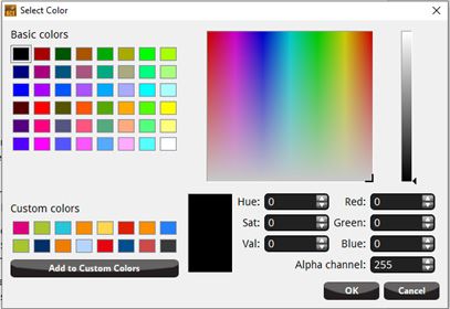
Design Studio | Guide to Graphics
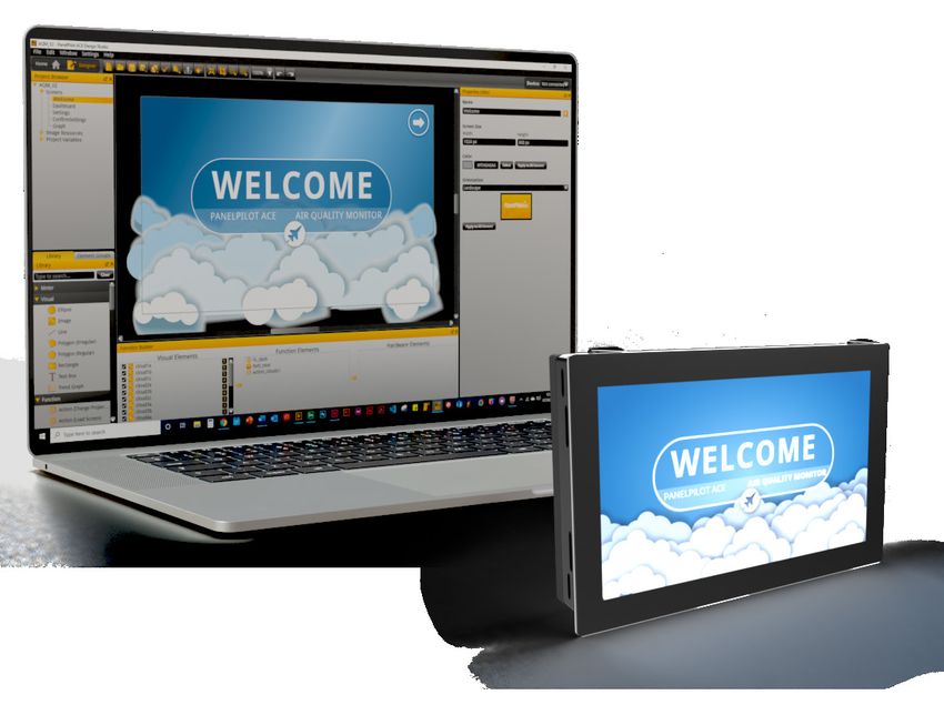
PanelPilotACE Design Studio
Guide to Graphics & Text
1. Introduction
The key to making a successful PanelPilotACE Project Make sure that you have the latest version of the
has two elements to it. Firstly, as a developer you want PanelPilotACE Design Studio software installed on your
to create a Project (App) that functions smoothly and PC. This can be download for free from:
efficiently. Secondly, it is also important to take time
www.lascarelectronics.com/software/panelpilot-software/
to consider the visual layout and graphics that you are
panelpilotace-design-studio
going to create.
There are also a number of PanelPilotACE App
Using the tools and features within the PanelPilotACE
templates available for use and customisation. There is
Design Studio you will be able to create Projects
a selection included within the Design Studio Software
that have accessible and well designed screens.
and more can be downloaded from the PanelPilot
These will compliment the App’s functionality and help
University:
to deliver a positive user experience for your audience
or customers. www.lascarelectronics.com/panelpilotace-university/
project-templates
This guide focuses on the graphic and text elements
that are currently available in the PanelPilotACE Free graphic and image elements are also available
Design Studio software. from here:
For further information and guides to using the www.lascarelectronics.com/panelpilotace-university
PanelPilotACE Design Studio please go to:
We also offer a full Custom App design and build
www.lascarelectronics.com/panelpilotace-university. service for customers that would prefer our
in-house PanelPilotACE experts to create an App.
Contact us to discuss your requirements.
PanelPilotACE | Design Studio | Guide to Graphics | Issue 1 07/2020 3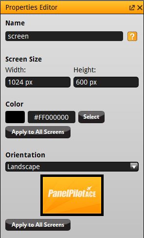
2. Graphic file types                                                     The size of a graphic can be manually adjusted in the
                                                                          Properties Editor window by specifying its width and
Below is a list of common graphic and image formats                       height values. The unit of measurement in the Design
and their compatibility with the PanelPilotACE Design                     Studio is Pixels (px). A graphic can also be manually
Studio.                                                                   adjusted on-screen by selecting it and pulling the
                                                                          edges. If you want the dimensions of a graphic to resize
                                                                          proportionally, enable the Maintain Aspect Ratio toggle
 File Type                     Design Studio Compatible                   button.
 *.png                                       Yes
                                                                          Other options for manipulating a graphic or image in
 *.jpg                                       Yes
                                                                          the Properties Editor are:
 *.bmp                                       Yes
 *.gif                                       Yes                          Optimise For - Optimises the graphic for either quality
                                                                          or speed. There maybe a drop in the quality of the
 *.svg                                       Yes
                                                                          graphic but it will help to make the Project run faster.
 *.tiff                                      Yes
 *dwg                                        Yes                          Opacity - Controls the transparency of a graphic. (see
                                                                          4.1 for more information).
 *.pbm                                       No
 *.raw                                       No                           Transform Origin - Defines where the axis
 *.pdf                                       No                           co-ordinates of an element or shape are referenced
                                                                          from. This is useful when using the Rotation and Scale
 *.eps                                       No
                                                                          options.
 *.jpf (jpeg 2000)                           No
 *.wmf                                       No                           Rotation - Allows a graphic or shape to be rotated on
                                                                          its axis from 0o to 360o degrees.
 *.tga                                       No
 *.pct                                       No                           Scale - A shape or graphic can be resized between
 *.ai                                        No                           -500% and +500%.

The recommended file formats for logos and vector
graphics are *.png and *.svg. Both of these formats
allow a graphic to have a transparent background.

Detailed images such as photos should ideally be
formatted as *.jpeg or *.png.

We also recommend that any graphic and image files
you want to use in a PanelPilotACE project are created
in a specialised graphics application. These can output
files as “Optimised” for screens. This will ensure that
the graphics are of the highest quality and detail but
have the smallest file size possible.

2.1 Importing Graphics
When importing a graphic or image into the Design                                      Features found in the Properties Editor
Studio it will display on the screen as 100% actual size,
unless it’s dimensions exceed the Project’s screen size
(PanelPilotACE model dependant). If so, the Design
Studio will display the graphic smaller than 100% to fit
the screen. If you require the graphic to display at its
original size, click on the Set to Image Size button in the
Properties Editor window.

4   PanelPilotACE | Design Studio | Guide to Graphics | Issue 1 07/2020
Design Studio | Guide to Graphics

3. Project screen sizes                                      4. Color
The screen dimensions of both PanelPilotACE models           All the Visual Elements in the Design Studio Library
are listed below:                                            (except Images) can have their color properties
                                                             customised via the Properties Editor window.
SGD-43-A = 480 x 272 pixels
                                                             There you can see a thumbnail swatch showing the
SGD-70-A = 1024 x 600 pixels                                 current color and the Hex Code representing it.
Resolution = 72dpi                                           The color can be changed by clicking on the thumbnail
                                                             swatch or by clicking on the Select button.
The default orientation of the screens is landscape but
this can be changed to portrait if required. This can be     This will activate the Select Color window. This window
changed in the Properties Editor.                            contains a pallet of basic colors to choose from or
                                                             you can create a new custom color in either of the
If creating a background image for either model that         following ways:
you want to fill the entire screen, then they should be
created with these dimensions.                               1.   Use the color picker and slider to manually move
                                                                  the selection cross-hairs around the spectrum box
The maximum resolution of the screen is 72dpi. Using              until the required color is generated. The lightness/
higher resolution images of more than 72dpi will result           darkness of a chosen color can be controlled using
in larger file sizes that may slow down the speed and             the slider. The current color selection is displayed
performance of the PanelPilotACE device.                          under the Spectrum. Click OK to accept the new
                                                                  color or cancel to return to the project with no
Note: It is recommended that graphics are prepared at             color changes made.
100% the intended size. Enlarging graphics above 100%
will result in loss of quality (pixelation).                 2.   If you want to select a specific color for an object,
                                                                  it is possible to do that by specifying its Hex or
The recommended minimum size for buttons and other                RGB code. The Hex code can be specified directly
user interactive (touch) elements is 40 x 40px.                   in the Properties Editor, or the RGB code can be set
                                                                  in the Select Color window.

                                                                                     Thumbnail        Hex Code           Select Button
                                                                                      Swatch

                                                                                          Color options in the Properties Editor

                                   Select Color Window

                                                           PanelPilotACE | Design Studio | Guide to Graphics | Issue 1 07/2020     5
4.1 Opacity
6. Backgrounds
The visual transparency of an object can be
When creating a background for a Project, consider
customised. The amount of opacity is defined by %,
all the graphic elements that are to be shown on the
100% being the maximum (solid) value or 10%* being
screen. We recommend combining any visual elements
the minimum (fully see-through). These values can
that don’t have a function associated with them into
be controlled moving the Opacity slider within the
the background image. This reduces the number of
Properties Editor.
image files required.
Transparency can also be adjusted by changing the
If a plain background is preferred, select a color for the
value of the Alpha Channel within the RGB settings in
screen in the Properties Editor. This can be used on
the Select Color window. 255 is the maximum (solid)
all screens within a project by clicking the Apply to All
value and 0 is the minimum (fully see-through).
Screens button.
* The minimum opacity that can be set with the
slider is 10%. If complete invisibility is required, it
is recommended to use the Visible property instead
(available in the Properties Editor menu).
4.2 Custom Colors
If you have created a custom color as described by
any of the methods above, then this can be saved
for re-use in the project by clicking on the Add to
Custom Colors button in the Select Color window.
Clicking this button will add the new color to the
Custom Color palette.
5. Borders
All shapes in the Library can be customised by adding
an outer border if required. The boarder consists of a
solid unbroken line that wraps itself around the entire
outer of the shape. The width (thickness) and color
of a border can be adjusted as preferred, the width is
specified in pixels (px). The color of the border is also
customisable via the Properties Editor.
The Properties Editor for Screens showing the
“Apply to all screens” button
Ellipse with a border applied
6 PanelPilotACE | Design Studio | Guide to Graphics | Issue 1 07/2020Design Studio | Guide to Graphics
6.1 Gradient Fills
Gradient fills can be applied to shapes within the
Design Studio. Gradient Fills blend 2 or more colors
into each other and can simulate 3D and metallic
effects. Backgrounds can be given more visual impact
using gradients.
To create a background shape with a gradient fill do
the following:
Above, An Ellipse with a linear gradient applied using lots of gradient
Add a Rectangle visual element to the screen and
stops. Below, the list of gradient stops used in the Ellipse.
resize it to the PanelPilotACE’s screen size (SGD-43-A
= 480 x 272 pixels, SGD-70-A = 1024 x 600 pixels) or
alternatively, manipulate the rectangle to the required
size by pulling on the sides of the shape to the edges
of the screen.
Next, right-click over the shape to access the sub menu
and then select Add Gradient Fill.
There are 3 gradient effects to choose from:
Linear Gradient Radial Gradient
The Start and Final Stops adjust the physical X and Y
Conical Gradient
positions of the stops within the shape. These can be
use to create different gradient effects.
If creating a background, make sure the background
Selecting one these will apply the gradient to a copy shape is ordered to the back of the screen below all
of the shape you have chosen. The original shape will other elements or if using layers in your project, set it
remain unchanged and can be reused or deleted as to the bottom layer (usually layer 0).
required.
The colors used for the gradient can be selected in
the Properties Editor. They are applied at the Gradient
Stops. A gradient stop is any point between 0% and
100%. The stops can be added or removed with the +
and - buttons.
PanelPilotACE | Design Studio | Guide to Graphics | Issue 1 07/2020 77. Basic Options Polygon (Irregular)
The Polygon (irregular) is by default an equilateral
The Design Studio has several basic options that can
triangle (3 points) measuring W:157px by H:135.97px.
be applied to images and shape elements that are
The shape can be altered by adding or subtracting
common to most computer programmes. These are:
points within the Properties Editor. The X/Y values of
Cut, Copy, Paste and Delete. They can be accessed by
the points can be changed individually and all points
right-clicking on a selected element to activate the
can be rotated through a 360-degree clockwise axis.
submenu or by using keyboard short cuts:
Cut = Ctrl + X
Copy = Ctrl + C
Paste = Ctrl + V
Delete = Delete Key
8. Basic Shapes
Polygon Irregular default Polygon Irregular with
The Design Studio allows you to draw several basic
8 points creates an octogon
shapes. These are:
Ellipse
The default Ellipse shape available from the Visual Polygon (Regular)
Elements Library is a non-proportionate circular shape The Polygon (regular) shape is by default an equilateral
(an ellipse) that is sized as W: 100px x H: 75px. Giving triangle (3 edges). Each edge measures L: 50px. The
this shape an equal width and height e.g. 100px x number of edges can be increased or decreased and the
100px will transform it into a circle. length of edges can be changed. The edges will all be
the same length.
Non-proportionate ellipse Proportionate ellipse (circle)
Polygon Regular default Polygon Regular with 6 points
Line creates a hexagon
The default Line shape is a straight horizontal rule that
measures 100px by 2px.
Line default
8 PanelPilotACE | Design Studio | Guide to Graphics | Issue 1 07/2020Design Studio | Guide to Graphics
Rectangle
The Rectangle shape is by default a 4-sided shape
measuring W: 100px x H: 75px. The width and height
can be altered in the same way as previous shapes
via the Properties Editor. One feature unique to the
rectangle shape is that the 4 corners of the shape can
be rounded using the Corner Radius selector and slider.
X & Y Coordinates
Rectangle default Rectangle with
rounded corners
9. Positioning Graphics
& Images
The position of any image or shape on-screen can be
manipulated by selecting the element and moving
it around the screen with the mouse. They can also
be moved by setting their X and Y positions in the
Properties Editor.
The Align Elements sub menu
The X and Y axes run horizontally and vertically from
the top left-hand corner of the screen. The axes are
measured in pixels. An elements position on the screen
is described by the X and X pixel coordinates. 10. Building Graphics
Images and shapes can be layered on-top of each other.
with Shapes
The order of layering can be changed by right-clicking The Design Studio allows you to draw several basic
on an element and choosing from the arranging shapes. These are Ellipse, Line, Polygon (Irregular),
options of Send to Back, Send Backward, Bring Forward Polygon (Regular) and Rectangle. See the Basic Options
or Bring to Front. section for a description of these shapes.
Images and shapes can also be positioned relative They can be manipulated in size, proportion and color
to the screen or other elements. If one element is as previously described. These shapes can also be
selected then it will align itself to the screen. If more connected together to create other shapes or images.
than one element is selected, then the elements will
align relative to each other. Right-click on the element The shapes can combine, subtract or intersect with
or elements that you want to align and then choose each other. These features are available by selecting
from the alignment options available under the Align more than one shape, then right clicking over the
Elements submenu. selection and choosing an option from the Merge
submenu.
PanelPilotACE | Design Studio | Guide to Graphics | Issue 1 07/2020 910.1 Combine Option
10.4 Exporting Graphics
Selecting Combine Elements will merge two or more
Any shape element that you have created in the Design
shapes into one.
Studio can be exported as a *.png or *jpeg image file
for use in other applications. To do this, right-click over
the shapes that you want to export (hold down the Ctrl
key if selecting more than one shape). Choose the Save
to Picture option from the drop-down menu. This will
activate a Windows Explorer screen to select your Save
As options from.
10.5. Saving Graphics and Images as Templates
It is possible to select a number of visual elements
including images and shapes to create a new
Two ellipse shapes (left) combined to create one new shape (right)
PanelPilotACE Template where they can be saved for
reuse. Select the elements that you want to use (hold
10.2 Subtract Option down the Ctrl key if selecting more than one shape).
Right-click with the mouse to select the submenu
Selecting Subtract Elements will remove the upper
and select Save As Template. This will activate the
shape from the lower one leaving a void or cut-out
Image Resource window. Here you can select any other
where the upper shape was.
available visual elements within the current project to
include in the new template. Click Abort (Cancel), Skip
(Ignore) or Continue to complete this action.
The User Defined section of the Library will appear with
a sub-heading called My User Template# If you click
on this heading it will bring all of the visual elements
saved in the Template into the current project.
Alternatively, a new project containing those elements
can be accessed via the Home Screen.
Two ellipse shapes (left) using Subtract. The upper blue ellipse is
subtracted from the bottom orange one.
10.3 Intersect Option
Selecting Intersect Elements will remove the all areas of
the shapes, except where they overlap. This will leave
behind a new element that is called a Path. This has
the same editable properties as a shape has.
Two ellipse shapes (left) using Intersect. All areas of both ellipses are
subtracted apart from the areas that overlapped.
10 PanelPilotACE | Design Studio | Guide to Graphics | Issue 1 07/2020Design Studio | Guide to Graphics
11. Using Text & Fonts Any font can be loaded for use into the Design Studio.
See the main Design Studio User Guide for instructions
Text can be added to a Project by adding a Text Box on how to do this.
Visual Element to a screen. The content of the text box
When a new text box is added to a screen it will be
is created in the Properties Editor. As with shapes, the
displayed as a transparent box outlined with a grey and
position and size of the text box can be customised.
white dashed line. Within the box is a default sample
The alignment of the text, color, font type and some
of [text]. This is duplicated in the Text section of the
style attributes can also be customised. The aim is to
Properties Editor. To edit the content, highlight [text]
provide Good Readability of the text on each screen.
in the Properties Editor and then type your text over it.
As a general rule, a Sans-serif fonts such as Arial, This will be duplicated in the text box you have placed
Helvetica and Open Sans are easier to read on a screen on-screen.
than Serif fonts such as Times Roman.
The recommended minimum font sizes to ensure good
readability are:
Headings: 14px +
Body text: 11px (Open Sans)
The Design Studio is supplied with a set of licence-
free fonts. These are recommended for use with
PanelPilotACE projects. They have been tested to work The default text box when initially added to a screen.
well with PanelpilotACE screens.
Bitstream Vera Sans
Bitstream Vera Serif
DejaVu Sans
DejaVu Serif
Droid Sans
The text window in the Properties Editor.
Droid Serif
Lascar Digital
Liberation Sans
Liberation Serif
Nanum Gothic
Open Sans
The content has been edited in the text window.
PT Sans This also appears in the text box (left).
PT Serif
PanelPilotACE | Design Studio | Guide to Graphics | Issue 1 07/2020 1111.1 Font Selection and Properties Bold
The default font used in the Design Studio is Droid Bold will make the font display at a heavier weight
Sans (24pt). The font type can be changed by clicking (thicker) than its default or regular state.
on the dropdown menu in the Properties Editor and
selecting a new font from the list. The font size can be
changed by either typing a new value in the Pixel Size
field or by using the Up / Down arrows on the right side
of the field. The font size range in between 5 – 999
pixels.
If the size of the text box is too small the text will Italic
appear cut off, or if you have reduced the font size it
maybe too big. The text box can be adjusted manually Italic will slant the font slightly to the right.
by pulling the sides of text box in or out as required.
Alternatively, you can right-click over the text box to
activate the sub menus. Here you will see the two
Auto-Fit options.
Auto-Fit to Content will resize a text box to exactly fit
the text currently within the box.
Underline
Auto-Fit to Text Box will resize the text to fit the text Underline will add a horizontal rule to the bottom of
box. the font.
Fonts can be further customised by using the Font
Properties buttons.
Bold Italic Underline Strikethrough Overline
Button Button Button Button Button
Font Properties and styles in the Properties Editor. Font Properties Buttons
12 PanelPilotACE | Design Studio | Guide to Graphics | Issue 1 07/2020Design Studio | Guide to Graphics
Strikethrough 11.2 Text Styles
Strikethrough will add a horizontal rule through the Additional to font properties, there are four Text Styles
middle of the font. that can be applied to text:
Normal (Default) – no style applied to text.
Outline
A colored outline is applied to the text. The color can
be changed by clicking on the Style Color thumbnail or
by manually entering a new hex value in the color field.
Overline
Overline will add a horizontal rule above the font.
Raised
Raised will add a “shadow” to the text making it appear
to be raised from the screen. The color can be changed
Letter Spacing
by clicking on the Style Color thumbnail or by manually
Letter spacing controls the distance between the entering a new hex value in the color field.
characters of a font. The characters will appear further
apart as the value is increased. The range is between 0
(default) and 30.
Sunken
Sunken will add a “shadow” to the text making it
appear to be sunken into the screen. The color can be
changed by clicking on the Style Color thumbnail or by
Word Spacing manually entering a new hex value in the color field.
Word spacing controls the distance between words
used in the text box. The words will appear further
apart as the value is increased.
PanelPilotACE | Design Studio | Guide to Graphics | Issue 1 07/2020 1311.3 Text Alignment 11.4 Font Color
Text Alignment is the position of the content within a The default font color is Black (#FF000000). The color
text box. The Design Studio allows you 6 options for can be customised by clicking on the thumbnail swatch
positioning in both horizontal and vertical dimensions. or by clicking on the Select button.
As with most word processing or design tools, the Use the color picker and slider to manually move the
Design Studio allows Left, Centre and Right alignment. selection cross-hairs around the Spectrum element
These 3 positions can also include Top, Middle and until the required color is generated. The lightness/
Bottom of the text box. These positions can be darkness of a chosen color can be changed using the
selected by clicking on the required position as shown slider. The current color selection is displayed under
in the diagram below. the Spectrum. Click OK to accept the new color or
cancel to return to the project with no color change
made.
If you want to select a specific color for an object,
it is possible to do that by specifying its Hex or RGB
code. The Hex code can be specified directly in the
Properties Editor, or the RGB code can be set in the
Select Color window.
Text Alignment Options
Color Options in the Properties Editor
Select Color Window
14 PanelPilotACE | Design Studio | Guide to Graphics | Issue 1 07/2020Design Studio | Guide to Graphics
PanelPilotACE | Design Studio | Guide to Graphics | Issue 1 07/2020 15Contact us for more
PanelPilotACE products,
services and support
UK & Europe
sales@lascar.co.uk
+44(0)1794 884567
Americas
us-sales@lascarelectronics.com
+1 (814) 838 8141
Asia PanelPilotACE
saleshk@lascar.com.hk Design Studio Guide to Graphics
+852 2389 6502 Issue 1 07/2020
www.lascarelectronics.comYou can also read


