Quickr Theme Customization and Branding - J2EE Architecture
←
→
Page content transcription
If your browser does not render page correctly, please read the page content below
Quickr Theme Customization and Branding – J2EE
Architecture

                                          Deepak Khandelwal
                                          Shigehisa Okamoto
                                           Catherine Tchong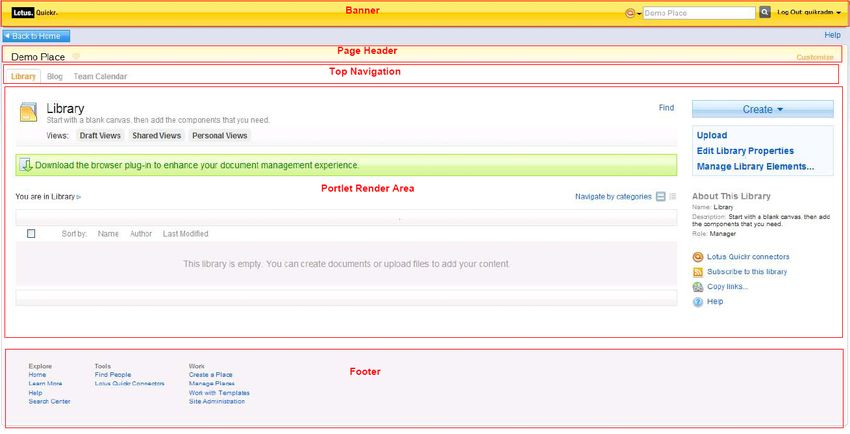
Theme Customization and Branding – J2EE Architecture
This article describes how to customize the out-of-the-box standard 8.1 Quickr Theme, and to modify
it to better match your organizations’ corporate identity.

As a starting point, we begin with this “look and feel” for Quickr, namely the standard 8.1 Quickr place
theme.

We illustrate how to arrive at a customized example Quickr place for the fictitious ITSO Millenia
Corporation, shown in the image below.

This article provides an analysis of the Quickr page layout and themes which make up a Quickr page,
then provides a step-by-step instruction on how to complete this customization.

3.1 Goals and scope of theme customization for this example

Quickr Themes allows you to add your unique graphic identity and look and feel to your
application while the Quickr server handles all the functionality.

In this chapter we first explain what a Theme is and which elements it contains, including the
stylesheet files, java script files, images, color palette and layout components such as HTML
and JSP. We will also include reference information for Quickr skin. We then walk through
the steps to get an existing Theme to modify and how to upload it once it is modified. We
discuss the process we used when creating the Theme for our sample company
ITSOMillennia Consulting. In the last section, deployment of customized theme using
XMLAccess and admin console is provided.

3.2 What is a Theme
A Quickr Theme controls the look and the layout of a TeamPlace: its fonts and background
colors; how an element looks when it is selected; where the navigational controls appear; and
so on. When you create a TeamPlace, you can select a Theme by choosing from a gallery of
predefined Themes. You can also modify an existing Theme or create a new Theme. Using a
custom Theme, you can give your TeamPlace a strong brand identity, or design it to look like
other corporate sites, or supply additional functionality as well as a unique look.

3.3 The Quickr theme layout architecture

This section provides an overview of the Lotus Quickr theme and its artifacts. By convention,
WebSphere Portal themes are broken down into four subfolders: colors, icons, images, and js
(javascript). Each of these folders contains a set of theme files as suggested by the folder
name. Essentially, a theme includes four main elements: Java Server Pages, stylesheets,
script files, and theme graphics that include image and icon files.

3.3.1 Explanation

The main theme fragments are:

   o   Theme Banner
   o   Page header
   o   Top Navigation row
   o   Page area (Portlet render area)
   o   Page footer

Figure 1: Theme Layout

So overall structure can be defined as :

Figure 2: Theme Layout
Banner

                      Breadcrumb Section

                           Page Header

                      Top Navigation Tabs

                             Page Area

                           Page Footer

3.3.2 Layout Components : Theme JSP

Java Server Pages are text documents that contain static data and dynamic data. Static data
can be expressed in any text format where dynamic data is used to construct the dynamic
content of the page. Lotus Quickr JSP files are located at the root of the QPG folder located
in the WebSphere Portal themes directory at:
was_profile_root/installedApps/cellname/wps.ear/wps.war/themes/html/QPG
The theme is composed of a set of files that consist of a parent JSP file and subsequent
fragments of the parent JSP. The fragment JSPs are included from within the parent JSP, and
by convention, they are saved with JSPF extensions. For most requests, the portal page is
rendered starting with Default.jsp in the themes directory unless the request has been
modified by a newWindow="true" parameter. In this case, the page is rendered using
Plain.jsp. Following figure shows an overview of all the theme files and how they are laid out
with respect to the parent file and to each other.

Figure 3: Theme file hierarchy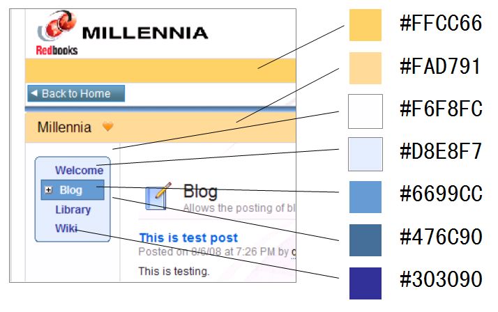
Default

                                             Page
   Head         Banner                                    Top nav      Side nav       Footer
                                            header

                              Global        Header
  Toolbar      Crumbtrail
                              actions       content

            Search
            control

Default.jsp is the parent JSP file that includes the JSP fragments (denoted by the JSPF
extension) and tag libraries that are needed to render the theme elements. The fragments are
compiled into the servlet for Default.jsp. Whenever you make a change to a fragment, resave
Default.jsp to force the servlet to recompile. Resaving Default.jsp ensures that the servlet
picks up the latest modifications to the fragments.

The head.jspf file is the first fragment included in Default.jsp. This file contains header
elements of an HTML page. In the Lotus Quickr theme, all the stylesheets and client-side
script files are linked from head.jspf. The page title and text direction are also set in this file.
For better performance, link any additional files added to the theme in head.jspf. This
approach consolidates all downloads to the beginning of the page and avoids retrieval in the
middle of page rendering.

The banner.jspf file, as suggested by its name, displays the page banner shown in figure
below. The banner includes the product logo, search box, and action links to login and
logout. It also includes the banner breadcrumb that displays the Back To Home button, a
button that lets you expand or compact the screen width, and Lotus Quickr help. Like
Default.jsp, the banner also includes fragment files that are compiled in banner.jspf.

These fragments are:
banner_toolbar.jspf. This fragment renders the toolbar at the top that includes the product
logo and search control box and links to login and logout.
banner_searchControl. This is a subfragment of banner_toolbar.jspf. It renders the search
control box at the right end of the banner toolbar.
banner_crumbtrails.jspf. This fragment renders the Back to Home link on a theme page.
banner_globalActions.jspf. This fragment contains the code that points to the links to
expand and compact the page width and to Lotus Quickr help.

Figure 4: Page banner
This section of the theme, contained in pageHeader.jspf and shown in figure below, displays
the application header. In this JSP, you can find the source that retrieves the application name
and favorite status. The Customize link that is displayed at the right end of the application
header is also rendered in this fragment. The Customize link displays a dynamic palette that
is rendered with pageHeaderContent.jspf and shown in figure 6.

Figure 5: Page Header

Figure 6: Customize palette

The pageHeaderContent.jspf file contains the source that renders the customize shelf. The
customize shelf provides the ability to add components, members, and new pages or to
modify the properties for an existing place.
The topNav.jspf file is a simple and short file that renders the tabbed navigation row that
allows users to switch between different components in the same application; see figure 8.
The fragment uses different styles to differentiate between the selected and unselected tabs.

Figure 7: Tabbed navigation

The sideNav.jspf file renders subpages created under the top-level navigation node in a place.
By default, child nodes to the parent page in a place are displayed in side-tree navigation. In
a later section of this article, we discuss an example to change the default styles to a
horizontal navigation style instead.
The footerLarge.jspf file renders the section at the bottom of the page that contains quick
links to commonly accessed areas of Lotus Quickr; see figure 9. The links are internal links
to portal pages, and they appear in an expanded or a collapsed state.

Figure 8: Footer

3.3.3 Images

Images are used for icons and tools in the theme pages. These files are placed in the images
folder at the root of the theme directory at:
was_profile_root/installedApps/cellname/wps.ear/wps.war/themes/html/QPG/images
When you customize a new theme, you can modify the existing image file or create new ones
and place them in the images directory.
Image files are spread across various subfolders that are created to keep the image files
grouped with respect to various sections of the page.

3.3.4 Stylesheets

The layout content is contained in the theme JSP files, but the presentation details of the
content are defined in stylesheets. Lotus Quickr stylesheets are located in the same folder
with the theme JSP files at:

was_profile_root/installedApps/cellname/wps.ear/wps.war/themes/html/QPG
Similar to the theme JSPs, the stylesheets are broken into several fragments that are included
from the parent stylesheet named styles.jsp. Stylesheets are saved as JSP files to
accommodate differences in locale and browser support. Similar to default.jsp, the parent
stylesheet must be recompiled to pick up the updates to the fragments included in it. Here is a
list of stylesheets and a brief description of the contents of each file:

styles_cacheSettings.jspf. Used to set the cache headers for all CSS JSPs.
styles_extension.jspf. Contains theme extension styles.
styles_help.jspf. Contains the styles used to render Lotus Quickr help content.
styles_ibm.jspf. Contains styles for the WebSphere Portal administrator portlet page.
styles_ibmportlet.jspf. Exclusive to the Lotus Quickr theme, contains styles used by the
document library and web content management components in Lotus Quickr.
styles_oobQuickr.jspf. Contains styles for the My Places Navigation portlet.
styles_people.jspf. Contains styles in the person card.
styles_portlet.jspf. Contains the default styles that are shipped with the IBM theme.
styles_qpg.jspf. Contains styles for Lotus Quickr administrative portlets only.
styles_rules.jspf. Sets browser- and locale-specific CSS rules.
styles_theme.jspf. Contains general theme styles that are used in the theme files and
fragments.
styles_themeSolo.jspf. Is included when the toolbar render is turned off. Adjusts the page
elements to display well without the toolbar.
3.3.5 Color palette

A color palette allows you to set the color scheme of the theme. In WebSphere Portal, the
color palette is defined by a property file that contains key value pairs holding references to
colors and graphics used in the theme. This is a useful concept that lets users change the
color scheme of the theme without making any changes to the stylesheets. You can assign a
color palette to an entire theme or to a single page depending upon the design requirements.
Refer to the section, "Using color palettes in the theme," in the WebSphere Portal Infomation
Center *1 to get details on creating, using, and referencing color themes in WebSphere Portal.

*1
http://publib.boulder.ibm.com/infocenter/wpdoc/v6r0/topic/com.ibm.wp.ent.doc/wps/dgn_co
lorpalet.html

Out of the box, the QPG theme uses the default color palette. You will reuse it in this
customization.

3.3.6     Theme policy

A theme policy is an XML file that controls how various parts of the theme are rendered on a
page. This design concept allows you to display a single theme in multiple ways.

Figure 9: Theme Policies

 Banner                         Tool bar                                                  Portal page hierarchy
                                                                                            Level1
   Level1   Level1    Level1             Top nav
                                                                                            Level1
 Level2
                                                                                                  Level2
 Level3
                                Banner                           Tool bar
 Level2         Contents                                                                                 Level3
  Side                           Level1     Level1     Level1             Top nav                 Level2
  nav
                                   Level2     Level2   Level2
Single TopNav
                                Level3
                                Level4
                                                                 Banner                       Tool bar
                                Level3        Contents
                                 Side                            Level1
                                 nav                             Level1
                               Double TopNav                     Level2        Contents
                                                                  Side
                                                                  nav

                                                                SideNav only

Theme policies are an important part of the theme and theme customizations. Lotus Quickr
installation is shipped with two policies used to render the Lotus Quickr pages:
QuickrMyPlaces and QuickrSpaces.

To set up a new policy, you must create and install it using the XML configuration utility as
described in the WebSphere Portal Information Center.*2
*2 http://publib.boulder.ibm.com/infocenter/wpdoc/v6r0/topic/com.ibm.wp.ent.doc/wps/dgn_th empolicy.html 3.4 The Quickr skin Skins represent the wrapper that goes around the components. They are made of row containers, column containers, and controls. The containers act as a wrapper for the inside portlet application, and the control section renders portlet controls. By default, Lotus Quickr uses QuickrSkin, which was designed specifically to work with Lotus Quickr themes and pages. In the "Getting Started" section of this article, we created a custom_skin from the default Lotus Quickr skin. This skin directory contains three main JSP files: UnlayeredContainer-H. This is the row container. UnlayeredContainer-V. This is the column container. Control.jsp. This renders the controls for the portlet application. 3.5 Millennia theme customization 3.5.1 Creating Millennia theme : Introduction To make modifications to the theme, you need administrative access to the Lotus Quickr server. The Lotus Quickr theme is shipped in a folder named “QPG” in the WebSphere Portal theme directory. The section that follows describes how to create custom themes and skins from Lotus Quickr and how to apply them to the desired team places. It also describes the steps you take to enable JSP reloading on the custom theme. This approach helps save development time when you make changes to the theme. Create a custom skin Lotus Quickr uses “QuickrSkin” as the default skin for the “QPG” theme. If you choose, you can create a new skin that is more suited to your custom environment. The skin files are located here : was_profile_root/installedApps/cellname/wps.ear/wps.war/skins/html/ Use the default skin called “QuickrSkin” as the starting point for your custom skin. To do this, copy the existing “QuickrSkin” folder to a new folder and rename that folder custom_skin. You can now set this skin as the default skin for your custom_theme. Create a custom theme To create your custom theme, first make a copy of the Lotus Quickr theme folder and rename that folder to a name that is appropriate to your theme. The WebSphere Portal theme files are located here:
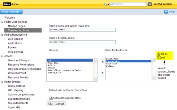
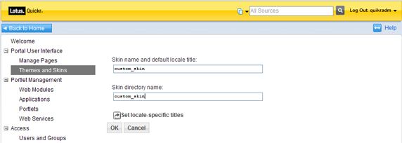
was_profile_root/installedApps/cellname/wps.ear/wps.war/themes/html

You need to make a copy of the “QPG” folder and paste that copy back into the WebSphere
Portal theme folder at the above location. After pasting it, you can rename the folder
custom_theme (in this case, “Millennia”). You are now ready to set the custom_theme on the
desired places in your workspace.

Set theme to a place

Your next step is to register your custom_skin and custom_theme with WebSphere Portal,
and then to set them both on the desired team places. To do this, you first need to create a
new theme in WebSphere Portal and point that to the custom_theme folder. Registering new
skins and themes will be done in Site Administration – Advanced Administration – Themes
and Skins.
Optional : If you created a custom_skin, first register your new skin by clicking the Add
New Skin button on this page. See figure 10.

Figure10. Adding a new skin

You are now ready to register your theme and set your custom_skin as the default skin for
your custom_theme. Choose Site Administration – Advanced Administration – Themes and
Skins – Add new theme.
The directory name listed on the WebSphere Portal site administration page must match the
folder name that you created in the WebSphere Portal theme directory. In this example, the
new theme name and directory name are both set to custom_theme. At this point, you have
the option to add any skins desired by your theme, and then to set the custom_skin as the
default skin. See figure 11.

Figure 11. Adding a new theme and setting the default skin on a theme
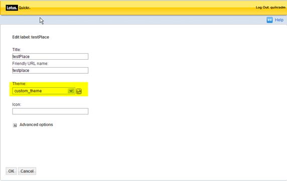
After you have created the new theme and registered it in WebSphere Portal, you can apply it
to one or more places. Choose Site Administration – Advanced Administration – Portal User
Interface – Manage Pages, and then follow these steps. See figure 12.

  1.   Click the content root under the My Pages header on the left side.
  2.   In the list of pages that appear on this page, navigate to your place under Application
       Root or search for it by typing its name in the search box.
  3.   Click the Edit Page properties icon for the desired place.
  4.   Select custom_theme from the drop-down box under Theme header, and then click OK.

Figure 12. Setting the theme on a place
At this point, you are ready to start applying your customization to the custom_theme.
Enable automatic JSP reloading
To view changes to your theme JSPs without restarting WebSphere Portal, you can force the
application server to automatically check for new versions of JSPs. Even though this is ideal
for development and testing purposes, you should disable automatic JSP reloading in a
production environment. Enabling automatic reloading forces the IBM WebSphere
Application Server engine to check the file system for updated files on every page refresh
and slows down the overall performance.
Follow these steps to enable automatic JSP reloading:
1. Open the file
was_profile_root/config/cells/cell_name/applications/wps.ear/deployments/wps/wps.
war/WEB-INF/ibm-web-ext.xmi.
2. Find the entry shown in listing 1 in this file.
Listing 1. ibm-web-ext.xmi file
3. Change the value for reloadingEnabled to true.
4. Save the file.
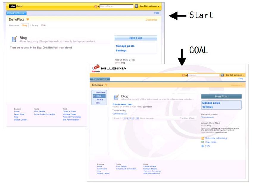
5. Restart WebSphere Portal.While this is ideal for development and testing purposes, automatic JSP reloading should be disabled in a production environment because of performance issues. *3 *3 http://publib.boulder.ibm.com/infocenter/wpdoc/v6r0/topic/com.ibm.wp.ent.doc/wps/dgn_rel oad.html 3.5.2 Customizing “Millennia” theme Start image and Goal image You have start point as “QPG” default theme and customize to "Millennia" as goal image like figure 13. Figure13. Start image “QPG” theme and Goal image “Millennia” theme You could settle the difference between the two by customizing. You notice the difference of colors, the structure of Banner part (“Millennia” has two lines) and navigation style (“Millennia” look like the SideNav), See wire frame figure 14. Figure14. Structural difference at wire-frame image
Customizing Lotus Quickr theme policy

We will create a new theme policy, starting from the default Lotus Quickr one. You can
export default Lotus Quickr theme policy using XMLAccess. See Listing 2.

For more information on XMLAccess, please refer to
http://publib.boulder.ibm.com/infocenter/wpdoc/v6r0/topic/com.ibm.wp.ent.doc/wps/adxmlts
k.html.

Listing 2. ExportThemePolicy.xml

              file:///c:/temp/exported_QuickrSpaces_ThemePolicy.xml

Locate this file at c:\temp for example (in case Windows), then in command prompt,

< portal_server_root>\bin\xmlaccess.bat –url /lotus/config –in
c:\temp\ExportThemePolicy.xml –user  -password
This command will create c:\temp\exported_QuickrSpaces_ThemePolicy.xml file. You can
rename this file to QuickrSideNavOnly_ThemePolicy.xml and edit it to perform the
following modifications :(edit to Bold value) :
Listing 3. Editing QuickrSideNavOnly_ThemePolicy.xml
:
theme
:
Side Navigation Only Theme Policy
:
QuickrSideNavOnly
:
0
:
false
:
3
:
0
QuickrSideNavOnly
Save your custom XML theme policy file .
You can import your new theme policy using the following XML file. See Listing 4.
Listing 4. AddThemePolicyNode.xmlfile:///C:/temp/QuickrSideNavOnly_ThemePolicy.xml
You could execute XML import at WebSphere Portal Admin page. Choose Site
Administration – Advanced Administration – Portal Settings – import XML, and then follow
these steps. See figure 15.
1. Select C:/temp/AddThemePolicyNode.xml for Directory: field.
2. Click the Import button.
Figure15. Import XML to add new theme policy
After you have installed the new policy in WebSphere Portal, it can be set on a page by
accessing Page properties under Manage Pages in Portal Site Administration. To do this,
follow these steps (see figure 16):
1. Search for the Application root under Manage Pages, Select Page > Content Root
(You may have to turn several pages).
2. Click the Edit page properties icon for the Application Root.
Figure 16. Application Root under Manage pagesFigure 17. Setting theme policy on a page
3. The desired policy “QuickrSideNavOnly” can be selected from the drop-down box
under Navigation Type on this page as shown in figure 17.
You find style has changed to “Quickr side navigation only” accessing Quickr place page
(figure 18).
Figure 18. Quickr Side Navigation Only styleNote: In our theme customization example (Millennia theme), we used the navigation
properties of theme policy to easily switch from one type of navigation to another. Changing
the theme policy for the Application Root page will set the theme policy for all Quickr places
(specific themes can be set on each Quickr place, while all Quickr places inherit from the
same theme policy).
Theme policies can be set on the Application Root page and a few other pages (homepage for
example).
If you want to use different navigation styles for different places, you have to build themes
that are independent from the theme policy from the navigation point of view.
Page background
You can update the page background image easily using the color palettes. The color palette
used by Lotus Quickr is default.properties.
To update your theme background, follow these steps:
1. Open default.properties located at custom_theme/colors.
2. Find property bodyMarginBackground = url(./colors/qpg/body_background.gif).
3. Update this property to point to your custom background image:
bodyMarginBackground = url(./colors/custom/body_background_ml.jpg)
4. Background of Toolbar and Body should be transparent. So update are following;
Listing 5. Update in colors/default.properties
bodyMarginBackground=url(./colors/qpg/body_background.gif) repeat-x
bodyBackground=#FFFFFF
toolbarBackground=#FFDB4A url(./colors/qpg/toolbar_background.gif) repeat-x
bodyMarginBackground=url(./colors/custom/body_background_ml.jpg) repeat-x
bodyBackground=transparent
toolbarBackground=transparent5. Next, resave styles_rules.jspf, styles.jsp, and Default.jsp. This step updates the
timestamps on all the files and forces the theme to recompile the files and to read the
color palette into the theme again. You should also check web browser cache must be
cleared. After these changes occur, the page background is updated to look similar to
the one shown in figure 19.
Figure 19 After page background is updated
Theme banner
The next step is to update the logos in the theme designed for the custom team place. Lotus
Quickr banner table structure also be target for customization. Follow the steps listed here to
tailor the banner to your custom environment.
Figure 20 displays the banner logo highlighted in pink. You can update this to a custom logo
by making modifications in the banner_toolbar.jspf file that is located in /custom_theme.
Figure 20. Banner logoFind the text shown in listing 6. and update the file path parameter value to point to your
custom logo file (in Bold).
Listing 6. Banner title element in banner_toolbar.jspf
The banner is updated to look like the image shown in figure 21.
Figure 21. The Millennia banner
Another row table is needed for search bar, login/logout and user profile link. It can be
modified by tag.
In the styles_theme.jspf file located at /custom_theme root, add original class .toolbar-second
as shown in listing 7.
Listing 7. Toolbar-second style definition in styles_theme.jspf
.toolbar-second {
background-color: #FFCC66;
border: 1px solid;
border-top-color: ${colors.bodyBorder};
border-bottom-color: ${colors.bodyBorder};
border-right-color: #FFCC66;
border-left-color: #FFCC66;
}
Orange color use #FFCC66. You had better collect information about updated colors for new
theme in advance. (See figure 22)Figure 22. Update color information in Millennia theme Then update again the banner_toolbar.jspf file as shown in listing 8.
Listing 8. Add  element and comment out toolbarShadow in banner_toolbar.jspf

 :
 :
 --%>

 :
 :
 --%>
The banner margin and padding can be modified in the style file. Image can be updated
respectively. toolbarShadow can be reused at bottom of banner.

Listing 9. Update margin and padding in styles_theme.jspf

 .banner {
         color: ${colors.bannerText};
         background: ${colors.bannerBackgroundImage};
         background-color: ${colors.bannerBackground};
         margin: 0px;
         padding: 0px;
         border: 1px solid ${colors.bodyBorder};
 }

 .bannerTitle{
         font-size: ${requestScope.cssRules.fontSize.large};
         color: ${colors.bannerTitleText};
         font-weight: bold;
         padding-${requestScope.cssRules.bidiLeft}: 10px;
 /*      padding-top: 4px;      */
 /*      padding-bottom: 4px;   */
         padding-top: 0px;
         padding-bottom: 3px;
         float:${requestScope.cssRules.bidiLeft};
 }

 .toolbar {
     color: ${colors.toolbarText};
     background:${colors.toolbarBackground};
     margin-${requestScope.cssRules.bidiRight}: 0px;
 /*    border-bottom: 1px solid ${colors.toolbarBorder};       */
 /*    border-left: 1px solid ${colors.toolbarBorder};         */
 /*    border-right: 1px solid ${colors.toolbarBorder};        */
 /*    padding: 7px 5px; */
     padding: 0px 0px;
 /*      -moz-border-radius-bottomright: 4px; */
 /*      -moz-border-radius-bottomleft: 4px;          */
 }

 .toolbarShadow {
     background:${colors.toolbarShadowBackground};
 /*    height: 4px;     */
     height: 6px;
     padding: 0px;
 /*    margin: 0px 3px 0px 3px;        */
 }

 a.returnHome{
 /*      background: #2e93e2
 url(images/quickr/returnHome_${requestScope.cssRules.bidiLeft}.gif) center
 ${requestScope.cssRules.bidiLeft} no-repeat; */
         background: #476C90 url(colors/custom/returnHome_left_ml.gif) center
 ${requestScope.cssRules.bidiLeft} no-repeat;
         border: 1px solid ${colors.breadcrumbBorder};
         padding: 1px 15px !important;
         display: block;
 }
Listing 10. Update menu icon in banner_toolbar.jspf Listing 11. Add toolbarShadow in banner.jspf
Listing 12. Update in colors/default.properties

 toolbarShadowBackground=url(./colors/qpg/toolbar_shadow.gif) repeat-x

 toolbarShadowBackground=url(./colors/custom/toolbar_shadow_ml.gif) repeat-x

The banner should be updated to look like the one shown in figure 24.

Figure 24. Updated banner

Page area

The following section provides guidance on updating the page area in the Lotus Quickr
theme. As indicated by the name, the page area in the theme is wrapped in a  tag with
the ID value pageArea. This  tag acts as a wrapper for the page header, the top /side
navigation, portlet render area, and the page footer.

The page header, shown in figure 25, is the first section rendered within the page area. This
space is used to display the application title, the application favorite status, and the
Customize link that allows users to control access to the place and add pages or components
to a place. Common customizations to this section include updating the background image,
font styles, and header dimensions.

Figure 25. Page header

Here are a few examples of different customizations for the page header.

Background is updated from image to color. Padding is omitted and bottom border is added.

Listing 13. Update in colors/default.properties

 customizeBackground=transparent url(./colors/qpg/barBack.gif)

 customizeBackground=#FAD791
Listing 14. Update pageArea style definitionnt in styles_theme.jspf

 #pageArea {
     background-color: ${colors.bodyBackground};
     border: 1px solid ${colors.bodyBorder};
 /*    padding: 2px;     */
     padding: 0px;
     -moz-border-radius: 4px;
 }

 #pageHeader {
     background: ${colors.customizeBackground} top
 ${requestScope.cssRules.bidiLeft} repeat-x;
     padding: 2px;
     border-bottom: 1px solid ${colors.bodyBorder};
 }

After these changes are made, the page header now looks similar to the one shown in figure
26.

Figure 26. Page header after updates

Figure 27 shows the side navigation row that contains all the pages for a team place. The
section of the theme has scope for some advanced customizations.

Figure 27. Side navigation

Default side navigation has simple look and feel. Let's build unique menu area for side
navigation with original style class (as shown in listing 15-16).
Listing 15. wpsSideNav style definition in styles_theme.jspf
.wpsSideNav{
font-size: ${requestScope.cssRules.fontSize.normal};
border: 1px solid;
border-color: ${colors.sideNavBorder};
text-decoration: none;
white-space:nowrap;
background-color:${colors.sideNavBackground};
/* margin-top:0px; */
/* margin-bottom:0px; */
/* margin-${requestScope.cssRules.bidiLeft}: 0px; */
/* padding-${requestScope.cssRules.bidiLeft}: 0px; */
font-weight: bold;
margin: 15px 10px 15px 10px;
padding: 4px;
-moz-border-radius: 6px;
/* This is a fix for the IE peekaboo bug */
{height: 1%;}
}
.wpsSideNav-box {
background-color: #F6F8FC;
border-right: 1px solid;
border-bottom: 1px solid;
border-color: ${colors.bodyBorder};
}
Listing 16. Add class to sideNav in Default.jspFigure 28. Side navigation after updated styles
It is necessary to superadd color data in side navigation and borders. The example in listing
17-18 shows how to update style definitions.
Listing 17. Update wpsSideNav style definition in styles_theme.jspf
.wpsSideNav .wpsNavItem a {
display: inline;
border: 0px !important;
}
.wpsSideNav .selected{
color: ${colors.sideNavSelectedText} !important;
background-color: ${colors.sideNavSelectedBackground};
text-decoration: none;
padding:3px 3px;
display:block;
cursor:default;
white-space:nowrap;
border: 1px solid;
border-color: ${colors.sideNavSelectedBorder};
margin:0px 2px 0px 2px;
}Listing 18. Update in colors/default.properties sideNavText=#000 sideNavTopLevelText=#000 sideNavBackground=#FFF sideNavBorder=white sideNavTopLevelBorder=#E6E6E6 sideNavSelectedBackground=#777777 sideNavSelectedBorder=#E6E6E6 sideNavText=#303090 sideNavTopLevelText=#303090 sideNavBackground=#D8E8F7 sideNavBorder=#476C90 sideNavTopLevelBorder= sideNavSelectedBackground=#6699CC sideNavSelectedBorder=#476C90 At this point, your team place looks like the one shown in figure 29. Figure 29. Side navigation after updated styles The last step is to update portlet style. Frame of portlet is decorated by skin, but some portlet style depend on which theme include. the purpose is to give the consistency of externals between theme and skin.
Listing 19. Update portlet side bar style definition in styles_ibmportlet.jspf

 .ibm-portlet-sidebar .primary-action-section BUTTON {
 /*   background: #E6F0FC url(./images/portlet/buttonBg.gif) left center
 repeat-x; */
 /*   color: #0063DC; */
    background: #E6F0FC url(./colors/custom/buttonBg_ml.gif) left center
 repeat-x;
    color: #FFFFFF;
    border: 1px solid #9acae8;
    padding: 0.2em 0.5em;
    cursor: pointer;
 }

 .ibm-portlet-sidebar .action-section {
 /*    background-color:#F6FBFF;            */
 /*    border:1px solid #C2E2F4;            */
    line-height: 1.4em;
    padding: 0.5em;
    padding-bottom: 0;
    margin-bottom: 2em;
    background-color:#D8E8F7;
Figure 30. Portlet side bar area before and after updated styles
    border:1px solid #476C90;
    -moz-border-radius: 6px;
 }

The final result is shown in figure 31.

Figure 31. Updated view of the place
3.6 Deploying customized theme and skin 3.6.1 Deploying themes and skins in a production environment Theme and skin JSPs are managed as part of the main WebSphere Portal enterprise application and are thus part of the WebSphere Portal EAR file. The WebSphere Portal EAR file must be updated and redeployed when adding new themes and skins. Failure to do this could cause the custom themes and skins to be deleted when the EAR file is subsequently updated. To update and redeploy the EAR file with the new themes and skins, follow the instructions in the WebSphere Portal Information Center.*4 *4 http://publib.boulder.ibm.com/infocenter/wpdoc/v6r0/topic/com.ibm.wp.ent.doc/wps/dgn_dp ycst.html 3.6.2 Install theme and skin into Quickr As already described in this chapter, to install the theme deployed to Quickr, Administrative portlet “Themes and Skins” is used. Alternative way is provided by XMLAccess. Sample file shown in listing 20.
Listing 20. DeployTheme.xml

                          customSkin
                 A customSkin!

                          A customTheme

Further information is in the WebSphere Portal Information Center.*5
*5
http://publib.boulder.ibm.com/infocenter/wpdoc/v6r0/topic/com.ibm.wp.ent.doc/wps/admxm
smp.html

See also support information about PK63234 *6 for Lotus Quickr 8.1 services for Portal.
*6
http://www.ibm.com/support/docview.wss?uid=swg21307594

3.7 Summary

This chapter summarizes common customizations to the Lotus Quickr theme for WebSphere
Portal. It describes how to create a new theme and skin and how to apply it to a place. It also
talks about the theme components and the role that each component plays in the theme.
Finally, the chapter went over individual theme sections and provided examples of common
customizations to modify the theme.
You can also read


