ABSTRACT Create Interactive Data Visualizations for Clinical Data Review Using Base - PharmaSUG
←
→
Page content transcription
If your browser does not render page correctly, please read the page content below
PharmaSUG 2019 - Paper AD-197
 Create Interactive Data Visualizations for Clinical Data Review Using Base
                            SAS® and JavaScript
                                         Raj Kiran Boddu, Takeda

ABSTRACT
Is your organization stuck between the slowness of building custom reports for data review, versus the
cost of JMP®? Learn how to leverage free, open source JavaScript libraries together with the power of
Base SAS® and build interactive visualizations and dashboards that are web-based, shareable and have
drill down, filtering and cross-filtering capabilities. With the help of macros and specific examples, this
paper will show you how to recreate common visualizations produced by off-the-shelf software like JMP®.
While the use case is of particular interest to programmers who support clinical data review, the concepts
and techniques can be applied in many areas in Pharma and other industries.

INTRODUCTION
Traditionally, clinical data review has been conducted using pre-defined reports including graphics built by
a programmer with Base SAS®. Although these graphics help to understand complex data, it is very hard
to investigate any relationships and patterns in data due to their static nature. Interaction enables one to
adjust a visualization to their own needs and ask it different questions. It helps us in exploring data and
sharing detailed insights in an efficient way. Interactive clinical data visualizations support common use
cases including:
    1) Risk based monitoring and remote site monitoring.
    2) Identification of data issues.
    3) Identification of covariates and feature analysis for modelling.
    4) Identification of safety signals in large amounts of data.
    5) Sharing results with stakeholders.

There are several ways one can create an interactive data visualization. There are lot of modern tools in
the market such as Tableau®, Microsoft Power BI®, Qlik®, Tibco Spotfire®, JMP®. These tools need some
investment to buy and maintain licenses. Depending on the extent of usage, this might be a worthwhile
approach, but can also become expensive to scale for large number of users. Base SAS® has gained
near ubiquitous usage for clinical data review. But, there is very limited ability to create interactive
visualizations using Base SAS®. By adding the ability to create interactive visualizations to Base SAS®
one would keep the costs lower and be able to better review data. This paper describes an alternative
technique to create such visualizations using Base SAS® and JavaScript.

In this paper, I have put forth the methodology, using SAS macros, to create two common interactive data
visualizations available in JMP Clinical. JMP Clinical is an extension to JMP and provides a set of pre-
built scripts which create reports for clinical data exploration and support the use cases mentioned above
and much more.

OVERVIEW OF METHODOLGY

Figure 1 illustrates the basic mechanism by which an Interactive visualization works. Most commonly, an
interactive data visualization involves one or more graphic representations of the data that are designed
to react to user actions on it. For Example, clicking a data point on a scatter plot will trigger an event and
a query is generated which includes details of the point. This query can also be generated in other

                                                       1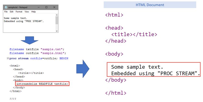
widgets like dropdown select boxes. Interactive data visualizations are always connected to the data
source. This way, when a query is generated, it is propagated to the data and results are propagated to
the other graphics. The graphics are then updated to either highlight the points included in the results or
filter them.

Figure 1. Mechanism of Interactive Data Visualization

Traditional methods to achieve this is using a server-based technology that can query the data source
and send the results back to the front end to update the visualization. But, these results can not be
shared with people who do not have access to the server. For a sharable, interactive visualization, we
need to package the data, the graphic and the connection logic into one portable file.

HTML is a file format that is widely used and can be accessed from any modern personal computer. A
single HTML file is made up of several components.
    1) HTML is a markup language that creates visible elements on a HTML page.
    2) JavaScript is another language that is used to control the behavior of the HTML elements.
    3) Cascading Style Sheets (CSS) is used to control the appearance of the HTML elements.
Although all three of them are used in creating the interactive data visualization, for our purpose, we will
focus on HTML and JavaScript parts.

The methodology described in this paper uses custom HTML and JavaScript code to create the graphics
and widgets on a HTML page. Unlike the graphics created by ODS HTML, the graphics created by this
approach are dynamic and react to user actions

                                                      2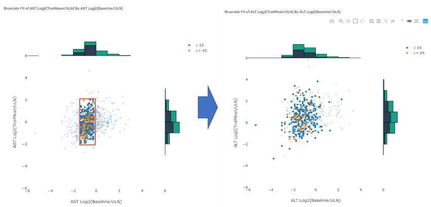
The HTML code is used to create a HTML page from scratch and assign placeholders for the widgets and
the graphics. We can customize the HTML code to arrange these elements the way we like.
The JavaScript code performs some crucial functions on the page:
    1) Create the initial graphic and populate the widget using the data.
    2) Generate a query when a user performs any action on either the graphic or the widget.
    3) Query the data and send results back to the graphic.
    4) Update the graphic based on the results of the query.

Figure 2. Role of HTML and JavaScript code

PLOTLY AND CROSSFILTER

Writing JavaScript can get complicated if we only use JavaScript as-is. Instead, JavaScript libraries
provide a set of helper functions that can be used to do specific jobs.

Plotly is an open-source JavaScript library that can be used to create visualizations in Scalable Vector
Graphics (SVG) format and embed them on a HTML page. It can be used to create over 20 chart types,
including 3D charts, statistical graphs, and maps. These graphics are dynamic in nature and provide an
interactive interface. Whenever the user interacts with these graphics, they react by triggering an event
query which includes information regarding the interaction.

One of the major challenges in creating interactive visualization with multiple graphics is the
communication between the graphics. This is because, these graphics do not know what other graphics
are on the same display. Moreover, it can not provide the specific information that the other graphics
need to update. So, a direct communication between the graphics is not possible.

                                                     3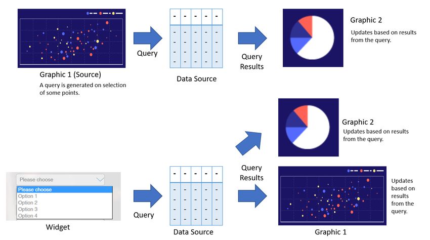
A tool that is useful for adding filtering and cross-filtering capabilities to our visualization is Crossfilter.
Crossfilter.js is a JavaScript library for exploring large multivariate datasets in the browser. This library
links together the graphics and the widgets on a HTML page with the data. It also provides useful
functions that are used by the graphics to query the data and get the information they need specific to the
creation of that graphic. This way, anytime the filters are applied, the filter queries are propagated to the
Crossfilter instance and the query is resolved to generate results. The graphics on the page can then get
the information they need to be updated.

Figure 3. Communication between different components of Interactive data visualization

We can import both these libraries into the html page using the following code:

Once Imported, we can use the methods and functions available from these libraries to create our desired
interactive visualization. In addition to these libraries, a small amount of custom JavaScript is also used to
efficiently manage all the functionality.

BASE SAS® PROCEDURES USED

Instead of writing custom HTML and JavaScript code manually, we can use Base SAS® procedures to
generate the HTML and JavaScript code, that create interactive visualizations. This way, we can build
custom visualization using SAS datasets.

                                                       4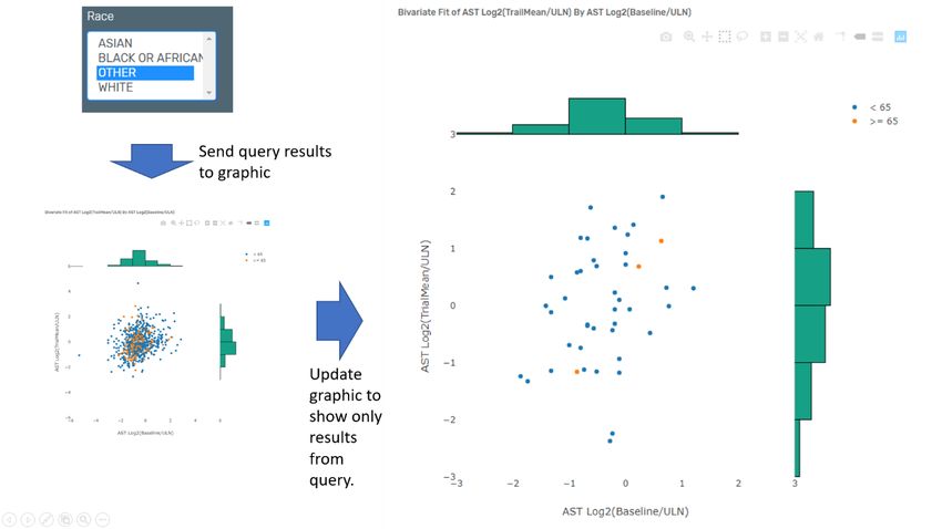
THE STREAM PROCEDURE
The STREAM Procedure has been added to Base SAS® in version 9.4. This procedure allows us to write
HTML and JavaScript code together with SAS statements in the same program. It also allows the use of
SAS macro logic mixed with HTML or JavaScript code. Another feature of the STREAM Procedure is that
it allows us to embed the contents of an existing file into the output file.

Figure 4. Example of the STREAM Procedure to create HTML output.

Figure 5. Example of the STREAM Procedure to create JavaScript output

                                                 5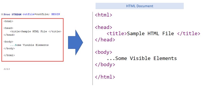
Figure 6. Example of the STREAM Procedure to embed the contents from an existing file
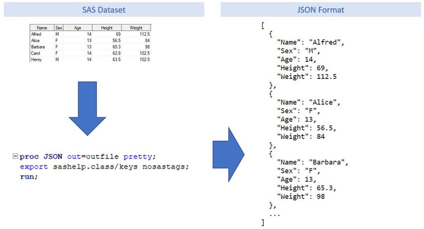
THE JSON PROCEDURE
The HTML file created using the above method cannot have a connection to the data source in SAS
dataset format. So, we need to store the data inside the HTML document in a format that is readable by
the browser. JSON is a light weight format to store data for web-based documents. The JSON Procedure
is used to convert the SAS dataset to JSON format and the STREAM Procedure is used to write it to the
HTML document.
Figure 7. Example of the JSON Procedure
6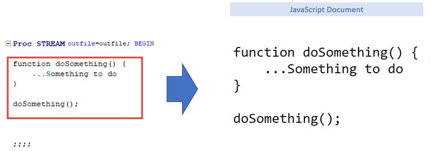
MACRO FRAMEWORK FOR CREATING INTERACTIVE VISUALIZATIONS

The approach described in the paper uses a set of custom SAS macros that are modular in nature. Each
SAS macro has a specific function, that can be used together to create custom interactive data
visualizations. Full code and examples are available at https://rajkboddu.github.io/PharmaSUG2019.html.

MACRO INIT
The INIT macro initializes the files needed for creating the visualization. Each of the components
(graphics or widgets) use both HTML and JavaScript code. To be efficient, we are going to use temporary
files in SAS memory to write the relevant parts and the finally put them together. The INIT macro is used
to create these temporary files.

MACRO DATA
The DATA macro uses the JSON Procedure to convert the dataset into JSON format. Then the STREAM
Procedure is used to write it to the HTML file. Since all the widgets and graphics use this data, they will
always get the current state of data.

MACRO FILTERS
This macro writes HTML code to the document that creates a placeholder on the HTML document for
each of the variables. It writes the JavaScript code which queries the data and finds the distinct values for
each variable and populates the selection options in the corresponding placeholders. It also writes the
JavaScript logic that tells the browser to query the data for the selected items and perform the update to
the graphics, whenever the user selects one or more items.

MACRO SCATTER
This is the main macro that creates the graphics. It writes the HTML code to the document that creates
the placeholder for scatterplot using the variables provided. Writes the JavaScript code to create the
graphic and put it in the placeholder assigned for it. Writes JavaScript code that has the logic to tell the
browser to query the data for the selected points and perform updates to other graphics, whenever the
user selects one or more points on the graphic. This includes functionality for cross-filtering as well as
resetting when the selection is removed.

MACRO COMPILE
The compile macro stiches together all the files created earlier into a html file. This file can be opened in
the browser to display the visualization.

                                                       7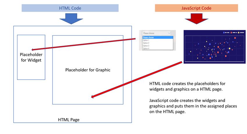
Figure 8. Flowchart of Macros writing to different temporary files

EXAMPLES
Before we look at the code and learn about how I used all these techniques to output an interactive
visualization, let’s look at some example visualizations. Full code and examples are available at
https://rajkboddu.github.io/PharmaSUG2019.html.

FINDINGS SHIFT PLOTS
Figures 9 and 10 are screenshots of an interactive data visualization that display scatter plots for each
finding with log2(Baseline value/ULN) on x axis versus log2(Trail Mean value/ULN) on y axis for each
subject. The histograms show the distribution of values on each axis. Selecting points on the scatter plot
will overlay distribution of selected points in the respective histograms. Also, other plots on the same
page will highlight the points corresponding to selected data. Selecting one or more values from the
filtering pane on the left, will filter the data and refresh the plots on the page with only the filtered values
displayed. Hovering over each point will display tooltip with additional information regarding that point.

Figure 9. Screenshot of cross-filtering

                                                        8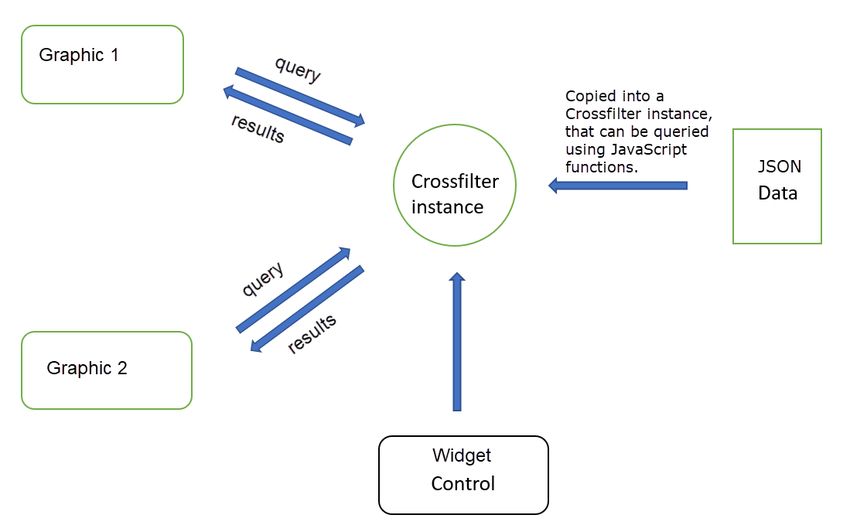
Figure 10. Screenshot of filtering using a widget
The following is the description of the dataset that is used for creating the Findings Shift plots. The
dataset is already aggregated and structured at subject level. The creation of this dataset using the raw
findings values is out of scope for this paper.

                         NAME                            LABEL
                         AGEGR1                          Age Group 1
                         ALT_Log2_Baseline_ULN_          ALT Log2(Baseline/ULN)
                         ALT_Log2_TrialMean_ULN_         ALT Log2(TrialMean/ULN)
                         AST_Log2_Baseline_ULN_          AST Log2(Baseline/ULN)
                         AST_Log2_TrialMean_ULN_         AST Log2(TrialMean/ULN)
                         RACE                            Race
                         SEX                             Sex
                         USUBJID                         Unique Subject Identifier
Table 1. Description of variables in the input dataset for Findings Shift Plots

The following SAS code is used for generating the Findings Shift Plots:

data findings;
 set psug.Findings_Shift_Plots;
run;

                                                     9
%init;
%data(findings);
%filters(data=findings,vars=SEX RACE);
%scatter(name=alt,data=findings,x=alt_log2_baseline_uln_,
y=alt_log2_trialmean_uln_,color=AGEGR1,hist=y);
%scatter(name=ast,data=findings,x=ast_log2_baseline_uln_,
y=ast_log2_trialmean_uln_,color=AGEGR1,hist=y);
%compile(htmlout=findings_shift_plot.html,
title=Findings Shift Plots);
AE EXPLODING VOLCANO PLOT
Figure X is a screenshot of an interactive data visualization that displays incidence rate of adverse
events. Each term is displayed as a bubble. The terms can be filtered using the filter pane on the left. The
X axis is the Risk Difference. The Y axis is -log10(Raw p-value). The size of the bubble is the number of
subjects with that event and the color indicates the Relative Risk towards one or the other treatments.
The “Play” and “Pause” buttons control the animation in the plot. When we click on play button, the graph
animates to show the plot over the course of selected time intervals. The animation can also be controlled
by adjusting the slider next to the buttons.
Figure 11. Screenshot showing the change in position of the marker for Hypotension
10The following is the description of the dataset used to create the AE exploding volcano plot.
NAME LABEL
AEBODSYS Body System or Organ Class
Count Number of subjects
NegLog10_Raw_p -log10(Raw p-value)
RR Relative Risk
RiskDiff Risk Difference
TimeWindowNum Time Window based on Study Days
Table 2. Description of variables in the input dataset for AE exploding volcano plot
The following SAS code is used for generating the AE Exploding Volcano plot:
data AE;
set psug.AE_Incidence;
run;
%init;
%data(AE);
%scatter(name=aevolcano,data=AE,x=RiskDiff,y=NegLog10_Raw_p,color=RR,
size=Count,frames=TimeWindowNum,ID=AEDECOD);
%compile(htmlout=aeincidence.html,title=AE Volcano Plot);
The %scatter macro call in this example is little different. Here, we are using some additional parameters
to specify the variables which have the values for size of the bubble and the frames for animation, i.e.
time windows. The ID parameter is used to tell the graphic to track the changes in values based on ID
value.
CONCLUSION
For a successful trial, analysis of study data needs to be effecient and areas requiring special attention
flagged quickly. In addition, too much unnecessary information can be as burdensome. Solutions are
needed that can filter through the data, allowing for smarter decision making, and when necessary, quick
intervention. Sponsors and study teams may benefit from interactive data visualizations to efficiently
explore trial data. This paper illustrates two examples of interactive visualizations that are available
through JMP Clinical package and describes how to create them using Base SAS® and JavaScript
technologies. Although the examples shown are limited to using %scatter macro and use Plotly and
Crossfilter JavaScript libraries to render the interactive visualization, the techniques can be extended to
create a set of other macros that create other types of graphics or using other libraries. By doing so, we
can build custom interactive plots easily and share them without a requirement of expensive software.
11REFERENCES
Plotly. “plotly.js | JavaScript Graphing Library.” Accessed April 29, 2019. https://plot.ly/javascript/.
Square, Inc. “Crossfilter.” Accessed April 29, 2019. https://square.github.io/crossfilter/.
SAS Institute Inc. “SAS® Help Center: Syntax: PROC STREAM.” Accessed April 29, 2019.
https://go.documentation.sas.com/?docsetId=proc&docsetTarget=p06pqn7v5nkz02n0zkpq7832j1yp.htm&
docsetVersion=9.4&locale=en.
SAS Institute Inc. “SAS® Help Center: Syntax: PROC JSON.” Accessed April 29, 2019.
https://documentation.sas.com/?docsetId=proc&docsetTarget=p06hstivs0b3hsn1cb4zclxukkut.htm&docs
etVersion=9.4&locale=en.
SAS Institute Inc. “Clinical Data Analysis Software | JMP Clinical.” Accessed April 29, 2019.
https://www.jmp.com/en_my/software/clinical-data-analysis-software.html.
SAS Institute Inc. “Findings Shift Plots | JMP Clinical.” Accessed April 29, 2019.
https://www.jmp.com/support/downloads/JMPC71_documentation/Content/JMPCUserGuide/OP_C_FI_00
03.htm.
SAS Institute Inc. “AE Incidence Screen | JMP Clinical.” Accessed April 29, 2019.
https://www.jmp.com/support/downloads/JMPC71_documentation/Content/JMPCUserGuide/OP_C_EV_0
004.htm.
“Plotly.js + Crossfilter.js.” Accessed April 29, 2019. https://plotly.github.io/plotly.js-crossfilter.js/.
ACKNOWLEDGMENTS
I would like to thank Manuela Koska, Vanessa Hayden and entire programming team at Takeda for their
valuable feedback and support.
CONTACT INFORMATION
Your comments and questions are valued and encouraged. Contact the author at:
Raj Kiran Boddu
Takeda
rajkboddu@gmail.com
Any brand and product names are trademarks of their respective companies.
12You can also read