Daily report 30-04-2020 - Analysis and prediction of COVID-19 for different regions and countries
←
→
Page content transcription
If your browser does not render page correctly, please read the page content below
Daily report 30-04-2020
 Analysis and prediction of COVID-19 for
 different regions and countries

Situation report 45 Contact: clara.prats@upc.edu

 With the financial support of
Foreword The present report aims to provide a comprehensive picture of the pandemic situation of COVID‐19 in the EU countries, and to be able to foresee the situation in the next coming days. We employ an empirical model, verified with the evolution of the number of confirmed cases in previous countries where the epidemic is close to conclude, including all provinces of China. The model does not pretend to interpret the causes of the evolution of the cases but to permit the evaluation of the quality of control measures made in each state and a short-term prediction of trends. Note, however, that the effects of the measures’ control that start on a given day are not observed until approximately 7-10 days later. The model and predictions are based on two parameters that are daily fitted to available data: a: the velocity at which spreading specific rate slows down; the higher the value, the better the control. K: the final number of expected cumulated cases, which cannot be evaluated at the initial stages because growth is still exponential. We show an individual report with 8 graphs and a table with the short-term predictions for different countries and regions. We are adjusting the model to countries and regions with at least 4 days with more than 100 confirmed cases and a current load over 200 cases. The predicted period of a country depends on the number of datapoints over this 100 cases threshold, and is of 5 days for those that have reported more than 100 cumulated cases for 10 consecutive days or more. For short-term predictions, we assign higher weight to last 3 points in the fittings, so that changes are rapidly captured by the model. The whole methodology employed in the inform is explained in the last pages of this document. In addition to the individual reports, the reader will find an initial dashboard with a brief analysis of the situation in EU-EFTA-UK countries, some summary figures and tables as well as long-term predictions for some of them, when possible. These long-term predictions are evaluated without different weights to data- points. We also discuss a specific issue every day. Martí Català Clara Prats, PhD Pere-Joan Cardona, PhD Sergio Alonso, PhD Comparative Medicine and Bioimage Centre of Enric Álvarez, PhD Catalonia; Institute for Health Science Research Miquel Marchena Germans Trias i Pujol Daniel López, PhD Computational Biology and Complex Systems; Universitat Politècnica de Catalunya - BarcelonaTech With the collaboration of: Guillem Álvarez, Oriol Bertomeu, Laura Dot, Lavínia Hriscu, Helena Kirchner, Daniel Molinuevo, Pablo Palacios, Sergi Pradas, David Rovira, Xavier Simó, Tomás Urdiales PJC and MC received funding from “la Caixa” Foundation (ID 100010434), under agreement LCF/PR/GN17/50300003; CP, DL, SA, MC, received funding from Ministerio de Ciencia, Innovación y Universidades and FEDER, with the project PGC2018-095456-B-I00; Disclaimer: These reports have been written by declared authors, who fully assume their content. They are submitted daily to the European Commission, but this body does not necessarily share their analyses, discussions and conclusions. 1
(0) Executive summary – Dashboard

 2
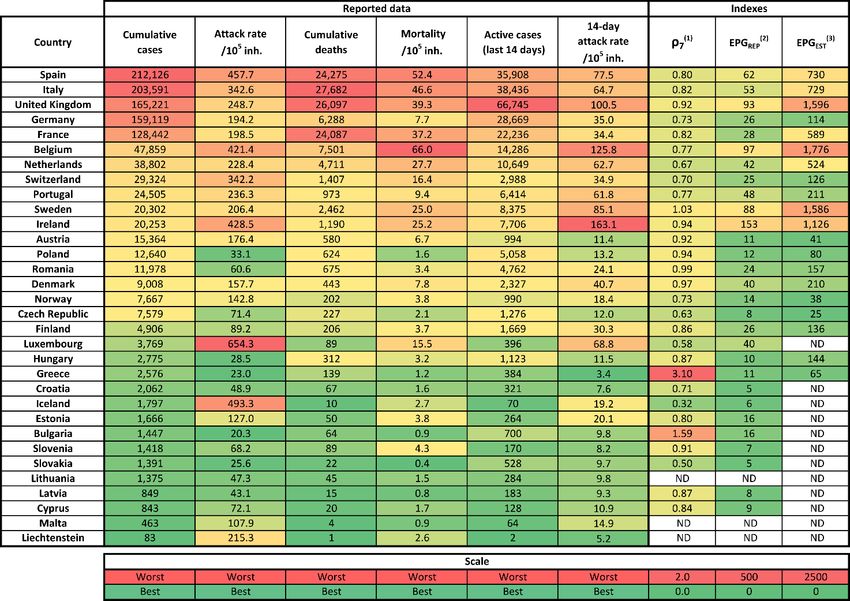
Global EU+EFTA+UK trends and needs
In most EU + EFTA + UK countries the
intensity of the pandemic is
declining. Many of them are
entering a new stage that suggests
many questions. What the evolution
of the pandemic will be after
controlling its growth? Will we have
significant new outbreaks? We must
be realistic: we do not know, since
the last big pandemic was in 1918.
Thus, we have no experience. We
need to observe the behaviour of
countries that are already at this
stage, such as South Korea. Let us
look at 4 European countries, those
that exceeded 20,000 cases but
that are more or less efficiently
controlling the final stage: Austria, Poland, Romania and Denmark. Currently, all of them have few new cases
and their ρ7 is around 1. Austria has been a country heavily affected by the pandemic, with a cumulative
incidence of 171 cases per 105 inhabitants, reached 1141 new cases in a single day (12.7 new cases per 105),
but has managed to control the situation. Last five days has an average of 59 new cases per day (2.7 per 105
inh.). Poland managed to slow down growth before it reached worrying values, but it has remained several
weeks at around 350 new cases daily, which is the average of the last 5 days (0.9 by 105). A similar situation
is found in Romania, with an average of 312 new cases per day in the last 5 days (1.6 per 105). Finally,
Denmark, with an average of 160 new cases in the last 5 days (2.7 per 105). By the moment, the conclusion
we can extract is that it is very difficult to end the last phase of the pandemic, which points to a long tail.
Further decrease in incidence is clearly a challenge. Countries with much higher incidences have to look
closely at these four countries to be prudent in their decisions. Indeed, it is very different to stabilize the tail
at 1 new case per 100,000 inhabitants or at 3, 4 or 5 per 100,000 inhabitants.

Trends for specific countries
Belgium, Sweden, UK and Ireland have a high EPGEST (1776, 1596, 1586 and 1126, respectively). The causes
of this situation need to be analysed. In today's analysis we discuss the situation in Sweden. At the other
extreme we find Slovakia and Croatia, which have only reached a cumulative incidence of 26 and 49 per
100,000 inhabitants. This is an incidence 9 and 18 times lower than that found in Spain, respectively.

 3
Situation and trends per country Table of current situation in EU countries. Colour scale is relative except when indicated, this means that it is applied independently to each column, and distinguishes best (green) form worst (red) situations according to each of the variables. New! Last column (EPGEST) indicates EPG assessed with estimated real 14-day attack rate (see report 39 for details). EPGREP is calculated with data reported by countries. EPGREP and EPGEST cannot be compared between them because scales are different, but can be independently used for estimating risk of countries according to reported or estimated real situation, respectively. (1) ρ3 is the average of 7 consecutive ρ, but can still fluctuate. (2) EPG stands for Effective Growth Potential. EPGREP is obtained by multiplying attack rate of last 14 days per 105 inhabitants (i.e. density of cases) by ρ3 (a value related with effective reproduction number and that, therefore, determines the dynamics for subsequent days). EPGEST is obtained by multiplying estimated real attack rate of last 14 days per 105 inhabitants by ρ3. Highlights for countries with highest number of reported cases Among the 5 countries most affected by the disease, the only one with a still complicated situation is the UK. Germany is in a really good situation. If we look at Spain, Italy and France, according to EPGEST, they are between 7 and 6 times worse than Germany. Among countries with more than 10,000 cases, all have a ρ7 below 1 except Sweden, with a value close to 1. 4
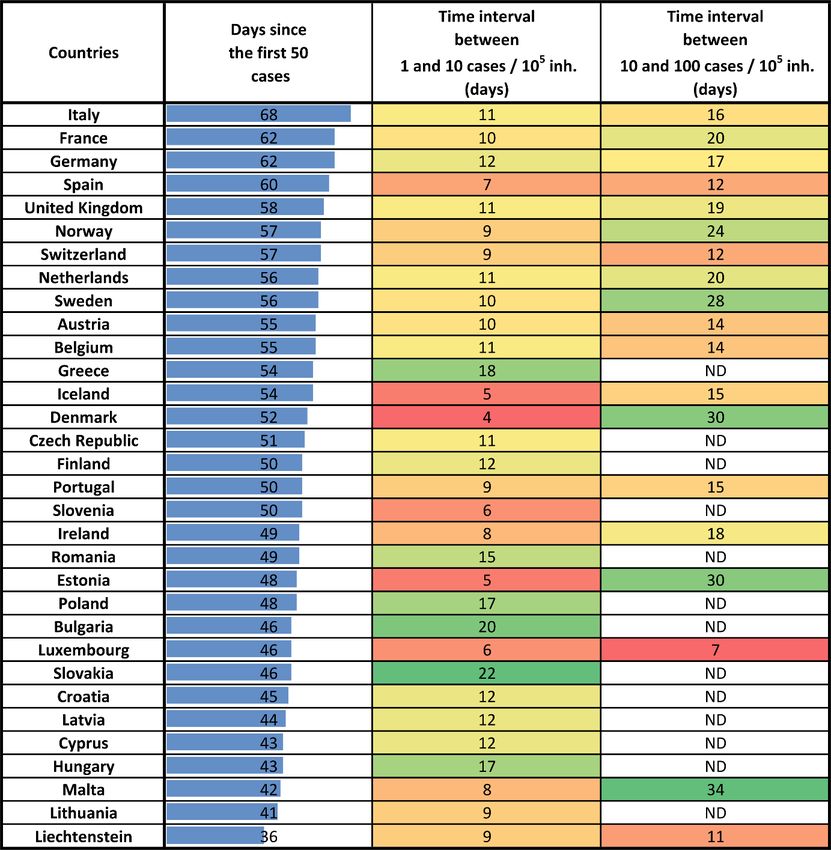
Time indicators by country
This table summarizes a few time indicators for each country: time since 50 cases were reported, time
interval between an attack rate of 1/105 inhabitants and an attack rate of 10/105 inhabitants, and time
interval between attack rates of 10 to 100 per 105 inhabitants (only for countries that have overtaken this
threshold).

 5
Analysis: The situation in Stockholm (Sweden)
In previous assessments we have developed a methodology to estimate the real number of cases from the
reported CFR and from evaluating diagnostic delays. From that, we can produce an ordering of those
countries that are currently in worst shape regarding the situation of the epidemics. In the last two weeks,
the same two countries are always on the top positions: Belgium and Sweden.
Belgium is overreporting the number of deaths by COVID-19. They count all people dead in residences as
deaths by COVID-19, no matter the real suspicious level regarding the origin of its death. This overcounting
leads to a biased in the numbers. Belgium is probably not in a position much worse than Sweden.
The evolution of Sweden in terms of and the reduction in mobility is shown in the following figure, where
mobility data were obtained from Facebook Data for Good. The soft public policies to prevent social contact
have been unable to reduce below 1 almost 8 weeks after the onset.

The question then arises about how two countries with roughly the same population (10-11 million people)
but with very different land mass (this is, two countries with very different population density, 380 vs 25
inh./km2) can be in a similar situation. One would expect that Sweden or Norway, and even Denmark, with a
larger natural social distancing, would have a much slower pace of growth for the epidemics and an easier
way to control it than Belgium. And indeed, most Northern European countries have the epidemics under
control and with very low incidence except for Sweden, as shown in the following table.

The key explanation for this situation is the analysis of the geographical distribution of people in Sweden.
The Stockholm metropolitan area concentrates 2.4 million people with slightly above one-fourth of the
Swedish population. Then Gothenburg comes second with one million. If we look outside these regions, the
population density is very low and the situation is reasonably good. More interesting is the situation in

 6
Gothenburg, which has not even 200 cases of reported dead by COVID-19 while Stockholm has close to 1400.
7 times more with only 2.5 times the population. We proceed to show that this is not anecdotal. The reason
why Sweden is in a similar situation as Belgium is because the situation in Stockholm is more worrisome than
in many other cities in Europe.
Our estimated incidence in the metropolitan area is around 8-10%. However, if instead of the metropolitan
area one considers the city proper, which has 1 million inhabitants, the incidence could reach 15-20%, if cases
in the Stockholm region are concentrated in the higher density city core. Despite this grave situation in the
city, the government only issues recommendation regarding social behaviour. In comparison with Denmark,
which banned public gatherings and imposed fines, or Spain, where there is a national curfew, the mobility
patterns could not be more different. Here in the graph we provide information of mobility and confinement
for Spain and Denmark using weekly averages of @facebook data for good and its corresponding growth rate
of the epidemics the different weeks. Note that Spain has had < 1 for last 3 weeks, and Denmark has had
 ≤ 1 for last 2 weeks.

As it can be seen, small punitive measures and early warning have allowed an excellent control of the
epidemics in Denmark. In Spain, curfew controlled an initial large growth while Sweden initial growth has
continued consistently. If present tendencies continue, the epidemics would spread to the whole city of
Stockholm until a majority of the population has gone through the disease and would eventually stop if herd
immunity is present.
It is important to estimate the death toll that the strategy of letting the virus spread in Stockholm will have
for the city population supposing that herd immunity will kick in at the estimated 65% rate of incidence. If
this is the case, and using a 1% mortality rate as discussed in other assessments, it would be around 6000
deaths in the city proper. If we take a more optimistic approach of 0.5% considering that a large fraction of
the elder population is taking isolating measures then the death toll in the city proper will be around 3000
deaths. Taking into account that the metropolitan area has right now around 1500 deaths, we expect that
number to triplicate in the metropolitan area. The basic numbers are that, if present policies continue, the
death toll in Stockholm metro area could reach between 4000 and 15000 people. So, in a not pessimistic
scenario, this is the equivalent of having close to one million death people due to COVID-19 in UE+EFTA+UK.

 7
Long-term predictions
Long-term predictions, evaluated with the whole historical series and without weighting last 3 points. Up-
left: Predictions of maximum incidences per country (total final expected attack rate per 105 inh.). Up-right:
Predictions of maximum absolute number of cases per country (K, in log scale). Blue lines indicate current
situation. Bottom-left: Time in which peak in new cases was achieved / will be achieved. Bottom-right: Time
at which 90 % of K was achieved / will be achieved. Blue dotted line indicates current date.

Final expected K for UE+EFTA+UK. Evolution of
predicted K with time, where convergence to best
estimate is seen. Last prediction is numerically shown in
title.

 8
2020-04-29

 9
Italian regions

Spanish regions

 10
2020-04-30

 11
2020-04-29

 12
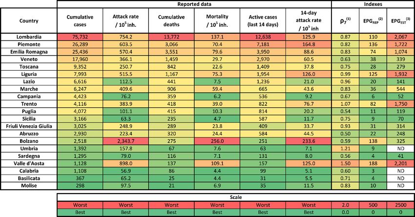
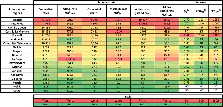
Situation and trends in Italian and Spanish regions

Italy

Spain

(1)
 ρ3 is the average of 7 consecutive ρ, but can still fluctuate. (2) EPG stands for Effective Growth Potential. EPGREP is
obtained by multiplying attack rate of last 14 days per 105 inhabitants (i.e. density of cases) by ρ3 (a value related with
effective reproduction number and that, therefore, determines the dynamics for subsequent days). EPGEST is obtained
by multiplying estimated real attack rate of last 14 days per 105 inhabitants by ρ3.

 13
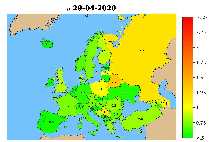
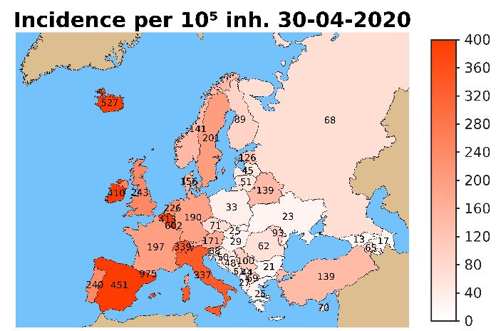
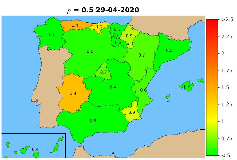
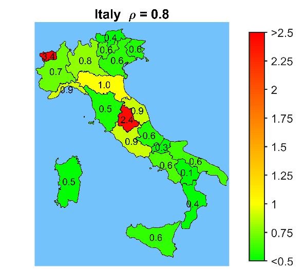
Maps of Italian and Spanish regions

Cumulative incidence and spreading rate (ρ) in Italian and Spanish regions.

 14
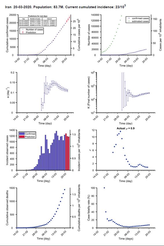
Legend: Countries’ reports details

Confirmed cases:
 data (blue), Estimated
 model fitted cases using
 (dashed line), death rate (see
predictions (red Methods)
points and table)

 Fitted a value Fitted K value
 using points using points
 prior to each prior to each
 date date

 Evolution of ρ, a
 Reported
 parameter related
 and
 with Reproduction
 predicted
 number (see
 new cases
 Methods)

 Reported Deaths /
 deaths cumulated
 reported cases

 15
(1) Analysis and prediction of COVID-19
 for EU+EFTA+UK

Data obtained from https://www.ecdc.europa.eu/en/geographical-distribution-2019-ncov-cases

 16
17
18
19
20
21
22
23
24
25
26
27
28
29
30
31
32
33
34
35
36
37
38
39
40
41
42
43
44
45
46
47
48
(2) Analysis and prediction of COVID-19
 for other countries

Data obtained from https://www.ecdc.europa.eu/en/geographical-distribution-2019-ncov-cases

 49
50
51
52
53
54
55
56
57
58
59
60
61
62
63
64
65
66
67
68
(3) Analysis and prediction of COVID-19
 for Spain and its autonomous
 communities

Data obtained from https://github.com/datadista/datasets/tree/master/COVID%2019 and
 https://covid19.isciii.es/

 69
70
71
72
73
74
75
76
77
78
79
80
81
82
83
84
85
86
87
Methods

 88
Methods (1) Data source Data are daily obtained from World Health Organization (WHO) surveillance reports 1, from European Centre for Disease Prevention and Control (ECDC) 2 and from Ministerio de Sanidad 3. These reports are converted into text files that can be processed for subsequent analysis. Daily data comprise, among others: total confirmed cases, total confirmed new cases, total deaths, total new deaths. It must be considered that the report is always providing data from previous day. In the document we use the date at which the datapoint is assumed to belong, i.e., report from 15/03/2020 is giving data from 14/03/2020, the latter being used in the subsequent analysis. (2) Data processing and plotting Data are initially processed with Matlab in order to update timeseries, i.e., last datapoints are added to historical sequences. These timeseries are plotted for EU individual countries and for the UE as a whole: Number of cumulated confirmed cases, in blue dots Number of reported new cases Number of cumulated deaths Then, two indicators are calculated and plotted, too: Number of cumulated deaths divided by the number of cumulated confirmed cases, and reported as a percentage; it is an indirect indicator of the diagnostic level. ρ: this variable is related with the reproduction number, i.e., with the number of new infections caused by a single case. It is evaluated as follows for the day before last report (t-1): ( ) + ( − 1) + ( − 2) ( − 1) = ( − 5) + ( − 6) + ( − 7) where Nnew(t) is the number of new confirmed cases at day t. (3) Classification of countries according to their status in the epidemic cycle The evolution of confirmed cases shows a biphasic behaviour: (I) an initial period where most of the cases are imported; (II) a subsequent period where most of new cases occur because of local transmission. Once in the stage II, mathematical models can be used to track evolutions and predict tendencies. Focusing on countries that are on stage II, we classify them in three groups: • Group A: countries that have reported more than 100 cumulated cases for 10 consecutive days or more; • Group B: countries that have reported more than 100 cumulated cases for 7 to 9 consecutive days; • Group C: countries that have reported more than 100 cumulated cases for 4 to 6 days. 1 https://www.who.int/emergencies/diseases/novel-coronavirus-2019/situation-reports 2 https://www.ecdc.europa.eu/en/geographical-distribution-2019-ncov-cases 3 https://www.mscbs.gob.es/profesionales/saludPublica/ccayes/alertasActual/nCov-China/situacionActual.htm https://github.com/datadista/datasets/tree/master/COVID%2019 , https://covid19.isciii.es/ 89
(4) Fitting a mathematical model to data Previous studies have shown that Gompertz model 4 correctly describes the Covid-19 epidemic in all analysed countries. It is an empirical model that starts with an exponential growth but that gradually decreases its specific growth rate. Therefore, it is adequate for describing an epidemic that is characterized by an initial exponential growth but a progressive decrease in spreading velocity provided that appropriate control measures are applied. Gompertz model is described by the equation: − � �· − ·( − 0) ( ) = 0 where N(t) is the cumulated number of confirmed cases at t (in days), and N0 is the number of cumulated cases the day at day t0. The model has two parameters: a is the velocity at which specific spreading rate is slowing down; K is the expected final number of cumulated cases at the end of the epidemic. This model is fitted to reported cumulated cases of the UE and of countries in stage II that accomplish two criteria: 4 or more consecutive days with more than 100 cumulated cases, and at least one datapoint over 200 cases. Day t0 is chosen as that one at which N(t) overpasses 100 cases. If more than 15 datapoints that accomplish the stated criteria are available, only the last 15 points are used. The fitting is done using Matlab’s Curve Fitting package with Nonlinear Least Squares method, which also provides confidence intervals of fitted parameters (a and K) and the R2 of the fitting. At the initial stages the dynamics is exponential and K cannot be correctly evaluated. In fact, at this stage the most relevant parameter is a. Fitted curves are incorporated to plots of cumulative reported cases with a dashed line. Once a new fitting is done, two plots are added to the country report: Evolution of fitted a with its error bars, i.e., values obtained on the fitting each day that the analysis has been carried out; Evolution of fitted K with its error bars, i.e., values obtained on the fitting each day that the analysis has been carried out; if lower error bar indicates a value that is lower than current number of cases, the error bar is truncated. These plots illustrate the increase in fittings’ confidence, as fitted values progressively stabilize around a certain value and error bars get smaller when the number of datapoints increases. In fact, in the case of countries, they are discarded and set as “Not enough data” if a>0.2 day-1, if K>106 or if the error in K overpasses 106. It is worth to mention that the simplicity of this model and the lack of previous assumptions about the Covid- 19 behaviour make it appropriate for universal use, i.e., it can be fitted to any country independently of its socioeconomic context and control strategy. Then, the model is capable of quantifying the observed dynamics in an objective and standard manner and predicting short-term tendencies. (5) Using the model for predicting short-term tendencies The model is finally used for a short-term prediction of the evolution of the cumulated number of cases. The predictions increase their reliability with the number of datapoints used in the fitting. Therefore, we consider three levels of prediction, depending on the country: 4 Madden LV. Quantification of disease progression. Protection Ecology 1980; 2: 159-176. 90
• Group A: prediction of expected cumulated cases for the following 3-5 days 5;
 • Group B: prediction of expected cumulated cases for the following 2 days;
 • Group C: prediction of expected cumulated cases for the following day.

The confidence interval of predictions is assessed with the Matlab function predint, with a 99% confidence
level. These predictions are shown in the plots as red dots with corresponding error bars, and also gathered
in the attached table. For series longer than 9 timepoints, last 3 points are weighted in the fitting so that
changes in tendencies are well captured by the model.

(6) Estimating non-diagnosed cases
Lethality of Covid-19 has been estimated at around 1 % for Republic of Korea and the Diamond Princess
cruise. Besides, median duration of viral shedding after Covid-19 onset has been estimated at 18.5 days for
non-survivors 6 in a retrospective study in Wuhan. These data allow for an estimation of total number of
cases, considering that the number of deaths at certain moment should be about 1 % of total cases 18.5 days
before. This is valid for estimating cases of countries at stage II, since in stage I the deaths would be mostly
due to the incidence at the country from which they were imported. We establish a threshold of 50 reported
cases before starting this estimation.

Reported deaths are passed through a moving average filter of 5 points in order to smooth tendencies. Then,
the corresponding number of cases is found assuming the 1 % lethality. Finally, these cases are distributed
between 18 and 19 days before each one.

5
 At this moment we are testing predictions at 4 days for countries with more than 100 cumulated cases for 13-15
consecutive days, and 5 days for 16 or more days.
6
 Zhou et al., 2020. Clinical course and risk factors for mortality of adult
inpatients with COVID-19 in Wuhan, China: a retrospective
cohort study. The Lancet; March 9, doi: 10.1016/S0140-6736(20)30566-3

 91
You can also read