DataInk: Direct and Creative Data-Oriented Drawing
←
→
Page content transcription
If your browser does not render page correctly, please read the page content below
DataInk: Direct and Creative Data-Oriented Drawing
      Haijun Xia1, Nathalie Henry Riche2, Fanny Chevalier1,3, Bruno De Araujo1, Daniel Wigdor1
                        1                                                                 2                                     3
                  University of Toronto                                                    Microsoft Research                       Inria
     {haijunxia|fanny|brar|daniel}@dgp.toronto.edu                                        nath@microsoft.com

 Figure 1 DataInk enables easy creation of visually creative data visualizations. Visualization authors can interleave illustration
   (right, lower), data binding (right, upper), layout configuration (center, middle) to quickly create visualizations that can be
            iteratively specified through direct manipulation on the levels of data point (right) or data dimension (left).
ABSTRACT
                                                                      INTRODUCTION
Creating whimsical, personal data visualizations remains a
                                                                                      Visual representations of data are a powerful
challenge due to a lack of tools that enable for creative
                                                                                      communication medium for presenting insights and ideas in
visual expression while providing support to bind graphical
                                                                                      an understandable form. Beyond traditional information
content to data. Many data analysis and visualization
                                                                                      visualization, designers, artists and enthusiasts alike also
creation tools target the quick generation of visual
                                                                                      leverage this mode of expression to craft meaningful,
representations, but lack the functionality necessary for
                                                                                      beautiful, and memorable pieces [10, 14, 29, 33, 49]. While
graphics design. Toolkits and charting libraries offer more
                                                                                      compelling, authoring visualizations that embody creative,
expressive power, but require expert programming skills to
                                                                                      artistic influences is presently a laborious task, typically
achieve custom designs. In contrast, sketching affords fluid
                                                                                      requiring one to alternate between different tools to form an
experimentation with visual shapes and layouts in a free-
                                                                                      enticing, yet factual representation of the data [4].
form manner, but requires one to manually draw every
single data point. We aim to bridge the gap between these                             Tools that aim at supporting design creativity in
extremes. We propose DataInk, a system supports the                                   information visualization should encompass design
creation of expressive data visualizations with rigorous                              expression, i.e., the crafting of highly customized and
direct manipulation via direct pen and touch input.                                   stylized visuals and rigorous execution of the principles of
Leveraging our commonly held skills, coupled with a novel                             information visualization to ensure that the visual properties
graphical user interface, DataInk enables direct, fluid, and                          of visuals comply with data they encode [5]. Our goal is to
flexible authoring of creative data visualizations.                                   also encompass support for creativity [48], and thus
                                                                                      empower users with creative exploration through the fluid
Permission to make digital or hard copies of all or part of this work for             and spontaneous experimentation with glyphs and layouts,
personal or classroom use is granted without fee provided that copies are
                                                                                      to facilitate ideation and iterative design.
not made or distributed for profit or commercial advantage and that copies
bear this notice and the full citation on the first page. Copyrights for              While several tools exist to assist with the generation of
components of this work owned by others than ACM must be honored.
Abstracting with credit is permitted. To copy otherwise, or republish, to             data visualizations, there is a lack of software that supports
post on servers or to redistribute to lists, requires prior specific permission       design creativity. The tools used by visualization authors
and/or a fee. Request permissions from Permissions@acm.org.                           today typically enable for either rigorous visualization, or
CHI 2018, April 21–26, 2018, Montreal, QC, Canada                                     creative design expression, but none address our goal of
© 2018 Association for Computing Machinery.
ACM ISBN 978-1-4503-5620-6/18/04…$15.00                                               facilitating data visualization as both a medium and a tool
https://doi.org/10.1145/3173574.3173797                                               for creative expression.
                                                                                  1
Visualization toolkits (e.g. D3 [8]), graphical interfaces (e.g.       on authoring strategies of over 60 visualization creation
Lyra [46]) and online applications (e.g. RAWGraphs [16])               tools. Online tools also proliferate and spark practitioners’
address the rigorous execution of visualizations by enabling           discussions on their merits and limitations [43]. We review
users to automatically apply visual encodings to their data.           visualization authoring tools with regard to the purposes
These tools offer different trade-offs between power and               they address, delineating the gap our work fills.
simplicity of use. Programming toolkits enable for the
                                                                       Rigorous Execution
implementation of any custom data visualization, however               Deeply rooted in scientific practice—where visualizations
often have a steep learning curve. Online applications are             are seen as functional assets for analysis—the vast majority
limited to the creation of a small set of predefined, mutable          of tools developed by the research community support the
data visualizations. The lack of flexibility to customize              systematic building of a visualization from data. This
visuals in a fluid manner makes these tools poorly suited for          ensures that the visual properties of marks scrupulously
creative exploration and design expression.                            comply to the data they encode (i.e., rigorous execution).
In contrast, graphic design and illustration software such as          Visualization toolkits and charting libraries (e.g., D3.js [8],
Adobe Illustrator [1] enables rich visual expression, but              Vega [45], ggplot2 [58]), and advanced systems for data
lacks support to leverage data bindings to aid in drawing.             analysis (e.g., Microsoft Excel [37], Tableau [50], PowerBi
Further, the lack of support for bindings hampers iterative            [38], Lyra [46], iVisDesigner [40]) afford some level of
design, since simple changes require significant work. The             design expression. However, creating custom graphics and
visualization research community has recently started to               layouts requires substantial training such as learning to
address this by bridging diverse types of interfaces [4] and           program, or having good command of the vast functionality
augmenting illustration software with specific widgets [27].           present in a full-featured graphical user interface. Trading
These latter efforts, however, rely on a rigid, complex                power for simplicity, many online systems (e.g. ManyEyes
workflow that hampers creative exploration. This work thus             [54], EasyCharts [17], RAWGraphs [16]) enable non-
set out to support design expression and rigorous execution            expert audiences to create visualizations of their data in just
while offering flexibility, plasticity and freedom to                  a few steps, i.e., load data, choose a template, and select the
manipulate for creative exploration via iterative design.              data dimensions to represent. The range of possibilities
The inherent freeform nature of sketching enables                      these applications support, however, is limited to
visualization authors to follow their inspiration and quickly          commonplace visualizations. The integration of custom
model and remodel different designs, or discard them                   glyphs and layouts is usually limited or not supported.
without second thoughts [6, 42]. Such unconstrained means              In such tools, creative exploration is hindered due to the
of expression can also foster an author’s expressivity and             large number of steps required to generate, evolve, and
promote understanding when drawing with data [56]. We                  refine design alternatives. Moreover, most design decisions
articulate a set of five design decisions rooted in the                have to be made before the user can see an actual visual
literature of supporting creativity via direct manipulation            representation of their data. Users not versed in the art of
and contextualized in the domain of data visualization.                crafting data visualizations may not fully comprehend what
Embodying these design decisions, DataInk 1 , a pen-and-               each decision entails or how the series of decisions they
touch enabled user interface that leverages drawing on a               made will impact the resulting visual representation [36].
digital canvas and the use of direct manipulation to                   Méndez et al. proposed iVolver [35] to alleviate the need to
seamlessly access visual properties of graphics and bind
                                                                       making decisions beforehand, following the principle of
them to data. A user study with eight designers and non-
                                                                       constructive visualization [21]. While this approach affords
experts demonstrates that DataInk affords direct, fluid, and           more expressivity than other systems, it still requires one to
flexible interactions for the authoring of creative and                learn the workflow language to achieve the envisioned
expressive data visualizations.                                        designs, making it difficult to pursue creative exploration.
RELATED WORK
                                                                       Design Expression
Many authoring tools have been proposed to assist users in             Beyond their functional purpose, visual representations of
creating visualizations for their data. Creating a visual              data have increasingly been viewed as a means of
representation of data requires one to specify a visual-data           expression, where pursuits for aesthetics can further yield
mapping: associating data dimensions to visual variables               unique, beautiful pieces [53]. Many designers and artists
such as color, shape, size, or position [3, 11]. This encoding         leverage design expression to craft personally-relevant and
produces marks that visually represent the data, as a one-to-          evocative visualizations susceptible to provoking emotional
one correspondence between each data point and its visual              responses from the audience. One example demonstrating a
representation (i.e. glyph-based representation) or as a               high level of design expression is the Dear Data project
groups of data points (e.g. bar charts). Grammel et al. [18]           [33], featuring a collection of hand-drawn data
surveyed visualization and HCI publications, and reported              visualizations. Recent studies investigating visual thinking
                                                                       on whiteboards [9] and data sketching [56] highlighted the
1
    http://datainkresearch.github.io                                   expressiveness of sketched visuals when working with data.
                                                                   2
Figure 2 A storyboard illustrating data-oriented drawing with direct input following the principles of direct manipulation. a)
Sketching visual designs using digital ink on a canvas enables one to experiment with various shapes. b) Selecting one of the shapes
to specify a data-visual mapping automatically populates the canvas with all relevant data points. c) Sketching compound glyphs to
represent additional data dimensions. d) Drawing a layout based on a data dimension to structure the data spatially. e) Redrawing
        the layout to map the data to a different data dimension. f) Redrawing a visual mark for a different data dimension.

Sketching is widely recognized as an excellent instrument            DATAINK AND DIRECT MANIPULATION
for the quick generation of multiple designs due to its              We share the spirit that direct manipulation can enable
inherent freeform and effortless nature [6, 42]. Yet, the lack       users to easily express their intent, and hence support their
of automation makes it hard to envision how resulting                creativity [48]. However, creating a direct manipulation
visuals might be mapped to actual data.                              system that not only supports easy entry for novice users
                                                                     but also complex functionalities and flexible workflow for
The same issue holds for graphics design and illustration            experts is very challenging. Despite the general claim of
tools such as Adobe Illustrator [1], which focus on design           supporting direct manipulation, many of the systems are not
expression but lack support for mapping realized visuals to          direct enough, especially ones using WIMP UI [5, 27],
data. Bigelow et al. [4] provide insights on the laborious           suffering from the intrinsic indirectness of WIMP [2].
process in which designers alternate back and forth between
graphics authoring and data visualization tools to realize           We seek to rigorously support direct manipulation to allow
stylized visuals. Recent efforts have tried to simplify this         users to fluidly experiment with visual designs and visual-
process by providing bridges between tools [5] or                    to-data bindings to create expressive data visualizations
integrating data-driven widgets in illustration interfaces           (Figure 2). Informed by literature, we articulate a set of five
[27]. Such efforts are great avenues to reconcile the                design decisions illustrated in Figure 3.
expressive power of graphic design software to generate              D1. Create and manipulate with direct input
data visualizations. Yet, they impose a high threshold [51]          We focus on a new UI with direct pen + touch input to
on users, as they still require to master complex                    leverage commonly held skills [52], while keeping the
functionalities, making it laborious to generate alternative         interaction vocabulary simple to ease the learning.
designs, which can inhibit creative exploration.
                                                                     We also draw inspirations from designers’ and artists’
Creative Exploration                                                 general workflows [4], where designs are first explored by
Pen and touch enabled interfaces leverage natural human              sketching on paper or whiteboards. A similar workflow
sketching and physical manipulation skills, empowering               should be supported to foster the rapid experimentation
users to pursue creative tasks in a fluid workflow [20]. The         with visual marks, by providing freeform sketching with
visualization community sees these interfaces as a                   direct pen input on a digital canvas (Figure 3:1a), through
promising alternative to WIMP UIs, allowing analysts to              easy access to the visual properties of graphics via direct
focus on the data under study, rather than how to operate            touch input (Figure 3:1b).
the interface [30]. Several visualization tools take
advantage of pen and touch input for data exploration [9,            To compose compelling visual designs for a given dataset,
15, 23, 44, 62] and its presentation to an audience [31, 32].        authors usually take several iterations to explore different
                                                                     visual encodings [4]. To support this, the users should be
However, pen usage is often limited to making simple                 able to access data dimensions and visual properties of
annotations on customized data views. Only rarely is the             graphics at any time through direct physical manipulation
expressiveness of sketching exploited to create new simple           (Figure 3:1c) [20, 60].
stroke-based visuals (e.g. [31]). In the context of graphics
authoring, direct manipulation approaches such as object-            D2. Interact with objects – data points as glyphs
oriented drawing [60] have been introduced to facilitate the         To empower users to craft expressive visual representations
creative exploration of visual designs by providing a novel          of their data, we propose a focus on glyph-based
and more direct interaction metaphor to manipulate the               visualizations [7]. In this type of visual representations,
visual properties of graphics. The present work continues to         each data point is objectified as a glyph, which turns
pursue this line of research, investigating the power of pen         aggregation of abstract numbers into a physical object that
and touch interaction to enable users to create personalized,        one can direct interact with [60]. The visual properties of
expressive data visualizations.                                      compound glyphs are dictated by one or more dimensions

                                                                 3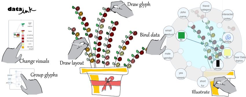
Figure 3 The design decisions of DataInk. 1) Freeform sketching (1.a), direct manipulation (1.b, 1.c) to enable flexible authoring of
  visual designs, and quick access to both visual properties of glyphs and data attributes. 2) Composing glyphs specifying visual
   properties to data dimensions. 3) creating layouts and editing them as objects. 4) specifying visual-data mapping from visual
                   variables or data dimensions. 5) supporting multiple workflows from the legend or the canvas.
of the data point it represents. Glyph-based representations          experiment with different data dimensions it could encode;
[34, 41] are commonly found in visualization for                      or they may start from a data dimension and experiment
communication purposes [39] as they afford expressiveness             with different visual encodings that could represent it.
in the composition of visual marks, while also offering a
                                                                      D5. Support flexible workflow – multiple abstraction levels
concise presentation of multivariate information. They also           To foster flexible exploration [48], it is essential to support
simplify the specification of the visual-data mapping since           the workflows of creating data visualizations on the levels
they do not require complex specification of grouping.                of data point and data dimension.
We propose to empower users to create visually-rich marks             Data visualization experts, may use a generative approach,
portraying multiple facets of data points (Figure 3:2), by            making decisions on the data dimension level. They may
iteratively incorporating components.                                 choose visual encodings for each data dimension and values
D3. Interact with objects – layouts as objects                        successively (e.g., map each value of ‘tree type’ to a shape,
Configuring data-driven layout is another challenging and             then map each value of ‘temperature’ to a color, etc.). Put
abstract task. To make it as direct as possible, we propose           differently, they decide on a set of rules to generate glyphs:
objectify layout as objects, following the Object-Oriented            the legend. Designers on the other hand, may take more of
approach [12, 60], to provide the suitable representation for         a design-by-example approach, making decisions at the data
interaction and reasoning. This suggests considering the              point level, by iterating on the design of the final glyph for
layout as a visual mark that a user can directly draw on the          individual data points (e.g., draw a glyph representing a tree
canvas, manipulate the properties of, and bind a data                 that grows in a warm environment and produces fruit). Put
dimension to. The visual mark can also serve to select                differently, they decide on the designs of glyphs first: the
groups of glyphs for direct manipulation. We see properties           visualization, and derive generative rules later.
of the layout such as the distribution path and the order of
                                                                      Supporting users to follow either one of these workflows or
glyphs along the path similarly to the visual properties of
                                                                      fluidly switch between them, we propose using a legend
glyphs (e.g. shape and color).
                                                                      and visualization canvas metaphor (Figure 3:5). Interaction
We seek to empower users to create a spatial structure                within the legend enables specification of mappings on the
encoding different dimensions of the data by iteratively              data dimension level, while interaction within the canvas
composing the outcome they envision (Figure 3:3).                     enables them to specify mappings on the data point level.
D4. Support flexible workflow – bidirectional mapping                 To summarize, the five design decisions support the
The realization of a data visualization requires one to               creative authoring [48] of data visualizations by providing:
specify a set of mappings between data dimensions and
visual variables [13]. To provide maximum flexibility, we             •   low threshold: easy entry for novices,
propose to enable users specifying visual-data mappings               •   high ceiling: experts to achieve sophisticated pieces,
from either direction (Figure 3:4). In simple terms, a user           •   wide walls: a wide range of possible explorations,
may start from a visual property (e.g. shape, color) and              •   many styles and many ways: multiple workflows.

                                                                  4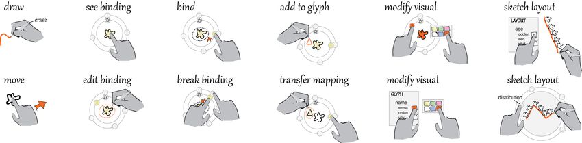
Satisfied by the design of her current glyph, Emma decides
                                                                     to organize the glyphs. She does not really know what data
                                                                     dimension would provide an interesting structure. Working
                                                                     at data dimension level, she taps the layout legend and
                                                                     browses through the different data dimensions (Figure 4:d).
                                                                     As the data dimensions are in focus, DataInk previews the
                                                                     different groupings in the canvas. Given the number of dogs
                                                                     she has in her visualization, Emma opts for structuring the
                                                                     space by the gender of the dog owners. The dogs appear
                                                                     now into two distinct groups on the canvas. Emma can
                                                                     touch each group and move them in the canvas. As she taps
Figure 4 DataInk: a) the main canvas. b) the visual-data             the layout legend, she can select a particular group and
palette to edit visual properties and encode the mapping. c)         simultaneously draw distribution path in the canvas. This
glyph panel to define mappings like a legend. d) layout panel        enables Emma to experiment with different layout shapes
to structure data dimensions. e) menu to load data, search for       for each group. She concludes by saving her work and
vector graphic visuals and save visualizations.                      sending it to the large format printer (Figure 4:e). See
                                                                     supplemental material for the video of this scenario.
DATAINK WORKFLOW
DataInk (Figure 4) is an application that incorporates our           DATAINK USER INTERFACE
design decisions. We first describe the workflow to create a         DataInk is composed of five UI components (Figure 4). The
data-driven drawing, then delve into the design of each              visualization canvas (Figure 4a) shows the generated visual
interface component.                                                 representation of the data, as well as any visual elements
                                                                     not bound to data such as handwritten text or illustrative
To engage with her colleagues at her new job, Emma                   marks. A contextual visual-data palette appears when a user
decided to create a fun, whimsical visual representation of          taps on a visual element, enabling them to set appropriate
her personal data. Inspired by Dear Data [33], she recorded          mappings (Figure 4b). The legend depicting the sets of
the dogs she encountered during her daily commute during             mapping between visual encodings and data dimensions are
the week in a spreadsheet, where each row is a dog and               grouped in two panels: one for the glyph (Figure 4c) and
each column represents one of its characteristics (e.g. color,       one for the layout (Figure 4d). A side menu (Figure 4e)
length of fur, whether their owner was a man or a woman).            allows the users to access functionalities such as searching
Emma opens DataInk on her pen-and-touch enabled tablet               vector graphics, loading data, saving the visuals, as well as
and loads her spreadsheet. She starts by experimenting with          providing access to several illustration tools.
different dog shapes by drawing on the canvas (Figure 4:a).          SKETCHING
Looking at the different shapes she drew, she taps on her            DataInk offers freeform sketching (D1) to enable users to
preferred design and binds it to data dimensions. The                ideate on graphical elements that can later serve to compose
system instantaneously duplicates the dog drawing, and               data visualizations. Users can generate these graphical
spread the newly created collection of dogs randomly on              elements by directly drawing on the canvas with a digital
the canvas. Each drawing represents a data point.                    pen or writing in a search box to import vector graphics.
As Emma taps on a dog, a visual-data palette (Figure 4:b)            Visual elements on the canvas can be accessed and
appears depicting the visual properties of the drawing in the        modified by touch interaction. DataInk follows an object-
inner ring, and the values for each data dimension in the            oriented drawing approach [60], materializing properties of
outer ring. Working at the data point level, she can modify          the visual elements as interactive cards that can be directly
the color of her drawing from white to brown because the             manipulated to adjust their values.
data value of this dog shows that it was brown. She then
can create a mapping from the color visual encoding to the
color data dimension by aligning the inner and outer rings.
The legend (Figure 4:c) thus updates to display the color
mapping. Emma taps the legend to access the list of colors
and sets them successively. She then decides to encode a
second data dimension, the fur length, by adding a shape to
her dog drawing. She taps a dog, draws on the canvas just
above its head and map the shape of this mark to the
corresponding attribute using the visual-data palette. She
then taps a different dog, and changes the shape by drawing
in a contextual interactive panel invoked directly from the            Figure 5 Object-Oriented Drawing: sketching or reusing
touching the visual shape item in the palette or legend.              visuals and directly editing visual attributes on the canvas.
                                                                 5
Creating Data-Driven Glyphs
The users can select any visual marks to represent the data,
using them as a glyph. To create a glyph, the user can first
lasso the visual marks with the stylus to indicate a selection.
She can then drag and drop the selected marks into the
glyph panel to create a glyph. Alternatively, she can hold
the glyph panel with her non-dominant hand, and lasso the
visual marks with the stylus using her dominant hand, to
transfer the selected visual marks into the glyph panel.
Immediately after the assignment, all the data points (e.g.,
rows of the data table) are represented by the glyph and
spread on the canvas. Tapping each glyph on the canvas
reveals the data values of the data point it represents, and
existing visual encodings, if any, via a contextual visual-
data palette (Figure 6).
                                                                       Figure 6 Visual-Data Palette - visual attributes distributed
Visual-Data Palette                                                    along the inner ring, data attributes along the outer ring.
We designed the visual-data palette to enable flexible
bidirectional mappings between data dimensions and visual             Transfer a Mapping
properties of the glyph.                                              A user may iterate over different encodings of a data
                                                                      dimension. For example, the user may want to experiment
Inspect and Edit the Attributes
                                                                      with encoding the data dimension ‘color’ to the fill color of
The palette is composed of two rings (Figure 6), whereby              a different stroke. Instead of removing the old mapping and
the outer ring depicts a list of data values if this visual
                                                                      creating a new one, she can transfer mappings she has
represents a data point, and the inner ring depicts a list of
                                                                      previously created to new components. She can hold the
visual attributes for the selected elements. DataInk currently        existing mapping with one hand, and lasso select the strokes
supports shape, fill, stroke, and size for strokes. Existing          she likes with another hand to transfer the mapping to a
mappings are always shown to inform the users of how data             new set of shapes (Figure 7). Similarly, this change is
dimensions have been encoded. The user can lasso select               automatically propagated to all other glyphs.
any element to inspect its visual attributes (Figure 7).
Changes of the visual attributes of a data-driven glyph will          Compose Compound Glyphs and Mappings
be automatically applied to all others.                               A user can sketch freely on the canvas, even on top of the
                                                                      glyphs as annotations. However, when the palette is
Create and Remove a Mapping
                                                                      activated, the user can directly draw on the glyph to add
The user can specify a mapping by dragging a visual                   additional strokes to that glyph. The new strokes are again
property (inner ring) and drop it into the slot next to the           automatically prorogated to all the glyphs. This enables the
data property (outer ring). Once mapped, both items are               users to iterate on the glyph design for complex visual
visibly linked and form a new mapping object that rides               effects even after the glyph is created.
across the rings. The user can break a mapping by holding
and dragging either of its attribute off from the other.              DataInk builds upon the aggregated attributes from
Creation and deletion of a mapping is automatically                   Collection Objects [61]. When multiple strokes are
propagated to the corresponding visual attribute and data             selected, the aggregated visual attributes are shown, each of
value in other data-driven glyphs. Changes of the visual              which can be mapped to a data dimension. This allows for
attribute of a mapping will only be applied to glyphs that            complex mappings between data properties and the visual
have the same data value. In Figure 6, the data dimension             properties of any sets of strokes. In Figure 6, the data
‘color’ is encoded by the fill color of the shape.                    dimension ‘color’ is mapped to the fill color of two shapes.

                                         Figure 7 Pen and Touch Interactions in DataInk
                                                                  6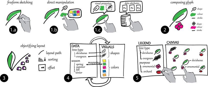
Figure 8 Editing visual properties from the glyph legend.           Figure 10 Specifying distribution path for a data dimension
                                                                                      from the layout legend (a).
Legends
The visual-data palette enables users to reason at the data         Layout Legend
point level, on the canvas. To provide a flexible workflow          The layout legend depicts the visual-data mappings for the
(D5), DataInk also enables users to work on the data                layout of the visualization (Figure 10). The user can
dimension level, inside the legends, which show the                 preview the effects of different groupings by browsing the
overview of all existing mappings. DataInk provides two             set of data dimensions available from the data items on the
types of legends: a glyph legend and a layout legend.               left of the legend (Figure 10a). Once a data dimension is
                                                                    selected, glyphs on the canvas are separated into several
Glyph Legend                                                        groups according to the data values of the data dimension.
The glyph legend depicts all the visual-data mappings of            Touching one of the values selects the corresponding set of
the glyph (Figure 8). When the user creates a mapping               glyphs on the canvas. Users can then hold the data values
using the visual-data palette, an aggregated mapping object         on the legend and draw distribution paths for each group
is created inside the glyph panel. Tapping on the mapping           directly on the canvas to distribute them.
object expands it and reveals the subordinate mapping
objects for categorical data dimensions, the user then can          We see a set of grouped glyphs as a glyph of a higher level.
set the mappings for each value of a data dimension                 A group of glyphs can be freely moved on the canvas by
successively (e.g., assigning a color to each data value;           dragging. Tapping on the group reveals the visual-data
Figure 8). For quantitative data dimensions, a panel is             palette on the group level (Figure 9), with the aggregated
shown for users to specify the mappings for a small set of          data attributes on the outer ring, and two new structural
values (min, max and several intermediate values) and               attributes on the inner ring: the distribution geometry and
interpolate the property for the entire continuous interval.        the sorting order of the glyphs along the path. The user can
                                                                    modify the distribution of a group. Tapping on the
When configuring a mapping, a user may first work on the            distribution attribute calls out a drawing lens covering the
data point level, experimenting with visual-data palette on         group, where the user can erase and redraw new distribution
the canvas. Once deciding on the mapping, she can then              paths. In a similar spirit to the glyph legend, additional
work on the data dimension level to effectively map the             structural properties of the layout, the distribution path and
complete set of data values. Interaction with the visual-data       sorting order, are also visually represented in the legend.
palette and the glyph panel can be interleaved, with the
changes properly synchronized with each other.                      DataInk supports flexible workflow on various levels of the
                                                                    glyphs on the canvas. The user may want to adjust the
                                                                    visual-data mappings of individual glyphs while working
                                                                    on the layout configuration of a group with the palette. She
                                                                    can dive onto the level of individual glyph by directly
                                                                    lassoing the glyph or its components. The palette will then
                                                                    shrink to the individual glyph level. After the changes, she
                                                                    can go back to the group level by tapping the group to
                                                                    expand the palette back to the group. The direct indication
                                                                    of objects and levels of interest as well as the rapid shrink
                                                                    and expansion of the palette, allow the users to flexibly
                                                                    switch their intention on different aspects of their design.
                                                                    USER STUDY
                                                                    We conducted a user study to gain insights into the
                                                                    potential of DataInk in supporting design expression,
                                                                    rigorous execution, and creative expression, as well as the
 Figure 9 Visual-Data Palette of a group of glyphs, with two        usability of the system for authoring data visualizations. We
  new structural attributes: distribution and sorting order.        targeted at designers to understand tradeoffs of DataInk
                                                                7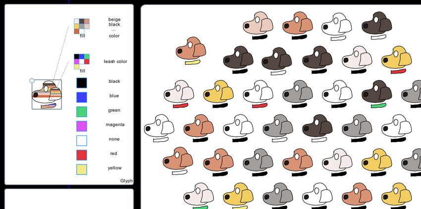
compare to graphics design tools, and invited non-experts            using a 5-point Likert scale (1–strongly disagree, 5–
(limited experience in programming, data analysis and                strongly agree). The experimenter then conducted a semi-
design) to assess the receptiveness by a general audience.           structured interview to collect qualitative comments on the
                                                                     expressiveness, utility, and usability of DataInk.
Apparatus
DataInk was implemented as a web application using D3.js,            Results
running on a Surface Studio, where finger and stylus input           Overall, all participants successfully completed the tasks
can be simultaneously detected and differentiated.                   and created data visualizations for each dataset. We did not
                                                                     observe any notable differences in terms of DataInk usage
Participants
We recruited 8 participants (3 males; Age:18 to 39,                  or quality of the outcomes among designers and non-
Average: 26). Four of them (D1-D4) were designers who                experts, though our sample size is small. In the following,
reported having more than 7 years of experience using                we report subjective ratings and qualitative comments made
digital drawing applications. The others were non-experts            by participants that suggest that DataInk enabled them to
(P1-P4) who reported having no or very limited experience            easily get started (i.e. had a low threshold) and create
in digital drawing. All participants reported having no prior        expressive data visualizations (i.e. had a high ceiling),
experience in creating data visualizations, except P2 who            while supporting a wide range of data-visual mappings (i.e.
had experience using D3.js to create charts. Participants            had wide walls) in a fluid and flexible workflow (i.e.
received $50 for an approximately 90-minute session.                 supporting many paths, many styles).
                                                                     Low Threshold - Learning Curve and Usability
Protocol
Participant first filled a consent form and a demographics           All participants found the interface easy to learn (5/8
questionnaire, then completed three tasks with DataInk,              strongly agree and 3/8 agree) and easy to use (5/8 strongly
concluding by a feedback questionnaire and an interview.             agree and 3/8 agree). As D2 noted, “your tool to Illustrator
                                                                     is like SketchUp to AutoCAD.” They also found the
Demonstration and Training (25 min).                                 interface had “no high-skill cap” (D3) and was “fun to use”
The experimenter demonstrated the underlying concepts of             (D2, D3, D4, P3, P4).
DataInk, including basic sketching, glyph composition,
visual-data mapping and layout via a walkthrough of an               Notably, the usability of the Visual-Data Palette was a
example. Participants were instructed to replicate the exact         recurrent theme discussed in the open comments. Several
same example, seeking guidance whenever necessary. The               participants found the drag-and-drop nature of the visual
experimenter also encouraged them to freely explore the              attributes to data attributes to be “very easy and intuitive”
interface to try every functionality.                                (D2, D3, D4, P1, P2, P4). D4 noted “it’s like tether the
                                                                     actual data and the visual representation”.
Replication and Iteration Exercises (20 min)
The experimenter then proceeded to the replication task.             The locality and the design of the Visual-Data Palette
This task consists in asking participants to replicate a data        enabled participants to “quickly pick up the functionalities
visualization for a new dataset without guidance.                    of the system” (P1), as “it doesn’t distract [them] at all”
Participants received the target visualization on a paper            (P1). When compared to traditional graphic editing
sheet, along with an accompanying legend describing the              software, P2 noted: “I can’t remember all the stuff and
visual encodings. We design this exercise to assess the              things are usually several click away”. In contrast,
learning curve necessary for people to use DataInk to                participants found the palette enabled them to “have an
recreate a design from scratch and bind data to its visual           overview of all the available data attributes” (P1), and that
elements. The second task required participants to alter and         “the slot on the inner ring is good visual indicator of the
iterate on their design, requiring them to make four changes         mapping” (D4). D1 and D3 noted the “new set of tools”
to the glyph composition and three changes to the layout             provided by the interface are “unfamiliar” and “different”,
given an example provided by the experimenter.                       but the DataInk is “simple, straightforward, consistent, and
                                                                     easy to grasp”.
Freeform Exploration (25 min)
After completing the replication and iteration exercises, the        High Ceiling – Expressive Power
experimenter ask participants to design their own data               Participants responded positively about the expressiveness
visualizations. Half of the participants (D1, D2, P1, P2)            the interface, strongly agreeing (6/8) or agreeing (2/8) that
started with the dataset used in the previous stage to give us       it was easy to create the desired visuals, and strongly
an opportunity to assess the expressivity of the system. We          agreeing (5/8) or agreeing (3/8) that they were satisfied
provided the other half (D3, D4, P3, P4) with a new dataset          with the range of visualization designs the system is
to observe the entire creation process.                              capable of. Participants highlighted the range of
                                                                     possibilities that DataInk affords: “You have the micro of
Questionnaire and Interview (20 min)                                 what you can change, which is the glyph, right? And you
Participants concluded the study by a questionnaire,                 have the macro which is the overall layout with the shapes,
addressing expressive power and usability of our prototype           you can get really crazy funky with it.”

                                                                 8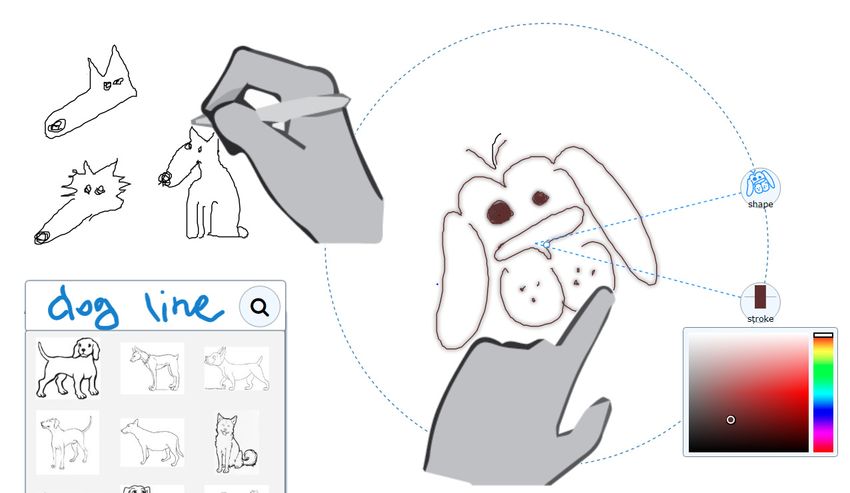
Figure 11 Examples of design realized by participants during the freeform exploration tasks.
Participants also favored the set of consistent interactions to        commented that always being able to see the data
specify the visual-data mappings, which enabled them to                dimensions was useful for their creative process on the
achieve sophisticated outcomes, e.g., “The foundation is               canvas (e.g., “…This helps me to think about the creation of
really good and I can see how it scales up, because you can            the glyph, deciding which data attributes to pick and what
just populate the functionalities with more and more                   would be the most appropriate visual form or layout to
attributes, but they all work the same way. I can totally see          represent them” (P1)), and legend (e.g., “Looking at the
its potential” (D4). Participants commented the sketching              attributes, I really have the urge to map them all!!” (P3)).
and rapid generation of data-driven graphics support their
                                                                       Every participant explored different mappings for glyphs
creativity, e.g., “I feel like I could get more creative. I like
                                                                       and layouts (Figure 11). The ability to propagate changes to
that outcome which was easy to do, easy to read, info
                                                                       other glyphs and setting the mapping on the attribute level
clearly communicated, and visually appealing.” (P3)
                                                                       in the legend were reported as key factors to support rapid
Wide Walls, Many Paths, Many Styles– Creative Exploration              exploration of different alternatives, e.g., “I like the
For the Iteration task, all participants successfully                  capability the tools provide for easily duplicating glyphs
completed the requested changes, and rated that it was easy            and mapping data attributes to visual elements. I am happy
to change glyphs (4/8 strongly agree and 4/8 agree) and                to be able to create a data visualization containing so much
layout (all strongly agree).                                           data in such short time.” (P1), and “It’s fast. You can
Positive comments on the ability to experiment with                    change the drawing and mappings easily. It’s something
alternatives: “I like the flexibility to try out different             everyone can easily put together.” (D3).
things”(P3), and ratings on the statement that it was easy to          Suggestions for Improvement
experiment with different alternatives (5/8 strongly agree             We observed several usability issues, such as quickly
and 3/8 agree) suggests that DataInk supported their                   locating a data dimension of interest. The DataInk palette
creative explorations. Figure 11 features several                      orders existing mappings in relation to the part of the glyph
visualizations designed at the Freeform Exploration stage.             they apply to. However, this design induces changes in the
Participants were all satisfied by their final creation (5/8           order of items in the outer ring. D1 and P2 suggested
strongly agree and 3/8 agree).                                         keeping this order persistent instead, sorting them in
                                                                       alphabetical order for easy navigation. D4 suggested having
During the tasks, we observed different workflows and
                                                                       a search function of data attributes for large datasets.
creation strategies. All participants started by drawing basic
                                                                       Participants also suggested several features such as multiple
shapes to act as a glyph representing a data point. After the
                                                                       glyph and layout panels (P3) to easily change and compare
glyphs populates the canvas, instead of electing to see the
                                                                       different designs, and moving these legend inside the
data attribute of a data point, D1 and P3 started with the
                                                                       canvas (D3) to take advantage of the entire screen space.
layout, as they “want[ed] to know how many different
things are in the dataset, like how many data attributes,              DISCUSSION AND FUTURE WORK
how many different values of them, and how many data                   The study suggests that DataInk is promising to support
points in each group”. After seeing the different categories,          creative exploration, design expression, and the rigorous
D1 continued exploring layouts, while P3 switched to                   execution of creating data visualizations. We reflect on
exploring how to compose the glyphs. The rest started by               each of these goals, outlining limitations, challenges, and
composing the glyphs and then the layout. All participants             opportunities for future work.
went back and forth between the glyph and layout editing to            Limitation and Opportunities
see whether there were data attributes left to be visualized.          When considering design expression, DataInk only supports
We also observed participants fluidly switching between                glyph-based visualizations with a subset of the features
visual-data palette and legend. Participants typically                 available in professional illustration software. While there
experimented with new drawings mappings directly on the                is a trade-off between low thresholds (i.e., learning curves)
canvas. Then, they switched to the legend to set the                   and high ceilings (i.e., expressivity), we believe that there
mapping for every value of a data dimension, e.g., “the                are opportunities to support greater expression without
dragging and the coding on the legend make it very simple              compromising the interaction paradigm. We ground our
and fast to do what I want to do” (D3). Participants                   discussion with examples from Dear Data [33].

                                                                   9
Glyphs                                                               levels of groupings, distribution paths, and orders. In our
DataInk supports a subset of the visual properties available         prototype, this could be achieved by specifying multiple
for encoding. Adding support for additional ones such as             layout cards, however, the order of layout cards introduces
rotation or opacity is directly achievable. Another                  dependencies and constraints regarding the possibilities of
interesting addition is to incorporate procedural drawing            the nested layout structure. Conveying these constraints to
techniques such as those demonstrated in Vignette [26] and           the users in a transparent way, and enabling them to fluidly
Para [22]. To reproduce the glyph made of concentric                 experiment with layout hierarchies, raises new challenges.
circles in Figure 12:a, DataInk requires users to draw a
                                                                     Blurring the Line with Data Exploration
different shape for each data value. This process forces the
                                                                     When considering creative exploration, Design Decision
users to provide a categorical visual encoding for
continuous data value, while procedural drawing enables              1,4, and 5 suggested interactions to explore the different
the generation of continuous ones.                                   data dimensions and fluidly experiment with visual-data
                                                                     mappings. Reflecting on our study observations, we believe
Generalizing DataInk to encompass every data visualization           that we can enrich DataInk to provide more data
is out of scope. We reflect on a few straightforward                 exploration capabilities. We plan to enrich the interactions
extensions, and more challenging ones. A simple                      with the legend to enable users to browse and manipulate
modification to our prototype would enable users to create           data dimensions (e.g. filtering, grouping, and sorting). The
visual marks representing aggregates used in standard                goal of our current prototype is to probe and evaluate a new
representations such as bar or bubble charts. DataInk could          interaction concept rather than engineering a full-featured
support this by enabling users to bind properties of visuals         system. Assured by the research community, in the future,
to the results of operations on groups of data points. For           we seek to support the entire workflow from collecting and
example, one could create groups of dogs by fur length (via          editing data to creating and sharing visualizations.
the same mechanism provided to group glyphs for the
                                                                     Bringing Creativity to the Next Level
layout). Then, by providing a set of operations on groups
                                                                     DataInk goes beyond the generation of static visualizations.
(e.g. count), one could map the size of a drawing to the
                                                                     We envision many opportunities to support creative and
results of this operation. DataInk would thus generate one
                                                                     expressive designs for interactive and dynamic data
drawing per group, rather than one per data point.
                                                                     visualizations. The philosophy and general directness of our
Other types of visualizations would require more profound            approach combines well with techniques such as Draco [25]
changes. For example, node-link diagrams (Figure 12:b)               or Kitty [24], enabling users to specify the dynamic and
rely on two types of glyphs: nodes and links. This may               interactive behavior of graphics through sketching. A direct
result in a more complex creation process, as it introduces          opportunity for future research would be to explore how
dependencies between nodes and links glyphs when                     interactions afforded by these systems can be integrated
generating the visualization.                                        into DataInk and augmented to support data binding.
Layout                                                               CONCLUSION
One of the more challenging features to tackle pertains to           We propose DataInk, a system for authoring whimsical and
the specification of the layout of visual marks in space. Our        personalized visual representations of data. DataInk aims at
current prototype enables the users to specify a single level        supporting the creative process while affording design
of grouping of glyphs as well as their distribution path and         expression to craft visually-rich graphics via freeform
sorting order. Supporting the hierarchical and nested spatial        sketching and rigorous execution by maintaining a tight
structure that can be seen in several examples of Dear Data          coupling between visuals and data via direct manipulation.
(Figure 12:cd) would require a user to specify multiple              The design decisions of supporting direct manipulation are
                                                                     embodied as a simple set of pen-and-touch interaction
                                                                     techniques and a fluid graphical user interface, which
                                                                     enable both rich expressiveness and effortless execution of
                                                                     data visualizations. A user study with eight designers and
                                                                     non-experts suggests that this approach is promising and
                                                                     demonstrate that DataInk allows users to unleash their
                                                                     creativity to experiment with differently visual designs and
                                                                     create a diverse set of glyph-based visualizations.
                                                                     ACKNOWLEDGEMENTS
                                                                     We would like to thank members of DGP lab for their input
                                                                     and the reviewers for the valuable feedback. Special thanks
                                                                     to Peter Hamilton for his assistance with the video, Michael
Figure 12 Examples from Dear Data requiring more features: a)        Wang for assisting the implementation, as well as Giorgia
shape generation for continuous data; b) node-link diagrams; c)      Lupi and Stefanie Posavec for permission to use images
               hierarchical or d) nested layouts.                    from Dear Data.
                                                                10
REFERENCES ACM Symposium on User Interface Software and
1. Adobe Illustrator 2017, Retrieved September 16, 2017 Technology (UIST ’16), 133-144.
from www.adobe.com/Illustrator https://doi.org/10.1145/2984511.2984577
2. Michel Beaudouin-Lafon. 2000. Instrumental 13. William S. Cleveland and Robert McGill. 1987.
interaction: an interaction model for designing post- Graphical Perception: The Visual Decoding of
WIMP user interfaces. In Proceedings of the SIGCHI Quantitative Information on Graphical Displays of
conference on Human Factors in Computing Systems Data. Journal of the Royal Statistical Society. Series A
(CHI '00). 446-453. (General) 150(3):192–229.
http://dx.doi.org/10.1145/332040.332473 https://doi.org/10.2307/2981473
3. Jacques Bertin. 2010. Semiology of Graphics: 14. Darius Coelho, Ayush Kumar, and Klaus Mueller.
Diagrams, Networks, Maps (1st ed.). ESRI Press, 2015. Data Memes for Personal Visualization.
Redlands, Calif. Proceeding of IEEE VIS 2015 workshop Personal
4. Alex Bigelow, Steven Drucker, Danyel Fisher, and Visualization: Exploring Data in Everyday Life.
Miriah Meyer. 2014. Reflections on How Designers 15. Andrew Crotty, Alex Galakatos, Emanuel Zgraggen,
Design with Data. In Proceedings of the International Carsten Binnig, and Tim Kraska. 2015. Vizdom:
Working Conference on Advanced Visual Interfaces interactive analytics through pen and touch. In
(AVI ’14), 17–24. Proceeding of VLDB Endow, 8(12):2024-2027.
https://doi.org/10.1145/2598153.2598175 http://dx.doi.org/10.14778/2824032.2824127
5. Alex Bigelow, Steven Drucker, Danyel Fisher, and 16. DensityDesign Research Lab. RAWGraphs. Retrieved
Miriah Meyer. 2017. Iterating between Tools to Create September 16, 2017 from http://rawgraphs.io/
and Edit Visualizations. IEEE Transactions on
17. Drupal. EasyCharts. Retrieved September 16, 2017
Visualization and Computer Graphics, 23(1), 481-490.
from http://www.easychart.org/
https://doi.org/10.1109/TVCG.2016.2598609
18. Lars Grammel, Chris Bennett, Melanie Tory, and
6. Bill Buxton. 2010. Sketching user experiences: getting
Margaret-Anne Storey. 2013. A Survey of
the design right and the right design. Morgan
Visualization Construction User Interfaces. In EuroVis
Kaufmann.
- Short Papers.
7. Rita Borgo, Johannes Kehrer, David H.S. Chung, http://dx.doi.org/10.2312/PE.EuroVisShort.EuroVisSh
Eamonn Maguire, Robert S. Laramee, Helwig Hauser, ort2013.019-023
Matthew Ward, Min Chen. 2013. Glyph-based
19. Lars Grammel, Melanie Tory, and Margaret-Anne
Visualization: Foundations, Design Guidelines,
Storey. 2010. How Information Visualization Novices
Techniques and Applications. Eurographics State of
Construct Visualizations. IEEE Transactions on
the Art Reports, 39-63.
Visualization and Computer Graphics 16(6): 943–952.
8. Mike Bostock, V. Ogievetsky, and J. Heer. D3 Data- https://doi.org/10.1109/TVCG.2010.164
Driven Documents. 2011. IEEE Transactions on
20. Ken Hinckley, Koji Yatani, Michel Pahud, Nicole
Visualization and Computer Graphics, 17(12):2301–
Coddingotn, Jenny Rodenhouse, Andy Wilson, Hrvoje
2309. https://doi.org/10.1109/TVCG.2011.185
Benko, and Bill Buxton. 2010. Pen + touch = new
9. Jeffrey Browne, Bongshin Lee, Sheelagh Carpendale, tools. In Proceedings of the ACM Symposium on User
Nathalie Riche, and Timothy Sherwood. 2011. Data interface software and technology (UIST ’10), 27–36.
analysis on interactive whiteboards through sketch- https://doi.org/10.1145/1866029.1866036
based interaction. In Proceedings of the International
21. Samuel Huron, Sheelagh Carpendale, Alice Thudt,
Conference on Interactive Tabletops and Surfaces (ITS
Anthony Tang, and Michael Mauerer. 2014.
’11), 154-157.
Constructive Visualization. In Proceedings of the
https://doi.org/10.1145/2076354.2076383
Conference on Designing Interactive Systems (DIS
10. Alberto Cairo. 2012. The Functional Art: An ’14), 433–442.
introduction to information graphics and visualization. https://doi.org/10.1145/2598510.2598566
New Riders.
22. Jennifer Jacobs, Sumit Gogia, Radomir Mech, and Joel
11. Stuart K. Card, Jock D. Mackinlay, and Ben Brandt. 2017. Supporting Expressive Procedural Art
Shneiderman, eds. 1999. Readings in information Creation through Direct Manipulation. In Proceedings
visualization: using vision to think. Morgan Kaufmann. of the SIGCHI Conference on Human Factors in
12. Marianela Ciolfi Felice, Nolwenn Maudet, Wendy E. Computing Systems (CHI ’17), 6330-6341.
Mackay, and Michel Beaudouin-Lafon. 2016. Beyond https://doi.org/10.1145/3025453.3025927
Snapping: Persistent, Tweakable Alignment and 23. Jaemin Jo, Sehi L'Yi, Bongshin Lee, and Jinwook Seo.
Distribution with StickyLines. In Proceedings of the 2017. TouchPivot: Blending WIMP & Post-WIMP
11Interfaces for Data Exploration on Tablet Devices. In 33. Giorgia Lupi, and Stephanie Posavec. 2016. Dear
Proceedings of the 2017 CHI Conference on Human Data. Princeton Architectural Press.
Factors in Computing Systems (CHI ‘17), 2660-2671. 34. Eamon Maguire, Philippe Rocca-Serra, Susanna-
https://doi.org/10.1145/3025453.3025752 Assunta Sansone, Jim Davies, and Min Chen. 2012.
24. Rubaiat Habib Kazi, Fanny Chevalier, Tovi Grossman, Taxonomy-Based Glyph Design with a Case Study on
and George Fitzmaurice. 2014. Kitty: Sketching Visualizing Workflows of Biological Experiments.
Dynamic and Interactive Illustrations. Proceedings of IEEE Transactions on Visualization and Computer
the ACM Symposium on User interface software and Graphics, 18(12):2603-2612.
technology (UIST ’14), 395–405. https://doi.org/10.1109/TVCG.2012.271
https://doi.org/10.1145/2642918.2647375 35. Gonzalo G. Méndez, Miguel A. Nacenta, and Sebastien
25. Rubaiat Habib Kazi, Fanny Chevalier, Tovi Grossman, Vandenheste. 2016. iVoLVER: Interactive Visual
Shengdong Zhao, and George Fitzmaurice. 2014. Language for Visualization Extraction and
Draco: bringing life to illustrations with kinetic Reconstruction. In Proceedings of the SIGCHI
textures. In Proceedings of the SIGCHI Conference on Conference on Human Factors in Computing Systems
Human Factors in Computing Systems (CHI ’14), 351- (CHI ’16), 4073–4085.
360. https://doi.org/10.1145/2556288.2556987 https://doi.org/10.1145/2858036.2858435
26. Rubaiat Habib Kazi, Takeo Igarashi, Shengdong Zhao, 36. Gonzalo G. Méndez, Uta Hinrichs, and Miguel A.
and Richard Davis. 2012. Vignette: interactive texture Nacenta. 2017. Bottom-up vs. Top-down: Trade-offs in
design and manipulation with freeform gestures for Efficiency, Understanding, Freedom and Creativity
pen-and-ink illustration. In Proceedings of the SIGCHI with InfoVis Tools. In Proceedings of the SIGCHI
Conference on Human Factors in Computing Systems, Conference on Human Factors in Computing Systems
(CHI ’12), 1727-1736. (CHI ’17), 841-852.
https://doi.org/10.1145/2207676.2208302 https://doi.org/10.1145/3025453.3025942
27. Nam-Wook Kim, Eston Schweickart, Zhicheng Liu, 37. Microsoft Excel 2016, Retrieved September 16, 2017
Mira Dontcheva, Wilmot Li, Jovan Popovic, Hanspeter from https://products.office.com/en-us/excel
Pfister. 2017. Data-Driven Guides: Supporting 38. Microsoft Power BI, Retrieved September 16, 2017
Expressive Design for Information Graphics, IEEE from https://powerbi.microsoft.com/en-us/
Transactions on Visualization & Computer Graphics,
23(1):491-500. 39. Otto Neurath. 2011. From Hieroglyphics to Isotype: A
https://doi.org/10.1109/TVCG.2016.2598620 Visual Autobiography, eds. Matthew Eve and
Christopher Burke, Hyphen Press.
28. https://doi.org/10.1145/2207676.2208302
40. Donghao Ren, Tobias Höllerer, and Xiaoru Yuan.
29. Randy Krum. 2013. Cool infographics: Effective 2014. iVisDesigner: Expressive Interactive Design of
Communication with Data Visualization and Design. Information Visualizations. IEEE Transactions on
Wiley. Visualization and Computer Graphics, 20(12):2092–
30. Bongshin Lee, Petra Isenberg, Nathalie Henry Riche, 2101. https://doi.org/10.1109/TVCG.2014.2346291
and Sheelagh Carpendale. 2012. Beyond Mouse and 41. William Ribarsky, Eric Ayers, John Eble, and Sougata
Keyboard: Expanding Design Considerations for Mukherjea. 1994. Glyphmaker: creating customized
Information Visualization Interactions. IEEE visualizations of complex data. Computer, 27(7):57–
Transactions on Visualization and Computer Graphics 64. https://doi.org/10.1109/2.299412
18(12): 2689-2698.
https://doi.org/10.1109/TVCG.2012.204 42. Yann Riche, Nathalie Henry Riche, Ken Hinckley,
Sheri Panabaker, Sarah Fuelling, and Sarah Williams.
31. Bongshin Lee, Rubaiat Habib Kazi, and Greg Smith. 2017. As We May Ink? Learning from Everyday
2013. SketchStory: Telling More Engaging Stories Analog Pen Use to Improve Digital Ink Experiences.
with Data through Freeform Sketching. IEEE In Proceedings of the SIGCHI Conference on Human
Transactions on Visualization and Computer Graphics Factors in Computing Systems (CHI ’17), 3241-3253.
19(12):2416-2425. https://doi.org/10.1145/3025453.3025716
https://doi.org/10.1109/TVCG.2013.191
43. Lisa Rost. Blog Post. Retrieved 12 September 2017
32. Bongshin Lee, Greg Smith, Nathalie Henry Riche, from https://source.opennews.org/articles/what-i-
Amy Karlson, and Sheelagh Carpendale. 2015. learned-recreating-one-chart-using-24-tools/
Sketchinsight: Natural data exploration on interactive
whiteboards leveraging pen and touch interaction. In 44. Ramik Sadana and John Stasko. 2014. Designing and
Proceeding of the IEEE Pacific Visualization implementing an interactive scatterplot visualization
Symposium (PacificVis ’15), 199–206. for a tablet computer. In Proceedings of the 2014
https://doi.org/10.1109/PACIFICVIS.2015.7156378 International Working Conference on Advanced Visual
12You can also read