EMAIL ON ACID INTERACTIVE EMAIL GUIDE - GIF - EMAILONACID
←
→
Page content transcription
If your browser does not render page correctly, please read the page content below
EMAIL ON ACID
INTERACTIVE EMAIL GUIDE

                  < >

                        GIF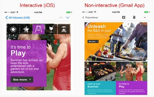
LET’S GET STARTED...

Email was around long before the Internet, but unfortunately email
hasn’t progressed like web development has with dynamic and
interactive content you see daily. This isn’t for lack of trying, though.
With all the limitations around what clients can support, an animated
GIF has been about as flashy as it can get, but no more! The dawn
of interactive email has arrived and it brings with it what the future
of email will look like!

Interactivity in email allows you to say good bye to static campaigns
and hello to delivering enriched emails which users can interact with.
No, email clients don’t support Javascript, so how does an email dev
accomplish this? By leveraging HTML, CSS and CSS2 to detect user
interactions and create complex functionality.

In this guide, we’ll break down 5 cutting edge coding techniques to
make your email interactive and your audience engaged. In all these
coding techniques we remember the words of Elliot Ross when he
said, “Flashy design for no reason is confusing and awkward.” The
examples we give will ensure the interactive elements work alongside
solid copy to increase opens, clicks and revenue, all while delighting
the end-user. Plus, we’ll touch on the limits of interactivity, fall back
strategies and the importance of testing. Enjoy!
CONTENT
CHAPTER 1          [page 4]

Coding Interactive
Hotspots in HTML Email

CHAPTER 2          [page 11]

Using Interactive Email to
Highlight Content

CHAPTER 3          [page 19]

How to Create Responsive
Rollover Images for Email

CHAPTER 4          [page 24]

Animated Image
Carousels in Email

CHAPTER 5          [page 32]

Four Interactive Email
Fallback Strategies

CHAPTER 6          [page 40]

Other Limitations of Interactivity
+ the Importance of Testing

C HAP TE R #

                                       CHAPTER 1

 CODING INTERACTIVE
HOTSPOTS IN HTML EMAIL
Interactive hotspots, or positioned information overlays, are a good way to deliver additional contextual
information on an image. This chapter will go into how you can implement interactive hotspots in email
that work in many of the major email clients.

We sent out an email with an infographic that incorporated interactive hotspots. When the user hovered the
cursor over the hotspot a small text overlay appeared next to the hotspot that provided more information
about the statistics within the infographic.

                                          VIEW THE EMAIL

                                                     4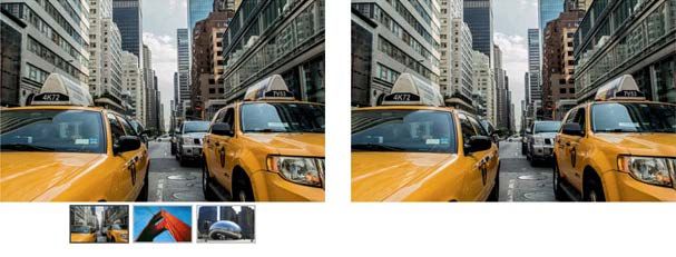
Now, let’s get into the nitty gritty
of how we accomplished this...
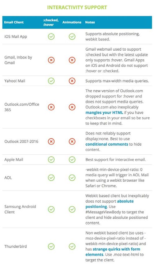
INTERACTIVE HOTSPOT SUPPORT
As usual, interactive hotspots only work in certain email clients - in this case email clients that support the
:hover pseudo-class. This includes iOS Mail, Apple Mail, Yahoo! Mail, AOL Mail and the Webmail version of
Gmail (except Gmail for Business). In the other email clients, the infographic is shown without the hotspot
markers.
HOTSPOT BUILDING BLOCKS Rollover below for more information
We’ll go through the steps of building a simple
hotspot example. If you want to view the completed
example before we jump in, click here.
“ABSOLUTE” POSITIONING USING MARGINS
As most email clients don’t support absolute
positioning, we position the hotspot icons with
a technique that Mark Robbins of Rebelmail
pioneered, which uses margins.
The technique positions elements in a container by first wrapping the element you want absolutely
positioned with a div that has zero width and height and overflow set to visible. Then within the first
wrapping element, wrap the element with another div with display set to inline-block and with the element
relative positioned within the container using left and top margins.
It’s a pretty cool technique and you can read more about this positioning technique in the Rebelmail blog.
5
C HAP TE R 1

USING THE :HOVER PSEUDO-CLASS

We then add a div with the text overlay that we want to show once the hotspot is triggered. It is hidden by
default by having its max-height set to zero. Then we wrap both the hotspot marker and the overlay with
a div with a class name “ehotspot”.

Within the style block, we add a :hover selector that displays the hidden div once the user hovers over the
element. Simple, right?

              .ehotspot:hover div {
                    max-height:none!important;
              }

                          The infamous pi (π) is used to calculate the circumference
         or area of circles.

EXAMPLE WITHOUT FALLBACKS                                   Rollover           below for more information

You can see the example without fallbacks here.
We still need to add some techniques to handle
the clients that this won’t work in - Outlook, Office
365 and the Gmail mobile app.

                                                                 Square is the name of the payment
                                                                 startup founded by Twitter co-
                                                                 founder Jack Dorsey.

                                                        6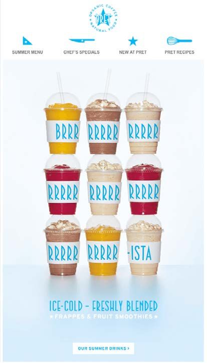
C HAP TE R 1

IMPLEMENTING FALLBACKS

To make implementation straightforward, we’ll hide
the entire interactive container from non-supported
clients and display a separate container that just
contains the image with the shapes. This also
means you can display an entirely different image
in the fallback container if you like. Alternatively, you
can choose to just hide the markers and show the
base image.

             … interactive content …

All clients that don’t support interactive email also don’t support media queries, so we can use a simple
media query to hide the fallback and display the interactive containers.

           @media screen and (max-width:9999px){
                      .fallback{
                           display:none;
                           display:none!important;
                           max-height:0;
                           overflow:hidden;
                      }
                      .kinetic{
                           display:block!important;
                           max-height:none!important;
                           position:relative;
                           overflow:hidden;
                           width:400px;height:280px;
                      }
                  }

                                                        7
C HAP TE R 1

NOTICE:
Due to the Gmail app’s support for media queries but not the :hover pseudo-class, we need to use this
technique to hide the kinetic elements from the Gmail app. This technique includes setting a class to the
body of the email (ie. gmail body) and adding the media query code below. Alternatively you can use the
-webkit-min-device-pixel-ratio media query in the above code to limit interactivity to only Webkit based
clients and forgo the following code:

           @media screen and (max-device-width:1024px){
                    u + .gmailbody .kinetic{
                         display:none!important;
                    }
                    u + .gmailbody .fallback{
                         display:block!important;
                         max-height:none;
                    }
               }

SUPPORTING HOTSPOT TOGGLING IN TOUCH DEVICES

To support toggling of the hotspot in touch devices such as on mobile, a hidden alternate hotspot marker
is placed outside the hotspot div.

                   The infamous pi (π) is used to calculate the circumference or
          area of circles.

                                                   8
C HAP TE R 1

The alternative marker will be set to visible when the hotspot is triggered. The alternative marker is
absolutely positioned so that when visible it will overlay the original marker. Since the alternate marker is
not within the hotspot, tapping the icon will deactivate the :hover selector and close the overlay.

The CSS to display the alternate marker must be put into a media query for mobile or tablet devices so
that it will not be active in non-touch devices as it will cause the overlay to flicker. For our purposes, we
put it in a max-device-width:1024 media query.

          @media screen and (max-device-width:1024px) {
                     /* hide original marker */
                     .ehotspot:hover img{
                          visibility:hidden;
                     }
                     /* show alternate marker */
                     .ehotspot:hover + img{
                          max-height:none!important;
                          z-index:3;
                     }
              }

OTHER TWEAKS

You may want to consider a few of these tweaks to polish your email and deal with client quirks.

• Attribute selectors are added to support interactivity in Gmail Webmail.

• The base image is wrapped with a link with an anchor (...) so that the user can
hide a hotspot in mobile or tablet by tapping the base image itself.

• A “hint” element is added to the top of the interactive container to inform the recipient that the hotspots
below are interactive. This hint element is only visible in clients that support interactivity.

• Animations are added to grow and shrink the hotspot to attract the user’s attention in clients that
support interactivity.

• You’ll also notice that overflow:visible!important is added to max-width elements. That is to deal with
Yahoo! Mail’s addition of overflow:auto on elements with max-width set.

                                       SEE THE FINAL CODE

                                                       9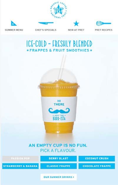
C HAP TE R 1

CONSIDERATIONS FOR RESPONSIVE EMAIL

A drawback of this technique is that it does not support responsive images. This is because the margin
offsets of the hotspots are specified in pixels. The images should not be made to shrink or expand to its
container or the hotspot coordinates will be off.

However, you can still leverage interactive hotspots in your responsive designs with a combination of the
following tweaks.

• Use media queries to re-adjust both the image size and hotspot coordinates on mobile.

• Use scalable images in the fallback image so your hybrid/spongy email will still scale appropriately in
the Gmail mobile app.

• Use a narrower base image so that the email has room to shrink in a mobile client.

• Use large fonts in your email so a fixed width email will still look good in mobile.

                       Now let’s move into our next
                    interactive technique, highlighting
                         content via interactivity!

                                                     10
C HAP TE R #
CHAPTER 2
USING INTERACTIVE
EMAIL TO HIGHLIGHT
CONTENT
Interactive email is a topic hot on everybody’s lips; it’s what
everyone wants to be sending out. Day by day we see new
clever examples popping up. In this post, we’ll show you how
we used interactive elements to highlight areas of our product
in a recent email, and how good content can go hand-in-
hand with interactive elements.
VIEW THE EMAIL
11C HAP TE R 2
THE GOAL
My goal with this email was to split it into clear content blocks, each block highlighting a different part of
Email on Acid in a way that adds a bit of interactivity. In each section, I’ll explain how and why it was coded
in the way it was, how we dealt with fallbacks, and the end product.
Take a look at the full email here. Make sure to use a webkit browser (like Chrome of Safari) so you can
enjoy all the interactive goodness!
FORUMS - HOVER ANIMATION
The first area of Email on Acid we wanted to highlight is our forums. For this section, we decided to add
three icons showing the benefits of joining and posting on our forums, as can be seen below:
Forums
We’ve been building up a rock-solid group of email marketers, coders and designers
that live and breathe email over the past 7 years. Join the conversation today to get
and give help on email coding and marketing techniques.
Get assistance with Contribute to the Brainstorm ideas with
email bugs community email geeks
Join the conversation
Forums
To add an element of interactivity to this section, we wanted to add a clever hover effect. When you hover
over an icon,
We’veit been
gives building
the impression that the icon
up a rock-solid is reversing.
group of email marketers, coders and designers
that live and breathe email over the past 7 years. Join the conversation today to get
and give help on email coding and marketing techniques.
Get assistance with Contribute to the Brainstorm ideas with
email bugs community email geeks
Join the conversation
12C HAP TE R 2
Although this may look a complicated piece of code the implementation is fairly simple. Let’s break it down.
All three icons are coded in the same way. We have a table and a cell to contain the image. You’ll notice
that the cell has a class of iconArea1BG and the image itself has an id of iconArea1.
The next step is to add the CSS to the located in the . We’ll need to reference both the class
and id seen above.
#iconArea1:hover {
opacity: 0;
transition: all 0.3s linear;
}
This section is handling the id of iconArea1 we placed on the image. This piece of code is simply saying
that when we hover over the image we want it to switch from full opacity, to zero opacity.
#iconArea1BG {
background-image: url(images/icon1-1.jpg);
background-repeat: no-repeat;
}
13C HAP TE R 2
This piece of code is handling the class of iconArea1BG. With this snippet, we're simply adding a background
to the cell with the icon in it.
So, to recap, by adding these two pieces of CSS to the email we're saying that when we hover over the
image it will become transparent, enabling us to see the background hidden behind it.
In terms of fallbacks, this piece of code works itself out. For any clients that don't support the :hover
functionality, they'll simply see the standard icons.
EMAIL TEMPLATES - SIDE-SCROLLING IMAGE
The next thing to highlight was our free email templates. We have a fantastic selection of bullet-proof
email templates that are completely free with a community account. It was important to show the wide
variety of different templates we have.
To achieve this, we created a wide image which consisted of multiple preview images of our templates.
We then set it as the background image of the section and had it scroll infinitely. Unfortunately, it’s always
trickier to code than to explain. So, let’s see how we coded this section!
14C HAP TE R 2
First off, we have to deal with Android 5.1 and Gmail App with Non-Google Accounts (GANGA) which will
not display background images.
We simply contain a table inside a div with the class of fallback.
@media screen and (-webkit-min-device-pixel-ratio: 0) {
.fallback {
display:none;
display:none!important;
max-height:0;
overflow:hidden;
}
.interactive{
display:block!important;
max-height:none!important;
}
}
By adding the above snippet of CSS to the head, we will ensure that any clients that will render our
interactive section will hide the fallback div. By using a combination of all these hiding techniques, we can
ensure a bulletproof hidden section.
15C HAP TE R 2
So, now for the main section.
There’s a lot going on here, but we’ll break it down bit by bit! Let’s start with the div containing all of the
content. This div is set to hide by default, which we reverse in the embedded CSS snippet above on clients
that will render it.
Next up, we have some VML to ensure our background image renders on Microsoft Outlook clients. We also
have to include a transparent PNG with the width and height of the whole area, to ensure that when we’re
scaling the size of the email we can see the entire background image.
16C HAP TE R 2
We also have an id set on the table cell of “animate-area2”. This is how we handle the animation of the
section, as seen in the CSS below.
#animate-area2 {
width:650px;
background-image: url(images/scroller.jpg);
background-position: 0px 0px;
background-repeat: repeat-x;
animation: animatedBackground 45s linear infinite;
-moz-animation: animatedBackground 45s linear infinite;
-webkit-animation: animatedBackground 45s linear infinite;
}
@keyframes animatedBackground {
0% { background-position: 2400px 0; }
100% { background-position: 0 0; }
}
@-moz-keyframes animatedBackground {
0% { background-position: 2400px 0; }
100% { background-position: 0 0; }
}
@-webkit-keyframes animatedBackground {
0% { background-position: 2400px 0; }
100% { background-position: 0 0; }
}
We’re simply saying here that our animation, named animatedBackground, we want it to move from its
original position along the x axis by 2400 pixels, which is the width of the image. This is what creates the
scrolling effect. We also set the animation to be infinite.
The final piece of interaction added was to let the user be able to pause the animation on hover. This was
done simply so they could read the information on the images, as it can be tricky to read as they scroll
past. This was done by adding a :hover style as seen below.
17C HAP TE R 2
#animate-area2:hover {
-webkit-animation-play-state: paused;
-moz-animation-play-state: paused;
-o-animation-play-state: paused;
animation-play-state: paused;
}
EVENTS - IMAGE CAROUSEL
Another element of our Email on Acid offering to
promote was our recent dive into hosting events
for the email community. For this section, we
wanted to show speakers from our first meetup,
along with their names and presentation title. We
did this by adding a carousel in the email.
To create a fully working bulletproof carousel
we used the guide provided by our email expert,
Justin Khoo. You can read how to achieve this over
on his blog.
One thing to note is that with the recent Gmail
changes they have dropped support for attribute
selectors which, unfortunately, means this carousel
won’t work within Gmail. However, that’s a fair price
to pay for mobile responsiveness in Gmail, right?
EDITOR - ANIMATED GIF
Our final section to highlight in the email was our
awesome email editor.
We used an animated GIF here. Animated GIFs
have long been a staple of the email marketing
industry. Not only are they incredibly robust, they
boast exceptional support in most email clients.
We still need to ensure the first frame of the GIF
has the right content in it, as Outlook 2007, 2010,
2013 and 2016 will only render the first frame.
18C HAP TE R #
CHAPTER 3
HOW TO CREATE
RESPONSIVE ROLLOVER
IMAGES FOR EMAIL
Rollover or mouse over images are ubiquitous on the web.
E-commerce websites often feature images of products where
an alternative view of a product is displayed when the visitor
hovers a cursor over an image. Rollover images allow more
information to be displayed without cluttering the page.
This chapter will go over how to create interactive rollover images
in email that will scale with the width of your email. The rollover
images will be interactive in Apple Mail, Yahoo! Mail, AOL Mail, the
webmail version of Gmail and some versions of Outlook.com. In
other email clients, the image is non-interactive.
19NON-RESPONSIVE METHOD
Justin Khoo demonstrated a method to create rollover images in email using background images. However,
the old method requires the width of the image to be fixed because the background-size property is not
uniformly supported by all email clients.
This means you cannot place the image within responsive layouts as the image will not scale.
RESPONSIVE METHOD
The basics of responsive rollover images is pretty straightforward - you wrap a link around two images,
and hide the alternative image by default.
Then in a style block you use the :hover pseudo-class to hide the main image and show the alternate
image when the user hovers over the link with the class “rollover”.
.rollover:hover .main{
max-height: 0px !important;
}
.rollover:hover .alt{
max-height: none !important;
}
Simple huh? Unfortunately, it’s not so straightforward as both images will be visible in Outlook 2007+.
This is because max-height is not supported by those clients. If you’re wondering why not just use height
instead, well Outlook 2007+ ignores image dimensions set to zero!
20C HAP TE R 3
FIXES FOR OUTLOOK
To hide the alternative image from Outlook, we wrap it with a div and use the mso-hide:all Microsoft Office style.
ADDING SUPPORT FOR GMAIL
Finally, we use the attribute selector hack for Gmail to make the image interactive in Gmail webmail as
well. We add a summary attribute on the link and we also simplify the code by replacing the “main” and
“alt” classes with “>” direct child selector.
.rollover:hover > img,
* [summary=rollover]:hover > img{
max-height: 0px !important;
}
.rollover:hover > div img,
* [summary=rollover]:hover > div img{
max-height: none !important;
}
Code continued on next page.
21C HAP TE R 3
WHAT ABOUT MOBILE?
On mobile - specifically iOS - because the image is wrapped in a link, when a user taps on an image,
both the hover and click fires simultaneously. The rollover image will appear for a split second before the
link opens in the browser.
Since this may be jarring to the user, we can disable the rollover state in mobile by using this media query
@media screen and (max-device-width:1024px) {
.rollover:hover > img,
* [summary=rollover]:hover > img{
max-height: none !important;
}
.rollover:hover > div img,
* [summary=rollover]:hover > div img{
max-height: 0px !important;
}
}
22C HAP TE R 3
COMPLETED SAMPLE
Check out a working sample of this code below.
MOBILE IMAGE SWAP
It would be a shame if we went through all this effort without also supporting mobile. However, all is not
lost! Even though there’s no concept of a hover state in mobile, we can try alternative approaches such
as adding a separate “tapzone” to display the alternate image.
This article covers a method on how to display a rollover tapzone in mobile.
SEE THE FINAL CODE
23C HAP TE R #
CHAPTER 4
ANIMATED IMAGE
CAROUSELS IN EMAIL
This chapter will cover how to build a basic carousel that will
fade from one image to the next.
Since CSS animations mostly only work in Webkit based clients,
the carousel will be active in iOS Mail (iPhone, iPad), Apple
Mail and Outlook for iOS and Mac. Other clients will display the
fallback content.
24C HAP TE R 4
THREE IMAGE CAROUSEL
The carousel we’ll be building will contain three images, although you should be able to customize it for
as many images as you like.
View completed demo (Use Chrome or Safari to see the animation)
The basics of this carousel are pretty straightforward; we start with a div containing a set of images with links.
25C HAP TE R 4
Then we’re going to position the images so they overlap each other using absolute positioning. This will
display the last image on top instead of the first. We’ll change that in a minute.
.carousel a{
position:absolute;
top:0px;
left:0px;
}
We’ll now use the following CSS to cycle through the images in the carousel. Specifically, we’ll shift their
z-index positions up and down depending on which part of the animation the image is in.
.carousel a {
position:absolute;
top:0px;
left:0px;
-webkit-animation: car-anim 9s linear infinite;
}
.carousel a:nth-child(1){
-webkit-animation-delay: 0s;
}
.carousel a:nth-child(2){
-webkit-animation-delay: 3s;
}
.carousel a:nth-child(3){
-webkit-animation-delay: 6s;
}
@-webkit-keyframes car-anim
{
0% {
z-index:2;
}
Code continued on next page.
26C HAP TE R 4
33%{
z-index:2;
}
33.001%{
z-index:1;
}
100%{
z-index:1;
}
}
See an example here.
As you can see, we have an animation sequence called car-anim. All three images will be sharing the
same animation, but they’ll start at different times using the animation-delay property. The animation will
last a total of 9 seconds (3 seconds for each image).
So far, pretty straightforward stuff.
FIXING SWAPPING GLITCH
If you run the code above, you’ll note that at times there’s what appears like a very brief glitch when the
images swap. This is due to the fact that when cycling the images, the lower level images share the same
z-index (1). In absolute position stacked elements, if two elements share the same z-index the bottom-
most element appears on top -- therefore there’s a brief moment where the 3rd image appears before
the 2nd image gets its z-index changed to 2.
This issue doesn’t present itself if we cycle the images according to their natural stacking order, (from the
3rd image to the 1st), but we felt conceptually cycling the 3rd image first feels odd, so we fix it by hiding
an image using opacity:0 when it is no longer at the top. We add a slight delay when hiding to account
for the iOS transition gap.
27C HAP TE R 4
@-webkit-keyframes car-anim
{
0% {
z-index:2;
opacity:1;
}
33%{
z-index:2;
}
33.1%{
z-index:1;
opacity:1;
}
35%{
opacity:0;
}
100%{
z-index:1;
opacity:0;
}
}
USING NEGATIVE ANIMATION DELAY TO ADDRESS IOS SCROLL QUIRK
In iOS9 the email client pauses animations when the user scrolls the email. However, it does not pause
the animation delay timer. This can potentially cause timing issues if the user scrolls the email after
the first animation has started but the animations for other images have yet to start. This issue is not
present in iOS10.
One solution is to not use animation delay, but that would be a huge setback. Thankfully, there’s another
option, and that is to use negative animation delays. Negative animation delays as stated in the referenced
article “start the animation immediately, as if that amount of time has already gone by.” This works for
us because any scrolling of the email will pause all animations since they are already running so the
animations don’t lose sync.
We change our animation delays for our images to the following. You can shift the delays up or
down to start the animation at any time but they must be spaced equally apart based on the total
animation runtime.
28C HAP TE R 4
.carousel a:nth-child(1){
-webkit-animation-delay: -9s;
}
.carousel a:nth-child(2){
-webkit-animation-delay: -6s;
}
.carousel a:nth-child(3){
-webkit-animation-delay: -3s;
}
FADE EFFECT
To improve the carousel experience we’ll add a fade effect so that the images fade out and fade in during
the image transition. This is achieved using the opacity style. For our purpose, we’ll set the transition period
to 5%. You can set it to a larger or smaller value to speed up or shorten the transition time.
@-webkit-keyframes car-anim
{
/* start fade in */
0%{
z-index:2;
opacity:0;
}
/* end fade in */
5%{
opacity:1;
}
33%{
z-index:2;
}
/* lower z-index - allow next image to fade in */
33.1%{
z-index:1;
}
/* already obscured */
38%{
opacity:1;
}
Code continued on next page.
29C HAP TE R 4
/* hide */
38.1%{
opacity:0;
}
100%{
z-index:1;
opacity:0;
}
}
The code above will start the animation as the first frame is fading in (the last frame fading out). Since
we don’t want to start the animation in the middle of a transition, we push out the animation delay by
one second:
.carousel a:nth-child(1){
-webkit-animation-delay: -10s;
}
.carousel a:nth-child(2){
-webkit-animation-delay: -7s;
}
.carousel a:nth-child(3){
-webkit-animation-delay: -4s;
}
ADD RESPONSIVENESS
To make the carousel scale to the width of its container, we add the following CSS.
.carousel{ .carousel a{ .carousel img{
width:100% !important; width:100%; display:block!important;
height:auto !important; display:block; width:100% !important;
} } height:auto !important;
}
30C HAP TE R 4
We also need to make at least one image position:relative so that the fluid container doesn’t collapse now
that height is set to auto.
.carousel a:nth-child(1){
position:relative;
}
When using this strategy, you need fallbacks in place for clients without CSS animation support. We will
cover different fallback strategies in the next chapter.
MORE IMAGES?
If you’d like to have more than 3 images in your carousel, simply add more images into the HTML and
adjust your animation blocks appropriately. For four images, instead of fading out at 33%, you fade out at
25% and for five images, you fade out at 20%.
BACKGROUND IMAGE APPROACH
There’s an amazingly simple approach to swap images in a carousel by changing the URL of background
images. Unfortunately, this technique has a side effect in iOS9 that causes the images to glow and
fade even when the images are not transitioning. If you’re interested, you can see the code for it here.
Apparently iOS10 does not suffer from this bug so this may be an option soon.
FINISHED CODE
So there you have it, a fully working responsive animated image carousel!
Check out the completed code below. (Use Chrome or Safari to see the animation)
SEE THE FINAL CODE
31C HAP TE R #
Lorem ipsum dolor sit amet , consectetur adipiscing
adipiscing elit
elit,, sed do eiusmod tempor
incididunt ut labore et dolore magna aliquaa.. Ut enim ad minim venia m, quis nostrud
exercitation ullamco laboris nisi ut aliquip
aliquipex
exea
eacommodo
commodoconsequat
consequat .
Lorem ipsum dolor sit amet, consectetur Lorem ipsum dolor sit amet, consectetur
adipiscing elit, sed do eiusmod tempor adipiscing elit, sed do eiusmod tempor
incididunt ut labore et dolore magna incididunt ut labore et dolore magna
aliqua. Ut enim ad minim veniam, quis aliqua. Ut enim ad minim veniam, quis
nostrud exercitation ullamco laboris nisi nostrud exercitation ullamco laboris nisi
ut aliquip ex ea commodo consequat. ut aliquip ex ea commodo consequat.
CLICK HERE CLICK HERE
CHAPTER 5
INTERACTIVE
EMAIL FALLBACK
STRATEGIES
Interactivity and animations in email using CSS is one of the really exciting things to happen to email
over the past few years. However, due to email clients having varying CSS support, it is important
to ensure that your email still renders nicely in clients that aren’t able to handle advanced CSS by
providing fallback content.
This chapter will go over various fallback methods to handle clients that are not so “capable.”
32C HAP TE R 5
FALLBACK STRATEGIES
We’ll go over the specific fallback techniques later in the chapter but for now let’s go over common
approaches to handling fallback content.
Separate Content for Interactive and Fallback
The easiest way to handle different email capabilities is to display different content depending on
capabilities. This method is familiar to those who develop responsive email where certain content is
shown to a user in the desktop version and different content is displayed in the mobile version.
The downside of this approach is the potential duplication of content, like links, images or text, that show
in one content block may also appear in the other content blocks.
In general, what goes on is that we display the fallback content block and hide the interactive content by
default. Then, in the style block, we use CSS selectors and media queries to hide the fallback block and
display the interactive block in clients that support interactivity. An example of this is the Pret campaign
in the graphic below.
KINETIC FALLBACK
33C HAP TE R 5
Here’s a simple example that shows how to enable an interactive block only in webkit-based clients:
@media screen and (-webkit-min-device-pixel-ratio: 0) {
.fallback {
display:none;
display:none!important;
max-height:0;
overflow:hidden;
}
.interactive{
display:block!important;
max-height:none!important;
}
}
This is displayed by clients that aren’t Webkit based.
This will only be displayed in Webkit based clients.
If you’re wondering why we used all the redundant hiding CSS styles, this article will shed the light on why
it is necessary.
Switching Between Interactive and Non Interactive Layouts
The advantage of the previous strategy is that having separate interactive and fallback versions is
straightforward and easy to implement. However, the drawback is that you may have duplicate content.
An alternative approach is to merely change the layout of elements when rendered in a client that
supports interactivity.
Here’s an interactive carousel tutorial written by Geoff Phillips featuring three content blocks. When viewed
in a non interactive client, the content blocks are displayed in stacked order. But when viewed on a client
that supports absolute positioning, the content is displayed in a carousel.
34C HAP TE R 5
While a bit more complicated to pull off, for content heavy elements, the savings in email size may be
worth it. Another example of an email that used this approach is the B&Q email below where the same
content blocks are laid out differently based on the support of interactivity and absolute positioning.
Unfortunately, the HTML of the email is no longer available.
Hiding Just the Interactive Elements
The other method of developing fallbacks for email is simply by hiding the interactive elements in non-
interactive clients. For example, if the interactive element is a carousel with thumbnails at the bottom,
hiding those thumbnails by default and displaying them in interactive clients is one way to handle fallbacks
without creating a separate block for the fallback content.
35C HAP TE R 5
4 Do Nothing
Certain interactive elements will fallback automatically such as rollover images. A rollover image within
an email client that does not support the :hover pseudoclass will just be a static image. Similarly, if you’re
applying CSS entrance effects to certain elements that are already visible in the email, these effects will
simply not execute in clients that don’t support CSS animations.
FALLBACK TECHNIQUES
The Clients
Before we go into the actual fallback techniques, it helps to understand the limitations of the various
clients. The list below is not exhaustive and you can see more details about each client here.
36C HAP TE R 5
USE PRE-CHECKED CHECKBOX TO DETERMINE :CHECKED SUPPORT.
This technique is covered in this interactive shopping cart example where fallback content is displayed for
clients that don't support the :checked selector.
INTERACTIVE FALLBACK
The method to determine :checked support is to place a checked checkbox above the element containing
the interactive content and then to display the content using the :checked and (+) sibling selector (note
Gmail “lang” attribute selector hack added as well) to display and hide content.
The following is an example code. (When dealing with checkboxes, always keep in mind the Outlook.com
checkbox bug).
.cbox:checked + .interactive,
* [lang=”x-cbox”]:checked + [lang=”x-interactive”]
{
display:block !important;
max-height: none !important;
}
.cbox:checked + .fallback,
Code continued on next page.
37C HAP TE R 5
* [lang=”x-cbox”]:checked + [lang=”x-fallback”]
{
display:none !important;
display:none;
max-height: 0px;
overflow: hidden;
}
FORM CONTENT
FALLBACK CONTENT
USE -WEBKIT-MIN-DEVICE-PIXEL-RATIO MEDIA QUERY TO TARGET CSS ANIMATION
SUPPORT
If you want to display or hide content that depends on CSS animation capability, the simplest way is to
target Webkit clients. Certain webmail clients such as AOL Mail allow -webkit-min-device-pixel-ratio
so you may want to take that into account. However, AOL Mail also supports more CSS than most other
Webmail clients so that may not be an issue.
38C HAP TE R 5
However if all you are doing is adding simple animation effects to existing elements, then this is safe to use.
@media and (-webkit-min-device-pixel-ratio:0){
….
}
You can also use the max-device-width filter with the -webkit-min-device-pixel-ratio filter if you only
want to target mobile or tablet clients - specifically iOS. This can be handy as there are some webmail
(specifically AOL Mail and Comcast) that will also trigger the -webkit-min-device-pixel-ratio media
query but not allow certain CSS like animations.
@media and (-webkit-min-device-pixel-ratio:0) and (max-device-
width:1024px){
….
}
THINGS DON’T STAY THE SAME
Although the fallback techniques work at the time of writing, email clients are constantly changing and
sometimes it causes techniques to no longer work. So, if you’re building a particularly advanced kinetic
email design, make sure you do early tests on the main clients before going down the road and realizing
your design may no longer work on certain clients. That leads us into our next chapter that will discuss
why you should test your interactive techniques before you send.
39C HAP TE R #
CHAPTER 6
OTHER LIMITATIONS OF
INTERACTIVITY + THE
IMPORTANCE OF TESTING
We already discussed the need for fallback
strategies because of client support
limitations, now we’ll discuss other things to
keep in mind when using this technique.
SIZE
Things like image galleries, tabbed and accordion layouts allow you to offer a lot
more information in a much cleaner layout. Visually this means more information in
less space, but it’s still contributing to the total file size you’re sending.
A couple of years ago Mallory Mongeon, Digital Marketing Manager at Email on Acid, wrote a great post
titled How does email file size affect deliverability? In this post she advises keeping your HTML file size
under 100KB, and we stick to that rule. Going much over this limit can mean your email gets cropped in
some email clients and is more likely to end up in the spam folder.
40C HAP TE R 6
SIZE [CONTINUED]
Unfortunately, you won’t fit a full website into 100kb (we’ve tried) but you can still get a lot of content in
there. If you optimize your code well, avoid duplicate content and reuse CSS it is possible to keep files
sizes down.
If you’re skirting close to the 100kb limit, it’s wise to double check your files size after you’ve uploaded your
code to your ESP, some may add extra code that will bloat your files size and push you over the 100kb limit.
LOAD OPTIMIZATION
Similar to file size, load times can go up sharply with interactive email.
The biggest offenders here are images. People will often use a large animated gif as
a fallback to the interactivity. This may look good, but it’s also adding a lot to the load
weight. Hiding an image tag will not stop the file from downloading, the user may not see it but the file
will still download.
So, if you have a 500kb fallback gif which you hide and replace with 5 100kb images in a gallery, the user
will actually be downloading 1000kb of images every time. Think about trying to reuse content rather than
replacing it. There is a really good throttling tool built into Google Chrome to test load times. If you open
your email in Chrome and enable this tool you can emulate the load time of a 2G, 3G 4G or any custom
connection you can think of. Here’s a great article on the google developers site to tell you more.
TIME
Probably the biggest limitation holding people back from experimenting with interactive
email is time. It takes longer to design interactive email and much longer to code and
to test. I’m afraid there are no shortcuts here, you have to put in the hours.
We know, because it’s what our dedicated email developers do on a daily basis to push the limits of email!
DON’T FORGET TO TEST!
With any email campaign, interactive or not, one of the most important parts of the
process is testing. A broken email campaign can damage your ROI, brand image and
trust you’ve built between your company and the reader. Let us be your comprehensive QA check before
you deploy your emai1! We offer unlimited email testing in the most popular clients and devices, free for
7 days. Take our platform for a spin to finally relive your send anxiety.
41E MAILONAC ID. C OM
Creating the Best Email
Experience, in Every Client
CSS animations are a great way to enhance your emails, but this technique is often
overlooked by developers, designer and marketers. A delicate balance must be achieved
to ensure your email looks great in every inbox, while enabling advanced interaction
functionality in the inboxes that support these enhancements. Give everyone the best
possible experience in your emails, regardless of the email client, by vigorously testing
your emails before you hit “send.” Try us free for 7-days to get access to unlimited email,
image and spam testing.
Protect your revenue and your bottom line
by building and testing your email in the
most popular inboxes.
TRY IT FREE!
42You can also read


