Freecharge.in - Usability Test
←
→
Page content transcription
If your browser does not render page correctly, please read the page content below
Freecharge.in - Usability Test
Freecharge.in is a leading online mobile recharge portal. They were facing several
problems on their current website such as:
    1. Most users were not selecting coupons
    2. Click rates on other devices such as Data card was negligible

Moreover, they were going in for a website redesign and wanted to get a deep insight
into issues with the current website so that they don’t repeat it again in the new site.

Techved consulting recruited a mix of regular Freecharge users and novice users and
conducted a UT to gain an understanding of the current pain points in the site. For
example, we tested critical taskflows like recharging a mobile, selecting coupons,
registering on the site etc. More importantly, we provided recommendations for areas
which were major pain points for users.

Following is a part of the final report presented to Freecharge.in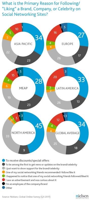
Usability test
Freecharge.in
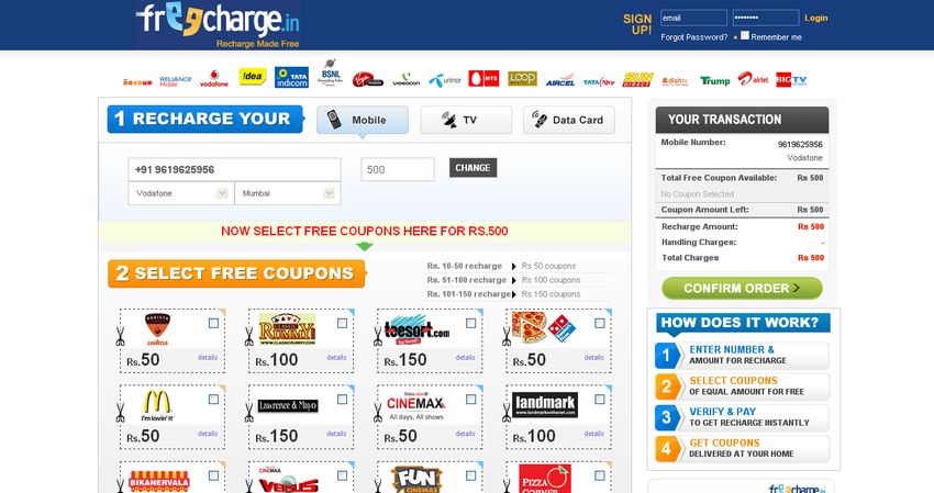
Table of Contents

1.   Objective
2.   Methodology
3.   Detailed Findings
     1.    Positive Findings
     2.    Home Page
     3.    Confirm order tab
     4.    Coupons
     5.    New interaction model (recommendation)
     6.    Grouping of coupons (recommendation)
     7.    My account
     8.    Facebook connect (recommendation)
     9.    User preferences (old website)
     10.   User perception (new website)
Objective

• Why do users not select coupons?

• Was the process of signing up appreciated by users?

• What is the user perception of “My Account”?

• In the user perception, what is the best and worst thing in the old and
  new website?

• What are the expectations of the users from the website?
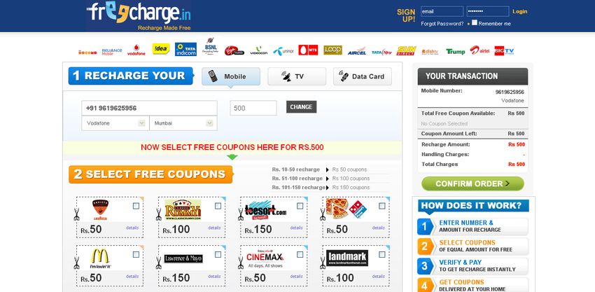
Table of Contents

1.   Objective
2.   Methodology
3.   Detailed Findings
     1.    Positive Findings
     2.    Home Page
     3.    Confirm order tab
     4.    Coupons
     5.    New interaction model (recommendation)
     6.    Grouping of coupons (recommendation)
     7.    My account
     8.    Facebook connect (recommendation)
     9.    User preferences (old website)
     10.   User perception (new website)
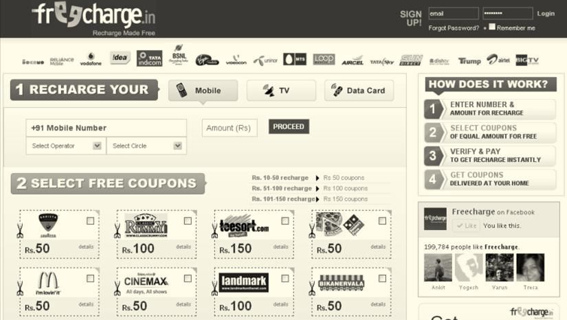
Other devices went unnoticed

Failed to notice the available choices
in the selection of devices.

Why?
The default recharge device and the
right-side positioning of the buttons
restricted the user vision.
R   Other devices went unnoticed

The other devices are more noticeable because the left side is NOT a blind spot.

            Mobile
              TV
           Data Card
“How does it work” unnoticed

The “How does it work” information
blurb went unnoticed.

Why?
Right-hand side positioning made the
users to interpret it as an ad on the
website.
Reference:
Sep 15 2010 by Cameron Chapman,
Place Important Content on the Left of a Web Page.
http://goo.gl/AIKFj
                                                              “How does It work” I thought it is a
                                                              sort of advertisement.

 Present “how it works” as an illustration or a video walkthrough.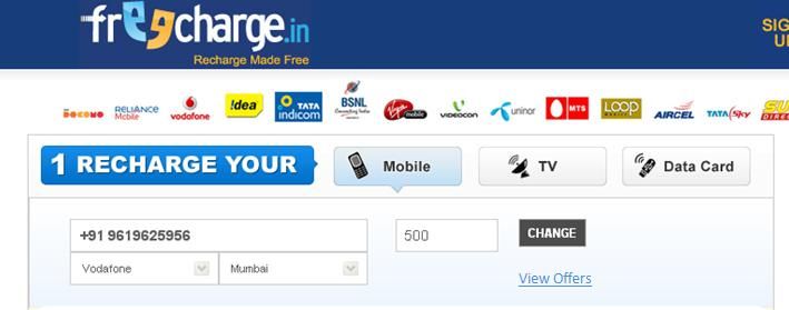
R   Credibility concerns for novice users

Educate users about benefits of My Account when a non-logged in user clicks it.

                                                    About us Contact Us

                        My Account
                        Login to access My Account.

                        You can save multiple numbers, see your transaction history,
                        keep a tab on your recharge expenses and more!

                        Username:
                        Password:

                                           Login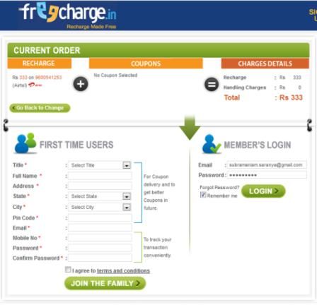
R   Credibility concerns for novice users

Use a Fat Footer to help users quickly find links to know more about the company i.e.
about, privacy policy, contact etc.

                                                                  About us Contact Us

    Logo           Logo             Logo                Logo                  Logo                Logo   Logo

             About Us                      Contact Us                                   Blog
             Terms and Conditions          Customer Support                             RSS
             Privacy Policy                Online prepaid mobile recharge               Sitemap
             FAQ
Network logo link back to the homepage
Users got frustrated when the
clickable network links took them
back to the homepage.
They expected to see a page
customized for the network they
selected.
“ What is the use of having it as links?”
Although this may help SEO, it’s hampering the User Experience of the site.
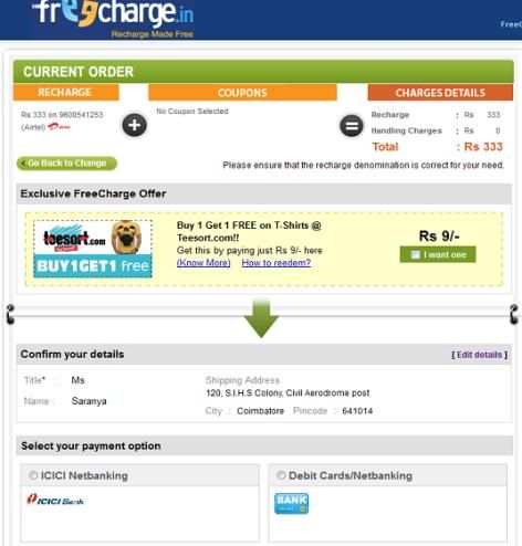
Consider linking it to a network-specific page.Redundant display of information
Transaction details appear thrice throughout the task flow of recharging
the phone.
This repetition of information is unnecessary.
Hence, the site can be uncluttered and presented more neatly.
Homepage Pre-login Post-login CheckoutInconsistent amount field Availability of drop down on the Airtel - dropdown “Amount” tab for some networks and a text field for the other networks confused users. Eg. Airtel has a dropdown while Vodafone has a text field. Vodafone – text field Keep a uniform field (either dropdown or text field) for entering the amount
Confusion in recharge amount

Users hesitate to fill the amount for
recharge because they are unaware
of the permissible amounts for
recharge.

Why?
There is no guidance for the amount
for which the device can be
recharged.

Either use a dropdown or an auto-suggestor text field to inform users about
permissible amounts.
R    Confusion in recharge amount

View offers buttons helps the users to get the offers for their network.
Also, a dropdown will inform users of the recharges available for their network.

                                                                    view offers for vodafone
Talk time related information Novice users searched for the total talk time, as per the recharge Talktime: Rs 400 amount, on the Transaction Details tab. However, Freecharge doesn’t provide the talk time for the recharged amount. Providing the talk time for the recharge amount will significantly improve the UX.
Talk time related information

Expert users check for offers from
their network service providers
before recharging on the Freecharge.

For example, users research the
amounts giving full talk time on
Google and then do the recharge
using Freecharge.

Providing the talk time for the recharge amount will significantly improve the UX.
Table of Contents

1.   Objective
2.   Methodology
3.   Detailed Findings
     1.    Positive Findings
     2.    Home Page
     3.    Confirm order tab
     4.    Coupons
     5.    New interaction model (recommendation)
     6.    Grouping of coupons (recommendation)
     7.    My account
     8.    Facebook connect (recommendation)
     9.    User preferences (old website)
     10.   User perception (new website)
Table of Contents
1. Objective
2. Methodology
3. Detailed Findings
1. Positive Findings
2. Home Page
3. Confirm order tab
4. Coupons
5. New interaction model (recommendation)
6. Grouping of coupons (recommendation)
7. My account
8. Facebook connect (recommendation)
9. User preferences (old website)
10. User perception (new website)R Highlighting the “Free Coupons” Tab
The highlighting of “FREE” will be enticing and hence, effective in increasing sales.
About us Contact Us My Account
View offers by vodafone
2 SELECT COUPONS FREE
Confirm order
Choose Your Coupon for worth Rs.500
Proceed without Coupon?R Adding “Proceed without coupons” link The link makes the users aware that they can proceed even without selecting coupons.
R Reordering the confirm order tab
The new placement ensures that confirm order comes in the flow of completing the task.
About us Contact Us My Account
View offers by vodafone
2 SELECT COUPONS FREE
Coupon selected Qty Amount
x Mc Donalds 1 Rs 100 Confirm order
x Mc Lawrence 2 Rs 200
Coupon amount left 3 Rs 300
Proceed without Coupon?R Coupons – rollover information
Keep only one rollover and aggregate all coupon related information in it. Also, show
rollover on hovering over the coupon image.
Insta coupon
Delivered instantly via email
Classicrummy.com
Valid against minimum bill of Rs. 100
Applicable on – classicrummy.com
Valid in – All cities
Terms and conditions:
1. It’s delivered directly to your
email.
2. Get Rs 100 extra cash on
purchase of Rs 100
3. Register at classicrummy.com
and make a purchase of Rs. 100
4. Get Rs 100 extra cash on
purchase of Rs 100
5. Register at classicrummy.com
and make a purchase of Rs. 100R Selecting coupons
New task flow for selecting coupons.
Add
Add (2) Remove
On hover Select 2 coupons
Rs 100 Details
Rs 100 Details
Rs 100 Details
After selection Click on details
Add
Insta coupon
Delivered instantly via email
Classicrummy.com
Rs 100 Details
Rs 100 Details Valid against minimum bill of Rs. 100
Applicable on – classicrummy.com
Valid in – All cities
Terms and conditions:
1. It’s delivered directly to your email.
2. Get Rs 100 extra cash on purchase
of Rs 100Table of Contents
1. Objective
2. Methodology
3. Detailed Findings
1. Positive Findings
2. Home Page
3. Confirm order tab
4. Coupons
5. New interaction model (recommendation)
6. Grouping of coupons (recommendation)
7. My account
8. Facebook connect (recommendation)
9. User preferences (old website)
10. User perception (new website)My Account is rarely used
The regular users said that they have
never visited “My Account”.
Why?
The primary context of use is to do
their recharge.
Also, they are not aware that My
Account exists or what its benefits I don’t want to spend more time on the
website. If the website/company has
are. some features it is them who has to
show me.
Place My Account in the header and make it available pre-login as well.
Post-transaction, explain the benefits of My Account to users.R My Account is rarely used
Placing My Account in the header makes users aware of that functionality and entices
them to explore it.
About us Contact Us My AccountMy Contacts - Renaming Freecharge
Users were unsure of what the
“freecharge” button did. Many
thought that it would take them to
promotional content for the site.
Why?
Because the label is unfamiliar and
hence, it’s difficult to predict its
functionality.
Repeat Order
A label such as “repeat order” is easier to understand than “freecharge”Table of Contents
1. Objective
2. Methodology
3. Detailed Findings
1. Positive Findings
2. Home Page
3. Confirm order tab
4. Coupons
5. New interaction model (recommendation)
6. Grouping of coupons (recommendation)
7. My account
8. Facebook connect (recommendation)
9. User preferences (old website)
10. User perception (new website)R Facebook – shared activity Users can message friends who have selected similar coupons, via facebook connect, to schedule an activity together to redeem the coupons. Your friends selected This will make Freecharge a more Rohan Singh Manish Pandey Manish Pandey Vikrant Raut social website and increase user All coupons engagement.
R Facebook – notification of new coupons Freecharge can inform users of new coupon arrivals via their facebook page. Facebook is the quickest and most engaging means to make users aware of new offerings. Nielson Norman, Nov 3, 2011 – What is the primary reason for following a Brand on social networking sites? http://blog.nielsen.com/nielsenwire/global/deal-with-it-discounts-drive-brand- love-on-social-media/
Table of Contents

1.   Objective
2.   Methodology
3.   Detailed Findings
     1.    Positive Findings
     2.    Home Page
     3.    Confirm order tab
     4.    Coupons
     5.    New interaction model (recommendation)
     6.    Grouping of coupons (recommendation)
     7.    My account
     8.    Facebook connect (recommendation)
     9.    User preferences (old website)
10. User perception (new website)Confirm order button Move the confirm order button to a visible area
Categories for coupons

  Make categories for coupons
Everything on one page

  Try to bring everything in one single page
Thank you.
You can also read