FROM ANALYSIS TO PRESENTATION - Information visualization for reifying issues and reenacting insights in visual data analysis
←
→
Page content transcription
If your browser does not render page correctly, please read the page content below
FROM ANALYSIS TO PRESENTATION
                        Information visualization for reifying issues
                       and reenacting insights in visual data analysis
                                      MARINA BOECHAT & TOMMASO VENTURINI

      We discuss the use of information visualization in digital sociology, (particularly in Controversy Mapping),
      and its role in outlining issues and objects of study through progressive insights. We believe the
      differences in visualizations between analysis and presentation are better understood as linked by a chain
      of transformations, rather than as two separate and stable levels of representation. We propose that,
      through such chain, two research movements are performed: the reification of issues, related to the
      construction of a stable consensus, and the reenaction of insights, that points to the role of visualizations
      as communication tools. We will illustrate such movements and effects by using a few examples of
      visualizations produced in the EMAPS research project.

1. Introduction

    As much literature in Science and Technology Studies (STS) and History of Science has established, images
such as photographs, schematic drawings and graphs have a crucial role in scientific research, either as
instruments of inquiry, for sharing material between researchers, or for advocating specific findings (Daston &
Galison, 2010; Mayer, 2011; Latour, 1985; Offenhuber, 2010; Lynch, 1985). Nevertheless, not much of this
literature has been dealing with the specificities of information visualization in scientific activity and with the
transformations between visualizations used during inquiry and the visualization employed for the
presentation of findings. These issues bring forth the role of visualizations for the discussions inside research
groups that work with visual data analysis, and also towards other discussions as findings are presented.
    The discussion we are proposing is related to a fundamental concern of the philosophy of science,
represented by the distinction between the context of discovery and the context of justification. According to
Hoyningen-Huene (1987), this distinction can take on many shapes, but it generally refers to the difference
between the discovery as an empirical process (and therefore sociologically, psychologically and historically
situated), while justification is seen as a set of methods or procedures based on formal logic, to develop
critical tests for what has been discovered and streamline the description of the discovery.
   As we discuss the transformations of visualizations, we should keep in mind that visual data analysis is a
process of discovery that works towards the presentation of results to build the conditions to its justification.
Of course, we are not saying that the presentation of findings through visualization is in itself the context of
justification, but it does set a stage of objects with which justification can be developed. In this sense,
visualization builds bridges between these two contexts in a specific way: in all the transformations, we find
visual documents that can help outline both the insights of the discovery and the elements of the justification.
    In this paper we discuss the use of information visualization for visual data analysis in digital sociology,
(particularly in Controversy Mapping), and its role in outlining issues and objects of study. Researchers
working with digital methods (Rogers, 2013) have been developing innovative work by taking advantage of
the growing richness of digital inscriptions left by human activity. Those digital inscriptions are seen as sources
of insights, not only about cyberculture, but about society in general. So by scraping data from social media
and public databases and repurposing data from varied sources (Marres & Weltevrede, 2013), scholars can
manage to develop representations of social activity in the making.
   Controversy Mapping is a kind of social cartography developed from the work of various STS authors. Its
practitioners have, in the last few years, incorporated many tools from digital sociology, while advancing their
main goal, which is to describe and visually deploy controversies (Venturini, 2010). That means that the final
results of each inquiry, composed equally of texts and graphs, will not aim at establishing certainties, but at
unfolding the means of a discussion (Venturini et al., 2015).

                                      DOI:10.3166/LCN.12.4.185-204 © 2016 Lavoisier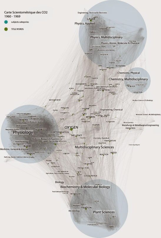
186   Les cahiers du numérique – n° 4/2016

   Our argument derives from the repeated observation that visualizations in the exploratory stages differ
substantially from the ones used to present the final findings: the earlier will tend to be rawer and closer to
the datasets, while the latter will tend to be more streamlined, displaying aggregate results of analysis.
Nevertheless, we believe it is more productive to consider this difference as a chain of transformations, rather
than as two separate levels of representation. Through such chain, two research movements are performed:
the reification of issues, related to the construction of a stable consensus within the research group, and the
reenaction of insights, that points to the role of visualizations as communication tools.
    Unlike what is often believed, these movements do not necessarily lead to simpler visualizations in order
to clarify specific findings to a wider audience. Visualizations used in final presentations may be simple or
complex depending on the issues being demonstrated and on the inquiry itself. Nevertheless, we argue that
they will be more focused than the ones in the exploratory stages, in the sense of concentrating on the
aspects of data that took part in the constitution of the issues. We will call these visualisations ‘shallower’
visualizations, not in the sense of being superficial, but of displaying a shallower field depth. The term “field
depth” derives from optics and is used to describe the interval in which objects closer or farther than the
exact focus will have acceptable definition. Field depth is said to be deep (if the focus interval is wide) or
shallow (if the focus interval is narrow). So the term, as used here for visualizations, points to a process of
filtering, definition and aggregation, rather than of mere simplification.
   We will illustrate our two movements by using a few examples of visualizations produced in EMAPS
(http://www.emapsproject.com/), a European research project. Between 2010 and 2014, scholars, designers
and developers from different research institutions got together with different stakeholders (called ‘issue
specialists’) to experiment with visual data analysis and develop visual representations of the debates on
ageing and climate change adaptation.

2. Visualizations between discovery and justification

   As claimed by numerous scholars, images are crucial for scientific activity, from the many devices used for
exploration at the beginning of the inquiry towards the standardized and measured representations that
outline epistemic objects and demonstrate scientific discoveries. Daston & Galison (2010) extensively describe
the role of scientific atlases in the development of a collective empiricism and of different scientific ethos
from the eighteenth century on. Serres & Farouki (1999) see scientific images as cultural objects, and point to
their presence in everyday life and to their role in rediscovering wonder in the world. Offenhuber (2010)
discusses the rhetorical power of visualizations, and their capacity for engendering narratives. Regarding the
social sciences more specifically, Healy and Moody (2013) describe a history of the use of information
visualization in such fields, related to issues such as reliability and the ease for sharing code and data between
researchers and wider publics.
    In an article called “Les vues de l’esprit”, Latour (1985) describes the role of images, drawings and visual
records for constituting “immutable mobiles”, i.e. standardized and stabilized objects that could be
recombined and transported to different contexts. Later on, in Pandora’s hope (1999), he describes the
process in which such objects are developed, in a series of transformations between an initial object of study,
that is complex and messy, to progressively compatible, standardized and reliable elements. Lynch (1985) had
already described a process of the same sort, regarding mechanically produced (or photographic) images in
biological sciences: according to him such processes involves steps of mathematization and schematization of
images, until they become streamlined and shareable documents.
   All these works point to the multiple transformations that scientific images undergo during the inquiry.
These transformations are particularly evident in digital visualization. Unlike mechanically produced images,
digital visualizations have no indicial relation with the object of study. They are derived not from a direct
manipulation of their object, but from a manipulation on the digital information collected on it. Because this
double mediation (that of digitalization and that of the transformations operated in the computer), the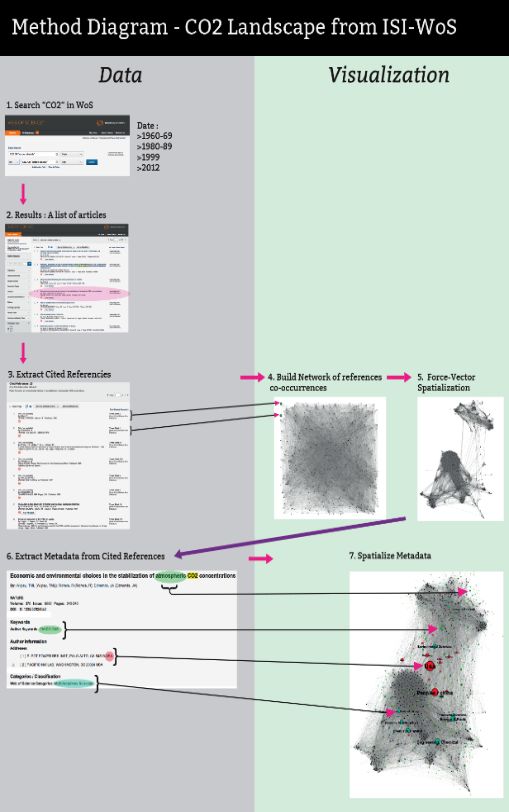
From analysis to presentation   187

spatiality of digital visualization is even less constrained by the resemblance to its object and may change
drastically as researchers experiment with different methods of visualization.
   Visualizations are, at once, tools for exploring a context of inscriptions and for displaying configurations
that advance a specific description of things. Because of this double function, they can play different roles in
data analysis. At one end, they work as instruments for discovery, prompting insights and suggesting findings,
while at the other end they convey ‘hardened’ facts and their demonstration (Latour, 1999).
   The transformation of information visualizations seems, to some extent, to follow the distinction
(customary in the philosophy of science) between the context of discovery and the context of justification.
According to Hoyningen-Huene (1987), diverse interpretations of this distinction have been put forward by
authors such as Popper, Kuhn and Feyerabend, who depicted discovery and justification as:
(a) two processes that follow each other, with the first being the condition for the second;
(b) two counterparts, with justification functioning as a critical test to reconstruct discovery;
(c) two different methods, with discovery being “an empirical enterprise, (...) [that] may involve historical,
    psychological and sociological reasoning” (p.505), while justification (or critical testing) being
    fundamentally logical;
(d) the object of different disciplines, with philosophy of science addressing the logic of justification, and
    history, sociology and psychology studying the empirical processes of discovery;
(e) the different results obtained by asking questions about discovery or about justification.
   Though the justification/discovery distinction captures in broad terms the direction of the transformations
undergone by scientific images, the model that it proposes is far too abstract to describe the actual work of
information visualization. Such work, we argue, bridges the gap between discovery and justification in a very
specific way, and can display evidences of how the two contexts interact.
   Certain kinds of inquiry promote a clearer distinction between exploration and publication, analysis and
presentation. In a traditional demographic study, for example, the final findings are expected to be as hard as
possible, so the corresponding visualization must be concise and clear– no matter how many tests were
conducted during analysis, or how much exploration it took to reach those conclusions. Yet, in most other
cases, the transformation of information visualization will not go so linearly from exploration to publication.
Controversy mapping, in particular, will tend to emphasize the many translations between analysis and
presentation, for two reasons: first, because it adopts a participative approach in which visualizations should
remain open in order to assure the communication among participants coming from varied backgrounds; and
second, because its very goal is to encourage the debate rather than to reach certainties.

3. Visualizations in controversy mapping

    Controversy Mapping is a method of social research that uses visual analysis to produce maps of the
assemblies that actors form around disputed issues. It derives from a long tradition of dispute analysis in
science and technology studies and actor-network theory and has been developed in its digital form at the
médialab at Sciences Po Paris and at the Digital Methods Initiative (DMI), at the University of Amsterdam.
   In controversy mapping, visual translation is part of the inquiry itself, part of refinement of the research
questions and of the objects of study. As the work progresses, new objects like categories and clusters are
outlined and it is possible to elaborate other ways of treating the data and visualizing it, according to
questions that become progressively more precise and are matched with more defined objects. Each version
incorporates and makes visible more and more interpretation and analysis. Therefore, in the development of
inquiries in EMAPS, new objects are produced whose spatiality does not necessarily map back to the initial
visualization, and the data can be filtered and converted into other structures.
   An example of this process is displayed in a work carried out by the Sciences Po médialab on the mapping
of the scientific literature related to CO2. Figure 1 illustrates the protocol behind this type of research and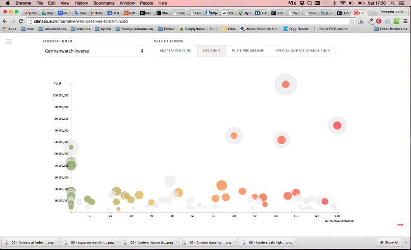
188   Les cahiers du numérique – n° 4/2016

figure 2 provides a streamlined, yet still complex, version of the network for the years of 1960 to 1969. The
image was produced by querying the ISI Web of Science for the keywords “carbon dioxide” or “CO2” and
extracting all the references cited in the resulting bibliographical notices. These references are used to build
an initial network of reference co-occurrence. As we can see in the illustration, this first network is almost
illegible and does not provide much information. A second version is created by using a force vector algorithm
that makes clusters evident (Jacomy et al., 2014). After that, another layer of data is produced by extracting
metadata from the bibliographical notices (authors, institutions, keywords, disciplinary categories…): this
information is displayed as new nodes connected to the references (a keyword, for example, is connected to a
group of reference if they appear in the same bibliographical notice). In this study it is clear how
transformations in visualizations are intertwined with transformations in data.

                 Figure 1. CO2 Landscape from ISI-WoS,      Figure 2. Scientometric map des CO2, by
                Method Diagram, by Venturini & De Pryck               Venturini & De Pryck

4. Visualization in the EMAPS Project

   EMAPS is a European collaborative project completed in 2014 and developed by a consortium of six
European research centers (Sciences Po médialab, DMI from UvA, Young Foundation, Polimi Density Design
Lab, Barcelona Media and Dortmund Institute of Spatial Planning). Its main result was a set of maps about the
controversies on climate change adaptation that aimed at mobilizing digital data to equip public debate (see
the project blog at http://www.emapsproject.com and the final results at http://www.climaps.eu). EMAPS
mixed the different research traditions of its partners becoming a ground for experiments in digital social
research and information visualization.
   During the EMAPS data sprints (Venturini et al., 2016) we were able to follow in detail the transformations
of visualizations during data exploration. In the next pages, we will discuss a particular chain of
transformations started in the Amsterdam sprint, in March 2014. The sprint gathered scholars, developers
and designers from the participant centers in the University of Amsterdam for five days of intensive work.
Participants were organized in five groups, each working with different datasets to explore different research
questions around the theme of climate change adaptation. Group 4 (named Uses and Users of Vulnerability
Indexes), carried out two projects: the first studying the uses of vulnerability indexes; the second exploring the
extent to which flows of adaptation funds are related to vulnerability ranking.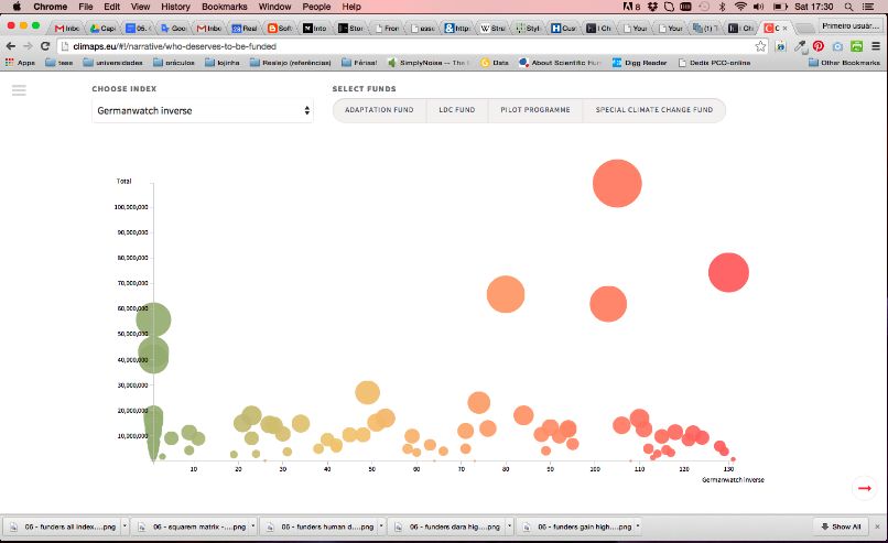
From analysis to presentation 189
For the second project, the visualizations were intended to discuss two main question:
– Are the countries considered most vulnerable also the ones who receive the most adaptation funds?
– Do the countries considered vulnerable by some indices receive more funds than those considered
vulnerable by other indices?
The studied indexes were: the DARA Climate Vulnerability Monitor1, Germanwatch’s Climate Risk Index
20142 and Maplecroft’s Climate Change Vulnerability Index3. The UN Human Development Index4 was also
used as the researchers identified in the debates a perceived link between climate vulnerability and lower
human development. A dataset on the allocation of funds by country was available (thank to the collaboration
of climatefundsupdate.org) for each of the major international funds: the Adaptation Fund (AF); the Least
Developed Countries Fund (LDCF); the Special Climate Change Fund (SCCF); and the Pilot Programme for
Climate Resilience (PPCR).
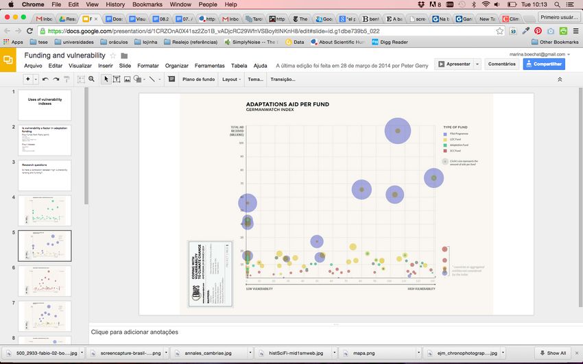
Figure 3. Adaptation aid per Fund - Germanwatch Index. One of the visualizations in the series that displayed
the allocations of each fund across countries, ordered by vulnerability to climate change, according to the
Germanwatch Index. The allocations are represented by their value in dollars. Source: EMAPS archives
Two kinds of bubble graphs were tried out. The first (figure 3) position countries-bubbles in a scatter plot
according to their level of vulnerability (X-axis) and the allocations of the four funds (Y-axis). The other graph
(figure 4) was a long list of countries sorted by vulnerability, with circles proportional to the amount of
funding received by each fund. This second diagram had several design problems: it did not provide a general
view of the data points (scroll was needed) and it displayed less dimensions than the first, failing to show the
actual amounts of funds that were allocated for each country. However, it displayed the amounts in terms of
the percentages of the total budget each fund allocated, thus comparing the priorities of each fund to
vulnerability according to each index. Another difference is that it was flatter: instead of allowing
superpositions the graph spread all data points side by side. This allowed for different considerations, more
geared towards discussing criteria of funders and the relevance of the indexes, and not the gross financial
result.
1. http://daraint.org/climate-vulnerability-monitor/climate-vulnerability-monitor-2012/monitor/
2. https://germanwatch.org/en/cri
3. http://maplecroft.com/themes/cc/
4. http://hdr.undp.org/en/content/human-development-index-hdi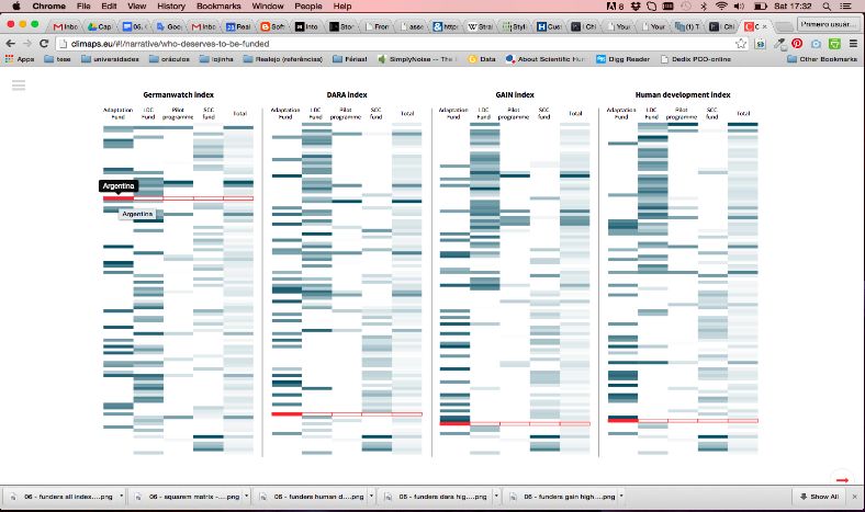
190   Les cahiers du numérique – n° 4/2016

               Figure 4. A view of the HTML visualization that displayed proportional allocations
                 of each fund for each country, ordered according to the Germanwatch Index.
                                           Source: EMAPS Archives
From analysis to presentation 191
Figure 5. Multilateral Adaptation Funding and Vulnerability Indexes. The interactive version, where one can
choose an index for the x axis and the funds to be included in the mapping, thus changing the size of the circles
proportionally. Source: http://climaps.eu/#!/map/multilateral-adaptation-funding-and-vulnerability-indexes
Figure 6. Another view from the previous visualization, displaying only the LDC Fund in the colored areas, with
the gray circles indicating the total funds allocated to each country. Source:
http://climaps.eu/#!/map/multilateral-adaptation-funding-and-vulnerability-indexes
Figure 7. Multilateral Adaptation Funding and Vulnerability Indices - Matrix. The bars for each country are
ordered vertically according to each index, and the color density is proportional to the amount allocated.
Source: http://climaps.eu/#!/map/multilateral-adaptation-funding-and-vulnerability-indices-matrix192 Les cahiers du numérique – n° 4/2016
In the final results published in Climaps.eu, the two approaches are present: figures 5 and 6 show different
views of an interactive version of the graph in figure 3. Now the colors of the bubbles are used to reinforce
the growing vulnerability. In figure 7 we see a much clearer and condensed version of the initial HTML graph
in figure 4. Both final versions present a richer descriptions of the issue and are not necessarily simpler than
the initial ones.
In the Oxford sprint, that took place in April 2014, participants were gathered in four groups. Two of them
used variations of the HTML bubble graph in order to display square matrices. Group 3, that sought to profile
adaptation practices, tuned this diagram into a large graph for initial exploration and comparison of
adaptations projects along many topics (we see a partial reproduction of this graph in figure 9).
Group 1 was also interested in profiling projects, but for understanding which hazards were more related
to vulnerability. So the same structure was used, but with data coming from two different sources: the
databases from UNDP5 and ci:Grasp6. Both of them are available in websites of public access, in series of web
pages that offer a full view of each project but do not allow comparisons. The EMAPS visualization combines
the two datasets and facilitate the comparison among more than three hundred items.
Diagrams that facilitate an initial appreciation of large amounts of records, are often the starting point for
many following transformations. The grid in figure 10, for example, was used to compare the cases of India
and Bangladesh. This comparison generated the graphs in figures 10 and 11, and was represented in a more
complex interactive visualization in Climaps.eu (figure 12). The final interactive visualization replaces the
bubbles with bars with the advantage of showing the proportion of each value to the maximum, aiding
comparison. Nevertheless, the general table-like structure is maintained: instead of a matrix of the bubbles
(figure 4), we now have a matrix of bars.
We identify three main movements of transformation in this case: first, the display of the first bubble
graph is refined into a more streamlined presentation; second, the structure of the big grid is polished in
order to function as a generic tool for other research questions; third, the analysis of the data drives new data
treatments and the production of more advanced visualizations (see a schematic summary in figure 12). In the
second movement, the bubble graph was turned into a square matrix: this time extra visual elements were
added to generate a general tool for integrating different datasets and offering an initial data exploration. In
the third movement, the structure is used to reconcile different datasets so that researchers could have a
more complete view, and afterwards specific data points and details identified in the grid are displayed in
more limited visualizations.
5. Shallowness, reification and reenaction
It should be clear by now that, across work groups and data sprints, from analysis to presentation,
simplification is not an adequate way of characterizing the effects of visual transformations.
While examining these transformations, we initially come across two interpretations of the idea of visual
simplification. First, we could think of simplification as a process in the chain of transformations in scientific
images (Lynch, 1985). It can be understood as a progressive schematization that condensates relevant cues
and thus visually simplifies an initial messy object. Second, we could think of simplification in relation to
communication, as part of the effort of making visualizations more accessible. This second interpretation is
often present in the literature of information design. Tufte (1983), for example, talks about improving the
data ink ratio of graphics, arguing for the removal of all the visual information that does not display data and
is therefore just decorative.
The html bubble graph, despite its many design problems, did display very clearly the (lack of) correlation
between the priorities of funders and the vulnerability indexes. We believe this is related to its very flat
presentation (with the bubbles distributed as if in a table, with no superposition and no depth in presentation)
5. http://adaptation-undp.org/
6. http://pik-potsdam.de/cigrasp-2/From analysis to presentation 193
and a normalized dataset, where differences in the sizes of total budgets were cleared by treating them as
percentages. Since the research question was geared towards understanding the priorities of each fund, and
comparing them to the priorities suggested by vulnerability indexes, displaying amounts in dollars would
introduce unnecessary detail (considering the very different allocations of the different funds). In this sense,
the initial bubble graph is shallower than the better visually designed visualization in figure 3, because, on the
one hand, it is more limited and more focused, and, on the other hand, it is more regular from a visual
standpoint. We consider the final streamlined version in figure 7 to be even shallower, because it does not
depend on navigation or scrolling to display all the data for all indexes: it organizes them side by side to
facilitate comparison.
Indeed, by progressively framing issues in visualizations we tend to aggregate many elements in more or
less cohesive entities. Reconstructing the insights of the enquiry, we tend to display these insights as entities
themselves, building highlights and clearing out elements that are not directly connected to the
demonstration. Moving from analysis to presentation demands the hardening of the objects of study, as well
as the progressive outlining of narratives and rhetorical strategies. This movement does entail some
simplification. Yet, this simplification should not be mistaken for an objective in itself or, even worse, a
necessary didactic effort for the audience of the final presentation. In fact, simplification happens as a by-
product of defining objects and developing the inquiry. Instead of thinking in terms of simplification, we
propose the idea of progressively shallower visualizations, in the sense that they flatten the data landscape,
not by avoiding complexity, but by reducing the depth of focus . At each step, the visualizations do not
become simpler and do not necessarily display less information, but do indeed become more coherent and
display elements more neatly.
Figure 8. The big grid, a square matrix to integrate datasets from different profiling sources and to help
identifying patterns between many projects. Source: EMAPS Archives194 Les cahiers du numérique – n° 4/2016
Instead of a growing simplification, we observe two more subtler movements: the reification of issues and
the reenaction of insights. In the first movement we are using the term “issues” (and not ‘scientific objects’ or
‘facts’) to highlight the role of visualization as a tool for academic and public debate. We also do not want to
lose sight of the idea that scientific objects and facts are produced through research work (Latour, 1999), and
that visualizations gives visual clues to advance of such processes. This first movement is complemented by
another movement that we call the reenaction of insights. This latter is related to the concerns about
communication, which entail didacticism and rhetoric (Offenhuber, 2010). The insights that happen in the
analysis stages have to be re-produced (or demonstrated) in presentation, thereby maintaining part of the
exploratory perspective even in the final results.
Figures 9 and 10 (from top): visualizations
drafted to highlight aspects of the profiles
of India and Bangladesh, that served for
the communication between researchers.
First, the comparison on vulnerability
ranking, and second, the comparison of
number of projects by funding source.
These graphs take one step further from
the initial grid, selecting only some of the
data points considered to be the most
relevant, after the general view the grid
provided. Source: EMAPS archives
The chain of transformations from analysis to presentation follows, to some extent, the development of
the inquiry. In most cases, this development is not linear: all assumptions will be questioned and some will be
abandoned; explorations will lead to dead-ends; visual analysis will sometime only display the limitations or
the vices of database; all research questions will have to be adjusted and many will be discarded. Likewise,
visualizations are altered, cut out, made again, become the base to others, discarded, replaced, refined. Much
like what we see in the schema presented in figure 12. Visualizations comment, detail and contextualize other
visualizations, and may also build over the work done in previous ones, making these last disposable and
outdated.From analysis to presentation 195
Figure 11. One of the visualizations finally published on the site Climaps.eu: a tool where the user can verify the
findings exposed in the text or search for meaningful comparisons. The visualization proposes a comparison
between India and Bangladesh, but there is also the possibility of taking a broader view and seeing the data on
all the projects from countries. Source: http://climaps.eu/#!/map/what-is-an-adaptation-project-ii
Nevertheless, it is by opening and threading these paths that classifications are created, alliances outlined,
clusters identified, patterns revealed. All these items become visible entities, things that scholars can point to,
compare, discuss and challenge. This is what we call the reification of issues, and it is part of the exchanges
inside research groups. It is the labor necessary to progressively (though not linearly) framing the issues and
developing the discursive and visual tools to address them.
The other movement of this process, the reenaction of insights, is more closely connected to the role of
visualizations as tools for engaging wider audiences. Offenhuber points to a rhetorical maneuver that is used
when researchers demonstrate results of visual data analysis:
“...after puzzling the audience with a complex visualization, the presenter selects, seemingly arbitrarily,
a single data point and connects it to a story, an anecdote that unlocks the principle of the whole
representation. I suspect this single data point is seldom as arbitrary as it might seem, in fact the whole
visualization might be designed to highlight this single point – a rhetorical device allowing the audience
to reproduce the discovery of meaning in the data.” (Offenhuber, 2010, p. 370)
Figure 12. A summary of the transformations observed in EMAPS196 Les cahiers du numérique – n° 4/2016
This strategy, called “visual anecdote”, convinces by reproducing the transformations carried out during
analysis. This relates to what Latour (1999) calls the chain of reference of scientific artifacts, where at each
step of transformation it is important to keep the link to the previous step in case results need to be
reproduced. Locating the reenaction of insights only in the final results, however, would be too narrow.
Research projects gather different people, with different backgrounds and the visualizations also serve to
make sure the “everyone is on the same page”. Throughout the whole analysis, the reenaction of insights is
therefore part of the discussion that supports the enquiry. In general, our case provides a strong argument
against the separation of discovery and justification, at least in information visualization. If EMAPS was
productive in generating findings and communicating them it is because it effectively combined the reification
of issues and the reenaction of insights: the final maps communicate by demonstrating.
References
Daston L., Galison P. Objectivity. Zone Books: Brooklyn, 2007.
Healy K., Moody J. (2014). Data visualization in sociology. Annual review of sociology, vol. 40, p. 105-128.
Hoyningen-Huene P. (1987). Context of discovery and context of justification. Studies in History and Philosophy of
Science, vol. 18, n° 4, p. 500-515.
Jacomy M., Venturini T., Heymann S., & Bastian M. (2014). ForceAtlas2, a Continuous Graph Layout Algorithm for Handy
Network Visualization Designed for the Gephi Software. PloS One, 9(6), e98679.
Latour B. (1985). Vues de l’esprit, Culture & Technique n° 14. http://documents.irevues.inist.fr/handle/ 2042/ 29797
Latour B. (1999). Pandora's hope: essays on the reality of science studies. Harvard, Harvard University Press.
Lynch M. (1985). Le retine exteriorisé. Culture & Technique, n° 14. http://documents.irevues.inist.fr/handle/2042/29797.
Marres N., Weltevrede E. (2013). Scraping the Social? Issues in live social research. Journal of Cultural Economy, 6(3), pp.
313-335.
Mayer K. (2011). Scientific images? How touching!. Science, Technology & Innovation Studies, 7(1), p. 29-45.
Offenhuber D. 2010. Visual Anecdote. Leonardo, 43(4), p. 367-374,
Available: http://dspace.mit.edu/handle/1721.1/60338 (Access: 01/05/2014)
Rogers R. (2013). The end of the virtual: digital methods. Cambridge: MIT Press.
Serres M., Farouki N. (1999). Paysages des Sciences. Paris, Éditions Le Pommier-Fayard,
Tufte E. (1983). The Visual Display of Quantitative Information. Cheshire, Graphics Press.
Venturini T. et al. (2015). Designing Controversies and their Publics, Design Issues, n° 31, vol. 3.
Venturini T., Munk A., & Meunier A. (2016). Data-Sprint: a Public Approach to Digital Research. (C. Lury, P. Clough, M.
Michael, R. Fensham, S. Lammes, A. Last, & E. Uprichard, Eds.) Interdisciplinary Research Methods (forthcoming).
Venturini T. (2012). Building on Faults: How to Represent Controversies with Digital Methods. In Public Understanding of
Science, n° 21, vol. 7.You can also read