Guidelines for an Accessible Presentation - Gian Maria Greco - Version update: version 3.1
←
→
Page content transcription
If your browser does not render page correctly, please read the page content below
Gian Maria Greco

       Guidelines
            for
an Accessible Presentation
    Version update: version 3.1
   Release date: 19 March 2018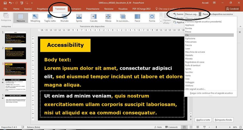
Summary
Introduction
Release versions
General Tips
Layout
Colours
 Colours: General Layout ............................................................................ 11
 Colours: Contents......................................................................................... 13
Text
 Text: Header................................................................................................... 14
 Text: Body ....................................................................................................... 15
 Text: Boxes ..................................................................................................... 16
 Text: Lists ........................................................................................................ 16
 Text: Tables .................................................................................................... 16
 Text: Charts .................................................................................................... 16
Font
 Font Type ......................................................................................................... 17
 Font Size .......................................................................................................... 17
Media
 Media: Videos ................................................................................................ 18
 Media: Images - General ........................................................................... 18
 Media: Images – Alternative Text ........................................................... 19
 Media: Images – Alignment ...................................................................... 20
 Media: Audio .................................................................................................. 21
 Slide Transitions ............................................................................................ 22
Slide Animations
Handout
Check List
References
Introduction
The guidelines included in this document are designed to
help speakers make their talk and slide presentation more
accessible.
Comments and suggestions are very welcome. Please,
address them to Gian Maria Greco:
gianmaria.greco@uab.cat.

Please, cite as: G. M. Greco (2017), Guidelines
For an Accessible Presentation, version 3.1.

This document is based on Greco (2013) and was created
as a deliverable of the MSCA project “Understanding
Media Accessibility Quality” (UMAQ - H2020 MSCA -
752659 - 2017-2019). More information can be found at
http://pagines.uab.cat/umaq.

The UMAQ project has received funding from the
European Union's Horizon 2020 research and innovation
programme under the Marie Sklodowska-Curie grant
agreement No 752659.
Release versions

First release
Code: 1.0
Author: Gian Maria Greco.
Release date: 03 February 2013.
Language: Italian.
Original title: Come fare una presentazione accessibile.

Second release
Code: 2.0.
Author: Gian Maria Greco.
Release date: 04 May 2016.
Language: English.
Note: this version was developed for the ARSAD 2017
conference. The introductory page is specifically
customised for the conference participants.
Main modifications: translation into English; change of
title in “Guidelines for an Accessible Presentation”.

Third Release
Code: 2.1.
Author: Gian Maria Greco.
Release date: 16 April 2017.
Language: English.
Main modifications: section “Introduction” modified;
added new sections “Release Versions” and “Note: Font”;
correction of typos; document licensed under Creative
Commons.
Fourth Release
Code: 2.2.
Author: Gian Maria Greco.
Release date: 29 August 2017.
Language: English.
Main modifications: correction of typos and alt texts;
“references” section modified.

Fifth Release
Code: 3.0.
Author: Gian Maria Greco.
Release date: 06 December 2017.
Language: English.
Main modifications: section “Introduction” modified;
added new section “The UMAQ Conference and Project”;
section “Slide Transitions” modified; section “Note: Font”
deleted; correction of typos; Creative Commons license
updated.

Sixth Release
Code: 3.1.
Author: Gian Maria Greco.
Release date: 19 March 2018.
Language: English.
Main modifications: section “Introduction” modified.
General Tips
While preparing your talk and the slide presentation
be aware that persons with sensory disabilities or
other specific needs might be in the audience.
Write in the slides every essential information you will say
in your speech.
Organise slides and sentences within the same slide in a
logical and coherent sequential order.
Sentences should act like surtitles. A deaf person in the
audience should be able to understand your talk only by
reading the slides.
If a slide contains a quote, be careful to say “I quote”
when you are quoting it in your speech and to say the
source of the quote, if it is indicated on the slide.
At the beginning of your speech, describe to the audience
the general layout of your slides (e.g. “all the slides are
white text on black background and text has left-
alignment, the header is white-on-black and text has
centre-alignment, etc.”).
Ensure that each sentence finishes with punctuation.
Copy the text from each slide into the related “note panel”
and fill in the metadata information to help assistive
technology.
Prepare your slides following the indications in this
document, then print your presentation in greyscale. If
the result is hard to read, some people might find the
original version hard to read as well. If so, check again
your presentation for accessibility issues.
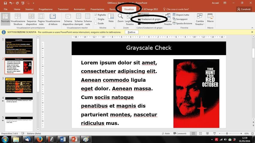
If you use Microsoft PowerPoint, instead of printing, you
can use the greyscale visualisation mode to check the
presentation (see image below).

Microsoft PowerPoint: View Tab->Greyscale.

The result is a temporary greyscale visualisation of your
presentation (see image below).
Apple Keynote doesn’t have a built-in greyscale
visualisation feature. Use the built-in greyscale
visualisation mode of your Apple computer. You can easily
access it in the accessibility preferences under the general
system preferences (see images below).
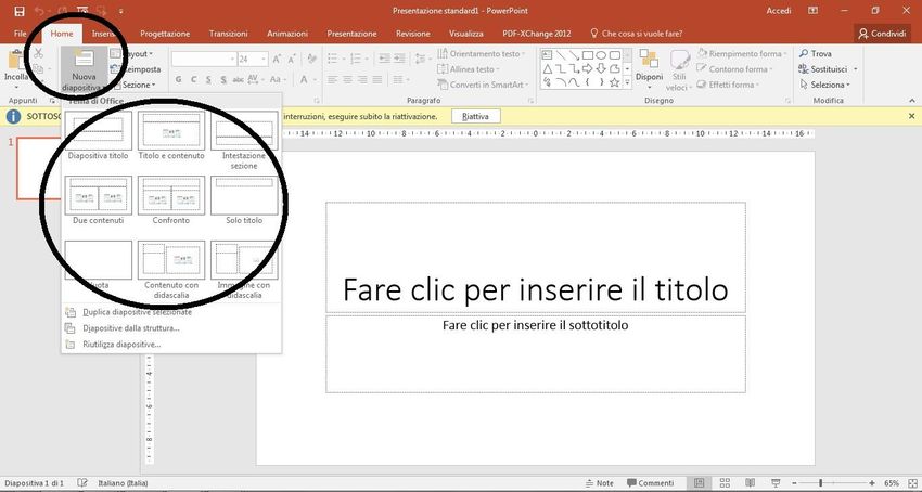
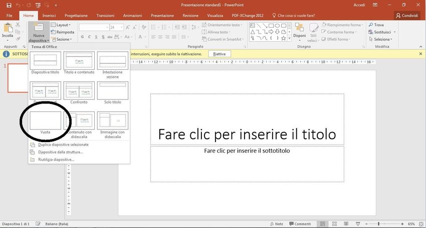
Layout
Use one of the predefined slide layouts available in your
slide-show presentation software (see images below).
This will help you produce slides with consistent heading
and body text sizes. It will also make your presentation
easier to navigate and allow assistive technology to work
properly, in case you will distribute the file or make it
public.

Microsoft PowerPoint: select “New slide” under the
Home tab.

Apple Keynote: click on + symbol.
In any case, never use the “Blank” layout (see images
below).

Microsoft PowerPoint

Apple Keynote
Colours Colours: General Layout Use colour contrast: Black-on-white White-on-black Yellow-on-black When possible, prepare the presentation in both (a) black-on-white and (b) white- or yellow-on-black styles, then choose which one to use accordingly to the lights in the room (see images below). Bright room: prefer the black-on-white style. Dark room: prefer the white- or yellow-on-black style.
If you use yellow-on-black, be careful not to use a too
bright yellow (see image below).

When needed you can also use black-on-yellow, possibly
not for the whole presentation but only for specific slides
or, even more preferably, for the header (see image
below).
Colours: Contents
Do not use colours to convey essential information.
Be aware of colour blindness.
If you use colours, choose a good high contrast between
text and background and avoid pale colours on coloured
backgrounds.
If you use a black background, try to dose white and
yellow texts. Too much white text might dazzle the
audience.
Try to make a consistent use of colours in all your slides.
Text
Text: Header
Give each slide a unique header title. This will also help
navigation with assistive technology.
Visually define and differentiate the header from the body
text (see examples below).

Be aware that headers and footers might be difficult to
read by some assistive technology. Therefore, do not put
there essential information, only redundant information.
Text: Body
Do not use all capitals, underline or italics for emphasis.
They disguise the shape of the characters and make the
text harder to read.
If you need to emphasise text, use colour contrast or
shapes, see images below.

If you use slides with dark background colour and pale
text colour (i.e. white-on-black or yellow-on-black), make
the text bold in order to increase text depth and make it
easier to read.
Do not justify body text. Always align text to the left.
Left alignment keeps the gap between words constant and
makes new lines easy to find.
Text: Boxes
Do not add text boxes to slides. If you need another area
of text on a slide either choose a different layout with
additional content placeholders, or add additional content
placeholders to the slide.
Text boxes may produce accessibility issues. E.g. they
may be read in the incorrect order by a screen reader.

Text: Lists
Use lists only when useful. If you are creating slides with
lists, use the “Bullet and Numbering” lists command of
your slide presentation software. Do not manually type
characters or numbers. End each line in the list with
proper punctuation.

Text: Tables
Use the built-in table command of your slide presentation
software to create tables. Do not use tabs, spaces or draw
table to display columns and rows of data.

Text: Charts
Do not put data charts as images, rather use the built-in
chart feature of your slide presentation software.
Font
Font Type
Use a sans-serif font (e.g. Arial, Verdana).
Do not use a serif font (e.g. Times New Roman).
If you plan to distribute the file of your presentation, e.g.
in a PDF version, use an easy-to-read font specific for
dyslexia, such as Tiresias or biancoenero. Alternatively,
prefer Verdana.
Font Size
Format the text of your slides according to the following
suggestions:
Header: 36 points; never below 32.
Body text: 30 points; never below 26 points.
Respect a 6 point ratio between header and body
text.Media Media: Videos If you use a video in your presentation, add captions. If it is not possible, put a slide with a transcript after the slide with the video. This will be useful in case you plan to distribute the file of your presentation. Media: Images - General Do not use images to convey essential information. If you have to, describe the images to the audience. Prepare your speech so that the description of the images fits naturally as part of the speech. Use a high colour contrast between image and background. Don’t insert text as an image, or put text over images (see image below).
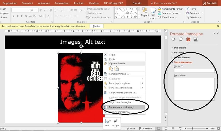
Media: Images – Alternative Text
In order to help assistive technology, provide alternative
text describing the information in a non-text element (see
images below).

Microsoft PowerPoint: right click on the image then
choose “Size and Position” from the menu, then choose
“Alternative Text” in the menu on the right. Put the image
description in the “description” box.

Apple Keynote: Click “Format” then choose “Image” in
the menu on the right. Put the image description in the
“description” box.
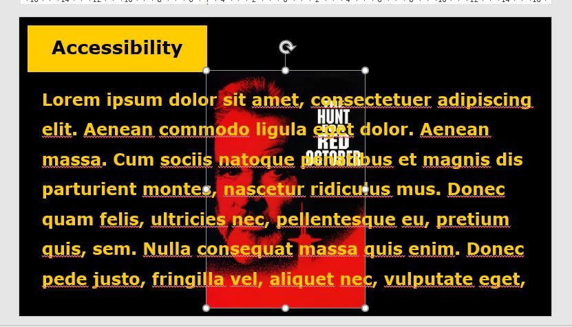
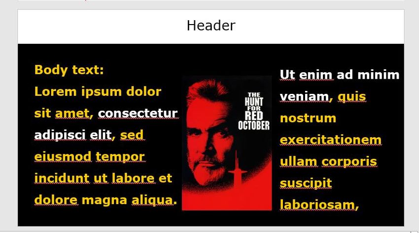
Media: Images – Alignment
Don’t put images on the left margin of the slide or in the
middle of text (see images below).

Always put images on the right margin of the slide and
text, if any, on the left margin (see image below).
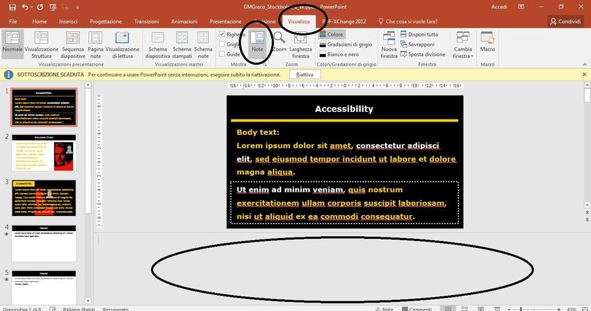
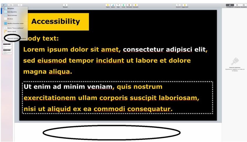
Media: Audio
If you use an audio file, provide a text equivalent; e.g.
put a slide with a transcript after the slide with the audio
file.
You can also place the transcript of any audio or video in
the Notes panel (see images below).

Microsoft PowerPoint: to open the notes panel, select
“Notes” under the “View” tab.

Apple Keynote: to open the notes panel, click the “View”
button in the toolbar, then choose “Show Presenter
Notes”.
Slide Transitions
Add a sound indicating the transition from one slide to the
next. If you add such a sound, ensure to tell this to the
audience at the beginning of your speech.

IMPORTANT: please, do not use any strange or fancy
sound; it might disturb and distract the audience. We
strongly recommend to use the standard simple
“click” sound provided by Microsoft PowerPoint.

Microsoft PowerPoint: to add a transition sound, go to
the Transition tab, then select a sound from the related
menu (see image below). Please, prefer the “click”

Apple Keynote: this software does not have a built-in
feature for adding a transition sound.
Follow the steps below for the first slide, then replicate
the process for any other slide. Alternatively, create the
other slides by duplicating the first one in order to keep
all its features, transition sound included.
1. Download a sound from the web (e.g. from
http://soundbible.com/tags-beep.html).
IMPORTANT: please, do not use any strange or fancy
sound; it might disturb and distract the audience. We
strongly recommend to use the standard simple
“click” sound provided by Microsoft PowerPoint.

2. Drag and drop the audio file in the area near the slide
(see image below).

3. Click on the “Build Order” button at the bottom right of
the screen. The panel with all the animations of the slide
appears (see image below).
4. From the list of animations, select the sound. Drag and
drop it at the beginning of the list (see image below).
Slide Animations
Avoid decorative animations. They may distract the
audience.
Use animations within a slide to help the audience avoid
information overload by reducing the amount of text to be
processed at one time and let them focus the attention on
the point being discussed. E.g., every time a new
sentence appears put the previous sentence in grey and
leave in black only the sentence you are focusing at the
moment (see images below).

Use the “appear” mode instead of other animation modes,
such as “fly-in” or “fade-in”.
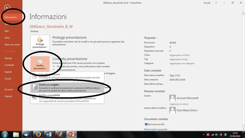
Accessibility Checker
Microsoft PowerPoint: use the built-in feature of
PowerPoint to check for accessibility issues in your
presentation (see image below).

Apple Keynote: unfortunately, Keynote doesn’t seem to
have a built-in accessibility checker.
Handout
If you want to use a handout, please prepare an easy-to-
read handout of your talk, print it and give it to the
audience before your talk:
use an easy-to-read font
left alignment
colour: black-on-white
font size: 18 points, never below 16 points
define the margins of the page with a thick, black line
(as done in this document)
if longer than one page or printed on both sides, use
page numbers
use short, clear sentences
use bold to highlight important words.
If you plan to bring a handout, you are also encouraged
to bring some copies printed in Braille.Check List Check Done Use a predefined slide layout. Font style without serif. Font size text 30 points. Header size text 36 points. Good colour contrast. Colours are not used to convey essential information. Consistent use of colours in all the slides. No large blocks of all capital letters, only when needed. No use of underline or italics. Text is left aligned. Images, tables, and graphs are on their own on the slide or are to the right of text. No use of text boxes. Images, videos, and graphs are explained in a separate slide. No text over images. Each slide has a unique header title. Slides and sentences within the same slide are in logical and coherent sequential order. Sentences end with punctuation. Sound added to slide transitions. Animations added to make text paragraphs appear one at a time, when needed. “Appear” animation mode used. Presentation printed in greyscale is readable. Videos have captions. Handout fulfilling the requirements (if handout is prepared).
References B. Denton, “Design for All: PowerPoint 2007 ”, IT Services, Birbeck – University of London, October 2011. G. M. Greco, “Come fare una presentazione accessibile”, POIESIS, Lecce, Italy, 2013. “Requirements for making accessible Word 2007 documents at the U.S. Department of Education ”, Georgia AER Chapter, Association for Education and Rehabilitation, Version 1.0, January 2012, http://www.gaaer.org/accessible-powerpoint- presentations. “Creating accessible PowerPoint presentations ”, Microsoft, https://support.office.com/en - us/article/Creating-accessible-PowerPoint- presentations-6f7772b2-2f33-4bd2-8ca7- dae3b2b3ef25. “Accessible Microsoft Powerpoint presentations ”, Adobe, http://www.adobe.com/accessibility/products/pr esenter/accessible-powerpoint.html. “Seven Steps to Creating an Accessible PowerPoint Slideshow”, Department of Rehabilitation, State of California, http://www.dor.ca.gov/disabilityaccessinfo/das - docs/7-steps-2-create-accessible-powerpoint- slideshow.pdf.
You can also read