ICQB Introduction to Computational & Quantitative Biology (G4120) Fall 2019 Oliver Jovanovic, Ph.D. Columbia University Department of Microbiology ...
←
→
Page content transcription
If your browser does not render page correctly, please read the page content below
ICQB
Introduction to Computational & Quantitative Biology (G4120)
Fall 2019
Oliver Jovanovic, Ph.D.
Columbia University
Department of Microbiology & Immunology

                       Lecture 8: Quantitative Analysis and Presentation of Visual Data
                                                                    November 5, 2019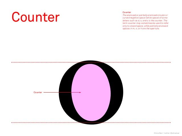
Visual Display of Quantitative Data
Effective Visual Display of Data
Reveals data, does not conceal or distort it.

Clearly communicates complex, multivariate ideas.

Encourages exploring the data at multiple levels.

Efficiently presents many numbers in a small space.

Has purpose, not “chartjunk”, and should focus the viewer
on the substance of the data, not distract them.

Source: The Visual Display of Quantitative Information by Edward R. Tufte

                                         Lecture 8: Quantitative Analysis and Presentation of Visual Data
                                                                                      November 5, 2019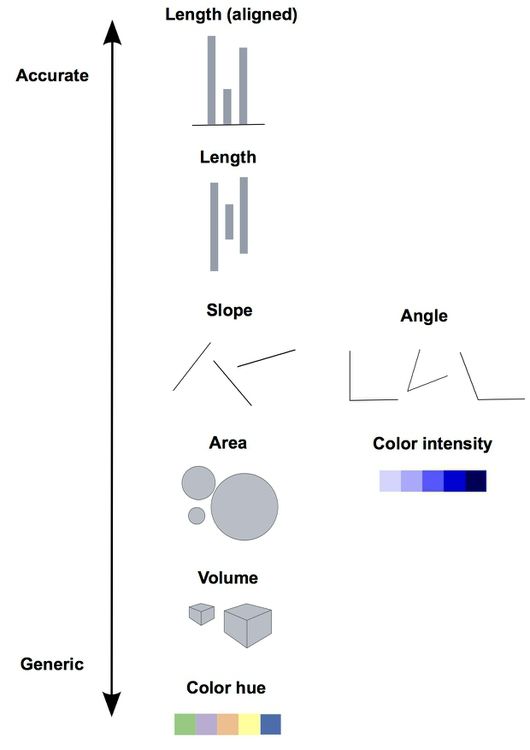
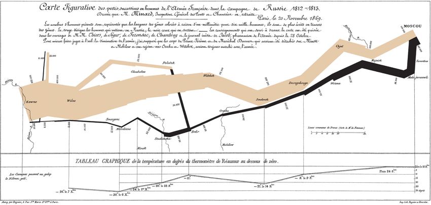
Minard’s Chart of Napoleon’s Russian Campaign

Source: Charles Joseph Minard, 1861

                                      Lecture 8: Quantitative Analysis and Presentation of Visual Data
                                                                                   November 5, 2019
Typography
Typography is the art of communicating with letter forms. Decisions have to be made
about the typeface to be used, the size (e.g. 12 point size), weight (e.g. light, semi-bold,
bold, extra-bold) and style (e.g. italic). In modern use, a font is a typeface. Fonts are
typically classified by form (Serif or Sans Serif), era (Old Style, Transitional, Modern, etc.)
and spacing (Fixed Width or Variable Width).
Serif (Roman) fonts have decorative lines at the end of a stroke:
Caslon, Garamond, Goudy, Sabon (Old Style)
Baskerville, Georgia, Times New Roman (Transitional)
Bodoni (Modern)
Trajan (Incised)
Sans Serif (Gothic or Grotesque) fonts lack serifs:
Gill Sans, Myriad, Optima (Humanist)
Arial, Franklin Gothic, Helvetica (Grotesque)
Futura, Proxima Nova (Geometric)
Garamond Gill Sans
Lecture 8: Quantitative Analysis and Presentation of Visual Data
November 5, 2019Fixed Width vs. Variable Width
Each character in a fixed width (monospaced ) font takes up the same amount of
horizontal space, like a typewriter, allowing multiple sequence alignments to
properly align. Variable width fonts can throw off multiple sequence alignments.
Commonly Used Fixed Width (Monospaced) Fonts
Mac OS X Courier, Courier New, Monaco, Letter Gothic
Windows Courier New, Lucida Sans Typewriter
Fixed Width Font Alignment (Courier)
. . . m s h N q f q f i G n L t r D
M A s R G v N K V I L V G n L G q D
M A v R G I N K V I L V G R L G k D
Variable Width Font Alignment (Times)
. . . m s h N q f q f i G n L t r D
M A s R G v N K V I L V G n L G q D
M A v R G I N K V I L V G R L G k D
Lecture 8: Quantitative Analysis and Presentation of Visual Data
November 5, 2019Elements of Design
Alignment
Nothing should be placed arbitrarily. Every element should have some visual connection
with another element. Guide lines or an underlying design grid can assist with this.
Proximity
Related items should be grouped in close proximity.
Hierarchy
Create a clear hierarchy of elements (e.g. header, sub-header, and text).
Contrast
Avoid displays where everything blends together or lacks contrast. Make important items
very different. Bold weights or italic style can help, or a using a san serif font for headers
and a serif font for body text (or vice-versa).
Consistency
Repeat visual elements of the design throughout, and use them consistently. Use fonts
and color carefully and consistently, and avoid overuse or arbitrary use of either.
Source: The Non-Designer’s Design Book by Robin Williams
Lecture 8: Quantitative Analysis and Presentation of Visual Data
November 5, 2019Elements of Design
Alignment
Nothing should be placed arbitrarily. Every element should have some visual connection
with another element. Guide lines or an underlying design grid can assist with this.
Proximity
Related items should be grouped in close proximity.
Hierarchy
Create a clear hierarchy of elements (e.g. header, sub-header, body text, legends).
Contrast
Avoid displays where everything blends together or lacks contrast. Make important items
very different. Bold weights or italic style can help, or a using a san serif font for headers
and a serif font for body text (or vice-versa).
Consistency
Repeat visual elements of the design throughout, and use them consistently. Use fonts
and color carefully and consistently, and avoid overuse or arbitrary use of either.
Source: The Non-Designer’s Design Book by Robin Williams
Lecture 8: Quantitative Analysis and Presentation of Visual Data
November 5, 2019Comprehension
ALL CAPS vs. Mixed or lower case
Text set in ALL CAPS has a significantly lower level of comprehension than text
set in mixed or lower case, even in relatively short text, such as headlines.
Line Length
Text set in lines that are too short or too long can increase reading time and
decrease comprehension. Lines of 40 to 75 characters are considered ideal.
Open Counters vs. Closed Counters
Fonts with more open counters (the space enclosed by the letter form) are
considered more comprehensible.
Text and Background Color
Black text or dark colored text blocks on white backgrounds or lightly tinted
(10% to 20%) color backgrounds have the highest level of comprehension.
Avoid using lighter color text blocks, or backgrounds with more color when
possible, as these can have poor comprehension.
Lecture 8: Quantitative Analysis and Presentation of Visual Data
November 5, 2019ALL CAPITALS
ALL CAPS VS. MIXED OR LOWER CASE
TEXT SET IN ALL CAPS HAS A SIGNIFICANTLY LOWER LEVEL OF COMPREHENSION
THAN TEXT SET IN MIXED OR LOWER CASE, EVEN IN RELATIVELY SHORT TEXT, SUCH
AS HEADLINES.
LINE LENGTH
TEXT SET IN LINES THAT ARE TOO SHORT OR TOO LONG CAN INCREASE READING
TIME AND DECREASE COMPREHENSION. LINES OF 40 TO 75 CHARACTERS ARE
CONSIDERED IDEAL.
OPEN COUNTERS VS. CLOSED COUNTERS
FONTS WITH MORE OPEN COUNTERS (THE SPACE ENCLOSED BY THE LETTER FORM)
ARE CONSIDERED MORE COMPREHENSIBLE.
TEXT AND BACKGROUND COLOR
BLACK TEXT OR DARK COLORED TEXT BLOCKS ON WHITE BACKGROUNDS OR
LIGHTLY TINTED (10% TO 20%) COLOR BACKGROUNDS HAVE THE HIGHEST LEVEL OF
COMPREHENSION. AVOID USING LIGHTER COLOR TEXT BLOCKS, OR BACKGROUNDS
WITH MORE COLOR WHEN POSSIBLE, AS THESE CAN HAVE POOR COMPREHENSION.
Lecture 8: Quantitative Analysis and Presentation of Visual Data
November 5, 2019Line Length
Anything from 40 to 75 characters in a line of text is widely regarded as an
optimal length of line for a single-column page of printed text. That translates
to roughly 7 to 13 words per line. For multiple columns on a page, lines should
be 40 to 50 characters.
Source: The Elements of Typographic Style by Robert Bringhurst, image by J. Rinker Design
Lecture 8: Quantitative Analysis and Presentation of Visual Data
November 5, 2019Open vs. Closed Counters
Typeface choice: Open Counters
Counters, the white space within letters such as ‘o,’ ‘e,’ ‘c,’ etc., help to define a
character. Typographers believe that large, open counters aid legibility.
Counter Open
Lorem ipsum dolor sit amet,
consectetuer adipiscing elit Legible
Closed
Lorem ipsum dolor sit amet, Not-so-
consectetuer adipiscing elit legible
Source: It’s About Legibility by Allan Haley
Lecture 8: Quantitative Analysis and Presentation of Visual Data
November 5, 2019A Study of Text and Background Color
Black Text on White Background
Black text on a white background had the highest level of comprehension (70% good).
Black or Dark Text on Lightly Tinted Backgrounds
Black or dark colored text on 10% to 20% tinted backgrounds had acceptable comprehension (32% to
68% good).
Lighter Color Text
Lighter colored text on white or 10% to 20% tinted backgrounds had poor comprehension (0% to 29%
good).
Colored or Black Backgrounds
Any text on a 40% or more tinted background had poor comprehension (0% to 22% good). White text on
a black background had the worst comprehension (0% good).
Preference Does Not Mean Comprehension
Despite the potential for lower comprehension, 81% of the subjects stated they found a colored
background more attractive and interesting than black on white text.
If you must set type on a dark background, lighter translucent backgrounds, heavier font weights (bold
or extra-bold) and simpler, more geometric fonts may help.
Source: Type & Layout by Colin Wheildon
Lecture 8: Quantitative Analysis and Presentation of Visual Data
November 5, 2019A Study of Text and Background Color
Black Text on White Background
Black text on a white background had the highest level of comprehension (70% good).
Black or Dark Text on Lightly Tinted Backgrounds
Black or dark colored text on 10% to 20% tinted backgrounds had acceptable comprehension (32% to
68% good).
Lighter Color Text
Lighter colored text on white or 10% to 20% tinted backgrounds had poor comprehension (0% to 29%
good).
Colored or Black Backgrounds
Any text on a 40% or more tinted background had poor comprehension (0% to 22% good). White text on
a black background had the worst comprehension (0% good).
Preference Does Not Mean Comprehension
Despite the potential for lower comprehension, 81% of the subjects stated they found a colored
background more attractive and interesting than black on white text.
If you must set type on a dark background, lighter translucent backgrounds, heavier font weights (bold
or extra-bold) or simpler, more geometric fonts may help.
Source: Type & Layout by Colin Wheildon
Lecture 8: Quantitative Analysis and Presentation of Visual Data
November 5, 2019Visual Encoding of Information
There are multiple ways of using
visual cues to encode data. Slope in
line charts, area in bar and pie
charts, color in heat maps, etc.
Certain visual cues are easier to
accurately interpret than others.
Source: Cleveland, W.S. and McGill, M.
(1985) Science 229: 828-833 and Data
Visualization by Peter Aldhous Lecture 8: Quantitative Analysis and Presentation of Visual Data
November 5, 2019Encoding Information in Form
Human eyes are better at accurately
interpreting some forms of encoded
information than others. Length
aligned along a common scale is
easier to accurately interpret than
area or volume.
Above, the same data are presented
in two ways: aligned length (top)
and area (bottom). Which visual
Source: Data Visualization by Peter Aldhous
Lecture 8: Quantitative Analysis and Presentation of Visual Data
November 5, 2019Dot Matrix Visualization of DNA
A A T C A G T
A dot matrix shows all possible T • •
matches between two sequences
A • • •
with a dot placed at every match.
For longer sequences, a window
A • • •
with a specified stringency for
C •
placing a dot can be used instead. A • • •
G •
T • •
A • • •
A • • •
T • •
C •
A • • •
G •
T • •
Lecture 8: Quantitative Analysis and Presentation of Visual Data
November 5, 2019Dot Matrix Analysis of DNA
In dot matrix alignments, regions A A T C A G T
of sequence identity show up as T • •
diagonals. Closely related A • • •
sequences will display a long A • • •
diagonal corresponding to the C •
aligned sequences. Shorter A • • •
direct repeats will show up as G •
shorter parallel diagonals. T • •
Shorter inverted repeats will A • • •
show up as shorter A • • •
perpendicular diagonals.
T • •
C •
A • • • • = Aligned sequence
G • • = Direct repeat
T • • • = Inverted repeat
Lecture 8: Quantitative Analysis and Presentation of Visual Data
November 5, 2019Dot Matrix Self Analysis of DNA
A DNA Strider DNA Self Matrix (Window Size 1, Stringency 1) of 200 nucleotides of pBR322
sequence with a 40 nucleotide inverted repeat added to the beginning of the sequence.
Lecture 8: Quantitative Analysis and Presentation of Visual Data
November 5, 2019Dot Matrix Self Analysis of DNA
The 40 nucleotide
inverted repeat appears
as short diagonals
perpendicular to the
diagonal of the
sequence alignment.
A DNA Strider DNA Self Matrix (Window Size 1, Stringency 1) of 200 nucleotides of pBR322
sequence with a 40 nucleotide inverted repeat added to the beginning of the sequence.
Lecture 8: Quantitative Analysis and Presentation of Visual Data
November 5, 2019Dot Matrix Pairwise Analysis of DNA
A DNA Strider DNA Matrix (Window Size 15, Stringency 7) comparison of plasmid RSF1010 and
plasmid R1162 (antiparallel) oriV regions.
Lecture 8: Quantitative Analysis and Presentation of Visual Data
November 5, 2019ImageJ
ImageJ is a free, public domain image processing program written in Java, with
distributions available for OS X, Windows and Linux.
ImageJ can display, edit, analyze and process 8 to 32 bit images and image series in
stacks, and can import numerous image file formats, including TIFF, GIF, PNG, JPEG,
BMP, DICOM, FITS and "raw" files.
In addition to standard image processing functions, ImageJ can calculate area and
pixel value statistics of user-defined selections, measure distances and angles and
create density histograms and line profile plots.
ImageJ is multithreaded and highly optimized for image processing, able to process
over 40 million pixels per second even on older computers. ImageJ has built in macro
support, including a macro recorder, with over 300 macros available (https://
rsb.info.nih.gov/ij/macros/) and an extensible plug in architecture, with over 500
plug ins that add functionality to ImageJ available (https://imagej.nih.gov/ij/plugins/).
Source: https://imagej.nih.gov/ij/
Lecture 8: Quantitative Analysis and Presentation of Visual Data
November 5, 2019ImageJ Plug In Architecture
ImageJ was designed with an open architecture that provides extensibility via Java plugins. Custom
acquisition, analysis and processing plugins can be developed using ImageJ's built in editor and Java
compiler. User-written plugins make it possible to solve almost any image processing or analysis problem.
Acquisition
TWAIN, SensiCam Long Exposure Camera, µmanager, etc.
Analysis
Cell Counter, Colony Counter, Microscope Scale, Cell and Multi Cell Outliner, Read Plate, etc.
Color
RGB Stack Splitter and Merge, Color Counter, RGB Measure, etc.
Filters
Background Correction, Subtraction and Normalization, Contrast Enhancer, Linearize Gel Data, Convolver, etc.
Graphics
Arrow, Image Slice Macro, Image Layering Toolbox, Interactive 3D Surface Plots, etc.
Stacks
Concatenate Images or Stacks, Depth From Focus, Object Tracker, Time Series Analyzer, etc.
Source: https://imagej.nih.gov/ij/
Lecture 8: Quantitative Analysis and Presentation of Visual Data
November 5, 2019ImageJ and Density Analysis
Lecture 8: Quantitative Analysis and Presentation of Visual Data
November 5, 2019ImageJ and Particle Analysis
Lecture 8: Quantitative Analysis and Presentation of Visual Data
November 5, 2019Phylogenetic Analysis
Phylogeny is the sequence of events involved in the evolutionary development
of a species or taxonomic group. A physician, Ernest Haeckel (1834-1919)
coined the term “phylogeny,” the phrase “ontogeny recapitulates phylogeny,”
and created the first phylogenetic trees after reading Darwin’s Origin of
Species.
Lecture 8: Quantitative Analysis and Presentation of Visual Data
November 5, 2019Phylogenetic Trees
Rooted Trees
In a rooted tree, a single node is
designated as a common ancestor, and a
unique path leads from it through
evolutionary time to all other nodes. It
thus provides information about the
common ancestry of sequences and the
direction of evolution, and is the most
common type of tree used to study
evolutionary relationships.
Unrooted Trees
Unrooted trees specify only the
relationship between nodes, and nothing
about the direction in which evolution
occurred. A root can be assigned to an
unrooted tree through the use of an
outgroup, for example a species that
unambiguously previously separated from
the other species being compared (e.g.
baboon, when comparing humans and
gorillas).
Source: Krane & Raymer, Fundamental Concepts of Bioinformatics, NCBI
Lecture 8: Quantitative Analysis and Presentation of Visual Data
November 5, 2019Rooted Tree Reconstruction
The possible number of unrooted trees is one step less (i.e. 5 species or OTUs → 15 trees, still an
enormous number with many species or OTUs). The number of possible trees for n OTUs can be
estimated by (2n-3)!/(2n-2(n-2)!) for bifurcating rooted trees and (2n-5)!/(2n-3(n-3)!) for bifurcating
unrooted trees (Brian Golding, Reconstructing Phylogenies).
Lecture 8: Quantitative Analysis and Presentation of Visual Data
November 5, 2019Tree Topology
Operational Taxonomic Unit (OTU)
This corresponds to the terminal nodes of a
phylogenetic tree (also known as leaves, tips
or external nodes). They represent the
genes, organisms, families, species or
populations, as appropriate, for which you
have data.
Internal Node
This corresponds to points within a
phylogenetic tree where interior branches
meet (also known as vertices). These
represent inferred ancestors.
Outgroup
An OTU or taxa included for the purpose of
rooting a tree.
Lecture 8: Quantitative Analysis and Presentation of Visual Data
November 5, 2019The Principle of Parsimony
Occam’s Razor
“Pluralitas non est ponenda sine necessitas” (Do not increase the
number of entities required to explain anything beyond what is strictly
necessary)
– William of Occam (or Ockham) (1284-1347)
Most parsimonious: requires less changes than its neighbor
These two trees are equally parsimonious
Lecture 8: Quantitative Analysis and Presentation of Visual Data
November 5, 2019Practical Phylogeny
Practically speaking, when trying to build a phylogenetic tree, you will want to use
the most accurate multiple sequence alignment (MSA) algorithm you can to align
your sequences, then use a heuristic algorithm to build your tree, followed by a
bootstrap analysis to evaluate the quality of the tree.
DNAStar MegAlign
The MegAlign package performs MSA with the ClustalW algorithm and then
builds an automatically rooted tree using the Neighbor-Joining algorithm, and can
perform bootstrap analysis.
DNAStar MegAlign Pro
MegAlign Pro offers additional MSA algorithms, including Clustal Omega,
MUSCLE and MAFFT. It creates unrooted trees using the BioNJ algorithm.
Other phylogeny packages worth mentioning include Clustal, MEGA (simple),
MrBayes (Bayesian inference and Markov chain Monte Carlo methods), RAxML
(Randomized Axelerated Maximum Likelihood), PAUP and PHYLIP. The R
programming language also offers many packages for phylogenetic analysis.
Lecture 8: Quantitative Analysis and Presentation of Visual Data
November 5, 2019Phylogenetic Tree of SSBs
Lecture 8: Quantitative Analysis and Presentation of Visual Data
November 5, 2019Heat Maps
Heat maps are graphical representations of data in which values in a matrix are
displayed as colors. The R programming language is often used to handle the
analysis and visualization of heat map data. In bioinformatics, heat maps are
commonly used to represent gene expression in microarray data.
Lecture 8: Quantitative Analysis and Presentation of Visual Data
November 5, 2019Color Blindness and Heat Maps
Red-green color blindness can have a prevalence as high as 15% in certain
populations, and is generally more common in males than females. Thus, be
cautious when using reds and greens with similar contrast, hue, saturation or
brightness.
Lecture 8: Quantitative Analysis and Presentation of Visual Data
November 5, 2019R
The R programming language was released in 1993 by Ross Ihaka and Robert Gentleman,
statisticians at the University of Aukland in New Zealand. Their original goal was to develop a
statistics language suitable for teaching in their Mac computer lab. The language’s name is a
reference the S programming language for statistics, which was one of their inspirations, and
also refers to the first names of the authors.
The reference implementation of R is primarily written in C, Fortran and R and and is free and
open source, released under the GNU General Public License, and supported by a community
of open source developers at the Comprehensive R Archive Network (CRAN), which serves as
a repository for R and free third party R software, and currently contains over 15,000 packages.
R is an interpreted language, and primarily supports procedural programming with functions,
but has some object oriented functionality. It supports matrix arithmetic, a wide variety of data
structures useful in math and statistics, math symbols, and a variety of graphing functions.
R has become one of the most popular programming languages used by statisticians and data
miners, and is becoming well established in bioinformatics. The Bioconductor repository
contains 1,823 free, open source bioinformatics and genomics packages for R.
Source: https://www.r-project.org and https://cran.r-project.org and https://bioconductor.org
Lecture 8: Quantitative Analysis and Presentation of Visual Data
November 5, 2019RStudio
RStudio is a free, open source, Integrated Development Environment (IDE) for
the R programming language that provides R with a simple graphical user
interface and useful development tools. It runs on Mac, Windows and Linux.
The source editor features R specific highlighting, code completion, and smart
indentation, and allows you directly run R code from it. Help and
documentation are built in, along with the ability to quickly jump to function
definitions. Additional support for development is provided by an interactive
debugger, support for version control systems (Git and Subversion), and
package authoring and documentation tools.
RStudio can simultaneously display multiple panes, typically a source code
editor pane, an interactive console pane (like Terminal), a workspace pane, and
a plotting pane. Interactive graphics can be created using the manipulate
package.
Source: https://www.rstudio.com
Lecture 8: Quantitative Analysis and Presentation of Visual Data
November 5, 2019Working with R and RStudio Install the appropriate version of R from https://cran.rstudio.com and then download and install the appropriate version of the free RStudio Desktop from https://rstudio.com. The RStudio Source editor pane (upper left by default) is useful for larger projects, otherwise the interactive Console pane (by default below it) can be used directly. In both the Source editor and interactive Console, Tab acts as an auto-complete function, suggesting file or function names and Alt and - is a shortcut for the frequently used
Heat Maps with R
The following R source code generates a random matrix of 10 columns and 20
rows containing 200 random integers between 1 and 100, then views the
randomly generated data. It then creates a heat map using the default cyan to
purple heatmap colors (note that there is no line break in the third line).

hm
References
The Visual Display of Quantitative Information by Edward R. Tufte

The Non-Designer’s Design Book (4th edition) by Robin Williams

Type & Layout by Colin Wheildon

ImageJ User Guide free at:
https://imagej.nih.gov/ij/docs/guide/user-guide.pdf

Phylogenetic Trees Made Easy by Barry G. Hall

An Introduction to R free at:
https://cran.r-project.org/doc/manuals/r-release/R-intro.pdf

A Little Book of R for Bioinformatics free at:
https://a-little-book-of-r-for-bioinformatics.readthedocs.org/en/latest/

                                Lecture 8: Quantitative Analysis and Presentation of Visual Data
                                                                             November 5, 2019
Phylogentic Analysis Appendix
Lecture 8: Quantitative Analysis and Presentation of Visual Data
November 5, 2019Phenetic vs. Cladistic Phylogeny
Phylogenetic Reconstruction
Phylogenetic reconstruction attempts to estimate the phylogeny for some data. Any collection
of sequences will share some ancestral relationship, and the data within the sequences
contains information that can be used to reconstruct or infer these ancestral relationships. A
phylogenetic tree is a branching structure which illustrates the relationships between the
sequences.
Phenetic Approach
Phenetic taxonomy was invented in 1750 by Michel Adanson. In the phenetic approach, a tree
is constructed by considering the phenotypic similarities of the species without trying to
understand the evolutionary pathways of the species, and thus may or not be the correct
phylogeny. Trees constructed by this method are called phenograms or dendrograms.
Cladistic Approach
Cladistic taxonomy was invented by the German entomologist Willi Hennig in 1950. It involves
the rigorous application of the concept of evolution to taxonomy. Taxa are defined by what
distinctive features their members have, not what features they share with others. In the
cladistic approach, a phylogentic tree is reconstructed by considering the various possible
pathways of evolution and choosing from amongst these the best possible tree, that is, the tree
that involves the fewest changes, and thus the least amount of convergent evolution. Trees
reconstructed by this method are called cladograms.
Lecture 8: Quantitative Analysis and Presentation of Visual Data
November 5, 2019Tree Terminology
Monophyletic
A group descended from a single common ancestor that contains only and all
descendants from that ancestor.
Paraphyletic
A group descended from a single common ancestor that does not contain all the
descendants from that ancestor.
Polyphyletic
A group whose members are not descended from a single common ancestor.
Gene Tree
A phylogenetic tree based on divergence observed within a single homologous gene in
different species. It may accurately represent the evolutionary history of that gene, but not
necessarily the species. Species trees should be based on comparison of numerous
genes.
Bootstrapping
A method for checking the robustness of a given phylogentic tree by checking whether
every portion of the alignment equally supports the structure of the tree.
Lecture 8: Quantitative Analysis and Presentation of Visual Data
November 5, 2019Phylogenetic Terminology
Homologs
Genes with a common ancestral sequence. They may have been separated by speciation (orthologs) or
duplication (paralogs).
Orthologs
Homologous genes in different species that arose from a common ancestor. They tend to have similar
structure and function.
Paralogs
Similar genes within a single species that are the result of a gene duplication. They tend to have different
but related functions.
Xenologs
Genes acquired by horizontal transfer between species, typically mediated by a plasmid, transposable
element, or virus.
Symplesiomorphy
Having characters that are both derived from a common ancestor and uniquely shared by a group. This is
essential to clearly establishing a phylogeny. Having only derived or shared characters is not sufficient to
establish a phylogeny.
Homoplasies
Convergences of a particular character at a particular site. These typically pose the most difficulty in
attempting to reconstruct the ancestral phylogenetic tree.
Lecture 8: Quantitative Analysis and Presentation of Visual Data
November 5, 2019Distance Matrix Methods
Distance Method
Distance based methods attempt to construct trees based on measures of distance between OTUs
(i.e. genes or species). In contrast, character based methods evalute particular features (i.e. DNA
sequence, amino acid sequence, # of legs, etc.).
Unweighted-Pair-Group Method with Arithmetic Mean (UPGMA)
A clustering algorithm which constructs a distance matrix, then clusters together the least distant
pair of Operational Taxonomic Units (OTUs), followed by successively more distant OTUs. At each
step of the algorithm, the number of OTUs declines by one, replaced by a joint OTU, from which
subsequent distances from other OTUs are calculated, until the algorithm finishes by clustering the
last pair of OTUs. This method assumes that the rate of evolutionary change between all branches
of the tree is the same, which is generally not a valid assumption. In nature, examples of rates of
evolution varying between taxa are common. As a result, corrections to this assumption are often
used with this approach.
Neighbor Joining Method
This attempts to correct for the assumption made by UPGMA that the same rate of of evolutionary
change applies to all branches of the tree. It is otherwise similar to UPGMA, but generally gives
better results. It yields an unrooted tree.
Fitch and Margoliash
This method attempts to find an optimal tree of minimal distance. It yields an unrooted tree.
Lecture 8: Quantitative Analysis and Presentation of Visual Data
November 5, 2019Maximum Parsimony Methods
Maximum Parsimony
The maximum parsimony method involves evaluating as many trees as possible, giving each a score
that is used to choose between different trees. The highest scoring, or most parsimonious tree is the
one with the minimum number of evolutionary changes. A number of different methods can be used to
calculate scoring.
Fitch Parsimony
For a particular tree, traverse from the leaves toward the root of the tree. At each internal node,
determine the set of possible states (e.g. nucleotides). Then, traverse the tree from the root towards the
leaves, picking ancestral states for each internal node to minimize the number of changes required. The
Fitch algorithm assumes position independence, and that any state is equally likely to change to any
other state. Variations which weight the costs of changes differently exist.
Dollo Parsimony
Assumes that derived states are irreversible, that is, a derived character state cannot be lost and then
regained. Hence, the state can evolve and be lost many times throughout evolution, but cannot be
inferred to have evolved twice. The tree with maximum parsimony is the one in which derived
characters have been lost the fewest number of times.This method has been used with restriction
fragment length polymorphism (RFLP) data, since restriction sites are difficult to gain, but easy to lose. It
may be more useful when dealing with non-sequence data, for example, complex phenotypes, which
are unlikely to have evolved more than once.
Source: Brian Golding, Reconstructing Phylogenies
Lecture 8: Quantitative Analysis and Presentation of Visual Data
November 5, 2019Other Methods
Maximum Likelihood
The method of maximum likelihood attempts to reconstruct a phylogeny using an explicit
model of evolution. It specifies values for the likelihood of a given trait evolving within a
lineage, and chooses the most likely tree, given these values. It attempts to predict the most
likely interior nodes given the OTUs, then the most likely tree. Theoretically, this may be the
most powerful method available. For a given model of evolution, no other method will
perform as well nor provide you with as much information about the tree. Unfortunately, this
is computationally difficult to do and hence, the model of evolution must be a simple one.
Even with simple models of evolutionary change the computational task is enormous and
this is the slowest of all methods.
Compatibility
Compatibility methods recode data involving multi-state characters to include knowledge of
the ancestral states of characters, and from this determine what changes are compatible.
Compatibility methods are more accurate when there are slow rates of evolutionary
change. Both compatibility and parsimony assume that homoplasies will be rare.
Source: Brian Golding, Reconstructing Phylogenies
Lecture 8: Quantitative Analysis and Presentation of Visual Data
November 5, 2019You can also read