MEASURING INEQUALITY: LORENZ CURVES AND GINI COEFFICIENTS - CORE Econ
←
→
Page content transcription
If your browser does not render page correctly, please read the page content below
EMPIRICAL PROJECT 5

         MEASURING INEQUALITY:
        LORENZ CURVES AND GINI
             COEFFICIENTS

LEARNING OBJECTIVES
In this project you will:

• draw Lorenz curves and interpret the Gini coefficient
• calculate and interpret alternative measures of income inequality
• research other dimensions of inequality and how they are measured.

 Key concepts
 • Concepts needed for this project: ratio and decile.
 • Concepts introduced in this project: Gini coefficient and Lorenz curve.

INTRODUCTION
There are many criteria that policymakers can use to assess outcomes or
                                                                             CORE PROJECTS
allocations of economic interactions, in order for them to evaluate which
                                                                             This empirical project is related to
outcome is ‘better’ than the others. One important criterion for assessing
                                                                             material in:
an allocation is efficiency, and another is fairness. Outcomes that eco-
                                                                             • Unit 5 (https://tinyco.re/
nomists would define as ‘efficient’—those that cannot make one person
                                                                                5600166) of Economy, Society,
better off without making someone else worse off—may be undesirable
                                                                                and Public Policy
because they are unfair. To read more about how economists use the
                                                                             • Unit 5 (https://tinyco.re/
word ‘efficiency’, see Section 3.3 (https://tinyco.re/2876321) in Economy,
                                                                                5986623) and Unit 19
Society, and Public Policy.
                                                                                (https://tinyco.re/1408798) of
                                                                                The Economy.

                                                                                                           259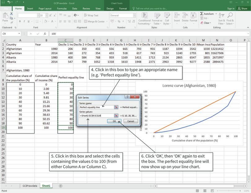
EMPIRICAL PROJECT 5 MEASURING INEQUALITY: LORENZ CURVES AND GINI COEFFICIENTS

                                             For example, a situation where a small fraction of the population lives in
Lorenz curve A graphical
                                         luxury and everybody else struggles to survive may be efficient, but few
representation of inequality of
                                         people would say it is desirable due to the vast inequality between the rich
some quantity such as wealth or
                                         and poor. In this case, policymakers might intervene by implementing a tax
income. Individuals are arranged in
                                         system where richer people pay a greater proportion of their income than
ascending order by how much of
                                         poorer people (a progressive tax), and some revenue collected in taxes is
this quantity they have, and the
                                         transferred to the poor. Empirical evidence on people’s views about the
cumulative share of the total is
                                         fairness of the income distribution and further discussion of the concept of
then plotted against the
                                         fairness can be found in Sections 3.4 (https://tinyco.re/7883386) and 3.5
cumulative share of the population.
                                         (https://tinyco.re/7126396) of Economy, Society, and Public Policy.
For complete equality of income,
                                             To assess inequality economists often use a measure called the Gini
for example, it would be a straight
                                         coefficient, which is based on the differences in incomes, wealth, or some
line with a slope of one. The extent
                                         other measure between people. We will first look at how the Gini coeffi-
to which the curve falls below this
                                         cient is calculated and compare it with other measures of inequality
perfect equality line is a measure
                                         between the rich and poor, such as the 90/10 ratio. We will also use Lorenz
of inequality. See also: Gini coeffi-
                                         curves to show the entire distribution of income in a country. Then, we
cient.
                                         will look gender inequality to see how this dimension can be measured.
                                         Finally, we will look at how inequality can be accounted for in indices of
                                         wellbeing, such as the Human Development Index (HDI).
Gini coefficient A measure of
                                             To learn more about how the Gini coefficient is calculated from differ-
inequality of any quantity such as
                                         ences in people’s endowments, see Section 5.8 (https://tinyco.re/5748024)
income or wealth, varying from a
                                         of Economy, Society, and Public Policy.
value of zero (if there is no inequal-
ity) to one (if a single individual
receives all of it).

 260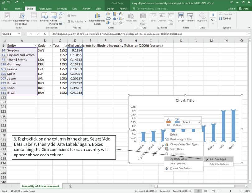
EMPIRICAL PROJECT 5

        WORKING IN EXCEL

PART 5.1 MEASURING INCOME INEQUALITY
One way to visualize the income distribution in a population is to draw a
Lorenz curve. This curve shows the entire population along the horizontal
axis from the poorest to the richest. The height of the curve at any point on
the vertical axis indicates the fraction of total income received by the
fraction of the population, shown on the horizontal axis.
   We will start by using income decile data from the Global Consumption
and Income Project to draw Lorenz curves and compare changes in the
income distribution of a country over time. Note that income here refers to
market income, which does not take into account taxes or government
transfers (see Section 5.9 (https://tinyco.re/1276323) of Economy, Society,
and Public Policy for further details).
   To answer the question below:

• Go to the Globalinc website (http://tinyco.re/9553483) and download
  the Excel file containing the data by clicking ‘xlsx’.
• Save it in an easily accessible location, such as a folder on your Desktop
  or in your personal folder.
• Choose two countries and filter the data so only the values for 1980 and
  2014 are visible. You will be using this data as the basis for your Lorenz
  curves. Copy and paste the filtered data (all columns) into a new tab in
  your spreadsheet.

1 In this new tab, make one table (as shown in Figure 5.1) for each country
  and year (four tables total). Use the country data you have selected to fill
  in each table. (Remember that each decile represents 10% of the popula-
  tion.)

                                                                                 261
EMPIRICAL PROJECT 5 WORKING IN EXCEL

                         Cumulative share of the population (%)      Cumulative share of income (%)
                                                              0                                      0
                                                             10
                                                             20
                                                             30
                                                             40
                                                             50
                                                             60
                                                             70
                                                             80
                                                             90
                                                            100

                   Figure 5.1 Cumulative share of income owned, for each decile of the population.

                    EXCEL WALK-THROUGH 5.1
                    Creating a table showing cumulative shares

                    Figure 5.2 How to create a table showing cumulative shares.

                    1. The data
                    We will be using data from Afghanistan and Albania for this example. The data
                    has been copied and pasted into a new tab on the spreadsheet. We will make a
                    cumulative table for Afghanistan in 1980. (The other three tables are made in
                    the same way.)

262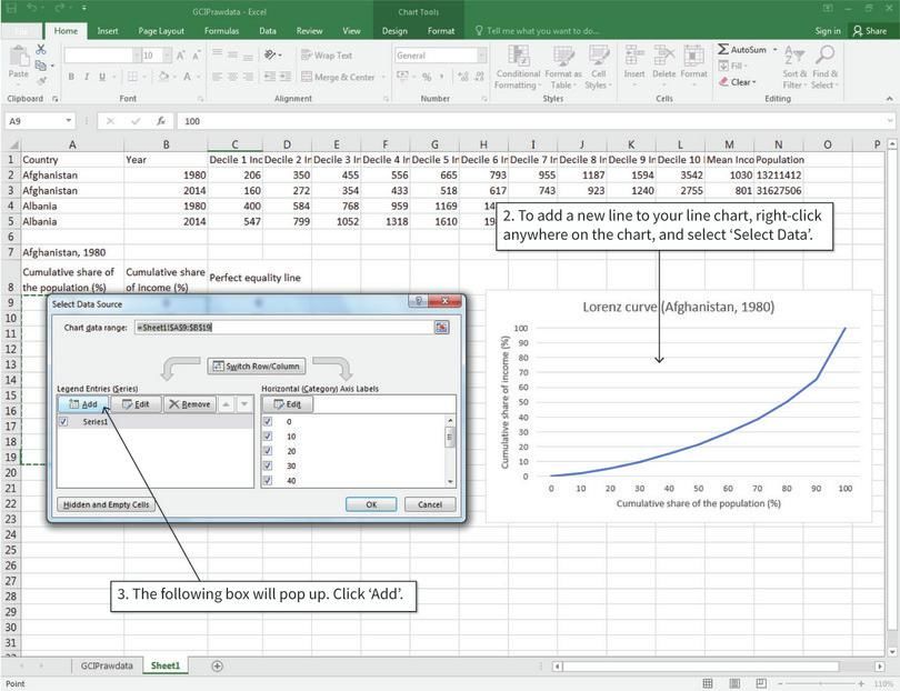
PART 5.1 MEASURING INCOME INEQUALITY

2. Calculate the cumulative share of income using the SUM function.
To calculate the cumulative share of income, we need to add up all the
incomes corresponding to that decile and all smaller deciles, and then divide
by the sum of all incomes.

3. Calculate the cumulative share of income using the SUM function.
Decile 2 and the remaining deciles are calculated slightly differently from
Decile 1, because we have to also include the incomes of lower deciles in the
calculation.

                                                                                        263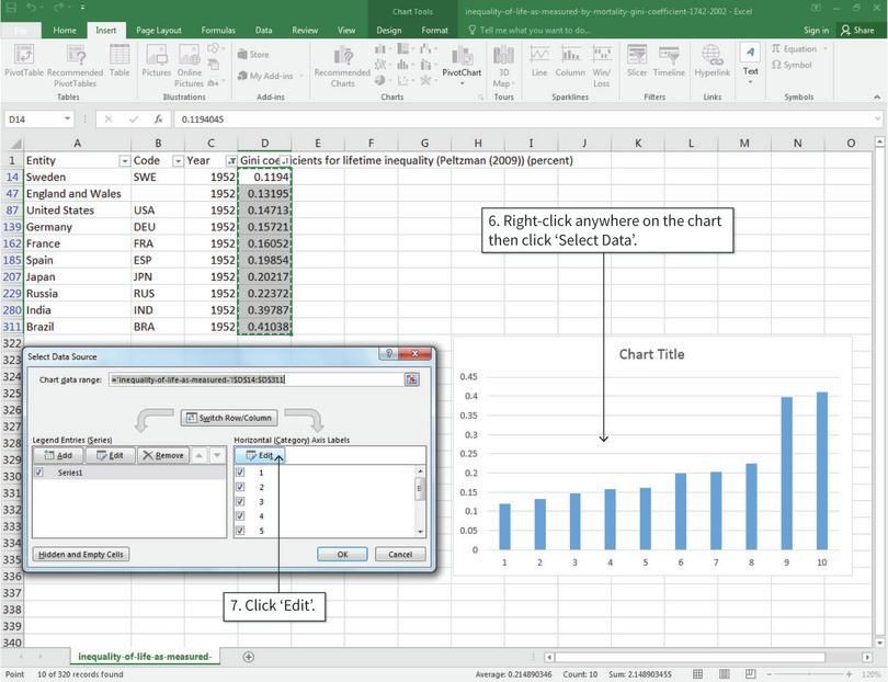
EMPIRICAL PROJECT 5 WORKING IN EXCEL

                    4. Calculate the cumulative share of income using the SUM function
                    You can use this table to plot a Lorenz curve with the first column as the hori-
                    zontal axis values, and the second column as the vertical axis values.

                   2 Use the tables you have made to draw Lorenz curves for each country in
                     order to visually compare the income distributions over time.

                      (a) Draw a line chart with cumulative share of population on the hori-
                          zontal axis and cumulative share of income on the vertical axis. Plot
                          one chart per country (each chart should have two lines, one for 1980
                          and one for 2014). Make sure to include a chart legend, and label your
                          axes and chart appropriately.

                      (b) Follow the steps in Excel walk-through 5.2 to add a straight line
                          representing perfect equality to each chart. (Hint: If income was
                          shared equally across the population, the bottom 10% of people
                          would have 10% of the total income, the bottom 20% would have 20%
                          of the total income, and so on.)

264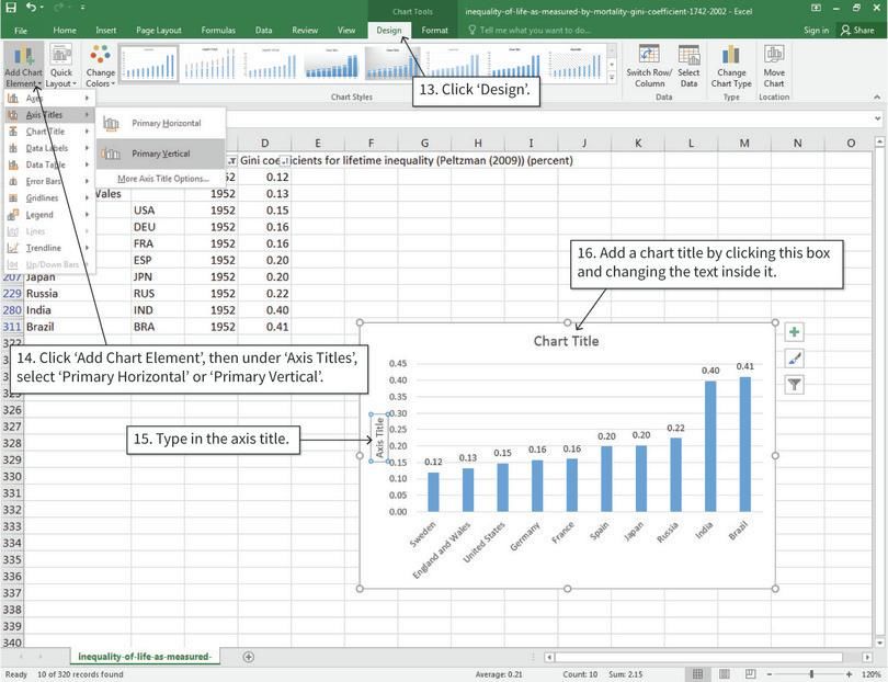
PART 5.1 MEASURING INCOME INEQUALITY

EXCEL WALK-THROUGH 5.2
Drawing the perfect equality line

Figure 5.3 How to draw the perfect equality line.

1. The data
We will use the Lorenz curve for Afghanistan in 1980 as an example. The values
we need to plot the perfect equality line are given in cells C9 to C19 (labelled
‘perfect equality line’). You will notice that these values are the same as those
in cells A9 to A19, because the perfect equality line is where the horizontal and
vertical axis values are equal to each other.

                                                                                           265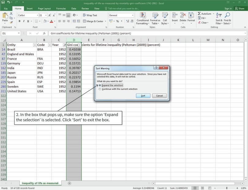
EMPIRICAL PROJECT 5 WORKING IN EXCEL

                    2. Add the required cells to the line chart
                    For the perfect equality line to show up on the chart, we need to add it as a
                    separate data series.

                    3. Add the required cells to the line chart
                    Since the values in cells A9 to A19 and C9 to C19 are the same, it doesn’t matter
                    which range of cells you add to the chart. After step 6, the perfect equality line
                    will appear on your chart.

                   3 Using your Lorenz curves:

                      (a) Compare the distribution of income across time for each country.

266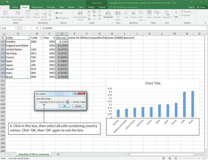
PART 5.1 MEASURING INCOME INEQUALITY

   (b) Compare the distribution of income across countries for each year.

   (c) Suggest some explanations for any similarities and differences you
       observe. (You may want to research your chosen countries to see if
       there were any changes in government policy, political events, or
       other factors that may affect the income distribution.)

A rough way to compare income distributions is to use a summary measure
such as the Gini coefficient. The Gini coefficient ranges from 0 (complete
equality) to 1 (complete inequality). It is calculated by dividing the area
between the Lorenz curve and the perfect equality line, by the total area
underneath the perfect equality line. Intuitively, the further away the
Lorenz curve is from the perfect equality line, the more unequal the income
distribution is, and the higher the Gini coefficient will be.

4 Using a Gini coefficient calculator (http://tinyco.re/8392848), calculate
  the Gini coefficient for each of your Lorenz curves. You should have
  four coefficients in total. Label each Lorenz curve with its
  corresponding Gini coefficient, and check that the coefficients are
  consistent with what you see in your charts. (Hint: In the Gini calculator,
  the income values need to be in a single column, but in the spreadsheet
  the income values are in a single row. You will need to copy and then
  paste-transpose each row so that your data is in the correct format to
  enter into the Gini calculator. See Excel walk-through 2.1 (page 79) for
  help on how to paste-transpose.)

Now we will look at other measures of income inequality to see how they
can be used with the Gini coefficient to summarize a country’s income dis-
tribution. Instead of summarizing the entire income distribution like the
Gini coefficient does, we can take the ratio of incomes at two points in the
distribution. For example, the 90/10 ratio takes the ratio of the top 10% of
incomes (Decile 10) to the lowest 10% of incomes (Decile 1). A 90/10 ratio
of five means that the richest 10% of the population earn five times more
than the poorest 10%. The higher the ratio, the higher the inequality
between these two points in the distribution.

5 Look at the following ratios:
  • 90/10 ratio = the ratio of Decile 10 income to Decile 1 income
  • 90/50 ratio = the ratio of Decile 10 income to Decile 5 income (the
    median)
  • 50/10 ratio = the ratio of Decile 5 income (the median) to Decile 1
    income.

   (a) For each of these ratios, explain why policymakers might want to
       compare the two deciles in the income distribution.

   (b) What kinds of policies or events could affect these ratios?

We will now compare these summary measures (ratios and the Gini coeffi-
cient) for a larger group of countries, using OECD data. The OECD has
annual data for different ratio measures of income inequality for 42 coun-
tries around the world, and has an interactive chart function that plots this
data for you.

                                                                                      267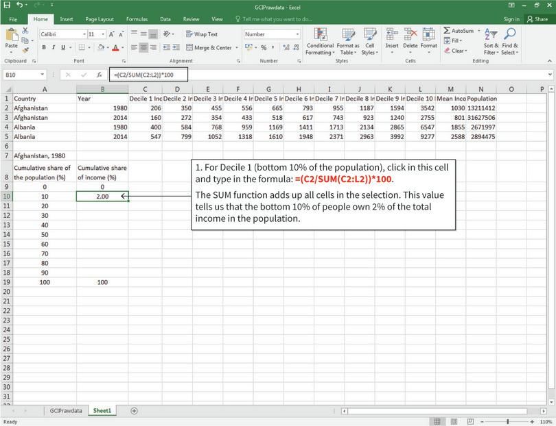
EMPIRICAL PROJECT 5 WORKING IN EXCEL

                      Go to the OECD website (http://tinyco.re/5057087) to access the data.
                   You will see a chart similar to Figure 5.4 which show data for 2015. The
                   countries are ranked from smallest to largest Gini coefficient on the hori-
                   zontal axis, and the vertical axis gives the Gini coefficient.

                   6 Compare summary measures of inequality:

                      (a) Plot the data for the ratio measures by changing the variable selected
                          in the drop-down menu ‘Gini coefficient’. The three ratio measures
                          we looked at previously are called ‘Interdecile P90/P10’, ‘Interdecile
                          P90/P50’, and ‘Interdecile P50/P10’, respectively. (If you click the
                          ‘Compare variables’ option, you can plot more than one variable on
                          the same chart.)

                      (b) For each measure, give an intuitive explanation of how it is measured
                          and what it tells us about income inequality. (For example: What do
                          the larger and smaller values of this measure mean? Which parts of
                          the income distribution does this measure use?)

                      (c) Do countries that rank highly on the Gini coefficient also rank highly
                          on the ratio measures, or do the rankings change depending on the
                          measure used? Based on your answers, explain why it is important to
                          look at more than one summary measure of a distribution.

                   The Gini coefficient and the ratios we have used are common measures of
                   inequality, but there are other ways to measure income inequality.

                   7 Go to the ‘income inequality’ section (http://tinyco.re/4140440) of the
                     Our world in data website, and choose two other measures of income
                     inequality that you find interesting.

                   Figure 5.4 OECD countries ranked according to their Gini coefficient.

268
PART 5.2 MEASURING OTHER KINDS OF INEQUALITY
(a) For each measure, give an intuitive explanation of how it is measured
and what we can learn about income inequality from it. (For example:
What do the larger and smaller values of this measure mean? Which
parts of the income distribution does this measure use?)
(b) If possible, find data or a chart for your chosen measures for the two
countries you used in Questions 1 to 6, and explain what these
measures tell us about inequality in those countries.
PART 5.2 MEASURING OTHER KINDS OF INEQUALITY
There are many ways to measure income inequality, but income inequality
is only one dimension of inequality within a country. To get a more
complete picture of inequality within a country, we need to look at other
areas in which there may be inequality in outcomes. We will explore two
particular areas, focusing on the measures used and their limitations:
• health inequality
• gender inequality in education.
First, we will look at how researchers have measured inequality in health-
related outcomes. Besides income, health is an important aspect of
wellbeing because it determines how long an individual will be alive to
enjoy his or her income. If two people had the same annual income
throughout their lives, but the one person had a much shorter life than the
other, we might say that the distribution of wellbeing is unequal, despite
annual incomes being equal.
As with income, inequality in life expectancy can be measured using a
Gini coefficient. In the study ‘Mortality inequality’ (http://tinyco.re/
8593466), researcher Sam Peltzman (2009) estimated Gini coefficients for
life expectancy based on the distribution of total years lived (life-years)
across people born in a given year (birth cohort). If everybody born in a
given year lived the same number of years, then the total years lived would
be divided equally among these people (perfect equality). If a few people
lived very long lives but everybody else lived very short lives, then there
would be a high degree of inequality (Gini coefficient close to 1).
We will now look at mortality inequality Gini coefficients for ten coun-
tries around the world. First, download the data:
• Go to the ‘health inequality’ section (http://tinyco.re/2668264) of the
Our world in data website. In Section 1.1 (Mortality inequality), click the
‘Data’ button at the bottom of the chart shown.
• Click the blue button that appears to download the data in csv format.
1 Using the mortality inequality data:
(a) Plot all the countries on the same line chart, with Gini coefficient on
the vertical axis and year (1952–2002) on the horizontal axis. Make
sure to include a legend showing country names and label the axes
appropriately.
(b) Describe any general patterns in mortality inequality over time, as
well as any similarities and differences between countries.
269EMPIRICAL PROJECT 5 WORKING IN EXCEL
2 Now compare the Gini coefficients in the first year of your line chart
(1952) with the last year (2002).
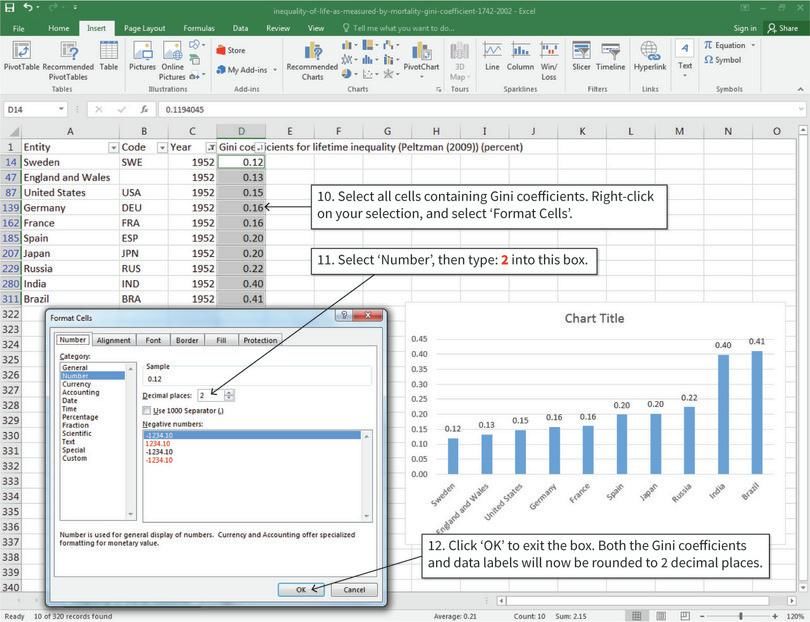
(a) For the year 1952, sort the countries according to their mortality
inequality Gini coefficient from smallest to largest. Plot a column
chart showing these Gini coefficients on the vertical axis, and
country on the horizontal axis. Add data labels to display the Gini
coefficient for each country.
(b) Repeat Question 2(a) for the year 2002.
(c) Comparing to your chart for 1952 and 2002, have the rankings
between countries changed? Suggest some explanations for any
observed changes. (You may want to do some additional research, for
example, look at the healthcare systems of these countries.)
EXCEL WALK-THROUGH 5.3
Drawing a column chart with sorted values
Figure 5.5 How to draw a column chart with sorted values.
1. Sort the data from smallest to largest Gini coefficient
We will use the Gini coefficients for 1952 as an example. The data has been
filtered to show values for the year 1952 only.
270PART 5.2 MEASURING OTHER KINDS OF INEQUALITY
2. Sort the data from smallest to largest Gini coefficient
After step 2, the countries will now be sorted according to their Gini coefficient
(from smallest to largest).
3. Draw a column chart
Now we will make a column chart with the sorted Gini coefficients. After step 5,
the column chart will look like the one shown above.
271EMPIRICAL PROJECT 5 WORKING IN EXCEL
4. Change the horizontal axis labels to country names
Now we will change the horizontal axis labels to country names.
5. Change the horizontal axis labels to country names
After step 8, the horizontal axis labels are now country names.
272PART 5.2 MEASURING OTHER KINDS OF INEQUALITY
6. Add data labels to the columns
Data labels will make the vertical values easier to see, especially for values
that are very close to each other. After step 9, the Gini coefficients will appear
in boxes above the columns.
7. Round the Gini coefficients to two decimal places
The chart may be too crowded at first because the data labels are not rounded
to two decimal places. If we round the Gini coefficient values, the data labels
will change accordingly.
273EMPIRICAL PROJECT 5 WORKING IN EXCEL
8. Add axis titles and a chart title
After step 16, your chart will look similar in style to that of Figure 5.4 (page
268).
Other measures of health inequality, such as those used by the World Health
Organization (WHO), are based on access to healthcare, affordability of
healthcare, and quality of living conditions. Choose one of the following
measures of health inequality to answer Question 3:
• access to essential medicines
• basic hospital access
• composite coverage index.
To download the data for your chosen measure:
• If you choose to look at either the access to essential medicines or the
basic hospital access measure, go to the WHO’s Universal Health
Coverage Data Portal (http://tinyco.re/9304620), click on the tab
‘Explore UHC Indicators’, and select your chosen measure.
• A drop-down menu with three buttons will appear: ‘Map’ (or ‘Graph’)
shows a visual description of the data, ‘Data’ contains the data files,
and ‘Metadata’ contains information about your chosen measure.
• Click on the ‘Data’ button, then select ‘CSV table’ from the
‘Download complete data set as’ list.
• If you choose to look at the composite coverage index measure, go to
WHO’s Global Health Observatory data repository (http://tinyco.re/
3968368), and select one category to compare (economic status,
education, or place of residence). To download the data for that category,
click ‘CSV table’ from the ‘Download complete data set as’ list. You can
read further information about this index in the WHO’s technical notes
(http://tinyco.re/5693881).
274PART 5.2 MEASURING OTHER KINDS OF INEQUALITY
3 For your chosen measure:
(a) Explain how it is constructed and what outcomes it assesses.
(b) Create an appropriate chart to summarize the data. (You can replicate
a chart shown on the website or draw a similar chart.)
(c) Explain what your chart shows about health inequality within and
between countries, and discuss the limitations of using this measure
(for example, measurement issues or other aspects of inequality that
this measure ignores).
Since an individual’s income and available options in later life partly
depend on their level of education, inequality in educational access or
attainment can lead to inequality in income and other outcomes. We will
focus on the aspect of gender inequality in educational attainment, using
data from the Our world in data website, to make our own comparisons
between countries and over time. Choose one of the following measures to
answer Question 4:
• gender gap in primary education (share of enrolled female primary
education students)
• share of women, between 15 and 19 years old, with no education
• share of women, 15 years and older, with no education.
To download the data for your chosen measure:
• Go to the ‘educational mobility and inequality’ section (http://tinyco.re/
8784776) of the Our world in data website, and find the chart for your
chosen measure.
• Click the ‘Data’ button at the bottom of the chart, then click the blue
button that appears to download the data in csv format.
4 For your chosen measure:
(a) Choose ten countries that have data from 1980 to 2010. Plot your
chosen countries on the same line chart, with year on the horizontal
axis and share on the vertical axis. Make sure to include a legend
showing country names and label the axes appropriately.
(b) Describe any general patterns in gender inequality in education over
time, as well as any similarities and differences between countries.
(c) Calculate the change in the value of this measure between 1980 and
2010 for each country chosen. Sort these countries according to this
value, from the smallest change to largest change. Now plot a column
chart showing the change (1980 to 2010) on the vertical axis, and
country on the horizontal axis. Add data labels to display the value
for each country.
(d) Which country had the largest change? Which country had the
smallest change?
275EMPIRICAL PROJECT 5 WORKING IN EXCEL
(e) Suggest some explanations for your observations in Questions 4(b)
and (d). (You may want to do some background research on your
chosen countries.)
(f) Discuss the limitations of using this measure to assess the degree of
gender inequality in educational attainment and propose some
alternative measures.
276EMPIRICAL PROJECT 5
SOLUTIONS
These are not model answers. They are provided to help students, including
those doing the project outside a formal class, to check their progress while
working through the questions using the Excel or R walk-throughs. There are
also brief notes for the more interpretive questions. Students taking courses
using Doing Economics should follow the guidance of their instructors.
PART 5.1 MEASURING INCOME INEQUALITY
1 China and the US are used as examples.
China, 1980
Cumulative share of the population (%) Cumulative share of income (%)
0 0.00
10 3.14
20 7.63
30 13.43
40 20.47
50 28.82
60 38.55
70 49.92
80 63.28
90 79.33
100 100.00
Solution figure 5.1 Table showing cumulative income shares for China (1980).
311EMPIRICAL PROJECT 5 SOLUTIONS
China, 2014
Cumulative share of the population (%) Cumulative share of income (%)
0 0.00
10 0.92
20 2.84
30 5.81
40 9.95
50 15.44
60 22.55
70 31.75
80 43.95
90 61.43
100 100.00
Solution figure 5.2 Table showing cumulative income shares for China (2014).
United States, 1980
Cumulative share of the population (%) Cumulative share of income (%)
0 0.00
10 2.29
20 6.22
30 11.52
40 18.08
50 25.89
60 35.04
70 45.73
80 58.44
90 74.39
100 100.00
Solution figure 5.3 Table showing cumulative income shares for the US (1980).
312PART 5.1 MEASURING INCOME INEQUALITY
United States, 2014
Cumulative share of the population (%) Cumulative share of income (%)
0 0.00
10 1.88
20 5.14
30 9.66
40 15.41
50 22.45
60 30.92
70 41.09
80 53.58
90 69.90
100 100.00
Solution figure 5.4 Table showing cumulative income shares for the US (2014).
2 (a) Solution figures 5.5 and 5.6 show the Lorenz curves for China and
the US, the perfect equality line applies to the next question’s
solution.
(b) Solution figures 5.5 and 5.6 show the Lorenz curves for China and
the US, with the perfect equality line.
Solution figure 5.5 Lorenz curves for China.
313EMPIRICAL PROJECT 5 SOLUTIONS
Solution figure 5.6 Lorenz curves for the US.
3 (a) The area between the perfect equality line and the Lorenz curve
reflects inequality. Inequality in both countries widened between
1980 and 2014. The change in China is far larger than that in the US.
(b) Although income distribution is more equal in China than in the US
in 1980, it is less equal in China than in the US in 2014.
(c) China had a mostly planned economy in 1980, which prioritized
equality. Since 1978, China has undertaken waves of reforms to
marketize the economy and improve efficiency. The rapid growth has
come at the cost of equality. By introducing market reforms,
opportunities emerged for private gain through entrepreneurial
activities. Although rapid growth and high inequality are negatively
correlated both in high income countries and in a group of ‘catching
up’ countries, as discussed in Section 19.11 (https://tinyco.re/
1686411) of The Economy, rapid growth in China has come at the cost
of rising inequality.
Inequality in the US is higher than in most developed countries.
Many people attribute the higher inequality to policies favouring the
rich. Worsening inequality in the US can be explained by a range of
factors, including tax policies that favour the rich, education policies
that dampen the opportunities for intergenerational mobility (see
Section 19.2 (https://tinyco.re/3301931) of The Economy), the skill-
biased technological change that raises the incomes of workers with
skills complementary to ICT and reduces that of workers with skills
substitutable by ICT, and the decline of labour unions
(http://tinyco.re/434258).
4 Solution figures 5.7 and 5.8 show the Lorenz curves for China and the
US with Gini coefficients labelled.
314PART 5.1 MEASURING INCOME INEQUALITY
Solution figure 5.7 Lorenz curves for China, with labelled Gini coefficients.
Solution figure 5.8 Lorenz curves for the US, with labelled Gini coefficients.
5 (a) These ratios all help give policymakers an idea of the distribution of
income in the economy and where income is concentrated. Policy-
makers may use the information to decide on policies favouring
certain income deciles of the population.
• The 90/10 ratio compares the two extremes of the income
distribution and tells policymakers about the difference
between the richest and the poorest. Policymakers can use
315EMPIRICAL PROJECT 5 SOLUTIONS
the information to decide how much income to redistribute
to the poorest.
• The 90/50 ratio tells policymakers about how the middle
class is doing relative to the richest. The ratio can also be
used to determine the distribution of tax burden among the
relatively rich population.
• The 50/10 ratio reveals the distribution of income among
the relatively poor population. Policymakers can use the
information to determine the amount of income to be
redistributed to each group, and to determine who is in
relative poverty (many governments define the poverty line
relative to the median income).
(b) See Section 19.8 (https://tinyco.re/2299150) of The Economy to see
how governments can affect income inequality.
6 (a) Students will plot the data for the ratio measures by changing the
variable selected for the Gini coefficient.
(b) The inter-decile ratios are calculated as the ratios between incomes
of various deciles of income distribution. The 90/10 ratio, for
example, is the ratio of the income of the 9th decile to the income of
the 1st decile.
Larger values mean the income from one decile of the distribution
is higher relative to the income from another decile.
(c) Countries that rank highly on the Gini coefficient also generally rank
highly on ratio measures. There are, however, some exceptions.
Slovenia, for example, while being the most equal country in terms of
the Gini coefficient in 2015, was only the 5th most equal country in
terms of the 90/10 ratio. The potential differences in rankings of dif-
ferent measures mean it is important to look at more than one
measure. The Gini coefficient is an overall measure of a distribution
that may mask extreme inequalities between certain groups of the
population.
7 Measures chosen here are the share of income going to the top 1%, and
the share of children living in relative poverty.
• Share of income going to the top 1%: This measure looks at the high end
of the income distribution (the right tail). Larger values indicate that
the very rich have a larger share of the income, and that there is
therefore more inequality between the very rich and the rest of
society. However, this is a narrower measure of inequality than the
Gini coefficient because it only tells us about how the very rich are
doing.
• Share of children living in relative poverty: This measure is defined as
the share of children living in a household with half of the disposable
income of the median household. A larger value indicates that a
larger proportion of children are living in relative poverty.
316PART 5.2 MEASURING OTHER KINDS OF INEQUALITY
PART 5.2 MEASURING OTHER KINDS OF INEQUALITY
1 (a) Solution figure 5.9 shows the mortality inequality Gini coefficients
for the ten countries.
(b) Mortality inequality has been falling over time in all countries except
Russia. Developing countries tend to have greater mortality inequality
than developed countries. Industrialized, richer countries seem to have
materialized most of the available improvement (somewhere at a mor-
tality Gini of 0.1) since the 1960s. Exceptions to this are India and
Brazil, which are both still on a significant downward trend and still not
close to a mortality Gini value of 0.1. The only country in this set of
countries where some of the gains are being reversed is Russia, although
the latest upward movement is fairly modest, and one may interpret this
as Russia having settled on a higher mortality Gini of about 0.15.
2 (a) Solution figure 5.10 shows Gini coefficients by country for 1952.
(b) Solution figure 5.11 shows Gini coefficients by country for 2002.
(c) The rankings are different in 1952 and 2002. Japan, for example,
moved up five places in the ranking to become the second most equal
country in 2002. The rapid economic development in Japan has led to
rising life expectancy. Living to old age is now the norm in Japan
rather than a privilege enjoyed only by the rich. The rising
proportion of elderly voters has contributed to policies aimed at
improving elderly care, which have reduced the variation in life
expectancy. The United States, on the other hand, dropped four
places to become a relatively less equal nation in the group. The high
costs of healthcare may prevent poor people from accessing
treatment, especially if uninsured. It is more likely for disadvantaged
groups in society such as minorities or part-time workers to lack
insurance coverage.
3 This example looks at access to essential medicines.
Solution figure 5.9 Mortality inequality Gini coefficients (1952–2002).
317EMPIRICAL PROJECT 5 SOLUTIONS
Solution figure 5.10 Countries ranked according to mortality inequality Gini
coefficients in 1952.
Solution figure 5.11 Countries ranked according to mortality inequality Gini
coefficients in 2002.
(a) The median availability of selected generic medicines (in percentage
terms) is a measure of the access to treatment. Data on availability,
defined as the percentage of medicine outlets where a medicine was
found on a given day, are collected through surveys in multiple
regions for each country.
(b) Solution figures 5.12 and 5.13 provide two charts summarizing the
data.
(c) There are large disparities in health inequality across countries. For
example, availability in the Russian Federation is 100%, whereas in
China it is about 15%. The availability of medicines within a country
can differ depending on whether an outlet belongs to the public or
318PART 5.2 MEASURING OTHER KINDS OF INEQUALITY
Solution figure 5.12 Median availability of selected generic medicines in the private
sector.
Solution figure 5.13 Median availability of selected generic medicines in the public
sector.
the private sector. In some countries, such as Brazil, private sector
availability of medicines is far higher than that in the public sector.
The reverse is true for other countries such as Sao Tome and
Principe. Note that a higher availability of medicines in the private
sector does not necessarily mean greater access for the entire popula-
tion, since the private sector is only open to individuals with the
ability to pay. This disparity means that richer individuals can access
a wider range of medical treatments.
319EMPIRICAL PROJECT 5 SOLUTIONS
The data has some limitations. The basket of medicines differs
across countries. The data reflects availability on the day of data
collection, which may not be a representative day. Outlets could
stockpile medicines in expectation of the arrival of the data collection
team. Availability does not account for the dosage and strengths of
the products.
4 Solution figure 5.14 looks at the gender gap in primary education.
(a) Note: It is difficult to find ten countries without any missing data
point between 1980 and 2010. Countries with full data may not be as
interesting as others. The lines below connect all available data
points.
(b) For most countries in the selected group, the share of female pupils in
primary education fluctuated around levels just below 50%
throughout the period. China and India were the most unequal coun-
tries in 1980. India had the greatest improvement in equality over the
period, and by 2010 the female share reached nearly 48%. Note the
inverse U-shape for China, which could be due to the increasing
gender imbalance in the school-age population (around 112 males
per 100 females in 2010 (http://tinyco.re/7113498)).
(c) Solution figure 5.15 shows the percentage change in the measure
between 1980 and 2010.
(d) India had the largest change, whereas France had the smallest change.
(e) India had the lowest share of enrolled female primary education
students in the group in 1980. Rapid development and changing
beliefs have contributed to the efforts to reduce gender education
Solution figure 5.14 Female pupils as a percentage of total enrolment in primary
education.
320PART 5.2 MEASURING OTHER KINDS OF INEQUALITY
inequalities. Universal primary education and promotion of gender
equality are among the 8 goals in the Millennium Development Goals
(MDGs) to which India committed to achieve by 2015 since 2000.
France, as a developed country, had relatively high equality from
the beginning of the period and hence had experienced relatively
little change over the period (due to less scope for improvement).
From Question 4(c), it is apparent that countries which already
had very a high percentage of female enrolment (PFE) saw no change.
Those countries with initially low female participation have
significantly improved.
The data demonstrates that the past few decades have seen a
significant improvement in access to education for girls. If you
repeated the above analysis for all countries, you would see similar
results.
(f) The measure depends on the gender composition of the population.
If there are more male than female children of primary schooling age
in a country, then the share of female enrolled must be less than 50%.
The ratio of female to male in enrolment rate, which provides a pop-
ulation-adjusted measure of gender parity, can be used instead.
Remember that all we can see here is enrolment in primary
education. It is possible that males could receive more education
overall (secondary and higher levels). In fact, if you go back to the
‘educational mobility and inequality’ section (http://tinyco.re/
8784776) of the Our world in data website, you will see that in many
regions females still receive a significantly smaller amount of
education overall.
Solution figure 5.15 Change (%) in female pupils’ share of total enrolment in
primary education.
321You can also read


