New York City's Multifamily Housing in Distress
←
→
Page content transcription
If your browser does not render page correctly, please read the page content below
New York City’s
Multifamily Housing in Distress
Using the Building Indicator Project to identify
and address physical and financial distress

A Report by
University Neighborhood Housing Program

Released April 28, 2011
at Fordham University’s Rose Hill Campus in the Bronx
New York City’s Multifamily Housing in Distress
Acknowledgements
       This report was written by Gregory Lobo Jost with assistance from Jim Buckley, Catherine
Clarke, and Nathan Snyder.
       University Neighborhood Housing Program (UNHP) would like to acknowledge the financial
supporters of the Building Indicator Project (BIP), especially our report and forum sponsor, Enterprise
Community Partners. Enterprise is a long-time partner and supporter of our affordable housing and
development work, and we are especially thankful to them for underwriting the cost of subscriptions
for almost two dozen nonprofit organizations and agencies in New York City who are magnifying the
power of BIP through their own critical neighborhood work.
       We would also like to thank the Charles H. Revson Foundation for their role as another report
sponsor. Additionally, support from The Goldman Sachs Urban Investment Group, Mizuho USA
Foundation, the M&T Charitable Foundation and the Community Preservation Corporation have
helped to make this research possible.
       We would like to acknowledge those who helped us refine our scoring system, including a
number of bankers, affordable housing managers, and research partners. Special appreciation goes
to those lenders who have been long-time active users of BIP data and have consistently attended
meetings of our Multifamily Assistance Center including Apple Bank, Capital One Bank, the
Community Preservation Corporation, Fannie Mae, HSBC and Ridgewood Savings Bank.
         Additionally, we value the collaboration on issues of over-leveraged and distressed
multifamily properties over the years by Fordham Bedford Housing Corporation, the Northwest Bronx
Community and Clergy Coalition, the CASA program at New Settlement Apartments, Enterprise,
LISC, the Citizens Housing and Planning Council, the Furman Center at NYU, the Association for
Neighborhood and Housing Development, the Urban Homesteading Assistance Board, and the New
York City Department of Housing Preservation and Development.
         Special gratitude goes to John Ziegler and Tri Vo of LotInfo, LLC for developing the customized
utilities for automating BIP and for working with us to update and improve the system. Without
their assistance, we would likely not have moved BIP beyond the Bronx and still might be torturing
numerous interns.
         Speaking of which, UNHP greatly appreciates the hard work of all of its past and present
employees and interns who have worked on the Building Indicator Project, from Luke Hayes who
was our first BIP intern way back in 2003, to Eric Fergen who put in countless hours between 2005
and 2007 as both intern and staff member, and to current Peace Corps Fellow intern Nathan Snyder
who contributed tremendously to the research for this report.
         Thank you to the International Political and Economic Development (IPED) program at
Fordham University for providing us with a steady flow of amazing graduate student interns over
the past six years. Additionally, both the Office of Government and Urban Affairs and the Dorothy
Day Center for Service and Justice at Fordham University deserve our gratitude for their support and
partnership over the years, and for providing us with the space for our affordable housing forums.
         Finally, we would like to acknowledge the City of New York for making all of this public data
available online.

                                                        1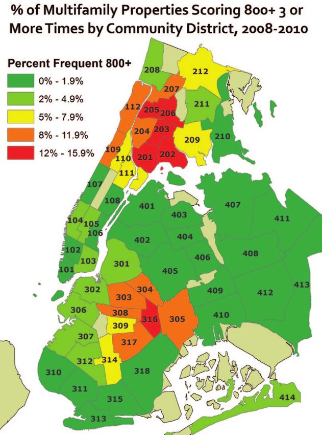
New York City’s Multifamily Housing in Distress

Executive Summary
        The number of New York City’s multifamily properties in physical and/or financial distress
is on the rise, according to research based on University Neighborhood Housing Program’s (UNHP)
Building Indicator Project (BIP). The BIP database, conceived in 2003, launched in 2004 and improved
and expanded over the following six years to its current form, works as a tool to identify levels of
distress in buildings with at least five residential units using publicly available data on violations,
liens and mortgages. With input from housing and banking professionals in the public, private and
nonprofit sectors, UNHP tested, analyzed and refined a scoring system where properties with a score
of 800 or above warranted further examination to confirm probable physical and/or financial distress.
        Documenting the growing disconnect between sales prices and net operating income in
Bronx multifamily housing in the early and mid 2000s, as well as the swelling number of households
with a severe rent burden throughout the decade, led UNHP to believe that levels of distress in the
local housing stock would rise. Speculative landlords would not be able to meet high debt service
payments without cutting back on services to buildings, especially as other operating costs such
as water and insurance were increasing dramatically. The gambles of private equity investors on
replacing working class lower-rent tenants with higher income earners in places like the west Bronx
would not pay off, and all parties would pay a price, especially the tenants and the housing stock
itself. The need for a tool like the Building Indicator Project was and continues to be apparent.
         Currently, the BIP database tracks violation, lien and lender data for more than 62,000
properties in four boroughs of New York City, and the most recent data shows nearly 3,400 properties
containing approximately 135,000 apartments scoring above our likely distress threshold of 800
points. This represents 5.5% of all properties in the database, and is a significant increase from the
fall of 2009 when 3.3% were likely distressed. The percent of properties also increased slightly in all
boroughs except Manhattan since the spring of 2010, bucking the trend of scores dropping slightly
each fall.
         In this report we will present current data on Bronx real estate trends, housing-related
demographics of Bronx neighborhoods at the epicenter of this crisis, and a detailed analysis of BIP
data including trends of distressed housing by neighborhood, type of property and by lender. We
will also discuss some of the uses of BIP by community groups across the City, and the influence it is
having on lenders and public policy. In sum, we will demonstrate the current and potential power
of BIP to improve the quality of housing in poor and working class neighborhoods throughout New
York City, especially in places like the west Bronx.

                                                       1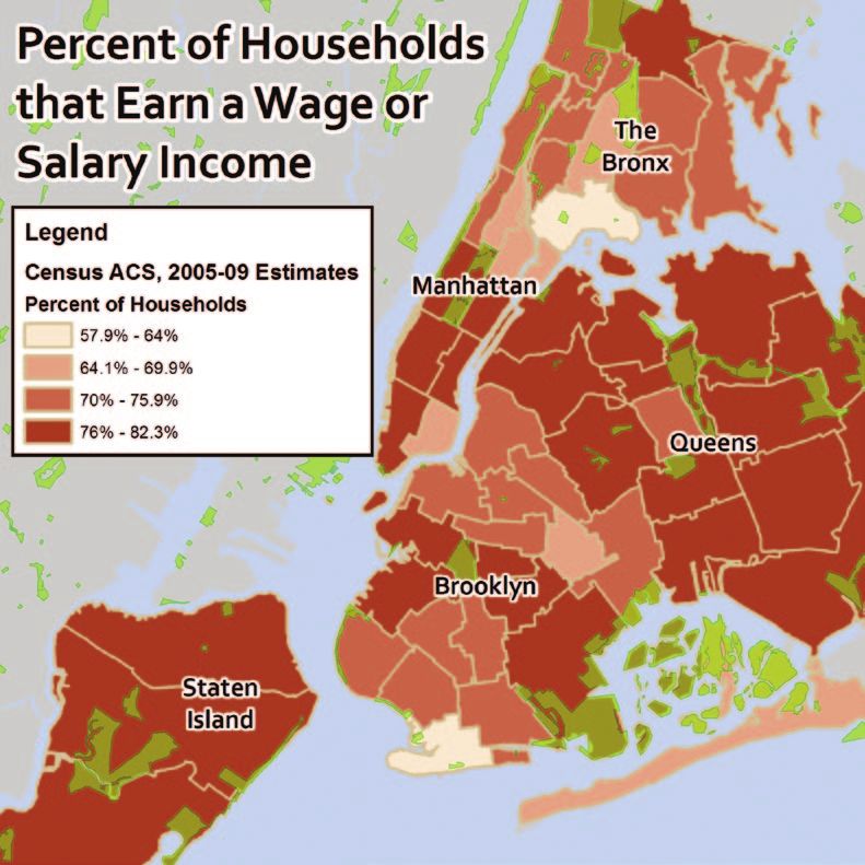
New York City’s Multifamily Housing in Distress

                      2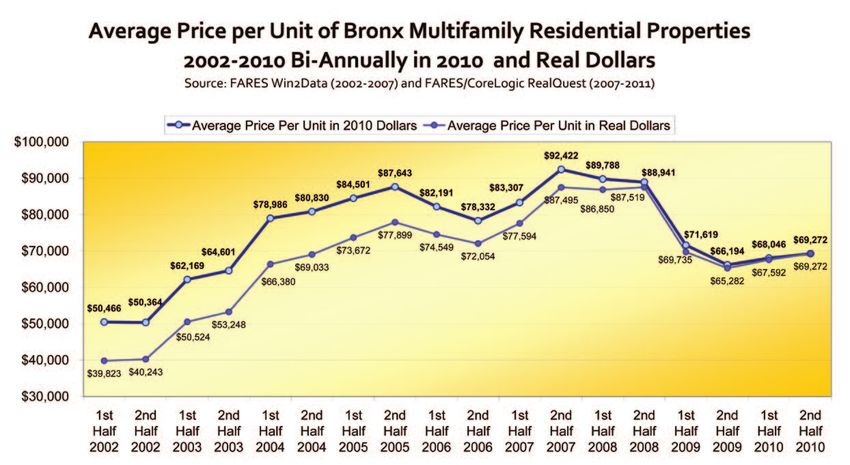
New York City’s Multifamily Housing in Distress

The Bubble Behind the BIP Story
        Aside from the confusion over who would be the next President of the United States, the day
after the 2000 election is most memorable to UNHP staff because of the forum we held at Fordham
University’s Lincoln Center Campus on rising Bronx real estate prices. Entitled Six Times Rent Roll,
more than 50 lenders, regulators, owners and managers responded to both anecdotal and empirical
evidence of rising sales prices in Bronx multifamily housing at the forum. These rising prices had
impeded UNHP’s ability to work with tenant and nonprofit groups to purchase buildings, and
triggered memories of a previous spike in the late 1980s when Freddie Mac was financing building
sales for similar amounts prior to a sharp downturn and ensuing foreclosure crisis in the Bronx
multifamily real estate market.
        In the following years, UNHP would complete a detailed analysis of real estate data with
assistance from the Citizens Housing and Planning Council (CHPC) and issue a report in 2003 entitled
A Real Estate Bubble in the Bronx? that reached the significant conclusion that speculation could not
be ruled out. UNHP continued to update the research on sales prices and net operating income in
subsequent reports in 2005, 2007 and 2009.1 Now in 2011, we are able to look back and see some
intricacies of that bubble and how we developed the Building Indicator Project just in time to identify
the housing distress caused by the growing number of individual bursts.2

          Figure 1

       Using sales price data for residential apartment buildings in the Bronx with at least six rental
units from First American Real Estate Solutions/CoreLogic, we track sales price per unit going back
      3

to 1985 (see Figure 1 above). After a period of relative volatility in the late 1980s and early 1990s, a

1         All UNHP Reports including A Real Estate Bubble in the Bronx?, 2005’s Rising Values in a Highly Subsidized Market,
2007’s Shrinking Affordability, and 2009’s Envisioning the Future of the Red Zone are available at www.unhp.org/forums.htm
2         In the mid- to late-2000s we began to refer to the predicted bursting of the Bronx multifamily real estate bubble
as a series of individual bursts, as individual over-leveraged buildings and portfolios would go in foreclosure over a
drawn out period of time.
3         We elected to look at properties with at least six rental units as this is the minimum number required for a build-
ing to be rent stabilized.
                                                               3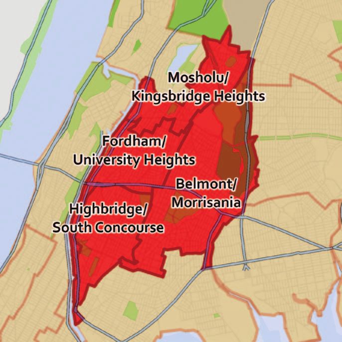
New York City’s Multifamily Housing in Distress

rapid and steady increase in sales prices begins in the late 1990s. With the lone exception of 2001,
sales price per unit increased uninterrupted for the decade beginning in 1996, skyrocketing 794% by
2005. This represents an average annual increase of 30% sustained over a nine year period.
        After another slight drop in 2006, two more years of increases brought sales prices to almost
$90,000 per unit (all figures are adjusted to 2010 dollars) before the correction seen in 2009. Annual
data for 2009 and 2010 shows a steady average price per unit around $68,500.

        Figure 2

        What has always set off alarm bells for us has been the dramatic disconnect between sales
prices and net operating income (NOI). Using Rent Guidelines Board data from their annual Income
and Expense Studies, we see in Figure 2 that growing income numbers in Bronx multifamily housing
have been offset by increasing operating and management (O&M) expenses. The result has been
that, adjusted for inflation, NOI has remained virtually flat since 1990, even accounting for the very
recent jump in 2009.
        Hence, rising sales prices were not the result of an increase in profitability of Bronx apartment
buildings, but rather likely stemmed from speculative investment and expectations based in the
bubble mentality of the 2000s. While some lenders practiced conservative underwriting during this
period, others became more aggressive and sought larger market share and short term profits. In
general, most Bronx multifamily loans during this period were not based on traditional debt service
coverage ratios. While some of the loans may have been considered conservative based on loan-
to-value ratios (with large amounts of cash from private equity investors), there are documented
cases of underwriting using projected income based on unreasonably high expectations of turnover
of tenants.4 In the end, these aggressive lenders aided speculators in putting many thousands of
properties at risk of deferred maintenance and deterioration while increasing levels of harassment of
low-rent tenants and contributing to the loss of apartments affordable to working class New Yorkers.

4     Source: Predatory Equity: Evolution of a Crisis by the Association for Neighborhood and Housing Development,
November 2009. http://www.anhd.org/resources/Predatory_Equity-Evolution_of_a_Crisis_Report.pdf
                                                            4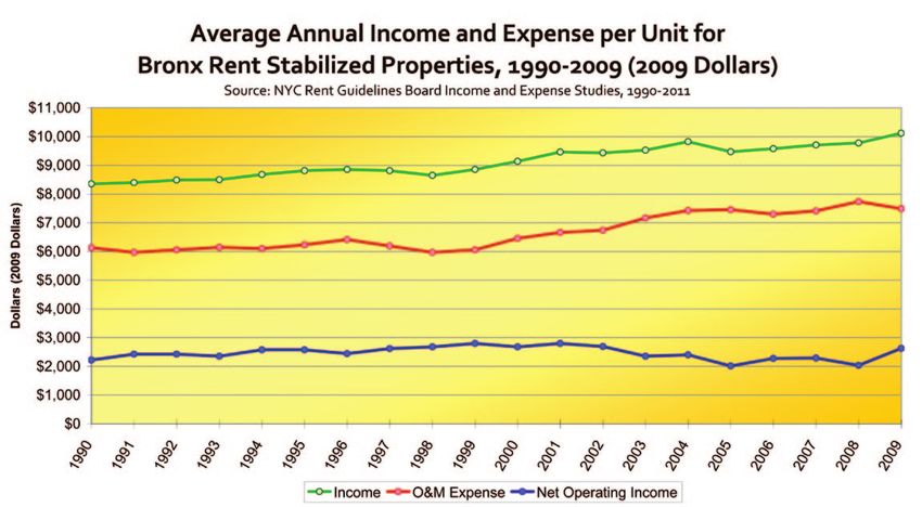
New York City’s Multifamily Housing in Distress

   Figure 3

        Biannual sales price data (see Figure 3 above) gives a more detailed look at changes in the Bronx
multifamily real estate market. We see a peak in the first half of 2006, only to be surpassed in the
second half of 2007 and both halves of 2008. The dramatic drop did not arrive until the first half of
2009, and prices have remained under $70,000 per unit since then.
        Near-peak sales prices coincided with record sales volume during the first halves of 2005,
2006 and especially 2007 (see Figure 4 below), when adjusted price per unit stayed above $82,000. As
a result, a huge segment of Bronx multifamily housing stock was sold at record prices, creating a
potentially enormous pool of buildings that would be at-risk of physical and financial distress due to
over-leveraging.
   Figure 4

                                                        5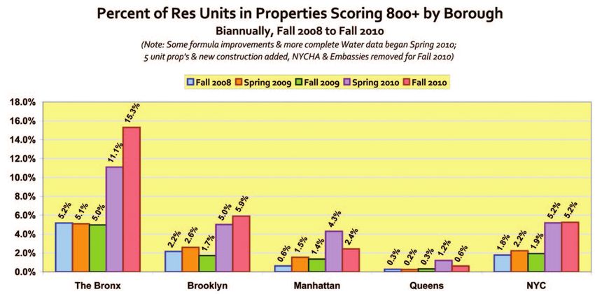
New York City’s Multifamily Housing in Distress

       Figure 5

       If both owners and lenders had based value on actual net operating income and debt service
coverage ratios, the average price per unit would have looked closer to Figure 5. Our theoretical price
per unit is based on NOI data from the Rent Guidelines Board, interest rate data from CPC, gradually
decreasing debt service coverage ratios from 1.25 in 1990 to 1.16 in 2009, and gradually decreasing
loan-to-value ratios from 80% in 1990 to 75% in 2006-2009. Equilibrium of sorts was reached in
1998 and 1999, while 2001 was also close. While we realize these are ballpark estimates, they still
demonstrate the dramatic contrast between actual speculative and theoretical responsible investment
during this period. Even with a bump up in Figure 6
NOI and a sharp drop in sales prices for 2009,
average price per unit is still almost double           “The West Bronx
what it might be if it were based on actual             Corridor”
average operating income.

The People of the West Bronx Corridor
        In UNHP’s work, the traditional
boundaries have been the Northwest Bronx,
bounded by the Cross Bronx Expressway to
the south, the Harlem and Hudson Rivers to
the west, the Bronx River to the east and the
City line to the north. However, we have
identified slightly different boundaries for
an area in the City that has been hardest hit
by levels of housing distress and share many
other demographic and economic indicators.
Featured in our 2009 report, Envisioning the Future of the Red Zone, “the West Bronx Corridor” is

                                                       6
New York City’s Multifamily Housing in Distress
comprised of Bronx Community Boards 3, 4, 5, 6 and 7 and includes neighborhoods such as Fordham,
University Heights, Norwood, Highbridge, Crotona, Bedford Park, Belmont, Mount Hope, Morris
Heights and southern Kingsbridge Heights, with the Grand Concourse as its spine stretching from
161st Street to Mosholu Parkway.5
These neighborhoods also share a similar housing stock, comprised mainly of five and six
story walk-up and elevator apartment buildings as well as a mix of two and three family homes
and a few high rises, and a relatively small amount of public housing.6 While these neighborhoods
experienced varying levels of devastation during the 1970s and early 1980s, they all witnessed many
occupied rehabilitations during the past thirty years with the assistance of effective community
organizing, neighborhood-based housing development organizations, private-public partnerships
and City investment.
In total, these neighborhoods are home to more than 540,000 residents living in about 180,000
households.7 According to data from both the 2008 New York City Housing and Vacancy Survey
(HVS) and the 2005-2009 American Community Survey (ACS), they share similar demographic
profiles that can be categorized Figure 7
generally as predominately Latino and
black, immigrant--heavy (especially
Dominicans, Mexicans and West
Africans), working class and working
poor, with a high percentage of the
population under the age of 18.
Approximately 70% of house-
holds in the West Bronx Corridor
(WBC) reported a wage or salary
income on the 2005-2009 ACS 5-Year
Estimates.8 While not as high as some
other parts of the City, this percentage
is only slightly less than the citywide
average of 75%, and is about the same
as it was in 2000, despite a recent spike
in the unemployment rate.
However, incomes in the West
Bronx Corridor are among the lowest
5 While we mention here Community Districts (CDs), most demographic data is based on Sub Borough Areas
(SBA), also known as Public Use Microdata Areas (PUMAs) which closely correspond to CDs, though in a few cases two
CDs are combined to form one SBA to reach a large enough population count, including Bronx CDs 3 and 6 which form
one SBA known as Morrisania/Belmont.
6 Most of the Public Housing in the West Bronx Corridor is concentrated in the southeast part of the area.
7 Taken on their own, these neighborhoods would rank as the 33rd largest City in the nation between Albuquerque
and Tucson. At 56,910 people per square mile [64,472 if you exclude Bronx Park], it is more than twice as dense as the City
as a whole, and nearly as dense as Manhattan.
8 The 2005-09 ACS Estimate is the most recent dataset with a large enough sample size to look below the county
level with a relatively small margin of error. Data also exists at the one year and three year levels, but with much higher
margins of error.
7New York City’s Multifamily Housing in Distress
in the City and have, in the past decade, Figure 8
failed to keep up with inflation. Median
household income is around $25,500,
which is about 4.5% less than what
it was in 2000 adjusted for inflation.9
Single parent households make up 44%
of the total, meaning a family with two
wage earners is not typical.10
Additionally, a large percentage
of the population in this area does
not have a high school diploma or
GED,11 limiting residents to service
sector employment where wages have
stagnated in the past decade, and
benefits are limited or none. The growing level of income inequality in New York City (with the top
1% now earning 44% of the income) means there is less money to be earned by those at the bottom of
the job ladder.12 Neighborhoods like the West Bronx Corridor suffer the most from this confluence of
severe economic stratification and wage stagnation for those at the low end of the pay scale. Attempts
to bring about living wage legislation are in progress, but if successful, it would not improve wages
for the vast majority of residents.13
While the Bronx continues to offer the lowest rents of any borough in the City, affordability
is a serious and growing problem. Asking rents have increased at a much faster pace than incomes
and a household that has moved in the past five years pays significantly more in rent than one that
has remained in the same apartment for more than a decade (see Figure 9 on Page 9). Overall, more
than a third of renter households in the West Bronx Corridor now pay more than half of their income
on rent, and this number would be much higher if not for the large number of Section 8 vouchers in
our neighborhoods.14
Furthermore, gentrification pressures in other parts of the city have increased the level of
economic segregation as more and more poor and working class families have been priced out of
their old neighborhoods. Aside from moving out of the City entirely, one of their few alternatives is
to move to the Bronx in search of cheaper rents. Affordable housing units built under the Mayor’s
New Housing Marketplace, while commendable, have been more than offset by the loss of “affordable”
rent regulated apartments.15 With the loss of lower-rent apartments in other boroughs and increasing
9 In 2000, the average of median household incomes for West Bronx Corridor SBAs was $20,553, which adjusted
for inflation to 2009 dollars would be $26,671. Median household income in 2005-09 in 2009 dollars averages out to
$25,465. Sources: 2000 Census and 2005-2009 American Community Survey
10 Source: 2005-2009 American Community Survey
11 Upwards of 40% of WBC residents aged 25 and over do not have a high school diploma or GED. Source: 2005-
2007 American Community Survey.
12 Source: Grow Together or Pull Further Apart? Income Concentration Trends in New York by the Fiscal Policy Institute,
December 2010. http://www.fiscalpolicy.org/FPI_GrowTogetherOrPullFurtherApart_20101213.pdf
13 Living wage legislation currently pending would apply only to developments that receive public subsidies.
14 Sources: 2005-2009 American Community Survey and 2008 Housing and Vacancy Survey
15 Source: Shrinking Affordability, by UNHP, March 2007. http://www.unhp.org/pdf/ShrinkingAffordability.pdf
8New York City’s Multifamily Housing in Distress
Figure 9
levels of economic segregation, it is difficult to imagine an end to the Bronx’s position as the borough
with the lowest median income and the highest poverty rate.
The weakening of rent laws in 1997 is partly to blame for the loss of “affordable” rent
regulated apartments, as they encouraged a climate of speculative investment with new and easier
paths towards deregulation. Current threats in Albany force us to question rent regulation’s ability
to ensure even semi-affordable rents for poor and working class New Yorkers going into the next
decade. Citing similar affordability statistics from the 2008 Housing and Vacancy Survey, Rafael
Cestero, who served as the City’s Housing Commissioner up until the end of March 2011, recently
insisted that rent stabilization is not an affordable housing program.16 Any time a family pays half
of their income on rent, the housing cannot be considered “affordable” in its traditional sense, where
no more than a third of income should go towards housing costs. Yet, without the protections of rent
stabilization, the situation could actually be much worse for working families, and many more of
them would not be able to afford to live within the borders of New York City.
The Building Indicator Project’s Role
Michael Bloomberg has made many changes in NYC during his two-and-a-half terms as
Mayor, but one of his first and most significant was incorporating technology into City administration
in a variety of ways. Making publicly available property data accessible online in his first two years of
office dramatically altered the way community and property research could occur.
In the summer of 2003, the idea of combining some of this data first dawned on UNHP staff.
Though the process might involve many hours of screen time and tedious web research, it would be
much simpler and easier than spending thousands of hours at a municipal office. The result could
be a small, searchable database of properties with many characteristics including violations, liens
and mortgage data. While the name “Building Indicator Project” was at least a year away, as was the
concept of a scoring system to rank the buildings for likely levels of distress, the concept of BIP was
born and the initial research began that summer.
16 Commissioner Cestero made these comments at the March 10, 2011 meeting of UNHP’s Multifamily Assistance
Center.
9New York City’s Multifamily Housing in Distress
Our earliest research began with nothing new: Home Mortgage Disclosure Act data to identify
some of the top multifamily lenders in the Bronx. With this list, we then moved to the Automated
City Register Information System, more commonly known as ACRIS. Housed on the Department of
Finance (DOF) website, ACRIS provides summary information and actual documents related to
property transactions, including deeds and mortgages. By performing a search for a bank name (e.g.,
“Chase” or “Astoria”), limiting the search to party 2 on a mortgage transaction (giving the name of
the mortgagor), we could more or less identify the lending portfolio of an institution as long as that
name was present.17
The lists compiled, however, could be very extensive if the lender was also active in the 1-4
family lending market. They would need to be parsed down when we then pulled up the number of
housing code violations from HPD Online, a website from which we could also glean unit count and
building registration (i.e., owner, manager) data.
Soon into the process we also realized we could pull data on outstanding property tax and
emergency repair program charges from the Department of Finance’s ePayment Center (since renamed
the eService Center), a multi-service site where one can make all types of payments to DOF.
The Department of Buildings (DOB) Buildings Information System website also provides
property and violation information online, including both DOB and ECB (Environmental Control
Board) violations, and we soon began to include this data as well. These violations pertain more to
structural and exterior issues with a property, as well as elevator issues and work without permits.
While they may not indicate issues within a household’s apartment, the additional violation data
could help to paint a more complete picture of a building’s physical condition.
Much of the motivation for compiling this data was to deepen the conversation with multifamily
lenders beyond the pricing research we had undertaken as part of our Multifamily Assistance Center
meetings. While we could discuss underwriting practices and the disconnect between sales prices
and NOI, the idea of discussing actual portfolios could lead to concrete plans for distressed properties
and potentially influence future lending practices.
In March of 2004, we were first able to put the usefulness of the data to the test. Armed with
manila folders full of housing code and lien data for each bank’s portfolio, we presented early stage
BIP data to a room full of lenders.18 The meetings featured updates on pricing data as well as the
distribution of data from what had by then been officially named the Building Indicator Project.
It was at this meeting that our very earliest attempt at a scoring system was debuted. There
was instant feedback about the different types of violations and their relevance, as well as suggestions
for cleaning up lien and mortgage holder data (for example, we removed mortgage satisfactions and
realized that some real estate tax charges listed were not yet due or less than 30 days late).
Additional meetings followed with more feedback on the scoring system, including accounting
for the number of units in a property. Our goal was to create a formula that would catch small,
medium and large properties in distress, and a straight per-unit count would skew heavily towards
small properties, as has been the case in a number of other databases.
17 For example, in searching for the portfolio of Fannie Mae, multiple searches would need to be performed includ-
ing “Fannie” and “Federal National Mortgage”, as well as “FNMA”.
18 Some of the lenders looked as though we had hacked into their systems when we distributed the folders for the
first time.
10New York City’s Multifamily Housing in Distress
During the spring of 2005, UNHP staff inspected numerous buildings to test the formula.19
With very few exceptions, buildings that scored above 800 points on our system appeared visually
distressed.20 Lenders and servicers, after completing thorough inspections using our data would
confirm for us that 800 was a reliable cut-off, though by no means do we say that every building
above it is definitely distressed, and every building below it is not. Rather, the BIP scoring system is a
powerful and effective tool in identifying buildings that are in immediate need of deeper examination
to confirm likely levels of distress, and 800 points is a pragmatic threshold.21
Despite making major advances on the formula and achieving participation from a number
of major lenders, the BIP database still only contained about 2,500 Bronx properties at the end of
2005. UNHP hired a small crew of interns for the summer of 2006 to expand BIP to the entire Bronx
– about 7,100 properties with at least six residential units. Records were researched individually and
painstakingly on four different websites for each property (HPD Online, Buildings Information System,
eService Center and ACRIS), meaning a total of more than 28,000 inquiries to complete the dataset.
While this work was extremely valuable and comprehensive for the Bronx, we realized at the
end of the summer that it would be difficult for us to repeat, since we valued the mental health and
eyesight of our interns. Thus, we began our search for a partner who could help us automatically pull
this same data from the various websites. Eventually, we contracted with LotInfo, LLC, a mapping
and IT company focusing on property, owner and building information, to do just that. The concept
of expanding the BIP beyond the Bronx (which had been a frequent request from a number of lenders)
was close to becoming a reality. While it took a few tries to get the bugs worked out, we began pulling
data using the customized utility from LotInfo in the fall of 2007 and had our first four-borough22
final report in 2008, profiling nearly 58,000 properties.23
In this interim period, we refined our formula and developed other improvements to
the dataset. We worked hard at persuading the Water Board and Department of Environmental
Protection (DEP) staff to make outstanding water charges available with a block and lot number
(previously only available online with an account number) which would become a reality in March
2009. The current incarnation of the formula was developed at this time and, even though it is based
on neighborhood work in the Bronx, it has been proven to be reliable and effective at identifying
distressed multifamily buildings regardless of size or borough.
The Logic Behind the Formula
The BIP formula weights various violations and liens differently based on the level
of current distress each is likely to indicate. Data from HPD comes in seven different fields,
six from HPD Online (code violations) and one from the eService Center (Emergency Repair
19 These inspections were usually based on walkthroughs of exterior and common areas, though occasionally we
were allowed access to actual apartment units, either by the super or by tenants.
20 Some of these exceptions included a building where almost all of the recent hazardous violations were for peel-
ing lead paint, and another property that was at the time under renovation.
21 A lower number than 800 could definitely be used. We often refer to properties with scores between 500 or 600
and 799 as borderline properties.
22 Data for Staten Island is not available on most automated City systems, so our research has been limited to the
Bronx, Manhattan, Brooklyn and Queens.
23 At this point we limited the database to properties with at least six residential units. Currently the database
includes all properties with at least five residential units and has more than 62,000 properties.
11New York City’s Multifamily Housing in Distress
Program liens). HPD code violations are broken up into three classes, “A” which are considered
non-hazardous,24 “B” which are considered hazardous,25 and “C” which are considered
immediately hazardous.26 As “A” class violations are the least serious (e.g., repainting an
apartment, posting signs), they are weighted the least, while the more serious “B” and
“C” class violations are weighted more heavily. While “B” class violations are often good indicators
of deferred maintenance (e.g., broken or defective plaster, leaky faucets), the immediately hazardous
nature of “C” class violations (e.g., major leaks, peeling lead paint) requires them to be the most
heavily weighted.
The age of a violation is also important in considering its relevance to current conditions. If
a violation has been issued in the prior year (previous 12 months), the violation is given additional
weighting in BIP.27 Hence, an “A” class violation issued in the prior year would count for a total of
3 points toward the absolute score (not yet weighted by unit count), while if that single “A” class
violation was more than a year old, it would only count for one point. A recent “B” class violation
would count 6 points while an older one for 2, and a recent “C” class violation would count for 8
points or 3 points if it were not in the past year.
As older violations are not always officially cleared even if they may have been corrected, this
weighting structure allows those older violations to still count towards a final score while placing
stronger emphasis on what has been happening in the past year. We believe our scoring system
negates the outdated argument of HPD violation data being old and unreliable.
Figure 10
UNHP Building Indicator Project
Scoring System Summary
Absolute Score = (All “A” Class Violations) + (2 * All “B” Class Violations)
+ (3 * All “C” Class Violations) + (2 * Prior Year “A” Class Violations) +
(4 * Prior Year “B” Class Violations) + (5 * Prior Year “C” Class
Violations) + (3 * Open DOB Violations) + (3 * Open ECB Violations) +
((City Lien + Water Lien)/225) + (ERP Lien/75)
Per Unit Score = (Absolute) / (Number of Residential Units)
“The BIP Score” = (Absolute Score) * (Per Unit Score) / 25
24 According to HPD’s website, “A” class violations are “non-hazardous, such as minor leaks, chipping or peeling
paint when no children under the age of six live in the home, or lack of signs designating floor numbers. An owner has 90
days to correct an ‘A’ violation and two weeks to certify repair to remove the violation.
25 According to HPD’s website, “B” class violations are “hazardous, such as requiring public doors to be self-
closing, adequate lighting in public areas, lack of posted Certificate of Occupancy, or removal of vermin. An owner has 30
days to correct a ‘B’ violation and two weeks to certify the correction to remove the violation.“
26 According to HPD’s website, “C” class violation are “immediately hazardous, such as inadequate fire exits,
rodents, lead-based paint, lack of heat, hot water, electricity, or gas. An owner has 24 hours to correct a C violation and
five days to certify the correction to remove the violation. If the owner fails to comply with emergency C violations such
as lack of heat or hot water, HPD initiates corrective action through its Emergency Repair Program.”
27 One reason we used the prior 12 months as the cutoff for recent violations is that HPD’s website aggregates vio-
lation counts at this level.
12New York City’s Multifamily Housing in Distress
Data from the Buildings Information System comes in three fields, two of which are used in
the score. Both DOB and ECB violations are weighted evenly and pertain to construction, boiler,
elevator, local law, plumbing, site safety and zoning infractions.28 A single DOB or ECB violation is
worth 3 points towards the absolute score, the same as a recent “A” class violation or an older “C”
class violation from HPD. We also pull data on complaints, but do not factor them into the score since
they are not actually issued by an inspector. We do not weight DOB or ECB violations on their age,
but only count violations that are still currently open.
While DOB and ECB violations are not likely to occur within a dwelling unit, they help to
paint a more complete picture of a property and can help push a building over the 800 point threshold
in various circumstances and, as we have learned from one of our subscribers, can be very useful on
their own.29
Data on outstanding municipal charges is available from the Department of Finance via their
eService website and then categorized into four fields, two of which are used in the score. Outstanding
water charges are in the field “Water”, while the field “City Lien” encompasses any property tax
or municipal fees more than 30 days in arrears as well as any Emergency Repair Program (ERP)
charges.30 ERP charges are also separated out in another field, “ERPs”, while the field “Total City
Lien” is a sum of “Water Lien” and “City Lien”. These last two fields are counted in the scoring
formula, with the ERP charges weighted much more heavily; “Total City Lien” is multiplied by a
factor of 4.44E-03 (or 1/225) while “ERPs” is multiplied by a factor of 1.33E-02 (or 1/75). The result is
that every $450 of outstanding tax or water charges is equal to 2 point towards the absolute score (the
same as one older “B” class violation), while every $450 in ERP charges is worth 8 points towards the
absolute score (the same as one recent “C” class violation).
We originally arrived at the weighting of the “City Lien” via a merging of average and median
violation and lien data on Bronx buildings, and have always factored ERPs more heavily as they are
indicators of both physical and financial distress. While violations are the main factor in most high
scoring buildings, enormous liens can result in astronomical scores, especially when ERPs come into
play.31 Nonetheless, lien data is very valuable and the combination of using it along with violation
data is part of what makes the Building Indicator Project unique32 in identifying both physical and
financial distress, especially understanding that one can often to lead to the other.
The final weighting adjustment in our formula accounts for the unit count. Earlier versions
of the formula sought a balance between absolute and per unit numbers by experimenting with
28 The types of DOB and ECB violations include Administrative (AD), Boiler (BL), Cranes & Derricks (CD), Con-
struction (CN), Elevator (EL), HPD (HP), Local Law (LL), Public Assembly (PA), Plumbing (PB), Physical Disabilities (PD),
Quality of Life (QL), Signs (SG), Site Safety (SS), and Zoning (Z).
29 Source: Demolition Through Intentional Neglect, by Asian Americans for Equality, January 2011.
http://www.aafe.org/rsr/Demolition_through_Intentional_Neglect.pdf
30 According to HPD’s website, “If an emergency condition is verified in an apartment by an HPD inspector, and
the owner fails to make the necessary repairs in a timely manner, HPD’s Emergency Repair Program (ERP) may repair the
condition. If HPD repairs the emergency, HPD will bill the owner for the cost of repairs.”
31 In our 2005-2006 BIP database for the Bronx, the score of a particular building (3569 Dekalb Ave) was signifi-
cantly higher than all others due to the fact that it was in 7A program where a court had appointed an administrator to
manage and renovate the property. A total of more than $1 million in work was performed on the building by the admin-
istrator and placed as an ERP lien on the property.
32 We understand that HPD’s new Proactive Enforcement Bureau appears to be using very similar indicators to BIP,
so its uniqueness may be called into question.
13New York City’s Multifamily Housing in Distress
both summing and averaging the two. The current version33 is based on the product of the two, and
we have been happy with the results. Yet, in order to remain at the 800 point threshold, we divide
the product by 25, a number we reached based on capturing the same proportion of buildings we
identified with a previous formula. While we accept that the details of our scoring system are based
more in pragmatic results than in complex algorithms, the underlying fundamentals are proven.
Liens vs. Violations
A helpful way to understand the role violations and liens play in identifying distressed
buildings is to categorize properties by how they get to 800 points. A building with zero HPD or
DOB violations and no outstanding ERP liens would need varying levels of outstanding tax and
water charges to equal 800 points based on the size of the property. For instance, a six unit building
would need to owe about $13,000 per unit in back taxes and/or water totaling $78,000 to score 800;
a 25 unit building would need $6,350 per unit or $159,000 total; a 75 unit building $3,670 per unit or
$275,000 total; and a 200 unit building $2,250 per unit or $450,000 total. If the lien was entirely ERP-
based instead of taxes and/or water, each of these size buildings would only need a quarter of the
respective amounts owed to reach 800.
Likewise, there are many potential scenarios where a building with no liens and only HPD
code violations can score 800, also depending on unit count. A 25 unit building would need about 2
prior year “B” and 2 prior year “C” violations per unit to score 800; larger buildings need fewer per
unit while an 8 unit building would need just over 3.5 each of prior year “B” and “C” violations. As
it is not typical for a building to have only “B” and “C” violations, or only prior year violations, the
possible (and actual) scenarios are endless.
Looking at our most recent BIP data set for November 2010, we can determine how many
buildings scored at least 800 points due to liens or violations, how many buildings would score at
least 800 with either liens or violations, and how many needed a combination of both to pass the
threshold (see Figure 11 on Page 15). Out of a total of 3,395 properties throughout the City that score
800 or above, nearly 2,000 (57%) needed some combination of liens and violations, while another 37%
(1,246) made the list due to violations. Less than 5% would have scored above 800 with either liens
or violations, and just 59 properties, less than 2%, were based on liens.
There are a few noteworthy variations by borough. In Queens, 76.7% of 116 properties needed
a combination of liens and violations to score 800, 14 points higher than any other borough; Brooklyn
had the highest percentage of buildings (44.2%) scoring over 800 based on violations; and liens had
the biggest impact in the Bronx where 8.5% of properties made the list based solely on liens or would
have with either liens or violations.
The largest group of high scoring properties needed some combination of liens and violations
to equal 800 points. This statistic highlights the strength of BIP to include both types of indicators and
join them together with proper weighting to produce an accurate and reliable list of likely distressed
properties.
33 We continue to look for ways to improve the BIP formula. We are in the process of extracting additional data
from HPD’s website on “I” class violations and on building registration, and are refining some of the rules on mortgage
holder from ACRIS. While these improvements in data supplied to subscribers will not affect the formula, new data may
become available in the future that might be cause for changes.
14New York City’s Multifamily Housing in Distress
Figure 11
Properties Scoring 800 or Above, November 2010
Need
Violation Either Lien
Lien Based Lien and Totals
Based or Violation
Violation
New York City 59 1,246 156 1,934 3,395
Manhattan 17 353 25 666 1,061
Bronx 23 357 66 606 1,052
Brooklyn 18 515 60 573 1,166
Queens 1 21 5 89 116
Percent
New York City 1.7% 36.7% 4.6% 57.0%
Manhattan 1.6% 33.3% 2.4% 62.8%
Bronx 2.2% 33.9% 6.3% 57.6%
Brooklyn 1.5% 44.2% 5.2% 49.1%
Queens 0.9% 18.1% 4.3% 76.7%
Thus, according to the BIP formula, most distressed properties in New York City are either
physically distressed or physically and financially distressed, not just financially distressed. It is rare
for a property owner to keep a building in good physical condition and owe extraordinary amounts
in back water or tax bills. This is also impacted by the lien sale process in New York City, where
substantial liens are sold to a third party debt buyer. Legislation in December 2007 allowing stand-
alone water liens to be sold (even if taxes were current) has also contributed to this phenomenon.
With the City Council currently considering legislation to allow stand-alone Emergency Repair
Program liens to be sold, the effect will likely become more pronounced. While properties that have
had their liens sold might be considered financially distressed, this will not be reflected in the current
BIP formula.34
In the end, our formula is only as good as the data going in. Inaccurate inputs can result in
faulty results, as was the case in data analyzed by the RAND Corporation for fire station closings in
the late 1960s and early 1970s that proved devastating,35 in crime data analyzed through CompStat by
the NYPD36 in the 1990s, and most recently in erasures on standardized test scores in public schools.37
While we do not have reason to believe HPD code inspectors are manipulating data, the number of
inspectors and the level of aggressiveness by HPD’s Division of Neighborhood Preservation play
34 At one point in 2006, UNHP added 500 points to a building’s score if its lien had been sold during the Depart-
ment of Finance’s annual Lien Sale. However, once the lien is sold it is difficult to track to see if it has been paid off. Until
we can better track liens that have been sold, we will probably not include this data in the score again.
35 Sources: Wallace, Deborah and Rodrick, A Plague on Your Houses : How New York was Burned Down and National
Public Health Crumbled. Verso Books: 2001; and Flood, Joe, The Fires : How a Computer Formula Burned Down New York City--
and Determined the Future of American Cities. Penguin Books: 2010.
36 Source: Chen, David, “Survey Raises Questions on Data-Driven Policy” in The New York Times, 8 February 2010.
http://www.nytimes.com/2010/02/09/nyregion/09mayor.html
37 Source: Gillum, Jack and Marisol Bello, “When standardized test scores soared in D.C., were the gains real?” in
USA Today, 30 March 2011. http://www.usatoday.com/news/education/2011-03-28-1Aschooltesting28_CV_N.htm
15New York City’s Multifamily Housing in Distress
a key role in the data we get back in BIP. If budget cuts severely impact code enforcement efforts,
the number of violations issued on the whole will likely drop, meaning the number of 800 buildings
could drop, even though in actuality levels of distress might be rising. And of course, the degree
to which tenants feel comfortable, empowered, and trustful enough to call 311 to complain about
conditions in their buildings also has an impact on whether inspections are performed and violations
are written.
Borough Trends
The current version of the BIP database contains all properties with at least five residential
units in Manhattan, Brooklyn, Queens and the Bronx, excluding condominium buildings, public
housing and embassies. While Brooklyn has the most properties, it has the smallest average unit
count at about 20. Manhattan has the most units, with just over 725,000, while the Bronx has the
largest average unit count at about 40. Across the four boroughs, there are more than 1.8 million
apartments found in 62,241 properties38 in the BIP database.
Figure 12
UNHP Building Indicator Project Database, November 2010
Percent
Percent
Total Properties Units
Properties Total Units Units 800+
Properties 800+ in 800+
800+
Properties
Manhattan 20,893 786 3.8% 725,849 17,692 2.4%
The Bronx 7,906 865 10.9% 319,311 48,862 15.3%
Brooklyn 23,299 1,635 7.0% 466,497 27,604 5.9%
Queens 10,143 109 1.1% 320,182 1,962 0.6%
NYC 62,241 3,395 5.5% 1,831,839 96,120 5.2%
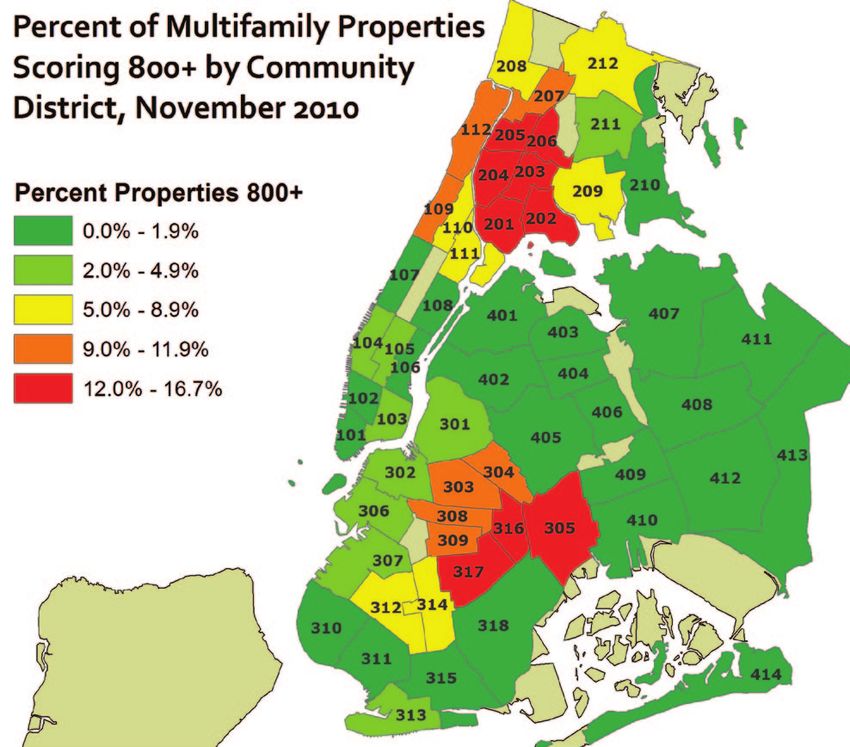
Buildings scoring above 800 in November 2010 did not always keep to the individual
borough profile (see Figure 13 on Page 17). While the average unit size for high scoring buildings in
Brooklyn was similar to the overall Brooklyn average, in the Bronx the average unit count for 800-
plus properties was significantly higher than the overall Bronx average. In Queens and Manhattan,
however, the average size of high scoring buildings was much smaller than the respective overall
borough averages.
The median unit count for all multifamily buildings and 800-plus buildings is very similar
across the City: in the Bronx the median counts are 26 and 28; in Manhattan 16 and 17; in Brooklyn
8 and 8; and in Queens 7 and 8. Across the four boroughs, the median unit count of all multifamily
properties in the BIP database is 10, while for high scoring buildings it is 12.
38 Technically, there are 62,241 tax lots in the database, and a small percentage of them contain more than one
building. Data in BIP, however, is grouped by tax lot since both DOB and DOF also group data by tax lot. HPD breaks
violation data into separate buildings, including those that share a tax lot. Violation data from HPD for lots that contain
multiple buildings is aggregated for the individual tax lot.
16New York City’s Multifamily Housing in Distress
Figure 13
Avg Res Unit Avg Res Unit Median Res Median Res Unit
Count Count, 800+ Unit Count Count, 800+
Manhattan 35 23 16 17
The Bronx 40 56 26 28
Brooklyn 20 17 8 8
Queens 32 18 7 8
NYC 29 28 10 12
Thus, while the Bronx has the highest percentage of multifamily properties scoring above
800 (10.9%), an even higher percentage of its units (15.3%) are found in these properties (see Figure
14 below). In the other boroughs, the dynamic is the opposite: while 1.1% of Queens multifamily
properties score above 800, only 0.6% of its units are in these properties; in Manhattan the respective
percentages are 3.8% and 2.4%; and in Brooklyn the proportions are a bit closer at 7.0% and 5.9%.
Figure 14
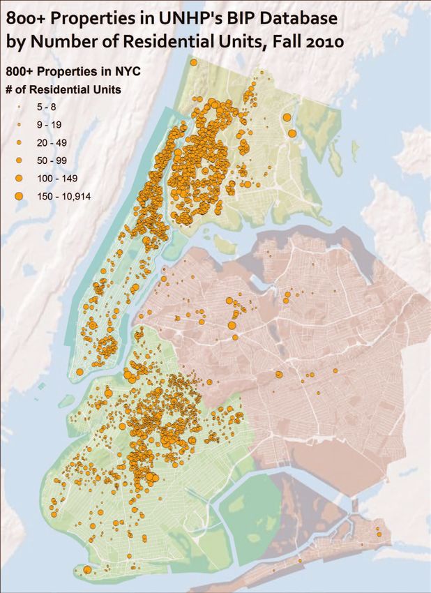
At the Neighborhood Level
Whether we look at the current set of high scoring properties, or the “repeat offenders” who
have scored above 800 in at least three out of the five runs of the data, the geographic concentrations
remain similar (see Figure 15 on Page 18). The entire south and west Bronx (excluding Riverdale)
plus parts of the northeast Bronx are saturated with distressed housing. The same is true for upper
Manhattan, though the situation is more severe in Washington Heights than in East or Central Harlem.
Other than the Lower East Side, Chinatown and a smattering in Hell’s Kitchen, the rest of Manhattan
is in good shape. Central Brooklyn is also saturated with high scoring properties, from Bushwick and
Bed-Stuy to Flatbush to Brownsville and Cypress Hills. In Queens, high scoring buildings are few
and far between but some very small concentrations are found in Far Rockaway and Jackson Heights.
17New York City’s Multifamily Housing in Distress
Figure 15
18New York City’s Multifamily Housing in Distress
Figure 16 In many of
these neighborhoods,
especially the west
and south Bronx and
east-central Brooklyn,
the percent of the
multifamily housing
stock that is likely
distressed is in the
teens, while bordering
neighborhoods in
upper Manhattan,
central Brooklyn and
the northwest Bronx,
between 9% and 12%
are high scoring. In all
of these neighborhoods,
the issue of properties
in distress is especially
acute.
The housing
stock in New York City also varies greatly from one borough to another, and often from one
neighborhood to another. Thus, the total number of properties in distress does not tell the full story,
as the number of units in these properties can vary widely. Huge numbers of very small multifamily
buildings (6-8 units) exist in Brooklyn and Queens while mid size buildings dominate upper
Manhattan and the west Bronx. Very large complexes are scattered throughout all of the boroughs.
For the most part, the neighborhoods experiencing the highest levels of distressed housing now
are the same ones that have been historically redlined and where the fight to preserve communities
has been ongoing for more than 35 years. In places such as the West Bronx Corridor, Upper Manhattan
and Central Brooklyn, huge investments in creating and preserving affordable housing have been
made, but these investments are threatened with increasing levels of distress in the aging privately
owned rental stock that dominates these neighborhoods.
19New York City’s Multifamily Housing in Distress
Figure 17
Figure 18
Tracking Trends Over Time
BIP data for all four boroughs goes back to the fall of 2008 and has been updated twice a year
since then. The addition of water lien data and some minor updates to the weighting of violations
in the spring of 2010 had a small but noticeable impact on scores. Additionally, the base file of
properties was updated for the fall of 2010 to include five unit properties and newly constructed
properties while excluding public housing and embassy buildings.
Regardless of these minor changes, two larger trends emerge. First, on average there are
more properties with higher scores in the spring than in the fall of a given year. This is likely due to
20New York City’s Multifamily Housing in Distress
Figure 19
Figure 20
heating season when violations are issued for lack of heat and/or hot water, and when owners may
put off municipal bills in favor of fuel payments. The second noticeable trend is a general upwards
move in the number of distressed properties, likely due to the increased number of over-leveraged
properties and better code enforcement from HPD.
Both trends hold true for the total number of properties, the number of units in those properties,
and both of these as percentage of totals. For the most part, they also apply across all four boroughs
(see Figures 17 and 18 on Page 20, and Figures 19 and 20 above).
21New York City’s Multifamily Housing in Distress
Figure 21
Figure 22
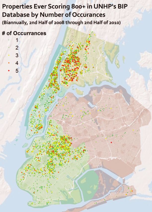
Repeat Offenders
Another way to gauge levels of distress in a property is to look at its score over time and
whether it has repeatedly scored above 800. The BIP Database tracks scores over time, and a field
entitled “Occurrences” lists the number of times a property has scored above 800.
This data allows us to easily see the total number of properties in each borough that have ever
scored above 800 points, and the breakdown on the number of occurrences of those properties (see
Figure 21 above). In Brooklyn, nearly 2,800 properties have at some point made the list, while in both
the Bronx and Manhattan the number is just below 1,600 each. Even though the majority of properties
to score at least 800 have done so only once or twice, there are a significant number of properties
identified as distressed three or more times in the Bronx (509), Brooklyn (499), and Manhattan (397).
22New York City’s Multifamily Housing in Distress
Figure 23
23New York City’s Multifamily Housing in Distress
As a percentage of multifamily Figure 24
properties in each borough (see Figure
22 on Page 22), the Bronx has by far
the highest proportion of properties
ever scoring 800 at 20.1%, and the
highest percentage (6.4%) scoring 800
at least three times. While the percent
ever scoring above 800 in Brooklyn
(12.0%) is significantly higher than
in Manhattan (7.6%), the percent
qualifying three or more times is
about 2% in both boroughs. Queens
remains well below the citywide
average in both categories.
Below the borough level, it is
a similar set of Community Districts
that encompass frequent high scoring
buildings (see Figure 24 at right) as
those where 800 plus buildings were
concentrated for the most recent BIP
data.
Citywide, more than 6,000
properties have ever scored above 800,
which is close to 10% of all properties
in the BIP database. Within this, more
than 1,400 properties are frequent
offenders having scored above 800 three or more times, representing 2.3% of all properties currently
in the database.
Lender Analysis
Analyzing the portfolios of lenders is one of the most powerful aspects of the BIP database,
yet because it relies partially on a computer formula pulling ACRIS records, accuracy is not always
100%. However, as previously mentioned, UNHP staff and interns manually check ACRIS records
for every property that scores at least 800 in BIP. For lower scoring buildings, we rely on a formula
to identify the most recent lender. The utility also extracts the recording date of said mortgage, and
our lender analysis is based only on mortgages recorded in the past 20 years.39
The most recent lender according to ACRIS is then grouped under an “Umbrella” entity
to encompass bank subsidiaries and acquired institutions. For instance, properties listed with the
umbrella of “Chase” have mortgages made by Washington Mutual, Dime Savings Bank of New York,
Chase Manhattan Mortgage Corporation, EMC Mortgage Corporation, and JPMorgan Chase Bank,
39 Mortgages recorded more than 20 years ago are excluded from this analysis.
24New York City’s Multifamily Housing in Distress
Figure 25
Figure 26
to name a few. Approximately 54% of all properties in BIP have a mortgage recorded in the past 20
years by a lender under one of our umbrella entities, while another 8% are part of an umbrella entity
but were recorded before 1991.40
This analysis looks at the umbrella entities with the most mortgages recorded in the past 20
years (see Figure 25 above) with three main exclusions: government entities,41 commercial mortgage
backed securities (CMBS), and Mortgage Electronic Registration System (MERS). Since MERS is not
an actual lender but an electronic registry that tracks mortgage assignments, we cannot be certain who
actually owns mortgages listed under them. Loans that are clearly part of a CMBS, where the lender
of record from ACRIS is the actual name of the CMBS or the bank is listed as a trustee, are currently
excluded from a lender’s portfolio. If a current lawsuit on behalf of tenants seeking to make the
40 The balance either have no mortgage recorded or their lender is not categorized in an umbrella.
41 Government entities that issue mortgages that we exclude from this list of lenders include HPD, the NYC Hous-
ing Development Corporation, and the U.S. Department of Housing and Urban Development. We also exclude the Com-
munity Preservation Corporation as the properties they finance overlap significantly with these government entities.
25You can also read