Red Lines & Hockey Sticks - A discourse analysis of the IPCC's visual culture and climate science (mis)communication - Diva-portal.org
←
→
Page content transcription
If your browser does not render page correctly, please read the page content below
Red Lines & Hockey Sticks
         A discourse analysis of the IPCC’s visual culture
             and climate science (mis)communication

                      Thomas Henderson Dawson

Department of ALM
Theses within Digital Humanities
Master’s thesis (two years), 30 credits, 2021, no. 5
Author
Thomas Henderson Dawson

Title
Red Lines & Hockey Sticks:
A discourse analysis of the IPCC’s visual culture and climate science (mis)communication.

Supervisor
Matts Lindström

Abstract
Within the climate science research community there exists an overwhelming consensus on the question of climate
change. The scientific literature supports the broad conclusion that the Earth’s climate is changing, that this change
is driven by human factors (anthropogenic), and that the environmental consequences could be severe. While a
strong consensus exists in the climate science community, this is not reflected in the wider public or among poli-
cymakers, where sceptical attitudes towards anthropogenic climate change is much more prevalent. This discrep-
ancy in the perception of the urgency of the problem of climate change is an alarming trend and likely a result of
a failure of science communication, which is the topic of this thesis.
      This paper analyses the visual culture of climate change, with specific focus on the data visualisations com-
prised within the IPCC assessment reports. The visual aspects of the reports were chosen because of the prioriti-
sation images often receive within scientific communication and for their quality as immutable mobiles that can
transition between different media more easily than text. The IPCC is the central institutional authority in the
climate science visual discourse, and its assessment reports, therefore, are the site of this discourse analysis. The
analysis tracks the development and variations in the IPCC’s visual culture, investigates in detail the use of colour
and the visual form of the “Hockey Stick” graph. This work is undertaken to better understand the state of the art
of climate science data visualisation, in an effort to suggest the best way forward to bridge the knowledge gap
between the scientific community and the public on this important issue. The thesis concludes that a greater em-
phasis on the information aesthetics of their data visualisations could benefit the IPCC’s pedagogical reach, but
that it may also be argued that it is not the IPCC’s role in climate change discourse to produce the most visually
persuasive images. That they exist as a tone-setting institution that provides authority to entities that are better
geared towards wider communication, such as journalism and activism.

Key words
Climate Change, IPCC, Data Visualisation, Information Aesthetics, Science Communication.

                                                            2
Table of Contents

Introduction…………………………………………………………7
  Purpose Statement and Research Questions…………………………...……..10
  Previous Research…………………………………………………………….11
  Theory & Method…………………………………………………………….15
  Method………………………………………………………………………..16
  Theory………………………………………………………………………...18
  Materials………………………………………………………………………23
  Relevance and Topicality……………………………………………………..24
Development and Variation in IPCC Data Visualisation………..25
  First Assessment Report (1990)………………………………………………26
  Supplementary Report (1992)………………………………………………...29
  Second Assessment Report (1994)……………………………………………29
  Third Assessment Report (2001)……………………………………………...32
  Fourth Assessment Report (2007)…………………………………………….34
  Fifth Assessment Report (2014)………………………………………………36
  A note on two-dimensional globe projections………………………………...37
Recurring Colours: Prominence of the Colour Red……………..38
  History and cultural associations……………………………………………...39
  Infographics…………………………………………………………………...40
  In (the English) language……………………………………………………..41
  Colour in IPCC reports………………………………………………………..42
  Colour in non-IPCC climate visualisations…………………………………...47
Recurring Forms: The “Hockey Stick” Graph & Upward
Exponentials………………………………………………………...49
Discussion and Conclusions………………………………………..59
  Conclusions…………………………………………………………………...66
Bibliography………………………………………………………..67
  Literature……………………………………………………………………...67
  Appendix……………………………………………………………………...70

                               3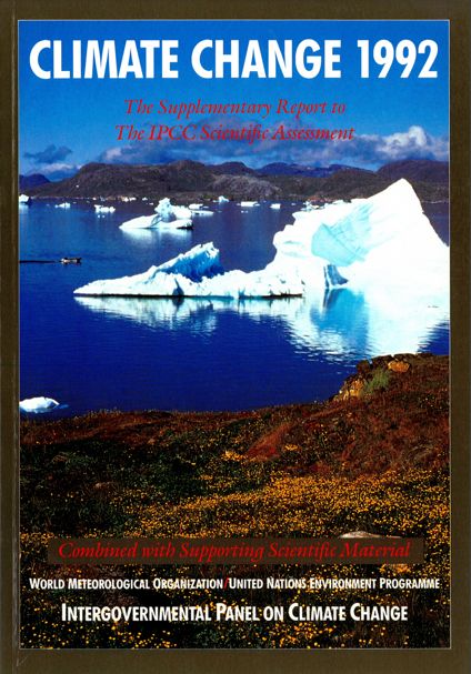
Table of Figures

Figure 1. IPCC, 1990, Climate Change: The IPCC Scientific Assessment, Cam-
     bridge University Press, Cambridge, p.xxii. ……………………………….27
Figure 2. IPCC, 1990, Climate Change: The IPCC Scientific Assessment, Cam-
     bridge University Press, Cambridge, p.xiv. ……………………………….28
Figure 3. IPCC, 1990, Climate Change: The IPCC Scientific Assessment, Cam-
     bridge University Press, Cambridge, Front Cover. ………………………..29
Figure 4. IPCC, 1992, Climate Change 1992: The Supplementary Report to The
     IPCC Scientific Assessment, Cambridge University Press, Cambridge, Front
     Cover. ……………………………………………………………………...29
Figure 5. IPCC, 1994, Climate Change 1994: Radiative Forcing of Climate Change
     and An Evaluation of the IPCC IS92 Emission Scenarios, Cambridge Univer-
     sity Press, Cambridge, Front Cover. ………………………………………30
Figure 6. IPCC, 1994, Climate Change 1994: Radiative Forcing of Climate Change
     and An Evaluation of the IPCC IS92 Emission Scenarios, Cambridge Univer-
     sity Press, Cambridge, p.10. ………………………………………………30
Figure 7. IPCC, 1994, Climate Change 1994: Radiative Forcing of Climate Change
     and An Evaluation of the IPCC IS92 Emission Scenarios, Cambridge Univer-
     sity Press, Cambridge, p.37. ………………………………………………31
Figure 8. IPCC, 2001, Climate Change 2001: Synthesis Report, Cambridge Univer-
     sity Press, Cambridge, Front Cover. ……………………………………....32
Figure 9. IPCC, 2014, Climate Change 2014: Synthesis Report, IPCC, Geneva,
     Front Cover. ……………………………………………………………….32
Figure 10. IPCC, 2001, Climate Change 2001: Synthesis Report, Cambridge Uni-
     versity Press, Cambridge, p.34. ……………………………………………33
Figure 11. IPCC, 2007, Climate Change 2007: Synthesis Report, Cambridge Uni-
     versity Press, Cambridge, Front Cover. ……………………………………34
Figure 12. IPCC, 2007, Climate Change 2007: Synthesis Report, Cambridge Uni-
     versity Press, Cambridge, p.6. ……………………………………………..35
Figure 13. IPCC, 2007, Climate Change 2007: Synthesis Report, Cambridge Uni-
     versity Press, Cambridge, p.9. ……………………………………………..36
Figure 14. Harris, J. 2016, Why all world maps are wrong, Vox/Youtube, viewed
     30 May 2021, < https://www.youtube.com/watch?v=kIID5FDi2JQ&ab_
     channel=VoxVoxVerified>. …………………………………………….…37
Figure 15. Greenbaum, H. and Rubenstein, D. 2011, The Stop Sign Wasn’t Always
     Red,     The      New    York     Times     Magazine,    . ………………………..40

                                        4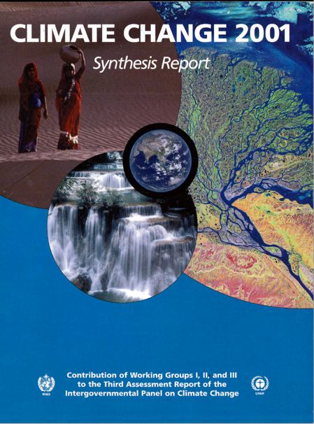
Figure 16. Health and Safety Executive, 2021, No access for unauthorised persons,
     HSE,       viewed    30    May      2021,    . ………………..40
Figure 17. Woolley, T. 2020, Coronavirus: Why the maths behind ‘COVID alert
     levels’ makes no sense, The Conversation, viewed 30 May 2021,
     . ……………………………………40
Figure 18. Wikipedia, 2021, Homeland Security Advisory System color chart, Wiki-
     media Commons, viewed 30 May 2021, . …………………………………………………..40
Figure 19. IPCC, 2007, Climate Change 2007: Synthesis Report, Cambridge Uni-
     versity Press, Cambridge, p.9. ……………………………………………..42
Figure 20. IPCC, 2001, Climate Change 2001: Synthesis Report, Cambridge Uni-
     versity Press, Cambridge, p.7. ……………………………………………..43
Figure 21. IPCC, 2014: Climate Change 2014: Synthesis Report, IPCC, Geneva,
     p.11. ………………………………………………………………………..43
Figure 22. IPCC, 2014: Climate Change 2014: Synthesis Report, IPCC, Geneva,
     p.23. ………………………………………………………………………..44
Figure 23. IPCC, 2001, Climate Change 2001: Synthesis Report, Cambridge Uni-
     versity Press, Cambridge, p.17. ……………………………………………45
Figure 24. IPCC, 2007, Climate Change 2007: Synthesis Report, Cambridge Uni-
     versity Press, Cambridge, p.36. ……………………………………………45
Figure 25. IPCC, 2014: Climate Change 2014: Synthesis Report, IPCC, Geneva,
     p.21. ………………………………………………………………………..45
Figure 26. Bittermann, K. 2013, PAGES 2k Reconstruction, Wikimedia Commons,
     viewed 30 May 2021, . ………………………………………………………………...46
Figure 27. BBC 2019, How years compare with the 20th Century average, BBC
     News, viewed 30 May 2021, . ………………………………………………………….47
Figure 28. The Economist 2020, Week in Charts: The business of climate change,
     The Economist, viewed 30 May 2021, . ……….......................48
Figure 29. Hawkins, E. 2018, Warming Lines, Wikimedia Commons, viewed 30
     May         2021,      . ………………………………49
Figure 30. Henson, B. 2020, Sir John Houghton, Climate Scientist and Founding
     IPCC Editor, Dies at 88, The Weather Channel, viewed 30 May 2021,

                                           5
. …………………………...50
Figure 31. Acklam, P. J. 2007, The natural exponential function y = ex, Wikimedia
     Commons, viewed 30 May 2021, . ………………………………………51
Figure 32. Kinnard, C., Zdanowicz, C., Fisher, D. et al. 2011, “Reconstructed
     changes in Arctic sea ice over the past 1,450 years”. Nature, 479, p.511.
     ……………………………………………………………………………..54
Figure 33. Rohde, R. A. 2005, 1000 Year Temperature Comparison, Wikimedia
     Commons,         viewed     30     May     2021,     . ……….55
Figure 34. Chalabi, M. 2018, The 2nd of my 4 horsemen of the 2018 apocalypse:
     climate change, Twitter, viewed 30 May 2021, < https://twitter.com/mon-
     achalabi/status/1075777777905926145?lang=en>. ……………………….56
Figure 35. RCraig09 2019, Warming stripes BEHIND line graph - Berkeley Earth,
     Wikimedia Commons, viewed 30 May 2021, < https://commons.wiki-
     media.org/wiki/File:20190705_Warming_stripes_BEHIND_line_graph_-
     _Berkeley_Earth_(world).png>. …………………………………………..58
Figure 36. Minard, C. 1869, The number of men in Napoleon’s 1812 Russian cam-
     paign army, their movements, as well as the temperature they encountered on
     the return path, Lithograph, 62 × 30 cm, Wikimedia Commons, viewed 1 June
     2021,            . …………………………………………………………………62

                                         6
Introduction

The scientific community of climate researchers have in the last thirty years formed
a strong international consensus that the Earth’s climate is changing, that average
global temperatures are rising, and that this fact will likely result in an environmen-
tal and ecological crisis. Climate scientists as a group are approaching a unanimous
consensus on the conclusion that the observed warming of the planet is caused by
human factors, with one recent survey finding 100% agreement on the issue (Powell
2019, p.183) and findings of similar surveys generally hovering between 95-100%
agreement (Anderegg 2010; Cook 2013; Cook 2015). What few voices of dissent
that do exist within the scientific community have generally been derided for pro-
ducing work which does not replicate, contains a pattern of common mistakes, or
methodological flaws (Benestad et al. 2016, p.699).
       This consensus has been formed in large part by the compilation of the most
pertinent current research into assessment reports by the Intergovernmental Panel
on Climate Change (IPCC). Five such reports have been compiled since 1990, with
the most recent report having been published in 2014, and a sixth report is due to
be published in 2022.
       Climate change poses an existential threat to the global population, posing a
particular threat to those developing nations that can ill afford to defend against the
increased threat of drought, wildfires, flooding, and other natural disasters (Men-
delsohn 2008, p.5). A changing climate – changing at a faster rate than might be
expected to occur naturally due to human activity – has the potential to cause seri-
ous and irreversible ecological damage; which both threatens the existence of large
numbers of species of plants and animals, and as a result – again – the survival of
humans. Left unaddressed, climate change has the possibility to initiate a mass ex-
tinction event that has not been seen on Earth for millions of years. The situation is,
therefore, a crisis, which only decisive action on an international scale will serve to
avoid.
       The problem in the efforts to mitigate against this crisis is that while there is
a remarkably strong scientific consensus on the human factors driving climate
change, the threats posed, and the solutions required; the general public and the
policymakers elected to represent them are often sceptical at a much higher rate
than the scientific community. Scepticism about the nature and urgency of the prob-
lem, and what – if any – action is required to combat it hovers around 30% across
the global population, with some countries as low as 10% but some as high as over
50% (Pew Research Centre 2018).
       This disparity between the scientific consensus and public opinion signifies a
breakdown in communication between scientific research bodies and organisations,
and wider society. There are likely numerous socio-political causes that influence

                                             7
this disparity which will not form part of the focus of the present study. A full ex-
amination of the factors which might cause such a disparity would contain more
fields of study and be wider in scope than the size of this project allows. But for the
purposes of contextualising the problem that is addressed in this study, I will list
three of the biggest obstacles to climate science communication to the general pub-
lic, as I see them.
       One factor in a perceived breakdown in scientific communication in the de-
veloped world is a recent rise in populism, epitomised by the prominent British
politician Michael Gove when he stated: ‘I think the people in this country have had
enough of experts, with people from organisations with acronyms saying that they
know what is best and getting it consistently wrong’ (Sky News, 3 June 2016). This
rise in populist politics has resulted in an increased scepticism in scientific author-
ity, particularly that of international organisations. Another factor is a general lack
of scientific education among the general population, which makes information lit-
eracy on an admittedly complex topic such as climate change a challenge. Finally,
the influence of counter-information PR strategies and political lobbying from par-
ties with vested interests in downplaying the effects of climate change – or at least
hose beyond the actions of individual consumers – such as fossil fuel companies.
Which has served to muddy the water of the public discourse around climate change
and the crisis it is causing.
       While acknowledging their existence, the present study will generally set
aside the socio-political factors alluded to above in order to address one particular
aspect of the scientific communication on anthropogenic climate change. Choosing
instead to view the visualisation of climate science data/information as a discourse
all of its own, and investigate it using a humanistic approach of a discourse analysis
of this specific visual culture.
       To adopt the phraseology of discourse analysis, the assessment reports of the
IPCC are the institutional literatures that have the greatest power to produce a dis-
cursive formation which can shape its subject – anthropogenic climate change –
into a discourse which is productive and persuasive, not just for the purposes of
communicating within the community of climate scientists but also outside of it.
       It is perhaps also worth highlighting that the IPCC is a sort of forum for cli-
mate science researchers, with the reports representing a summary of the consensus
reached within that forum. During the early period of the IPCC’s existence, its pur-
pose was very much to attempt to establish a link between human activities and
observed changes in the Earth’s climate, with an emphasis on the mutual persuasion
between scientists. However, more recent assessment reports have been produced
in conditions where the consensus among the scientists who contribute to the re-
port’s contents has been remarkably strong. As a result, the emphasis has turned
away from persuasion within the bounds of the scientific community and instead

                                            8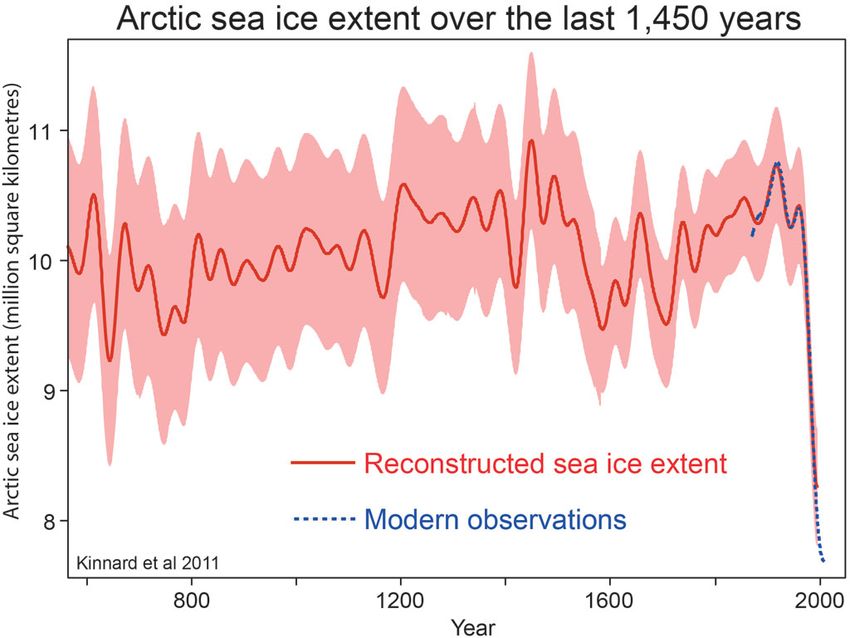
been turned outwards towards the general public, but with particular emphasis on
policymakers.
       The IPCC as an organisation has shifted to producing a discourse which is
productive outside of climate science circles and not just within them. This has co-
incided with a wider cultural shift towards the visual as a primary medium for com-
munication, which transcends linguistic barriers and has an enhanced capacity to
communicated complex ideas in a more accessible and efficient manner than lan-
guage. Therefore, the present study will attempt to better understand the breakdown
in communication between climate science discourse actors – principally the IPCC
– and the wider public. It will do so by approaching the visualisation of climate
change data as a sub-discourse of the wider discourse of climate science. By apply-
ing a discourse analysis methodological approach to this specific visual culture, this
study will attempt to describe and critique the information aesthetics of the IPCC
and other climate data visualisation objects it scrutinises, in order to better under-
stand their discursive power and ask the question: how do they communicate the
information they contain and how has this changed through the various iterations
of the assessment reports?
       This thesis is focusing on this aspect of climate visual culture in particular,
rather than the culture as a whole because these visual objects represent the most
transferable information objects within this discourse. This specific focus is im-
portant because the scientific climate discourse does not generally deal in the emo-
tionally charged iconographic imagery of activism and journalism (with the notable
exception of IPCC report covers). And those activist discourses do not engage with
the language of written scientific reports in a comprehensive way. But data visual-
isation artefacts represent a form of immutable mobile that can move through these
related discourses with limited friction and carry an argument from the scientific
discourse through to journalism and activism with limited loss of understanding.
The ease of movement with relatively low loss of information is complicated, how-
ever, by the degree to which these visualisations often need to be reformed or re-
worked from a design perspective to better capture the attention of – and persuade
– the audience. This gap between what scientific data visualisation often feels is the
more authoritative and neutral mode and the more emotive and argumentative
modes of journalism and activism. This is an important point for the consideration
of climate science data visualisation as immutable mobiles and when considering
the failures of communication on this issue.
       This is an analysis of a discourse followed by consideration of the practical
implications of that discourse as it relates to the problem of scientific communica-
tion, and climate change communication in particular. The analysis will track the
development and variations of data visualisations contained within the IPCC as-
sessment reports, before moving on to focus on two specific visual aspects of the
data visualisation in the reports and in the wider climate science discourse: the use

                                            9
of the colour red and the controversy around Michael Mann’s so-called “Hockey
Stick” graph.

Purpose Statement and Research Questions
While a great deal of research has been conducted in the field of science communi-
cation in the field of information studies, and some research has even been at-
tempted to understand the effectiveness of data visualisation in the scientific litera-
ture of climate science from the perspective of the natural sciences and even social
sciences (Neset et al. 2009; Daron et al. 2015; Harold et al. 2019), there has been
virtually no attention paid to this question from the humanities and this is what this
thesis sets out to correct. The purpose of this visual discourse analysis study is to
describe the information aesthetics of data visualisations within IPCC assessment
reports and to compare and contrast these with examples from the wider discourse
around climate science visual culture.

The study is based on the following research questions:

How does the visualisation of climate science research exhibited in IPCC assess-
ment reports represent a productive sub-discourse within the wider discourse of cli-
mate science that serves to effectively persuade outsiders by making effective use
of an information aesthetics framework?

    How might the information aesthetics of the data visualisation exhibited in
    IPCC assessment reports be characterised?

    How has the compositionality of the IPCC’s data visualisation changed or re-
    mained the same through successive assessment reports?

    How does the data visualisation in the IPCC’s assessment reports compare to
    climate change data visualisation examples exhibited in other media?

                                            10
Previous Research
While much of the scholarly concern for describing and understanding data visual-
isations in climate science has originated from within the natural sciences, there has
been a small amount conducted from the perspective of humanists and social scien-
tists. While this project is in some sense an exercise in information aesthetics re-
search, it is interesting to note that this is a relatively unique approach to the topic
and certainly to this particular set of empirical materials, with previous research
into climate science information aesthetics being vanishingly small.
What research that has been conducted into climate change visual culture has
two main characteristics. The first is that approaching the objects from this perspec-
tive – a perspective slightly removed from the invested position of the natural sci-
ences – has resulted in the uncovering of a fresh perspective on the problem of
ineffective climate science communication. It is in this sense that this current paper
aims to continue in the tradition of previous research. The second is that studies
have often tended to focus on the visual culture of climate change as a whole, pri-
oritising the – admittedly more visually stimulating – iconographic photography or
art associated with climate change journalism and activism, while paying little at-
tention to the visuality of climate science data visualisation from organisations such
as the IPCC, which are set up ostensibly to be non-partisan.
There have been a small number of humanistic and social science-oriented
investigations into climate change visual culture, and these have approached the
topic from various different angles. Adam Brenthel (2016) has produced one of the
most comprehensive surveys of this specific visual culture. Brenthel approached
the topic from the perspective of an Art Historian and attempted to unpack the vis-
ual culture in its entirety; including ‘scientific articles, news reports, websites, pam-
phlets, videos, and other kinds of public outreach material produced by research
institutes’ (Brenthel 2016, p.19). Brenthel surveys a broader scientific communica-
tion landscape than is the purpose of this thesis and interrogates it using the tools
made available by compositional and iconographic approaches to visual culture
analysis. This is a useful method for investigating photographic or visual art empir-
ical materials, but the specific sub-genre of data visualisation does not provide the
same interpretive material for “exploring beneath the surface” or “finding hidden
meaning” that Art History approaches often aim to exploit. Instead, a discourse
analysis is more appropriate for this kind of investigation, which the section on
theory and method will explore. Brenthel also aims to better understand a perceived
problem of failed science communication but approaches the problem with a larger
scope, paying little attention to these specific and important reports which form the
core of this thesis.
Much of the other investigations that have approached similar materials to
this thesis, or similar topics to this thesis from a humanistic or social science per-
spective, have done so in a way that is more tangential than Brenthel’s work – which
11is the most direct companion to this paper. Another important work in this area of
research was conducted by Julie Doyle (2007), who used a more similar methodo-
logical approach to a different set of materials. Doyle conducted a visual discourse
analysis of campaigns organised by the environmental charity Greenpeace during
the 1990s and 2000s, with special emphasis on their campaigns that focused on
climate change. This research focused on the visual rhetorics as well as the textual
discourse of the campaigns and sought to historicise them by tracking the develop-
ment over time. The scope of this project was naturally less focused on visualisa-
tions because it also considered the textual component of the campaigns. In addi-
tion, the focus on a campaigning charity group rather than an intergovernmental
organisation means the research addresses the issue of climate change communica-
tion from a different perspective. Where the charity’s role is to spread awareness,
and the materials they produce have a certain license to be partisan, the IPCC has a
more defined target audience of other members of the scientific community and
policy makers whom it attempts to persuade and convince to take action. The IPCC
occupies a different space within climate science discourse, it possesses a degree of
gravitas and scientific prestige compared to an organisation like Greenpeace, but it
is also beholden to a certain rigour and accuracy that an organisation with license
to be partisan does not.
Taking an altogether different approach, Sean Cubitt (2012) compared the
visual culture of climate science and instances of narrative fiction filmmaking. In
his reading of the perceived communication failure on climate change he identified
two major obstacles. He argued that compared to fictional films climate change
visualisations are not given the same flexibility with regards to meaning making
and believability. Outlandish incidents can occur in the course of a narrative film,
but the audience is willing to accept it as believable and part of the reality because
of a willingness to suspend disbelief. Phenomena that are not a part of everyday life
are acceptable to audiences in film, but in climate science data visualisation, that
which is not tangible or relatable to everyday life is often more likely to be rejected
by audiences as unbelievable. He argues that the bar for persuasion is much higher
for climate science communication.
This resonates with an observation by Brenthel that technological solutions
are often cited as the most likely means of bridging the communication gap in cli-
mate science. Brenthel argues that this idea that we need better technology to cap-
ture the impact of climate change as well as more advanced means to represent data
from climate research is a fallacy. The need, he says, is for better story telling; story
telling that can emote and provoke a reaction even if that reaction is rooted in met-
aphor or symbolism and not necessarily in hard data. This he claims is more effec-
tive than attempting to render images more “real”.
Cubitt makes a further observation that is particularly prescient for climate
data visualisation. He states that because of the visual medium ‘[a]ll data
12visualizations tend toward spatial solutions for the problems raised by time’ (Cubitt
2012, p.293). This poses a particularly tricky challenge to individuals and organi-
sations who try to visualise the problem of climate change and must attempt to re-
port on a phenomenon where time is important: the large scale of time the Earth’s
climate is described over, and the time society has left to address the issue. In the
face of a time sensitive problem, data visualisation specialists only have space to
communicate with. This issue may shed some light on the IPCC’s overreliance on
line graphs as a data visual form.
Moving more into a social science space, some work has been done on climate
science communication in media studies. Notably by Brigitte Nerlich and Rusi Jas-
pal (2013) who have done a great deal of work on the portrayal of climate and
weather in the media. Some of Nerlich and Jaspal’s work has focused on the media,
extreme weather events, and the emotional reactions of audiences. They tended to
find that it is possible to overemote on these topics in the media, that overly emotive
coverage of extreme weather and climate change tends to make viewers become
defensive and disengage with the topic. They find that this can be a fatal flaw in
maintaining the attention of a viewing audience; but that, despite this, media outlets
make the same mistake over and over again. They observed that even a relatively
mild announcement from the IPCC, for example, was supplemented with imagery
of extreme weather; which they insist is not effective and has a tendency to under-
mine scientific communications strategies. In this sense, Nerlich and Jaspel are in
disagreement with Brenthel, who – as outlined earlier – suggests emotive and reac-
tion provoking images are a better means of communicating the urgency of the
problem of climate change. But this is not supported by the findings of Nerlich and
Jaspel.
Regarding the psychological perspective on climate science communication
and the effect it has on an audience, George Lakoff (2010) does not comment spe-
cifically on the merits of emotive imagery. However, Lakoff’s work on cognitive-
linguistic issues of climate change offer interesting insights and echo conclusions
drawn by Cubitt. What Lakoff suggests is that, on a cognitive level, humans lack
the adequate tools to frame a problem like climate change. At least with respect to
producing images that are meaningful and socially impactful, he argues that humans
are not well equipped to comprehend a problem that occupies the temporal and
special scope of climate change. In addition to assigning current visualisation tools
as too abstract and inadequate for the purpose, Lakoff argues that this inadequacy
is rooted in a human psychological blocker on comprehending the possibility of
change in the future.
These findings by Lakoff are reinforced by the work of Mark Nuttall (2012),
who approaches climate change visualisations from an anthropological perspective.
He argues that humans are capable of understanding the present and to an extent
the past, but that visualising the future often results in some kind of reference to the
13present or the past, that humans struggle to imagine things beyond what they al-
ready know. This finding is in specific reference to scientific climate research vis-
ualisations and leaves open the possibility of more artistic expressions of climate
change, as is promoted by Brenthel and Cubitt as more effective climate visual me-
dia.
One final prominent piece of work on climate change visualisations from a
humanistic or social science approach is the research carried out by Saffron O’Neill
and Mike Hulme on the iconography of climate change. They argue for the essential
meaning making of icons in climate science as a visual culture. They argue that
rather than, say, the scientifically conventional images that appear in IPCC reports,
Greta Thunberg and Al Gore’s film An Inconvenient Truth are better vehicles for
scientific communication because of their iconoclastic nature. This thesis would
argue that particularly Michael Mann’s “Hockey Stick” graph is iconic in its own
way. Crucially they point out that relatable icons are more powerful than those
which are culturally, socially or geographically distant. But taking their point, the
scientific research underpinning the more iconic images still have value and act as
originators in the discourse.
O’Neill and Hulme view icons as useful proxies for what is a difficult “en-
emy” to represent visually. The invisible threat of climate change is only rendered
visible when it manifests. This challenge is interesting to observe in the assessment
report covers produced by the IPCC and how these have developed and changed
over time. O’Neill and Hulme also make an interesting distinction between icons
and representations of icons, which is fruitful to consider when discussing the
“Hockey Stick” graph and its legacy.
In their work on climate change visualisations, Birgit Schneider and Lynda
Walsh (2018) identify a peculiar problem with more advanced climate research data
visualisations. They discuss the implications of tools which allow the viewer to
“zoom” in on different geographical areas in order to see how that area might be
affected in the future by a warming climate. Taking a media studies and politics
approach to the question, they identified the purpose of this tool to help localise the
problem of climate change and to help people to understand that the problem is not
distant but close to home. This resonates with the discussion of O’Neill and Hulme
about familiar icons. However, Schneider and Walsh see a problem in this possibil-
ity of “localising” climate change consequences. They argue that showing the prob-
lem as local rather than global could have the opposite of the desired effect of en-
gaging more people, instead it might serve to disengage those people whose local
area is less likely to be affected. They argue that presenting the problem as global,
as a concern for everybody, is a better approach.
Joseph Daron et al. (2015) identified a gap in knowledge on the topic of ef-
fective climate science visualisation. They argue that we do not know enough about
what makes for “good” climate visualisations. They carried out a survey to gauge
14comprehension and found that choices of graphical form and style had a major im-
pact on how well an audience understood the objects presented to them.
An example of previous research of extreme importance for this particular
thesis is the work carried out by Jordan Harold et. al (2019) on the IPCC and its
visual communication. This paper took a social science and computer science ap-
proach to the problem, interviewing IPCC report authors on their opinions on the
process of producing the IPCC’s visualisations, as well as some graduate students,
and supplemented these findings with computational methods of discerning the
“readability” of the visualisations. The IPCC report authors reported that they felt
the visualisations were not ideally suited to be understood by their target audience
(policymakers) but that aesthetic conventions on data visualisation in a natural sci-
ences research setting constrained the range of options available to the authors.
These interview findings were reinforced by the second part of the study that used
computational methods to quantify the readability of the visualisations and gauge
the level of comprehension required to understand them. They found that the visu-
alisations contained large amounts of information, used multiple colours, and were
packed densely with visual elements; they concluded that these characteristics made
for a collection of images that were difficult to comprehend without expert inter-
pretation. These findings are illuminating in the problem of climate science mis-
communication, but while they cover a social science and a quantitative computa-
tional methods approach, the purpose of this thesis is instead to approach this same
problem from a humanistic perspective.
Theory and Method
The following section will describe the theoretical and methodological approach of
this thesis. It will detail the interpretive resources utilised to analyse the data and to
define important concepts for that interpretive framework. It will describe the
choice of methodological approach as well as the choice of empirical data, and the
motivations behind these choices.
In justifying this investigation’s choice of theoretical and methodological ap-
proach, there is first the need to attempt to answer some fundamental questions. The
object of enquiry for this thesis is a collection of objects which are visual in nature,
and so there are some fundamental questions around how to regard visual objects
as empirical data in an academic thesis. We might begin by asking: how do we think
about images in an academic context? Can we treat them like text, or are they some-
how different? How do they work? (Can we conduct a close reading of them? Can
they [alone] form a discourse?).
15Method
The general methodological approach of this thesis takes the form of a dis-
course analysis. Discourse analysis is that scholarly investigation which is con-
cerned with the discursive production of some authoritative account. In the case of
this thesis, the authoritative account in question is the data visualisation of the as-
sessment reports of the IPCC. Discourse is expressed through images, texts, and
practices (any and all of these are legitimate sources of analysis). The sole focus of
this investigation are images. Within the conventions of a discourse analysis, it is
acceptable for sources to sometimes be eclectically assembled, this might be un-
conventional in some qualitative research approaches in both the humanities and in
the social sciences, but this is demanded by the intertextual nature of a discourse
analysis method.
A key concept to be defined in this section of the thesis is that of a “dis-
course”. What is a discourse? A discourse might be understood as a coherent pattern
of statements across a range of archives and sites (Green 1990, p.3). The wider the
range of archives/sites the better the analysis. The most interesting discourse anal-
yses bring together previously disparate materials (Rose 2001, p.143), and it is for
this reason that this analysis not only draws on visualisations from the IPCC reports
for interpretive materials. In addition to the systematically assembled IPCC visual-
isations, this dataset is supplemented by the “eclectically assembled” climate-cen-
tric data visualisations from other sites. Primarily journalism and more Avant Garde
examples of scientific data visualisation. On the selection of materials for conduct-
ing a discourse analysis, an emphasis should be placed on quality over quantity
(Tonkiss 1998, p.410). For the purposes of this thesis, a selection has been made
from all possible sources of a few supplementary materials that presented them-
selves as interesting to the researcher as an individual, and with the primary dataset
of the IPCC visualisations in mind for which they made for compelling materials to
compare and contrast with.
Discourse analysis explores how these specific views or accounts are con-
structed as real or truthful or natural through particular regimes of truth. Discourse
is organised in order to be persuasive; discourse analysis focuses on the strategies
of persuasion. The primary interpretive tool for investigation in discourse analysis
is intertextuality. A search for recurring themes is common in discourse analysis.
With intertextuality depended on for interpretive power. It is through the composi-
tions, characteristics, and meanings of elements of the discourse and those of neigh-
bouring discourses that serve to illuminate the meanings of those being analysed.
One illuminates the other, and the meaning or power of a discourse is formed by
the mutual reinforcements of the other elements. With that being said, because –
according to theorists and practitioners of discourse analysis – all knowledge is
produced through the formation of a discourse, and all discourse analysis must be
conducted to some extent utilising prior knowledge to inform the interpretation, it
16is difficult for a researcher to sit outside of the system and view it with “fresh eyes”
or a sense of objectivity. Therefore, there is an extent to which discourse analysis
relies on “common sense” interpretations. This is a difficult methodological process
to describe. Foucault outlines the approach by stating that pre-existing impressions
‘must be held in suspense. They must not be rejected definitively, of course, but the
tranquillity with which they are accepted must be disturbed; we must show that they
do not come about by themselves, but are always the result of a construction the
rules of which must be known and the justifications of which must be scrutinized’
(Foucault 1972, p.25).
When approaching a discourse analysis methodologically, Tonkiss (1998,
p.414-5) suggests dividing the investigation into two main areas of analysis. The
first is an analysis of the structure of the discourse statements themselves. For the
purposes of this thesis, the – presumably conventionally textual – “statements” will
be substituted for the visual objects, and by their “structure” this thesis will under-
stand that to mean the compositionality of the images in this context. The second is
an attempt to problematise the social context of those statements. To ask questions
regarding who is saying them and in what circumstances? In addition to Tonkiss’
two areas of analysis, this thesis will also consider the technological circumstances
and limitations of the visualisations’ production, since this can be a significant fac-
tor in the resulting images.
The IPCC is an intergovernmental organisation of high international standing,
which does not conduct its own research but instead synthesises the findings of
actors in the field to produce assessment reports. The discourse they produce is
operating within the parameters of the natural sciences, but also at a boundary or a
meeting place between scientific research and international politics. Within this
context this thesis must attempt to understand how this particular discourse is struc-
tured and how it produces a certain kind of knowledge. In order to understand how
a discourse produces meaning it is important to understand how it describes things.
This is where the formative power of a discourse lies. Therefore, the key methodo-
logical practice of this thesis is to unpack how the IPCC visually describes its sub-
ject, how does this particular discourse describe things? For a discourse the act of
describing is the act of making something real (Rose 2001, p.150) and discourse
analysis, therefore, takes a constructionist view of the world.
Discourse analysis takes a somewhat unconventional approach to truth
claims. The practice aims to be persuasive rather than truthful or rather than making
claims to some unquestionable truth. As a result, practitioners should embody a
certain modesty in their analytical claims (Tonkiss 1998, p.260). That is not to say
that discourse analysts are absolved of any requirement to reflect critically on their
own research practices. The problem for reflexivity in discourse analysis is that
reflexivity is a mechanism for fields or disciplines whose research claims to have
ascertained some kind of objective truth. Discourse analysis does not do this since
17it rejects the idea of objective truth as a concept. Therefore, it would be logically
inconsistent to engage in a reflexive practice when the entire paradigm of the prac-
tice is centred around the idea that any analysis can only be tied to the specific
researcher in question and the discourse they operate within. The work of a dis-
course analyst ‘seeks to open up statements to challenge, interrogate taken-for-
granted meanings, and disturb easy claims to objectivity in the texts they are read-
ing. It would therefore be inconsistent to contend that the analyst’s own discourse
was itself wholly objective, factual or generally true’ (Tonkiss 1998, p.259). In line
with the mode of approach to the notion of reflexivity, this investigation presents
its findings as originating from the interpretive perspective of the individual re-
searcher, and acknowledges that another researcher may identify different materials
in which to contextualise the empirical data, and may well come to different inter-
pretive conclusions, and that the existence of two forms of interpretation need not
invalidate each other. This modesty is discourse analysis’s substitute for reflexivity.
Theory
Does an image such as the graphical representation of scientific research data
require a different analytical approach to that which might be employed to interpret
a more traditional visual study object, such as a painting from one of the old mas-
ters, or a sculpture by Picasso? This thesis says no. That the same humanistic ap-
proach to interrogating the meaning of a painting, sculpture or piece of architecture
can also be employed in excavating the meaning of a graph or chart. This thesis
makes no claims to objective truth or knowledge. The problem of ascribing meaning
to images is that the analysis of images is necessarily interpretive and informed by
the subjective view of the researcher (Hall, 1997, p.9). Therefore, my interpretation
of the empirical objects of this study is entirely my own, and it is perfectly possible
that someone else conducting the same work may come to entirely different con-
clusions. For this reason, the interpretive power of this thesis lies in the use of crit-
ical intertextuality, to compare and contrast a primary set of data with a secondary
set, to do the work of describing rather than to make any claims of delving beneath
the surface or discovering any meaning which is hidden. The meaning on the sur-
face provides sufficient material for critical engagement.
When engaging in an interpretive analysis of a set of images, it is important
to do so with the aim of addressing questions around cultural meaning and power,
rather than merely giving consideration to aesthetic qualities for the sake of it. The
focus of this analysis will be on how scientific data visualisations often conform to
aesthetic principles that project notions of power and authority or accuracy, through
the misplaced trust in objects that are aesthetically minimalist. This standard of
presentation is common in the natural sciences and projects an air of objectivity and
accuracy that is not necessarily present.
18For the purposes of this thesis, the choice was made to employ a qualitative
rather than a quantitative approach, with an emphasis on curating a manageable
collection of interpretively engaging visual objects. Among which can be identified
a recurring set of visual patterns and themes can be identified, which can be ana-
lysed and understand to form a coherent narrative. While quantitative methods can
be deployed effectively in the analysis of visual images; such as those, for example,
developed by Lev Manovich, among others. These qualitative methods take huge
corpuses of film or photographs to produce composite images or structured data-
bases in order to take a broad overview of the empirical materials, an approach
Manovich terms Cultural Analytics. However, this thesis’ emphasis on exploring
the meaning of these objects and the trends identified among them suggests that
qualitative methods are more appropriate, a critical close reading of select objects
rather than a distanced overviewing of a dataset.
The interpretive approach of this piece of work is informed in great part by
the work on visual methodologies by Gillian Rose (2001). Rose’s suggestion that
successful interpretation of visual images depends on a passionate engagement with
what you are looking at, rather than strict adherence to a specific method, has been
instrumental to the work carried out here. While this thesis does have a specified
methodological and theoretical approach, exploring thematic intertextual connec-
tions and excavating the potential meaning of these objects has been prioritised over
sticking rigidly to a predetermined methodological framework that does not per-
fectly fit the materials or the aims of the thesis. Sitting as it does at the boundary
between a number of different/disparate disciplines, fields, or topics: discourse
analysis, visual culture, information aesthetics, and the topic (rather than practice)
of climate science. There is a necessity to adopt a flexible, adaptable approach ra-
ther than a rigid framework.
A central aim of this discourse analysis is to describe in order to better under-
stand the “visual culture” of data visualisation in climate science. In this sense, this
work is in line with the “cultural turn” in the social sciences. Within this context
the word “culture” has a specific meaning, which for the purposes of this thesis is
a concept worth defining. Culture can be understood as ‘the ways in which social
life is constructed through the ideas that people have about it, and the practices that
flow from those ideas’ (Rose 2001, p.5), culture is what Stuart Hall (1997, p.2)
referred to as ‘a process, a set of practices.’ These definitions have echoes of the
work of Bruno Latour and Steve Woolgar (1986, p.45) and their descriptions of life
in a laboratory as a set of practices and processes centred on writing and documen-
tation in which scientific truths are socially constructed within the laboratory itself,
by its practitioners, rather than through some unbiased mechanism for attaining
truth and accuracy that might be called the scientific method. This forms the basis
of a theoretical assumption of this thesis, which is that scientific knowledge centred
on the Earth’s climate is a social construct of the field’s research practitioners who
19You can also read